Brand Identity Guidelines

We hold ourselves to the highest standards to deliver consciously clean and clinically proven products with game-changing results. Think smart, skin-first, feel-good formulations, powered by next-generation actives, crafted to produce a real change in you and your skin.


At Glo Skin Beauty, we believe skincare is selfcare, and that the products you use every day should make a significant difference to your health and wellbeing. We obsessively research our formulations to curate consciously clean, clinically-proven skincare and cosmetics, powered by next-generation actives, crafted to produce real change in you and your skin.
Our professional heritage and partnerships with dermatologists means we hold ourselves to the highest standards to deliver game-changing products with clinically tested, transformative results.
As the peel pros, we offer the most extensive back bar collection of medical and spa-grade exfoliants, and the first-ever collection of professional peels designed exclusively for at-home use.
Reimagining our skincare rituals to meet today’s demands, we respect that every skin is unique. Our goal is to empower and educate, helping you tailor your treatments and personalize your own ritual, in a way that truly speaks to your skin.
Founded by a leading plastic surgeon, Glo Skin Beauty has been the authority for clean + clinical skin solutions trusted by medical professionals, aestheticians, and professional makeup artists globally for over 25 years. Glo blends clean mineral makeup and clinically-tested skincare with spa-like experiences both in and out of the treatment room.
One of the first brands to launch a full professional mineral makeup line, beauty is at the core of Glo’s heritage. Why mineral makeup? Because mineral makeup respects and nurtures skin’s health. Makeup can actually be the culprit for many skin concerns such as sensitive skin or breakouts. Our mineral makeup line is expertly crafted for artistry, everyday wear, and is designed for post-treatment and sensitive skin, gently imparting natural coverage that cares for skin without irritating it. The result? Highperformance, longwearing, pro-level products, powered by triple-milled, ethicallysourced minerals and nourishing skincare ingredients.
Specializing in Chemical Peels, Glo offers the most extensive collection of medical and spa-grade exfoliants and the first-ever collection of professional peels designed exclusively for at-home use.
From our full professional back bar menu and in-office treatments to at-home peels and elevated homecare essentials, we’re dedicated to results-driven, clean + clinical skin solutions for every skin.
Our innovative ingredients and flexible formulations work in synergy so you can customize and target your treatments to meet your skin’s needs.
Pro-level formulations available in homecare products for clinically-proven, transformative results.
Using the latest technology and cutting-edge research, our formulas are powered by potent active ingredients to deliver real results.
We only use selected synthetic ingredients when they’re scientifically proven to increase the efficacy of our formulas or enhance their safety.
Our commitment to clean skincare means we never formulate with parabens, artificial fragrance, talc, irritating sulfates, phthalates, harsh colorants, polyethylene beads, or mineral oil.
Glo Skin Beauty was founded on chemical peels and our firm belief in their power to produce truly transformative results.
Powered by 25+ years of formulation expertise, we’ve built on this belief to develop the most extensive line of medical and spa-grade exfoliants in the industry, and the first-ever collection of at-home peels, designed as the perfect introduction to chemical peels and to boost treatment cycle results.
Why do we love peels so much?
Because we believe exfoliation is the key to unlocking your glow and that every skin type can benefit from it. That’s why we offer a full lineup of peels to solve for every skin concern.
Our menu of professional peels are powered by acids, enzymes, and nextlevel ingredients harnessing the latest in skincare innovation, for clinically-proven, customizable, and transformative results.
Each of our peels is expertly crafted to target different skin concerns and sit at different levels to help you achieve your personalized skin transformation.


We begin with skin, and build our beauty to elevate and enhance. Our approach is simple: your skin, but better. Powered by your natural radiance, think smart skin-first, feel-good formulas, infused with nourishing ingredients, to help you solve, perfect, and glow.
Our makeup is infused with a proprietary blend of vitamins C and E, plus green tea extract for elevated antioxidant protection.
Triple milled, ethically-sourced natural minerals deliver longwearing, high-performance makeup, that’s gentle enough for even the most sensitive skin.
All our formulations are clean and talc free, for a more nurturing and nourishing approach to color and coverage.
From barely-there to bold, our mineral color range is curated to celebrate creativity and play. Tactile textures which blend effortlessly with skin for a second-skin effect.
Never tested on animals, our PETAapproved, award-winning mineral makeup line is kind to your skin and the environment.
To cut through a noisy skincare and beauty landscape, having an engaging, compelling, and cohesive brand identity is critical. In increasingly disloyal and lowattention times, customers want to know what a brand stands for—its integrity, its values, and most importantly, what’s in it for them.
Glo lives and breathes skincare, efficacy, integrity, and education. Translating this to the consumer and offering a seamless journey through every touchpoint within the Glo universe is vital.
Effective skin solutions are at the forefront of all Glo Skin Beauty does and Glo Skin Beauty is at the forefront of its industry. It communicates its expertise and knowledge to inspire and empower. It believes in itself and its audience.
Glo Skin Beauty defines its voice as that of a trusted friend. It speaks both to the professional and consumer with integrity and expertise.
• Authentic
• Positive
• Conversational
• Empathy
• Respectful
• Inclusive
• Innovative
• Curious
• Warm
• Accessible
• Educational
• Integrity
• Relatable
• Empowering
• Passionate
Glo celebrates every skin. It doesn’t focus on concerns, it focuses on solutions. It respects that every skin is unique and everyone’s journey is different.
• Cold, patronizing, or unapproachable
• Problem focused
• Trendy + fluffy
• Overly salesy and pushy or promotions focused
• No unsubstantiated claims, hyperbole, or over-the-top adjectives
• It does not push perfection
• It does not deviate from its protocols and recommendations as built out by the Education + Product teams

The primary logo is the brand’s centerpiece and most identifiable symbol. It should be used in all brand materials.
• Whenever possible, align primary logo right in layout and cut through center of ‘o’ at edge of asset.
• Otherwise, align logo left on design space with the middle left curve of the “g” on margin or copy block left side guide.
• Avoid centering logo if possible.
The secondary logo should only be used when the space available does not allow for the primary logo to be applied in its smallest size.
• In layout, align to top left or bottom right corner of margins.
DON’T CHANGE THE ORIENTATION
DON’T DISTORT THE LOGO
DON’T OUTLINE OR ADD EFFECTS
DON’T MAKE ANY ADDITIONS
DON’T USE AT A SIZE SMALLER THAN THE MINIMUM ALLOWED SIZE
DON’T USE IN ANY COLOR BEYOND PMS 424 GRAY, WHITE, SILVER FOIL (IN PRINT), OR BLACK
DON’T DISTORT THE LOGO
DON’T MAKE ANY DESIGN MODIFICATIONS
DON’T OUTLINE OR ADD EFFECTS
DON’T MAKE ANY ADDITIONS
DON’T USE WITHIN A BLOCK OF TEXT offers clean + clinical skin solutions...
DON’T USE IN ANY COLOR BEYOND PMS 424 GRAY, WHITE, SILVER FOIL (IN PRINT), OR BLACK

Gray is the primary color used for type and logo in all brand materials.
PMS 424 C | PMS 423 C (when printed on black)
CMYK 56/48/47/13 | RGB 115/115/115 | HEX #727273 | Black 69%
White is the primary color for all brand materials, and retail packaging for skin products. White text and logos are used atop color when the brand gray is illegible.
PMS WHITE
CMYK 0/0/0/0 | RGB 255/255/255 | HEX #FFFFFF
Silver foil is used for logo in product packaging.
CROWN FOIL 305 | SILVER HOT STAMP
Black is the primary color for beauty product packaging materials. Never use black for typography.
PMS BLACK
CMYK 0/0/0/100 | RGB 0/0/0 | HEX #000000
Used to colorblock and add backgrounds.
CMYK 0/0/0/20
RGB 209/211/212
HEX # d1d3d4
Black 20%
CMYK 0/0/0/6
RGB 239/240/240
HEX # efeff0
Black 6%
Each Solution Category Color helps to define Glo’s seven Solution Categories. These colors help signify ingredient stories and skincare solution goals to our consumer. When utilizing these colors in design, photography, or video, always ensure the core color represented coincides accurately with the featured products.
CLARIFY + BALANCE
PMS 5527 C
CMYK 27/13/20/0 | RGB 188/201/197 | HEX #BCC9C5
HYDRATE + RESTORE
PMS 2106 C
CMYK 31/24/7/0 | RGB 177/181/206 | HEX #B1B5CE
FIRM + REPAIR
PMS 7633 C
CMYK 24/36/27/0 | RGB 196/164/167 | HEX #C4A4A7
CALM + SOOTHE
PMS 2051 C
CMYK 11/25/8/0 | RGB 221/194/207 | HEX #DDC2CF
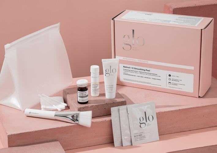
RESURFACE + SMOOTH
CMYK 12/29/25/0 | RGB 221/184/176 | HEX #DDB8B0
BRIGHTEN + GLOW
PMS 7520 C
CMYK 7/27/26/0 | RGB 234/190/176 | HEX #EABEB0
PROTECT + PREVENT
PMS 7506 C
CMYK 7/12/33/0 | RGB 239/219/178 | HEX #EFDBB2

GRAPHIK
The primary Glo Skin Beauty typeface is Graphik. It is a distinctly contemporary geometric sans serif with roots in modern 20th century design. It was designed by Christian Schwartz in 2009. Avoid any use of stylistic alternatives offered within the typeface beyond the styles and weights listed here. Text is never aligned right.
GRAPHIK LIGHT
ABCDEFGHIJKLMNOPQRSTUVWXYZ
abcdefghijklmnopqrstuvwxyz
1234567890!@#$%^&*()
• Used for body copy
• Kerning: 0, Leading: 1.5x
• When used in all caps, set kerning to 50
GRAPHIK LIGHT ITALIC
ABCDEFGHIJKLMNOPQRSTUVWXYZ abcdefghijklmnopqrstuvwxyz
1234567890!@#$%^&*()
GRAPHIK REGULAR
ABCDEFGHIJKLMNOPQRSTUVWXYZ
abcdefghijklmnopqrstuvwxyz
1234567890!@#$%^&*()
• Used for body copy when Graphik Light does not provide adequate legibility
• Kerning: 0, Leading: 1.5x
• When used in all caps, set kerning to 50
GRAPHIK REGULAR ITALIC
ABCDEFGHIJKLMNOPQRSTUVWXYZ abcdefghijklmnopqrstuvwxyz
1234567890!@#$%^&*()
GRAPHIK SEMIBOLD
ABCDEFGHIJKLMNOPQRSTUVWXYZ
abcdefghijklmnopqrstuvwxyz 1234567890!@#$%^&*()
• Used for sub-headers and for product names on packaging
• Kerning: 0, Leading: 1.5x
• When used in all caps, set kerning to 50
GRAPHIK SEMIBOLD ITALIC
ABCDEFGHIJKLMNOPQRSTUVWXYZ
abcdefghijklmnopqrstuvwxyz 1234567890!@#$%^&*()
HTF DIDOT
The secondary Glo Skin Beauty typeface is HTF Didot. It is a revival of the French modern typeface Didot with a classic and elegant feel, designed by Jonathan Hoefler in 1991. Hoefler’s design anticipates the degradation of hairline in smaller point sizes by employing heavier weighted strokes in the smaller point sizes. Avoid any use of stylistic alternatives offered within the typeface beyond the styles and weights listed here. Text is never aligned right.
DIDOT HTF L42 LIGHT
ABCDEFGHIJKLMNOPQRSTUVWXYZ
abcdefghijklmnopqrstuvwxyz 1234567890!@#$%^&*()
• Used for large headlines (45pt +), never for body copy
• Kerning: 0, Leading: 1.5x
DIDOT HTF L24 LIGHT
ABCDEFGHIJKLMNOPQRSTUVWXYZ
abcdefghijklmnopqrstuvwxyz 1234567890!@#$%^&*()
• Used for medium-sized headlines (20pt-44pt), never for body copy
• Kerning: 0, Leading: 1.5x
DIDOT HTF L16 LIGHT
ABCDEFGHIJKLMNOPQRSTUVWXYZ
abcdefghijklmnopqrstuvwxyz
1234567890!@#$%^&*()
• Used for small headlines and decorative call outs (13pt-19pt), never for body copy
• Kerning: 0, Leading: 1.5x
DIDOT HTF L42 LIGHT ITALIC
ABCDEFGHIJKLMNOPQRSTUVWXYZ
abcdefghijklmnopqrstuvwxyz 1234567890!@#$%^&*()
DIDOT HTF L24 LIGHT ITALIC
ABCDEFGHIJKLMNOPQRSTUVWXYZ
abcdefghijklmnopqrstuvwxyz
1234567890!@#$%^&*()
DIDOT HTF L16 LIGHT ITALIC
ABCDEFGHIJKLMNOPQRSTUVWXYZ
abcdefghijklmnopqrstuvwxyz 1234567890!@#$%^&*()
HOW TO UTILIZE BRAND TYPEFACES
These should be the standard usage practices for brand typeface variations across all available platforms.
Didot HTF L24 Light + Light Italic are for main headers that do not exceed 44pt.
Didot HTF L16 Light + Light Italic are for smaller headers 13pt-19pt.
GRAPHIK SEMIBOLD + LIGHT + REGULAR IN ALL CAPS ARE FOR SUBHEADS, WITH KERNING ALWAYS SET TO 50.
Graphik Semibold in Title Case is for Product Names on Packaging. Graphik Light + Regular in sentence case are for body copy.
KERNING + LEADING
Kerning must always be balanced and tight, with the standard across all typefaces set to 0. Kerning must be set to 50 if Graphik is used in all caps. Leading is set to 1.5x pt in all typefaces.
WEB + SOCIAL TYPOGRAPHY SUBSTITUTES
These are the typfaces that should be substituted where necessary in live text on web and in social media applications.
Didot Regular + Italic are substitutes for Glo’s Didot HTF typefaces. Do not use these substitutes anywhere the HTF typefaces are available.
Helvetica or Helvetica Neue are substitutes for Graphik. Do not use these substitutes anywhere the Graphik typeface is available.
SOCIAL TYPOGRAPHY BEST PRACTICES
Always utilize the typeface option visually closest to Graphik in social app-provided text features. For example, the “Strong” or “Classic” options available on Instagram Stories should be the default text used, never the “Neon” option.
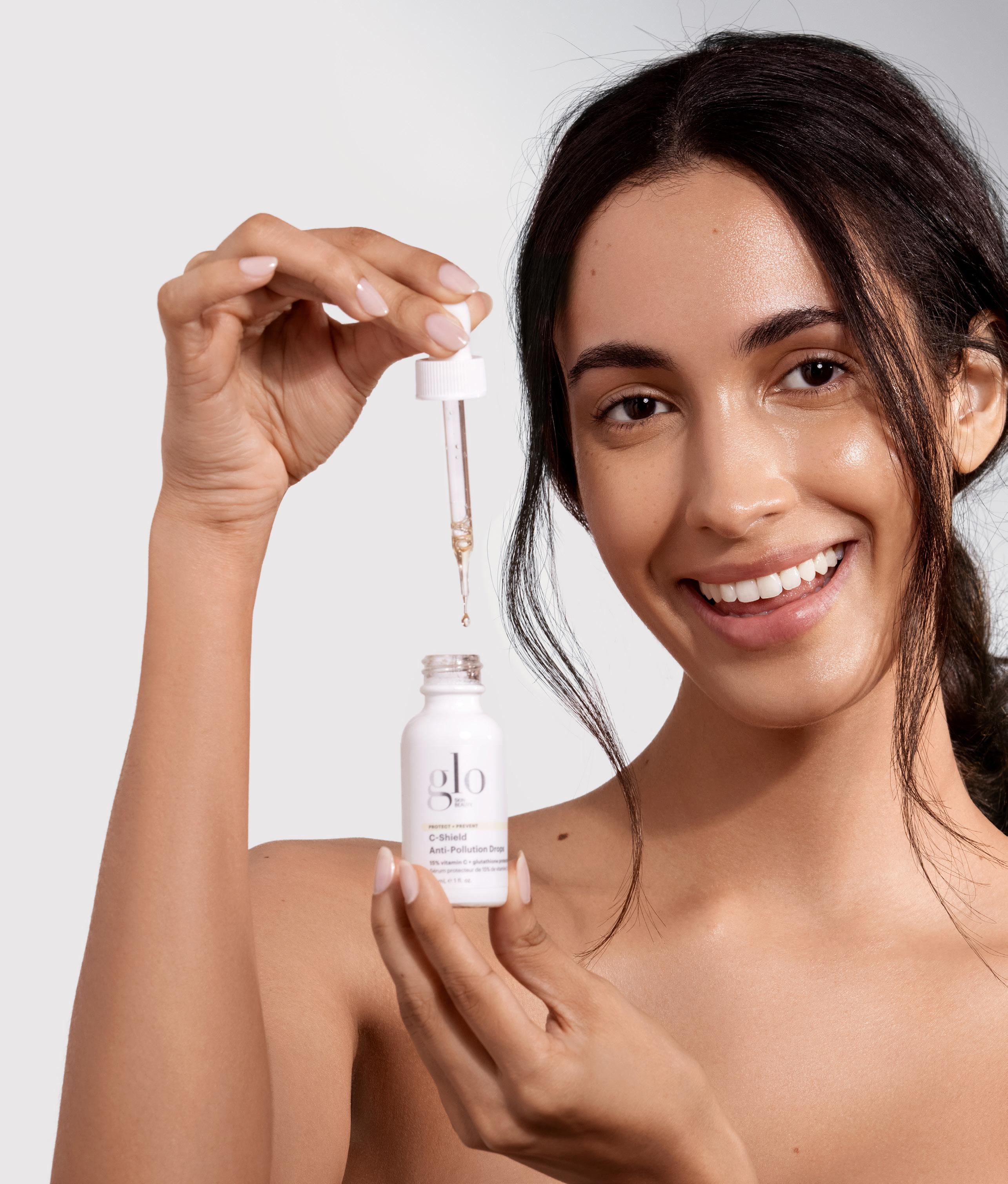
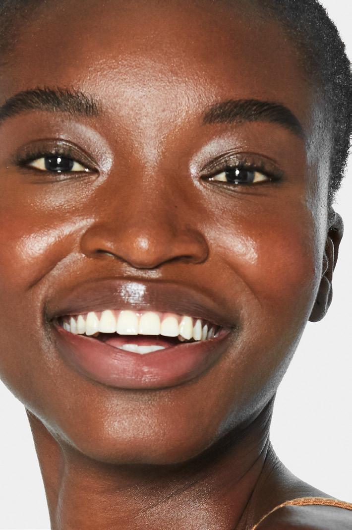


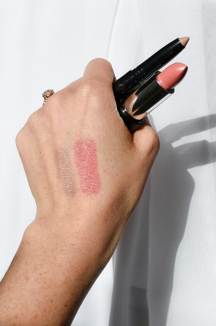
Clean styling reflected in natural hairstyles and neutral nails—amazing skin should be the focal point. 1 3 2
sun-like lighting that allows for clear capture of glowing skin and defined shadowing.
An attitude of levity, joy, lightheartedness.
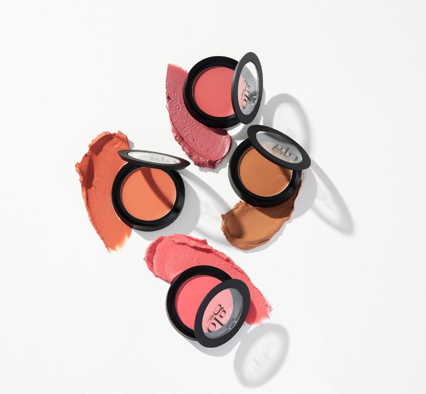

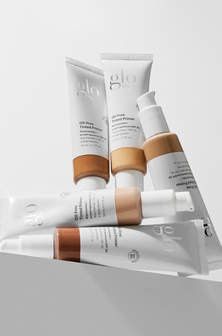


Bright, sun-like lighting that allows for clear capture of swatching, color, and defined shadowing.
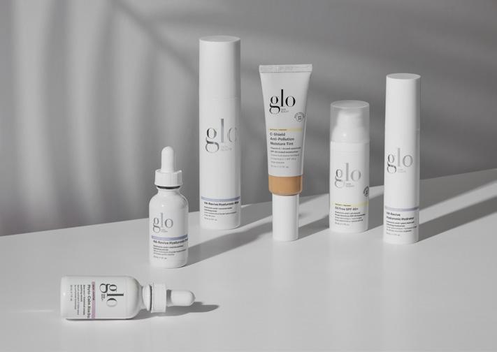
Usage of Solution Category colors coinciding with the appropriate product or whites, dove grays, and sandy beiges.
Props or editorial styling needs to feel clean, fresh, and modern. We are not kitschy nor too on-the-nose! 1 3 2


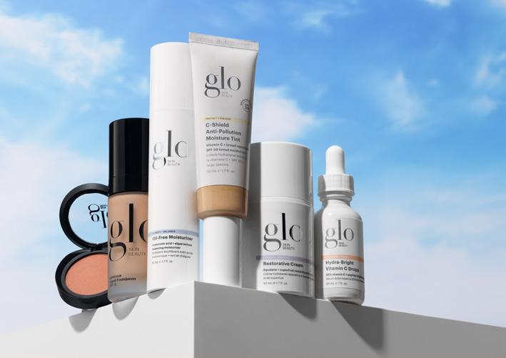
Bright, direct-from-the-sun lighting that allows for clear capture of swatching, color, and defined shadowing.
Backdrops and colors are clean, neutral, and modern.


Props are brandless (when possible), modern, simple, airy, and do not compete with our products.