WELCOME
This brandbook is designed to get to know the brand better, to understand its philosophy, its values, where it wants to go, as well as its target audience.
But it also forms a valuable part of how the brand seeks to present itself to the outside world, which is why this is a valuable resource when talking about visuals, identifying the logo, its colors, typography and much more.
I hope you find it as valuable as we do.
The visual strategy is focused on being able to show our clients, as well as the world in general, seriousness, cleanliness, modernity, elegance.
To give a vision to the world of versatility and adaptation to different projects.
Visual strategy
To generate a standardized internal communication, programs such as Monday/Click Up can be used, where people within the company can see how the tasks of the entire team are going, as well as generate comments within the same.
This could be complemented with biweekly meetings where the projects of each team member are discussed.
Internal communication
trust passion
responsibility
VAL
UES
honesty
commitment
respect
MARKET
Lady green, is a whichcompany has design projects, architecture, construction, renderings.

Main competitors
Currently it is already known statewide, and mainly in San Pedro Garza Garcia. As well as it is well positioned in social networks 270K followers. That is why it is one of its main competitors as it performs the same work as our company.
Cuadro is a developer of architectural projects, which has a graphic identity, as well as a high number of projects already completed.
This makes it a direct competitor of our company in the area.
Market insertion
What I would suggest for the company Tad, is first to position videos on social networks, being instagram, tiktok, also take presence in behance to reach world class clients.
It would also be an opportune way to hire google search, to appear number one in google searches, and get more visibility.
And to create the complete system, google display which would generate the power to generate ads within web pages.
Below you can read the SWOT analysis that was generated for the company, seeking to find its strengths as well as its points of improvement.
It has a defined process.
It has experience in the market.
It has a clear philosophy where the client's needs are put in the first level before
needs of the client rather than just delivering a project that they like.
Its design skills are good.
It has social networks where it already has visibility.
His renders have a defined aesthetic.
It does not have a mission, vision, brand values.
Its logo does not represent the brand.
His instagram page, even when he has followers, they are very few.
Its only added value is that it understands the aesthetics of the client.
Define your identity, mission, vision, logo and much more.
Generate a greater added value.
Seek to generate an impact on social networks.
Show the process to the community.
There are many people already working in the same area.
People may be suspicious because I don't talk on networks about the process.
There are certain designers who generate the render, but also show the render in real life.
Mission
The mission is focused on solving the needs of our customers, safeguarding at all times what the customer needs and wants.
In this way we can have an honest system, as well as understand and fulfill with responsibility each of the projects, delivering a work of the highest quality.
in the creation of renderings, we are also looking for an expansion that in the future will allow us to cover more areas of the architectural construction process.
Vision
We seek to position ourselves as a leading company
lGO0
TYPE
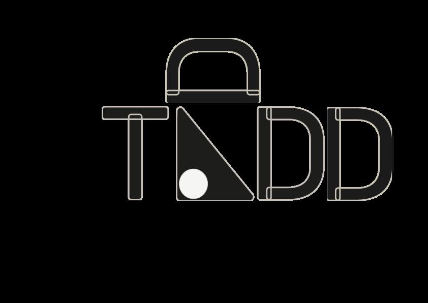
TThe logo is mainly conformed with the company's word "TAD", using the Bahnschrift typography, but it is modified, looking for the descending, ascending and upright to be rounded in comparison with the current shape of the chosen typography.
Another factor of all the letters, as well as the resource created to personify the "A" is the outline. The objective of this was to show the construction of the letters, understanding that the company is mainly dedicated to the construction of renders, that is why the final letter is shown but also the construction lines behind them.
The second very important factor of the logotype is the shape of our A, which makes the illusion of a square that effects to be the "mathematical" part of the logotype, as well as how it is positioned seeks to be a reference to a building, but all this from a circular vision, because we took care of the fact of how its serifs are circled, looking for harmony with the other letters.
The circle that is added to the same "A", is mainly a visual resource to generate a weight by the shape of the location; but also within the renders that the company has generated, many of them contain resources such as furniture, mirrors, lamps and more, in a circular shape, so at the time of creating the logo.
It is also a change of size, this to demonstrate the dynamism within the company, by the way it can adapt to different projects, always focused on what the customer wants and needs.
Another very important factor when generating this logo, are the colors, this logo is composed of three colors, the main one is the solid black corresponding to the code #1D1D1B, the second one is the white located in the circle, which seeks to generate a contrast, both in the "A", as in the whole logo, this white has the code of #F5F5F5F5F5F5. And finally, the beige color, which seeks to help the time to put in use the logo can have a color that makes the difference in the surface where it is being placed, like the logo; this color is #C7BFB8.
OTHER
WY A
Iso
type
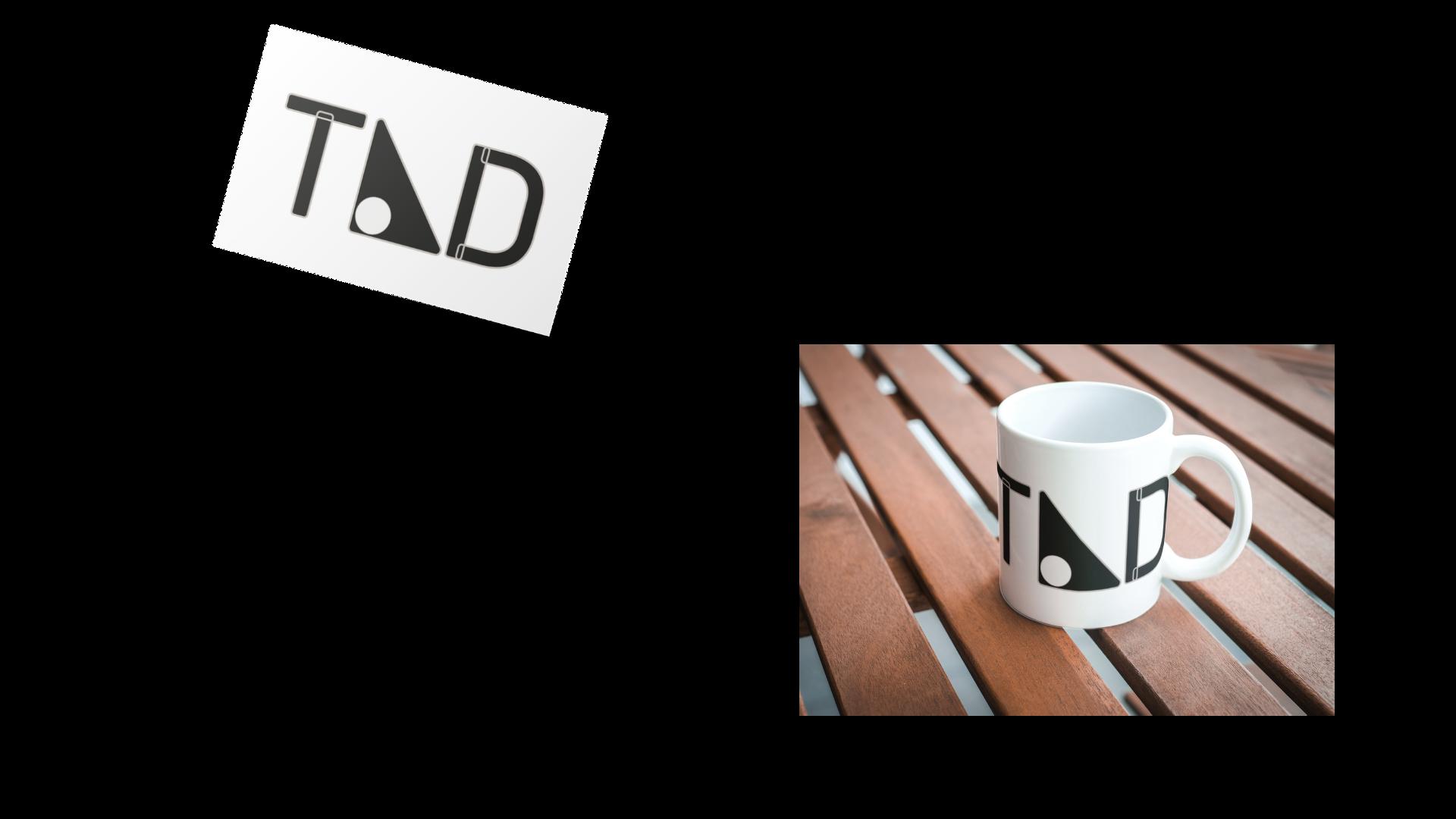
As part of the brand variants, an isotype was generated, taking it from the elemental part of the logo. The idea was to create this isotype to give the brand presence, as well as identity, without the need to cover so much space. However, this variant would be used to represent the brand in informal situations, since for documentation, as well as business cards, the logotype should be used.
Incorrect uses
At the moment of showing the logo to the world, there will be many perspectives of the same, however, it is important to take into account these incorrect uses, understanding that they are the forms that are not allowed to reproduce the logo, as well as the isotype.


Colors not indicated Cut
Obstructions Backgrounds
not indicated Blur Text added Orientations
Distortions Inclination
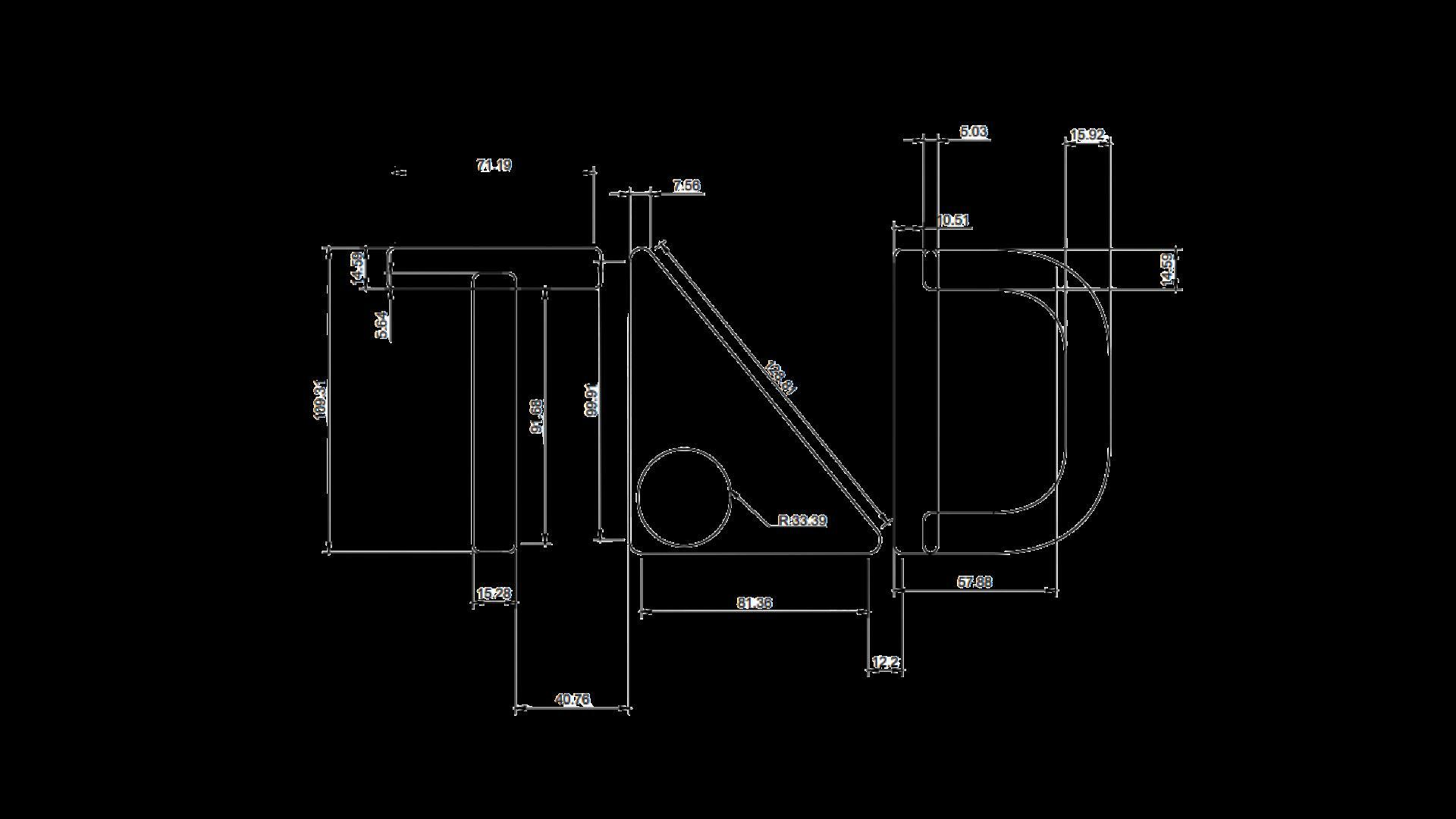
In the next part we find the measurements of the whole logo.
We can see how it is placed the measures from the intersections, as well as the diameter of the circle, the ascending and descending, as well as the general measures.
Something to be added is that the distance from the circle to the wall of the "a" is 2.15 cm.
These same measurements can also be taken into account for the proportions of the isotype.
PROPORTIONS


Security
space
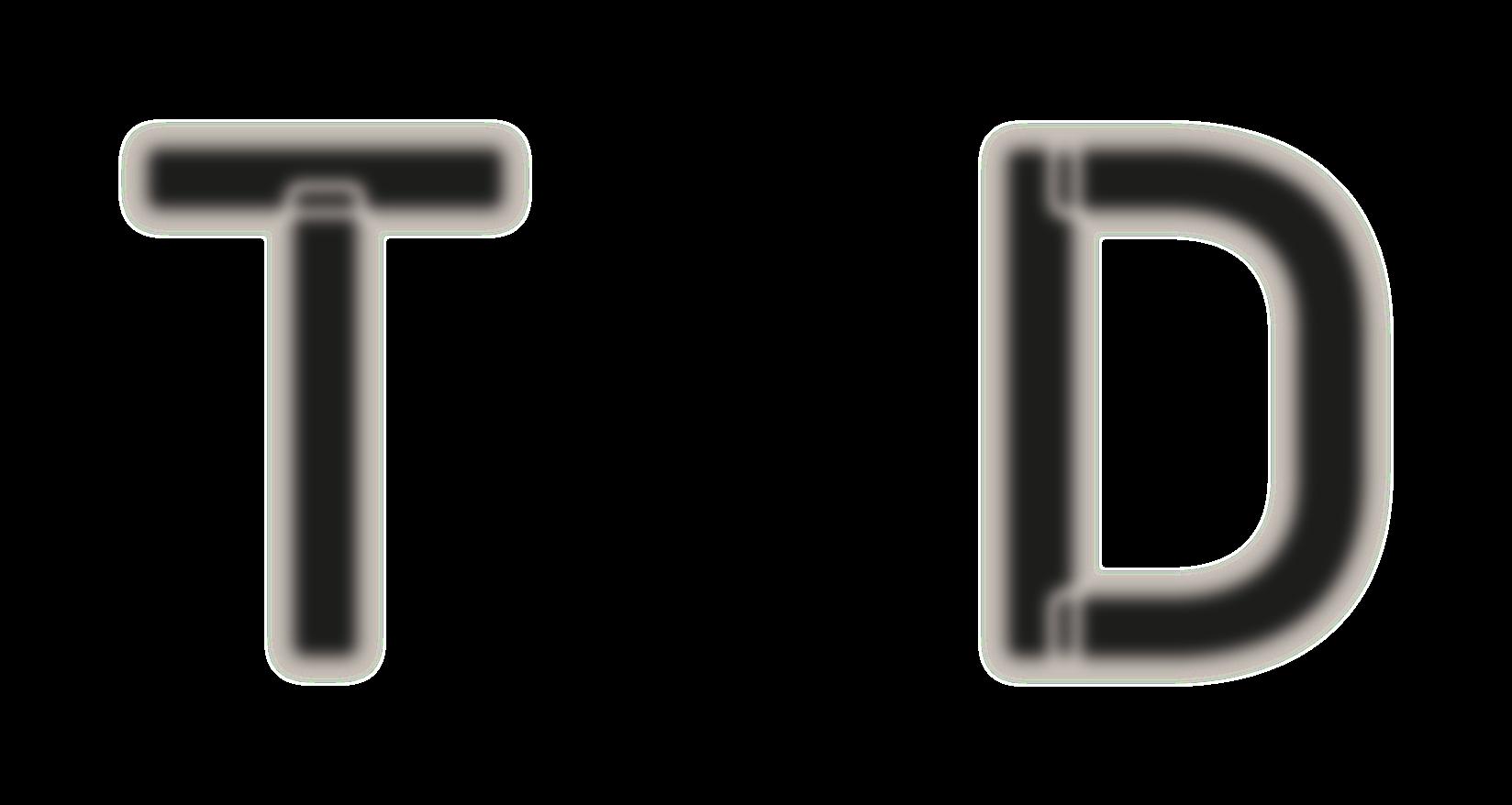
To generate this lockbox we took as a reference the letter "D", since it is the letter that at the moment of reproducing it is easier, from the way it is created, as well as the "wall", with which the word is created. This "D" has to be fulfilled from all angles.
It is also very important the measures, these measures the unit was "pixels", since it does not matter the form in which it is replicated, these measures will continue being the same, as well as reliable.
COLORS
To represent the brand we have chosen three colors, which colloquially can be known as beige, white and black.
This is because white gives us the vision of cleanliness, order, dynamism, beige makes us feel quality, elegance, dynamism, and at some point you can feel or relate as home. And finally, black, which undoubtedly represents formality, elegance.
That is why creating this color system seeks to demonstrate the values of the brand, but in a visual way that draws attention to whoever has an approach to the brand in general.
#1D1D1B #C7BFB8 #F5F5F5
The typographic system is based on two fonts, which although different, have something in common and that is the energy they transmit.
This energy seeks to give a rounded look to all the written aesthetics. The first typography is the one used in the logo (clearly in the logo with modifications), which is Bahnschrift, being this the one that will be used in titles, as well as in important phrases. It is worth mentioning that it is the whole typeface family.
This same typeface although undoubtedly demonstrates a comfort in the logo, also reflects an industrial work behind, which is an important part of the essence of the brand.
The second typeface is Tahoma, which will be used in long titles, showing a combination with the first one. Tahoma would also be used throughout the entire typeface family, varying according to what is needed at the time. Tahoma seeks to give an energy with curves, but maintaining an order, as well as a visual cleanliness.
TYPO
GRAPHY
Aa1 Bahnschrift family
Titles and catchy phrases ABCDEFGH IJ KLMNOPQRSTUVWXYZ obcdefghi jklmnopqrstuvwxyz 1234567890${&?!%.,:;-)
ABCDEFGH IJ KLMNOPQRSTUVWXYZ obcdefghi jklmnopqrstuvwxyz 1234567890${&?!%.,:;-) Aa1 Tahoma
Long texts ABCDEFGH IJ KLMNOPQRSTUVWXYZ obcdefghi jklmnopqrstuvwxyz 1234567890${&?!%.,:;-)
ABCDEFGH IJ KLMNOPQRSTUVWXYZ obcdefghi jklmnopqrstuvwxyz 1234567890${&?!%.,:;-)
These resources were created following the aesthetics of the brand, under curves.
They are generated to be decorative both on cards and social networks, but they still represent and are part of the brand.
Auxiliary resources


Uses
