LINER NOTES
BRAND THEME
BRAND ARCHETYPE
DESIGN RATIONALE: MOOD BOARD
TRACK ONE: EXPRESS YOURSELF
DESIGN RATIONALE: LOGO
LOGO USAGE
LOGO: CLEAR SPACE
LOGO: USE DO/DO NOT
COLOR PALETTE TYPOGRAPHY


BRAND THEME
BRAND ARCHETYPE
DESIGN RATIONALE: MOOD BOARD
TRACK ONE: EXPRESS YOURSELF
DESIGN RATIONALE: LOGO
LOGO USAGE
LOGO: CLEAR SPACE
LOGO: USE DO/DO NOT
COLOR PALETTE TYPOGRAPHY


In the heart of the neon-lit city streets, amidst the pulsating rhythm of life, there exists a resonance—a vibrant echo that reverberates through the souls of Gen X women. It’s the voice of relevance, of unapologetic self-expression, and of unwavering empowerment. It’s the echo of Mandy Madison.
Revitalizing favorite songs that resonate in the soul of Gen X, Mandy Madison brings fresh treatment to the favorite songs of a generation. The echoes of the 80’s and 90’s echo with new vigor, just like the women Mandy represents.
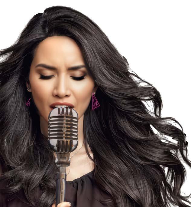
At the helm of this electrifying journey is Mandy Madison herself—a force of nature, a beacon of strength, and a testament to the power of authenticity. With her magnetic presence and her electrifying voice, she ignites the stage, commanding attention and stirring souls with every lyric, every riff, every beat.
The ECHO tour is a look back as well as a celebration of what is ahead. This space is a safe haven where every Gen X woman can come as she is, free from judgment, free from inhibition, and free to embrace her truest self. It’s a space where friendships are forged in the heat of the moment, where memories are etched in the fabric of time, and where voices find relevance.
So, to all the women who refuse to be silenced, who refuse to be contained, who refuse to be anything less than extraordinary—this is your moment.
This is your anthem.
This is your ECHO.
The theme for Mandy Madison ECHO Tour is Relevant. The tour’s relevance lies in its ability to address and resonate with the contemporary issues and challenges faced by women, particularly those of the Gen X generation. Whether it’s navigating work-life balance, breaking through glass ceilings, or confronting societal expectations, the tour acknowledges and celebrates the past experiences of its audience, while acknowledging the powerful future ahead.

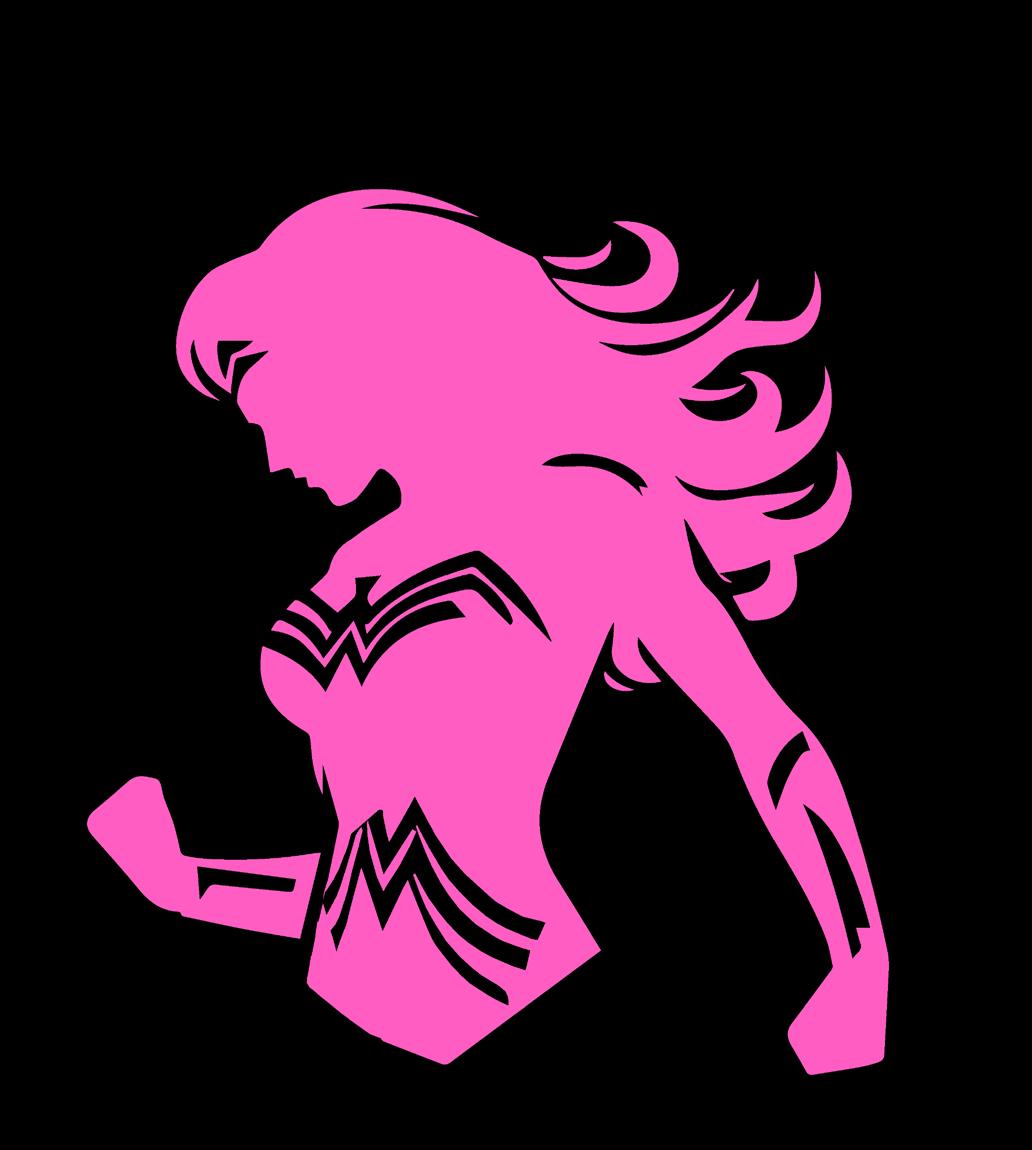
Mandy Madison ECHO Tour embodies the Hero archetype by inspiring and empowering women to achieve the goal of recognition and relevance. Through a transformative journey of music, storytelling and shared experiences, attendees are equipped with the tools, confidence, and support they need to make a meaningful impact in their own lives and the lives of others. Wonder Woman is the hero of Gen X and that is no accident. There’s no Supergirl or Batgirl here. It is a generation of Wonder Women.
The Mandy Madison ECHO Tour follows the classic hero’s journey narrative, where fans embark on a transformative experience to overcome challenges and finding empowerment. Through her performances, storytelling, songs, and interactions with the audience, Mandy serves as a beacon of hope and inspiration, showing women that they are relevant and worthy of being heard.
The Hero archetype is not just about personal achievement; it’s about using power and influence to make a positive impact on the world. The Mandy Madison ECHO Tour encourages women to pay it forward by using their newfound energy and confidence to uplift others. Let’s all level up!
The tour creates a supportive and inclusive community where women can connect with like-minded individuals, share their stories, and find strength in solidarity. Through fan pages, and social media engagement, attendees are encouraged to build meaningful relationships and support each other on their journeys of growth and empowerment. Let’s hear ya, Ladies.


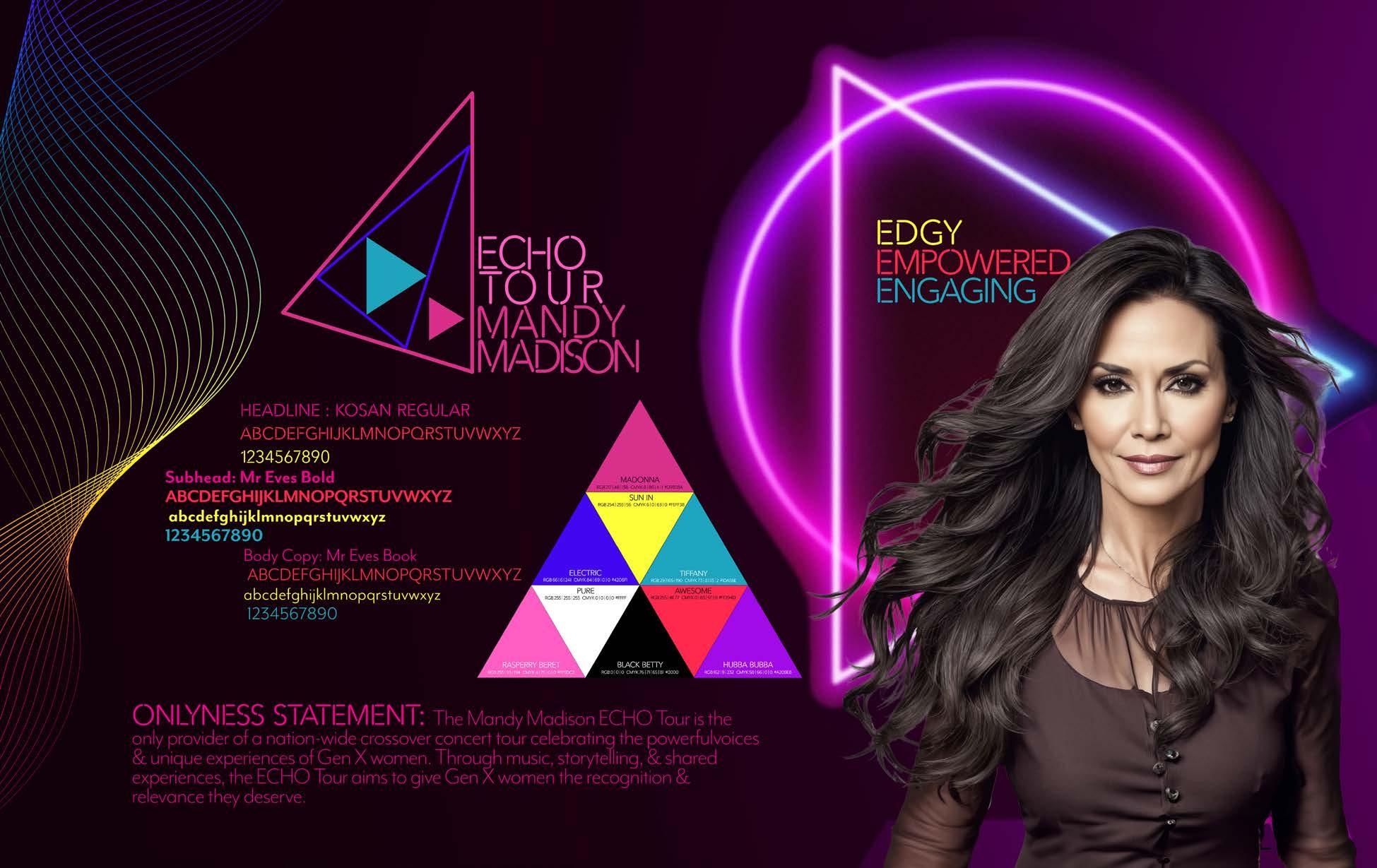


reminiscing about this era, enjoyingconversations about 80s/90s music, culture, and their journey from landlines to smartphones, understanding how the past shapes the future.

Imagery focuses on the interplay of light and dark. It’s not just about contrast, but where the light focuses. Strong geometrics, triangles and lines totally rock.



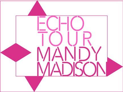
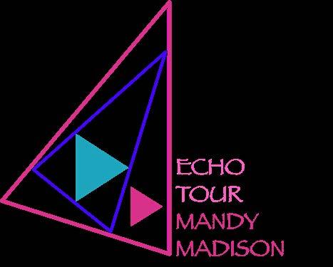
Mandy Madison ECHO Tour has a Primary logo, a Secondary logo and the Wordmark with triangle (“Snap”).
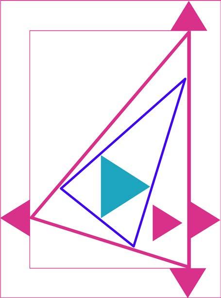
The logo uses the strong geometric shapes of the triangle to symbolize empowerment. The duplication of the two outer triangles visually represent the word “echo.” The inner two triangles also visually represent this concept, while also pointing to both the name of the tour and the name of the artist. The typography was chosen for its neon tube styling and readability. What’s more Gen X than neon and bold colors? NOTHING. Absolutely nothing.
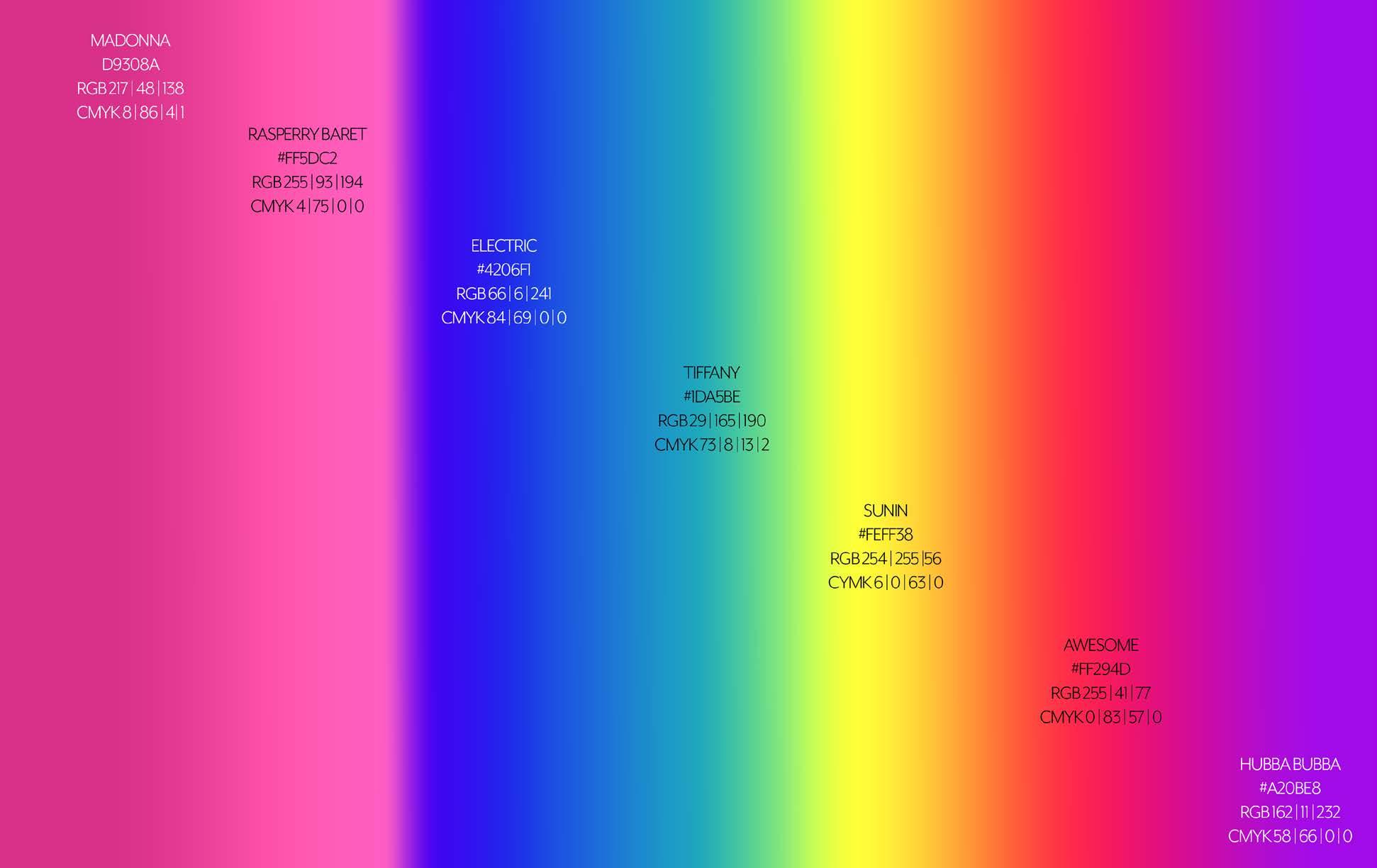
In most cases, the logos should be presented in full color (see p. 12 for specific hex codes, RGB and CMYK.) Logo colors should not deviate from full color unless it is being used in a graphic. In these cases, the logo colors may be changed to a single color from the color palette, or in pure black or pure white so that it is cohesive with the graphic. Have fun with it, but don’t forget to check the restrictions on page 11.
Hey, we’re Rock n’ Roll but rules can be cool too.



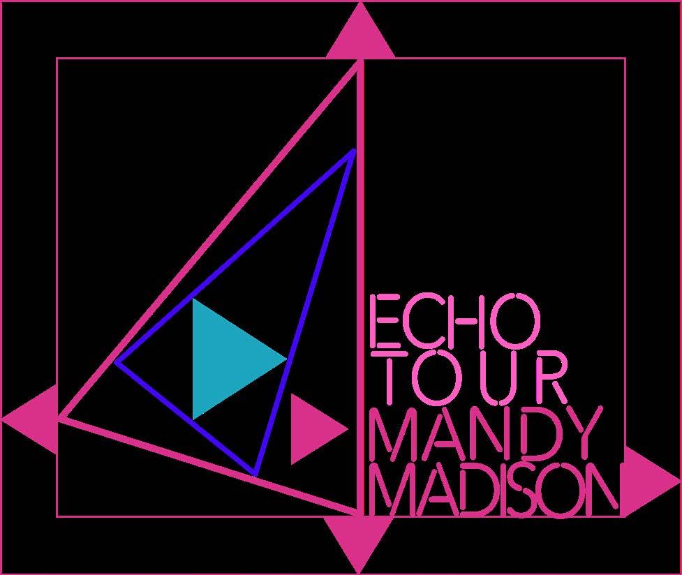
The Snap (smallest triangle of the four) should be used to determine clear space for the logos. No graphic elements should be in the clear space around the logos. Give us some space, man.
SPECIAL NOTE: There may be times to violate clear space but it should be rare and super intentional. Like, totally.

BODACIOUS:
Do use the logo as often as possible. We love it. Whenever possible, the primary logo should be used in its full color version. If the words “Mandy Madison ECHO tour” are on the graphic elsewhere, feel free to rock that Secondary Logo. Since the Primary Logo does take up some real estate (we like it LOUD), the Snap logo is a great option for smaller spaces. Can’t use the full color? Pick a single color from our amazing palette and use that. Mix and match with the background in another palate color or no background at all! Mandy likes to turn it up and grab attention.
BUMMER:
We hate to harsh your vibe, but there are some restrictons on the logo use.
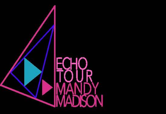
This isn’t Jazzercise class. Don’t skew, stretch, or distort any of our logos. They aren’t flexible.
Bruh. You have a lot of color options. Don’t stray from the palette.
Don’t make it weird. Use the typography and font styles in this guide. Papyrus?! As IF!
SPECIAL NOTE: If you can’t fit any one of the three provided logos, the name of the tour and the artist may be used. Follow the typography, color guidelines and nomenclature rules


Kosan - REGULAR (ALL CAPS ONLY)
ABCDEFGHIJKLMNOPQRSTUVWXYZ
01234567890


Kosan is our header/subheader typeface. The leading guideline for this font is auto, but it can be adjusted slightly as needed as long as the letters do not touch. Becuase this font only comes as a Regular style font, there is no bold guideline. Additionally, this font does not have symbols. This is a bummer, but Brandon Grotesque can be used when symbols are needed.
Weight - Regular | Kerning - 0 | Leading - Auto
Brandon Grotesque Bold (Use for symbols if needed for Kosan) ! @
Special Use: Cyberthrone
ABCDEFGHIJKLMNOPQRSTUVWXYZ -CAps
abcdefghijklmnopqrstuvwxyz - lowercase
Weight - Regular | Kerning - 0 | Leading - Auto TYPOGRAPHY
Mr Eaves Mod (Book or Bold)
ABCDEFGHIJKLMNOPQRSTUVWXYZ
abcdefghijklmnopqrstuvwxyz
1234567890
Mr Eaves Mod is our copy typeface. It is ideal for large bodies of text. This font can be used in Book or Bold weight as needed.
Weight - Book or Bold | Kerning - 0 | Leading - Auto
Sometimes, you need a special font. Cyberthrone is great for call outs, special titles, or times when the other fonts just won’t do. Be careful through...this font gets really tricky to read if there is too much of it or if the leading or tracking are tight. This font has one weight and is in all caps, but using all caps gives you a slightly different variation and size.


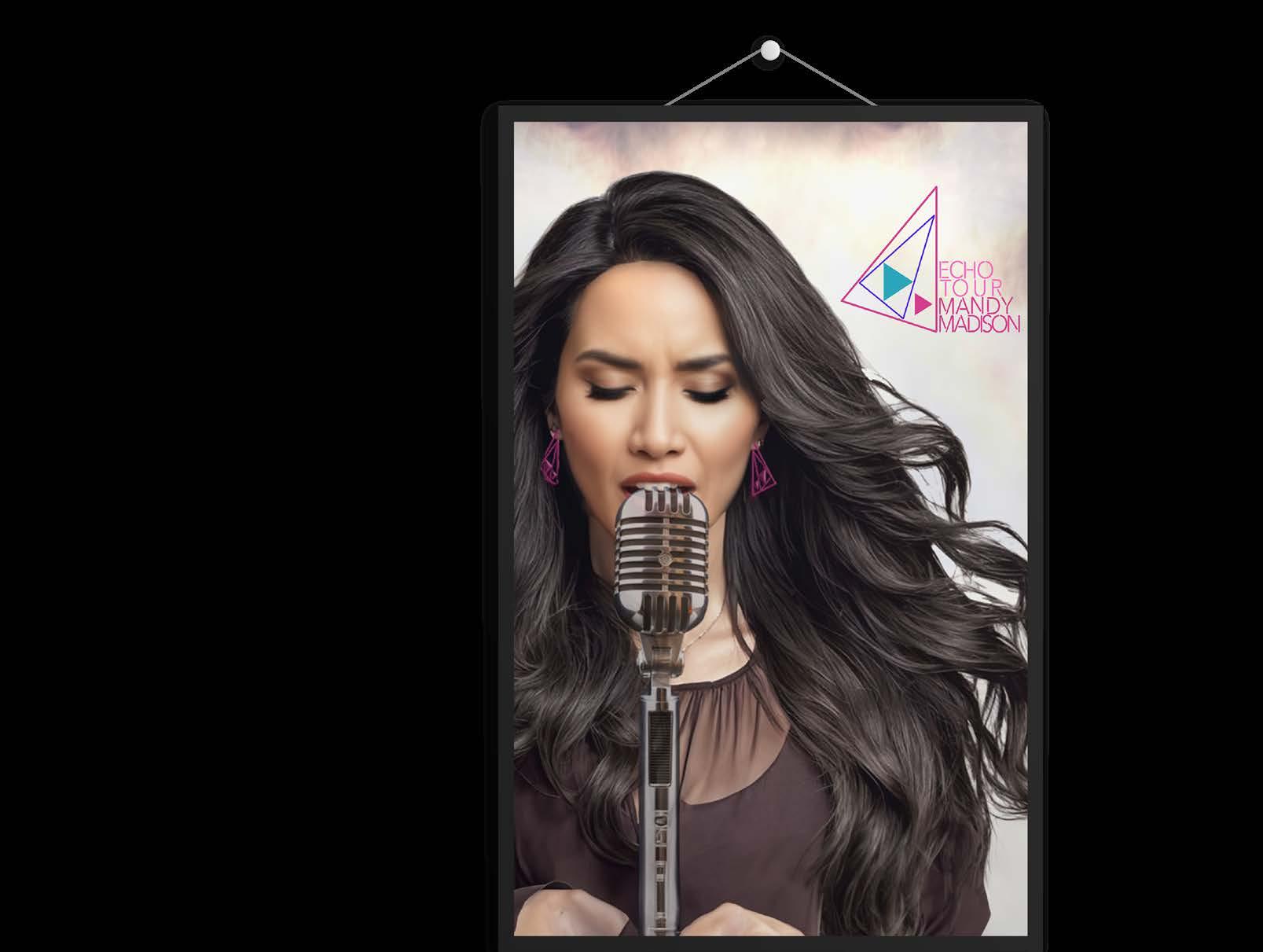
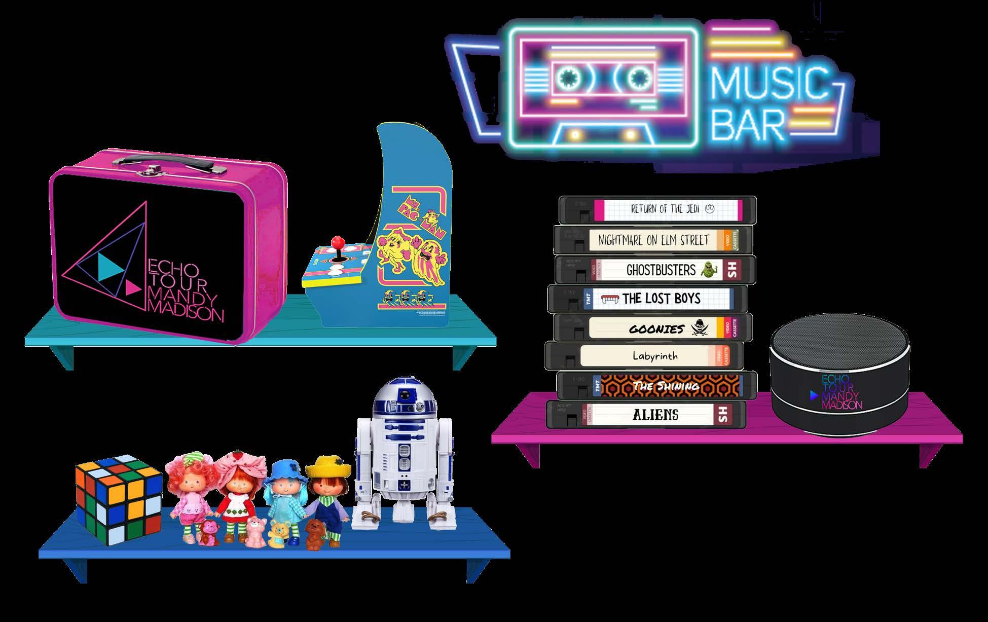
Gen X is very motivated to purchase collectibles and nostalgia-oriented items. In order to meet that challenge, all merchandise was developed with a nod to the past while bringing apparel and collectibles forward. *Add to cart*
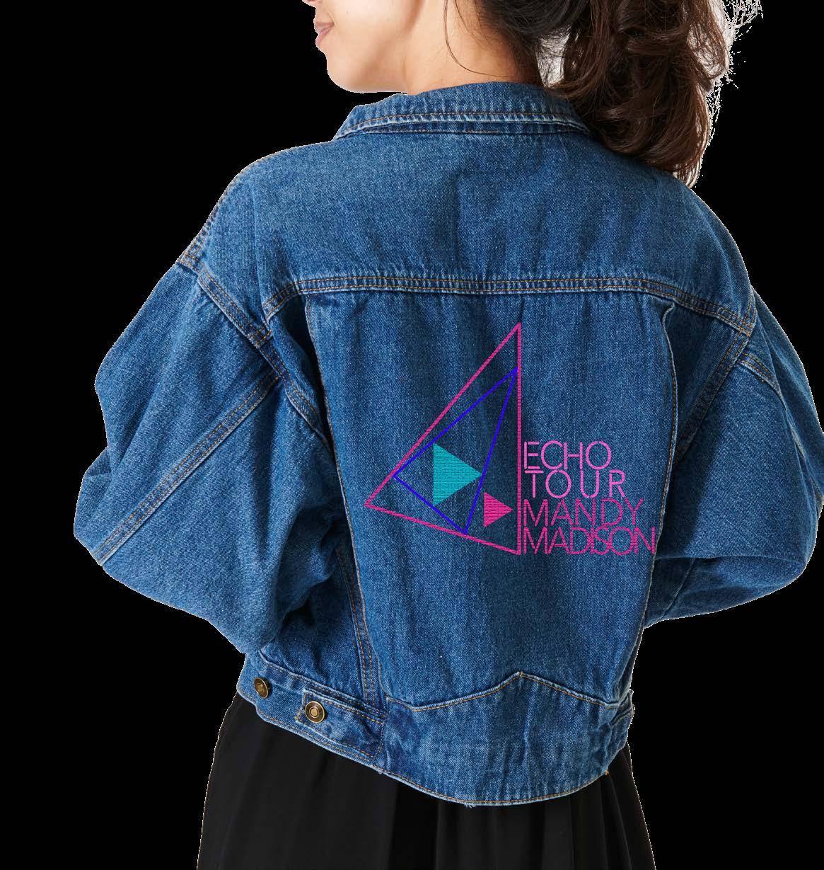


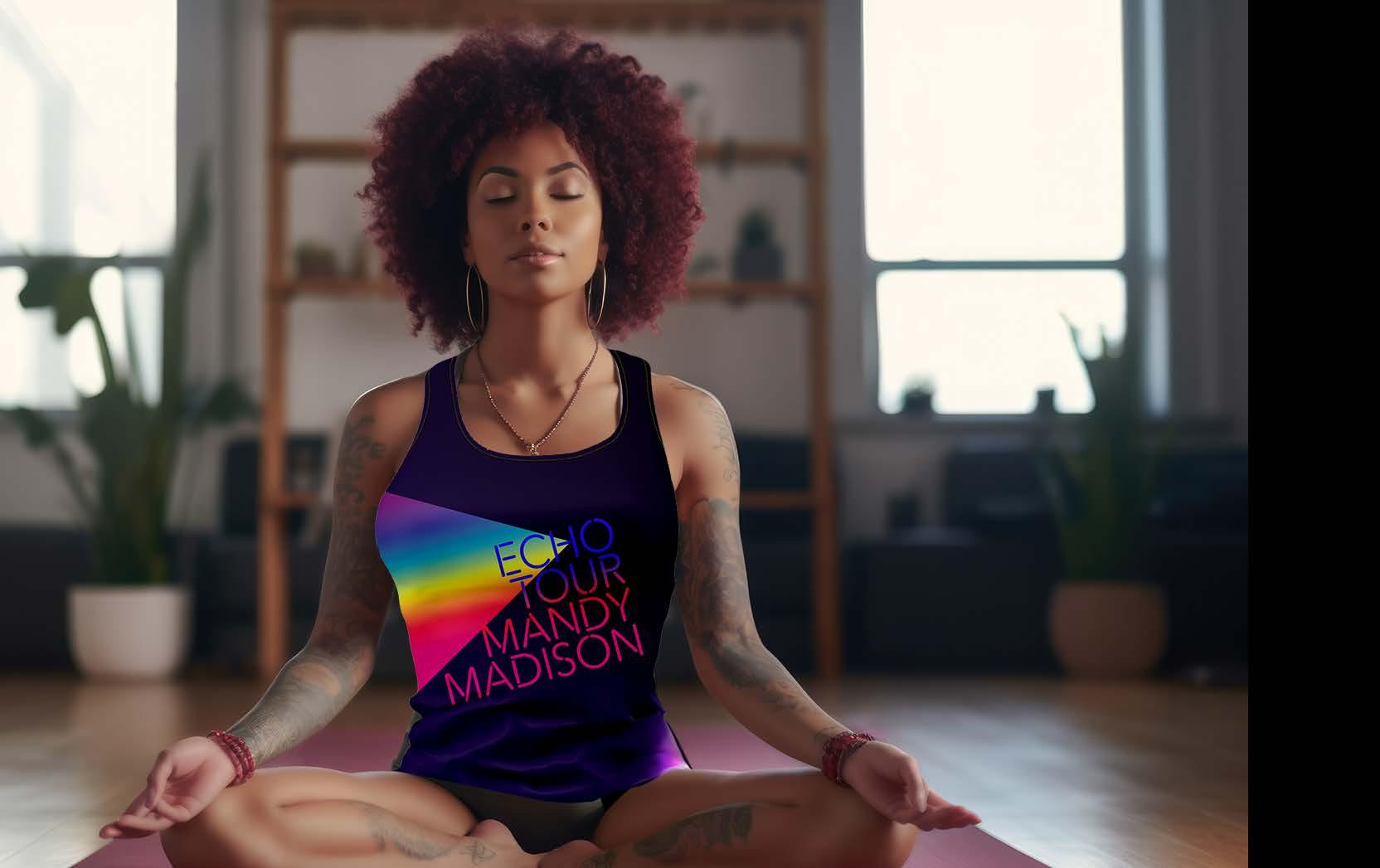
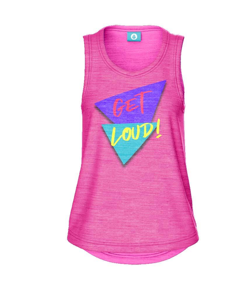


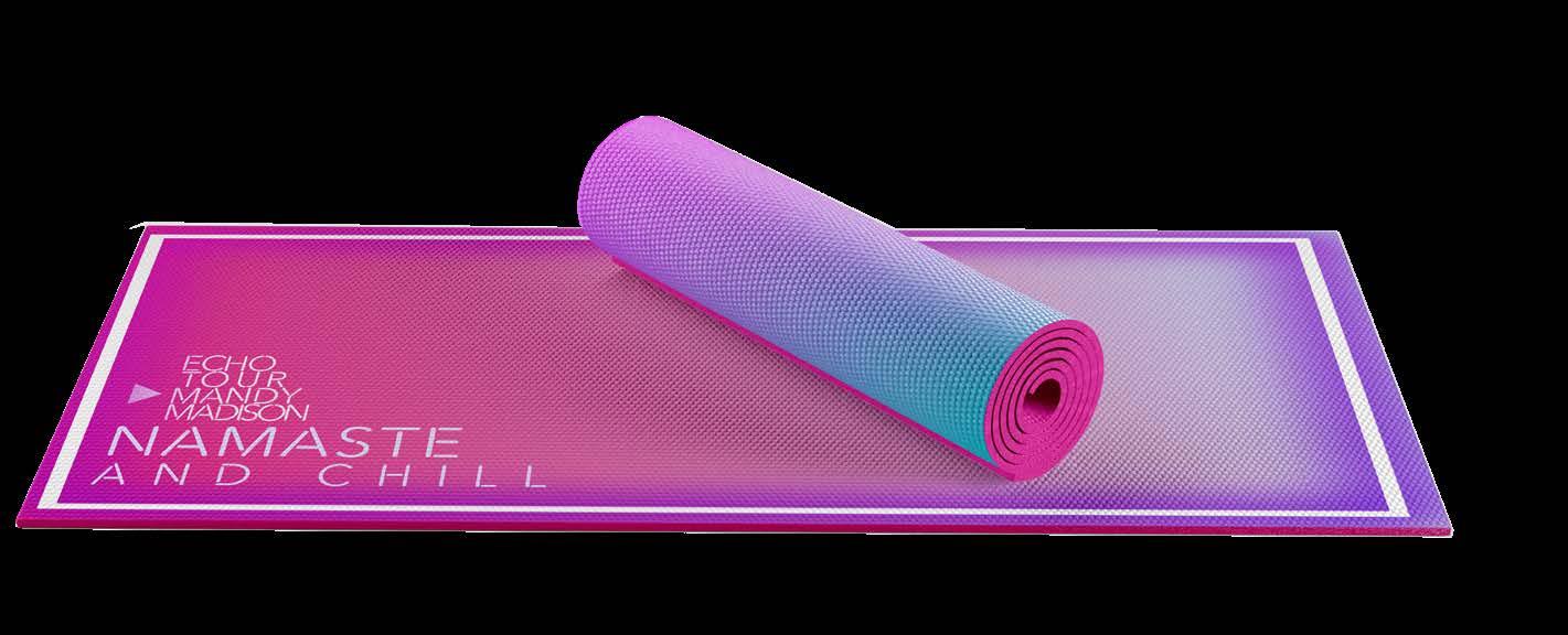
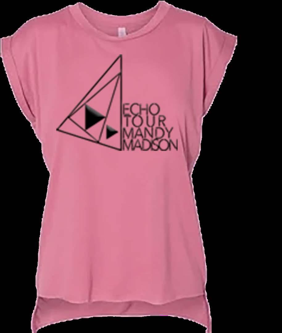
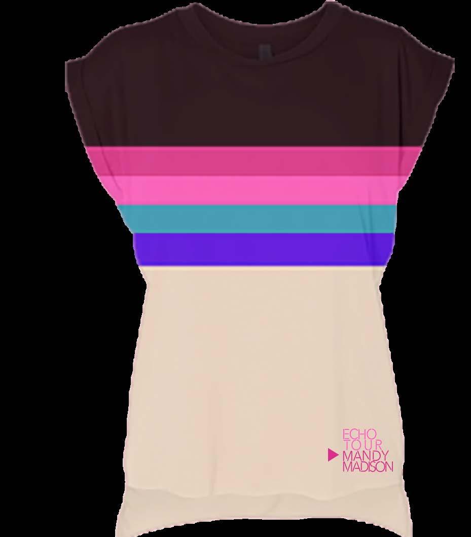


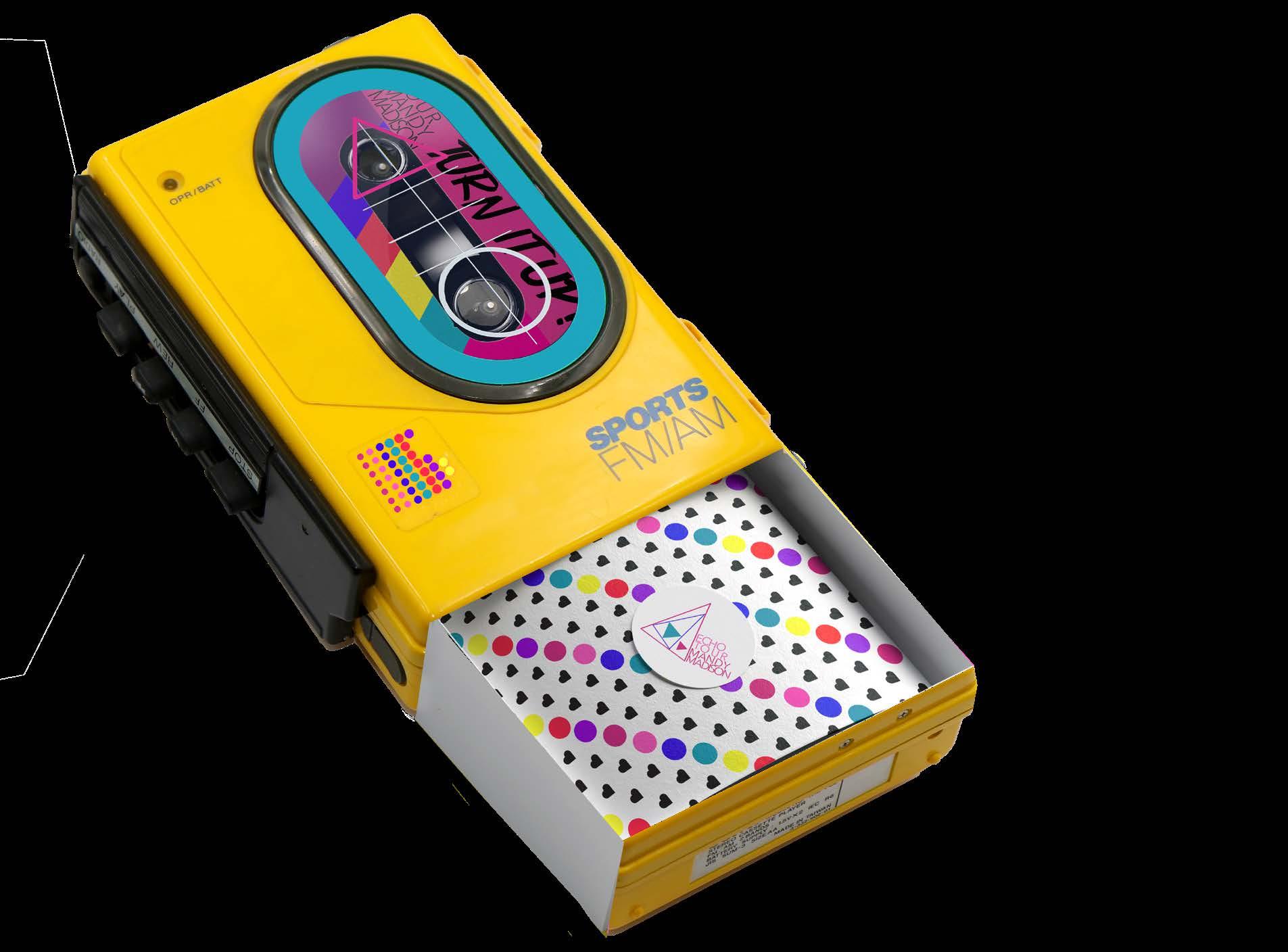

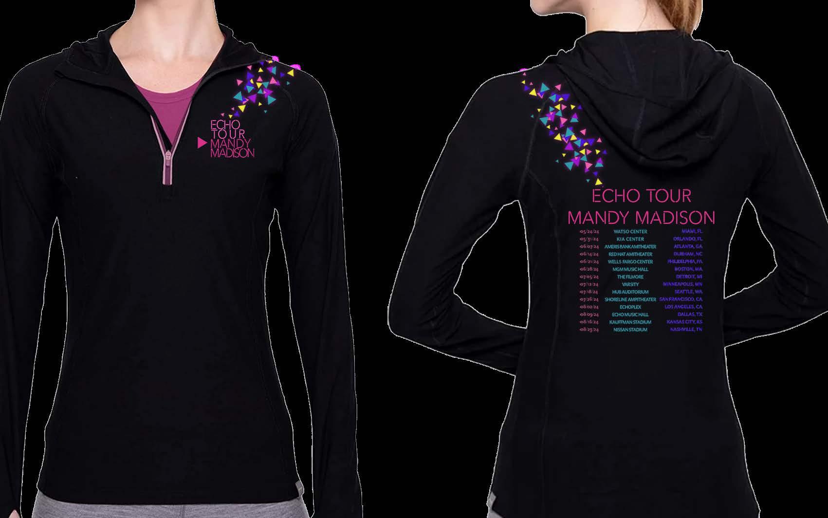

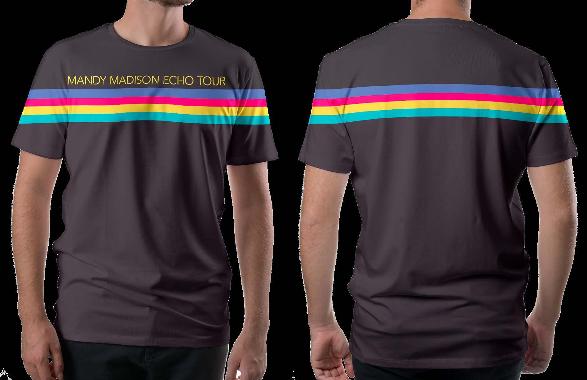
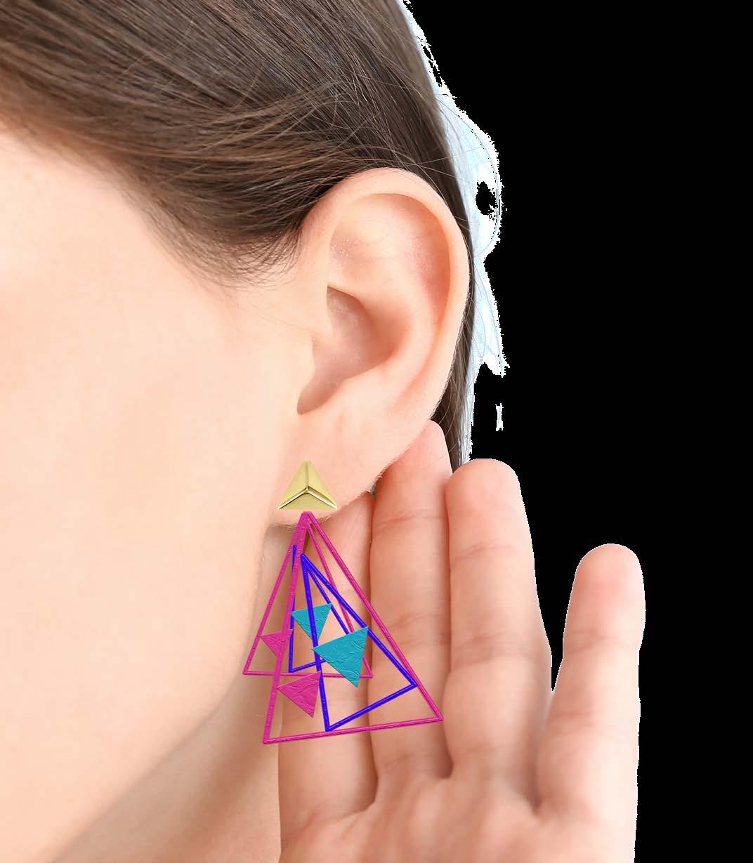
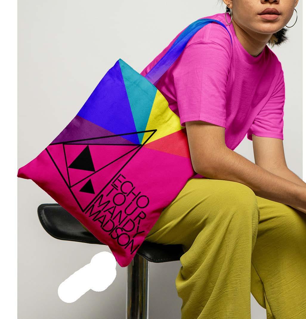


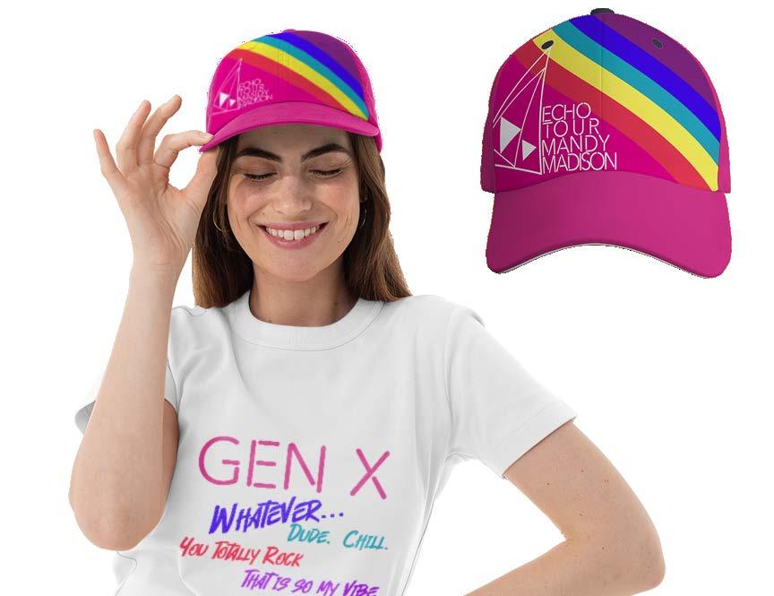

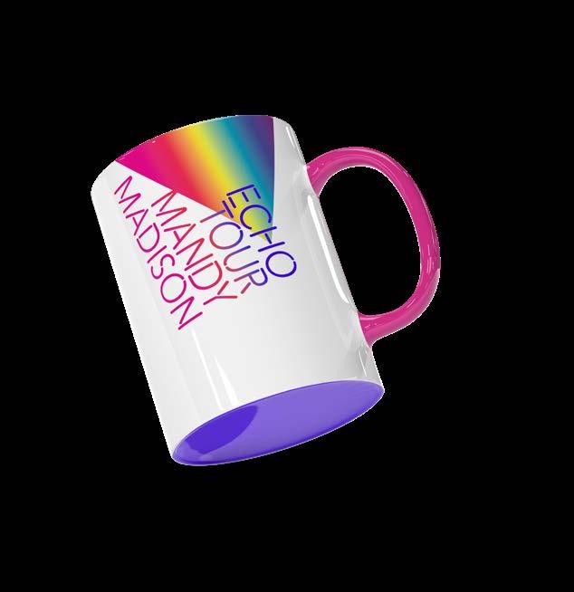
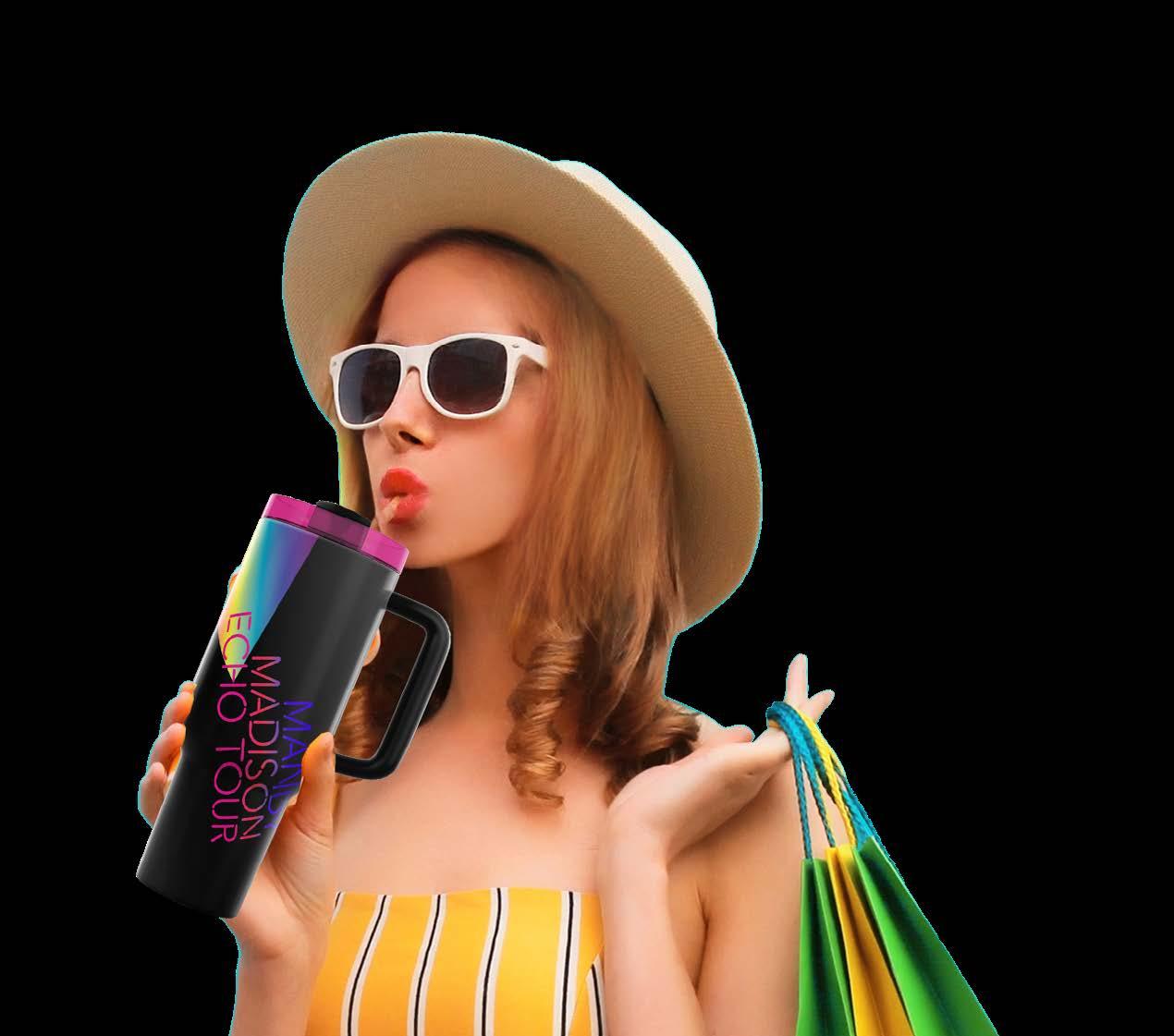

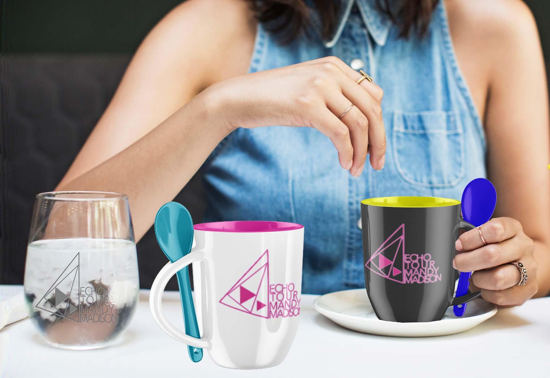

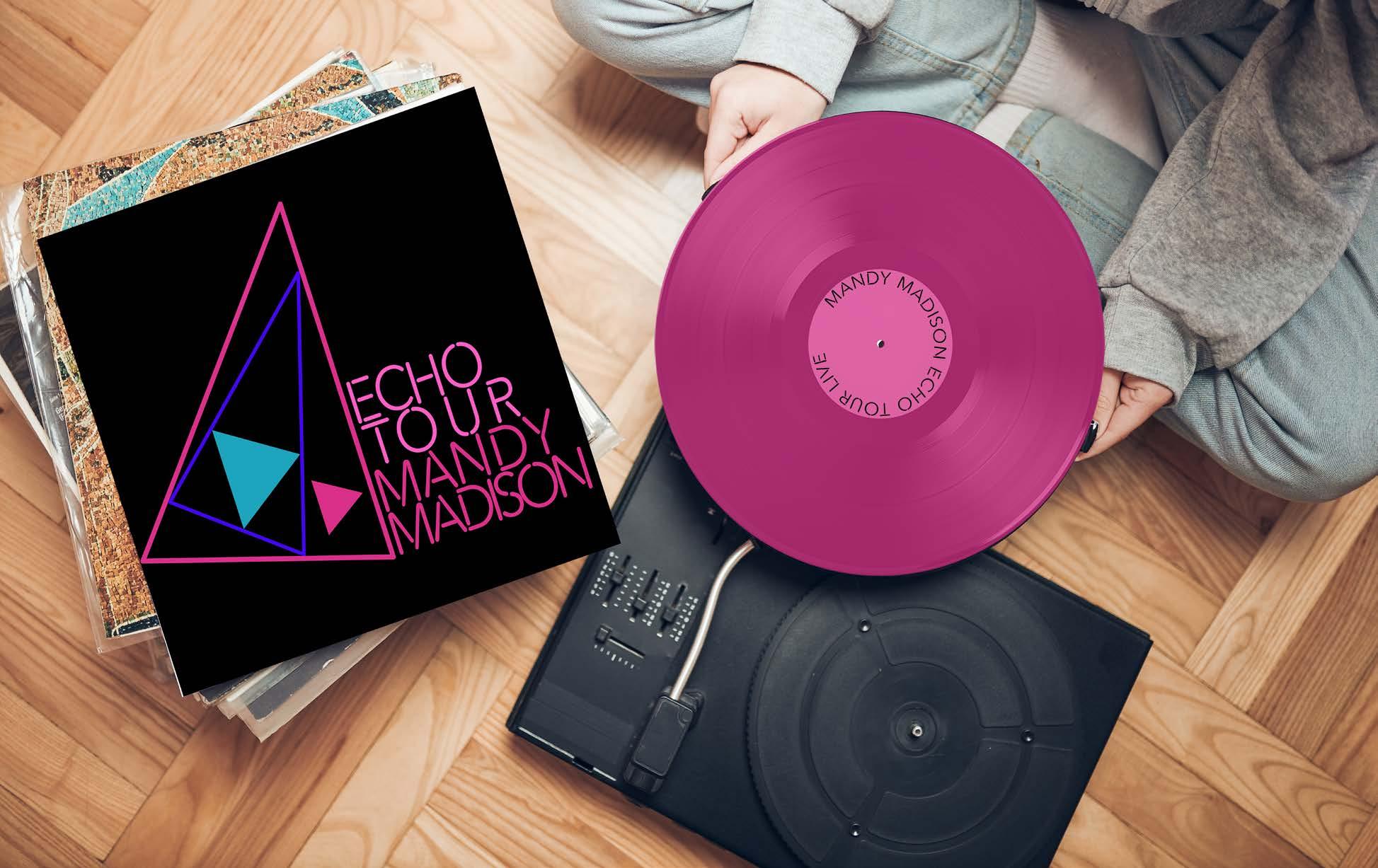
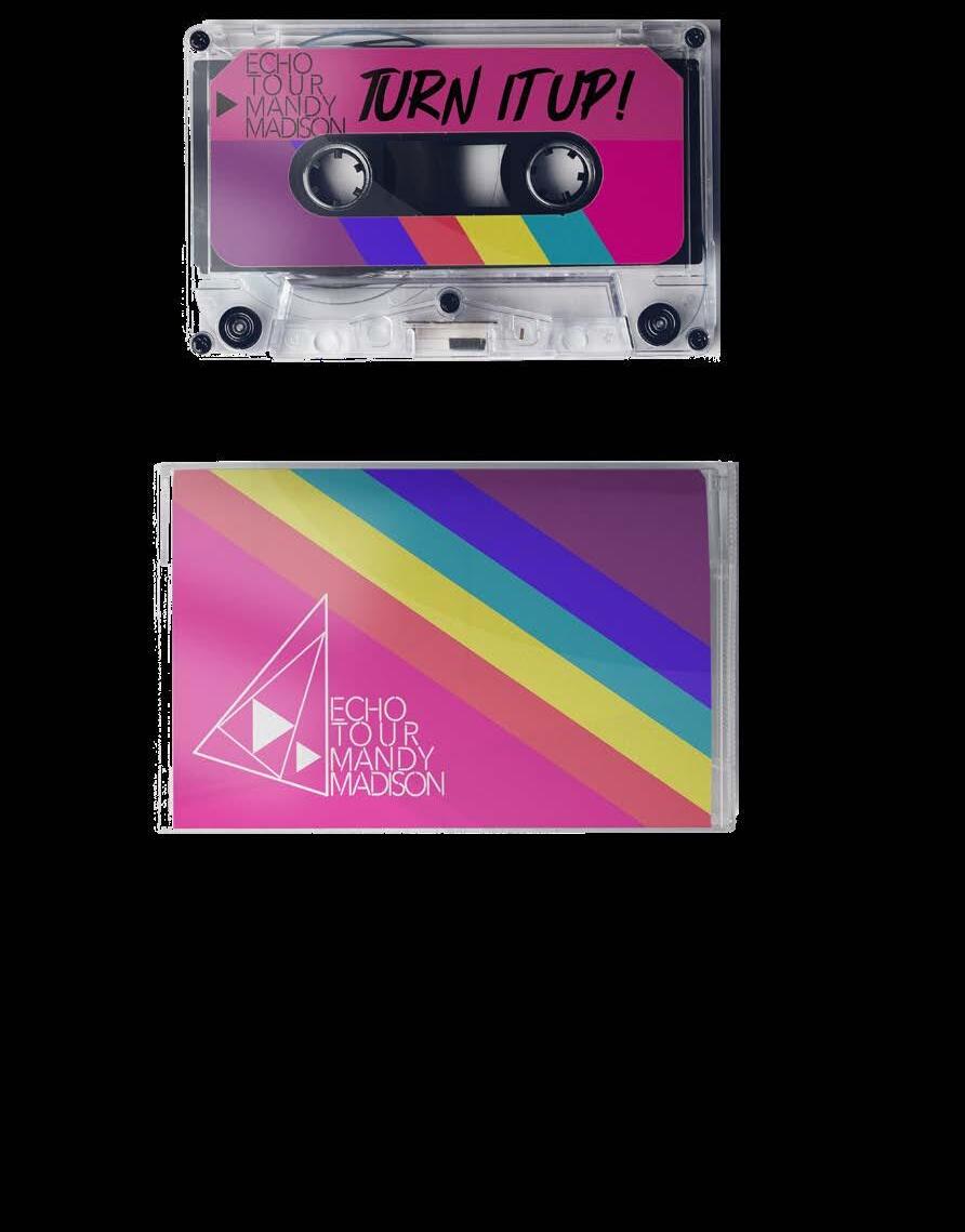
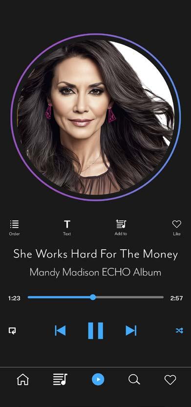
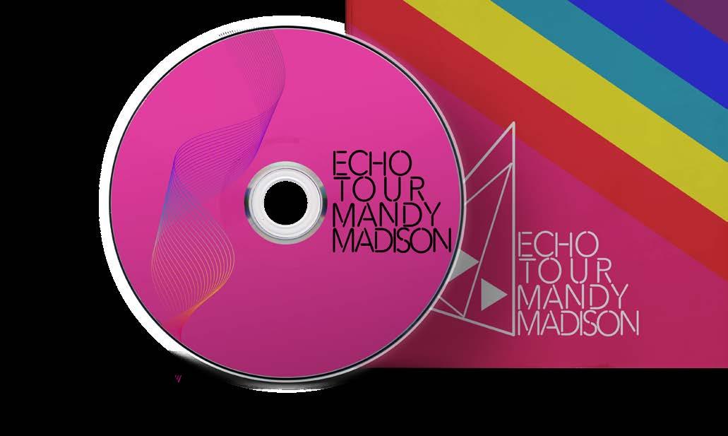






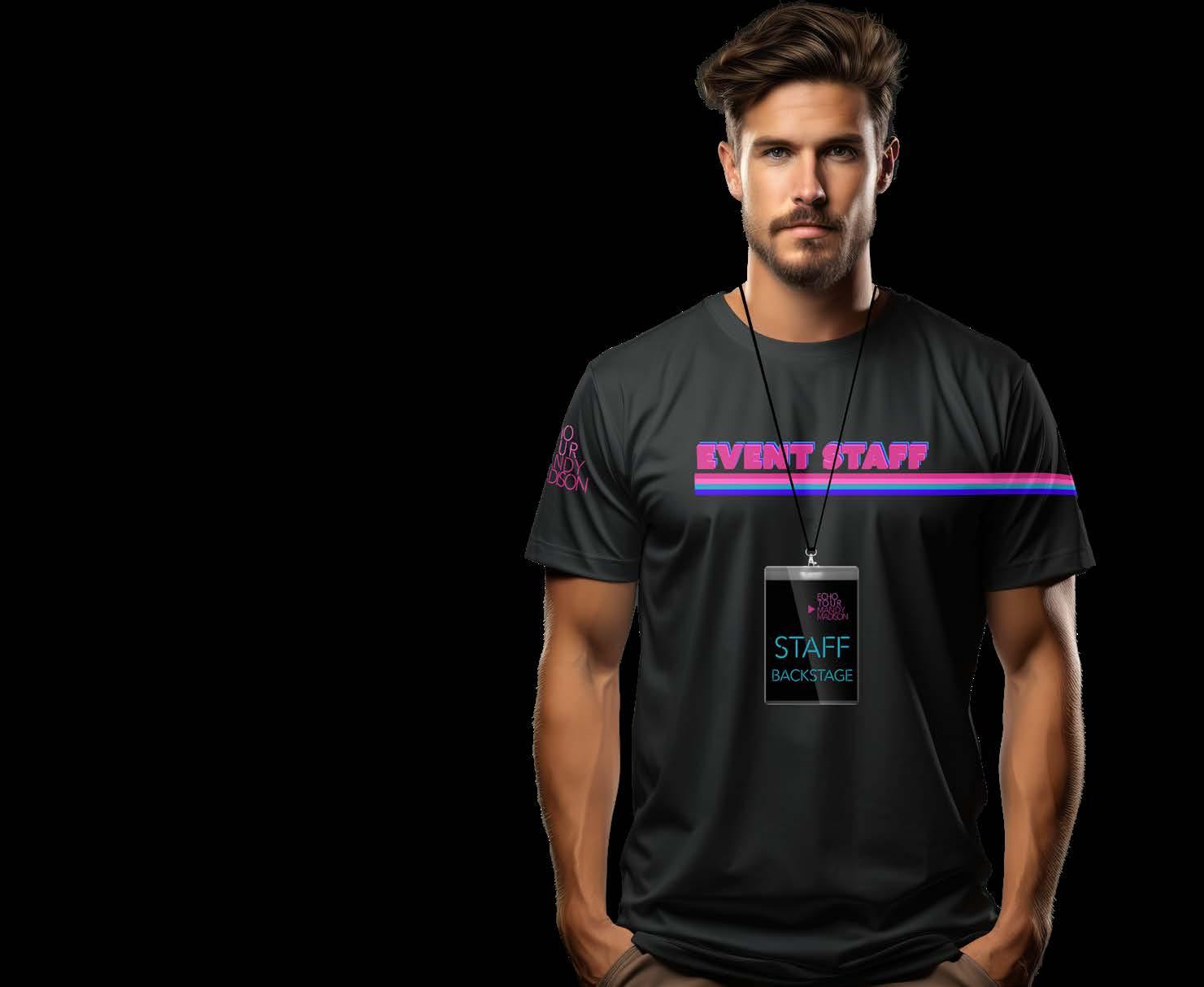
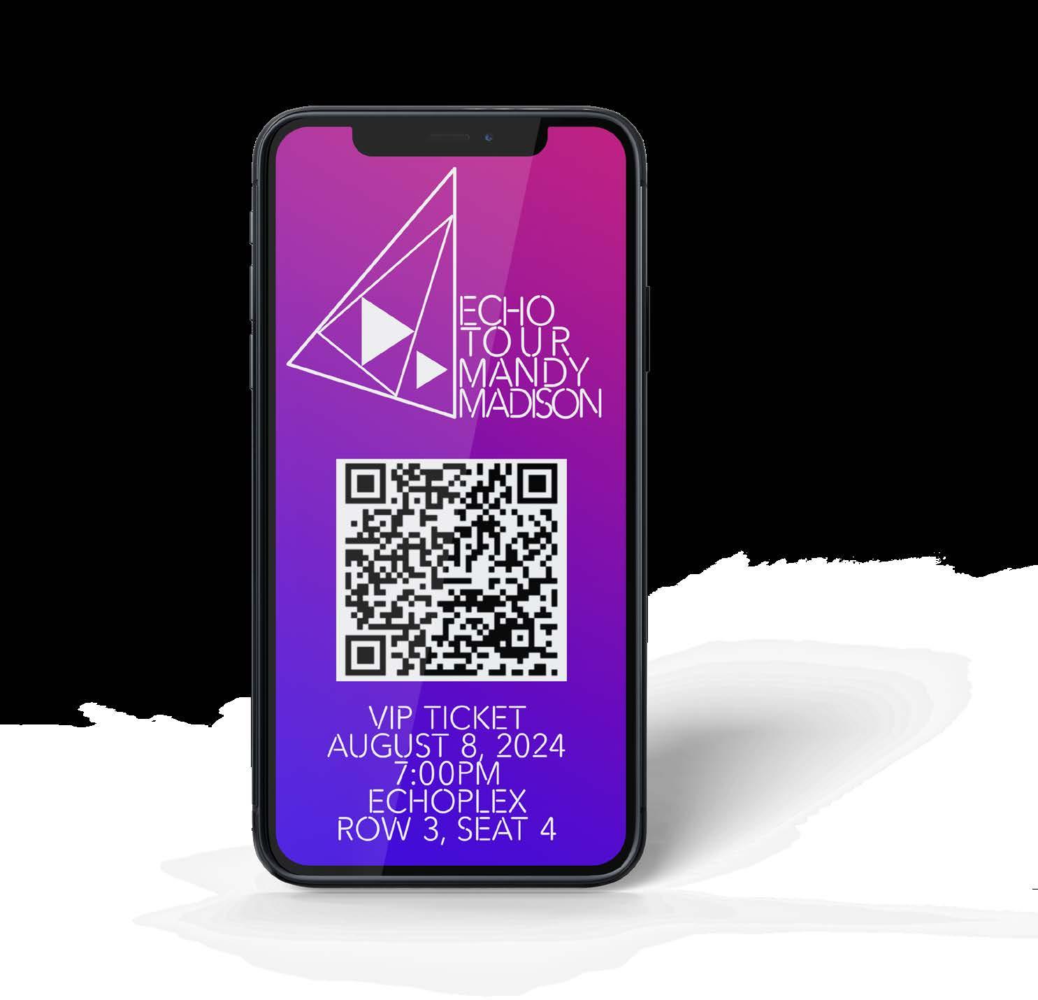
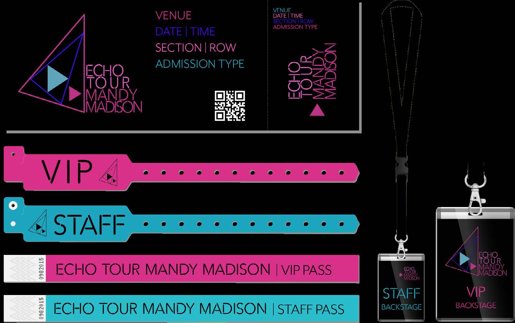
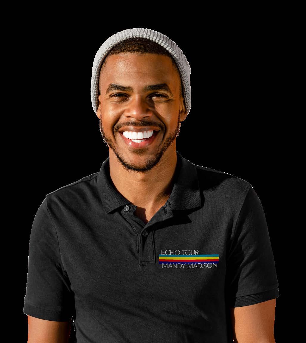
Ticketing, backstage passes and staff shirts all have to follow the branding for the ECHO tour. These followed the established aesthetic and we kept it cool. Let’s show off!





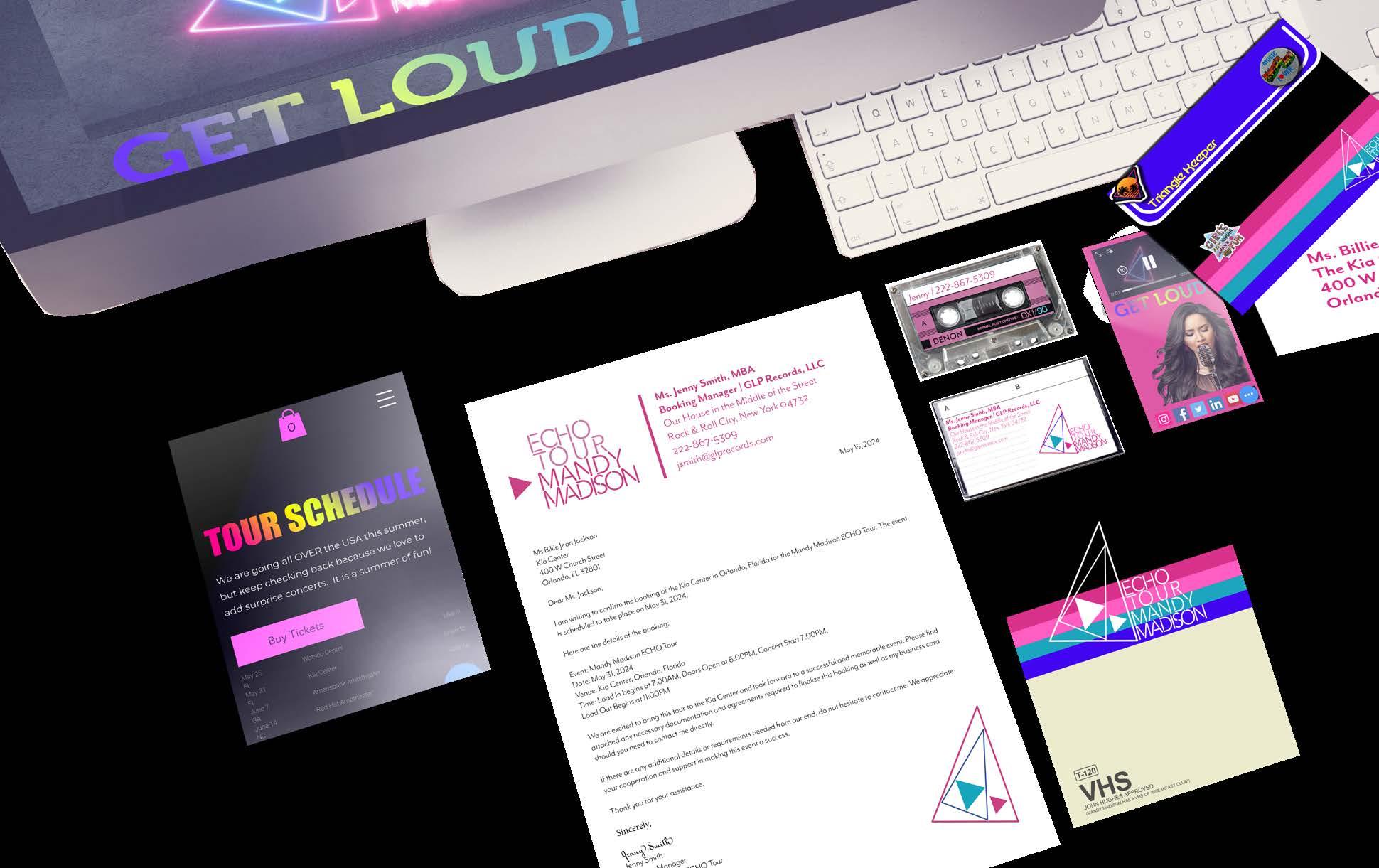

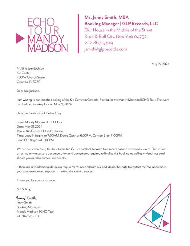
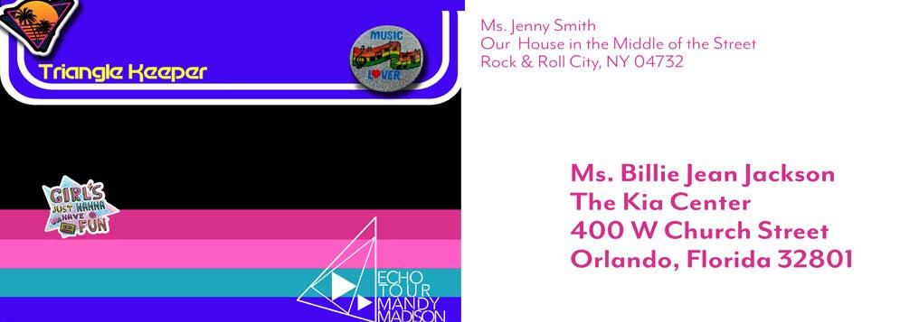
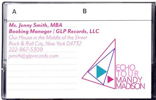
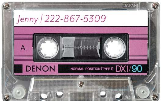
Just because it is professional, doesn’t mean it can’t be fun. The letterhead package celebrates nostalgia and brand elements while making space for business.

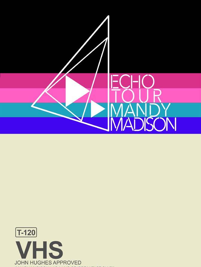


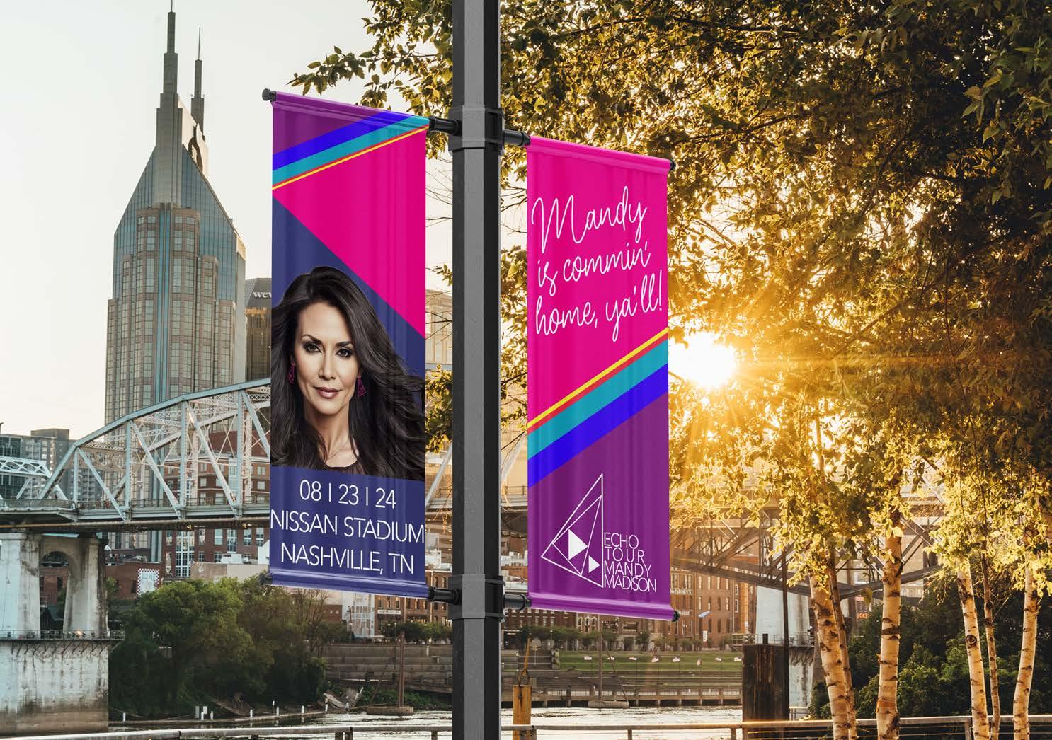
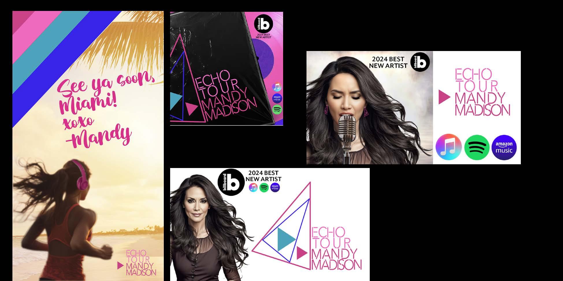
Every city gets a special message from Mandy in the Brand Voice of the tour.


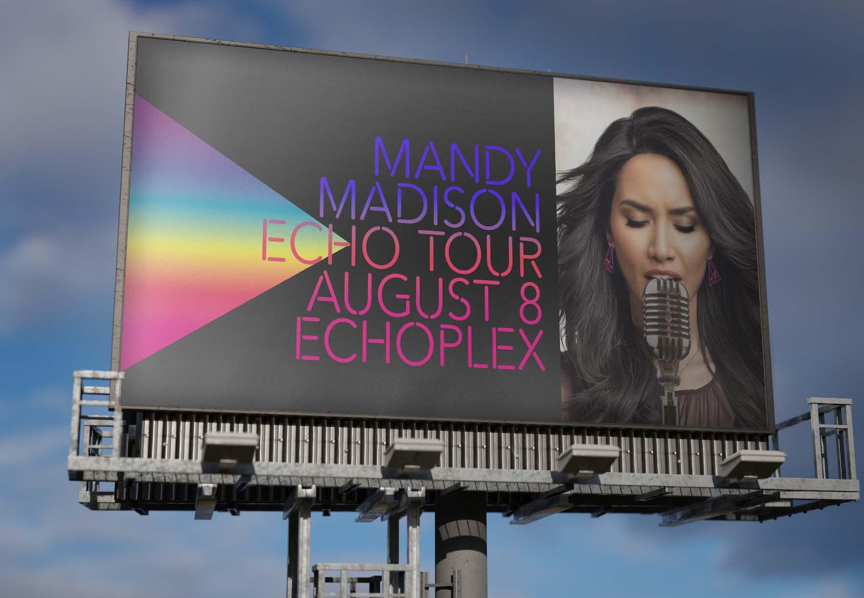


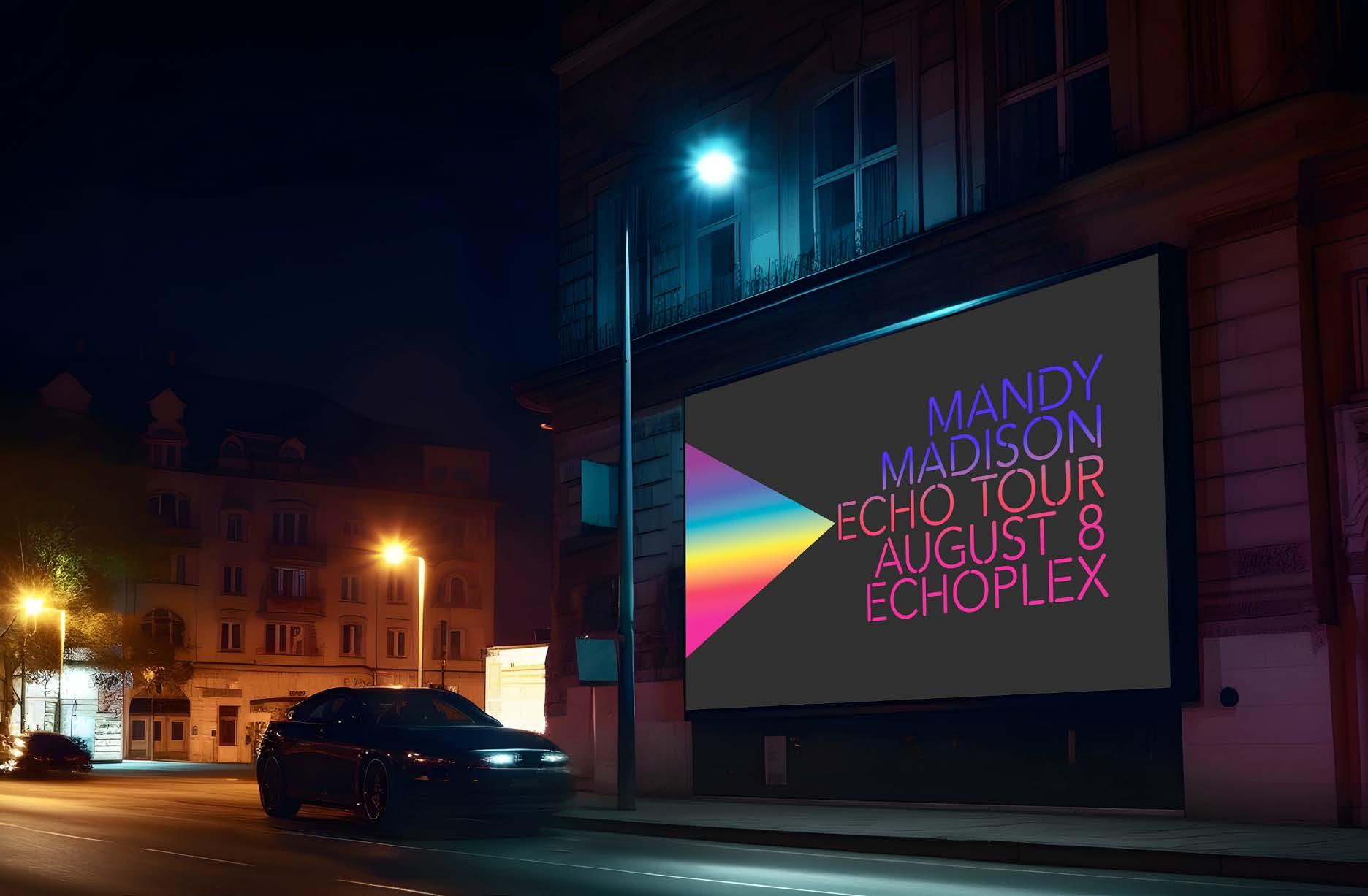


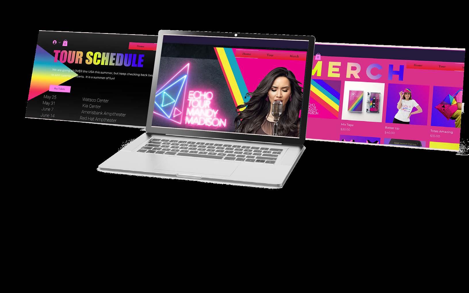
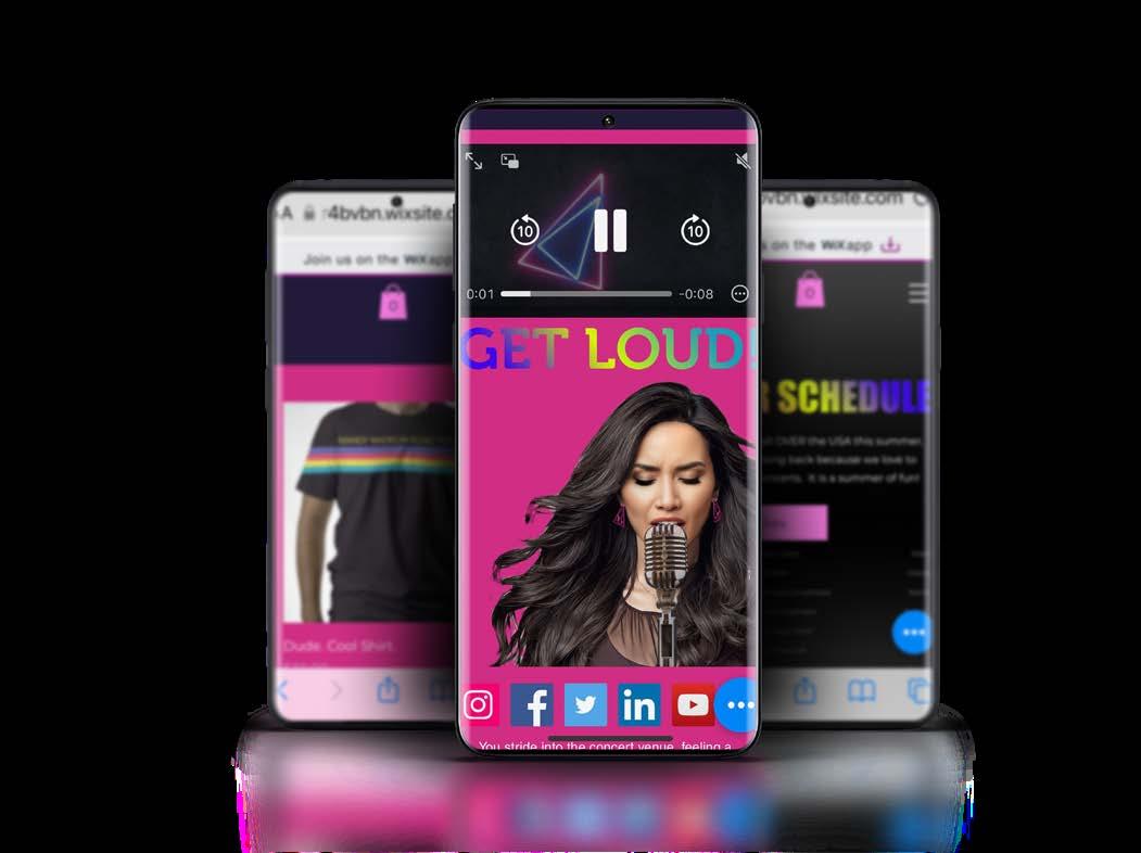
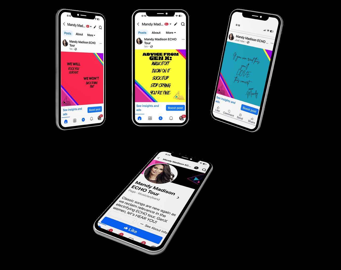
Get LOUD! Socials and Website ensure that fans can connect wih the Tour and one another.








Radio/ Spotify Commercial
Stage and sets for tour
Virtual background
TV Commercial Tour Bus Wrap Music Video App


