George Hill Portfolio 2024
Liant inte num nonsequam fugit, sandend ipicabo. Ciae nonse laut dolente mporem a vendign issitat iorrunde cupidel expedis volupta
Page title
1 |
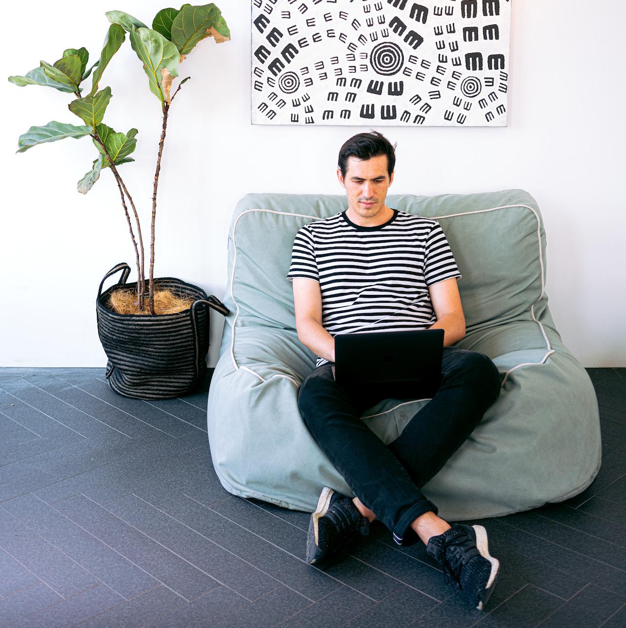
George Hill | Product Design Portfolio | April 2024
hello@georgehilldesign.com
@georgehilldesign
georgehilldesign.com
linkedin.com/in/georgehilldesign
About me
I am a recent graduate in product design, looking to further develop my skills and enter the field of information design. After three years of study, I am looking for opportunity that allows me to make a real contribution to live projects and challenges me to work as part of an industry-leading team.
As a designer my process is user-centred. I’m passionate about making products accessible, inclusive and sustainable. Interactions with products, services and systems are what users care about, and that is where I see the value of the designer. Every project starts with an understanding of the user, the problems they face and the weaknesses of existing solutions before I put pen to paper.
Education
BA (Hons) Product Design
Nottingham Trent University 2019-2023
CertHE Industrial Design & Technology Brunel University London 2016-2017
A-level Product Design, Sociology, Business Lincoln Castle Academy 2009-2016
Experience
Branding & Print, NTU DI, Nov 2022 - May 2023
During my final year at NTU I was a member of the Expo Committee, which organised the degree show for all undergraduate product design courses. As a member of the branding and print team, I collaborated with the rest of the team to develop and implement the brand for the 2023 show.
Structural Designer, StormDFX, Jun 2021- Jul 2022
During my placement year, I worked as a structural designer at StormDFX, designers and manufacturers of retail displays. I was responsible for developing concepts into technical drawings.
Skills
• Adobe Illustrator, InDesign, and Photoshop
• Solidworks
• Keyshot
• ArtiosCAD
About
Contents 04 | 01 Future Bus Stop 2023 Component of final year major project 18 | 02 Cykle 2022 Final year minor project 29 | 03 Audio/Visual 2021 Second year project
01 Future Bus
Stop
2023 Component of final year major project
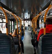
Improving the experience of using public transport, and leveraging its physical footprint to attract new users.
4 | 01
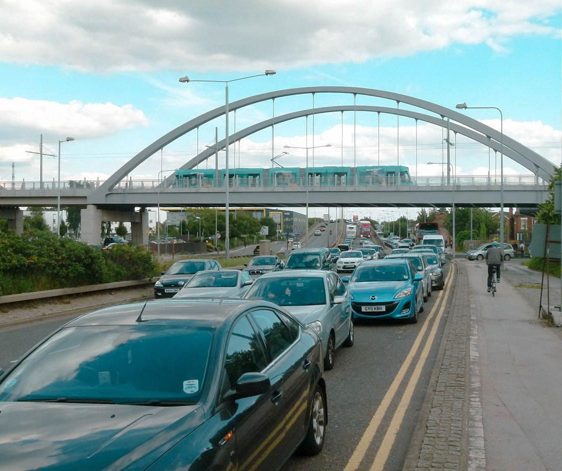
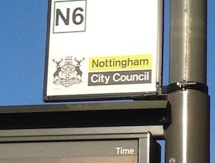
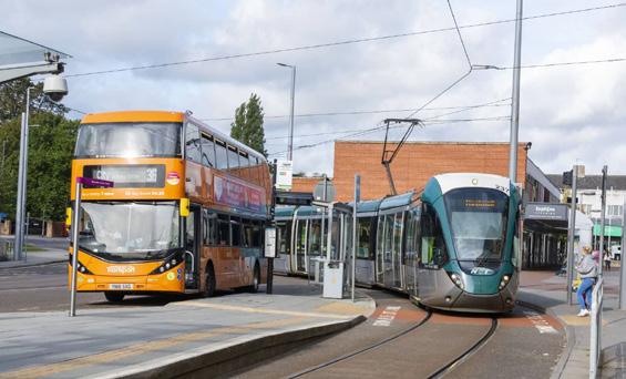
40% of households in Nottingham don’t have access to a car, but cars dominate our streets.
This is despite increasing awareness of the environmental and social damage caused by society’s dependence on cars.
How can we reduce car use in cities like Nottingham?
Improving perceptions
To get people ‘through the door ’
Let people see it as an attractive option
Why are people not using it? What do they think about it? What are the percieved challenges?
How?
Improving experience s
Keeping people using these modes by providing a better experience than the car
What are the positives? What are the challenges? What are people’s priorities?
5 | 01
The brief
Alan Murray-Rust
reduce
Increase use of public transport Increase use of active travel How can we
car use?
Perceptions
From going through a user’s journey, I identified a range of factors that affected the desirability of a journey made by public transport.
These were then categorised by whether they affected the perception of public transport, the experience of using it, or both.
From these factors, I determined that there were some that would be best suited to a product-design based intervention.
6 | 01
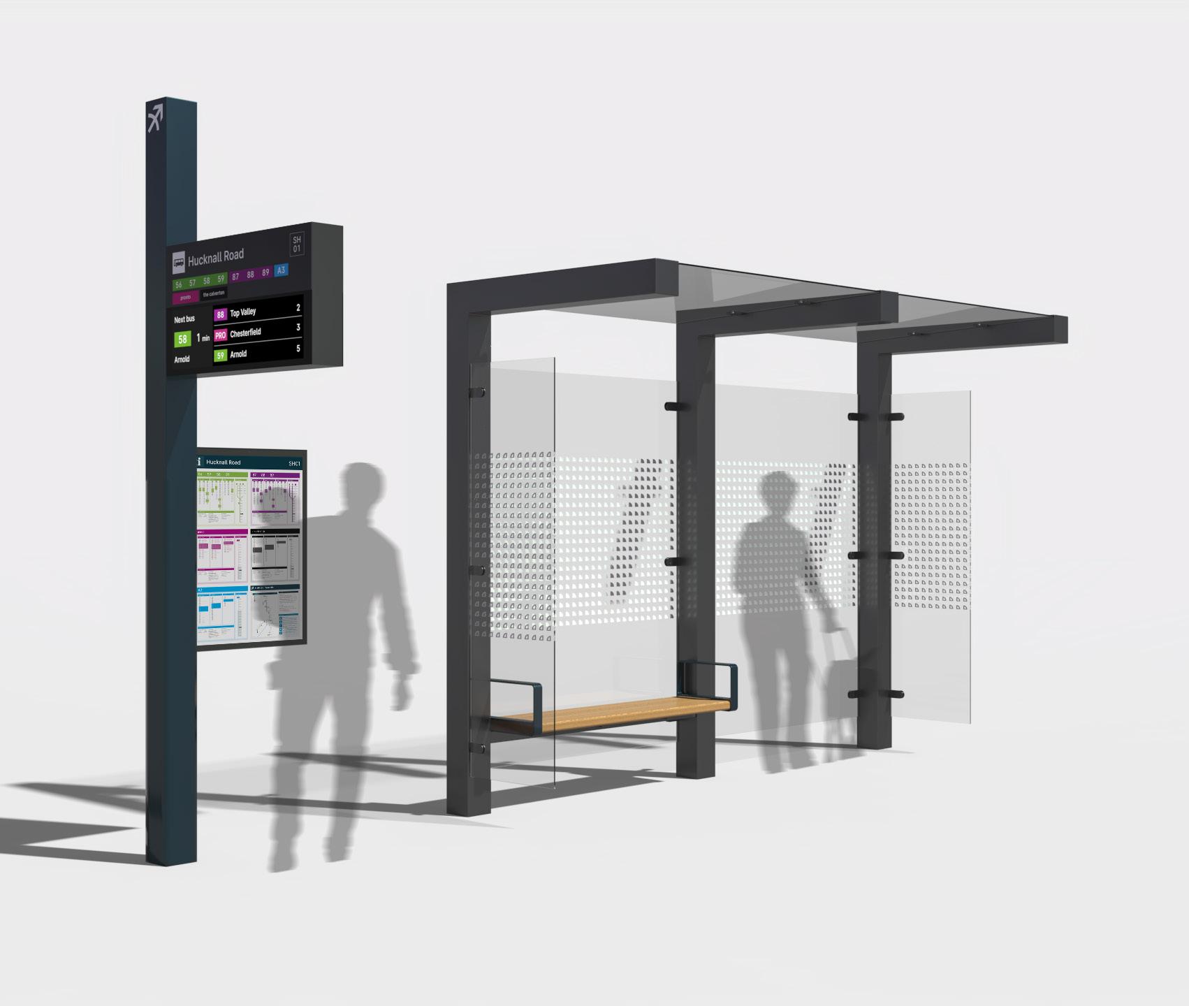
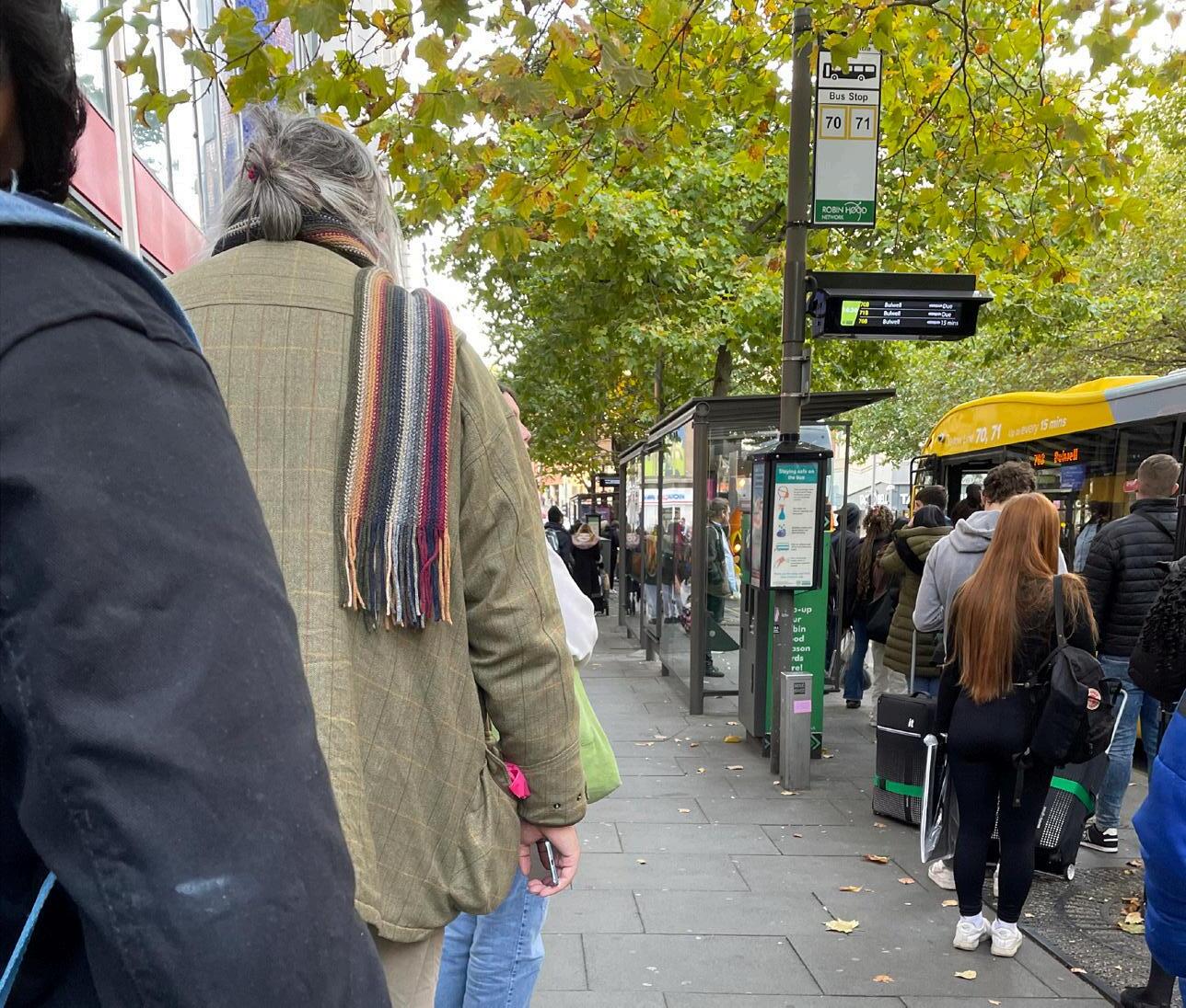
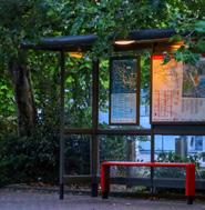
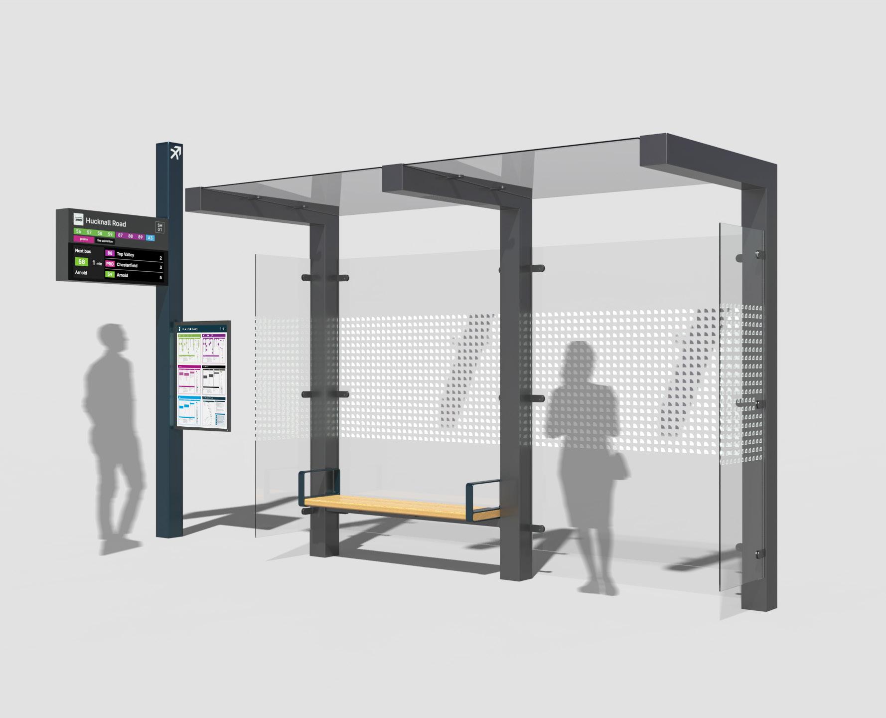
The factors around comfort of stops, safety, information, and look/feel could all be addressed through focusing on the physical footprint of the network - bus and tram stops. This would cover improving both the user experience and the non-users’ perception of the network.
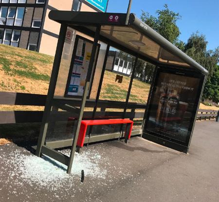

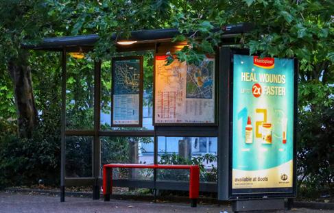
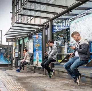
Waiting spaces
Research 7 | 01
Physical infrastructure Information Integration Branding Look + feel Safety
From this exploration, combined with secondary research that identified user’s expectations, I could develop a reframed brief and specification of requirements to define my problem-solving.
How might we...
use street furniture to improve perceptions and experiences of using public transport?
What are the pain points experienced by existing users of public transport?
What negatively or positively affects perceptions of public transport for non-users?
...that can be addressed using street furniture.
Reframing 8 | 01
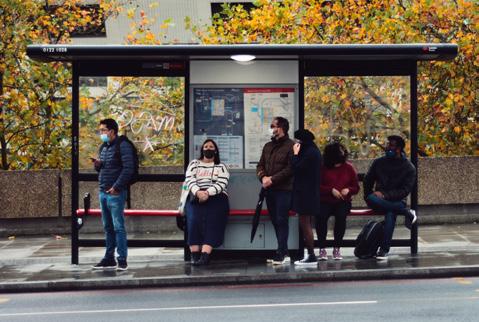
User journey


Public transport has a wide range of users, who use the system for a variety of reasons. To identify where the opportunities for improvement are, I developed user personas and journeys. These helped to map the types of users, ranging from regular commuters to unfamiliar users who typically get around by car.

9 | 01
User persona Public transport commuter Reasons for travel Commuting to work Essential and leisure shopping Social and leisure activities Information access Familiar user Uses operator-specific apps used for their commonly made journeys Gateway to the network Local bus or tram stop Familiar with their routes as a habitual user Jane’s transport priorities Value for money Reliability and dependability Jane, 48 Doesn’t own a car – depends on public transport Access to jobs, services, and leisure is limited to places accessible by public transport Works in service, care, or administration Reasons for travel Leisure shopping Social and leisure activities Family activities Information access Mapping apps Reassurance from on-journey information Doesn’t want to download apps Gateway to the network Local bus or tram stop Jame’s transport priorities Convenience Value for money James, 36 Owns a car – considers it essential for family life Lives in the city suburbs with his wife and two children Knowledge/professional worker Work flexibly from home 2-3 days a week User persona Car convert User persona City visitor Reasons for travel Leisure shopping Social and entertainment activities Information access Mapping apps Reassurance from on-journey information Doesn’t want to download apps Gateway to the network Park and ride site Mainline rail station Claire’s transport priorities Convenience Value for money Claire, 31 Lives in nearby town Works locally to where she lives Travels into the city on weekends to shop and spend time with friends Currently parks in the city, but is considering the train or park and ride due to the cost User journey Public transport commuter Locate Wa Chec Check Board Head to the stop no need to check where they already know Glance at the live times check how long they will be waiting Take seat to waitC heck times again, via the bus operator app Bus approaching Board “A least ha enough time to at chapte “Her at last “My bus isn showing on there ye “I can see the en from he I’ll check on the app instead.” “I hope can get seat “Here we e again. User journey Infrequent/occasional user Locate Con Wa CheckB oard Identify stop locatio Check its the right op, erring Google Maps to check the name Check that the ut needed tops here Look at the live times display check when the right bus will come ake seat wait Go on phone, listen to music keep occupied while waitin Glance at live display check time until the bus due Bus approaching check its the ut needed Flag bus down Boar “Hm... this the stop that maps told me need?” “I can eally see the sc en... only shows the next thre buses. can eally see the screen... and it only shows the next th buses. Ah yes, thats the number of the bus want “A least can sit down while wait. Bett eply to that text Ah, her is. There buses at this op, hope he sees me. User journey Information touchpoints Planning Confirming Checking Operator websites Mapping apps Mapping apps Operator apps Route maps at stops Live times display Timetables at stops Stop flag signs Operator apps What are the pain points for the regular user? How to convince him to leave the car at home? Convenience! How can it be a smoother experience? How can the physical footprint reflect the quality of the service? Don’t make him download an app. How can her experience by improved? Trips are a matter of routine - no planning Improving the visibility of information at the stop Needs more reassurance that they’re following their plan Point before bus or tram arrives is highstress Planning required –different ways to do this Some familiarity with the public transport system Sticks to the routes that she knows and sees as reliable Wants to be kept informed by the system Pre-planning - only an essential step for unfamiliar journeys Static information to guide users and reassure them Best done by dynamic informationLive times are trusted Is information prioritised in the same way as users? Making public transport feel like the first-choice experience
Fixed information
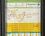
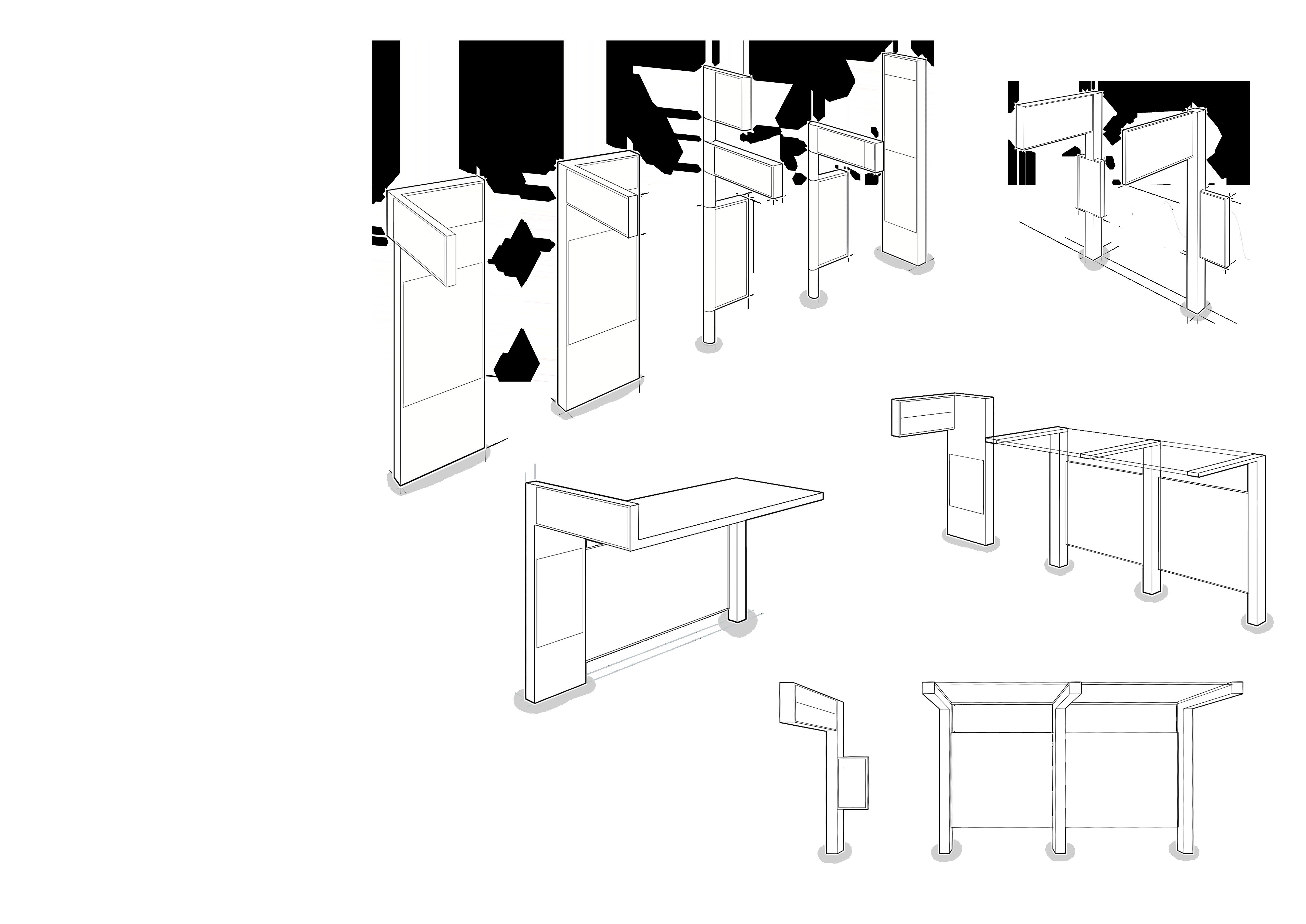
In order to better group the fixed and live information, I explored rotating the traditional bus stop flag into a landscape format. This would better accommodate the integration with the digital display for live information.
Starting with a clean slate, I considered what elements were necessary or useful to include on this panel. Most of this information was bypassed by habitual users, but was important reassurance to unfamiliar users.
11 | 01
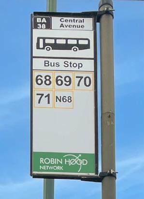
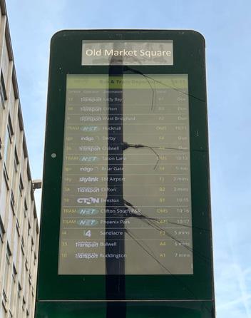
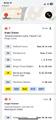
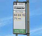
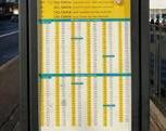
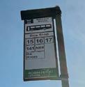
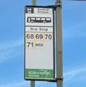
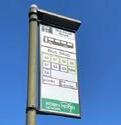
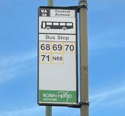
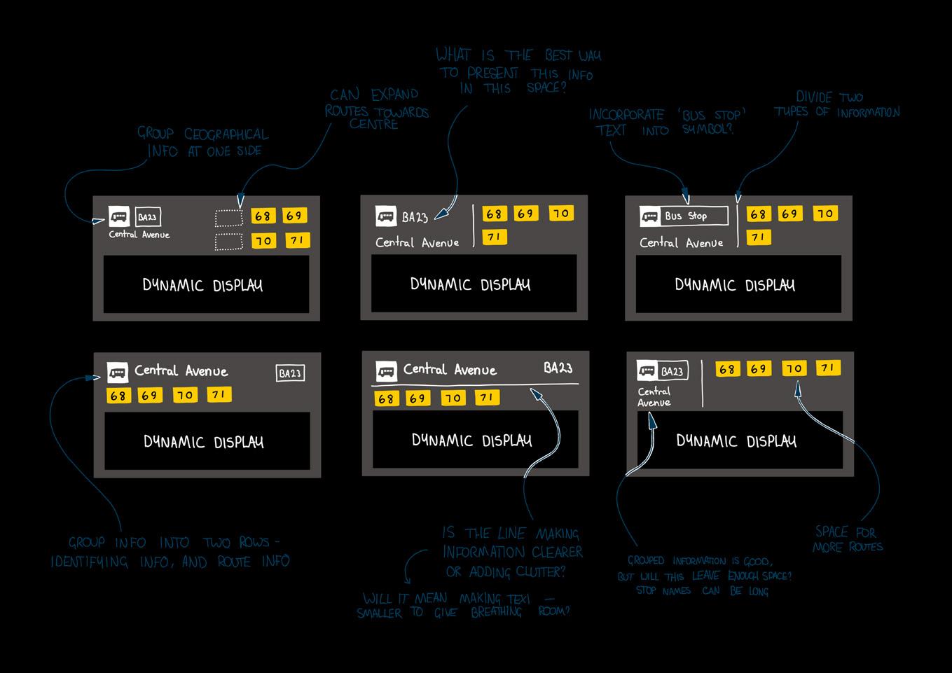
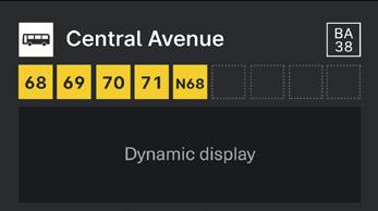
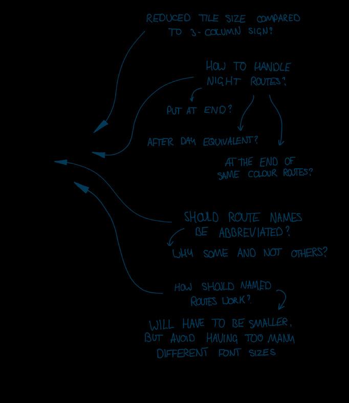
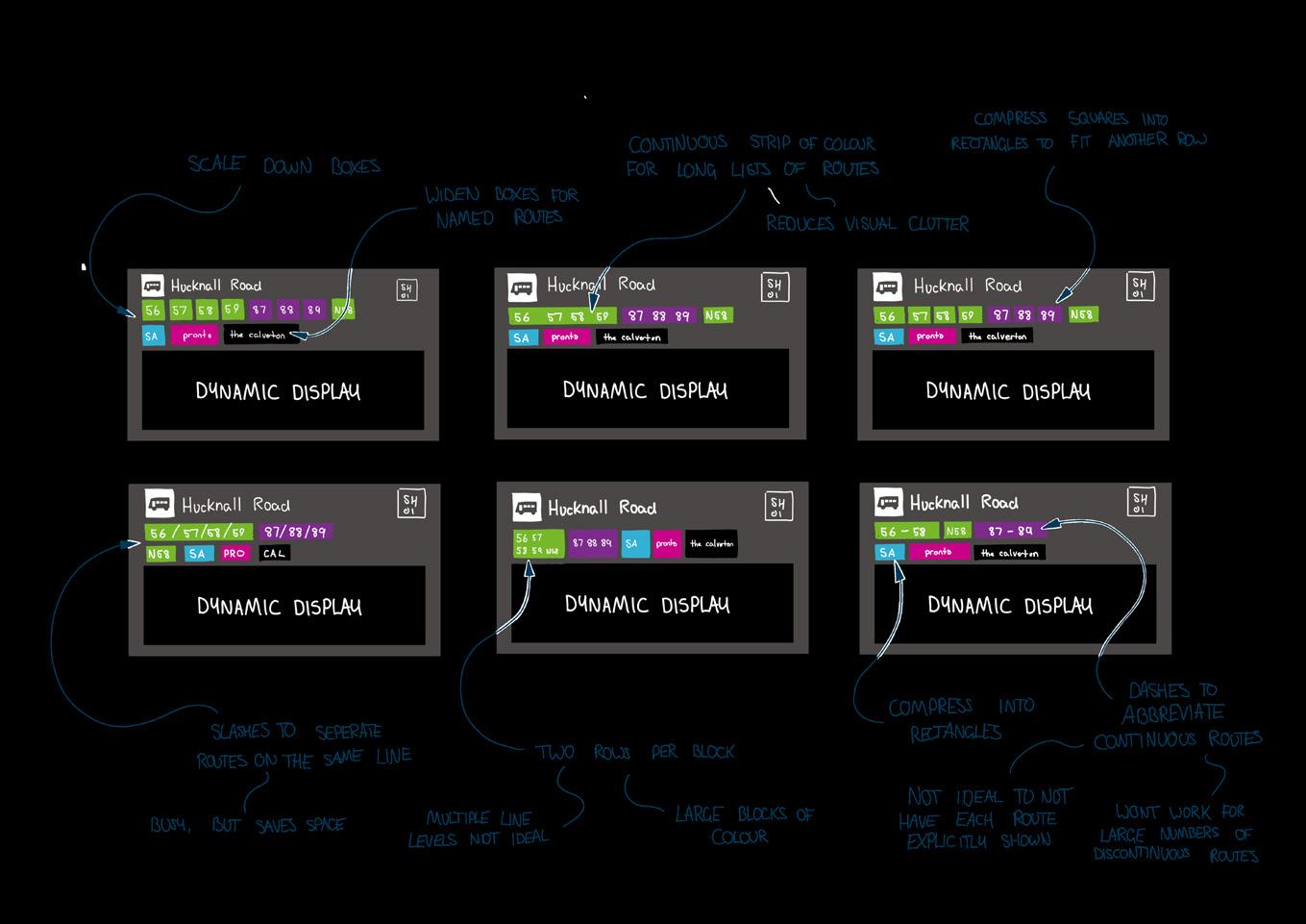
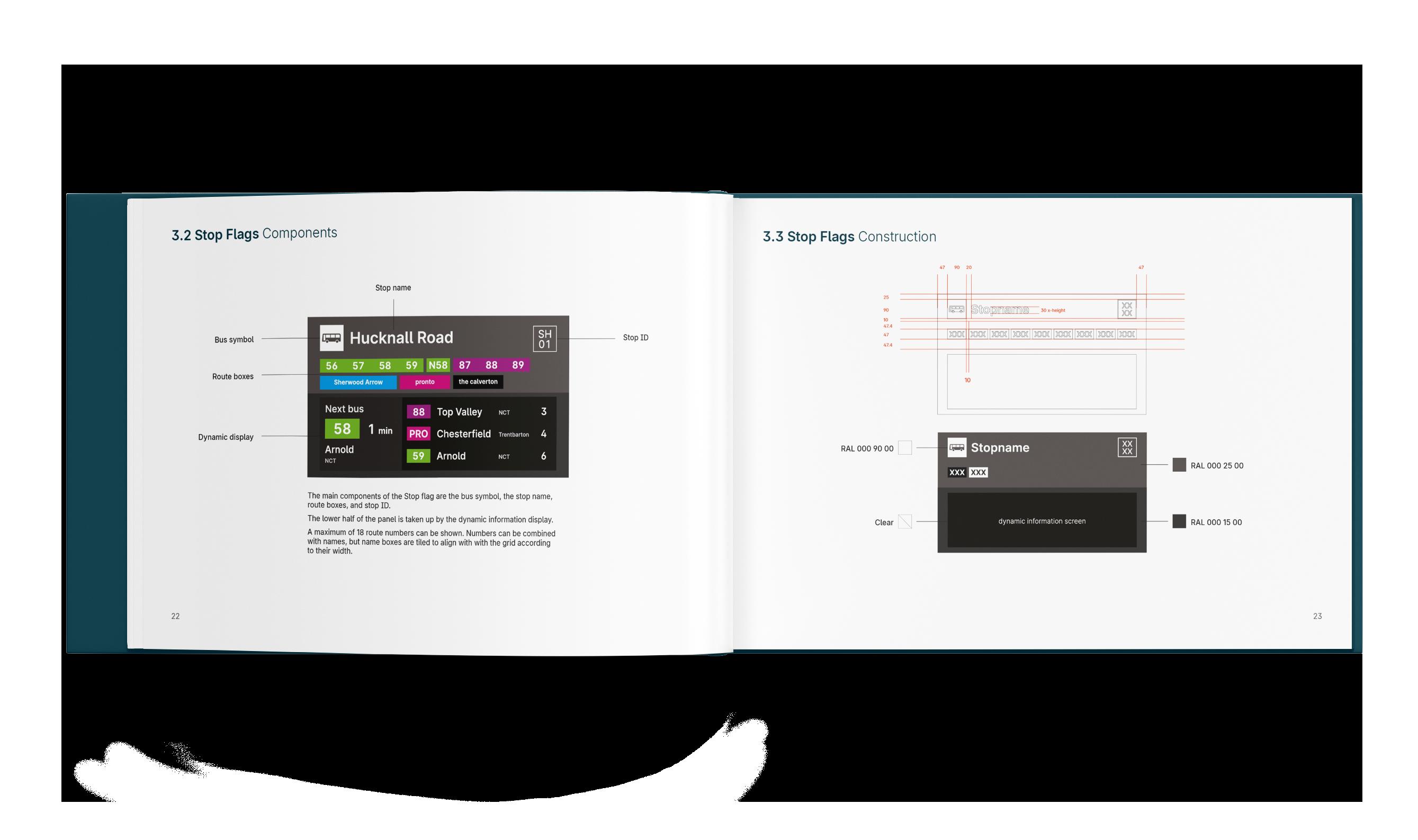
Information development Current information touchpoints Fixed Bus stop flag Identifying and marking bus stop location Indicating bus stop name and ID indentifying routes serving the stop Detailed Printed paper information Full route details, such as timetables and diagrams Operator information such as contact details Promotional/diversion information Dynamic Real-time information display, either full colour TFT or LCD, or older LED dot matrix Countdown for next arrivals at the stop/scheduled times Distruption and diversion information (upcoming known diversions and responsive) Promotional information Information development Stop signage – current signage evaluation Cent Avenue BA 38 68 69 Bus Stop 71 N68 70 Keep Clear large display of route numbers/names Distinct symbol for bus stop to identify location from distance Stop name and ID to reference with journey planning apps Stop Showing ‘bus stop’ text Seperating stop ID and name Start Using network branding as part of the identification of the stop Using route colours more clearly Combining stop name and ID Stop ID is seperated from the name, making its purpose unclear Stop name is small, this is a useful identifier for people alighting Clear, bold route information Bus symbol clearly identifies stop location from a distance Is ‘bus stop’ text necessary or clutter? Route colours are used but as thin outline Branding is not very visible, what purpose is it serving? Information development Stop signage ideation Information development Stop signage development Cent Av BA 38 68 69 Bus Stop 71 N68 70 Stops look neat and clear with a limited number of routes, and allows a few more to be added. But how would this formula or layout work with many more routes, particularly routes with names insted of numbers? How could they be accomodated? Small stop 1 6 routes Information development Stop signage development How to bring these info categories closer together? Does this layout of information reflect the way users need it? Implementing a logical hierarchy of information Providing breathing room for information Blank sheet what information needs to be here and what doesn’t? How to handle busier stops with a lot of different routes?
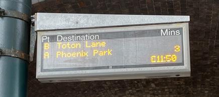
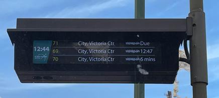
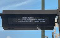
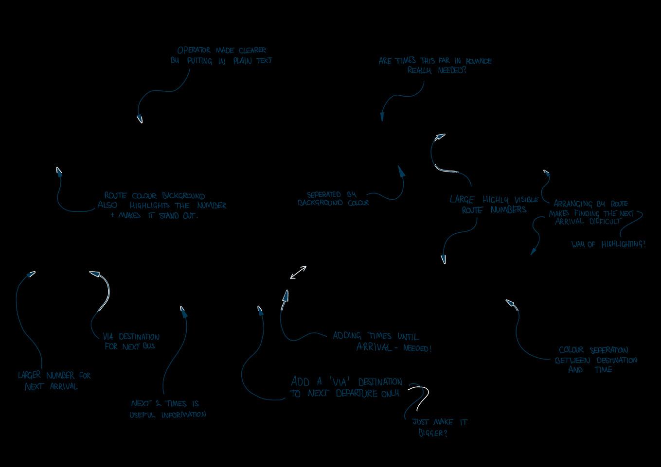
Dynamic information
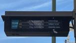
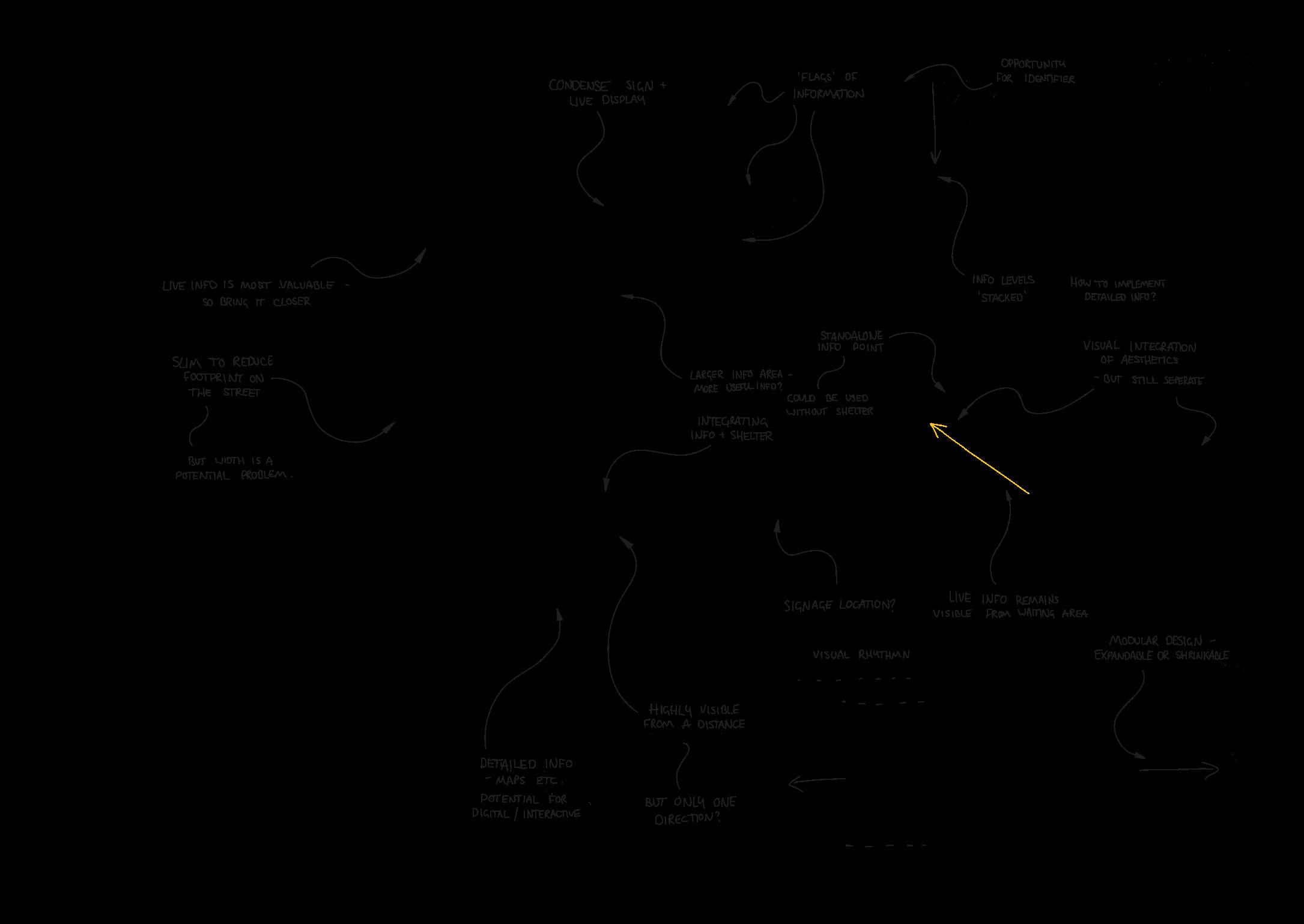
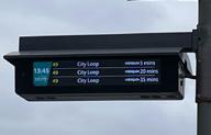
While the landscape format of the digital display was retained, again I considered how this touchpoint might better meet the needs of users. Increasing the size of the display itself would allow information to be larger and therefore more visible from a distance, as well as reconfiguring the way that departures were shown. I developed a ‘call out’ of the next departure to take advantage of the larger screen space.
12 | 01
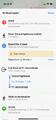
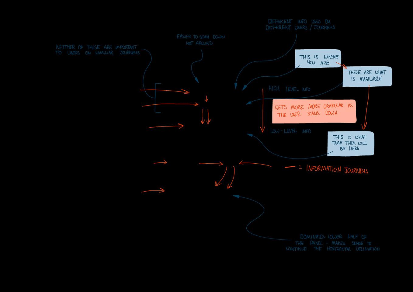
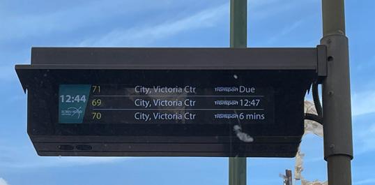
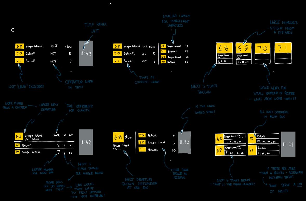
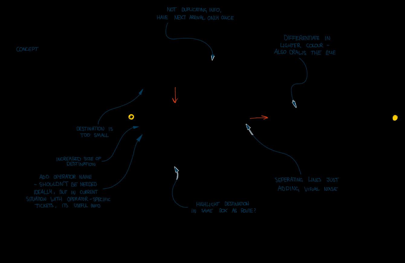
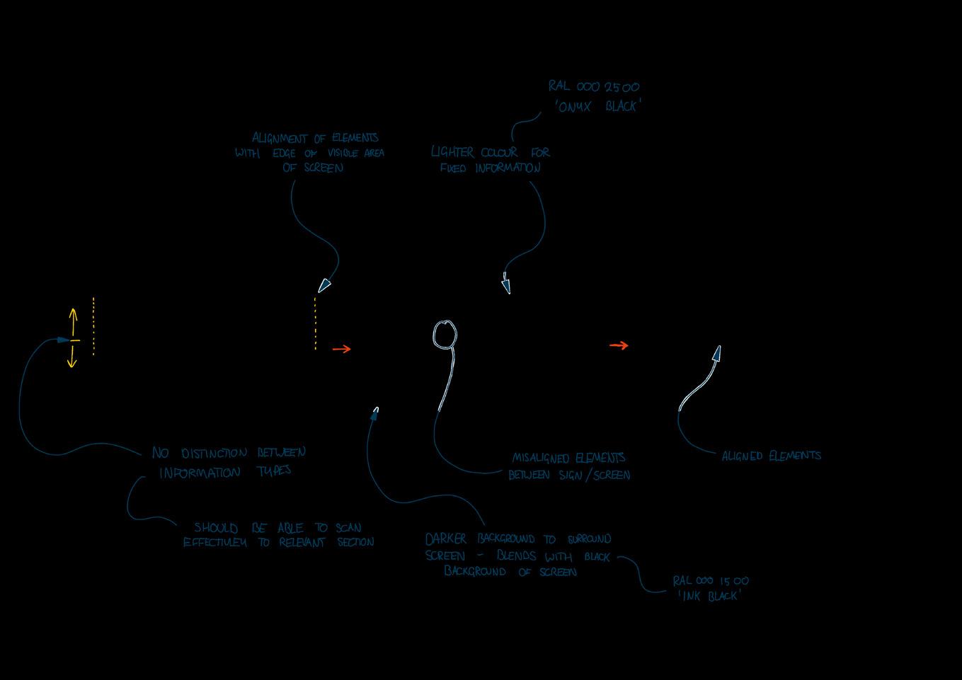
Information development Dynamic display Strengths and weaknesses Coloured area draws the eye before information does Type makes numbers ambigious 6 mins Current real time display Current time is useful info Route numbers differentiated in yellow Desitnation condensed and abbreviated unnecessarily Keep Differentiation of route numbers from destination and times Light text on dark background Stop Displaying operator logos – show name as text Abbreviating destinations Highlighting the time obver other information Start Differentiating routes by colour – routes in Nottingham have ‘line’ colours Using type with more differentiated numbers Organising information by need Information development Dynamic display Time until due Route number or name Operator Disruption information Current time Destination Crucial information Numbers are easy to remember More effective when combined with ‘line’ colours already used Familiar users know which route(s) they use Should be clearly visible from a distance possible Confirmatory information Useful confirmation of the route needed, particularly for infrequent users Indicates the direction of travel Confirmatory information Useful for people with single-operator tickets Additional information Nice to have Allows for mental calculation of arrival time for regular users Crucial information Time until arrival is the point of the live display Needs to be accurate Needs to be displayed clearly and unambiguously Additional information Important for user confidence to be kept informed about delays and disruption Allows users to plan alternative journeys or set expectations Thoughts Current format is consistent understood – is there anything that can be done with the layout of information that makes it easier to unserstand besides adopting clearer type and colours? Information development Dynamic display Information development Grouping by route more natural but more unfamiliar? would require scrolling or refreshing for busier stops Consistent visual style between information types Differentiation between fixed and dynamic information using background colour How to make this info clearer? Feels bolted on Group by route, not by time? More departures visiblebetter for more heavily Larger size for most urgent item - the next departure Which elements are useful vs not useful? How to provide reassurance to unfamiliar users? Just because we can show something, should we? Not very visible from a distance
Aesthetics
Whilst retaining the new positions of information, I refined the look and feel of the design.
A key consideration was providing a cohesive form between different elements, uniting them all in a common aesthetic in contrast with the existing stop. I also explored the finish options and how to implement network branding.
13 | 01
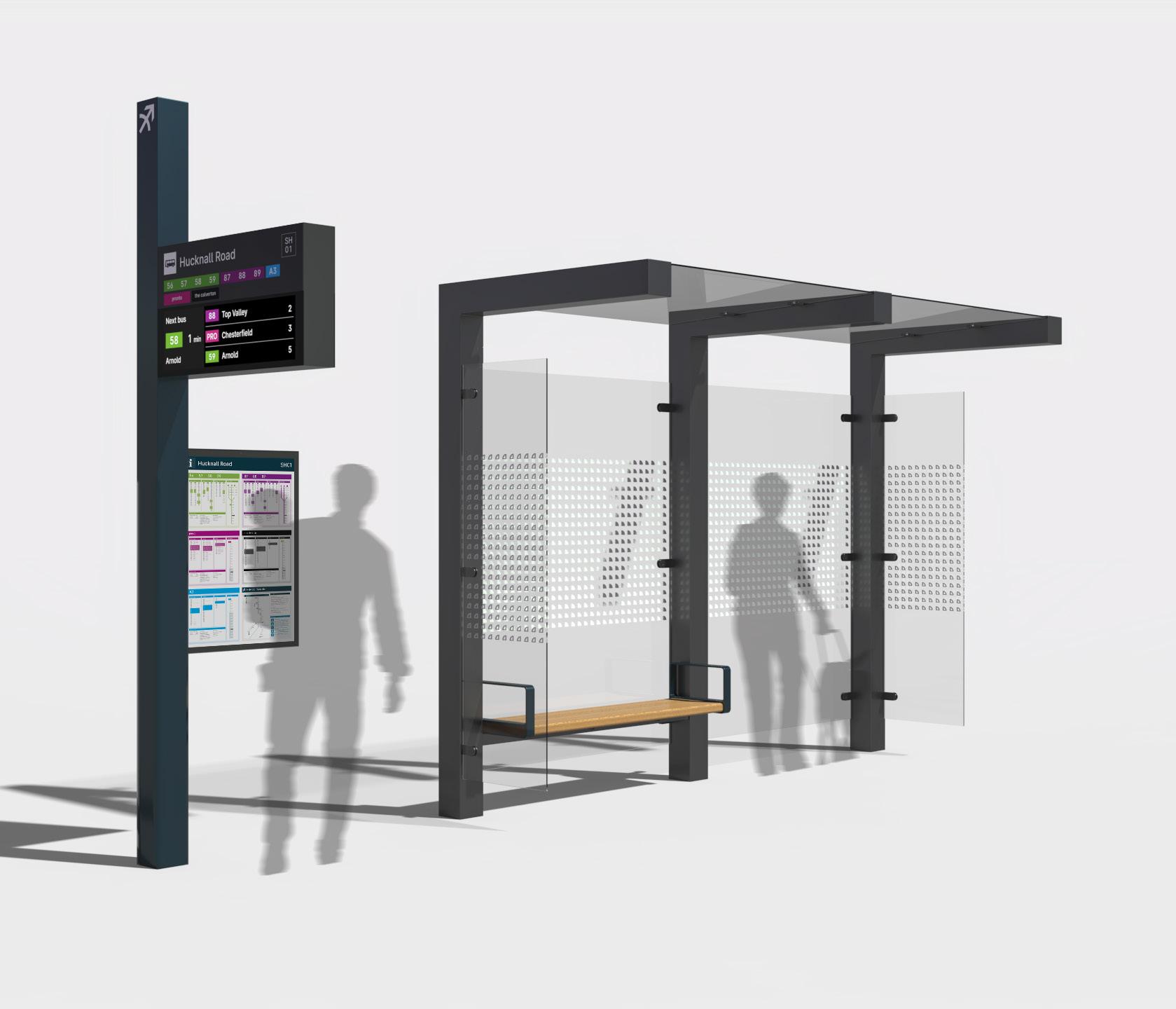
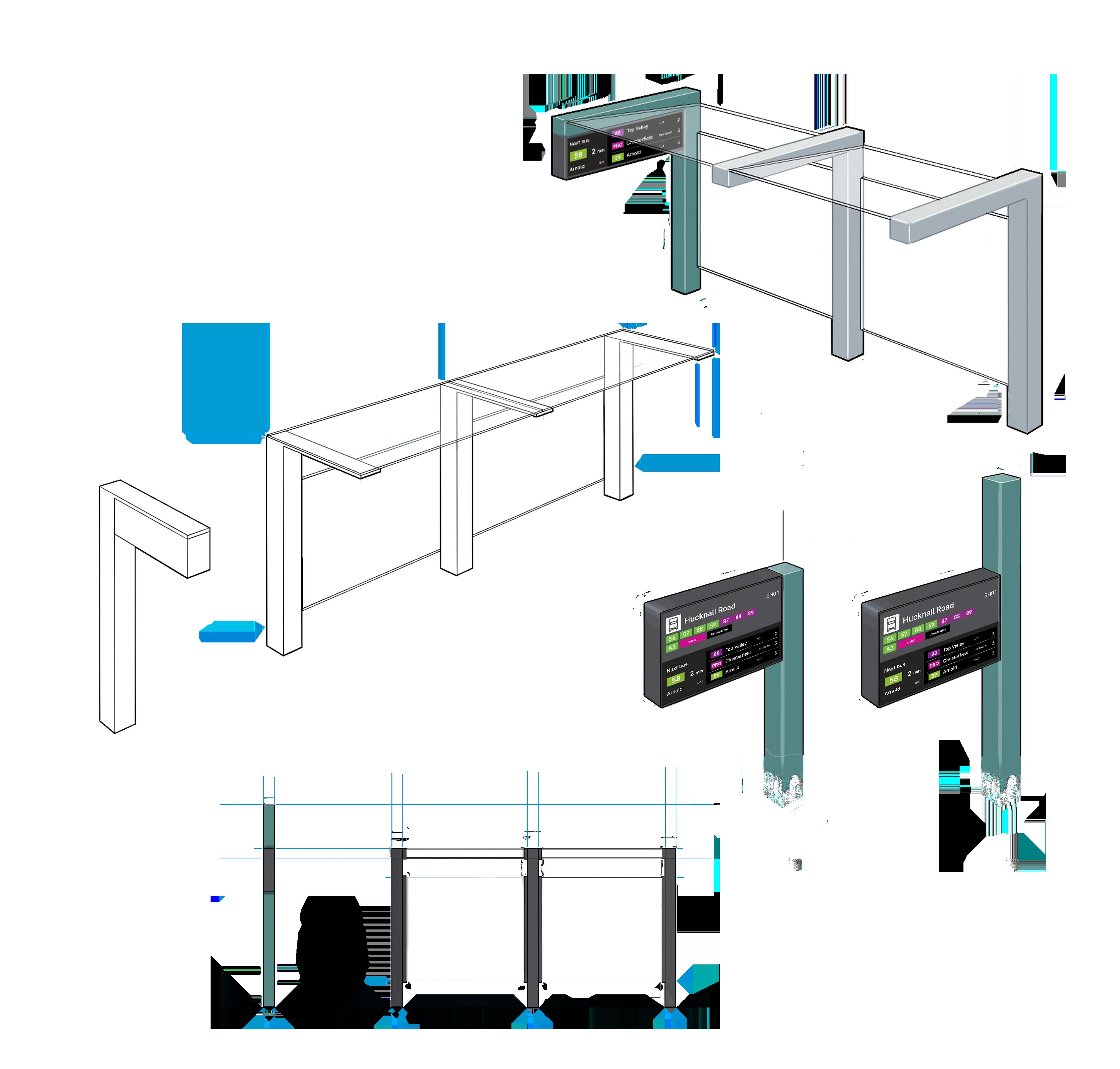
3D brand applications
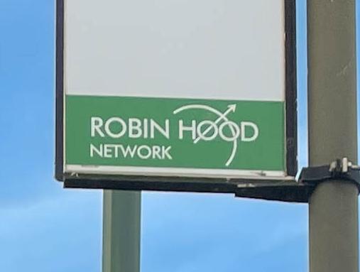
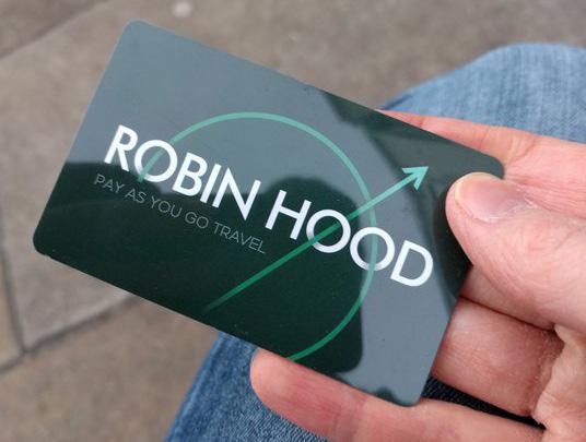
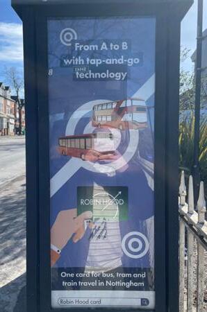
The future bus stop is the physical presence of the brand. This is strengthened by using brand colours and the arrowmark, and presenting information using brand typography and colours.
Information presented to network standards, using brand colours, typography, and symbols

Logo applied to column, acting as a ‘beacon’ for wayfinding

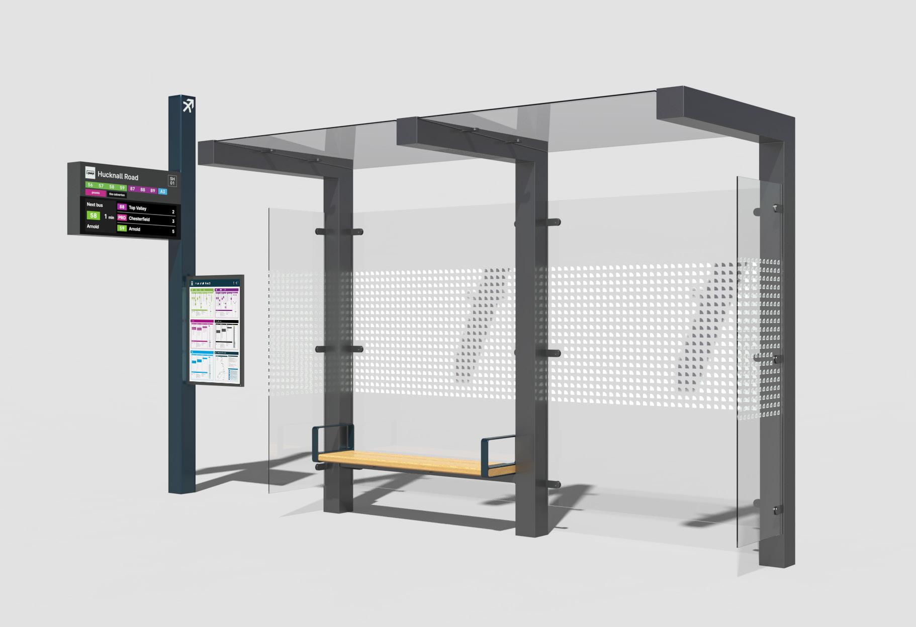

 Flag column in Robin Hood Teal, to provide visual distinction
RAL 220 20 20 Natural Indigo
Shelter structure in brand grey
Flag column in Robin Hood Teal, to provide visual distinction
RAL 220 20 20 Natural Indigo
Shelter structure in brand grey
RAL
000 25 00 Onyx Black
14 | 01 Aa
Shape of logo adapted into texture to provide visual contrast
Look + feel
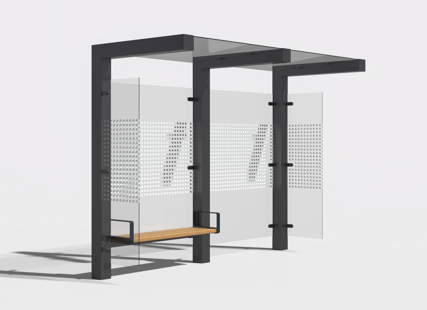
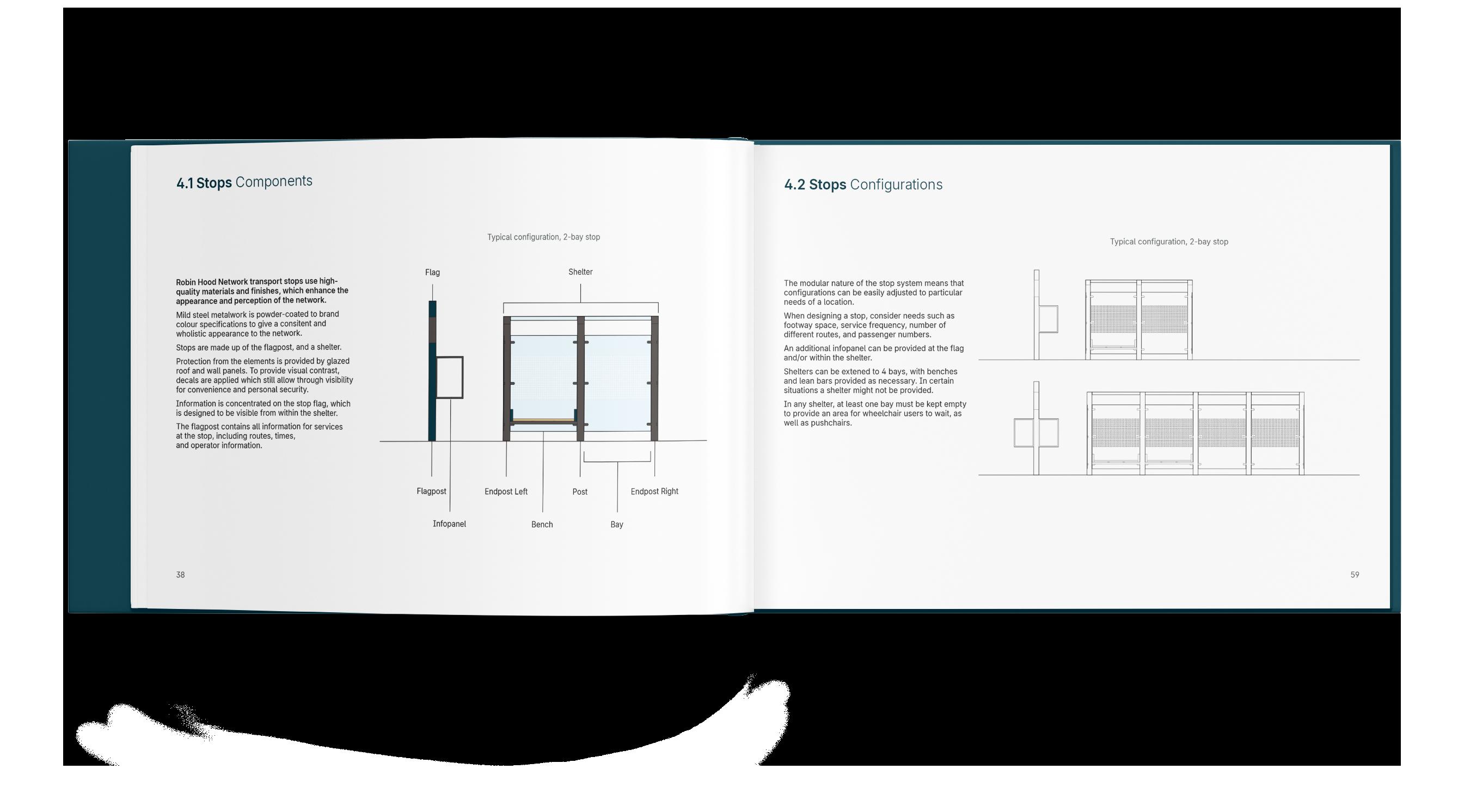
High-quality materials and finishes give a positive impression to the passenger and potential user, as well as having a positive impact on the street scape.
Glass manifestation uses a pattern derived from the network logo, with a hollow version to give better through visibility on shelter ends.
A visual rhythm and common height to elements of the stop give a holistic and unified appearance,
15 | 01
Experience
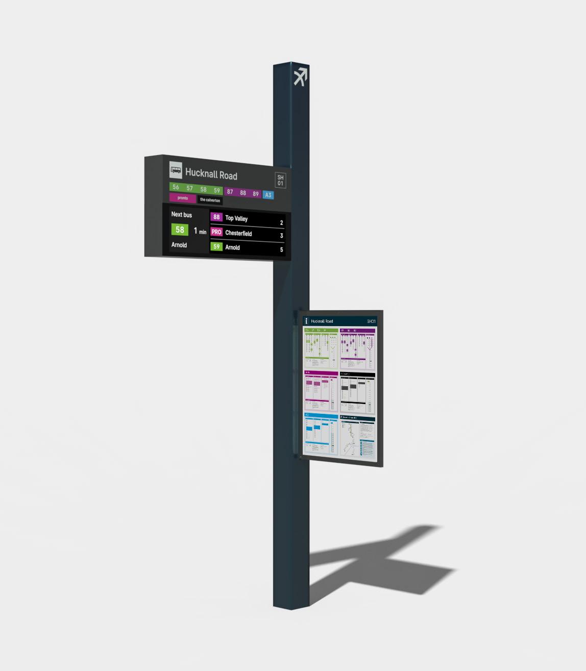
All information is concentrated on the ‘flagpole’ element common to all stops. Information is brought down closer to the passenger – live dynamic information and fixed signage are combined with a common design language and location.
Amenities like benches and lean bars are mounted to the structural elements of the shelter to reduce clutter and prevent dirt traps.
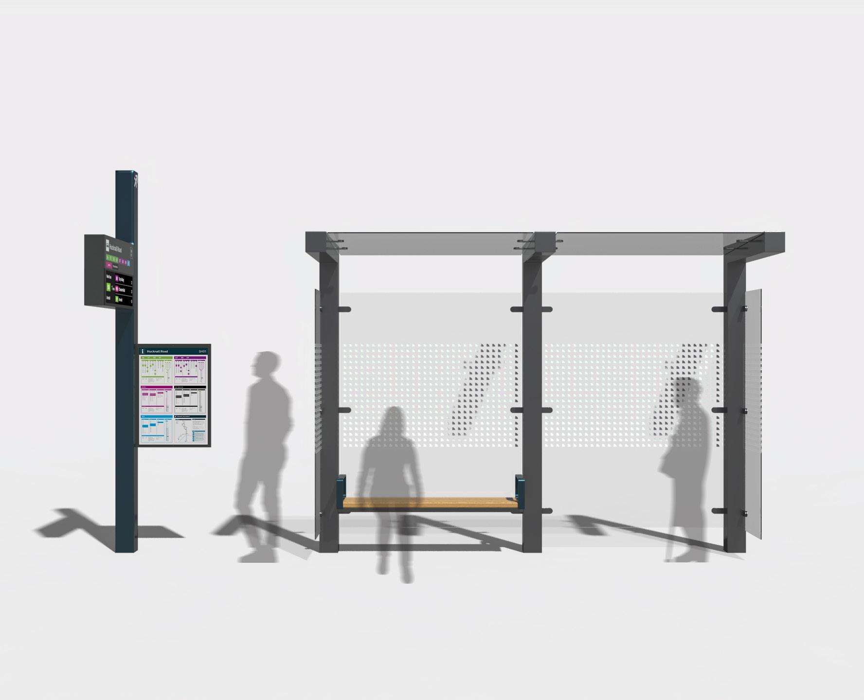
16 | 01
All the elements, both 2D and 3D, could be adapted to suit a whole range of situations. To demonstrate this, a ‘design guide’ was complied to show how the information and signage should be presented, and how stops can be configured to respond to local needs.
17 | 01
Flexibility
02
2021 Second year project 18 | 02
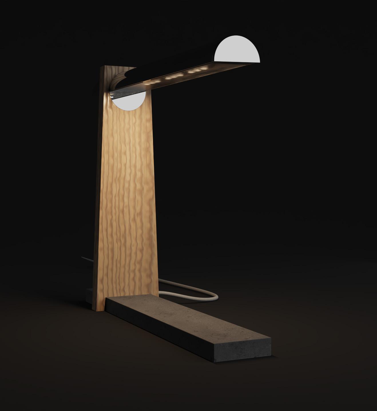
that lets you adapt your surroundings to different moods and activities
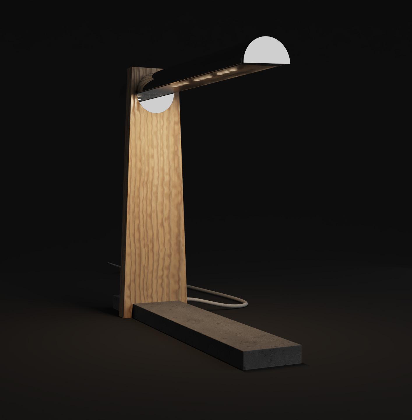
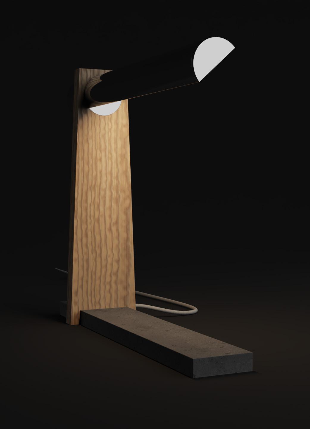
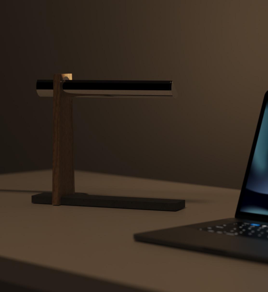
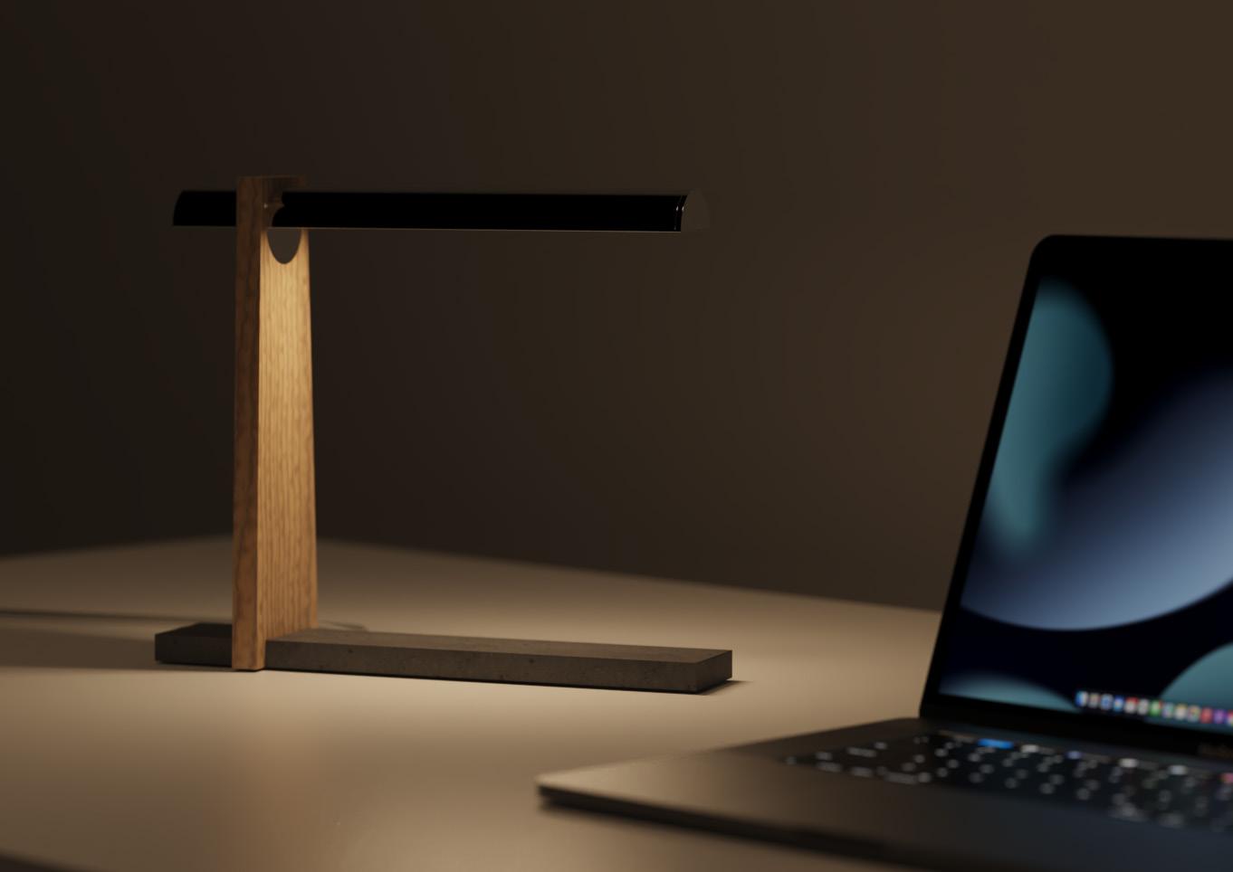
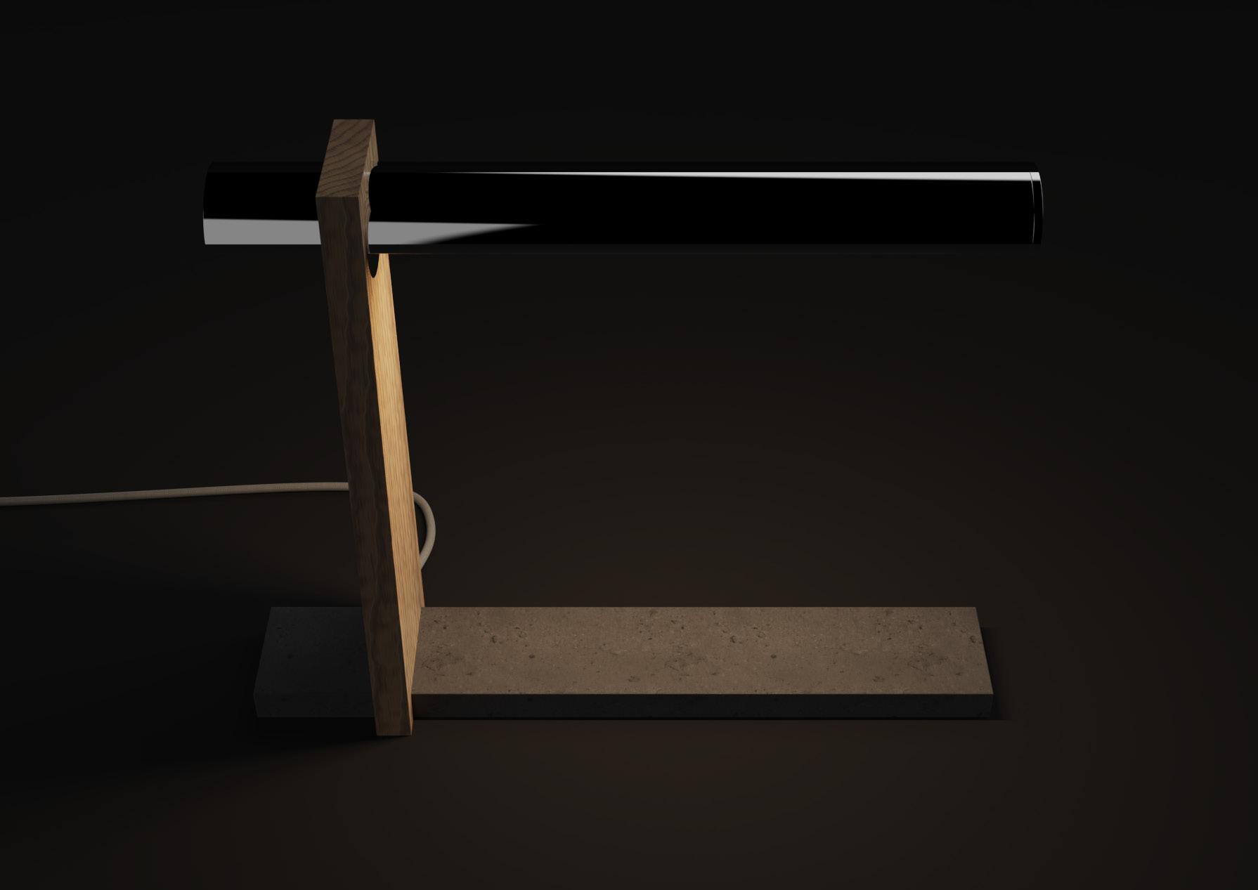
Cykle
Lighting
‘Design a piece of lighting for the home that fits within the Made.com market demographic. You should target your lighting design around one of the key themes from the WGSN 10 Key Trends report.’
brief 19 | 02
The
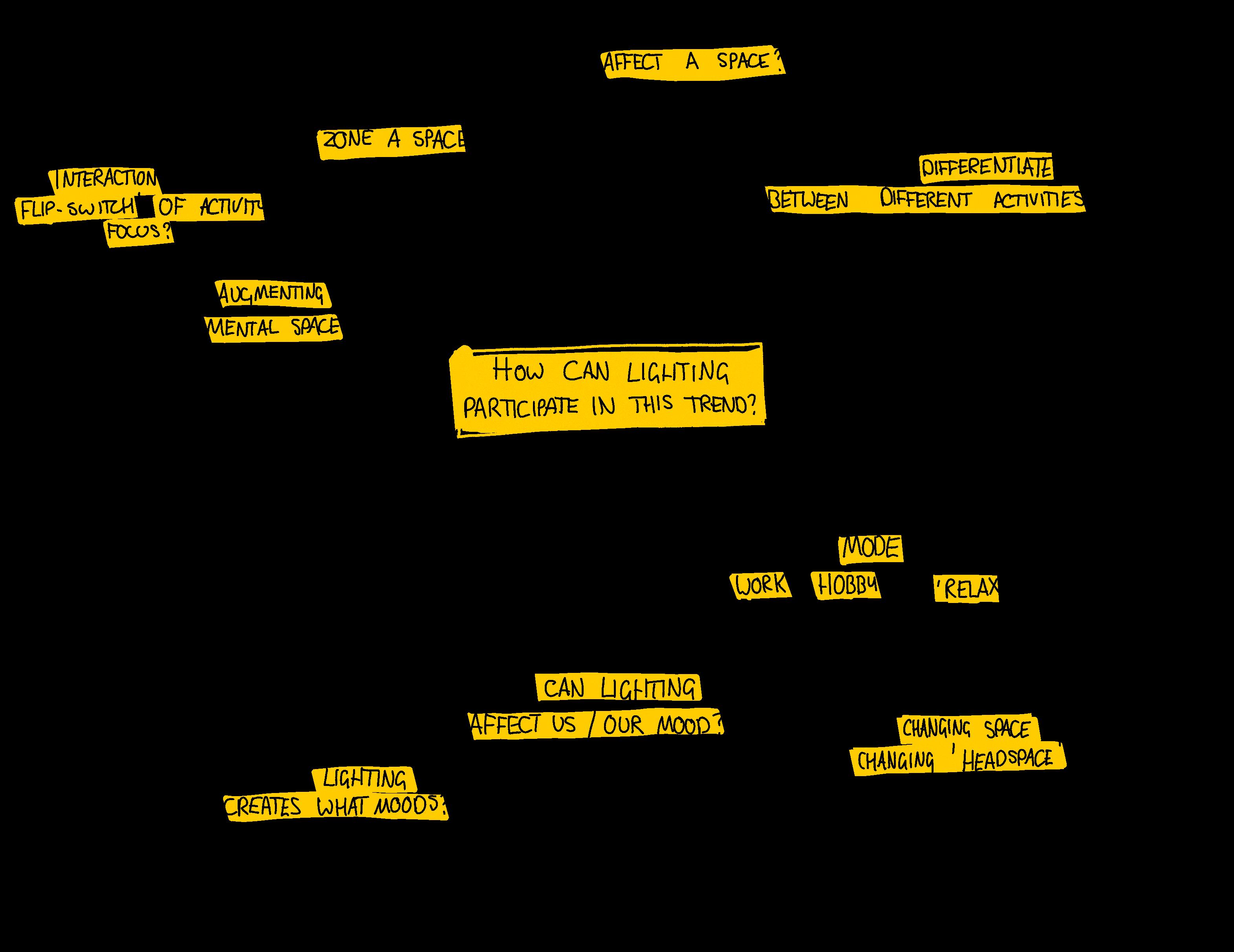
Research insights
Post-pandemic, more people are opting to work from home, at least a few days a week
The condition of the property market means that renters and buyers can only afford smaller homes
WGSN’s detailed trend reports traced the origin of the flexible lighting trend back to the same trend in interiors. The way we use our spaces has evolved to be more flexible and intensely used. Reacting to open-plan layouts, spaces are becoming ‘zoned’ for different functions using furniture, and potentially lighting
More activities are taking place at home, including work and hobbies
People are reconfiguring and ‘zoning’ their spaces to better suit the way they use their home
How can lighting participate in this trend?
20 | 02
To direct ideation, I wanted to reframe the original brief into something more focussed on the trend. Considering the insights from research, I mapped out how lighting could participate in the flexible trend in a meaningful way. In the end, this produced a new brief to guide my ideation.
How can we let people use light to transform their space and switch their mindset?
21 | 02
Reframing
Aesthetic inspiration
As a trend-driven project, I chose another trend identified by WGSN to guide the aesthetic development of the product.
‘Raw edges’ defines the materials and form, as juxtaposed materials and geometry like wood and natural stone provide textures and contrast.
Raw edges

‘embrace the dramatic tactility of unpolished wood and stone for organic statement pieces’
22 | 02
1 Hoi Kaloi / 2 En Gold / 3 Srebbinsdesign / 4 Life of an Architect / 5 Alcarol 1 2 3 4 5
Ideation
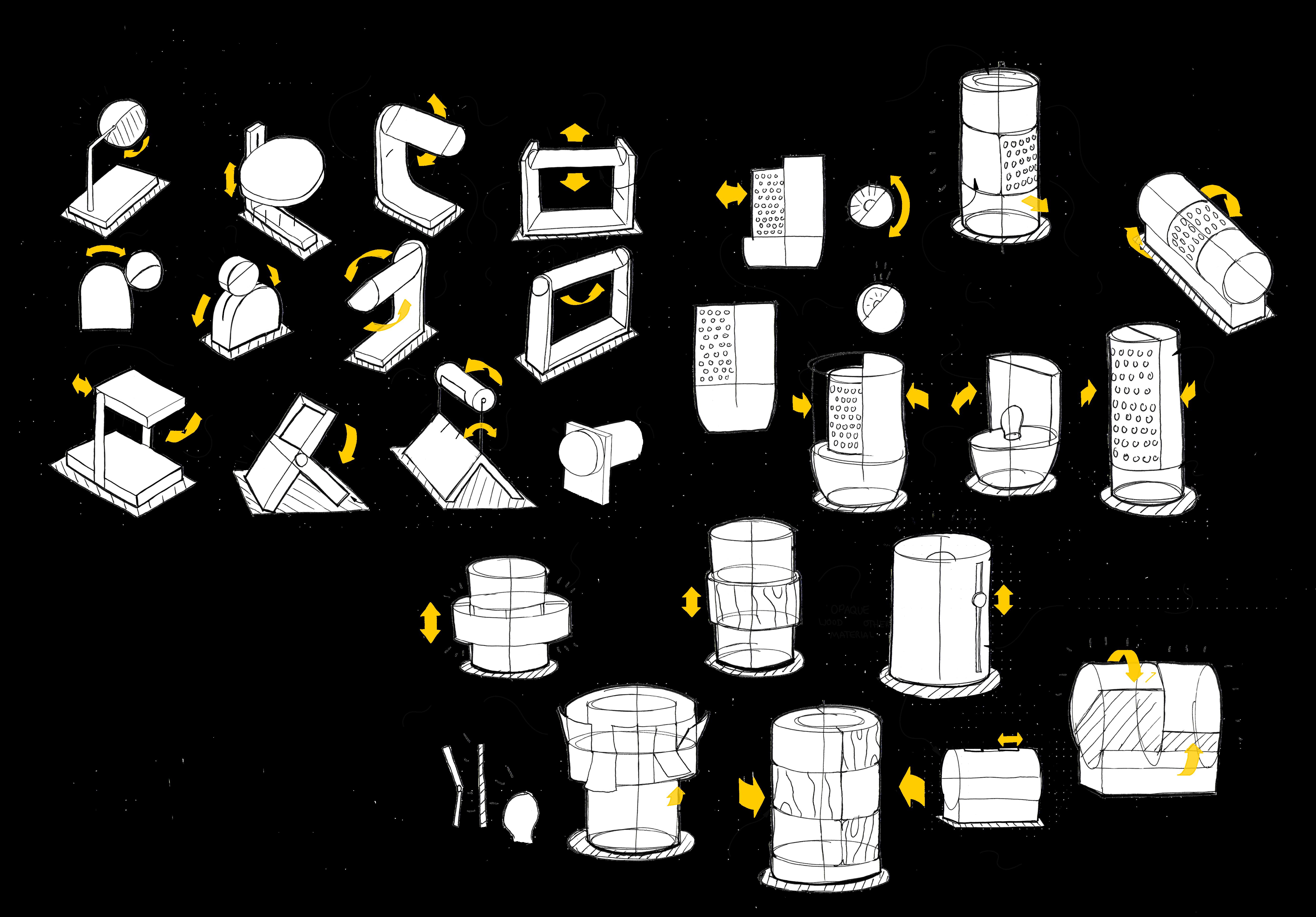
My ideation explored how light can be manipulated and changed in different ways. Of particular interest was the use of angle and direction, diffusion through different materials, and the use of adjustable shades.
While it was difficult to capture the motion and interaction ideating in 2D, this gave a level of freedom to explore ideas and evaluate later with sketch modelling.
23 | 02
Concept development
Evaluating the concepts from the ideation process, the concept of the light which can be tilted to transition from downlighting to uplighting had more potential to be a marketable product. The form and interaction were developed together, form reflecting how the lamp could rotate and exploring how to invite this interaction from the user.

24 | 02
Interaction
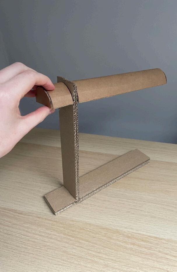
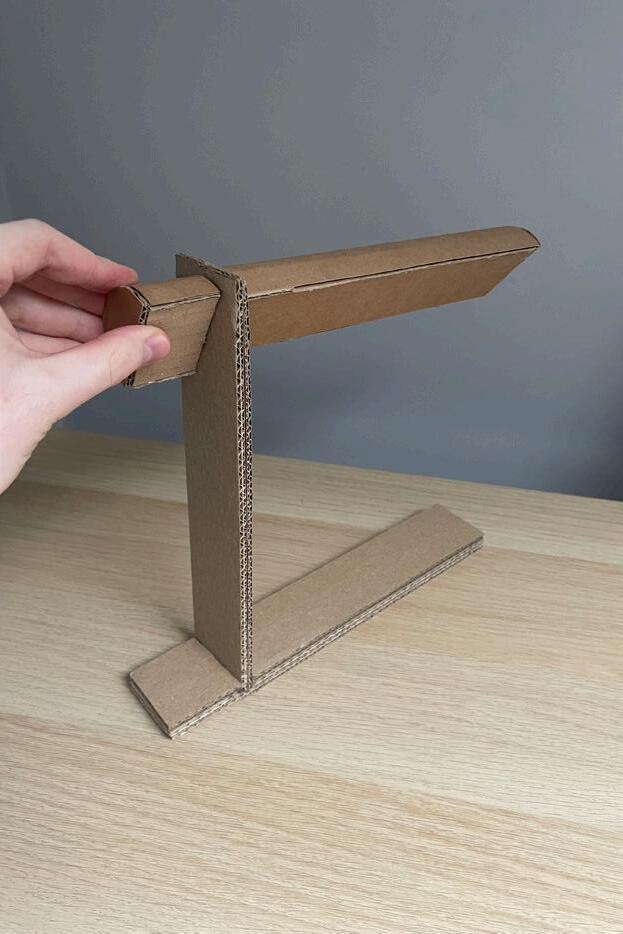
Since the concept was that the interaction with the physical product would serve as a signifier of the mental switch between moods/activities, it was important that this was fully resolved.
I used iterative cardboard prototyping, as well sketching, explore the relationship between different styles of dial and how that translated to the rotation of the light fitting.
In the end, the direct continuation of the halfcylinder of the lighting mount was the most effective at communicating the relation between the two.
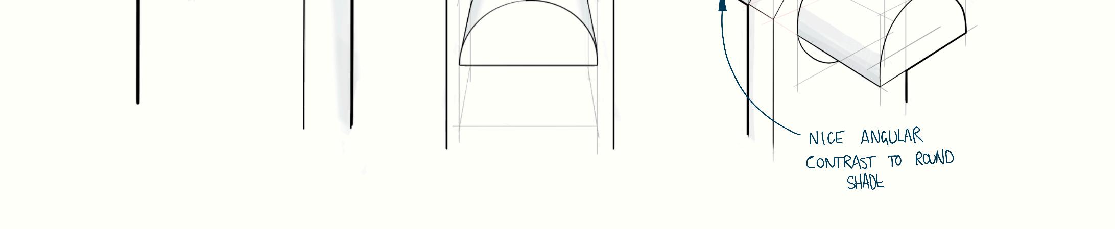
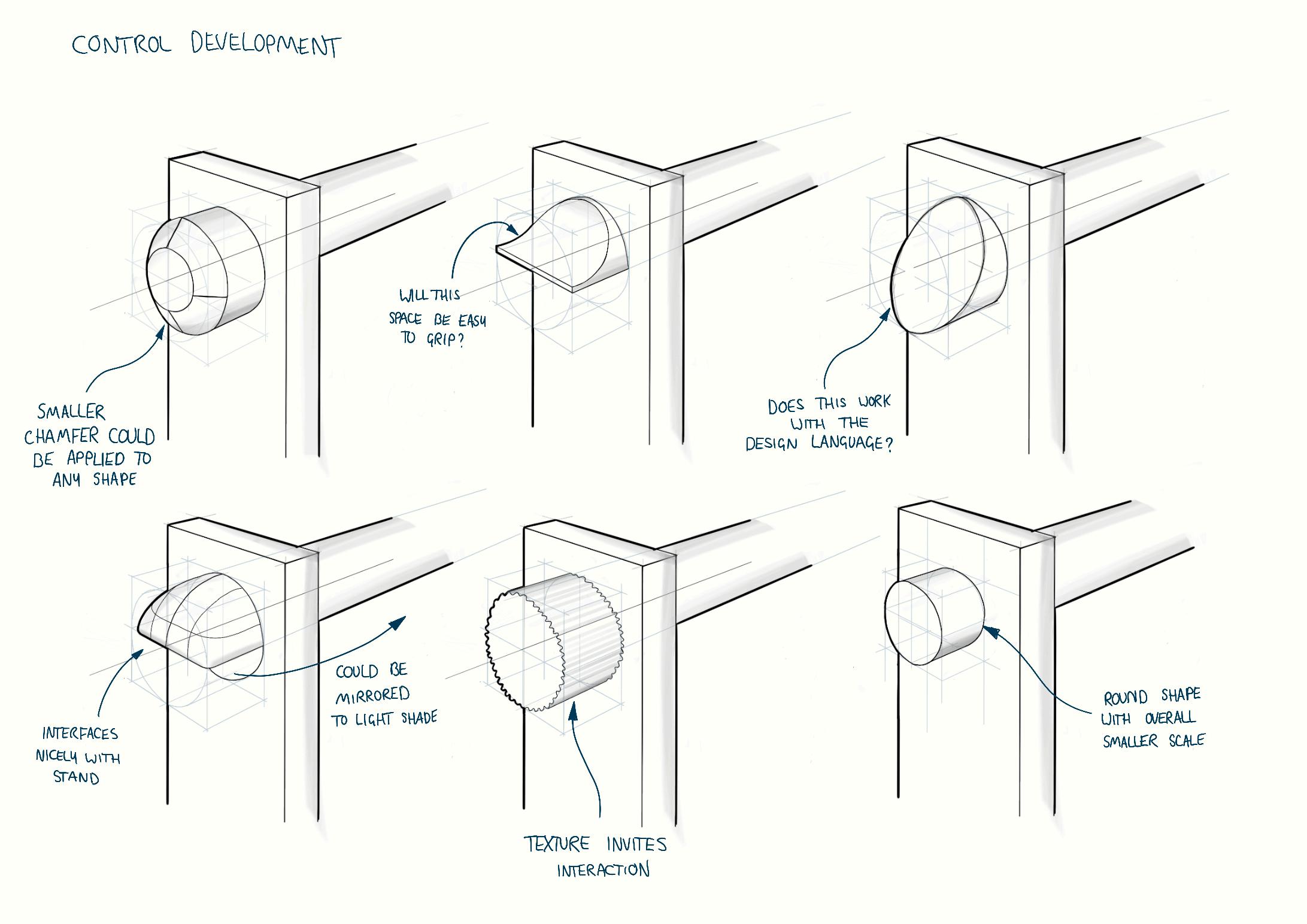
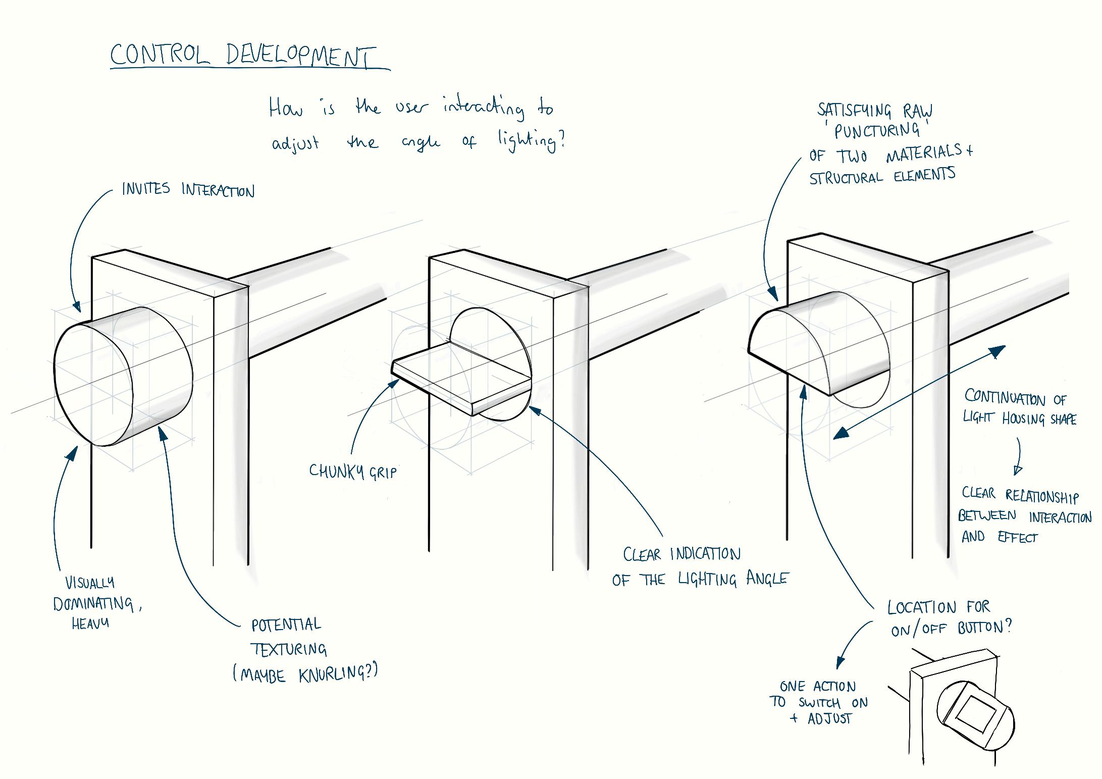
25 | 02
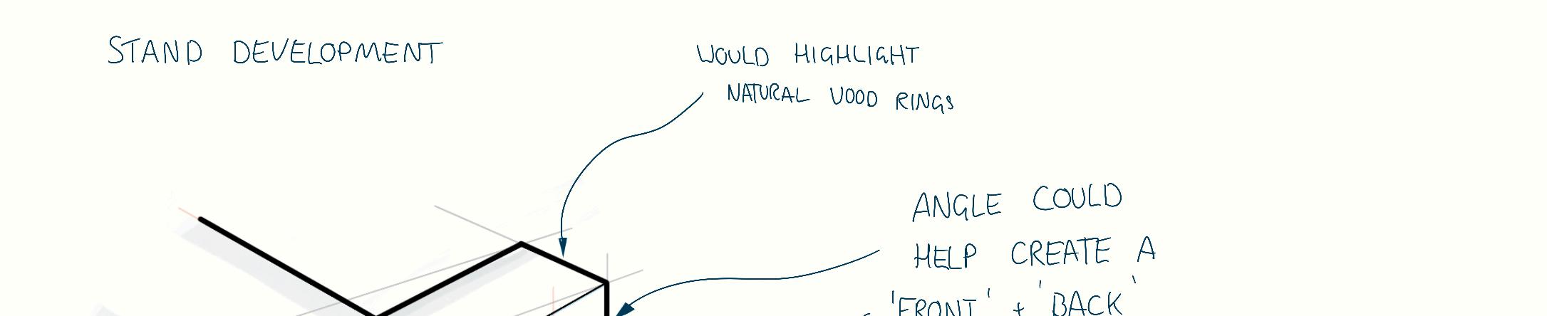
Flexibility

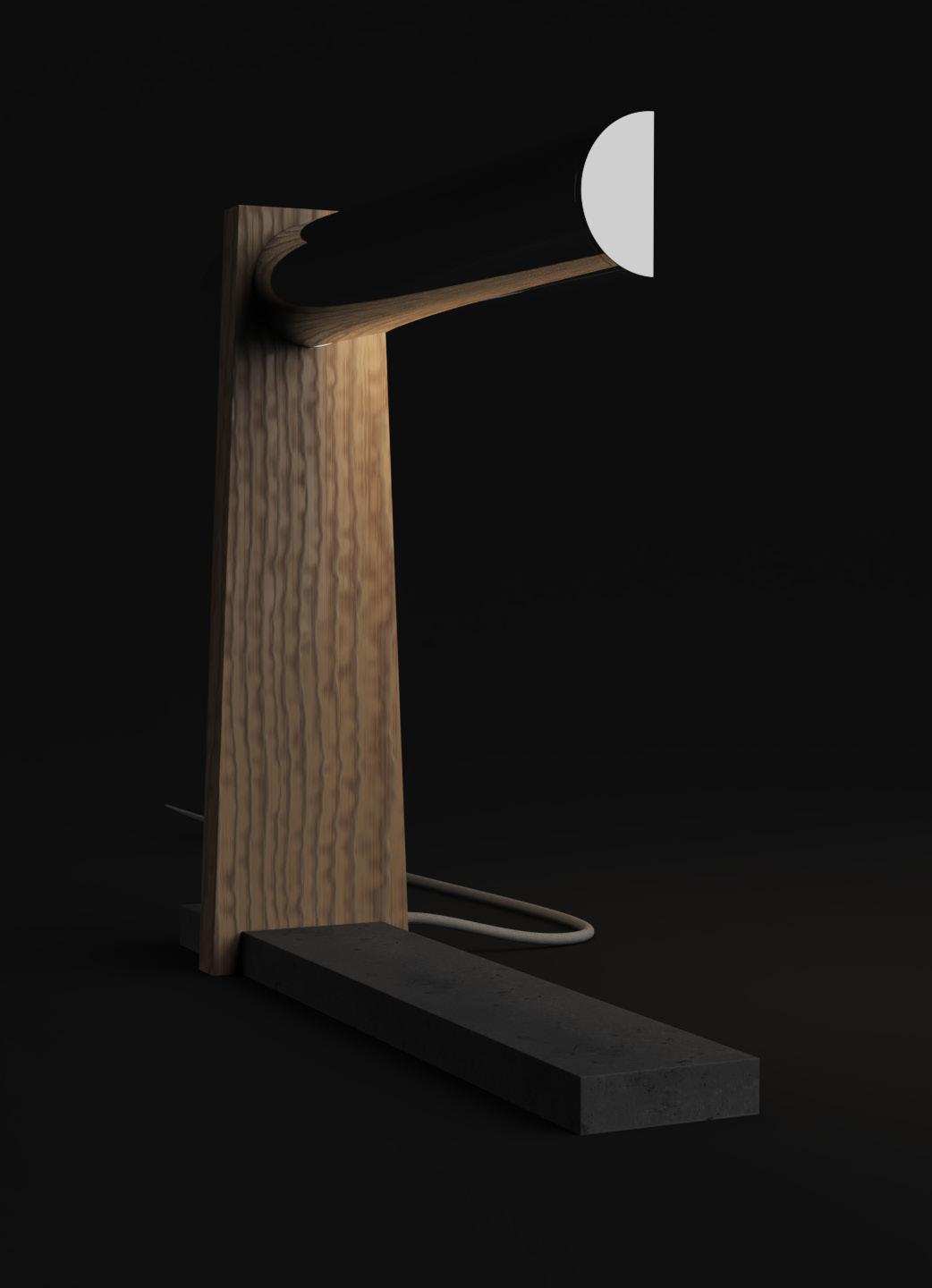
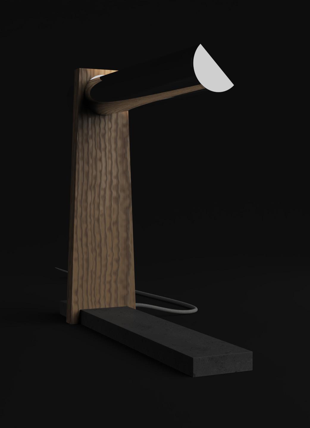
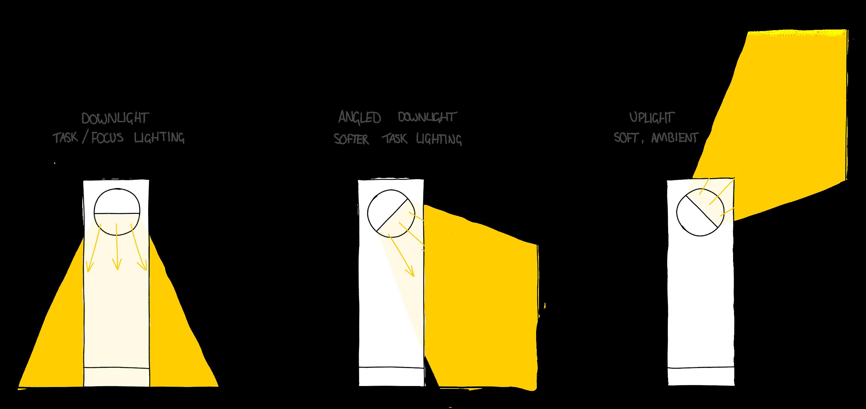
While the design of the lamp allowed it to be infinitely adjustable, four ‘modes’ emerged that communicated the potential lighting settings that could be achieved.
26 | 02
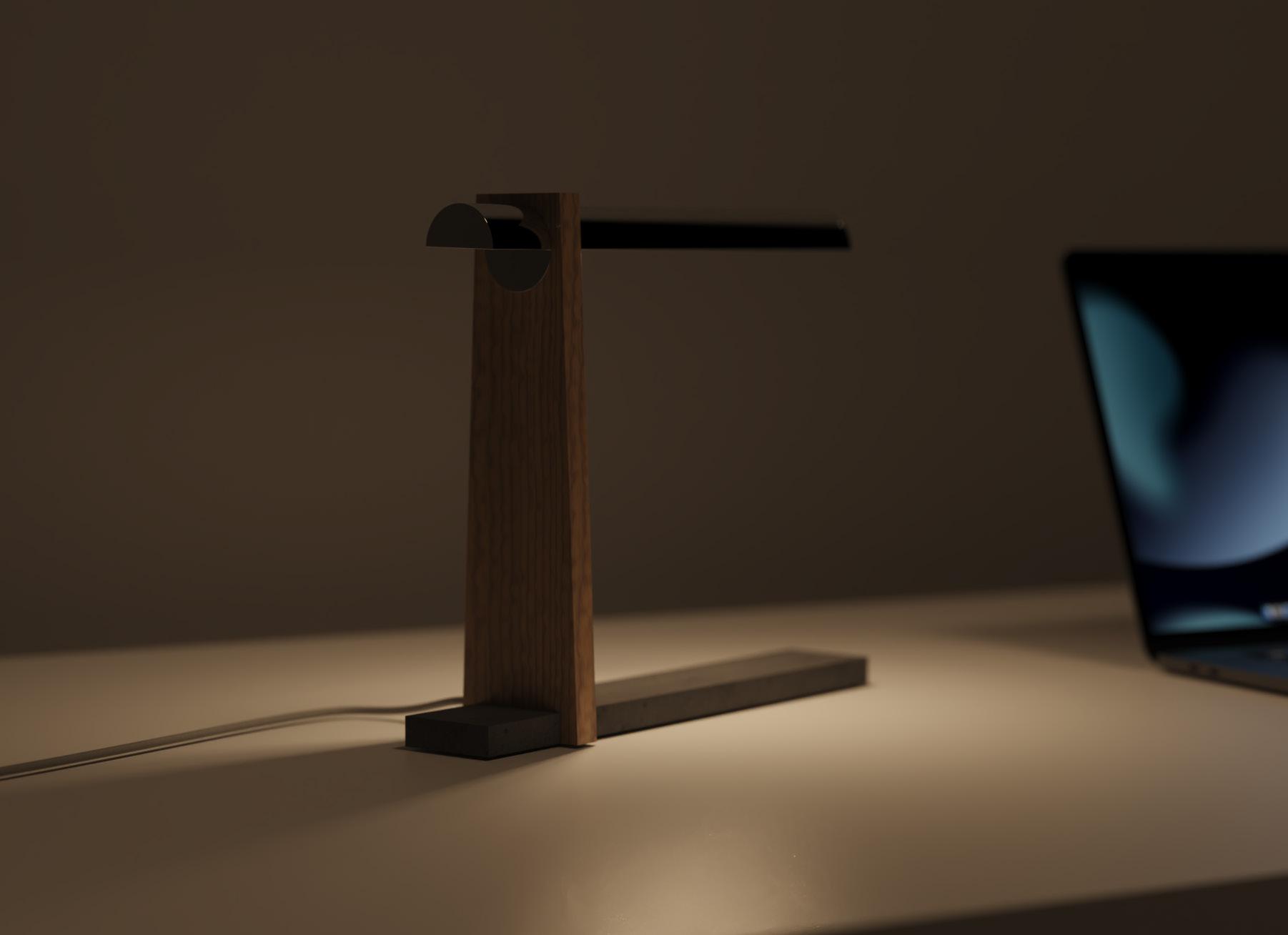
The flexibility of the lighting direction provides contrast between downlighting to enable focus, and uplighting to give ambience.
Users can adapt the lighting in their space to suit the range of different activities happening within it, and let the change of lighting signify a switch of headspace.
Ambience 27 | 02
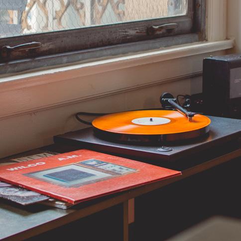
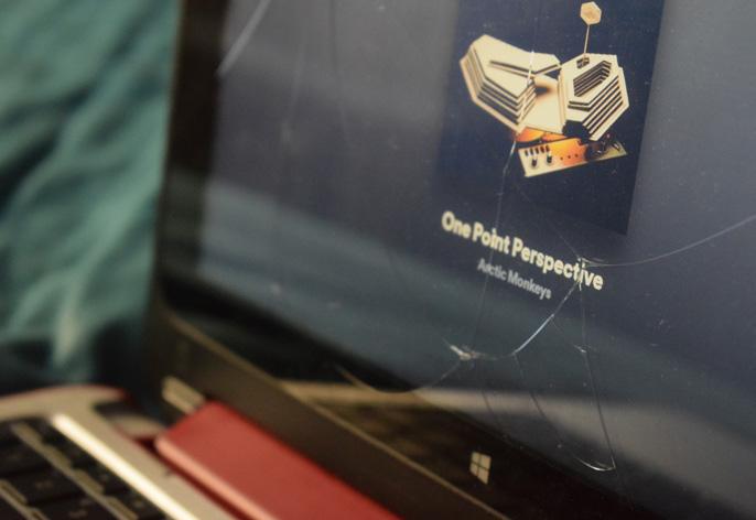
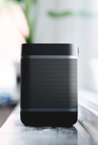
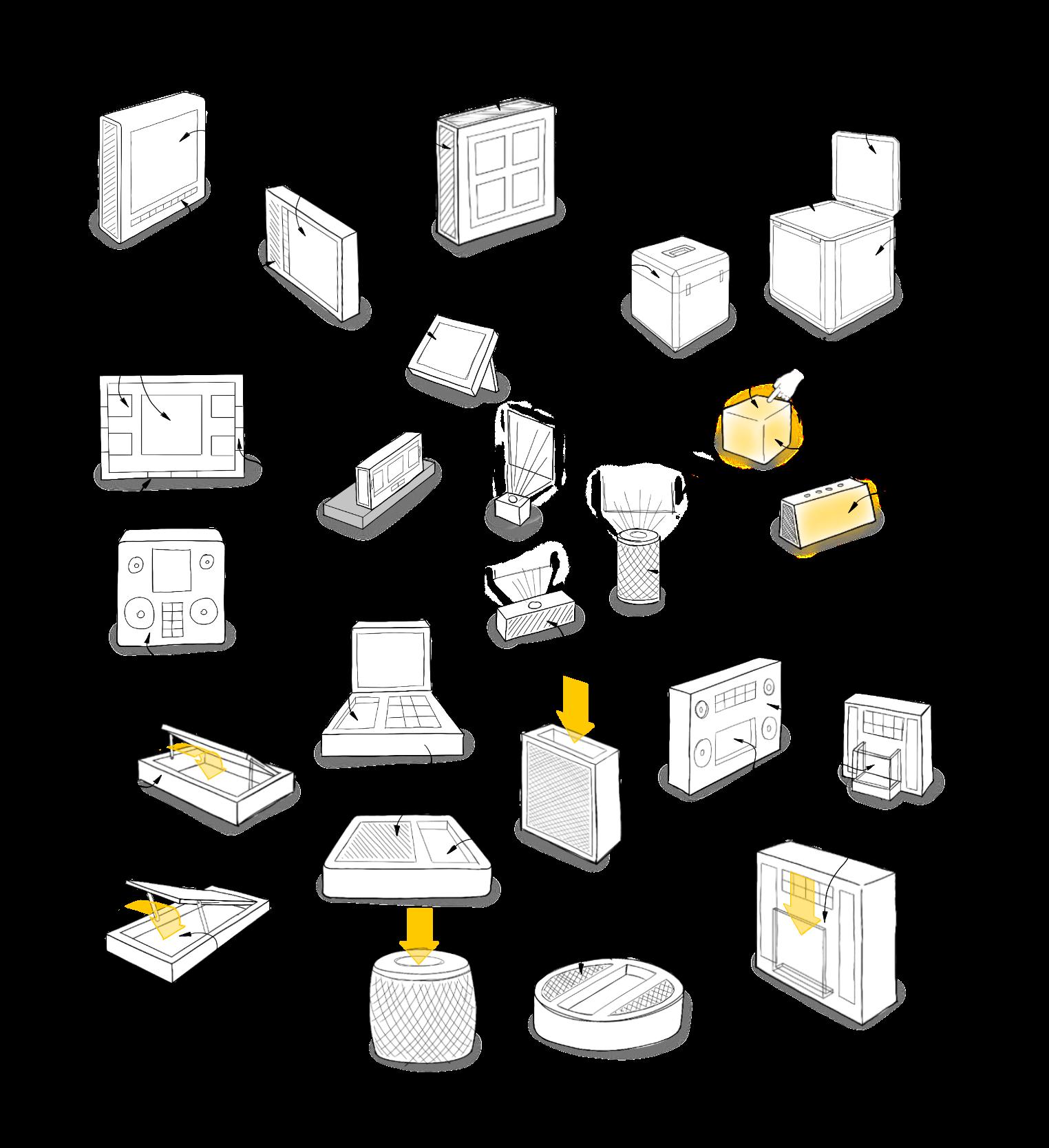
Audio/Visual
2021 Second year project
Audio player that brings back the joy of self-expression into your environment
03
30 | 03
Trend insights
Embrace the friction and inconvenience
Does this allow them to overcome inconveniences of the format, because of the novelty?
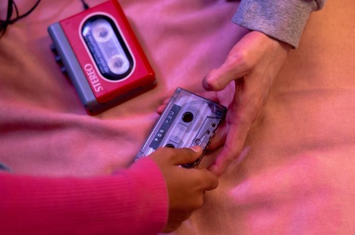
Artists that lead cassette sales indicate a young audience, who wouldn’t have used the format at its peak.
What has attracted them to using these old formats?
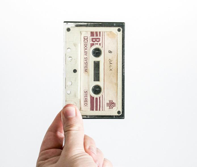
This project was trend-inspired. The Future 100 report produced by Wunderman Thompson identified a trend of ‘nostalgic formats’ – ie the resurgence of obsolete media formats gaining popularity. I mapped the insights from this report to identify where opportunities could be for a new product to respond to this trend.
What has made it so big, and culturally accepted?
Difference in artist sales between different formats suggests different audiences prefer different formats
‘Vinyl Revival’ is an accepted phenomenon
...is it possible to appeal to all of them? if not, need to identify which retro format audience I’m designing for
Just designing another aesthetically pleasing cassette player?
Potentially being purchases purely as memorabilia.
How to innovate in this area?
Bring something new?
...but new listening devices for cassette are being developed, indicating there is demand to use them for listening.
Intentionality and deliberate listening
Ceremony and ritual involved with the ‘practice’ of music listening
‘Screen fatigue’ has lead to a desire for tangibility and tactility in interactions
...convenience, but with tactile satisfying interaction
Possible to blend both of them?
Does this counteract the desire for immediacy and convenience?
31 | 03
Directions
To further explore these directions from the brief, I produces a moodboard for each of them. This allowed me to visualise what was ‘missing’ from the contemporary streaming experience. I identified that there was the most potential for innovation by addressing the themes of ‘physical expression’ and ‘intentionality and ceremony’
Decorating our space
Saying something about ourselves, to ourselves
Saying something to others that enter our space
Humans enjoy physical objects
Physical expression
Purposeful listening
Removing distraction
Intentional listening
Manual effot
Give and take
Intentionality + ceremony
Sharing
Borrowing
Lending
Experience of exchanging and sharing things we enjoy
Enjoying things together
Bonding over shared media
Identity
Subcultures and belonging
Shared experiences
Personal expression
32 | 03
In the time of physical media, our library of music was on display, on our shelves, in our homes. Digital download and streaming have changed this – our music collections are trapped in our devices. Some have returned to physical media, while for most the benefits of digital download and streaming are too important.
How might we express our music libraries in the physical environment, without physical media?
Consider...
The way people express their music tastes through physical media
From the exploration of the trend, I identified multiple reasons for its rising popularity. One factor was that the physical media enabled a sense of self-expression in our own environments – it allows us to express our taste in the physical rather than digital world. From this I developed a brief to explore how this could be done. I felt it was important to consider how the other factors, such as intentionality and ritual of listening would interplay in the brief.
The permanence of online streaming libraries
How people listen to their music at home
Brief 33 | 03
User + environment
To direct my ideation, and create a target aesthetic, I developed a user persona. This outlined his age, the music he likes, how he listens to music, and why he might be a participant in the trend of nostalgic formats. The trend has a wide scope of users, which is observed from the variety of musical artists releasing on obsolete formats.
Creative professional with disposable income
Music lover – into electronic music
Favourite artists are Underworld, Röyksopp, and Kraftwerk.
Grew up with CDs, MP3s, and enjoys using his iPod for nostalgia.
Has digitised his library using a streaming service.
34 | 03
Mark, 34
The ideation process began from the two themes that developed from my research; ‘intention and ceremony’ and ‘physical expression’. Many of the ideas responding to these themes had overlap, and after evaluating selected two that responded to each theme to develop into fuller concepts.
35 | 03
Ideation
Concept Review
Seen as for home... part of the
Portable or for home?
What else could be displayed?
More interaction through a screen, less novel approach
Potential
Different material choices
Different
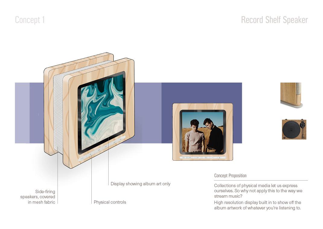
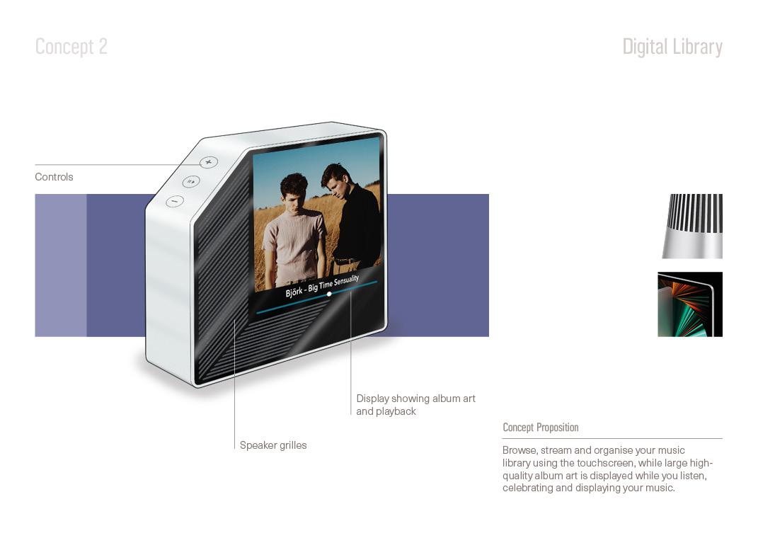
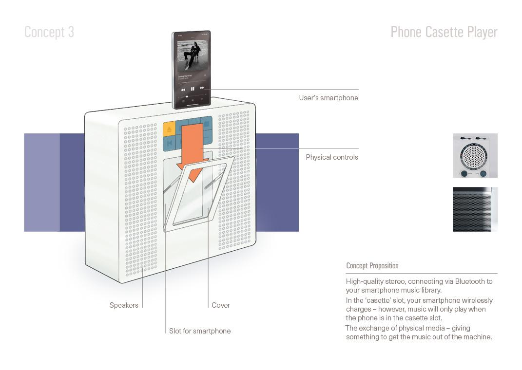
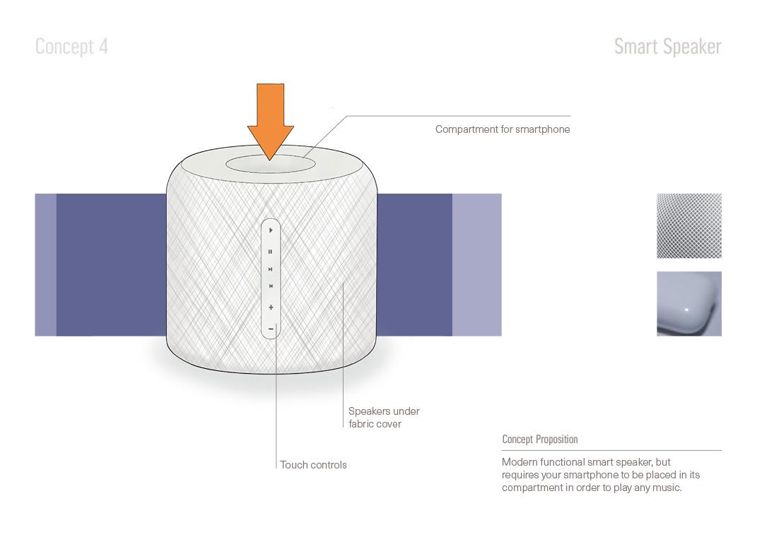
These concepts developed from the ideation process. I selected two designs from two themes of concepts - two addressing the theme of selfexpression, and two addressing the theme of intention and ceremony. Feedback was gathered from my classmates and tutors, and I also added my own reflections on the four concepts.
How
36 | 03
for wall mounting?
Changing orientation of the slot would make a clearer reference to the tape player Clearer connection through the detail of the mechanism
Answers the ritual element of the brief
Unique approach and novelty
will the phone be detected?
Animated album art is becoming more used...
Doesn’t celebrate the ritual and the inconvenience
use environment Most similar to conventional smart speakers
Phone/streaming is the vessel for the music... Augmenting the interaction
ritual
Form development
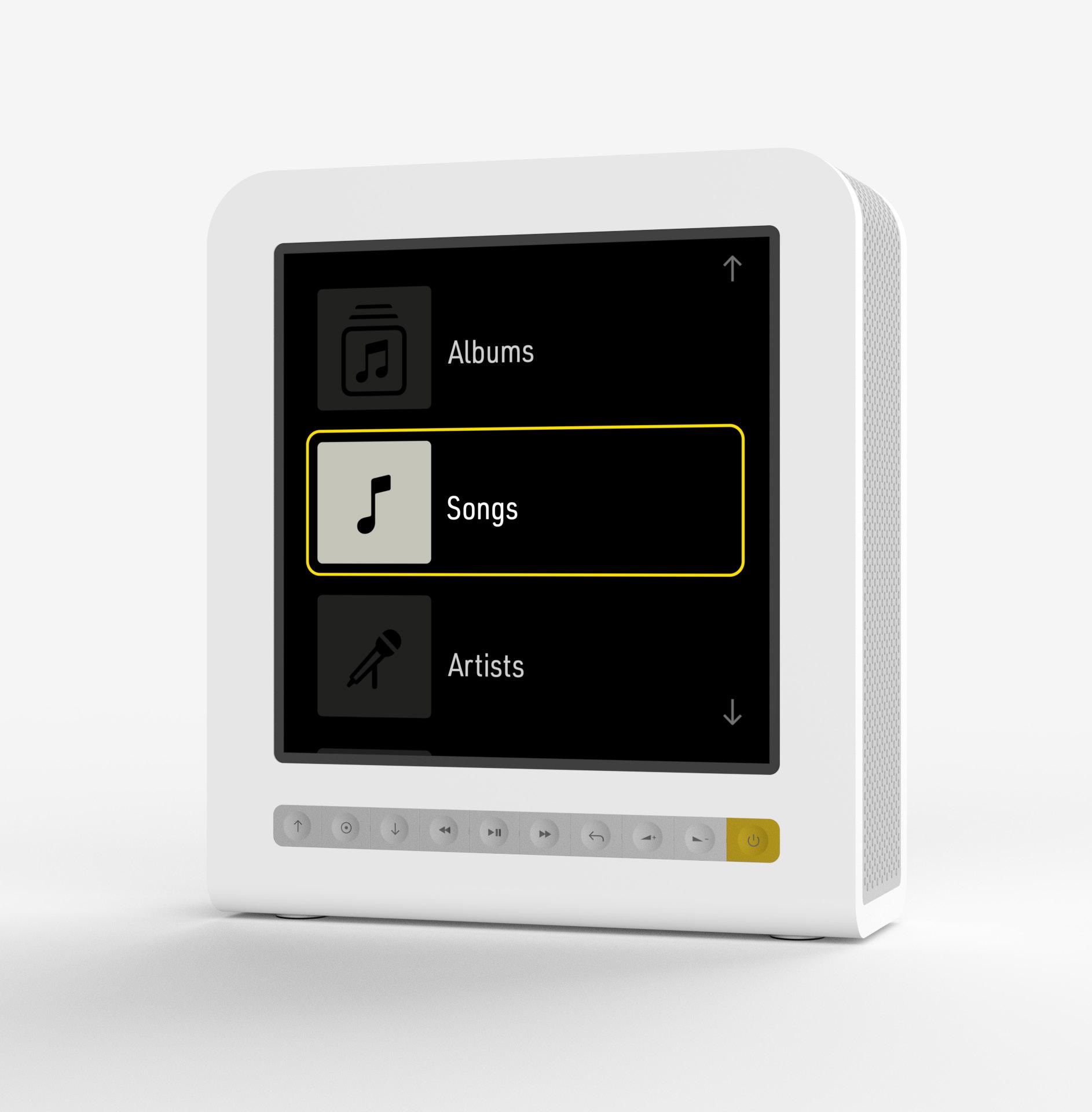
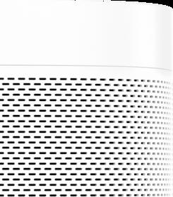
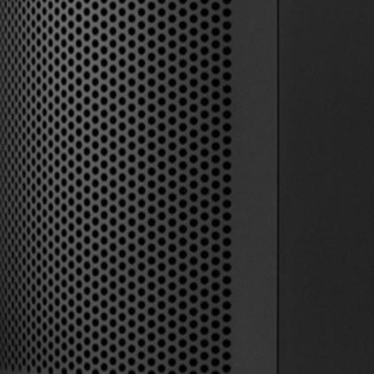
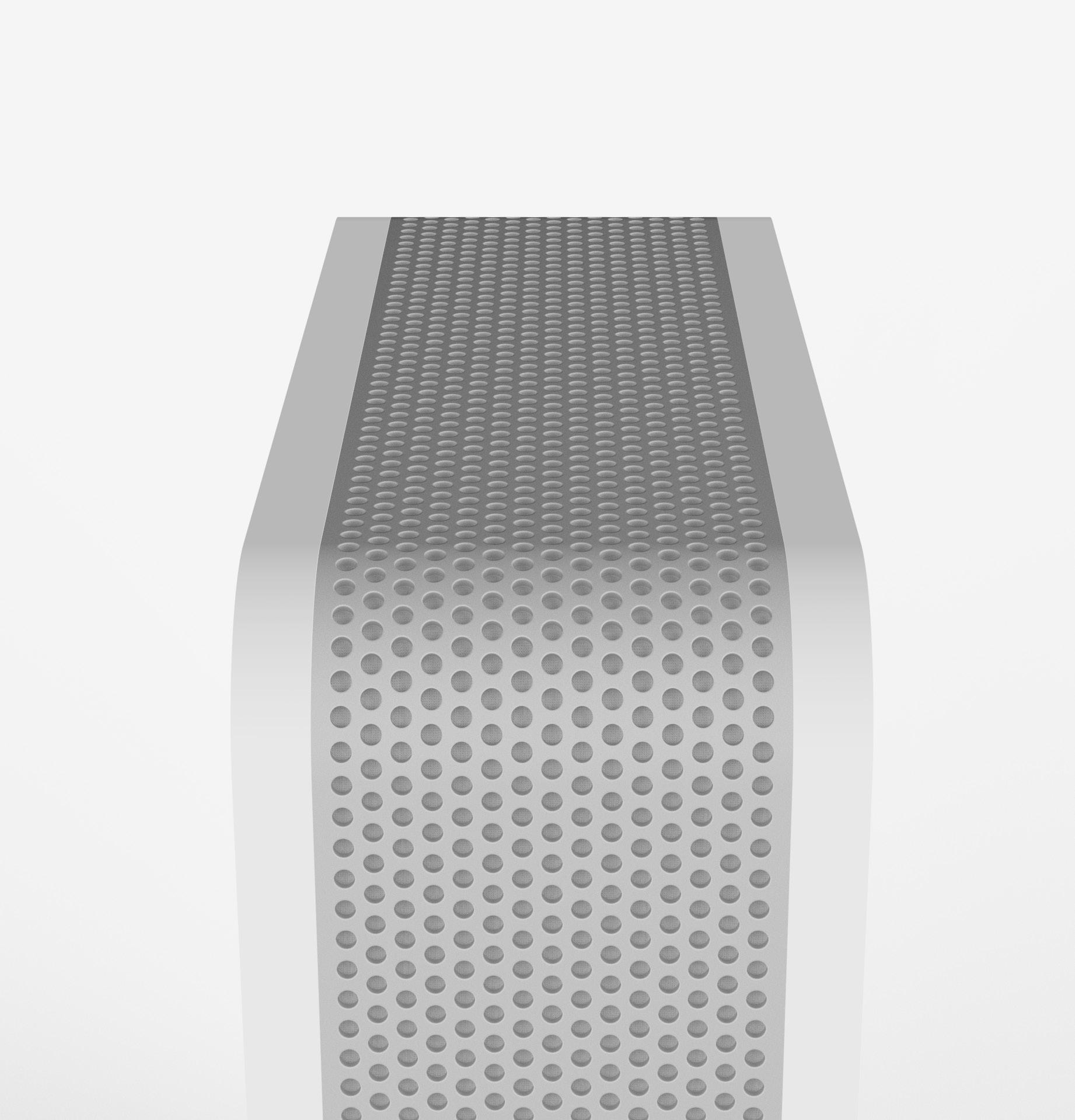
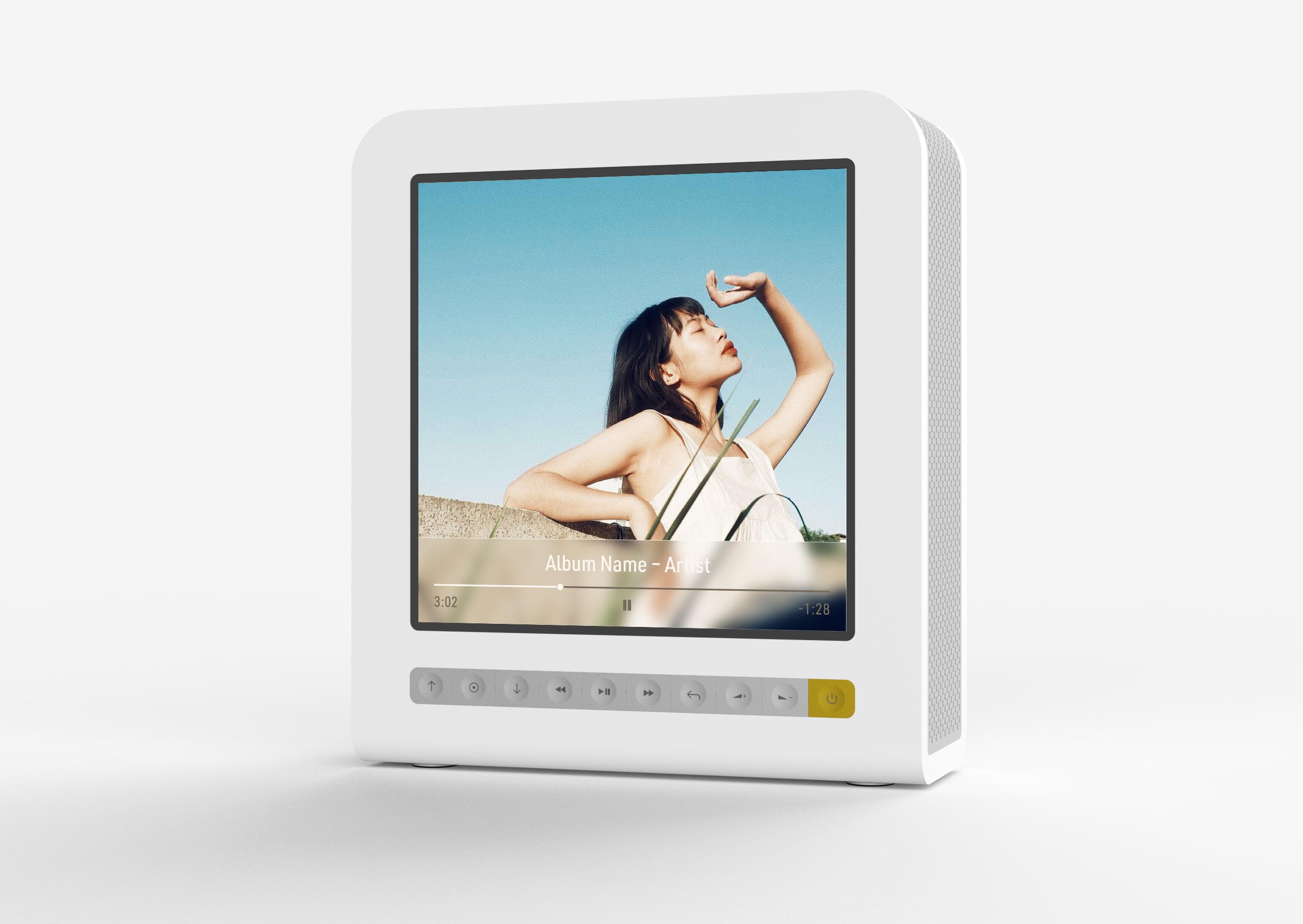
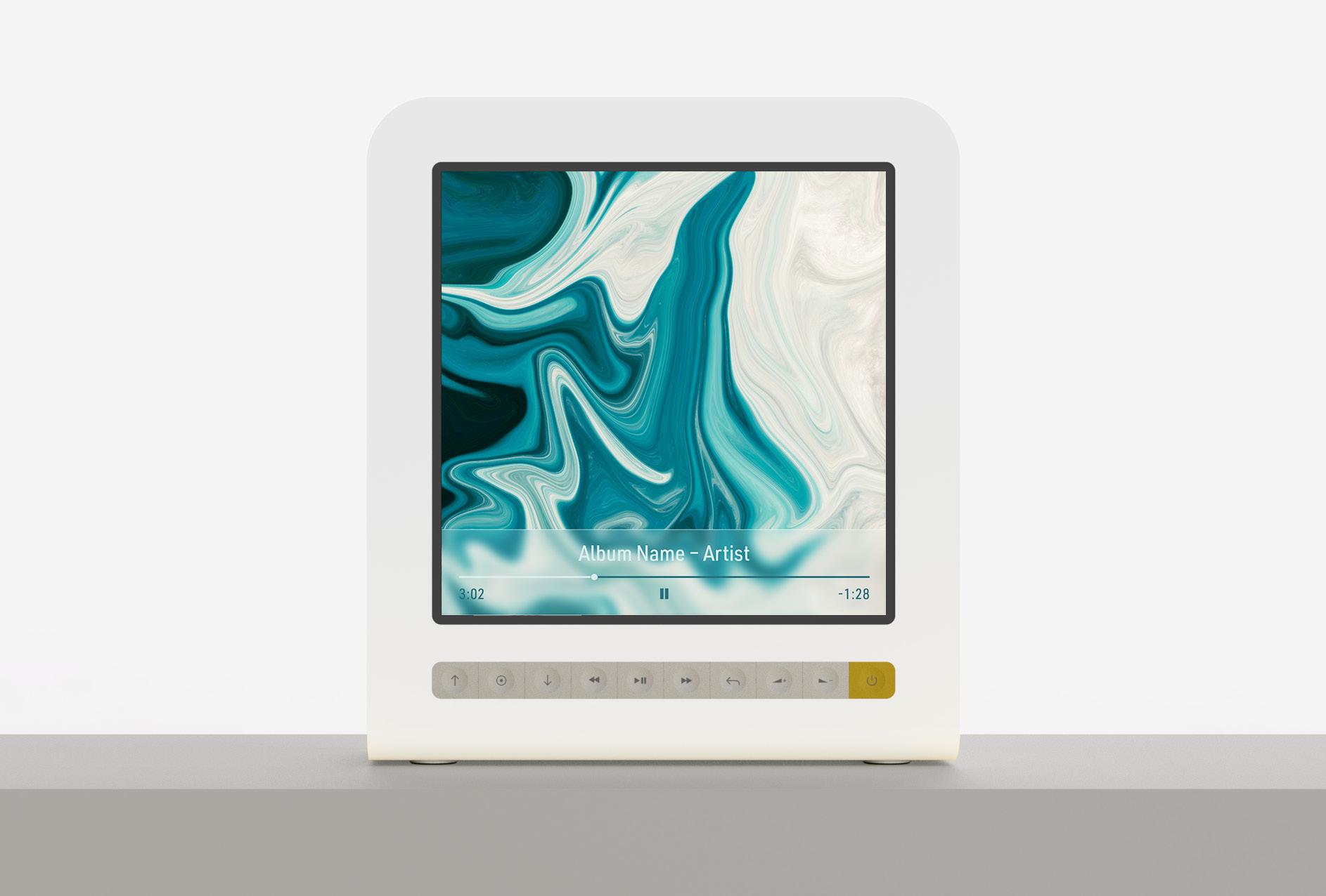
From the concept review, I explored different interpretations of the rectangular form from the concept. The idea of having side firing speakers behind the display was retained, and the form evolved taking inspiration from the design language of premium audio products. As interaction would be through the tactility of physical buttons, their form and position was also finalised, but their functions were left open to further refinement.
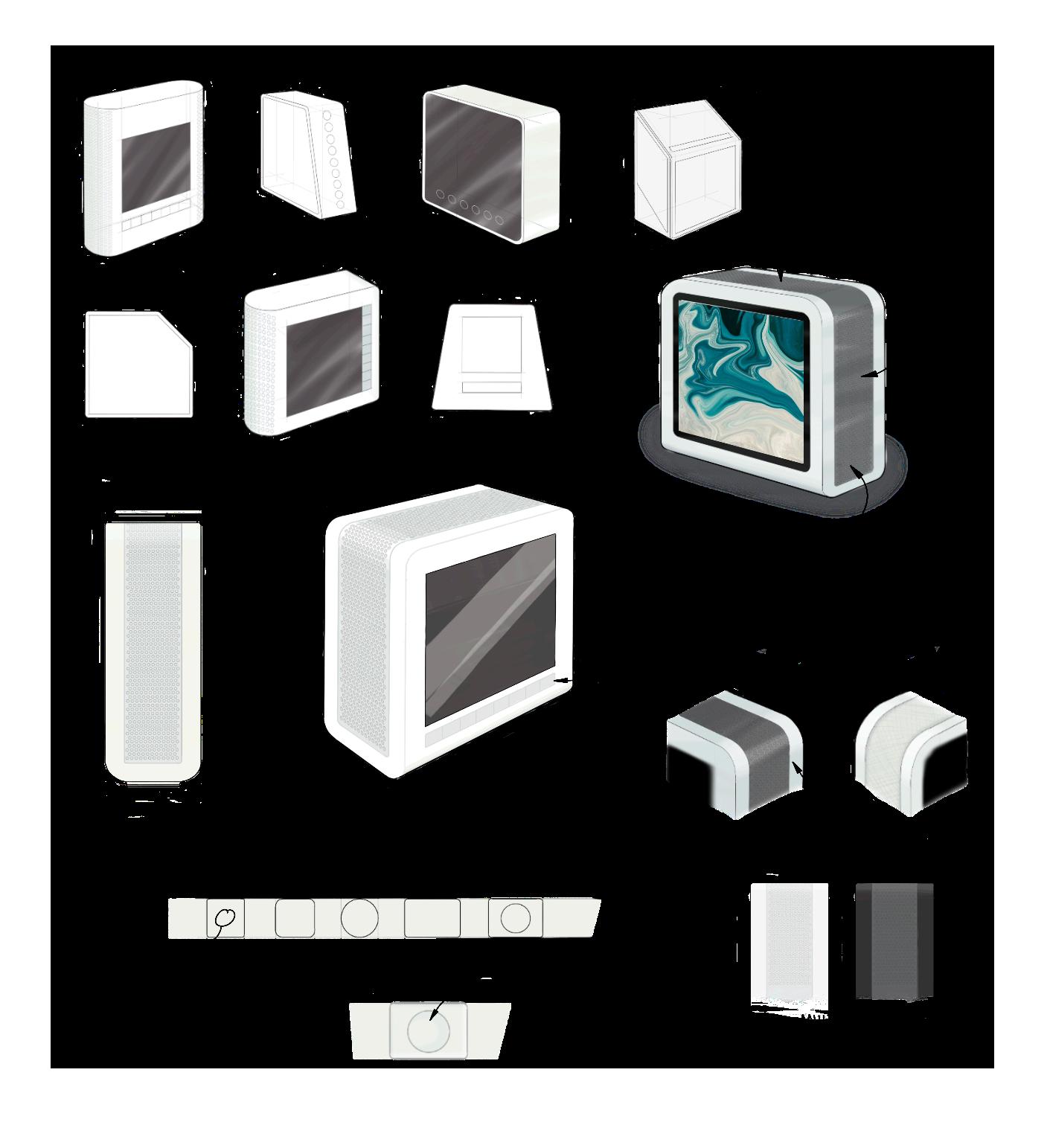
37 | 03
Interaction development
How to communicate this extra layer of function?
Affordances? Signifiers?
functions are needed?
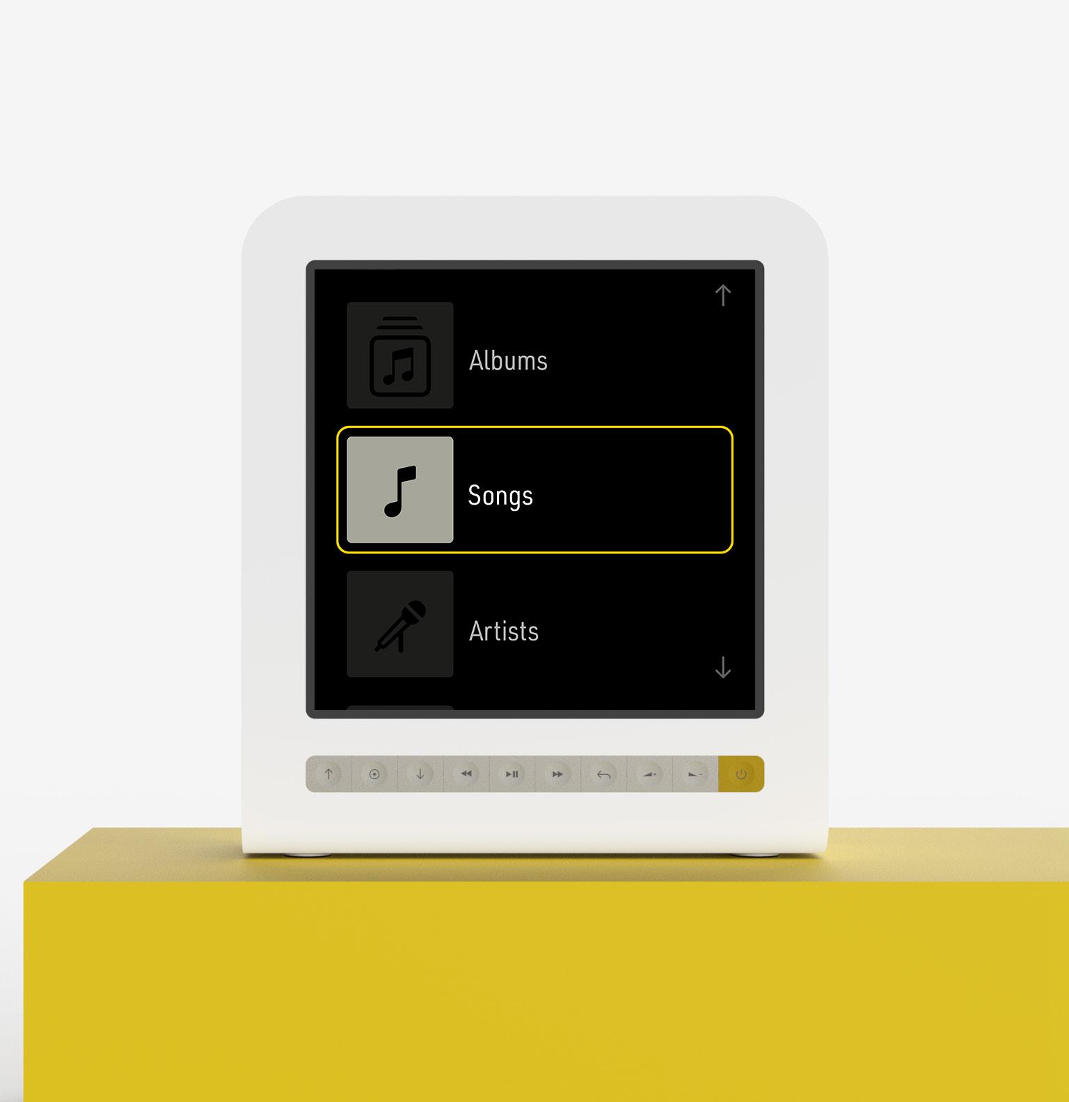
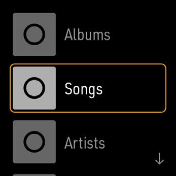
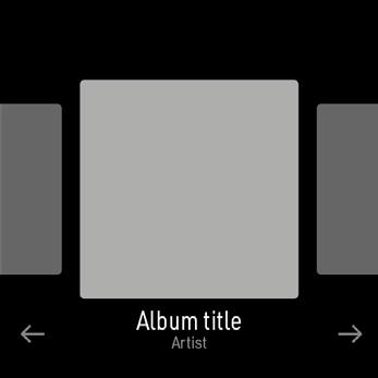
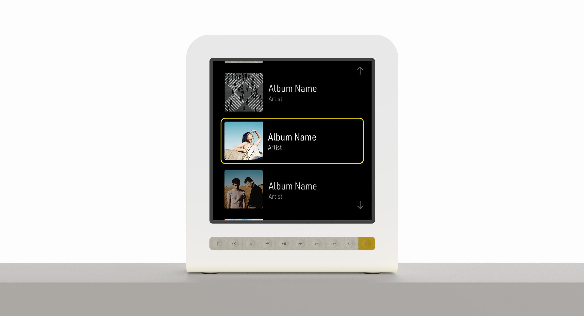
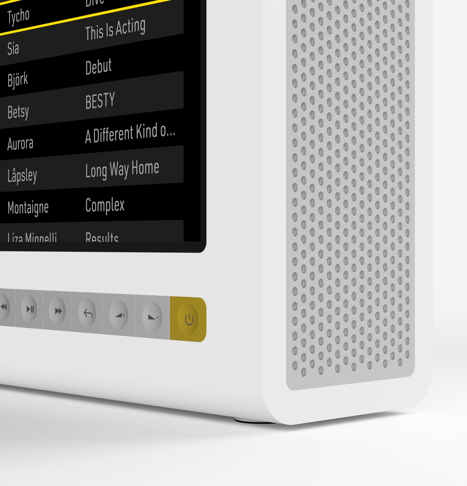
While interaction is through physical buttons, how the user’s music library is navigated needed to be refined. A simple, unobtrusive interface that focuses on the album art of the user’s library was developed, while the exact functions of the physical controls were finalised. Typography evokes the controls of traditional music hardware.
38 | 03
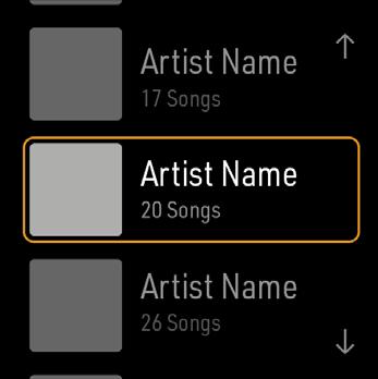
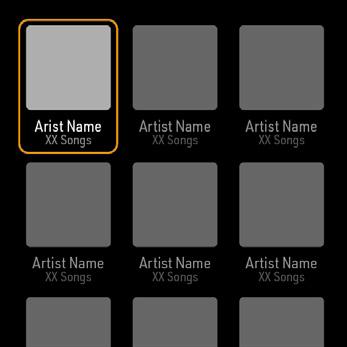
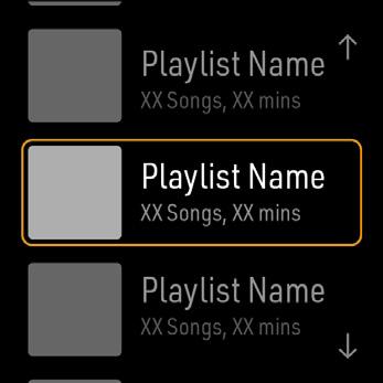
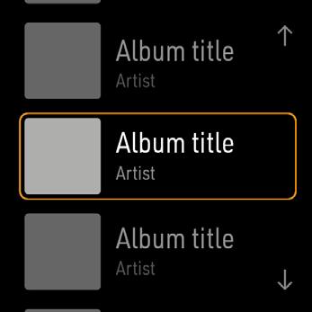
By artist By playlist Music selection What
‘Home’ menu + menu navigation Playback control
by
by
by album
Vertical
What
by song
playlist
artist
List of categories to get to music selection... simple scrollable list. ‘select’ and ‘back buttons to navigate between menu levels are less obvious... how to communicate this function
navigation buttons... best suited to the vertical scrolling of the UI Standard symbols for buttons that control playback and volume
would these be? Scrolling within media rather than skipping?
how
it
What
do users need when selecting an individual
Including
this is
Visual only - in keeping with the visual philosophy Large album cover display - looks good but not sure
efficient
could be Evokes the ‘browsing’ concept Text may be useful to complement album covers
information
song?
album art...
the concept
More
Icons
Visual is less important when browsing by artist? Showing albums featured on playlists?
compact without, though
needed for each menu item Compact but with added text, feels a little cluttered Navigating grids by using buttons... would that be intuitive? Potential to provide second layer of function by ‘long press’
Interaction + control
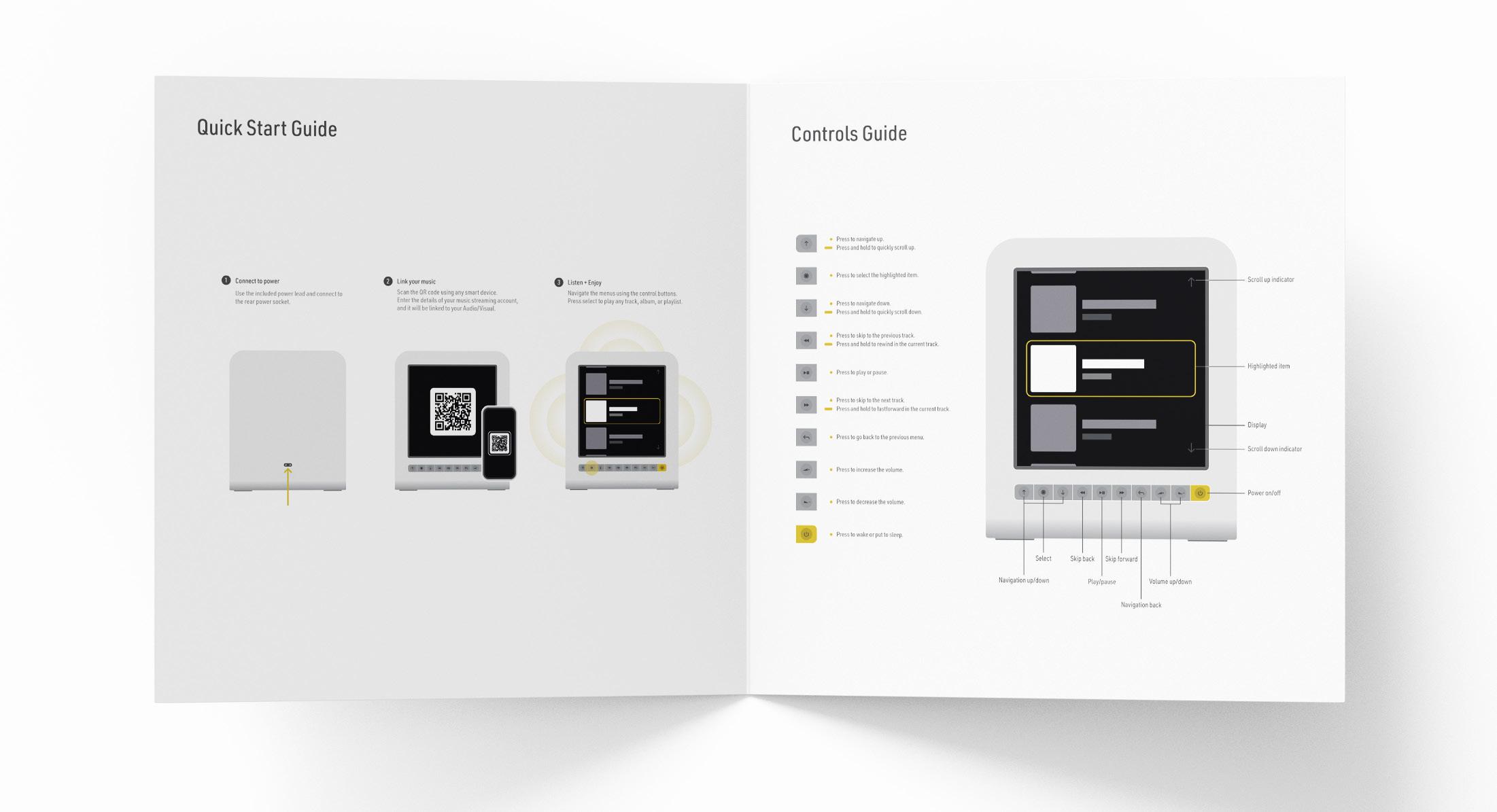
As the device uses a different interface and interaction compared to navigating a music library on a smartphone, I included a brief guide to the controls. While the navigational controls are relatively intuitive, this would help communicate the intended interaction with the device.
39 | 03
Detail 40 | 03
Liant inte num nonsequam fugit, sandend ipicabo. Ciae nonse laut dolente mporem a vendign issitat iorrunde cupidel expedis volupta
Page title
43 | 03 George Hill | Product Design Portfolio | April 2024
