
Greg Ambrovics Greg Ambrovics


Curriculum Vitae Greg Ambrovics
Lead Designer
Ambrovics Greg

Hi! I'm a lead UX/UI and product designer with 10+ years of experience.
I have graduated as an Industrial Design artist at MOME, before that I graduated as a mechanical engineer at BME (both in Budapest).
I started my professional career by a founding member of a multi-awarded start-up (Hitchhyper).
After the start-up experience I spent 2 years of freelancing / agency creative work for Hungarian, Dutch and Swiss clients on several UX/UI and marketing projects.
Then I spent 5 years in the banking sector in various UX/UI positions: I was a UX consultant for MKB for 1.5 years, then the UX/UI team lead for a banking software company (Appello) for almost 3.5 years. There later I became the manager of the marketing team in parallel.
During my years focused on banking and finance, I got luck to continuously work on digital transformation and customer experience-based projects both on the bank and and on the IT supplier side.
For the past 3 years, I have been working at EPAM as a Lead UX Designer.
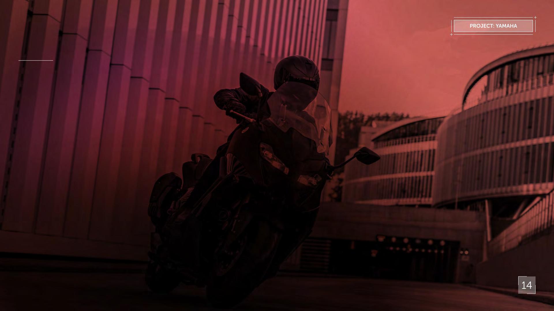
Here, I constantly work in international teams for clients such as Yamaha and Qatar Airways, and I also gave presentations in the Hungarian and global EPAM mentoring programs.
I was mentoring courses on UX and UI topics in the past 2 years at xLabs. Currently I am the course lead of the UI courses there.
Hard skills
Strong visual sense
Mobile APP design
Creative graphic design, key visual concept
Interaction design
Prototyping
Experienced team lead and mentor
Illustration
Personality
Sense of humor
Strongly creative
Team player
Reliable and helpful
Able to be fast or very detailed - based on the situation

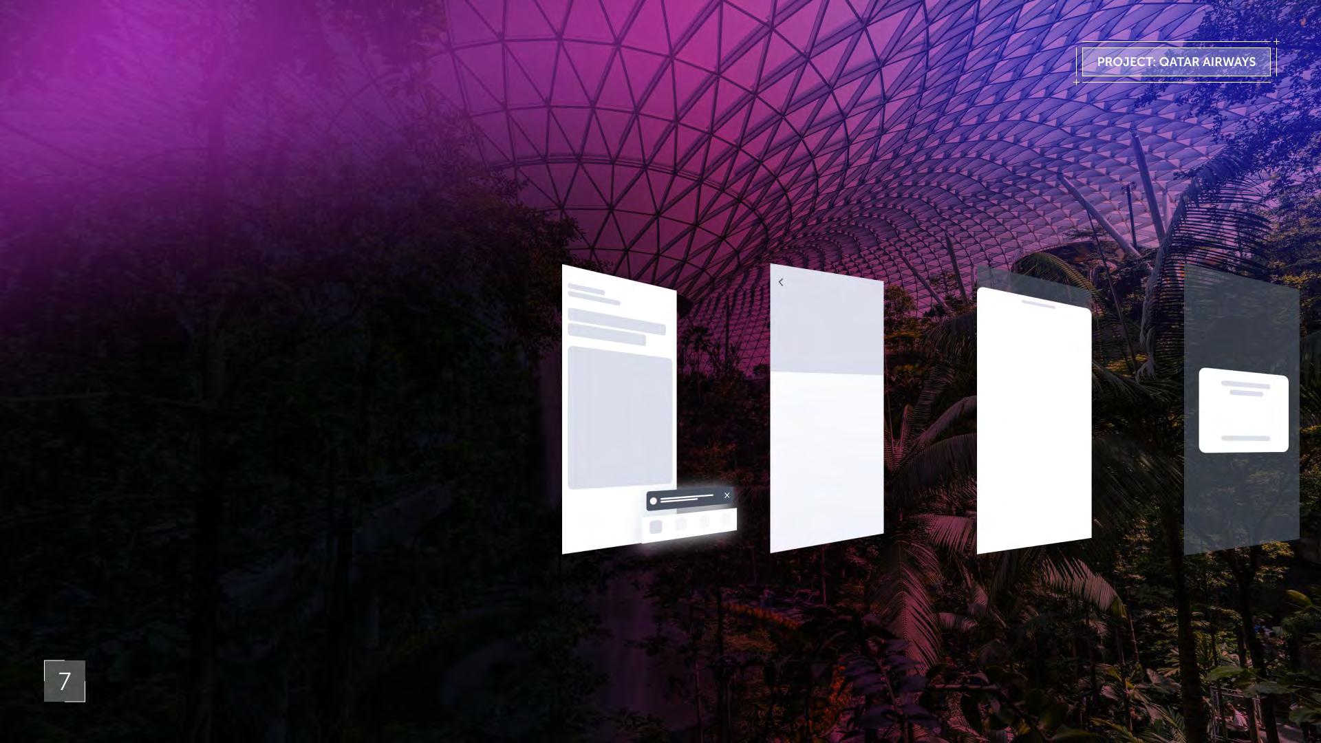
Project Qatar Airways Native Mobile


Qatar Airways
Desing System (iOS/Android)
Year: 2021-2024
Project description
Qatar Airways, a renowned global leader in the airline industry, has consistently received accolades as the best airline in the world for the past six consecutive years. In its continuous pursuit of excellence, Qatar Airways has embarked on a journey to enhance the digital experience for its customers both on responsive web and on native mobile systems (iOS and Android).
The significance of these redesign and development tasks were underscored by the imperative to partially set up and use the new digital identity for the 2022 FIFA World up.
Recognising the paramount importance of delivering unparalleled service, Qatar Airways has partnered with EPAM to elevate its customer experience and engagement to even higher standards - ver the past three years, I have played various pivotal roles within the project, demonstrating versatility and expertise across different domains
Initially, I served as the owner and maintainer of the design system libraries for both platforms, assuming ownership and responsibility for its maintenance and evolution
Subsequently, I transitioned into the role of the designer of the Profile POD In the most recent phase of the project, I assumed the role of designer on the Booking POD.
Defining the iOS / Android Experience Design Guidelines
In the ever-evolving landscape of digital design, where user experience reigns supreme, the importance of building a comprehensive design system and adhering to a meticulous naming convention cannot be overstated. These two pillars serve as the bedrock of efficient, scalable, and cohesive design processes, offering a lot of benefits to both designers and Qatar Airways organisation.
Layering
The app uses a very minimal structure, both in content and in layering of components. There are only 4 layers total for items to stack on top of the another, and almost never at the same time.
The base layer contains the heart of our content made up of the primary pages and subpages. The navigation appears where appropriate on top of that, along with in-app alerts.
Vision Objectives
Exemplify unsurpassed comfort - Demonstrate an empathetic understanding of the customer experience within the “new normal” of air travel.
Provide personalised services - Anticipate needs in every stage of the journey by knowing them and meeting them where they are.
Access exclusive experiences - Appeal to customers’ aspirations, providing VIP treatment that makes them feel special.
Drawwrs layer on top of the base layer while using a screened-back background to show through to the base layer, so users always know the context of the content they’re looking at.
Finally, custom pop-ups alerting users to necessary actions they need to take to continue their journey appear on top of the rest of the content. Like in the case of the drawer, a screened back background shows the content below.
The Qatar Airways app is where our customers feel the most cared for
Main page Nav / Alert
Drawer Pop up Landing / Sub page
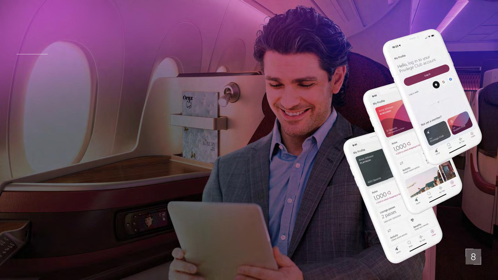
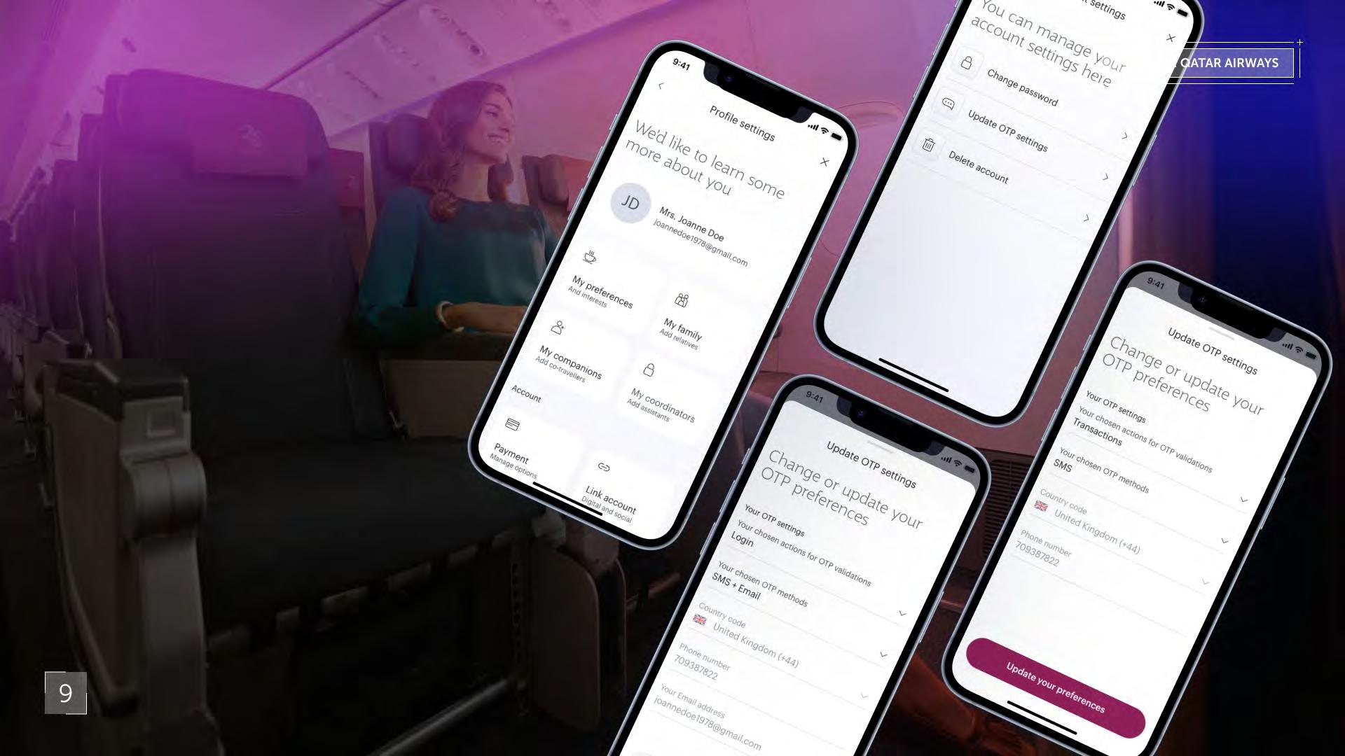
Mobile Profile Experience Qatar Airways
Project description
The Profile handling empowers mobile apps to deliver personalised experiences tailored to individual users' preferences, behaviours, and demographics. By capturing and analysing user data, such as browsing history, location, and interaction patterns, apps can offer tailored content recommendations, targeted promotions, and customised settings.
Effective profile handling streamlines the onboarding process for new users, enabling frictionless account creation and setup. By capturing essential user information upfront and guiding users through the setup process, apps can minimise drop-off rates and maximise-user engagement from the outset.
During the past years we have to solve some of the crucial problems of the previous versions of the application - such us updating the payment options or introducing the photographic data entry. We made a lot of customisation for special events such as the FIFA 2022 World cup or Formula 1 Grand Prix in Doha. I was also working on some experience development tasks such as changing the old Qmiles from the privilege club to the current global Avios point system. Year: 2022-2023
Project Feedbacks
“Gergely doing very good job on QR Mobile APP Profile POD. He runs the pod alone, plus he is the key Visual Language guy, he owns the components libraries.”
“Yes he is a Very good team player, he as time for everyone.”
"There is not really possibility for him to practice leadership tasks. He is doing his job perfectly, we have a great cooperation, Greg's presence is a big helpespecially with the not so independent engineers we are working together with."
Airways
Mobile Booking Experience
Year: 2023-2024
Description
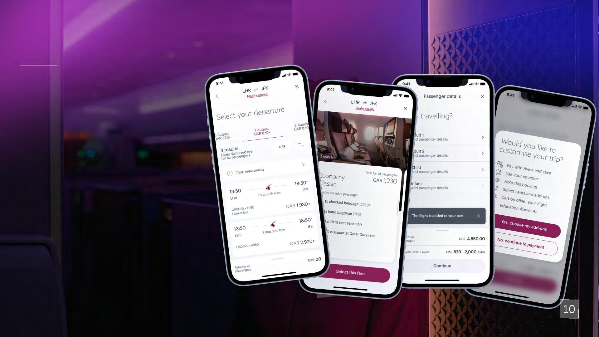
As I continue the work of a previous designer on the Profile POD I mostly used the existing UI KIT from the design system and for the last 9 months I was working on a legacy task - the fast checkout flows and related tasks.
From high-level ideations until the Hi fidelity prototypes and the design deliverables.
Project Feedbacks
“QR is a challenging client but it's a good project for airline UX experience. I know Greg has much broader interests, would be good to discover his skills on a more creative project.”
“definitely YES. He should have a more challenging role, as his current role is not enough challenging for him, and he is much more talented and experienced for that role, what he is doing now on the project.”
“Absolutely, it is always nice to be able to work with team members who are effective and easy to communicate with.”
Airways
Native Mobile in numbers
Used Tools M
Work in numbers
My responsabilities
UX re earc e
U ab l ty te t n
UX app ng Ex t ng and co pet tor ’ flow
De gn Sy te a ntenanc
UI de gn ba ed on t e de gn y te
UX/UI De gn for profil
UX/UI De gn for book n
H fi prototyp n
Contr but on w t t e
DAS Tea De gn
Sy te a ntenance
Participation
UX re earc
Stake older pre enat on Ag le d cover
De gn Sy te a ntenanc
Product de g
De gn Proce (D covery, define, de ng, del verable H g fidel ty w refra n De gn Handover docu enta ton
Mont ly pro ect new letter
Yamaha Motor Experience Audit

Project
Omni-channel Experience Audit Yamaha
Year: 2021
Project description

The client was one of the biggest Japanese personal mobility manufacturer, the Yamaha Motor Company.
This project was in 2021, right before the European launch of the eBike product line - the company wanted to simultaneously build on its existing, strong brand and create a separate, fashionable ,fresh, shiny identity for the new product-line.
The project mid-long term aims were actualising the current visual identity, relaunch the poor-performing international web shop and build a stronger web-community with its already existing users/customers - as primarily the company focused on their dealerships as its main sales and customerrelationship channels.
Analysis of the omnichannel experience
As an input into the design of the client’s omnichannel experience, the EPAM team have undertaken a UX audit to identify quick wins, usability improvements, opportunities and uncover areas where should be explored to improve the experience, increase sales and deliver a seamless experience for customers.
My responsibility were to make UX/UI audit based on usability heuristics and competitors websites.
Later on a second iteration round we started to design key wireframes and flows for the future website.
2021- Proposed Navigatio level
Table of categories and their selling points
Differe tiate betwee guest a d registered users journeys.
It is very important to offer the clients the information and product offers that are relevant to them.
It was also important to add new features that are able to stren then client en a ement
Adva ced earch optio
Product compari o Product co figuratio
Fi d my ize - hi t for choo i g the right phy ical dime io Stock availability i formatio
F A Q
Chatbot/Co tact
There should be an option to change location/ language on the landing page, but not as a prominent page.
The landing page is the place where the whole product range can be discovered.
If we know about a registered user that he/ she is a motorcycle enthusiast, the content reflect to that.
The actual product page is available in a much shorter way, even through shortcuts like “special offer” or the result of a detailed search.
The product comparison and the configuration options are part of the website, needn’t to download any separate application.
We added many new features to the product page to help strengthen the client engagement to the chosen product.


I can summarise the most important findings in the following 5 points:
1: Omni-channel means seamless web journey
Try to avoid forcing the user to change across multiple channels (Web, application, email, local dealer). It is necessary to strive to make all channels equally strong.
2: Offerin as many help to the customers as needed
Learn from the competitors best practices: Giving more hints to choose the fitting product online (configurator, size guide, chatbot, etc. ) and than offering free trials and test rides make the future customers more engaged.
4: Don t try to use the same experience for wide ran e of products
Different product lines need different marketing and journeys if there is the same template for a lawn mover a motorcycle and a wave runner, it will be suitable only for one of the product lines.
3: Keepin touch with the existin customers
The user s ourney never ends with the purchase the important memories came just after...
Most companies forget that using a product during its lifecycle is a very long period compared to the actual purchase period and these companies are loosing trust on not keeping touch with their customers.
5: Think with the head of an inquirer, not with the head of a P.O.
The inquirers often have very little idea about the relations among the products, their interest is often impulsive the UX have to help them to find what they are interested as soon as possible. There is no marketing text that solves that issue if the user can t receive the expected information.
X desi ner - Wireframe ser journeys and user flowsmappin the experienc Heuristic audit of the client and its competitor Card sortin sability testing

Appello Banking Solutions
PAST ProjectS Before EPAM
Engine Decision
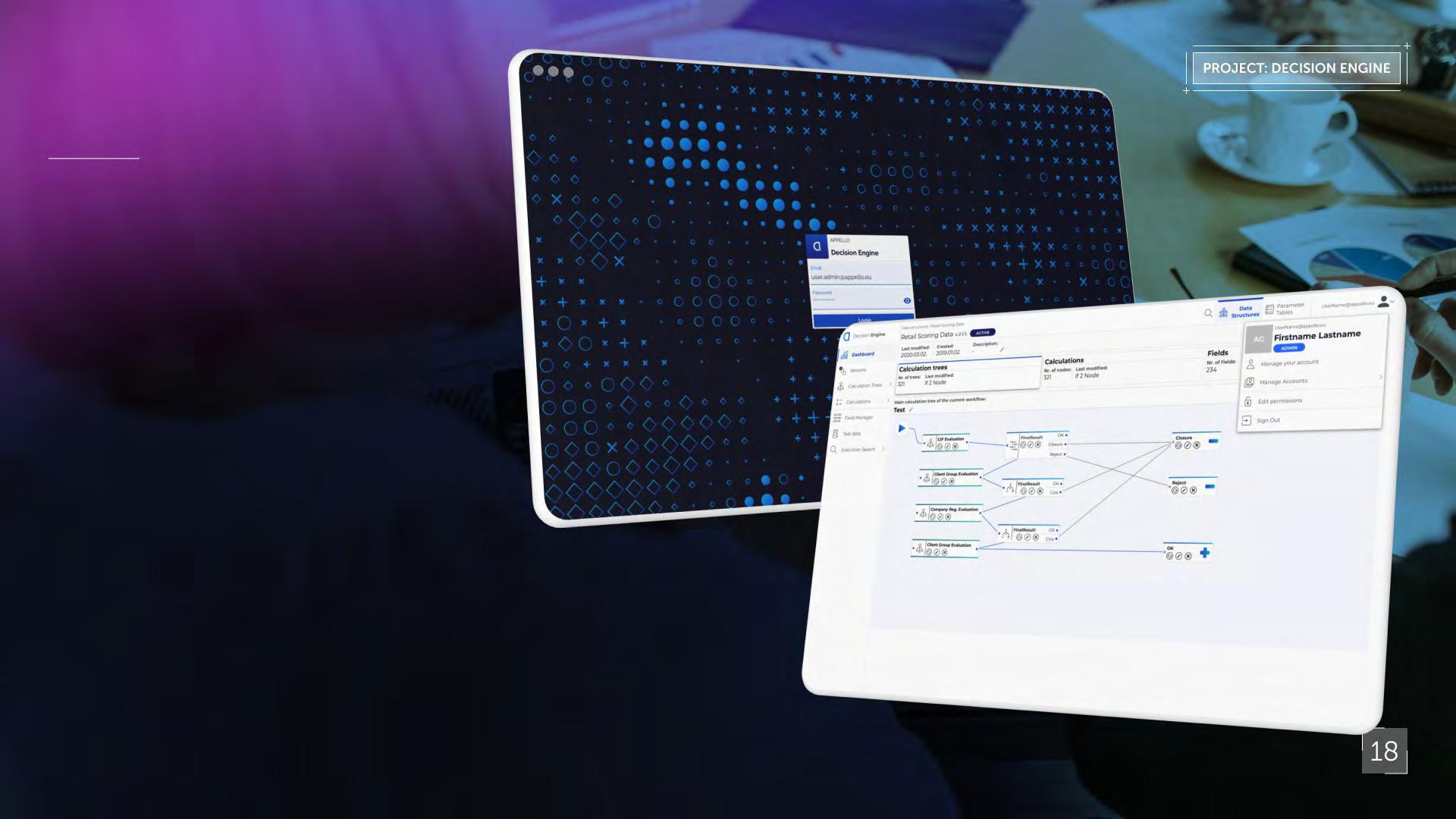
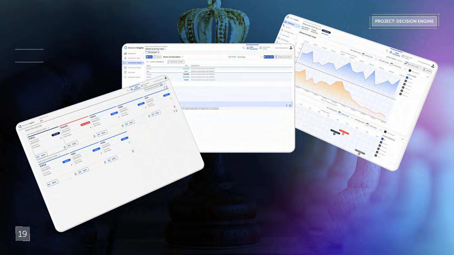
Project description
The Decision Engine can work for pre-screening, classical scoring and any additional decision points in any complex lending workflow. It is capable to handle an unlimited number of different or similar decision logics, which can differ by customer segment (including sub-segments), product lines, product variants, etc.
The models can be different by product or client sub-segments. They can be versioned and test-live models can be compared (champion-challenger). All parameters within the system are base parameters therefore mass upload of data components are feasible through excel files.
The built-in decision tree editor enables users to analyse results and gain more knowledge on approvals or rejections. The system was developed for banking segment, focusing on lending workflows, but the final product is able to work as a stand-alone Decision Engine.
I had chance to start a new product-line from scratch with the in-house team at Appello. We could work on the most up to date web technologies without implementing any legacy solution.
The team was working in a squad of front-end, back-end developers, a project manager, 3 business analysts and the in-house design team (3 people).
If you want to know more about the product:
https://appello.com/decision-engine/
Crypto-trading website concept Fundastic.com
Project description
Fundastik was a defunct start-up project.
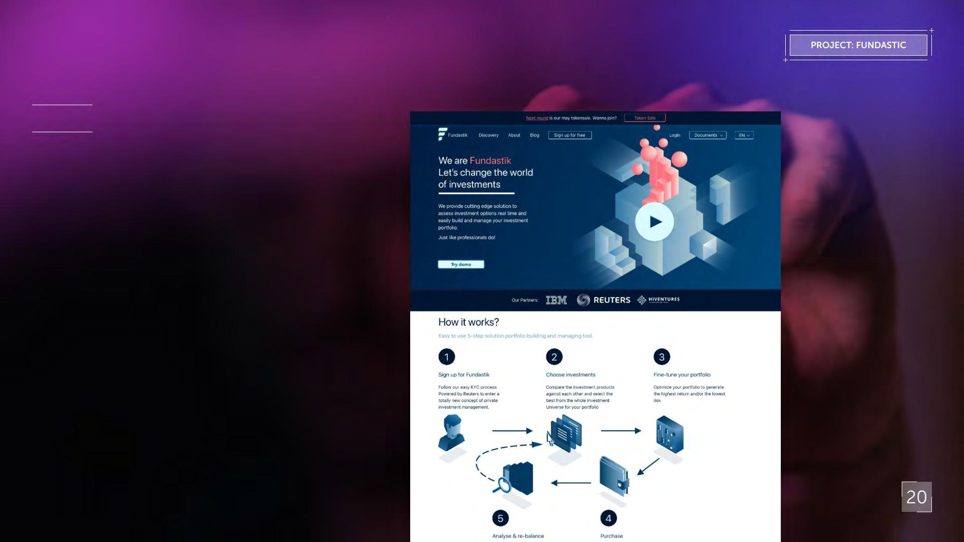
The branded materials and the first iteration of the UI were finished before the project was cancelled. The team made several user-testing on prototypes and a P.O.C. was made for testing the data sources and visualisation, but finally the project never reached the development phase.
The idea came from the then mainstream boom of crypto-currencies for small, private investors: building a user-friendly and visually stunning investment platform.
Meanwhile the start-up failed, there were several features planed in the concept which later became mainstream functions in contemporary stock-market platforms ( such as brokerage linking, interest-risk visualisation, crypto comparison, etc.).
Coal Map Europe
Infographics and webdesign
Project description
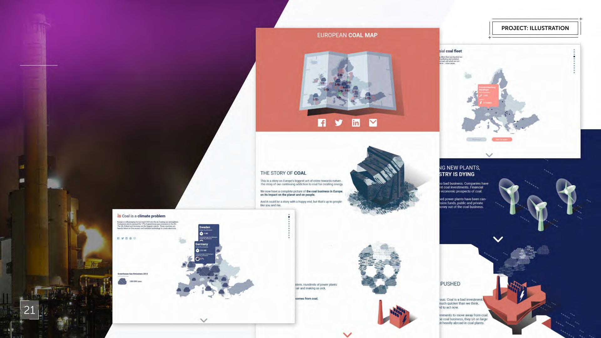
CoalMap-Europe was an informative website, sponsored by Climate Action Network Europe.
The website had 8 versions of different interactive maps, which visualise coal greenhouse gas emissions, coal pollution, coal power-plants, the actual owners of these power-plants in the pipeline, where the money and subsidies come from and what renewable capacities were built until that, what governments were doing that period ,etc.
Although the page has since been defunct, in the following article you can also read more about the project (the UI and some of the illustrations can be still seen here):
https://unearthed.greenpeace.org/2015/09/10/everything-you-need-to-know-aboutcoal-in-europe-in-one-awesome-map/
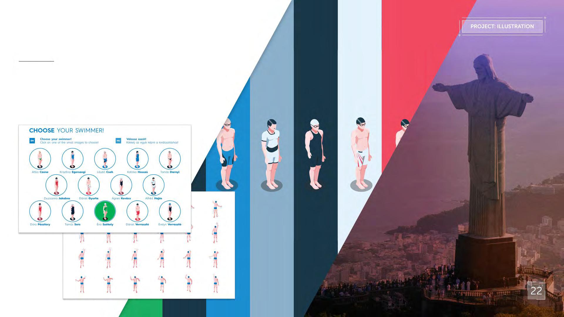
2016 Summer Olympics in Rio House of Hungary
I have worked as a graphic, UX & UI designer for House of Hungary, the hospitality house of Hungary in Rio de Janeiro for the 2016 Summer Olympic Games.
Project
description
For me the most interesting part of the project was designing the interfaces and illustrating a simple interactive sport game that paid tribute to the greatest Hungarian Olympic swimmers.
That year “House of Hungary”, the hungarian hospitality house won the exhibition's and visitors’ prize as the best and most innovative hospitality house.
https://www.behance.net/gallery/41975905/Swimming-Game
Thank you! Th