
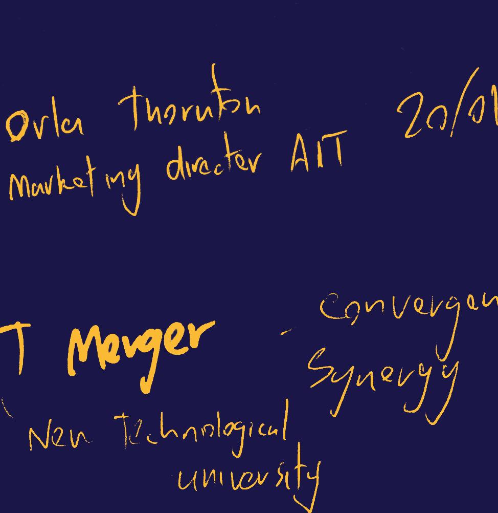
AIT & LIT Merger
Project Overview Aims Objectives
The Live Studio brief provides students with an opportunity to engage in some ‘real world’ design work as it deals directly with an external client. The brief deals with creating an identity for Athlone IT and Limerick IT, as the two entities merge to become a technological university. The brief requirements are to create branding, promotional & positional design, social media, signage & way-finding & information & editorial design for the emerging entity. It is vital in all areas to be sensitive and respectful in recognizing both entities, balance will be key.
By partaking in this brief, I hope to learn more about dealing directly with a client in a professional manner. I will learn to manage and self-direct within a real design brief, I hope to capitalize and expand on my existing design knowledge in a new area. I also plan to increase my knowledge on the subject of mergers in design.
To approach this brief I will need to establish a detailed breakdown of the project brief and the client needs to find exactly what is required. I will explore both existing identities in-depth to learn what truly defines them. My research will consist of looking at the current design approaches including the voice, tone, colours, brand assets, and type. I will also be looking at a range of any other existing branded materials from both entities to gain better overall insights.
Initial Stage

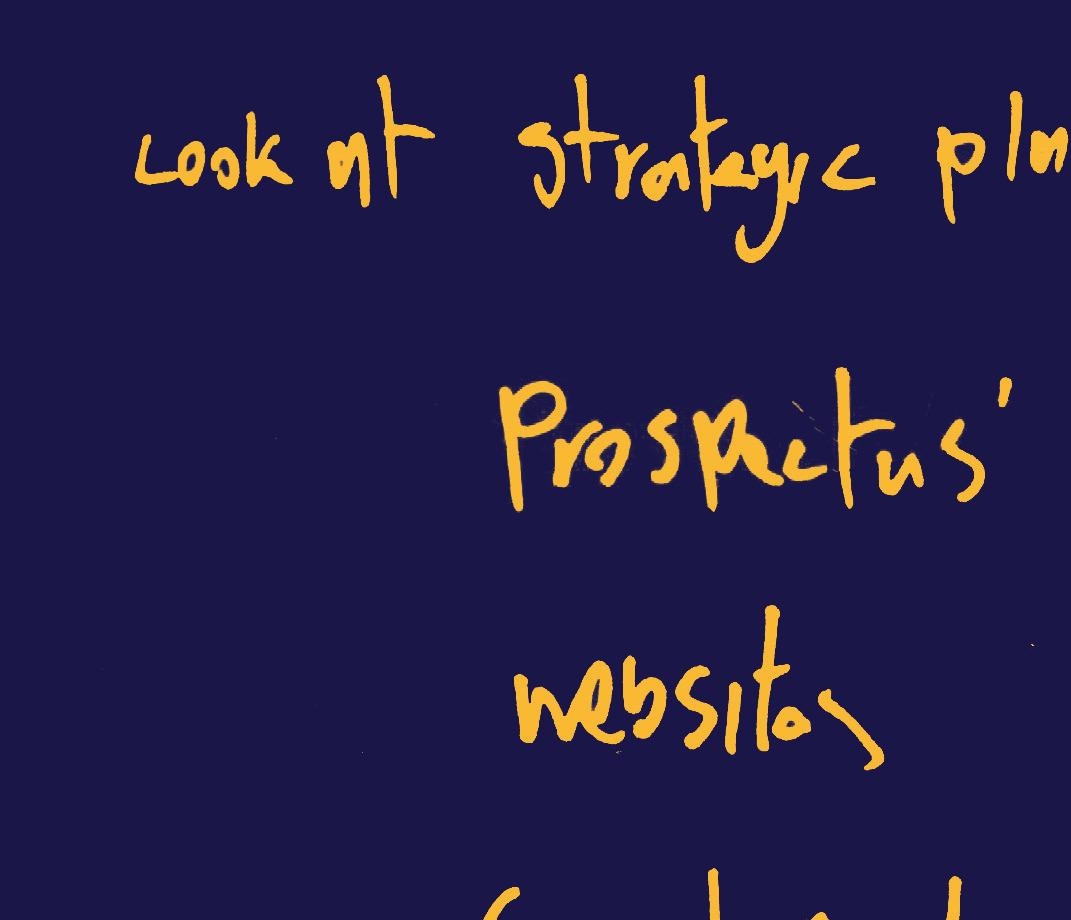
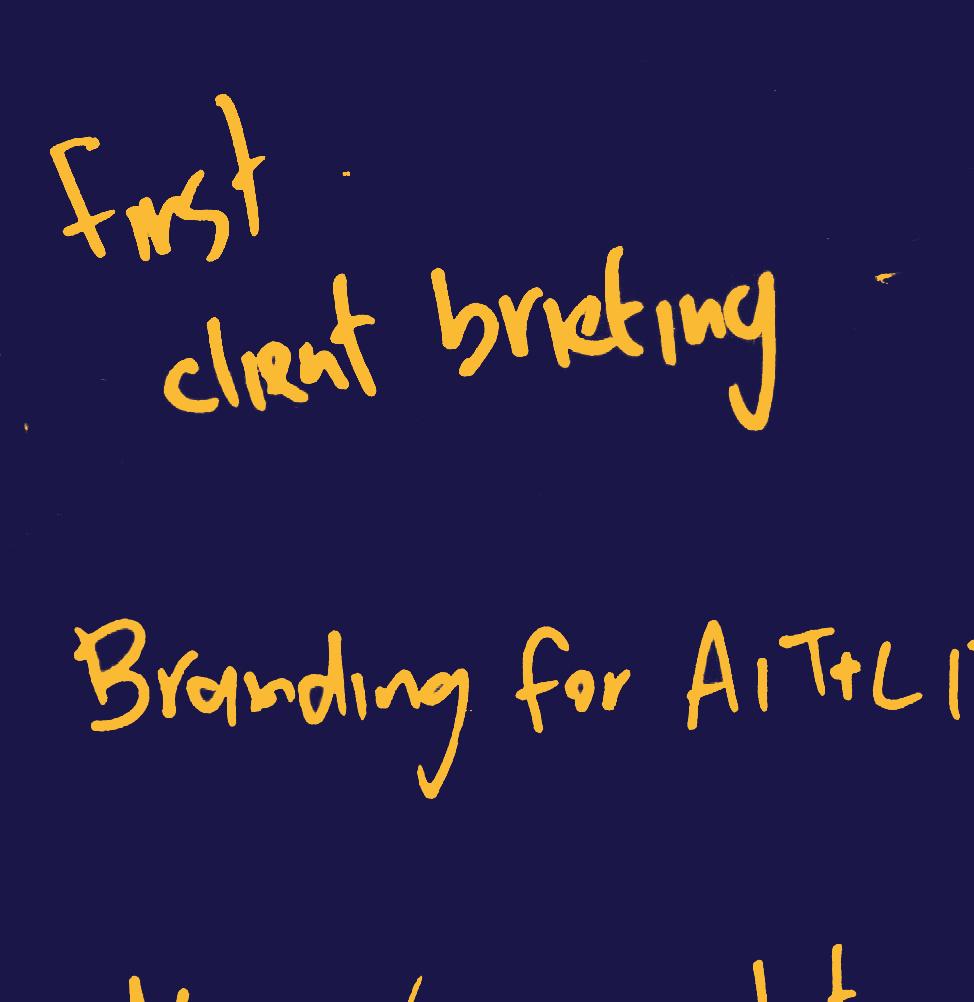
After the initial client briefing, we were advised to look at the strategic plans as well as the prospectus’, websites and social media of both colleges in great detail to get insights on the language and tone they use and to see where they plan on going in the future. The strategic plans, in particular, will be a very important and useful factor when developing the new identity as they state what already exists and what they believe their future holds.


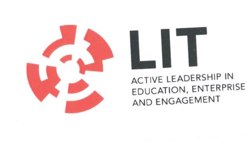

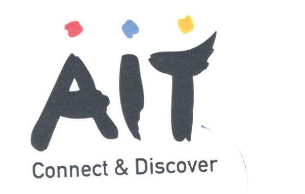
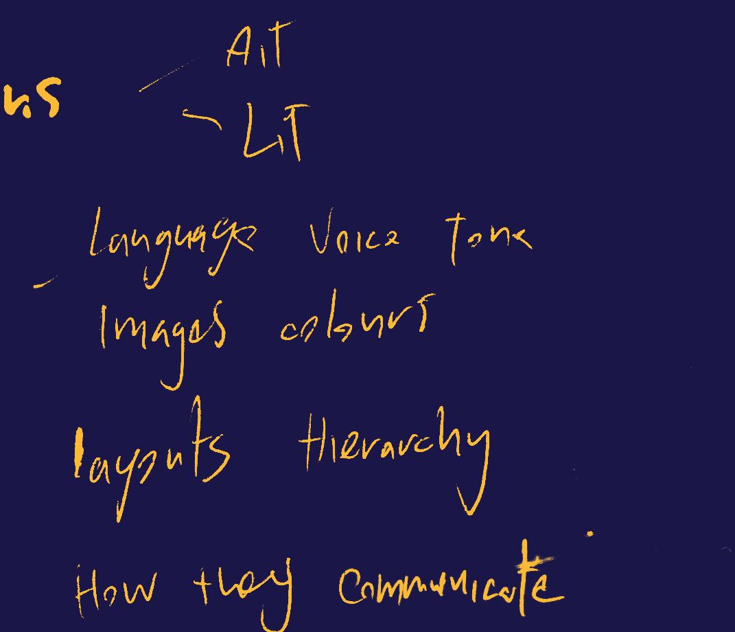
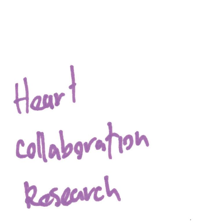
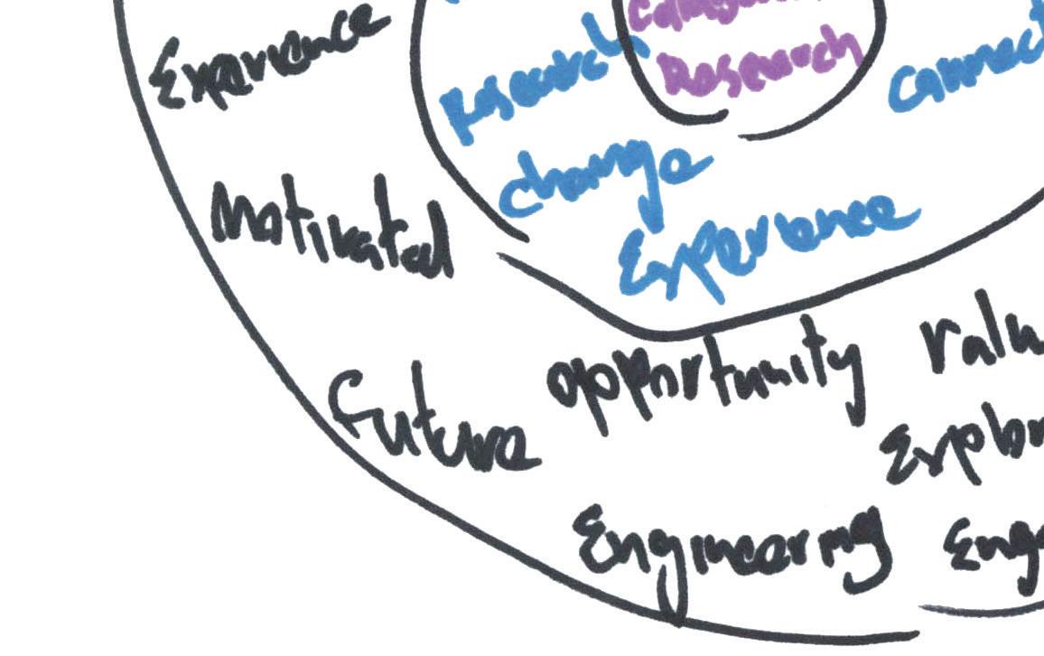
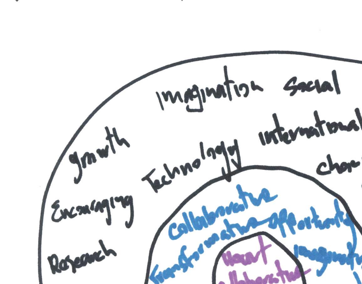
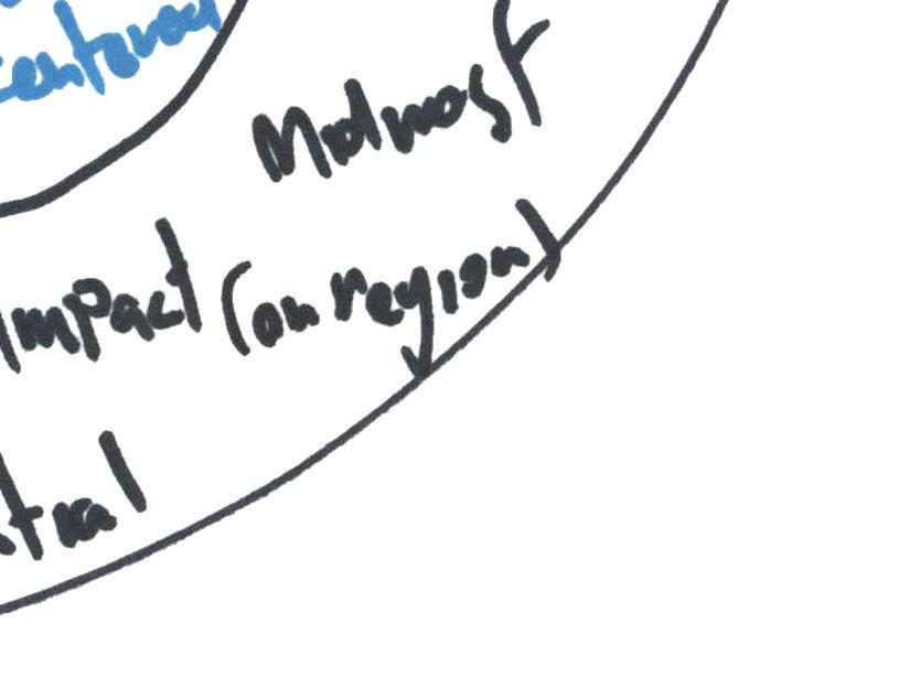
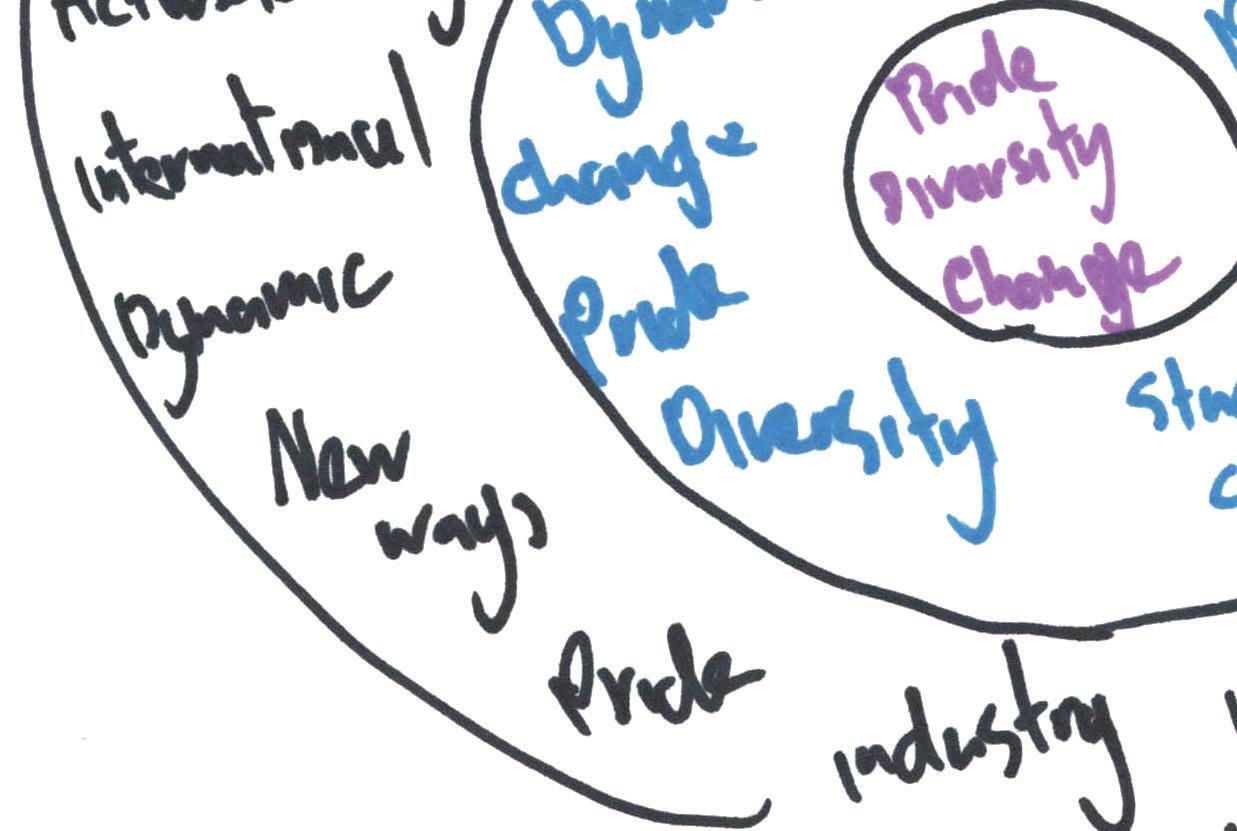
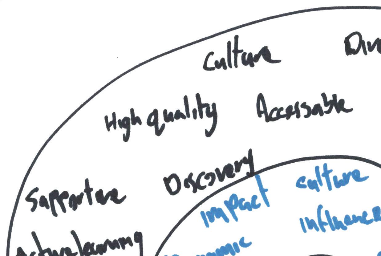
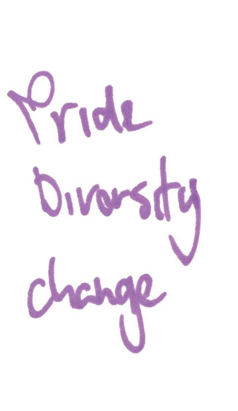
To begin, I conducted a reductive analysis from any keywords that were used and emphasized for each of the entities from their materials and online presence. The benefits of this research are to help define the existing identities so it can be used as something to begin building the new identity.





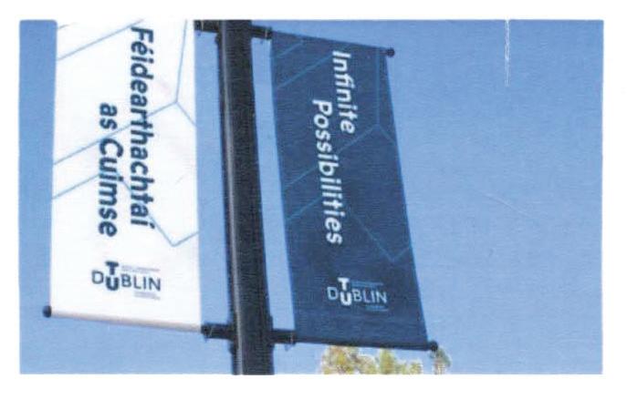
An entirely new type of University. TU Dublin is a dynamic and multidimensional environment fostering analyitical thinking and driving transformation and growth’.


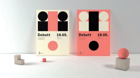
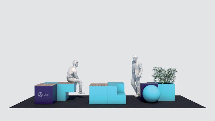
The city of Oslo has been given a new visual identity in an effort to build a stronger relationship between the municipality and its residents as well as clarify the public services’.²
Research
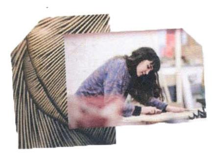
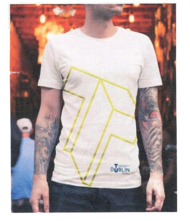
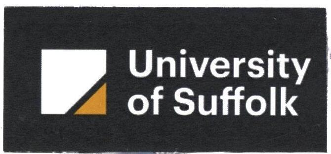
To continue my visual research I began by looking at other universities in Ireland and how they manage their branding and identity. This gave me good insights into what the university identity spectrum looks like in Ireland. This included the identity design of TU Dublin which is Irelands first and currently only Technological University. The identity was designed by Red Dog. It displays a good range of brand applications.
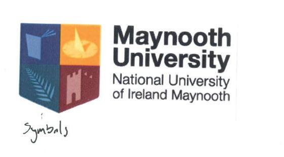
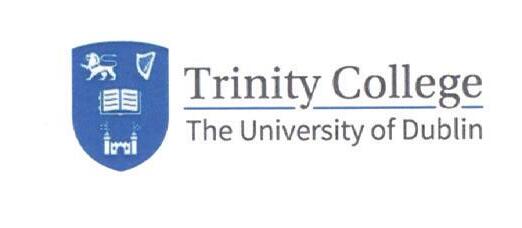
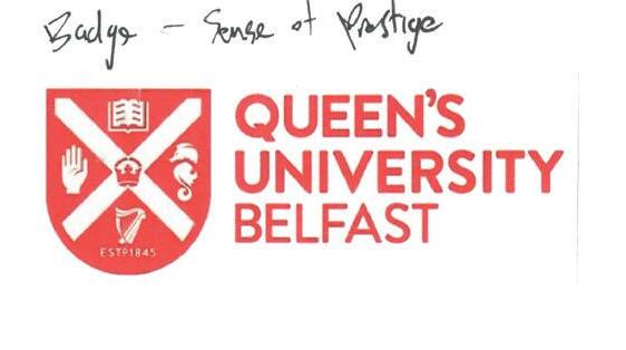
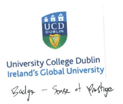
Another case study I looked at was the Oslo city rebrand by Creuna, which was inspired by the shapes of the city. This is a great example of branding of place. They created a flexible brand that can be easily used and adapted by many. It was designed to help establish and clarify a single entity within the city. It helps to bridge the gap between residents and the services of the city.
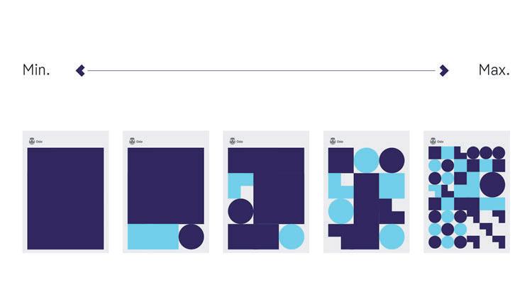
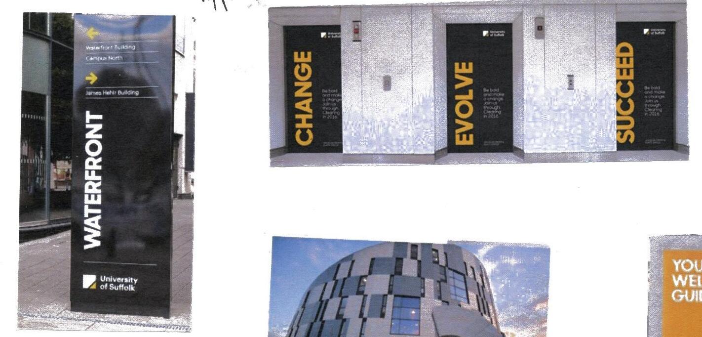
These examples appealed to me as they show a combination of branding of place and brand identity which is particularly relevant for this brief.



Nomenclature

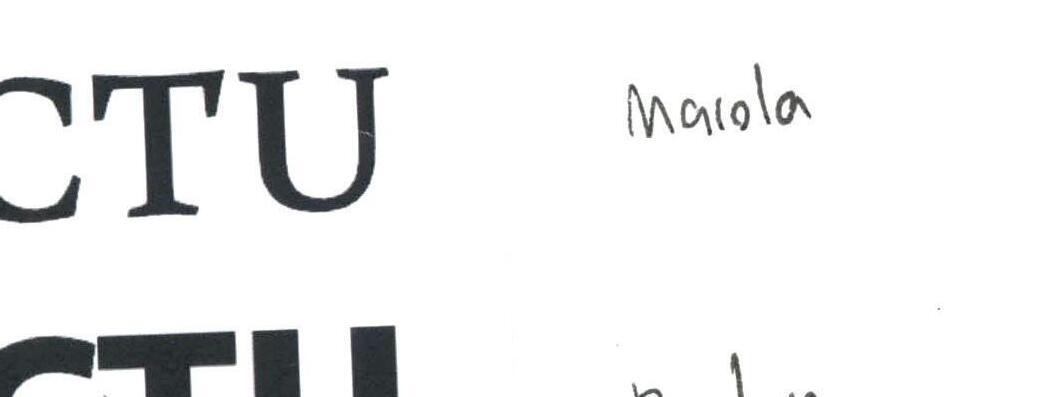


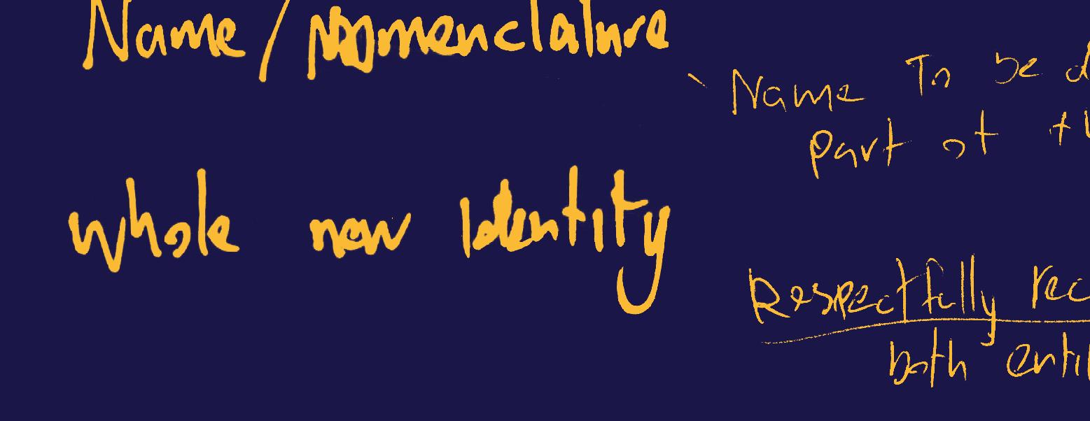
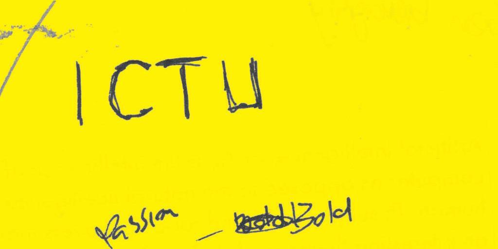
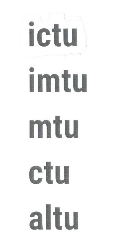
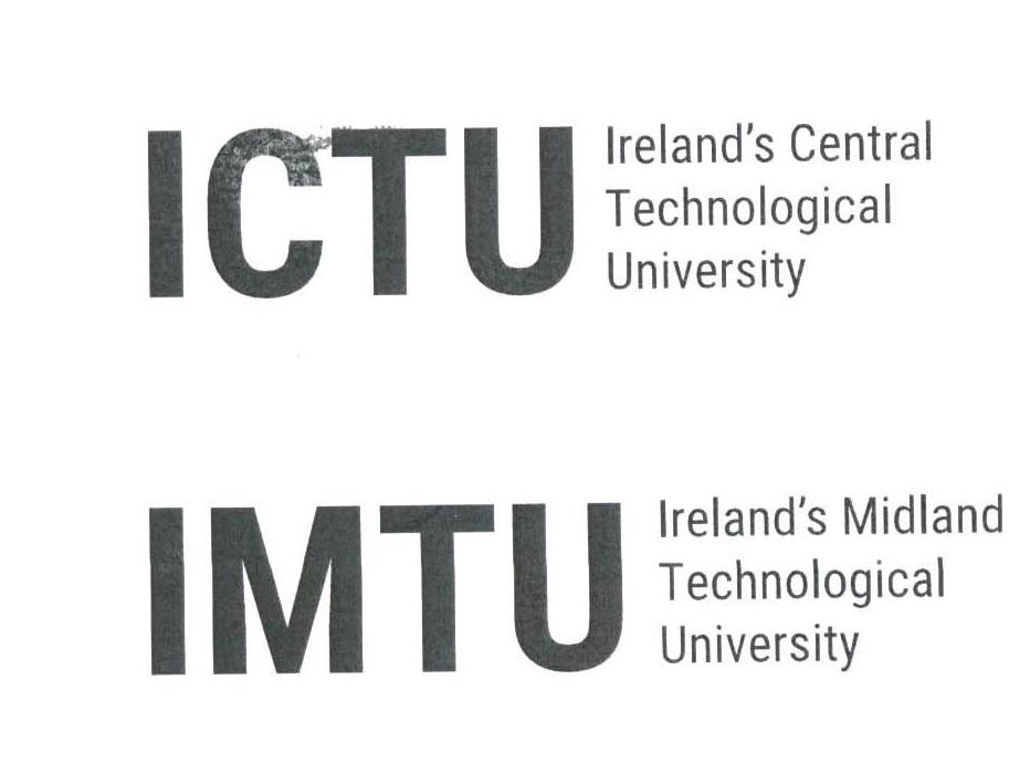
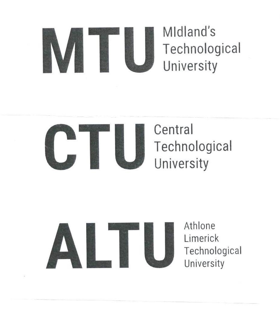
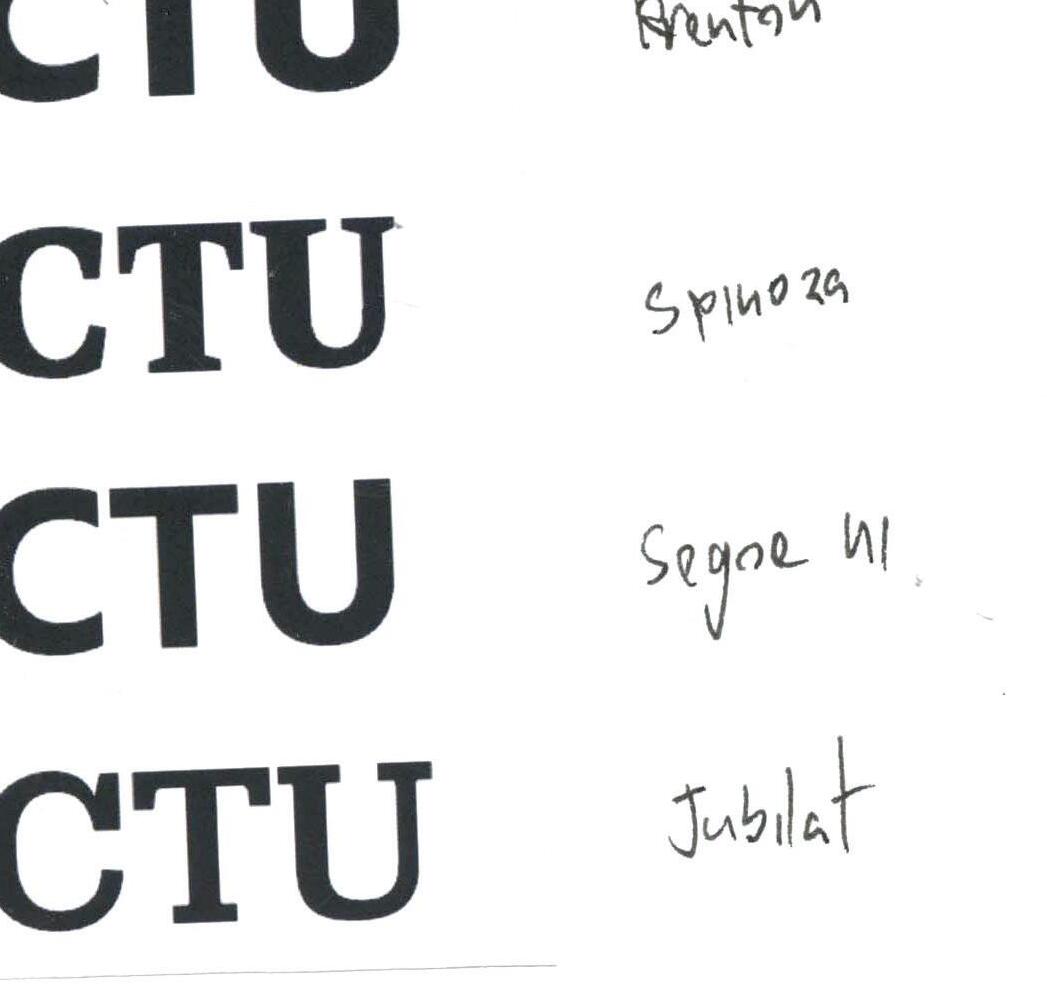
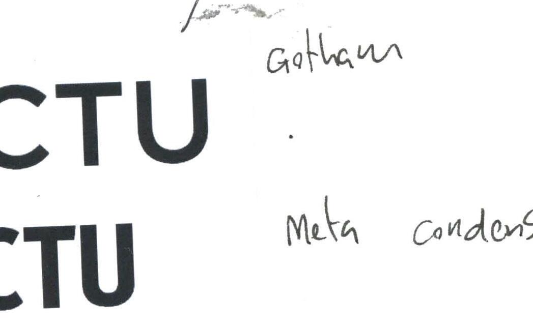
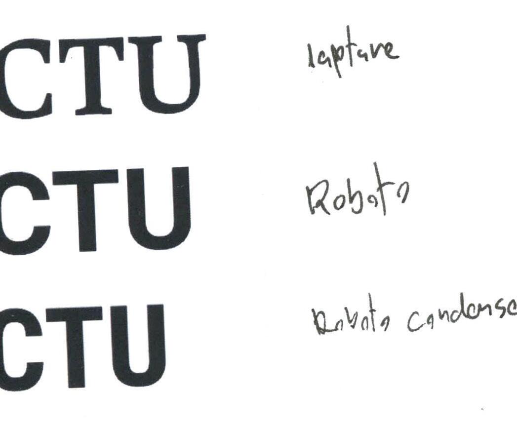
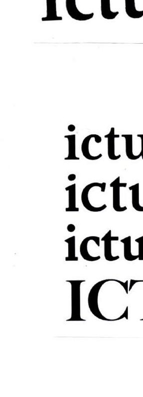
Part of this brief requirement is to create a name for the new identity. This part of the identity, in particular, will have to be approached sensitively as it must have a respective balance between both entities Doing this also offered an opportunity to look at possible letterforms to begin the visual experimentation. I began by typing out the acronyms of my name choices in a standard sans-serif font (Roboto) to get a clear idea of the form of both the large and the small accompanying text. I also tested these letters in various typefaces, serif, sans-serif, uppercase, and lowercase. My first preference was the standard sans-serif fonts due to their clarity, I found that some of the serifs became crowded on the serif fonts.
Ideation
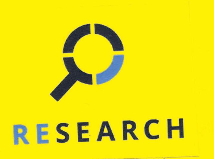

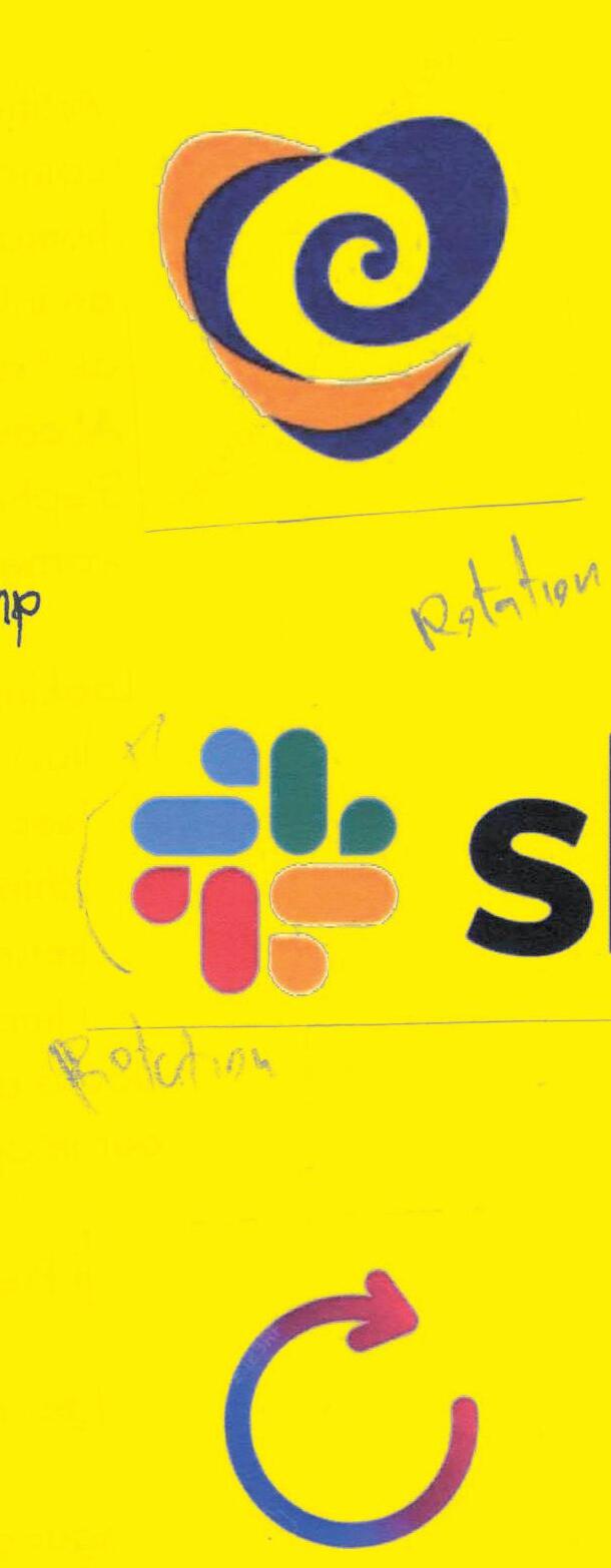

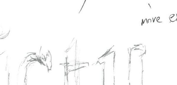
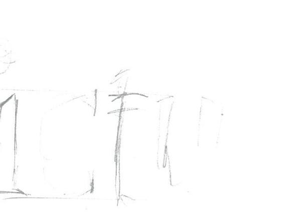
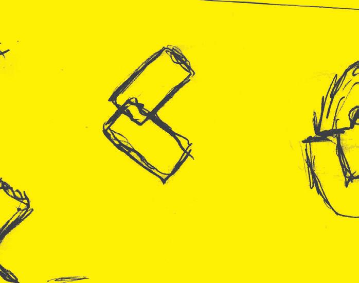
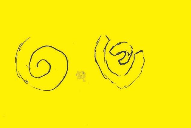
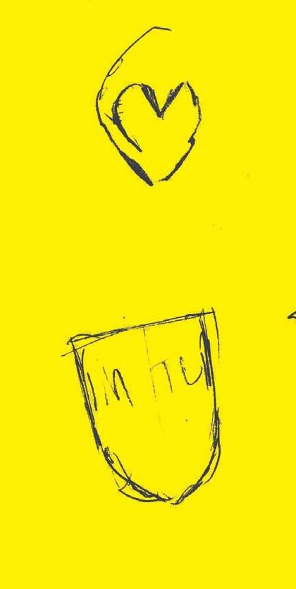
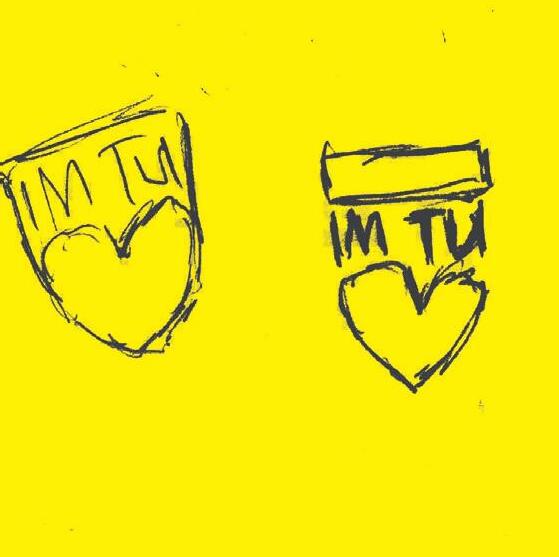
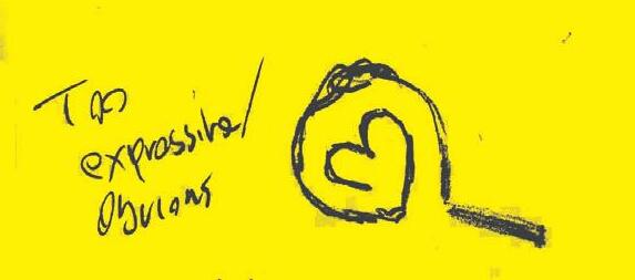
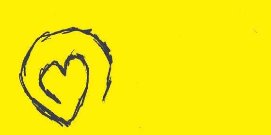
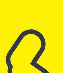
After having tested and experimented with some type, I wanted to try some ideas without type. The keywords which were defined earlier were a good starting point for this. I tried some sketches with hearts, arrows to indicate rotation or change, and some research-based ideas.


After experimenting and sketching for some time I didn't find much direction to follow. I felt that most of my ideas lacked the integrity of the institutes and could be misread as the imagery I was using could represent various different things. For these reasons I put these ideas to the side and began exploring different ideas.


ICTU Logo
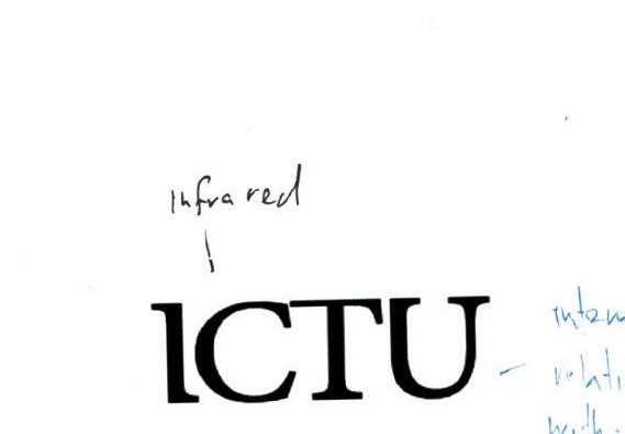



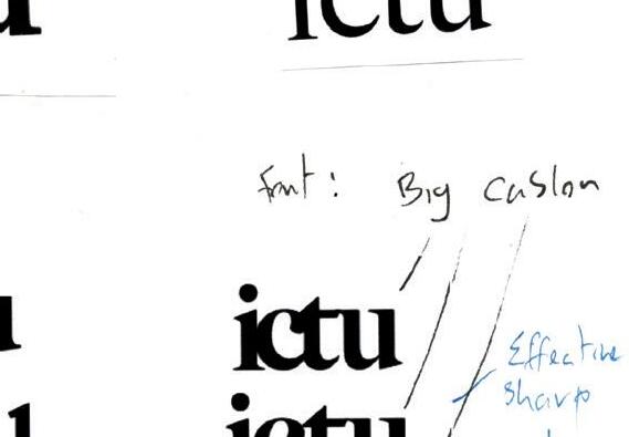
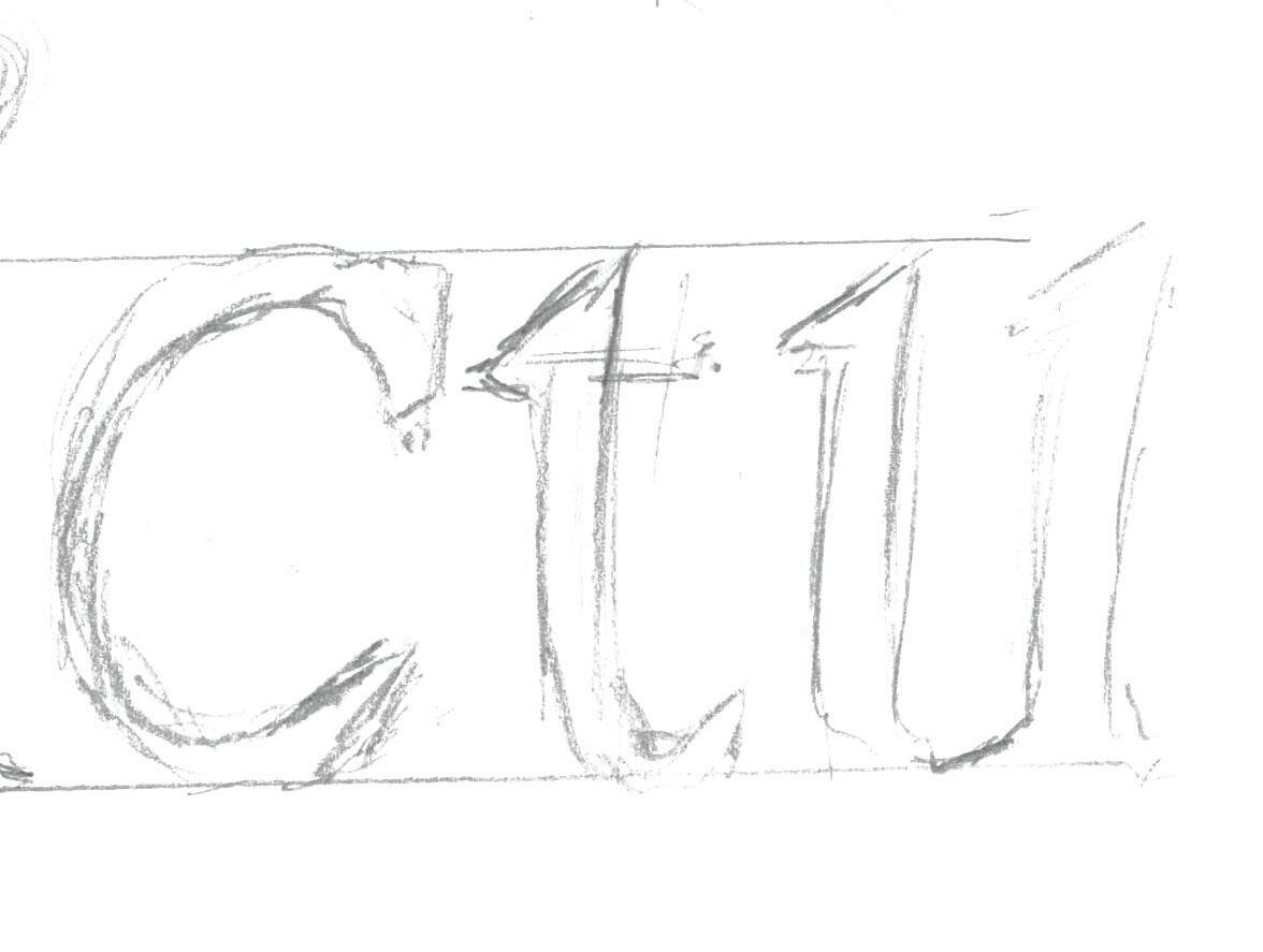
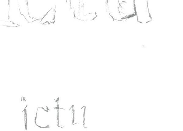
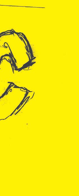
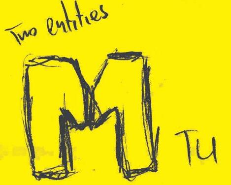
I tested some purely typographical versions As a lot of higher education places are known simply by their letters this is a good opportunity to bolster this name within the visual mark as it will be spoken. After being inspired by a lowercase font I experimented more letter variations. The lower-case font introduced some interesting letterforms with more personality and also solves the problem of the ‘I’ being mistaken for an ‘L’.
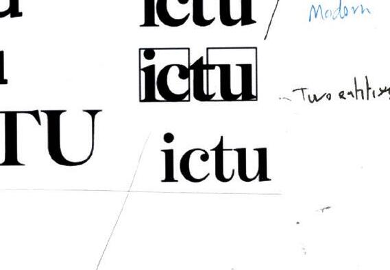
Sharing serifs between some letters could help with creating an interesting lettermark.


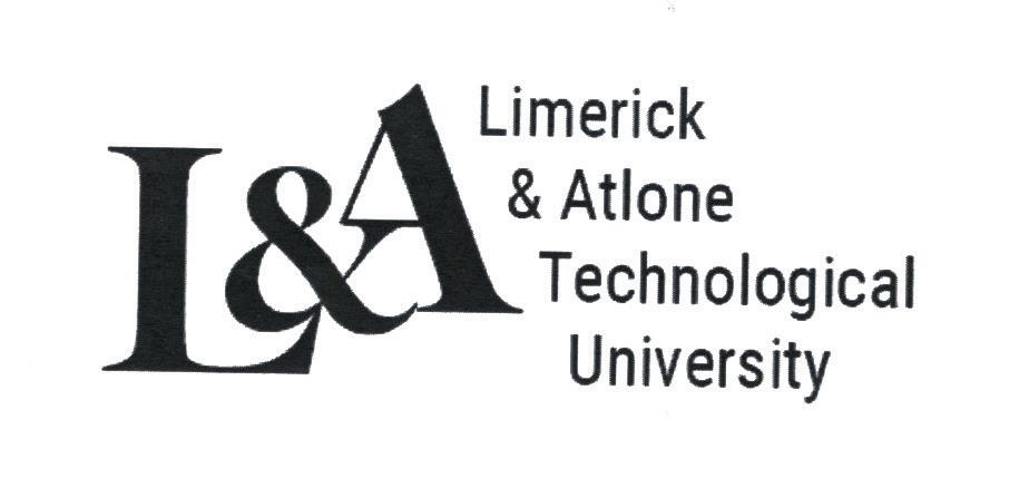
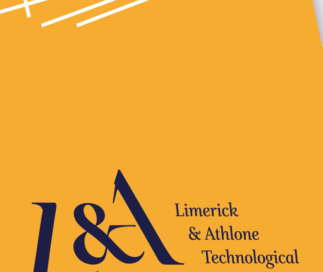
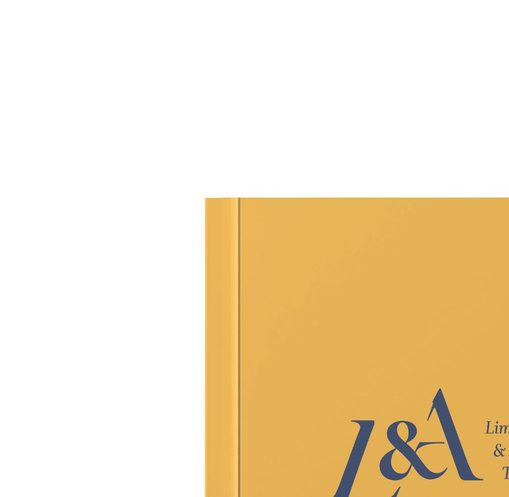
L&A Logo


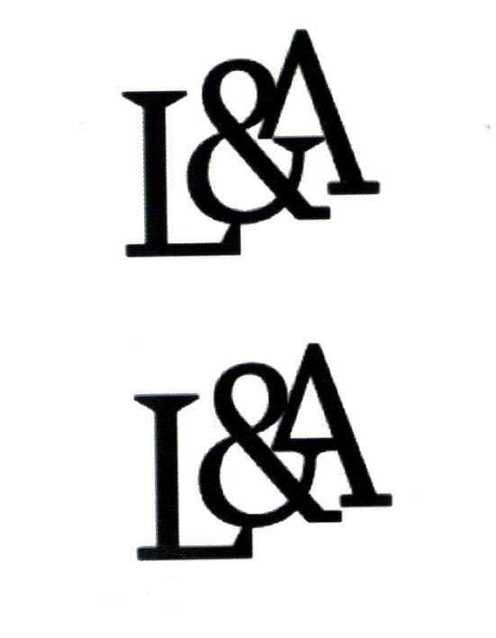
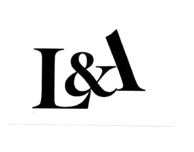
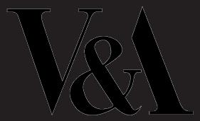
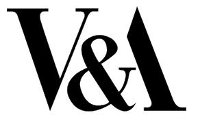
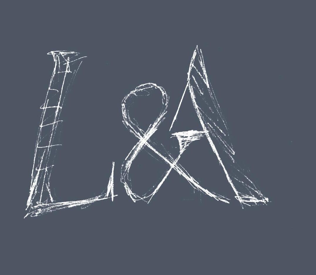
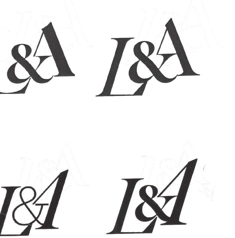
While researching some acronym and abbreviation logos for inspiration I noticed one with an ampersand which reminded me of the V&A logo by Alan Fletcher (Fig.18). This intrigued me to experiment with some possibilities. I found some good directions. A quick digital version I created revealed that the letterforms with the ampersand have a well-balanced form and definitely have the potential for a logo.
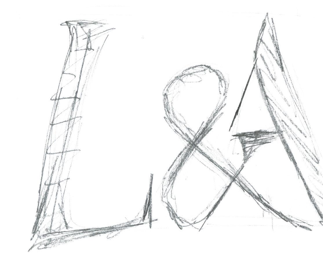
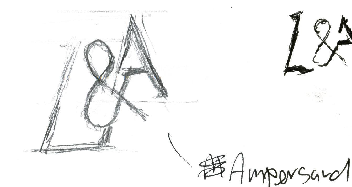
I then explored a wider range of formats such as different typefaces, different compositions, and adjusting the structure of the letters.
Equality and balance between Ballance between letterforms.
letters/ locations.
Aesthetically pleasing.
1st Potential Direction
2nd Potential Direction

First Client Presentation
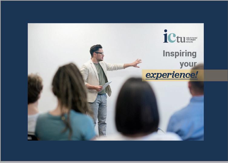
For the first client presentation, two potential logo directions were presented to the client, I showed some initial ideas, concepts followed by some sketches and how they developed into the two ideas as well as both logos working in quick digital mock-ups. With the goal of showing the potential of the concept working as a finished design.
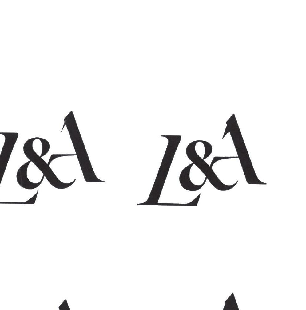
This turned out to be a vital part of the project as the client admired an earlier draft of this logo (Fig.19), which turned out to be a foundation for the final design. She admired the elegance, balance and simplicity of the letters. This feedback helped me to ideate and test with more versions of just the letters.
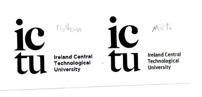
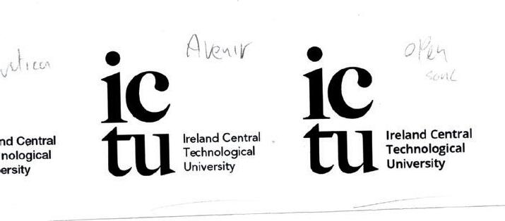
Feedback included interest in both logos and was advised to continue developing both ideas in tandem to see if one might become a clear frontrunner.
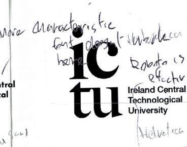
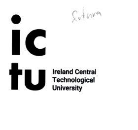
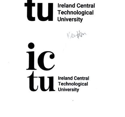
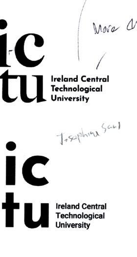
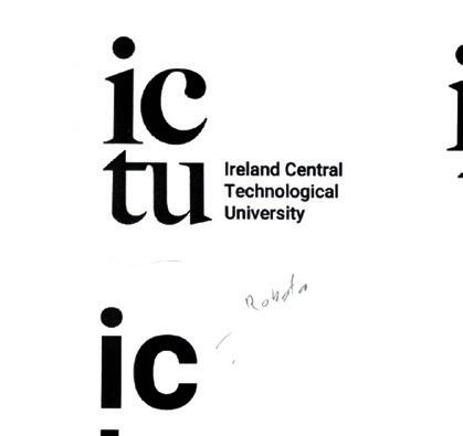
After testing a lot of versions with different layouts, sizes, compositions, typefaces I, with the help of lecturers and colleagues, decided that the L&A logo was more intriguing and had more potential going forward

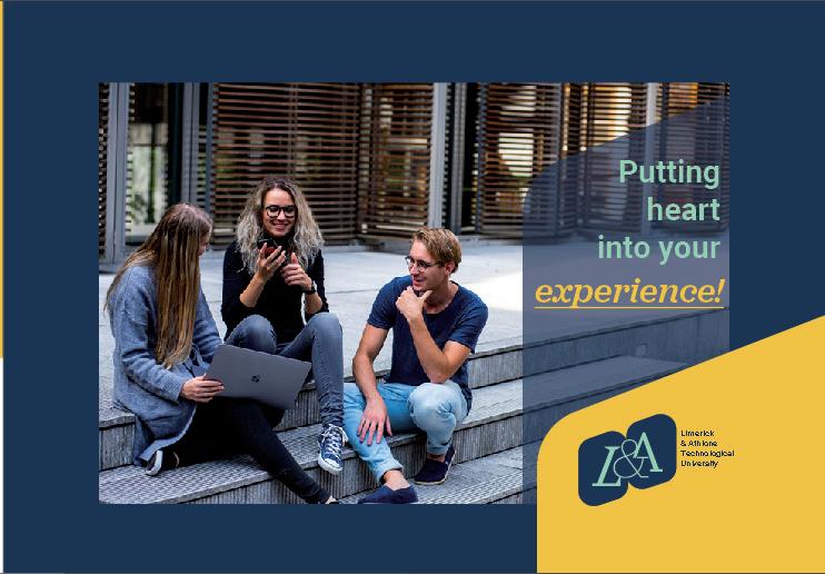 Ireland’s Central Technological University
Logo Development


This direction required a lot of trial and error. I tested a number of different things such as different typefaces, weights, compositions, angles, and adjusting different sections. This process was rigorous but also very rewarding as I believe I achieved what I set out to do.
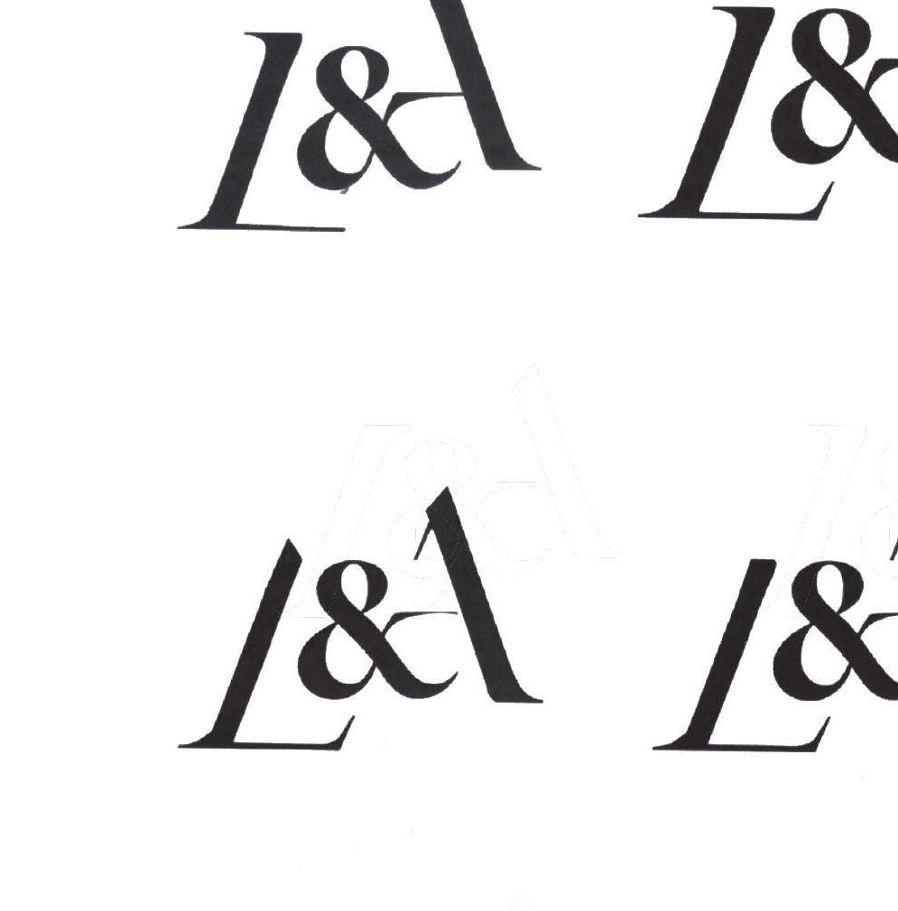
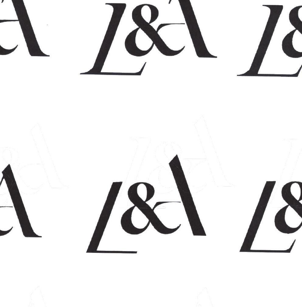
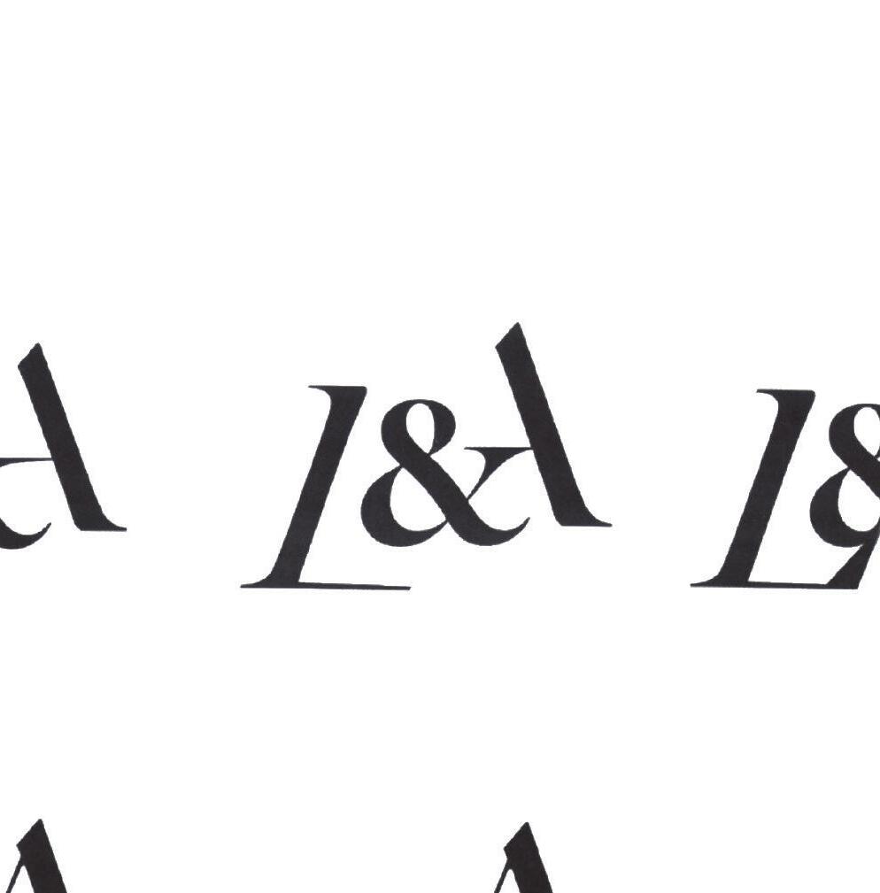
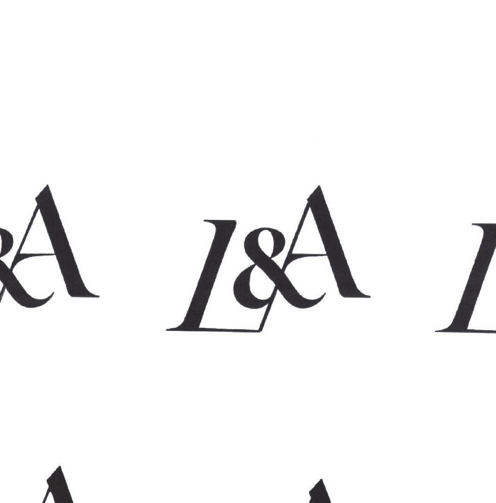
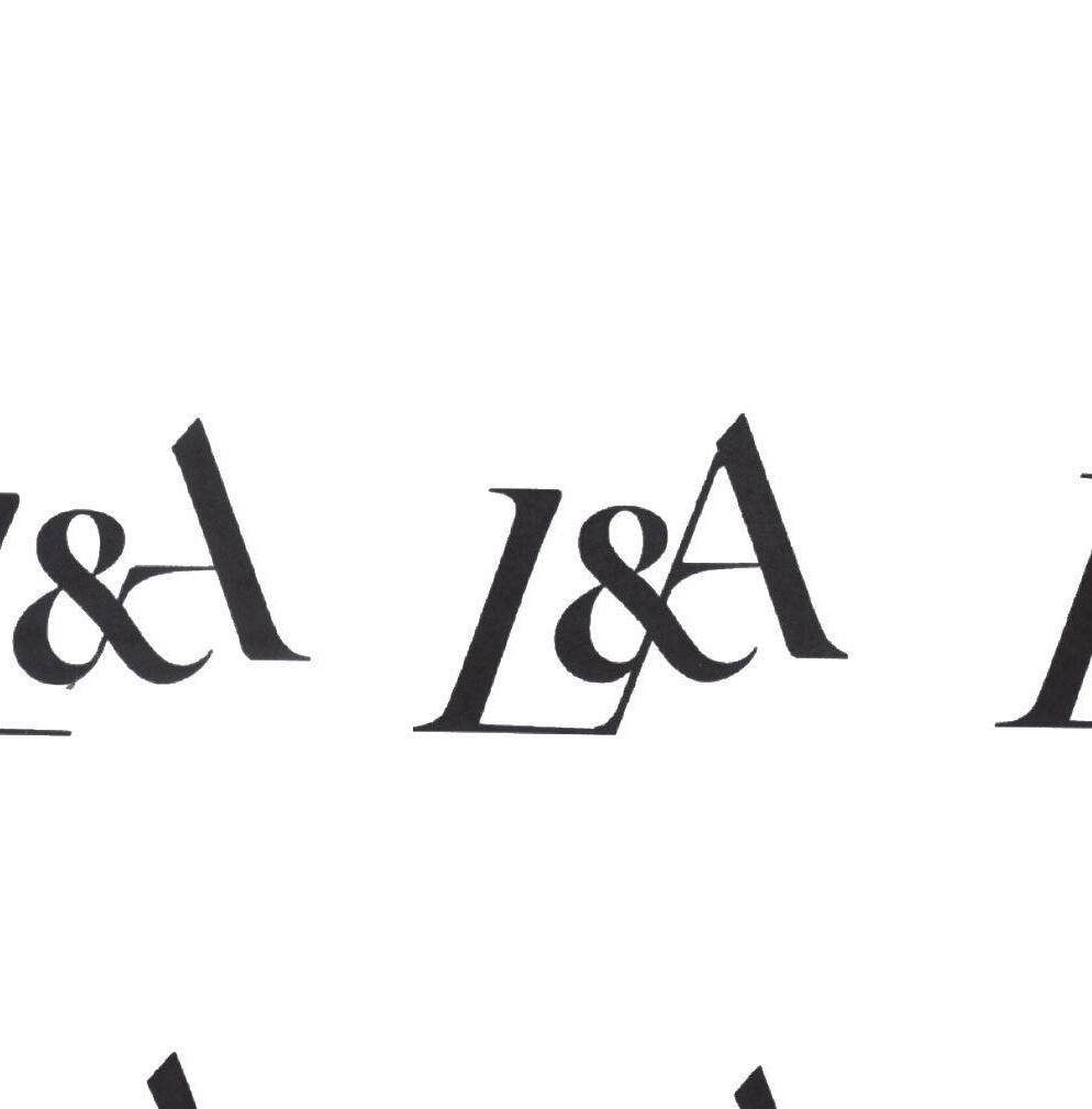
One of the issues with this logo draft was the inferred lines, the L sets an angle on a diagonal line which is opposite to the A. This is a nice balance set by the flowing line up the middle from the bottom of the L through the ampersand and finishing in the top of the A. This creates a nice feeling of unity between all the elements but the piece of the ampersand interrupts this flow. To solve this I had to reconstruct the element a number of times to get that flow while also keeping the integrity and legibility.
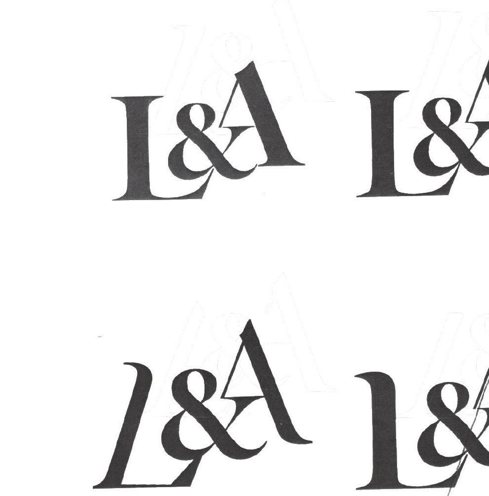
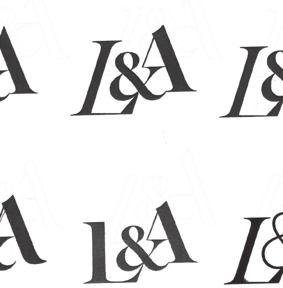

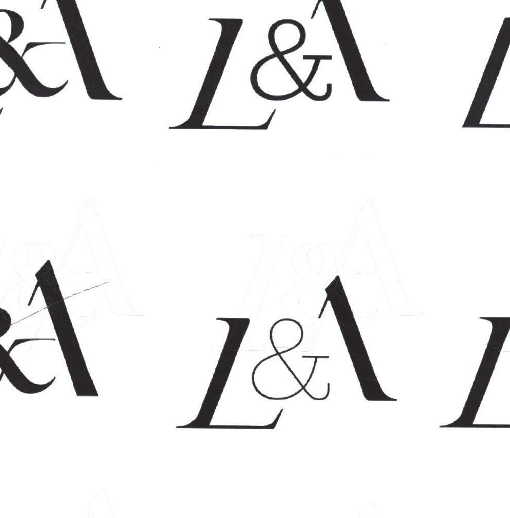
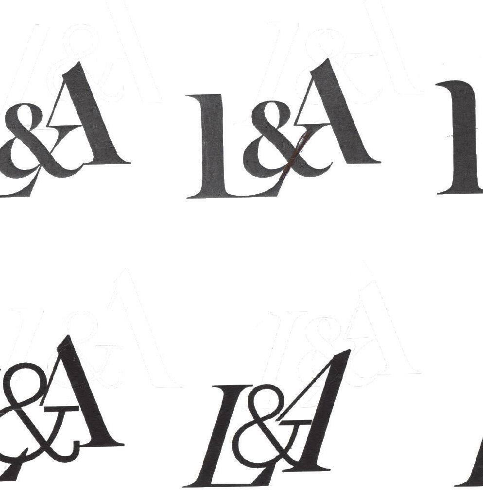
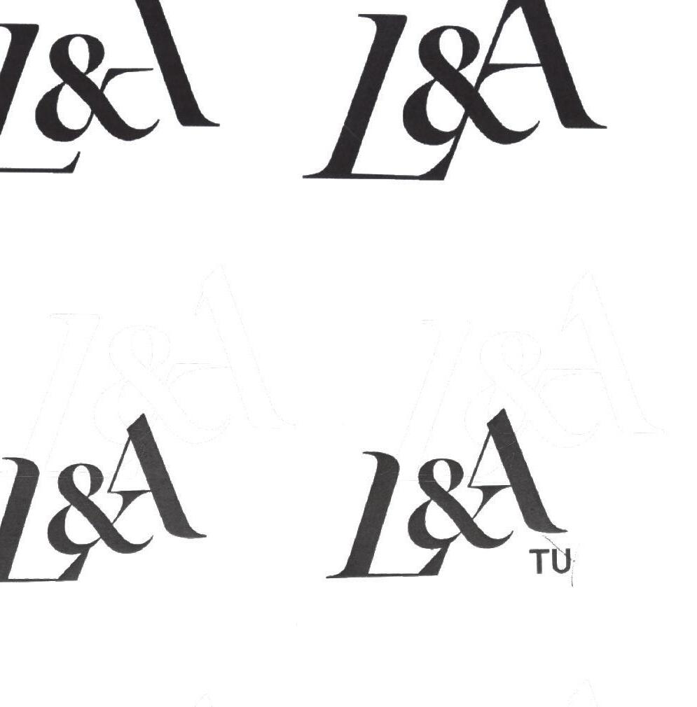
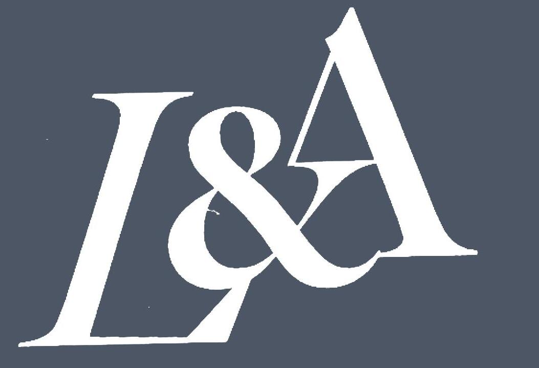
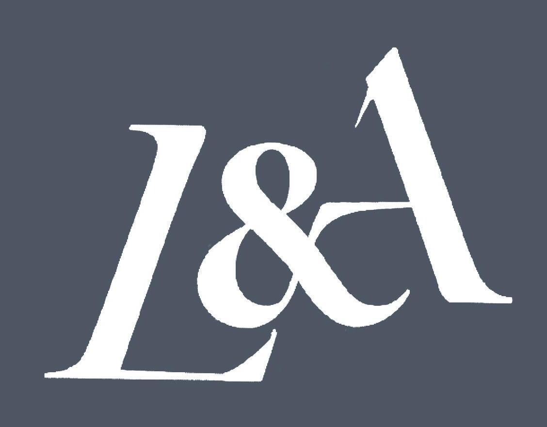
To keep a balanced structure I ensured that the angles and the serifs were all the same.

Principle of Closure
The principle of closure is one of a number of principles referred to as Gestalt principles of perception, the tendency to perceive information in this way is automatic.
This image (Fig. 20) from ‘100 Things every designer needs to know about people’ demonstrates how we see a shape that isn't actually there before we see the individual elements Susan Weinchenk explains how ‘Your brian creates these shortcuts in order to quickly make sense out of the world around you.‘³
In his book, Universal Principles of Design, William Lidwell explains ‘people will close the gaps and fill in missing
information to complete the pattern if necessary. The tendency to perceive information in this way is automatic and subconscious; it is likely a function of an innate preference for simplicity over complexity, and pattern over randomness. ⁴
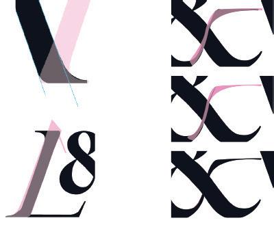
I made the choice to include these gaps while experimenting with different versions of the logo and making small changes. I found that the logo looked more visually intriguing.
This observation is reinforced as Lidwell mentions that ‘Subtle cues that help direct the eye through transitional elements also makes the logo more interesting to look as viewers
subconsciously participate in the completion of its design ⁵
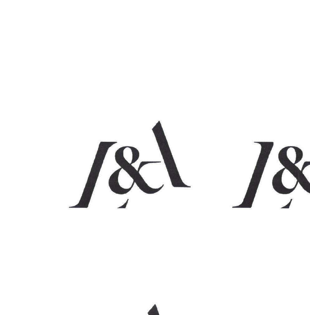
The pink lines demonstrate where I’ve used the principle of closure on this logo. The invisible line on the L is reinforced by a slightly enlarged serif at the end. The missing line on the A is suggested by the angle that is repeated in the centre from a small line coming off the A, the handle on the ampersand, and the angle leading off the top of the L’s serif.
The viewer will subconsciously close, or fill in the gaps where there is missing information to complete the pattern.
Colour Palette Slogan Type
A brand new colour palette to represent the new identity. For this project I chose a professional and mature complentary colour palette which works well with the concept of this project.
The primary colours are the dark blue which can be used with either the yellow or the light blue. Referring to colour theory the blue-yellow combination work as complementary colours and the blue light blue works as analogous. Using opposite colours and analogous on the colour wheel will help to achieve aesthetic colour palettes.⁶
The two secondary colours are added to keep the branding fresh. Without having alternating secondary colours, the original yellow and blue were beginning to dominate the brand and become too repetitive. The second, lighter blue was added to solve this problem.
Primary Secondary
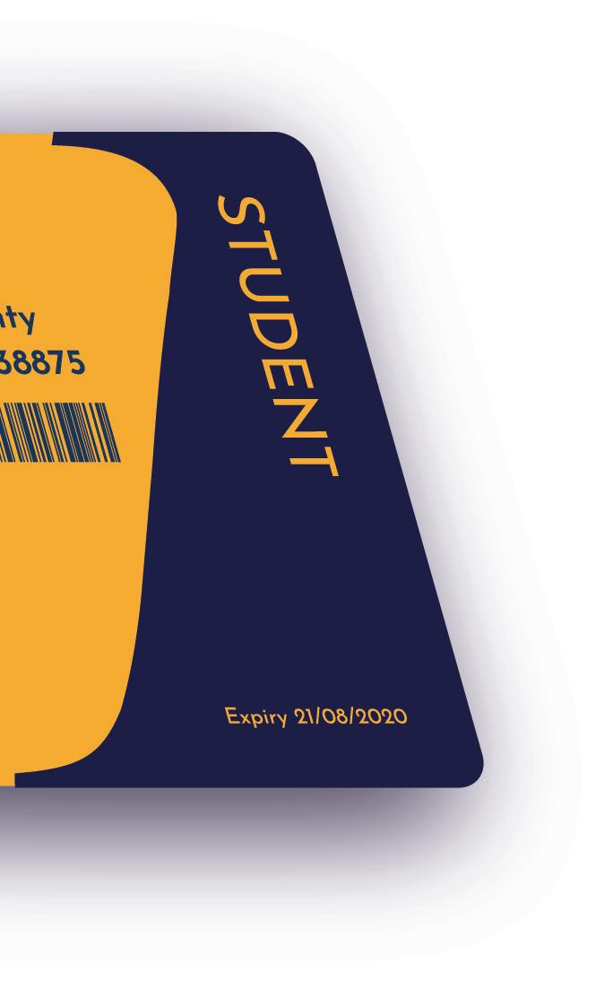
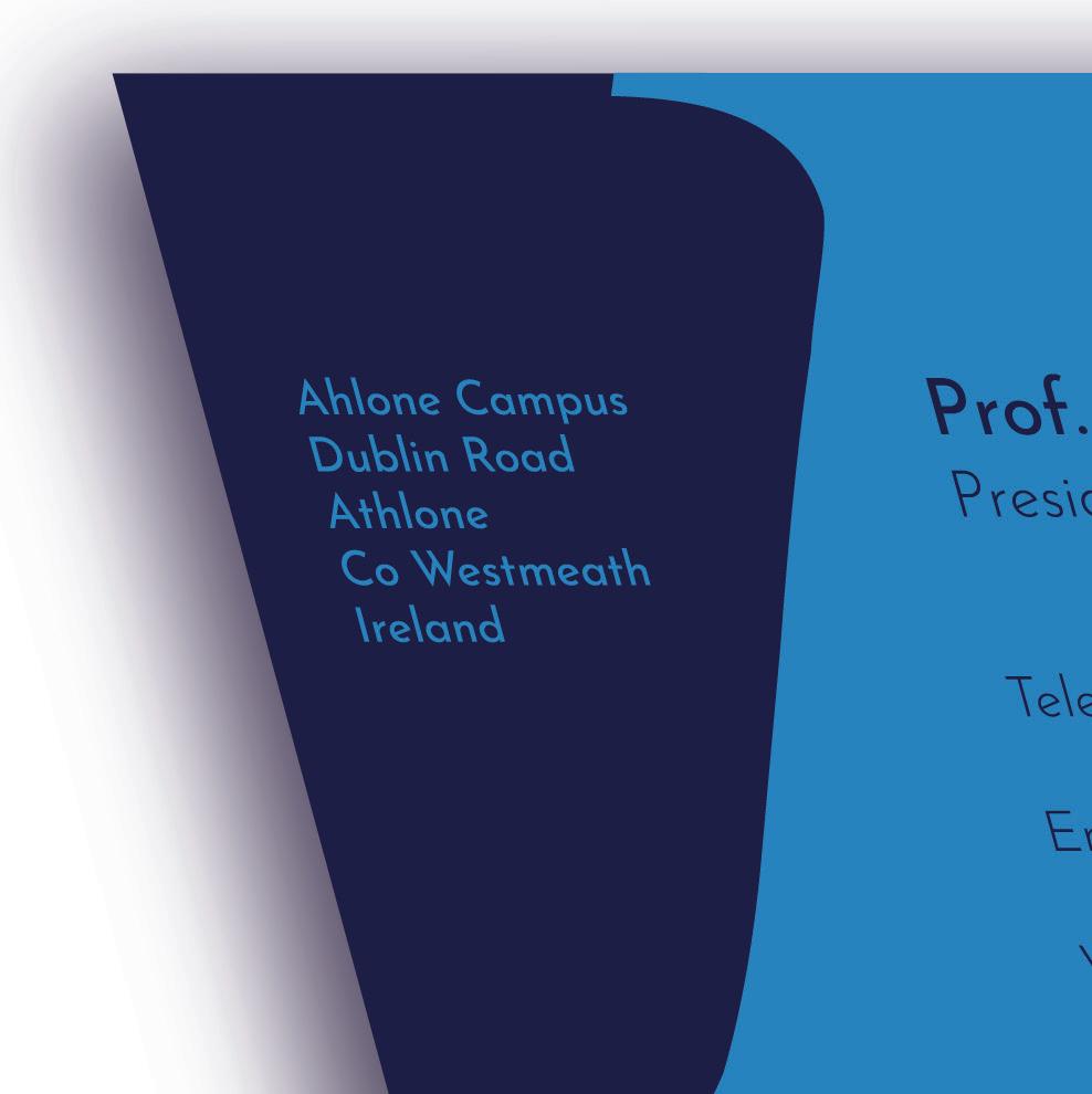
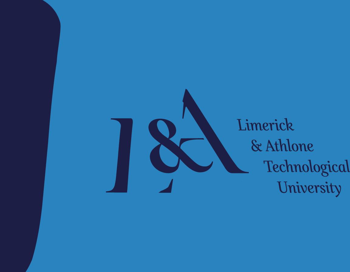
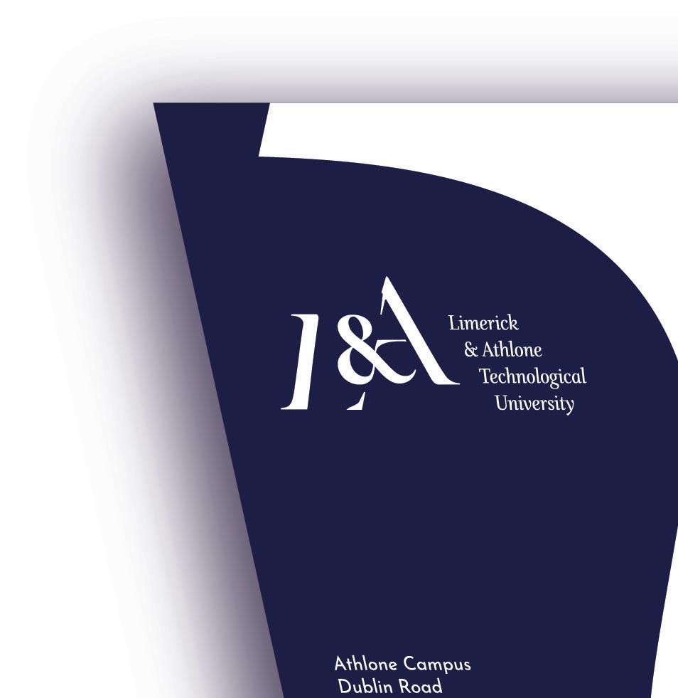
Final Logo
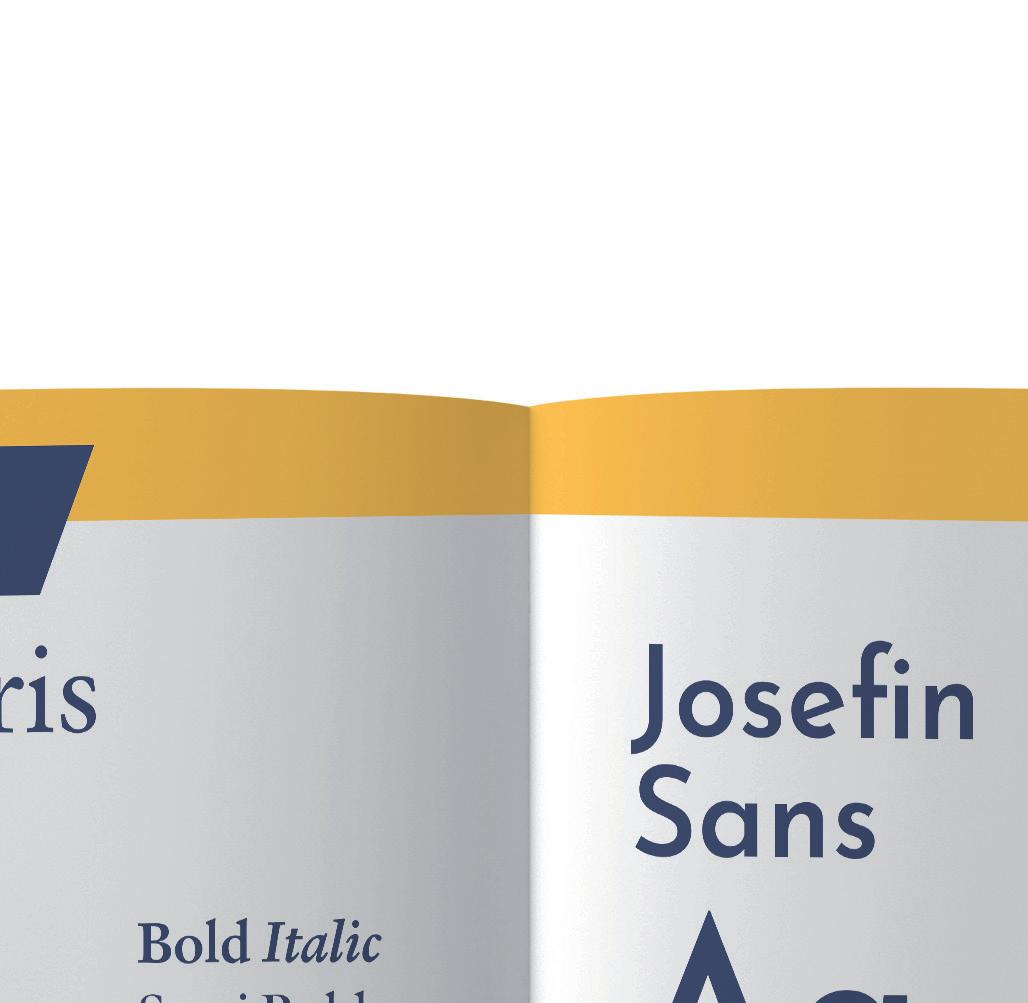
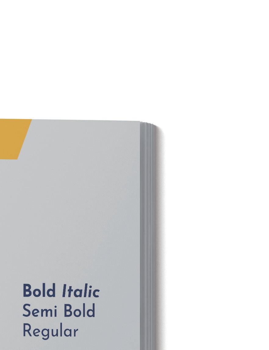
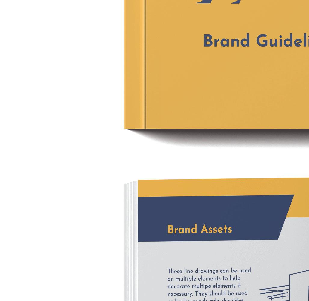
After a lot of experimentation throughout the project, the two final chosen typefaces for this identity are Verdigris Pro and Josefin Sans.
Verdigris Pro is a serif typeface which is easily legible and helps to convey the elegance that the logo carries.
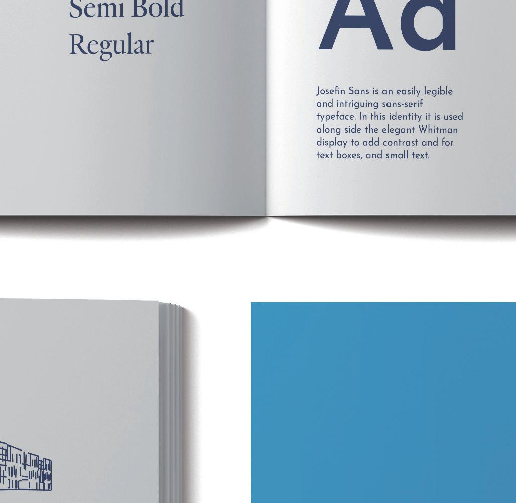
Josefin Sans is an easily legible and intriguing sans serif typeface. In this identity, it is used alongside the elegant Verdigris Pro to add contrast and for text boxes, and small text. It represents the structure, professionalism, and quality that the new TU assures.
Using both serifs and sans-serif work well as they create a clear contrast and can make a better design. Combining a serif with a serif or a sans-serif with a sans-serif can cause the design to look a little bland and undifferentiated.⁷
The slogan ‘Inspire, Innovate, Collaborate’ represents the creative and hard-working nature and the ability to change and do things together, as is suggested by the merger itself. The slogan reflects the voice of the brand as it is also inspirational, collaborative and encouraging.
Conclusion

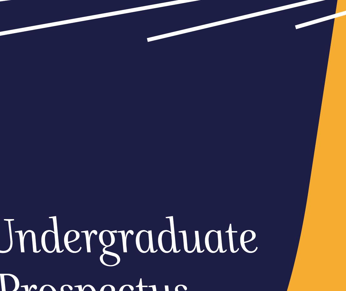
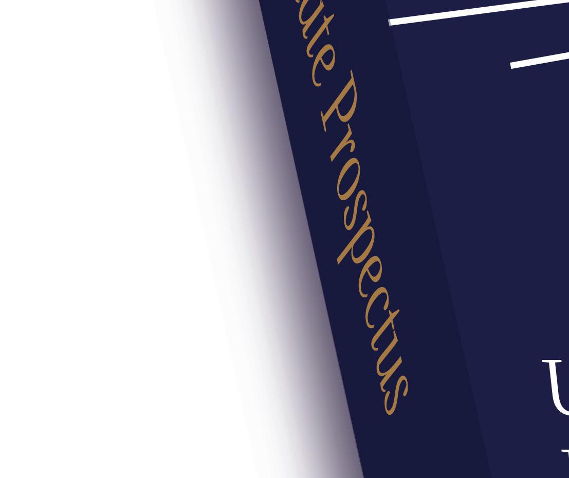
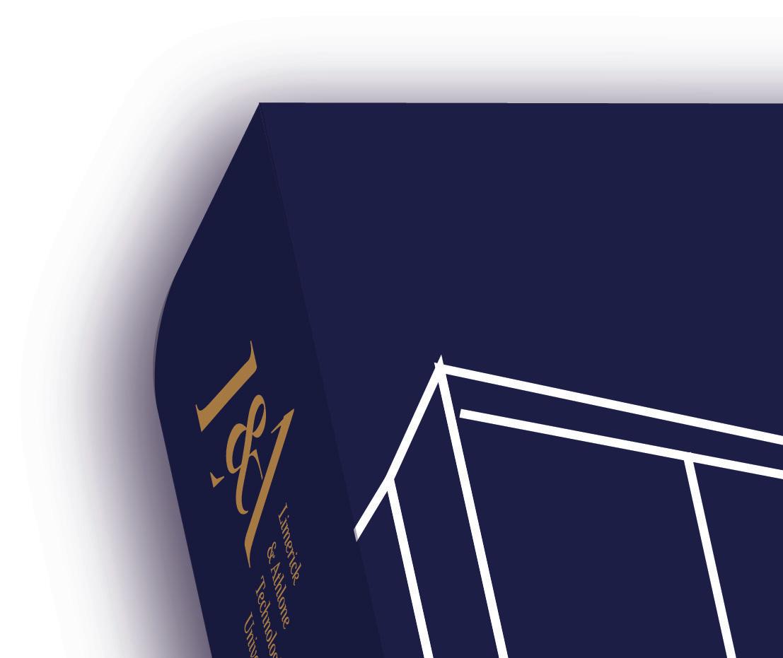
Reviewing this project, I feel overall the brand works quite well, The colours compliment each other, the branding overall looks professional, the elements work well and will be adaptable in different formats as the colour and stoke size can be adjusted to fit needs.


If I had more time I would put more focus into experimenting with the two secondary colours and try to find a way of using them without having to separate them. I would also widen the overall visual depth of the brand with the use of photography.
Throughout this project, I learned a lot about working effectively with a client and the importance of each interaction
regardless of how long. I also discovered more about working rigorously with logos as this was quite a complex logo. The type, spacing, alignment, and consistency, balance, legibility all had to be considered in detail. I also learned more about the significance of achieving balance and maintaining respect when merging two existing entities.
Overall on finishing this project, I believe it maintains good balance and provides for the client's needs. Initially it was a struggle to focus on two different identities and find what is important to bring into the new single identity, however, through the process, what is necessary becomes clearer.







































































Final Project
The Final Project brief is an extremely open and flexible one. The requirements for the final outcome is an exhibition piece that will consist of both digital and printed elements.
An exhibition can be defined as a public showcase of something, often associated with arts. Cambridgedictionary.org states that it creates:
‘a situation in which someone shows a particular skill or quality to the public, or the act of showing these things.’⁸
Due to the nature of this format, it's important that the piece takes into consideration the area, space, lighting, surroundings, and time.
The project begins by choosing three topics of interest. These are then discussed and narrowed to one relevant choice which will be expanded, researched, and defined. It creates the opportunity to have a voice and make a statement on the topic.
Aims Objectives
Throughout this project, I hope to create something that is effective as an exhibition piece and that takes advantage of the format.
A piece that has a light and humorous side and that makes a statement reflecting the reality of what social media and its users are becoming.
Establish a particular audience that my concept can be directed towards by looking at statistics, discussing with others, and surveying.
Research the growing culture of the social media world including current and emerging language and slang as well as popular meme formats that could be used in communicating my piece.
Research existing satirical, exaggerated and sarcastic pieces and advertising campaigns to get a clearer idea of what it requires.
Narcissist’s Playbook
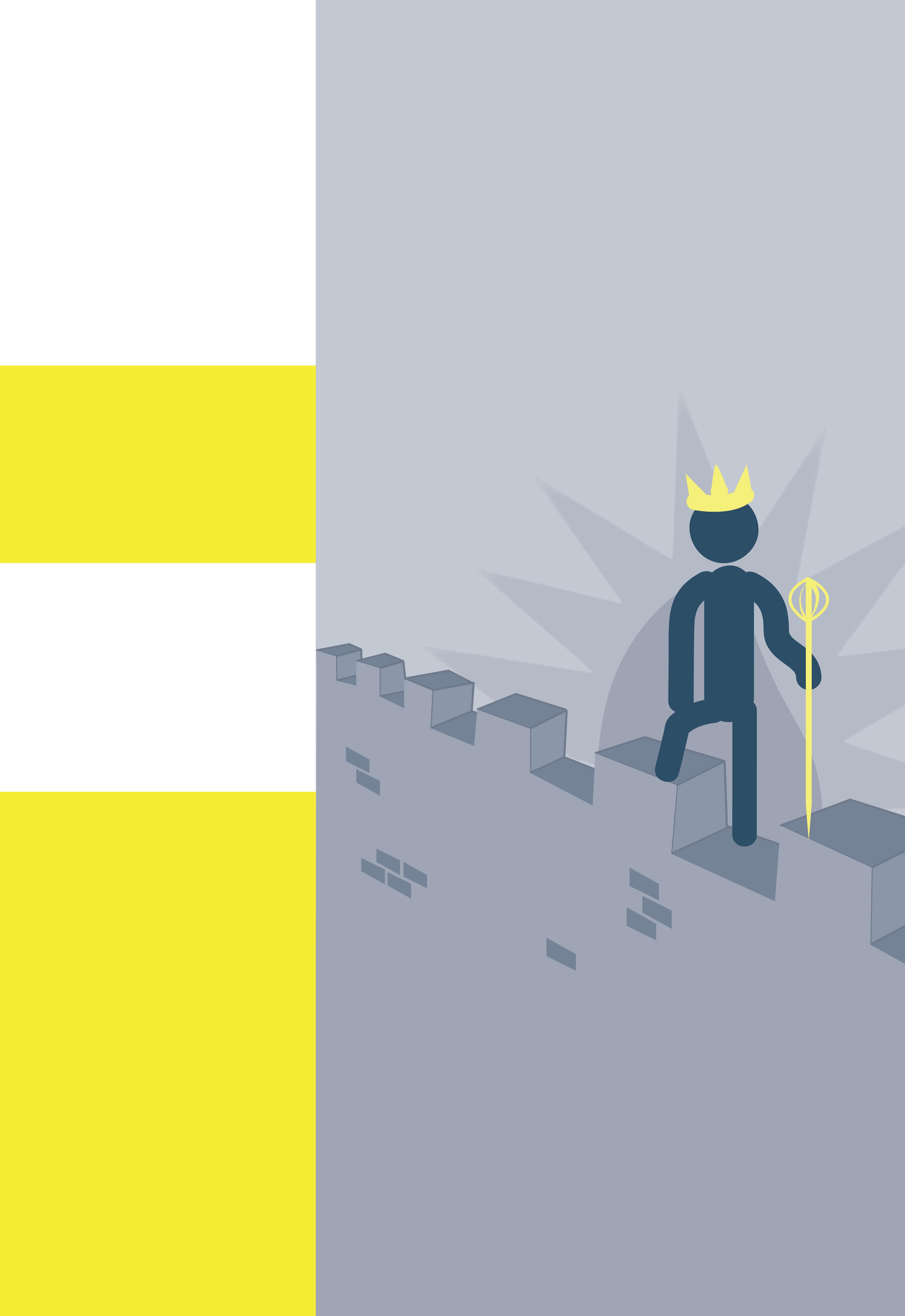
For the initial three ideas, the first was based on sleep and dreams, and their relevance or effects on us. While this could have been an interesting direction it may have become too personal or too superstitious.
The next idea was looking at doomsday or the end of the world. I looked at some previous predictions and future predictions and the official doomsday clock. This is also an interesting topic however may have directed the project in a science fiction type which wasn't my intention.
My final idea was about artificial intelligence, ‘which can be defined as a number of analytic tools that collectively attempt to imitate life and is currently largely used for problem-solving.’⁹ What intrigued me on this subject was the possible dangers that it could bring in the future. I began trying to build a project around this however most of my ideas seemed to reflect the ideas seen in science fiction movie and this wasn't my intention and it also may have appealed to a particular audience.

Following on from this idea I progressed into looking at social media and technology use in general, and how it has taken over everywhere. this led to looking at the addiction involved. This idea, however, seemed too generic and there are a lot of similar type projects that already exist.
From here I began looking at the narcissism and vanity often displayed by people on social media and how that is becoming increasingly normal. Looking at some self-proclaimed 'Influencers' and how their actions on social media fall directly into traits of a narcissist.
Initially, my research was based on social media and the negative parts associated with it and how it's taken over society and the addictive qualities.
This research, however, led to a lot of social media branding and the idea of being addicted. I then re-directed my idea and began researching some of the personalities that you see on social media. One in particular, ‘Influencers’ more particularly lifestyle influencers or self-proclaimed influencers.
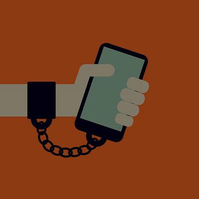
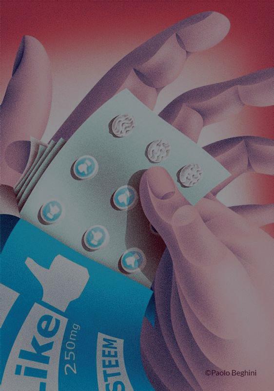
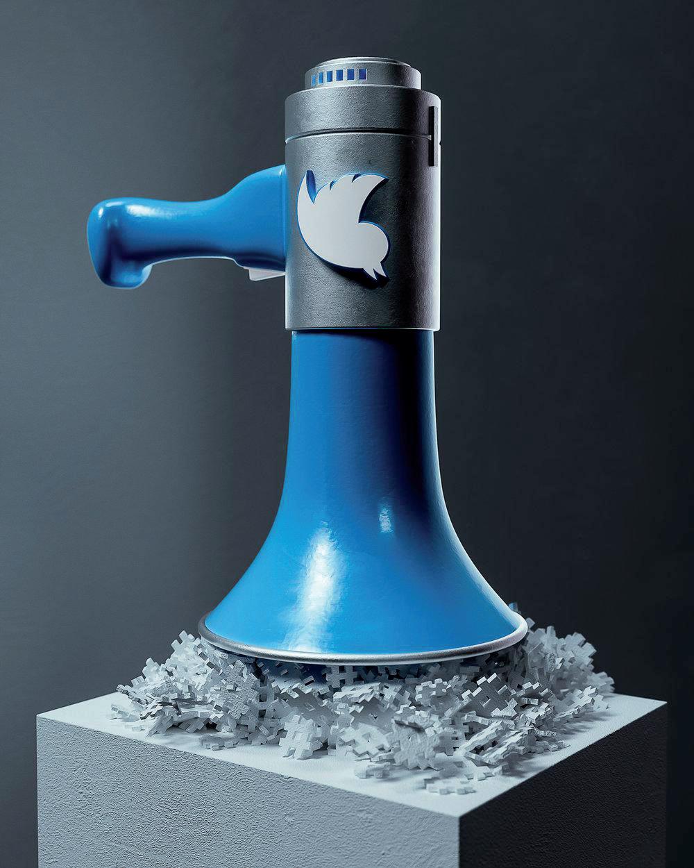
‘Influencer marketing is a form of social media marketing that uses influential people online to share brand messaging with their audiences in the form of sponsored content.’ ¹⁰



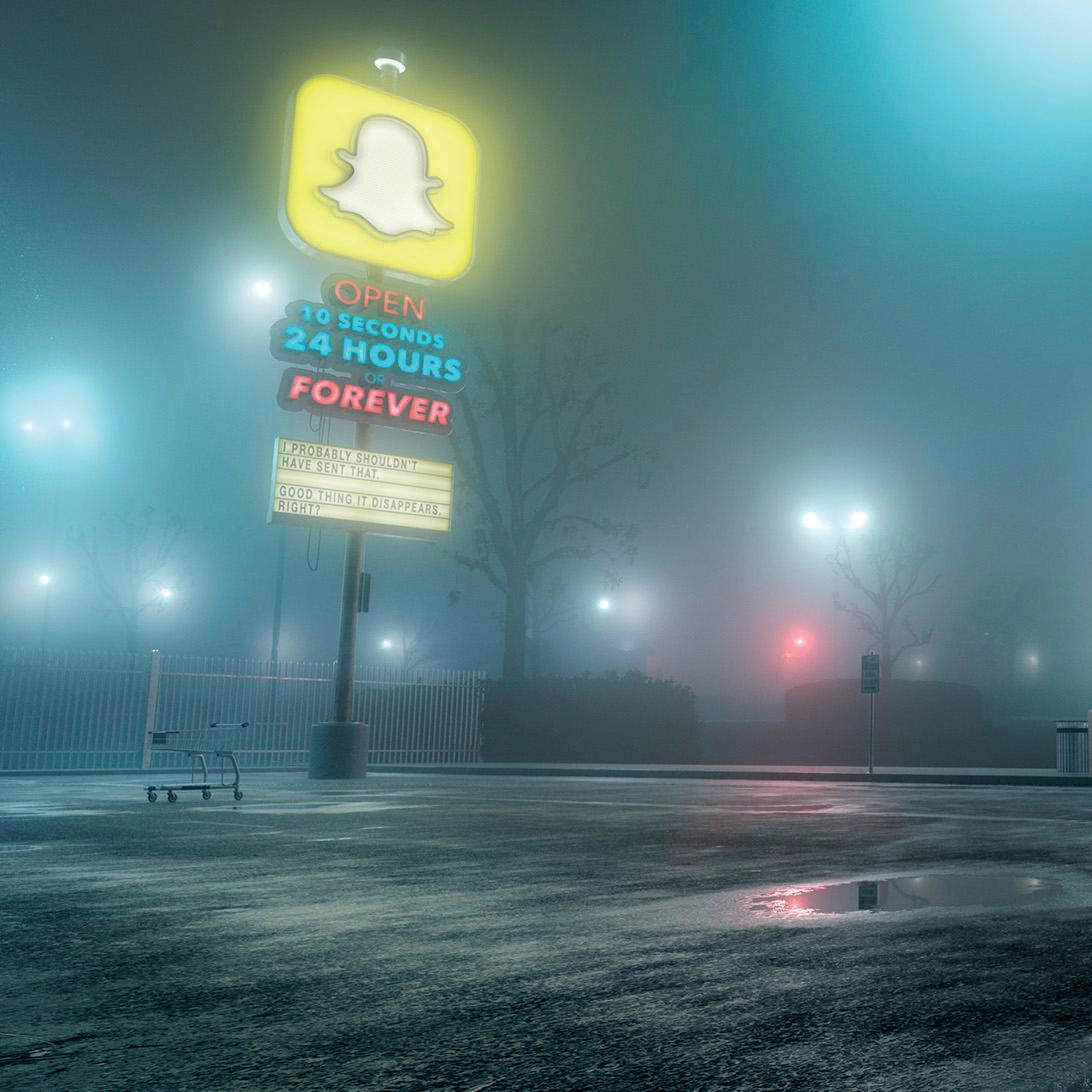
However, nowadays there are a lot of self-proclaimed influencers that ‘influence’ others to live their best life by showing off theirs on social media, however, theirs is mostly through a filter (staged/ fake/ unrealistic) and isn't nearly as great as their claiming it to be.
More and more users are becoming self-proclaimed influencers or are falling into a lot of the traits of one these traits include acting like you have a perfect life online by using highly edited photos portraying a more lavish lifestyle than the reality under the guise of trying to help others. When in reality it appears to be an excuse to pretend they live a perfect life and rub it others face.
I had the idea to make the project into something that would humorously reflect the negative characteristics of such personalities on social media.

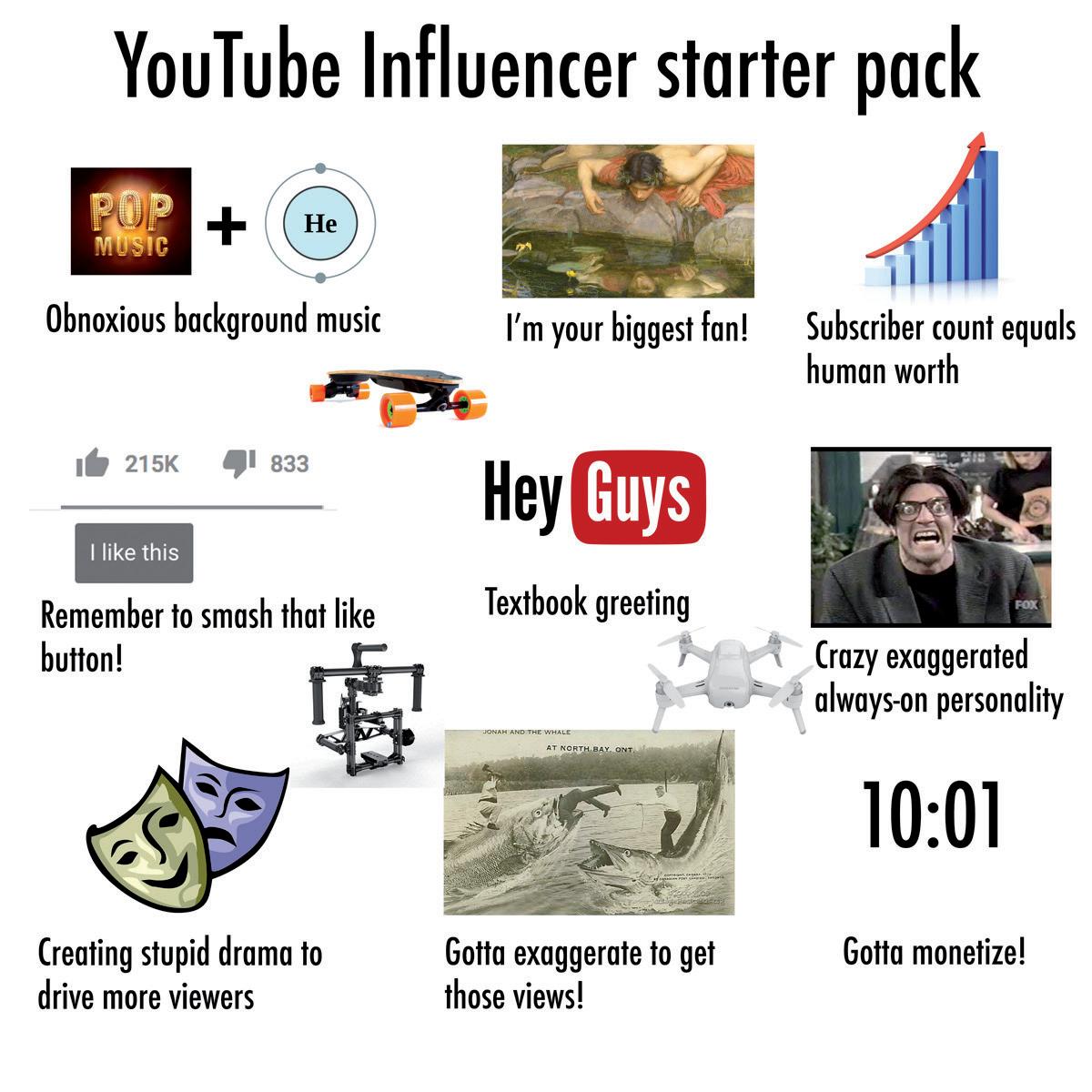
I researched some popular meme formats as they would help with the humor and are relevant to the topic as they are common on social media now. The ‘starter pack’ format is useful as it highlights the clichés of something. KnowYourMeme.com defines it as ‘a series of multi-panel photo sets meant to illustrate the archetype of a celebrity, company or subculture through a recommended selection of fashion articles, multimedia and other consumer products’ ¹¹
In my project, I want to use this method of highlighting the clichés that these influences fall under. It can be humorous as it displays the shallowness and un-originality of the personality.
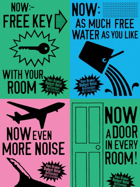
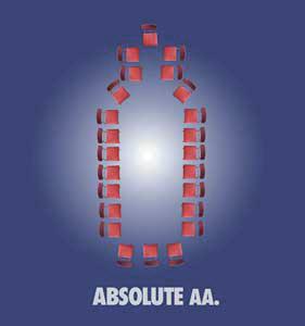
Following this, I also researched satirical advertisements which helped inspire the language that could be used in this project. The first idea of having a question and answer format.
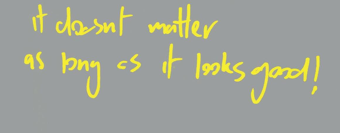
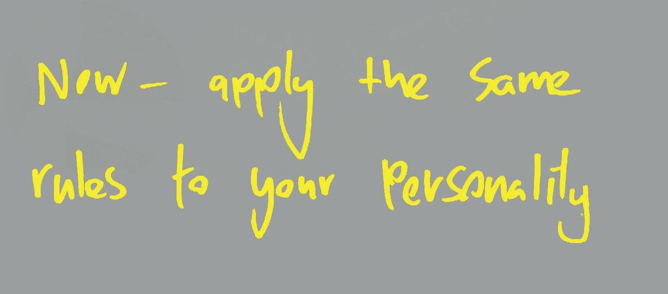
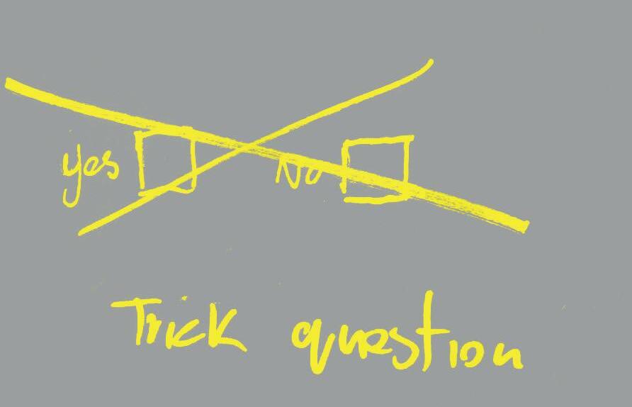
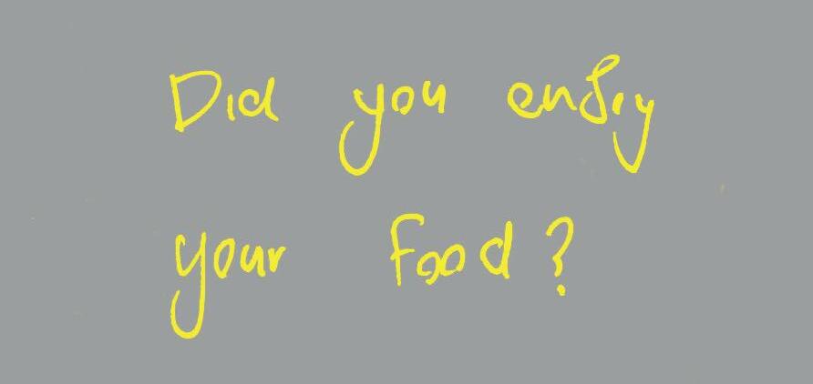
This is a first draft of what a question would be like. The answer would act as a slap in the face then you would be given sarcastic advice on how to be more narcissistic on social media initially the idea was to have this question as an interactive question on a computer, when the user would select an answer an animation would pop out saying ‘TRICK QUESTION’ and then give the real answer. It would be rhetorical or thought based questions and then followed up with a humorous answer.
Project Progression
Moving forward, my idea was to make a quiz and brand it like a game show where the questions would have sarcastic answers.
The format would be digital and interactive. Overall it would consist of trick questions and humorous and sarcastic answers based on narcissistic personalities on social media
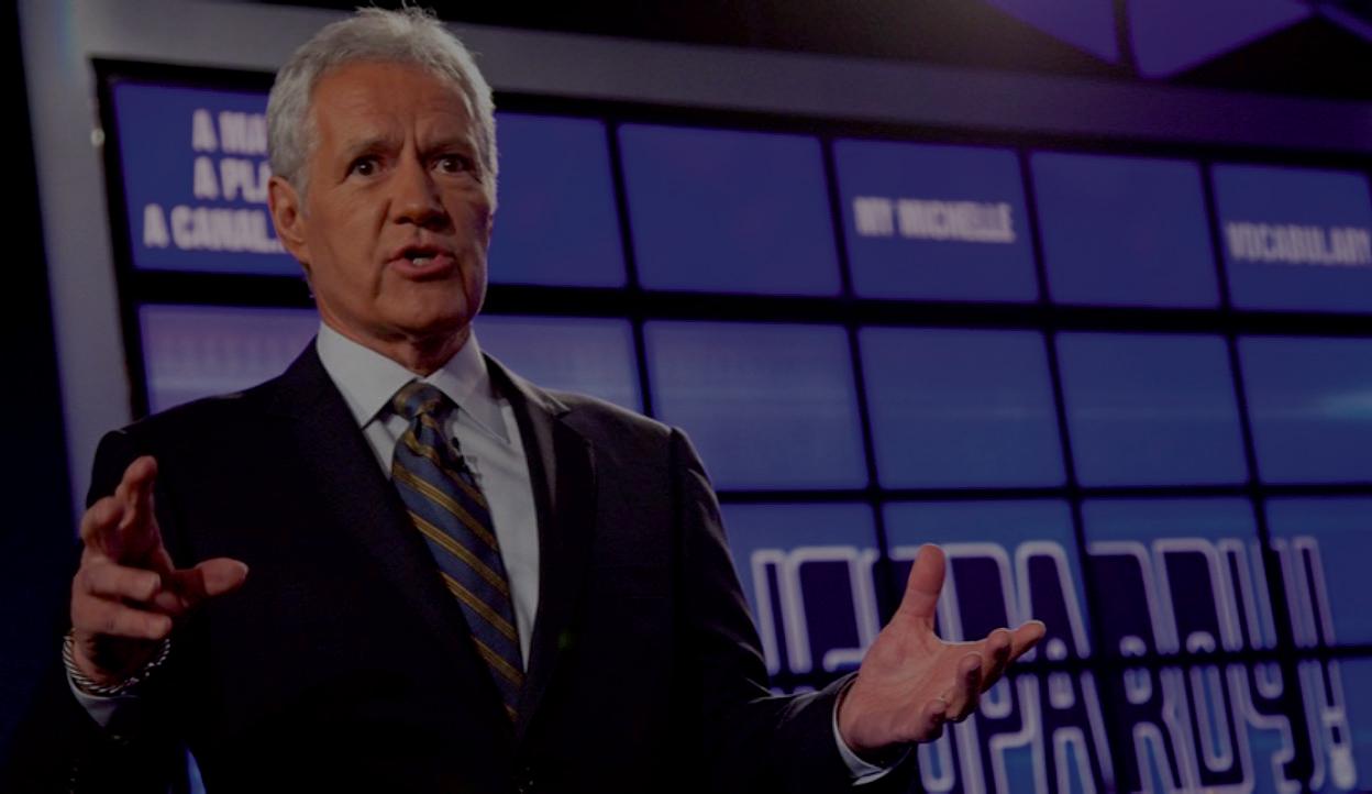
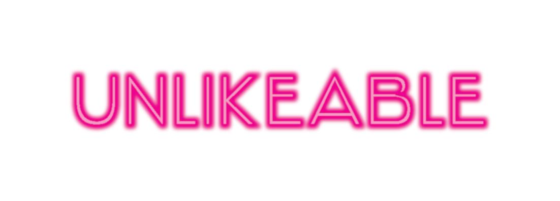
In an attempt to achieve the game show style I experimented and tested with a lot of different typefaces, colours, and elements such as outlines, dots, and 3D typefaces. Unfortunately, however, within the time frame and due to circumstances, I wouldn’t be able to achieve this interactive quiz in a way that would make a decent project.



‘If you want to succeed as an influencer you have to be a narcissistic jackass’Fig.27 Fig.28
Again I re-directed the project into a rhetorical question and aanswer style book. I created the questions based on some of the traits of narcissist’s and each will be accompanied by an illustration to boost the effectiveness of the imagery.
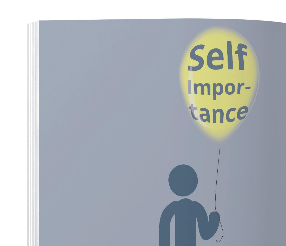
‘Traits of a narcissist can include great feelings of self-importance, need for power and admiration, over appreciation for one's own appearance, and a lack of empathy towards others.’¹²
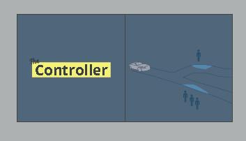
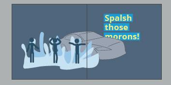
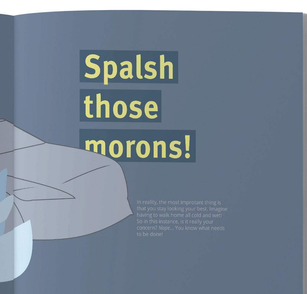
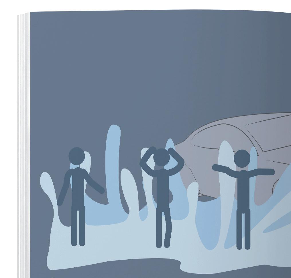
The first question is heavily inspired by the trolley problem which is an ethical thought exercise. It asks the viewer if they would rather a car splashes water on a number of random people or it splashes water on just you. This question

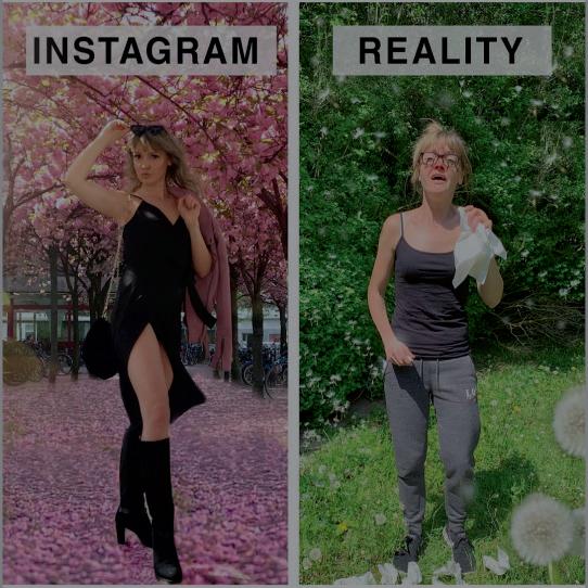
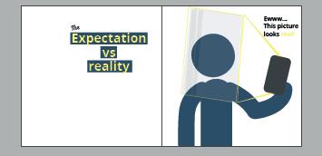
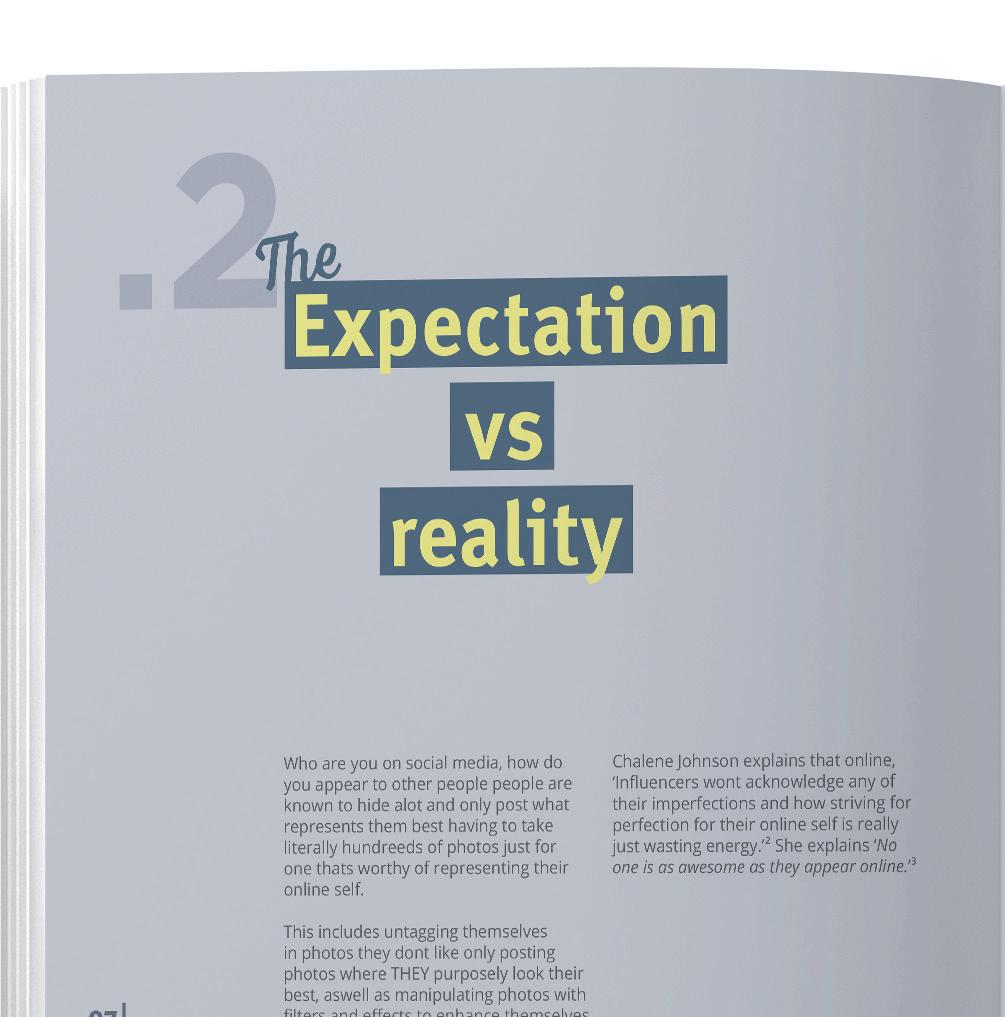
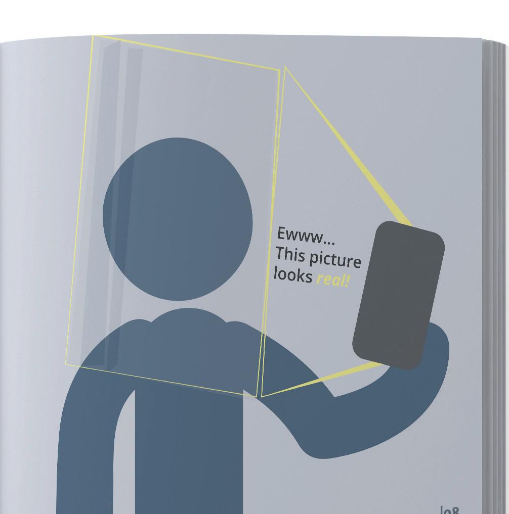
is asked to determine the lack of empathy or a selfish trait of a narcissist. Another question is based on 'Instagram vs Reality' which is another meme trend. KnowYourMeme.com defines this as ‘an observation used in comparative memes that point out the difference between how someone presents themselves on photo-sharing app Instagram vs. how they appear in real life. The setup is usually used in a mocking fashion and is pointed out when content creators present what is deemed an unrealistic representation of their lives on social media.’¹³
Chalene Johnson explains that online, ‘Influencers won't acknowledge any of their imperfections and how striving for
perfection for their online self is really just wasting energy.’¹⁴ She also explains ‘No one is as awesome as they appear online.’¹⁵
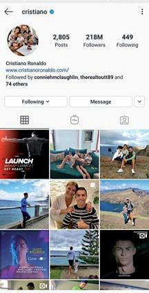
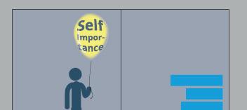
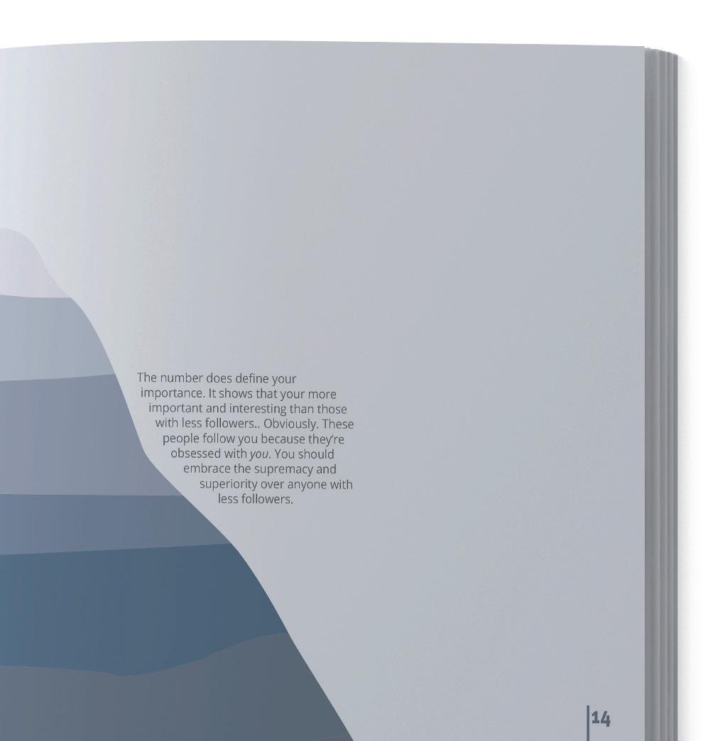
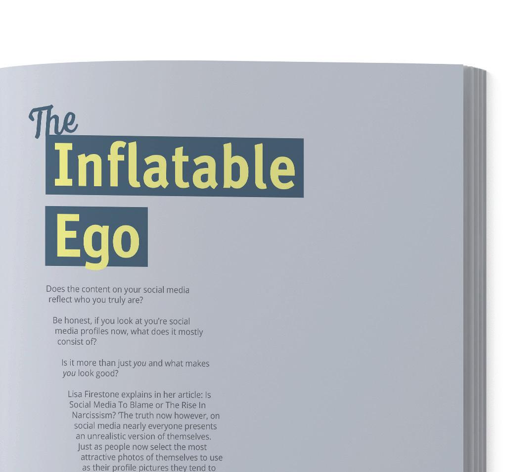
The third is based on the trait of having an inflated sense of self-importance. The illustration is in the format of an Instagram profile where all the content is based on the user alone. This is to portray the idea of them believing that all their followers want to see is them.
Old Colour Palette New Colour Palette
Colour
The colour and branding changed as it is no longer relating to game shows. Now that the format has changed to a playbook, it affords the opportunity to explore different colours. As there is a number of elements on a single spread, such as the large text, body text, illustration, and the background it was important to have a wider range of colours to create more depth and contrast while not overkilling it. I like keeping it simple and creating contrast with the colour palette was inspired by (Fig.03) and (Fig.04) as the pale yellow creates a strong contrast against the dark blue. According to colour theory, these are complementary colours as they are opposite to each other on the colour wheel, this should help the achieve an aesthetic colour palette.¹⁶


The chosen shades of pale blue range from light to dark and are used to represent the colder meaning behind the reality of the negativity relating to the narcissistic traits. While the yellow provided a small amount of light and helps catch attention due to the contrast.
 #fbee71
#434449
#445363
#50657a
#798496
#a4abb7 #d1d3d8
#244c63
Final Stages
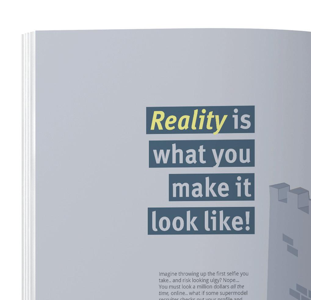
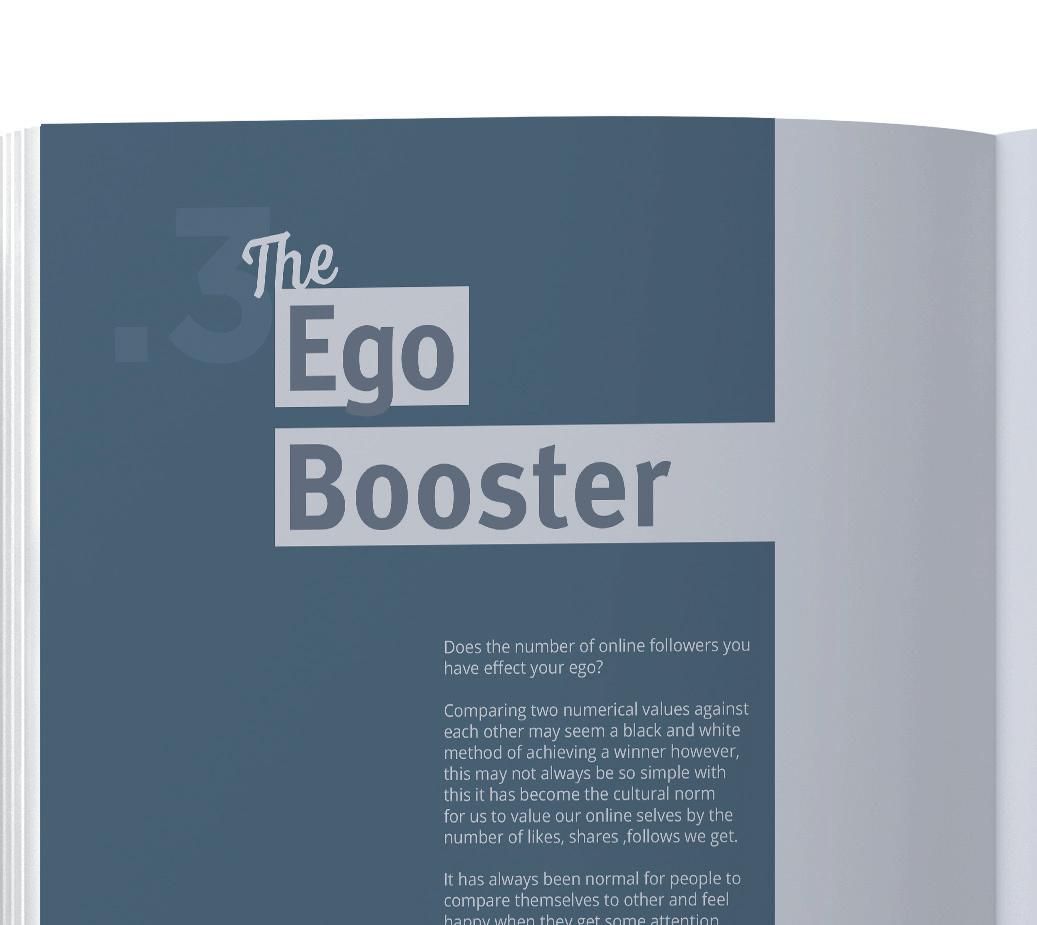
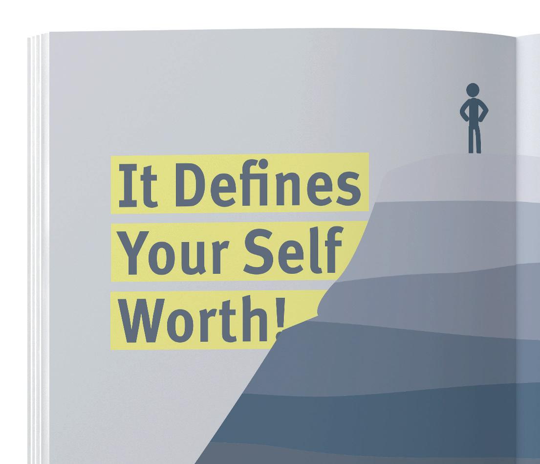
In this draft, it shows how the layout first pitches the question or thought, along with an illustration to enhance the idea then the next spread will give the ’play’ the plays will be based on the narcissistic thing to do. It will sarcastically inspire the viewer to be the best narcissist they can on social media.
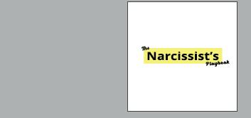
The large text and image on the ‘play’ spread are designed to be immediately and surprisingly humorous and add an unexpected change of pace to the language that’s being used as the previous spread acts as an informative piece or thought.
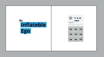
While this is a good example of the final structure, there were some design
changes made to increase consistency and cater to a better overall final piece.
The light brighter blue wasn’t necessary as the yellow is already bringing contrast. All spreads will need yellow and blue elements to keep consistency (Spread 1 & Spread 8).
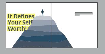
The body text has still to be added which will bring more structure to the alignment of the spreads. Small improvements can be made to the overall composition on some spreads by adjusting the size or position of the elements such as the illustration in (Spread 8). The background gradient (Spread 6) isn’t necessary, solid colours are working better.
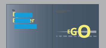
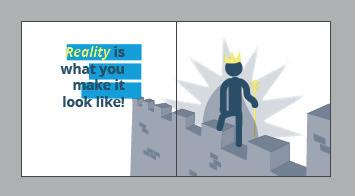
A lighter shade of blue in the background will be more effective on the spreads with white backgrounds.
In this draft, I liked the overall use of the shades of blue as it ties everything together well. The use of many more shades kept it from becoming repetitive as was a problem with the previous red colour palette, it also allows the yellow to be much more effective.
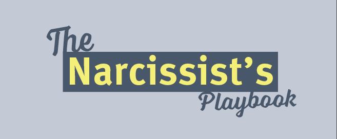
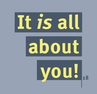
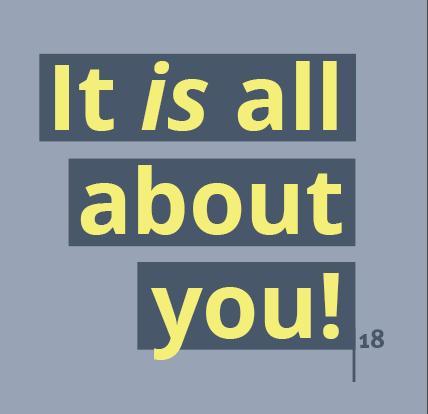
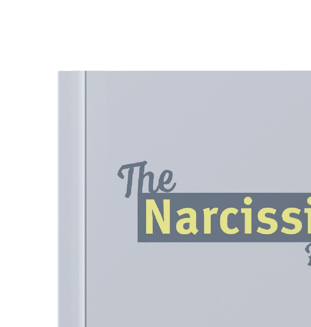
The Large fonts used are Meta and The text displayed on the front cover is simple and will introduce the colour and style of the book. ‘The’ and ‘Playbook’ used on title pages are Voltage, a more playful display font that brings a little contrast on the title pages.
Open Sans Meta
Originally all the text was Open Sans, the large text, however, lacked the character and personality which this project required.
I experimented with some more fonts including display fonts and serif while these had more personality, they were affected by the volume and simplicity that instantly meets the viewer. After experimenting with some similar typefaces, Meta stood out as it still worked with the style and it also contained more personality than before.
Conclusion
Reflecting on this project, I believe I could have spent more time experimenting with unique serif or display fonts as they may have been more intriguing however might have forced changes in the layout. The ‘play’ or title page could have been more unique then the answer page so that they are more clearly defined. However, I find that the simple colour palette is very effective and increases the consistency, the illustrations although very simple, work well at conveying the imagery. I believe the humor works well without being too insulting.

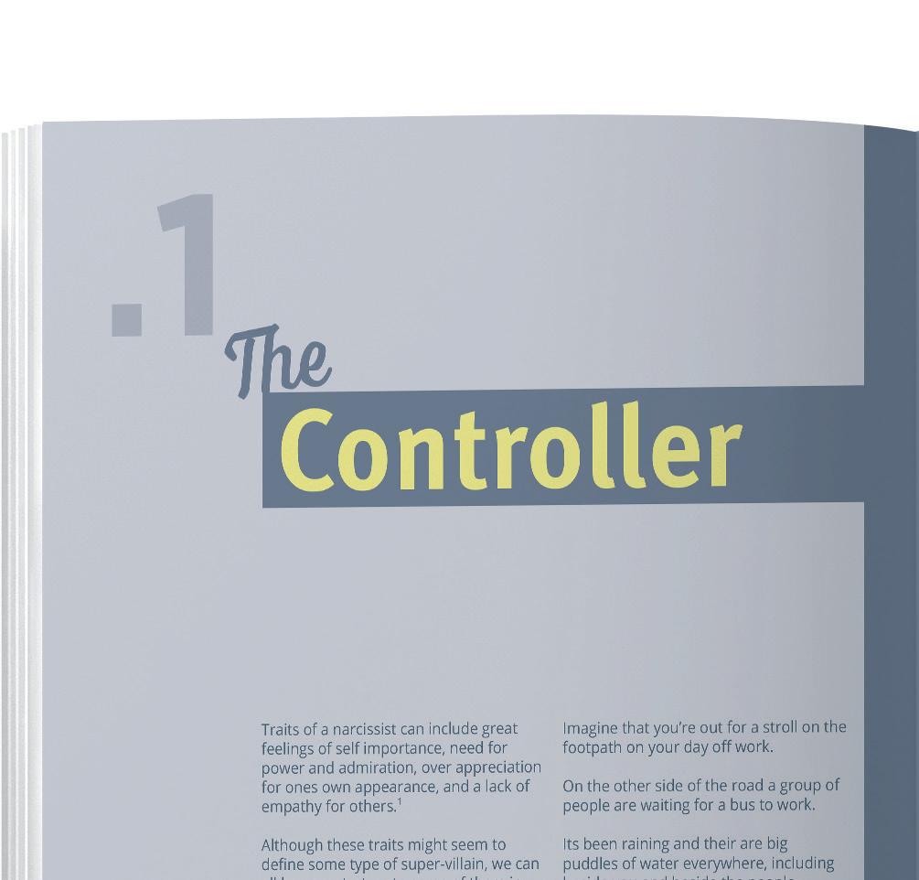
This project helped me to learn more about considering the type or volume of humor being used, such as too much, too obvious, or too offensive. Also working with the composition of the illustration slightly more outside the grid while keeping structure in the type. Finally, it helped me consider the balance of the content in the book such as the amount of sarcastic humor and the actual facts.

The early stages of this project were interesting as the original research and topics changed quite dramatically but the route was very useful in considering what I wanted it to be as a final piece In the later stages, the idea fell into place more and became something that was easier to do focused research on. It tied together well the reality of the narcissistic traits on social media along with the humorous, not so serious side.









Bibliography
Leung, Linda, Digital Experience Design, Bristol, U.K. Intellect, 2008.
Fetell Lee, Ingrid, Where Joy Hides & How To Find It, Ted Talk, April, 2018.
https://www.ted.com/talks/ingrid_fetell_lee_where_joy_hides_and_how_to_find_it?language=en
Accessed; May 7, 2020
Cherry, Kendra, Can Color Affect Your Mood and Behavior?, Verywell Mind July 17, 2019
https://www.verywellmind.com/color-psychology-2795824
Accessed; May 7, 2020
Colborne, Giles. : Simple & Usable, New Riders, 1249 Eight Street, Berkeley, 2010.
Lidwell, William. Beverly, Mass. Universal Design Principles, Rockport Publishers, 2010.
Weinschenk, Susan, 100 Things every designer needs to know about people, New Riders, 2011
Lidwell, William, Beverly, Mass, Universal Design Principles, Rockport Publishers, 2010
SHAWACADEMY.COM, Serif or Sans-serif, Eames, Williams, 2018
https://blog.shawacademy.com/serif-or-sans-serif-the-golden-rule-of-combining-fonts/
Accessed; May 7, 2020
Guggenheim website, Time-Based Media, August, 2017.
https://www.guggenheim.org/conservation/time-based-media
Accessed; May 8, 2020
J. H. Kim, S. A. Lim, H. H. Choi, Promotional Video Production which fused The Motion, Graphics and Color Marketing, Life Science Journal, 2014.
http://www.lifesciencesite.com/lsj/life1107s/102_24424life1107s14_476_480.pdf
Accessed; May 8, 2020
Kirkham, Pat, Saul Bass : a life in film & design, London : Laurence King, 2011.
Radatz, Ben, Perkins, Will, Inner workings, Art Of The Title, August 26, 2014. https://www.artofthetitle.com/feature/the-inner-workings/
Accessed; May 8, 2020
Berezyuk, Alexey, Wassily Kandinsky - Everything starts from a dot, Front Pictures 2017. https://www.youtube.com/watch?v=UsPbHcJW3WM
Accessed; May 8, 2020
Arditi, Aries, Making Text Legible Aries Arditi, Lighthouse International, 2009. https://wdcb.stcwdc.org/wp-content/PDF/making_text_legible.pdf
Accessed; May 8, 2020
REDDOG.IE, TU Dublin Branding, January 2019
http://reddog.ie/project/tudublin/
Accessed; May 8, 2020
DESIGNWEEK.CO.UK, Oslo City Rebrand, Henry Wong, June 2019
https://www.designweek.co.uk/issues/24-30-june-2019/oslos-new-identity-is-inspired-by-shapes-of-the-city/
Accessed; May 8, 2020
DICTIONARY.CAMEBRIDGE, Exhabition
https://dictionary.cambridge.org/
Accessed; May 8, 2020
M Gordon, Brent, Artificial Intelligence, Nova Science Publishers, New York, 2011
Boone, Laura, Influencer Marketing, Salem Press Encyclopedia, 2019 http://eds.b.ebscohost.com/eds/detail/detail?vid=1&sid=7ec23a5c-52ac-4493-b675-a620e270d67c%40pdc-v-sessm gr02&bdata=JkF1dGhUeXBlPXNoaWImc2l0ZT1lZHMtbGl2ZQ%3d%3d#AN=121772862&db=ers
Accessed; May 10, 2020
KNOWYOURMEME.COM
https://knowyourmeme.com
Accessed; May 10, 2020
PSYCHOLOGYTODAY.COM, Narcissism and Social Media: Should We Be Afraid?, Reed, Phil, 2019
https://www.psychologytoday.com/ie/blog/digital-world-real-world/201909/narcissism-and-social-media-should-webe-afraid
Accessed; May 10, 2020
CHALENEJOHNSON.COM, Annoying Things Influencers Do, Johnson, Chalene, 2019 https://www.chalenejohnson.com/annoying-things-influencers-do/
Accessed; May 10, 2020
Image Refernces
Fig.1; https://www.maynoothuniversity.ie/
Fig.2; http://www.nuigalway.ie/
Fig.3; https://www.qub.ac.uk/
Fig.4;https://www.dcu.ie/
Fig.5 https://www.ucd.ie/
Fig.6; https://www.tcd.ie/
Fig.7; https://www.ulster.ac.uk/
Fig.8; https://tudublin.ie/
Fig.9; http://reddog.ie/project/tudublin/
Fig.10; https://www.designweek.co.uk/issues/24-30-june-2019/oslos-new-identity-is-inspired-by-shapes-of-the-city/
Fig.11; https://onlystudio.co.uk/university-suffolk
Fig.12; logoground.com
Fig.13; https://testflight.apple.com/join/VtDI7uRL
Fig.14; https://slack.com/intl/en-ie/media-kit?eu_nc=1
Fig.15; https://stock.adobe.com/ie/103388981?as_campaign=TinEye&as_ content=tineye_match&epi1=103388981&tduid=cb2ac2f496b898ef55953a8f8c0c 1cfc&as_channel=affiliate&as_campclass=redirect&as_source=arvato
Fig.16; https://logodix.com/logos/1892770
Fig.17; https://www.123rf.com/photo_97933652_stock-vector-heart-logo-vectoricon-isolated-modern-heart-symbol-for-cardiology-medical-center-or-charity-. html
Fig.18: MEDUIM.COM [online], V&A logo, Alan Fletcher, 1989 https://medium.com/fgd1-the-archive/v-a-logo-by-alan-fletcher-1911200ec5e0
Fig.19: Weinschenk, Susan, 100 Things every designer needs to know about people, New Riders, 2011 p3
Fig.20-22; https://www.behance.net/gallery/61878925/ANTISOCIAL
Fig.23; https://www.reddit.com/r/starterpacks/comments/9rxgoc/youtube_influencer_starter_pack/
Fig.24; https://techablaze.com/blog/5-smartphone-habits-to-break-in-order-tobe-more-productive/
Fig.25; https://www.canva.com/learn/funny-ads/
Fig.26; https://shannandavidson.wordpress.com/2011/04/14/adbusters-absoluteaa/
Fig.27; https://www.cnbc.com/2020/01/14/jeopardy-host-alex-trebek-sharesplans-for-future-retirement.html
Fig.28; https://www.logolynx.com/topic/match
Fig.29; https://nymag.com/intelligencer/2016/08/trolley-problem-meme-tumblrphilosophy.html
Fig.30; https://www.sarcasm.co/these-instagram-vs-reality-photos-are-way-toorelatable/20190703_223911/
Fig.31; https://lovindublin.com/entertainment/brendan-gleeson-blows-viewersaway-with-rare-musical-performance-on-late-late-show
Fig.32; https://www.traxmusicstore.com/shop/books-for-music/music-books/piano/benj-pasek-the-greatest-showman-pvg/
Accessed; May 10, 2020
Accessed; May 10, 2020
Accessed; May 10, 2020
Accessed; May 10, 2020
Accessed; May 10, 2020
Accessed; May 10, 2020
Accessed; May 10, 2020
Accessed; May 10, 2020
Accessed; May 10, 2020
Accessed; May 11, 2020
Accessed; May 11, 2020
Accessed; May 11, 2020
Accessed; May 11, 2020
Accessed; May 11, 2020
Accessed; May 11, 2020
Accessed; May 11, 2020
Accessed; May 11, 2020
Accessed; May 11, 2020
Accessed; May 13, 2020
Accessed; May 13, 2020
Accessed; May 13, 2020
Accessed; May 13, 2020
Accessed; May 13, 2020
Accessed; May 13, 2020
Accessed; May 13, 2020
Accessed; May 13, 2020
Accessed; May 13, 2020
Accessed; May 13, 2020
Accessed; May 13, 2020
Accessed; May 13, 2020
