1. 2.
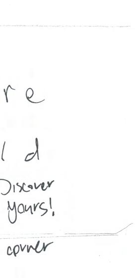
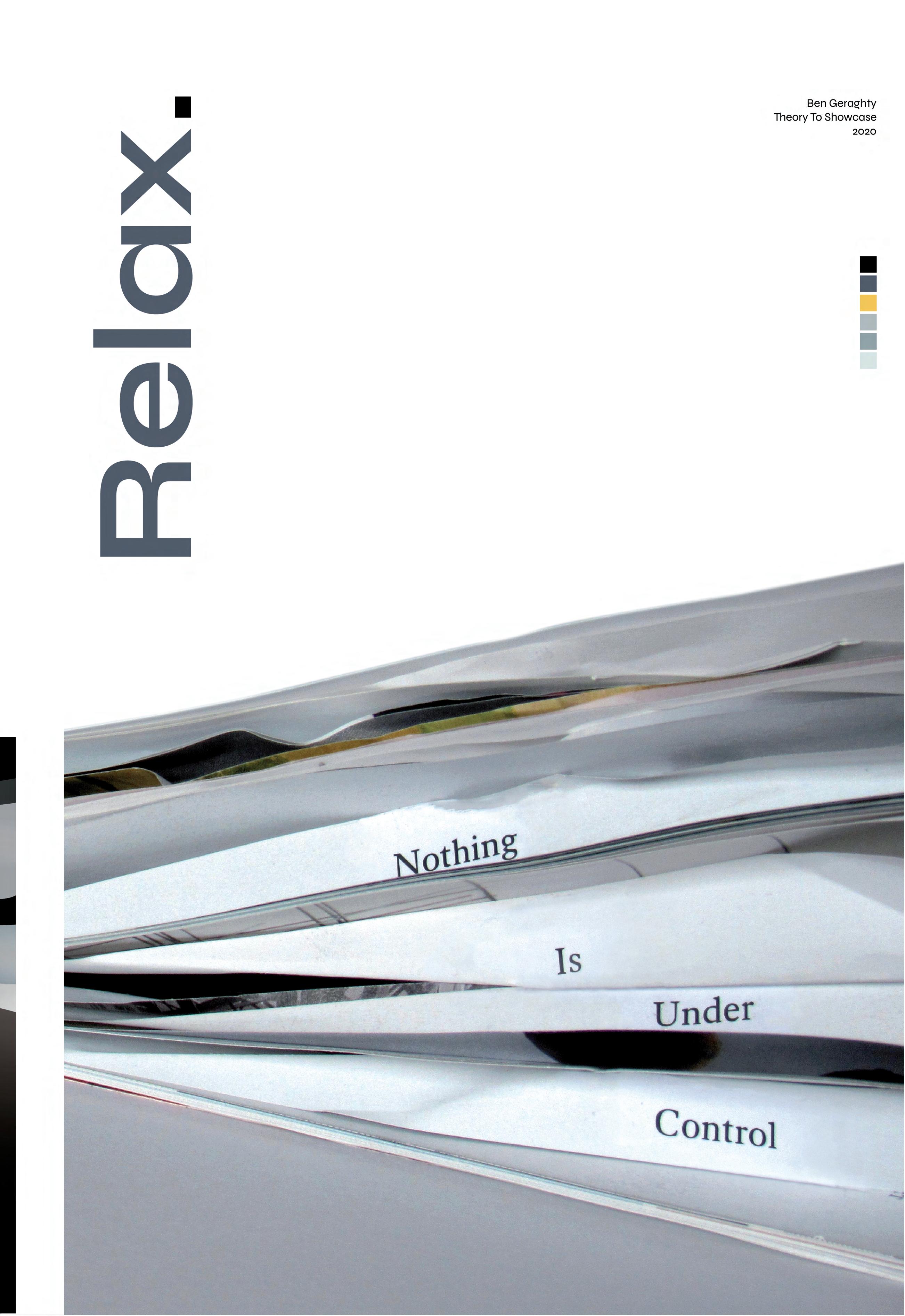
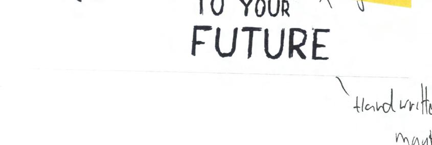
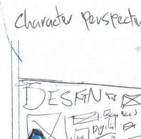
4. Platform For Joy Discover Your World AIT LIT Merger Narcissist's Playbook Experience Design Pg 01-10 Time-Based Media Pg 11-20 Live Studio Pg 21-34 Final Project Pg 35-48
3.


Experience design is the art of creating an experience for a user by way of design. It goes beyond just usability as you must consider the user or audience and, in particular, their emotions and values along with the environment in which it is set as these are all the vital factors that form experiences. In her book, Digital Experience Design, Linda Leung describes that experience design ‘encompasses the more abstract, emotional and atmospheric elements of users’ digital interactions such as attraction, seduction, and engagement.’¹
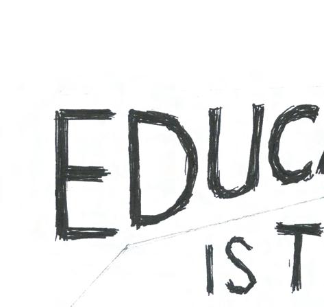
A Platform For Joy is an experience design project pitched by Network Rail. It raises the question ‘How might we unlock joy for people in train stations.’ The brief states that when approaching this project the following should be considered; What is joy? The station users needs and desires, the station space, the station environment, the potential staff, the facilities such as shelter, seating, tickets, the overall sense of place of particular stations and access for all people regardless of age, ability, visiting, local, first time user or
time-pressed commuters. The finished piece must be more than just a standalone retail solution, purely digital or a stand-alone app however, these could be features of the final piece. While developing the solution, it should be tested and prototyped by role-playing and modeling to gain useful feedback.
Aims:

Aims
By partaking in this brief, I hope to learn more about design in association with the users, or the audience’s experience. I want to take a more informed look at the connection between our surroundings and our emotions, senses, and behaviours, to create something that will have a meaningful effect on the user’s experience, and in this case, a joyful one. Overall I hope to gain a better and clearer knowledge of the subject of experience design.
Objectives:
To approach this brief I will attempt to find and define any existing issues for people in train stations and empathize with the user, the commuter. I will need to examine the station user’s needs, desires, fears and what they value in order to get a better understanding of them. I will also explore things that can bring joy to people in everyday life, find out what stimulates joy. I will look at existing experience design projects that cater to people’s emotions.
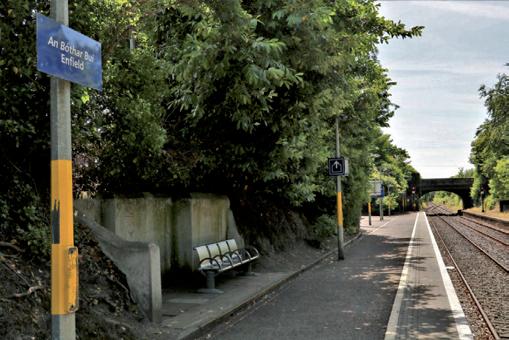
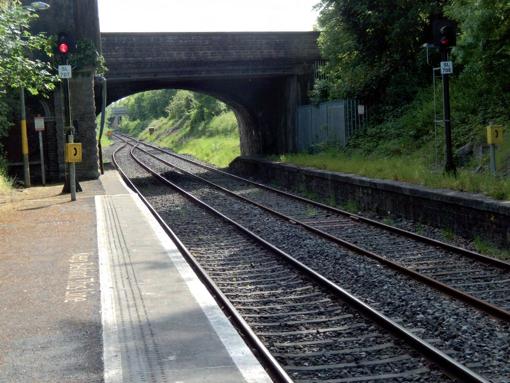
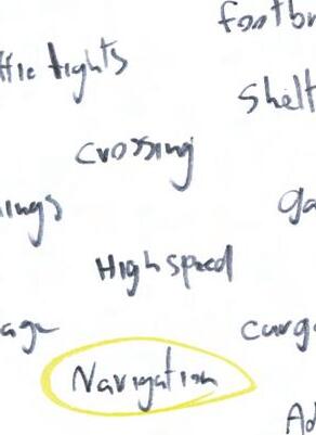
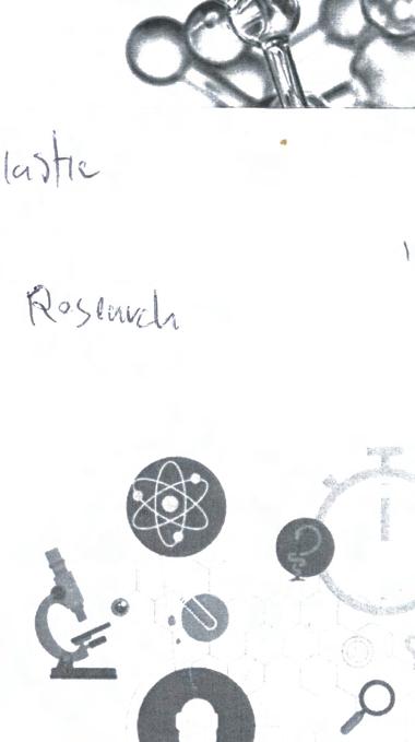
To find the issues that people might have in train stations I began by empathizing with the user, the first step of my chosen methodology. Firstly with myself and my past experiences of train stations, then with others, friends and family. I also spent time at my local train station photographing it as well as analysing people as they passed through. Following this, for secondary research, I looked at online reviews for train stations and created a list of words that are linked with the subject matter.
This research both primary and secondary gave me a broader view of the subject which this brief deals with and a clearer understanding of what needs to be achieved.
By combining my research I was able to empathise with a larger number of users which helped to define the issues more clearly. I found a range of things, both good and bad that are related to train stations and traveling by rail,
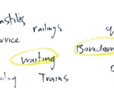
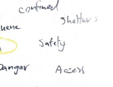
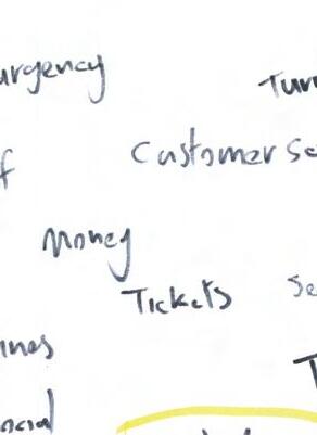
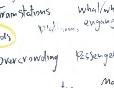
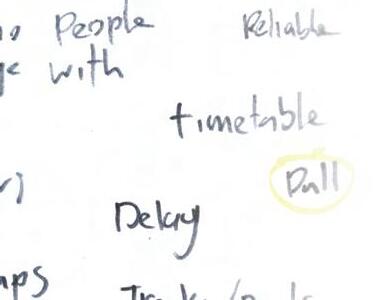
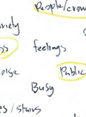
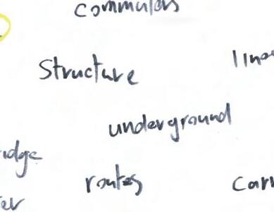
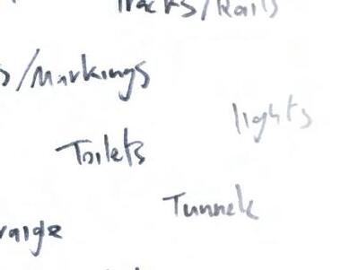
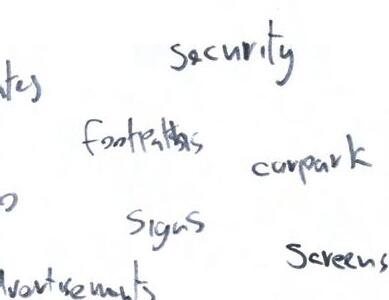
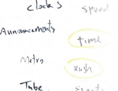
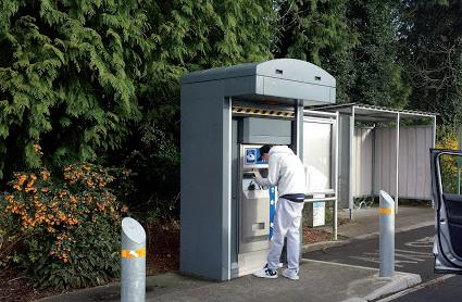
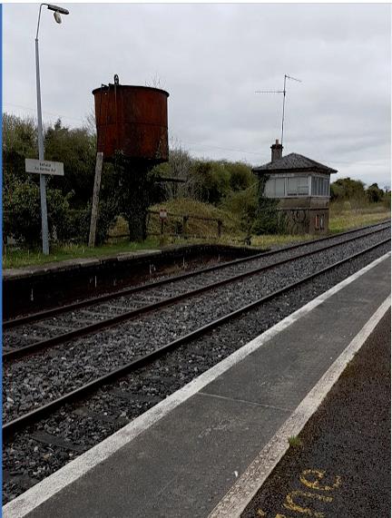
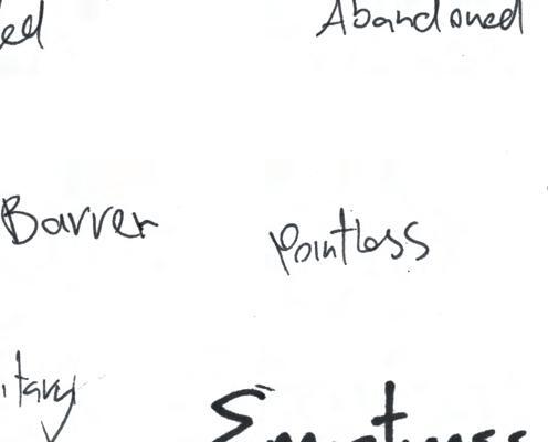
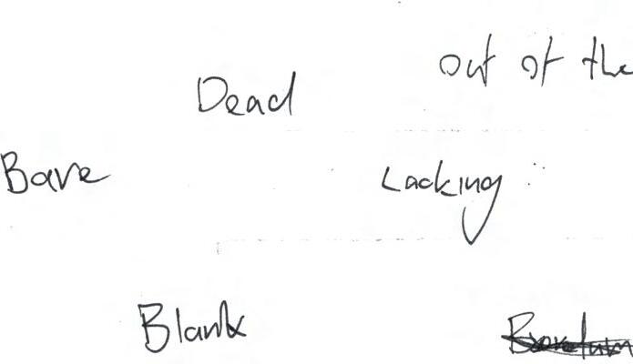
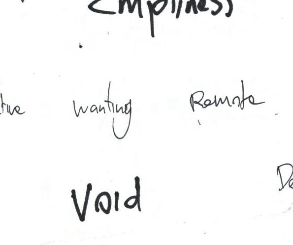

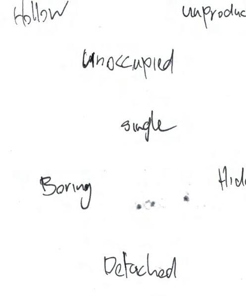
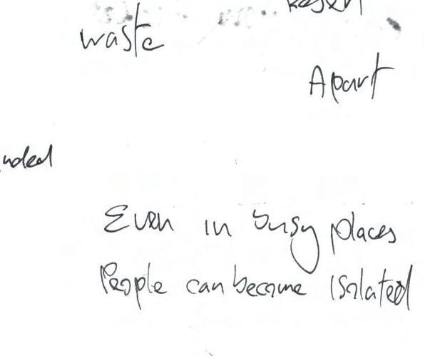
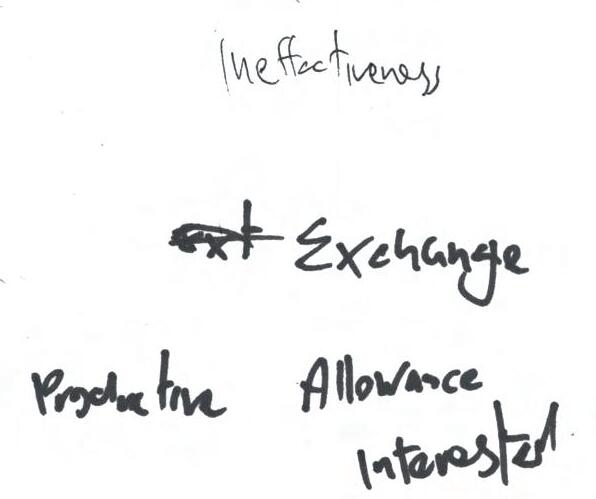
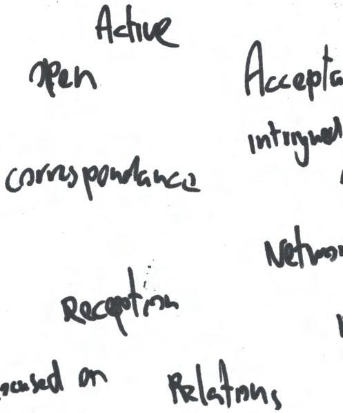
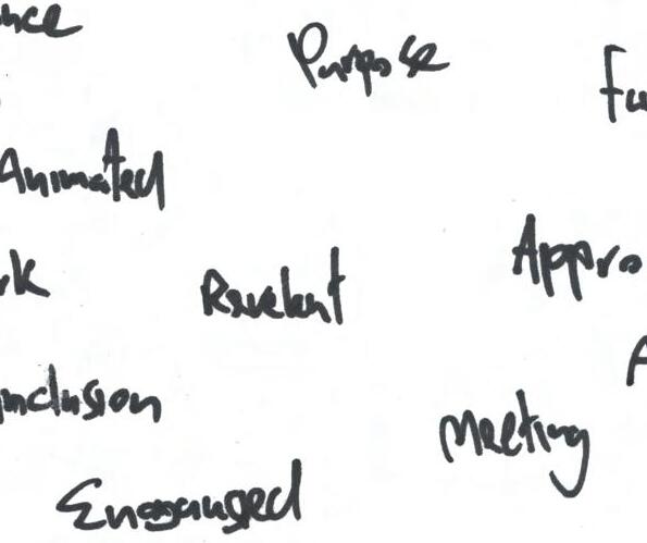
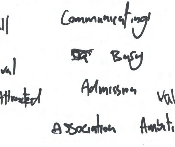
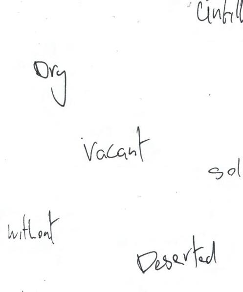
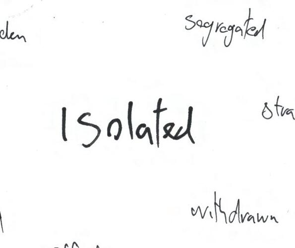
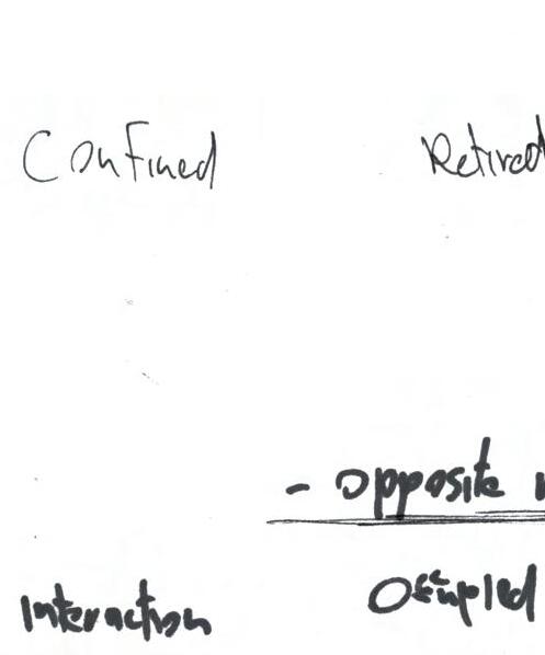
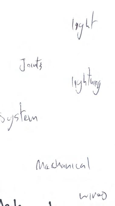
most importantly, I was able to find where the user’s pain lies. The main findings were, for a lot of commuters, especially regulars, waiting for a train is often inevitable, and it can be hard to do anything other than just waiting in this period whether its 5 minutes or 30 minutes. After exploring this issue, I summarised this experience up with 3 words: emptiness, void, and isolation. These words will be the key focus while generating ideas and progressing through this project.
Before creating ideas or solutions it is important to highlight exactly what it is asking for, an experience of joy. This is the most important part to interpret. The most useful resource for this I found to be Ingrid Fetell Lee’s Ted Talk in which she talks about what joy is and the science that surrounds it. She describes joy as:
The brief features and recommends Fetell Lee, a designer who works primarily with joy and wrote the book ‘Joyful’ in which she identifies 10 universal aesthetics of joy: Energy, abundance, freedom, harmony, play, surprise, transcendence, magic, celebration, and renewal.
²
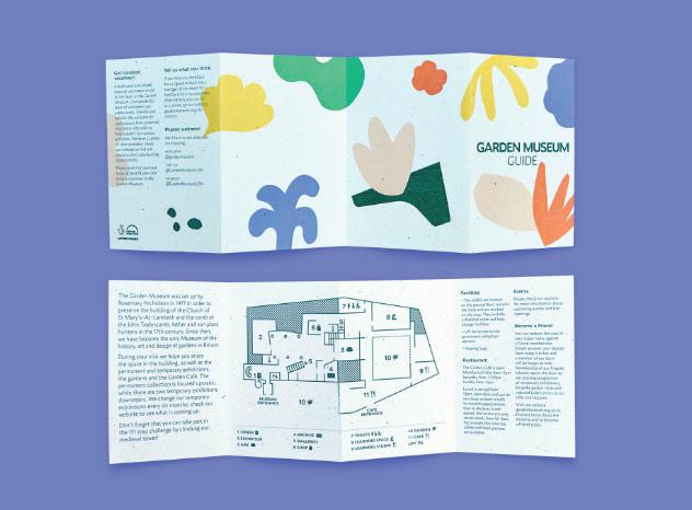
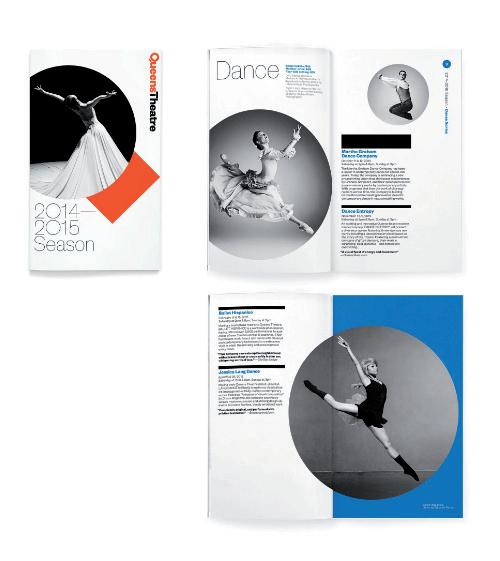
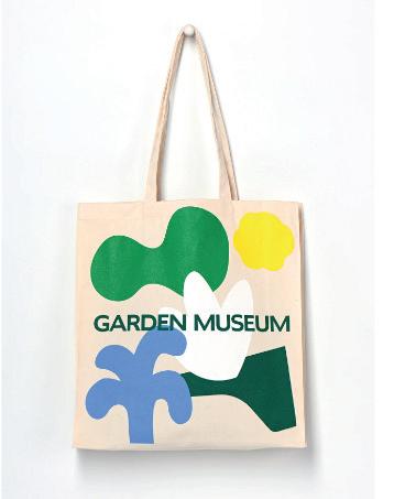
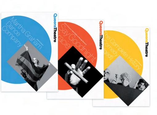
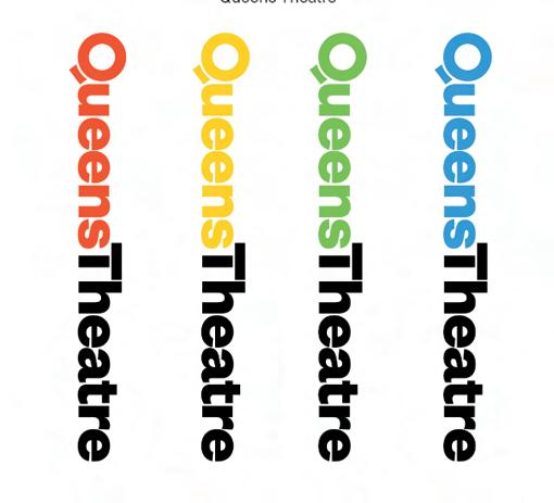
To gain inspiration while designing the visual aspects of my ideas I looked at some content from the ‘Aesthetics of Joy’ website and also some existing design pieces, such as the ‘Queens Theatre’ and the ‘Garden Museum’ branding by Pentagram. I like these for their simple use of bright colours, black space, and shapes, which are all important when creating joy as Fetell Lee describes ‘bright pops of colour, round things and an abundance of pieces.’³
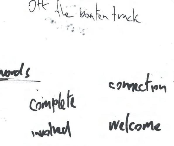
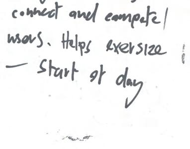
Based on the issues I defined from my research, I’ve chosen some positive keywords to aim towards when creating ideas: connectivity, socialization, friendliness, fun and obviously, joy. Overall the goal will be focusing on creating something that will help fill the gap or void that currently exists during waiting times.
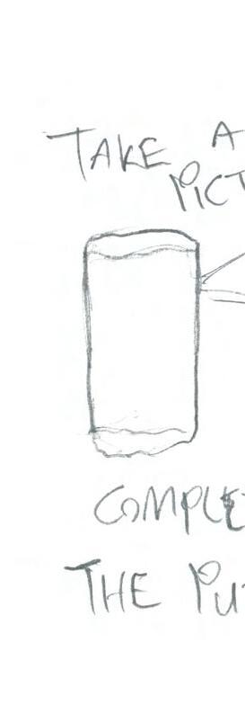
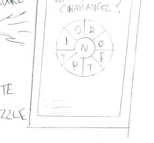
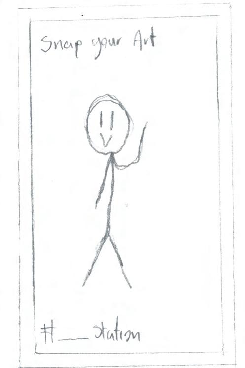
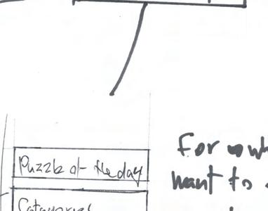
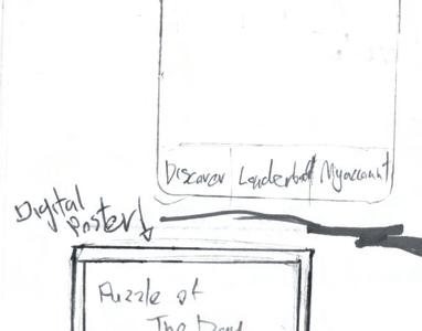
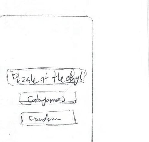
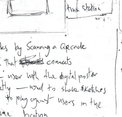
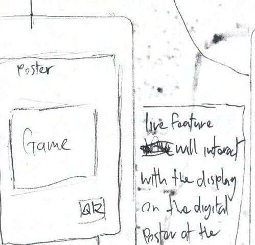
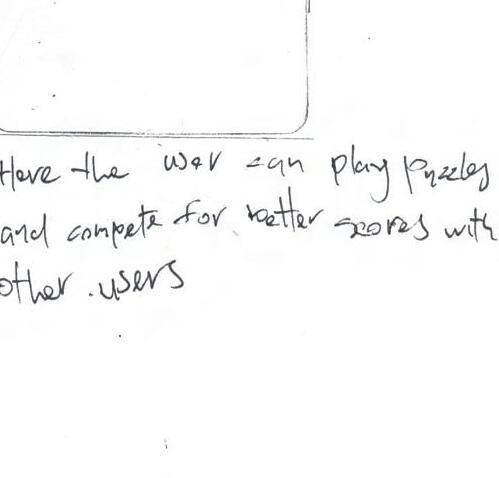
The initial ideas are based on posters in the station that users could interact with by uploading pictures of a quick drawing completed on their phone to the digital poster in their station. This was to create some pass-time fun for the user while also connecting people within the station. In a similar format, another idea was to display puzzles (e.g.. sudokus) on a digital poster so users could quickly photograph the poster and complete the puzzles on their phone while waiting for on the train.
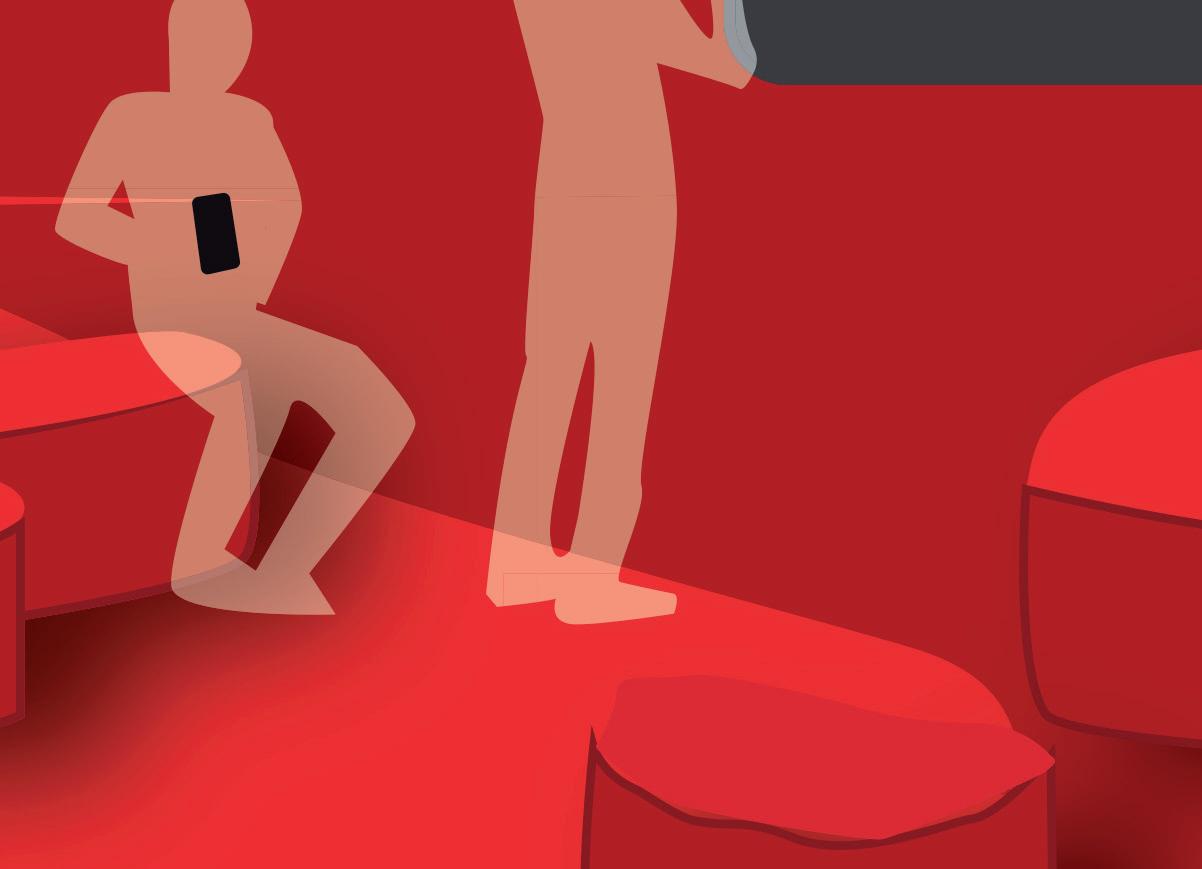
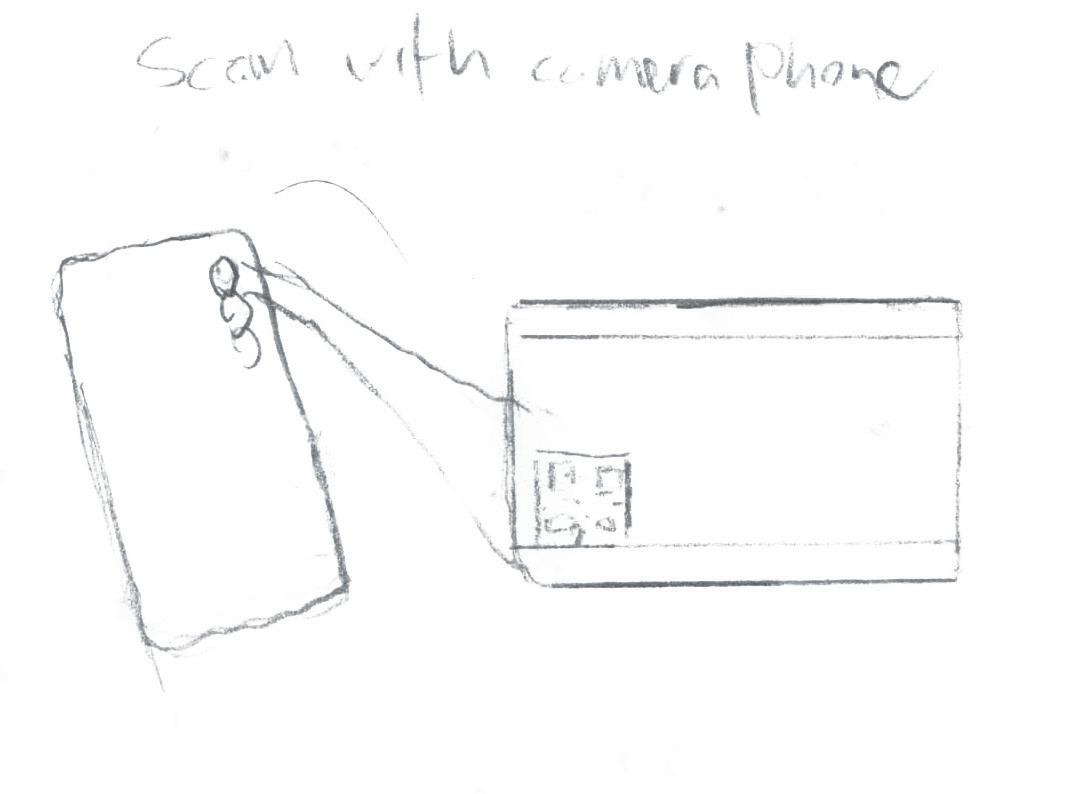
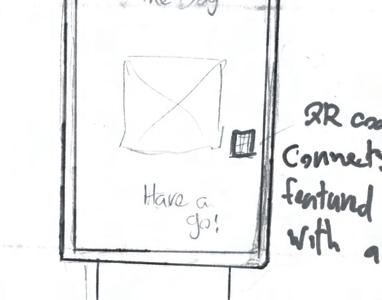
Getting away from posters I began thinking of other ways of implementing experience in a station environment. As a ticket is essential for people passing through train stations, and it is a physical printed item, a different idea was to use it as part of an experience by having a scan-able code on the ticket that would take the user to a web-page where there could be a quote, a funny video or a game, similar to the Cadbury scan for joy feature.
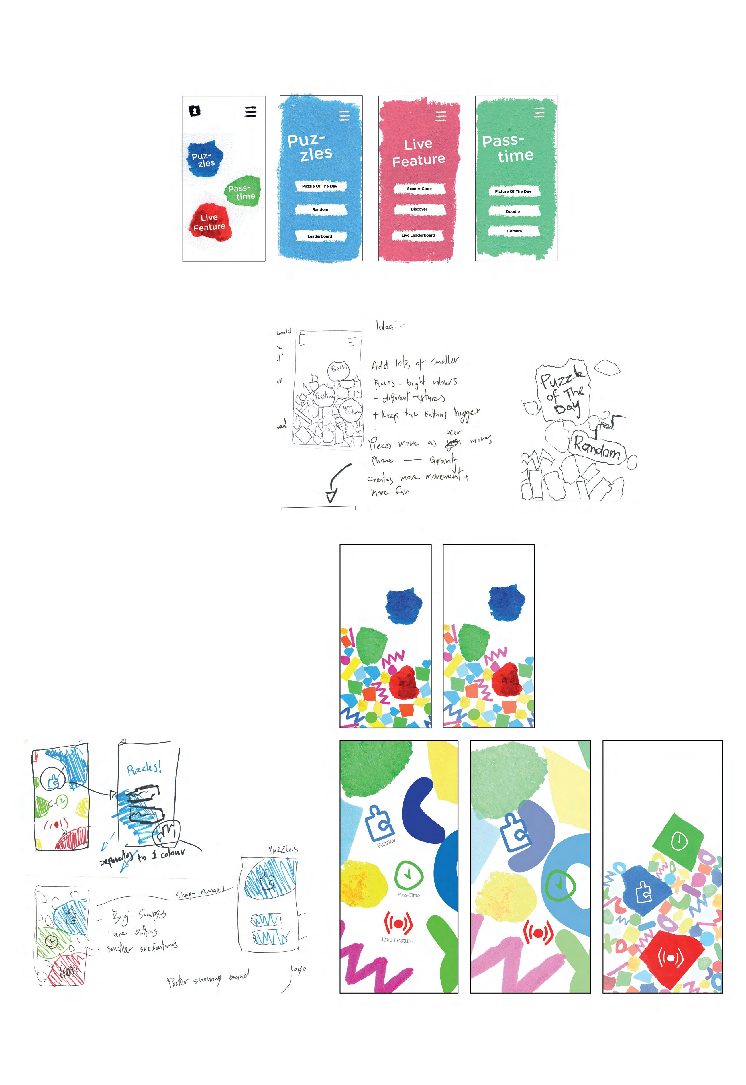
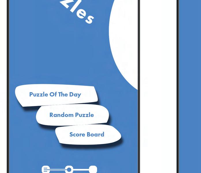
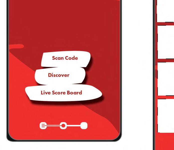
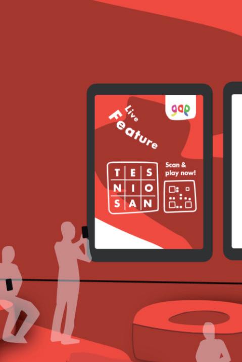
My chosen idea, that will incorporate some of the previous ideas, is a piece that will have a spacial feature in the station and an application that connects with it.
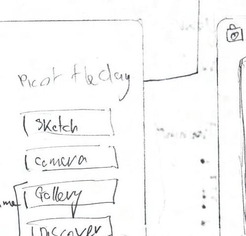
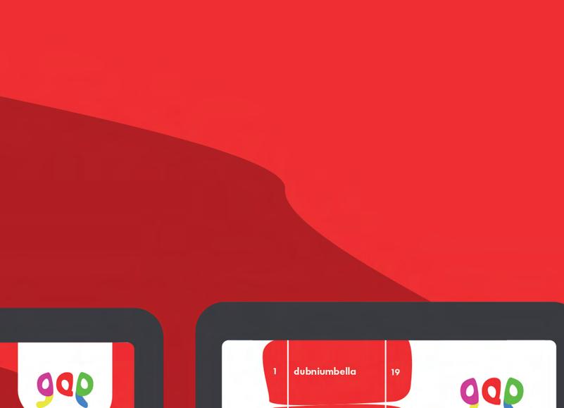
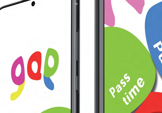
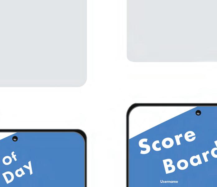
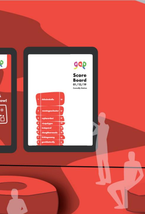
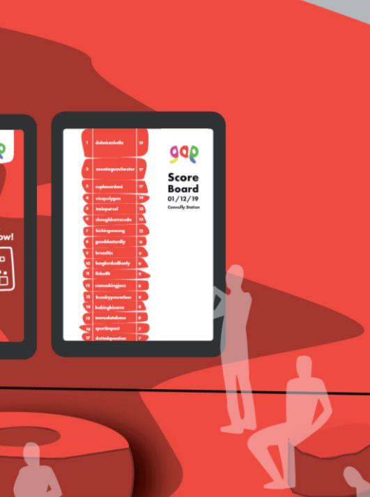
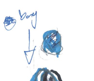
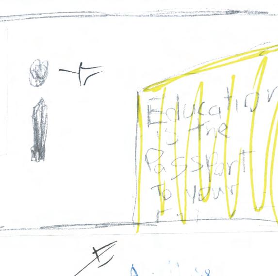
For the name, based on the concept of filling the void, I came across the idea of the name ‘Mind The Gap’ this connects the name with the message seen in all train station platforms. The chosen name then came while testing this as it appeared to still work if it was reduced to just ‘Gap’.
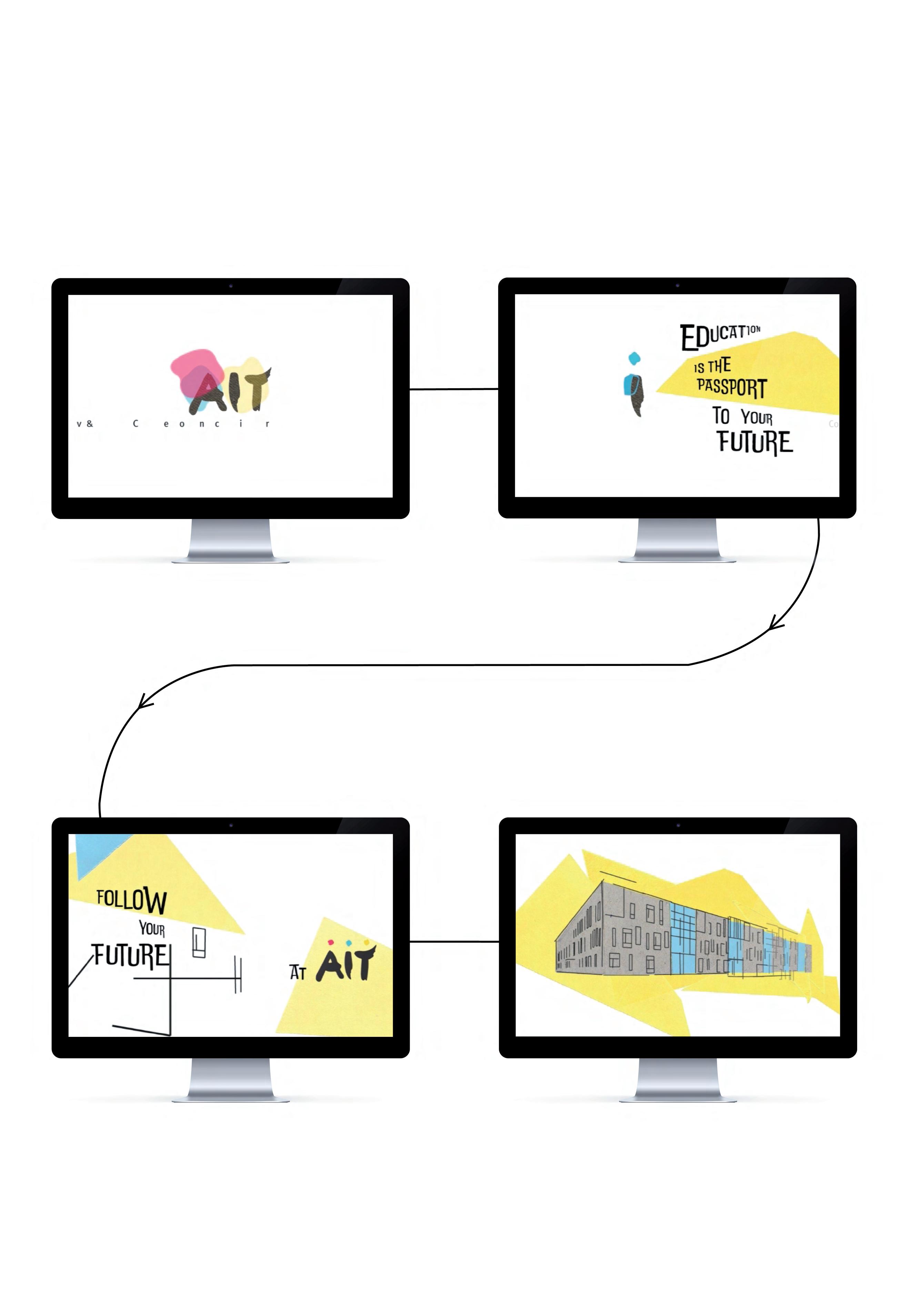
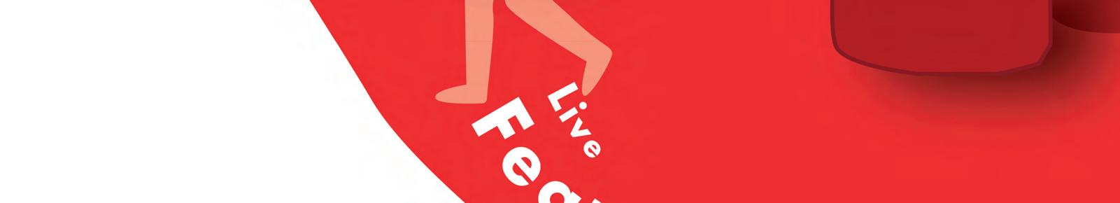
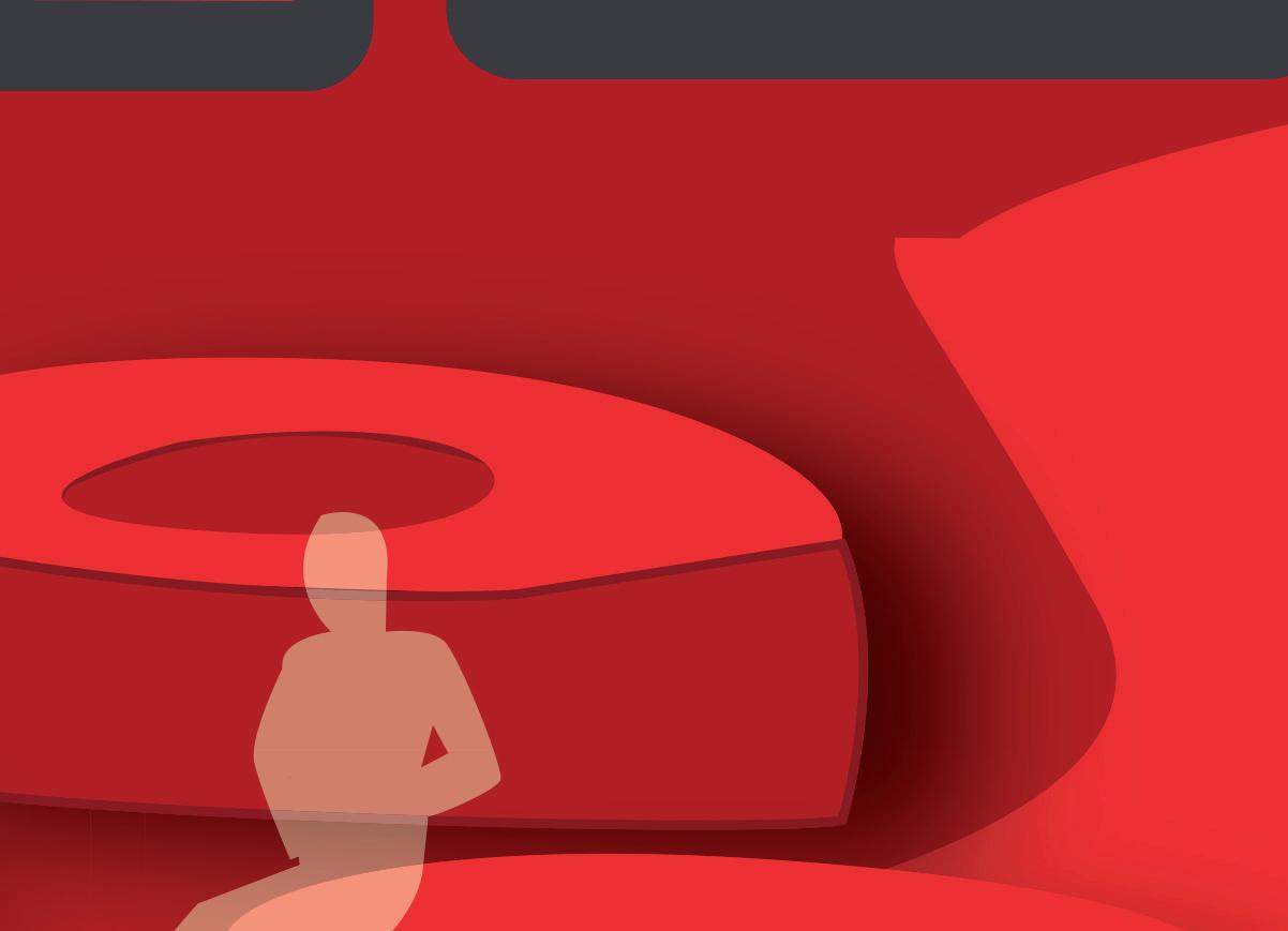
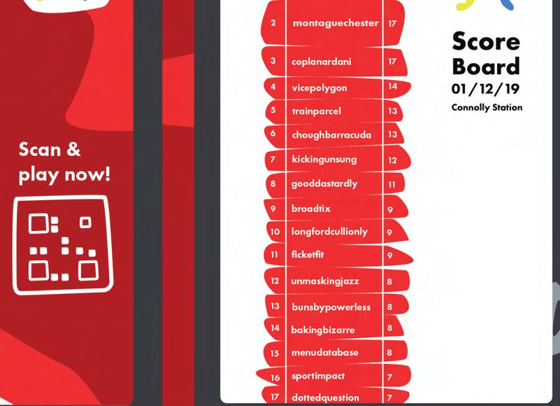
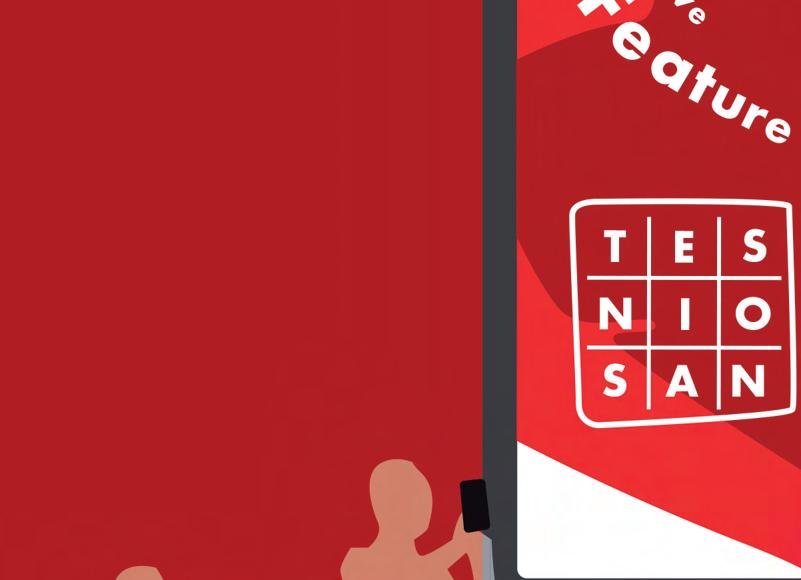
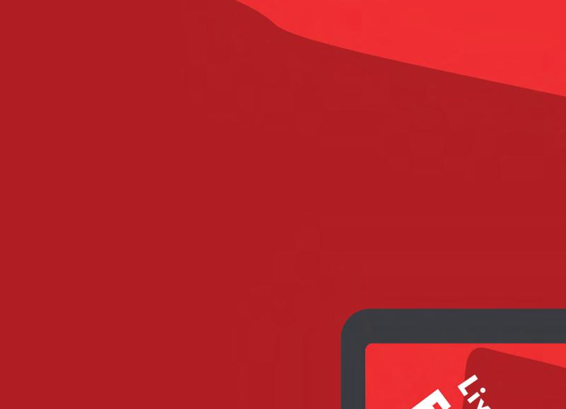
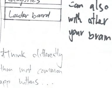
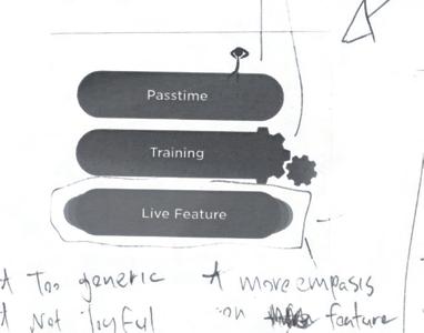
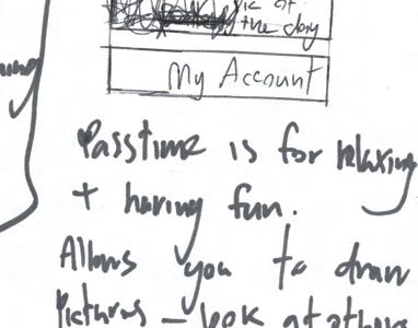
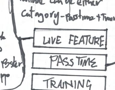
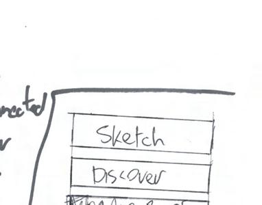
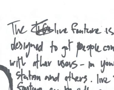
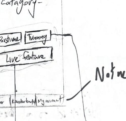
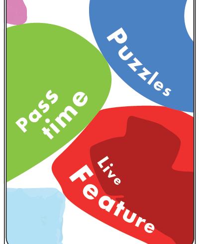
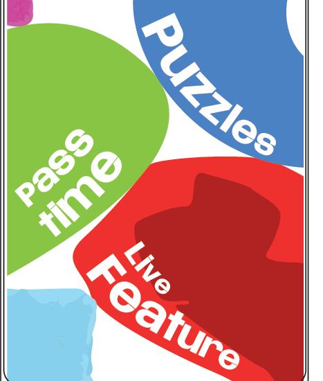
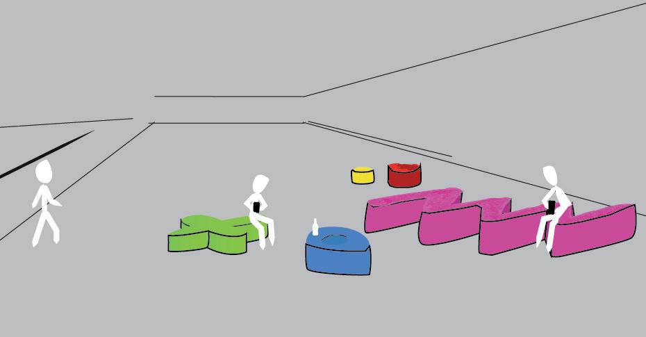
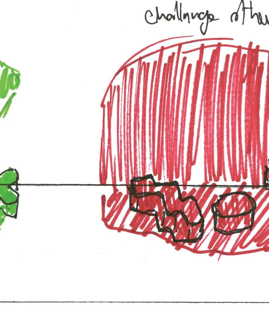
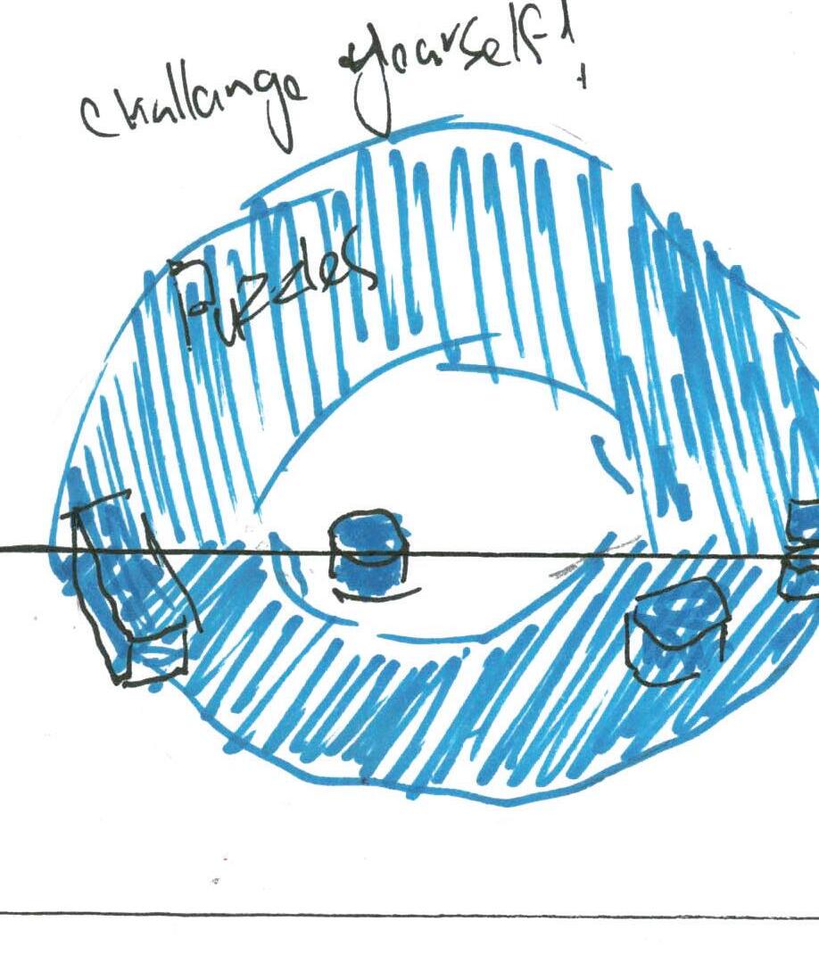
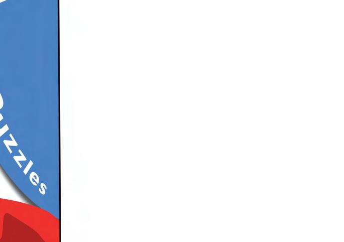
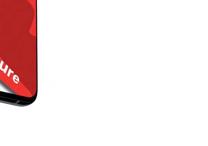
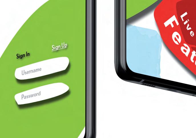
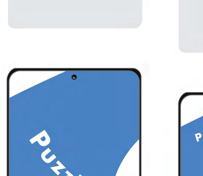
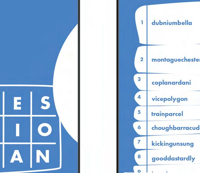
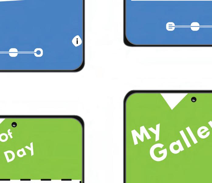
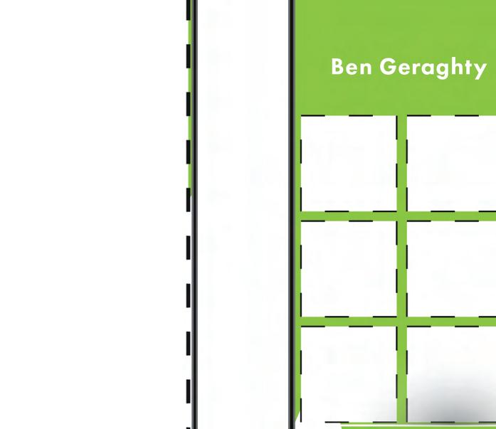
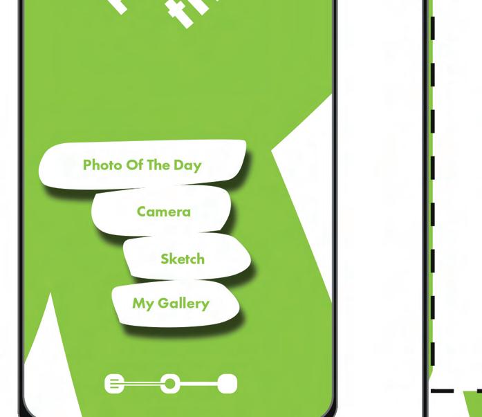
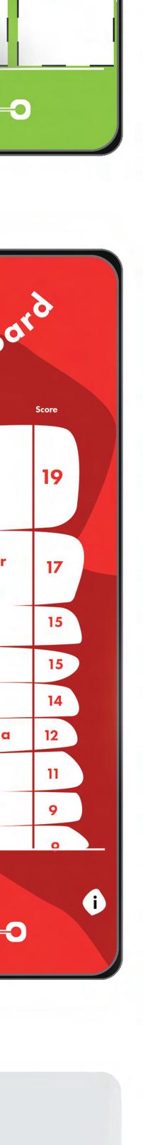
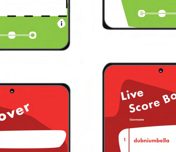
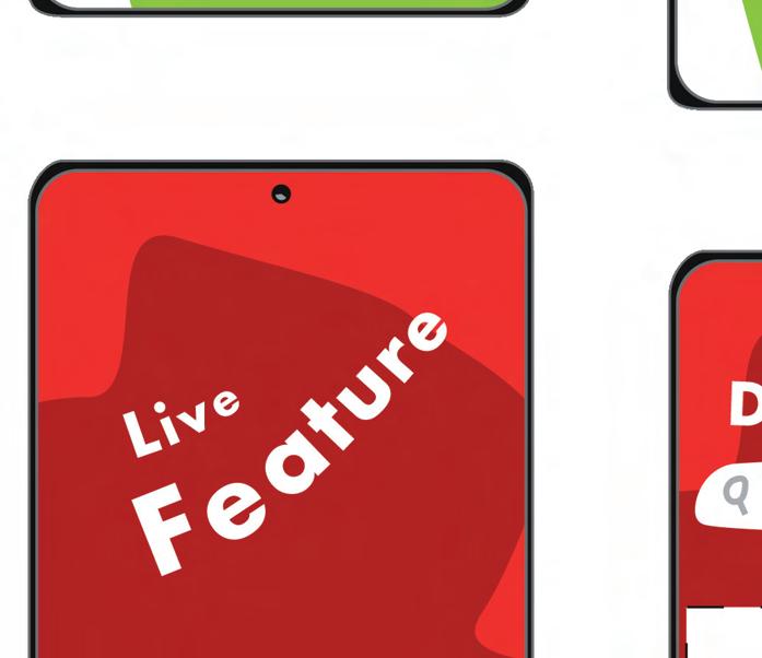
The concept is based on filling the emptiness and void that commuters can often encounter while waiting in the station or on train journeys. My research suggests that this is an issue for commuters that stifles joy. To counteract the emptiness and void of waiting, my idea is to create a waiting area in the station which will be split in three sections, live feature, pass time and puzzles. These sections will also correspond to the application’s functions. On the app the live feature will connect to a digital poster in the station, every day the poster will have different interactive activities, a game or a puzzle displayed, users can partake by scanning a code on the app and connecting with others at their station.
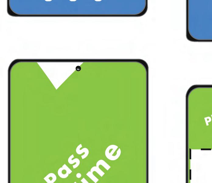
The other features will be pass time which consists of games and drawing, and puzzles which users can play random puzzles on, these two features however won’t require the user to be at the station, they can be used while on the train or anywhere else. The idea is that the user will use their chosen section while waiting in the corresponding zone.

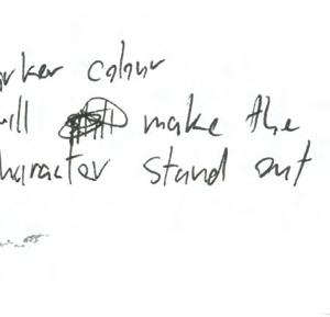
3 colours work well to defing the identity of the overall piece.
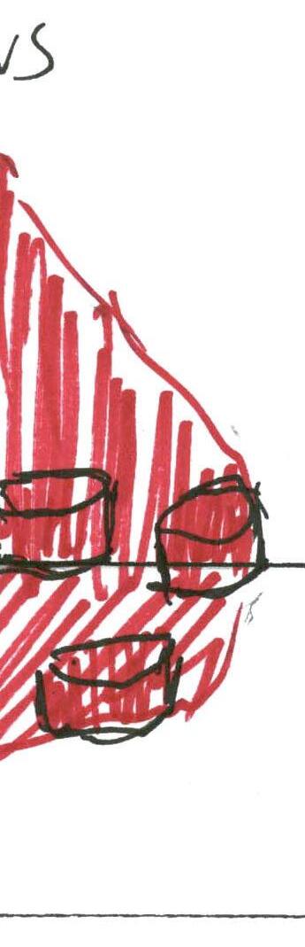
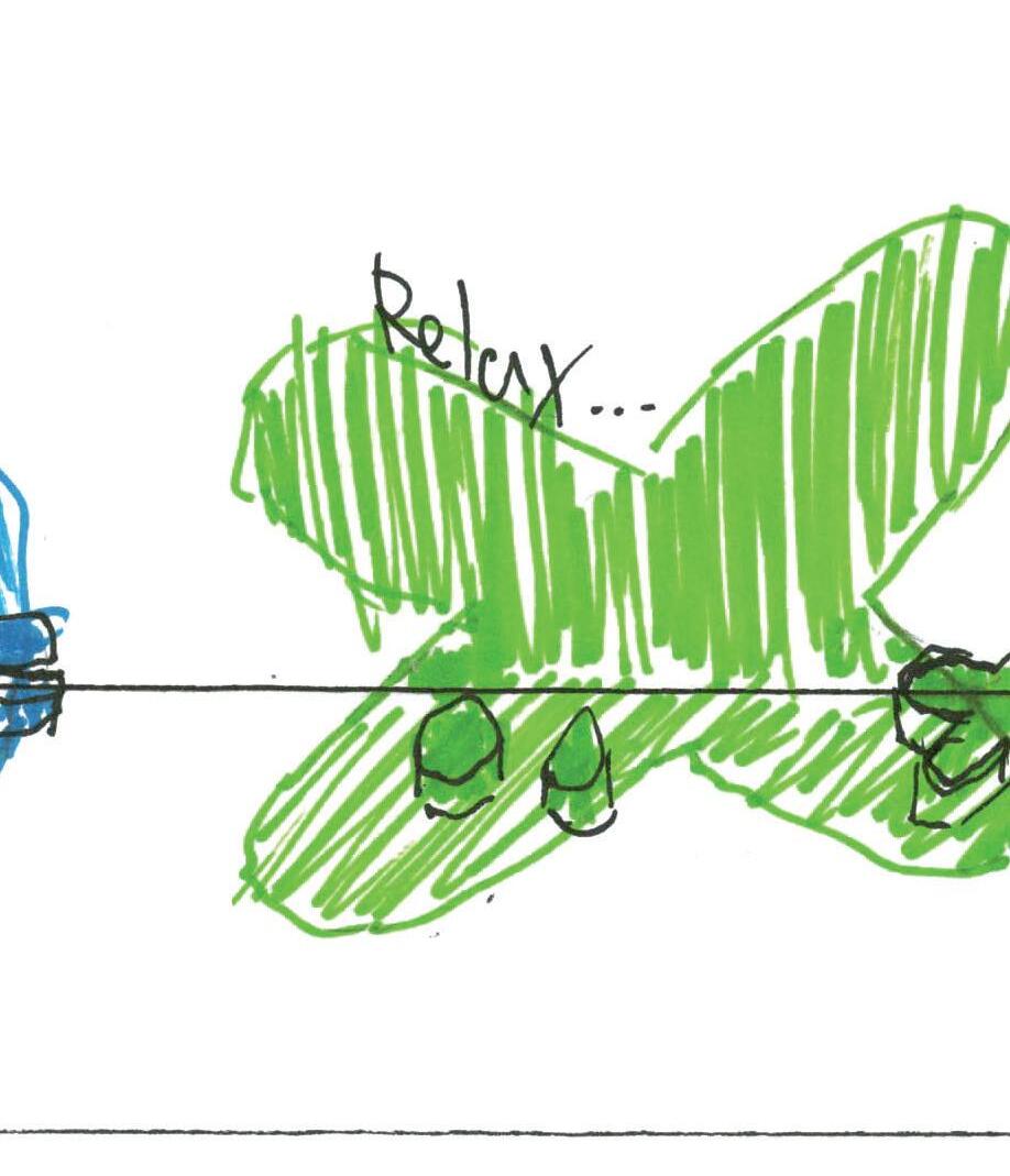
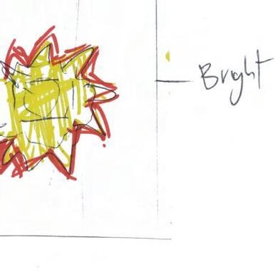
The sections will be coded by colour in relation to colour psychology. The live feature is red which can be intense and exciting and has the power to grab a viewers attention, this feature will be the most important as it directly relates to the environmental experience in the station and the app. The pass time feature will be green as it can be described as tranquil and restful. This section is supposed to help the user relax. The puzzles section is blue as it can help convey feelings of productivity and order.⁴
These colours will also help separate the features and make the visuals more colourful overall as well as helping to establish the branding. This colour scheme is created to help the user navigate through the sections and recognise that they represent the separate functions. As Giles Colborne mentions in his book Simple & Usable ’Layering information using colour takes advantage of the way the mind works, so it places very little load on the user.’⁵ These chosen colours also complement each other and have enough contrast to be easily recognised, as they are close to being a triad on the colour wheel.⁶
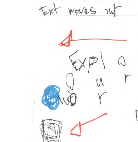
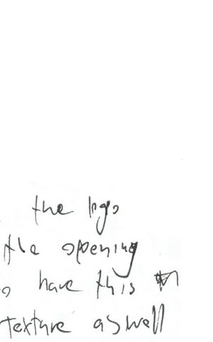
Looks too messy. Needs a lot more consistancy and simplicity with shapes, colours, and textures.
Titles, buttons and typeface are too plain/ boring for the subject.
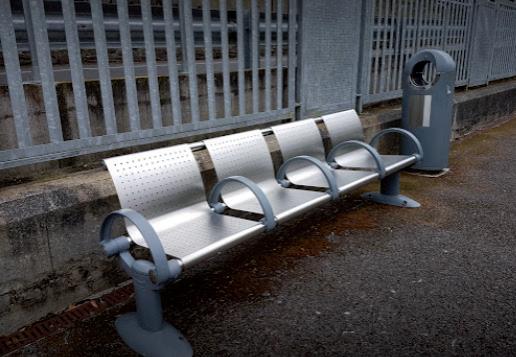
The idea of having a seating area is to cater better to the user who is waiting as users who are waiting are generally sitting. This should strengthen the connection between the user and the experience design piece. All stations will have access to the live feature via digital posters, larger stations will have the seating zone.
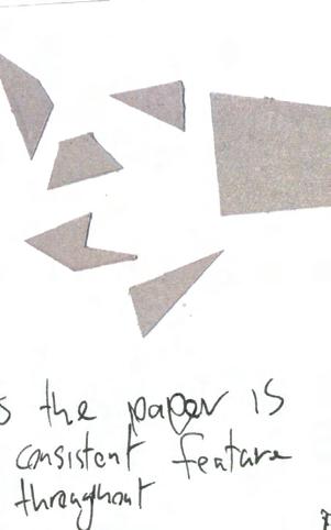
The chosen shapes, colours and font will be seen consistently throughout the final piece to drive home the identity of the brand. In their book Universal design principles, William Lidwell and Mass Beverly describe that this ‘helps establish unique brand identities to be easily recognised.’⁷ The soft and round style of the shapes was chosen to enhance the prospect of joy for the user, as Fetell Lee explains 'And what they found is that the amygdala, a part of the brain associated in part with fear and anxiety, lit up when people looked at angular objects, but not when they looked at the round ones.'⁸
Futura is more legible & isn’t as hard & sharp as Stadt which will work better in all areas of the design.
After experimenting with different fonts throughout the process, none seemed to fit well with the piece. I went back researching and found Stadt, a powerful, sharp display font. After prototyping and testing it my finding were that this font worked well in some area’s however, in other areas it was too overpowering and the sharp features contrasted badly with the brand elements. From these findings, I went back to empathising with the potential user to find a better choice. Taking from the positives of this font I replaced it with Futura which in bold has similarities to Stadt. After testing again this choice worked better overall for legibility and connecting it to the other brand elements.
Upon reviewing it myself I found that it has strong points and is an intriguing idea. Personally, I like the simple colours, shapes and the type that is consistent throughout. However, it also has some weaker points. I would like to have selected a more unique font that would be stronger in defining the brand I believe I spent too much time trying to make the wrong font work. Also after reviewing my piece, I feel that the actual functions of the app, puzzles, maybe isn’t the most joyful thing and could have been a function more suited to joy. Overall I believe my finished piece meets the criteria that were required.
The learning outcomes that I have acquired from this project were the overall importance to user-friendly design within experience design. Creating a connection between usability and aesthetics. Designing for a particular environment. The benefits of applying a methodology to a design process. The benefits of evaluating and critiquing my own work at different stages. Also how to effectively present an experience design piece.


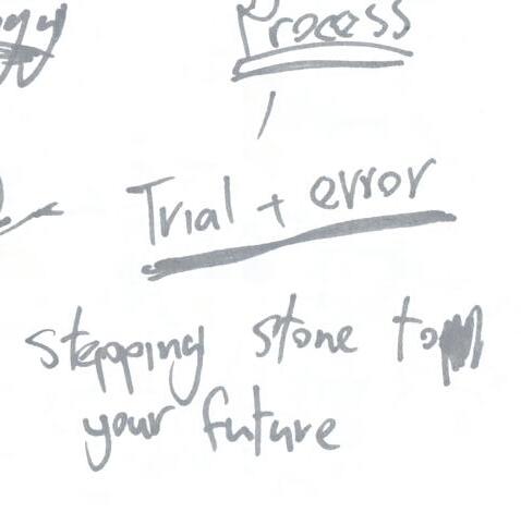
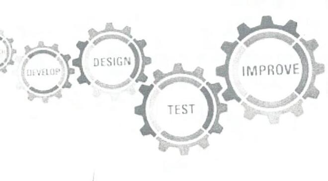
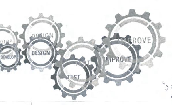
Finishing this experience design project I believe I have effectively applied and used a methodology. The methodology was effective as it kept a structure throughout my process. The early stages were useful in really understanding the issues. This benefited the next stage as it had a deeper purpose. My ideas were clearer and dealt with the issues. The final stages were very useful in refining and completing my chosen idea. Also going back to the early stages of the methodology was constructive while working through and finishing this project.
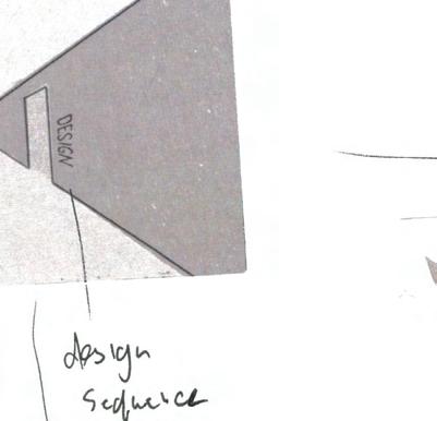
 Logo & Slogan


Time-based media can be conveyed through various mediums such as video, film, slide, audio, animation, motion graphics, but the essential piece is moving image and a durational dimension which unfolds over time.¹


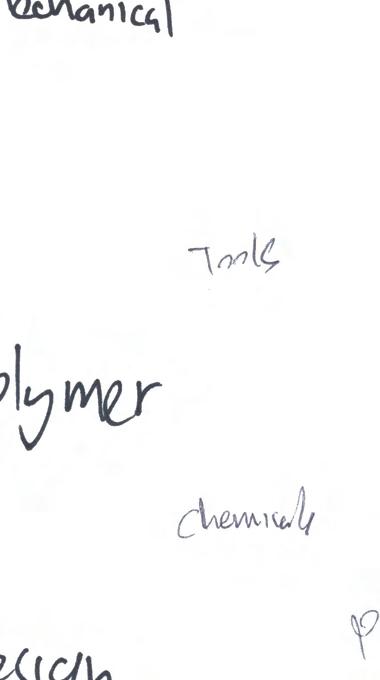
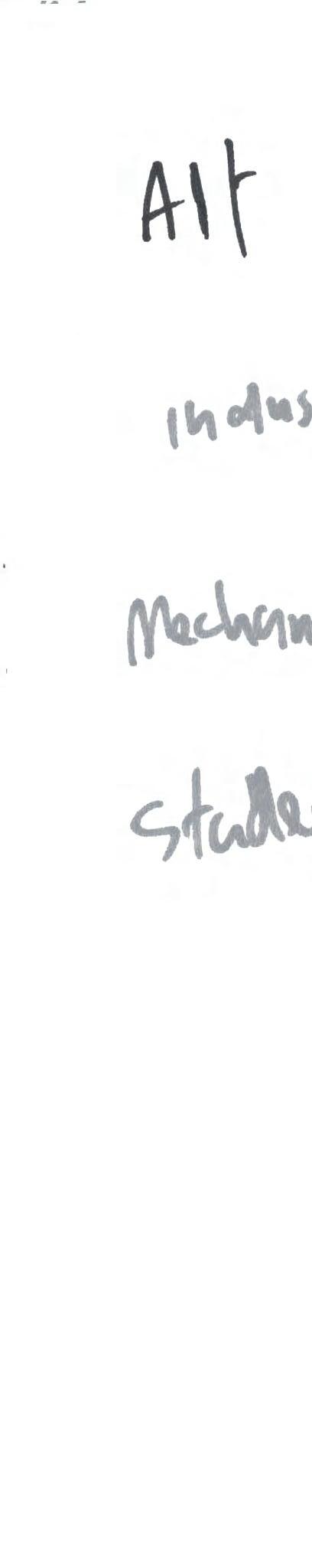
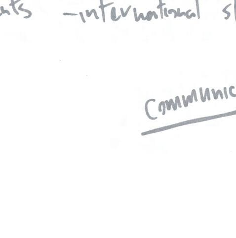
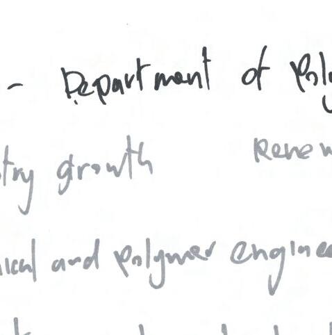
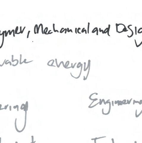
The requirements for this brief are to create an original time-based media piece, 60-100 seconds in length, showing and promoting the mechanical, polymer and design department in the Athlone Institute of Technology. It should be a reflection of what the department has to offer such as the courses available in the department along with the student life at AIT.
The finished piece should be executed in an energetic, positive, upbeat and friendly manner and must appeal to a diverse group of potential students, such as international, mature and leaving cert. In their paper, Promotional Video Production which fused The Motion Graphics and Colour Marketing, Jung Hee Kim, Seung Ae Lim, and Hak Hyun Choi explain ‘The purpose of the promotional video appeal to attract the attention of consumers increases.’² As this is a promotional piece, it could take a marketing strategy approach towards the subject, essentially to sell viewers a vision of AIT.
Aims:

Aims
By partaking in this brief, I hope to learn more about the core principles of time-based media. I will learn more about constructing a motion piece for promotional use and also learn more about what makes title sequences or promotional motion pieces effective and memorable. I will explore the various methods of creating a time-based media project.
Objectives

Objectives:
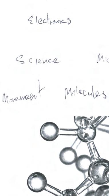
To approach this brief I will need to establish a detailed breakdown of the project brief and the client needs to find exactly what is required. I will explore the engineering, polymer and design department, the courses offered and the student life connected with it to help find what defines this department or what makes it stand out. I will also learn more about promoting a client within a time-based format.


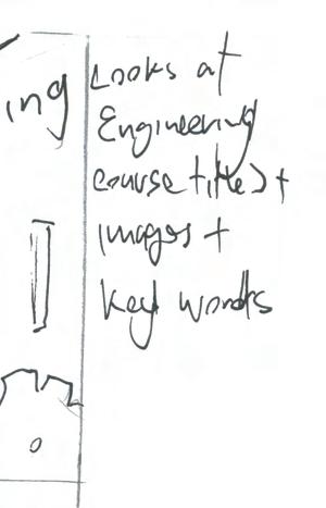
As this is a promotional piece, the first stage for this project was to find out what defines this department. To empathize with the client and gain some insights I began by looking at the AIT website, reading from the prospectus, looking at the courses offered and exploring their branding and content on social media to get a better feel for the whole institutes, and more importantly the department’s identity.

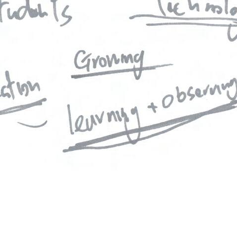
After empathising, I found some things that help to define the department, such as the wide range of courses offered within engineering, such as music, mechanical, polymer, and within design like graphic design, digital design and animation and illustration. The institute has an empowering and ambitious tone throughout its website and social media. These findings helped in defining the overall identity of the department.
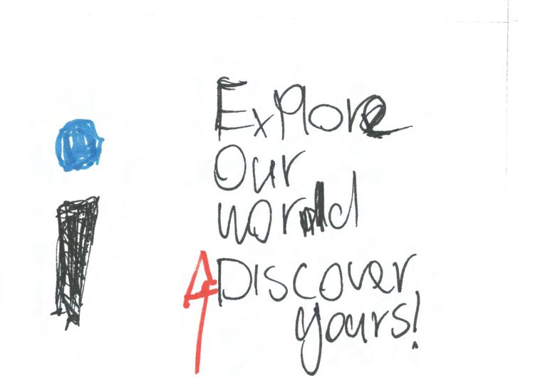
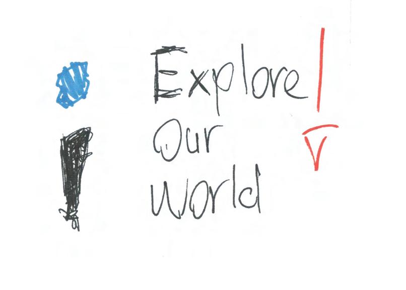
There is an opportunity to take from and expand on the tone that already exists for AIT. The empowering and ambitious tone is perfect for this promotional piece. Quick and simple slogans such as ‘Discover Your World’ and ‘Open Your Future’ are very effective titles. Alongside this there are features such as the logo and colour scheme, by using these it will help connect this piece with the institute’s overall brand.

To find some early inspiration I looked at some title sequences on ‘The Art Of The Title’ from the ‘Inner Workings’ collection, a lot of which had mechanical themes which relate to the brief subject.
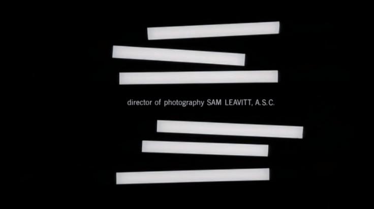
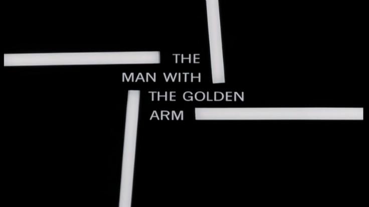
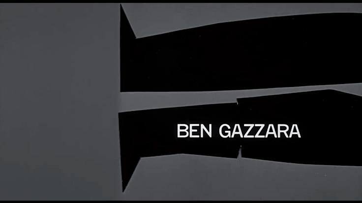
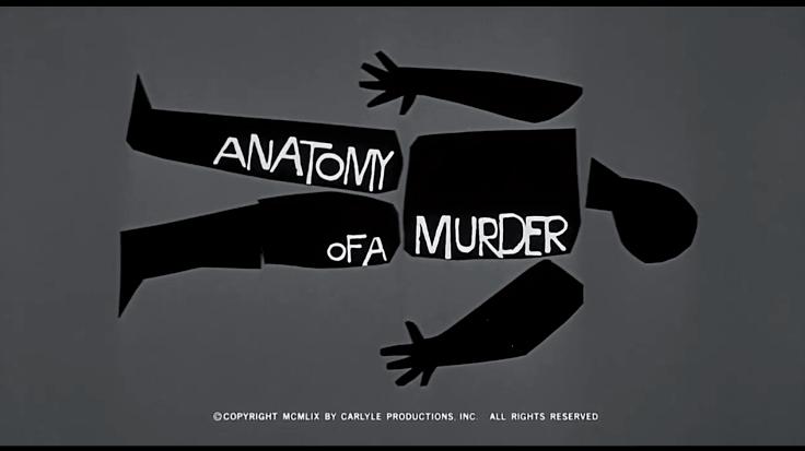
In terms of design and more specifically time-based media, I am often inspired by the work of Saul Bass. He is arguably the greatest designer of movie title sequences, his work in films, such a ‘The Man With The Golden Arm’ and ‘Anatomy Of A Murder’ is incredibly effective while also being very simple.
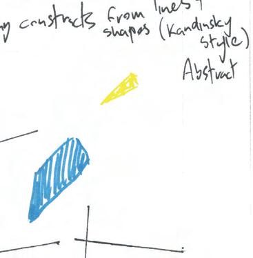
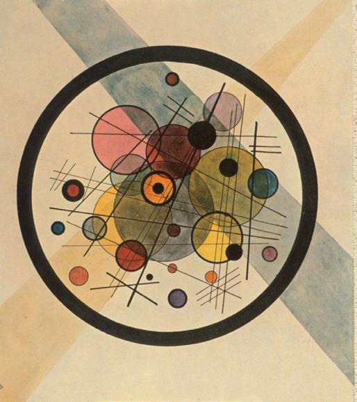
Another artist I found inspiration from for this project was Wassily Kandinsky, who was an abstract artist in the Bauhaus. After stumbling upon his work in a video, by Alexey Berezyuk.⁴ I admired the simple use of shapes and lines which created a distinctive style in his art.
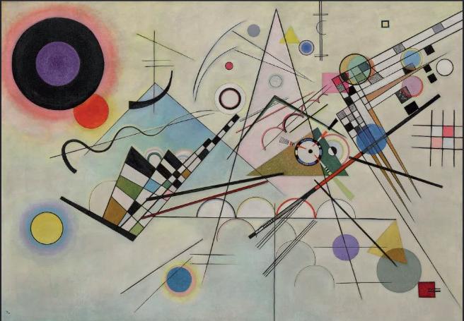
From this research there are some repetitive and consistent styles of solid, bold shapes, contrasting colours and an overall simplicity to the design. These can create strong visuals and are effective at conveying a message and tone which is what I hope to achieve in my final piece.
‘Saul understood and harnessed the power of image, and his energy and ideas transcended the boundaries that have traditionally separated design, film, architecture and art’.
³
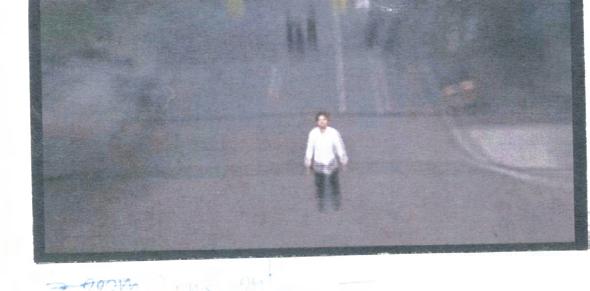
In the ideation stage, I tried experimenting with some different styles, some ideas were to get footage of students around the college, walking, socializing and studying and also featuring interviews with students and lecturers.
However looking back at the artists
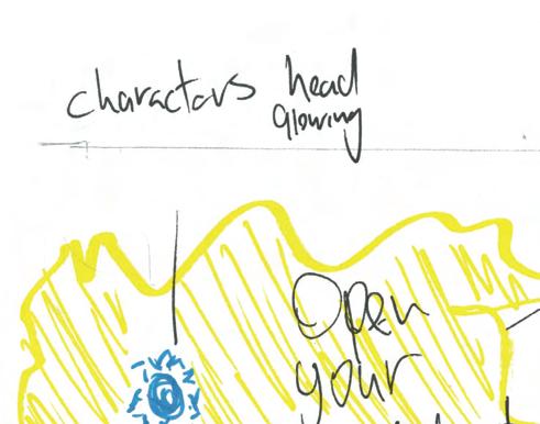
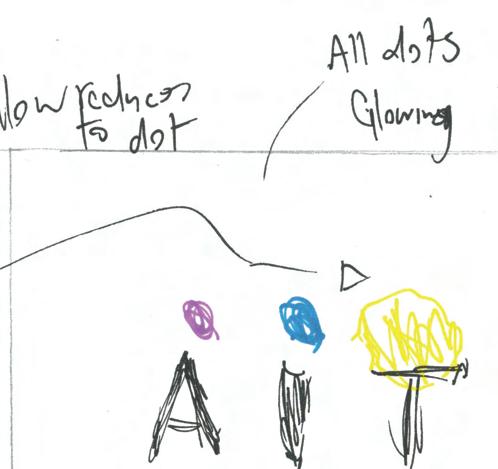
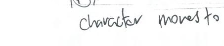
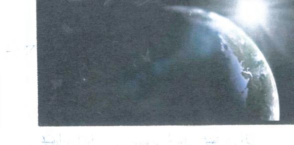
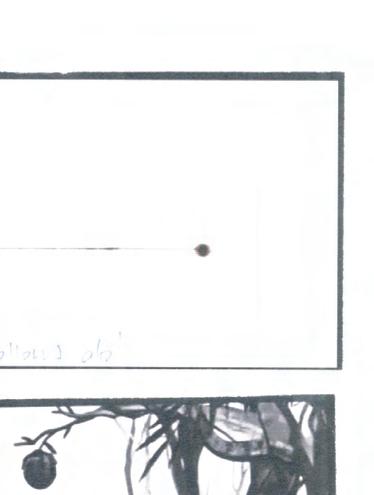
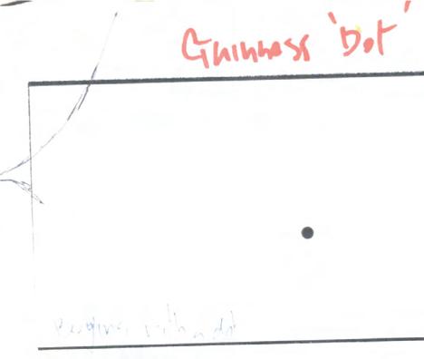
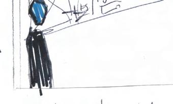
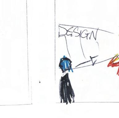
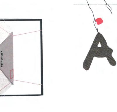
I took inspiration from, I decided to make my piece entirely from animation and motion graphics instead of film as it is closer to the style which I wanted to achieve. My idea is to create a character that could go on a journey of discovery around AIT, similar to Guinness’ ‘Dot’ ad. As my storyboards developed I had the idea to make the ‘I’ in AIT into the character
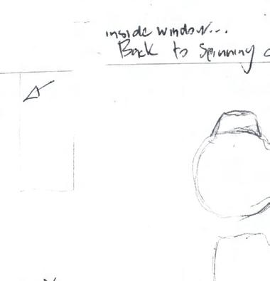
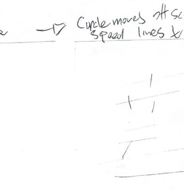
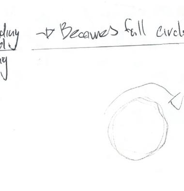
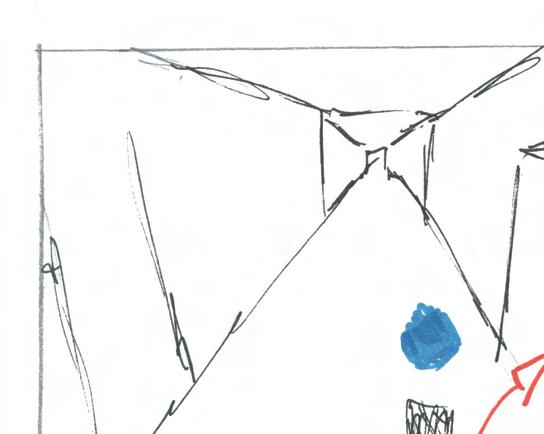
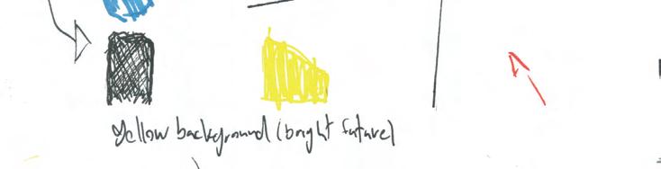
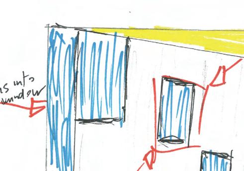
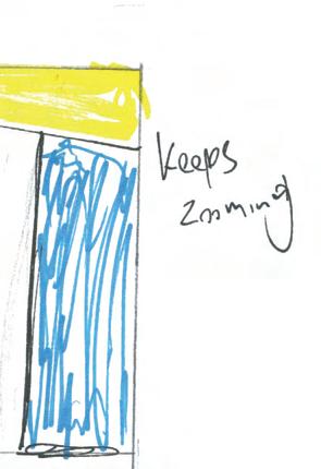
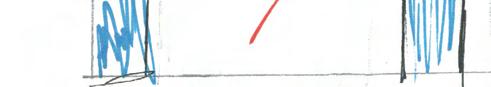
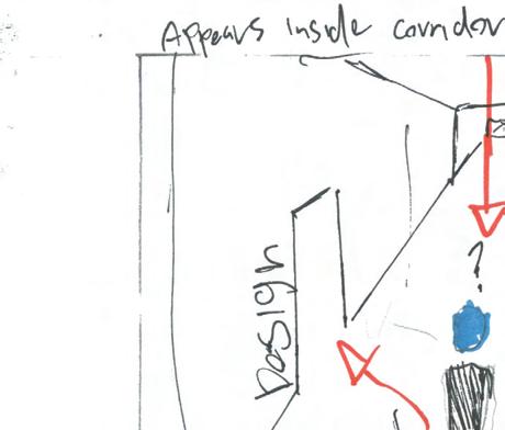
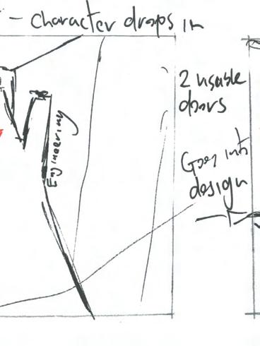
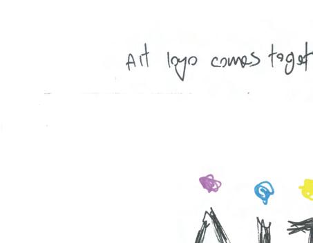
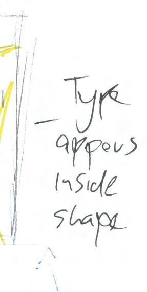
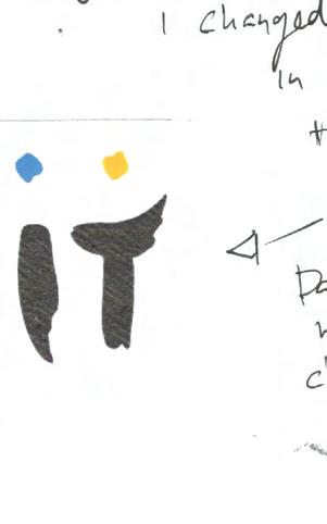
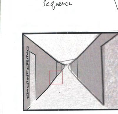
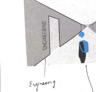
The piece will consist of is of the character, the ‘I’, which will appear first as the logo constructs in the opening, the logo then disappears leaving only the character,
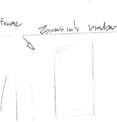
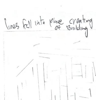
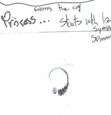
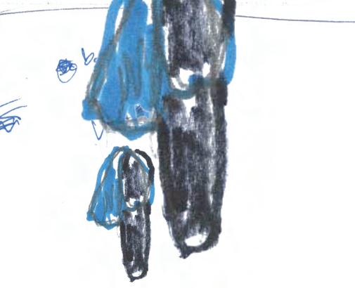
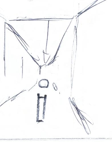
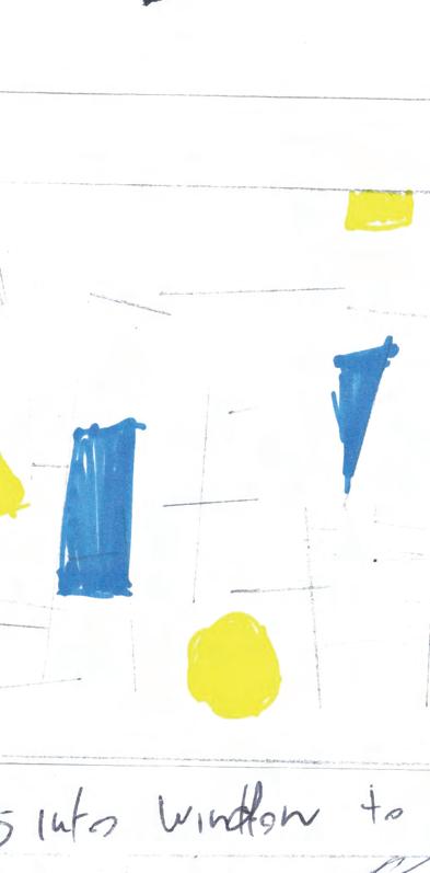
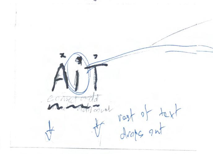
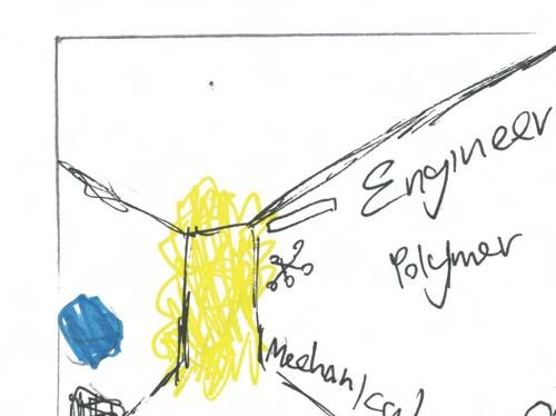
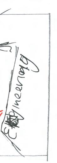
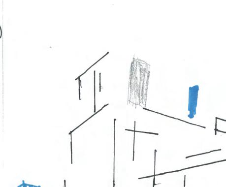
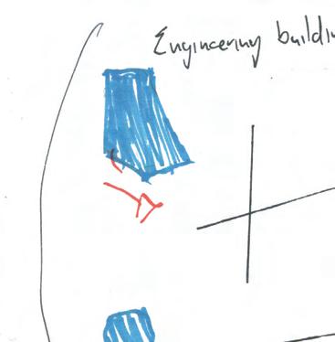
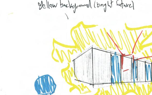
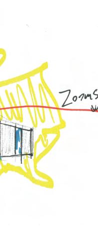
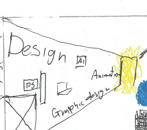
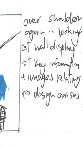
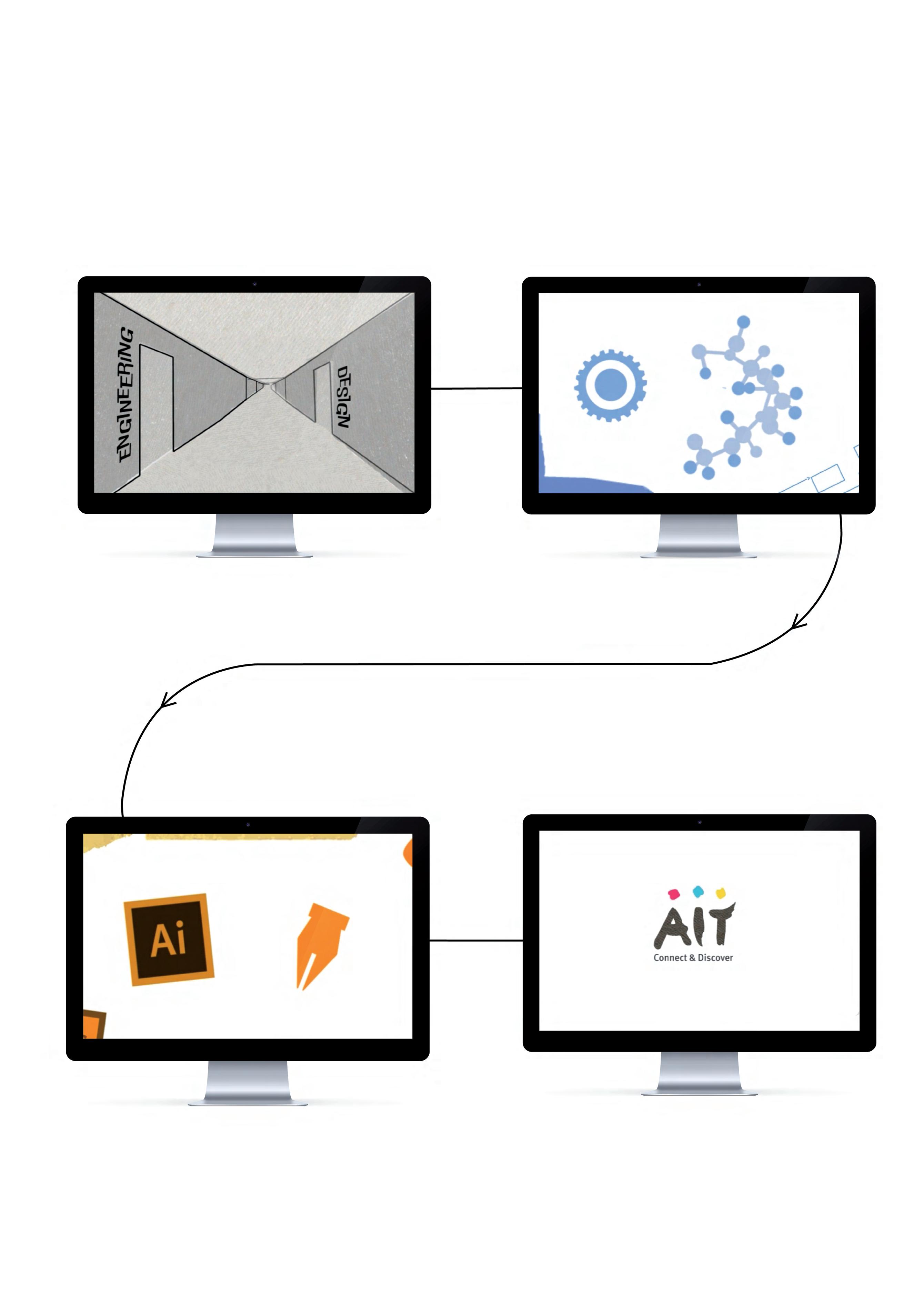
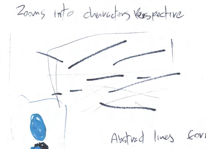
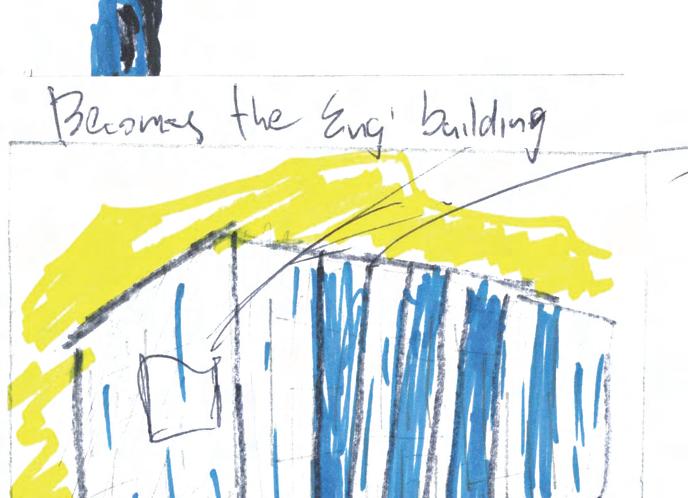
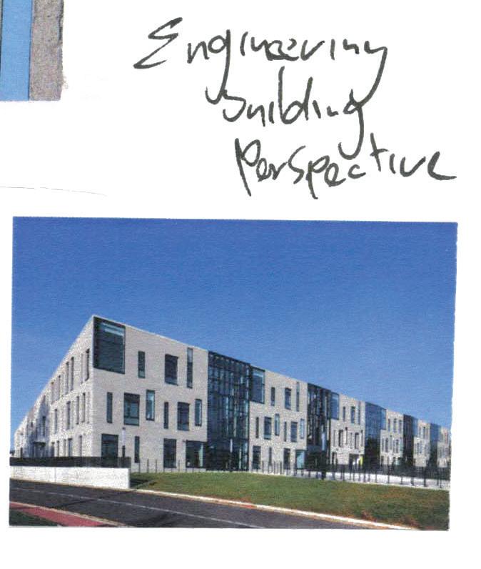
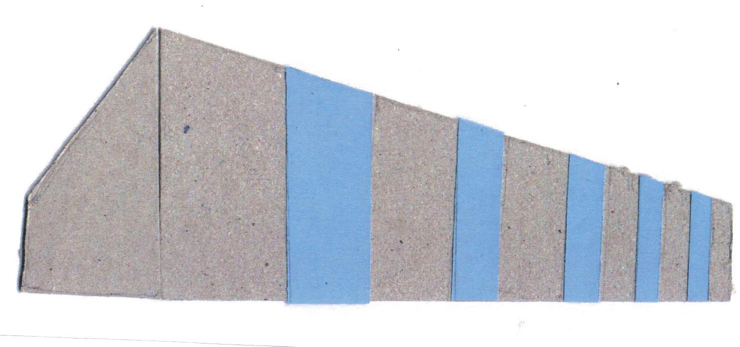
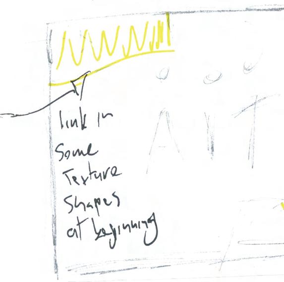
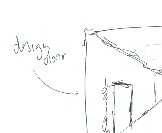
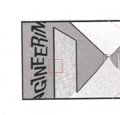
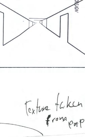
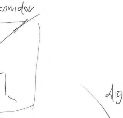
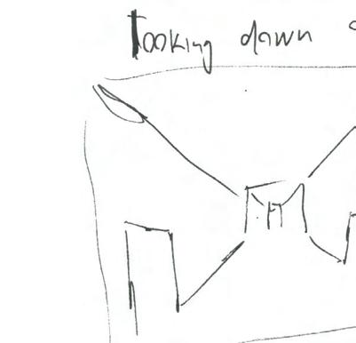
The setting, the AIT engineering building constructs in front of the character. I chose to use this as the setting as it has a distinguishable and identifiable look. The camera zooms into a window which takes the viewer inside the building into a corridor. Then here is shown some of the courses available, and some words and images related to the department sections to give a quick overview of what the department is all about. To make the this more understandable I split the department into two sections, engineering, and design.
The use of colour can help form characteristics and convey messages through non-verbal communication within a design.⁵ To help convey the essence of the engineering and design sections, they will be coded by colour. The design section in tones of orange which represent enthusiasm and creativity and the engineering section will be in tones of blue which represents productivity and stability. Jung Hee Kim, Seung Ae Lim, and Hak Hyun Choi mention that ‘the recognition of colors is connected to not only eyes but also brain, emotion, and experiences.’⁶
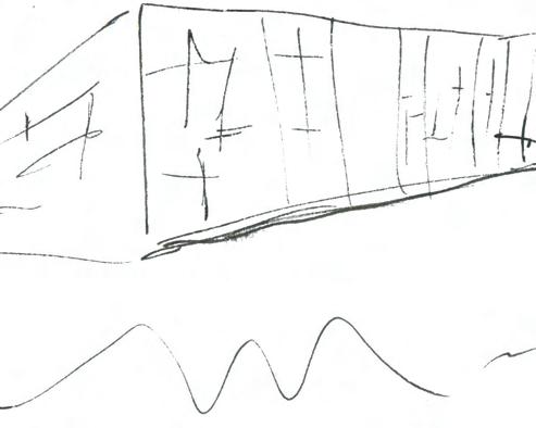


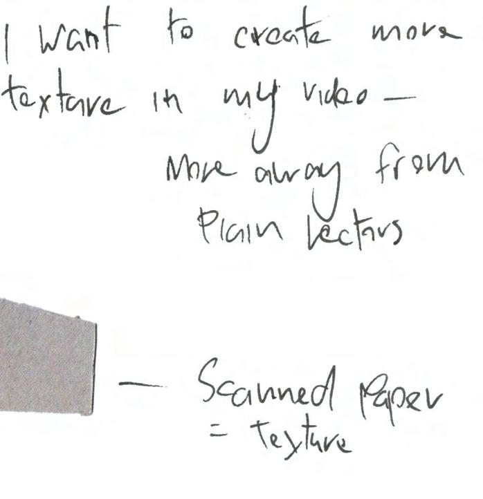
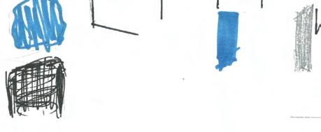
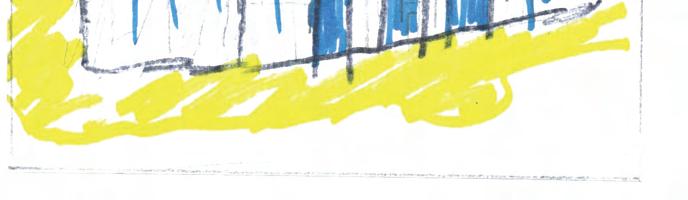
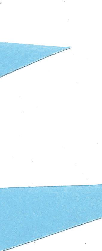
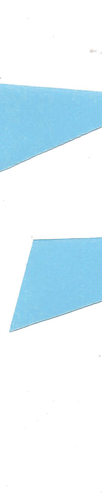
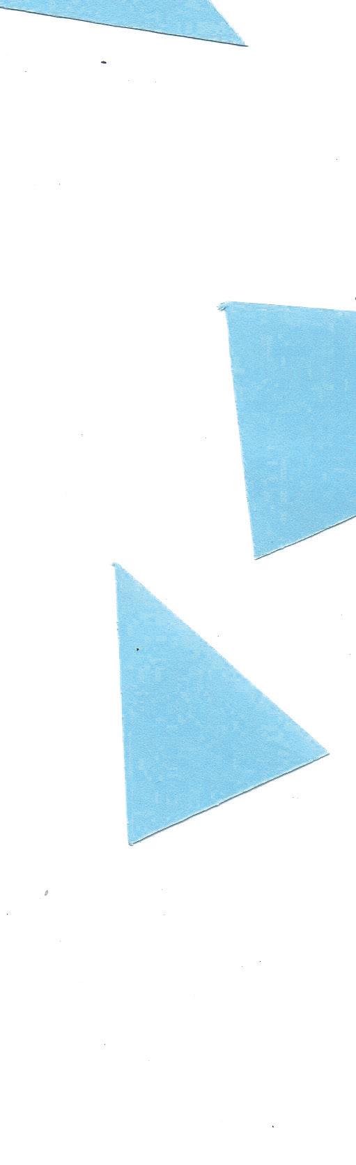
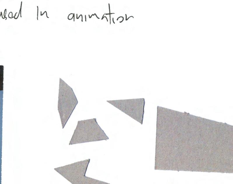
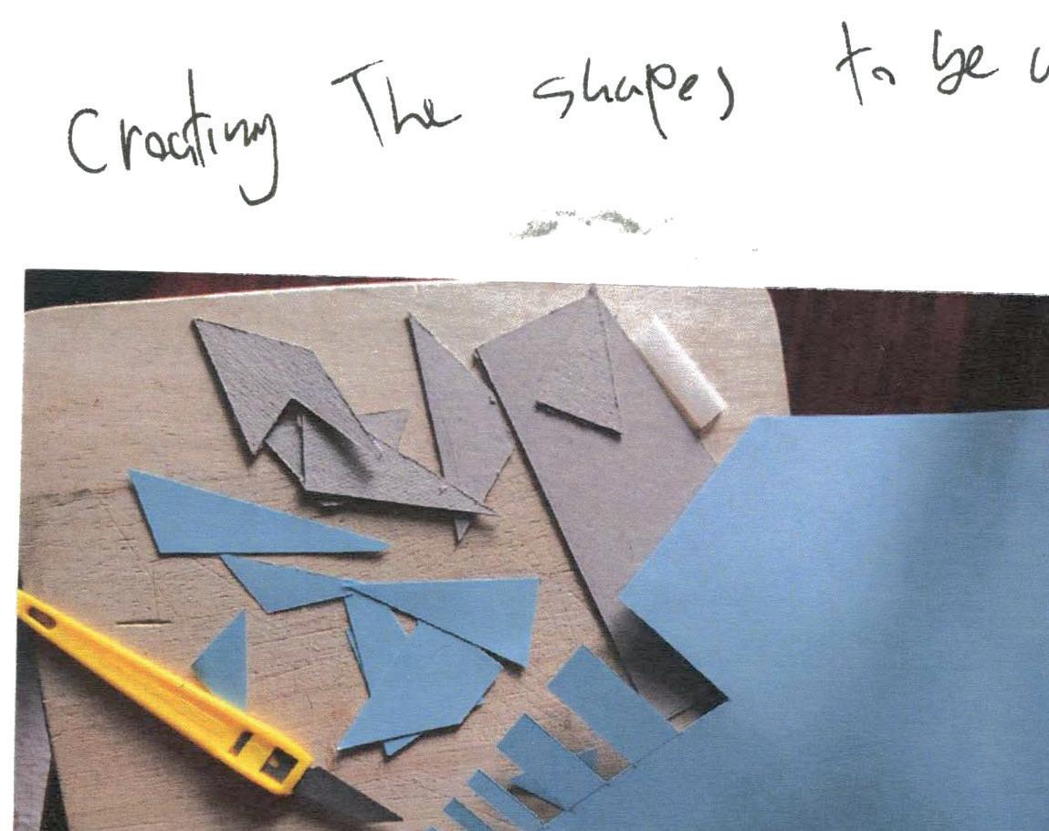
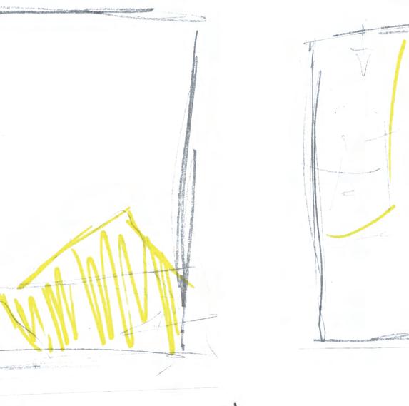
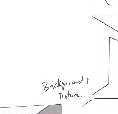
To produce the elements to be used in this piece I created paper cut out shapes and scanned them which helped to give some texture to the style. Using irregular or slightly abstract shapes also helps create a simple style such as in a lot of Saul Bass’ posters and title sequences.


For the type in this piece, initially, it was very standard type added on after effects however this looked unfinished and didn’t suit the style. After going back to previous research, Saul Bass’ Anatomy Of A Murder’ type stood out for its relationship between the text and image as it was slightly shaky and abstract like the image. This gave me the idea to use handwritten type and tie it in with the cut-out shapes that already featured. After testing the handwritten test with colleges and lecturers my findings were that the style was too messy and conveyed a more sinister feel.
After going back to my research and empathising again I choose to use the font DoubleBass, which is a display font that was inspired by Bass’ work in film titles and movie posters. Although this is a display font that relies more on a style than on legibility, its been used for titles only, Aries Arditi mentions in his paper ‘Making Text Legible' that decorative or cursive fonts should be for emphasis only’ rather than for body text.⁷ After testing I found that this choice worked better than the previous choices.
After executing the entire piece based on my storyboard the remainder of the time left was spent testing the whole piece and small sections of it with colleges and lecturers. This feedback was useful as it focused on small things such as consistency in timing and size. I then spent time refining the piece as much as possible before submission.

Upon reviewing this project I was happy with my final piece however, some things I wish I could spend more time on were putting more focus on the shapes and textures used throughout the piece making sure the style is consistent. Also, I would spend more time exploring fonts and wouldn’t use such a stylized display font. Overall though I believe that I achieved the style that I wanted and created an effective video in terms of promotion.
For me, the learning outcomes for this project were, in terms of a promotional piece the effectiveness that it must have as a time-based media video. It must tell a story and sell an idea in a short period. I also learned a lot about creating a motion graphics piece, and the importance of applying design principles throughout. I also learned more about the various methods of creating a timebased media piece.

The process of this project went well overall. I believe I achieved a good angle of what defines the college and the department. My chosen methodology was useful in this process as it helped break up the process into stages. The initial stages were spent gaining insights and generating a feel for what needs to be promoted. The idea stage was mostly spent researching styles and methods which was helped define what I wanted to achieve. Finally, the closing stages were effective in making decisions based on testing different ideas and hugely benefited my outcome.