PROJECT 1
SMALL MEDICAL OFFICE 01 02 03
PROJECT 3
RETAIL STORE DESIGN
PROJECT 2
SENIOR & CHILD MENTOR CENTER
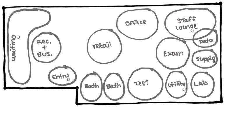
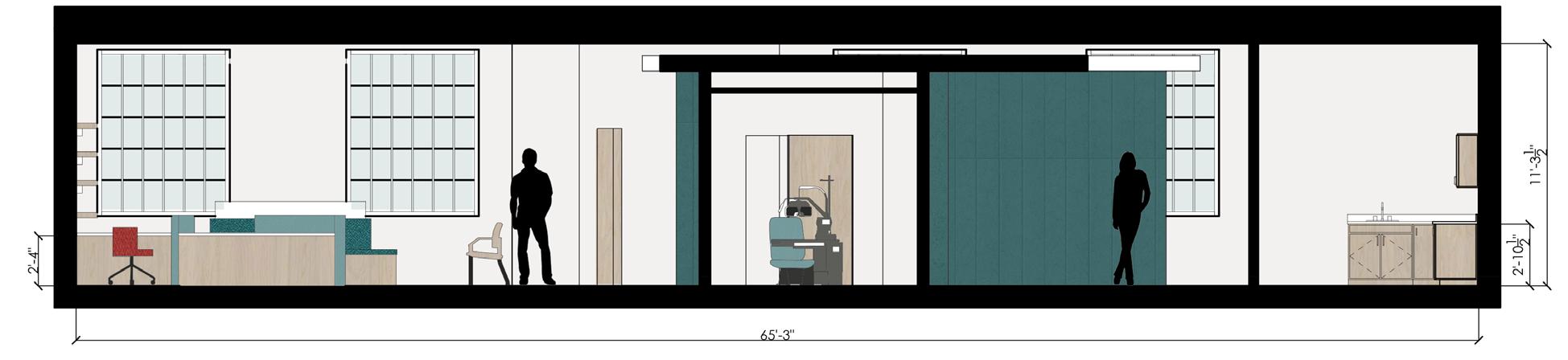
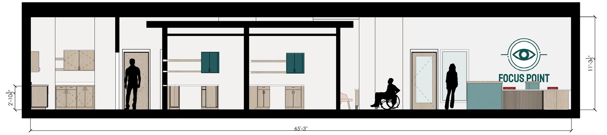
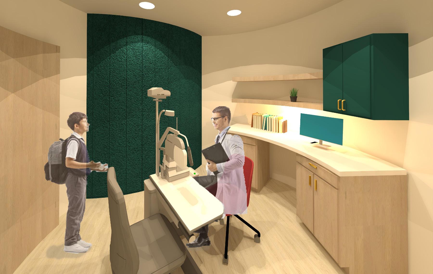
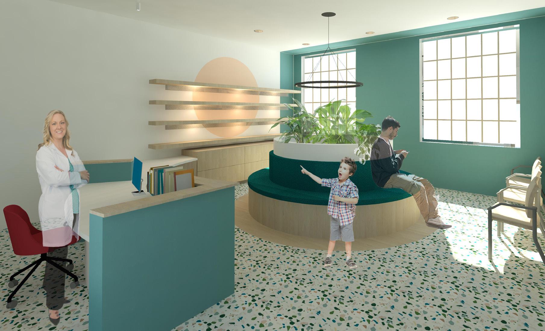
Focus Point Eye Center embraces the duality of blurred and focused elements to create a harmonious environment. As patients move through the examination rooms, the design shifts to a focused atmosphere. Through subtle cues such as texture and effective lighting, Focus Point Eye Center ensures a seamless journey from uncertainty to clarity.
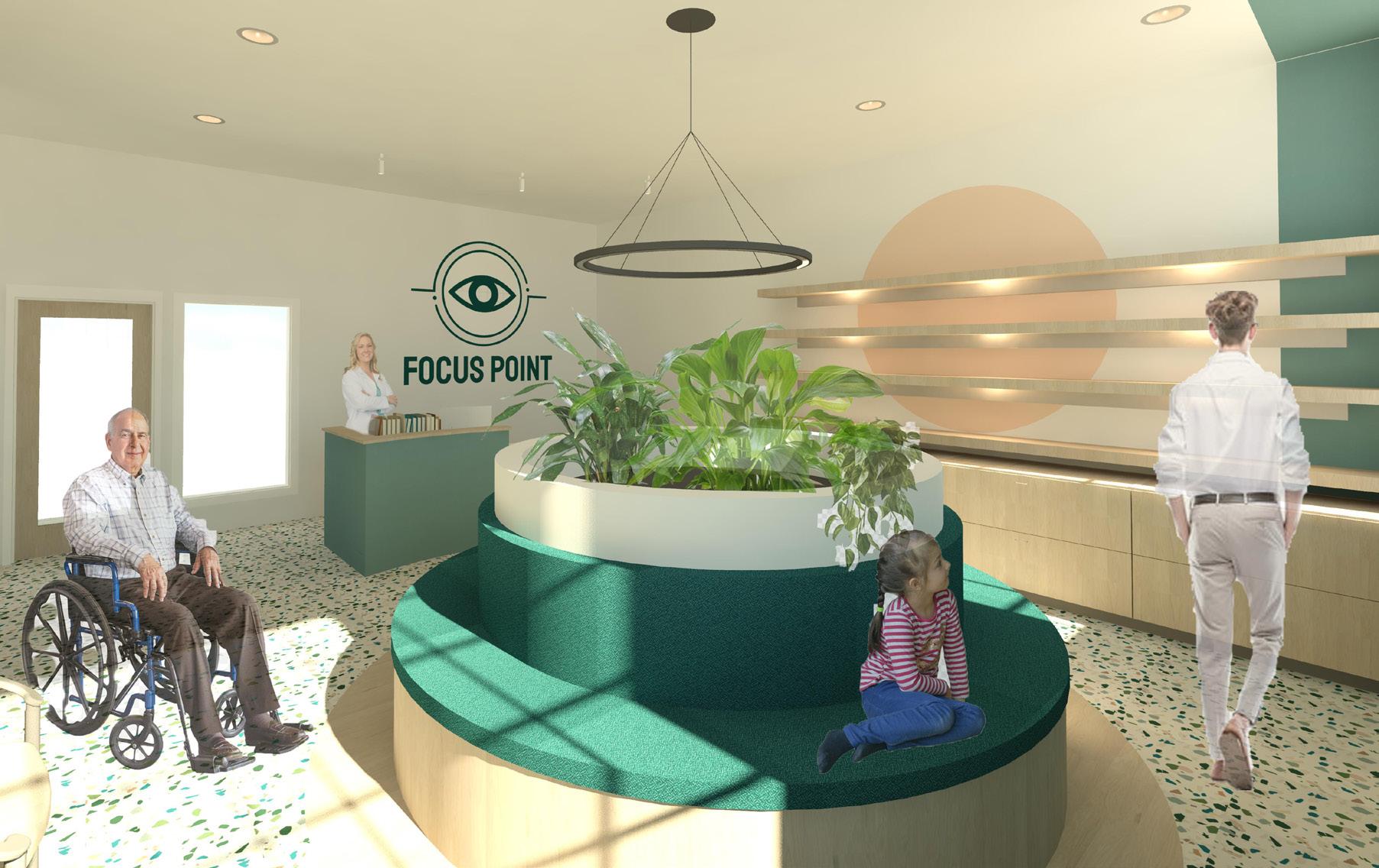
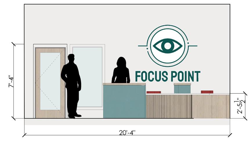
Patients’ Waiting Room
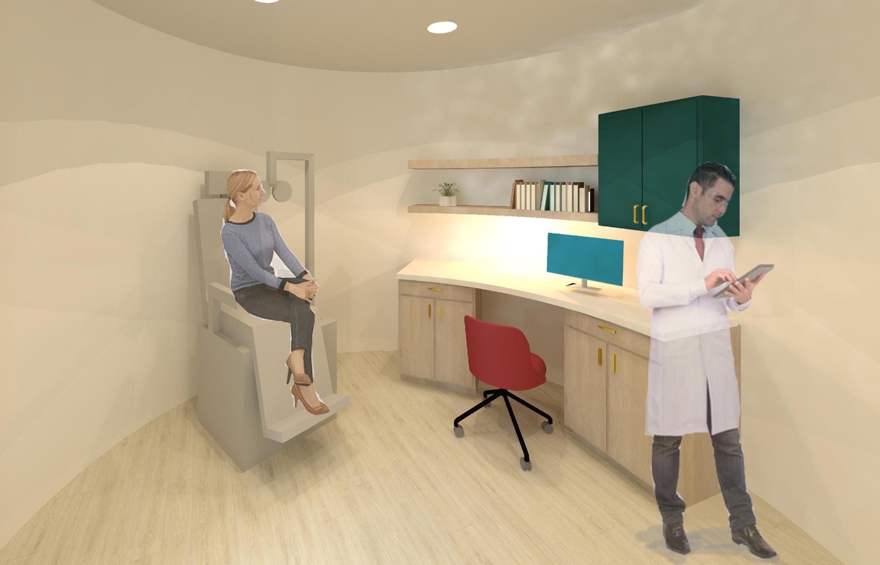
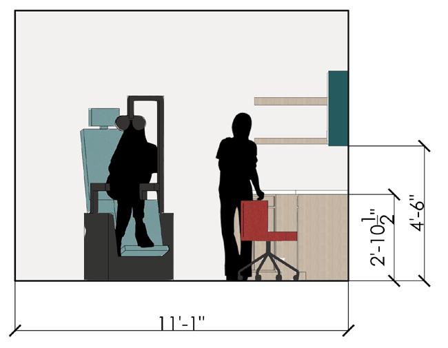
Exam Room
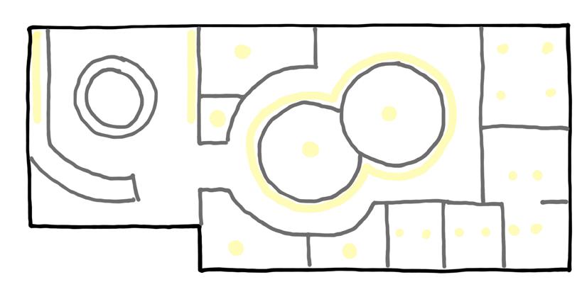
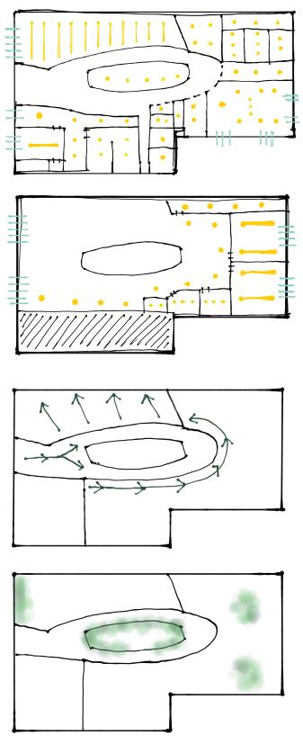
Lighting Placement Digram
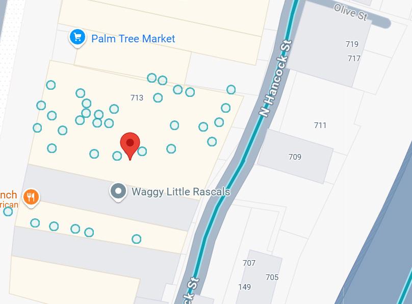
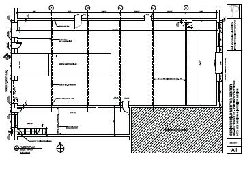
This project’s building is located at 709-715 North 2nd Street, Philadelphia, PA. The historic building was divided into three volumes. This space, located on the second floor, is approximately 1400-1500 square feet. The space faces 2nd street, offering an abundance of sunlight from the west.
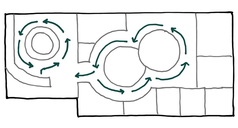
The shape of the examination rooms were inspired by the circular shapes found on the phoropter, an opthalmic device used to measure the eyes’ ability to focus light and helps determine a patient’s eyeglass prescription.
WAITING ROOM
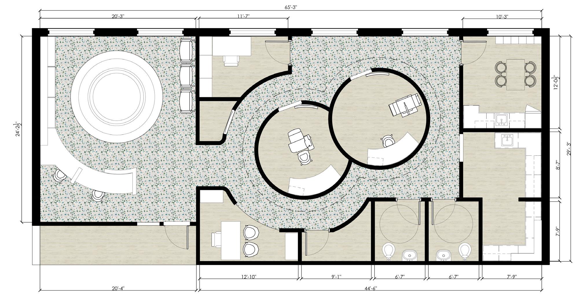
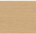
The use of appropriate finishes such as counter tops and floors that are easy to clean and maintain were incorporated within the design. Natural materials such as stone, tile, and wood textures as well as abundant amounts of natural light were used to create an appealing environment.


{Interdisciplinary}
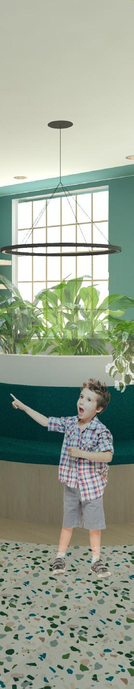
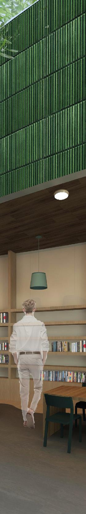
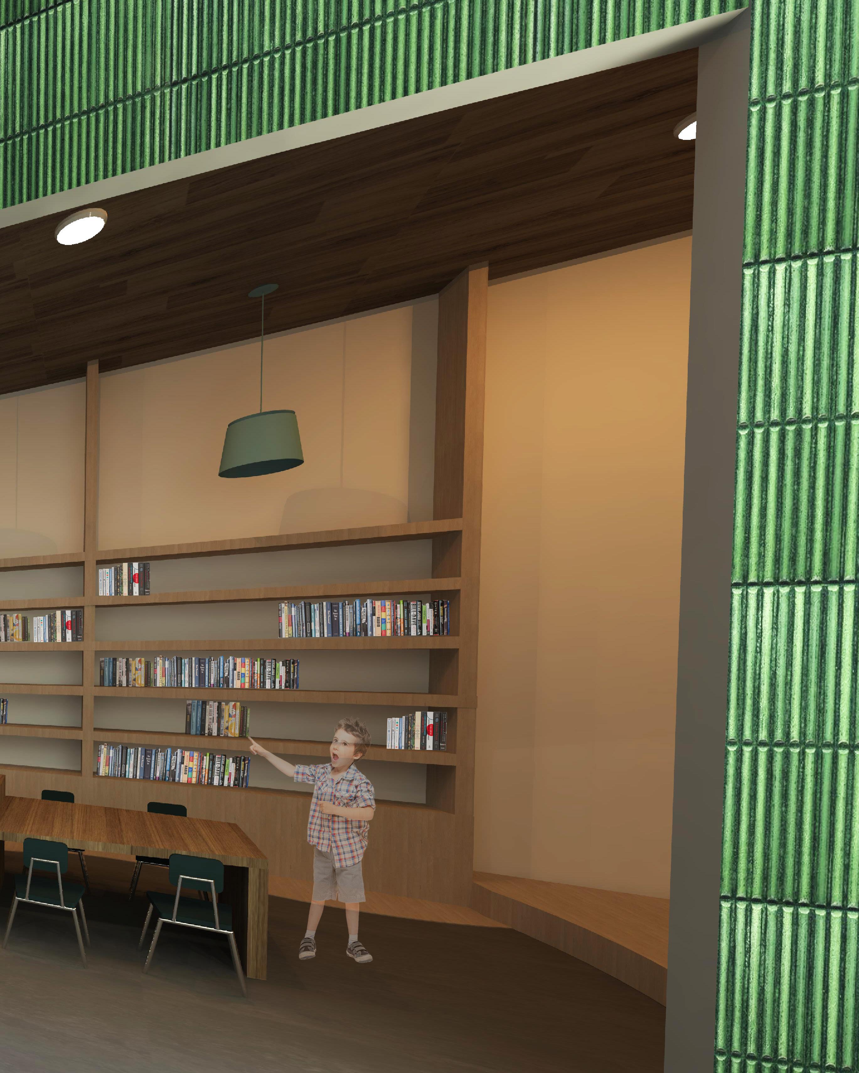
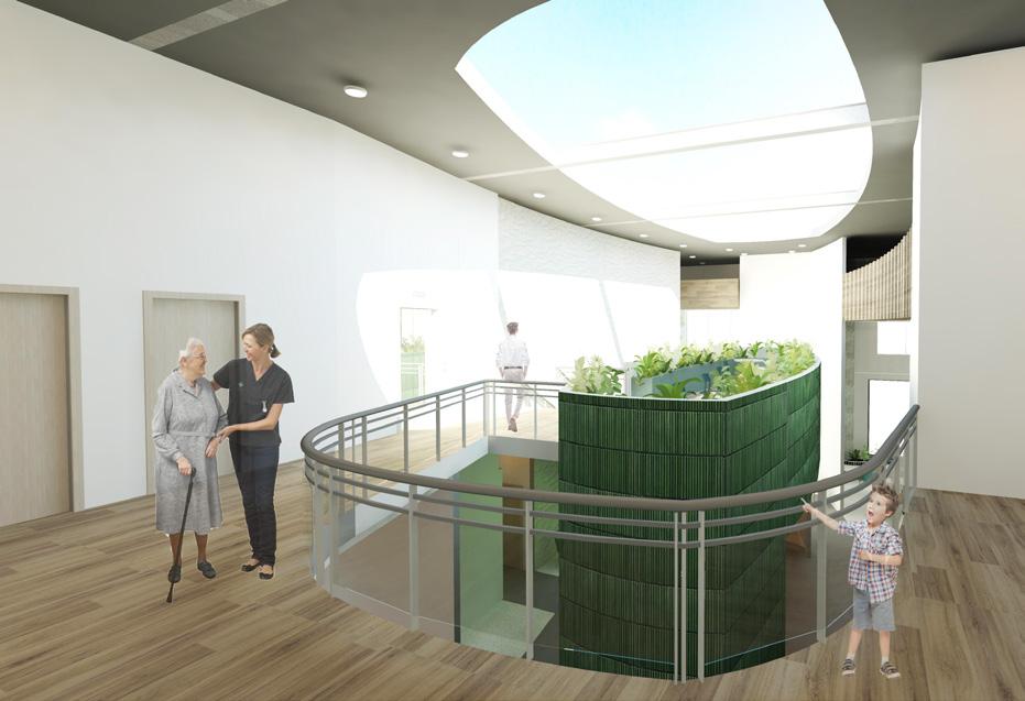
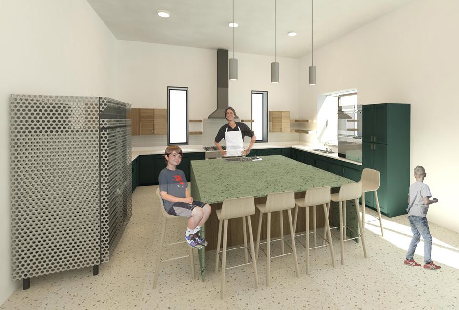
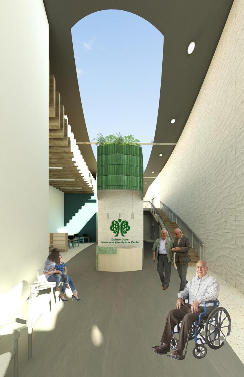
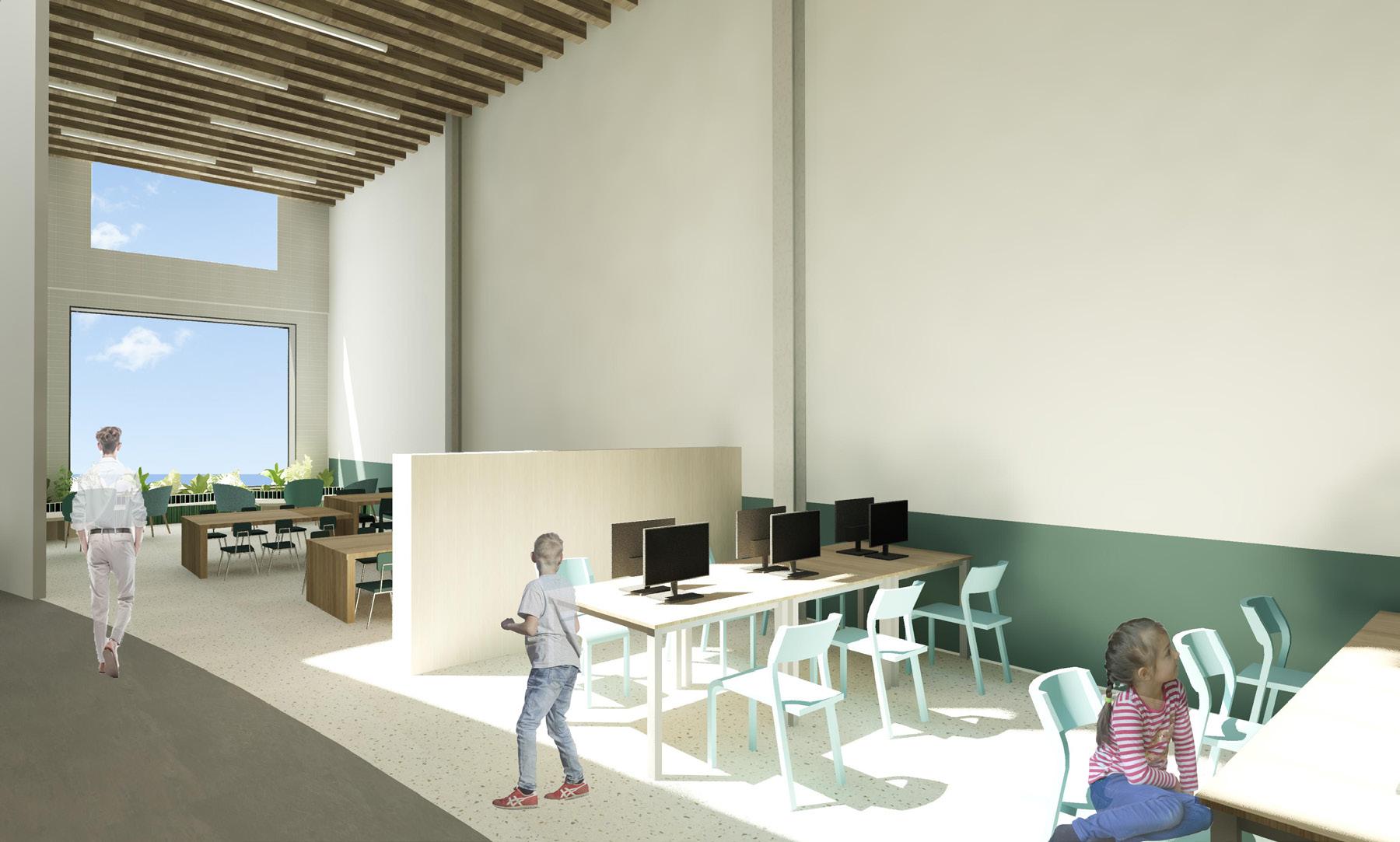
Golden Days: Senior & After-School Center emphasizes the gathering of many into a community, through the sharing of life stories and experiences. Golden Days: Senior and After-School Center is a place of belonging , where everyone can enter into a storybook-like world.

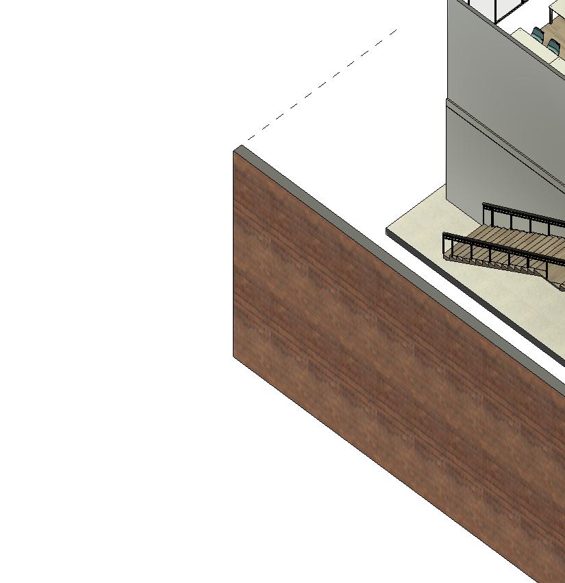
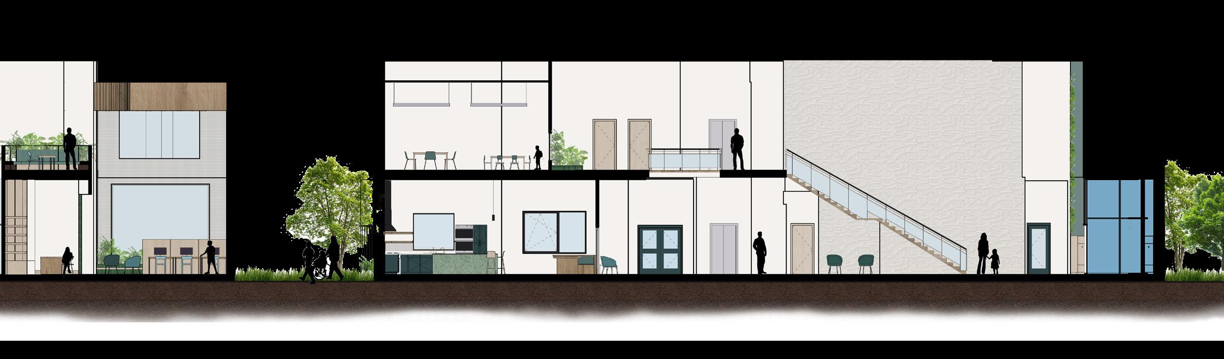
This building is located 916 Tasker Street at the heart of South Philadelphia. This inner-city neighborhood in Passyunk Square has a large majority of inter-racial and mixed-ethnic residents. The building itself consists of a two-story industrial infill warehouse and is surrounded by row houses.
This interdisciplinary project was made in collaboration with Thomas Jefferson University’s Occupational Therapy Program students. The point of this project, as well as this partnership, was to understand human behaviors and factors, especially those within senior citizens and children from elementary to preadolescence. Design students were to consider the social, emotional, physical, and even cultural needs of this site’s population.
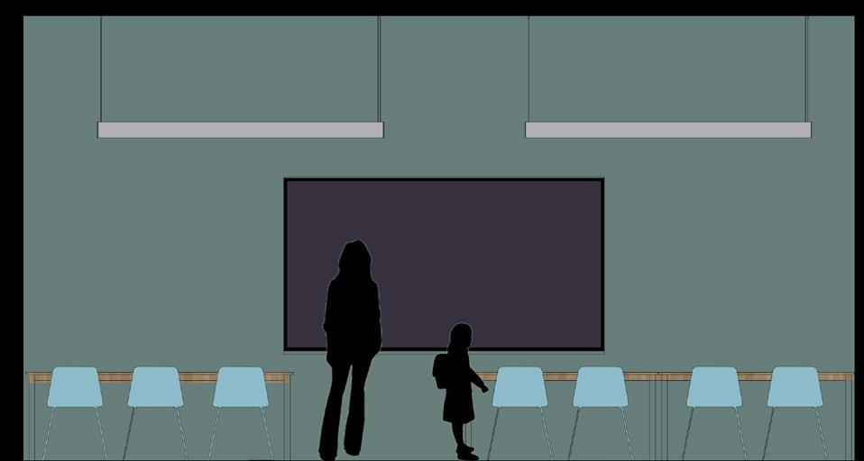
Dining Area: important for when cooks come in to cook meals, children have a place to sit out of the way; children and seniors can sit and eat together
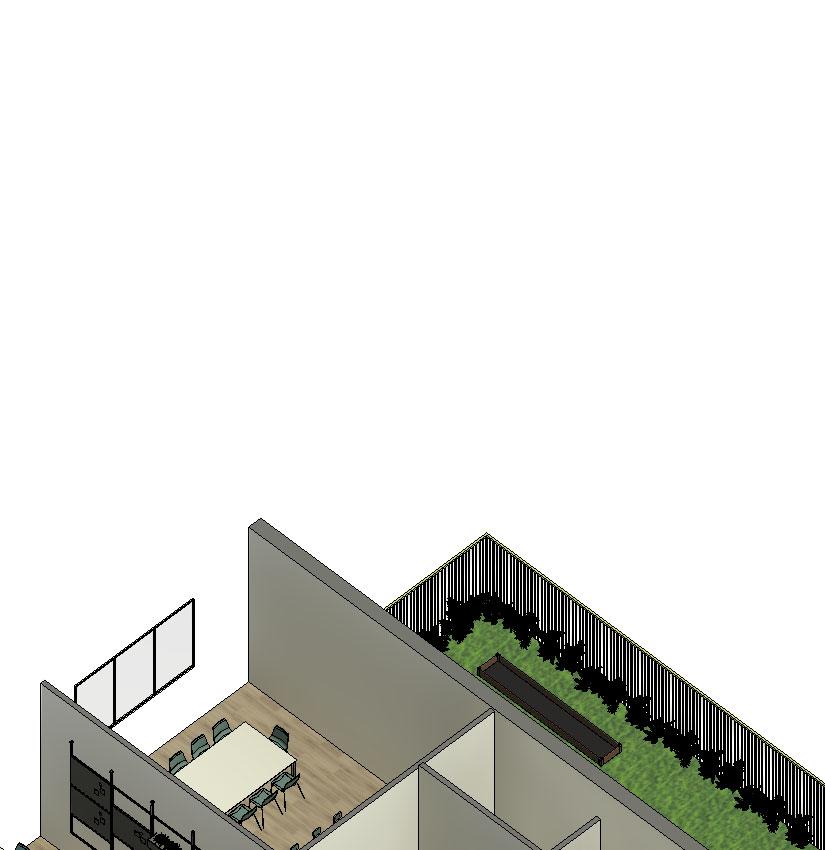


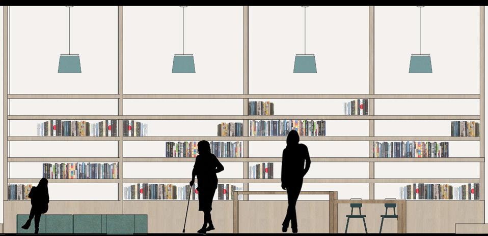
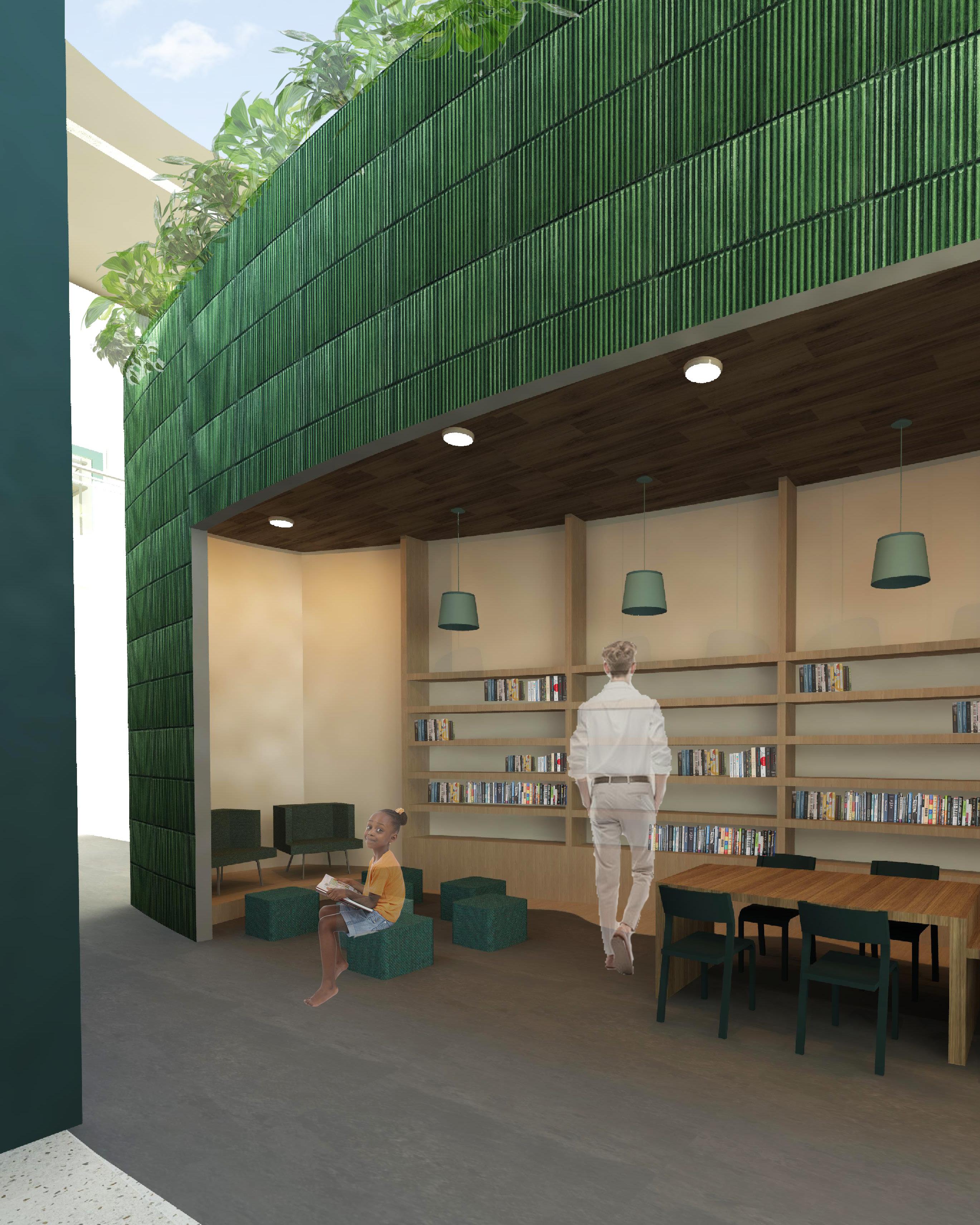
R and R Space: designated area for the children and seniors to read together and/ or do homework together

Color Scheme That Works: inviting and calming colors, as well as pops of bright hues for children to enjoy
Sense of Inclusion: heights, materials, and furniture to be accessible and used by all; a space for everyone to enjoy
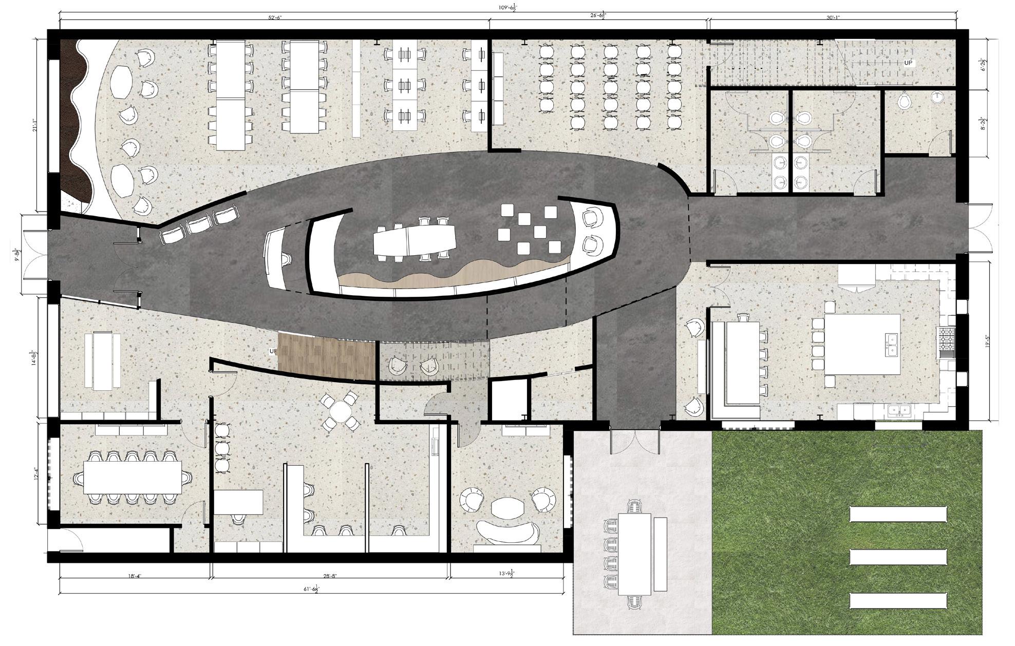
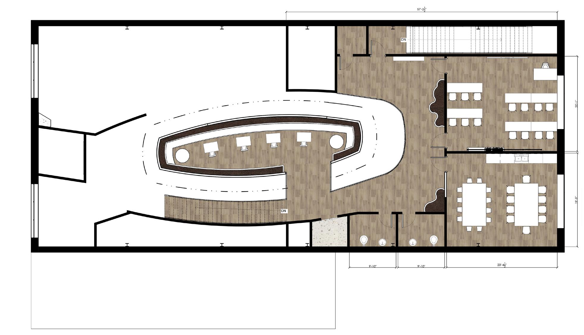
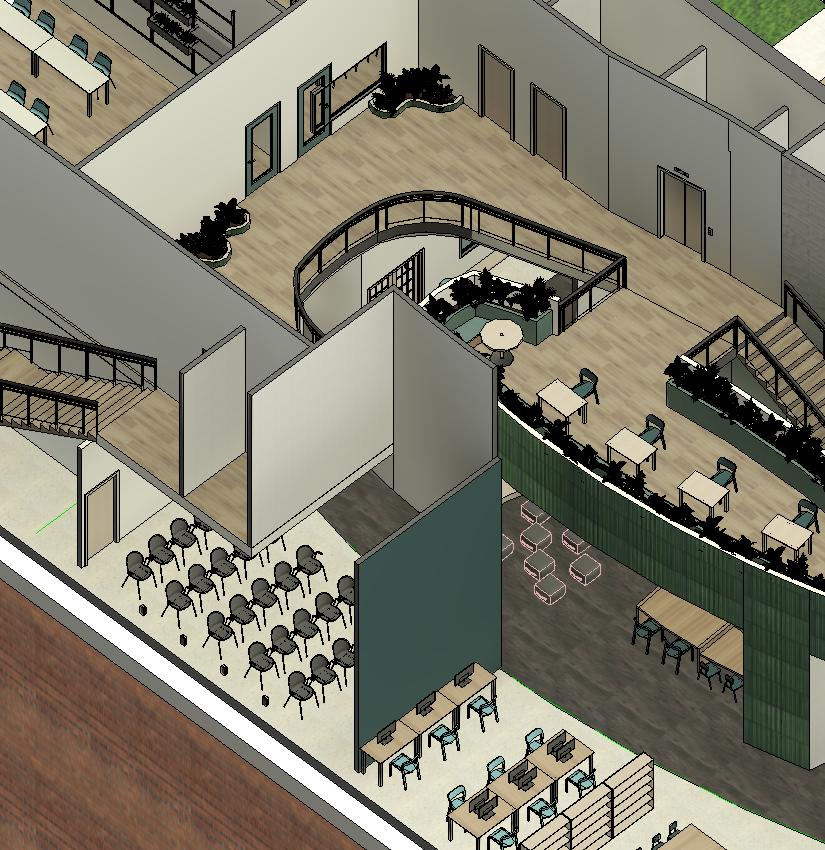
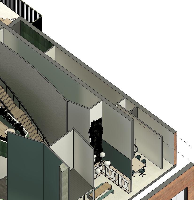
Second Floor Plan


Second Reflected Ceiling
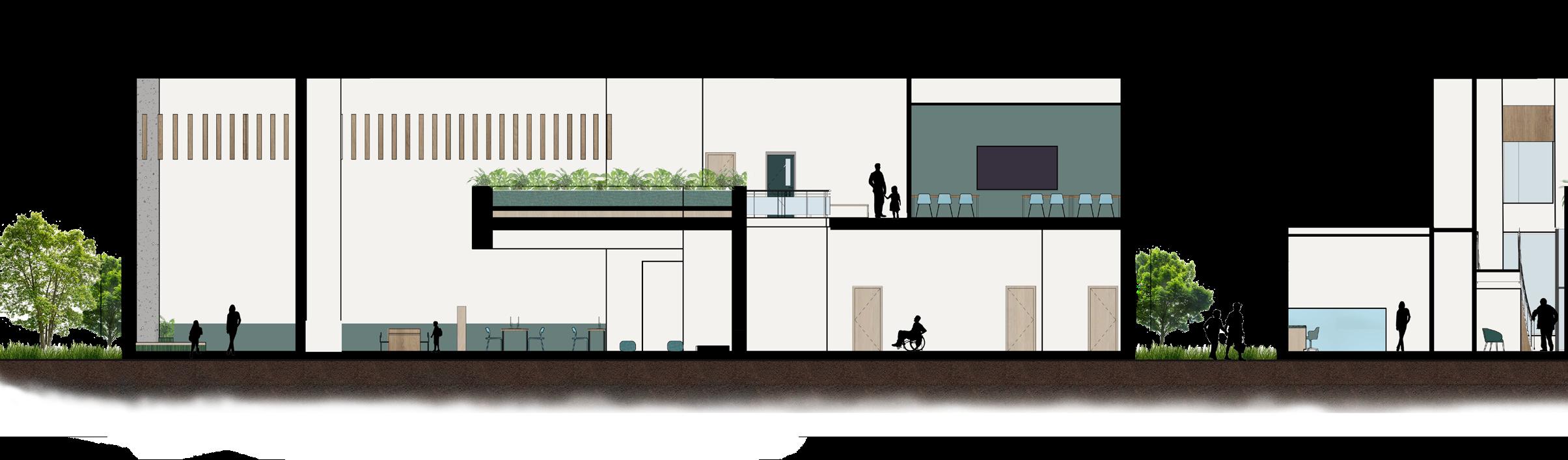
Considering that the new building interior will host a variety of different people, specifically the elderly and young children, it was important to take into account the different needs and wants, thus providing a space that is not only comfortable but safe for all.
Incorporating dimmable lights and acoustical elements throughout the space provided ease to visitors with sensitive hearing and vision. While considering the rules of ergonomics, the use of chairs and desks at different heights allowed for comfortable seating for different guests while they learn or teach. Placing plants all throughout the space helped to include the idea of biophilia, which not only brings appeal and tranquility, but helps to promote mental and physical health.


Triadic Color Scheme with Green, Blue, & Brown


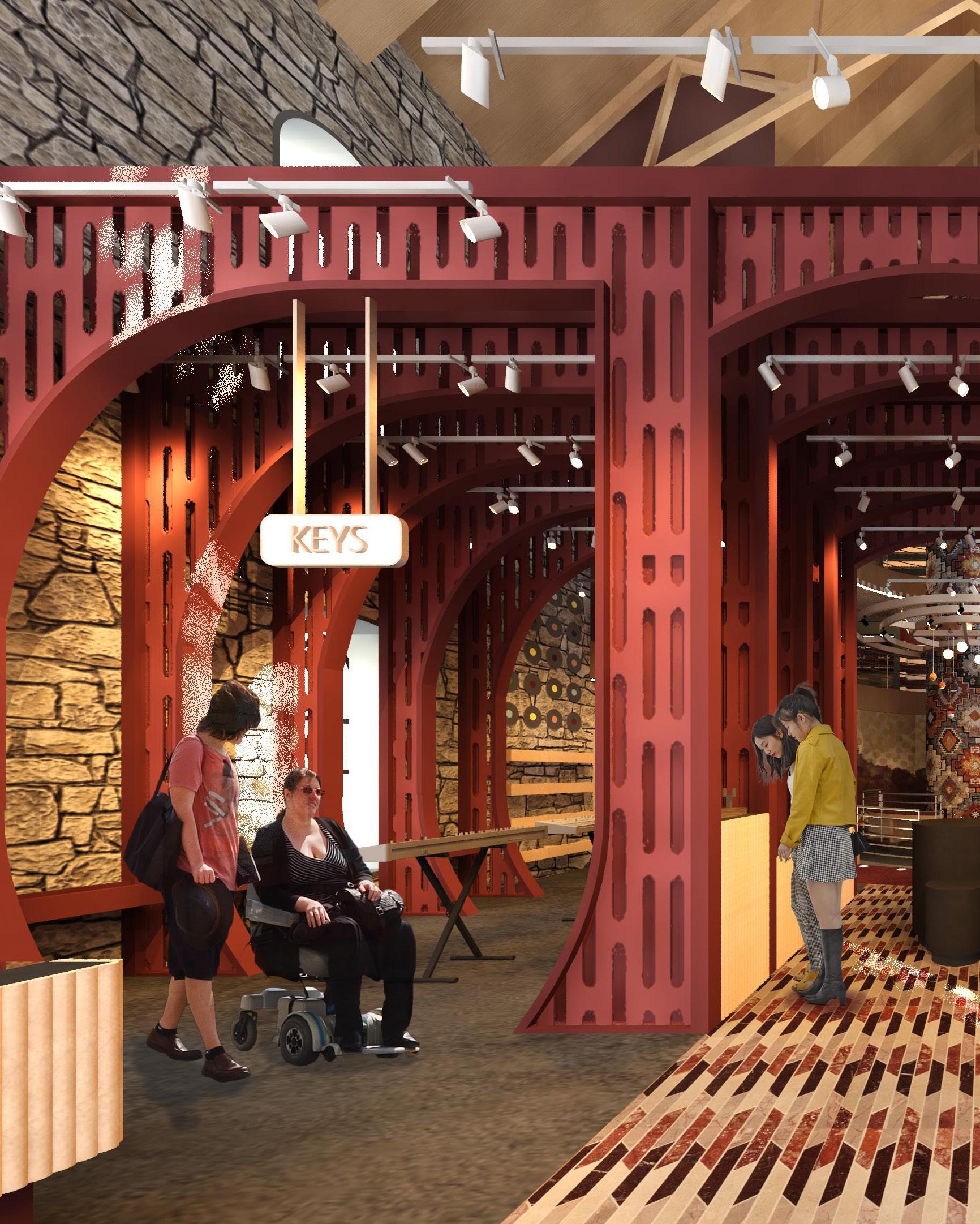
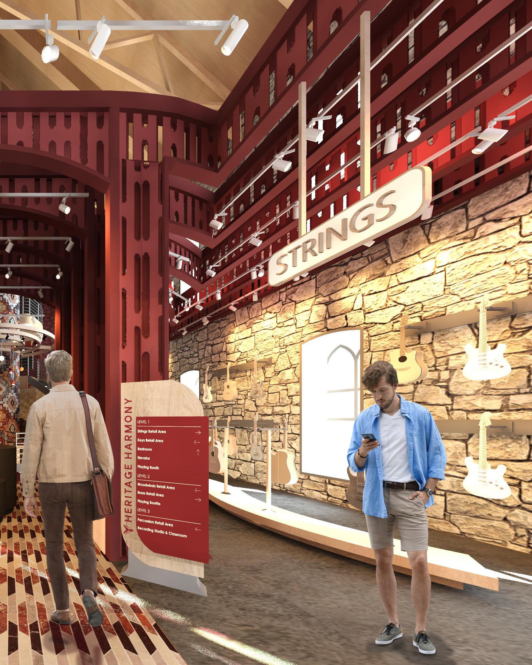
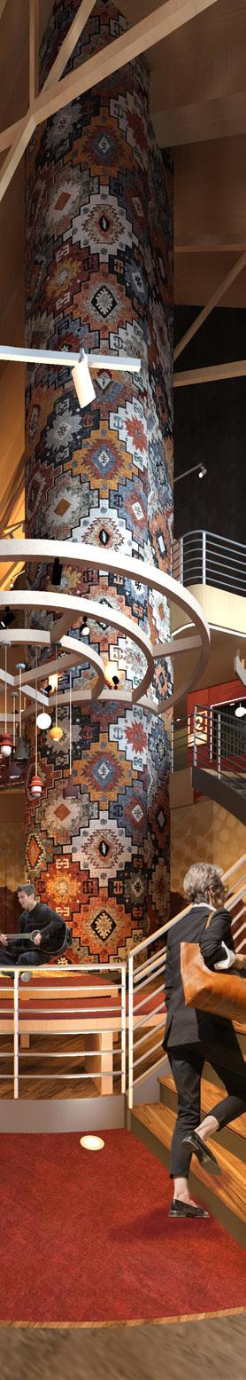
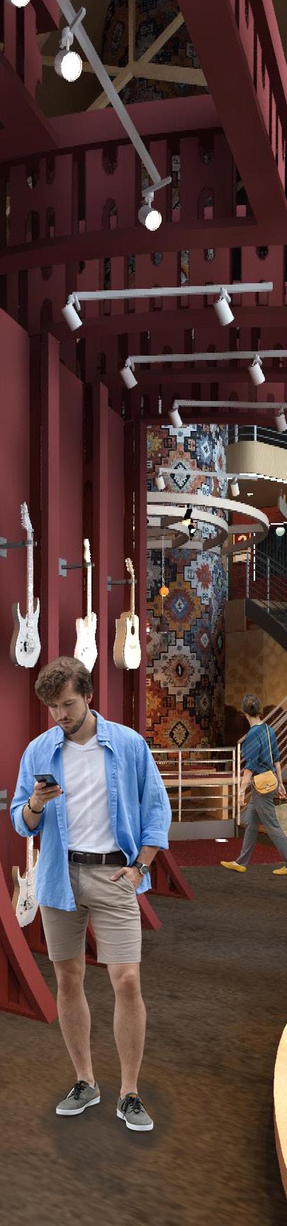
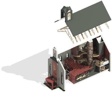
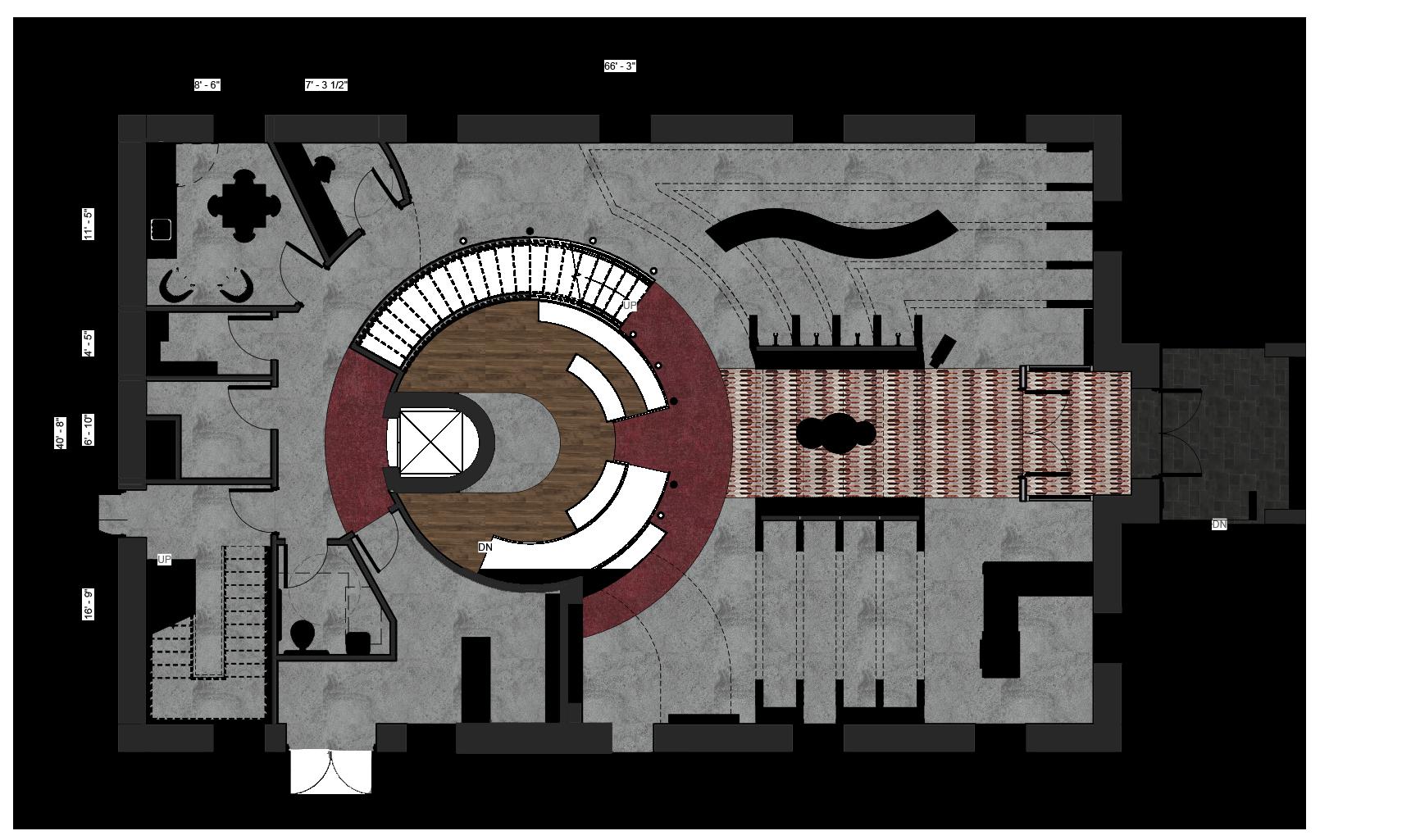
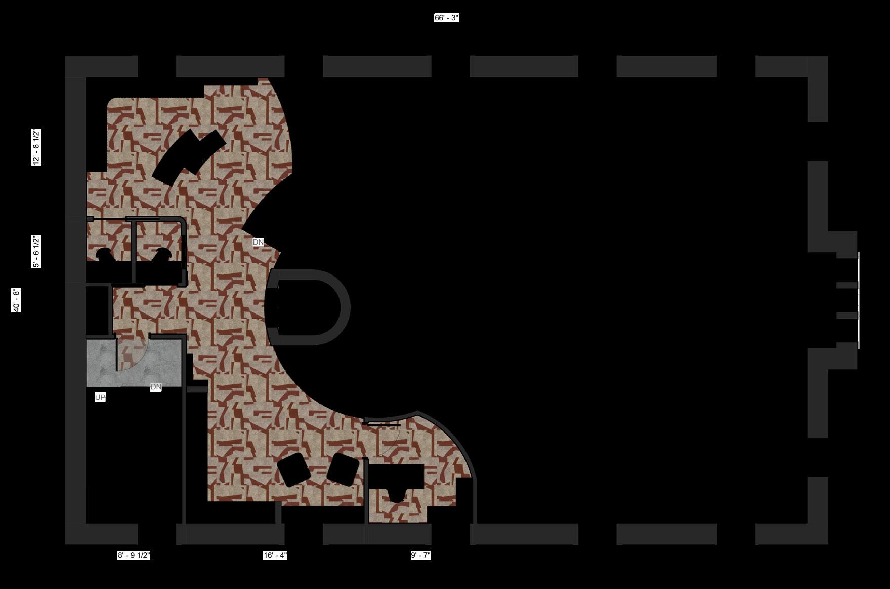
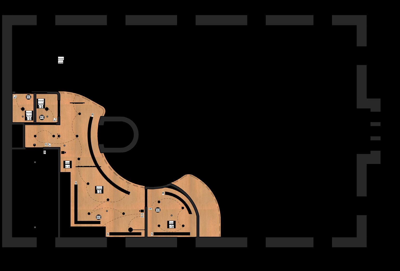
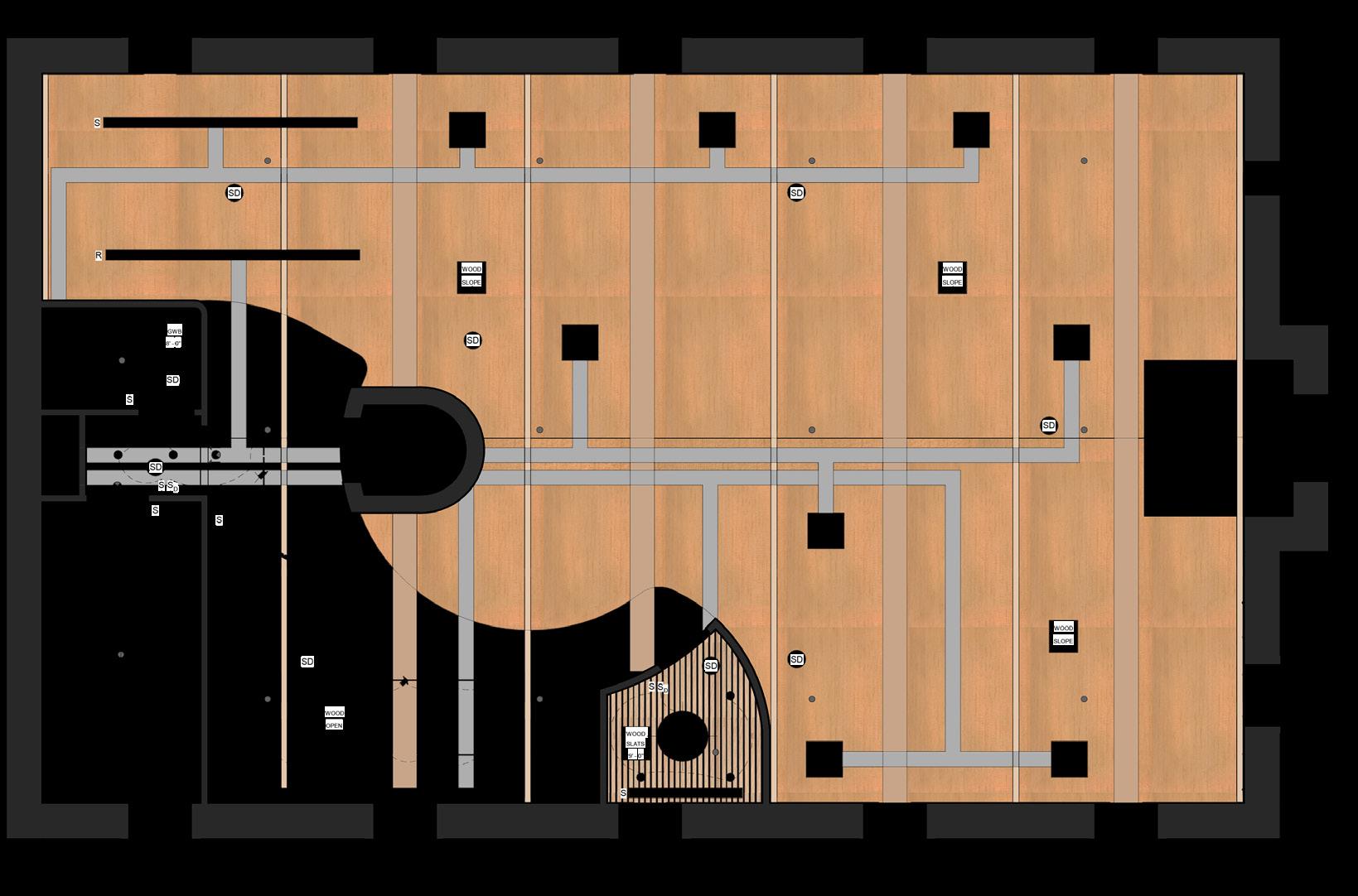
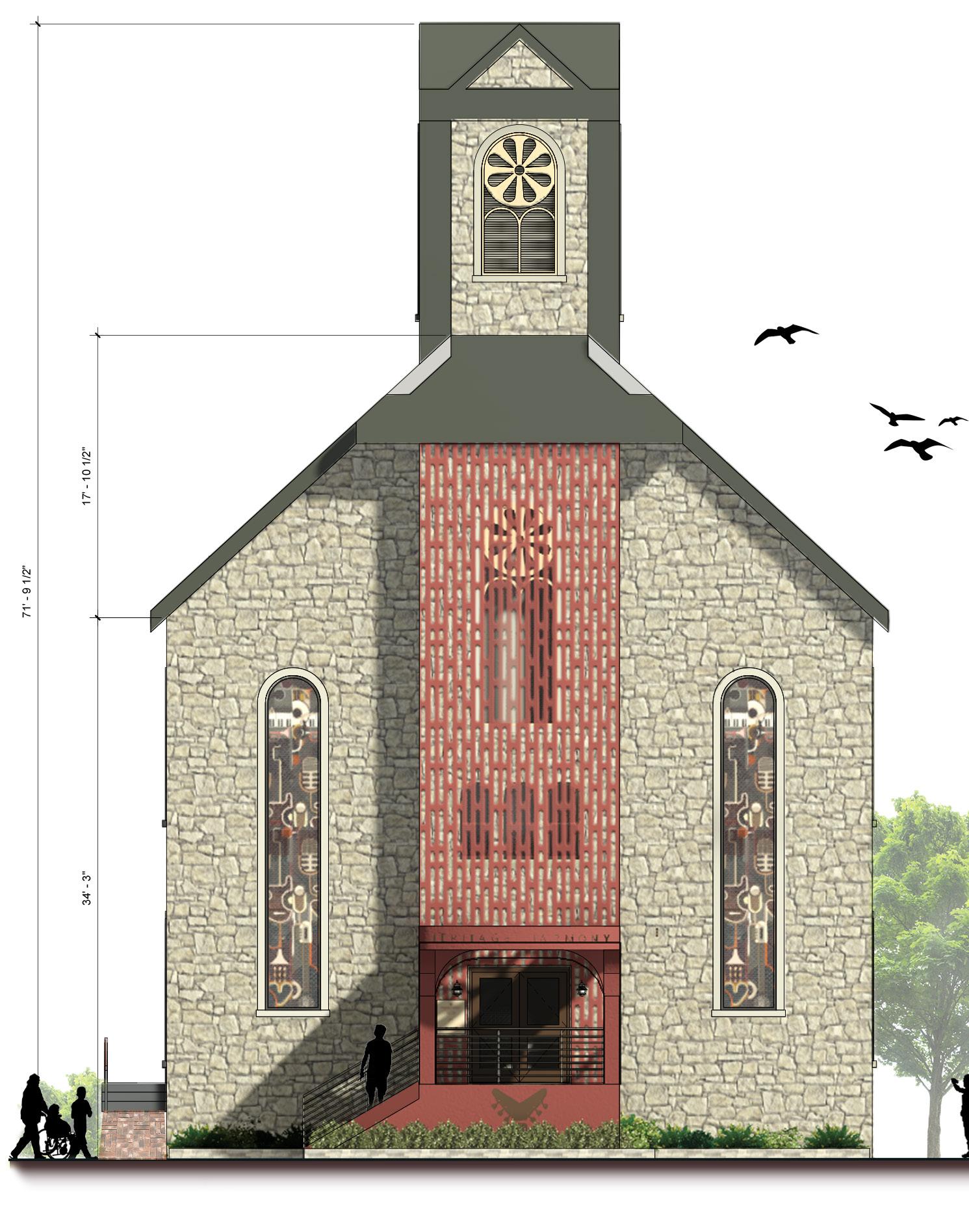
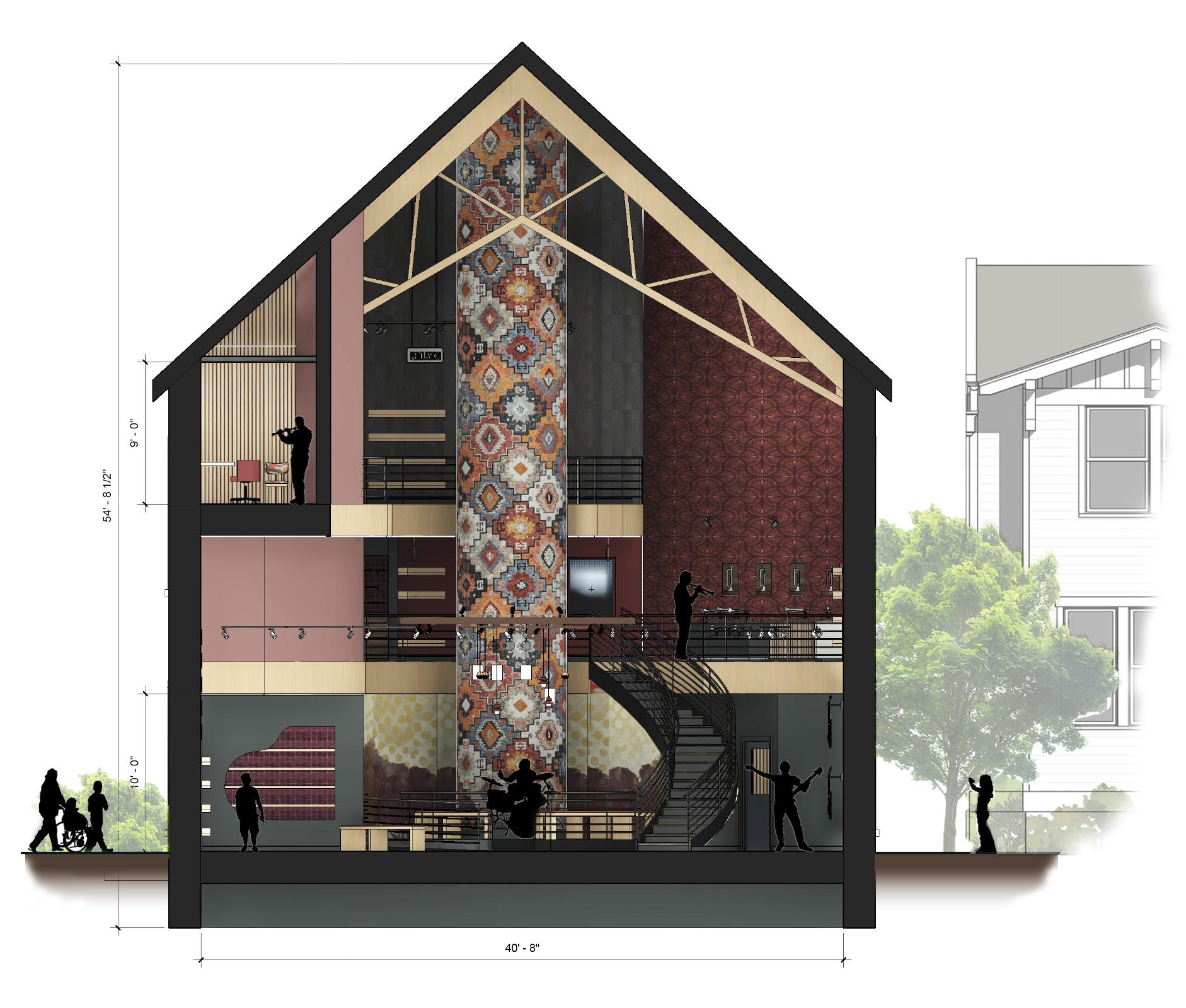
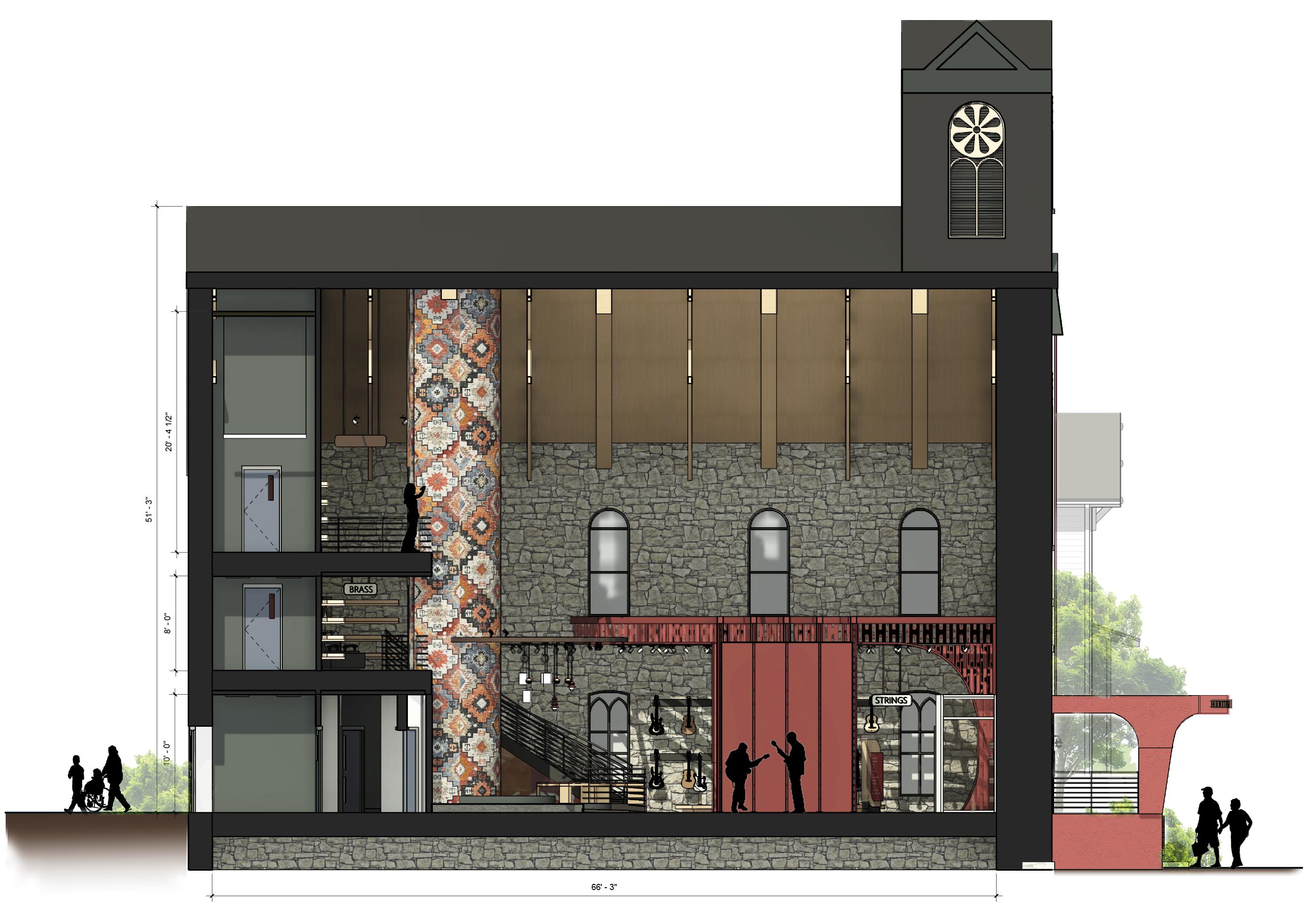
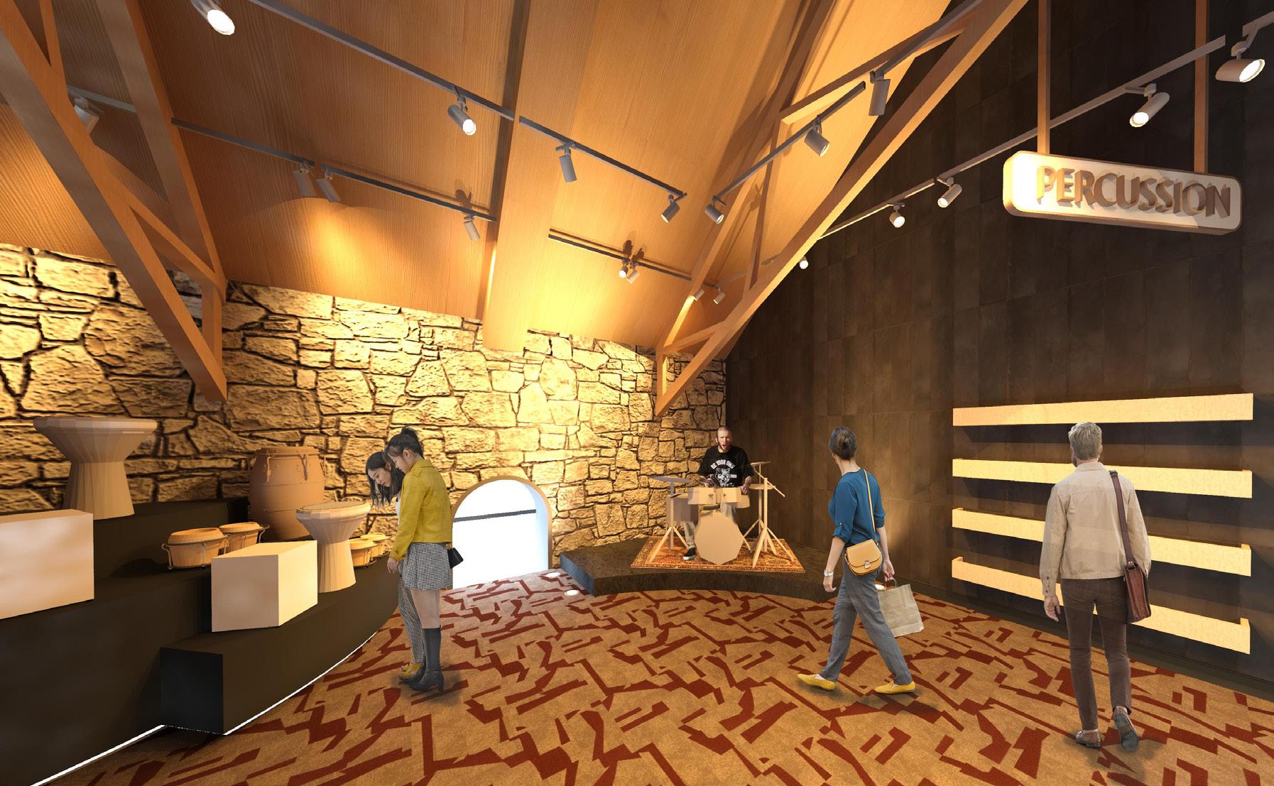
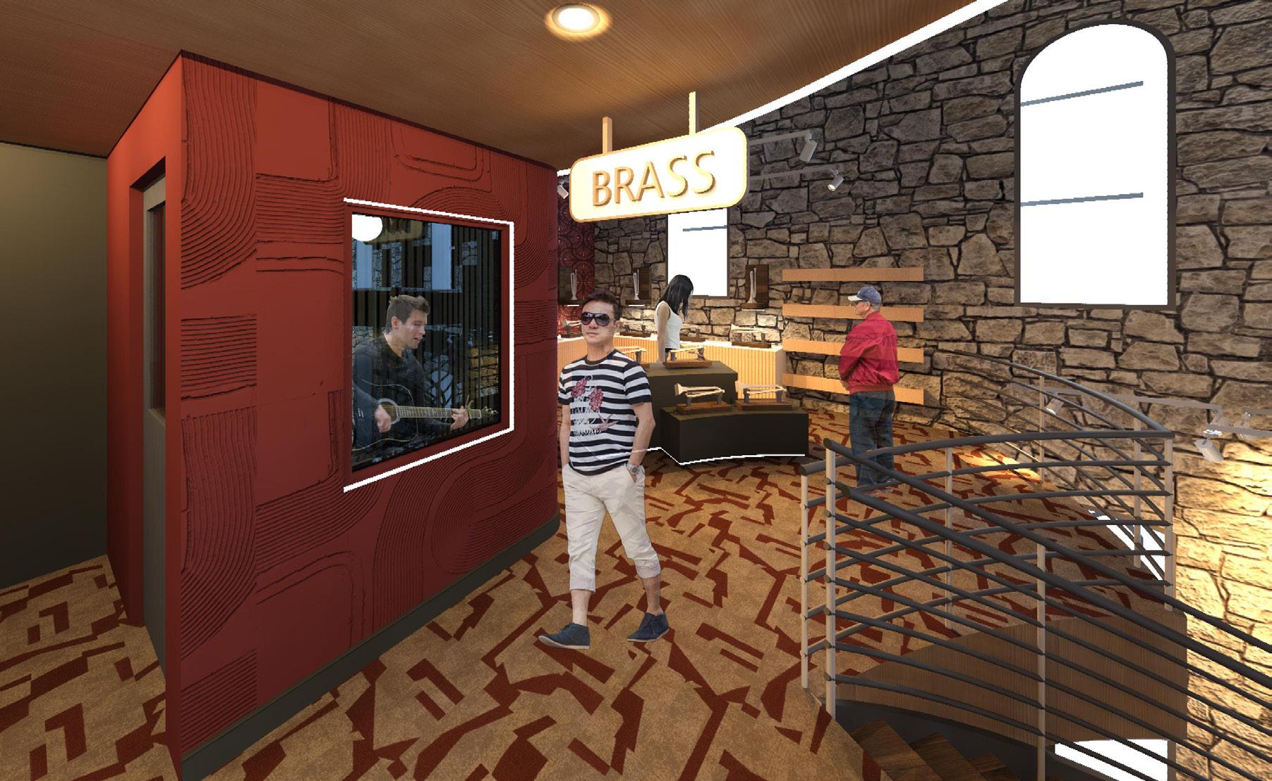
Heritage Harmony is a cultural musical instrument store that views and expresses music as an art form and an expression of culture. Visitors can discover music as cultural bridge at this store, where instruments around the world and across history invites others to explore diverse sounds, stories, and traditions. Embrace the art of music as a universal language that connects us all.
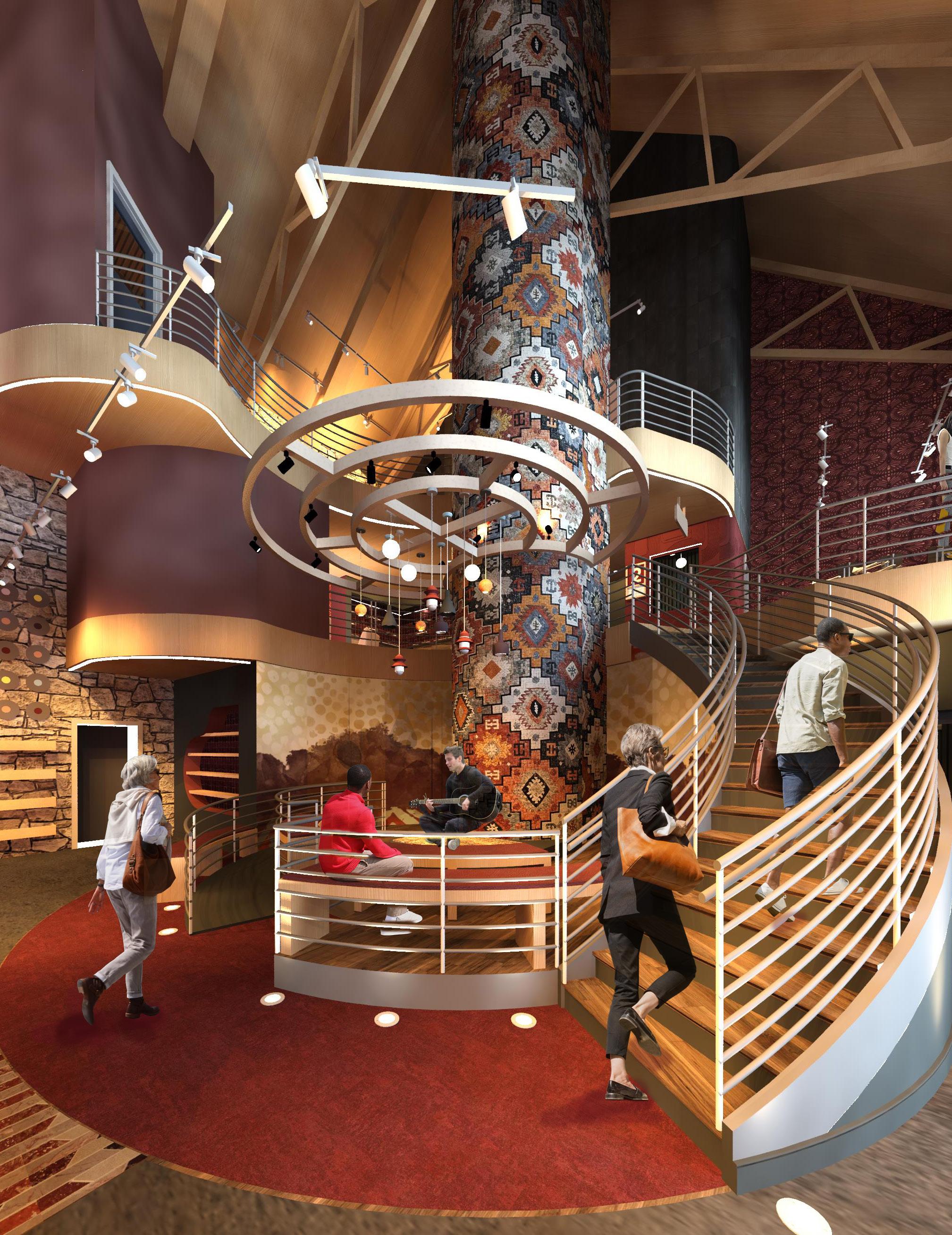
Performing Stage
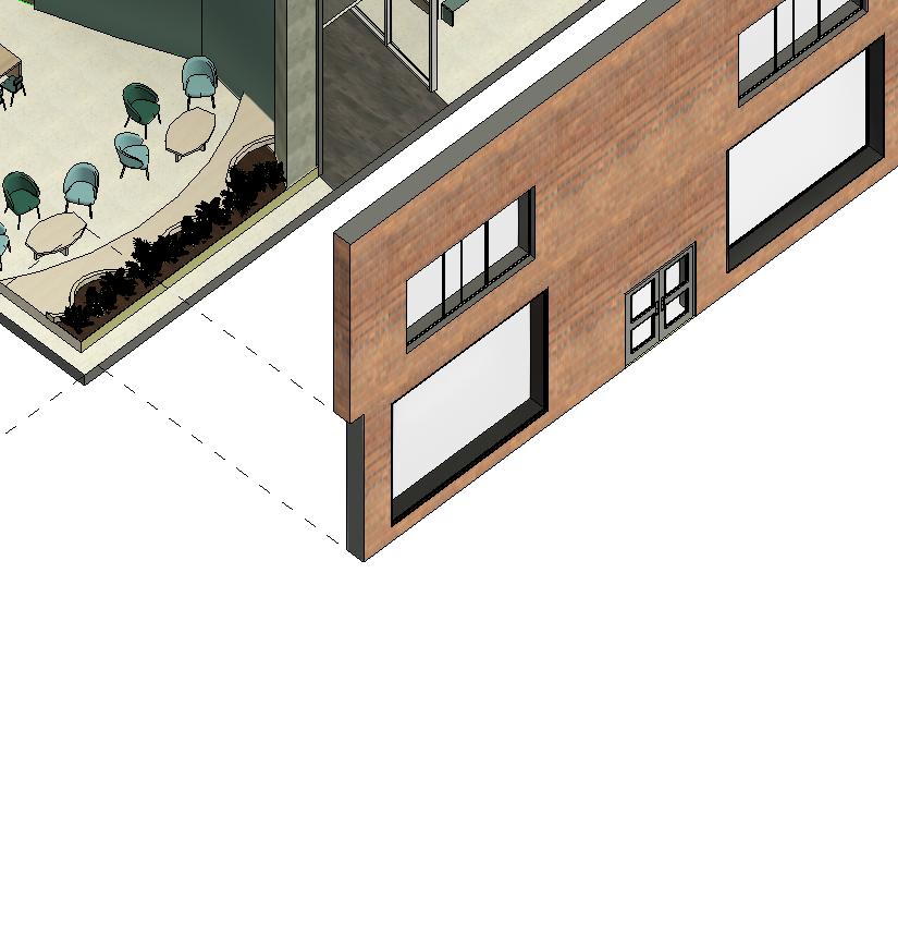
The building for this design is located at 15 South Main Street in New Hope, Pennsylvania. The building was originally a church with beautiful stained glass windows and a stone facade.
The project consisted of designing a new retail establishment that takes into consideration the demographics of the area, recent retail trends and connection to community. The borough of New Hope, Pennsylvania is known for its very artistic and historical presence. Its streets and blocks are flooded with unique small businesses and stores from clothing stores to bakeries. However, it lacked one thing, a musical instrument store.
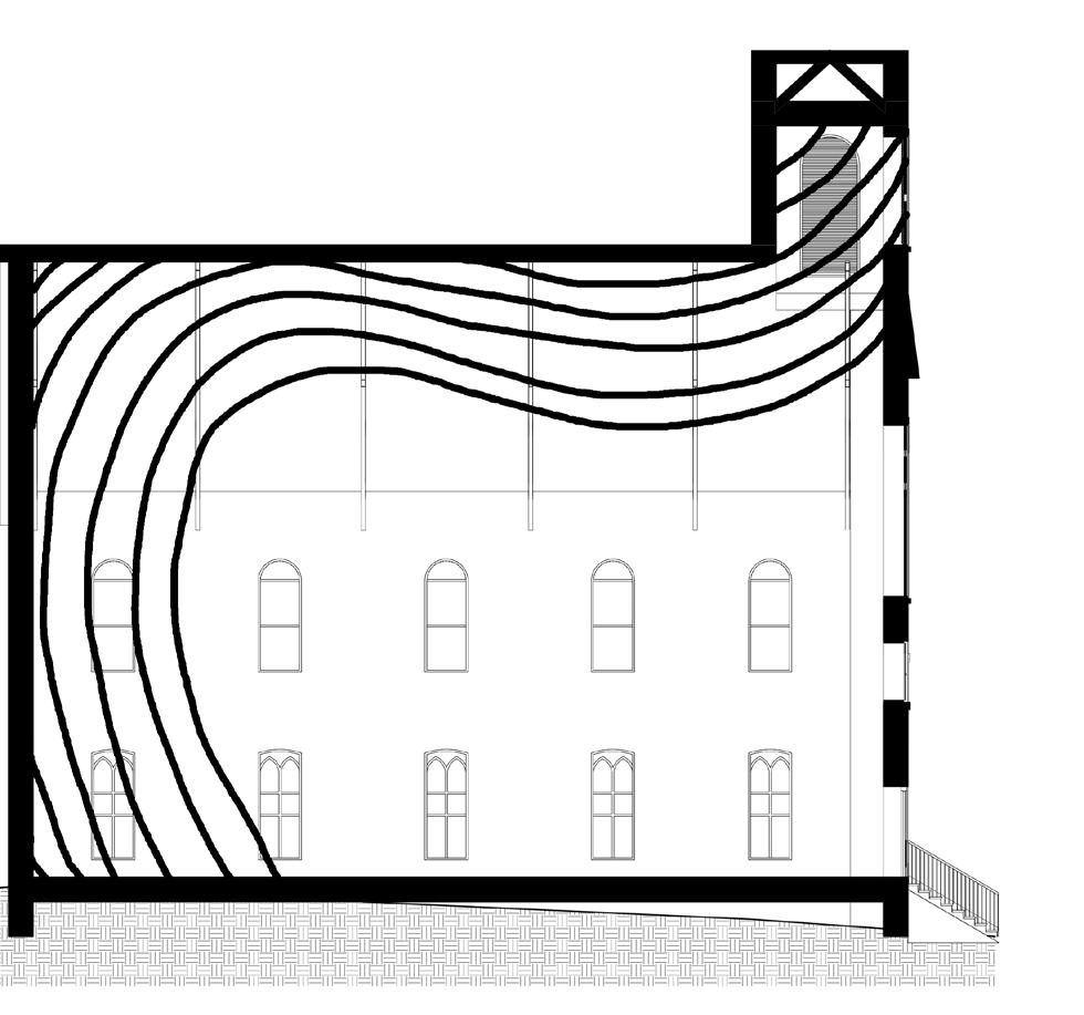

FRONT FACADE PROVIDES VISUAL CUES ABOUT BRAND + DESIGN EXPERIENCE
THIS CEILING IS LIGHTER AND HAS A WOOD FINISH TO MAKE THE SPACE FEEL TALLER + WARMER
WARM COLORS WERE USED IN THIS AREA TO CREATE A COZIER + INTIMATE ENVIRONMENT
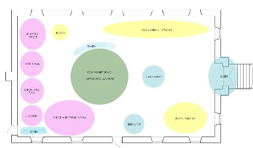
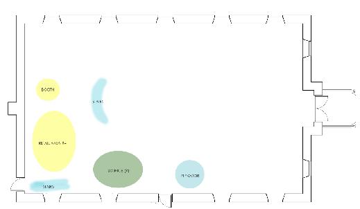
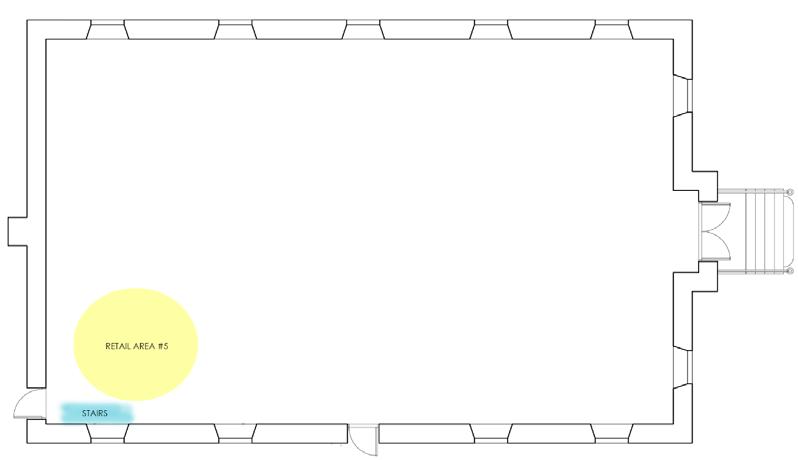
RETAIL AREAS ARE ORGANIZED SO THAT EACH HAVE THEIR OWN SPECIAL ZONES
DECOMPRESSION ZONE HAS BEEN ADDED TO PROVIDE A TRANSITION FROM OUTSIDE TO INSIDE SEPARATION OF LOUD VS. QUIET SPACES
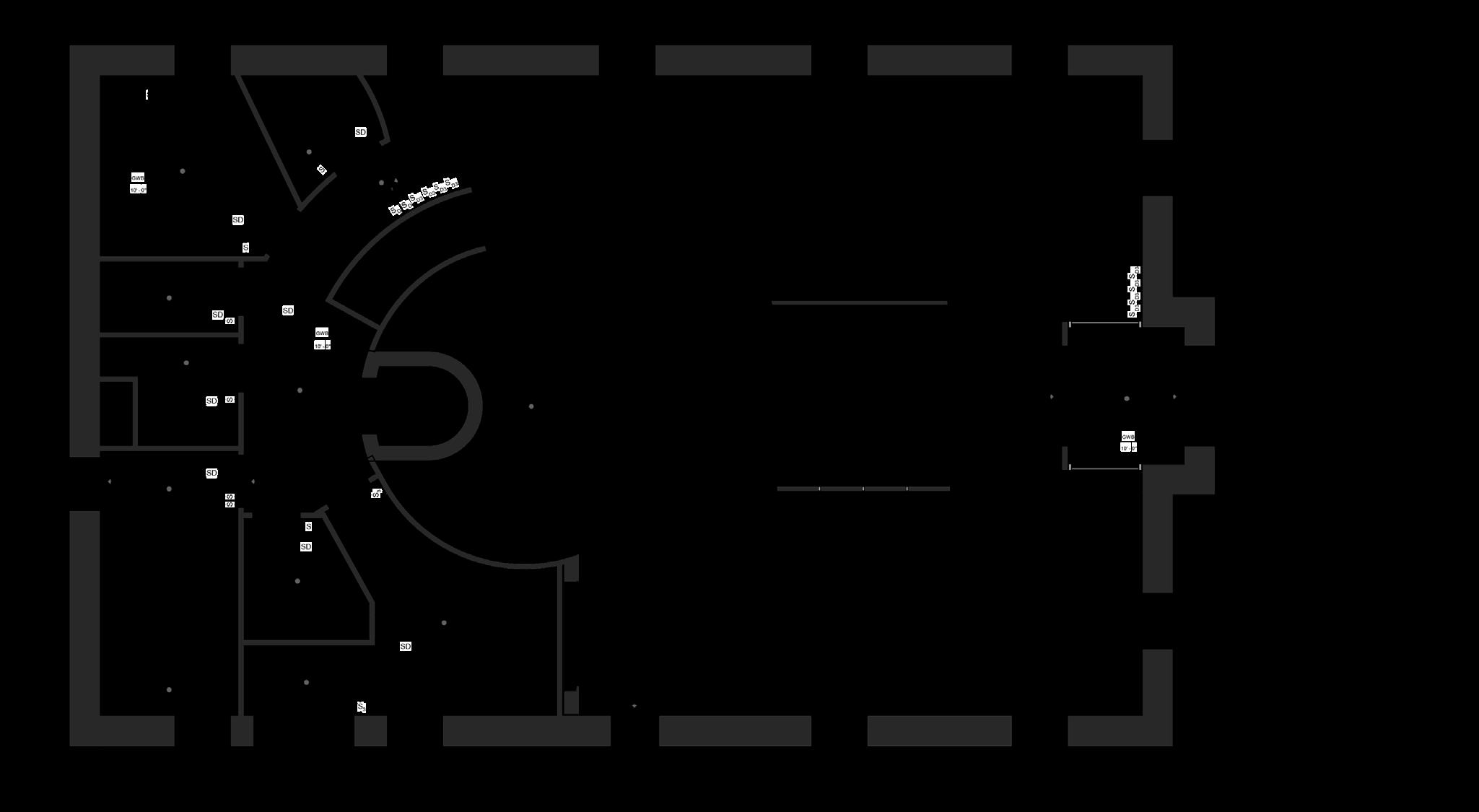
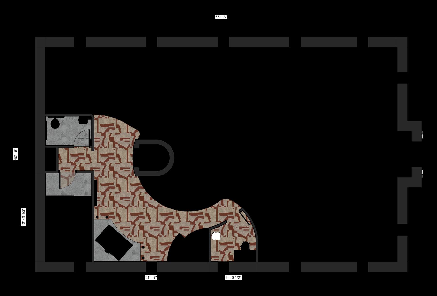
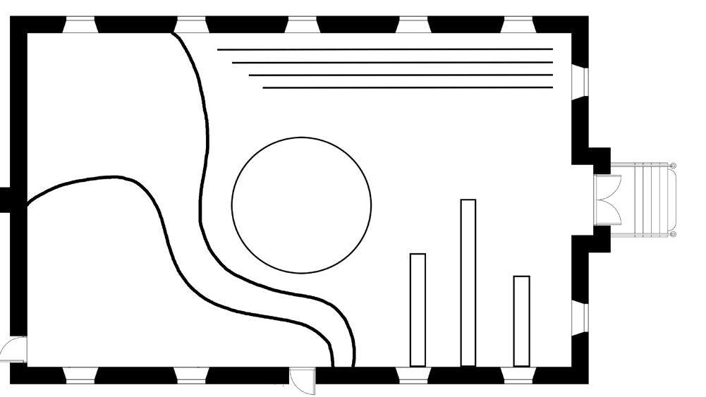
Third Floor Plan
Split-Complimentary with Red, Black, Purple, & Neutrals

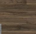
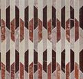


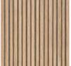


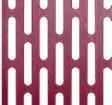
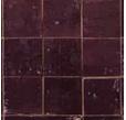

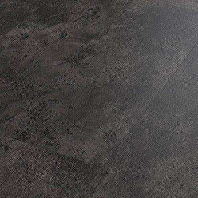
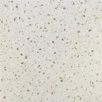
The material and finishes selected in this project were inspired by the mixing of dark reds, purples, black, and light wood tones. Selecting wood slats and tile carpeting help with absorbing sounds and act as a perfect acoustic solution in music retail stores. Using commercial grade products was a very important factors to consider since the store will experience high foot traffic.
Red is often seen and used in most music instrument stores to create a sense of energy, power and excitement. Black is used to create a sense of sophistication and brings classy appearance to products being sold. Purple is often used in areas of royalty and can bring a sense of creativity . Neutrals found in music stores are used to mimic the wooden materials used to make certain instruments such as guitars and violins. Natural wood tones create a sense of warmth and are welcoming.