BRAND GUIDELINES


At Medix 5.5, our mission is to provide targeted body-focused skin solutions for every body, everywhere - no matter your skin color, type, or concerns. We are championing a world where skincare focus is not just limited to the face but extends to the entire body. Our body-centric approach encourages simplicity, enabling you to look and feel your best from neck to toe in just three steps.
Medix 5.5, we envision a future where every body feels confident, cared for, and balanced. We will redefine the body care space with a solutionoriented no-nonsense body routine that allows you to live your most radiant and moisturized life.

Science Behind Beauty
Dermatologist and Allergy tested
Proven Ingredient
Skincare actives From Head to toe
Combining Dual Ingredients to maximize formula efficacy

Healthy Balanced Skin
Bringing skin back into balance
Aging gracefully
For All skin types and bodies
Medix Method
Affordable Luxury
We are the whole package
Able to beat the competition on high active % products
We don’t sacrifice luxurious textures for performance

We are positively uplifting but also deeply inclusive. We spread optimism and good vibes to individuals of all genders and ages. We want to brighten your day + boost your confidence, regardless of who you are. With us, you'll experience a refreshing burst of positivity that transcends gender and age, working hand in hand with achieving healthy, glowing skin.
The Medix voice is positive, inspiring confidence in our consumers. We are also direct and informative.
We have nothing to hide. As a direct-from-manufacturer brand, our ingredients and formulas are straightforward and perform exactly as they promise. We're here to deliver effective skincare solutions that you can trust, without any hidden agendas. With us, what you see is exactly what you get – results that speak for themselves.
We believe in providing you with clear and concise information about our products and ingredients. Our goal is to empower you to make informed decisions about your skincare. No confusion, no guesswork – to help you choose the best solutions for your skin's needs. With us, you'll always have the knowledge you need to take the best care of your skin.


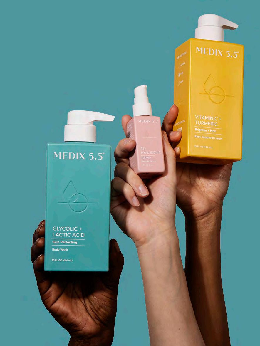
Get your skin ready with our cleansing/exfoliating/foaming body wash to remove impurities and prep your skin for treatment.

Choose a body treatment serum and apply to a targeted area of specific concern on your body.

Choose a body cream/gel/oil to lock in your serum's potency and rebalance your overall skin barrier to reveal your most radiant body.


PRIMARY
SECONDARY
The following messaging suggestions are to be used when promoting the brand on social media. The goal is to target new customers, grow the brand’s existing customer base, and retain loyalists. As a general framework, the brand demographic is: multicultural, 25-45 yearold women with an enthusiasm for skincare, a consciousness of aging skin and pricing, and a willingness to try new products.


Tagline exploration
Medix 5.5 Full Body Care
Medix 5.5 Balanced Skincare
Medix 5.5 Balanced Body
Medix 5.5 Skincare Science
Medix 5.5 Proof in pH
Hashtags
#mymedixmethod
#backtobalance
#everybodybalance
#skincarecommunity
#phpower for stories + captions for social media campaigns
Headlines appear in sentence case.
Buttons and CTA text appear in sentence case.

Use “+” in place of ampersand (&).
Use punctuation for clarity in headlines.
Medix uses the oxford comma in lists of three or more.
Medix Method is capitalized.
Your skin's ideal pH level is 5.5. Any disruption in its pH balance can trigger dryness, irritation, and breakouts.
At Medix 5.5, we've developed products meticulously crafted to rebalance your skin's pH equilibrium, keeping it within the optimal range for a robust and resilient skin barrier.
Balanced pH levels lead to skin that's supple and velvety, allowing your body to foster skin cell renewal, unveiling a radiant body glow that exudes health and vitality.

Medix 5.5 is more than a price tag. It's about effective benefits, quality ingredients, and a valuable experience.
We've shifted from chasing affordable to being accessible. We stand apart from others, emphasizing the uniqueness of our ingredients, formulations, and glowing skin results.
Our focus is on enhancing lives, building trust, and caring for customers' well-being, inside and out.

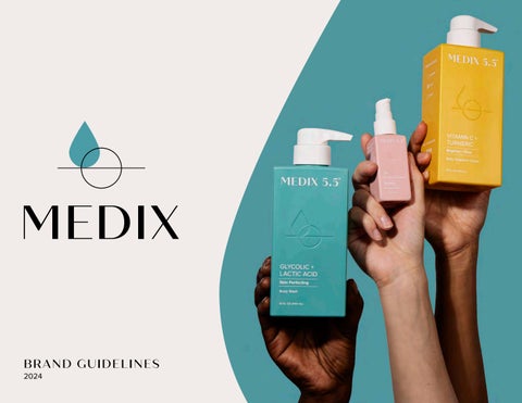
Medix 5.5 logo
Construction, usage, and clear space
Incorrect logo usage
Color palette
Typography

This is the primary logo that will be used across brand applications. It is essential to the success of the brand that the logo is always applied with care and respect according to these guidelines.
The wordmark-only logo is to be used when space is limited in layout and the stacked lock-up may not fit or be legible at certain sizes.
The logomark by itself should be used only in cases where it is immediately apparent to the audience that the drop stands for Medix 5.5. These situations include social media profile photos or the footer of multi-page documents.
When using the full color stacked lock-up or logomark, the drop should only appear in a corresponding Medix Rainbow color. The reversed versions of our identity may appear on different colored backgrounds from the Medix Rainbow, such as on product bottles. See page 15 for color palette usage.
When using the full color stacked lock-up or logomark, the drop can appear in any corresponding Medix Rainbow color. See page 15 for color palette usage.
When using the full color stacked lock-up or logomark, the drop can appear in any corresponding Medix Rainbow color. See page 15 for color palette usage.
Clear space is the area surrounding the identity. It ensures that the logo stands out in any environment and must stay free of any text or graphic elements.
Minimum clear space around the primary identity should never be less than half the height of the logo (denoted as 0.5x or 1x).
Minimum size ensures clarity and legibility of the logo. The wordmark-only and stacked lock-up should not be reproduced in print smaller than 9/16” wide or less than 50 pixels wide digitally. The logomark should not be reproduced in print smaller than 3/8" wide or less than 30 pixels wide digitally.
We pride ourselves on brand consistency. When using the Medix logo, adhere to the following rules at all times.
Squeezing, stretching, pulling, and squishing the logo are the most common ways the logo is misused. Generally speaking, do not modify the logo in any way. Do
The Medix Rainbow palette is for use on all product packaging and support materials. Using the Medix Rainbow is preferred to evoke the confidence and brightness of our brand. Match colors to Medix bottles when products are displayed. Medix Blue #889DC0 R136 G157 B192 C52 M27 Y0 K1 PMS 652 C
#CDB5A7 R205 G181 B161
C19 M28 Y31 K0 PMS 4575 C
Yellow #EBA700 R235 G167 B0 C0 M29 Y100 K1 PMS 124 C
#E07B44 R224 G123 B68 C0 M57 Y81 K1 PMS 7577 C Purple
Blush #DCA9AE R220 G169 B174 C7 M37 Y11 K0 PMS 501 C Peach #DCA9AE R220 G169 B174 C7 M37 Y11 K0 PMS 2031 C Green
C27 M77 Y29 K1 PMS 7432 C
#9F7B92 R159 G123 B146 C34 M53 Y13 K7
5145 C Teal
2234 C Pink #B55C7E R181 G92 B126
#22A2A8 R34 G162 B168
77 M16 Y35 K0
#A7C186 R167 G193 B134
37 M12 Y58 K0
Base palette
The base Medix palette is calm and balanced. It is to be used primarily in all communicative and information-heavy collateral. The base palette sets the foundation for the Medix Rainbow to shine, so it is best to avoid when products are highlighted.
The chart below represents the average percentage of usage for each color in the full brand palette. The Medix Rainbow is dominant, with Medix Blue acting as a bridge between both visual and educational content.
Informative content
Brand content intended to communicate or educate the consumer should be led by our base palette to avoid distracting from critical information.


Visual content
General visual content, the core of the brand which shows rather than tells, should tantilize the consumer with bright, appealing visuals. Leading with the Medix Rainbow is always preferred to draw our audience in.


Digital content overview
Below is a quick overview of the Medix color palette used in digital applications. The goal is for Medix colors to be used with even variation throughout brand collaterol.


The fonts for Medix 5.5 are Quiche Sans and Proxima Nova. These fonts should be used on the web and in professionally-produced marketing and sales materials.
Quiche Sans is available through Adobe Fonts. You can find licensing information at https://fonts. adobe.com/fonts/quiche-sans.
Proxima Nova is available through Adobe Fonts. You can find licensing information at https://fonts. adobe.com/fonts/proxima-nova.
Primary fonts
Proxima Nova / Semibold / ALL CAPS / 100pt tracking
PROXIMA NOVA IS USED FOR EYEBROWS
Quiche Sans / Medium / Sentence case
is used for headlines.
Alternative fonts
Arial / Bold / ALL CAPS / 100pt tracking
arial is used for subheads
Lucida Grande / Regular / Sentence case
Proxima Nova / Bold / Sentence case
Proxima Nova is used for subheads.
Arial / Bold / Sentence case
Arial is used for subheads.
Proxima Nova / Regular / Sentence case
Proxima Nova is used for body copy in paragraph text and bulleted lists.
Arial / Regular / Sentence case
Arial is used for body copy in paragraph text and bulleted lists.
Lucida Grande can be used in place of Quiche Sans, and Arial can be used in place of Proxima Nova in desktop publishing or on-screen applications where the primary fonts aren’t available, such as Microsoft PowerPoint or Word.
Color type is prefered for headlines, particularly for visual content and banners, to evoke the confidence and brightness of our brand. Please color match with the Medix Rainbow and match colors to Medix bottles when products are displayed, if possible. See sample layouts below.
The Medix Method is a simple, personalized, 3-step routine for full-body care, head to toe.


Get
Full color buttons and icons should also demonstrate white type with any included text and graphics.
When a full color background is used, type should be in white for ideal contrast and legibility. Inversely, when a white or tan background is used, bold colorful type is preferred.
The Medix Method is a simple, personalized, 3-step routine for full-body care, head to toe.
Color type is prefered for headlines, particularly for visual content and banners, to evoke the confidence and brightness of our brand. Please color match with the Medix Rainbow and match colors to Medix bottles when products are displayed, if possible. Please use best judgement with determining adequate contrast for legibility.
Hyaluronic keeps your skin hydrated.


When the background color pulls from the Medix Rainbow, typography in white is prefered for overall legibility.


Type in black is reserved only for highly informative content and documentation, set on a white or tan background. See example layout below.

Graphic and typographic layouts should be neat and orderly. Follow a clean grid whenever possible to break up content. A few isolated elements can be purposefully askew within a single page or view.


Don'ts
The following examples depict how not to compose graphic layouts and should be avoided to maintain the quality of the brand.


Do not
multiple elements out of aligment, collage-inspired grids
Do not
multiple overlapping elements on one screen, page or view
Do not
combine containers and overlapping elements on one page

Product photography should be shot in a well-lit studio, in order to capture bold, angular shadows. For brand consistency, products should be shot on colored backdrops that feature the brand's core palette.


The following examples depict how not to shoot product photography and should be avoided to maintain the quality of the brand.


Do not
show product on top of swatch from different item
Do not
pair the product with unrelated ingredients
Do not
use a background that pulls focus from the product
Full bleed Medix Rainbow backgrounds are always preferable to tan, white or neutral.
To maintain a consistent sense of contrast, bright images are best paired with neutral backgrounds, while neutral images are best paired with bright backgrounds.


Colors - before + after

Full bleed Medix Rainbow backgrounds are always preferable to tan, white or neutral.
When multiple products are depicted, please pick a single Medix Rainbow color from the packaging to avoid competing colors.


Colors - before + after

Full bleed Medix Rainbow backgrounds are always preferable to tan, white or neutral. When multiple products are depicted, please pick a single Medix Rainbow color from the packaging to avoid competing colors.


Colors
Monochromatic color blocking and gradients are acceptable with sparing use.


Colors — don'ts
The following examples depict how not to shoot product photography and should be avoided to maintain the quality of the brand.


depict product in dark or shadowy environments Do not
Do not
pair product with a Medix Rainbow color which does not match
Do not
pair product with multiple contrasting colors from the Medix Rainbow
use a white background on anything other than e-comm main product photos Do not
Product swipes should be shot in a well-lit studio in order to capture shadows with strong contrast. For brand consistency, shoot on color or neutral swatches from our palette.
As we develop our product photography library, this page will be updated.


Texture — don'ts
The following examples depict how not to shoot product photography and should be avoided to maintain the quality of the brand.


Do not
place a swipe on unapproved background colors that are not found in the brand palette
Do not
zoom in on the product being dispensed from container without adequate contrast
Do not
show the swatch in an unsightly fashion
When shooting model photography, shoot with the intention to create unique crops of the body and always consider diversity. Consider steady application shots to show a sense of motion in the product swipes. Shoot on background colors found in our core palette with a touch of high contrast to the lighting.
Studio-captured product application should aim to be a mix of short-clip video, motion or GIF format to capture essence of movement, as well as stills to show an array of skin and body types.


Don'ts
The following examples depict how not to shoot model photography and should be avoided to maintain the quality of the brand.


Do not
apply product with 1-2 fingers, whole hand is preferable
Do not
use backgrounds outside of the Medix color palette
Do not
use flashy clothing, clothing with logos, or extremely high contrast lighting
When capturing lifestyle photography, consider environments that are not overly staged and have a sense of ‘real life’. Strive for scenes that feel human and authentic. Showcase where our products should be used: the bathroom and home environments. Use a ‘less is more’ approach to how many products appear in frame at once.


The following examples depict how not to shoot lifestyle photography and should be avoided to maintain the quality of the brand.

Do not
overcrowd shot with too many unrelated items
Please note these examples are not applicable to certain social media and affiliate content, such as UGC or influencer marketing.


Do not
show too many products in the same shot
Do not
show the product mixed with other brands
medix55.com