Welcome to the PRIMED 2025 Exhibition. This year’s whole school focus— Thrive in 2025—is more than a slogan; it’s a declaration of intent. To thrive is to grow with confidence; to adapt with purpose; to create with meaning. The title PRIMED, drawn from the Oxford definition “prepared for a situation so that an individual knows what to do, especially after being given special information,” reflects the journey of our students. Over the past two years, through their engagement with the Visual Arts, they’ve been shaped, challenged and equipped — not only for what comes next in education, but for life.
Whether they go on to pursue further studies in Art and Design is still to be seen. What’s certain is that they will carry forward a richer sense of visual awareness, creative problem-solving and confidence in their ability to think independently. They are thriving — growing through reflection, exploration and artistic risk-taking.
In today’s world, success is increasingly defined by creativity, adaptability and a capacity for nuanced thinking. Visual Arts offers all of this and more. It is not a passive experience or rote learning, but a dynamic area where students learn to question, interpret and express. In choosing to make art and/or design, they learn to thrive outside of their comfort zones — through experimentation, inquiry and personal challenge.
The PRIMED 2025 exhibition stands as evidence of this transformation. At our School, the Arts are not an add-on; they are essential. Students have access to purpose-built facilities — from darkrooms and ceramics studios to digital design labs and printing presses. They work with a variety of media and techniques, and, just as importantly, they learn from real artists. Each year, we invite contemporary Australian creatives to share their practice and their stories, bridging the gap between the classroom and the professional world.
This year, we have been privileged to work with two exceptional artists, Andrea Shaw and Robert Malherbe, and another one – Leigh Hobbs – will be collaborating with our students later in Term 4. All share the same vital lesson: thriving in a creative life requires more than talent. It demands resilience, self-discipline, openness to failure and an unwavering work ethic. These artists offer more than technical skill — they provide the kind of “special information” that cannot be taught from a textbook.
As always, students were also encouraged to reflect on the legacy of Ludwig Hirschfeld Mack, whose influence introduced Bauhaus principles to Geelong Grammar School in 1943. His emphasis on hands-on learning, imagination and problem-solving is the foundation upon which our Visual Arts programme still stands. His approach—focussed on inquiry-based learning—continues to inspire generations of students to think critically and creatively.
As you move through the exhibition, you’ll see the results of this inquiry. The work on display is the culmination of effort, resilience and deep personal engagement. Students have worked tirelessly to refine their ideas, shape their artistic voices and take ownership of their creative direction. They have responded to both structured briefs and open-ended prompts, using the language of visual art to articulate their inner worlds and the realities that surround them.
Through this process, they’ve learned to see differently and, in doing so, they’ve grown. They’ve been primed not just for exams or portfolios, but for the challenges and opportunities of a fast-changing world. They’ve gained skills for life, and for living. They’ve discovered that to thrive is not about perfection, but about persistence, passion and the courage to create.
The Visual Arts Department, alongside the entire School, commends the growth, dedication and creative integrity shown by our students throughout the past two years.
Our graduates are more than ready.
They are PRIMED; ready to Thrive in 2025 and beyond.
Dr
Peter Bajer Head of Visual Arts
INTERNATIONAL BACCALAUREATE
VISUAL ARTS
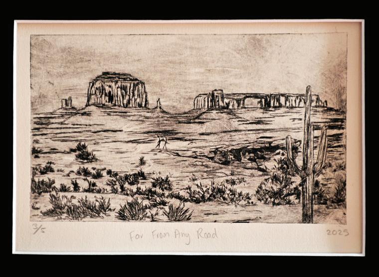
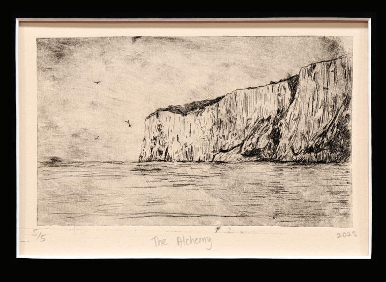
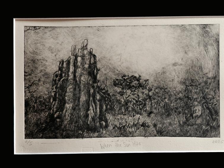
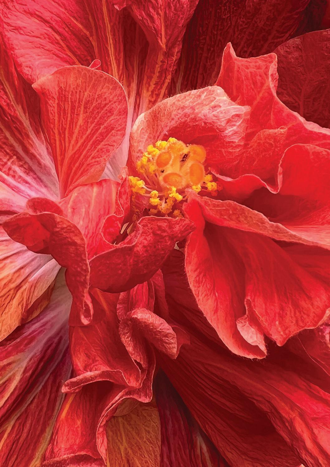
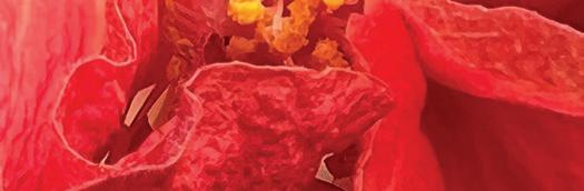
ELLA BORTHWICK (A)
Clockwise:
Far From Any Road
The Alchemy
When the Sun Hits
Intaglio prints
405 x 505 mm
My exhibition explores the theme of ‘Visual Articulation’- looking at the concept of human expression through the arts, notably literature and music, as well as representing this through my own visual art. I am fascinated by the concept of the arts being incredibly subjective and uniquely experienced by each person who engages with an art piece. Each created artwork is inspired by a different piece of music and/or poetry, and each artwork holds a different character; a different tone that reflects the tenor of the piece that inspires it, while also taking a new direction. This demonstrates how the arts influence and impact our lives- every piece of art provides a different experience, and I aimed to capture my own experience. When creating these artworks, I utilised the song’s tone and character to visualise images and scenes. I wanted the Exhibition itself to be reminiscent of the way a piece of art, music or literature evolves and shifts over its continuation, while also maintaining a clear thematic concern or melody. However, there are also slight differences in the artistic elements of each work, provoking invocations of subtle harmonies or shifting narratorial voice to demonstrate how a piece of art holds nuances to inspire and move us emotionally.
Top to Bottom:
Dies Irae
400 x 400 mm
Body Paint
300 x 300 mm
Miracle Aligner
400 x 400 mm
on canvas
Acrylic
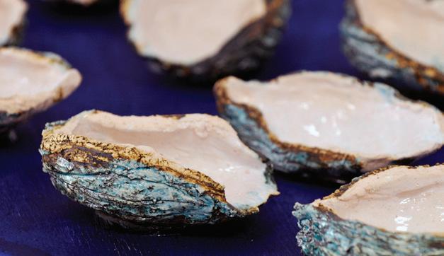
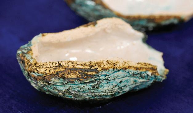
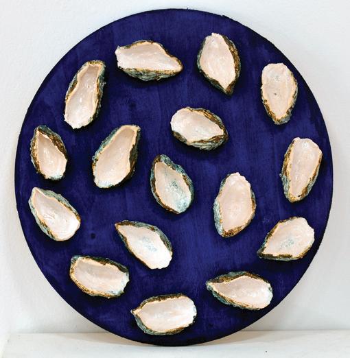
Shucked Remnants
Glazed ceramic with copper oxide attached to a plywood board
ø 450 mm
ELLA
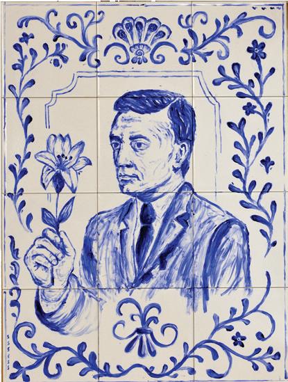
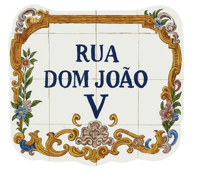
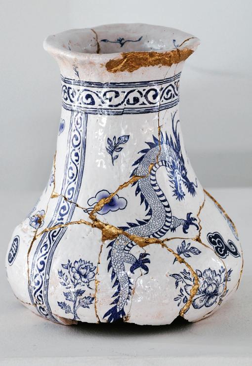
CORREA (EM)
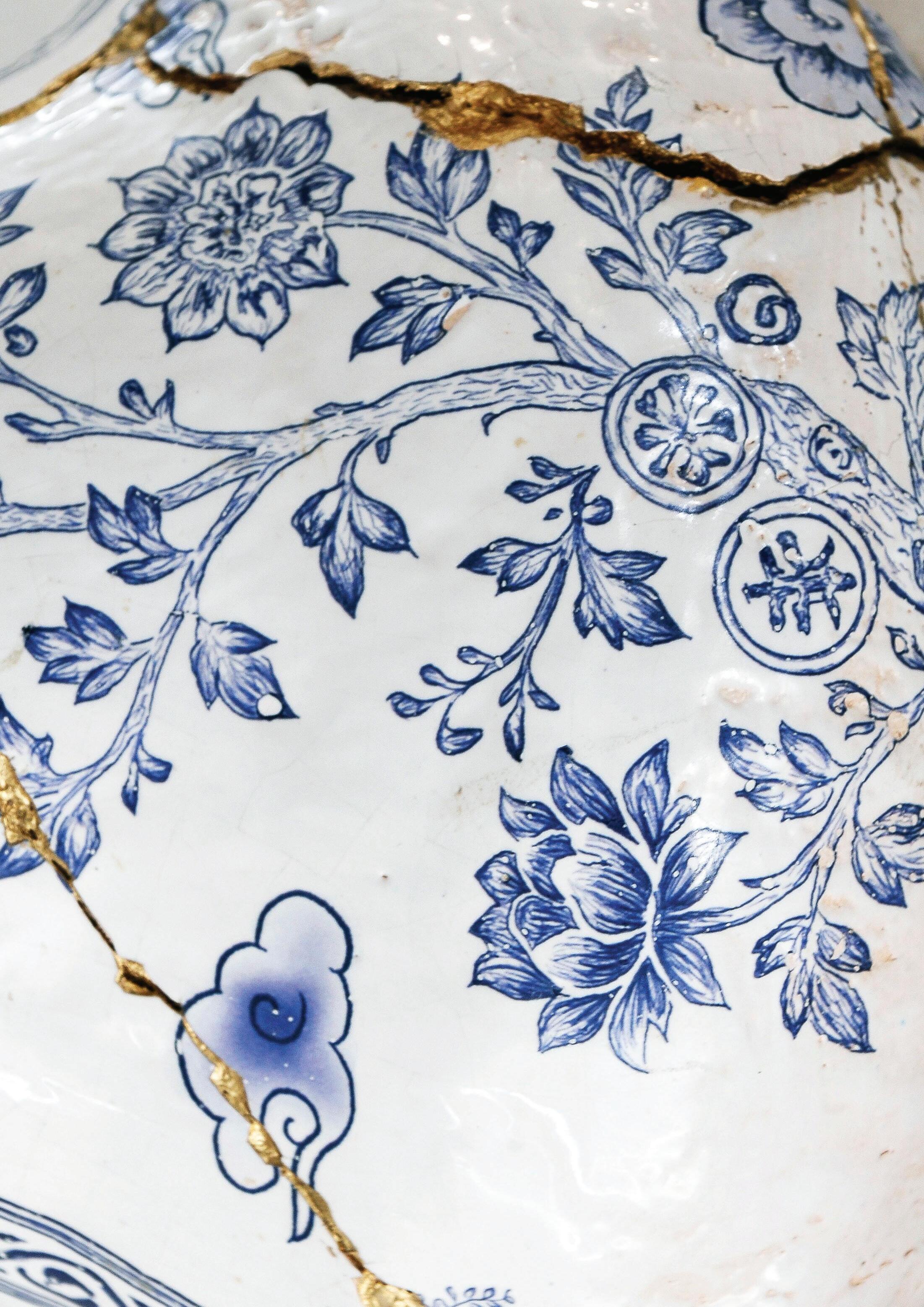
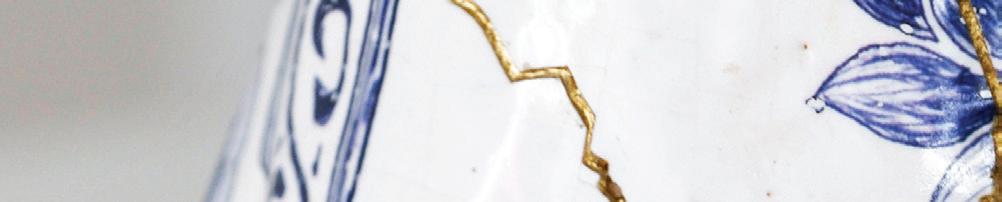
My exhibition explores a migrant botanist’s journey from Portugal to Macau. My great-grandfather José’s first act on arriving was to plant a ginger lily in his new garden, a culturally significant plant symbolising healing and adaptability that reflects how growth is possible in unfamiliar environments. His enduring act of planting became my way to understand migration not simply as movement, but as the establishment of new roots and the blossoming of opportunity. While this gesture formed the starting point for my enquiry, the exhibition broadens into a reflection on cultural fusion. In ceramics and tiles, Portuguese and Chinese traditions intersect, echoing how Macau itself retains visible Portuguese links through architecture and ornament. Across these works, fracture is reimagined through repair, ornament functions as a marker of exchange, and continuity is sustained through fragments rather than complete forms. The exhibition invites viewers to consider how the shattering upheavals of spirit, of life, of vessels and of culture are transgressed through restoration. My grandfather would often repeat a story he attributed to José: that planting is never enough, a garden must be watered if it is to grow. Roots may be established but, without acts of tending, they cannot endure. My intention is that audiences leave recognising that what remains in their own lives is sustained not by beginnings nor endings, but by the small, continuous acts that make renewal possible.
Top to Bottom:
Rua Dom João V, Digital illustration
355 x 385 mm
Endure
Glazed ceramic vase with hand-drawn decals
220H x 200W x 190D
Top to Bottom:
Threshold
Digital illustration
420 x 297 mm
Salus in Periculo
Digital illustration
420 x 297 mm
Jose Acrylic paint on tiles
594 x 420 mm
Spiritual Tenant
Glazed ceramic coated with copper patina
650 x 500 x 470mm
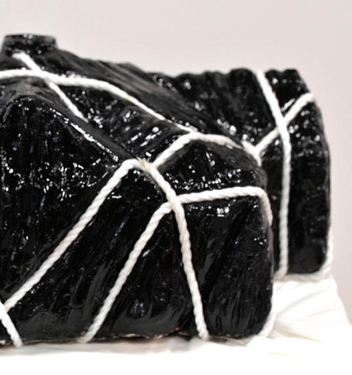
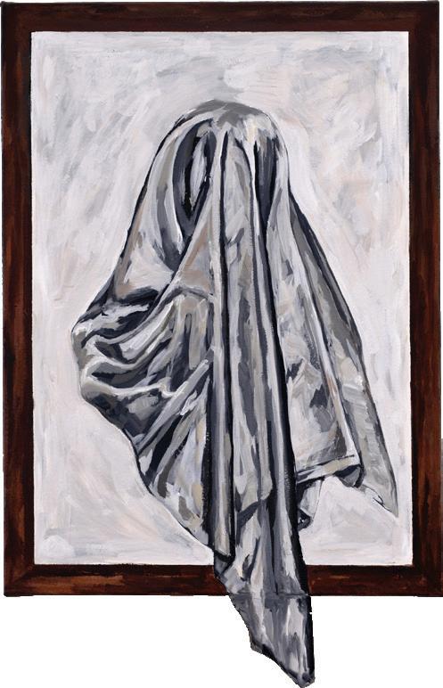
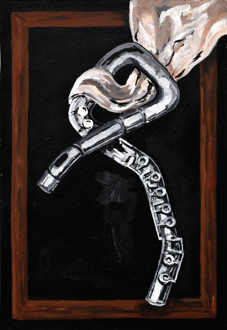
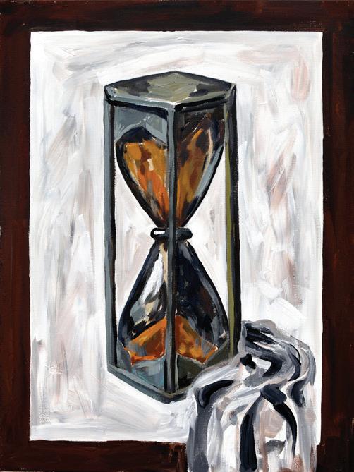
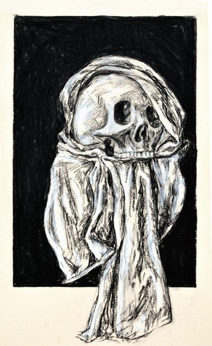
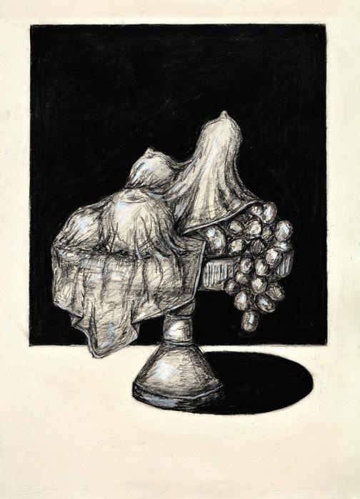
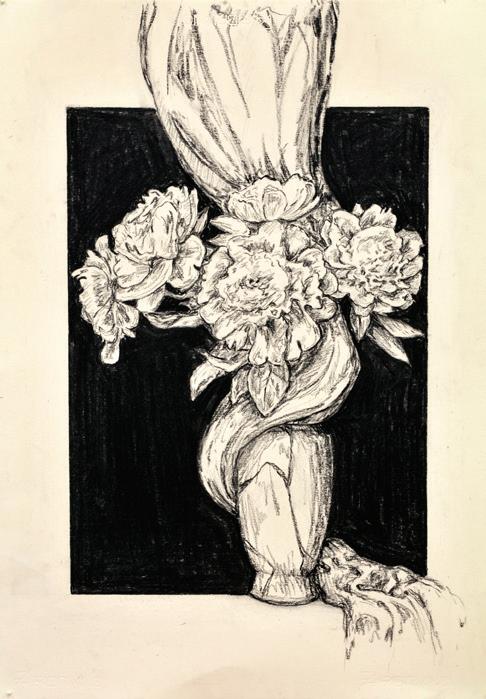
ABBIE LORD (CL)
My exhibition explores the tension between concealment and disclosure. Employing the recurring theme of drapery and veils, it reflects how the process of concealing something paradoxically draws attention to it. Central to the curatorial intent is my observation that in concealing an object or area, its presence becomes amplified. The works in this exhibition engage with memory, trace, and the suggestion of what is no longer physically there but still exists in symbolic form. The topic emerged as a result of an exploration of absence as narrative technique and consideration of how the unrevealed, unseen, or hidden holds as much, if not more, power. One of the key inspirations for concepts and form of the exhibition is Christo and Jeanne-Claude’s practice, whose wrapped sculpture works transform iconic architecture and landscape into abstracted shapes. Wrapping a building in fabric, both concealing and revealing the object beneath, prompted me to further investigate the material of fabric as a symbol of preservation and transformation. Similarly, the paintings by René Magritte, and his use of visual paradox and veiling, introduced an element of mystery and subjectiveness to his works. The paintings by Magritte conceal the subject in order to induce perception, and they invite spectators to form their own conclusion. This creates the effect of forming a conceptual link between concealment and physical presence: if nobody can see it, does it still exist?
Self portrait of who
Acrylic on canvas with wooden attachment
700 x 500mm
Forgotten Passion
Acrylic on canvas
700 x 500mm
Timeless Obscurity
Acrylic on canvas
700 x 500mm
Contemplating sustenance
Charcoal on paper
700 x 500mm
Everlasting Peonies
Charcoal on paper
700 x 500mm
The Pale Horseman
Charcoal on paper
700 x450mm
Left to right:
06:57 Ethereal Flight
00:56 Memory Lane
Digital manipulation
print mounted on foam core
840 x 594mm
ELAINE LU (EM)
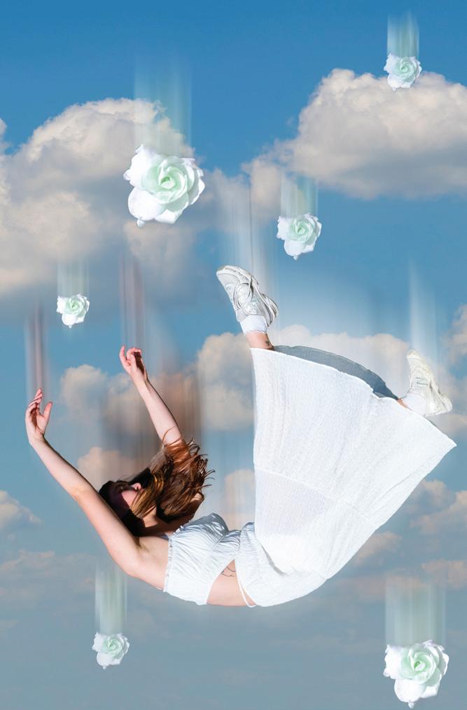
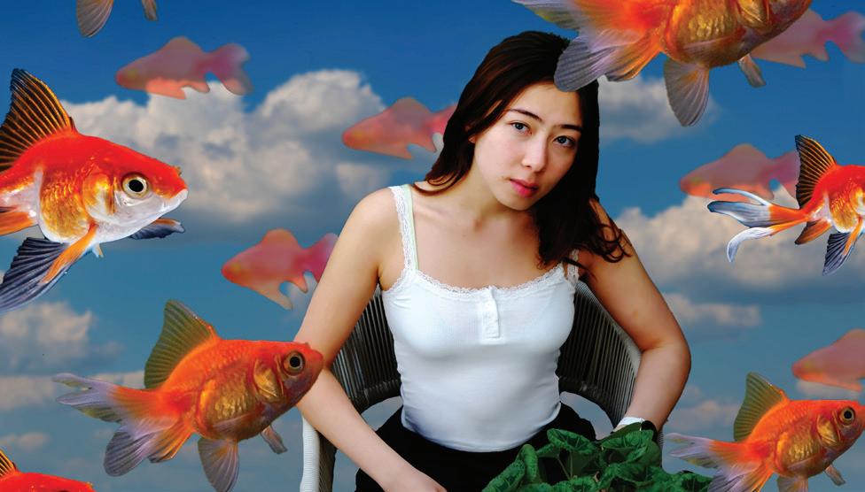
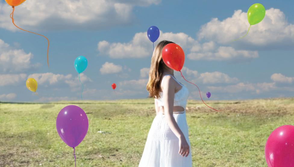
My exhibition explores the theme of dreams as an instinctive refuge when reality becomes overwhelming. To me, dreaming extends beyond sleep, serving as a response to real life and a space where desires, emotions, and suppressed realities resurface. Through this lens, my works reflect both hope and inner conflict, offering a glimpse into the subconscious and the truths hidden beneath the surface. Influenced by Surrealism, I sought to merge the conscious and unconscious, drawing on artists such as René Magritte and Salvador Dalí, whose symbolic use of dreams inspired my compositions. The stillness and spatial tension of Edward Hopper and Jeffrey Smart further informed my approach, shaping how I express the paradox between reality and the subconscious. This exhibition centres on lens-based digital manipulation. Photographs taken by me were digitally manipulated to simulate dream states, with black backgrounds evoking night and coherence. Symbols such as goldfish, balloons and motifs of death act as signals of fortune, joy and renewal, while surreal juxtapositions deepen the dreamlike quality. Structured to mirror stages of sleep, the works progress from entry into unconsciousness, through normal and lucid dreaming, before emerging into wakefulness. Using a consistent figure, I aim to immerse audiences in a narrative journey into the subconscious.
Top to Bottom: 01:54 Prophetic Currents 04:56 Blurred Reunion 02:57 Rebirth 06:13 Silent Observer 00:00 Late night
Digital manipulation print mounted on foam core 594 x 840mma
VICTORIAN CERTIFICATE OF EDUCATION
ART MAKING AND EXHIBITING
SIENNA BAILLIEU (CL)
This multi-panelled work captures a forgotten memory that is suspended between past and present, evoking the way memory reshapes familiar places and connections. The acrylic painting depicts a coastal jetty stretching across reflective waters beneath a richly textured sky. Painted on linen, the 20-panel format divides the scene into fragments, reflecting how memories exist as incomplete and layered moments that form a larger emotional narrative. It highlights how special a place, or an object, can be for one person but mean nothing to someone else. How a memory can feel so close yet so far in the distance to remember every detail. Contrast is created though the transition of the warm peach tones of the sun setting to deeper blues and violets as dusk settles in. The stillness of the water and openness of the sky provides a calm and reflective tone, while the fragmentation of panels introduces a subtle tension, suggesting memory’s fragility and the passage of time. My colour palette is intentionally faded, and I have used more pastels to convey a more distant and faded memory whilst still highlighting vibrant colours that symbolise summer. The horizontal composition is dominated by the jetty, acting as a visual anchor that guides the viewer’s gaze. The scale of this artwork makes the jetty feel monumental and personal, allowing the audience to experience the work to the full extent.
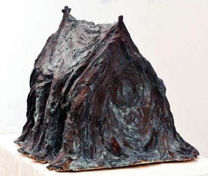
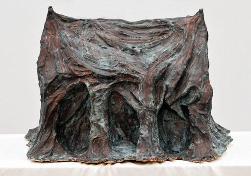
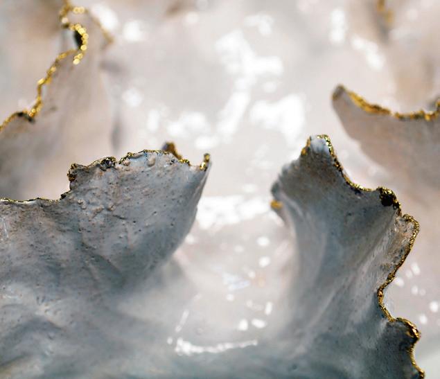
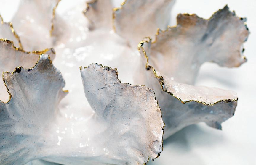
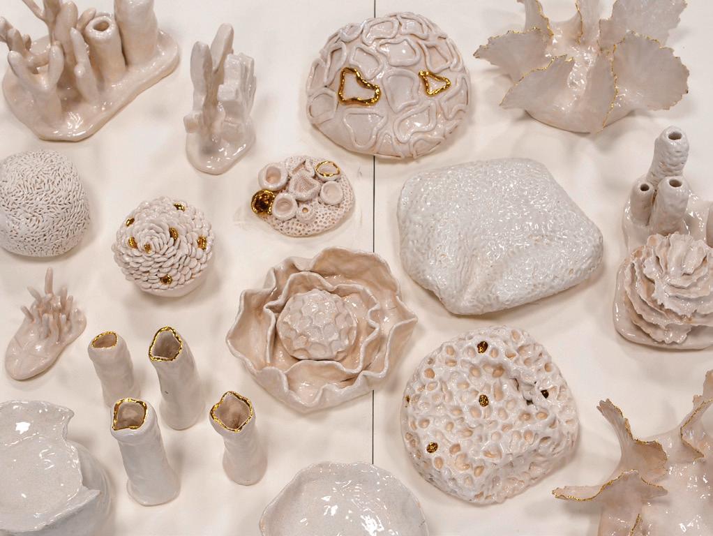
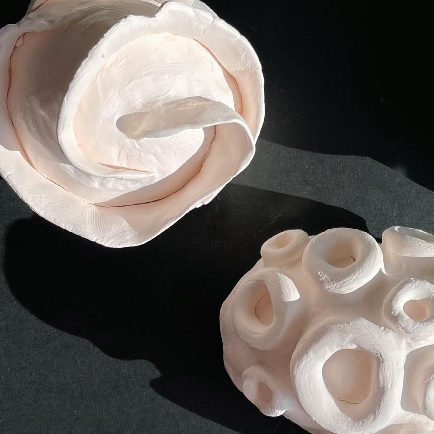
RUBY BARTER (A)
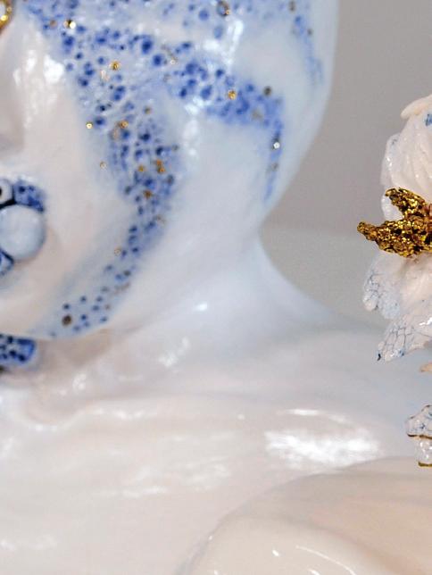
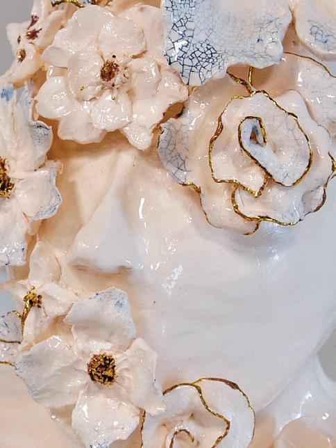
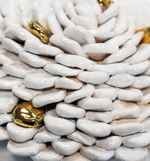
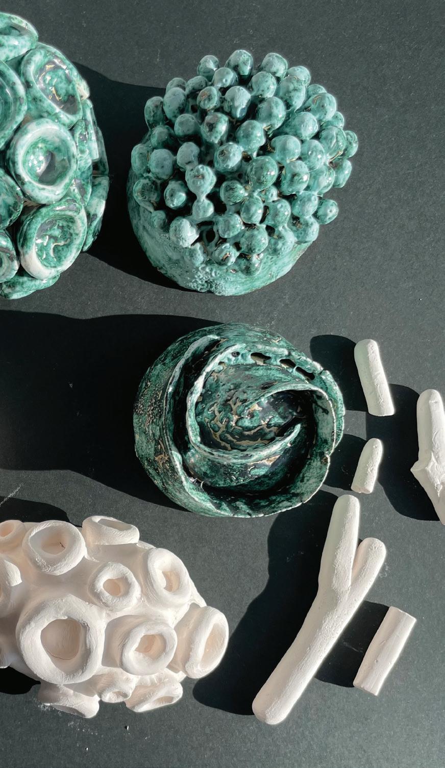
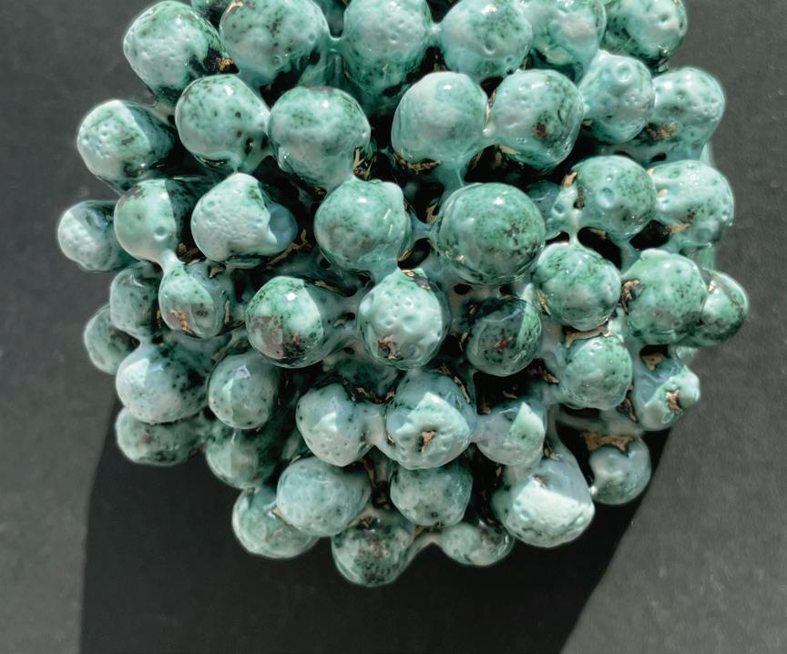
Anthozoa is an installation of ceramic coral forms that explores the fragility, resilience and decay of the Great Barrier Reef in the face of climate change. The title refers to the biological class Anthozoa, a group of marine invertebrates that includes true corals and sea anemones. Constructed from white raku clay, the work represents the transformation of coral from vibrant ecosystems into skeletal fragments caused by mass bleaching events. By arranging diverse coral structures, ranging from tubular branches to flower edged pieces, domes and brain-like spheres, the installation reflects both the biodiversity and the vulnerability of marine environments. The monochromatic white speckle palette, broken only by subtle applications of gold lustre, symbolises the evocative beauty of bleached coral. Designed to be displayed on a low plinth, the installation echoes the perspective of looking down into a reef from above. The spatial arrangement transforms the work into a contained reef graveyard; individual coral pieces function as delicate specimen, yet collectively they form a memorial to a disappearing ecosystem. The title Anthozoa anchors the conceptual focus; coral is not a decorative piece but living animals, and its survival is critical.
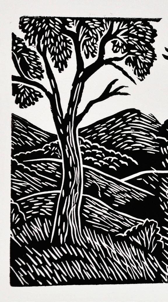
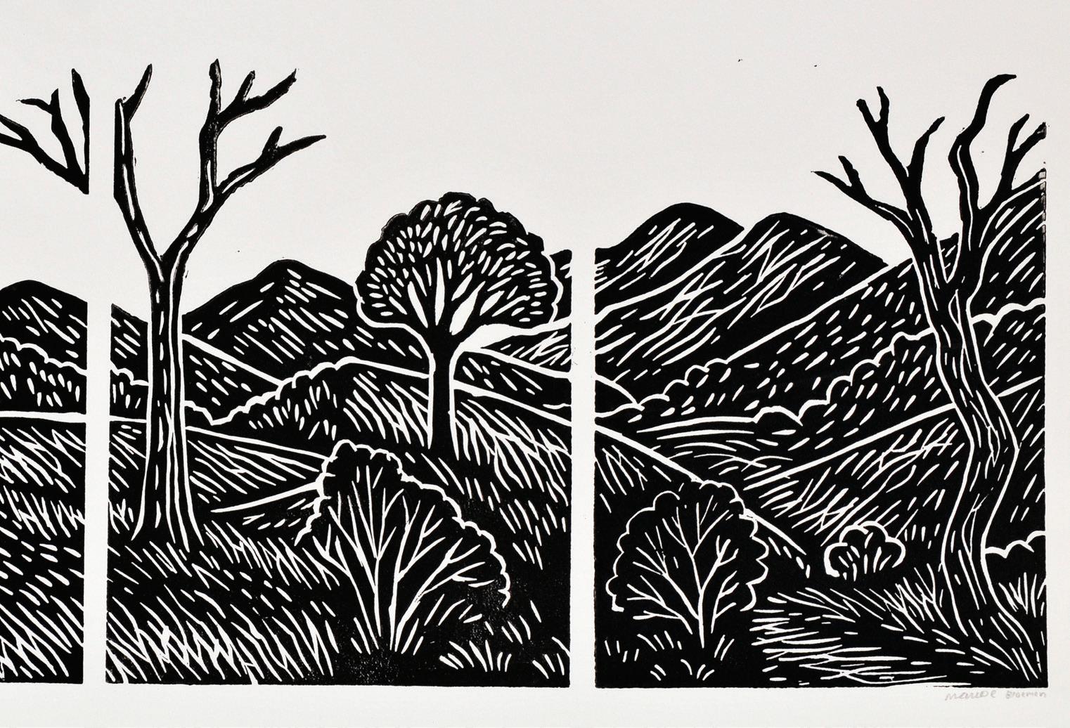
MAUDE BLOEMEN (HE)
Fragmented Memories is a resolved triptych that explores themes of memory, nostalgia and the fragile nature of human recollection. Developed and refined across Units 3 and 4, the work extends from initial single-panel lino explorations into a triptych format that reflects how memory operates—fragmented, layered and shifting across time. Silk-cut lino was chosen for its precision and versatility, allowing me to carve delicate, bold lines that symbolise the tension between clarity and loss within memory. Through carving, layering and masking, I refined how textures, tones and contrasts could work together without overwhelming the imagery. Masking became essential in maintaining clarity and separation between inked and un-inked areas, reinforcing the metaphor of sharp moments of recollection against fading absences. The visual language is central to the work’s resolution. Line and texture are used symbolically: carved marks vary in thickness and rhythm to mirror the fragmented nature of memory. The contrast between black and white strengthens this metaphor, with inked forms representing moments vividly remembered, while un-inked negative space speaks to silence, absence or erasure.
Balance across each panel and across the series ensures cohesion, while rhythm and repetition generate movement, reflecting the cyclical resurfacing of memory. The triptych format was a considered decision, expanding the scope of the work from a single reflection into a temporal sequence. Each panel represents a distinct fragment, yet they create progression—memory shifting and reshaping across time. Negative space within and between panels allows pause and contemplation, echoing the physical exhibition environment where the white walls amplify the sense of absence and silence.
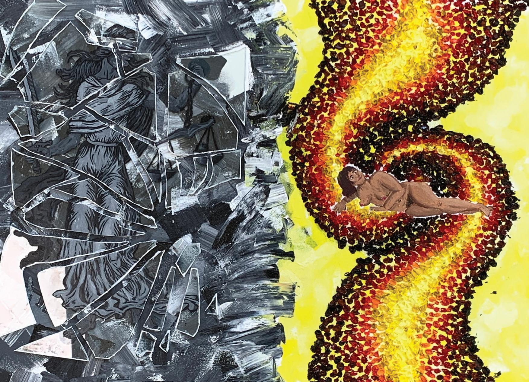
BELLA BURDETT-MOORE (CL)
What happens when we place patriarchal values at the forefront of our cerebral makeup? What happens when those values infiltrate our views of justice? There is currently a silent battle that women around the world are having to face, from Afghan women being stripped of their right to an education to American women being denied healthcare, to right here in Australia, where more than 150 women have been murdered since January 2024. For centuries, the story of the creation of Adam under god has been used as a theological justification for the enforcement of gender roles. I set out to reconceptualise the story, particularly Michelangelo’s fresco depiction of it, to portray how this line of thinking has evolved into systems that prioritise patriarchally skewed values over genuine justice. Similar to Michelangelo’s fresco depiction of god, the woman is framed by a bubble-like aura in an uneven texture and varied tone that mimics Vincent van Gogh’s stylised skies, further reconceptualising a male artist; much like women today, van Gogh faced the challenges of being in a system that wasn’t designed for him. To emphasise the reconceptualisation of the original fresco, the womanly figure is rendered nude and in a vulnerable position that is akin to Adam’s, yet still on the side of god, highlighting that women and our wombs generate life. Depicting the woman naked connects to the way that Michelangelo intentionally included vulgar depictions to enhance memorability. Georges Braque, a pioneer of fractured cubism and a misogynist, heavily inspired the left side of the painting. I reconceptualised his style to depict a Lady Justice on broken glass to highlight the damage caused by his way of thinking, using achromatic colours in a similar way to him, but reconceptualised, to reflect the lack of emotional depth and the fact that true justice isn’t black and white, but rather a grey scale, and that we all play a role in how justice is being skewed, not just men. These shards and the layers of abstract geometric cubism underneath are reaching out towards the woman in a similar way that Michelangelo’s god is reaching out towards Adam, reconceptualising the meaning to be that patriarchal justice is encroaching on femininity. My work aims to be bias-free portrayal of god’s word to “treat others the way you want to be treated”.
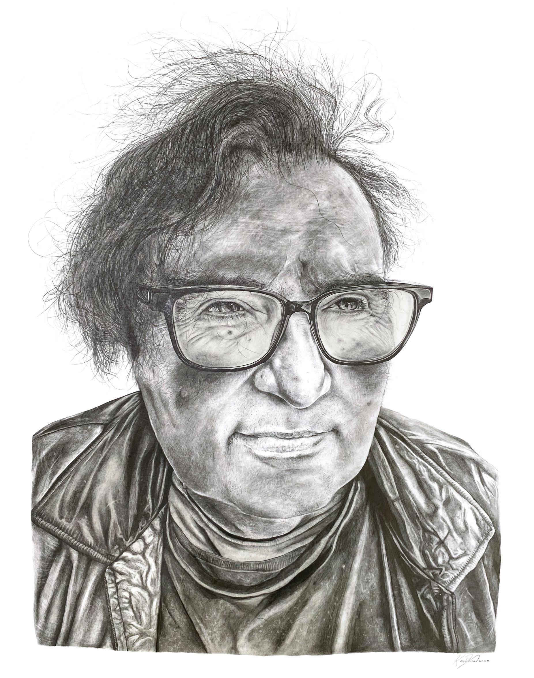
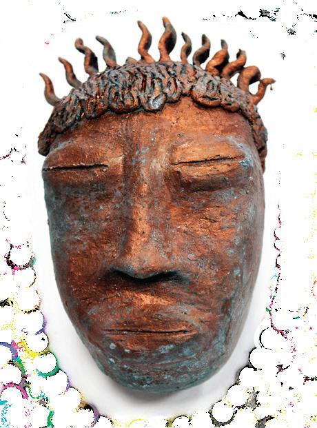
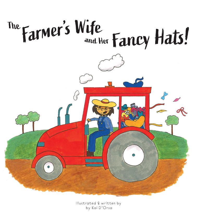
KAI D’ORSA (A)
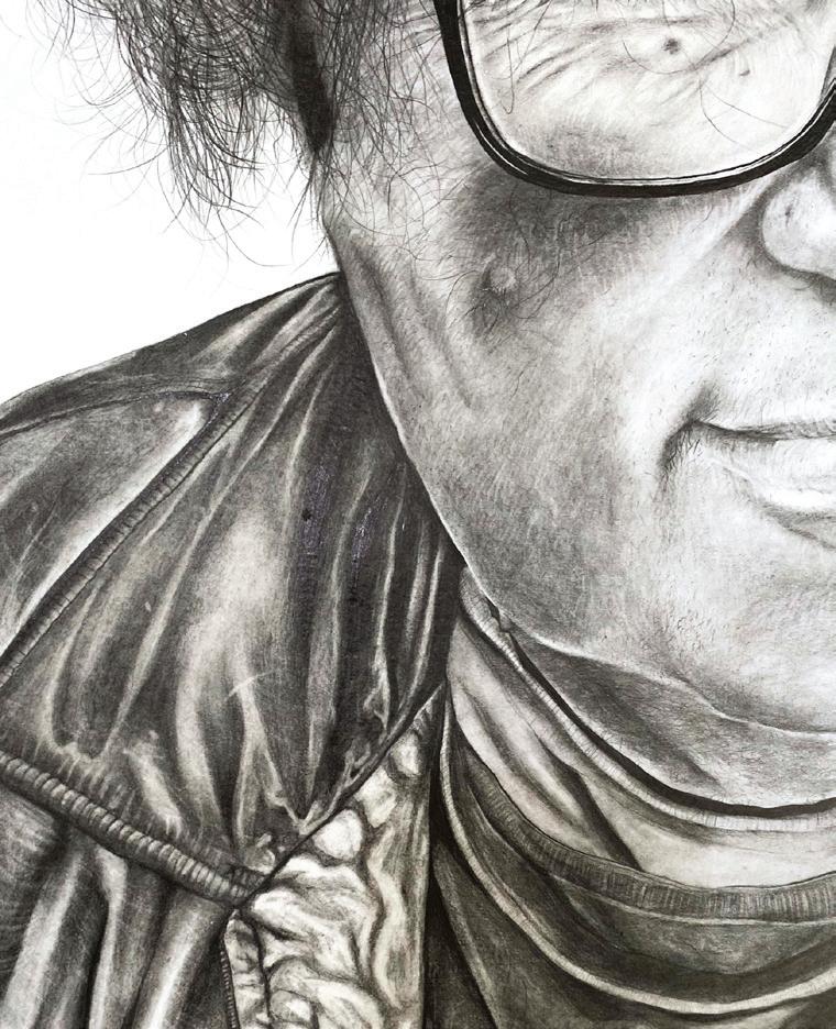
Untouchable Past is a graphite drawing on paper portraying Robert Drummond, a figure of deep significance in my life. His likeness emerges through delicate layering of pencil, where every line and soft shade captures both detail and vulnerability. Robert’s eyes, rendered with particular care, hold a gentle fragility - conveying humility, quiet strength, and a profound sense of peace after hardship. His distant gaze suggests a man reflecting on his past yet choosing to move forward, carrying pain but no longer bound by it. The creation of this work was intertwined with my own journey. During these art classes, I was navigating my parents’ divorce. Within the warmth of those evenings, sustained by hot chips, hot chocolate and shared creativity, I found comfort and escape. Robert’s presence, coupled with the act of drawing, provided a space to pour out my emotions and transform them into something meaningful. Although we come from different generations, Robert and I share scars from experiences that shaped us. This portrait is not only about him; it’s about our shared resilience and the truth that pain, while difficult, can guide us to become stronger, more compassionate individuals. Our past may be untouchable, but it shapes who we are today.
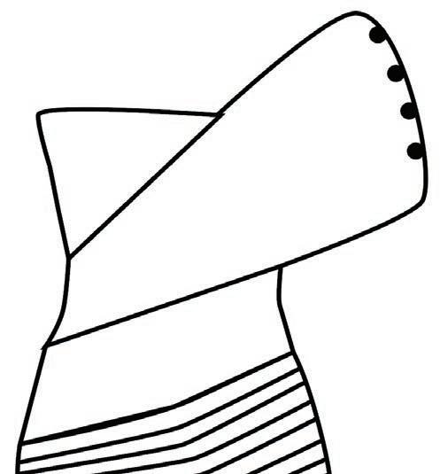
EMILY DACK (CL)
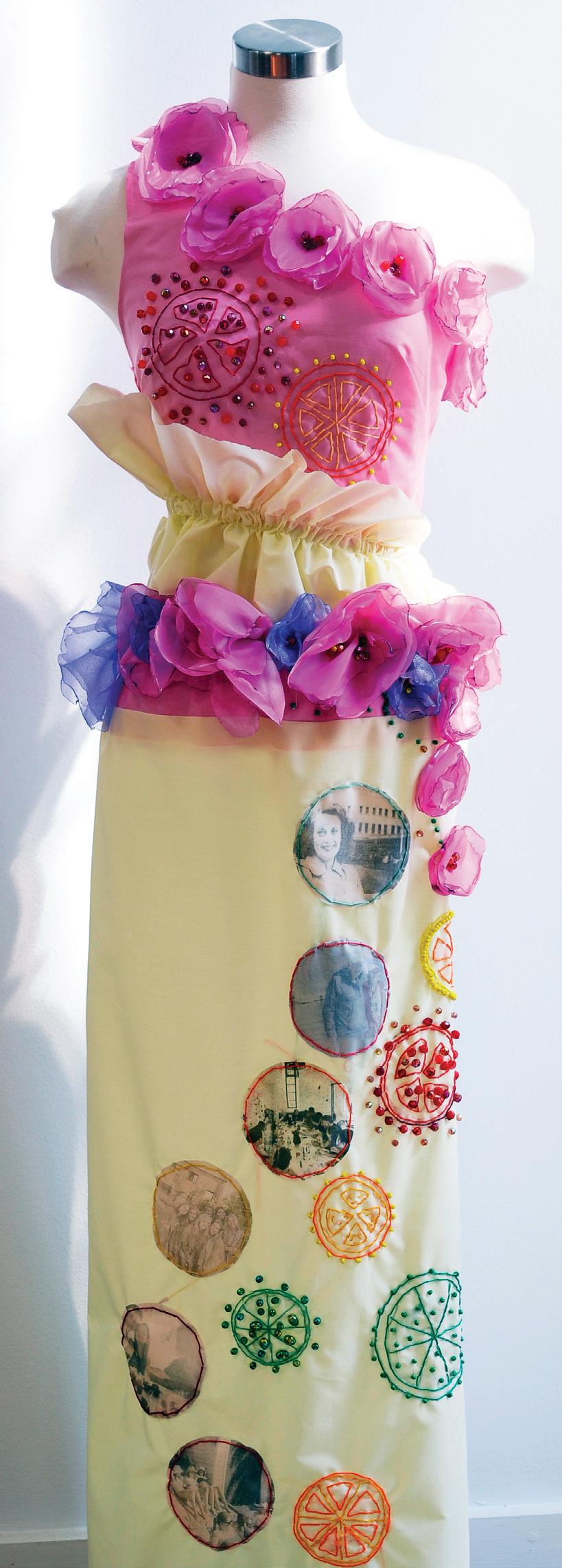
My artistic garment encapsulates the fragility of life and how an individual is shaped through their lived experiences, such as grief, family and friendships, that define who we are both biologically and socially. It explores the idea that each person, hypothetically, is what they ‘wear,’ carrying their personal history as layers of memory, emotion and identity. The artwork consists of linen, organza, beads, embroidery and transfer fabric. The geometric symbols of the Fruits of Life and Flower of Life became the forefront of my inspiration. Each circle symbolises a node of energy, or a step in the process of the universe itself. The Fruit of Life emerges when a subset of circles from the Flower of Life is highlighted or extracted, which I referenced through the embroidered floral motifs on my garment. These symbols represent unique outcomes, achievements and rewards that individuals encounter throughout the journey of life. The imagery transferred onto the fabric further personalises this theme, intertwining moments of happiness with deep sorrow. The passing of my father’s mother (Florence Mae) is embedded in this work as a symbol of generational grief; an absence that has shaped my family’s identity. This grief sits in dialogue with the joyful memories of family celebrations and friendships, creating a contrast that acknowledges life’s dualities. Through this interplay of mourning and joy, the garment communicates how identity is not linear, but a tapestry woven from both hardship and love.
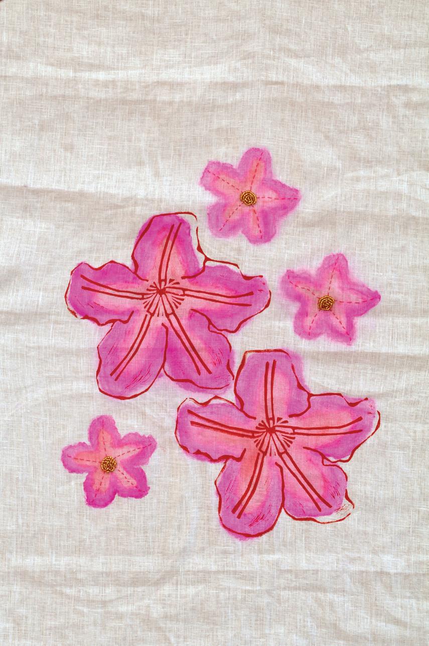
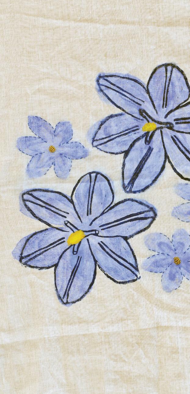
LUCY DANCKERT ( YR11 CL)
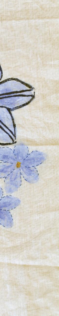
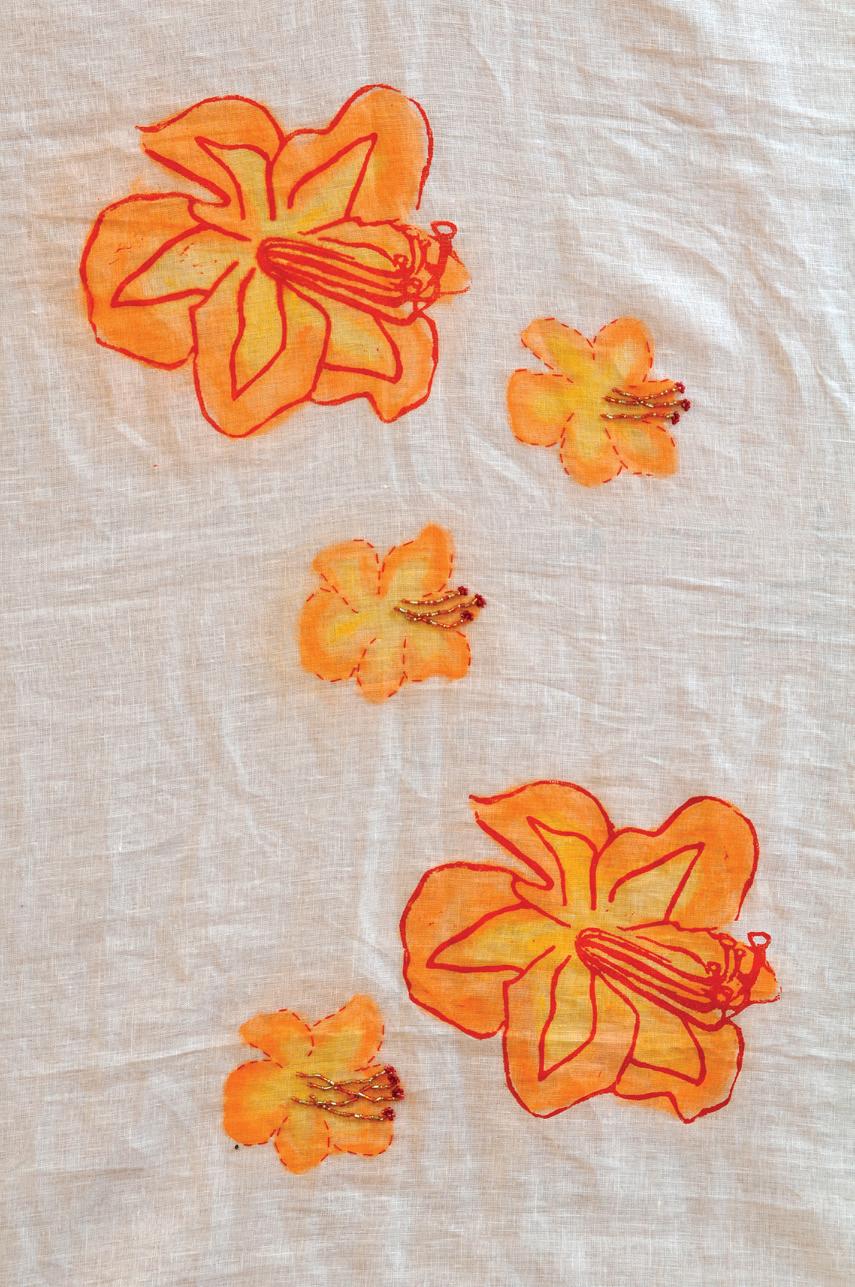
This artwork explores the theme of hidden fragility in Australian native flora, focusing on the hibiscus, morning iris and desert rose. Each flower reflects a balance of strength and vulnerability: the hibiscus is vibrant yet delicate, the morning iris blooms briefly before fading, and the desert rose survives in harsh conditions while appearing fragile. Together, they symbolise the quiet resilience within nature. Inspired by artists Andy Warhol, Donald Sultan and Diane Emery, I combined repetition, scale and fine detail to shape my visual language. Their practices encouraged me to merge printmaking with textile processes, transforming botanical imagery into layered, symbolic representations. Using lino and mono printing on linen, I explored contrast, texture and imperfection. Stitching, beading and embroidery extended the prints beyond paper, adding rhythm and tactility to highlight fragility. This combination of bold print and delicate textile work creates a dialogue between strength and delicacy, permanence and impermanence, echoing the dual nature of flora itself.
VEDASARA FARMER (GA)
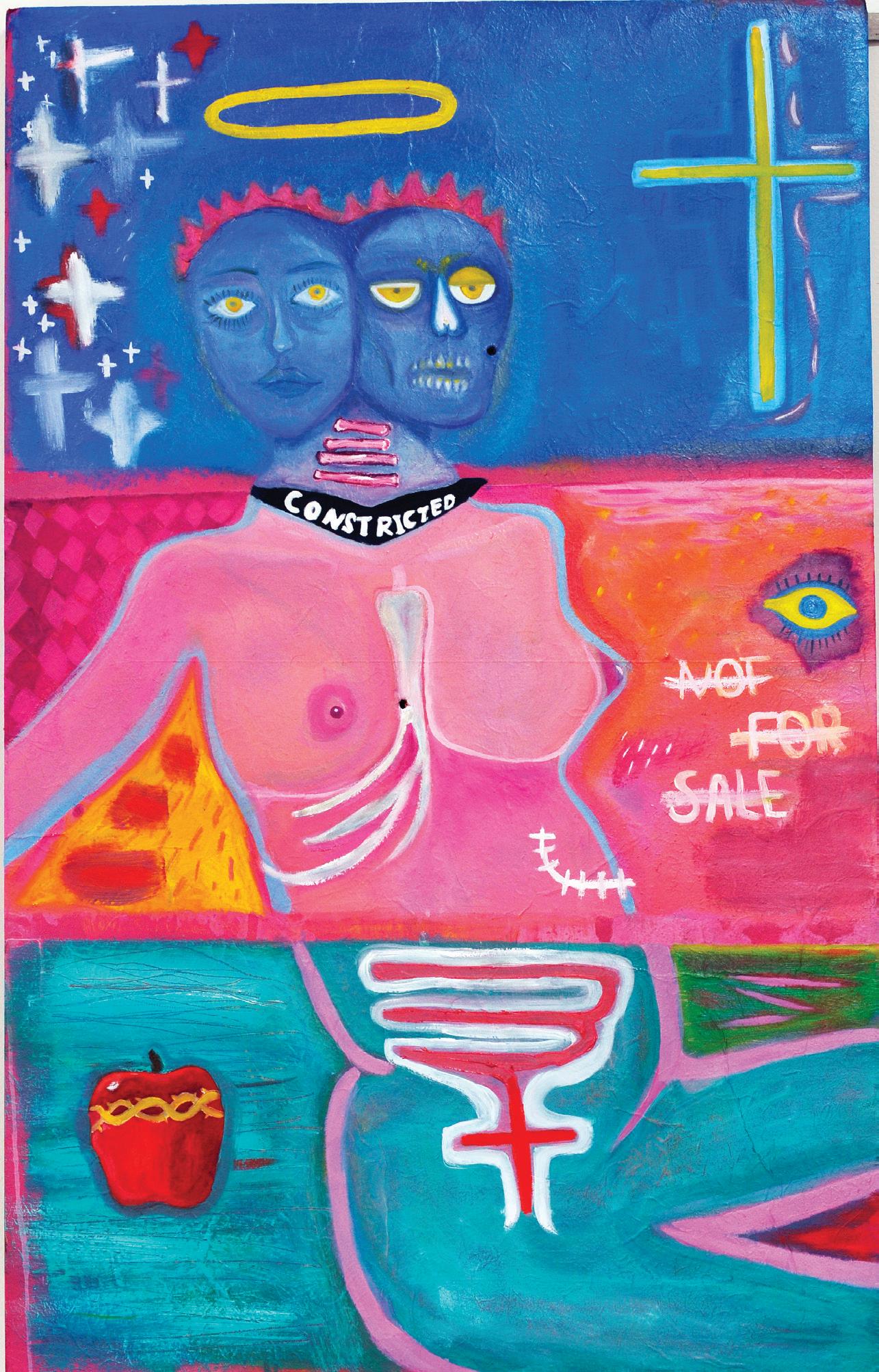
Constricted to fit within the space she is condemned to, she accommodates the external environment within these confined spaces. She has been split in two: the surveyor and the surveyed. My artwork blends inspiration from the allegorical story of Eve’s shame shown in Genesis and the concept of woman divided. Dissecting Eve is about being continually accompanied by your own image, forced to consider the surveying of oneself from the inside out. Inspired by John Berger’s comment that “men watch women, and women watch themselves being looked at”, the subject embodies this coupled identity: the face shown to the world and the internal skeletal form watching the viewer (us), watching her. Recurring brushstrokes and symbolic references, like the crosses, the apple, the halo and anatomy, draw on the influences of artists such as Jean-Michel Basquiat and René Magritte, who destabilised the power of religious symbols to communicate layered ideas of inequality and identity. The eye, embedded within the composition, functions as the intrusive outside viewer looking in at her; an ever-present reminder of surveillance, judgment and exposure. The distilled presence of the apple alludes to its role in manifesting Eve’s first sin, while the rib references her creation from Adam, embedding the notion of woman as originating from man, and therefore confined within his view and authority. The composition, broken into thirds and inspired by Mark Rothko, allows the use of a monochromatic palette where the subject is absorbed into their layered environment, while dynamic, complementary colours heighten intensity. Here, colour itself becomes symbolic: blue alludes to the iconography of the heavens, red and green evoke materialism and power, while yellow and pink point towards an ideal sensuality that is contrasted with embedded disturbances through symbol, line and text. Placed alongside the artwork is the playlist that enhanced the creative atmosphere in the production of the painting for the artist. Music acted as a catalyst for fostering a creative space for exploration and pushing artistic boundaries. A lot of Blur, Tool and Rage Against the Machine, combined with French girl bands, acted as a catalyst for the final piece.
Dissecting Eve reflects a historical shame, both personal and collective, through embedded text like ‘constricted’, where dual identities are bound, and ‘not for sale’, which resists commodification. The nude representation of the subject underscores their vulnerability as the surveyed, while simultaneously being idolised through the halo and other iconic symbols. Through the layering of oil colours and recurring motifs, the work provokes us to question how women have been confined to bear continuous shame throughout history. The stark subject matter of the surveyor and surveyed concludes with an enduring recognition of this inherited, intrinsic burden of being a woman.
EDWINA GORELL (CL)
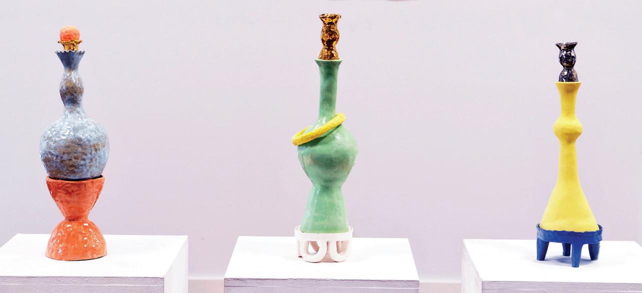
Strength versus Fragility presents a compelling view of form and balance, serving as both a portrayal of female anatomy and as a tribute to traditional perfume bottles. Using removable components, highlighted by vivid colours and metallic finishes, Strength versus Fragility effectively engages viewers, offering a glimpse into the complexity of surface textures and handcrafted qualities. Opposites in both organic and geometric shapes, as well as colour, are deliberately combined, establishing subtle contrasts that allow interactions between each form to complement each other’s stark qualities, whilst simultaneously maintaining individual freedom. The trio of forms, composed with tones derived from opposing positions on the colour wheel, evoke a sense of visual harmony, appearing delicate on the surface, yet anchored through a robust structural integrity.
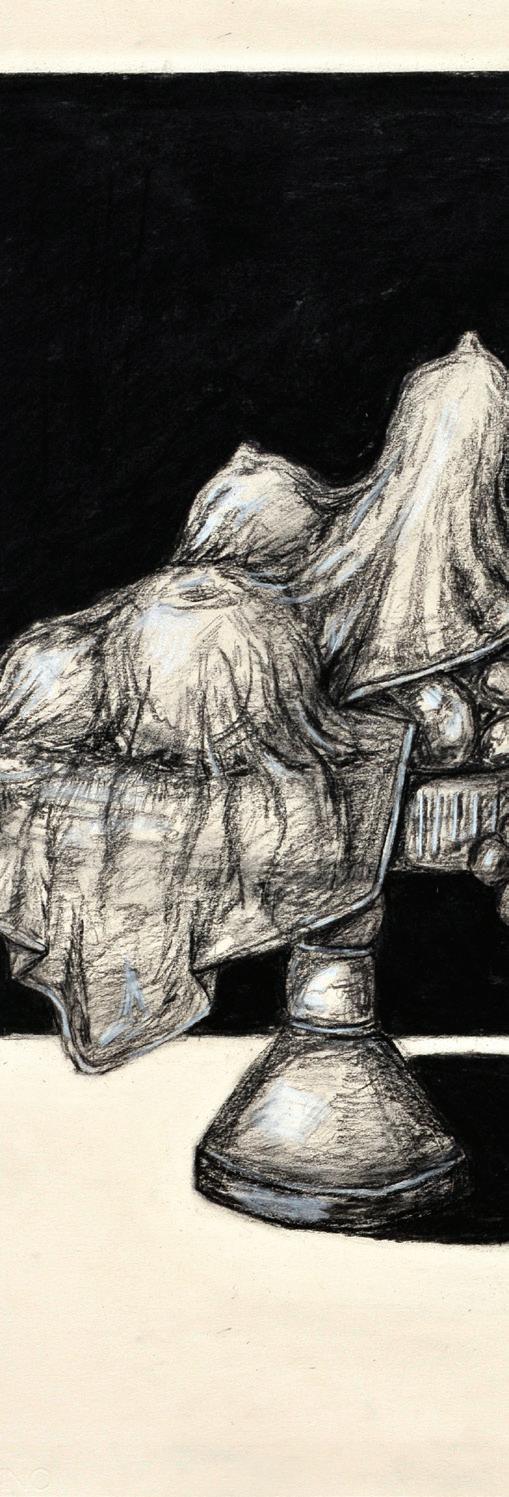
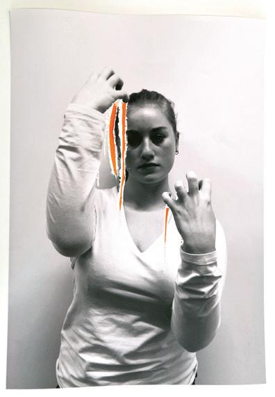
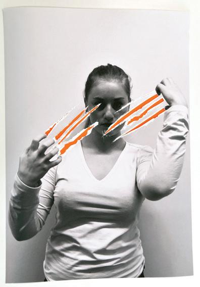
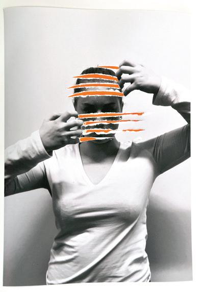
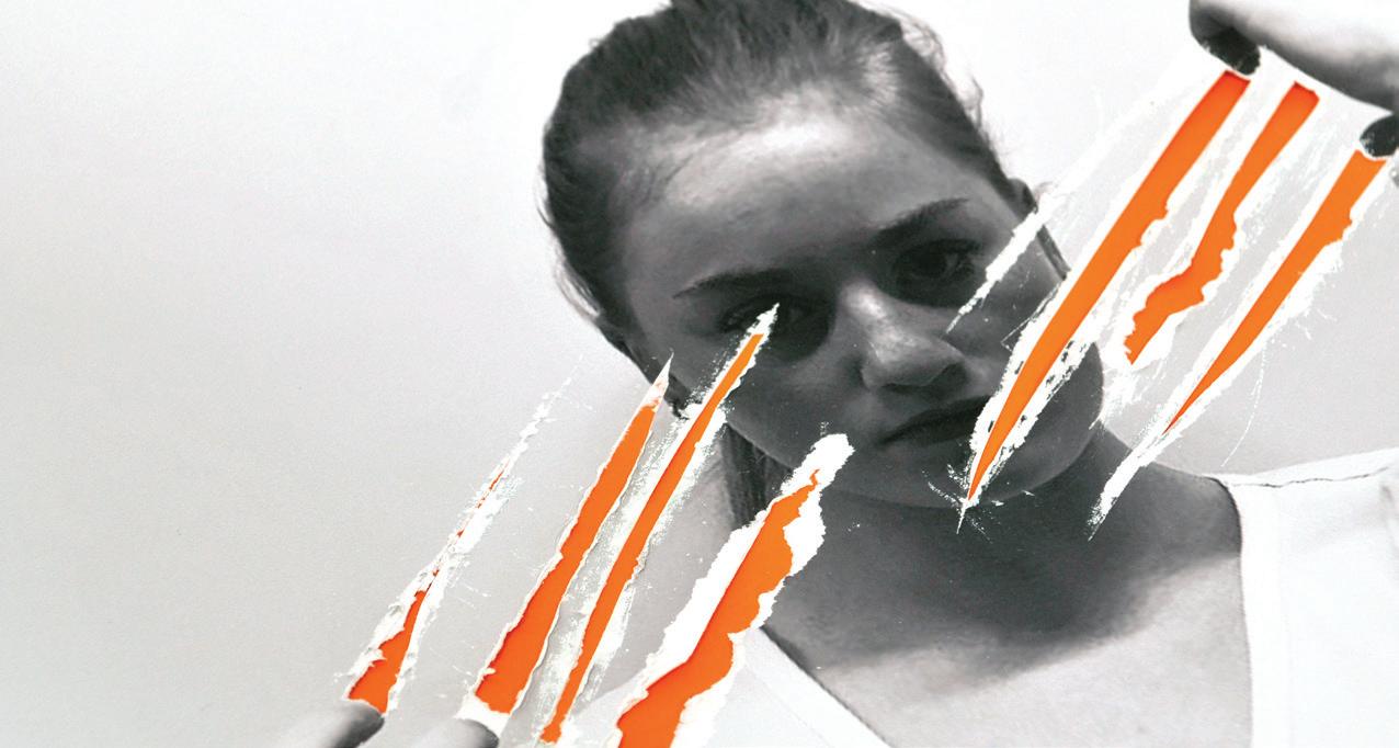
WILLOW HANRAHAN (A)
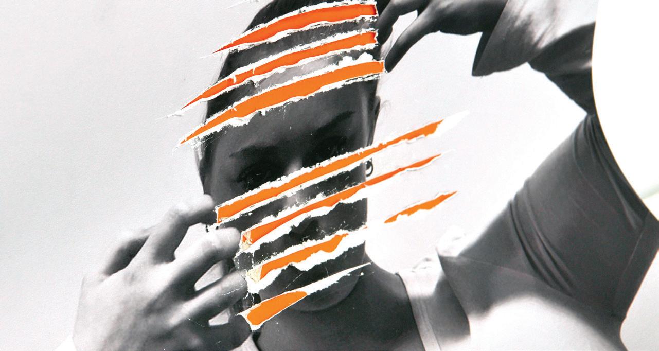
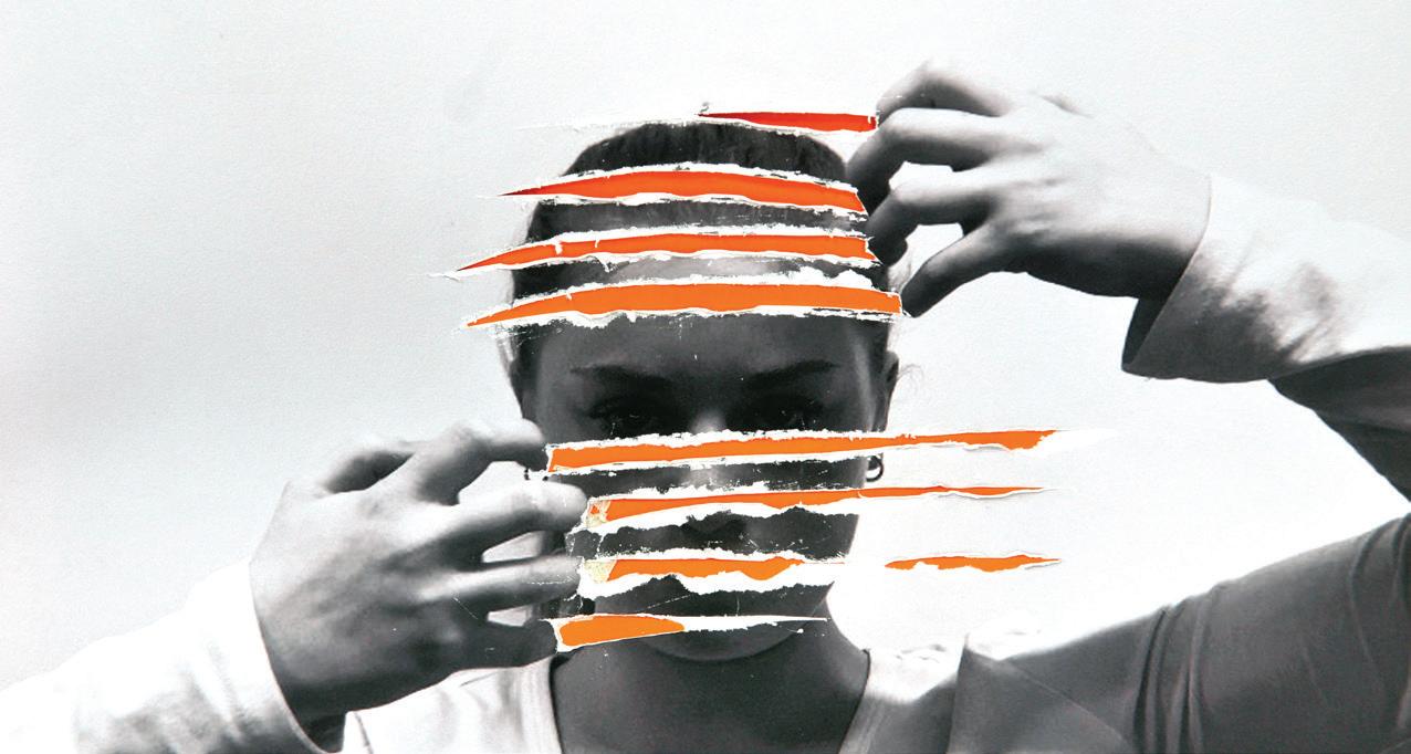
Rupture / Reveal explores the theme of vulnerability through staged portraiture and surface intervention. The photographs depict a figure shielding and concealing themselves, while the surface is violently cut and layered with vivid orange paint. These scars expose fragility yet also suggest resilience, as orange for me signifies both warning and vitality. By transforming the photographs into marked, textured objects, the work communicates the paradox of vulnerability, something that can feel painful and exposing, but also a powerful act of honesty and strength.
MOMO HE (CL)
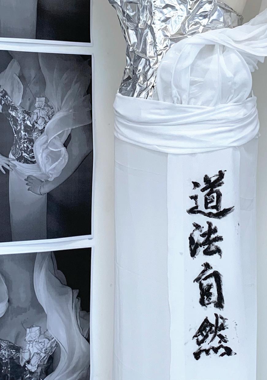
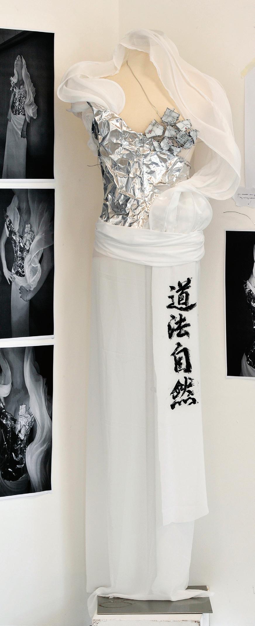
This wearable garment speaks from the fracture point of memory. Bound, Not Buried is a deeply personal reflection on scattered identity, cultural pressure and the weight of remembering. I collected and shattered porcelain plates, vessels of daily practice and Chinese tradition, and wired each shard back together by hand. In the tension between crack and repair, a new kind of strength emerges.
The corset form built from reflective aluminium shim creates a sculptural silhouette, protective yet vulnerable, holding the fragments close to the body like armour. Drapes of soft white organza swirl around this structure, evoking breath, spirit and the ephemeral. The contradiction between industrial and delicate materials is intentional; it mirrors the emotional dualities I carry- grief and honour; fracture and flourish.
This work is grounded in the philosophies and aesthetics of my artist influences. From Guo Pei, I drew sculptural discipline and reverence for tradition. From Vivienne Tam, the layering of textile narrative and cultural hybridity. And from Grace Wales Bonner, a quiet yet powerful exploration of heritage as something worn, shaped and reshaped.
The title is anchored by the Taoist phrase 道法自然 (Dao Fa Zi Ran) meaning “you discover who you are by acting naturally.” It’s a gentle but bold reminder that our true identities unfold when we stop resisting and begin listening to our pasts, our bodies, and our instincts. This piece is a form of listening. A way of speaking without words.
Installed with hand-painted calligraphy and monochrome documentary images, Bound, Not Buried is both garment and ghost stitched with silence, history and healing. It is not about perfection. It is about survival. Holding things together. And letting them breathe.
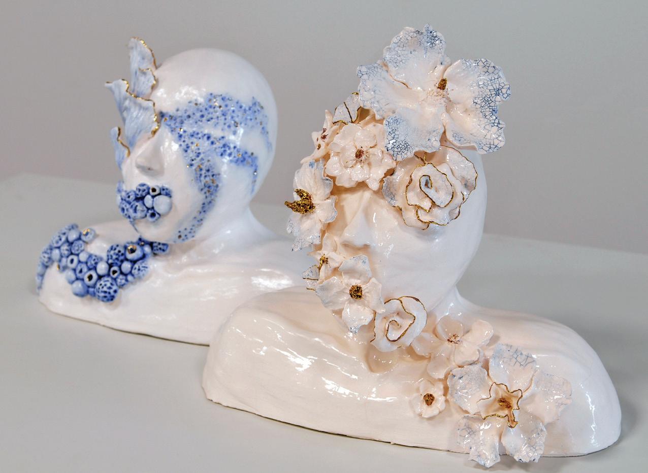
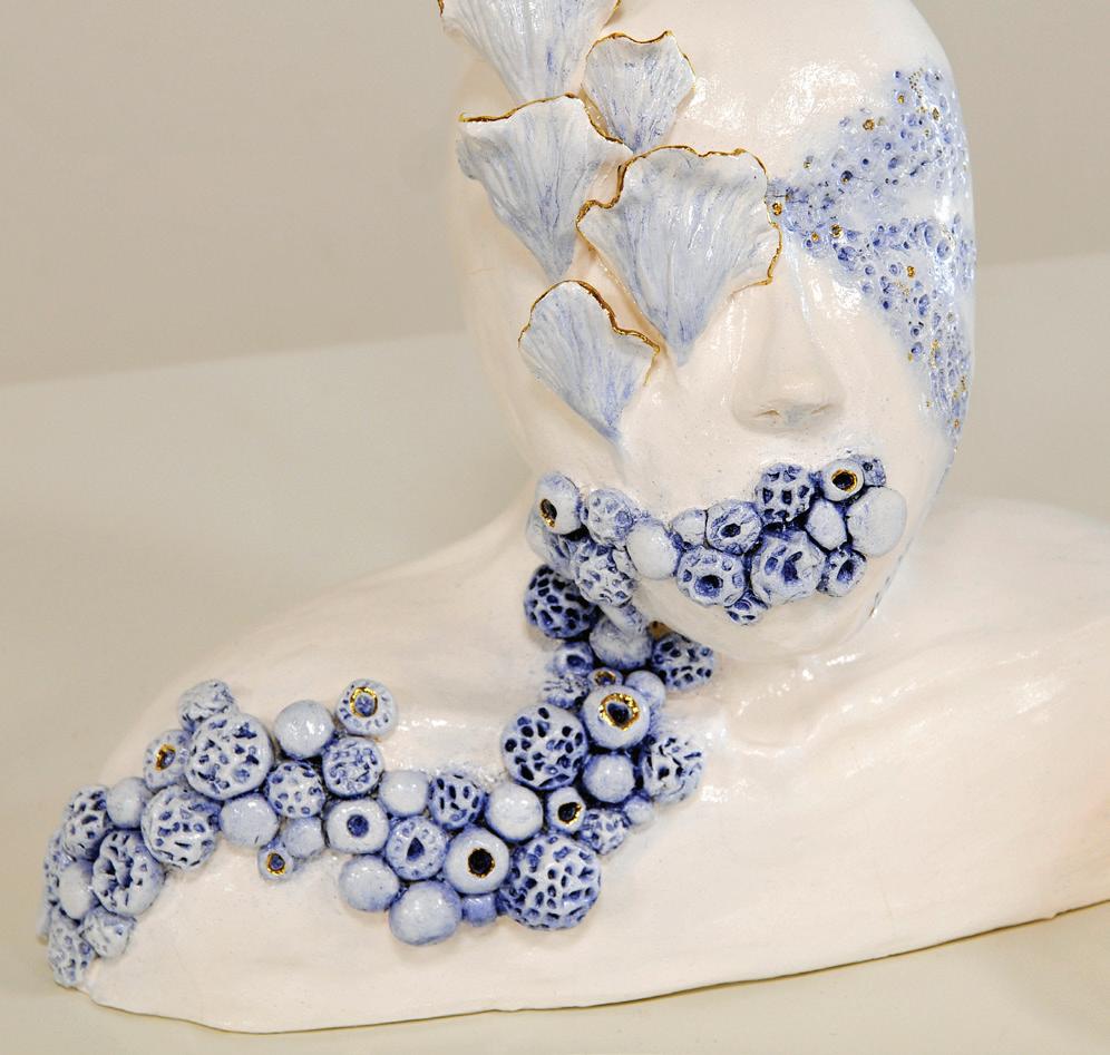
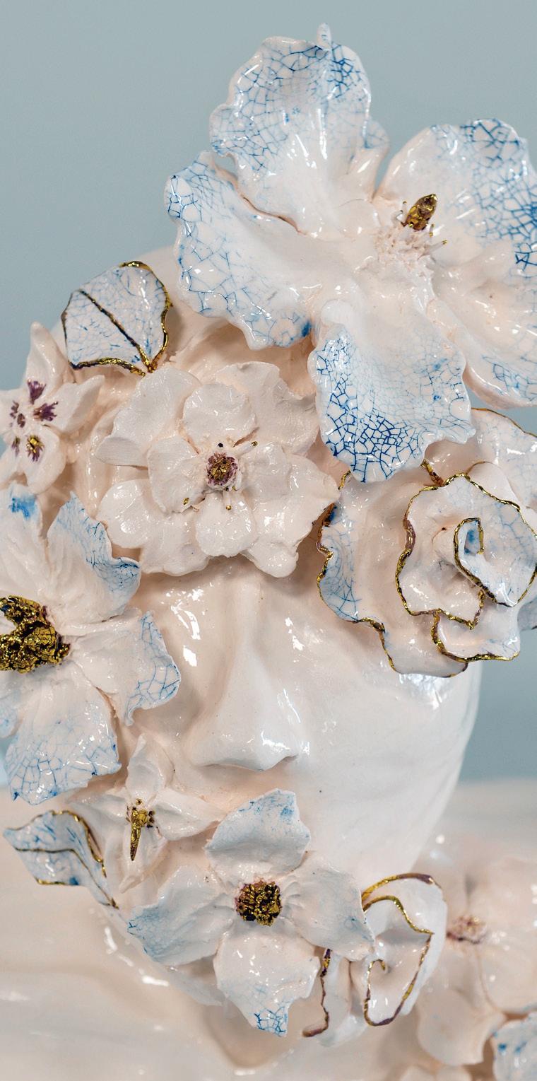
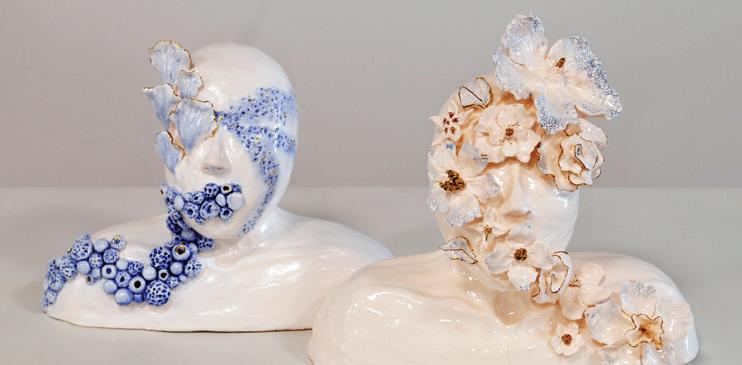
Fragile Mind explores the peculiar contrast between conscious and unconscious minds, overviewing the complex undertones of awareness. Through the delicacy and limited colour palette, the fine sculptures illustrate a thin line between contrasting human and natural forms. The two bust figures are a mix of both underwater-inspired motifs and floral elements. The serine use of minimal facial expression emphasises a surreal image, eliciting an otherworldly atmosphere. The choice of porcelain draws a focus to fragility and microscopic details, mirroring the delicate natural elements. The coral and floral detailing shadows the unconscious mind, while the robust human forms evoke the conscious mind. The precious crackle-glazed texture becomes a symbolic bridge between the two states of mind, with the ink filled fractures revealing hidden layers beneath the surface. In coming across these fragile forms, the audience is invited to pause, reflect, and consider stepping into the endless possibilities within our awareness.
Fragile mind
Art form- Ceramic porcelain sculptures
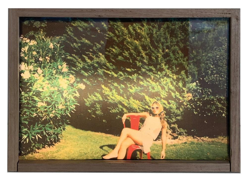
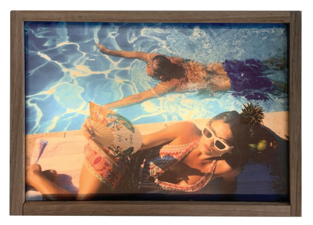
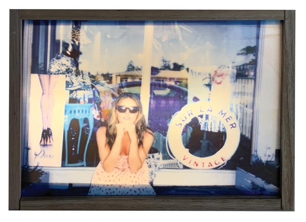
ANOUSHKA JENKINS (GA)
Sun faded Archives captures the glamour and leisure of holiday memories, evoking nostalgia through vibrant colour and a dreamlike atmosphere. The repeated female figure becomes a central motif, celebrating confidence and femininity while unifying the series. Playful summer symbols, such as sunlight, coastal elements and bold styling, invite viewers to connect with the joy and familiarity of shared experiences. Together, the works reflect on memory as both vivid and fleeting. The use of lightboxes further enhances this effect, transforming each photograph into a glowing time capsule. Their illumination intensifies colour, amplifies atmosphere, and invites the audience to engage with the works more intimately, reinforcing the nostalgic qualities of the series.
CHLOE MASON (EM)
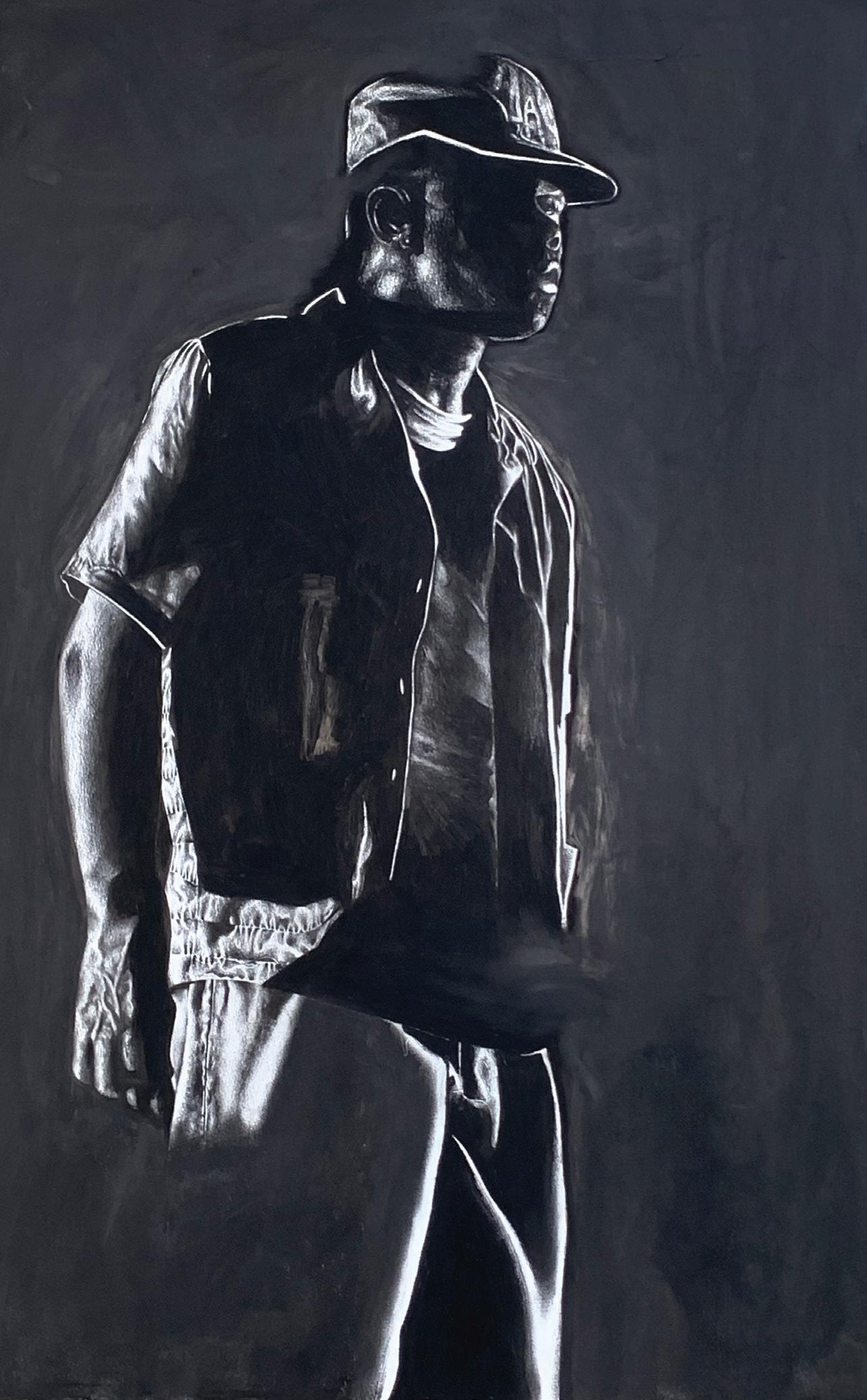
This graphite drawing explores how light and shadow can shape the way we remember a figure. I didn’t want to show everything clearly, so I let large parts of the body sink into the black background and only brought out certain areas, like the face, shirt and hand, with sharp highlights. This creates a strong contrast that makes the figure feel both present and hidden. When making the work, I used the full range of graphite pencils and focused a lot on blending and layering. I also used erasing to pull out highlights, especially in the folds of the clothes. These techniques let me get smooth shadows and clean edges, so the figure looks realistic but still dramatic. The size of the drawing was important too. A1 allows the figure to feel as if it is standing in front of you. In the Sinclaire hallway, with natural light coming from the windows and spotlights above, the contrasts in the graphite will stand out even more, helping viewers connect with the work on a closer level.
LUCY MCALLISTER (CL)
Water & Wings is a double paneled oil painting that traces the passage from struggle and solitude to hope and connection. Through the symbolic interplay of the sea and the sky, it contrasts individual resilience and communal strength. The left canvas depicts a solo bird soaring above a dark and turbulent sea. The deliberate colour palette of deep blues evokes emotions of melancholy, isolation, endurance and resilience. This panel communicates the universal human experience of navigating hardship, where the act of flight becomes a metaphor for resilience against difficultly. In contrast, the right canvas depicts a brighter seascape, where soft light bounces off the water as a flock of birds rise above. The shift in colour palettes from dark cool blues to warmer hues of orange, yellow and pink suggests renewal, community, and freedom. The two canvases, despite contrasting in tone, are bound by their shared subject matter and mirrored composition. The techniques of underpainting, dry brushing, blending and glazing work together to achieve depth, luminosity and vibrancy. These choices allow the works to capture the fluid interplay of air and water, underscoring their thematic focus on transformation. Together, the paintings act as a visual narrative. The left painting embodies isolation, melancholy and turbulence, while the right painting conveys freedom, motion and harmony. The juxtaposition between the artworks amplifies the tension between darkness and light, and grounded elements and flight, while also reaffirming their unseen interconnection. Capturing how the sky and ocean, often seen as separate elements, are deeply interconnected and intertwined, much like the emotional states of struggle and hope. Ultimately, Water & Wings symbolises the emotional transformation from solitude to unity, darkness to light, and turbulence to calm, highlighting the interconnection of grounded and airborne elements of the sea and sky.
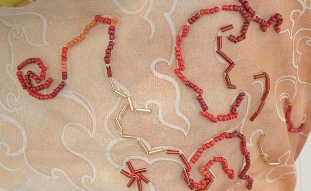
ABBEY-ROSE MCKAY (EM)
This garment explores the elemental subject matter of fire and water, bringing together their contrasting qualities to form a unified yet dynamic artwork. The design is driven by the tension between destruction and renewal, chaos and harmony, with each segment of the piece reflecting the power and fragility of fire and water. The bodice is divided into two halves to symbolise the elemental contrast within the forces. Embroidered wave motifs in cool tones reflect the fluidity and depth of water, capturing its calming and
life-sustaining properties. To create a contrast, the beaded embroidered lines of flame suggest intensity, heat and energy. Rising from the bust, a bold sculptural feature, constructed from gold aluminium foil, projects outward like an eruption of fire and sparks. Its reflective, metallic surface catches the light and symbolises the consuming brilliance and radiance of sparks, while its jagged, angular construction conveys unpredictability and destruction of the force. The skirt extends this interplay between fire and water. Constructed from pleated fabric with a dual meaning, it reflects the body of water by creating a rhythm of vertical lines that echo rippling waves, symbolising the steady flow and stability of water. Yet it also represents fire though rhythm, movement and structure. The repeated vertical lines created by the folds create a sense of upward motion, visually mimicking the ways flames ascend. In addition, the surface is interrupted by methodical burn marks, created through fabric manipulation and direct contact to a flame. These scorched areas reveal the destructive force of fire, leaving permanent marks while also transforming the material into something visually striking. The draped and gathered red fabric across the waist unites these sections, representing both fire’s intensity and the connective energy between the two forces. Through experimentation with pleating, embroidery, fabric burning and sculptural construction, this work conveys the fragile balance between two coexistent natural elements that are both fundamental, yet destructive.
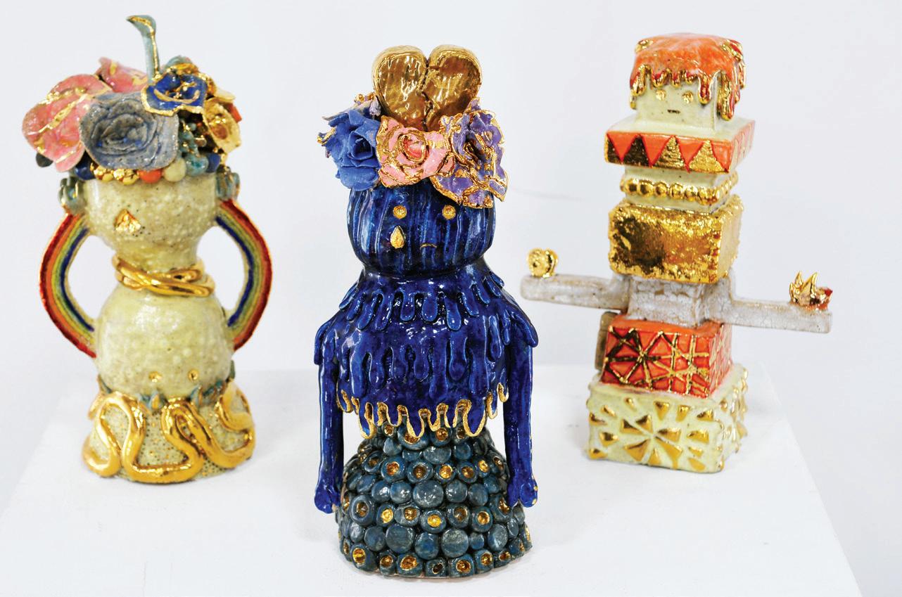
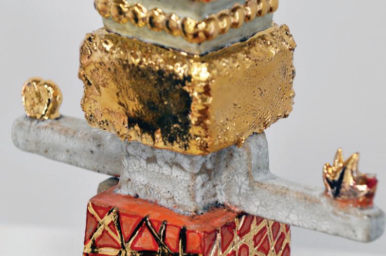
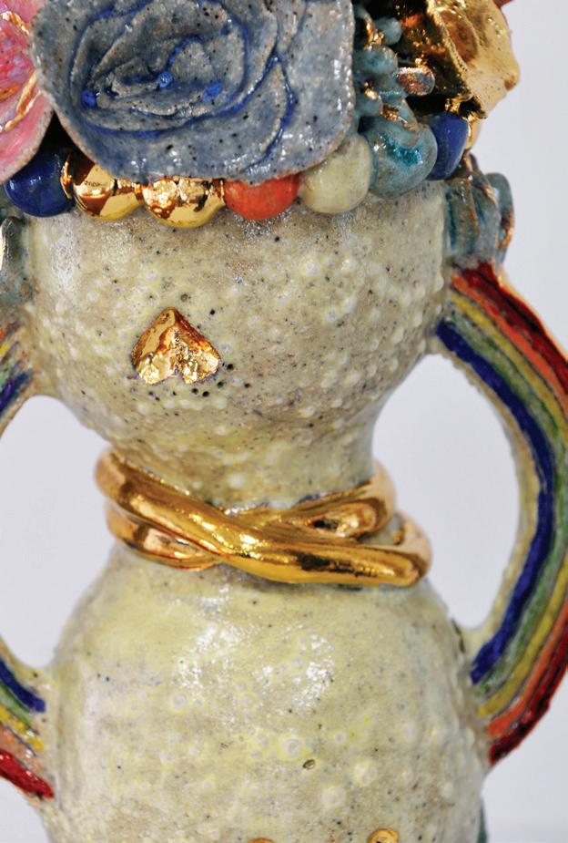
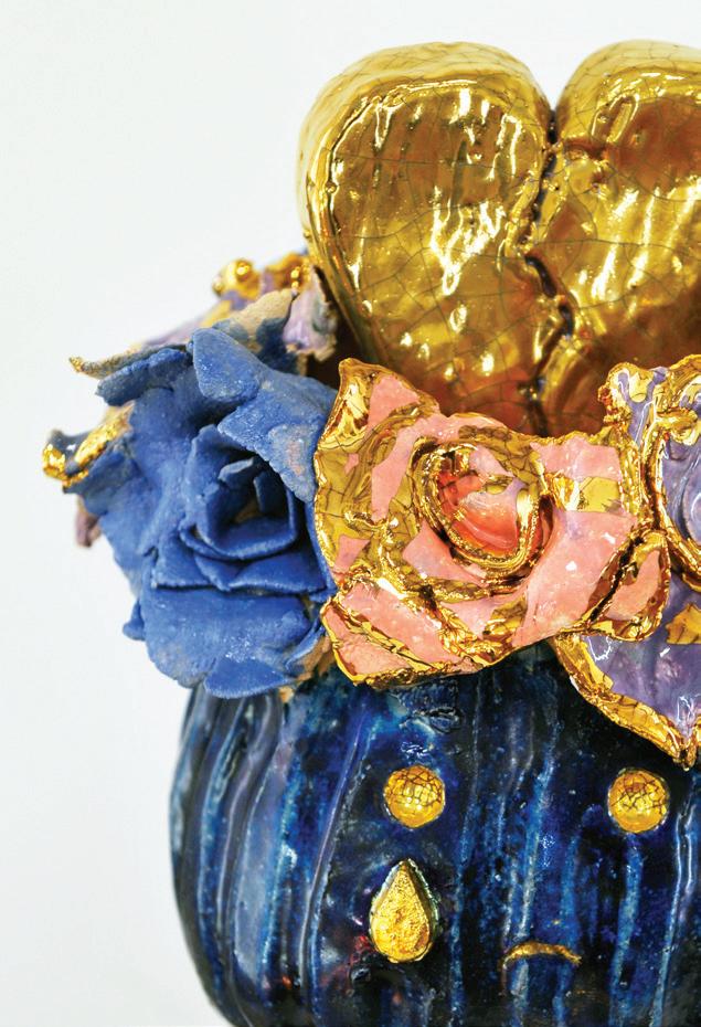
LUCIA MORTON (HE)
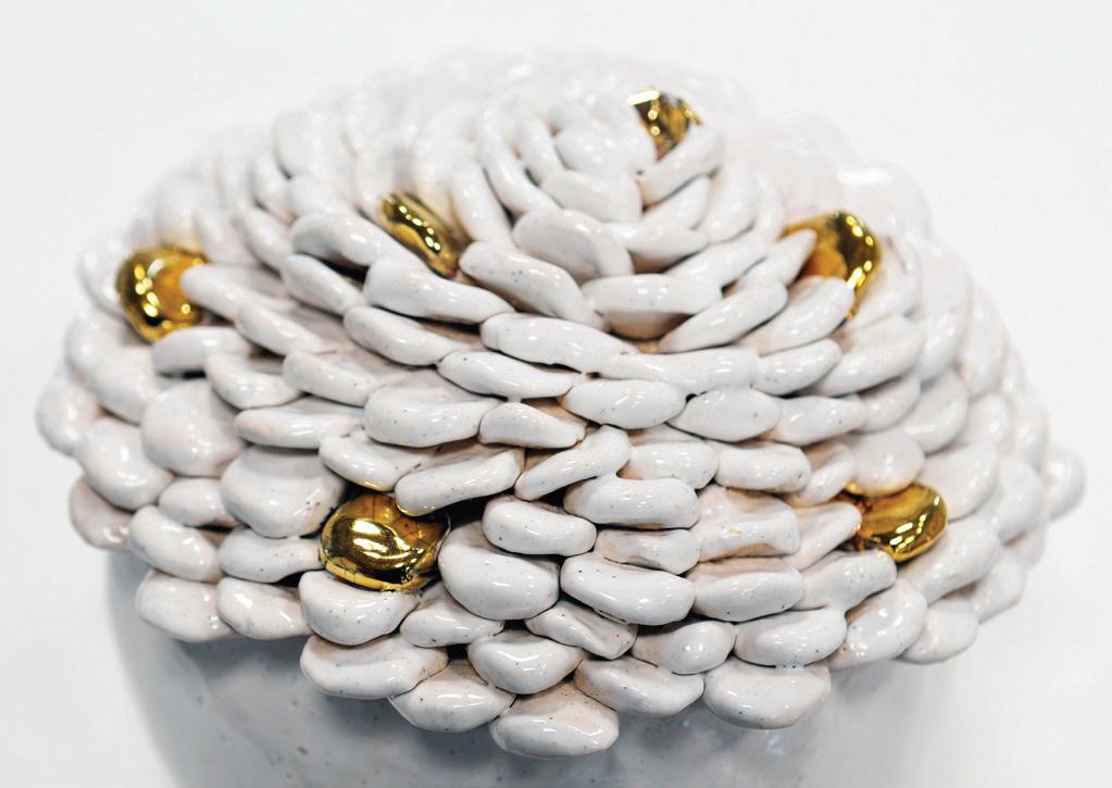
This trio of ceramic figures is a personal exploration into the emotional world that we all share. Happiness, sadness and anger; each character gives a form to feelings we often struggle to express by using shape, colour and textures to make the invisible emotions, visible. They were hand-built using specific techniques, like coiling, carving and slab construction, with each sculpture holding traces of the time, care and emotion placed into the series. Layers of glaze and gold lustre shift as light moves across them, just as emotions shift and reveal new highs and lows, depending on how we experience them. The happiness figure shines with warm lustres, soft floral details and rainbow glazes. Symbols of joy are also celebrated. Sadness is quieter and cooler, covered in deep blue tones and drooping forms that hold grief and vulnerability. Anger is raw and eruptive, with jagged and cracked surfaces and bold reds showing its fiery and conflicted energy. Together these figures form a conversation, not just between emotions, but between the artwork and the audience. I hope they encourage you to reflect on your own emotional landscape and remind you that all feelings, even the uncomfortable ones, are important, layered and completely human.
Expressing emotions
Glazed ceramic with gold lustre
H32 x W20 x D20
Sinclaire art gallery
GEORGIE PERCY (YR11 EM)
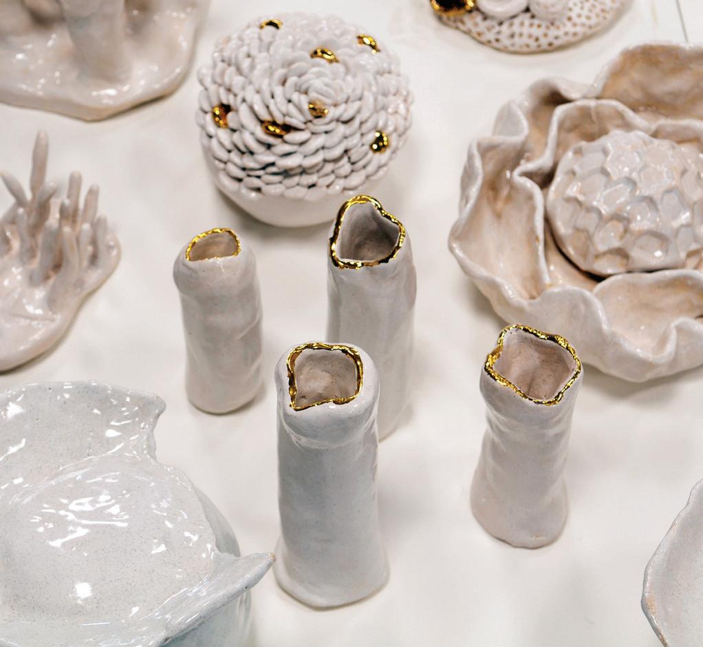
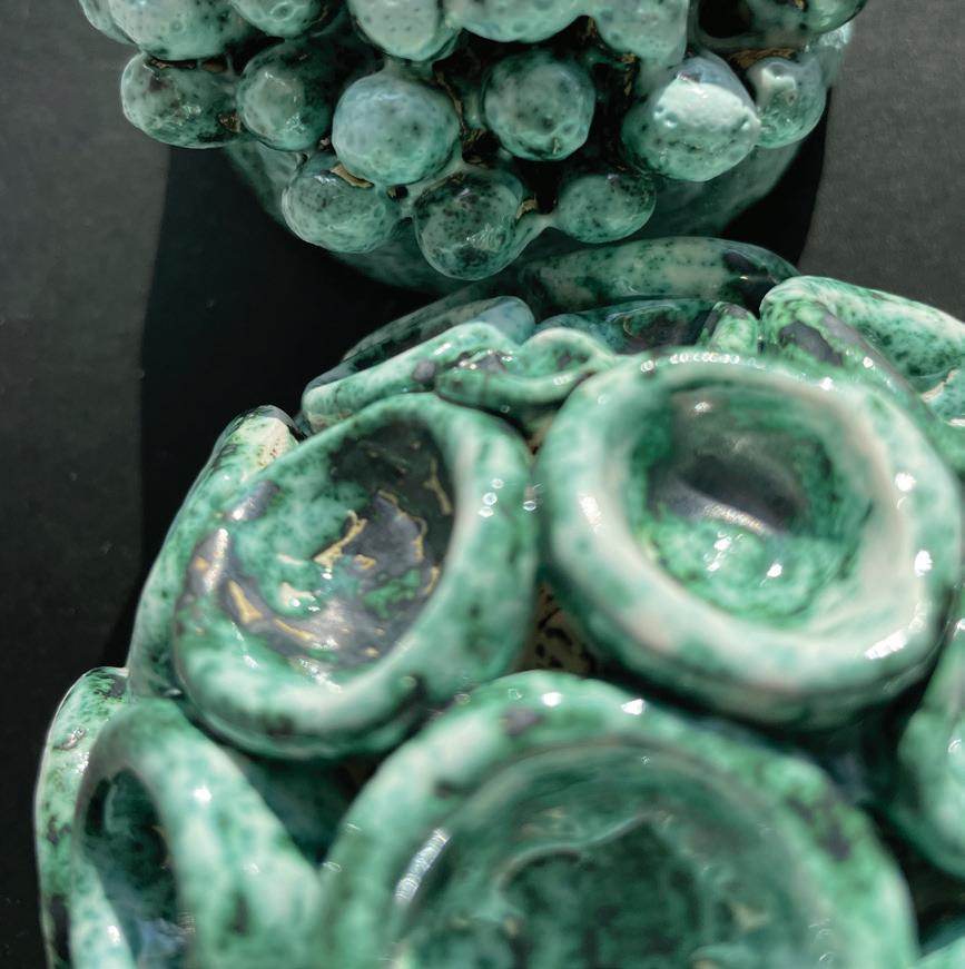
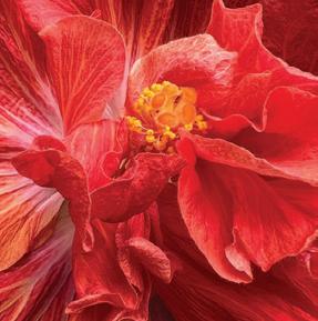
Fragile Reefs explores the transformation of coral from vibrant life to fragile decay, reflecting the impact of global warming and human activity on fragile marine ecosystems. Inspired by my personal experiences snorkelling on coral reefs in Coral Bay, WA, the work combines research, observation and experimentation to interpret both the physical and emotional dimensions of environmental change. The porcelain mounds are hand-built to emulate the intricate, organic forms of coral. Copper carbonate and white gloss glaze and bare porcelain emphasise the contrast between thriving, colourful coral and bleached, dying forms. The series allows both detailed examination of individual pieces and appreciation of the overall composition. The arrangement draws attention to the progression from life to death, encouraging reflection on environmental fragility and human impact. Colour and texture are central to communicating meaning. Bright, smooth surfaces signify vitality and hope, while muted, rough textures indicate decay and loss. The series functions as a metaphor for the fragility of natural ecosystems, human responsibility and the passage of time. The top-down perspective encourages the audience to engage with both form and narrative simultaneously, creating a contemplative and reflective experience. Fragile Reefs presents a dialogue between beauty and vulnerability; personal memory and global issues. The work invites viewers to consider the delicate balance of life within coral reefs and reflect on the ways human actions can affect these fragile ecosystems.
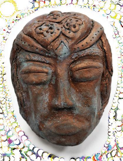
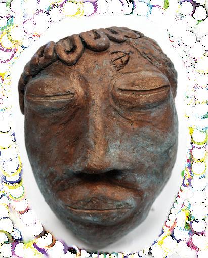
EDA PHILIP (CL)
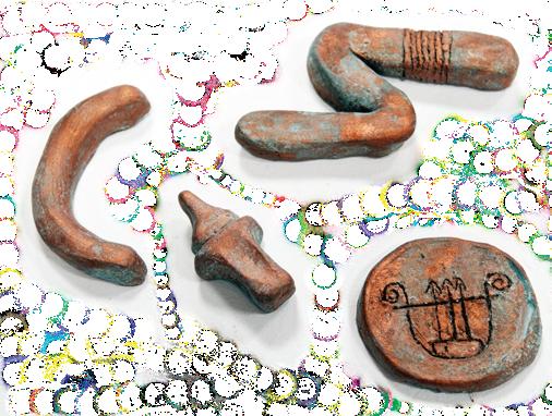
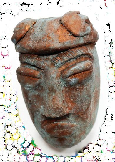
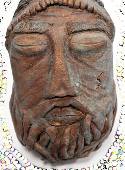
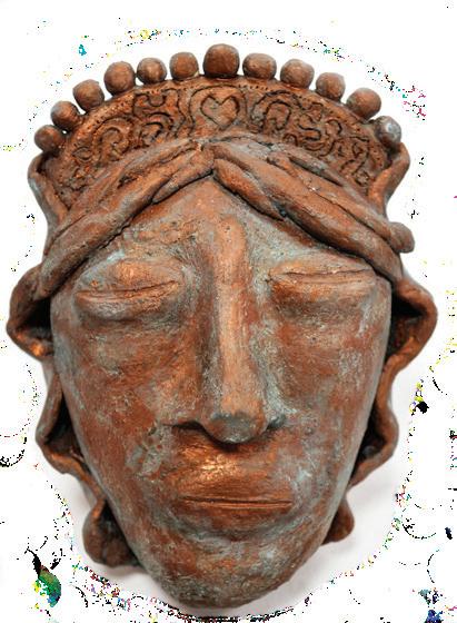
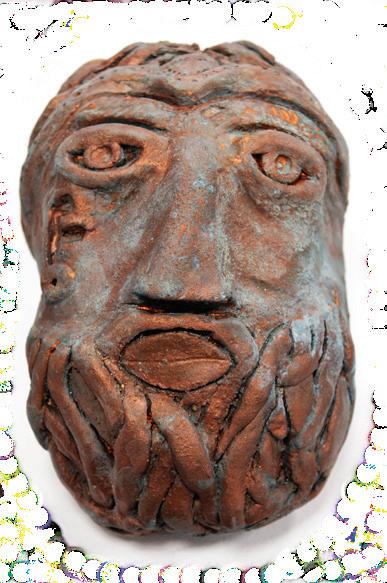
The Forgotten Parts is an artwork that is made out of white raku clay and painted in liquid copper. It was then covered in Patina Green, which chemically breaks down the copper, leaving it to be a green colouring on the work... almost like it has been discarded or left to rot away. The Forgotten Part displays a series of heads, masks and symbols that represent different aspects of Greek Gods and culture. Featured in the artwork are Zeus, Hades, Athena, Hermes, Demeter, Artemis, Aphrodite and Apollo. These are the main heads shown in the work, along with symbols from other gods like Poseidon and his trident. The artwork looks at the concepts that break down culture in Greek society in modern day and how the Greek Gods have been forgotten for what they brought to human life that we would not be able to live without. Greece is often a place where many go for holidays to enjoy the beach, food and the sun. Greece is a place of rich history and culture that many people are unaware of. The Greek Gods were worshipped in Ancient Greece for their contribution to human life and the light they gave to humans. The selection of Gods in this artwork covers a broad range of specialties like music, art, authority, beauty, love, wisdom, protection and many more values that mean so much to us in everyday life. The influence the Greek Gods had over the life of humans and how we live life to the fullest should be recognised more for their connections, as well as their own stories. The colour of the copper shows the discarding of this and gives the impression of being forgotten about at the bottom of the ocean. The work was heavily inspired by many artists, but primarily Nina Sandze, Jess River Cooper, Giovanni Strazza and Jochiam Kandler. All of these artists investigated how to display humans and culture in effective ways, as well as how to represent humans in their best and worst states. This assemblage of the Gods shows not only the hierarchy of the Greek Gods but also their power. And, if this were taken away, they would all be regular humans underneath all of their power and authority. Their qualities and powers make them Gods, while their simply being and their mistakes, that is human. The work looks at the complexity of the Greek God culture but it also looks at how it connects back to humans in multiple different ways. Enjoy!
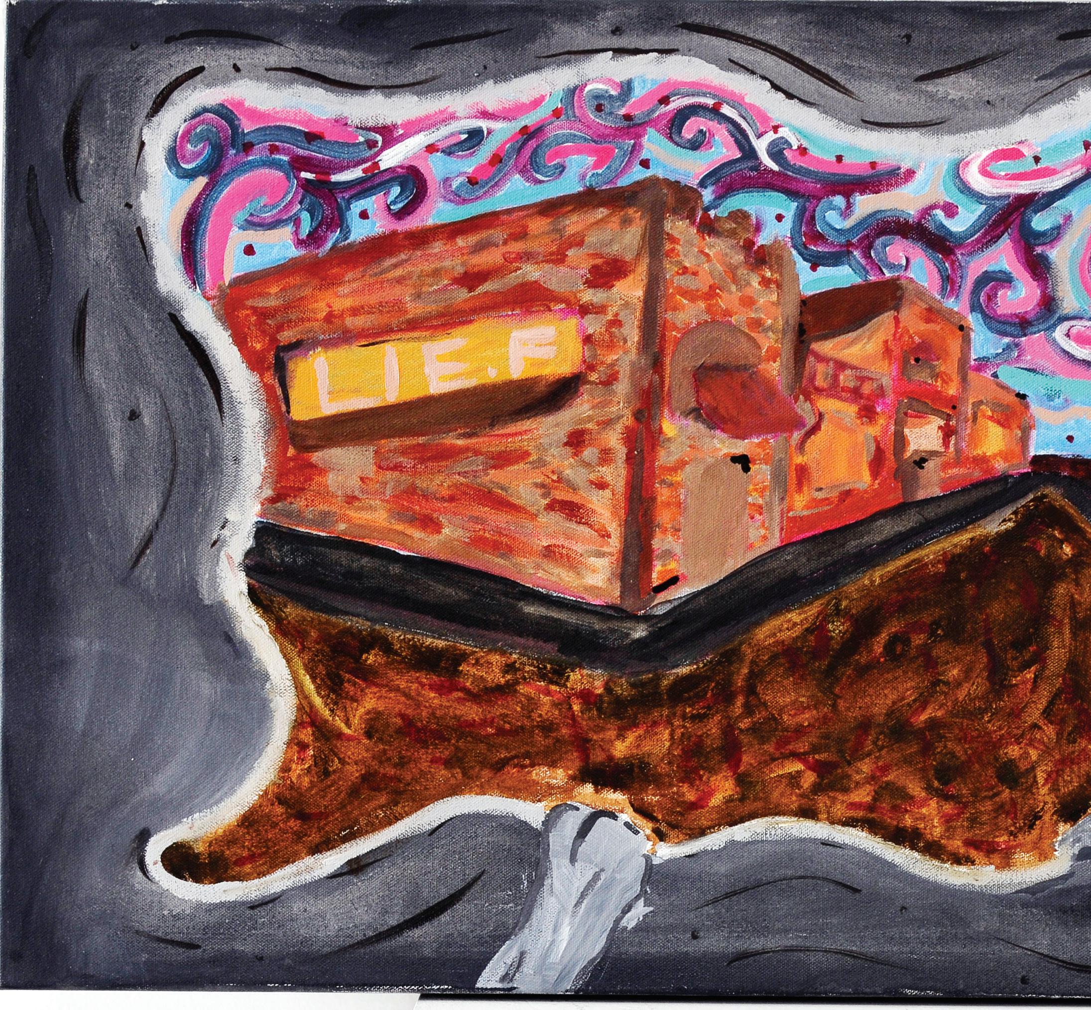
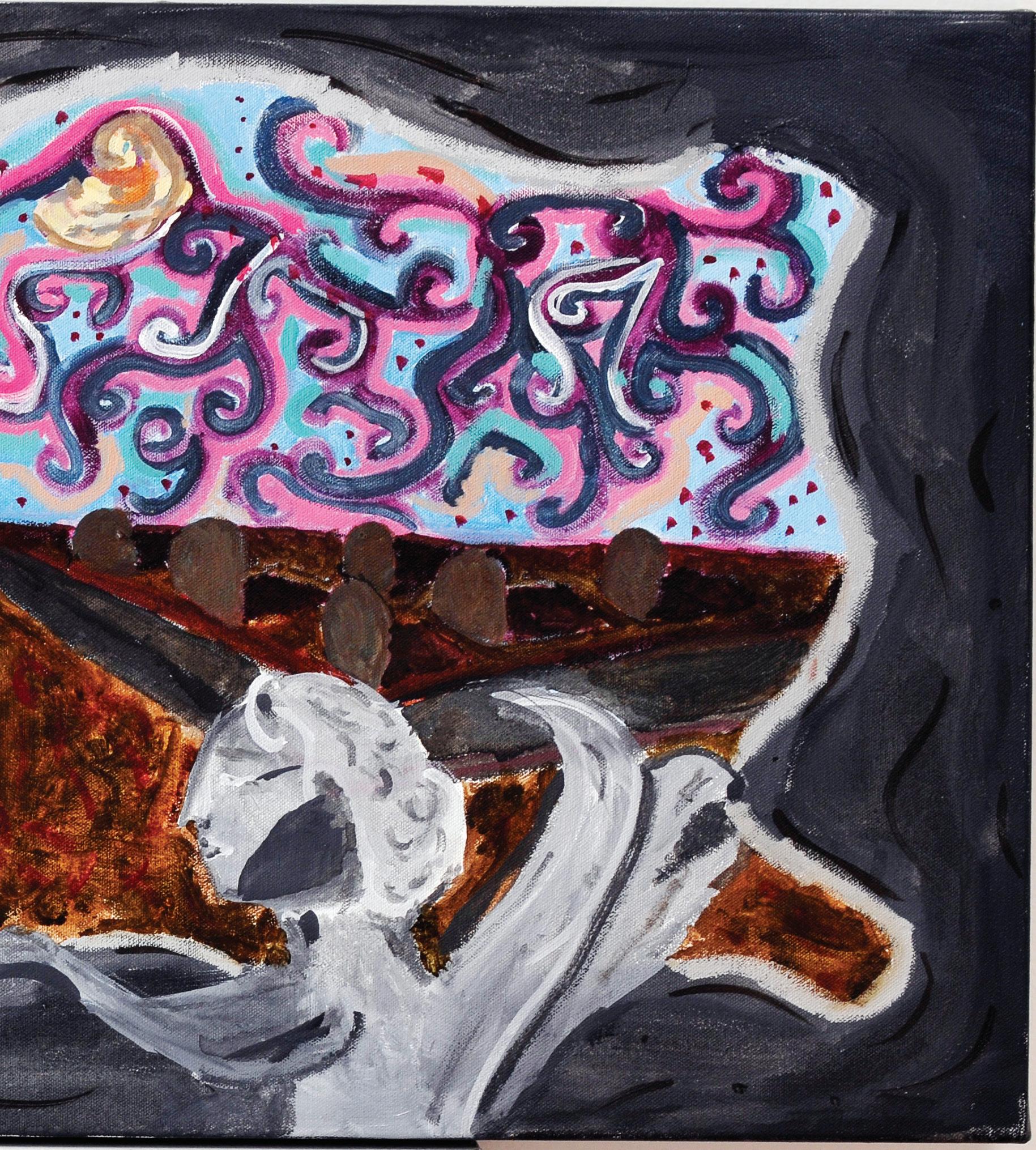
REU PHILLIS (YR11 A)
This artwork reflects on the theme of life, death and the in-between, presenting existence as a shifting passage between vitality and stillness. The illuminated building evokes the energy and presence of life, while the darker earth tones and ghostly figures gesture toward death, a space of silence and dissolution. Above, the swirling, dreamlike sky embodies the in-between, suggesting memory, spirit, and transition as boundaries that blur and transform. Through its contrast of light and shadow, solidity and fluidity, the work invites viewers to consider how life is lived, how death is faced, and what meaning may lie within the liminal space between them.
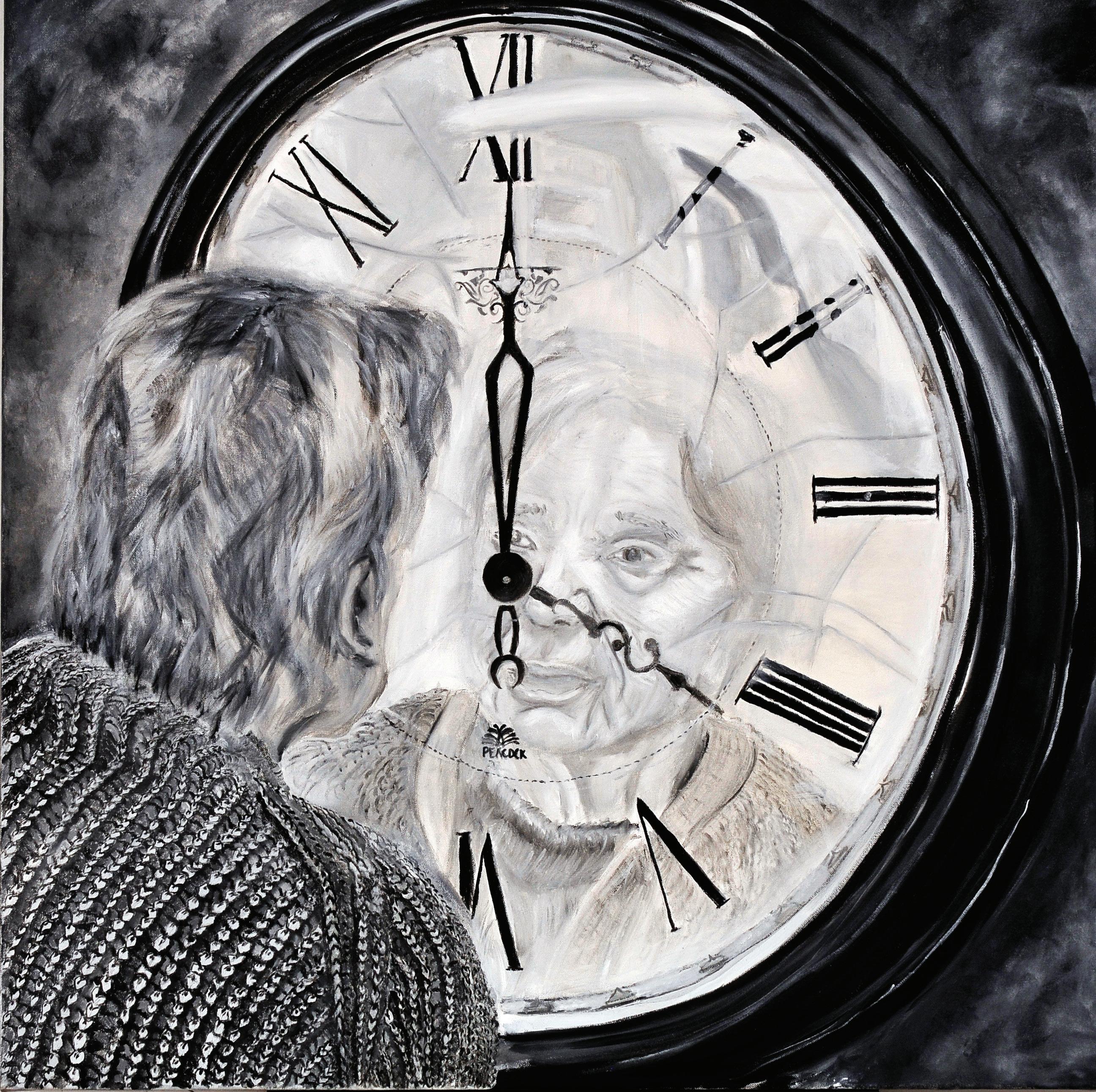
KYLIE ROBERTS (CL)
Us Through Time explores the theme of identity and how it transforms across the stages of life. The smaller, colourful painting portrays myself as a child, smiling in a moment of pure joy and innocence. This moment represents the beginnings stages of identity defined by freedom, playfulness, and unfiltered happiness. In contrast, the larger blackand-white work depicts my grandmother reflected within the face of a clock. Her gaze into the mirror of time speaks to memory, ageing, and reflection. Here, identity is shaped through time by experience, wisdom, and the inevitability of life’s passing. Together, these works trace a journey from youth to old age. The bright colours of childhood transition into the monochrome tones of reflection, emphasising the emotional shifts that occur as identity evolves. By displaying the smaller portrait first, the viewer is guided naturally from beginnings to endings, from innocence to contemplation. Through oil paint’s capacity for depth, blending, and realism, both works invite audiences to reflect on their own experiences of time and self.
NAYLA SALSABILA (EM)
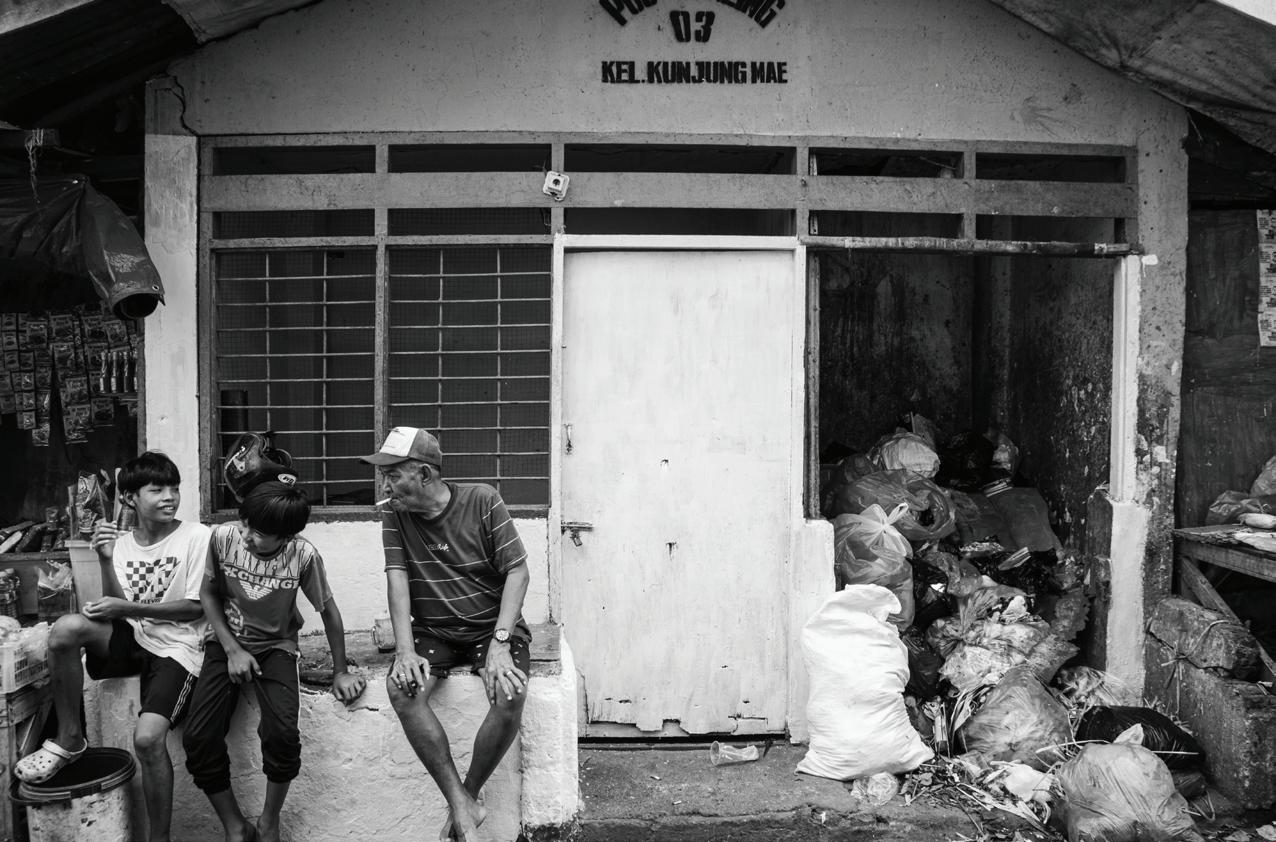
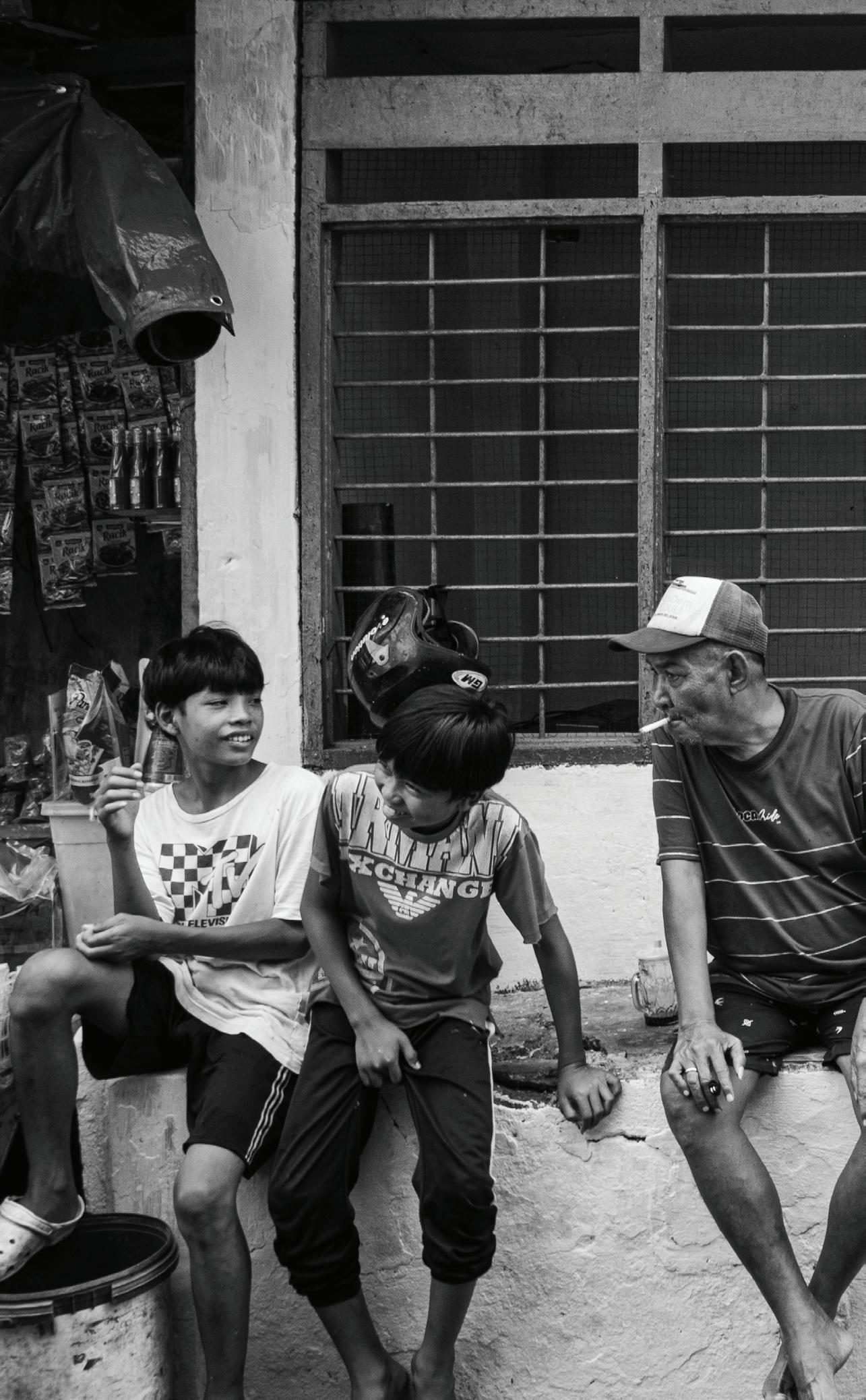
My photographic series depicts the world through the eyes of a child who carries economic responsibility in Indonesia. Inspired by Dorothea Lange’s documentary empathy, my series extended from a single picture into a sequence of candid moments gathered while I reconnected with my home, people and land. Images selected for the album aim to capture both tenderness and harsh reality, showing that play and labour often coexist. The playful doodles reveal the child’s innocence and limited exposure to reality, as well as moments of wonder alongside daily labour. On a deeper level, the entire series is about human connection, where a bond is formed between the photographer and the subject, and the audience develops a nostalgic empathy towards the subject. For me, art making is not a chore. In these moments, I discover that art is not only a reflection of the world around me, but also a way to understand the depths of my own humanity, to explore my emotions and experiences before transforming them into something meaningful and universal.
OLIVE SATCHELL (CL)
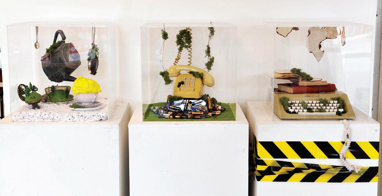
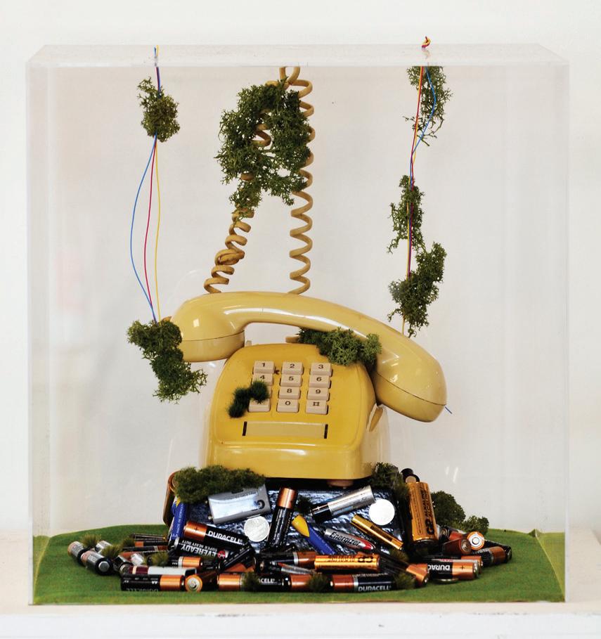
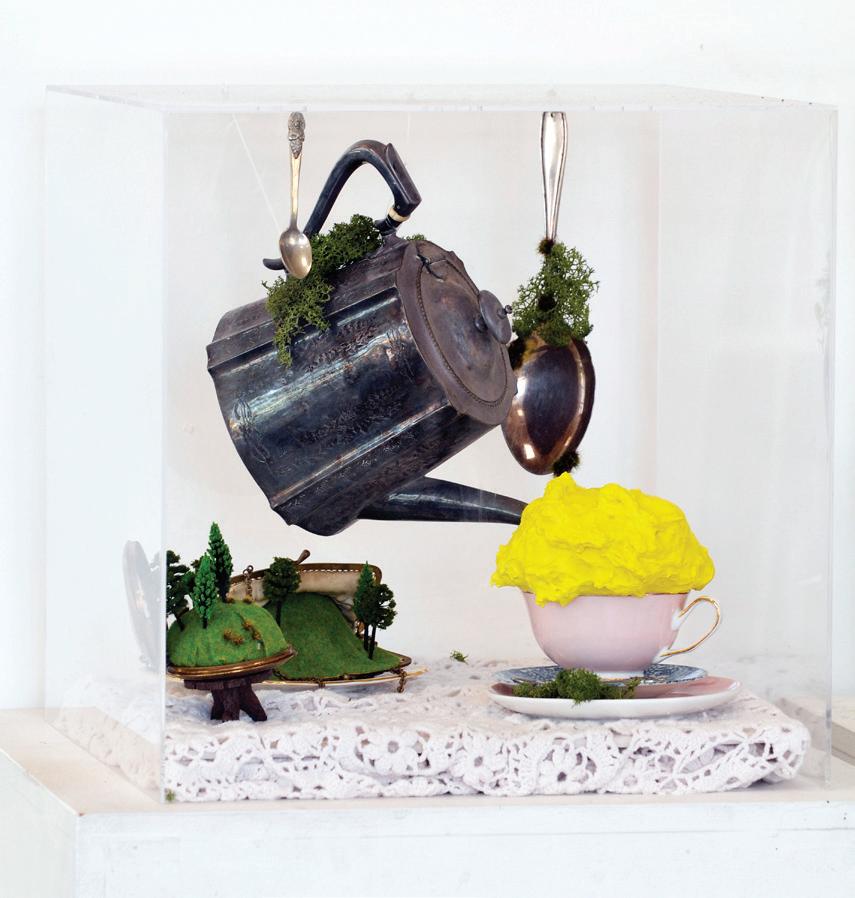
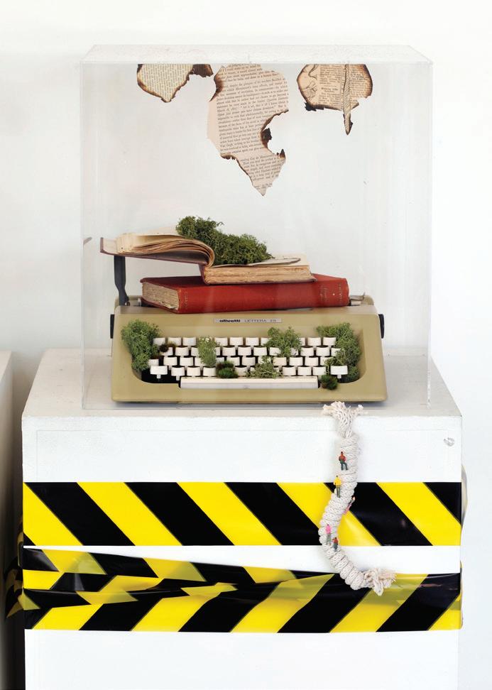
My series, After the Abandonment, is an archival display encapsulating issues prevalent in our world and nature’s strength to overcome these. These carefully composed scenes invite the viewers to embark on a visual journey, reflecting upon their own actions in our world. It examines the enduring resilience of the natural world against the weight of human excess, overconsumption and neglect. Each assemblage transforms discarded and familiar objects into archival displays, reflecting on the consequences of environmental destruction while suggesting nature’s power to reclaim. Inspired by Kendal Murray’s miniature manipulations and Fiona Hall’s museum-like presentations, these works integrate vintage and domestic objects with suspended elements, layers of greenery and eruptive materials. The result is a balance between chaos and order; containment and overflow. Each box highlights a different facet of human impact: Remnants 1 confronts the loss of ecosystems through burnt books, typewriters and creeping foliage; Remnants 2 reimagines discarded technologies as toxic monuments; and Remnants 3 reflects on the quiet, yet persistent, accumulation of everyday objects left behind. Viewers reflect on their own relationship with waste and to acknowledge nature’s enduring ability to persist, adapt and overcome.
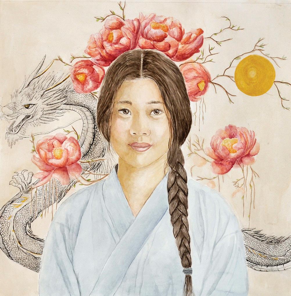
ANOUK SMITH (GA)
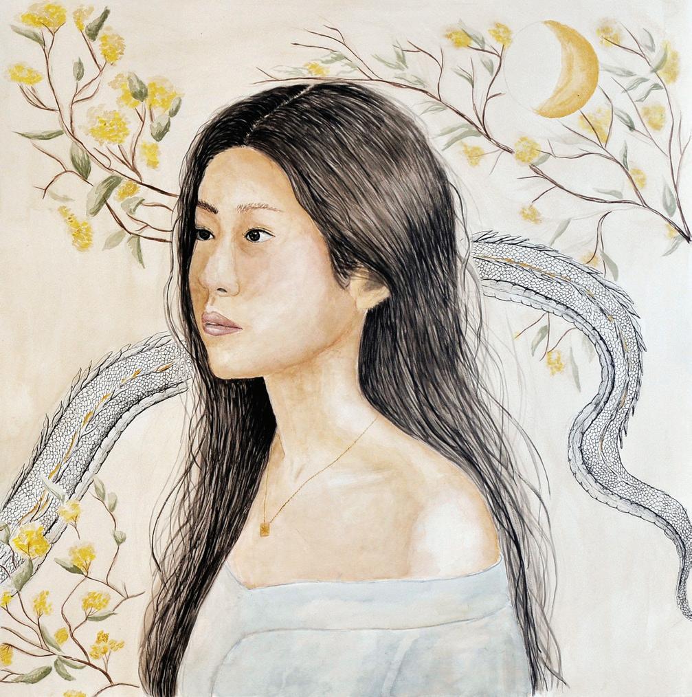
This diptych explores the interplay of nature and nurture in shaping human identity. Through watercolour portraiture and fineliner detailing, the works investigate the tension and harmony between what is inherited and what is lived; what is fixed and what is fluid. The first portrait, Intria, represents nature; the internal foundation of identity shaped by genetics, biology and inherited traits. Cool blue tones layered in translucent washes evoke calmness, continuity and the grounding presence of DNA. Fineliner symbols overlay the portrait with permanence, suggesting the unchangeable imprint of genetic inheritance, structured yet coexisting with the organic flow of watercolour. The second portrait, Experia, embodies nurture; the shaping forces of lived experience, environment and culture. Warmer hues of pinks, oranges and earthy tones reflect growth, energy and transformation. Watercolour bleeds and overlaps highlight the unpredictability of experience, while intricate fineliner motifs extend beyond the figure to symbolise relationships, stories and environments etched into the self. Together, the portraits are connected by a recurring dragon motif, a bridge between inheritance and experience. It represents resilience and transformation, uniting the structured permanence of DNA with the dynamic energy of nurture. The diptych as a whole presents identity as both structured and fluid; internal and external; a continual dialogue between what we are given and what we encounter.
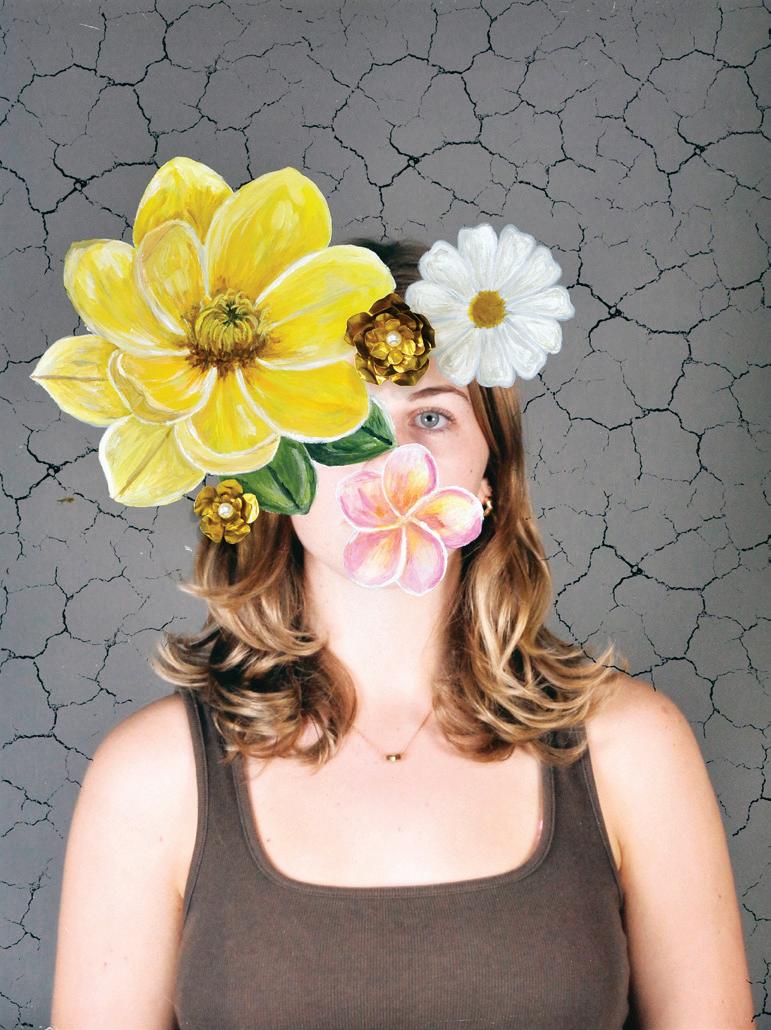
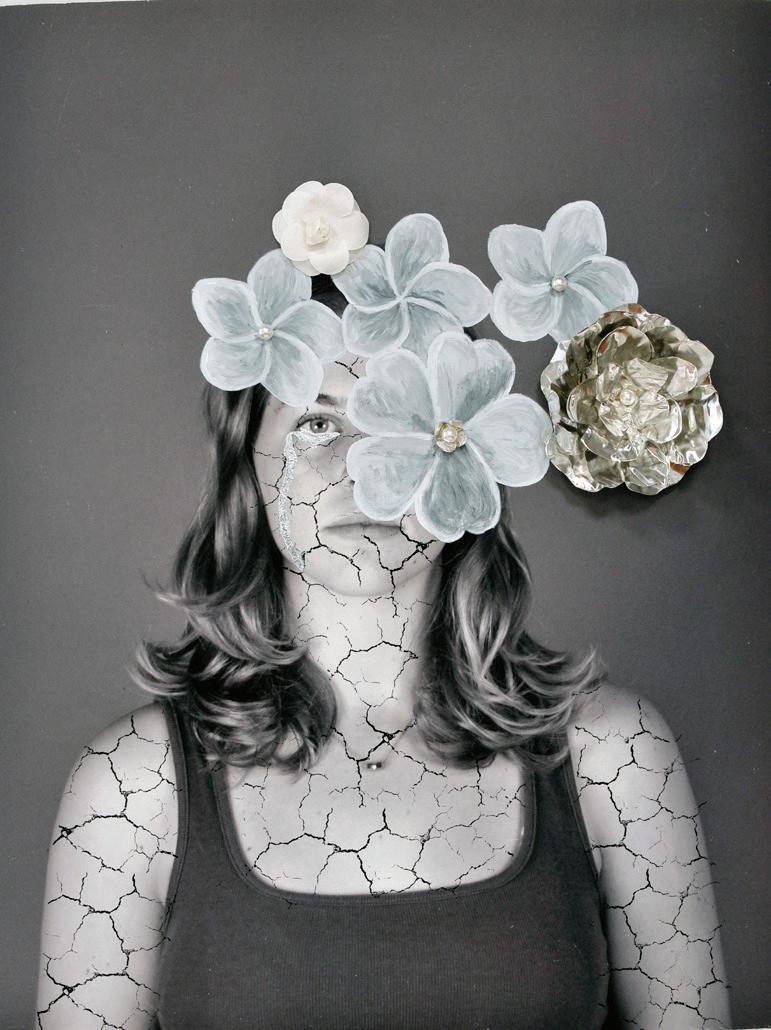
AUTUMN TAYLOR (CL)
What You See vs. What Goes On explores the tension between outward appearances and hidden emotions. Charlotte Lampson dominates each frame, with painted and three-dimensional flowers partially obscuring her face, symbolising the contrast between what is visible and what is concealed. The works investigate concealment, vulnerability and the emotional depth that lies beneath surface-level impressions. The two-piece series consists of a colour photograph and a black-and-white piece, each using different visual strategies to highlight layers of meaning. Warm gold and yellow tones in the colour photograph emphasise surface-level beauty, while silver leaf tears in the black-andwhite photograph evoke fragility, vulnerability and inner emotion. Layered cracks, applied behind Charlotte in the colour piece and across her in the monochrome piece, reinforce a sense of delicate tension. A key technique across both works is the combination of photography, Photoshop editing, and hand-applied materials to build layered textures. Three-dimensional flowers, created with acrylic paint and gold foil, add depth and tactility, while careful printing on A2 rag paper gives a matte, timeless quality to the images. The works are displayed in A2 timber frames without glass, in low lighting to enhance visibility of the textures and details. Through deliberate layering, material experimentation and the interplay between photographic realism and hand-applied elements, these pieces invite the viewer to reflect on the gap between what is outwardly seen and the inner emotional experience. The series encourages a slow, contemplative engagement, rewarding close observation with subtle details that reveal vulnerability, concealment and the complexities of human emotion.
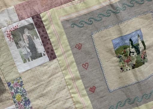
CHARLOTTE THOMPSON (HE)
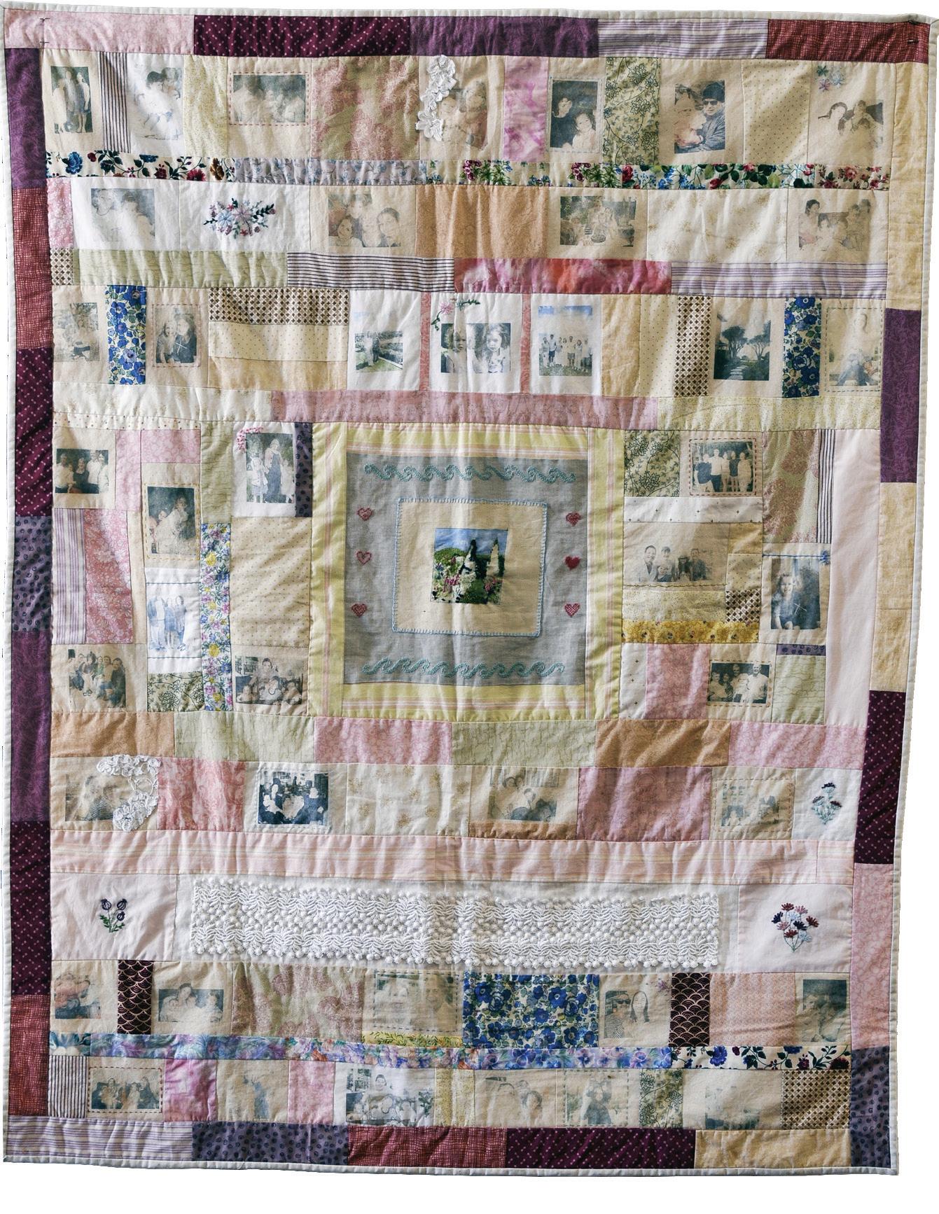
Generations are stitched into the cloth, memories woven through every thread. This design is central to my exploration of family, bringing together repurposed fabrics, cottons, threads, colours, photographs and vintage wedding lace. Using patchwork techniques, I combined machine and hand stitching with embroidery to add texture and depth to my design, reflecting the complex, interwoven nature of family relationships, traditions, memories and love. Shapes stitched together one patch at a time, forming varied patterns and lines that weave through the artwork like the lineage of my heritage. On my quilt, each patch holds a memory, each stitch a symbol of the continuous thread linking my family across time. Both sides of my family share a rich tradition of needlework, a heritage of textile art passed down through generations that has shaped who I am today. Watching my grandma patchwork from an early age instilled in me a deep appreciation for how fabric and a creative spirit come together to create something magical. Each piece is a reminder that history lives on through these fabrics and threads. The faded, vintage quality of the photographs is intentional, evoking a reflection on the passage of time rather than imperfections in the fabric. This quality emphasises the quilt’s heritage, illustrating how memories grow dimmer with time. This quilt exists not only as an artwork but as an heirloom, preserving the nostalgia of the textiles passed down from my mother, grandmothers and the generations before them. It brings together the stories of my family, especially the women in my life, transforming materials into an archive of love and lines of lineage. Every stitch tells a story, every fibre holds a memory, and the quilt, as a whole, carries the enduring legacy of family.
KATRINA YU (GA)
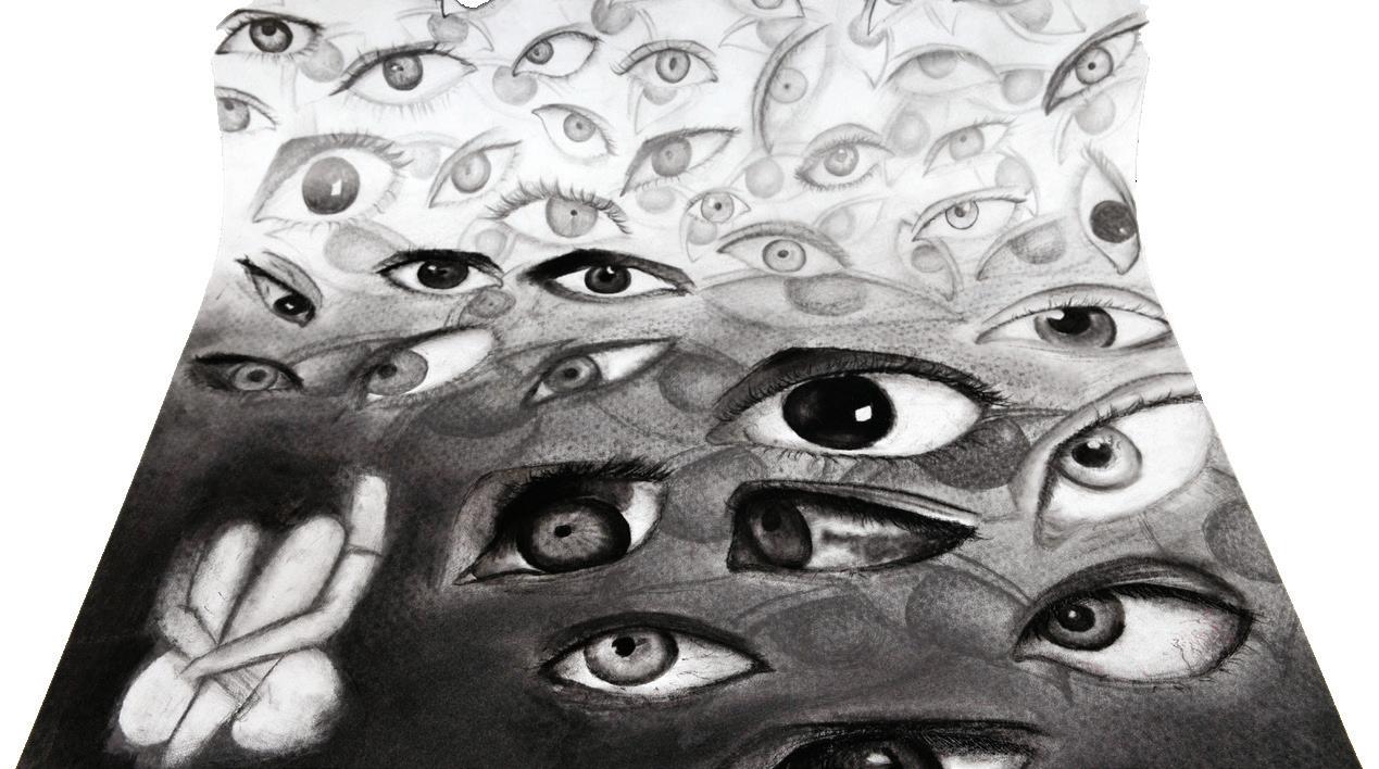
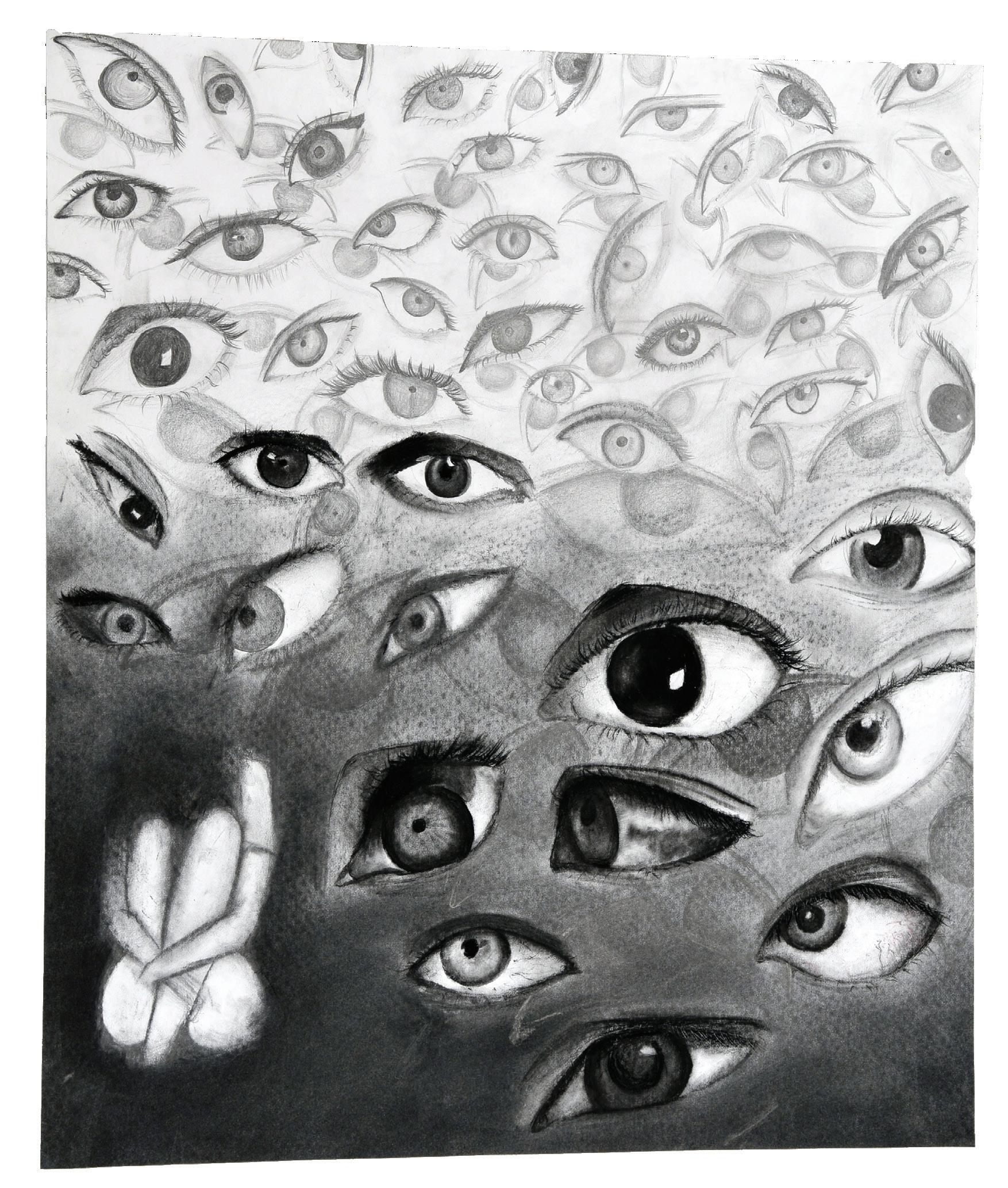
Social Gaze explores the uneasy feeling of always being watched. Layers of human eyes fill the composition, each gaze simultaneously unique and repetitive. Looking directly at the viewer, they create a sense of discomfort and entrapment. The eyes act as symbols of identity and judgement. They reflect the fact that people are constantly observed in both public and online spaces through social interactions, technology and cultural expectations. The drawing highlights how this scrutiny shapes individual’s self-perception.
Charcoal was chosen for its ability to capture subtle shifts in tone and contrast. Techniques such as layering, smudging, erasing and sharp linework create depth and atmosphere, intensifying the effect of the stares and giving the drawing a sense of realism. By surrounding the viewer with multiple gazes, Social Gaze blurs the boundary between private and public identity. It invites us to consider our dual roles as both the observed and the observers.
VICTORIAN CERTIFICATE OF EDUCATION
MEDIA
Scan to view the Digital Catalog, featuring some of our VCE Media projects.
LILY BALCOMBE (GA)
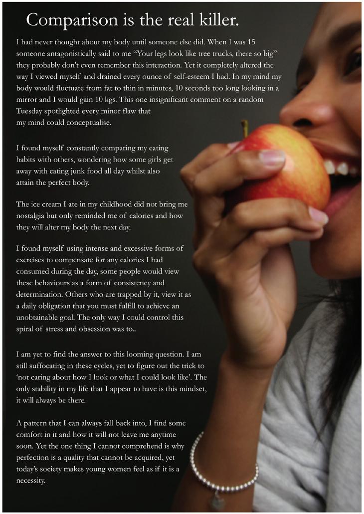
My zine Behind the Eyes. portrays the perspective of a girl struggling with body dysmorphia, and the reason that I created my zine was to bring awareness to the issue. It explores multiple different formats and styles that photography can be presented in, such as collaging, paper weaving and printing onto transparent film paper. I employed a circular narrative to be representative of my model opening her mind up to the audience, showcasing her mental state. The final page in my zine is woven, which is intended to be symbolic of my model pulling herself back together after exposing her thoughts to the audience. I chose to create a zine due to the written and visual elements, allowing the narrative to be strengthened through a combination of indirect images and direct articles. The clear pages in my zine are representative of the clouded view that can be adopted towards food when you are struggling with body dysmorphia. I decided to collage page 7 to allude to repetitive cycles that can emerge when confined to this mindset.
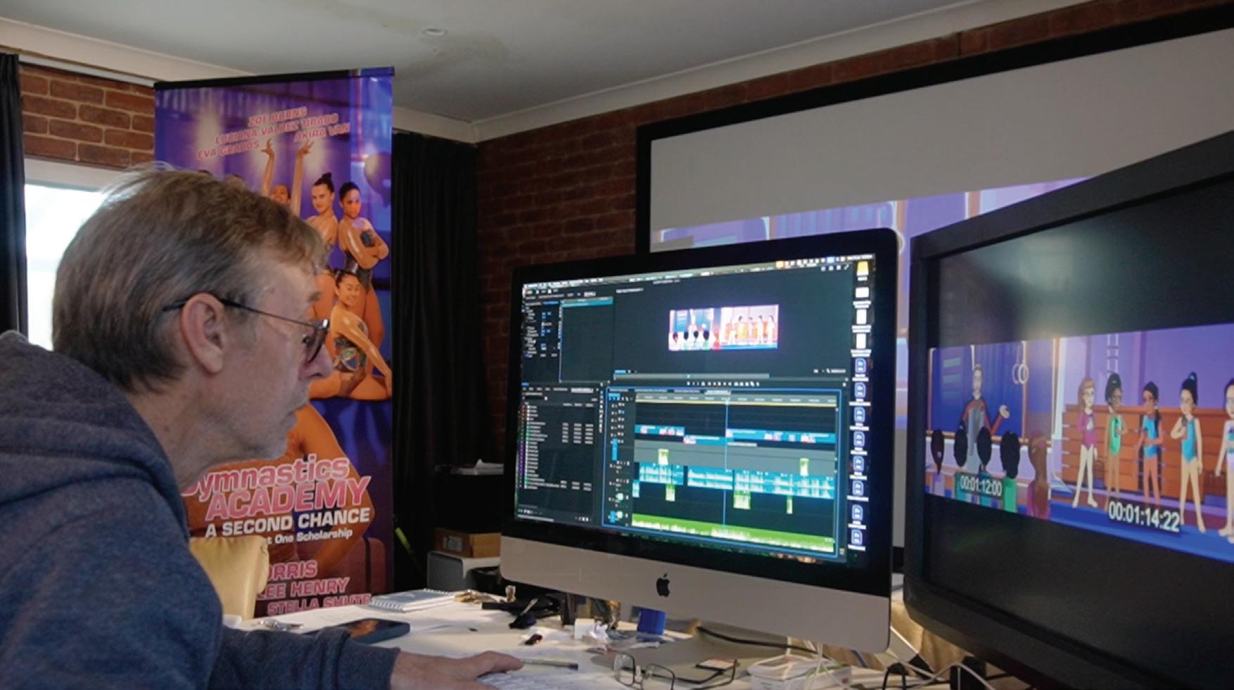
THOMAS BRADLEY (M)
My short film conveys the theme of over thinking and panic through a comedic and absurd lens. It is inspired by Monty Python, The Mighty Boosh and my own experience in auditions. The film centres around an aspiring actor who, in an audition, is demanded to do increasingly bizarre acts for the director of a mysterious piece of media. This story is portrayed in an absurdist comedy style, blending imagination and reality while also parodying several other pieces of media.
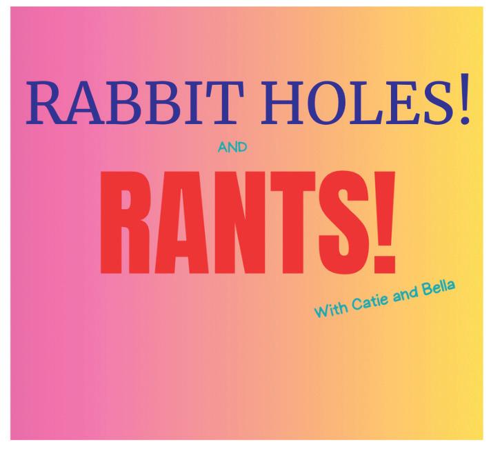
BELLA BURDETT-MOORE (CL)
Fall down the rabbit hole into a world of politics, history, mystery and just a tad of FUN with your hosts, Catie, Australia’s legal eagle who provides the legalities of cases, and her daughter, Bella, who chooses a new hyper-fixation to talk on each week. Through their insightful yet humorous perspectives and their family-driven dynamic, you will end feeling like a member of the family. The two provide not only the facts of what’s happened but also the implications of the cases on real humans, as well as the implications for them in their context, living in Australia. So strap in for a ride that looks into some of mankind’s most interesting cases.
FRASER CARR (A)
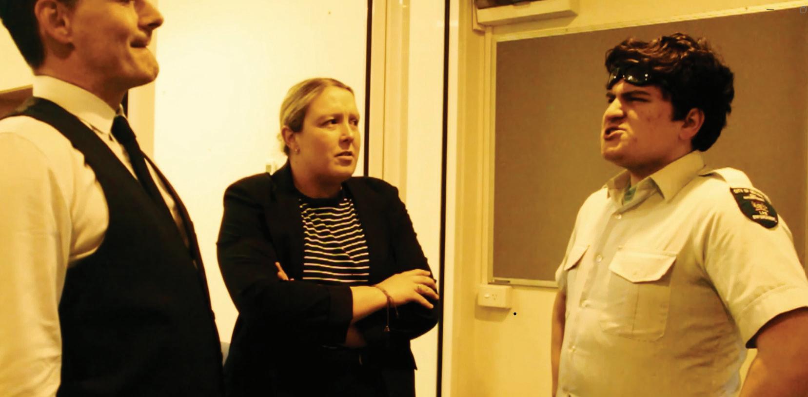
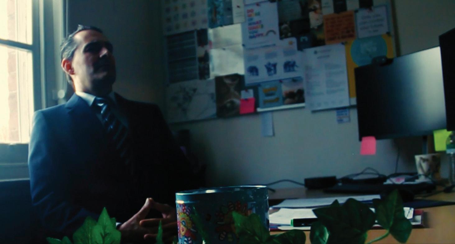
My media product is a short drama film titled The Teacher’s Dilemma. It follows a teacher named Steve who is confronted with a hidden, unethical system within his school. Through the story I wanted to portray how power and corruption in education can affect both staff and students, and how one person’s moral choices can create tension and change. The film uses realistic settings, naturalistic dialogue and conventions of the drama genre, such as close-ups, tracking shots and symbolic set design, to show Steve’s isolation and ethical struggle. My goal was for the audience to feel the pressure Steve is under and to think about the wider issues of ethics and responsibility in schools.
EMILY CRAWFORD (CL)
I produced this ‘dramedy’ short film, titled How To: Break The Loop, about a content creator who gets stuck in a time-loop during her endeavours to create the perfect pancakes. I wanted it to be reminiscent of short-form content that is rampant in today’s media and the pressures to not make any mistakes. The short film is based on the idea of perfectionism and re-doing something over and over again to try and get it to an unattainable standard. I based it on my own experiences in Year 12, trying to get something right and eventually realising that you just have to do your best and that’s what matters.
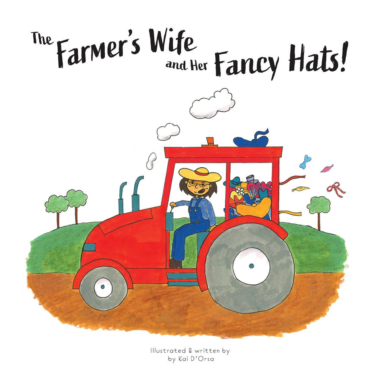
KAI D’ORSA (A)
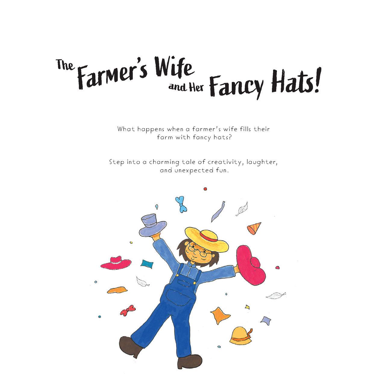
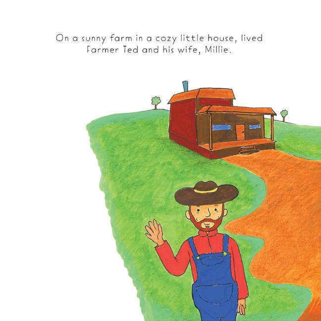
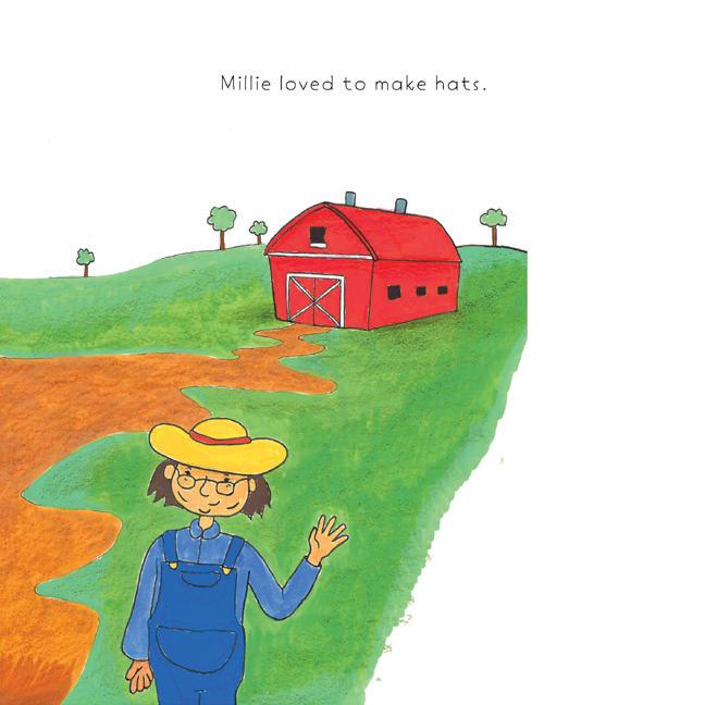
The Farmer’s Wife and Her Fancy Hats is a gentle, humorous children’s picture book designed to engage young readers aged 3–8 and their caregivers. Through soft pastel colours, expressive characters and playful storytelling, the book promotes emotional literacy, creativity and kindness. At its heart, it encourages readers to share joy through imagination and self-expression. The familiar farm setting and whimsical hat designs bring charm and relatability, while the simple narrative structure supports early literacy. Designed for shared reading, it fosters bonding moments between children and adults through questions, laughter and conversation. Feedback from both age groups confirmed its ability to entertain while subtly teaching values. The project reflects a deep understanding of children’s book conventions and demonstrates strong visual design and thoughtful storytelling. While there are areas identified for future refinement, the book remains a proud and meaningful achievement, celebrating connection, creativity and the simple joys of storytelling.
WILLOW HANRAHAN (A)
The Shell I Kept is a short film about friendship, loss and finding a way forward. Told through a mix of flashbacks and present-day moments, it follows a girl as she remembers her best friend, a relationship that ended either through death or drifting apart. As she relives their memories, she slowly learns how to carry her grief and keep going.
JEMIMA GRACE HEALEY (HE)
In a world saturated by filtered images and fleeting trends, The Inner Glow reflects on what it truly means to be beautiful. Through the intertwined stories of a 17-year-old girl navigating social media’s pressures and a 60-year-old woman who has embraced her natural self, the film celebrates the wisdom, confidence and peace that come with age. Set against the vast landscapes of paddocks, hills and ocean, and narrated in poetic reflection, it invites audiences to consider how connection to nature and self can outshine any external standard.
BONNIE LAMPARD (HE)
My tense mockumentary trailer titled BANG!, introduces the elimination game ‘Bang!’ and its role in my boarding house. The trailer explores how the game shapes trust and distrust between players, building tension and wavering apprehension as it unfolds. Inspired by such TV and film as Tag (2018) and The Office (US), I mix thriller conventions with moments of humour, particularly from the perspective of authority figures watching the chaos unfold. Handheld camerawork, electrifying music, slow zooms, thrilling chases and fourth-wall breaks draw the audience into the experience, making them feel the same adrenaline and paranoia as the players. While the tone leans into suspense, humour punctuates the tension, keeping the energy playful yet gripping.
EVIE LANE (HE)
Viced Glamour is a 12-post Instagram campaign that interrogates the subtle glamorisation of smoking, drinking and gambling within contemporary social media culture. Borrowing the visual language of high-fashion advertising and influencer aesthetics, the campaign deliberately entices audiences with sleek, aspirational imagery before undercutting this allure through captions and visual symbolism that reveal the darker reality of normalised addiction.
Designed for a 15–25-year-old audience, the work exploits the codes and conventions of Instagram fashion content to highlight how platforms blur the distinction between lifestyle aspiration and the promotion of harmful behaviours. Each post was carefully styled, photographed and edited to replicate the polished surface of fashion media while embedding critical cues that prompt audiences to question what is being represented and why.
My work aims to expose the way addiction is disguised as glamour and marketed to young people online. By subverting familiar aesthetics, the campaign encourages reflection on the uncritical consumption of social media, asking audiences to consider what is being sold to them, who benefits, and what remains hidden beneath the façade of glamour.
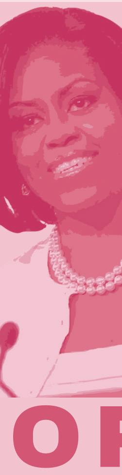
NELLIE MIDDLETON (EM)
Who Tells Her Story? reframes the White House not as a static monument to presidential power, but as a living, layered space shaped by the women who knew it best - the First Ladies of the United States. Too often, the First Lady is treated as an accessory to history - a silent witness who married power and was defined by her proximity to her husband. This product - a guidebook to the White House told through the stories of the First Ladies - challenges this societal notion by centring her voice, her influence and her imprint on the culture of the most powerful office in the world. Through archival research, narrative prose and visual storytelling, I trace how Eleanor Roosevelt’s press conferences, Jacqueline Kennedy’s cultural restoration, Hillary Clinton’s political advocacy, Michelle Obama’s community engagement, and Melania Trump’s symbolic subversions reveal the evolving interplay between gender, power and place. Each room becomes more than architecture; it is a stage where soft diplomacy, cultural preservation and personal identity converge.
This is both a historical document and a call to recognise that influence often resides in the margins. The White House tells many stories. This one belongs to the women who knew it best.
OLIVIA MIGLIORINI (HE)
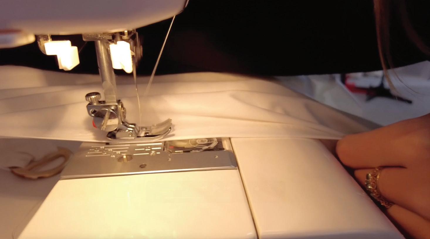
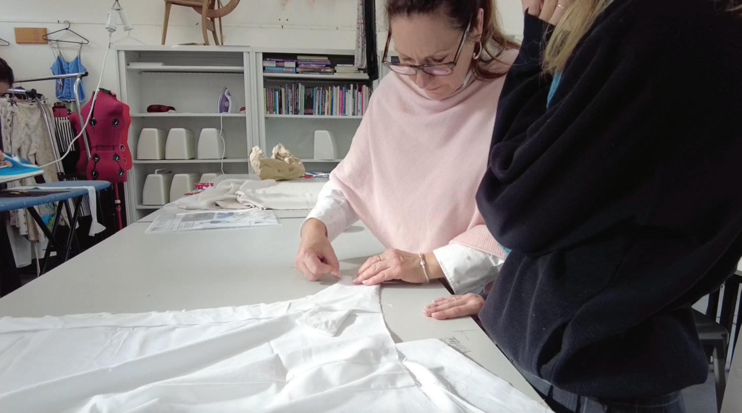
This year, throughout my Year 12 Media Studies, I have produced an expository documentary titled Behind the Seams, which explores the ethical and environmental impacts of fast fashion through a personal and reflective lens. Centered around interviews with both my textiles teacher and my peers, I aimed to capture different perspectives and insights into sustainability and overconsumption. The documentary combines personal storytelling with the wider global issue of fast fashion, aiming to inform and inspire change. By combining heartfelt and authentic interviews with informative content, Behind the Seams aims to evoke emotional responses whilst also encouraging viewers to reflect on their shopping habits and consider more sustainable alternatives.
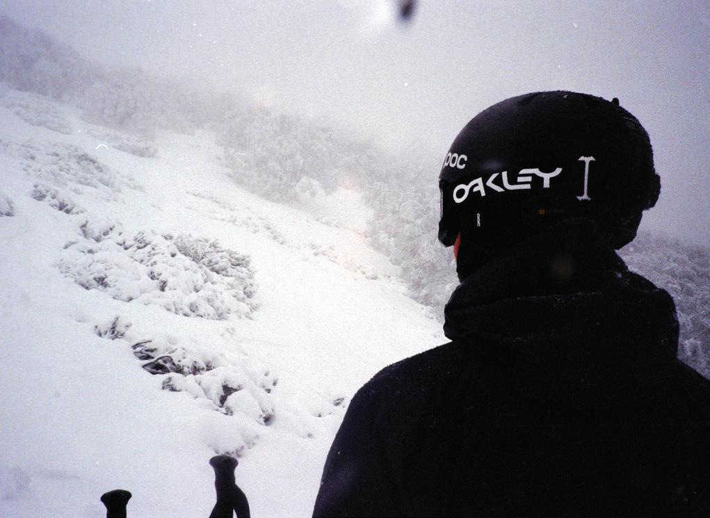
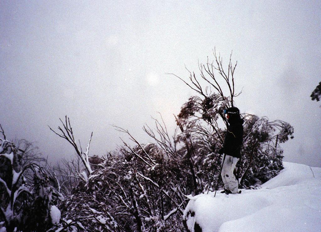
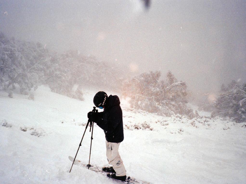
FINN PITHIE (FB)
I created this piece as a sequel to my piece from Year 11, featuring sculptural portraits of a faceless figure in ski/outdoor clothing and equipment. The use of film to capture the photographs reflects the high stakes when participating in extreme sports and developing the film; one mistake and everything can go wrong.
STELLA SHUTE (HE)
Still Rolling is a short film that follows my journey as a young actress in the film industry, featuring interviews from various perspectives that comprise the universal experience of being a child actress. This 4-and-a-half-minute film reflects my tempestuous relationship towards the acting industry, encouraging my audience to critically evaluate what it means to be ‘an actress’. The narrative of the film takes the audience through the emotional highs and lows of the career; however, it ultimately instils hope in aspiring and existing actors.
RUBY VIDOTTO (GA)
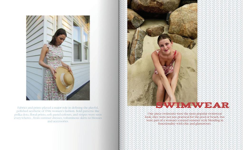
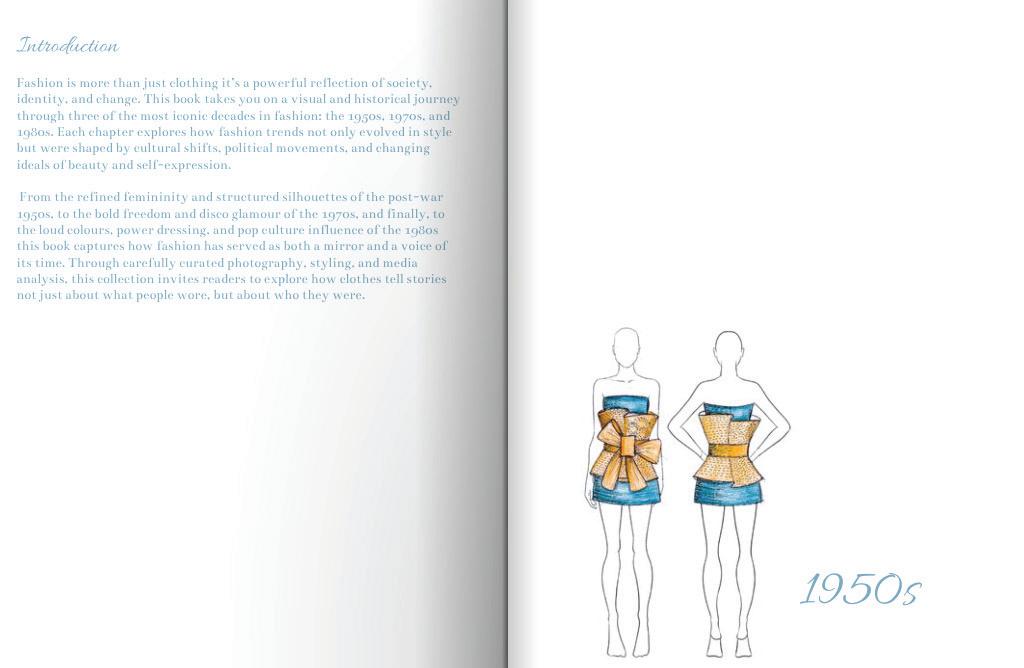
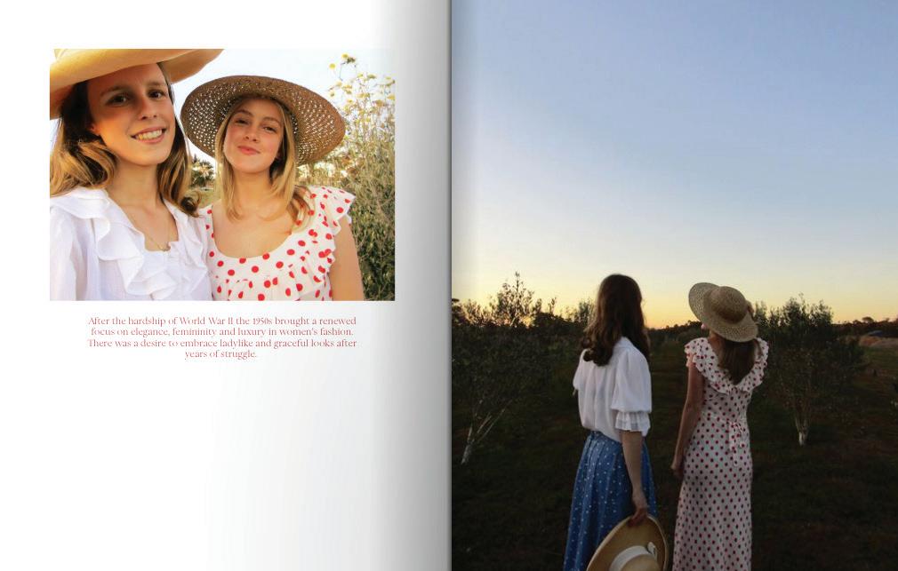
Threads of Time is a 24-page editorial-style coffee table book that traces the evolution of female fashion from the 1950s to the 2000s. Drawing inspiration from high-end fashion publications such as the Chanel series, the book blends rich photography, historical context, and design elements to capture how each decade’s style reflected its cultural, political and social climate. By combining symbolic codes of fashion, props and settings with technical codes such as colour, layout and lighting, the work creates distinct aesthetics for each era while maintaining a cohesive, elegant design.
My work seeks to represent fashion not just as a shifting trend, but as a powerful form of expression shaped by—and shaping—society. In celebrating the creativity and resilience of women through time, the book encourages audiences to reflect on how clothing has operated as both a tool of empowerment and a mirror of social constraints.
SEAN ZHUGE (FR)
My film, Cthulhu, is a trailer-like short film that aims to captivate fans of dystopic and Sci Fi based horrors. Ominous music paired with eerie atmosphere inflicts a sense of unease upon the audience. The film is centred around a not-too-distant future in which Cthulhu (H.P Lovecraft Fictional character) rises from the sea, and our protagonist, Yiran Kato, is tasked with figuring out what this creature is by visiting libraries and local museums. He recruits help from his best friend, Miles Jeffords, who is an expert in ancient mythology. The film incorporates heavy use of Unreal Engine to create its stunning visual effects, and the editing, fitting of a traditional trailer, creates the sense of urgency and a looming sense of doom by incorporating subtle pacing changes. The warm, saturated light on our character, a reference to traditional oil paintings, is used to illustrate a sense of formality and contrast. Cthulhu is a thought-evoking trailer that forces the audience to fill in the gaps between, creating a different narrative from person to person.
VICTORIAN CERTIFICATE OF EDUCATION
VISUAL COMMUNICATION DESIGN
ANNIE ARKER (EM)
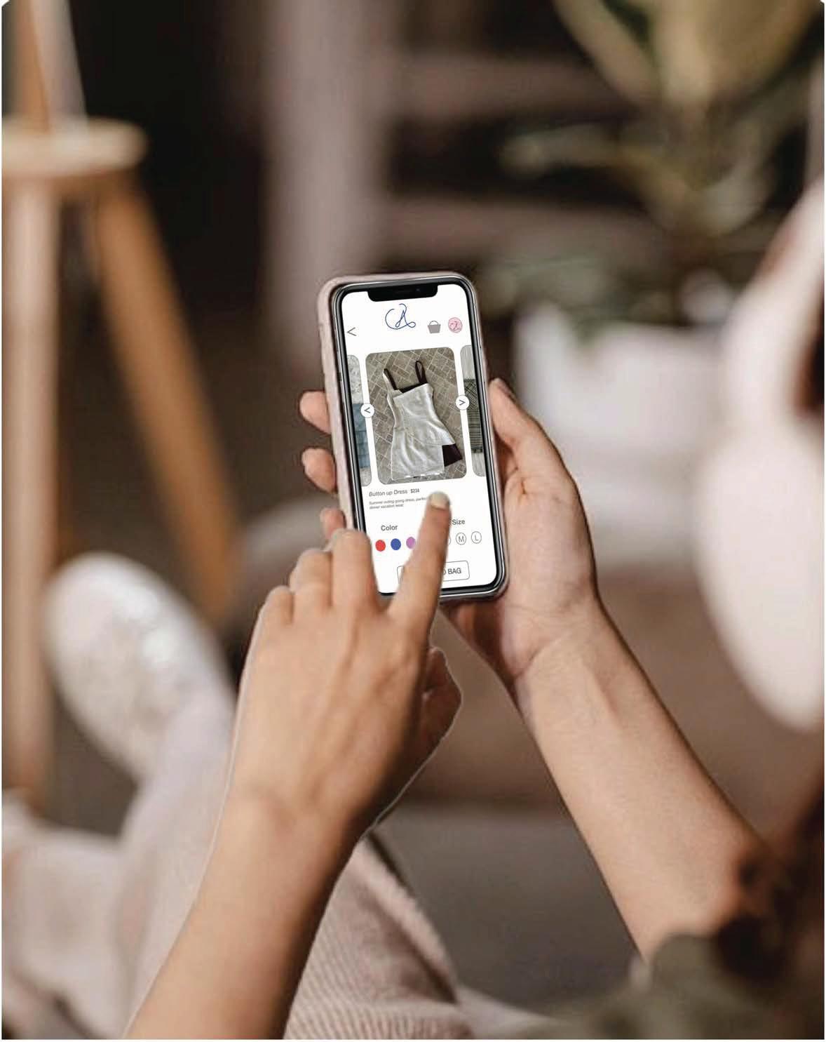
I designed a digital app interface and sustainable packaging design for AnnCo, a small Melbourne-based fashion brand that specialises in modern and eco-friendly clothes. AnnCo’s aim is to build an identity brand and gain stronger recognition among young female adults, aged 18 to 30, who are interested in fashion trends and appreciate environmental responsibility.
The app, designed using Adobe Xd, offers users a clean layout and visually seamless platform that represents AnnCo’s minimalist style. The app showcases three screens: a loading screen, a main screen and a product view screen. It features easy and engaging navigation with the use of icons. A warm-tone colour scheme is used throughout the app to create a calming and inviting atmosphere for users. The app includes a wishlist feature, where users can save their favourite items for future purchase, enhancing the overall shopping experience.
The packaging was created using Adobe Illustrator. The box was designed to protect garments during delivery while also reinforcing AnnCo’s brand identity. The packaging, made from recyclable material, incorporates: the logo of the brand, instructions and QR codes that link to the brand app to encourage interaction and brand recognition. Different sizes, from S to L, ensure that the boxes are suitable for a variety of garments. The use of natural, earthy colours was chosen to align with the brand’s core values.
Together, the designs are effective in presenting AnnCo as a modern, environmentally friendly fashion company that offers its youthful, trend-savvy audience a useful and fashionable experience.
23262604L
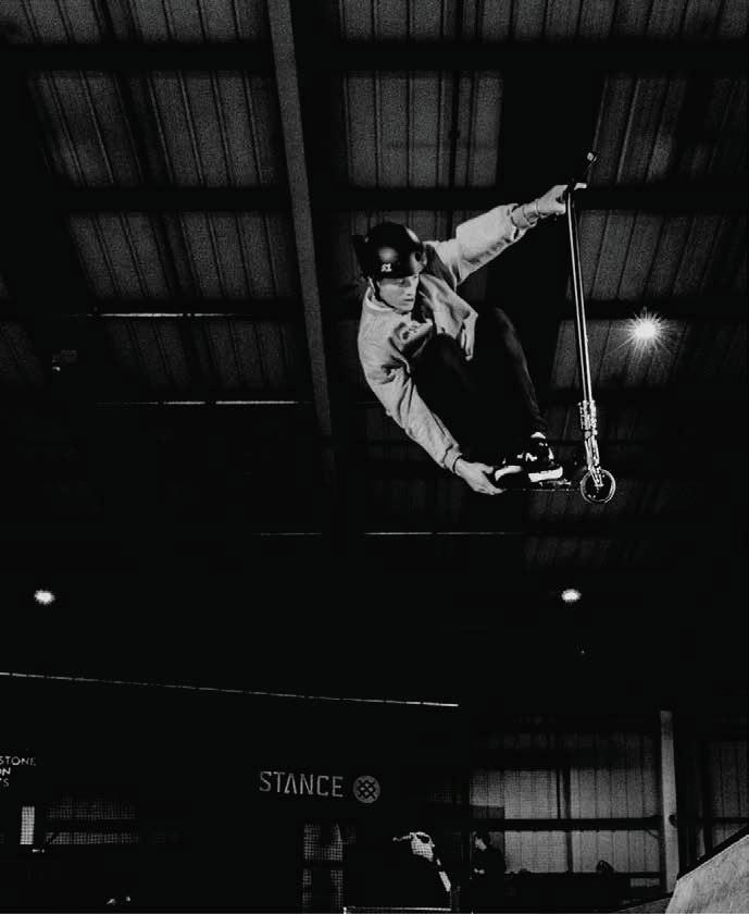
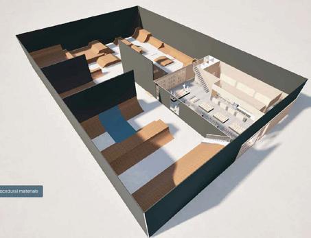
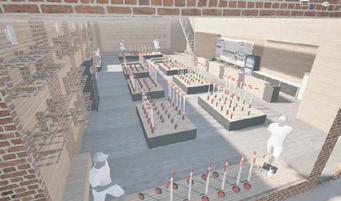
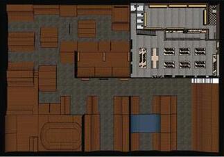
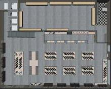
INDOOR SKATEPARK
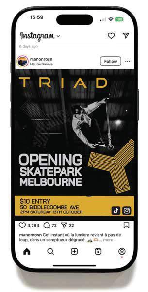
MILLER CLARK (FB)
My communication design focuses on environmental design and messaging. I have designed the full interior of an indoor skatepark and developed a social media post to promote its opening event.
The designs have been created for a popular stunt scooter company called TRIAD Scooters. TRIAD Scooters is a leading professional stunt scooter brand in Australia. They are expanding their presence through strategic promotions and infrastructure development. The company has recently acquired a large warehouse in Melbourne that was to be repurposed as a combined indoor skatepark and scooter retail store. The design was to attract extreme sports enthusiasts aged 6–30 (primarily male), representing diverse socioeconomic backgrounds.
The first design focused on designing a modern interior for a new indoor skatepark and scooter retail space. The brand is aiming to use the skatepark and store to offer a hands-on experience where riders can purchase parts or scooters. The project involves creating a functional and appealing space that promotes their brand. The presentation is a 3D render of the interior of the skatepark and scaled plan of the indoor environment.
The second design was created to promote the grand opening scooter event, making a social media post to attract attention, increase attendance and showcase TRIAD Scooters. It has a purpose to increase brand visibility and product awareness. TRIAD Scooters are hosting an event to celebrate the launch of the new skatepark.
KAI D’ORSA (A)
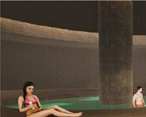
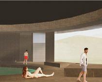
The Soak House wellness hub has been developed through two key design communications: a brand identity and a physical model with promotional materials.
The designs were requested by Victorian Health and Wellbeing, an organisation based in Melbourne, Victoria, that collaborates with hospitals, fitness centres, aged care facilities, healthcare providers, and sustainability initiatives to improve community wellbeing.
The logo, created in Adobe Illustrator, reflects Soak House’s values of relaxation, wellness and sustainability through natural tones of blue and green, soft curves and balanced geometry. Its adaptable design is presented across posters, tote bags, business cards and digital mock-ups, ensuring recognisability and professionalism across both physical and online platforms.
The architectural concept is represented through a detailed physical model and A2 promotional posters. Constructed from foam core, mount board and acetate, the model communicates form, proportion and balance, while large transparent windows highlight light, space and connection to the surrounding environment. Posters printed on coated paper display floor plans, elevations, and renders with vibrancy and clarity, reinforcing the earthy palette and authentic materiality of the hub.
Together, these communications provide the Victorian Health and Wellbeing team with both technical and experiential insights. They ensure Soak House appeals to the target audience of individuals aged 16+ across diverse genders, ethnicities and medium income demographics, while aligning with the client’s goal of fostering inclusivity, unity and rejuvenation through a high-quality wellness experience.
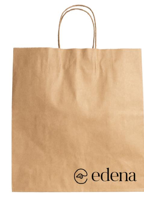
edena
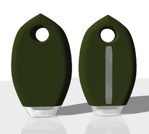
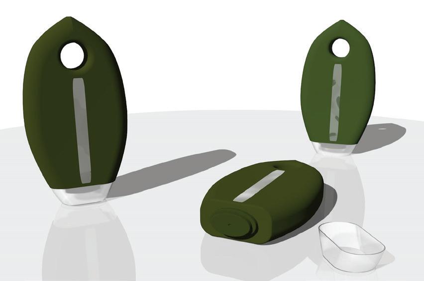
LIDIA DEBORTOLI (YR11 EM)
A logo and packaging design were developed as two design communications in response to the Edena brief. The brand identity focuses on a memorable and clever logo, created in Adobe Illustrator, which communicates the values of sustainability, simplicity and creativity. It includes a serif font and icon that resembles an ‘e’, and includes a leaf within the middle to further reinforce brands eco-friendly values. The logo is designed to be modern yet approachable, and adapts seamlessly across packaging, social media and promotional platforms, maintaining both legibility and impact.
The packaging design was developed in VectorWorks to contain and protect the laundry detergent while visually representing the brand. The bottle follows a leaf-inspired shape that helps reflect the brand’s values of sustainability, as well as the materials selected for their recyclability and reusability. The label, which is typography-based, balances functionality with visual appeal, providing clear information such as ingredients and usage directions, so as not to take away from the detail of the bottle. Both designs were presented as a series of images mounted on a foam board.
Together, these outcomes aim to appeal to environmentally conscious individuals, aged 20 and above, who value sustainable, long-lasting products. By combining a strong visual identity with practical, eco-friendly packaging, the design reflects the client’s mission to reduce household waste while offering products that are kind to the planet and our skin.
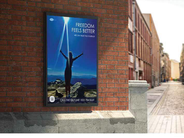
LUCY DE STEIGER (CL)
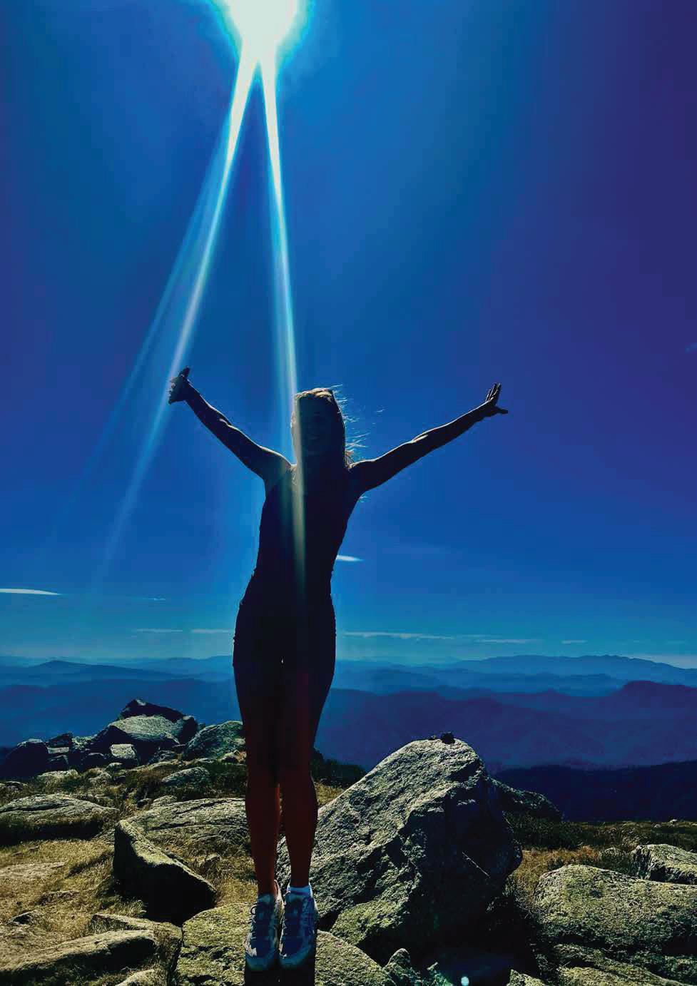
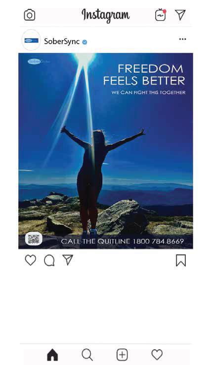
My communication designs consist of a poster campaign and an app prototype; both created with the aim of encouraging people aged 16-24 to quit substance use. This target audience often turns to peer groups and digital spaces for support, so both designs focus on being visually striking, relatable and accessible. The poster uses a bold mountain image with a figure standing with arms raised towards beams of light, symbolising freedom, clarity and strength after overcoming addiction. Strong contrasting colours and clean white text highlight the motivation slogan ‘Freedom Feels Better’ supported by ‘We Can Fight This Together’. A QR code for the app ‘SoberSync’ and Quitline number provide immediate access to help, ensuring the poster balances inspiration with real pathways to action. Its placement in outdoor spaces and on social media platforms, like Instagram, appeals directly to young people who regularly engage with both digital and public environments. The ‘SoberSync’ app continues this purpose, offering an interactive way to track progress, access tips and connect with support. Features such as mood check-ins, progress graphs and learning modules are designed with calming colour palettes and simple icons to reduce stress. The app’s interactive design suits the digital habits of 16–24-year-olds, providing motivation and ongoing support in an accessible, youth friendly format.
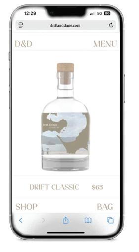
MOMO HE (CL)
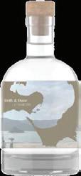
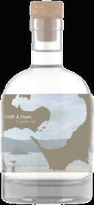
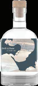
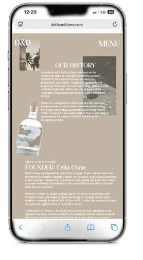
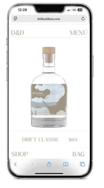
The Drift & Dune gin brand was brought to life through two distinct design communications: a bottle label and a website concept. Both were created to visually and functionally support the launch of a small-batch gin distilled along the Victorian coast.
The project was developed in response to a client’s brief, focused on showcasing the natural identity and refined character of the product. The design needed to feel premium, local and suited for boutique liquor retailers, cocktail bars and digital platforms.
The bottle label was created in Adobe Illustrator using a custom shaped die line, inspired by the Mornington Peninsula coastline. The design showcases soft pastel tones, refined serif type and hand-drawn botanical illustrations that evoke the company’s coastal heritage. A cohesive visual language ensures the label conveys essential details—such as alcohol content and distillery origin—with clarity, all while maintaining a visually distinctive and elegant appearance.
A website prototype was created for the client too. It includes a homepage, product overview, individual bottle pages and a brand history section. The layout and structure were refined through testing and user feedback to ensure easy navigation, strong visual hierarchy and brand consistency across both desktop and mobile devices. Both design outcomes strive to embody the harmony between natural beauty and refined craftsmanship. The identity is crafted to resonate with an adult audience who values local artisan products, quality ingredients and authentic storytelling. The result is a brand that feels grounded, cohesive and market-ready, providing the client with a strong foundation for both product launch and promotional efforts.
SEBASTIAN HIGGS (FB)
The client, a small Geelong-based business specialising in sustainable home organisation products, required a versatile and stylish storage unit suited to bedrooms, living rooms and home offices. The design needed to balance durability, affordability and environmental responsibility, while appealing to homeowners and renters in both small apartments and larger homes.
The logo, created in Adobe Illustrator, reflects the brand’s values of sustainability, functionality and style through clean geometry and natural tones. Applied across packaging, social media and digital campaigns, it will ensure strong recognition and a professional identity.
The storage unit is presented through 3D rendering. Its modular form highlights ease of use, adaptability and modern design, while materials used reinforce its sustainable qualities. Together, both communications provide the client with a cohesive product and brand identity.
SKEDADDLE SKEDADDLE
Good food, done right, delivered fast - since 2003.
BONNIE LAMPARD (HE)
The client, owner of the catering business Skedaddle wanted a fresh and playful, yet professional, logo and website design. With 22 years of hospitality experience spanning London to Melbourne, the client launched her own business and needed designs that reflected her love and enjoyment of food. The designs needed to appeal to a broad audience aged 16 to 40 – from students and event managers to businesses hosting brand campaigns and individuals celebrating personal milestones; from seasonal functions to 21st birthdays.
The logo needed to feel rustic yet sophisticated, while the website had to be bright, sleek and easy to use, with sections for the menu, catering services, business story, location, opening hours and social platforms. Mixing dynamic pastel colours with organic,
hand-drawn illustrations, the logo was created to stand out against competitors and catch the eye of potential clients. A modern fork and knife symbol anchors the design, reinforcing the food focus while adding hierarchy and continuity.
The website design is polished and vibrant, carefully tailored to the client’s audience. Human-centred design sits at its core, with soft contrast, minimal text and bold contemporary photography. Structured pages and natural rhythm guide the eye, making the site simple and enjoyable to navigate.
SKEDADDLE
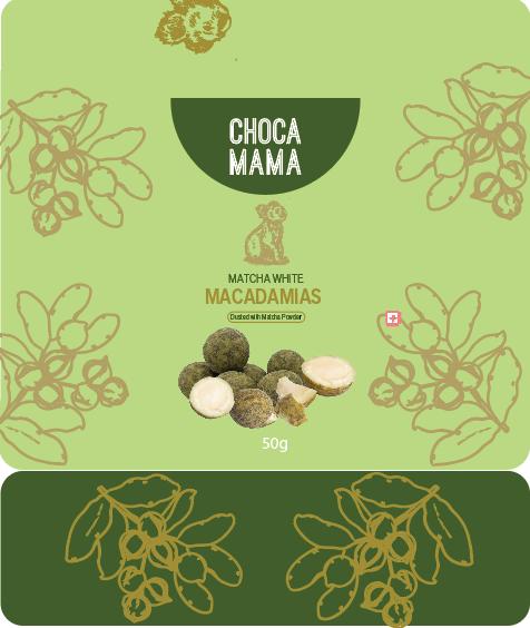
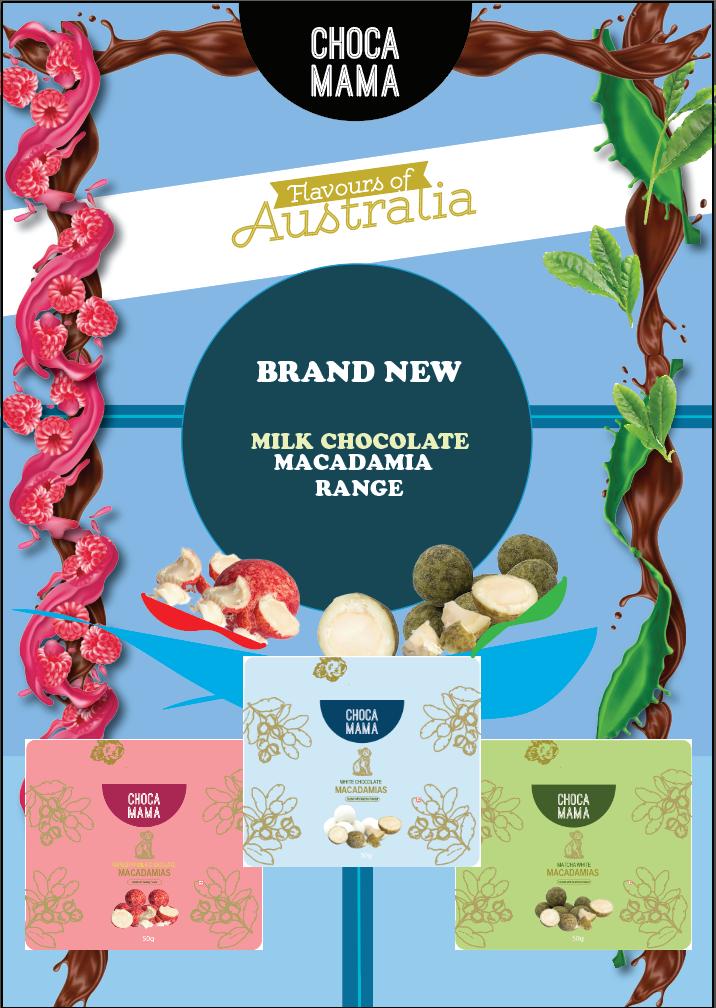
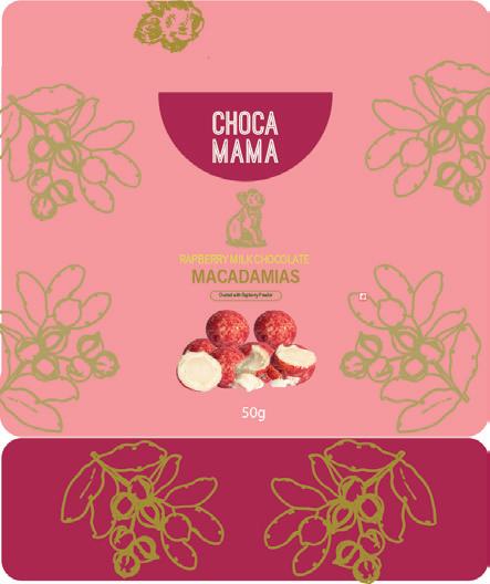
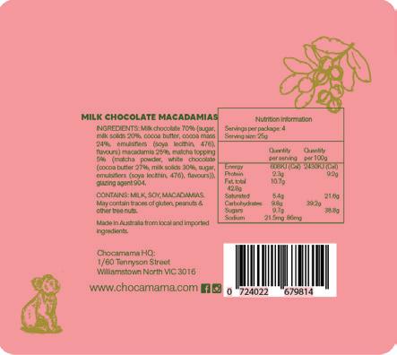
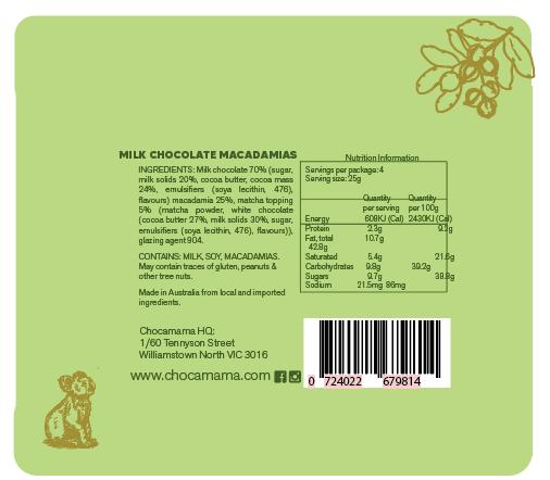
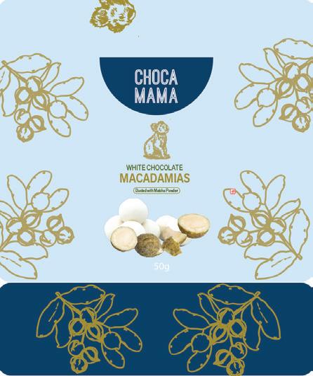
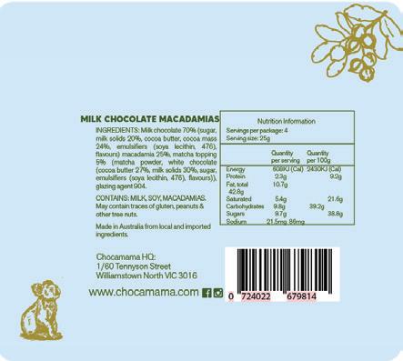
MAX MARTIN (P)
Chocamama is a chocolate and confectionary brand who supplies to a lot of different retail groups. Chocamama requested a packaging design of different flavoured chocolate macadamias that are aimed to be sold in airports. They hold 50 grams of product and are aimed towards international tourist to help gain traction overseas. My design has a heavy focus on colour, to try and emulate flavours in the best way possible, while also using Australian fauna and flora to project the Australiana look.
Chocamama also requested a digital advertisement that can scale up or down to fit appropriate needs, reflecting the brand and new range as best as possible to attract a similar audience in hopes for further purchase online. This design should clearly reflect various packages from communication 1 and the logo should be easily recognisable, so the audience can purchase from the right brand. The advertisement should be able to be used on social media, in catalogues and more.
GRACE NADORP (FR)
In my portfolio I have created two designs. The first design is a logo, and the second design is a fashion garment. The client that these designs were made for was a brand called Elizabeth Grace. It is a small fashion brand that is local to Melbourne. The brand is looking for a logo and a garment design for their up-and-coming runway.
The brief for Communication 1 was to create a logo that is minimalistic but reflects the values and aesthetic of the brand. The logo could either be a symbol or written with a maximum of two colours.
The brief for Communication 2 was to create a garment that is classy, innovative and colourful, as well as being sustainable. The garment needs to have at least three buttons and a detail on the front. The audience include young female adults who like fashion but are also looking for a sustainable option.
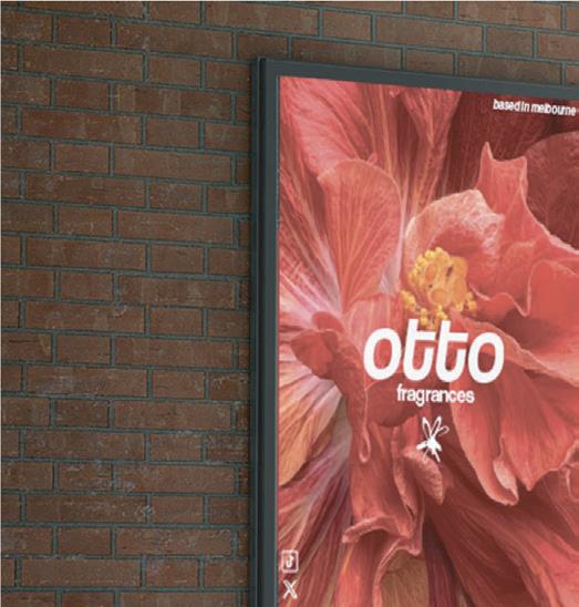
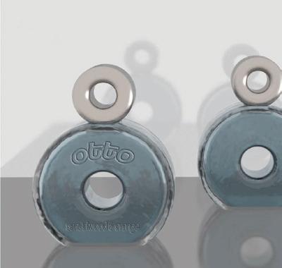
otto fragrances
SHIKOH STAFFORD (YR11 GA)
A logo and promotional poster were developed in response to the Otto brief as the first design communication. The brand identity focuses on a logo, created in Adobe Illustrator, which communicates the values of the Otto brand. The logo uses a photo of a flower reinforcing the premium positioning of the brand. It is designed to remain versatile and impactful across packaging, digital platforms and advertising, ensuring both recognition and consistency.
The poster was designed to promote the Otto brand and attract its target audience. It integrates the brand information with striking visual imagery and a carefully chosen colour palette to reflect the brand. Text hierarchy ensures the name and key brand messaging are clear, while the composition highlights Otto as a brand that is both contemporary and distinctive. The logo and poster were presented as mounted visuals to demonstrate how the brand identity translates across different promotional platforms.
The perfume bottle was developed in VectorWorks as the second design communication. It was designed to physically contain the fragrance while visually embodying the Otto brand values of luxury and innovation. The form of the bottle is unique and shaped as an ‘O’ with a hollow centre. The design was communicated through rendered images and orthogonal drawings, presented as a series of mounted visuals to highlight its aesthetic qualities and premium positioning.
based in melbourne
otto fragrances
otto fragrances
SEAN ZHUGE (FR)
My client is an owner of an Australian green initiatives company based in Melbourne that would like to establish a new travel brand called AirWays, targeting the Australian and future global market. The client has a background in green technology and progressive business ventures and is highly committed to environmental sustainability and minimalism in design. Through the adoption of modern marketing tools, such as merchandise and social media, the client aims to challenge the traditional aviation sector by offering an eco-conscious, stylish and modern, affordable airline alternative, initially beginning as a regional/ interstate travel service and other short distance flights to New Zealand and Fiji, then progressing to international markets. AirWays request a logo and lounge space for the AirWays brand that aims to target the preferred audience space, and showcases both quality and provides affordability, creating contrast to other pre-existing airlines. The designs are specifically aiming for an audience age range of 19-30 as well as frequent travellers, young adults and families.
AirWays
CONCEPT: this design utilises the pre-existing space at the sydney airport, but has a revamped and novel redesign.
MATERIAL: since the brand idolises sustainability as well as quality, most of our spaces are built from Recycled tiles and stones such as marble the bathroom doors also built using recycled plastic, for their durability and sustainability
PURPOSE: The design will be used as a place of relaxation whilst in high stress activities such as flying, this design aims to improve quality whilst being affordable, nothing too overtly fancy but still bringing a balance to price tag and product. the space offers space for children to play but also plenty of space to rest for the adults. a bar is incorporated to offer refreshments to our travellers to make their ideal journey more comfortable.
AirWays is a newly established Australian Melbourne based airline, encompassing quality whilst simultaneously maintaining affordability. AirWays is welcoming to all and best suits frequent travellers and young adults.
This lounge will be located at the sydney airport, as it experiences the most traffic per day travelling both interstate, and international, it has a wide and open view facing the Tarmac, and an open floor plan inspired interior that evoke a sense of comfort and security
THANK YOU
My heartfelt gratitude goes to the entire Visual Arts Department, with special thanks to Mrs Lucy Haigh, who oversaw two Year 12 VCE Art Making and Exhibiting classes, and Ms Jen Nicholls, who taught Year 12 VCE Media.
In addition, I extend my thanks to all the other members of the department whose hard work often happens behind the scenes: Ms Sharron Goodwin-Ryan, as well as Jane Maaser and Marita Seaton, our Art Technicians. Likewise, I am most grateful to the art staff from the other three campuses. I am sure that at various stages of their artistic journey, many of the art and design graduates were taught or assisted by them. The staff’s ongoing mentorship played a vital role in bringing the work in this catalogue to life.
I would like to express my gratitude to Ella Correa (EM) and Kai D’Orsa (A) who, as the Visual Art Captains, represented the Department in 2025.
Lastly, sincere thanks are due to Sofie Van Gunsteren (Designer) and Jon Barter (Photographer), whose efforts made this wonderful publication possible.