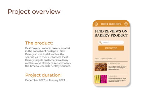
Project overview
The product:
Best Bakery is a local bakery located in the suburbs of Budapest. Best Bakery strives to deliver healthy, specialties to their customers. Best Bakery targets customers like busy mothers and elderly citizens who lack the time to research healthy variants.

Project duration:
December 2022 to January 2023.
Project overview
The problem:
Busy workers and commuters lack the time find healthy food.
My role:
UX designer designing an app for Best Bakery from conception to delivery.
The goal: Design an app for Best Bakery that allows users to easily review product and read these reviews.
ResponsibiIities: Conducting interviews, paper and digital wireframing, low and highfidelity prototyping, conducting usability studies, accounting for accessibility, and iterating on designs.
User research: summary
I conducted interviews and created empathy maps to understand the users l’m designing for and their needs. A primary user group identified through research was working parents who have difficulties to find healthy food.
This user group confirmed initial assumptions about Best Bakery customers, but research also revealed that time was not the only factor.
Other user problems included obligations, interests, or challenges that make it difficult to get ginformation in-person.
User research: pain points
Time
Working adults are too busy to spend time on gathering info.
AceessibiIity
Platforms for reviewung food are not equipped with assistive technologies
IA
Text-heavy menus in apps are often difficult to read and order from
Persona: Alla
Alla Woodhead
Age: Education: Hometown:
Family: Occupation:
32 Highschool diploma Paris 2 sons, 1 doughter Model
“Always too busy”
Goals
● Provide nutritional food for kids
● Healthy kids
● Spend money wisely
Frustrations
● There are too many product, need help and recommendation.
● Mot all the product healthy
Young, busy influencer. Looking for more quality time with family.

User journey map
Persona: Alla Woodhead
Goal: Provide nutritional food for kids from the local bakery
Mapping Alla’s user journey revealed how helpful it would be for users to have access to a dedicated Bakery review app
ACTION
Select bakery product for kids
Tasks
A. Look for healthy food
Find review on that product Make decision
Tasks
A. Browse product list
Go to the local bakery
Buy product
TASK LIST
B. Choose product
B. select item
C. read reviews
Tasks
A. make decision on customer reviews
B. choose product
Tasks
A. Look up bakery address
B. Walk to the local bakery
Tasks
A. Ask for the chosen food
B. pay for it
C. present to the kids
FEELING ADJECTIVE
IMPROVEMENT OPPORTUNITIES
Overwhelmed by too much information
Annoyed with overwhelming information
Anxious about forgetting the chosen product
Annoyed about the time it takes to the bakery
Happy to find healthy food for kids
Create a food review app for local bakery
Organize the product into different groups
Add search filters
Provide the user create favorites
Show the shortest route
Calculate the travel time to the bakery
Ask for review
Paper wireframes


Taking the time to draft iterations of each screen of the app on paper ensured that the elements that made it to digital wireframes would be well-suited to address user pain points.


Digital wireframes
As the initial design phase continued, I made sure to base screen designs on feedback and findings from the user research.
Low-fidelity prototype
The low-fidelity prototype the primary user flow of adding and reading reviews on bakery product, so the prototype could be used in a usability study with users.
https://www.figma.com/file/gqq9XFQFyRJTxAgflhmabK/Bakery-reviewapp?node-id=0%3A1&t=jzTJaU6ttc3tR9c6-1

Usability study: findings
I conducted two rounds of usability studies. Findings from the first study helped guide the designs from wireframes to mockups. The second study used a high-fidelity prototype and revealed what aspects of the mockups needed refining.
Round 1 findings:
* Users want to read reviews quickly
* Users want more category options
Round 2 findings:
* Platforms for reviewing product are not equipped with assistive technologies
Key mockups

High-fidelity prototype
The final high-fidelity prototype presented cleaner user flows for adding and reading review.
https://www.figma.com/file/gqq9XFQFyRJTxAgflhmabK/Bakery-reviewapp?node-id=27%3A3&t=jzTJaU6ttc3tR9c6-1

Accessibility considerations
1
Provided access to users who are vision impaired through adding alt text to images for screen readers.
2 Used icons to help make navigation easier.
3 Used detailed imagery for bakery product to help all users better understand the concept.
Takeaways
lmpact:
The app makes users feel like Best Bakery really thinks about how to meet their needs.
What I learned:
While designing the Best Bakery app, I learned that the first ideas for the app are only the beginning of the process. Usability studies and peer feedback influenced each iteration of the app’s designs.
Next steps
1. Conduct another round of usability studies to validate whether the pain points users experienced have been effectively addressed.
2. Conduct more user research to determine any new areas of need.