
INTRODUCTION
From shimmering moiré silk grounds to richly embroidered botanicals and beaded details, our wallcoverings setting the tone for 2025 are a study in texture, technique and transformation, celebrating innovation and tradition.
With a focus on material experimentation, these designs invite storytelling at its boldest and most luxurious— for those who see walls not as backdrops, but as a tactile, integral part of spatial experience.
Whether reimagining a classic composition or introducing something entirely new, our wallcoverings bring depth and distinction to both residential and public settings.
“The object of art is not to reproduce reality, but to create a reality of the same intensity.”
- Alberto Giacometti
A PERFORMANCE IN PATTERN
PHANTASM
In collaboration with Amy Lau
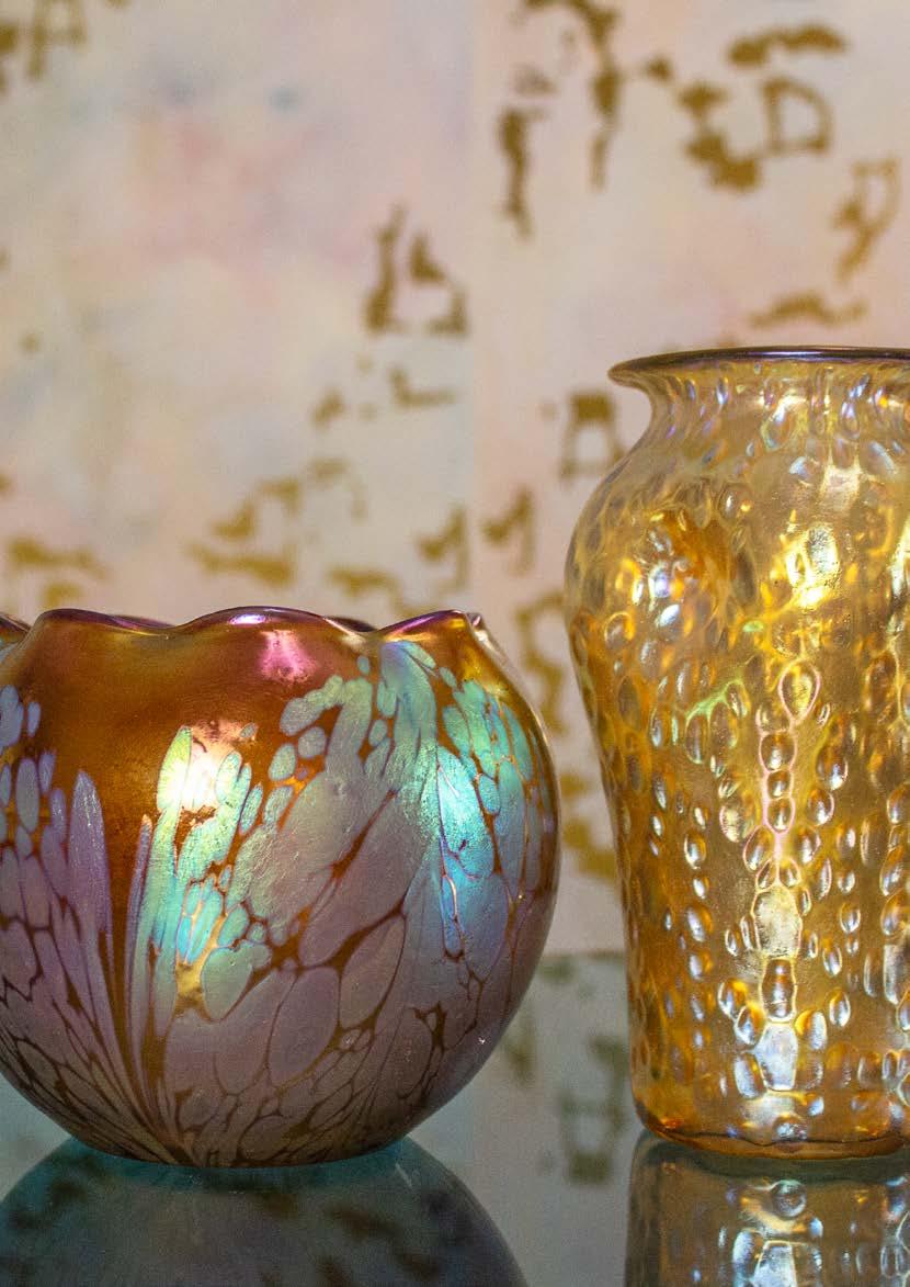
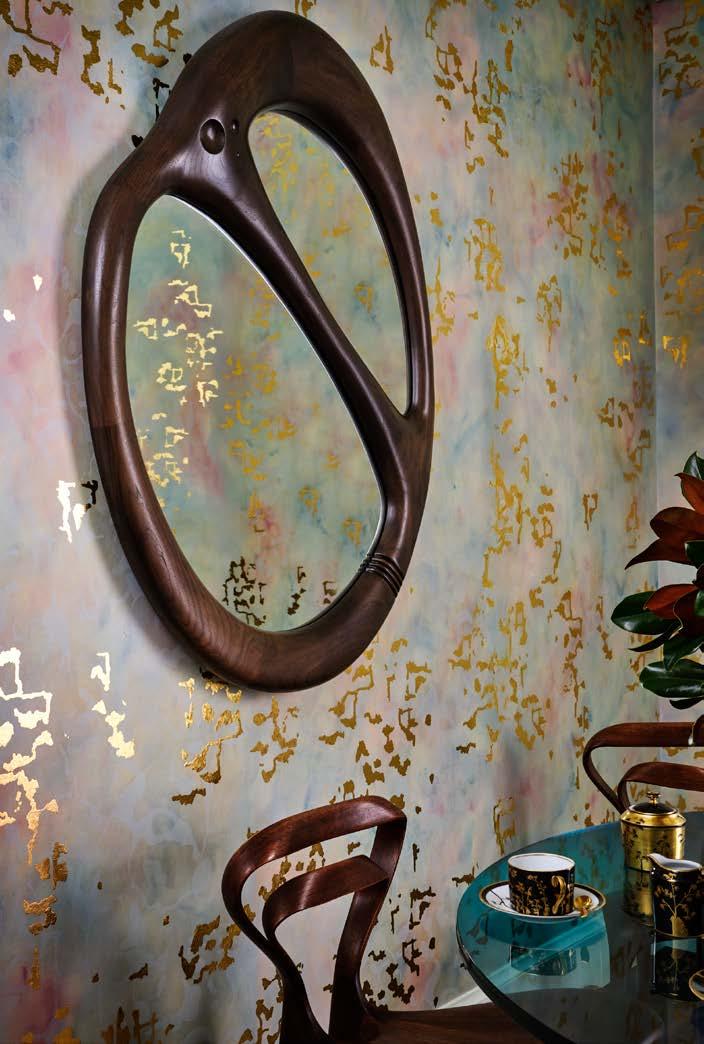
What began as a wallcovering for Amy Lau’s own home has evolved into something of rare significance. Phantasm embodies both her aesthetic vision and approach to living beautifully, reflecting our mutual passion for innovative craftsmanship and exceptional materials. Its painterly, abstract pattern draws inspiration from the iridescent qualities of Loetz glass—a renowned rival to Tiffany at the turn of the century.
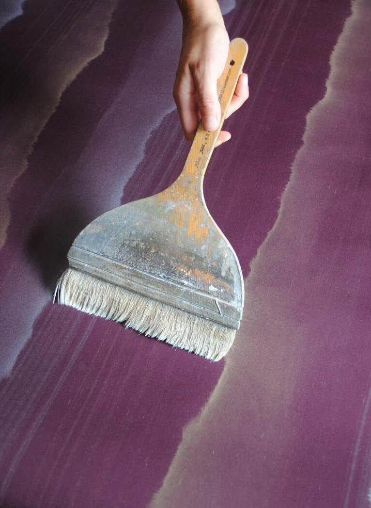
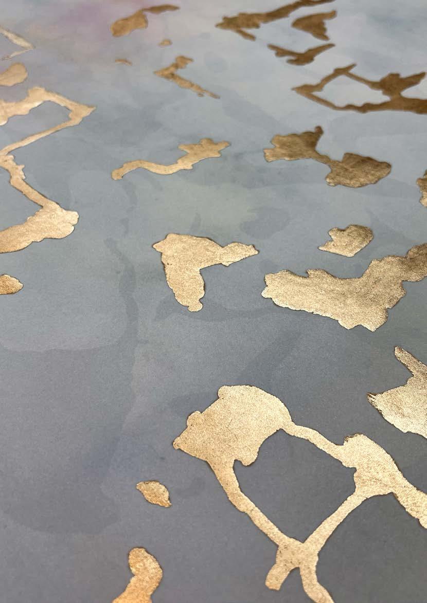
As light moves across Loetz glass, the colours appear to change, shift, and blend all at once. Phantasm captures this alluring dance of light and colour, with wet dyed silk carrying layers of ethereal swirls and golden metallic markings applied in homage to Gustav Klimt’s famed Tears of Freya.

“Designing with Amy was always a thrill ... She brought light, laughter, and fierce elegance to everything she touched. This piece is both a celebration and a remembrance: a tribute to Amy’s eternal eye, and the beauty she so effortlessly conjured”
- Fromental Co-founder, Tim Butcher
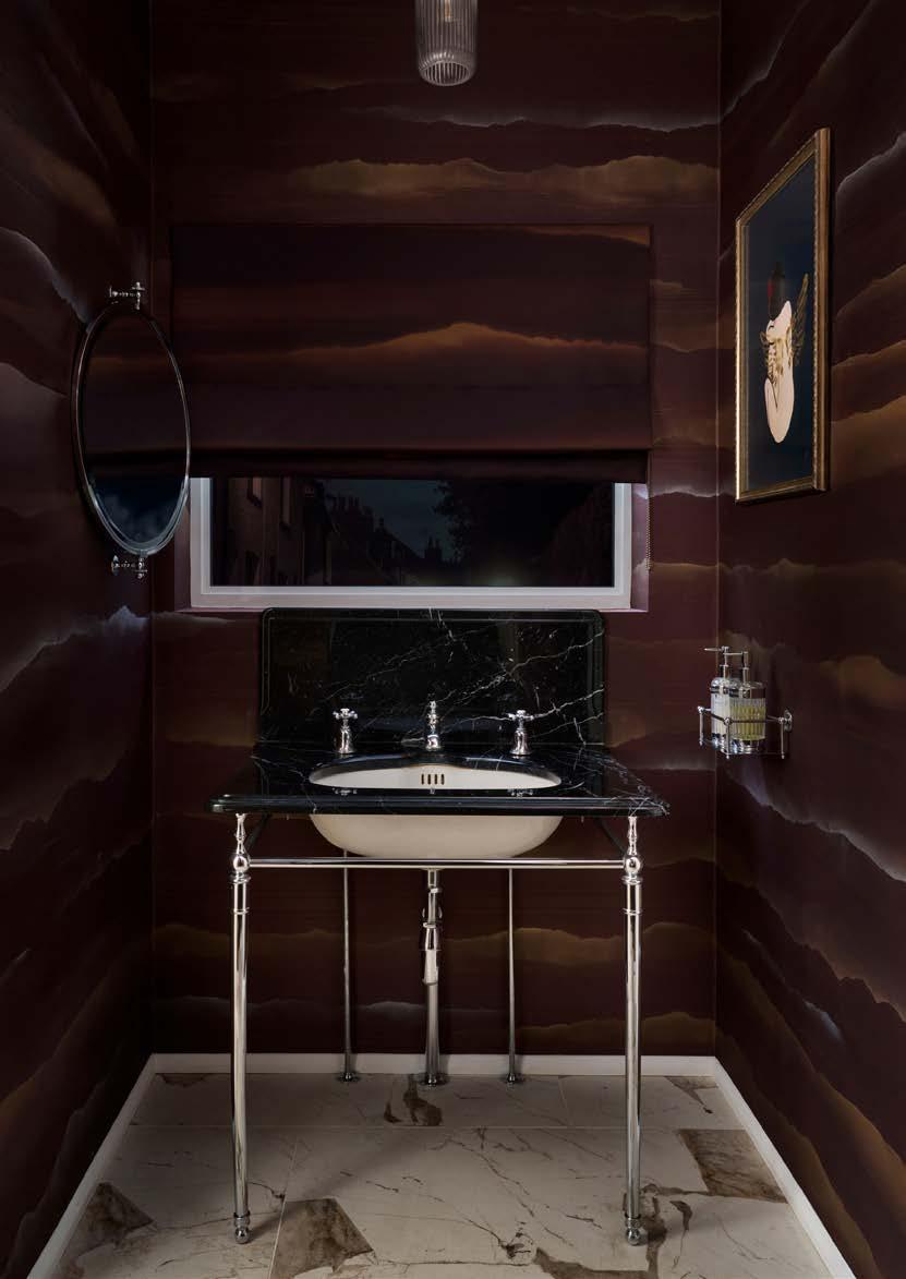
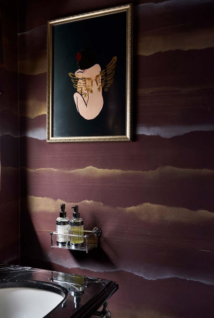
TRAVERTINE
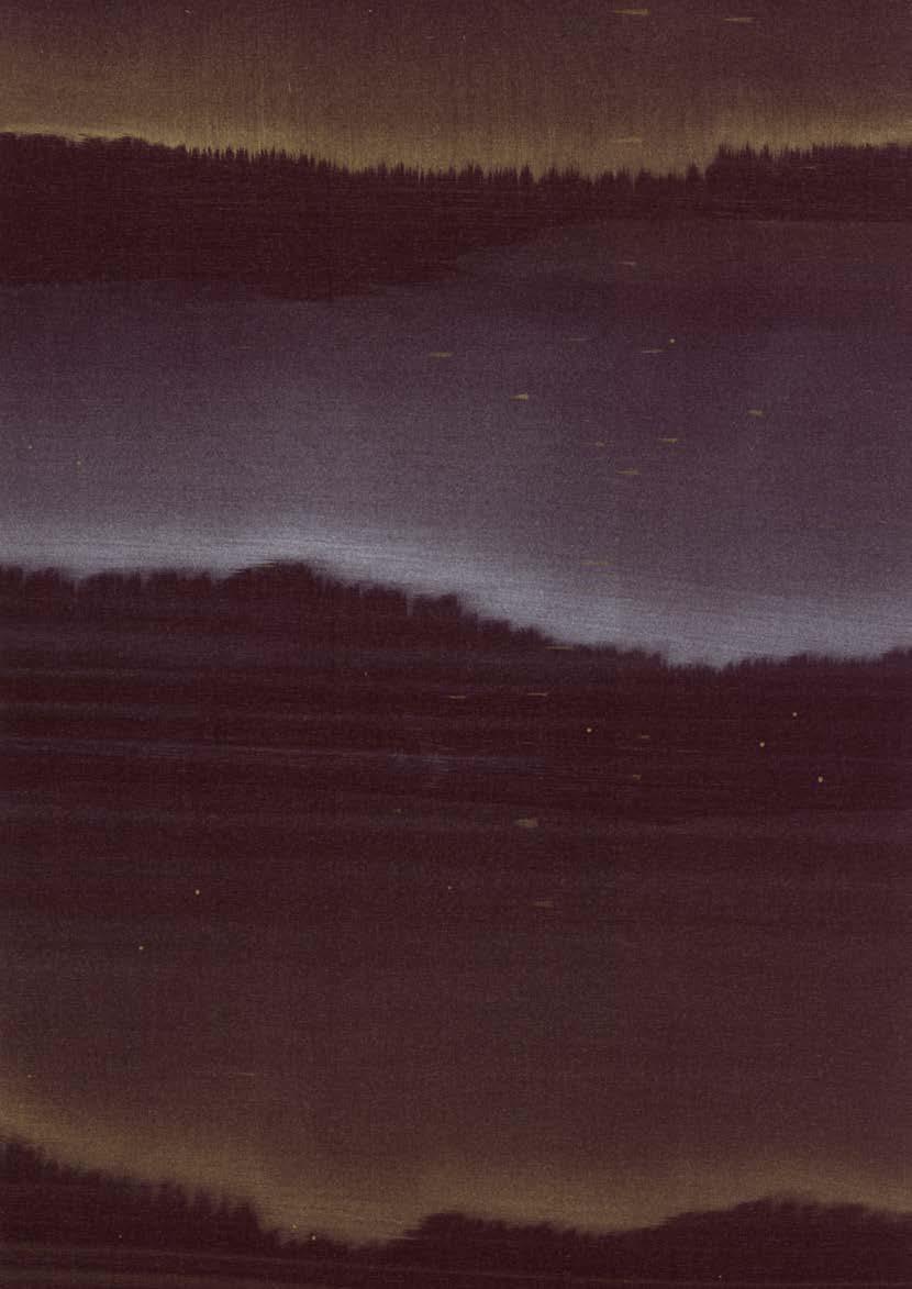
Born from serendipity in the studio, Travertine transforms the beauty of stratified stone into something more ethereal still. What began with excess gold acrylic brushed onto silk has since become one of our most captivating designs.
Washes of iridescent metallic paints are layered and brushed across silk grounds. The interplay of loose, gestural painting techniques results in an effortless design that is both understated and utterly mesmerising.
Now, we’re delighted to introduce three new jewel-like colourways to the collection.





MOLTEN
Aldous Huxley wrote about the spiritual allure of gems— their ability to blur the line between nature and art. It’s this quality that inspired Molten, drawn from the pioneering jewellery of Andrew Grima.
Lustrous Japanese beads, resembling precious gemstones, nestle against intricate metallic patterns hand-painted on a silk-linen ground.
WILDE DREAMS
In collaboration with Harris Reed
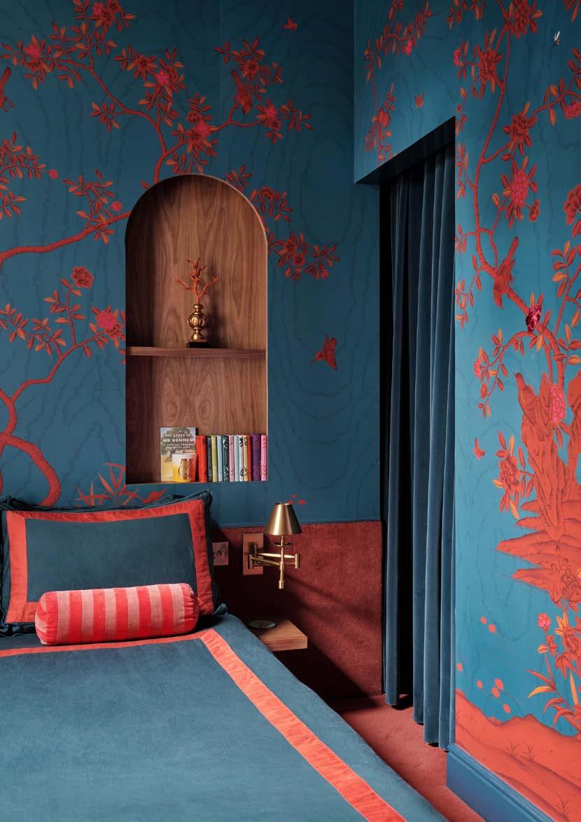
Harris Reed, the visionary behind the eponymous label that champions fluidity in design, appreciates the theatrical in fashion more than most. When we started working together, he immediately gravitated towards moiré silk—not just for its beauty, but for the way it amplifies everything around it. The patterns don’t just sit on the surface; they seem to pulse and breathe. It’s maximalism, yes, but with restraint. Reed calls it “controlled excess,” and we couldn’t agree more.

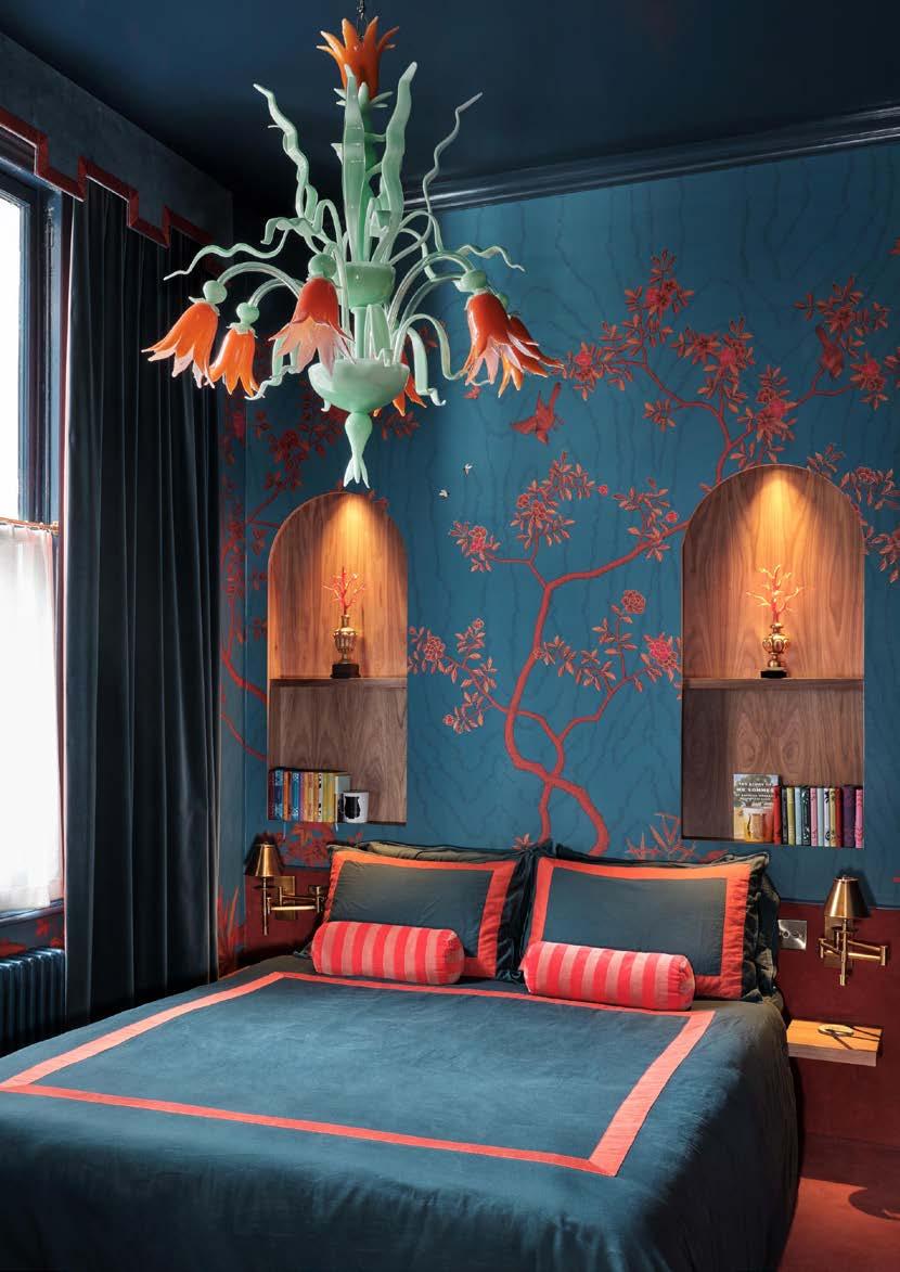
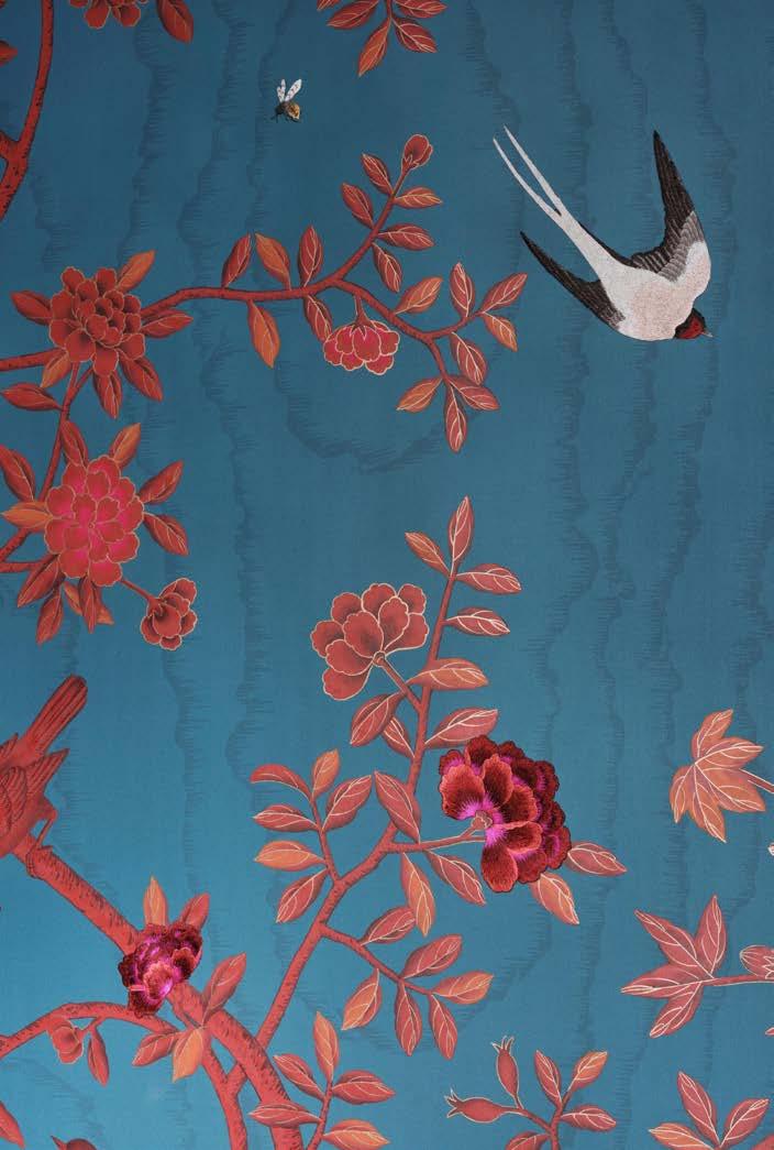
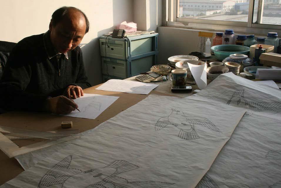
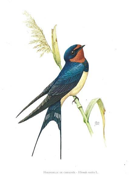
Swallow illustration from a 1950s French ornithological plate—one of the references behind our intricate swallows that swoop across the chinoiserie grove in Wilde Dreams.

BOTANICAL NARRATIVES

HIRONDELLES IN SAULT
In collaboration with Lalique
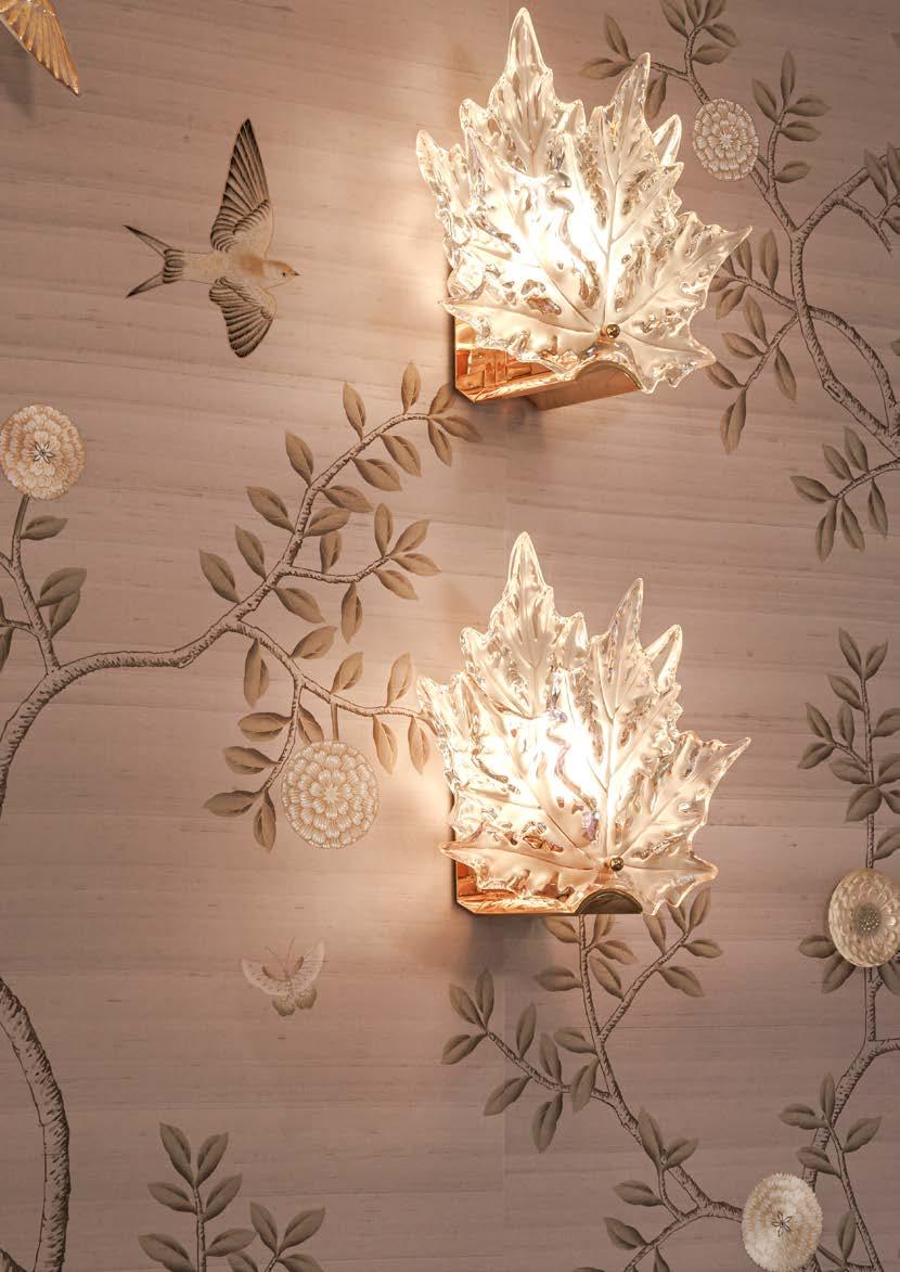
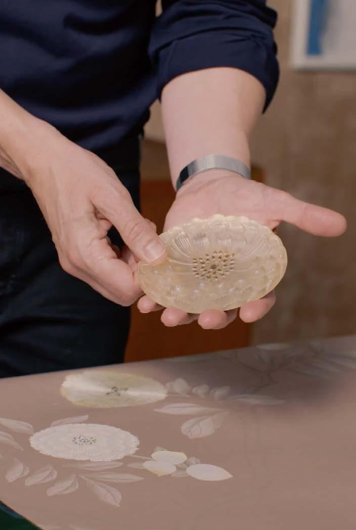
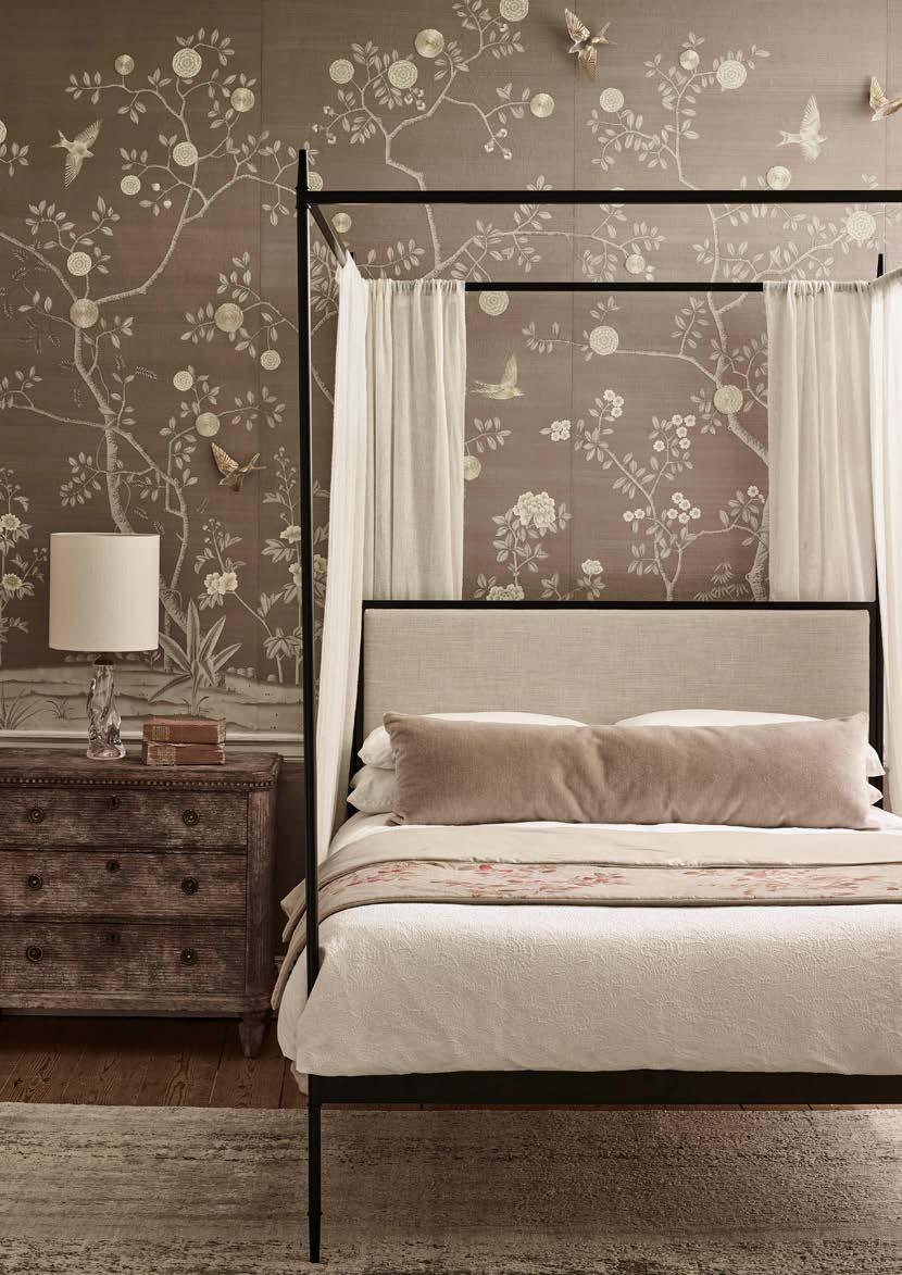
Hirondelles combines our signature hand-painting and intricate embroidery with Lalique’s crystal sculptures. Sault captures the design’s namesake swallows in graceful flight among dahlias on Blewitt Dupion silk.

NONSUCH ON RAW SILK
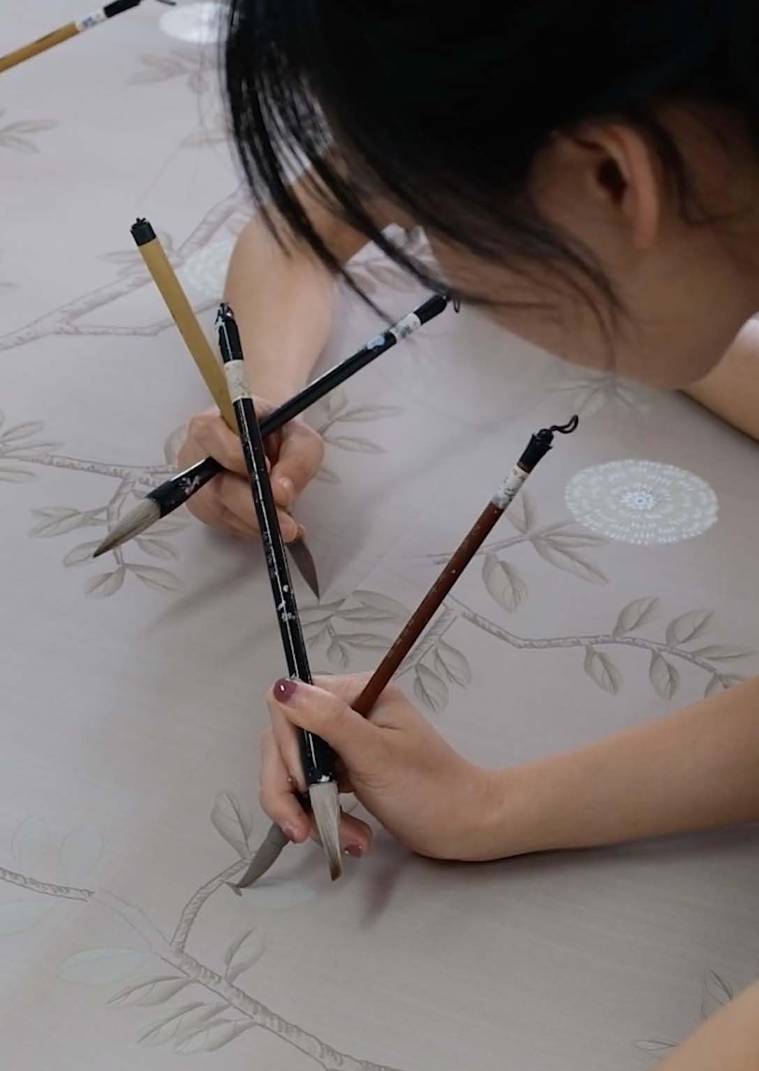
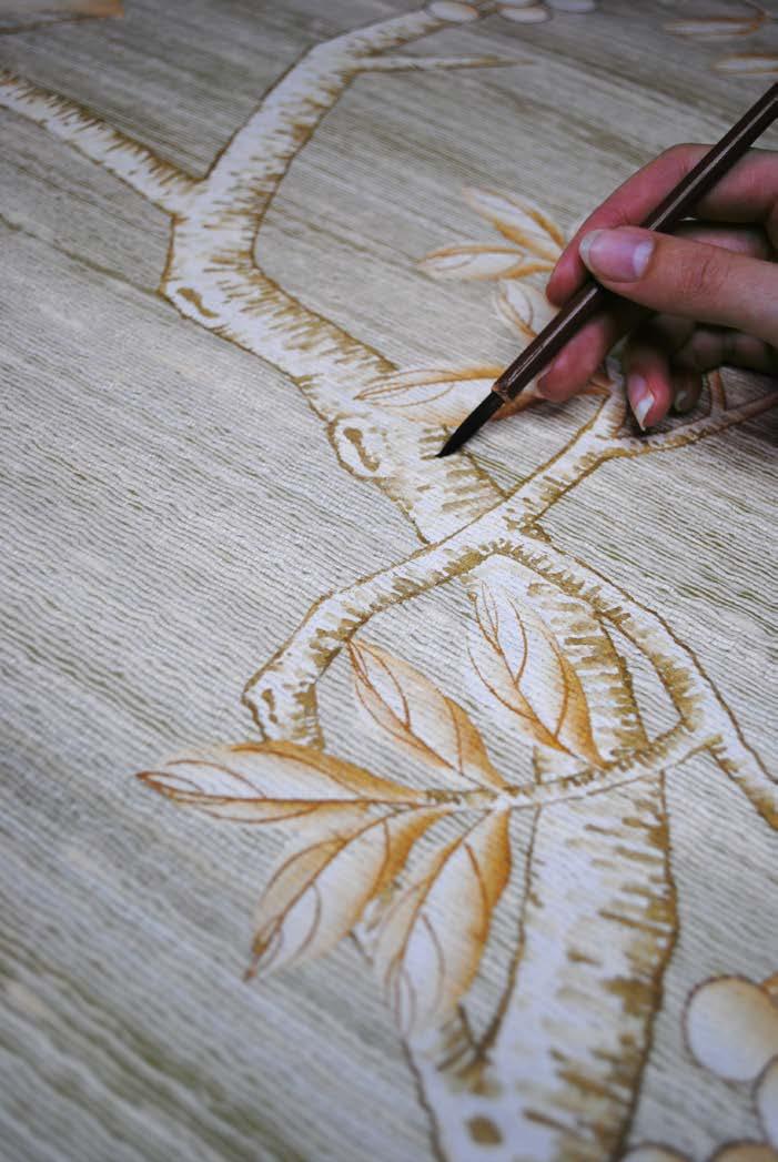
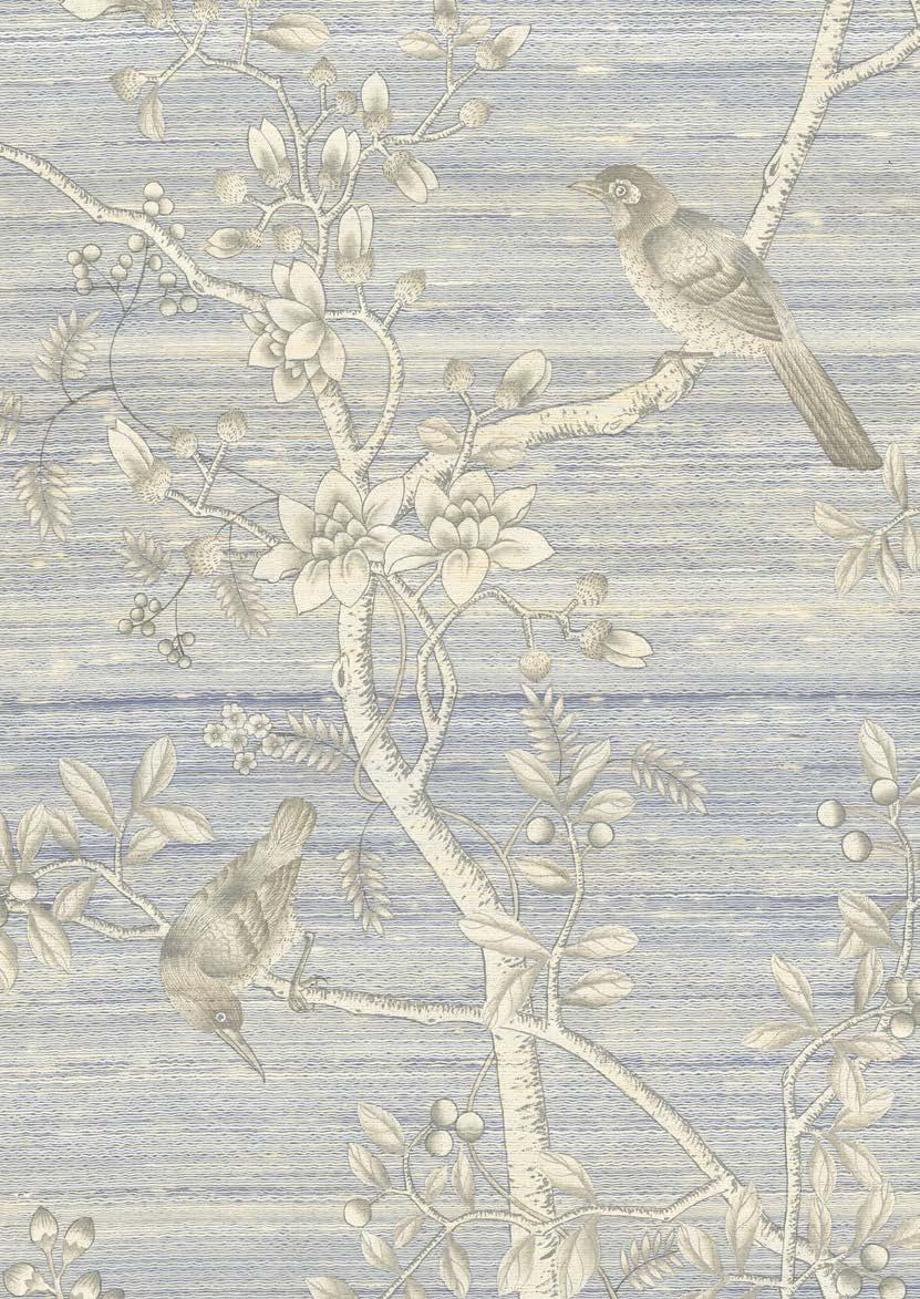
Reimagined on textural silk grounds in a confectionery palette of colours, our ever-popular Nonsuch Chinoiserie captures the elegant simplicity of New England style—light and airy.

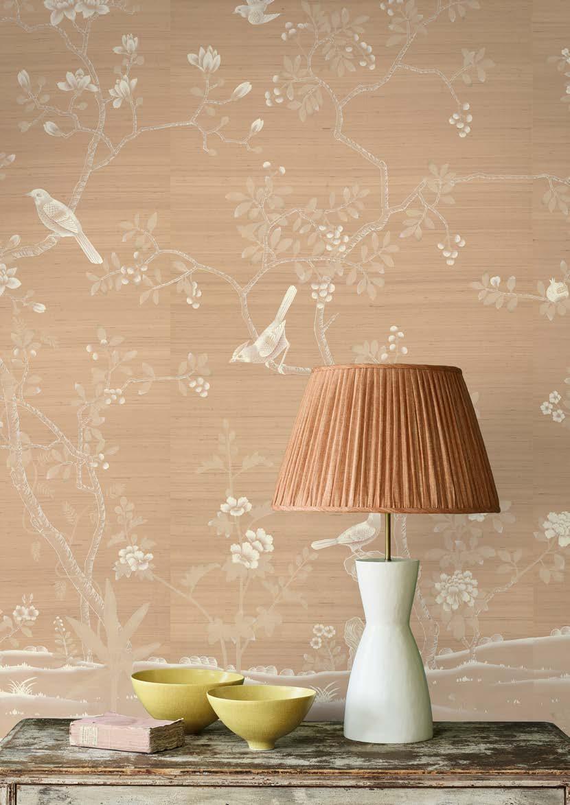
NONSUCH IN CIRCE
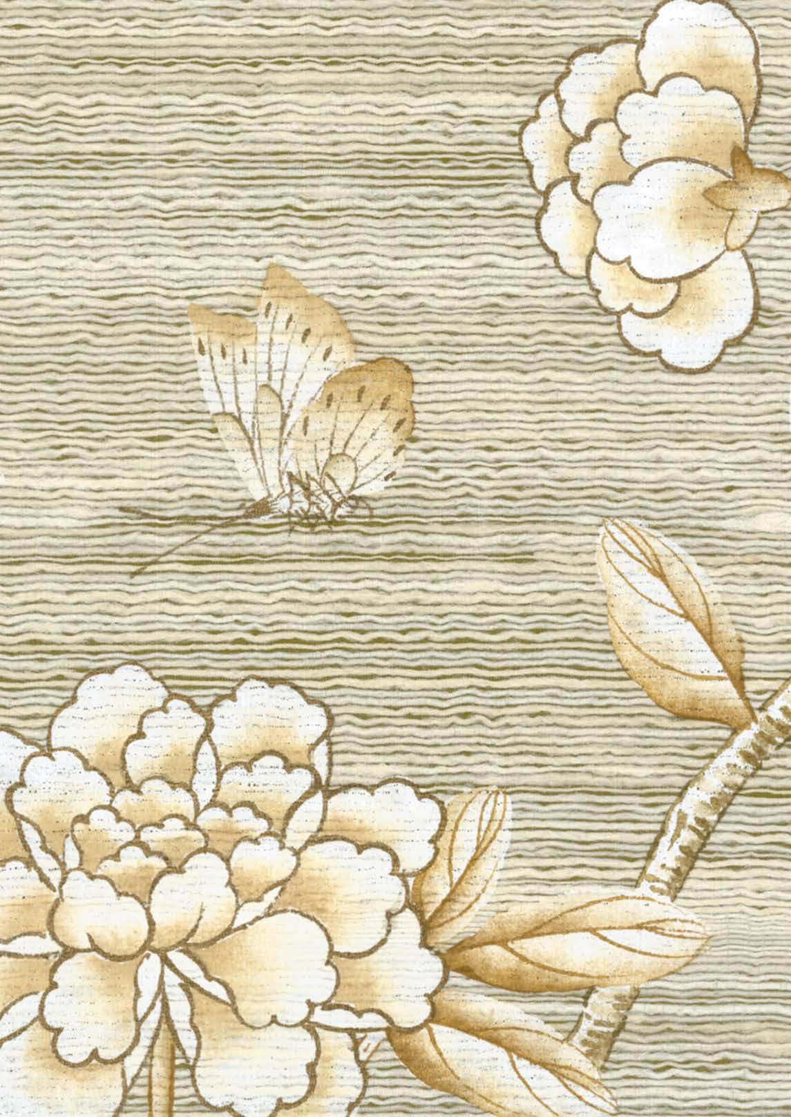
A restful and feminine colourway, Circe is set on a dusky pink dupion silk ground. Hand-painted in creams and taupes, the peonies, birds and butterflies are delicately outlined in warm platinum. Available with embroidery, Circe is a serene reinterpretation of our archived Cami colourway.


PRUNUS
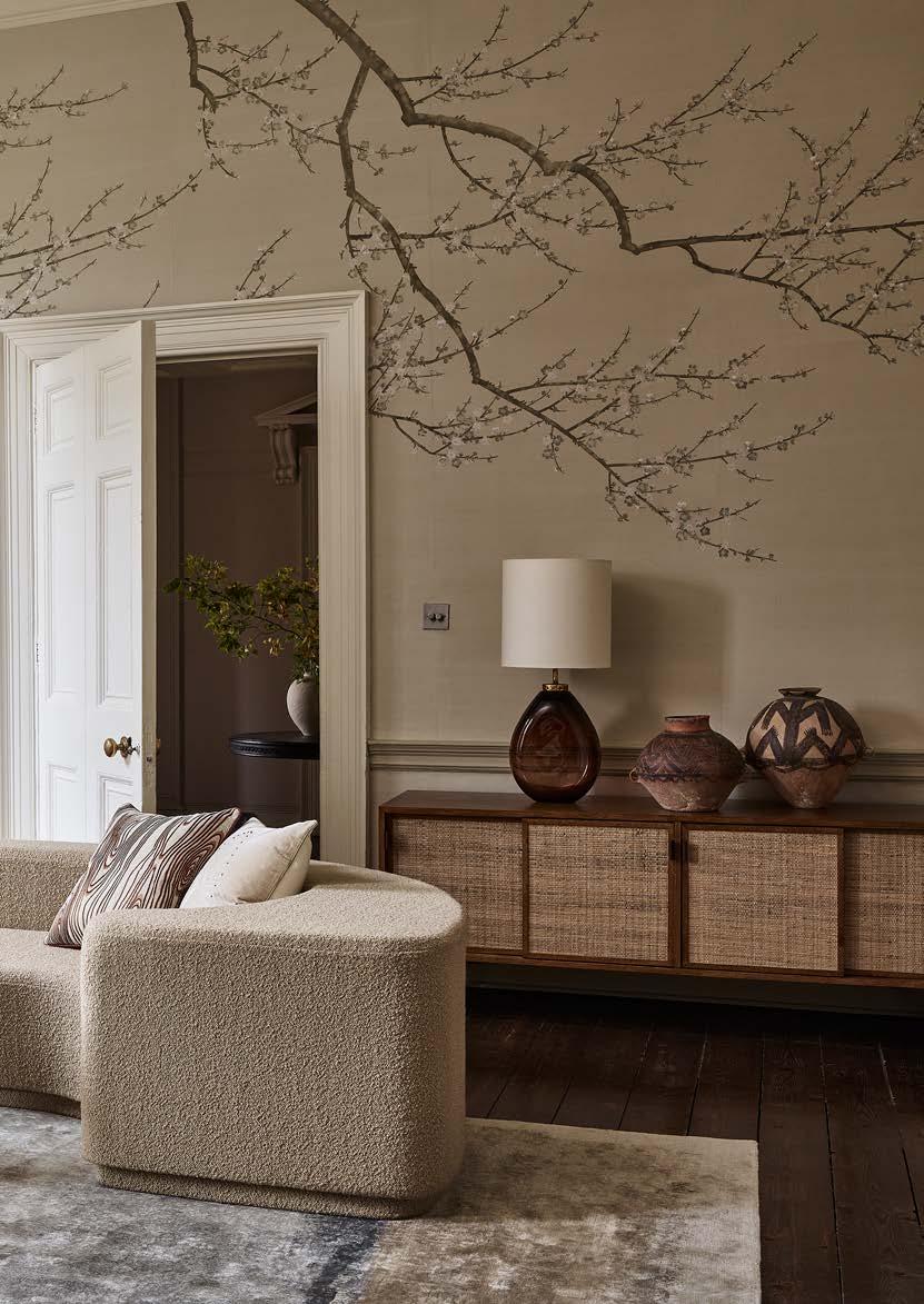
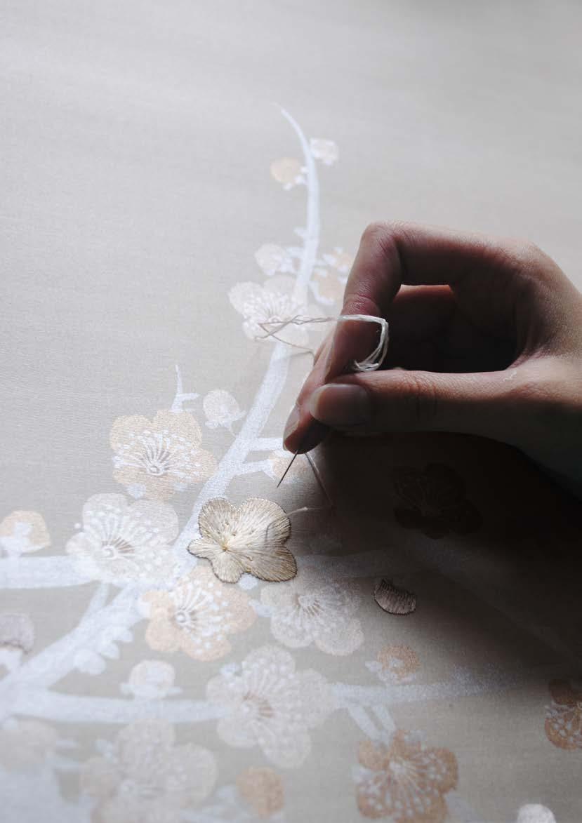
A perennial favourite, Prunus draws on the rich history of traditional plum blossom painting. A combination of our ‘unconscious’ painting style—which uses graceful, gestural brushstrokes—and the dazzling lustre of the handembroidered silk thread gives it an otherworldly beauty. Now available in two new colourways; Saroma and Taihu.
HERITAGE TECHNIQUES, CONTEMPORARY EXPRESSION

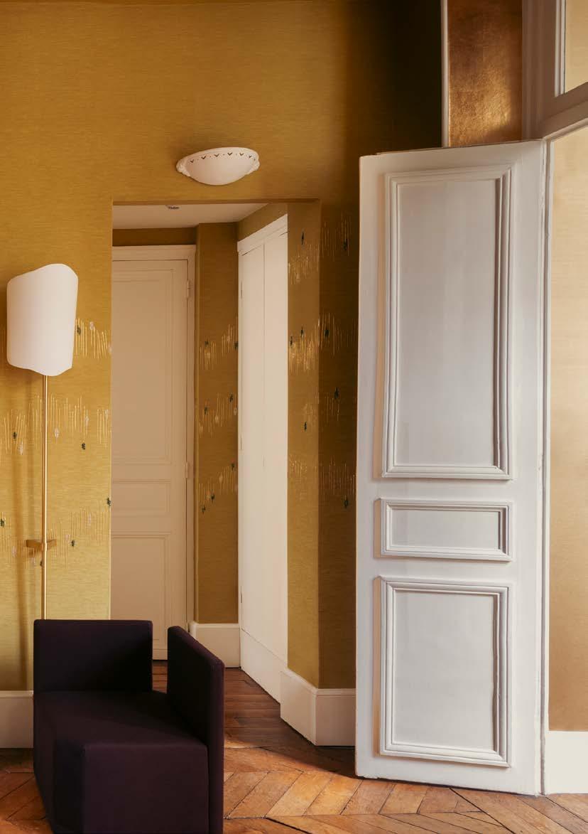
MISHIMA
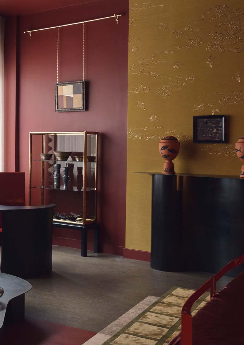
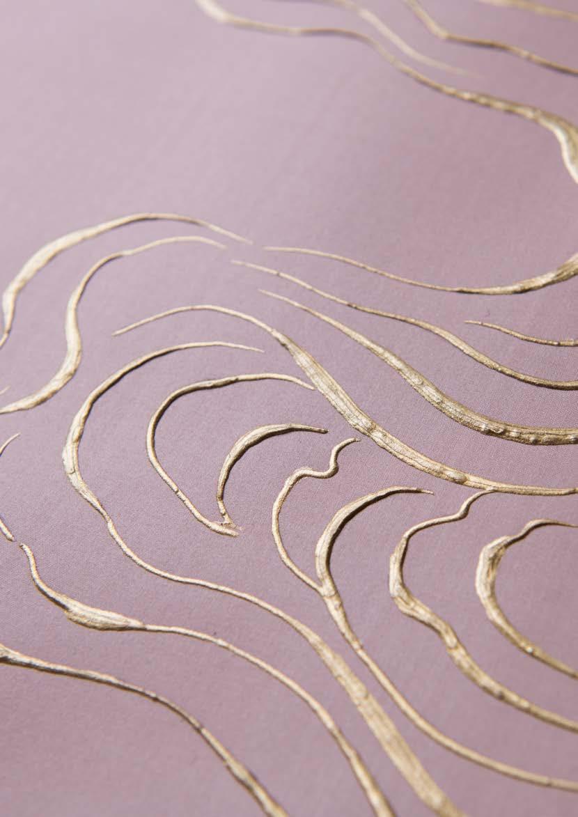
Named after one of Co-founder Lizzie Deshayes’ favourite novelists from her youth, Mishima began as a photocopied Japanese stencil, hidden in a forgotten sketchbook. Now rediscovered, its delicate sparrows and drifting clouds form the golden reliefs that define our wallcovering’s design.
FAISANS
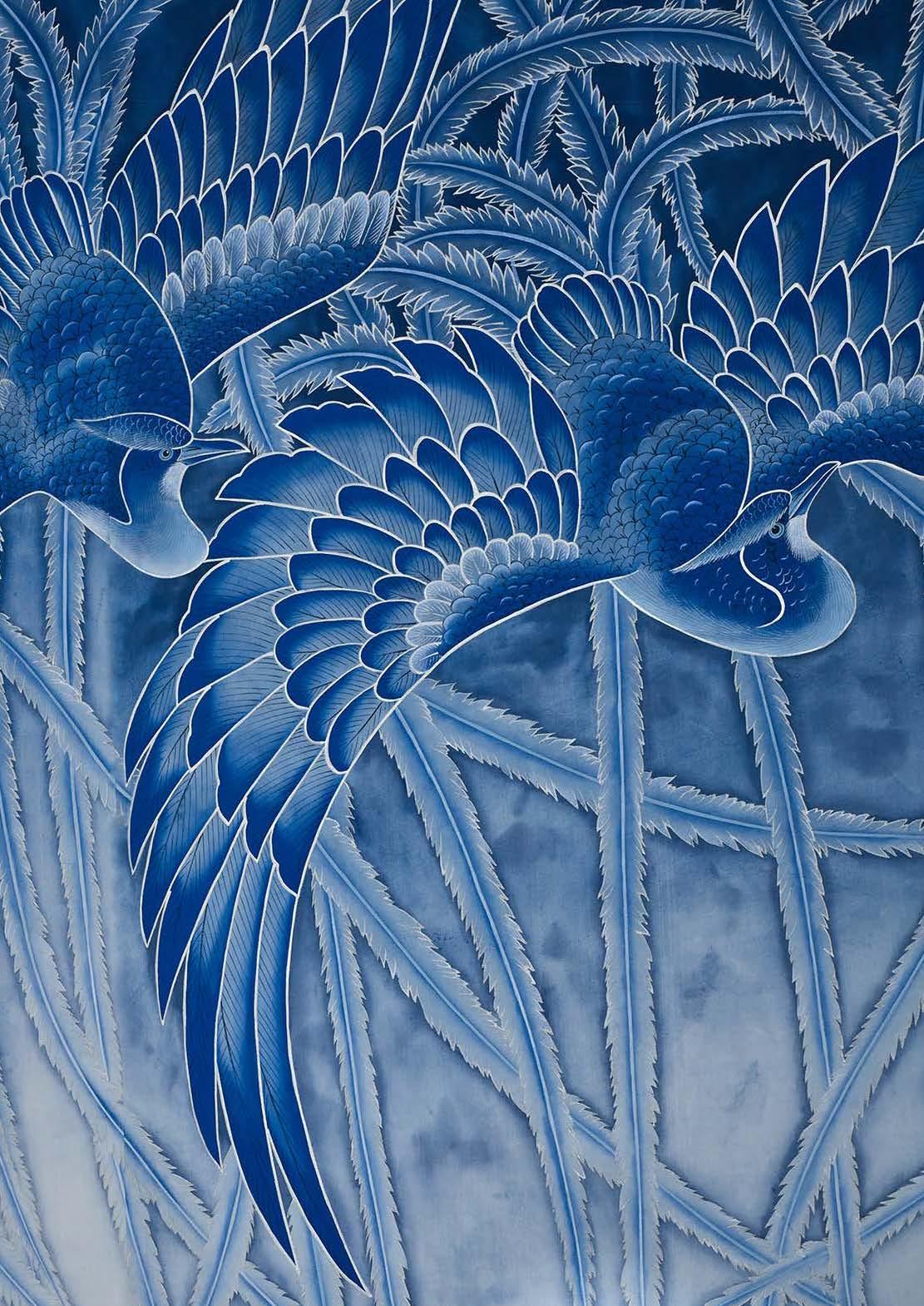
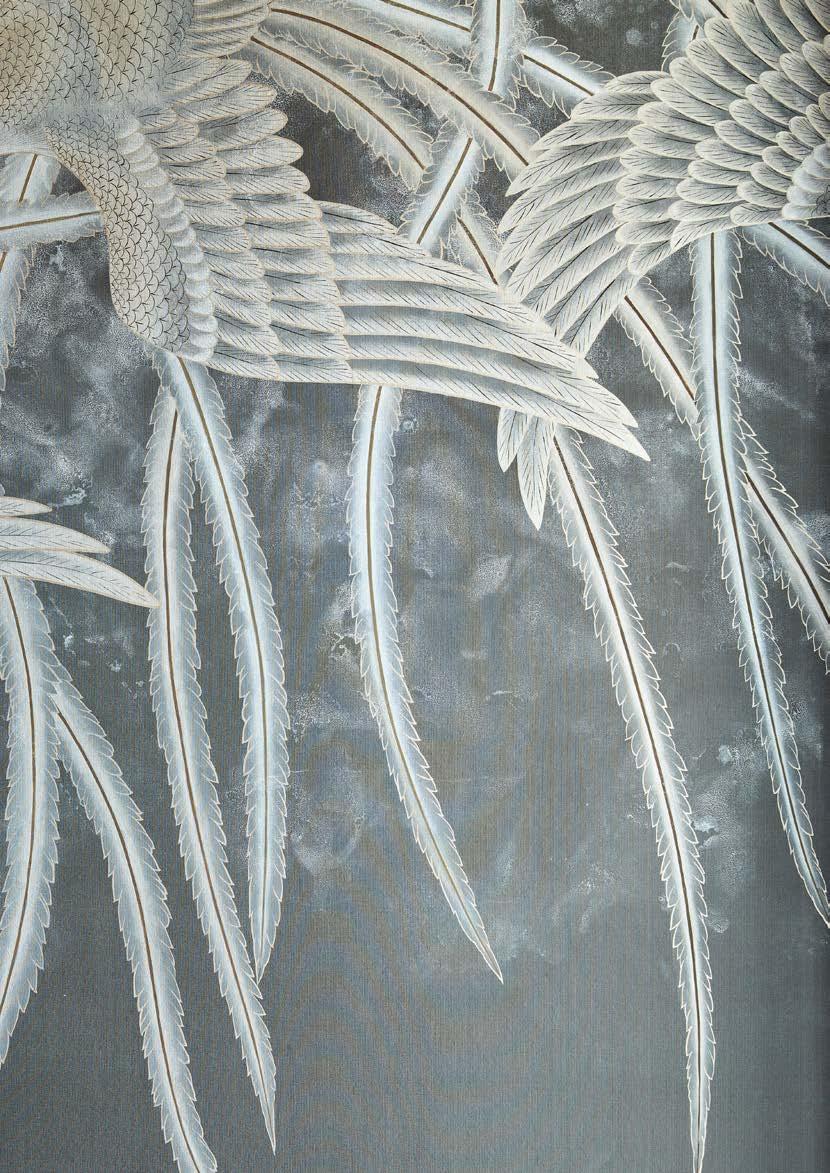
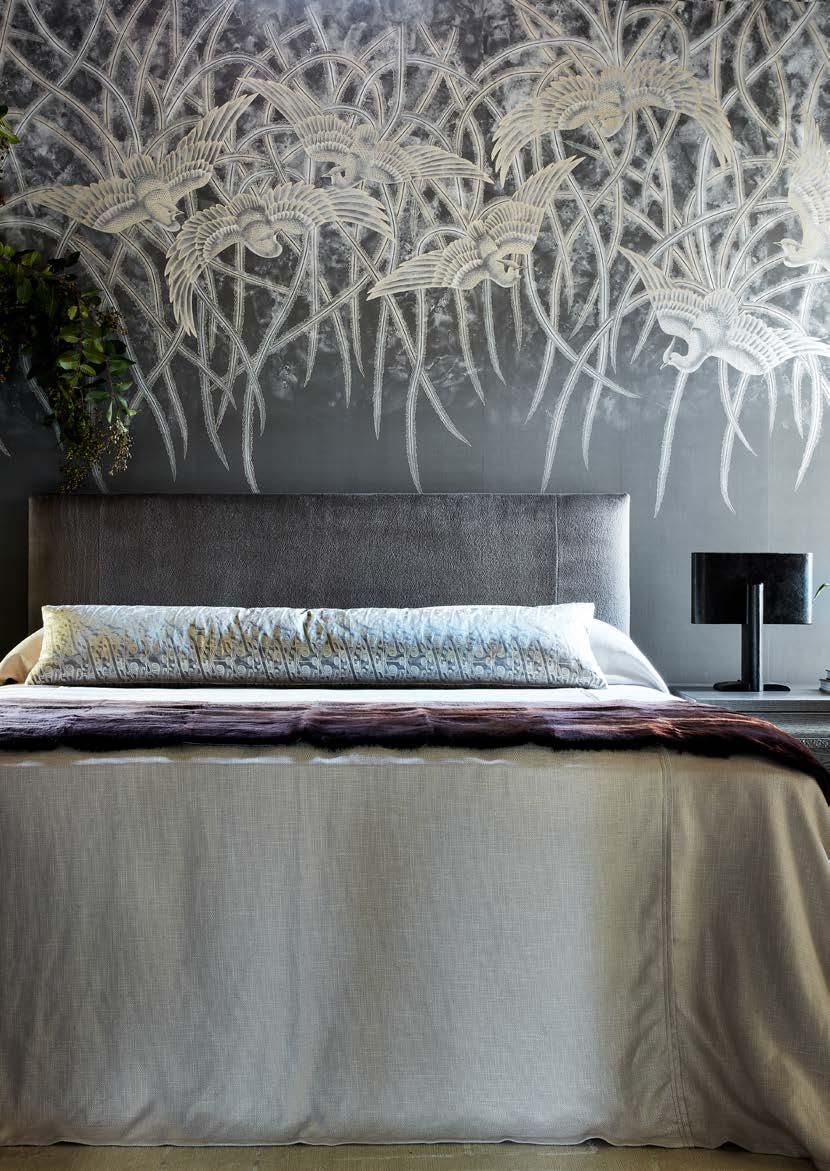
We’ve long been admirers of the work of French jeweller and master glassmaker René Lalique, whose striking creations helped define the Art Nouveau aesthetic at the turn of the 20th century. Inspired by his frosted and stained-glass vases, Faisans explores the interplay between naturalistic precision and stylised ornamentation.
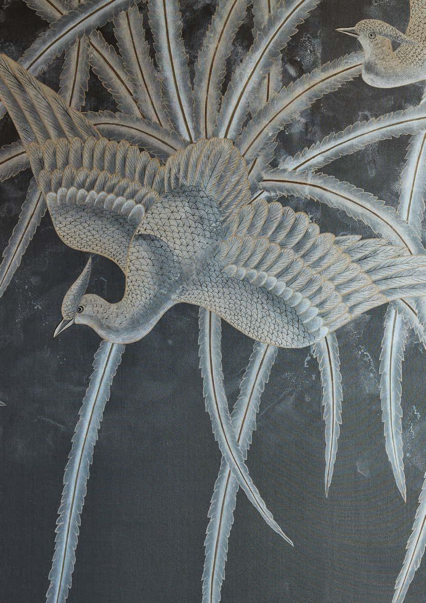
Pheasants dance elaborately across the design, their long tail plumes cascading. Monochrome palettes and creative application of the ombré effect bring to mind Lalique’s fine glassware with its exquisite frosting and staining.

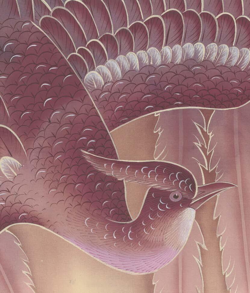
Bordeaux captures the rich complexity of aged burgundy against a luminous silk ground. Deep crimson tones evoke an atmosphere of sophisticated warmth, while the lustrous ground adds subtle radiance that shifts beautifully with light. Bold yet refined — like a fine wine.
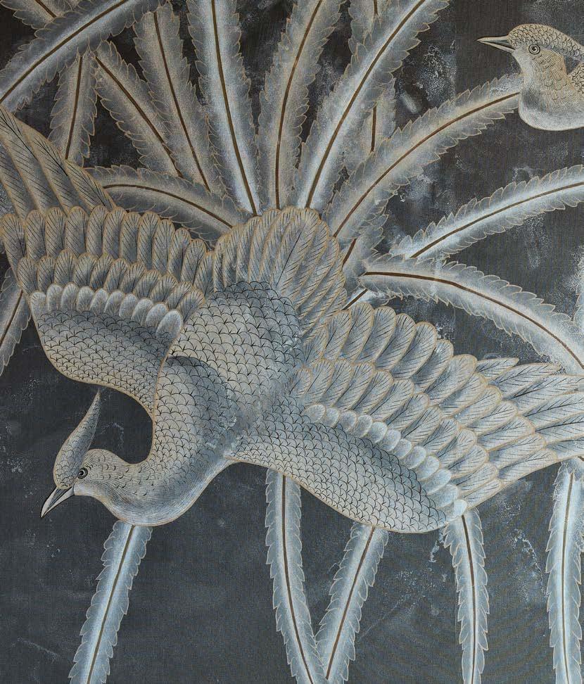
Hand-painted onto our Graphite Silk, Charbon’s whites and golds have a misty, chalky quality, imbuing the colourway with ethereal beauty.
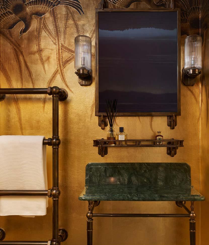
The only printed colourway in our Faisans collection, Doré has a fabulously glamorous, Art Deco quality. Its gilded paper ground is hand-finished with crisp foiled details and glazing.
