INTRODUCTION
This is a question that we, as IRIS by Argon & Co, get asked regularly by our clients when looking at their Demand Planning processes: what is the forecast accuracy I should aim for, given my own industrial context? The immediate answer is to consider the perfect forecast, with 100% accuracy, fully aligned with the actual demand. This target is obviously unrealistic: as the world around us is not fully predictable, the actual sales time series will always have a noisy and unpredictable component; hence the forecast accuracy shows a glass ceiling effect, which can be much lower than 100%. So, as a Demand Planner or Data scientist evaluating forecasting models, how do you set your Forecast Accuracy objectives? How do you know when your forecast can be considered good enough ? Is forecast accuracy even the right metric to evaluate?
1. Defining the forecast accuracy metric

Conceptually, forecast accuracy is a simple KPI whose objective is to measure the difference in % between the forecast quantity and the actual sales, to measure the quality of the forecast itself: how close was it to the reality? Let’s start by reminding ourselves of one possible forecast accuracy metric for an ensemble of products and during a defined period, based on Weighted Average Percentage of Errors (WAPE) metric:

From the formula above, we can make the following observations:
• The error metric WAPE is particularly relevant when considering together many products that can apart by several orders of magnitude in terms of Sales quantity. This is useful when looking at the “big picture”, mixing your high-runners and long-tail products in the same analysis, where you want to give more weight to your high-runners in the final accuracy. Alternatively, using the MAPE metric would apply a simple arithmetic average on all products. When looking at a single product, MAPE = WAPE.
• The Forecast accuracy needs to be evaluated for a given Lag, defined by the time difference between when the forecast was made and the realization of Sales. For instance, the forecast made in January for the sales happening in March is at lag 2 months.
• The forecast and actual sales need to be at the same granularity along the products, geography and time axis. We omitted the geography dimension (which can be stores, country, Region…) in the formula above for simplicity, however the products summarization actually corresponds to a {Products, Geography} tuple, often called a forecasting node or Demand Forecasting Unit (DFU)
Choosing the right definition of forecast accuracy will depend on your own unique criteria and comes down to this question: How will you analyze this KPI? What kind of decisions will you derive from it?
2. Setting the bar
After setting the definition of the accuracy KPI, defining a corresponding target for it is not so easy of a task. We can highlight a few approaches to be considered.
2.1 External benchmarks
The first approach is to leverage external or industry benchmarks. There is a reasoning that, for a given industry where several companies have more or less the same expectations from the sales forecast to drive their supply chain processes and are subject to the same externalities, the forecast performance could be compared between these competitors.
In reality, such a comparison proves to be unpractical. Building a sample of similar companies has its own caveats: the products and target markets will always vary slightly between companies, the distribution network and its lead times will be different, the advertising and promotions effort will differ as well, etc. All of these will impact the demand and its predictability, so you cannot expect the same accuracy from one company to another.
Even if you could narrow it down to a couple of competitors similar enough to your own organization, you would need to precisely know the forecast accuracy KPI value and its definition. We often find that different companies measure accuracy differently, so you would need to align calculation methods between competitors. Defining forecast accuracy often means to know:
• What is the forecast error driving the metric: is it the WAPE, MAPE, RMSE?
• How are considered errors greater than 100%? Is the accuracy capped at 0% or can it turn out be negative?
• What is the lag at which the accuracy is evaluated?
• What is the time period considered?
• What is the DFU granularity of the forecast evaluated? By {Product, Store}, {Product, Country}, other?
• What is the frequency of the forecast? Daily, Weekly, Monthly?
You would need to quantitatively answer all the questions above in the context of each competitor, and then align your own accuracy KPI to enable a comparison. Practically, this would require having full access to your competitors’ sales and forecast data and update it regularly.

2.2 Internal benchmarks
A more pragmatic approach, where you control all the source data and definition, would be to compare forecasting nodes (DFUs)1 against each other. Typically, the method involves:

• First, clustering together DFUs with similar behaviors
• Then, analyzing the dispersion of Forecast Accuracy for each cluster and set the forecast accuracy target for the cluster as the current Mean accuracy value
• Finally, all the DFUs that fall below the target should be improved. If the accuracy is later increased on these below-average DFUs, the target for the entire cluster will increase
This approach has the advantage of setting up a continuous improvement logic. However, the target is only as good and realistic as the cluster definition. Ideally, DFUs should be clustered based on all the facts that have an influence on their sales profile: market characteristics, variability, volume, clients order frequency, externalities… Practically speaking, we often define the target based on ABC/XYZ clusters, where :
• The ABC class is a Pareto of products based on Sales quantity (volume), with A as the high-runners and C as the long-tail
• The XYZ class is a Pareto of products based on Sales variability, with X as the most stable products and Z the most erratic ones. Variability is measured as

1 The comparison could also be made at Product level for simplicity
Here is a real-life example of the ABC/XYZ matrix, at lag 1 week (for a weekly forecast):
2.3 Upstream expectations
To set a reasonable target for the forecast accuracy, we should also ask ourselves the question: what is the risk associated with a bad forecast?
Sales forecasts drive several upstream supply chain processes: distribution requirements planning, production planning, procurement and purchasing. Each of these has a different sensibility to errors in forecast, considering they use the forecast figures at different lags, and under different aggregations.
Let’s consider the distribution requirement planning: a lower forecast accuracy will have to be compensated by higher safety stocks in the various storage locations. Hence, the target forecast accuracy to be considered as good enough could theoretically be defined as the accuracy that requires a safety stock in line with the company stock policy and budget.
For production planning, a lower forecast accuracy translates to impacts on buffer stocks, increased safety margins on lead-times and a link to batch sizes. Hence, as we go higher upstream, the impacts of forecasting error become intertwined with many factors and modelling it proves to be particularly complex and unrealistic to be setup in practice.
2.4 Irreducible error
Sales data, as a time series, can theoretically be decomposed in its additive (or multiplicative) components, as shown in the figure below2 . If you successfully remove trend and seasonality from the observed actual values, you’re left with the noise, or residual component, which is random and therefore unpredictable.

Techniques to de-seasonalize or remove the trend for a time series include:
- De-trending by differencing (essentially computing the variation between consecutive timesteps)
- De-trending by model fitting (fitting a linear model)
- Seasonality adjustment by differencing (looking at the difference between timesteps that are separated by the seasonal period, for instance 1 year)
- Seasonality adjustment by model fitting (with a polynomial curve)
2 Source : This figure can be obtained by using ‘statsmodels’ package in Python, with the function ‘seasonal_decompose’ under ‘statsmodels.tsa.seasonal’ module. The dataset used here is the airline passenger dataset, presented in section 3.2 of this article
The residuals (the noise) enable to measure the irreducible forecast error: by reversing the calculation, you’re able to measure the accuracy of the model built on the Trend + Seasonality components only; and consider the error made could not be avoided. You are therefore fixing the target accuracy at the level of performance a basic model considering 1 single trend and 1 single seasonality could achieve. As a consequence, we are now limited by how good our method of de-trending and de-seasonalizing is; and kind of chasing our own tail here, in the pursuit of setting a forecast accuracy target for more advanced models. Nevertheless, this method of benchmarking against a simple statistical model (such as moving average, naïve seasonal or seasonal moving average) is one of the most pragmatic data-driven approach so far.
So, how should you set the bar for a forecast accuracy to be considered as good? Probably by using a combination of these methods, adapting them to your own supply chain and industry context.
3. The limitations of forecast accuracy
3.1 Bias vs. Accuracy
If the accuracy measure how far the forecasts are from the actual sales in absolute value, it does not reflect systematic over or underforecasting, also referred to as Bias:
Over several time periods, you could theoretically find cases where the accuracy is close to 100%; but all the errors are made by over-forecasting the actual value. Alternatively, you could have a bias equal to 0% while the accuracy is quite poor, when the errors compensate on the long run. Here is a real-life example below, where we compare the performance of two models (may to nov. 2022 period, weekly data):

While model A has a higher accuracy, it also tends to over-forecast more than model B. Faced with a choice with these two models, one must consider the utility of the forecast: is it preferable to choose model B; which tries to predict the sales peaks (corresponding to promotional events, NDLR) but not exactly at the correct time? Or model A, which shows a flatter profile, averaging out the peaks and troughs?
When driving a supply-chain, model A forecast will translate to higher stocks and obsolescence risks, since over-forecasting bias directly translates to over-production and overstocks. The benefit of a few points of added accuracy and the safety stock reduction that comes with it is not enough to compensate for a doubling of the bias in this case.
This example well illustrates the need to consider both accuracy and bias when comparing models.

3.1 Accuracy vs. Predictability
A good forecast accuracy could just be the result of luck. Sure, on a long enough period of time, your luck will eventually run out, and forecast accuracy metric will begin to reflect it. However, when you are comparing two forecasting models together, both showing comparable levels of accuracy and even bias (within a few percentage points of difference), should you always prefer the model with the higher accuracy?
To illustrate this, let’s take as an example the airline passenger dataset, showing the number of passengers per month between 1949 and 1960 :

At first glance, this time series looks quite predictable, with a clear upward trend year after year and a repeating yearly pattern. It’s worth noting that this is rarely the case when looking at real-life sales time series on an individual DFU, but this example is useful to illustrate our point.
Let’s now try to apply 3 different statistical forecasting models and back-test their performance:

• Model 1: Naïve forecast, also called Random Walk. Forecast is equal to the last known actual value
• Model 2: Naïve forecast with 12 months seasonality. Forecast is equal to the value of the same month last year
• Model 3: Seasonal exponential smoothing (Holt-Winters model), with additive trend and seasonality parameters
Forecast Accuracy is measured at lag 1 month on the entire period, since January 1951
We can observe that, although the Naïve model (1) is as simple as it gets, it performs better than the Naïve Seasonal (2), both in forecast accuracy and bias. This is because the Naïve model is very reactive : the next forecast being the last value observed, and since consecutive months have values that are not that far apart except during the high growth / decline periods, the Naïve forecast is actually not far off from the actual value. However, the Naïve model is not really predicting anything. Meanwhile, the Naïve Seasonal (2) model is really trying to predict the seasonality, but completely misses the growing trend (by construction), hence the greater error and under-forecasting bias.
The clear winner is model 3, which can correctly predict the trend and seasonality, which reflects in a near-perfect accuracy and bias score.
Now, if you had only the first 2 model to choose from, should you really stick with the high-accuracy one? Visually speaking, from the graphs above, we would be more inclined to trust the second model (2). But we are clearly missing a KPI to measure how much the model is predicting versus reacting to the recent events.

A possible metric for this purpose is the coefficient of correlation R2 between the two series of variations measurements:
This R2 coefficient will measure how correlated the variations are. In other words, if the actual sales go up quickly (high positive actuals variation), a highly correlated forecast would produce a similar actuals variation figure. This would mean that the forecast correctly predicted the sharp increase.
This is best explained visually in correlation plots, where 1 dot corresponds to 1 datapoint on the time series.
From the correlation plots above, it becomes clear that the Naïve model (1) is not predicting anything, with no correlation between the forecasted variation and the actual variation. On the other hand, there is a strong correlation for Naïve seasonal (2) and SES (3). Again, this R2 KPI is not enough on its own and needs to be studied in conjunction with the accuracy and bias.

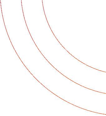
It is worth noting that this R2 KPI is mostly useful to compare forecasting models on short-term lags. Indeed, as the lag become higher, models that are purely reactive will show a rapidly decreasing accuracy, as illustrated below on the same airline passengers dataset:

4. Conclusion
Since we now understand the limitations of Forecast Accuracy KPI on its own, and the criteria to consider a forecast good enough, the action plan for Demand Planners, Supply Chain managers or Data Scientists in charge of evaluation a forecasting model should be to:
• Define: set the proper accuracy metric, adapted to your context: choice of lag(s), granularity, error metric
• Measure: implement a dashboard to compute the full set of KPIs necessary for forecast performance evaluation: accuracy, bias, R2; but also forecast stability, forecast confidence interval, and others
• Control: set a target for the leading accuracy KPI; using a combination of internal / external benchmarks if possible, or even quantitative methods as a second step
• Test & learn: The same dashboard should allow you to compare several models and drill-down on particular products, geographies or DFUs, in order to fully understand their behaviors, in which situation they are most adapted and their inherent limitations
IRIS by Argon & Co has developed Horizon in that spirit. Horizon is a plug & play dashboard working on a standardized demand planning data model, as a quick an exhaustive way of analyzing forecast performance for clients; and often serving as a starting point for their own in-production demand planning dashboards.