BRAND IDENTITY GUIDE


The name of our company has a tremendous impact on how customers and investors view us. It is very important that we be consistent in how we display our name. All employees and customers using our name are required to use the guidelines listed below. If in doubt, contact the Marketing Department.
• 1st use – “ Blum Construction Company ” or “ Blum Construction”
• Subsequent uses – “Blum” but NOT as 1st usage
• No longer use “Frank Blum Construction”, “Frank Blum” or “Frank L. Blum” unless approved by the Marketing Department.
Our brand logo set is bold and impactful. It’s geometric letterforms have a strong and clean look that fits our category. Our wordmark features a unique and custom “B” letterform that also contains a subtle “C” for “construction” that allows our name and brand to stand out in an interesting way.
PRIMARY LOGO
BADGE LOGO
WORDMARK
Contact kristie.touchstone@flblum.com with any questions, concerns or requests for approval related to the brand.
SECONDARY LOGO
• Proposals
• Official letterhead
• Apparel
• Electronic Documents
• Job Signs
• Client Gifts
• Apparel - screenprint only, with proof approval (no embroidery)
• Proposals, presentations
• Signage
• Proposals, presentations
• For use when space is limited (such as a program)
• Internal documents
• Apparel - with proof approval
• Do not use in place of primary logo
• Apparel - with proof approval
• Graphic Element in Electronic Document, presentations
• Swag - with marketing approval
Contact kristie.touchstone@flblum.com with any questions, concerns or requests for approval related to the brand.
CLEARSPACE
The minimum clear space around the logo is proportionately equal to the size of the “N”, regardless of the size of the logo.
MINIMUM SIZE 1.0”
MINIMUM SIZE 1.75”
The minimum clear space around the logo is proportionately equal to the width of the “B”, regardless of the size of the logo.
The minimum clear space around the logo is proportionately equal to the width of the edge of the “B”, regardless of the size of the logo.
Our brand mark includes a custom B icon that also contains a hidden C. Together, the bold B and C create a unique, ownable mark for Blum Construction. The B icon can be used as a stand alone icon or graphic element.
Opacity, percentages or tints of the colors in the palette are allowed.
MINIMUM SIZE 1.25”
MINIMUM SIZE 1.0”
MINIMUM SIZE 1.25”
MINIMUM SIZE .625”

The examples to the right show a few logo usages and a few usages that should be avoided. These rules apply to all versions of the logo lockup.
• Only use approved logo files.
• Do not alter the logo in any way.
• Do not use unapproved colors.
• Do not set the logo against backgrounds that do not provide ample contrast.

DO place on approved background colors with sufficient contrast.
DO place on approved background colors with sufficient contrast.

DO place on approved images with sufficient contrast. DO place on approved images with sufficient contrast.


DON’T place on unapproved background colors without sufficient contrast.
DON’T place over busy imagery without sufficient contrast.
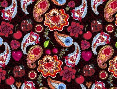
DON’T place on busy patterns or backgrounds without sufficient contrast.
DON’T place on unapproved colors without sufficient contrast.
The examples to the right show a number of logo treatments that should be avoided. These rules apply to all versions of the logo lockup.
• Only use approved logo files.
• Do not alter the logo in any way.
• Do not use unapproved colors.
• Do not set the logo against backgrounds that do not provide ample contrast.
DON’T change the color of any piece of an approved logo.
DON’T stretch, rotate, flip or distort the logo in any way.
DON’T change the proportions, reorder or remove any elements without approval.
DON’T change or rebuild the font within the logo.

Lorem ipsum dolorum apis reriae vella dor set emit daloit od quos musa ventorerfero occullorum quid etur? Anihillaces dit plitese liaturi re perchit dolorrovit.
DON’T add elements, patterns or graphics to the logo or outline any elements.
DON’T add unapproved visual or 3-D effects.
DON’T use low quality or low-resolution logos.
DON’T use the full logo in running copy.
BRAND IDENTITY GUIDE
Our primary typeface is named Flama
FLAMA BOLD
FLAMA BASIC
FLAMA LIGHT
Contact kristie.touchstone@flblum.com with any questions, concerns or requests for approval related to the brand.
BRAND IDENTITY GUIDE
Although Flama is always the preferred typeface to use in Blum materials, at times they will not be available or practical to use.
When working in Microsoft Office applications such as Word, Excel or PowerPoint, Franklin Gothic can be used as a replacement
FRANKLIN GOTHIC MEDIUM (BOLD CHARACTER STYLE)
ABCDEFGHIJKLMNOPQRSTUVWXYZ
abcdefghijklmnopqrstuvwxyz
0123456789–&$*%#@?!+=(.,:;)
FRANKLIN GOTHIC BOOK
ABCDEFGHIJKLMNOPQRSTUVWXYZ
abcdefghijklmnopqrstuvwxyz
0123456789–&$*%#@?!+=(.,:;)
Contact kristie.touchstone@flblum.com with any questions, concerns or requests for approval related to the brand.
These primary colors should appear first and most often in all marketing communications. They should be the dominant colors in any piece. In addition to being used in the brand logo, these colors can be used as background colors, graphics, type, etc.
For process-color reproduction, the CMYK conversions are shown that best match the Pantone® colors.
When spot-color printing is available, use the listed Pantone colors for greatest impact.
For web reproduction, the hexadecimal (hex) and RGB conversions are shown that best match the Pantone colors.
Percentages or tints of the colors in the palette are allowed. Tints can be especially useful in situations such as presentations, charts, graphics and projections.
