Fin Devereux Wells
Design Portfolio
Hello.
I’m Fin, a product design graduate from Nottingham Trent University. I’m an enthusiastic designer with sedulous work ethic, derived from consistent pro-activity and motivation.
A deep rooted artistic background fuels my ambition to design beautifully bespoke products widely accessible to a large spectrum of people.
Tel. 07788945149
Email. finwells01@gmail.com
https://linktr.ee/findevereuxwells

Education
Nottingham Trent | Product Design | 2019 - 2023
The John Fisher School | A-Level | 2016 - 2018
The London Oratory | GCSE | 2011 - 2016
Technical Skills
• Solidworks
• Vectorworks
• Photoshop
• Illustrator
• Keyshot
• Gravity Sketch
• Microsoft software
Feature & Shortlisting

Projects Sati 01 Jingyi 02 Multi-Form 03 Blakes London 04 01 0304 02
Sati
Brief
To design a flexible piece of furniture which aids slow living to improve mental health for those living fast paced lifestyles.
The design should appeal to consumers aged 22 – 35, seeking comfort and sophistication, with a keen eye for design. They should also possess receptive attitudes towards culture, change and experience, as well as being active individuals, engaged with new opportunities, with an understanding for their well being.
Today, many people are living fast paced lifestyles, unaware of the repercussions. Often overlooked, especially by those accustomed to it, are the bona fide implications of fast living, specificallyonthosesubjecttourbanisationdueto their albeit, inadvertent exposure to fast living.
In a fast paced, high-tech world, an analogue divertissement can prove invaluable to help decelerate, therefore, employing slow living practices is fundamental to encourage those living fast paced lifestyles to improve their mental health through behavioural change.
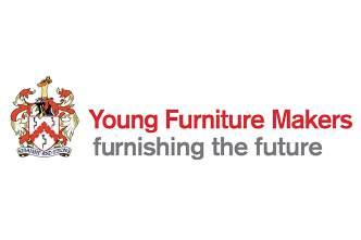
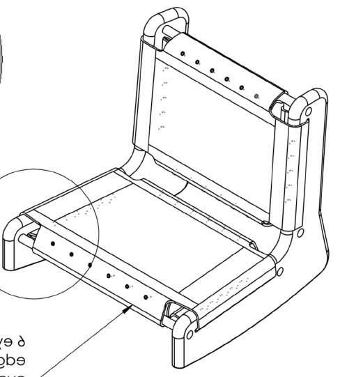
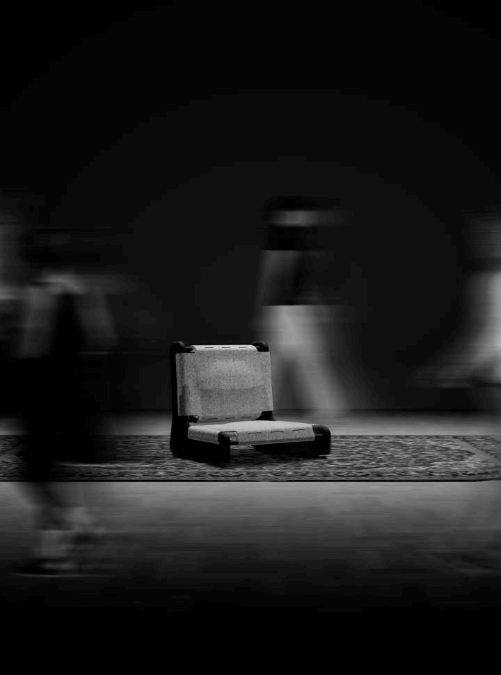
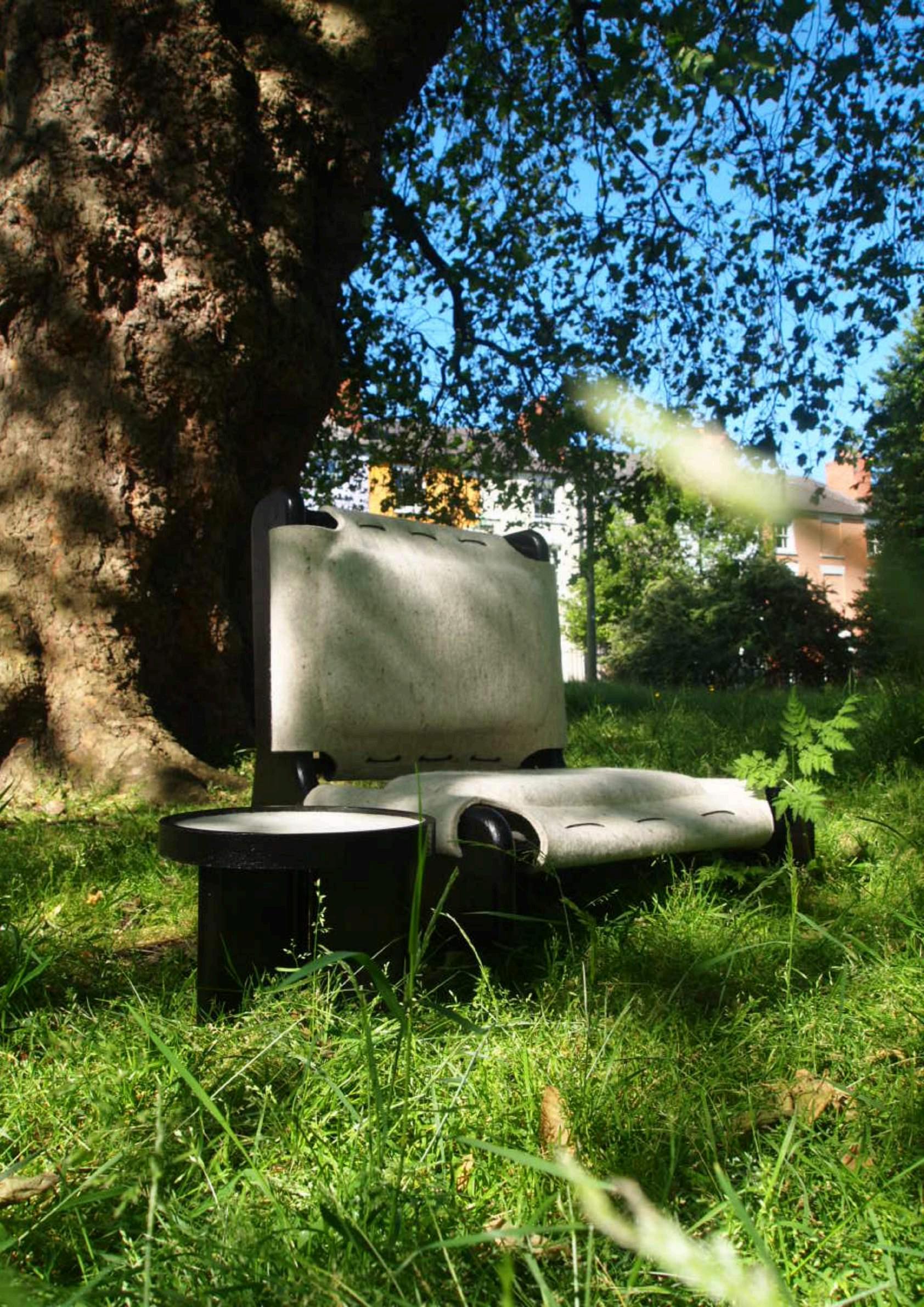
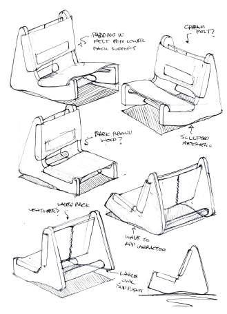
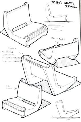
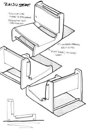
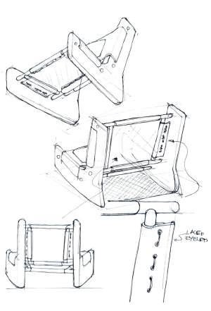
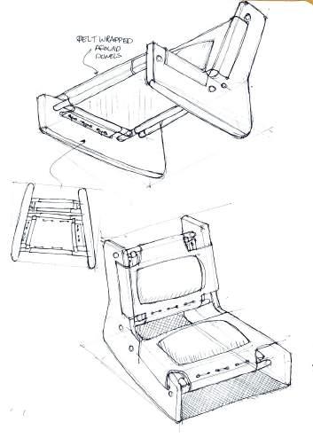
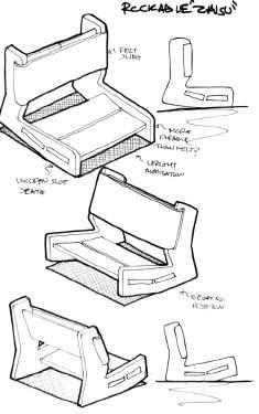
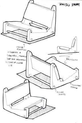
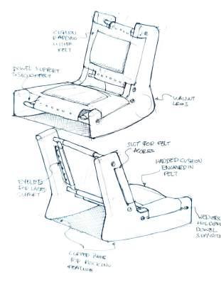
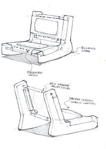
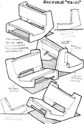
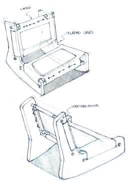
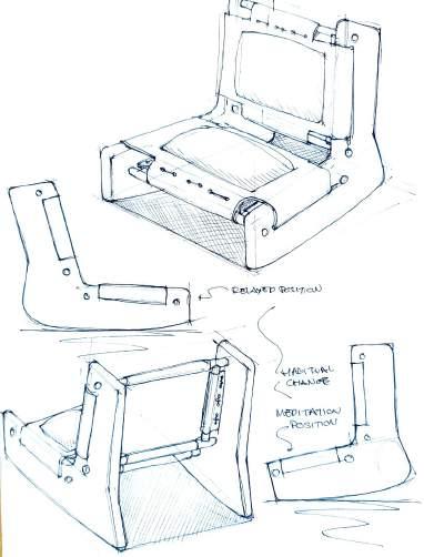
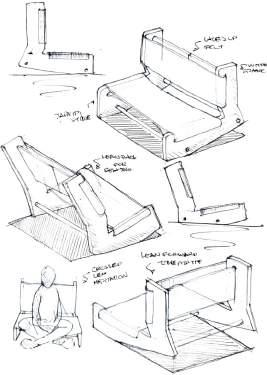
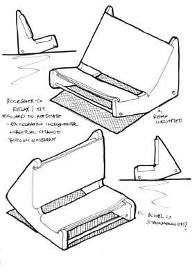
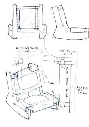
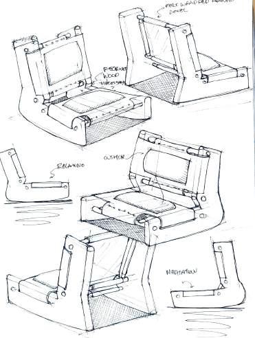
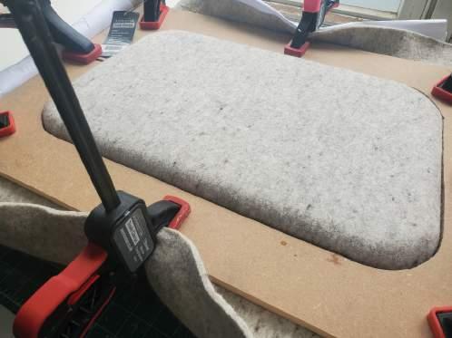
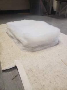
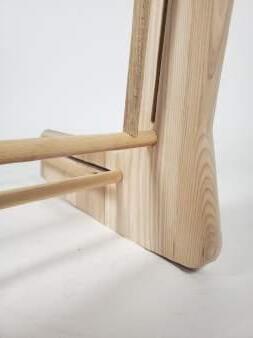
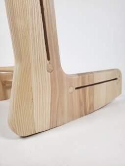
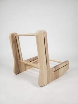
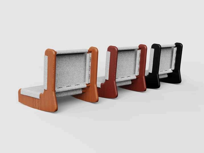
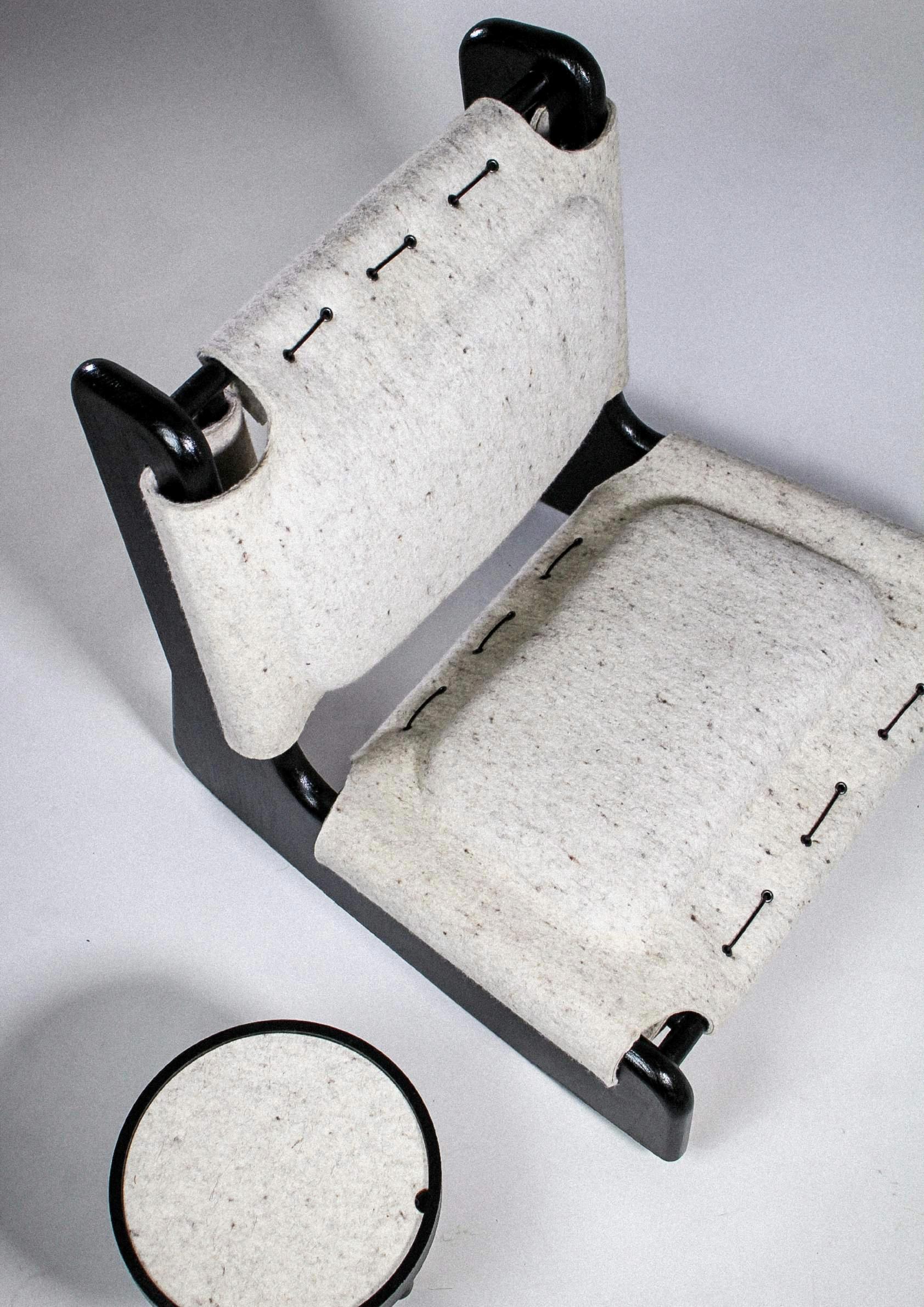
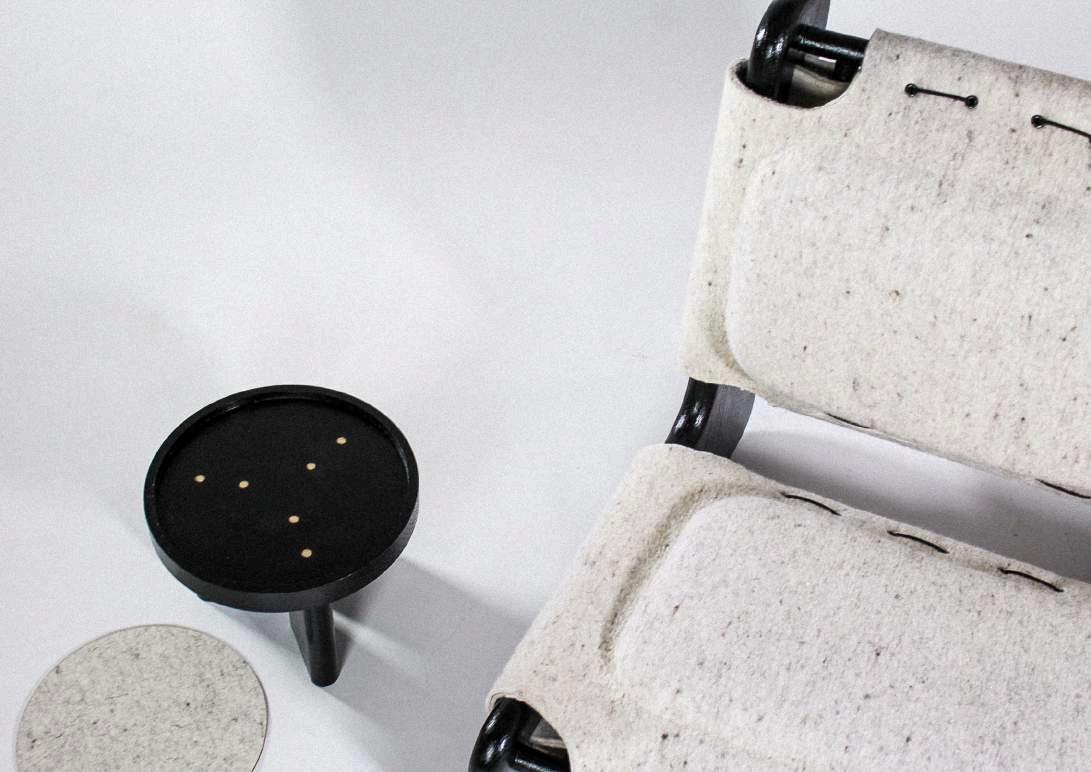
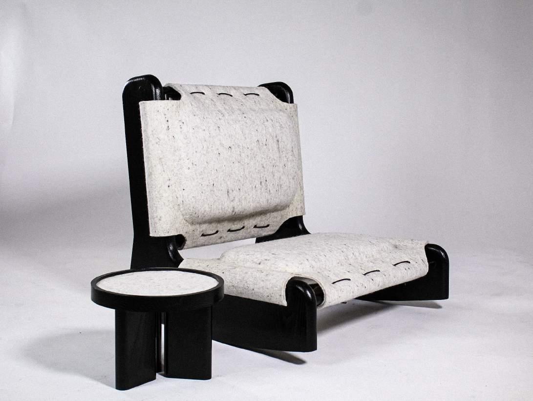
Sati, commonly translated as mindfulness in English, is a Japandi inspired floor chair. Having understood the difficulties of encouraging the practice of mindfulness, namely, meditation, Sati relies on behavioural change to instigate slow living. Constructed around a rocking motion, Sati allows users to gracefully lean back into soft felt into a relaxed position, as well as fluidly lean forward into an upright meditative position.
By virtue of its subjectivity and unpressured tranquillity, meditation provides an activity which permits individuals to indulge at a pace dictated by the individual. Being in control of their pace of life and therefore their mind will simultaneously improve mental health and overall outlook.
01
Ideation
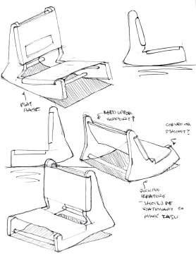
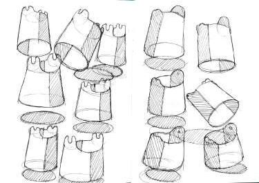
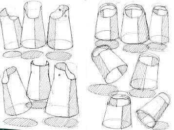
To encourage behavioural change, the design needed to provide an easy movement into the activity. Therefore, various ideation prevailed centred around a rocking motion to enable the user to effortlessly enter and exit a slower state.
A predetermined factor in its ideation was the idea of designing a floor chair in keeping with meditational practice and traditional Japanese Zaisu chairs, as well as the use of felt to inform the cosy Scandinavian aesthetic, essential to Japandi furniture.

Manufacture
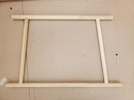
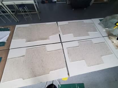
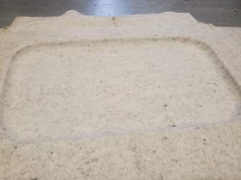
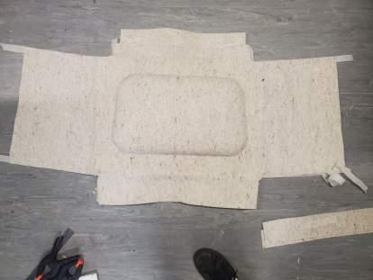
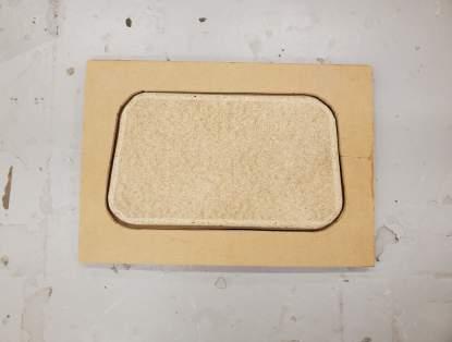
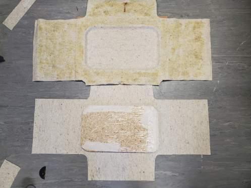
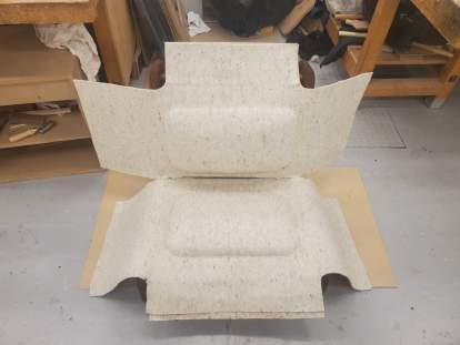
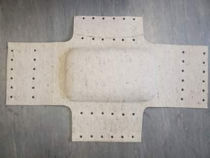
The manufacturing process involved two parts, woodwork and felt. To make the two legs, a CAD file was sent to the CNC and cut from 36mm white American Ash. The horizontal and vertical dowels were hand crafted and assembledwith10mmdowelpinsandPVAglue.
The felt upholstery was a new technique, rarely seen amongst contemporary furniture. Having never used felt before, understanding how to manipulate the material was imperative to gain the desired outcome. Speaking with professionals and testing prototypes enabled me to create a unique design, fitting for its desired Scandinavian aesthetic.
Jingyi Brief
Design a flexible piece of lighting to accommodate young professionals working from home, which provides a healthy solution to balancing work and leisure whilst situated at home.
The design should appeal to consumers aged 2540, seeking functionality and sophistication, while providing a unique experience, building a personal affair with the user by encouraging tactile engagement.
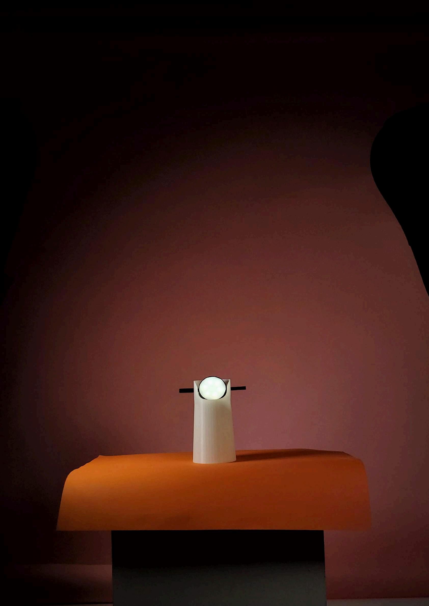
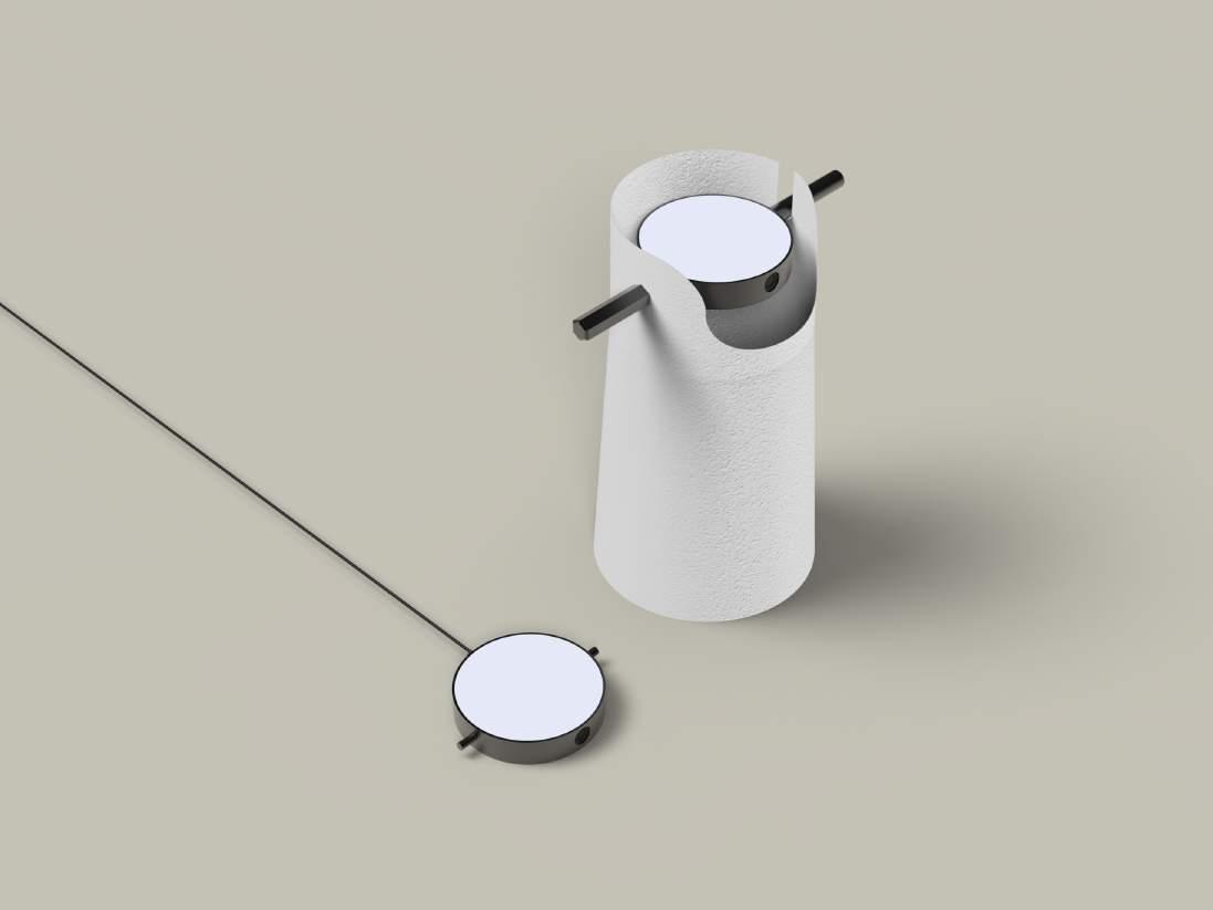
Pronounced ‘CHEENG EE’, Jingyi is a masculine and feminine name derived from China. It can mean gentleness, joy and happiness but more appropriately it means harmony; a word which symbolises my product wholly.
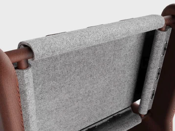
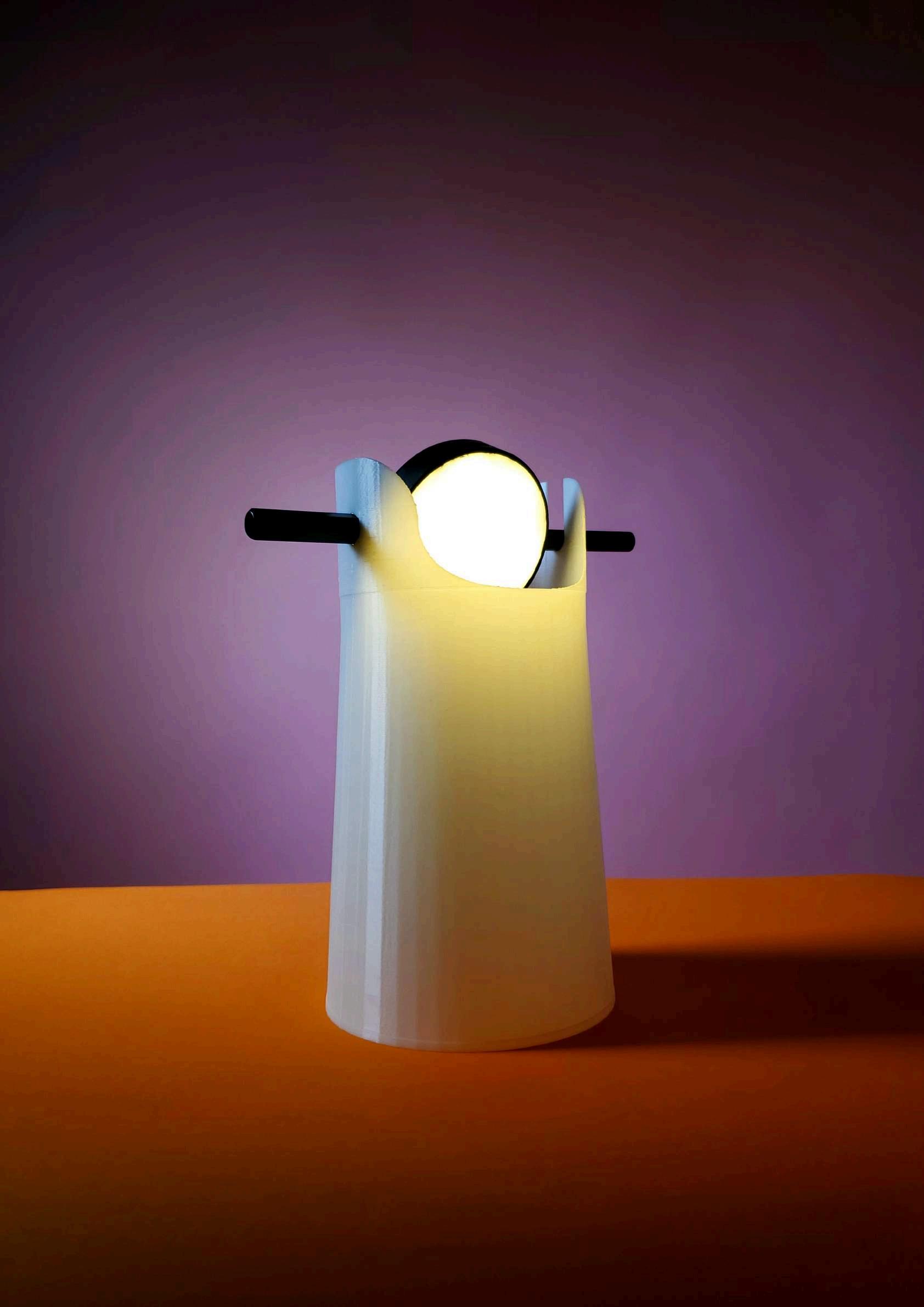
A table lamp designed for young professionals, aiming to strike a balance; harmony, between work and leisure, as well as encourage tactile engagement to shape personal connection.
Influenced by materials and user interaction Jingyi was born through ambition to provide people with a product which relies on regular physical engagement to create a bond between user and product.
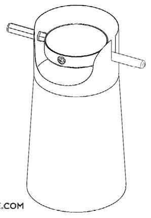
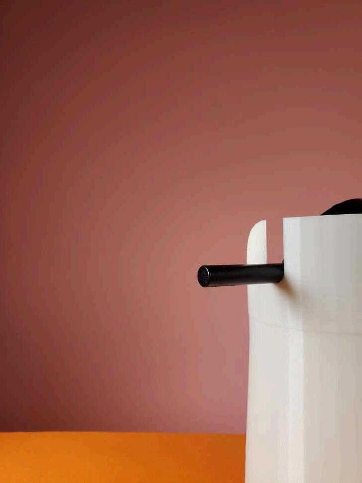
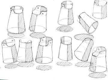
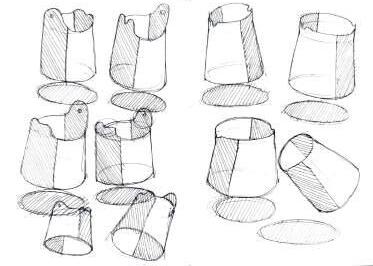
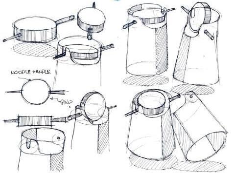
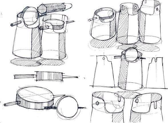
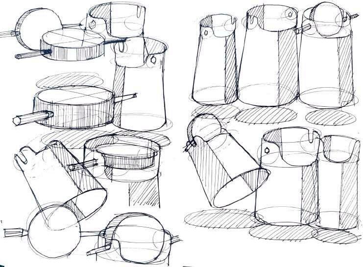
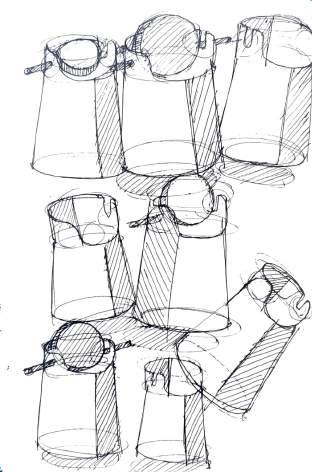
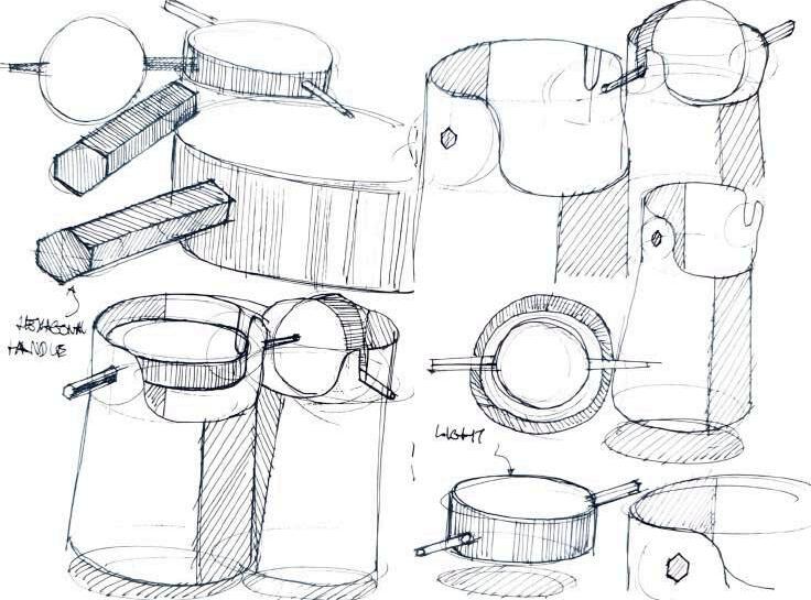
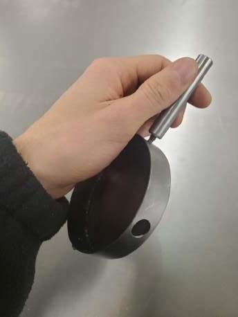
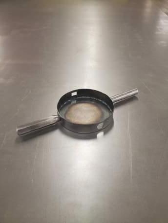
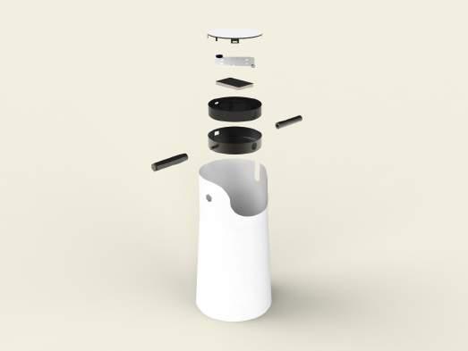
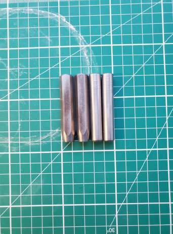
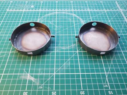
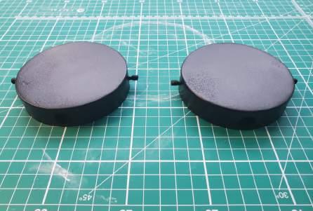
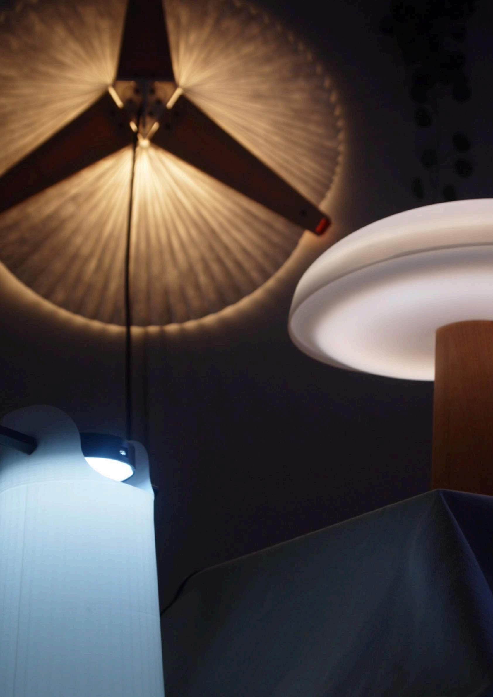
The outcome, a simplistic form, centred around effortless ergonomics, provides users with a work light and ambient lamp. Using friction as its main source of mechanics, users can rotate the light using the bespoke handles to 6 of the rotational points.
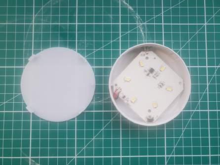
To be used during working hours, it can be faced upwards or downwards at an angle to face the work or provide an immersive illumination around the room. Targeted at individuals working from home, often their work space is the same as their downtime space, therefore Jingyi can be dimmed or faced downwards into the base to illuminate the white ABS filament to create an ambient glow and saturate the room with a more relaxing light.
02
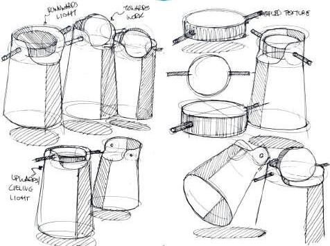
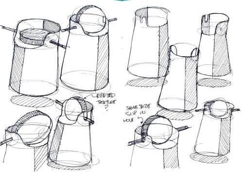
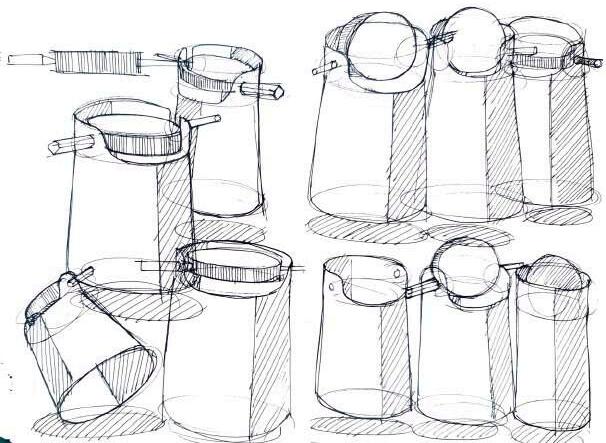
Ideation
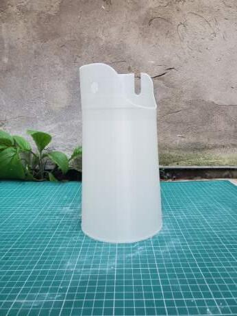
Focusing largely on user interaction and material suitability, Jingyi quickly took on a minimalist form, using a flared cylindrical base, originally intended to be made from porcelain, to provide a soft glow when the adjustable light is directed downwards.
Providing a relaxed ambience when the base is illuminated, the hexagonal steel handle allows users to just as easily use Jingyi as a work light by adjusting the light upwards or towards paperwork/ laptop by simply fixing the handle to one of the 6 rotational positions which best suits the occasion.

Manufacture
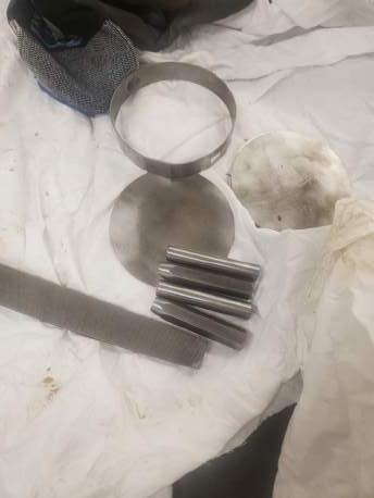
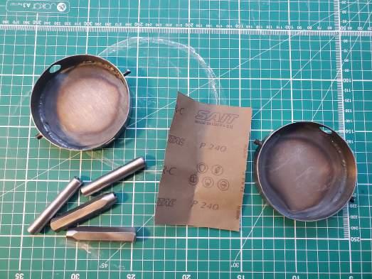
Whiletheinitialdesirewastouseporcelainforthe base of Jingyi, after much material exploration, polypropylene seemed the most appropriate material for manufacturing the base of Jingyi. However, due to the short time scale of the project, 3d printing was used to mimic the polypropylene in a white ABS filament. To encase the Ferswe touch light, 1mm sheet steel was bent around a plate rolling machine and welded together, before being welded to the circular base. The solid steel handles are cut using a circular saw to the 6mm length required, and the hexagonal handle is shaved using a lathe to create a cylindrical face towards the end. Both handles are drilled to create a thread.
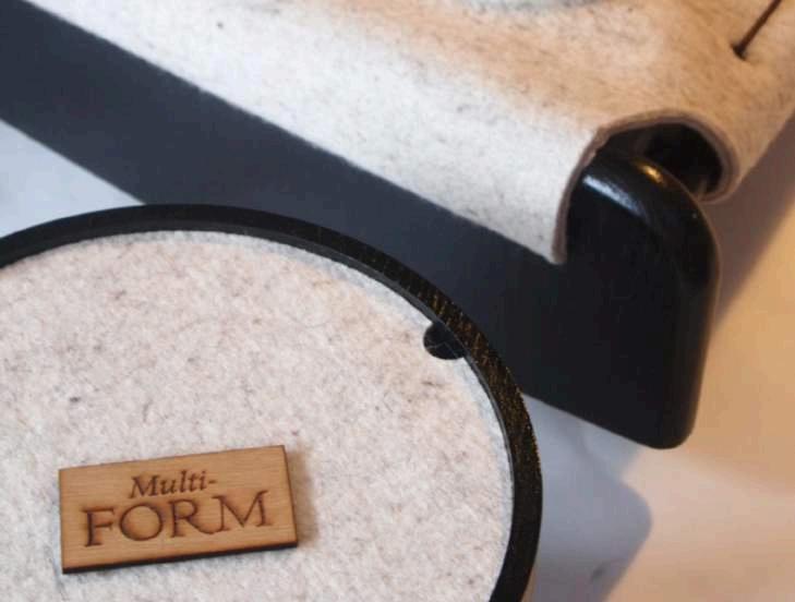
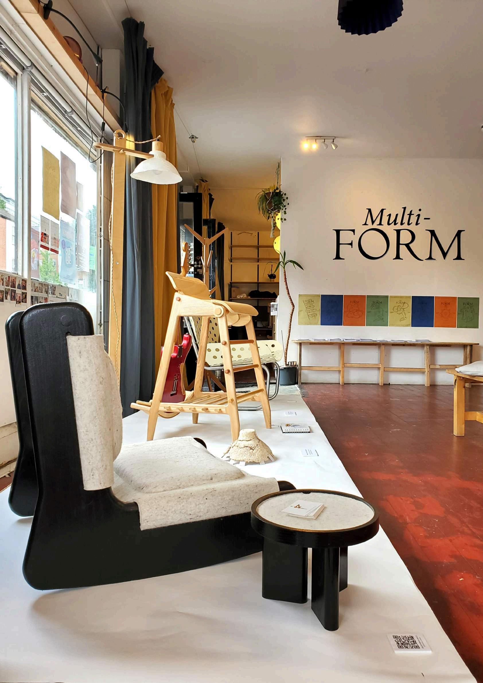
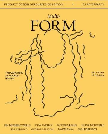
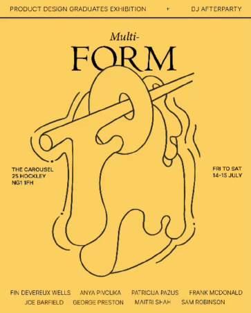
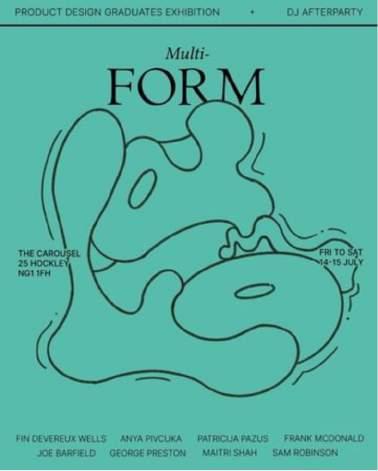
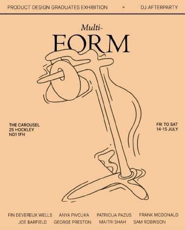
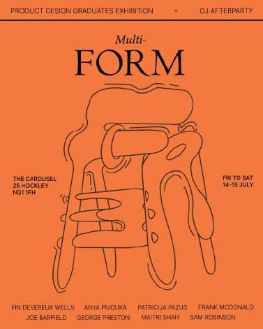
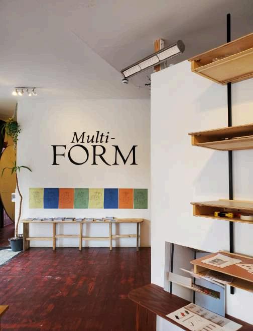
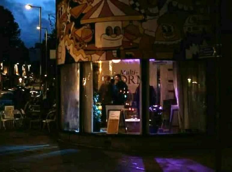
Multi-form
During my final months at university I organised and curated an external design exhibition with a few course mates to display our projects from our final year at University. In addition to hosting the exhibition, I hired a selection of Nottingham based Djs to play the second evening of the event in celebration of graduating.
Having instigated this event myself I started organising this event during my final year at university. I negotiated a work to hire scheme with the owners of the space to offset the hiring fee of £500. Over 5 months prior to my event, myself and friends worked as bartenders and baristas, accumulating £636 overall. The excess £136 was spent on promotional printing for posters and props for the show.
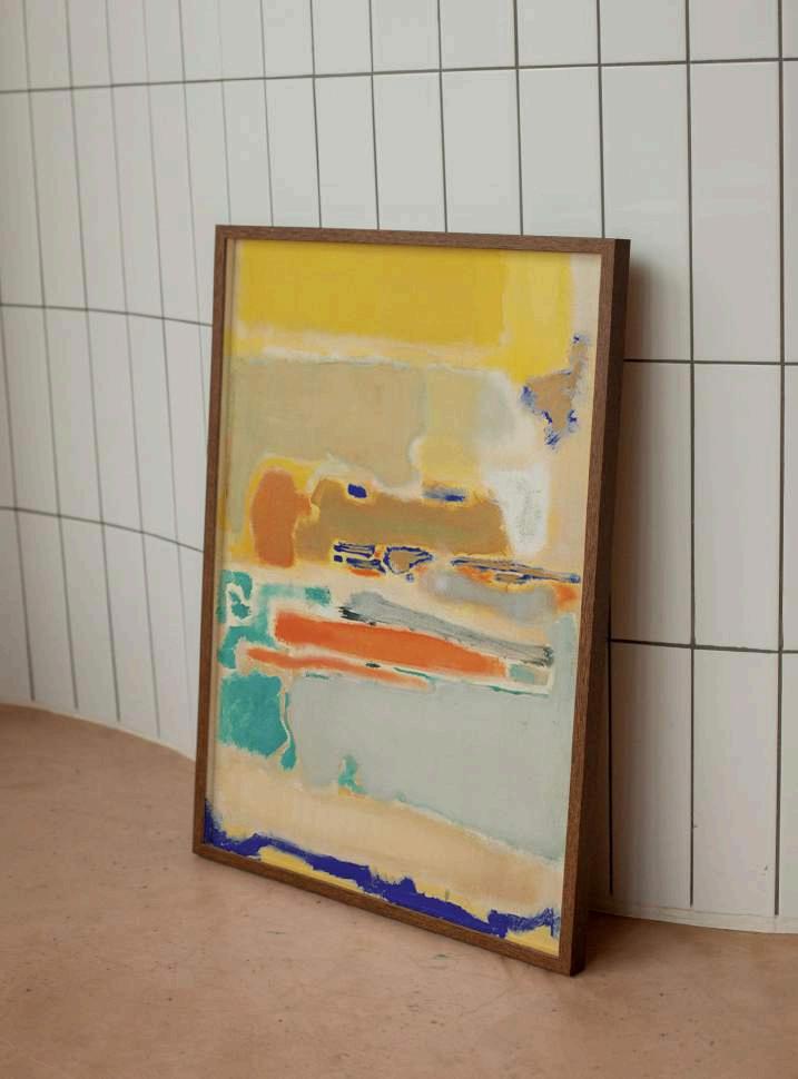
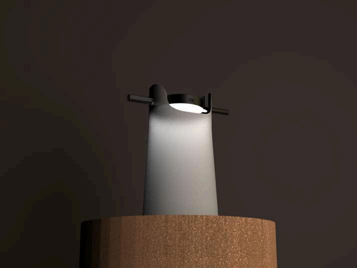
‘Multiforms’ are a collection of paintings by Mark Rothko.Arenownedabstractexpressionistpainter, known for his signature style termed as the technique of colour field painting, Rothko produced many huge canvases consisting of loosely blended bold blocks of colours. In Multiform, the artist created a composite of colourful free form of shapes, blurring together on thecanvas.Identifiablebytheirexpressivecolours, coupled with their immense scale, Rothko intended the viewer to be immersed in his work to evoke emotions and personal connection between the viewer and his paintings, stating, “my art is not abstract; It lives and breathes. I’m not interested in the relationship of colour and form or something in this spirit. I’m interested only in expressing the basic human emotions - tragedy, ecstasy, despair.”
Influenced by Rothkos elemental compositions, I curated a design exhibition which blurs the line between art and design, with a Multi-form of designs from a collection of exciting product design graduates in the hope of evoking an equally thought provoking response as Rothko intended.
03
Branding
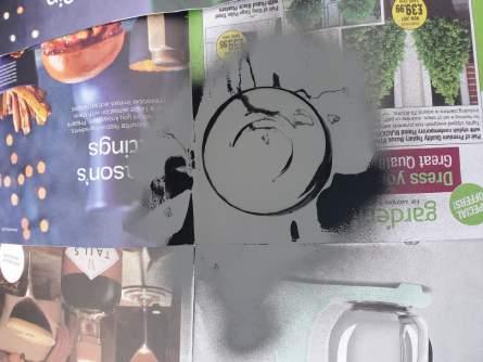
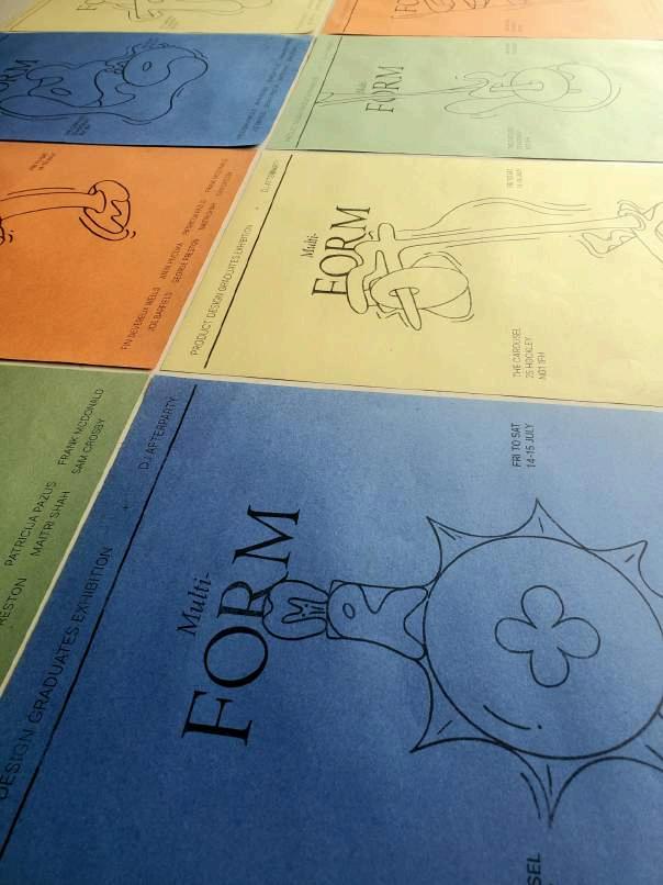
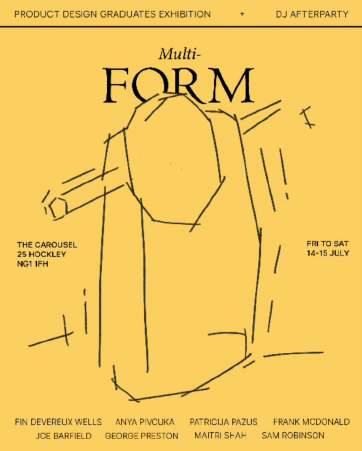
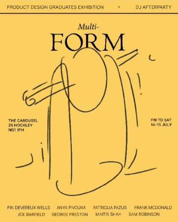
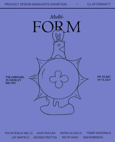
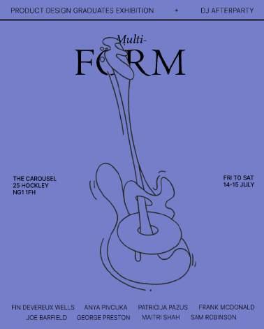
Befitting of Rothko’s ‘Multiforms’, our first approachtothebrandingofourexhibitionwasto ensure an appropriate colour palette to echo the artists paintings. Therefore our posters used a rotation of yellow, navy, orange and green, while our Instagram used yellow, turquoise, orange, beige and purple.
Hoping to bridge the gap between art and design, it was important to highlight the design aspect within our branding, so we chose to emphasis the word ‘form’, creating a selection of posters teasing each form of the design by each exhibitor.
In addition to promoting the event via social media, I took to the streets of Nottingham and displayed posters in shop windows to spread the word.
Instagram:
https:www.instagram.com/multiform_exhibition
Curation
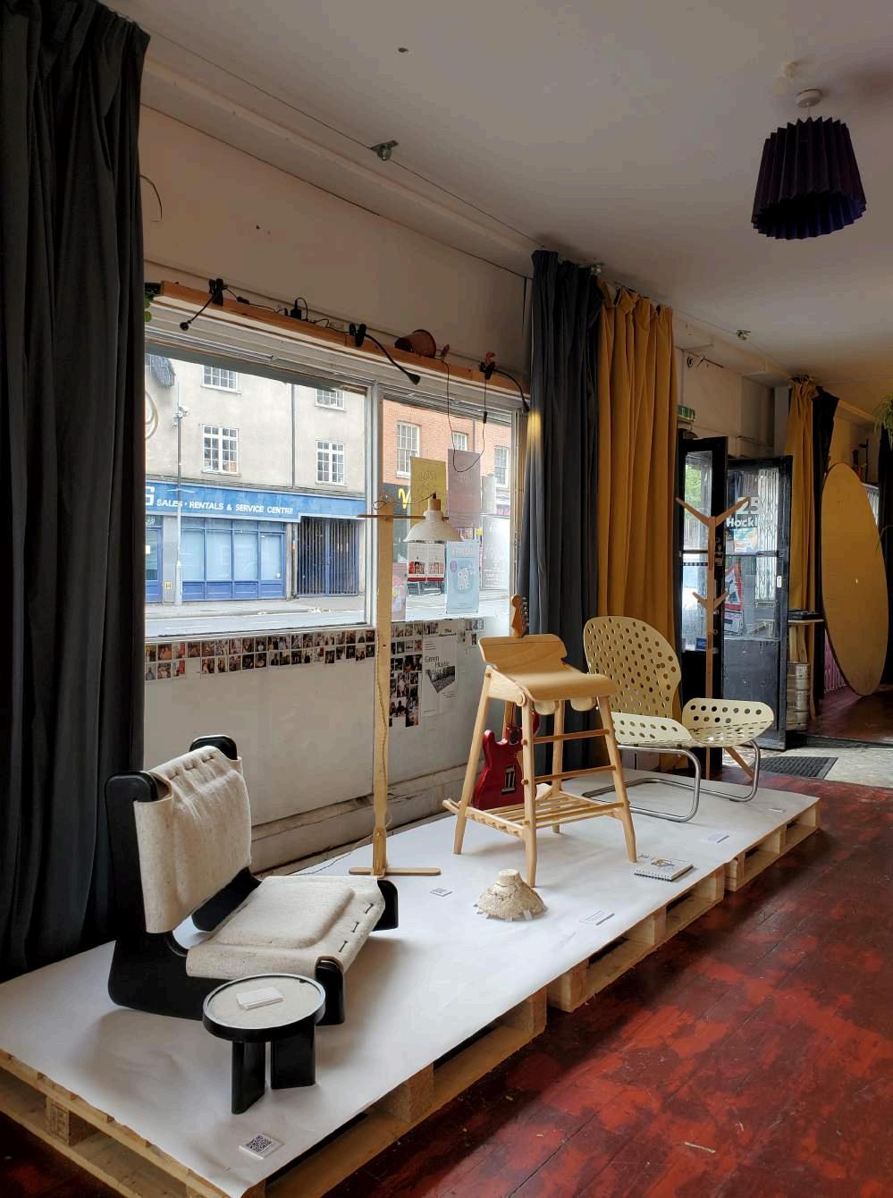
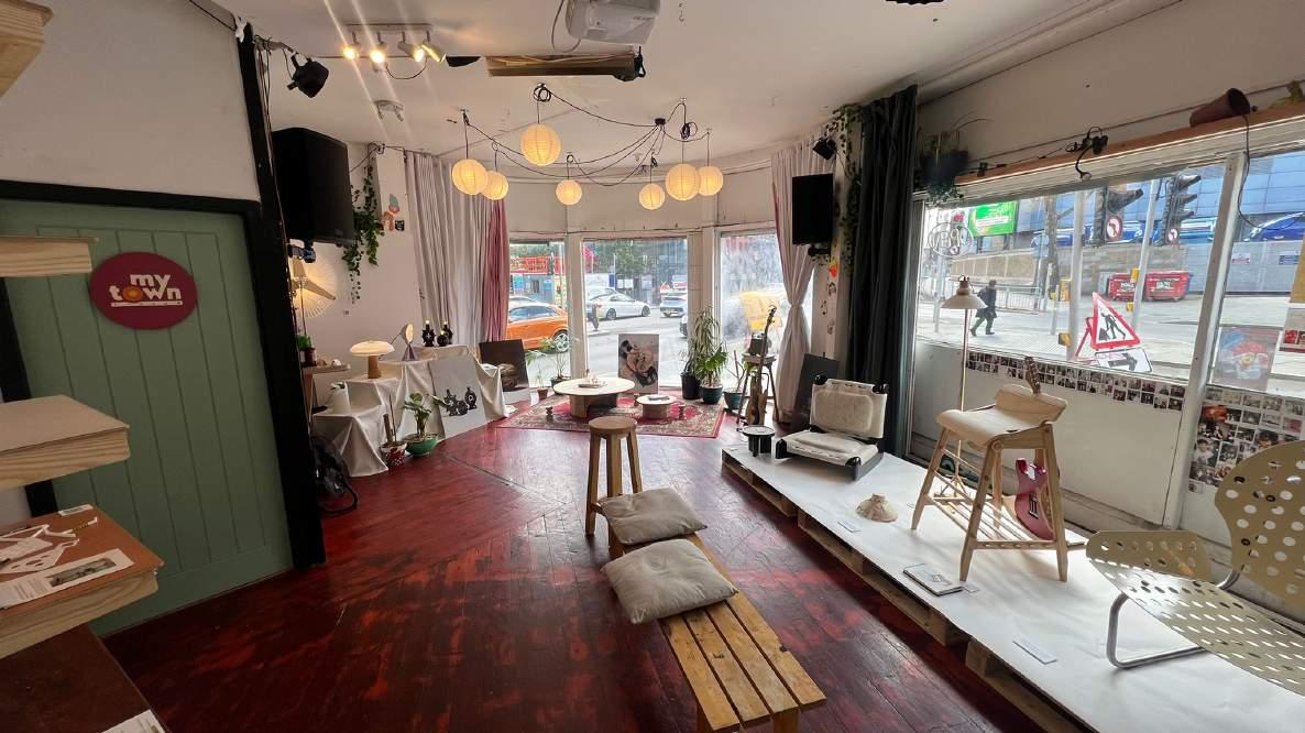
When curating the space we wanted to display our projects in an enticing way, and deviate from using mundane props such as white plinths to elevate our work. Moreover, creating a spacious area was imperative, providing accessibility to each product, yet remaining uniformed and cosy.
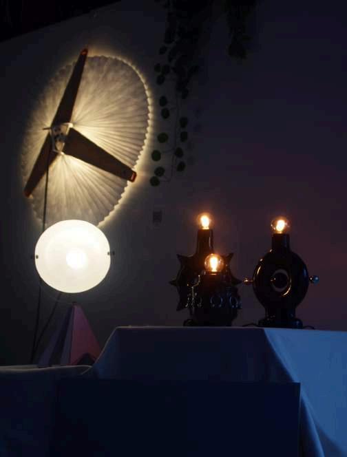
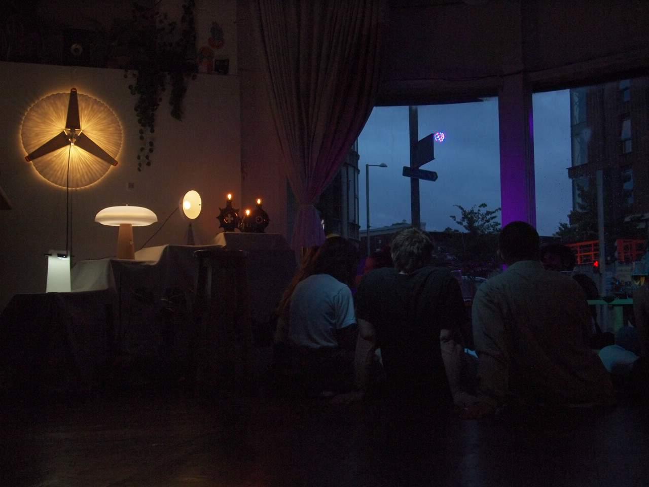
Therefore, a collection of differing props collected from around Nottingham such as palettes, card boxes, a linen cloth, a rug, and plants assisted in creating a minimalist, yet smart set up. The U shaped curvature of the room allowed visitors to view the work in a systematic way, and varied elevations made for interesting viewing, particularly within our lighting section.
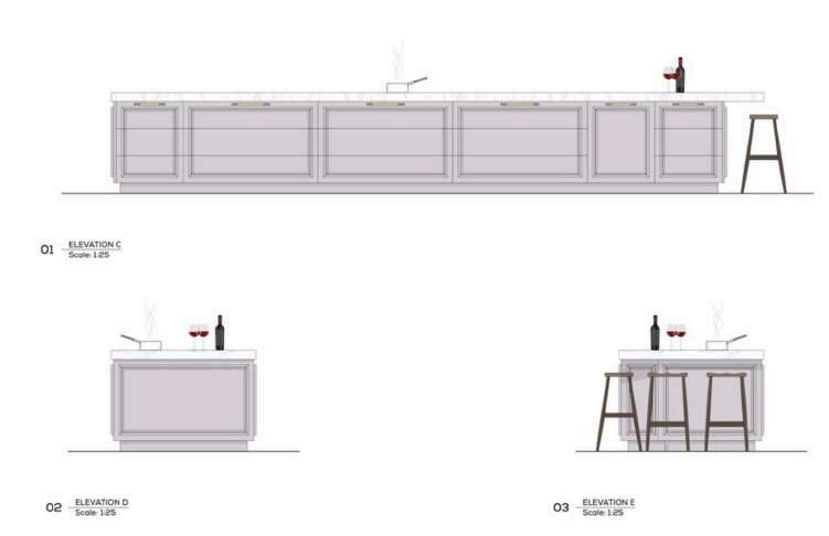
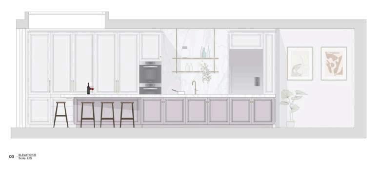
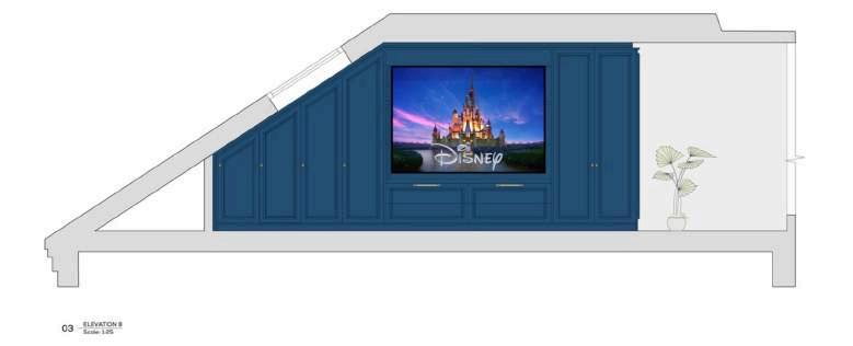
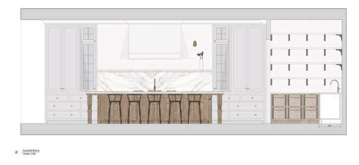
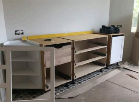
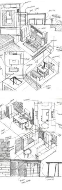
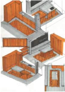
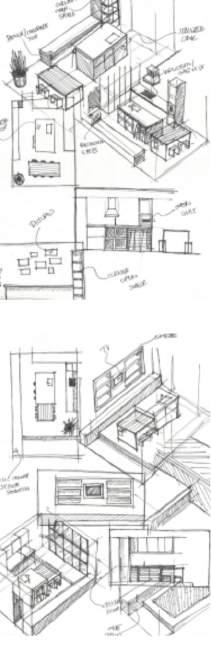
Blakes London
I spent my placement year working at Blakes London; a design led bespoke kitchen and joinery manufacturing company. Passionate about creating beautifully unique spaces, Blakes London specialise in high quality kitchens, bathroom vanities, dressing rooms and joinery.
My position at Blakes London was situated within thetechnicaldesignteamasatechnicaldesigner intern. The technical design team are an advanced creative group, who collectively share a passion for design and vision for high quality, truly bespoke product.
As a technical design intern, I was introduced to Vectorworks; a CAD and BIM software. Using Vectorworks I would present 2D plans and elevation drawings of living spaces and joinery packages to be delivered to clients and ultimately sentintoproductionifsuccessfulafterameticulous design process.
There are many steps in the design process for a technical designer. The first is to discuss the brief with a lead designer when obtained upon the initialclientmeeting.Theleaddesigneroutlinesthe clients preferences and ideas about their intended use of the dedicated space. For example, overall layout, style of cabinetry, list of appliances, materials, finishes and any special features to be aware of.
Technicaldrawingscommenceafterreceivingthe architectsfloorplansofthespace,andarealtered until the design is developed to a degree fitting with the clients original expectations and befitting of the clients budget.
Upon confirmation, a site survey is carried out by Blakes surveyor manager who visits the site and measures the specified area using a laser to gain a 360 degree scope of the area to gain an accurate structure of the room.
With correct structural dimensions,the construction stage begins, which is comprised of section drawings, Mechanical & Engineering drawings and worktop drawings.
04
Technical design
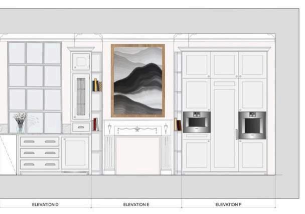
Ihadtheopportunitytoworkonnumerousdesigns at Blakes, working independently and in conjunction with the design team to interpret the desires of the client into beautiful designs.
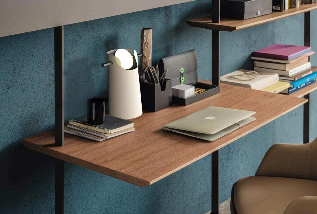
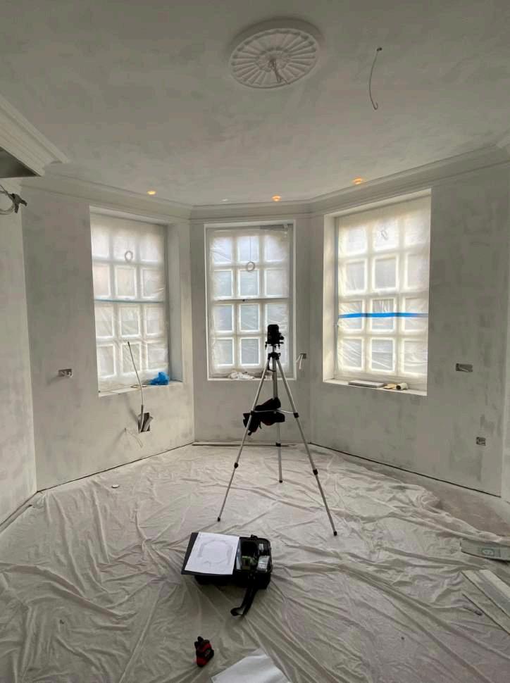
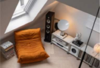
I worked on a range of exciting spaces including, kitchens, libraries, bedrooms, dressing rooms, bars, and living rooms (below). I found the initial stage of the design process most enjoyable as it proved the most creative aspect of the design process, during which I was able to make practical and creative suggestions to the clients and lead designers about the design where applicable.
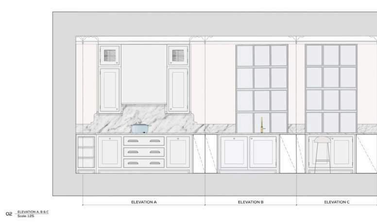
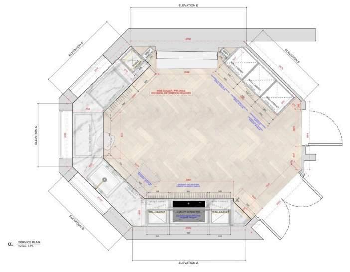
Case Study
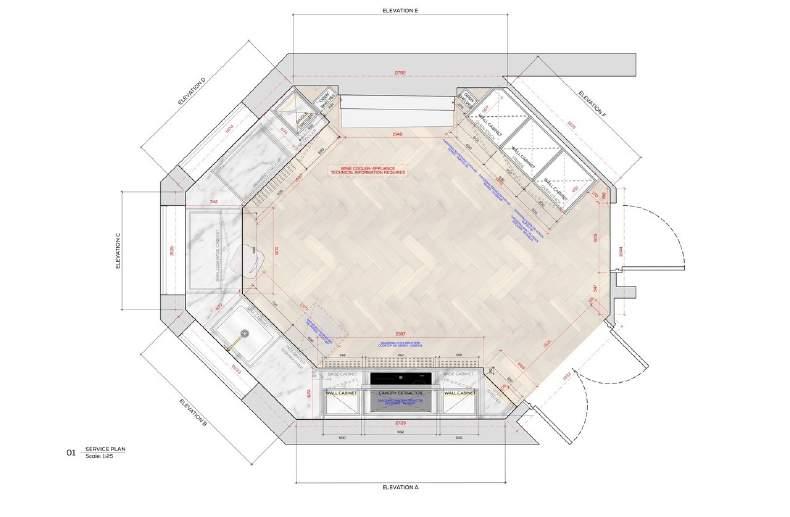
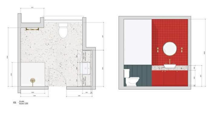
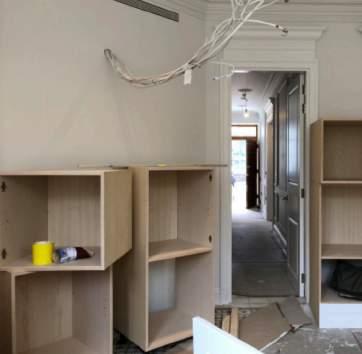
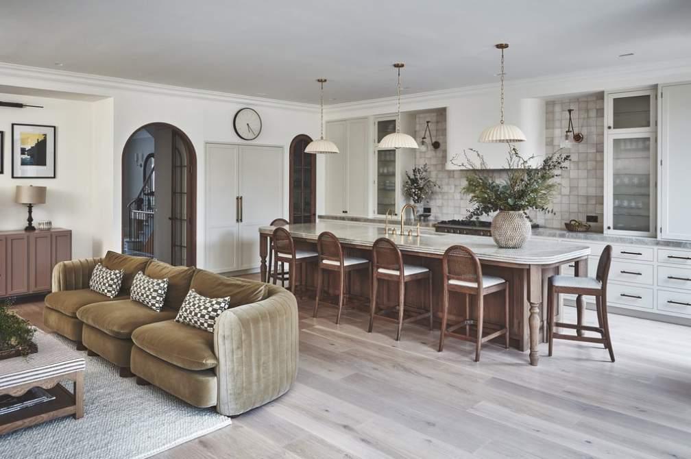
My first project, Victoria Road (left/above) , was an octagonal structured kitchen. The unique shape of the room brought unexpected challenges but excelled my learning and prepared me for subsequent projects.
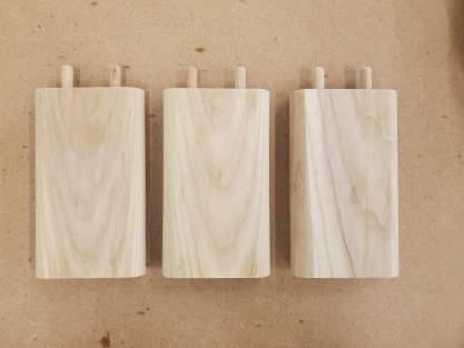
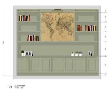
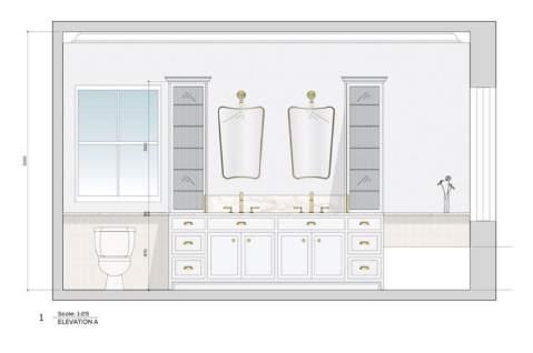
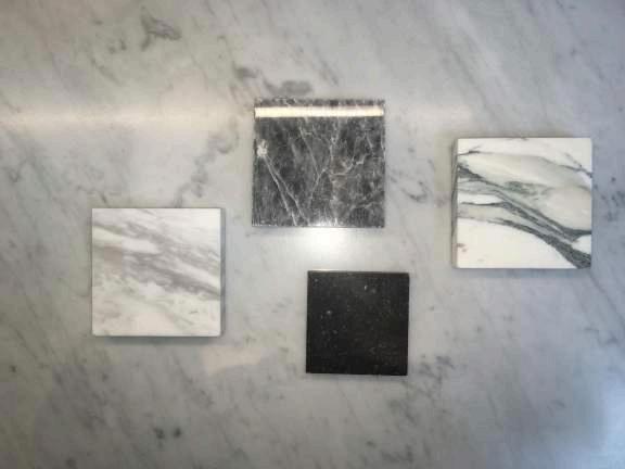
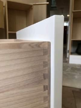
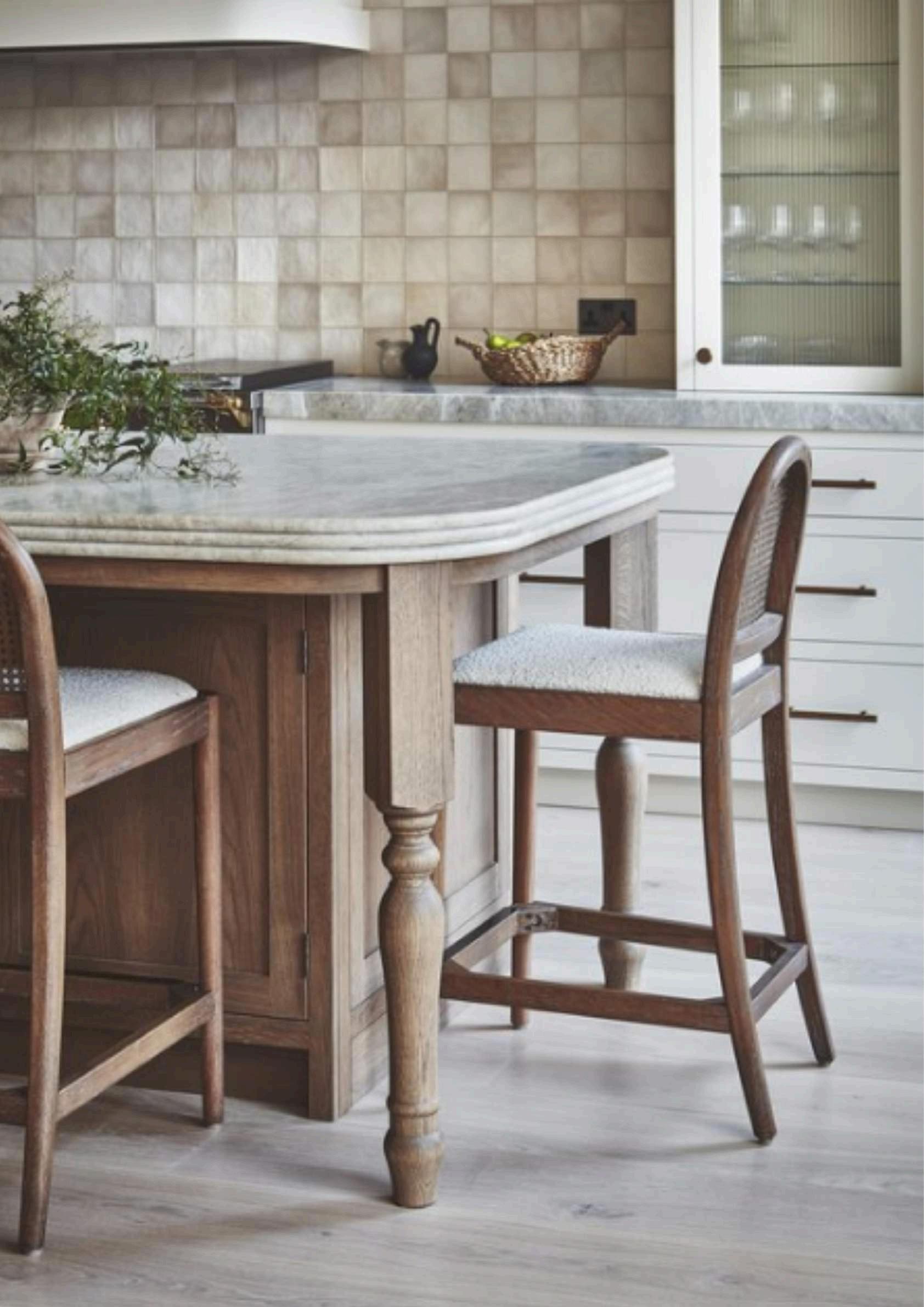
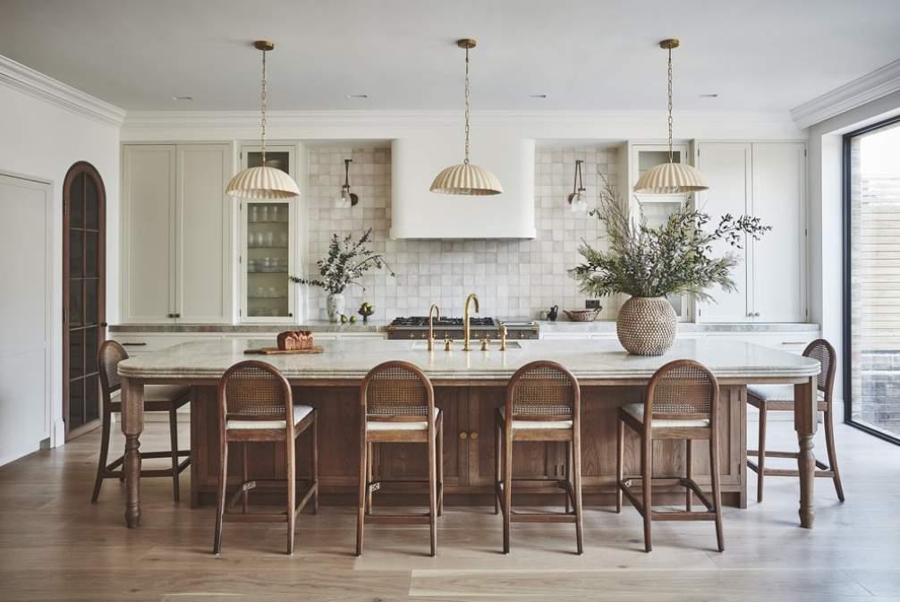
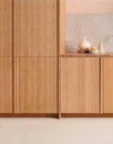
A favourite project of mine was Sudbrooke, where I was given the opportunity to construct the initial designs for a variety of rooms including a spacious kitchen which featured unique design features, such as a triple bull nose marble island worktop, complemented by bespoke turned wooden table legs (next page).
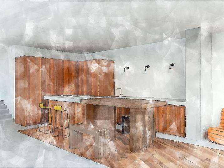
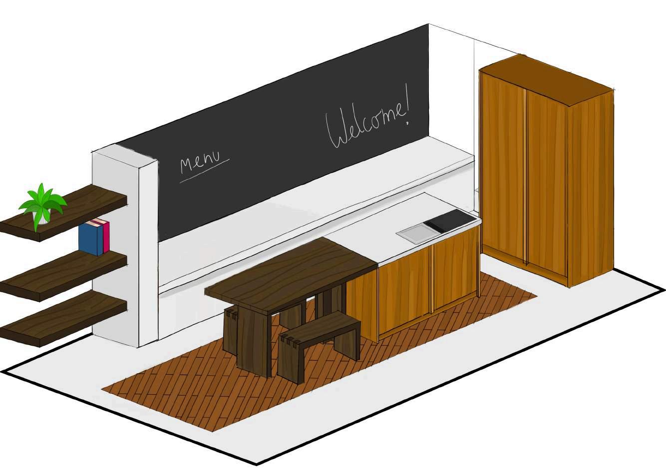
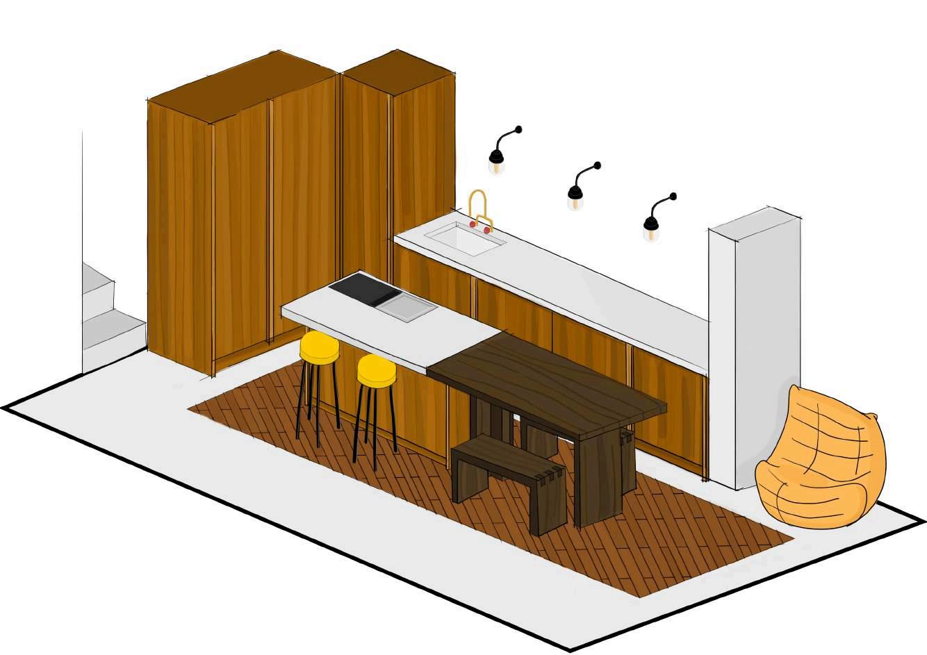
Design Challenge
Brief
Design a dream kitchen to house a family with 2 children and a pet dog. The space is 8x6m, with a glazed opening to a south facing garden space.
The design is not restricted to a budget but must contain a kitchen and eating space. It can be renderedusinganyappropriatesoftwareandcan include moodboards and ideation.
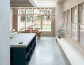
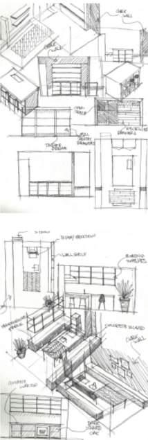
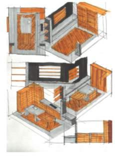
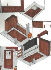
I opted to render my concept as a digital sketch using photoshop to deviate from using Vectorworks and practice my 3D visualisation skills in preparation for my final year at university.
By initially sketching rough plans for the design and conjuring a mood board, I was able to quickly visualisemypreferences,speedinguptheideation process.
My concept encompasses a minimalist aesthetic, inspired by Japanese and Brutalist architecture. Consisting largely of light concrete and varied woods, I uncovered an avid proclivity for contrasting materials in a subtle way.
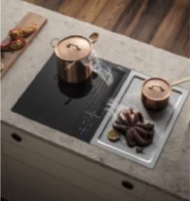
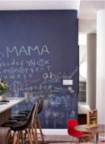
Although the design adheres to the family oriented brief, including a chalk board for the kids and menu for the week, I slightly digressed and designed the space to reflect my personality rather than the intended persona. Nonetheless, the design includes everything a kitchen requires, including a Bora induction hob, steel Teppanyaki Hob, a sink and tap, and hidden appliances and cupboard space.
A single Togo sofa and yellow topped stools add a popofcolourtotheroom,anddarkoaktableand seating separate the dining and cooking area.
Thank You Please get in touch: Finwells01@gmail.com 07788945149