Dedicated to my Mom, who introduced me to drawing at a young age and pushed me to pursue a career that I‘d be happy in. Thank you for always sticking up for me and accepting me no matter what. To my Papa and Nana, who are reading this from Heaven. And to my deadbeat dad, who wouldn‘t be reading this, even if he was still alive.
INTRO DUCTION
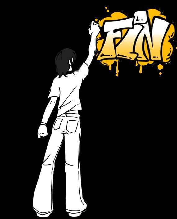
Hello, and welcome to my portfolio! My name is Finn Noto and this book was made to present all of the art I‘ve made as a part of my Introduction to Design course at SNC. All photos and art included are made by me. In here, I strive to showcase the skills, experience, and passion for creative work that I‘ve been called to since I was young. I recognized throughout my life that drawing made me happy and I constantly wanted to expand my skills.
This book and all of it‘s works inside are a part of my proudest creations. I haven‘t been able to make pieces for myself in a long time, but I was able to get back my motivation through this class and, especially, this project. Thank you for taking the time to read.
CRASH
COURSE 1
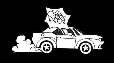
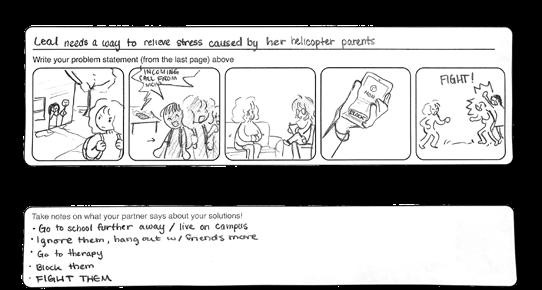
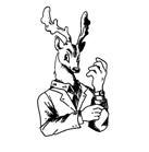
In this project, we were assigned partners and told to discuss problems that we were having. The goal of this project was to create a quick prototype for something that could fix our partner’s problem. during our discussion, my partner stated that she was having troubles regarding her parents. Everything she did only managed to make her problems worse. As a result, I created a video game, which I named “Beat Up Your Parents 2.” This was made as a way for my partner to relieve stress regarding her partners, when nothing else went right.
Engaging with a real person changed the direction of my prototype by making it relatable to both the other person’s problems and personality; it would be something that I felt the other person would enjoy and use if it was real. Showing unfinished work to another person, specifically the person I interviewed, didn’t make me feel too nervous. The products were endearing even in their unfinished form. My group was pretty ahead of the game in terms of the pace, but when it came to actually creating the prototype, I felt like I couldn’t get my idea across as well as I wanted to. It took some second guessing to create a solution that could be turned into a physical thing. If I went back and did it again, I would imagine more solutions/ask more questions pertaining to something more physical.
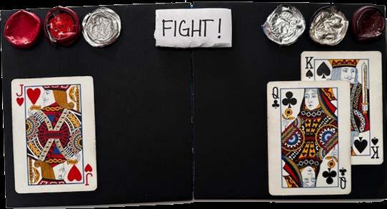
In this, I wanted to create a mortal-kombat style game where my client could relieve their stress caused by their parents. The joker is meant to represent the player, my client, and the king and queen are meant to represent their parents. The bottle caps at the top are meant to be the health bars of each party, the red being how much health they have left and the silver being how much they‘ve lost.
DOTLINE 2
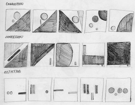
The goal of this project was to create three pieces using a limited number of grey or black dots and lines, without illustrating or overlapping shapes. The pieces we created were based on three words of our choosing, mine being “exhaustion,” “oppression,” and “rejection.” The three “-ions,” if you will. In this, we were meant to make images that could successfully convey these words’ meanings in an abstract way using composition and gestalt principles.
It wasn’t that hard making a well-crafted object like this. The hardest part was mounting the piece and getting it perfectly centered. I’m a perfectionist (to an extent), so I’d prefer to get things done perfectly, even if it takes longer. However, starting completely over is something I have to reconsider many times. Compared to the other abstract projects I had to do, I think I liked this one the most. It was difficult to represent ideas without necessary illustrating them at first, but once I saw examples and other people’s works, I started to get the hang of it and develop my own ideas. While we were going through critique, I thought that some of the pieces looked like they should’ve been in art magazines or logos. That made me start thinking about how I could use gestalt principles outside of school work.
SKETCHES
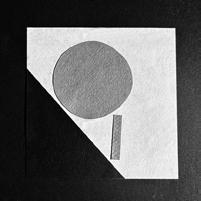
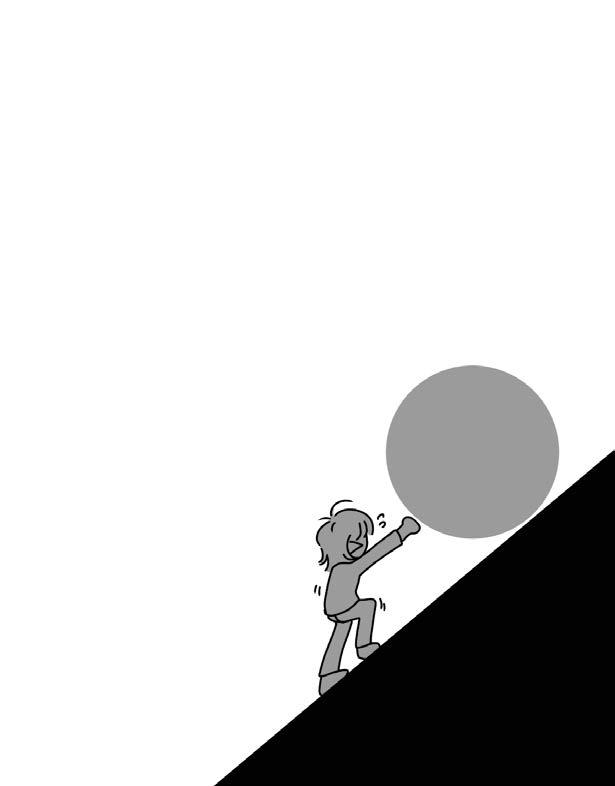
With exhaustion, I wanted to show the build up of events or emotions that leds to the burntout feeling of exhaustion. The fall of the dot is imminent, it’s soon to become a burden to heavy for the line to carry. I experimented with other concepts of exhaustion, such as fading out, or that feeling of dread when you have to face something larger than yourself, but ultimately went with the idea of an uphill battle.
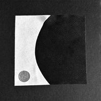
For oppression, the main factor I wanted to focus on was control. A large force looms ominously, making it impossible for the smaller force to grow. In this way, I wanted to convey how the larger object forcefully controls the smaller object, not letting in breath or grow.
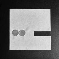
For rejection, I wanted to depict a sort of longing to be included, but ultimately being rejected due to born differences. The best way I could think of doing so was establishing an in-group and an out-group. In my thumbnails, I depicted several groups of lookalike objects and one lone object that was different.
FINAL PIECES
noun: exhaustion
1. a state of extreme physical or mental fatigue.
noun: oppression
1. the state of being subject to unjust treatment or control.
noun: rejection
1. the lack of acceptance
LETTER FORMS
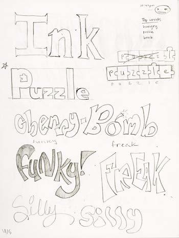
These are some of my original ideas when I was brainstorming for words to use. I was looking for something fun, that could be depicted in several different ways.
3The goal of this project was to create four pieces using a four or more lettered word. In this, we were asked to carve and print individual letters by hand to get a better understanding of how things like negative space and orientation contribute to how a word is interpretted.
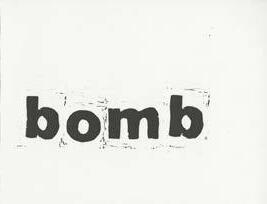
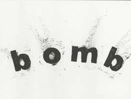
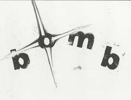
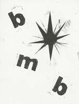
I experimented with a lot of words before ultimately choosing the word “bomb.”
Words like hungry, puzzle, pink; but I ended up believing that I could create something with a more interesting composition using “bomb.”
FINAL PIECES
While working with letterforms, I learned different techniques, as well as new terminology, such as kerning and letter anatomy. It also put into perspective how many different ways words can be defined, which was originally lost on me when I made my piece.
If I worked with these letterforms again, I would definitely use online programs to edit and experiment with my designs, as well as consider the different ways my word could be defined. I was very determined to keep the scrambled imagery of the text, imitating the idea of debris being blown away by an explosion. So, instead of sticking to the definition of “bomb” as an explosive, I would try thinking of other definitions (failing a test, volcanic eruption, etc.)
ITERA TIVE ILLUSTRATIONS
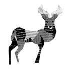
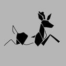
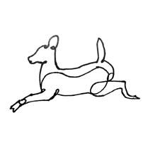
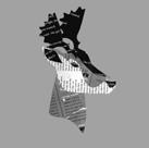
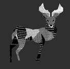
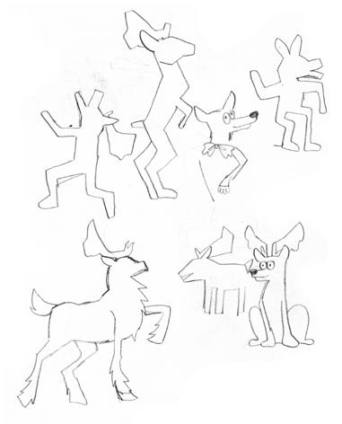
This project tested our ability to create a diverse variety of iterations depicting an animal or object of our choosing, as well as our ability to use different styles and mediums while doing so. We were asked to create two artist itterations, geometric collage iterations, and two type collage iterations of our subject for the final piece.
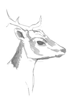
BEFORE
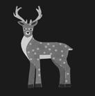
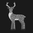
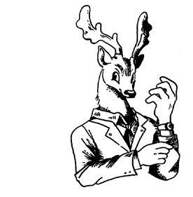
Upon hearing that this project could be based on an animal, I knew immediately that I had to choose some sort of deer or other cervidae. I ended up going with the fallow deer, because it’s flat and large antlers make it easier to recognize. During my time throughout this project, I was able to further my knowledge in capturing the shape of a deer. The shape of a deer’s head is something that’s often hard for me to capture perfectly, but in this project I feel as though I did a pretty good job at depicting a deer’s boney and delicate facial structure.
The media that was most challenging for me was type collage, simply because it was hard to find pages of text in the colors that I wanted, while geometric collage was the most enjoyable because I had a plethora of colors available to me.
I’ve always wanted to use Adobes products, but never had enough money to do so. This project introduced me to Photoshop and InDesign and taught me the basics of those softwares, which is something I’ll take with me as I progress through my career. If I continued with this project for four more weeks, I would take more time to experiment with poses. I might even add a mystical element, such as how Kiki Smith often depicts deer with tree branches for antlers.
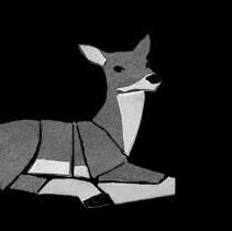
AFTER
POSTER PSA
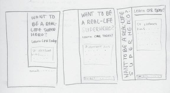
Three compositions I made for my client. I was originally trying to represent the Red Cross with what minimal means of illustration were allowed.
5With this project, we were able to learn the basics of what it’s like to have a client. The objective was to create both a creative brief for a PSA poster on a topic of our choosing, and create a poster for our assigned partner based on their creative brief. We were both the client and the designer.
The catch was that the poster was to be text only. It was challenging to not use illustrations at first, but I believe that the topic I was working with was easier when it came to only using type.
BEFORE
My client’s topic placed emphasis on the importance of learning CPR, and the ease at which one can do so. To convey this message, I was insistant on keeping the word “superhero” larger than the rest. I tried to create a clear visual hierarchy not only with the size of my text, but with colors as well. In all of my compositions, I used white text on black. We read text from top to bottom, left to right, but I felt as though it would stick out more if I were to put in against a wall of other posters.
I went through a lot of trial and error during this project. However, with my partner’s help, I learned how to work with a client. This also helped me use criticism from my client that was necessary to continue my progress and generate new ideas.
erin.bongers@snc.edu.
AFTER
WANTTOBEAREAL-LIFE SUPERHERO? LEARNCPRTODAY
If you are interested in learning how to use an AED, perform First Aid, and CPR on campus, St. Norbert has classes you can take for a fee of $50.
More information: erin.bongers@snc.edu.
This was my final. I orientated my color boxes on a diagonal to give my poster the energy and dynamism that superheros are often associated with. In addition, I created this gradient effect with the color boxes to guide the reader’s flow and add to the visual hierarchy. I also added the logo for SNC’s Wellness and Health program, as suggested by the director of SNC Wellness and Health herself.