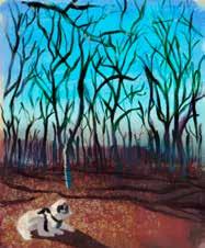
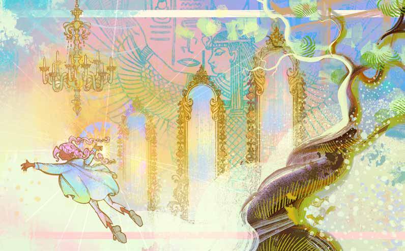
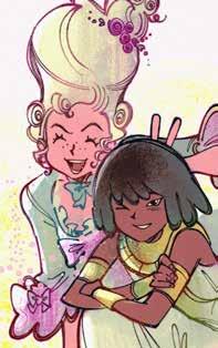
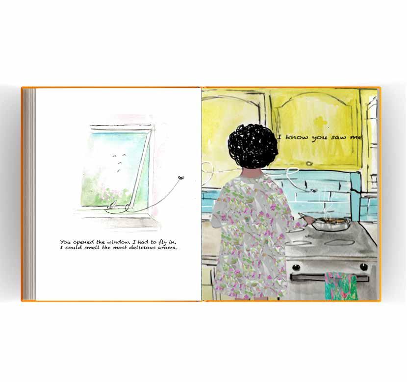
We dedicate this publication to the memory of Alicia Xing Yun Ong. She is much missed by students and staff of the BA Illustration Online.
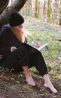
Illustration by Alicia Xing Yun Ong, based on a photo by fellow student Hannah Neuberger.
COURSE LEADER, SHEFALI WARDELL: CLASS OF 25
I am so thrilled to be introducing this first edition of Lore. A course publication and graduate showcase is something that a whole team of people have worked hard to achieve over the last year and seeing the work here is a proud moment. Our students come from different locations and backgrounds but all spend their time with BA Illustration online pursuing development and excellence in their practice. It is a joy to see the illustrators we are now sending into the world and as a course team we look forward to their next steps. With its variety of interests and specialisms I hope that you will enjoy delving into Lore and discovering new favourite pieces and illustrators of your own. We are so very proud of our class of 2025.
why lore?
SUZI KEMP: INTRODUCING LORE
Lore describes knowledge, wisdom or information about a subject. Lore may be mythical and made up or it could be rooted in a very real experience. Lore might make meaning out of something ordinary, or find magic in a daily ritual. Lore might affect or reflect culture and the way people live. Lore could be the study of something specific, or the creation of a new tradition.
Lore often communicates as narrative, and within the pages of this publication our students tell the stories behind selected illustration projects. Each student has chosen a project to present, and have shared their experiences working through this, from the process, (the ‘journey’), to the final outcomes (the ‘destination’). Some students have presented their responses to a Lore themed brief, while others have chosen to celebrate their personal journeys with the course and their developing practice.
This collection of work demonstrates the imagination, creativity and curiosity present in this student group, and represents the exciting growth and development which has emerged as a result of this immersive and dedicated approach. Students, thank you for sharing your story so far – we can’t wait to see where it leads!
Alicia Pariso
Creative Designer
Often leaning towards an abstract communication balance in illustrative methods, leaving hidden messages to be found. With this I like to immerse myself in a wealth of research methods in the countryside surrounding me in North West England and beyond. This balanced with a plethora of intense and critically evaluated findings, to bring them together I hope to evoke a conversation and create a meaningful connection.
email: aparisouk@gmail.com
instagram.com/aliciapariso www.aliciapariso.co.uk
facebook/pin: Alicia Pariso
linkedIn: Alicia Pariso
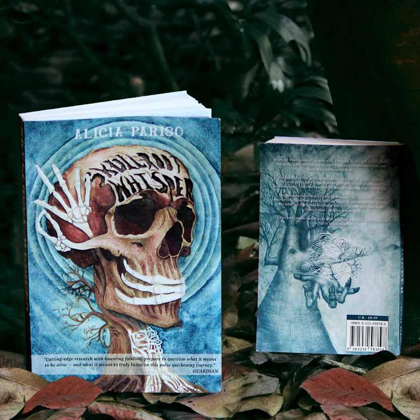
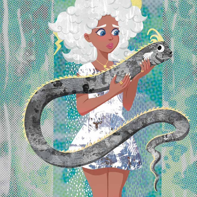
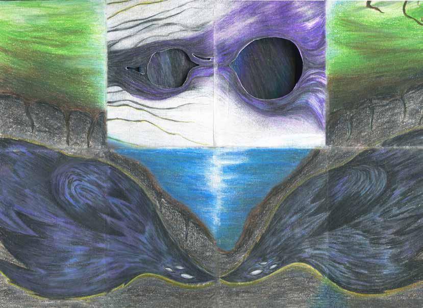
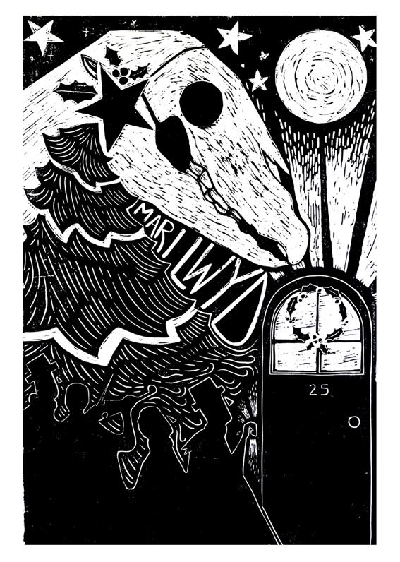
NATURE’S FREQUENCY: TRANSMISSIONS HEALING WHAT YOU CAN’T HEAR
Living authentically is to understand and control your freedom despite all complexities; all purpose and meaning in your life created by you.
Focusing on a deep-rooted connection with my choices in media and method whilst developing research styles, I chose to engage in a sensory approach to this journey. Acknowledging an organic flow to my process and visual responses, it allowed my scientific research to transcend its path towards a captivating narrative. One of which allowed me to revisit watercolour, a medium I love, with precision and intensity. In a search for meaningful visual connection to Sound, exploring through methods dissecting synaesthesia, neurological synthesis, medical
research and nature’s frequency, I needed to learn how to listen and feel through my visual research and communicate this resonant narrative inviting prospective readers to immerse themselves in the unfathomable. Anthropomorphising the towering Elms as they reach down with offerings of The Root Tree of Life cymatic pattern, whilst plucking at the stave of frequency resonating behind them, encouraging you to listen. The tree’s Extremely Low Frequency and ability to communicate or share it with ourselves for the purpose of healing, does this not in itself prove that their existence precedes their essence?
With each skull transmission, nature’s blueprint listening, can we learn to too?
Alison Udall
Illustrator
I am an authorial illustrator with a particular passion for children’s literature. I hope to inspire children to love reading good books, where they will be transported into imagined fantasy worlds; find their faith, develop their curiosity and be filled with hope and optimism for their future. I am also fascinated and inspired by our natural world and aim to capture its awesome beauty before we lose it altogether.
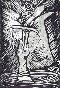
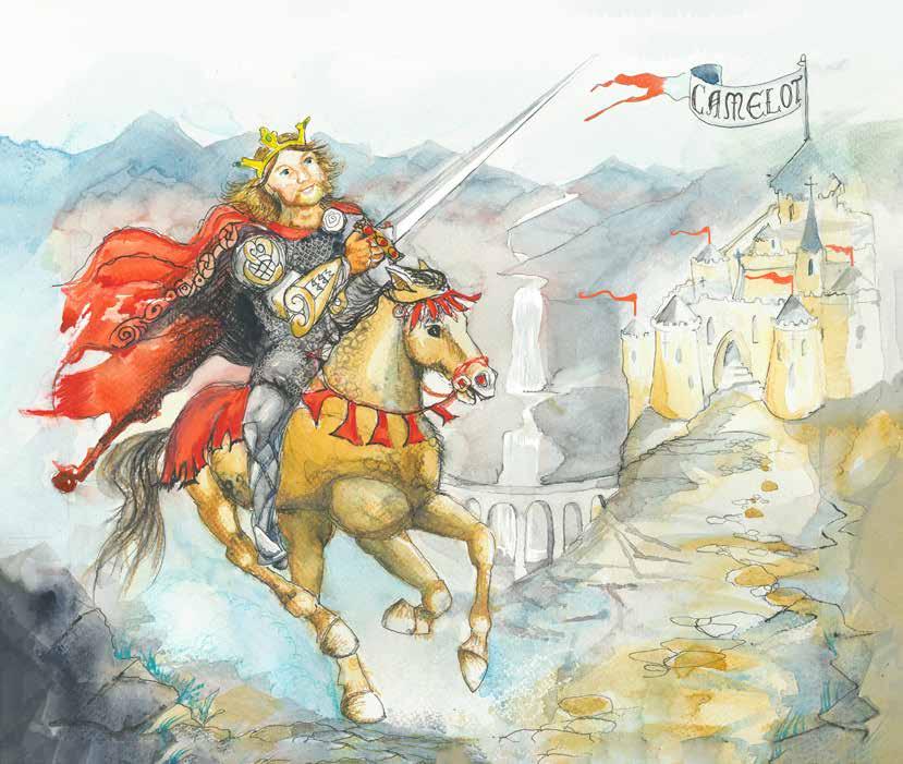
The direction for this Lore project was determined on my visit to the city of Winchester, the old capital of Wessex infused with the Arthurian Legends. At the Great Hall, I collected images of portraits, artifacts and models from twelfth century Britain, re-awakened my creativity, senses, curiosity and sketch book. I then set myself the brief to design a book cover and double page spread. ‘Excalibur’ the name given to King Arthur’s famous sword, represents a transfer of power. Based on a book called Arthur, High King of Britain by Michael Morpurgo. Following a Lino printing workshop, I was equipped to tackle a duotone Linoprint.
I utilised sharp Japanese woodcarving tools that could carve through the linoleum with ease. Choosing to cut separate linos which I would print being careful to print the light one first and then register the darker tone on top of that once dry. For the main image, I chose watercolour as my medium because it is cheap and eco-friendly. I sharpened up the image in Adobe Photoshop. This image originally started as my first design for a book cover but is more narrative and works better as a double page spread.
King Arthur rides to Camelot, his capital, a place of harmony, courage, chivalry and nobility. It is the home of the Round Table, where his noble Knight are considered equal.
Beatrice Adomaityte
Illustrator
I am an illustrator and comic-maker who specialises in whimsical, conceptual illustrations that spark joy. I love creating works that focus on the lives of women and girls, and the love I hold for feminine, energetic and dreamy aesthetics. I also love to dabble in some fun children’s illustration, where that colourful whimsy can shine brightly!
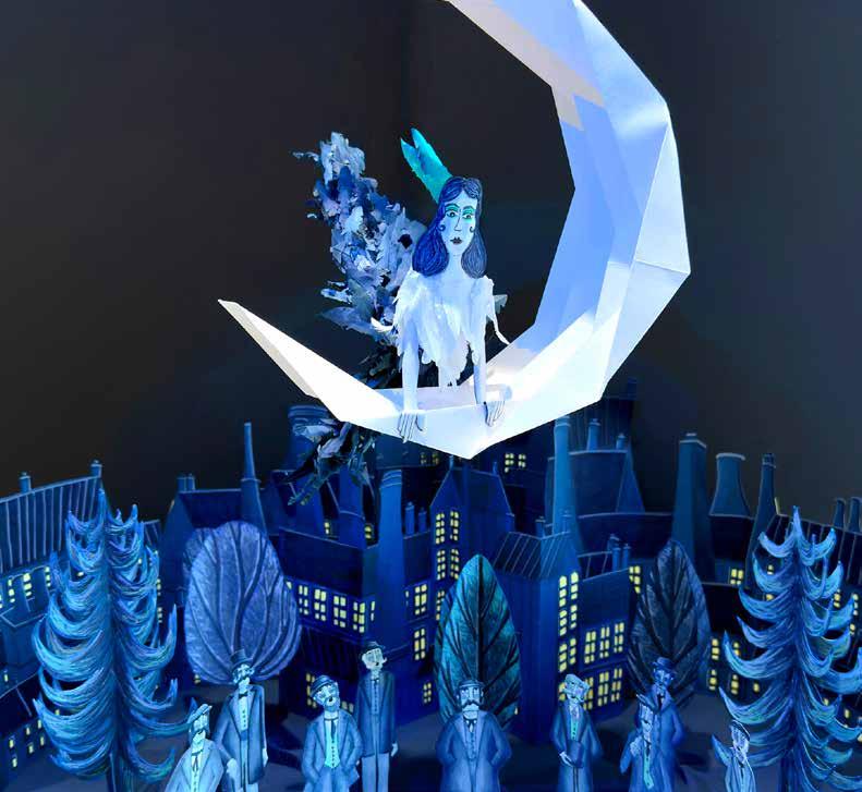
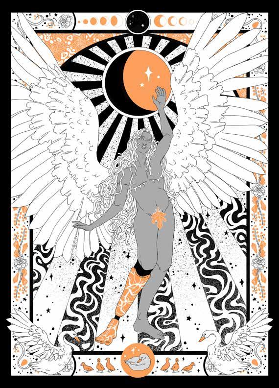
MODERN WITCHES
Modern Witches is a comic that follows the lives of several witchy ladies from different historical time periods, as they find themselves all in one place at the same time, on New Planet. The resident royals of New Planet propose them each a job: help us to make New Planet a habitable place, for in each of your timelines, the world is about to end. New Planet is littered with dungeons and dangerous inconsistencies — but you, yes, you, have the capacity to save humanity in each timeline, by creating a new place where people can live.
email: beatriceadomaityte@gmail.com
www.frotias.com
twitter/X: @frotias
The comic centres an all-female main cast that uses magical powers to explore this new, mystical place. Their best fun comes from their differences: imagine a girl all the way back from BC Ancient Egypt meeting a haughty dressmaker from 18th century France. The unique and funny flair and drama as they have to work together for a common goal. All with the fun of magic! The illustrations within this Lore magazine focus on the conceptual world of Modern Witches, and relay that sense of dreamy, exciting magic as each of these time periods meet in one place.
A conceptual piece that delivers the dreamlike magic of Modern Witches. The main character, Samirah, floats within a warped space in which several time periods meet.
Bethany Coram
Illustrator
I am an illustrator based in Essex and I work in various styles and mediums with a dash of whimsy. I like to illustrate for various purposes including editorials and concept art, though I do have special interests creating for the music and video game industries. I work methodically and I’m not afraid to questions to make sure I’m producing the best work for what is being asked.
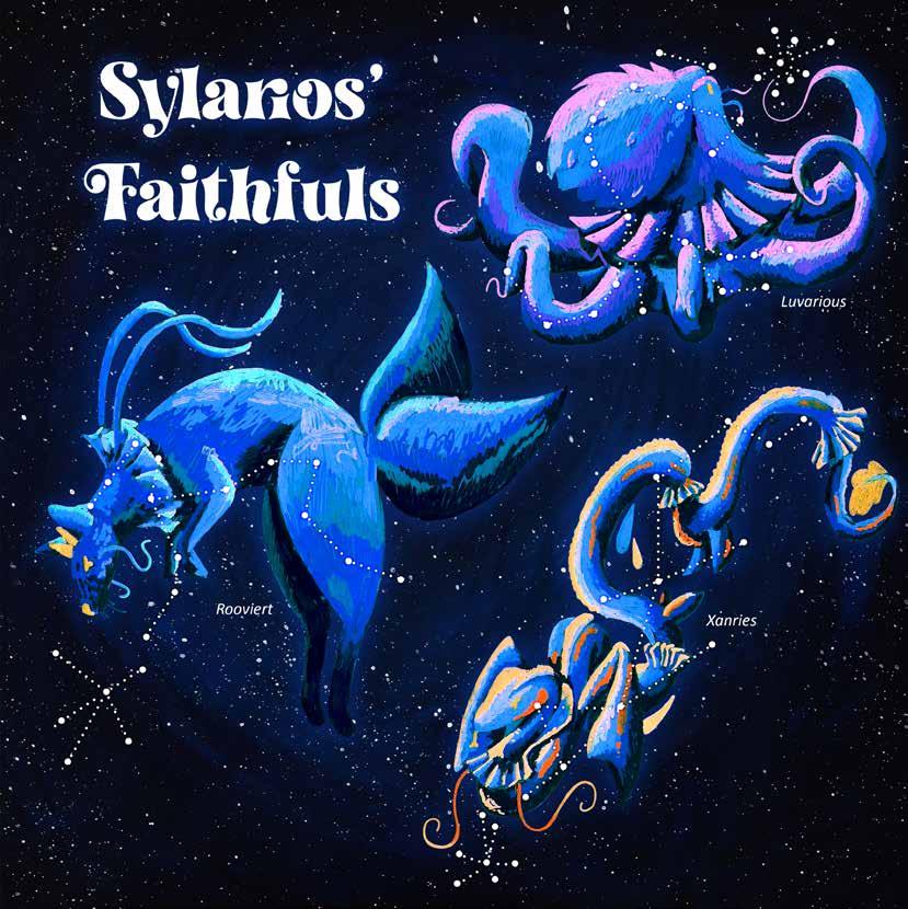
SYLARIOS’ FAITHFULS
Looking into constellations and the stories behind them, I decided I wanted to invent my own world; from the night sky, to creatures and lore surrounding them. Observing real animals, I created my own combinations as inspiration. Besides pushing myself for ideas, I moved away from my comfort zone in the materials and drawing style I wanted to achieve. Using a lineless style with acrylic markers, I wanted something scribbly yet detailed, a little messy yet refined. I think the artistic choice I used for the paintings summarised my whole project quite well: chaotic, but a fun end result!
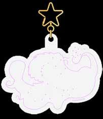
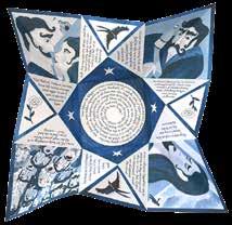
Sylarios’ Faithfuls are a set of three constellations, whose stories intertwine with the Sun-like star of this universe, Sylarios. Taking inspiration from mythology surrounding those in our night sky, I created stories to match with room for expansion. They are intended for those who love the night sky and finding the shapes it holds; those who like delving into the stories surrounding it; and even those who simply enjoy a dot to dot. As well as the image, each creature was made into keychains that you could hold to the sky and place them amongst the stars.
Inside the packaging of the keychains features a lore card with part of an illustration on the back. Collecting all 6 cards and piecing them together makes the large image Sylarios’ Faithfuls. .
Chantelle Jean-Paul Lee
Illustrator & Motion graphic designer
I am an experienced illustrator with over five years of experience who enjoys creating vibrant, bold artwork that sparks conversation. I experiment with combining analogue and digital techniques to imbue my pieces with unique textures. My growing interest in editorial and marketing has motivated me to achieve Adobe Certified Professional status in InDesign, Photoshop, After Effects, and Adobe Express, enabling me to move towards entering these exciting industries.
email: hello@chantellelee.co.uk
www.chantellelee.co.uk
instagram.com/mrsleedraws
linkedIn: chantellejeanpaullee
WEATHER LORE: FACT OR FICTION?
This project has been an exciting journey of personal skill development that enhanced my research and practical skills. I began by extensively investigating weather lore and translated that research into ageappropriate visual forms through observational drawing, refining my illustrations along the way. My exploration into the subject revealed that weather folklore stories and poems are sometimes rooted in science, so I aimed to include this in my final outcomes. After research, I experimented with analogue printing methods such as gel plate printing, to capture the dynamic textures of weather and blended that with my digital skills in Procreate and InDesign.
My project outcomes consisted of two magazine articles that explored weather lore and if there are any facts behind it. The main goal was to make the articles visually and cognitively engaging, so I incorporated interactive elements into my designs which naturally morphed my secondary focus from Ritual to Play. The children’s article features puzzles, while the teen article includes a Find Your Goddess Name game. It was a challenge to translate the same information between two different age-based audiences, but it was a rewarding experience that significantly enhanced my editorial skills, and I am happy with my outcomes.
Editorial illustration for a teenage magazine article focusing on weather lore.
Charlotte Clark
Illustrator
I am an illustrator based in London who thrives on creating meaningful messages through my illustrations. Whether it’s through symbolism, metaphorical language or my idiosyncratic view to life; creating illustrations that provoke an emotion, spark conversations or raise awareness is my passion.
email: charlotteclark 96@hotmail.co.uk
linkedin: charlotte-clark-467385212
charlotteclark96.myportfolio.com
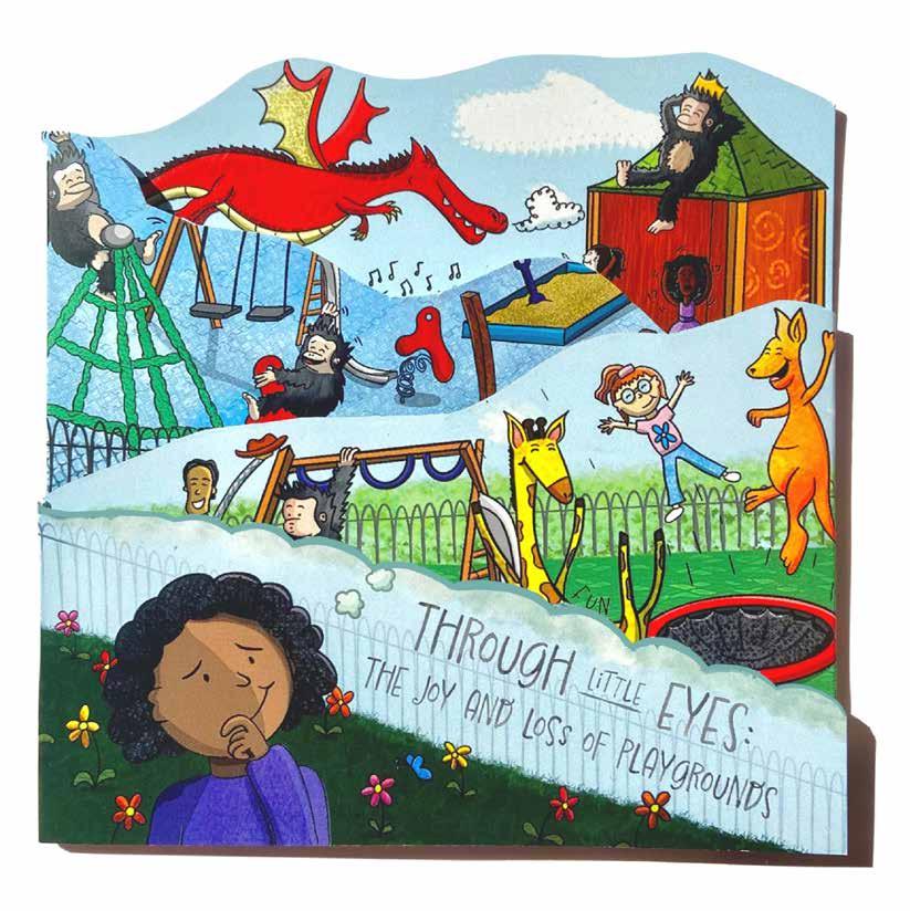
THROUGH LITTLE EYES: THE JOY AND LOSS OF PLAYGROUNDS
As a heavily digital illustrator, I wanted to push myself by incorporating analogue materials to broaden my illustrative practice and develop my authenticity. Through material exploration, I found that I could use the patterns and textures I created through frottage, black fine-liners, gouache paints, and charcoal to create my own set of unique digital brushes, using these to add depth and distinctive textures to my work. I enjoyed this process as it was fascinating to see how I could experiment with different analogue patterns to creating new and dynamic digitally brushes and using these to diversify my illustrations.
Using my research into the lore of playgrounds; I created a concertina spreading the importance of playgrounds, illustrated through the eyes of children verses the impact of not having them. With the theme of playgrounds, I opted for an interactive approach of a concertina, having the child’s perspective on the incline side and the negative impact on the decline side; one reason for this concertina shape. When folded, it creates a 3D landscape of a child imagining a perfect playground, reinforcing the importance of these, and in turn, provoking an emotion from my audience to think, sympathise and act.
Ellie Jobbins
Illustrator
I am interested in exploring nature and organic form in my practice. I use a range of media, enjoying tactility and texture in order to immerse an audience.
BIRDS IN THE OTHERWORLD
The central theme in this project are birds in Celtic mythology – their role in transporting humans into the spiritual realm known as the Otherworld. My initial visual research was observational, sketching magpies, which I then used to influence monoprints to respond to the prompt Haptic. I approach my work playfully, so this process was experimental by nature. The Otherworld (or Otherworlds) is an inbetween place, a sort of accidental journey experienced through the slipping of time, or following a bird, maybe diving into a river: it is the unexplained, deeply connected to the ancient natural world.
email: elliejobbins@icloud.com
instagram.com/ejobss
www.behance.net/elliejobbins
Irish mythology tells of various realms, good and bad, full of spirits and gods. I had initially began to thumbnail for a chronological narrative, trying to figure out a common mechanism for an audience to unravel the accordion book, before I realised this can be fully intuitive! There is no need for sequencing: this is to look at and perhaps piece together some vague narrative, but this is not its central purpose. I think there is something real and maybe missing in books aimed at adults that doesn’t engage with the tactility of a strangely folded book, and this was the outcome.
Elias Louis
Illustrator
I am a queer disabled illustrator based in the UK with a passionate interest in historical aesthetics, taking inspiration from medieval fantasy, fairytales and Victorian gothic literature, centering my work around queer joy and expression. Outside illustration, I enjoy book binding, garment sewing, cross stitch, reading and a little DnD.
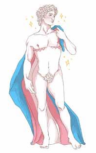
The theme of historical erasure of queerness has played a significant role in my project/s and is something that I would like to continue to explore, particularly in the current global political climate as LGBTQ+ rights are being erased. I feel that it is more important than ever before to celebrate queerness, in particular transness – of whom are at the forefront of anti-LGBTQ+ legislation and the sensationalised culture war. Through my work I want to continue to raise awareness and educate others about LGBTQ+ history as well as celebrating our joy, dispelling negative stereotypes to instead foster positivity.
To celebrate transness, I explored the great diversity of gender expression and transness and found that trans men are often the most forgotten and least represented out of trans people and often face negative stereotypes about masculinity. Through my piece I wanted to show that masculinity can be, and is, just as varied and expressive as femininity. As well as celebrating the joy of transition, the piece was heavily inspired by the fable The Ugly Duckling, highlighting the difficult yet joyful journey of becoming one’s true self in face of adversity.
Celebrating Trans-Masculine joy.
Emily Moon
Illustrator, Animator & Textile Artist
I am an illustrator currently based in South East England. I am drawn to themes of nostalgia, nature, folklore, and capturing the magic in the everyday. I love creating handmade tactile work using anything from textiles to hand painted paper collage, with pastel, pencil and paint. My favourite project has been my stop motion animation, The Enchanted Garden, using hand painted collage on a diy multiplane.
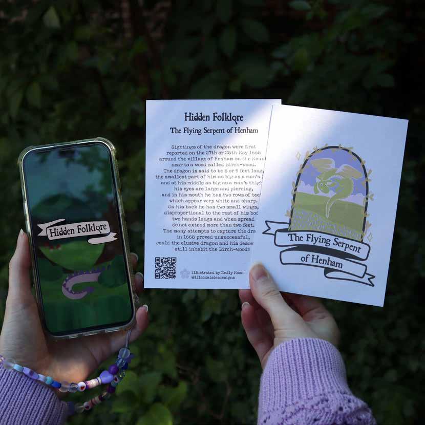
HIDDEN FOLKLORE
The journey of my project began with a flâneur trip with my dad to Hadleigh Castle, and conversations with my friends and family about local lore. We talked about The Essex Serpent by Sarah Perry, which led me to researching the dragons of Essex, where I discovered the tale of the flying serpent of Henham. This story excited and intrigued me as my family had lived in the next village, but we were all completely unaware of the lore, yet there was a real artefact dating from 1669 in the British Library reporting the sightings. This made me wonder what other hidden folklore stories are out there waiting to be discovered?
email: emily@lilacdaisies.co.uk
www.lilacdaisies.co.uk
social media: @lilacdaisiesdesigns
My project titled Hidden Folklore encourages a curiosity for uncovering and sharing folklore stories, and a deeper connection to the lore of the landscape around us. The concept of my project combines a physical stamp trail, inspired by Japanese stamp rallies, which builds the illustration for a collectible story card, with a digital app where you can keep track of the Hidden Folklore you have uncovered and plan your next adventure, so you can keep the stories in your pocket and take them with you wherever you go.
Illustrated collectible card for The Flying Serpent of Henham and opening screen of the Hidden Folklore app
Fynn Dodd
Illustrator
My name is Fynn (he/him) and I am an illustrator and creative based in West Sussex. I would consider my style to be flexible — working digitally I enjoy editorial and narrative projects. When I am not drawing you’ll probably find me with my head buried in a book.
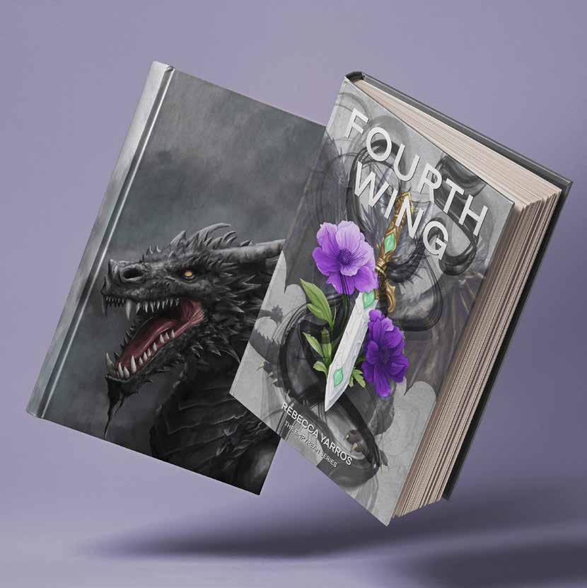
FOURTH WING
My exploration of the theme Lore led me to the realm of fiction and the role of an illustrator in publishing. I have analysed the elements required to design a striking book cover including the role of type and how it can influence tone and genre. Through researching the UK market, I observed which book cover designs are currently most popular with my intended audience analysing trends and common practices. I have reimagined the cover of Fourth Wing by Rebecca Yarros, creating a reversible dust jacket. This design choice gives an informative design that incorporates the blurb, publisher and author information as well as a decorative design on the reverse which entices collectors and more
email: fynndoddillustration@gmail.com
www.instagram.com/fynnillustrates
avid readers. I carried out contextual and historical research of the book to ensure that my illustrations were accurate and well informed; this is reflected in the use of celtic runes on the front of my jacket design. My audience are adults 20-40 years old and so have mature taste and are able to understand deeper meanings. Because of this I have used symbols such as flowers and a dagger to help me communicate the book’s tone and genre to my audience.
Reversible cover design for the book Fourth Wing by Rebecca
Yarros.
Joy Abbott
Reportage and children’s book illustrator.
I am an illustrator from Nottingham, England, and I have a passion for storytelling through my art. I enjoy capturing everyday moments in my sketchbooks, which I carry with me wherever I go. While I primarily work with watercolours, I also love experimenting with a variety of mediums. I have a particular fondness for locational sketching, as it allows me to create artwork based on my observations. I cherish these opportunities because they often reveal fascinating stories
FLY AWAY FLY
The Lore project has allowed me to create a short, empathetic children’s story that aligns with the theme of Play and reflects my research ideas as a reportage illustrator. My concepts for this module have developed through an initial exploration of various media and unexpected research findings, which have helped shape my project into something tangible. I believe it will resonate well in the book publishing industry with my intended audience of children. My preferred approach to making art work is to avoid being limited to a single medium, opting instead to work with a variety of materials and techniques. I particularly enjoy working in analogue formats, utilizing mediums such as watercolour,
email: Joyabbott1973@gmail.com
instagram.com/joyabbottmcdonald
collage, and linocut, while occasionally enhancing my work through digital methods. The aim of the brief was to produce a publication for children that teaches empathy through a short story. Throughout history, stories have been passed down to impart values. With this Lore brief, I aimed to capture that sentiment. Before starting a project, one should never underestimate the value of thorough research and planning, as they prepare you for various challenges. I discovered that research led me to some fascinating places, improving my understanding and ultimately contributing to my final outcome.
Fly Away Fly
A self-initiated children’s book project.
L.V. Green
Illustrator
I have a background in using traditional media but have discovered a love of digital during my time at university. My process is still thoroughly rooted in sketchbooks though and I love being able to bring those multi-media techniques together in unique ways that really reflect my journey as well as my inspiration..
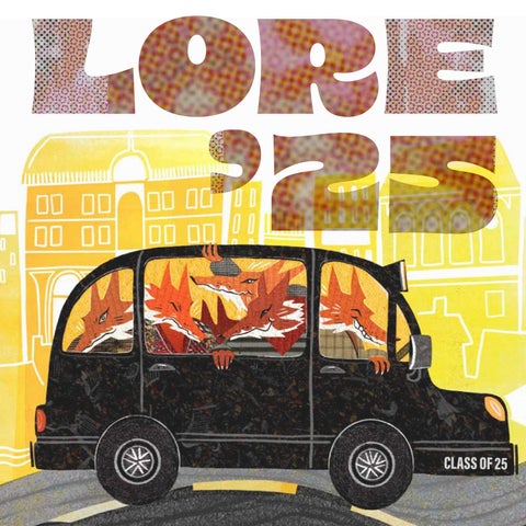
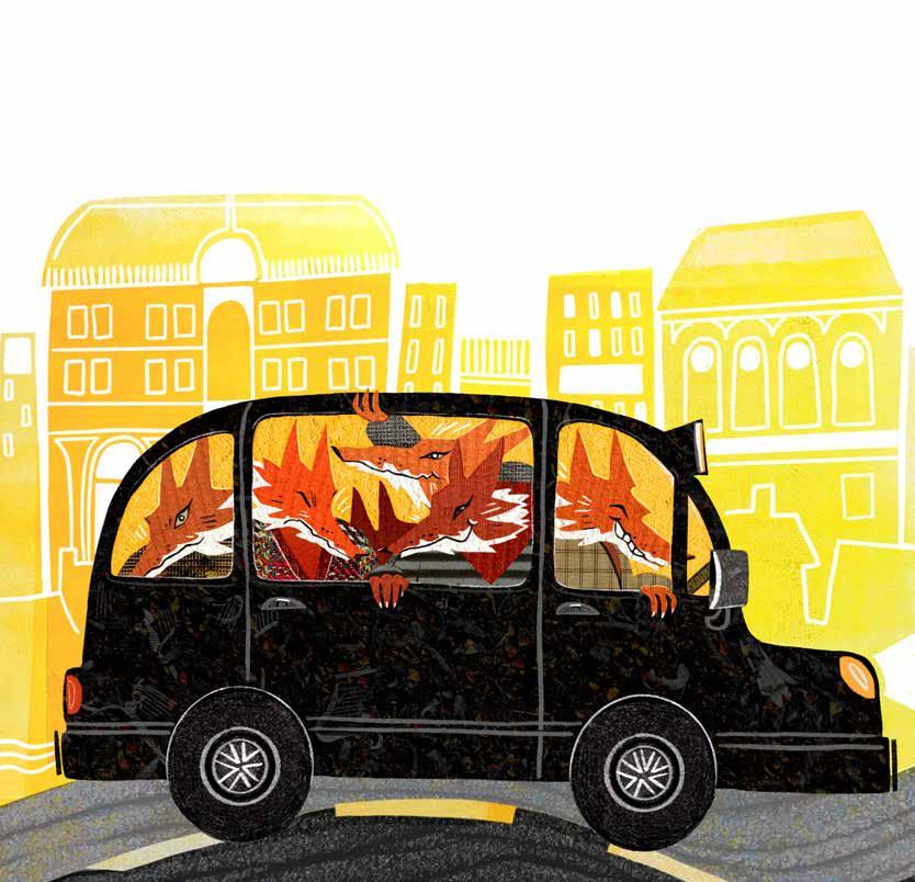
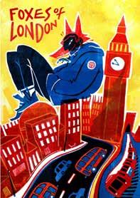
FOX-SPREADER
My project focused on the foxes that live in London and the folklore around shapeshifting creatures from mythology. I created a character based on a real fox that lived briefly in the penthouse of The Shard, before being caught and released, when The Shard was being constructed in 2011. In my process I utilised a lot of first-hand research to help inform my direction as well as my final pieces, interacting with materials, sketching and creating a collection of photographed textures that I used to create my work. The final outcomes were created as promotional material for a stage play that chronicles the misadventures of a cunning fox shifter making its presence felt in London.
email: hellolvgreen@gmail.com
instagram.com/lv illustrates cara: @lvgreen
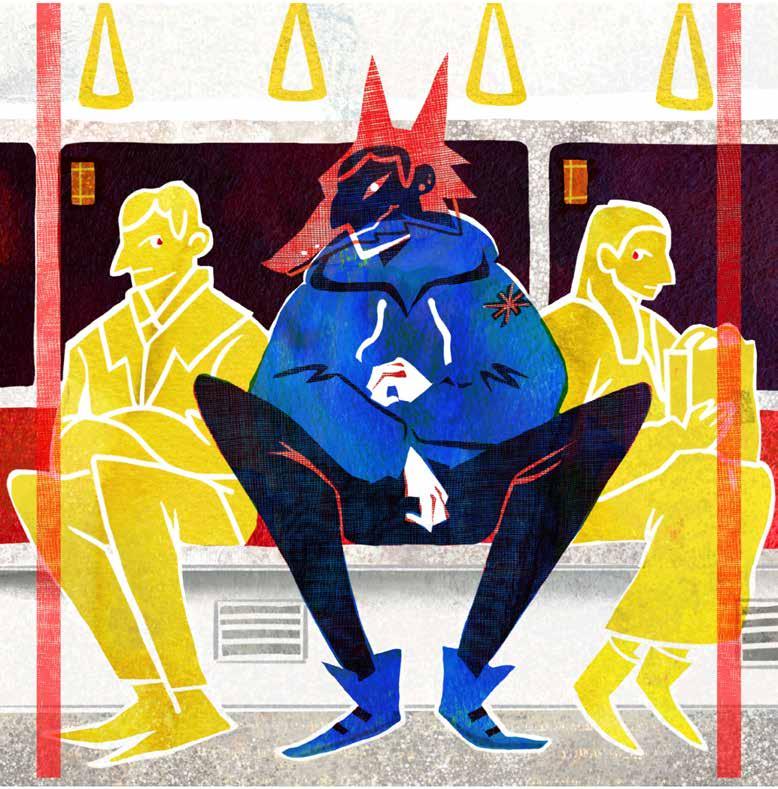
In the illustrations I hoped to capture a larger-than-life character and their imposition on the regular experiences and icons of the city. In this instance as an underground passenger spreading into the personal space of the commuters around him. I used digital mediums to combine textures I captured during research trips with some I made myself, using watercolour and printing processes, and created a collection of work around the character and their story.
Illustration for Foxes of London project: merchandise and promotional material. Digital collage.
Lauren Doble
Designer & Illustrator
I am an artist and illustrator based in Devon, UK. I enjoy working with a range of media with particular fondness for acrylic and oil paint. I have strong values toward sustainability as I spent my childhood growing up on a farm and like to incorporate this within my work.
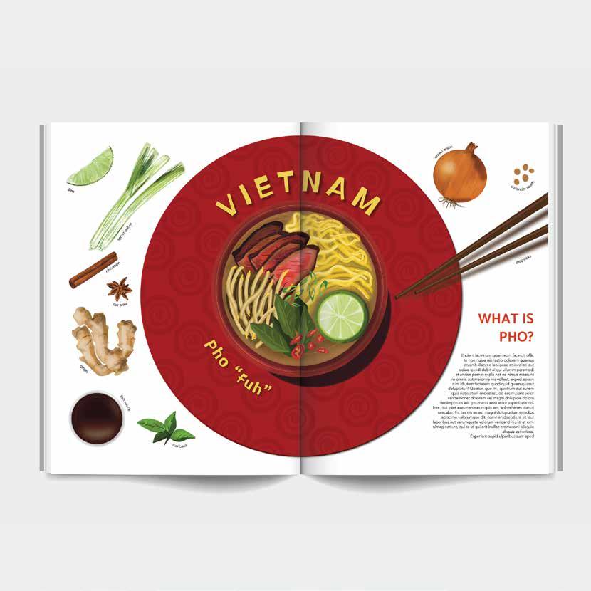
My journey in this project celebrates the cuisine and culture of countries across the globe. My book concept acknowledges the importance of equality, diversity and inclusion and how this can be included akin to educational content. Through research I explored new territories of culinary traditions, geographical factors, and how illustration assists in learning development amongst children. In-depth research allows me to become more aware to the world existing around me. As an illustrator, my visual language is still evolving, thus allowing me to proceed along this journey with extensive idea generation and medium experiments which include analogue and digital approaches.
The purpose of my project is to educate and entertain a children’s audience of the traditional dishes of each country. With vibrant colours and use of characters, the illustrations add playfulness to the book’s intention. As a collective illustrative book, the work positively reflects the depth of my research with clear visual indications of specific dish ingredients which will aid in learning, recognition and re-call for the readers. This project has added insight to where my practice can develop and succeed within the industry – children’s book illustrations were not previously considered nor an interest before this project.
Spread for the traditional national dish of Vietnam, Pho. Analogue and digital methods.
Logan Williams
Illustrator
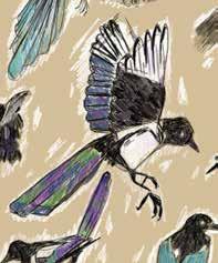
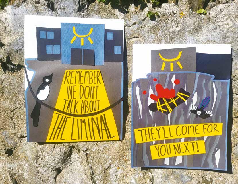
I am an illustrator based in the UK and I like to make character-focused work that spans a wide variety of genres, such as sci-fi and dystopia. My work is mostly digital, but I also enjoy working with traditional mediums.
One of the main goals I had with this project was that it had a sense of being grounded in reality. I wanted this world to feel like something that could run parallel to ours. A dystopian society that is not too out there to imagine. Observation sketches were a main part of my research. I wanted to see how I could take real life and bend it to fit this world’s perspective. A main part of this universe is the motif of magpies. So I needed to take extra care when working these birds into the logos I was creating. I believe that this project followed the ideas I had set out during my journey. The final posters hint at a dystopian world with two groups fighting against one another for control.
This project was a step toward creating my own worlds and has a clear influence from real life. By starting to build up a lore around the posters, I was able to create a foundation for further ideas that I plan to expand on in the future. These posters were the first steps into a new universe that has so much more to offer.
MCD
Illustrator
I am a South Wales based illustrator, whose current practice is inspired by the juxtaposition of order and chaos. I utilise playful, simplistic shapes and negative space in my work so I can balance lively textures and create engaging illustrations to suit a diverse range of topics.
email: mcdillustration@outlook.com
BRINGING WELSH LORE TO THE EVERYDAY
Ritual was at the forefront of this journey for me, celebrating this within the context of my work and embedding it in the process of making. Choosing to emphasise ritual in my practice allowed me to immerse myself in the ritual of making, while simultaneously exploring unique rituals of Welsh holidays. Striving to be more ritualistic in my practice led me to explore lino cutting. Bringing my attention to careful use of simple shapes and being intentional with space, and my discovery of these as strong elements of my visual language. This reflects the growing importance of ritual within my creative practice and how incorporation of it into my process helped illuminate my project goals.
Through a mix of ritualistic making and thorough research three overarching goals emerged: to communicate the rituals underlying key Welsh holidays, to emphasise these themes and encourage my audience to consider celebrating holidays with historic rituals (as opposed to commercialised themes surrounding holidays today), and to bring these elements together into a functional item that people can integrate into their lives in a ritualistic, mindful way. For this, I chose tea towels.
Illustration created for tea towels, bringing elements of Welsh lore to the mundane
Maria Sorokina
Illustrator
I am an illustrator from Vienna, specialising in children’s book illustration and primarily working with digital media. My work is characterized by vibrant colours, rich textures, and simple yet expressive shapes and characters. I am influenced by the mundane aspects of everyday life and try to shine a light on them through my fun illustration style!
SOUNDS FROM MY CHILDHOOD
This project began as a journey to reconnect with my childhood memories through sound. In my research, I discovered auditory memory, revealing how certain sounds can unlock forgotten moments. Listening to nature sounds combined with songs from my childhood allowed me to recall various experiences, including the happy memory of the goats that lived in a park I frequently visited as a child. This inspired me to highlight that moment in my unique style. The final outcome celebrates the playful essence of childhood, brought to life through bright colours, joyful characters, and my whimsical illustration style.
email: maria.sorokina.art@gmail.com
www.artmariasorokina.com
instagram.com/mariasoro art
Inspired by established children’s book illustrators, I aimed to capture a nostalgic memory that resonates with others. The warmth of the colours expresses the feelings and memories of my childhood, which have a deep connection to the sounds I have linked to those moments. The outcome aims to show how simple, everyday sounds can greatly affect us and bring back wonderful memories, encouraging a more mindful way of moving through life.
Sounds From My Childhood: a snapshot of a memory. I frequently visited a park where goats lived during my childhood
Niki Jenkin
Illustrator
I am an illustrator with a love of storytelling and all things paper. I like to believe that every image has the power to transport us, even if only for a moment, to another world. My tools of choice are typically inks and paint, pencils, and a good pair of scissors. I am most at home when working with my hands.
THE MAGPIE’S CURSE
History, storytelling, and working with my hands are important elements of my practice so I placed these at the heart of my project. Using the brief to explore the narrative possibilities of paper, I experimented with different folding techniques and three-dimensional construction. The opportunities and constraints of these methods helped me to articulate and push aspects of the story I’d created further. Working physically with paper has given me an insight into how a viewer might interact with my piece and the value of revealing information in stages. My outcome is a three-dimensional paper scene, and accompanying artefact based on an imagined folktale.
A mythical magpie/woman appears mysteriously each year, her performance resulting in the death of one of the town’s men the following day. The paper scene brings the folktale and the world in which it is set to life and engages the viewer directly. The viewer is then invited to reveal the magpie’s back story in three stages through the form of a folded paper love token. The methods of making and use of symbolism tie to the Victorian era in which the tale is set, creating additional layers of meaning and inviting the viewer to make their own connections.
Paper scene for self-authored folktale The Magpie’s Curse.
Natasha Hayball
Illustrator
I utilise tactile hand-drawn lines and textures created using watercolour, gouache and coloured pencil to explore themes of the everyday, family dynamics the concept of home. I observe and celebrate the familiarity of our daily interactions and the simplicity of the mundane, through soulful characters, and relatable settings. I am particularly interested in editorial illustration, novelty activity books and non-fiction projects.
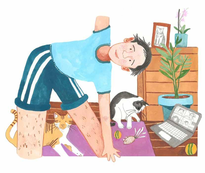
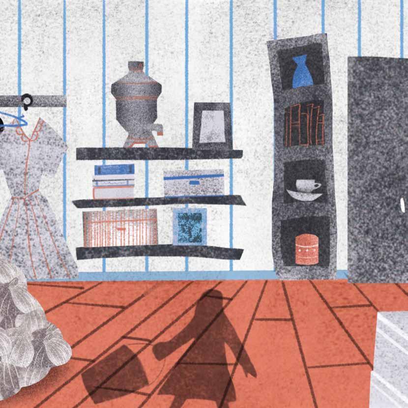
WORKING FROM HOME
My process often begins with thumbnailing. Here, I explored how the term ‘work-life balance’ has evolved within society today, to develop an illustration which responds to the rise in mental health focused media and the promotion of wellness rituals for the home environment, as a result of the pandemic. This research also highlighted the correlation between the bonds in which we share with our beloved pets, and its impact on our mental health which further influenced the direction in which I chose to represent the following themes to contemporary audiences using my dynamic visual language. Created using gouache and coloured pencil, this editorial illustration celebrates the everyday,
documenting cherished interactions between beloved pets and owner as they navigate ‘working from home’, playfully drawing from experiences of the pandemic and the resulting evolution of our home offices. To express themes of tranquillity and the comfort of home, I utilised colour symbolism generally found within spiritual practices as a vehicle to explore abstract representations of healthy wellness routines and their impact on our mental health. Observing a cherished mundane moment in time reminds us to take a break and share the present with our loved ones.
Self-initiated editorial illustration project highlighting the impact our pets have on our mental health and exploring the correlation between healthy well-being rituals and the importance of a restful home environment
Pia Marie Endres
Illustrator
I am an illustrator with a passion for creating colorful visuals to help make the world a happier place. I am illustrating for all kinds of projects, but I mainly write and illustrate children’s books with the goal to help readers believe in themselves and in their dreams. In order to create engaging, personal and playful illustrations, I mainly work analogue using a combination of different mediums.
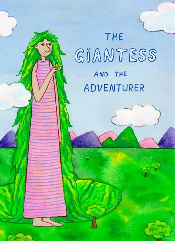
My goal for this project was to write and illustrate a children’s book about the lore of a giantess who is believed to be malicious and is tried to keep at bay with rules and rituals which all villagers follow rigorously. I started by researching existing lore about giants and experimenting with many different mediums. This led me to a mixed media approach of painting the outlines with blue acrylic ink, followed by a base layer of yellow and red acrylic ink to create depth and texture. I painted on top of this base layer using gouache and acrylics.
The result is a portfolio of work for my children’s book The Giantess and the Adventurer. It includes finished illustrations for the cover and two double page spreads, character sheets and sketches for all other pages. This book is a valuable story for young children, especially designed for the age group of 2-8 year olds, as it teaches them about the danger of blindly following what everyone else is doing. It is my ambition as an illustrator to create children’s books that strengthen the readers trust in themselves, in their uniqueness and in their curiosity, all of which this book celebrates.
Cover for children’s book, The Giantess and the Adventure
Rhiannon Pettie
Illustrator
I am a freelance illustrator with a strong focus on visual storytelling through illustration. My practice often draws from traditional techniques like printmaking and painting, which inform the visual language of my digital work. By combining expressive linework with bold, limited colour palettes, I create striking visuals that not only bring warmth and personality to a project but also communicate ideas clearly and with impact.
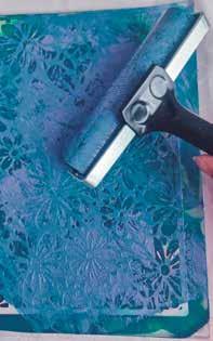
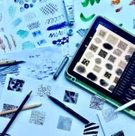
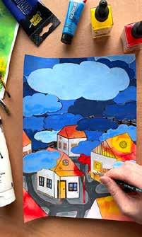
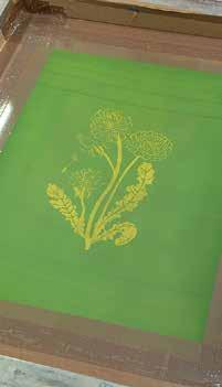
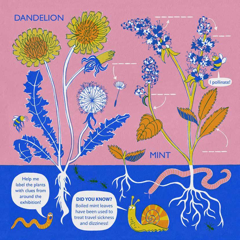
PLANT LORE
My journey began with observational drawing from real plants. I experimented through blind drawing, contour and non-dominant hand exercises, allowing me a freedom to draw and connect with the plant form. This looseness allowed me to deconstruct and stylize the plants which translated to the next stage – printmaking. I tested various methods such as lino, intaglio and screen printing (shown left). The skills acquired through these rigorous test prints resulted in a deeper understanding of working in layers, limited palettes and how my line and shape contrast would translate into the final composition. Inspired by research into STEM subjects within the National Curriculum for
email: hello@rhiannonpettie.com
www.rhiannonpettie.com
instagram.com/rhiannonpettie
threads: @rhiannonpettie
x (twitter): @rhiannonpettie
KS1 children, I was able to take my test prints and combine these interests, producing an activity sheet that could accompany a child on a museum visit. The handout included the front page, a history of herbal tea lore, exhibition map, and four activities. The main activity pictured, represents interaction, character design and information communication around the labelling of a plant. The illustration is balanced with a limited colour palette, linework and negative space, demonstrating the hand drawn visual language and printmaking influences from my project journey.
KS1 Activity ‘labelling a plant’, part of an A3 handout for an imagined exhibition about plant and herbal tea lore to support learning and engage child visitors
Rosie Middlewick
Illustrator
I have lived in Cornwall most of my life, which is lucky since being outside is always guaranteed to inspire me to create. For me analogue techniques are what really bring joy into my work. I am fascinated by book illustration, having always been an avid reader, I love to portray character and stories. I hope I always do this with compassion and warmth, creating something beautiful where I can.
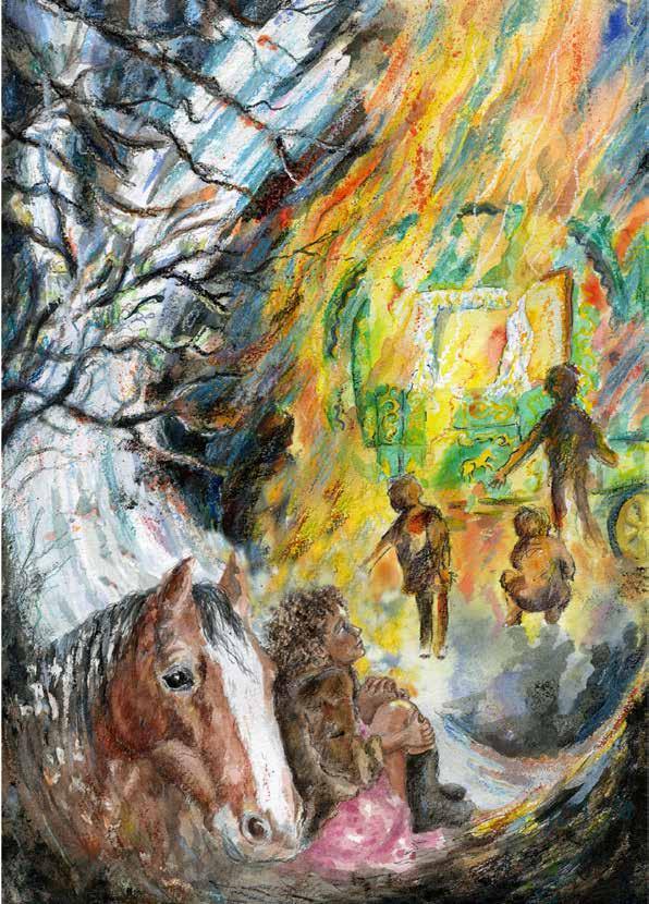
THE DIDDAKOI
I chose to create a series of illustrations for Rumer Godden’s book: The Diddakoi for readers aged 9+. It traces the story of Kizzy Lovell, an orphaned Romani traveller, as she navigates the loss of her home and the intolerance and unexpected kindnesses shown her in her new life. This offered an opportunity to explore character, through the protagonist Kizzy Lovell. The longer text and evocative writing gave me the challenge of visually conveying a multifaceted character, who retains brash independence in the face of the poignancy of grief, powerlessness, isolation and the turmoil of separation from culture and community. My approach to sensitively exploring character was to document the
instagram.com/Rosie Flo Illustrating
interaction between character and environment, particularly since the dramatic fragmentation of environment and community is such a key theme of the book. In this scene, of the funeral fire, I have tried to portray, through body language, something of this grief, using the Fibonacci spiral to connect the character to the source of her emotional turmoil. However, while suggesting something of the instinctual perceptions of the child protagonist, I also hope the illustration is intriguing and adds something to the text’s exploration of the richness and complexity of the Romani culture.
Illustration for The Diddakoi by Rumer Godden. Kizzy Lovell watching the wagon burn at her Gran’s traditional traveller funeral
Samantha Lawrence
Illustrator
I am an illustrator who enjoys coloured pencils, collaging, and digital design. My creations often feature birds, botanicals, and historical themes, reflecting my passion for storytelling and pattern design. With a background in hospitality and extensive travel experience, I bring a unique perspective to children’s illustration, editorial, and surface design.
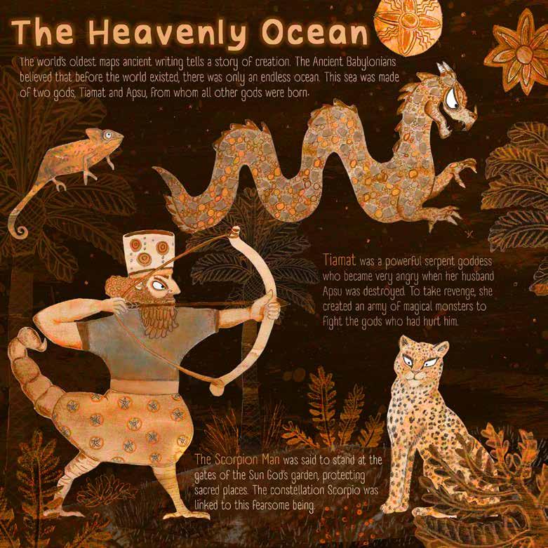
THE WORLD’S OLDEST MAP
This project brings to life the world’s oldest map housed in the British Museum as part of a factual children’s picture book concept. With the encouragement of Assyriologist Dr. Irving Finkel, I explored the map’s ancient cuneiform and created an illustrated scene inspired by Mesopotamian creation mythology. Using painting, papercut and a layered digital diorama approach, I built an immersive scene that sparks curiosity while staying rooted in the ancient text. This work reflects my process of combining tactile materials, storytelling, and visual design to create engaging, educational content that makes complex subjects accessible and exciting for young readers.
This project became a creative destination where my interests in ancient history, animals, and children’s illustration came together. I developed an illustrated concept for a factual children’s book based on the ancient Mesopotamian map, blending visual storytelling with historical research. Collaborating with Dr. Irving Finkel was a turning point—his insights deepened my understanding of the map’s origins and opened the door to a future project together. I’m now exploring the stories of those who discovered and studied the map, while continuing to build a practice focused on historical and naturethemed work that engages young audiences with curiosity and imagination.
Sam Rawlins
Illustrator and Creative Practitioner
I am a queer artist that has a passion for creating, across a wide range of disciplines and media and often mixing them to push the boundaries of illustration and my practice. I also like my work to be meaningful, representative, or convey a message to provoke emotion or thought.
email: sam art_ish@outlook.com www.sam-art-ish.com
facebook: Sam Art Ish instagram.com/sam.art ish
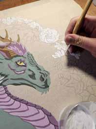
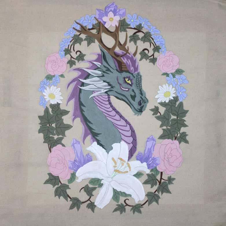
ALTAR CLOTH FOR THE PAGAN SABBAT IMBOLC
Focusing on the Pagan Sabbat, Imbolc, and the prompt word Ritual, I designed a dragon using elements that represent the holiday, such as animals, flowers, and crystals. Initially created digitally with Photoshop and using Adobe Acrobat, I was able to transition my illustration into functional art as an altar cloth. It took a lot of exploration with different materials for the canvas, however, I finally landed on a natural, undyed heavy cotton. As seen in the image. Using a combination of acrylic paint, fabric paint, and flow improver medium, I was able to paint straight onto the unprepped fabric.
Altar cloth for the Pagan Sabbat Imbolc, for use within practice or for divination/tarot reading
Tracey Dean alias ‘Toc’
Illustrator
As an artist and illustrator with a craft based background, my work is versatile drawing on techniques that range from sculpting, batik and weaving to painting and drawing. I enjoy experimenting with different media and I am inspired by nature and interactions between cultures.
email: tocillustrations@gmail.com
instagram.com/tocillustrations
linkedin: toc-illustrations-35132b360
facebook: toc illustrations
www.tocillustrations.com
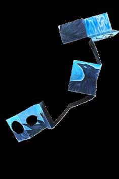
THE MORUADH’S TREASURE
I created a series of eight low-relief ceramic tiles to illustrate the Irish legend of The Moruadh’s Treasure (Moruadh means ‘sea-maid’/ mermaid in Gaelic). Clay’s tactile nature and expressive mark-making aligned with my chosen theme, haptic, from the Lore brief. Greek myths depicted on clay vessels were my initial inspiration, I was later drawn to Liverpool’s architecture with sculpted figures and decorative design friezes in low relief. These influences reinforced my desire to create a sculptural narrative using clay. Museum visits further deepened my appreciation for ceramic art and low-relief design. Researching Celtic myths and folklore proved fascinating and inspiring.
The ceramic tiles visually narrate a tale from Irish folklore. I loved the tactile process of working with clay, shaping different textures and forms. While the tiles stand alone as a series, I digitised them and designed a concertina book. Since Irish folklore is rooted in oral storytelling and mermaid legends vary, I rewrote the story in my own words and printed the text on the back of each colourful tile image. As the reader narrates the story, children can unfold the book like a banner, adding an interactive element, while they visually engage with the tale as it progresses.
Final ceramic tile in the series, depicting the mermaid’s escape to freedom
Victoria Edwards
Illustrator and maker
I am an illustrator and maker based in the Cotswolds, inspired by nature, flora and fauna around where I live. If I am not being creative, you will find me crafting for our family’s small business or out riding my horses and tending to livestock. I mainly work with watercolours and fine liners as they create a softer finish to my pieces, but I love exploring new mediums and techniques.
email: victoriaedwardsart@gmail.com
instagram.com/illustrated.by.victoria
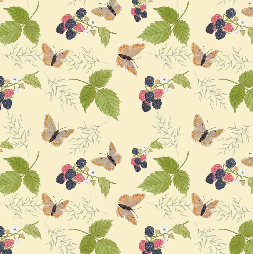
SUMMER HEDGEROW SURFACE PATTERN
The process for creating my surface patterns started with creating a couple of observational sketches of insects and flowers. These drawings then provided me with inspiration to then move onto developing my skills further, by creating new detailed watercolour illustrations to create something that was soft and delicate but also realistic. The process was a learning experience, as I had to learn how to edit and scan all my hand painted designs to create my patterns digitally. Once the editing process was finished, I moved onto composition layout for my pattern designs, which was something new that I really enjoyed.
This certain surface pattern is one of many that I am really proud of, and is one of my favourite pieces I completed when doing this degree. It allowed me to really find my passion for surface pattern design, and creating designs with my hand drawn/ painted illustrations. My aim was to create patterns that showcased different habitats, this one featuring a hedgerow habitat in the summer. Illustrating patterns is something that I can really see myself developing in the future as an illustrator. Alongside continuing to experiment and develop the skills that I have learnt on this BA degree.
Yulia Shchelkunova
Illustrator and maker
I am an illustrator based in Taiwan, working across children’s picture books and editorial illustration. Blending digital and analogue techniques—like hand printing, stencils, and collage—I explore storytelling through a cross-cultural lens. Inspired by my Russian roots and life in East Asia, my work often draws on folklore and place-based narratives to create images that feel both personal and universal.
TEACHER, TRAVELLER, WRITER: THE STORY OF VASILI EROSHENKO
For this project I wanted to refine my visual language while exploring new techniques. I employed stencil printing for figure drawing and integrated textile collages to introduce vibrant colours and textures. Historical research into eclectic Japanese fashion of the 1920s enriched my palette and influenced my overall imagery. Experimenting with silks, cotton, and wool allowed me to subtly convey each character’s personality. Although challenging, exploring the tactile side of illustration encouraged deeper reflection on my creative process and pushed my practice in exciting new directions. While working on a picture book about Vasili Eroshenko—a blind writer,
traveller, and teacher from my hometown—I set out to share a piece of overlooked history. What began as a personal project became an exploration of inclusive storytelling. Eroshenko’s active, independent life challenged me to represent disability without relying on stereotypes. I also began to explore how illustration can engage visually impaired audiences through tactile elements and non-visual narratives. This project deepened my understanding of illustration’s potential, encouraging me to think more critically and creatively about accessibility and the different ways stories can be told.
Illustrations for the picture book project Teacher, Traveller, and Writer: the Life Story of Vasili Eroshenko
Lore is a publication of BA Illustration Online
Falmouth University 2025
Publication designed by Jessica Jenkins, Deputy Course Leader
Front Cover fox illustration: L.V. Green
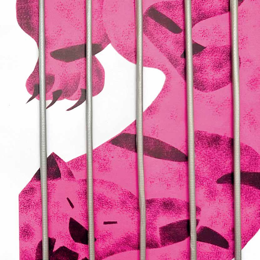
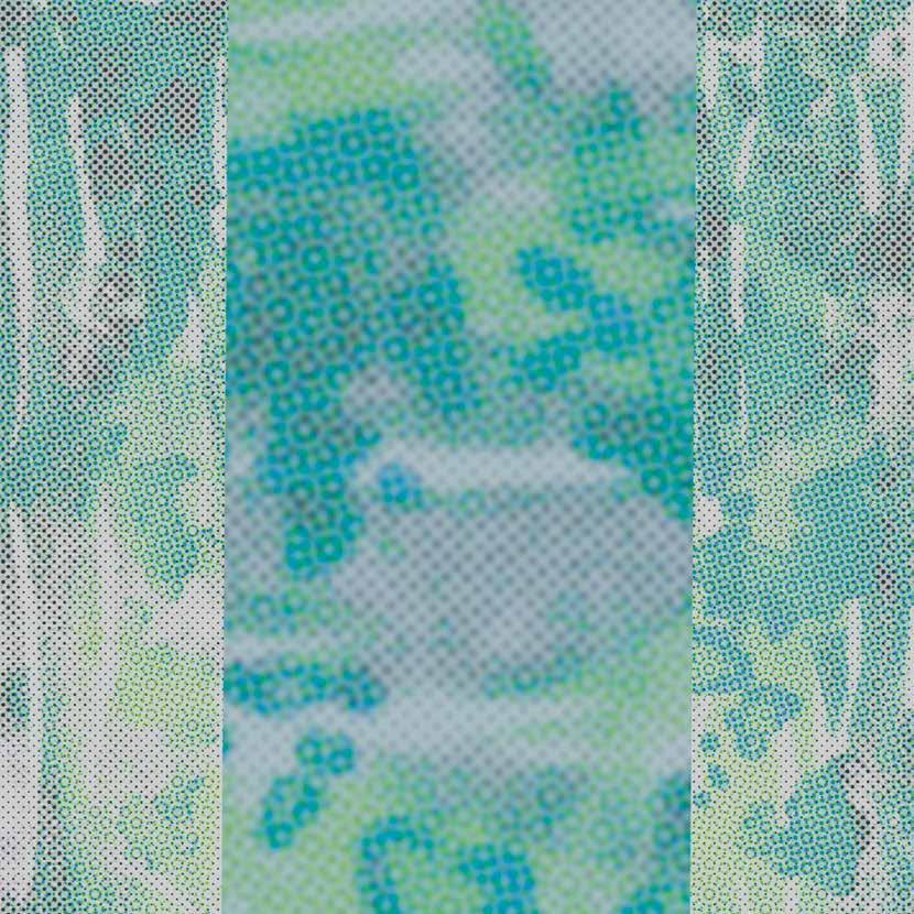
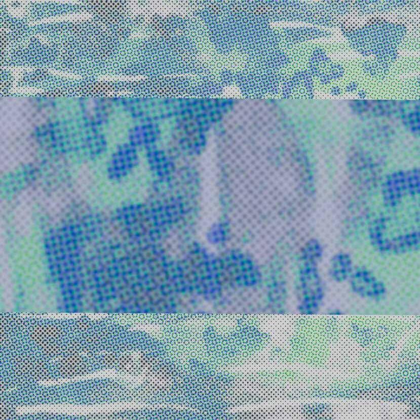
Textures on Lore 25 and backgrounds: Chantelle Jean-Paul Lee
Other textures for the words taken from work by Beatrice Adomaityte, Rhiannon Pettie, Niki Jenkin and Victoria Edwards.
Many people contributed to the success of this project and publication. The Lore Project was conceived by Suzi Kemp in dialogue with colleagues Shefali Wardell, Kit Mead and Jessica Jenkins. The module was taught in 2025 by Connie Noble and Helen Friel.
Our students have developed their practice since joining with us with the help of all our amazing tutors: Naomi Batts, Verity Slade, Connie Noble, Angela Chick Helen Friel, Joel Merriner, Peter Blodau, Pete Williams, as well with the insights of many visiting lecturers.