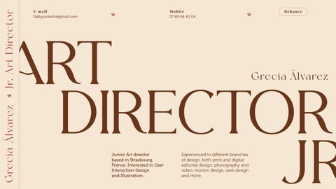
Junior Art director based in Strasbourg, France. Interested in User Interaction Design and Illustration.
Experienced in different branches of design, both print and digital: editorial design, photography and video, motion design, web design and more.
Grecia Álvarez
fabbyvioletto@gmail.com E-mail 07 69 64 40 04 Mobile * * jr. Grecia Álvarez Jr.
Director *
ART DIRECTOR
Art
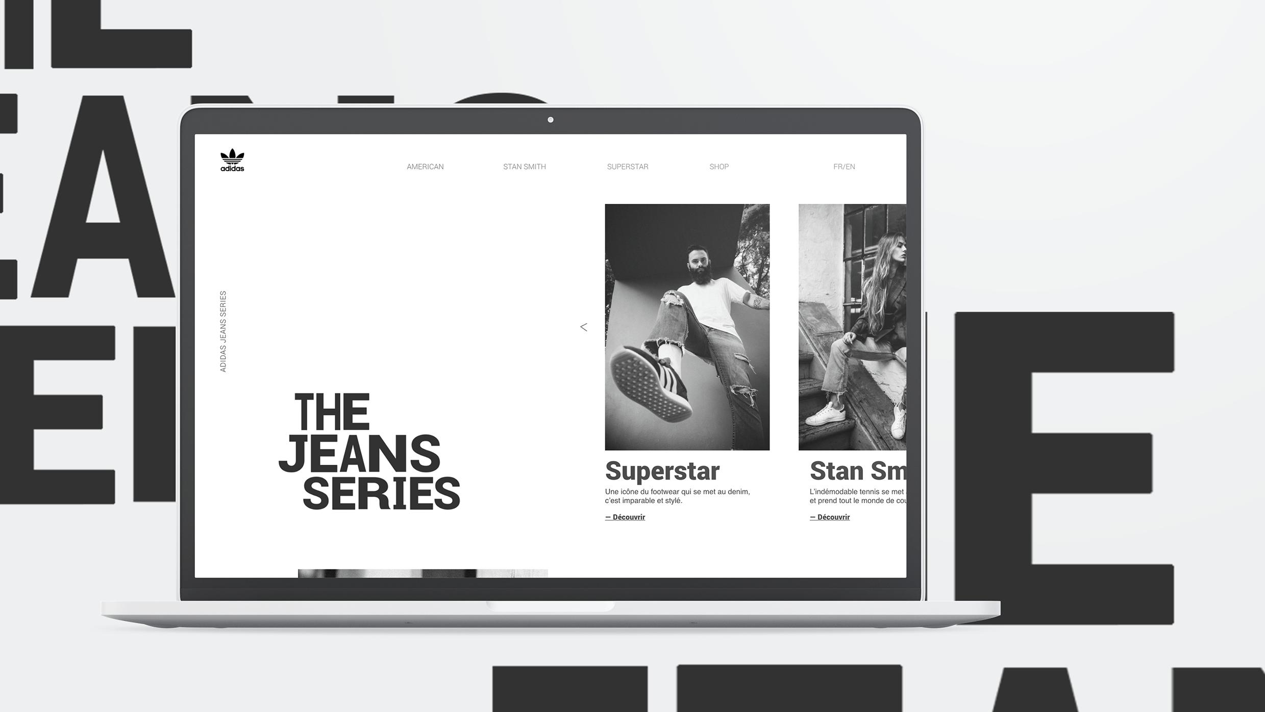
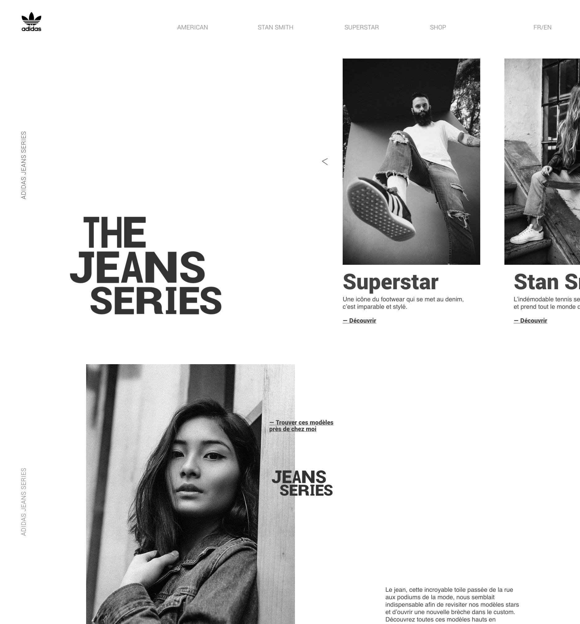
The Jean Series is a one page website designed as a part of a web design class projet.
An online catalogue of the latest Adidas Collection.
Web design 2020
Since the soul of the brand and particularly this collection is urban style, I decided to first, create a logotype that reflected this casual style and by playing with the thickness of the letters, to create a experimental vibe.
The layout was imagined as clean and classy
The layout was imagined as clean and classy aligning with the prices and the brand reputation.
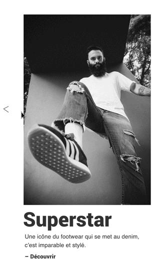
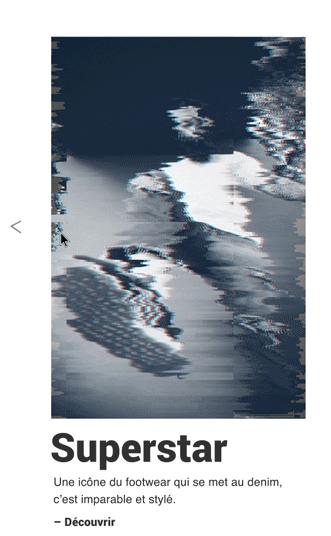
Yet following the line of experimental and urban style, a hover animation was created for the images on the carrousel. This animation recreates a glitch effect.
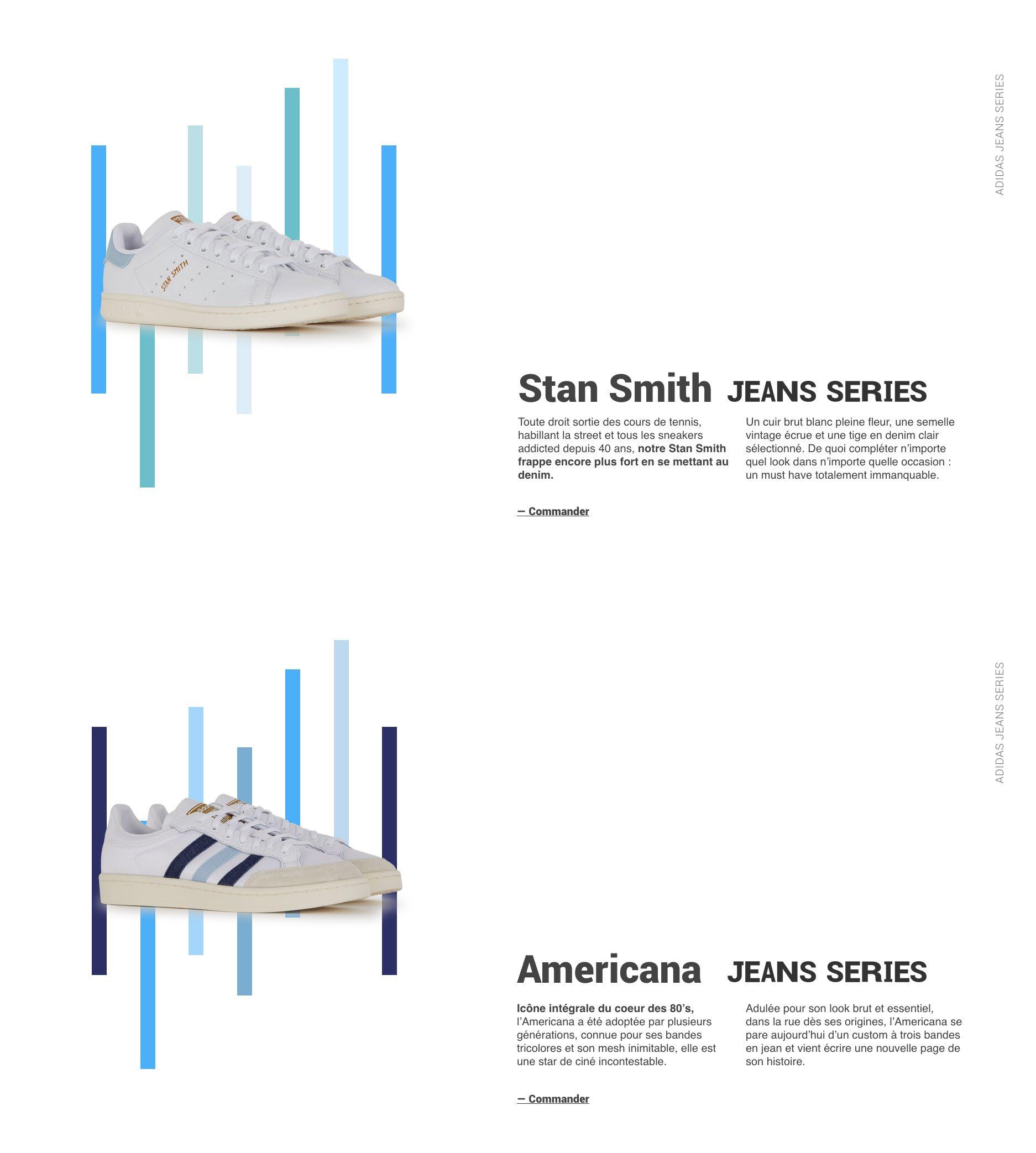
The same effect is founded in others elements of the website but without being overexploited.
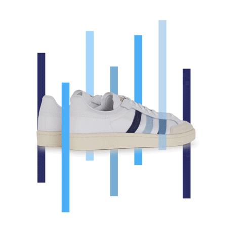
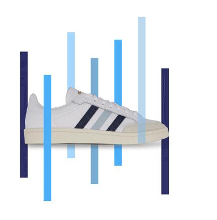
To display the sneaker’s collection and because is a one page landing page, an effect parallax seemed the best option.
So by picking the palette from each pair of sneakers and adding some lines, matching the sneakers design, the parallax show 3 perspectives of the model for the user to appreciate. Also the glitch effect appears but without interfering in the product view.
To see more about this project interactions and animations visit my Behance on link below.
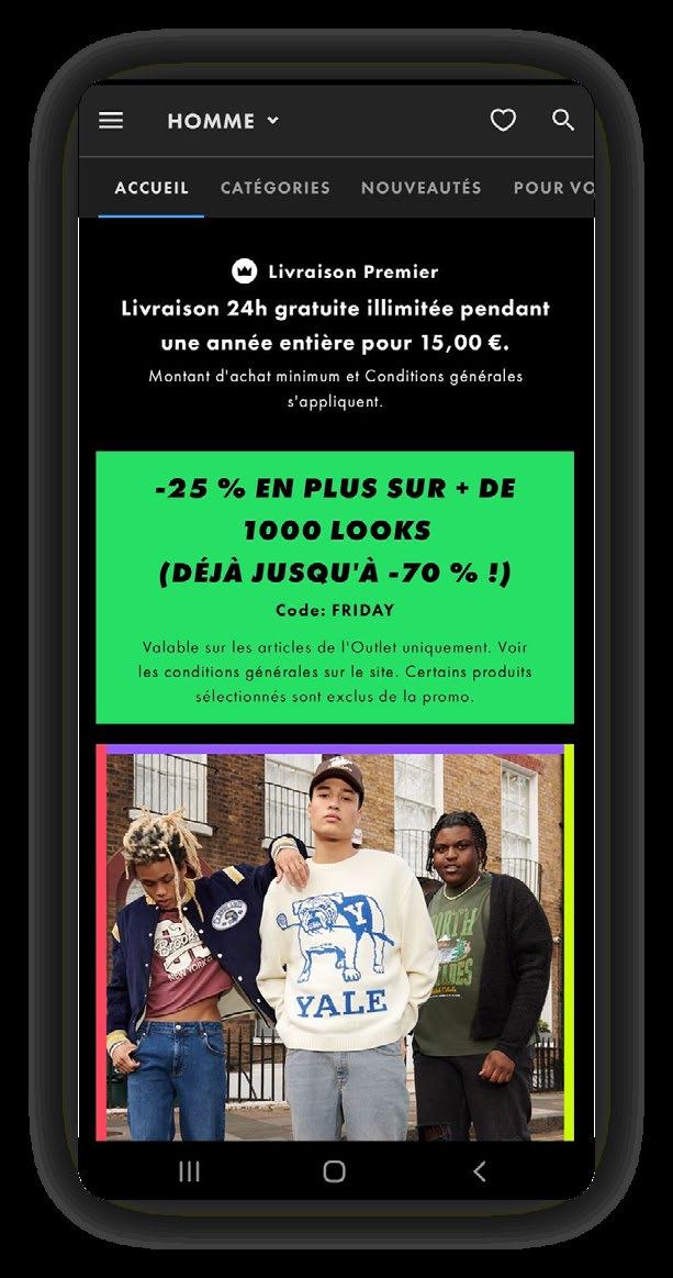
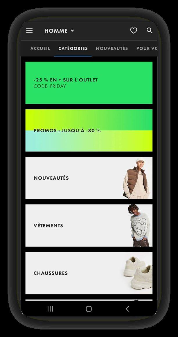
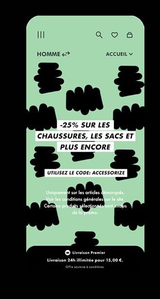
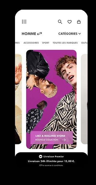
ASOS REBUILD
User interface redesign proposition for the ASOS app based on their existing design guidelines, this UI lifting aims to refresh the layout and usability.
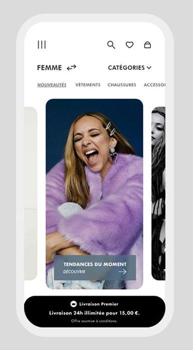
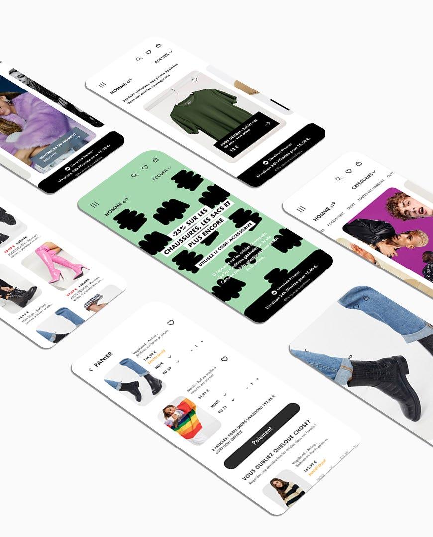
App redesign 2021
The main function added : an easy switch men/woman layout. The user then will have a suited selection of products but also of offers and discounts.
Another design solution was full page images on the home section. And also bigger images on the rest of the app. This simple decision gives the app a visual lift, order and clearness so the user do not get overwhelmed with to many information: products, offers etc.
A banner showing the offer of the moment is fixed to the layout. This allows the user to keep this info in mind while shoping.
Visit my Behance on link below and discover a video mockup of the app layout.
 Actual version
Lifting proposition
Actual version
Lifting proposition
App design 2021
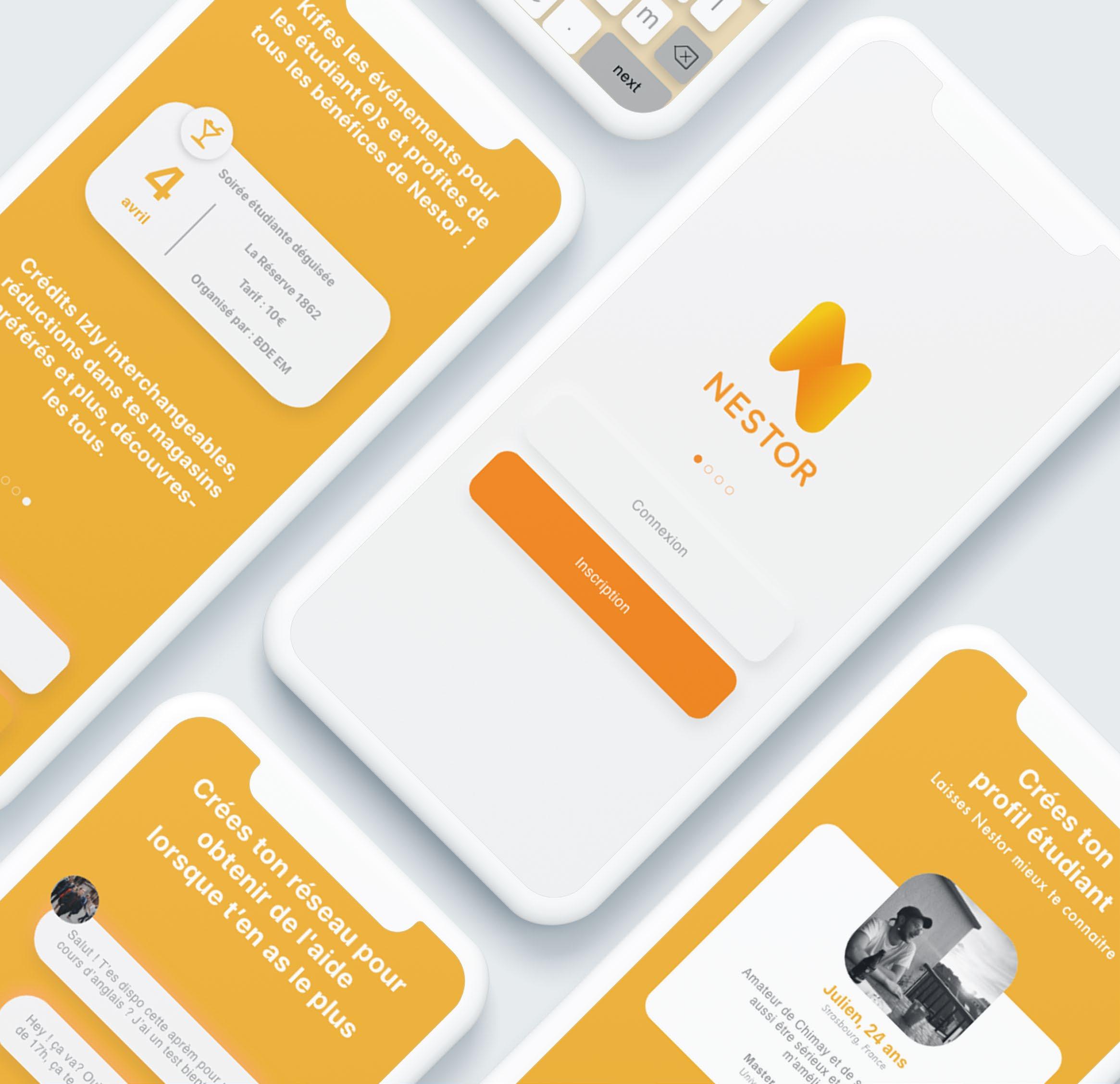
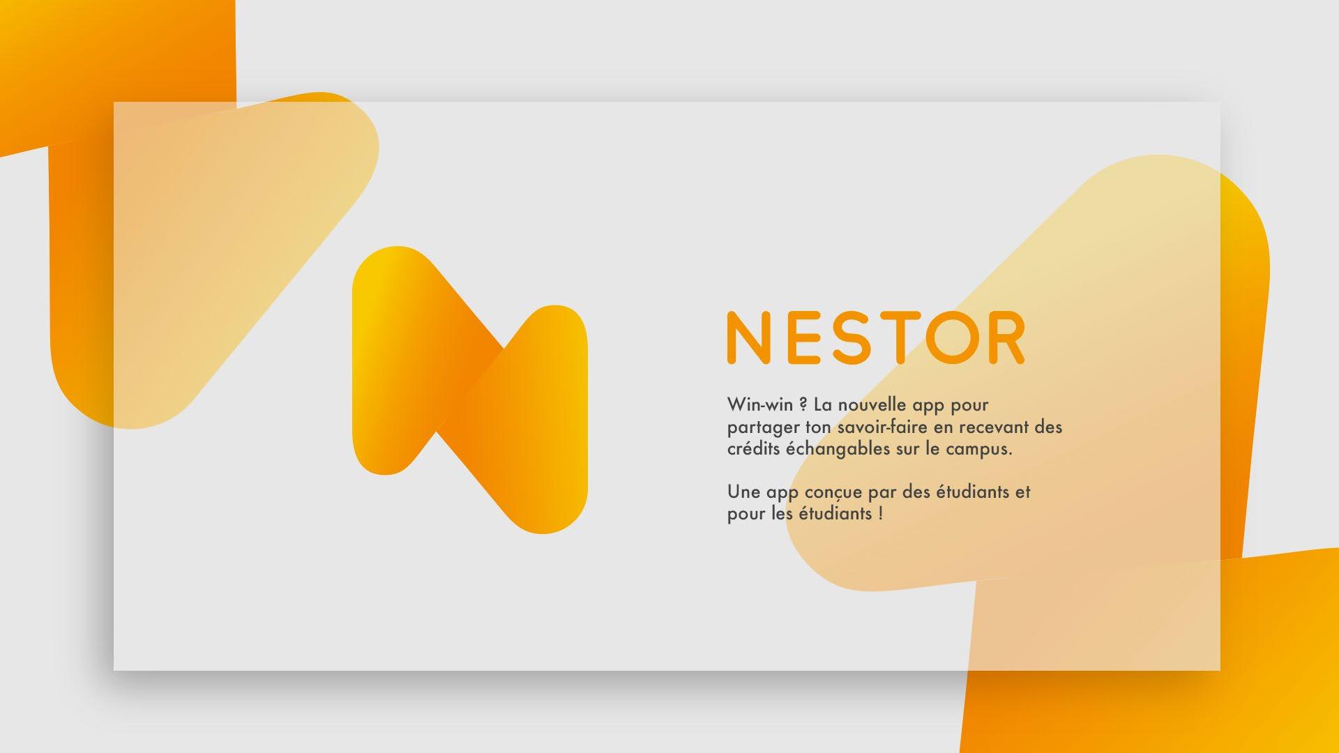
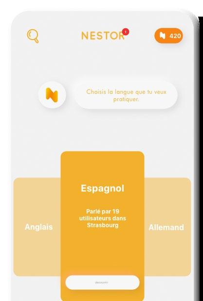
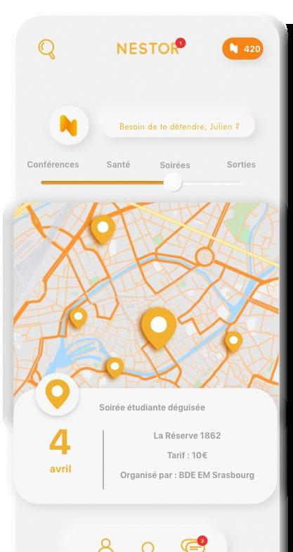
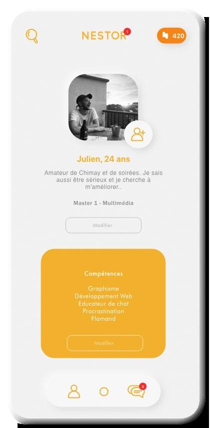
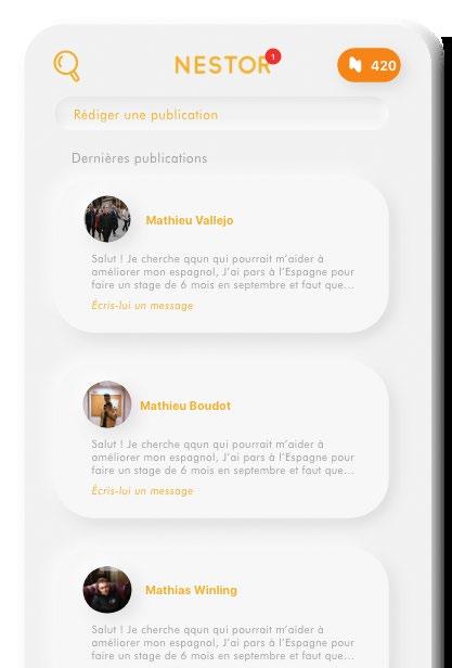
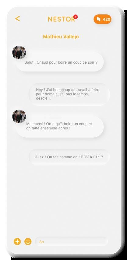
Nestor is an app designed for students. A personal assistant, ready to help you manage and study for the courses you want to improve. Like your language skills by exchanging with a bilingual or native person, to meet new people and above all to share knowledge and good times.
But Nestor does not stop there, it works in the same way as asocial network. But here you can meet people based on their skills, knowledge and interests.
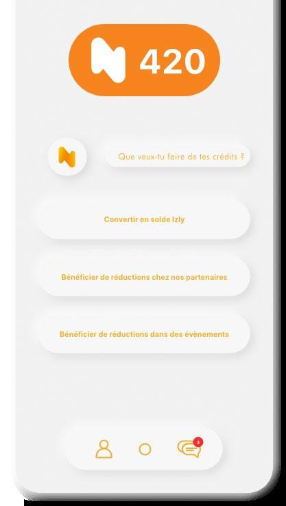
You can became a part of the online and in real life community and make friends while you cooperate and earn credits exchangeable on campus.
This project designed as a part of a app design class, is a collaboration with Gerard Gerber.
The project started with the conception of the app idea. What would it be use for and by whom. After this Gerard and I worked separatetly to propose a naming and logo concept. The idea of nestor came from him.
Nestor is a tribute to the world of Tintin, and more particularly to the character Nestor, Tintin’s and Captain Haddock’s master.
Being a comic very popular in France, we choose a fictional character whose role is to serve, to personify the application, while maintaining a light, sympathetic and familiar connotation.
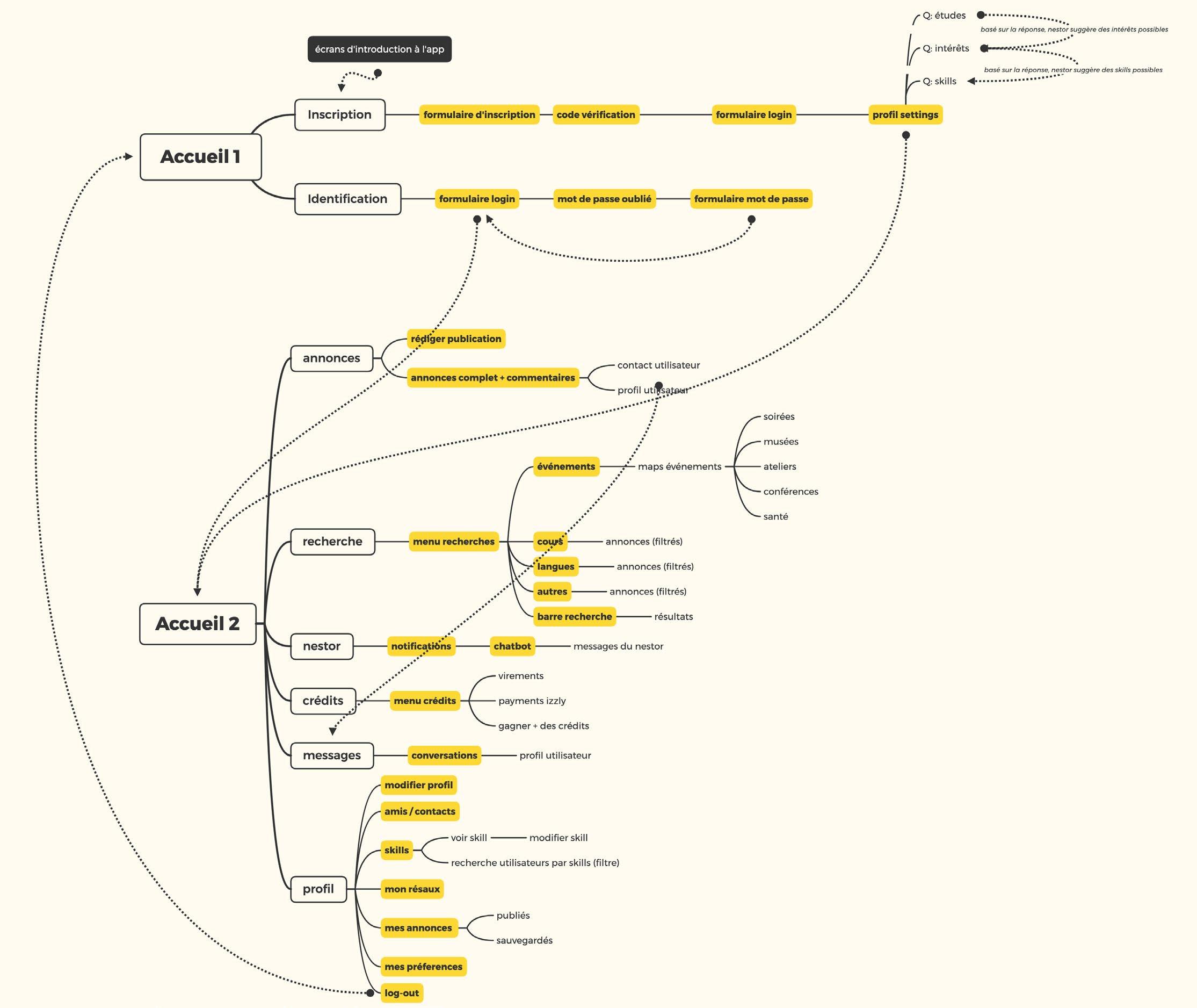
Next, we worked on the user flow to establish the path and to diginto the logo design and UI design.
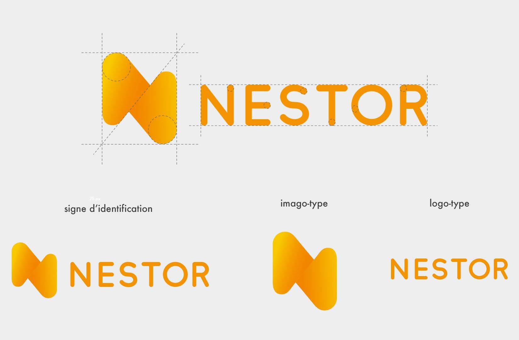
Each of us worked on a proposition for the branding and this one is mine.
The logo is made up of two interlocking shapes, representing the notion of mutual aid, like two hands or two arms holding each other. It symbolizes the exchange of knowledge and mutual help.
It is also an allusion to the character Nestor from the Tin-tin universe, representing the bow tie of the famous butler.
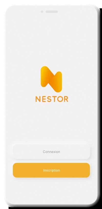
Due to the fact that Nestor is a mobile app, the imagotype will be the main element to be used in the App-store icon, while the logotype et imagotype as a whole will be use for the app interface and for the advertising purposes.
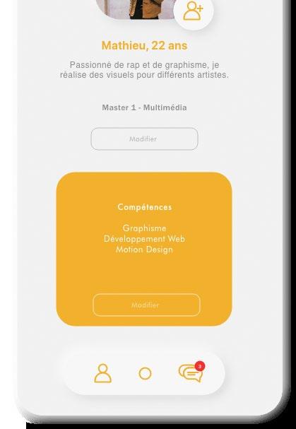
Finally for the UI design, We analyzed our design propositions and kept the best of both worlds.
We opted for a light, sober, modern design. The app is based on the Neumorphism style. It reflects a relief interface, very sober, with few graphic elements. We want the users to feel a sense of calm in a clean interface. A peaceful and organized place to learn yet keeping the orange tone for a vibrant vibe like a student life is.
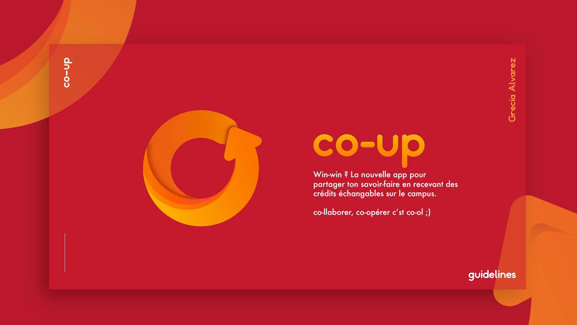
** I also attach my naming and branding proposition for the app.
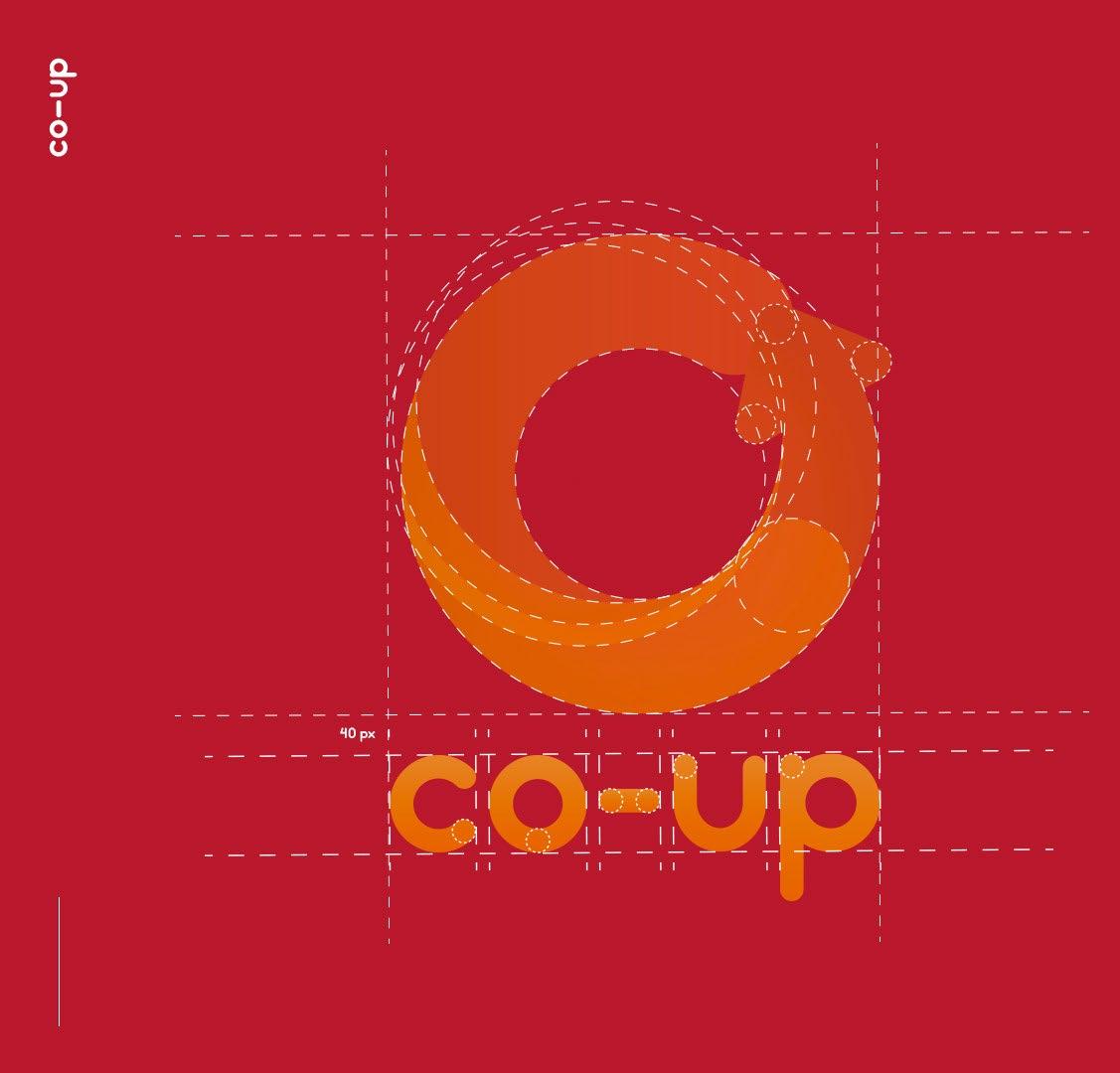
The name co-up is a mix between the first syllable of the word «cooperate» (def. working together) and up in English, chosen for its phonetics which in French resembles the next syllable of the mentioned word, coopérer. In the same meaning the word «coup» in French reinforces this notion like in the expression «coup de main».
This name is a short word, easyto remember and versatile for creating word games.
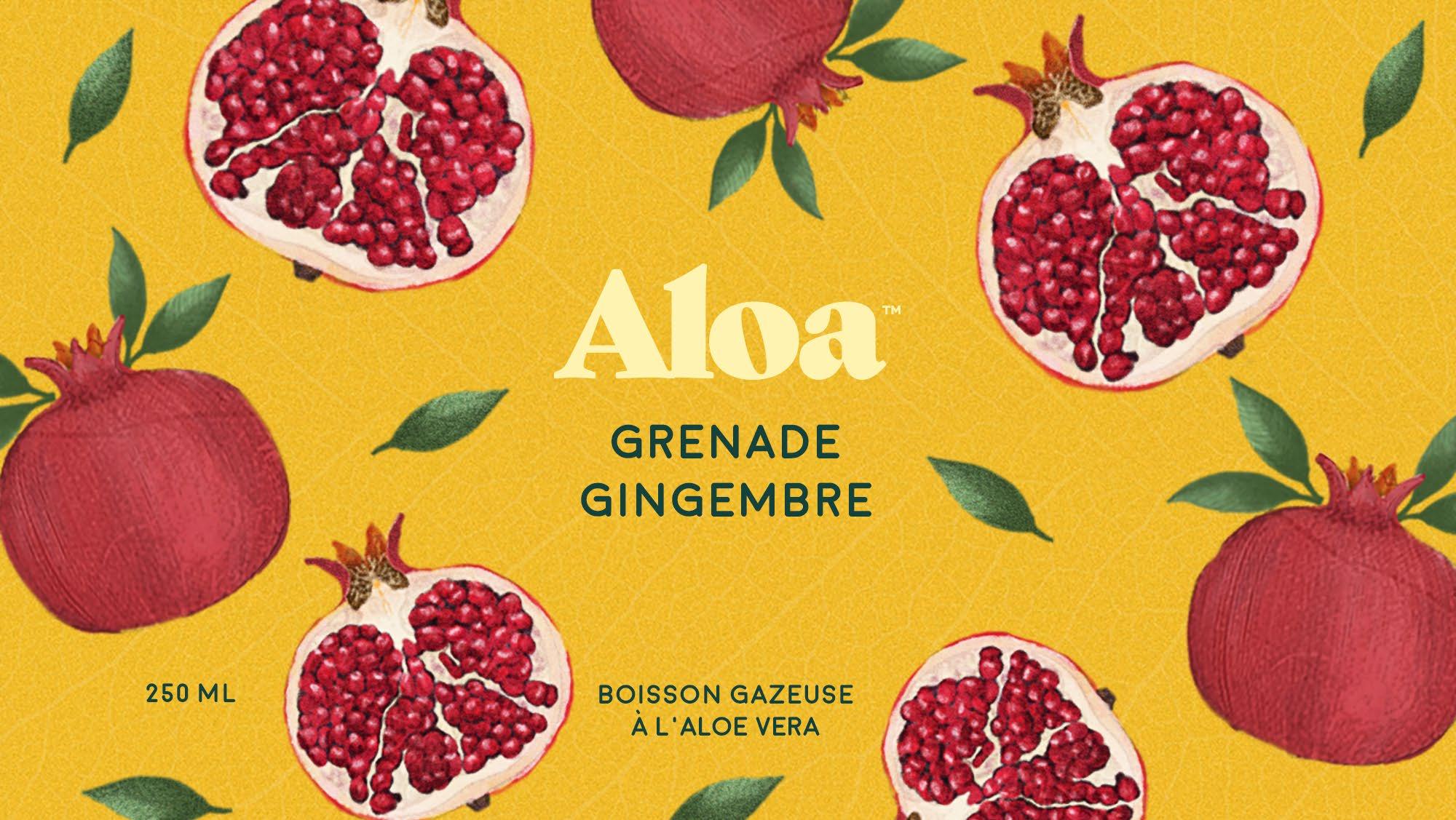
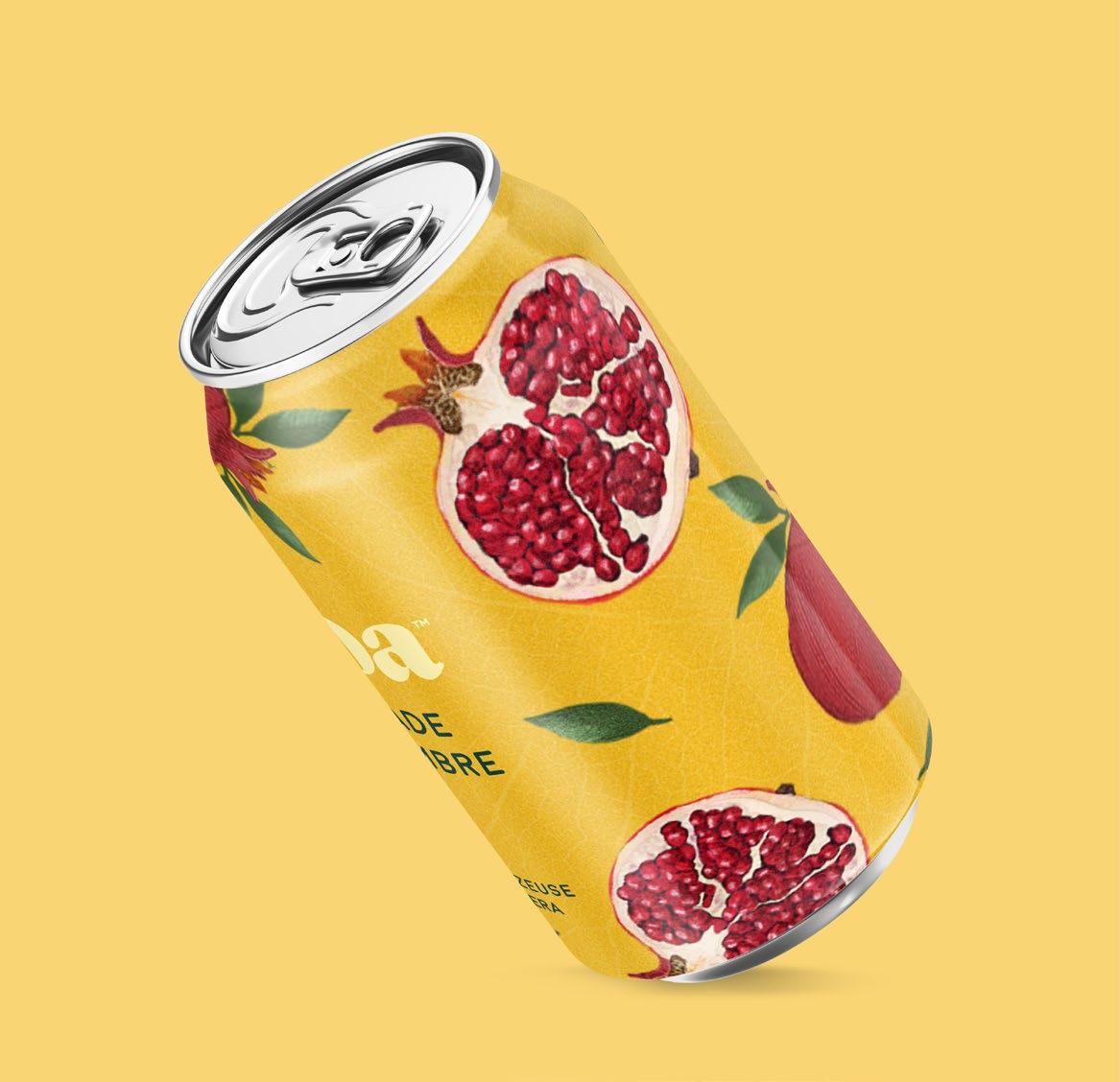
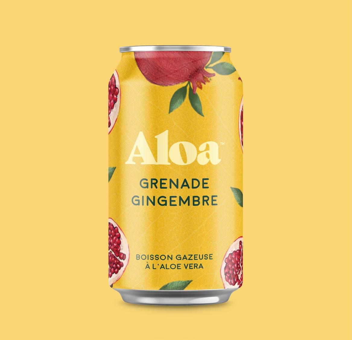
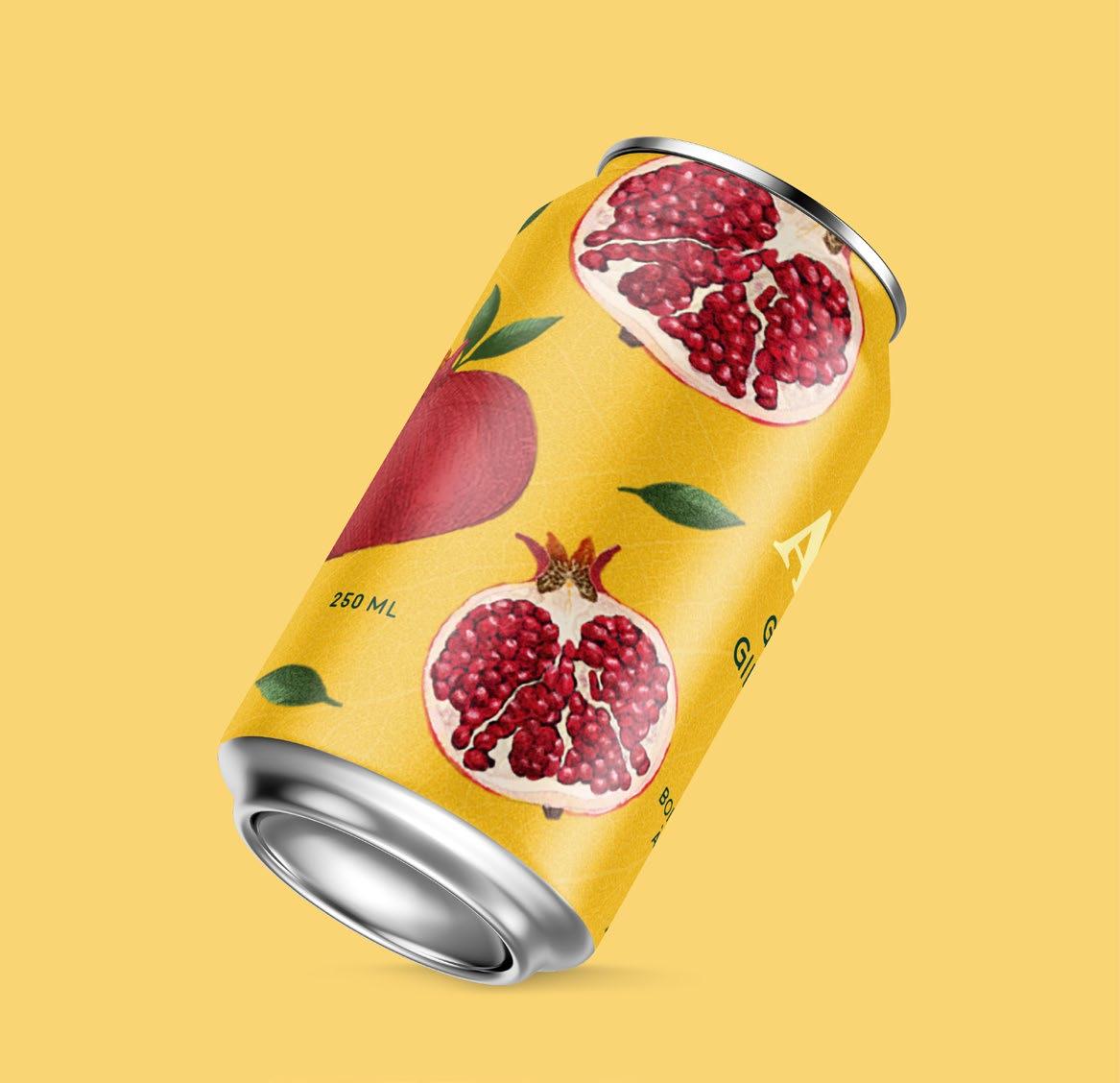
For this project the brief was to create a visual identity that reflected the organic ingredients and responsable character of the brand.
I leaned for retaking the spirit from scientifique illustration of botanicals and fruits. I illustrated digitally on photoshop the pomegranate and other elements and choose the vibrant yellow tone from a ginger on the inside. Resulting in a nice and contrasted design
& packaging design 2020
Illustration
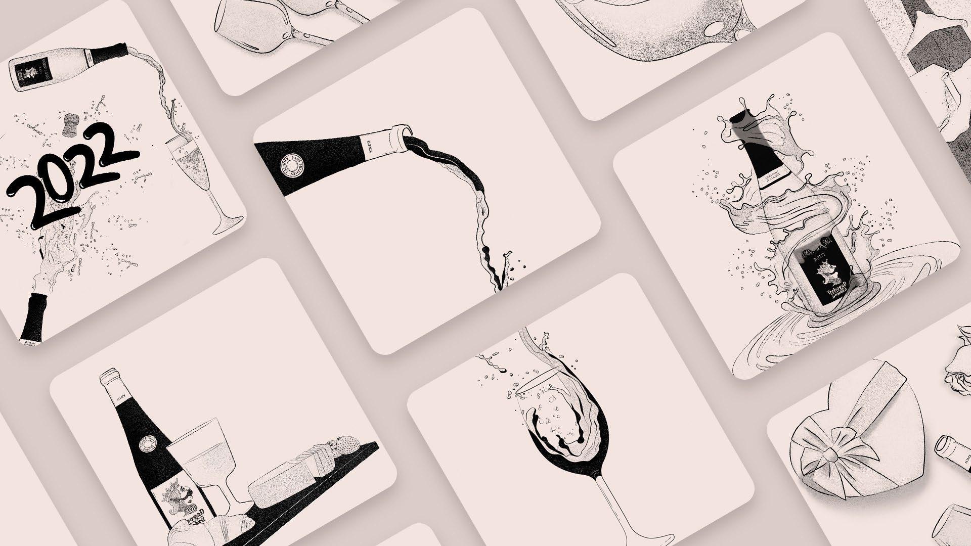
While working with a social media management agency I was put in charge of the illustrations for a local wine brand : Trebogad.
Since the account was already managed by someone on the egency before me, I had to pick up where he left and follow the design guidelines already stablished.
So for almost a year I have create this illustrations related with wine and local Strasbourg stuff ;)
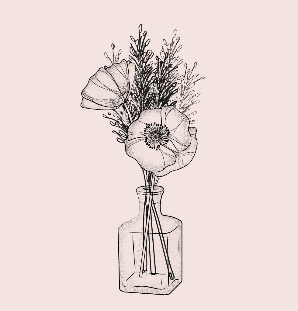
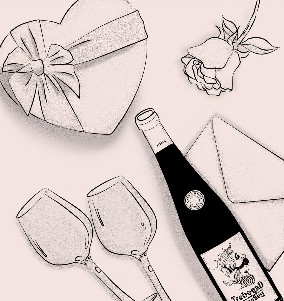
** Client’s account managed by the agency Auguste&Louise
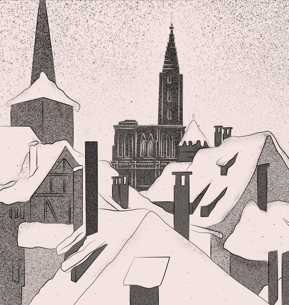
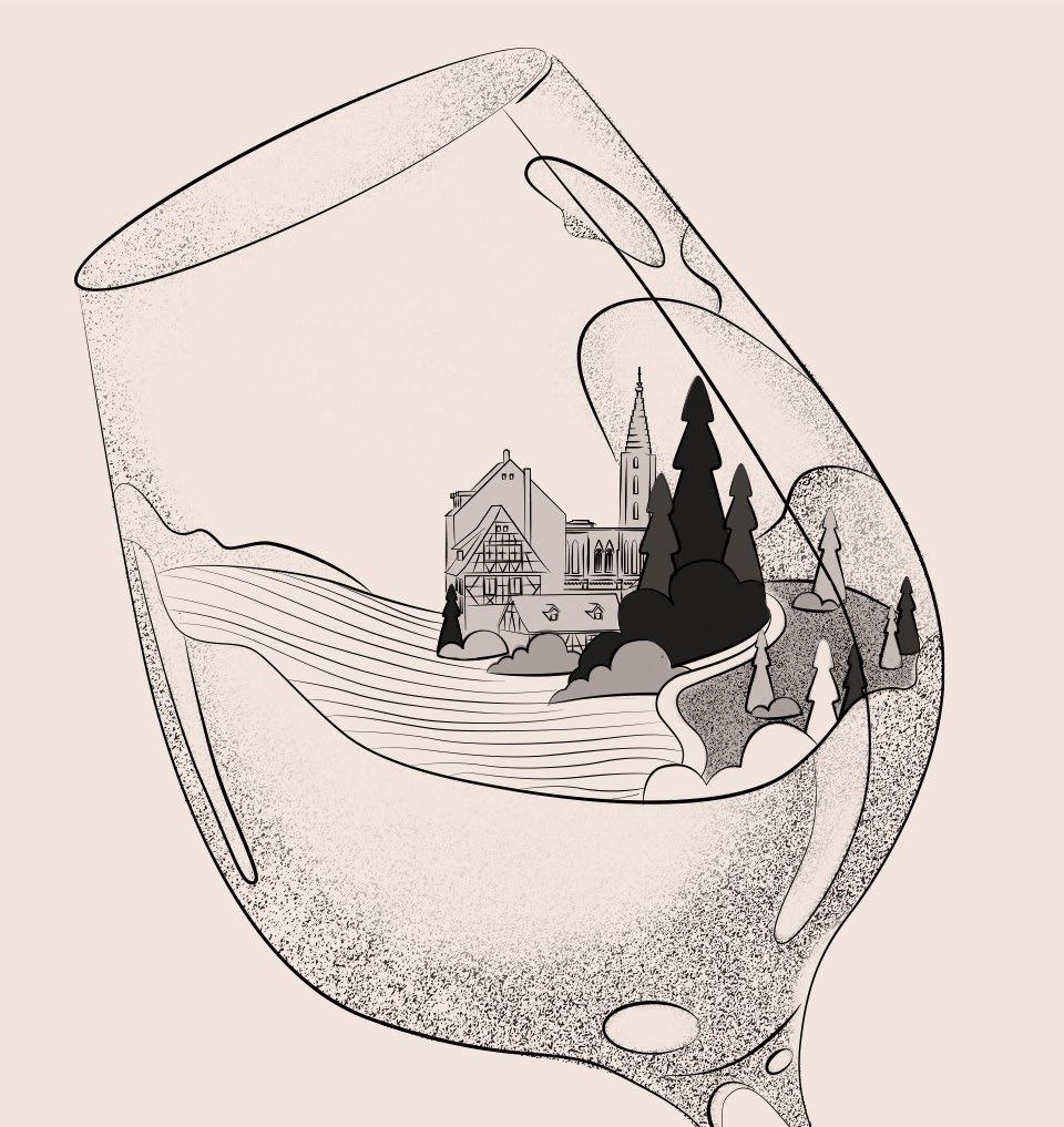
Illustration 2021
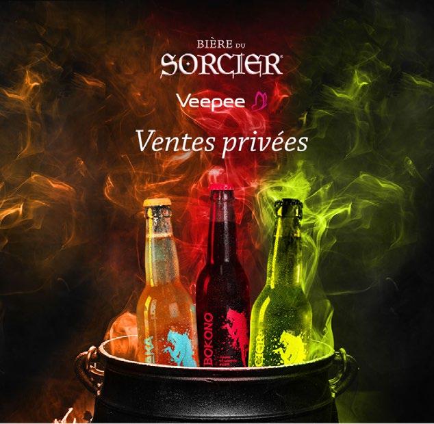
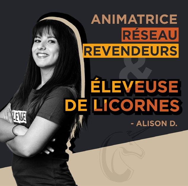
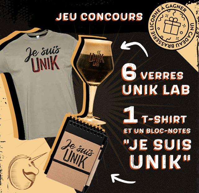
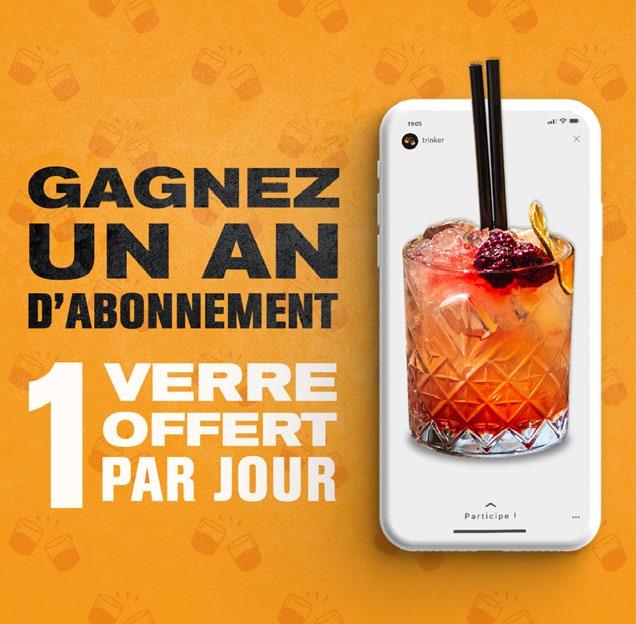
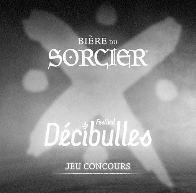
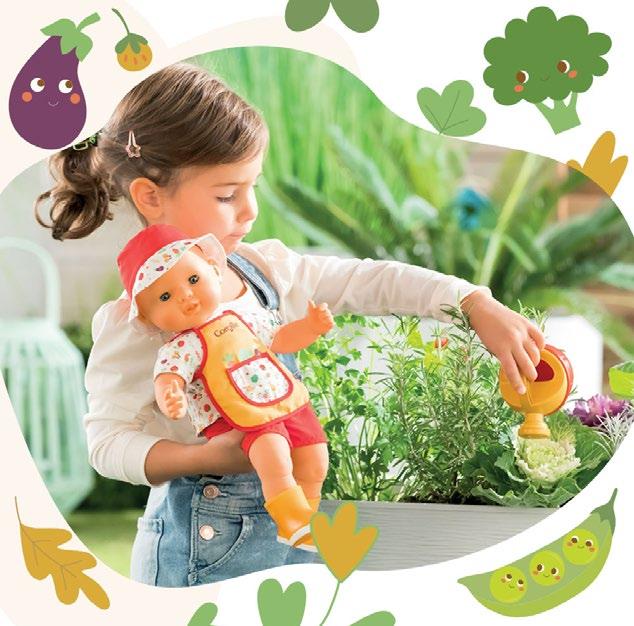
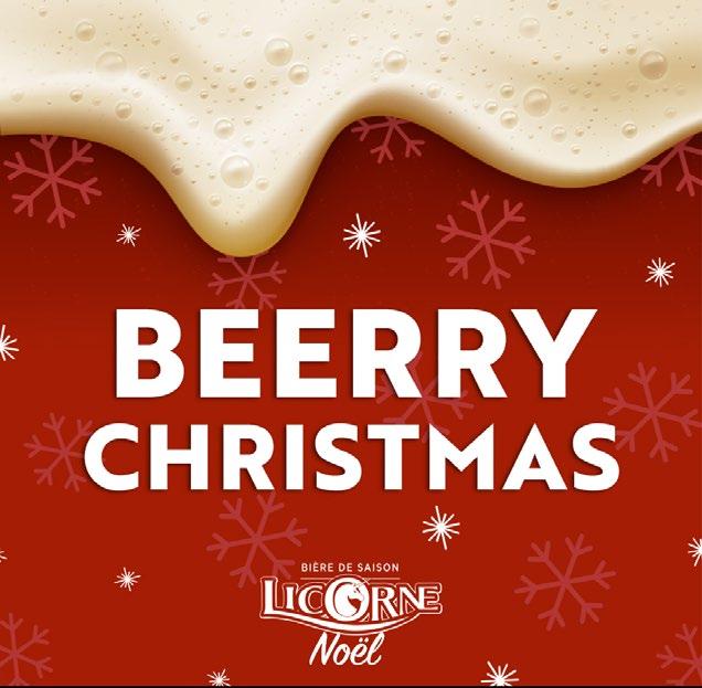
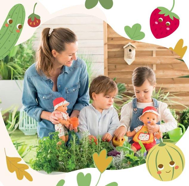
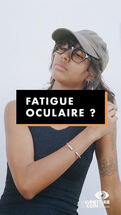
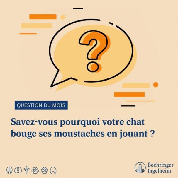
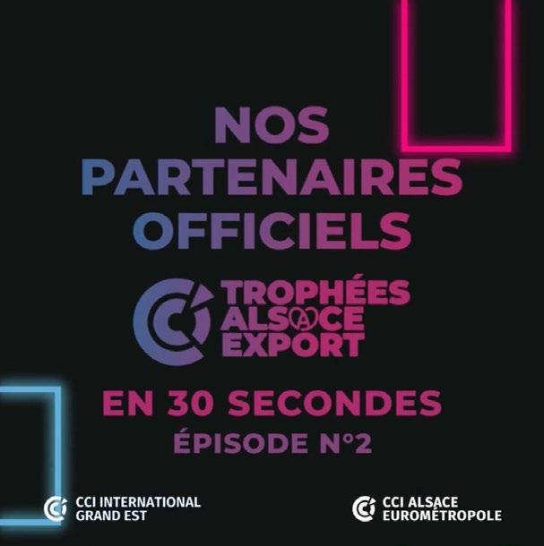
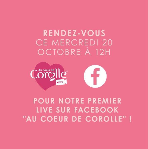
As a part of my work in Auguste&Louise doing social media visuals and videos are my day to day routine. I’ve worked for brands like Licorne, Corolle, bière du sorcier, Meteor, Boehringer and many more.
Here is a selection of few examples.
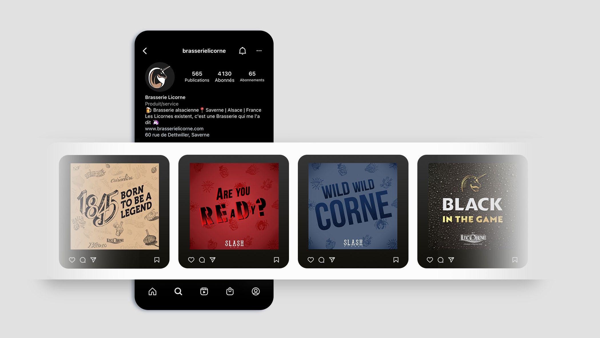
** All Client’s accounts are managed by the agency Auguste&Louise
Social media design 2021-2022
Sometimes I am required to create simple animations while of course setting a concept adapted for every brand. Here are some exemples that you can watch on my Vimeo channel.
** All Client’s accounts are managed by the agency Auguste&Louise
Motion design 2021-2022

Álvarez Grecia fabbyvioletto@gmail.com E-mail 07 69 64 40 04 Mobile * * DIRECTOR ART jr.