
Behind the Masthead


A Chronicle of Editorial Ingenuity Concept
Envy & Elegance is a captivating blend of style, sophistication, and substance, offering readers a glimpse into the intricacies of fashion and wedding guest attire. With its visually stunning layout and thought-provoking content, this miniature magazine sets a new standard of excellence for my creative process in the areas of editorial and publication design.

Creation
From the initial brainstorming sessions to the final layout designs, this miniature magazine showcases a seamless fusion of style and substance. Through the exploration of creative typography and print advertising layouts, Envy & Elegance sets a new standard of excellence in editorial and publication design, showcasing the transformative potential of Adobe InDesign in the hands of a skilled creator.


Refreshing Hibiscus and Dole

A Fresh Take on Menu Design
Concept
Hibiscus and Dole, a student-operated Hawaiian cuisine eatery, sought a fresh approach for their menu design, opting for a flat and trifold format. Taking on the challenge, I crafted new menus featuring their logo and extensive menu offerings. By meticulously crafting a typography hierarchy and introducing a vibrant color palette, I rejuvenated their visual identity.
Creation
For Hibiscus and Dole, a student-operated Hawaiian cuisine restaurant, a revamp of their menu design was essential. By focusing on typographic hierarchy and introducing a vibrant color palette, I transformed their menus into engaging visual experiences. The thoughtful incorporation of a happy hour section further enhances the dining experience, breathing new life into Hibiscus and Dole’s visual identity.


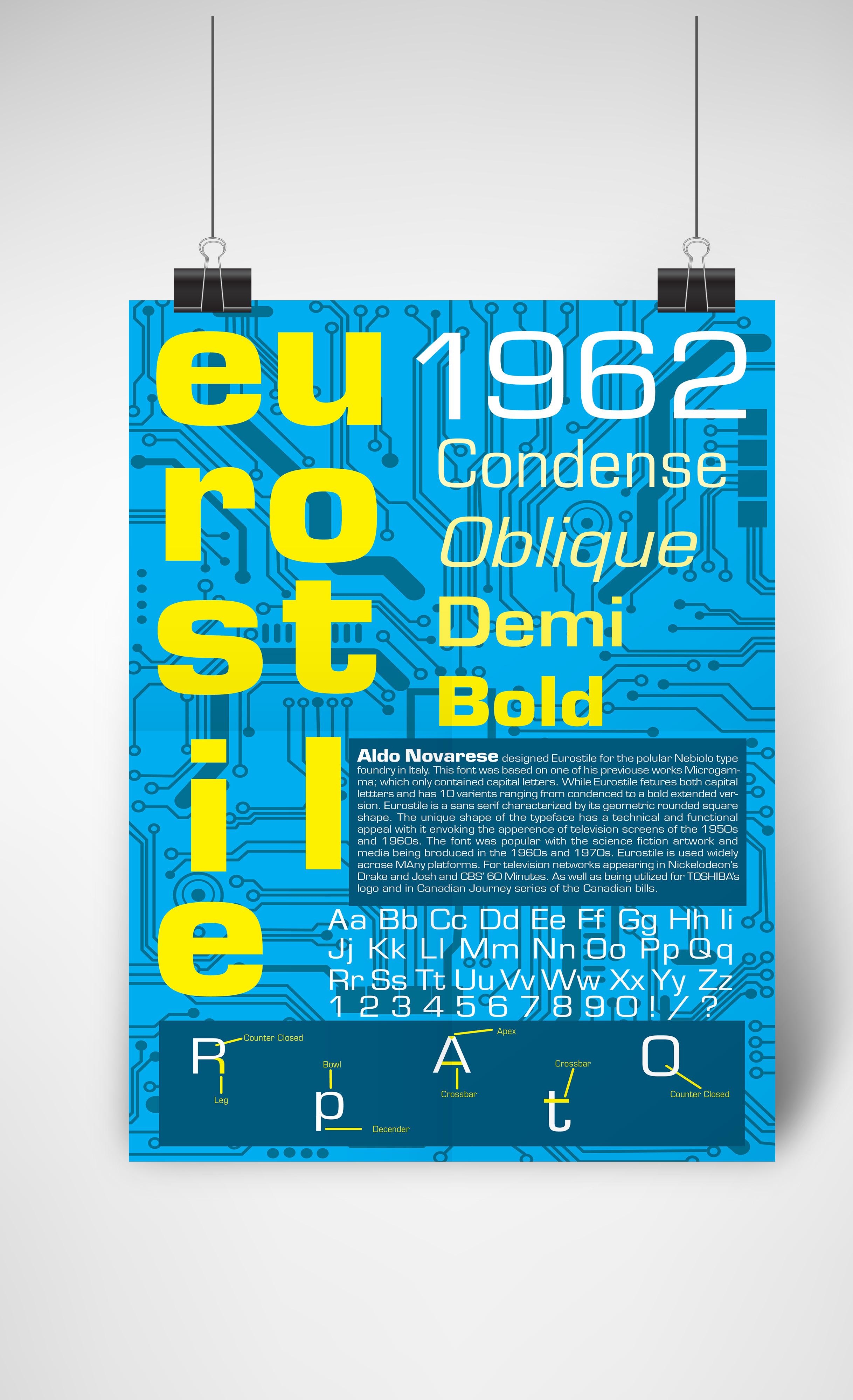
Understanding Typography

Mastering the Art of Communication with Type
Concept
Typography is a fundamental aspect of graphic design, and creating posters that illustrate fonts offers valuable insights into its nuances. In this project, I crafted three posters, each dedicated to a different type classification—serif, san-serif, and script fonts—aiming to highlight their differences and typographic definitions.
Creation
Embracing bold color schemes and departing from my usual muted palette, I crafted visually striking posters that effectively communicated the unique characteristics of serif, sans-serif, and script fonts. This project served as a platform to challenge myself creatively and refine my skills in harmonizing typography with vibrant color choices.


Evoking Strength


Hand-Drawn Typography
Reflecting Resilience
Concept
Hand-drawn typography has always been a passion of mine. From my earliest years as a child, I found joy in crafting personalized cards adorned with hand-lettered calligraphy quotes for friends and family. This project presented an exciting opportunity to immerse myself once again in the artistry of hand-drawn lettering, breathing life into the inspiring words of Kara Lawson’s quote “Handle Hard Better.”
Creation
The culmination of my exploration into hand-drawn typography resulted in a visually compelling and conceptually rich design. Drawing on my lifelong passion for calligraphy and lettering, I approached the project with enthusiasm and dedication. Through meticulous refinement and iteration, I crafted a design where each stroke and curve conveys the essence of Kara Lawson’s quote, inspiring resilience and strength in the face of adversity. and elegance, leaving a lasting impact on viewers.


Interface Integration


Integrating Skills from Logo Design to Website Development
Concept
This project marks the synthesis of various skills acquired across multiple classes, resulting in a comprehensive and polished final product. From the logo design crafted during a drawing class project to the initial website layout developed in Illustrator, culminating in the final interface meticulously crafted using Figma, this project exemplifies a journey of interdisciplinary learning and application.
Creation
This project stands as a testament to the integration of skills acquired across various disciplines, resulting in a cohesive and functional website interface. From the foundational logo design to the intricate webpage layouts, each phase of development contributed to an enriching learning experience, enhancing proficiency in design principles and interdisciplinary application. The project’s conclusion led to a refined prototype and improved understanding of practical design processes.


Unveiling the Creative Quest

Redesigning the Cover of Percy Jackson and The Titan’s Curse

Concept
Undertaking the challenge of redesigning a book cover, I delved into the world of Percy Jackson and The Titan’s Curse. Leveraging my familiarity with the story’s nuances, I embarked on a quest to curate ideas for an eye-catching cover design that would capture the essence of the narrative.
Creation
In the culmination of this project, I achieved a cohesive and visually striking book cover that effectively communicates the essence of Percy Jackson and The Sea of Monsters. Through a blend of creativity, skillful execution, and attention to detail, the redesigned cover serves as a testament to the transformative power of design in capturing the essence of a beloved literary work.


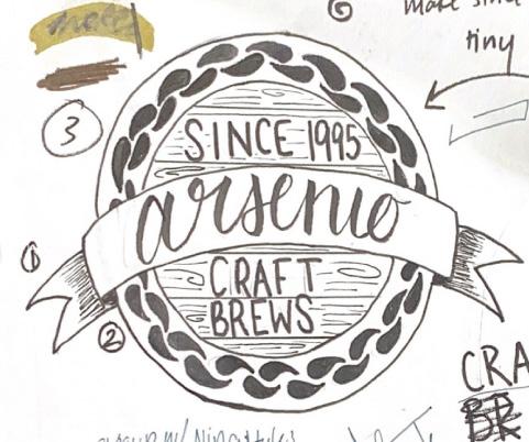
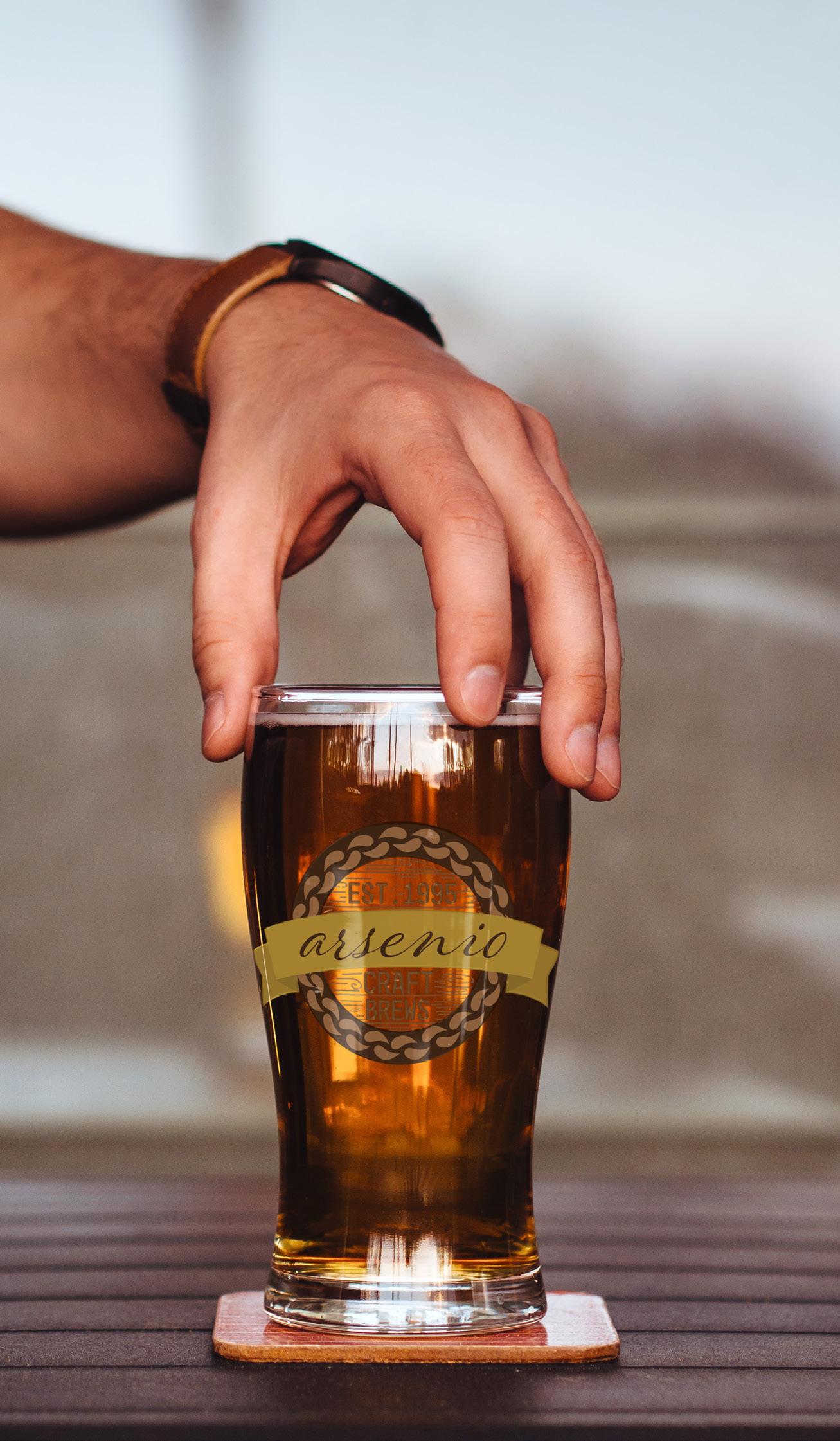
Arsenio Craft Brews Logo Design
Crafting Tradition with Modernity


Venturing into uncharted territory, I embraced the challenge of crafting a logo for Arsenio Craft Brews, a foray into an industry unfamiliar to me. Beginning with the font name Arsenio as my starting point, I embarked on a journey of exploration and creativity, seeking to encapsulate the essence of this brand within a timeless emblem.
The culmination of this design endeavor is a logo that not only captures the essence of Arsenio Craft Brews but also speaks to its heritage and craftsmanship. With its vintage charm and contemporary appeal, the logo has an inviting feel for consumers to embark on a journey of discovery and indulgence with each sip.


Behind the Masthead
Dealing Typography:

Redefining Typography Through a Deck of Cards

Concept
As a culmination of my typography semester, I undertook the challenge of crafting a deck of cards, each meticulously showcasing a font corresponding to every letter of the alphabet. Driven by a swift conceptualization, I eagerly immersed myself in this project, keen to explore its creative depths.
Creation
Assigned with the ambitious endeavor of creating a deck of cards that epitomized typography mastery, I swiftly translated conceptualization into tangible fruition. Employing thumbnail sketches as my guiding compass, I navigated through the intricacies of font curation and layout design, ultimately crafting a cohesive ensemble that encapsulates the essence of elegant typography.


