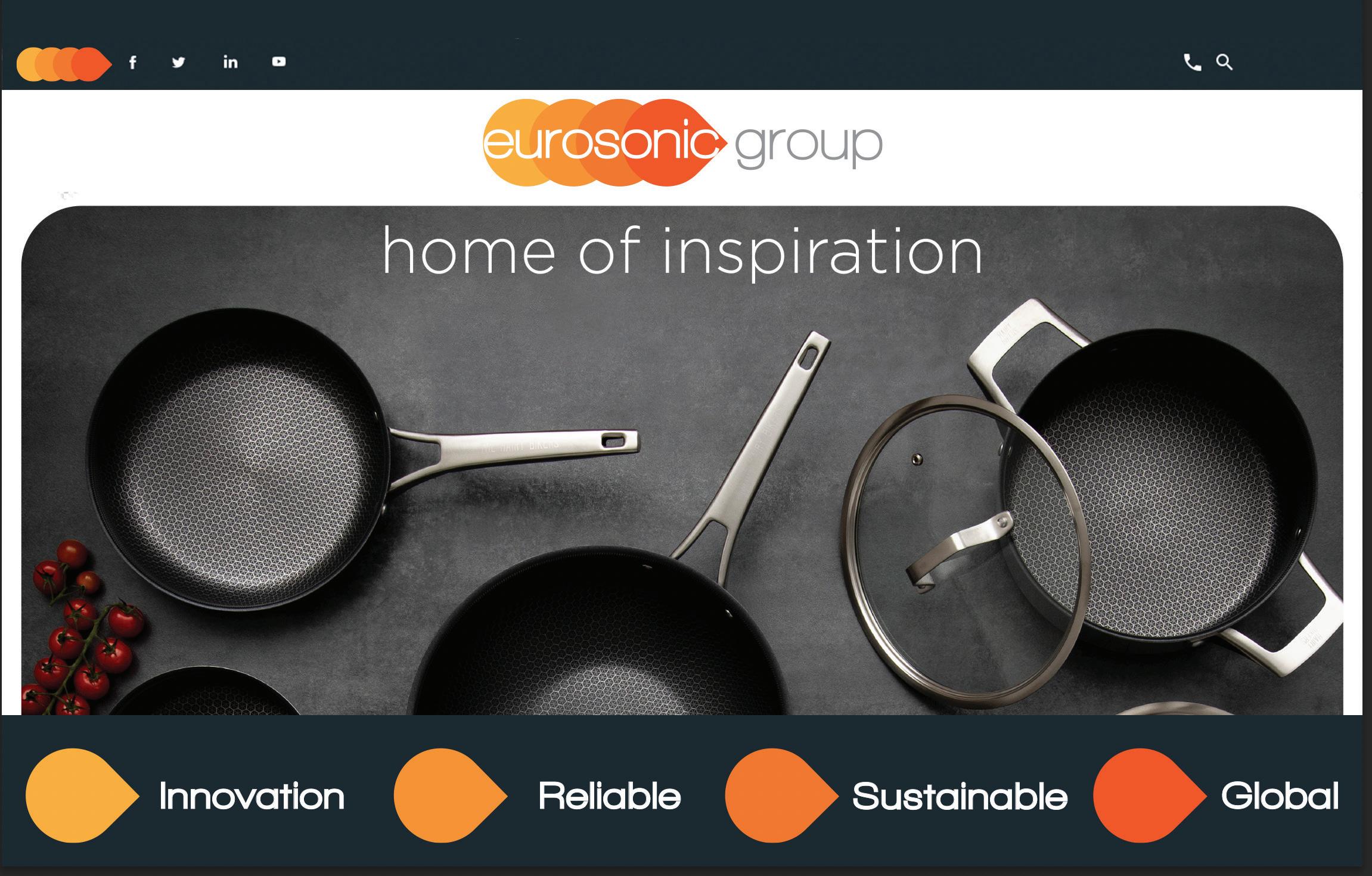
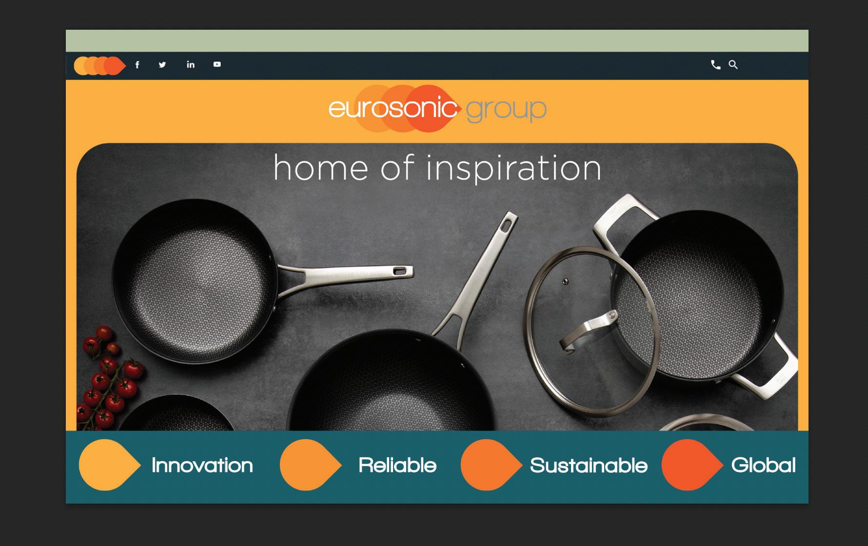
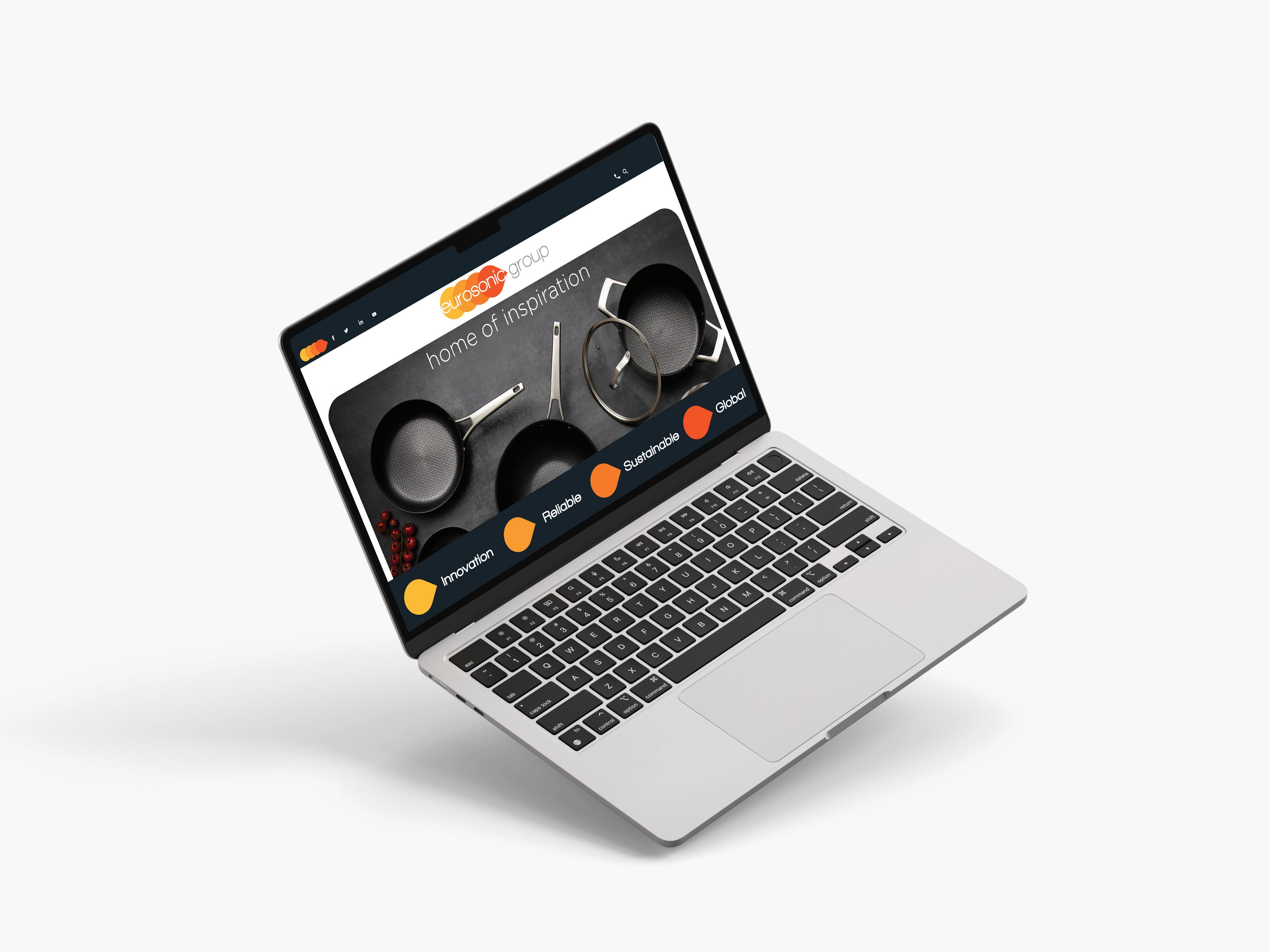
home of inspiration


Driven by cutting-edge technology and creativity. Continuously exploring new solutions. Embracing change and leading with forward-thinking approaches to meet industry demands.
Built on trust and dependability. Committed to delivering consistent, high-quality service. A steadfast partner to clients and customers, ensuring peace of mind in every project.
Connected with a worldwide network. Serving diverse markets across borders. Offering products and services that resonate globally while understanding and respecting local nuances.
Focused on environmentally responsible practices. Committed to reducing environmental impact and fostering sustainability in operations and products. Investing in the future by prioritizing long-term growth over short-term gains.
Putting the needs of our clients at the heart of everything we do. Listening, adapting, and delivering tailored solutions that exceed expectations. Building lasting relationships based on understanding and care.
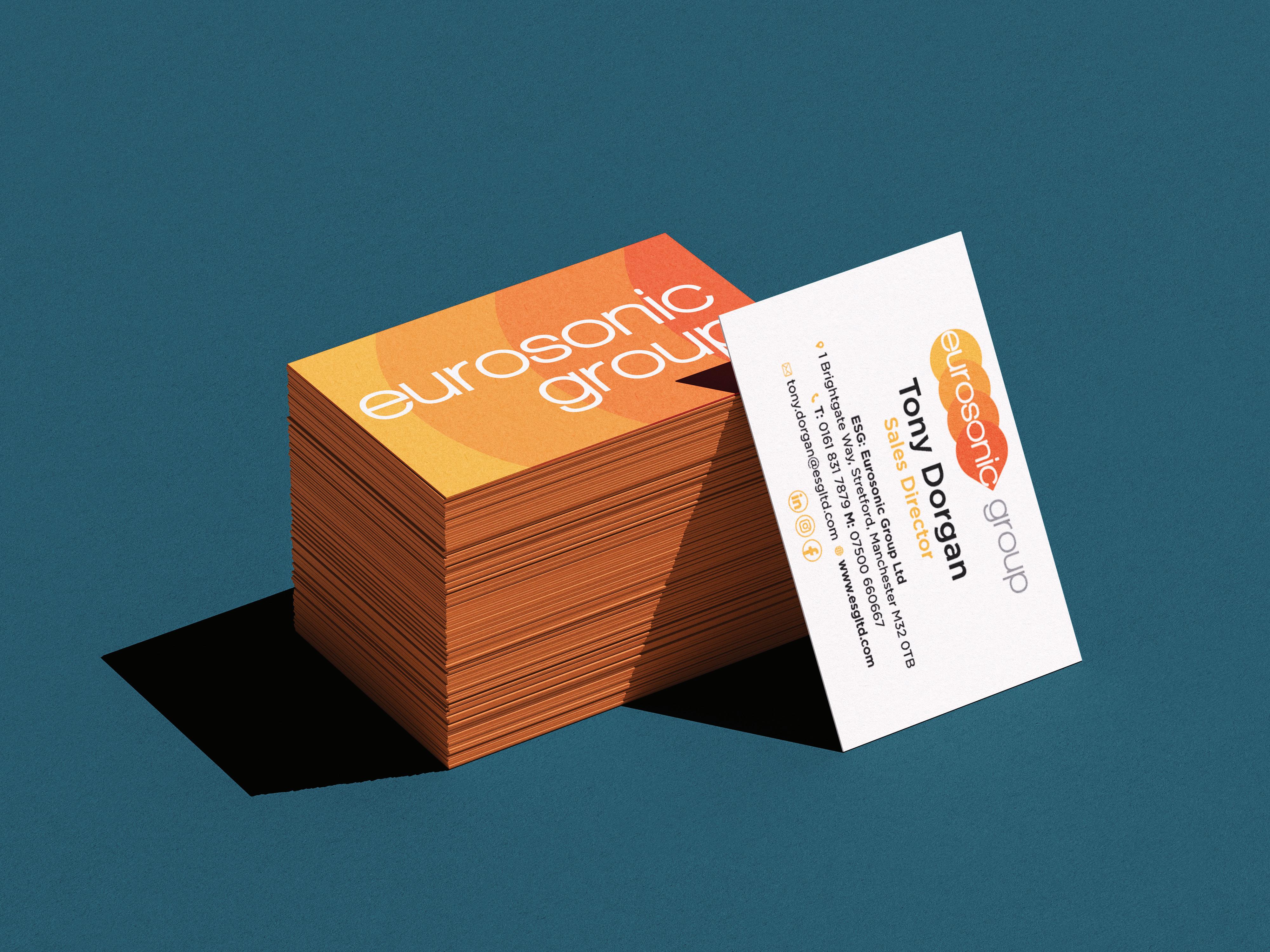

The cloverleaf shapes have been retained from the original, symbolizing the company’s progress and growth. The colour palette has been updated to more vibrant shades of orange, while the familiar grey from the original logo remains.
Overall, the logo stays true to its recognizable ESG identity but incorporates key updates that help it stand out in a competitive market.

in layout.
The submark variaiton of the logo is required to fit into condensed spaces where the larger logo variations won’t fit.
It can be a challenge to scale down a large primary logo into a more condensed space (suchas social media profile images, website footers and mobile website header) so this version of the logo is required to fit into those condensed spaces.
Faviocons tend to go unnoticed (until they’re missing). Ideally these will feature on your website to ensure your content is always branded without having to slap the primary logo onto every page.
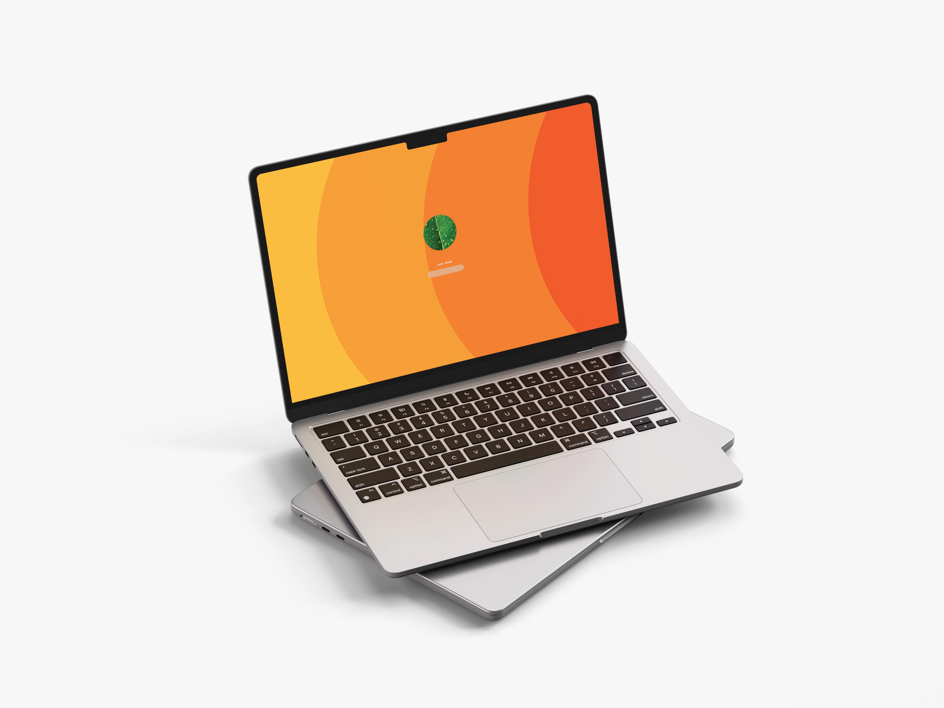
The black, white and grey logo may be applied to any solid coloured background as long as visual integrity is maintained.

The construction grid provides a consistent structure and visual rhythm. To ensure legibility, no elements may be placed nearby.
The four tear drop shapes are spaced equally apart with “eurosonic” aligned centrally within.
“eurosonic” and “group” are of equal heights/ sizes.
Text placed below is centrally aligned with the main logo.


Color palette is a key element of our brand. It works to maintain consistency, create clarity, and provide a distinct visual identity to the brand.
The colour palette has been updated to more vibrant shades of orange, while the familiar grey from the original logo remains.
The colour orange is a high energy and enthusiastic colour, with its warm and friendly hues it is often associated with creativity, optimism and excitement. It is also a very strong and confident colour which strikes a fine balance between calming and energising.
Orange has several effects on our physical health: it increases oxygen supply to the brain, stimulates brain activity, and energizes making it the perfect primary colour in an office environment.
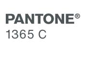
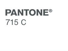
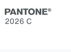
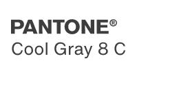
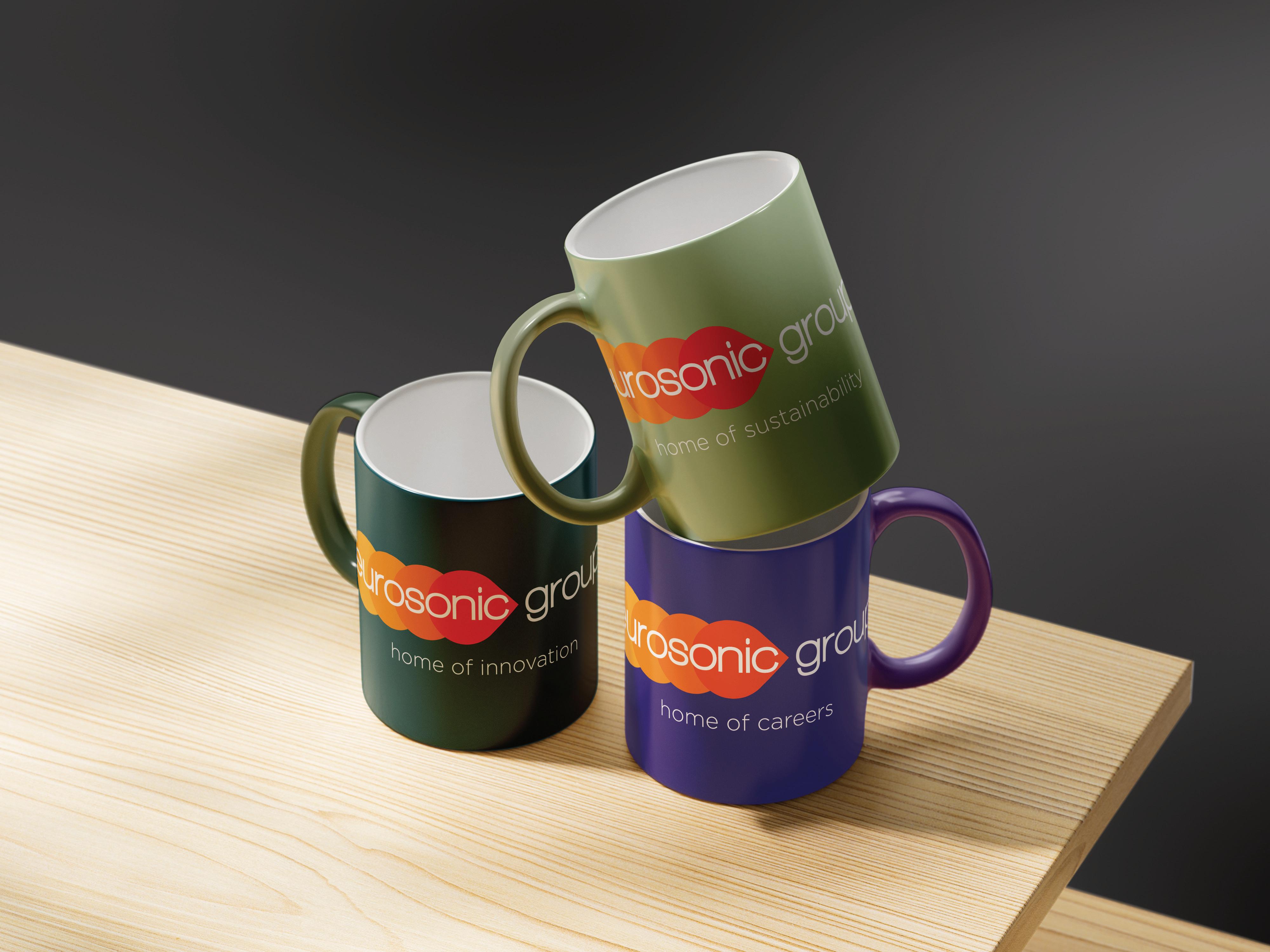
The colour blue has many advantages, not only does it promote trust, communication and efficiency (key traits you want to present to clients/ customers) but it is often used in brainstorming spaces to help prompt innovation.
Upon researching the colour blue these are the initial traits related to it:
Serenity, stability, inspiration, wisdom and reliability.
These colours can be applied in office environments and within presentations and will aid in promoting productivity and creativity to your employees.
To your customers they will aid in presenting your company as innovative and reliable.

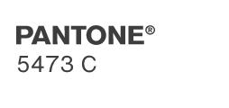
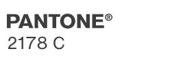
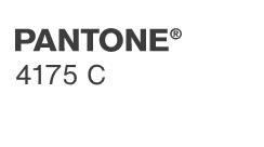
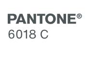
The colour green is the instantly recognisable colour of nature. Representing growth, harmony and freshness. It is the most restful and relaxing colour to the eye.
Sitting alongside the orange logo this secondary colour palette reduces the intensity of logo and brings the focus to the environment and sustainability.
Filling the office with greenery and plant life can be a great way of ensuring this element is portrayed to customers and employees alike.


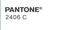
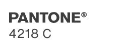
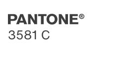
The colour purple symbolises ambition and creativity making it the perfect colour-way to symbolise the ESG home of careers.
Orange and purple sitting opposite each other on the colour wheel contrast one another but are classed as complimentary colours, bringing out the best in each other.
Maintaining this color scheme in your career and HR branding will make it instantly recognizable, reflecting both strategic direction and the concept of a positive career path.

Typography
Typography is a key element of our brand. It works to maintain consistency, create clarity and provide an identity to the brand.
Walkway black is our primary brand typeface. This typeface is to be used across the board until a secondary typeface is introduced to the brand.
The type face has multiple weights. The key weights to use are the following:
Headings
Walkway black - regular
Main body text
Walkway ultra bold - regular
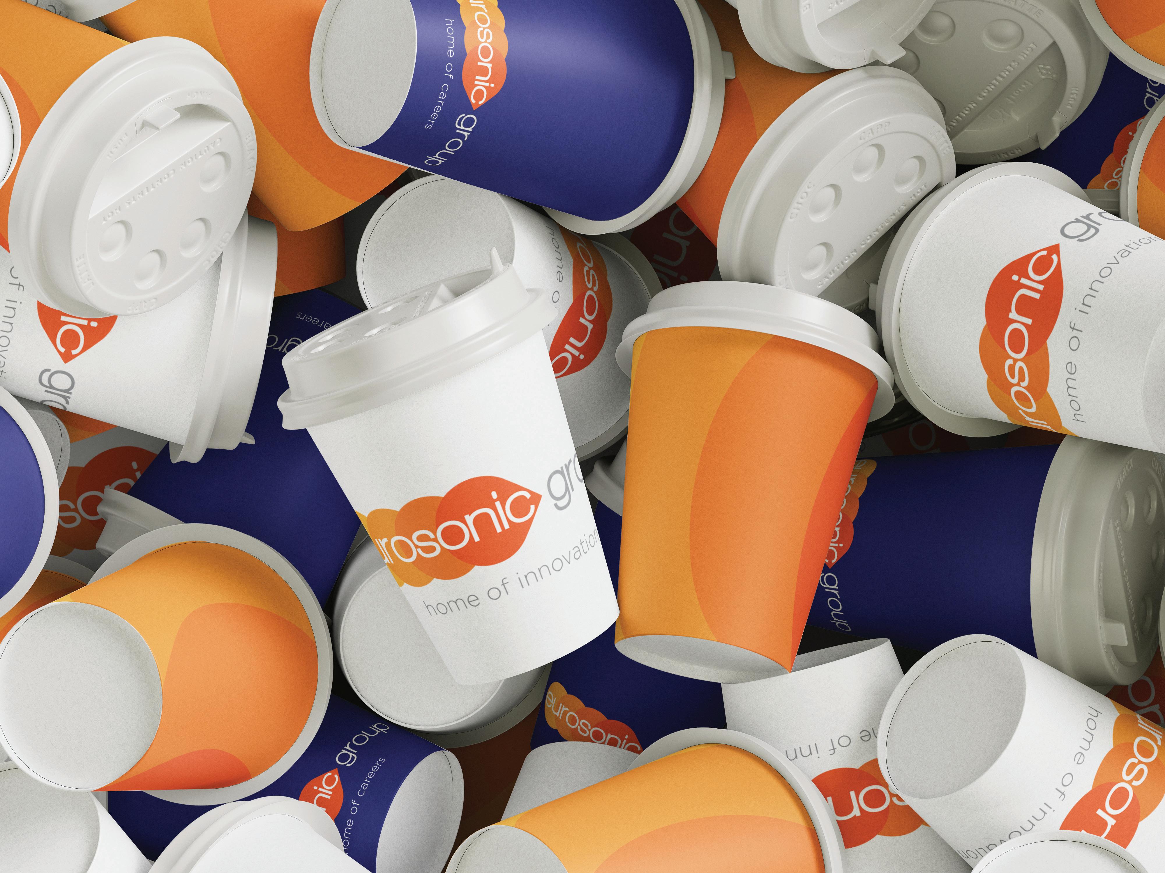
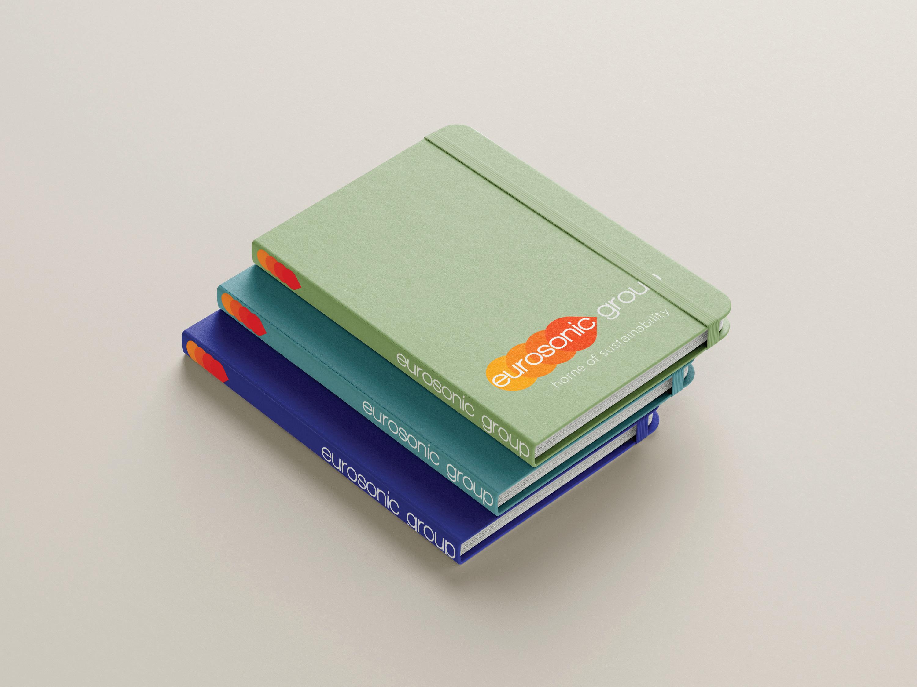
The next section will focus on the application of our brand colours and logo. These elements are crucial as they ensure a cohesive and recognizable brand image across all areas of the business. Consistent use of our colors and logo reinforces brand identity, whether in marketing materials, product packaging, or internal communications. This alignment helps strengthen customer recognition and trust.
home of inspiration
The eurosonic group logo colourways should always be applied on suitable and relevant background colours.
home of inspiration
home of inspiration
home of inspiration
home of inspiration
Do not put the logo on a background colour which are the same as those in the logo.
home of inspiration
home of inspiration home of inspiration home of inspiration
should not be put on a background colour which similar to those in the logo.
Logo should not be put on a background colour which similar to those in the logo.
Logo should not be put on a background colour which clashes.
The eurosonic Group logo should never be altered in any manner, including modifying the official colours, or the order of the colours. Always use supplied artwork (never recreate the design).
home of inspiration
Do not apply unotharised one-colour variations.

home of inspiration
Do not add a drop shadow.
home of inspiration
Do not modify any of the colours.
home of inspiration
Do not rotate.
home of inspiration
Do not recreate with objects, shapes, people or products.
home of inspiration

home of inspiration
Do not fill with imagery.
Do not place any elements over the top of the logo.
home of inspiration
Do not add graidents.
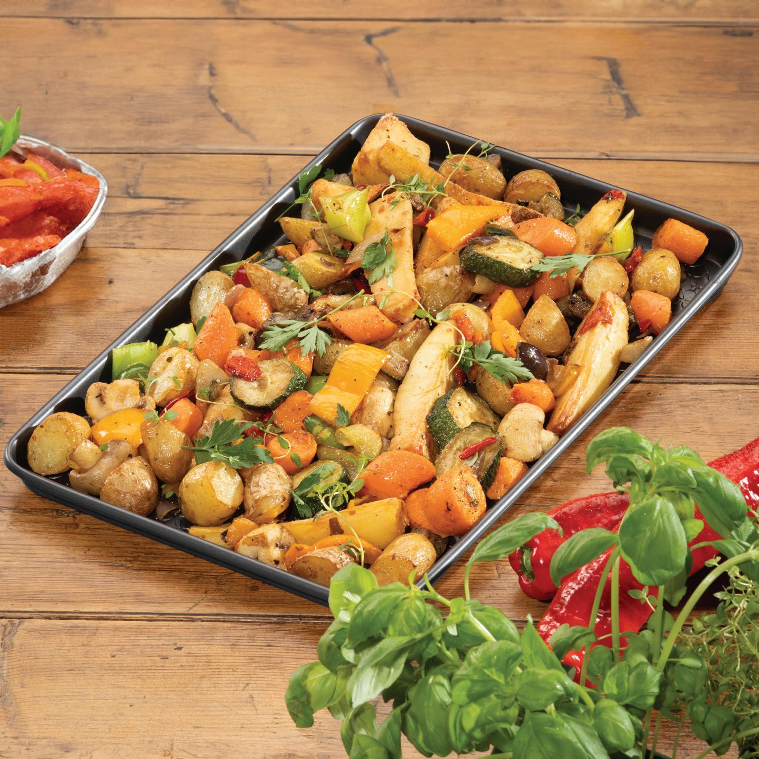
When placing the logo on a photograph, ensure legibility is maintained. Do not modify any colours to create contrast.
The full-colour logo may be applied on light backgrounds in photographs as long as legibility is not impacted.




Guidance
Use colour boldly in application to create space and impact, with big hits of white and big hits of colour . Select colours that align with the tone or theme of the communication . For example, white feels more elegant and red more energetic.
For digital interfaces, apply colour consistently, distinctively and intentionally, to accent specific elements such as buttons, text highlights or media tags .
Use core colours to flood a design.
Do not flood a design with an unrelated colour
Only headline text may appear in colour.
Do not apply colour headline text to a non-white background.
PRODUCT LAUNCH PRODUCT LAUNCH PRODUCT LAUNCH PRODUCT LAUNCH

Colours should be seperated by generous areas of white or black in most instances. Do not use a combination of bright colours side by side. In layout, colour should be used to create hierachy and space.
For digital interfaces, favour black and white backgrounds accented with the bold brand colours.
