
Print. Web. Branding. Development. 2024 Portfolio
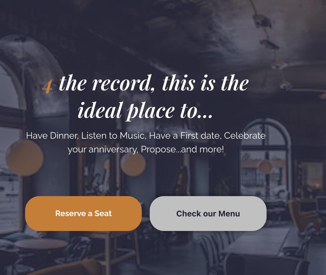
4theRecord
BRANDING
Adobe Illustrator
WEB DESIGN
Figma
DEVELOPMENT
WordPress
4theRecord is a restaurant unlike any other so clearly they also needed to have a Website experience unlike any other. 4theRecord features an About page, a Menu page, and an interactive Reservation page where you can customize every part of your experience.
Tasked with creating a restaurant brand and website I created a bold and personable brand and an equally beautiful and intriguing site that fit the custom voice of the brand. The site went from Sketches to Figma wireframes and Mockups and finally to development with a Wordpress Elementor live site.
01.
EstefanY Almanzar Pascual
Interactive Website Design
Typography
HeadingsPlayfair Display Bold Italic
Body CopyRaleway Light Color
Web Design
Humorous Elegant Bold Fun Interactive Fancy Unique Catchy Brand Voice Logo Branding Elements
#1C1F33 #D17A22 #BFC0C0
Palette
MOckups

The playfulness of the brand voice was carried throughout the whole site The site shows the elegance of the brand and the playfulness with its unique interactive elements and classic typography.


01. EstefanY Almanzar Pascual
Development

A lot had to be changed in the transition from Figma to Wordpress but I managed to keep a lot of the vital parts of the site. For a No-Code solution it definitely met my expectations, I hope to code it in the future.
01. Web Design
Real Travel
BRANDING
Adobe Illustrator
WEB DESIGN
Figma
DEVELOPMENT
HTML, CSS
As my first step into coding and web development, I was eager to try to code a rather ambitious design. The travel website ‘Real Travel’ was a highly stylized design with lots of irregular shapes and layouts. The Brand was all about standing out and being an experience so the design had to be like that too. The project went from conception to branding to a mockup and finally a fully coded landing page.
EstefanY Almanzar Pascual
02.
A Travel website Experience
Branding Elements
Logo Color Palette

“Experience the world, Don’t just Visit it.”

Swoosh design element shown through all of the design.

Playfair Display Bold Italic
Raleway Light
Web Design
Typography
MOckups

A lot of care went into creating the serene and reliable ambiance of the brand while still creating a unique layout. The wave designs all throughout the site made the site stand out as a completely different kind of travel website that fits Real Travel as a completely different kind of travel company. Making sure the site was responsive and a good experience for mobile users was also a critical part of the design.


EstefanY Almanzar Pascual
02.
Coding


A lot of planning and coding went into making every part of the website work. I had to split everything into super small parts so that I could code all the swooshes. And a lot of inspect element had to be used to debug all kinds of issues that arose from trying to do the footer and header as I envisioned.
Web Design 02.
Quote Posters
Multilingual quote posters
PRINT DESIGN
Adobe Illustrator
Emily Dickinson is a poet known and loved by all. Her poems inspire people and even over 130 years after her death they still hold meaning. Her Poem “Hope is the Thing with the Feathers” in particular is timeless and what many need to hear in times like these.
Tasked with creating a typographic quote poster, I had so many ideas to choose from. Out of the different quotes, song lyrics, and poems that came to me, “Hope is the Thing with the Feathers” was one that stood out the most. Inspired by having to translate the quote for my mother, I expanded the poster into 3 posters into 3 different languages.
EstefanY Almanzar Pascual
03.


Color Variations


Bird vectorization

Typefaces used
Scrapbooker sans
Snug variable Futura
Print Design
Final posters

EstefanY Almanzar Pascual
03.
Journey Forward 04.
New England Synod Assembly Graphics
BRANDING
Adobe Illustrator
PRINT DESIGN
Adobe InDesign
Tasked with a different kind of branding project-- branding for an event and not just branding for a company or organization, I worked to create branding and graphic elements to fit both the organization behind the event and the theme of the event itself. The project culminated in a logo design and other designed elements like a presentation screen and stationary elements. The design was for a real client-- the New England Synod.
Branding
Branding Development Process
Sketching


EstefanY Almanzar Pascual
Montserrat
#065B66 #DCE9F3
Indie Regular
Light Logo Color Palette #067091
Logo ITERATIONS
went through a lot of back and forth to try and perfect this logo. All of them were the same base concept but I still tried a lot of different options and colors and typefaces before I settled on the final.
Branding
04.
Stationary mockups


EstefanY Almanzar Pascual 04.
other mockups


Branding
04.
Presentation screen saver and alternative letterhead design and layout..
Hibiscus & Dole
flat and Trifold Menu Design
BRANDING
Adobe Illustrator
EDITORIAL DESIGN
Adobe Indesign
Hibiscus & Dole is a Hawaiian cuisine restaurant created in collaboration between JWU design and culinary majors. Tasked to continue with this brand and design their flat and folded menus using typographic hierarchy and colors of my choosing, I took inspiration from Hawaiian culture for my designs and expanded the branding into a new unique logo and color wave.
EstefanY Almanzar Pascual
05.
Branding Elements
Logo
Color Palette


Hisbiscus & Dole
floral elements
Typography
Editorial Design
Bodoni Lora Bold Italic Lora regular
Hawaiian Cuisine
Final Flat and Trifold Designs

Using the flowers I doodled based on the original logo, I created a layout using the outlines of the flowers to encompass the menu items and chose sophisticated but fun typography to fit the high end cuisine vibe.

EstefanY Almanzar Pascual
05.
Font Posters
Type Anatomy Posters
PRINT DESIGN
Adobe Illustrator
Tasked to design Type specimen posters for three different fonts, A serif, a sans-serif, and a display typeface. I created a set of font posters that showcase the individuality of each of the three chosen fonts: Trixie, Raleway and Bickham Script.
Print Design
06.
Choosing Fonts


Immediately Raleway stuck out as the Sans-Serif font that I wanted to make a poster for. It is a super versatile font with multiple weights and one that can double as both a body copy and as a heading. It is also one of my favorite fonts (as seen in how often use it). Trixie stood out to me because of the juxtaposition of it next to Raleway, they are vastly different fonts with completely different vibes. Bickham script fit right in as a third ‘individual’ in the set. The three fonts bring different things to the table and it was my goal to showcase that in my designs.
EstefanY Almanzar Pascual
The main characters shown in the posters for each font.
Final Posters

Print Design
06.
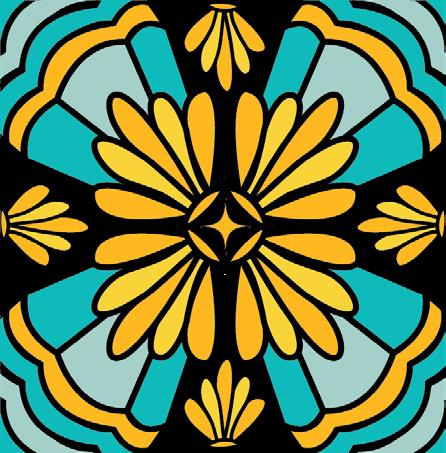
Stained Glass 07.
Stained Glass design explorations
PATTERN DESIGN
Adobe Illustrator
While working to create typographic patterns as a mini assignment in my typography class, I fell down a rabbit hole of pattern design and landed on stained glass design. I was immediately hooked. Getting inspiration from church windows and old stained glass catalogs I decided to try my own hand at creating stained glass window designs. I turned the result into mockups of what the stained glass windows would look like in reality.
EstefanY Almanzar Pascual
Outlines and Flat art
Initially, the designs were all just outlines but to really delve into the ‘stained’ aspect of the stained glass I colored the designs. This project inspired me to use more color in my designs and to delve into digital coloring more.
Pattern Design
Final colored mockups


EstefanY Almanzar Pascual
07.
Trouvaille
Lucky Finds for Inspiration Minizine
BRANDING
Adobe Illustrator
EDITORIAL DESIGN
Adobe InDesign
As a creative, I’m no stranger to getting inspiration from random places. When tasked with creating a ‘minizine’ on any theme or topic, the idea of a creative inspiration magazine came to mind immediately. ‘Trouvaille’, named after the French word for ‘lucky find’, is a collection of art and design inspired by a variety of sources, from historical movements, local architecture, and modern design to everyday sights like cracks on the sidewalk or the pattern of bricks on a wall.
Editorial Design 08.
Masthead Iterations


Editorial Elements

Color palette
The very first step of creating the minizine was the hardest for me. I came up with multiple different Masthead designs before settling on the final version. The final typeface was bouncy and fun and really fit with the concept that Trouvaille was going for.
EstefanY Almanzar Pascual
Final Masthead


Editorial Design
Back cover, AD, Creative Page It took 30 different cover designs for me to finally choose one. The inside pages and back cover were significantly easier for me to come up with. only made a few changes to those pages and their layouts. 08.
Cover
Article Spread Interview Spread


EstefanY Almanzar Pascual
08.
Portfolio Review
Second Year Portfolio Review Invitation
PRINT DESIGN
Adobe Indesign
A bold cutting mat inspired flyer inviting people to visit the second year portfolio review day presentations. Made in collaboration with my classmate Anna Luetzelschwab, the design features a cutting mat and paper style layout featuring Anna’s unique handlettering and illustrations. Through this design we showcase the essence of the second year portfolio and the design students that the day is all about.
Print Design 09.
My original design


For my original design I really liked the concept I came up with, thought it was bold and unique. I did think that it was missing something and that it needed more on the right side and some more texture and dimension so it looked less flat.
EstefanY Almanzar Pascual
Collaboration


When it came to choosing the final portfolio review flyer, it was between my design and the design of my classmate Anna, my professor Gail McCarthy decided to have us try and collaborate on the design and have a mix of both worlds. Anna’s beautiful illustratorions and handlettering and my layout and cutting mat idea. The final design ended up as a collaboration between 3 designers as Gail jumped in to revise the design and add things like the “CoED proudly presents” and our graduation dates.
Print Design 09.
Other Projects
A collection of smaller projects
PATTERN DESIGN
Adobe Illustrator


Typographic Patterns and patterns made from shapes based on the designs of my stained glass windows
EstefanY Almanzar Pascual


other Projects
A collection
of different smaller projects. Includes more stained glass designs, the logo for a perfume company, a quote poster, a perfume company website, a mobile website redesign for a local museum and a currency design for imaginary providence currency.
Print. Web. Branding. Development. www.Estefany.design