BRAND GUIDELINES BOOK
TABLE OF CONTENTS
4
6
Who we are
7
Our Brand
Our Voice
8 12
Logos
Construction
16
Logo Dos & Don’ts
18
Color
Typography
19
21 14
Imagery
Brand Applications


4
6
Who we are
7
Our Brand
Our Voice
8 12
Logos
Construction
16
Logo Dos & Don’ts
18
Color
Typography
19
21 14
Imagery
Brand Applications

We love paper, we love print, we love packaging. We also love the planet. Our founders were just artists who didn’t like the idea that their art was harming the world, so they decided to do something about it. Starting off a simple Paper recycling company, Paper Park evolved into a major force for sustainable substrates. We realized that while recycling paper helped, we needed to find ways to take trees out of the equation. Every day we evolve, from finding new paper substitutes to marketing sustainable alternatives to try and fight for the environment. We believe Paper doesn’t need to hurt the environment, we believe we can use paper for good.
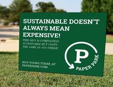
Though in our founding years we may have been known as an ‘upscale’ artist paper company, we have worked day and night o shed that image. We are NOT just for the rich artist, we are for everyone. Through various innovations in our paper making process and recycling initiatives we have made our papers just as affordable as any other leading paper brand. It shouldn’t cost more to save the world. Our paper is for everyone, for teachers, for students, for artists, for the every day person.
“Paper for Good.” & “Paper for Everyone”
Our voice & Tone is crucial to who we are as a brand. It’s what makes us “not like other brands”. We are:
• Bold
• Confident
• Helpful
• Humorous
• Ambitious
• A little sassy
• Ready to change the world.
We know, we’re quite the character. But in the dull corporate world of paper manufacturers, you need someone like us. We are driven and ready to fight for our planet, and we want you to join us, so we’re not going to talk to you like a robot, or be vague about our intentions. We’re going to be honest and clear but passionate.
We’re going to be a little sassy, and even a little silly, but don’t worry, we’re serious about paper and even more serious about the planet.
These Logo Variations are the main 4 forms of our brand’s identity. These forms of our logo are the ones that should be widely used in a variety of applications.
These responsive Logos take our main corporate identity and allow it to be used in a variety of applications. These Logos are Ideal for web uses like website headers because they can help stay consistent despite changes in screen sizes.
A lot of the other logos in our Logo system were created with responsive design in mind and also have smaller responsive groups.
As we have expanded over the years we have assigned different Logos to different parts of our company. From our handy corporate identity to our community recycling branch, these logos say a variety of things about our company.
These Logos are for Paper made from recycled pulp and for our community recycling initiatives. They should never be used in place of the main corporate identity as they specifically signify recycled paper.
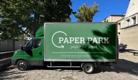
These Logos are for the sustainable synthetics product line. These logos CAN be used in place of the main logo unless the subject is specifically Natural wood pulp alternatives, in which case the main logo should be used.
For our Primary Logo we used the letter P from Paper as our unit of measure for the spacial relationships between the elements and for our clear space.
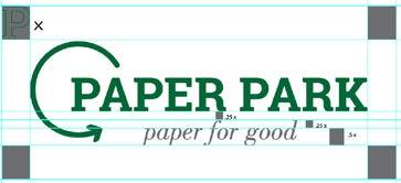

Clear Space is vital for every form of our logo even those not shown here. Appropriate use of clear space helps our logo breathe.
For the secondary Logo the construction was based on the same measure, the P from paper but instead with different scales.

In this logo specifically Clear space is absolutely necessary. The circular nature of the logo requires space so that it does not bleed out of its container in applications like pins and buttons.
Do it right!
Don’t change the direction or size of the arrow. In particular avoid arrows pointing down.
Don’t change colors to anything outside of the primary or secondary color palettes.
Don’t mix the primary and secondary color palettes.
Do it right!
Don’t separate the arrow from the rest of the logo.
Don’t use multiple logo variations at once.
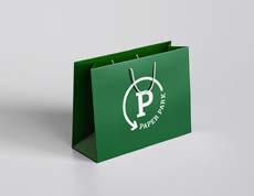
DO use the appropriate logo for each substrate type in packaging.
C:90 M:34 Y:96 K:26
R:0 G:104 B:56 #00688
C:86 M:27 Y:100 K:15
R:37 G:123 B:61 #257B3D
C:0 M:0 Y:0 K:0
R:255 G:255 B:255 #FFFFFF
C:85 M:50 Y:0 K:0
R:28 G:117 B:188 #1C75BC
C:0 M:0 Y:0 K:100
R:0 G:0 B:0
#000000
C:70 M:15 Y:0 K:0
R:39 G:170 B:225 #27AAE1
40lb
Subheadings, quotes, important details.
Bodoni Std Book Italic
8.5 x 11 216 x 279 mm
500 Sheets
Bright White Long Grain (150gsm)
Headings, Paper weights(lbs), measurements(inch), sheet count
Roboto Slab Bold
Logo that signifies paper collection
Body Text, Paper weights(gsm), measurements(metric), Descriptions and other paper info
Roboto Slab Regular
Our Typography should remain consistent throughout all brand applications and documents. In situations where these any of these typefaces are not available, other slab serifs may substitute it temporarily with approval but NEVER substitute logo type.
“Used” Paper, Nature



Advertising


