Make Mark


Make a MarkTM is an exclusive innovation project to explore the infinite creative possibilities of the world of packaging developed by three global industry leaders — Estal, Avery Dennison and LEONHARD KURZ.
In collaboration with some of the world’s top packaging design agencies, it’s both a platform and an open brief. With a focus on sustainability, luxury and innovation, we invite creatives around the globe to express themselves freely without constraint, to push the boundaries, to create the unexpected.
Together, we’re inspiring, supporting and evolving packaging design with innovations to create exciting opportunities within the Wine, Spirits, Beauty and Fragrance and Gourmet Food sectors.
Over the last three years all the creatives involved in the Make a Mark project have been provided with a platform to freely showcase their insights while bringing their ideas to life without the limitations of the day-to-day. Provided with first-hand access to some of the industry’s latest innovations, they’ve been able to use some of the most up-to-date packaging technologies to create their concepts.
Today, Make a Mark has now evolved from a creative passion project to become a global brand — living beyond its initial threeyear timeline. To celebrate this success, we’ve invited Make a Mark participants to showcase their version of our Make a Mark “X” as an extension of their original Make a Mark concept for this year’s book.
Since the inception of the project, we’ve become a close community of rebels and thinkers — all united by our love for glass, labeling, packaging and the desire to create new things. In the spirit of our ongoing collaboration, we’re calling our 2024 edition Make X Mark
For more than 25 years, Estal has specialized in providing premium glass bottle solutions to wine, spirits, beverage, gourmet, and beauty companies across the globe. With a commitment to innovation and sustainability, Estal promotes maximum creative freedom and continuously develops new solutions to achieve unique results. Estal loves the design world!
estal.com
Built on a history of industry-leading breakthroughs in the world of premium, innovative and sustainable labeling materials, Avery Dennison empowers consumer-focused brands to elevate their sustainability credentials and reduce the environmental impact of their packaging. The Fasson® labeling portfolio by Avery Dennison spans a range of luxury and contemporary self-adhesive papers and films that capture the brand’s essence and stir the consumer’s senses. Enhance the shelf appeal of high-end products such as wine and spirits, craft beverages, gourmet food, beauty creams, and more.
label.averydennison.com
As a global leader in thin-film technology, KURZ develops and manufactures decorative, high-end, and functional layers applied to a transfer carrier for a wide range of industries. This includes labeling and packaging, where KURZ is renowned for investing in new technologies and the development of innovative and sustainable solutions.
kurz-graphics.com


To translate the creativity of their packaging project “Epochia”, the studio turned the original label design into an “X” symbol, to symbolise the intersection between the world of wine-making and design, both driven by the human pursuit to transcend time and create something bigger than ourselves.
The ancient and the modern mix seamlessly in a dance of textures, fonts and treatments that convey this timeless feel and an endless love for the craft of winery. “A slice of time, harvested and bottled.”

Inspired by the original “Pharaonic” concept design, the opulence and grandeur of ancient Egypt are conveyed by the golden hues and intricate detailing.
At the centre, two obelisks form a striking “X” symbol, to symbolise the enduring strength and grandeur of Pharaonic architecture. The deconstructed cap, with its deliberate indents and imperfections, reflects the tumultuous history and resilience of the era. The same hieroglyphs that decorate the bottle spell out “A thing of beauty is never perfect” — adding a profound layer of meaning, reminding the viewer that true beauty encompasses both triumphs and tribulations.


Make a Mark is more than a creative meeting point; it is a space where innovative ideas and unique visions converge. In this space, we have merged our projects to bring “Vannity” to life — a fragrance that bridges the worlds of sensory innovative experience.
Vannity is a comprehensive experience, featuring an exquisitely designed perfume bottle, scented jewelry, and an innovative digital application, all crafted to accompany users in every aspect of their lives. This concept seamlessly integrates with Make a Mark’s iconic “X”, symbolizing the union of design and technology.
This partnership reflects Aktiva’s vision and expertise in the Beauty sector, demonstrating the commitment to innovation and leadership in a dynamic and competitive market.

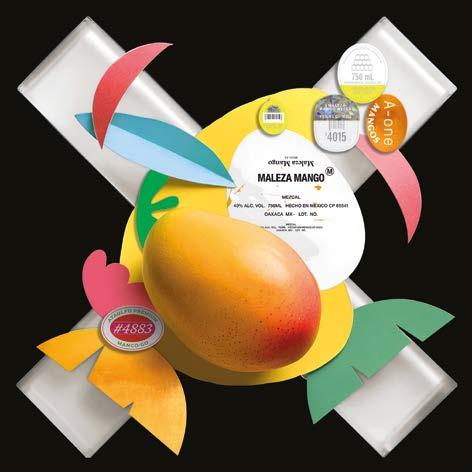
The studio’s original packaging design for Make a Mark takes on a new form and texture to reveal a juicy “X” symbol.
Their playful, minimal — yet bold identity is reflected through this cheerful composition, that perfectly mixes the tropical vibe, the saturated colors and the enchanting atmosphere of a Mexican supermarket.
A love tribute to the local culture and being true to their original design concept.


The studio wanted to translate the fluid, vivid essence of “Fiore”, their original packaging concept for food, into the new “X” symbol design for Make a Mark.
In the same way that just a few drops of Fiore can elevate a dish’s taste and aroma, the colourful shapes and textures interact with the iconic mark, transforming its shape and creating a dynamic interplay that reflects a flavour journey with endless horizons.

The studio’s vision for Make a Mark’s “X” symbol reflects their belief in the power of the project to inspire and give creative people the opportunity to express their ideas freely and innovatively.
They brought this concept to life by representing the “X” as a window or an opening, from which light shines through, supporting creative thinkers, illuminating their path, and helping them see their innovations.
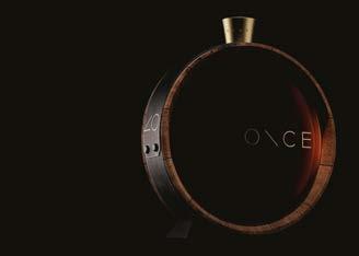
The light emanating from the darkness and projecting the “X” stands for the journey of ideas. This journey leads to the creation of impressive projects, such as their “ONCE” packaging bottle design, a uniquely conceived brandy concept that encapsulates the spirit of innovation and creativity.


The studios’s original “What’s your poison” packaging concept for high-strength vodka was reworked into an abstract symbol that highlights the damage illegal sewage is doing to UK rivers and waterways.
The new design evolved from the traditional “X” orange symbol used to warn of toxic contents, incorporating environmental hazard imagery and naming commonly found (but highly unexpected) substances in polluted rivers.
This combined approach is based on shocking the viewer into engagement and strives to emphasise the severity of the issue at hand through a very simple but effective design concept.

Construct the deconstructed — the iconic


For their new design proposal, the studio played with the different labels from their original packaging concept, this time placed on overlapping glass layers that recreate the “X” symbol through an imaginary perspective.
In a world bombarded with messages of all kinds, the studio strives to look beyond and understand the hidden meaning behind all things.
As a matter of fact, under close inspection, the viewer can decipher the hidden message behind their concept: “When the world pulls down, it is better not to be tied to anything”

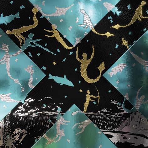
The original packaging project “Karoo Mermaid” for agave spirit was inspired by a 4500-year-old Koi San rock art found in the desert.
The studio conveyed all the materials and finishes of their original creation in a single “X” symbol design, using different techniques. To express the multiple KURZ embellishments used and the Avery Dennison Fasson Cotton texture as accurately as possible, they used Dream Composer to simulate the finishes.
To convey the custom Estal bottle developed, they incorporated the use of gold to represent the custom glass bottle by Estal, giving a liquid feel to the overall composition.

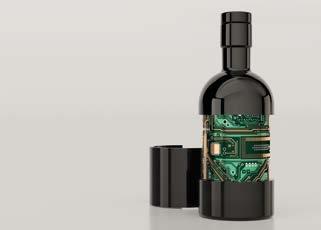
Urban Geeks Tokio”, the original packaging concept that envisions Tokyo as a circuit of different cultures coming together, was recreated by the studio as a new icon, taking the form of an “X” symbol.
In the same way that endless cultural values from around the world gather in Tokyo and are then transmitted back from Tokyo to the world, this new circuit explores exactly “the point where the flows intersect”.

Created from 100% waste by-products, the studio’s original concept “Papil” is all about the ‘Butterfly Effect’ — those small actions, such as the flutter of a butterfly’s wing, that can exponentially change the world.
The design graphically conveys how the flutter of their wings ensures only positive impacts on the planet, with the “X” symbol morphing into the shape of a butterfly, which then expands and emanates outwards, turning the bad into the good. The wasteful into the usable. And the wrong habits into the right actions.


Notte Oscura”, the hermetic perfume concept created for Make a Mark, takes on the form as an “X” symbol continuing the interplay of minimal design and intense light effects, for a unique, magical look.
The “dark night of the soul”, a concept born from the Carmelites, then used in transmutational alchemy and nowadays in psychology, is when the mind collapses due to a visceral problem, to finally create new awareness and transformation.
With this “X” symbol, the studio reminds us that pain and darkness are necessary to reach higher states of consciousness.
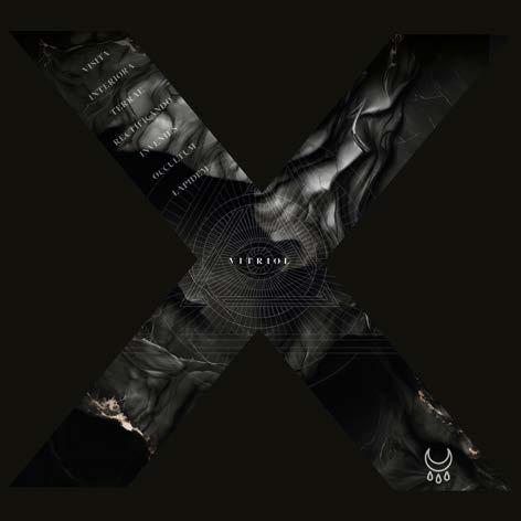
The inspiration behind the studio’s original packaging concept was drawn from the latticework from the iconic Rennie Mackintosh Willow Chair.
Amplifying this notion, the “X” symbol design plays with the same creative codes, to reveal a precious object inspired by the materials proper of the project partners.
A beautiful ode to art and design, framed by the famous quote by Mackintosh himself that reads: “Artists know that pleasure from their work is the spirit and soul of their existence”.


Inspired by their original concept, “Gingerly” — a luxury, plastic free sun protection brand — the studio envisioned a striking “X” glass object for the Make a Mark brand.
Building on the essence of Gingerly’s design, the team created a unique ‘X’ silhouette. By reimagining the shape of two stacked tiger cowrie shells, they sculpted a form that feels both organic and modern. The scalloped edges, reminiscent of the shell’s teeth, adorn the glass, adding textural depth and visual intrigue to the “X”.
The double-walled glass features a tortoise and amber gradient, reflecting the natural beauty of colors and textures found along the ocean’s edge. As sunlight filters through the glass, it casts a shadow that brings the “X” symbol to life.

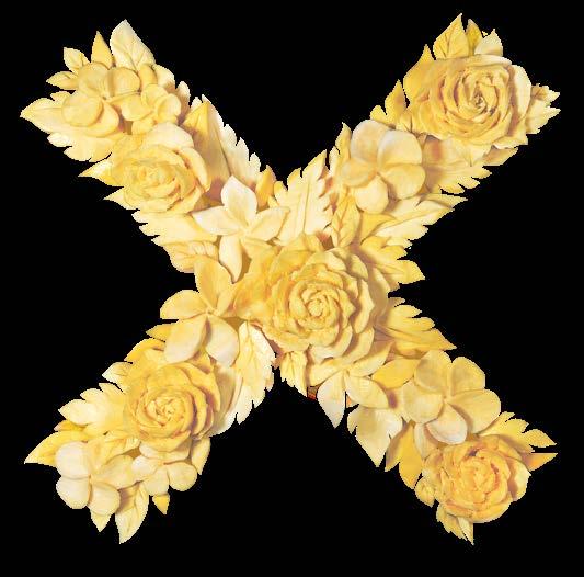
Their original concept “Lovehate” is an ode to the Thai fun culture, represented through a durian fruit.
The duality of love and hate is a fun spin on this infamous fruit: people hate the stinky smell, but love its taste once ingested.
Continuing on with this idea, the delicious pulp of this fruit gets carved out with traditional ornate Thai motives, to reveal their delicious take on the “X” symbol.


Following on from the studio’s original “Vivané’’ concept, where the soap bubble takes centre stage evoking fragility and beauty, the symmetry and balance of the new “X” symbol suggests harmony and equilibrium.
The sphere becomes the central point around which the entire structure is organised, to convey the sense of unity, the very centre of the universe.

The studio’s original packaging project “Noumenon” was named after the Kantian philosophical idea that everything has a true existence independent of and imperceivable by the human senses.
Today, they attempt to express this pure, yet unperceivable concept, through the power of AI, which is neither truly human, nor sensory.
Through the “X” symbol, the idea of the ‘noumenon’ becomes perceivable for the first time, approaching the concept and sentiment that who we truly are is often beyond our means of expression, to re-imagine self-expression as a radically true form beyond the limitations of style, speech, and mannerisms.


The studio’s original packaging project, “Metamorph”, was created in celebration of humanity’s dedication to innovation, creativity, and the transformative power of design.
Drawing inspiration from DNA components — adenine, guanine, cytosine, and thymine — they conceived a symbolic representation that embodies these principles.
Building on this theme, the “X” symbol design is reminiscent of the X-chromosome, symbolising the essential process of cellular division and multiplication, crucial for fostering growth, maintaining equilibrium, and driving evolution.
It underscores the studio’s beliefs and efforts in harnessing natural processes to propel progress, illustrating how thoughtful design can shape a future of continuous advancement.

In the studio’s “X” symbol design, all of the distinctive elements from the original packaging project ”Gran Pisco DOX” were remixed to create a disruptive and powerful mark full of meaning.
The copper horns symbolise strength, resilience, and vigour, values at the heart of the Bou Barroeta family, and the traditional distillation process in copper stills. The stopper symbolises the harmony between the sky and the earth, elements in constant movement but perfectly balanced, just like the constellations that revolve around the top.
The overall texture of the design arises from the process of copper corrosion and its minerals, showcasing its evolution and different states of the Chilean soil.


The starting point of the design proposal revolves around the “X” as a symbol that can be used to identify something unknown, as well as to indicate a variable term. Their original packaging project “Edit-36”, was based on combining different parts of packaging, to create a new one.
The “X” concept perfectly goes with this notion, because the result is unknown, and the process of creation consists of choosing some variables or others.
For this reason, the final proposal for their “X” symbol is not the crossing of two straight lines, but a central core from which four segments emerge, varying in colour and texture, that merge in constant change, like the beauty of life.

To adapt the expression of the “Sourglass” concept in an “X” symbol, the studio was immediately presented with a challenge. Should the identity be a direct representation and extension of the bottle structure? Or, should it be more abstracted and have its own personality with an implied connection to the bottle design?
Opting for the latter, they drew inspiration from the illustrations of the outer canister. The original, historical concept of the “Fitzrovia beer flood” was reworked and extended into the shape of an “X” mark — two main waves intertwine, revealing hidden characters and details within them, retaining the history, provenance and spirit of the award-winning original concept.


With this new design challenge, the international branding and design consultancy with offices in Paris, Singapore and New York, re-opens the narrative around “Khus”, their zerowaste perfume concept created for Make a Mark to shift the paradigms of luxury.
The “X” symbol — representing Avery Dennison, Estal and KURZ — opens a creative dialogue with vibrant colours, expressing the inspiration of designers.
The studio plays with negative space to reveal the power of the “X” mark, revealed by a colour gradient of the past editions, with an emphasis on the pink, the colour of the 2022 edition they took part in.

The studio’s “X” symbol design draws inspiration from the unique blend of contrasts in their original creation for Make a Mark — “Nan Madol”
They emphasised the interplay between stone and glass, the raw and the sophisticated, the light and the dark, and the visible and the invisible.
This creation mirrors the hidden secrets held in their packaging project, encouraging discovery and exploration. Each element is crafted to reveal more and more upon closer inspection, inviting observers on a journey of uncovering the mysteries and stories woven into its design.”


For their “X” symbol design, the studio focused on negative space, highlighting areas that are often overlooked but are critically important.
This approach symbolises the essential contributions of partners like Estal, Avery Dennison, and KURZ, who worked tirelessly behind the scenes to bring the Make a Mark projects to life. They collaborated seamlessly with designers from around the world, ensuring every detail was perfect.
The “X” only becomes visible when all elements come together, embodying true collaboration and the spirit of pushing the limits of what is possible. This design reflects the unity and innovative spirit that drives us all to create extraordinary work.
Nogashi”, the original packaging creation for Make a Mark, was reworked by the studio in the shape of an “X” symbol to mark the shift of paradigm needed in the beauty sector and luxury at large, where sustainable options are more and more accepted and understood.
The starting point of a new path of embracing the imperfections, turning them into valuable assets, that speak of the eternal intersection between the laws of nature and humankind.


Inspired by the original “EXOD” packaging project, the studio created a 3D reinterpretation of the “X” symbol.
The design features a double-crossed shape, symbolising a space capsule on an infinite journey. This visual metaphor represents clarity, exploration, and sustainability. The intersecting X shapes highlight collaboration and innovation, reflecting humanity’s pursuit of survival beyond Earth.
The new form symbolises hope, blending artistic expression with a commitment to environmental stewardship and invites viewers to envision a future where human evolution and sustainability are completely intertwined.

For their original packaging project “Manifesto”, the Italian studio focused on the constantly growing demand (and lack) of drinking water, and the issues around its accessibility through a message in a bottle.
Their “X” symbol design takes on the form of precious water, rising up against a desert and arid landscape where the imaginary message in a bottle was originally dropped, as a symbol of revindication full of hope and resilience.


As for the exquisite label of their original packaging concept “Avamposto Gin”, the fox takes centre stage, capturing the viewer while revealing the studio proposal for the “X” symbol.
A modern take on a nostalgic style, their timeless feel continues to intrigue the viewer, to talk tales of tradition, craft and love for nature.

The studio has been connecting the seemingly disparate worlds of sustainability and luxury for more than 25 years.
This statement of intention was already embroidered in their “Chronicle Whisky” decanter packaging concept for Make a Mark, and it converges into their new “X” symbol.
In the same way that a luxurious silver pipette and a natural wheat ear meet to elevate the whisky experience, this carefully curated imagery captures the luxury of sustainability.
A testament to the studio’s belief that these two concepts are not mutually exclusive, but rather complementary elements that can elevate each other to new heights.


The original wine concept created by the studio for Make a Mark already depicted a shiny “X” on its packaging label.
The new exploration of the “X” mark revolves around this same depiction, that symbolises two grapes, weaving together to create a wine better than the sum of its original parts — Cabernet x Shiraz.
Upon closer inspection, the same symbol also reveals two overlapping hearts: Australia’s gift to the world of wine has become a much loved blend with drinkers and connoisseurs across the globe.

The original “TOTEM” packaging concept is reimagined by the design agency through the lens of the “X” symbol, where colors and textures blend to create a bold and recognisable design.
The label design consistently ties together the various layers, thereby creating visual stability. The hot stamping detail adds a luminous and premium dimension to the letter.
The iconic custom cap of Totem, playing with disproportion, is reinterpreted here to form the connection between the different branches of the “X” symbol.


Whales are seen as the epitome of peace, wisdom and longevity, while simultaneously showing us hovering at the edge.
With this notion, “The brink”, title of the studio’s original packaging creation, was brought to life under a different light, in a graphic “X” form.
Keen to still convey the partners’ crafts through a different narrative: the opportunity to look back at the Make a Mark editions through the looking glass of Estal, the cleanliness and purity of unprinted white paper of Avery Dennison, and leading to the bright light, a spectrum of colour at the horizon, the embellishments of KURZ.

The original packaging design “Port 1836” was created as an ode to the fortified wine typical of the Douro Valley in Portugal, where the studio is based.
In an effort to tell the story of the century-old Port, the “X” symbol design offers an insight into the materials and the craft used in its production: the ancient glass-blowing technique reproduced by Estal is sealed by the same label as the original bottle, made by Avery Dennison to convey the rusticity of handmade paper, and the hot-stamping by KURZ to recreate the old sepia ink.
The whole image is very simple and minimal, leaving room to appreciate the beauty and heritage of these noble materials.


Honoring the truly innovative and brave spirit of Make a Mark, the studio delivered a new design concept, celebrating the graphic and physical embodiment of the union between Estal, Avery Dennison and KURZ, and the evolution of their project partnership.
Each of the founding brands are represented by an “X” symbol,with their own different elements: glass, paper and embellishment.
Together they form the iconic “XXX” symbol, also opening up a narrative around the historic clandestine alcoholic beverages.
A cultural legacy that represents our rebellious human spirit and has, through the years, become a symbol of craftsmanship and tradition, of freedom without constraints.


Make a Mark is all about combining ideas and styles. With this in mind, the studio in collaboration with CitrusAurantium, created their original packaging concept for wines, “Animorphe”
Recycling and upcycling parts of the actual packaging to represent the materials of the three main partners, the studio created a new “X” symbol, that is also a visual metaphor of what Make a Mark represents for them: a cross turning into a star, shining in the immense sky of our shared creative universe.


The Spanish studio built upon their existing concept “Gin Watcher” in their signature playful pop-style, this time creating an “X” symbol that complements it and hides a sweet soul.
It’s an ‘X’ shape chocolate box designed and created using Tyvek® and Noble papers supplied by Avery Dennison and finished with dot stamping by KURZ. The fresh and futuristic style labels have been printed by Etinsa.
Inside the box, the round chocolate pralines are reminiscent of the glossy texture of glass to represent Estal.
Because ‘Make a Mark is like a box of chocolates: you never know what you’re going to get!’

As true lovers of design and typography, the studio decided to pay homage to the first printing system, the movable type press created by Gutenberg in 1440 with their original packaging concept, “Gintographic”.
The printing process was manually back then, exactly like the process of making artisanal craft gin. Using this same reference as the concept for their “X” symbol design, the team pays tribute to 20 years of business with an exquisitely fine, hand-drawn illustration.


The original packaging for “Garnier Cognac” drew inspiration from the lavish elegance of the Casino de Monte-Carlo and its iconic Opera House.
The casino roulette in the “X” design is the quintessential representation of the Casino and the materials chosen for its depiction mirror the bottle’s creative codes.
A sculpted roulette wheel is also at the bottle’s base to introduce an element of play, with the central turret having the traditional “X” symbol, highlighting this seamless, natural connection.

Drawing inspiration from the mystical nature of their original packaging concept “Enigma”, the studio came up with yet another enigma, but one that embodies the fun they had throughout the no-limits creation process of Make a Mark.
Creative freedom and thinking outside the box are possibly the dream of every designer, and this very dream gave birth to the fluffy orange friend of their “X” symbol design.
The orange colour represents the Netherlands, where the studio is based, the soft hair reflects the velvet paper from Avery Dennison used for the original bottle’s label, the golden horn represents the embellishment from KURZ and the shiny eyes symbolise Estal’s glass vision.


The original “Azur Millésime’s” creative codes are clearly visible in the studio’s proposal for the new “X” symbol, using transparencies and lines superposition as an art form.
The design is composed of two main oval shaped glasses printed with the same, mirrored image, producing a geometric effect called “moiré o muaré”: the intersection of two visual patterns situated on top of each other, that results in a brand-new one. The illustration was made with a technique called “Suminagashi”.

“
Renaissance”, the revolutionary packaging project created for Make a Mark and celebrating the notion of transformation, has been translated by the studio into a unique “X” symbol with an organic, tactile feel.
Embracing imperfections, this exquisite expression crafted by remixing natural materials, highlights the alchemy of creation where flaws actually create individuality.
Renaissance” showed how the past can fuel future innovation, and this new “X” symbol invites audiences to see beauty in the unexpected, evolving through endless possibilities of reinterpreting what has come before.


43’oz
21 Moscova blvd., 6 Block, 6 Floor, MD-2068 Chisinau, Republic of Moldova
T: + 373 79 60 52 23 43oz.com
56Mar Nadd Al Hammar, Dubai, UAE
T: +971582244681 56mar.com
AAktiva Brand Experience Design
Av. Diagonal 508, Principal 2a, 08006 Barcelona, Spain
T: +34 934 234 690 aktiva.es
Anagrama
Colonia Condesa, Ciudad de México 06100, Mexico
T: +52 (55) 7825 8810 anagrama.com
ARD Design Agency
Rue du Simplon 40, 1800 Vevey, Switzerland
T: +41 21 925 40 40 ard.ch
BBackbone Branding
Hrachya Acharyan Street, 54B Yerevan, 0014, Armenia
T: +374 91 366 008 backbonebranding.com
Black Eye Project
The Paint Factory, 163 Rutland Road, Sheffield, S3 9PT, United Kingdom
T: +44 114 213 2002 blackeyeproject.co.uk
Black Squid Design
203 Melbourne Street, North Adelaide, South Australia 5006, Australia
T: +61 8 8361 8066 blacksquid.com.au
Boldrini & Ficcardi
Espejo 144, Piso 3, Of. 8, Mendoza, Ciudad, CP 5500, Argentina
T: +54 261 4231918 boldrinificcardi.com
Bravo Design Unit 204 B, Buchanan Square, 162 Sir Lowry Road, Cape Town, South Africa
T: +27 21 461 0245 bravodesign.co.za
BULLET Inc.
Space-M 302, 1-30-15 Higashinakano Nakano-ku, Tokyo 164-0003, Japan
T: +81 3 5937 3555 bullet-inc.jp
Butterfly Cannon
Holborn Tower, 137-144 High Holborn, London WC1V 6PL United Kingdom
T: +44 203 384 4572 butterflycannon.com
DDario Frattaruolo Design Via Romboni 16/A, 55041 Camaiore (LU), Italy
T: +39 340 816 5500 www.dariofrattaruolo.com
Denomination
Studio 1.12, 22-36 Mountain Street, Ultimo NSW 2007, Australia
T: +61 (0) 2 9281 5533 denomination.com
Designsake Studio
310 Sir Francisco Drake Blvd, San Anselmo, CA 94960, USA
T: + 1 415 509 3508 designsakestudio.com
FFarmgroup
81 Soi Chadsan Uahwattanasakul, Pattanakarn, Suanluang, Bangkok 10250, Thailand
T: +6692 835 9922 farmgroup.co.th
FLOV
ul. Tęczowa 83x, 53-601 Wrocław, Poland
T: +48 691 488 385 flov.co
forceMAJEURE
219 36th Street, 5th Floor, Brooklyn, NY 11232, USA
T:+12126250708 forcemajeure.design
HHuman
Loma Antigua T03 – 802, Bosque Esmeralda, Atizapán de Zaragoza, 52930, Edo. de México, México
T: +52.55.2531.4089 byhuman.mx J
JVD Estudio Pocuro 2465, Providencia, Santiago, Chile
T: +56 9 9078 4624 jvdestudio.cl L
Lavernia & Cienfuegos
Felix Pizcueta 23, Bajo Interior, 46004 Valencia, Spain
T: +34 963 525 750 lavernia-cienfuegos.com
Lewis Moberly
33 Gresse Street, London, W1T 1QU, United Kingdom
T: +44 (0) 207 580 9252 lewismoberly.com
Lonsdale
8 rue Lavoisier, 75008 Paris, France
T: +33 1 43 12 67 00 lonsdale.fr
MMABA
Avda. Teniente Montesinos 8, torre Z, 9º, 30100 Murcia, Spain
T: +34 868 075 840 estudiomaba.com
MARK Studio
63 Hout Street, Mercantile Building, Office Two, 1st Floor, Cape Town, 8001, South Africa
T: +27 (0)84 276 7622 themarkwebsite.co.za
Mazarine Pascalie Design
2 Square Villaret de Joyeuse, 75017 Paris, France
T: +33 1 58 05 49 00 mazarine.com
Morillas Pallars, 391-393, 08019 Barcelona, Spain
T: +34 932 922 070 morillas.com
OOfficina Grafica Via Fra’ J. Passavanti, 37, 50133 Florence, Italy
T: +39 055 553 5339 officinagrafica.com
Olssøn Barbieri
Nedre Slottsgate 8, 0157 Oslo, Norway
T: +4790087336 olssonbarbieri.com
Omdesign® Rua de Vila Franca, 54, 4450-802 Leça da Palmeira, Portugal
T: +351 229 982 960 omdesign.pt
PParallax Design 34 Delhi Street, Adelaide SA 5000, Australia
T: +61 8 8410 8855 parallaxdesign.com.au
Partisan du Sens 97 Rue Réaumur, 75002 Paris, France
T: +33 1 44 76 00 61 partisandusens.fr
Pocket Rocket Creative Unit 2, Touch Business Centre, Touch Road, Stirling FK8 3AQ, Scotland
T: +44 1786 468 040 thisisprc.com
RRita Rivotti
Praça das Amoreiras Nº4, 1º Andar, 1250-020 Lisboa, Portugal
T: +351 213 880 043 ritarivotti.pt
SeriesNemo Carrer de Ramón Turró 23, Ático, 08005 Barcelona, Spain
T: +34 93 221 18 27 seriesnemo.com
Studio Créa’ Design 84 Avenue de la République, 75011 Paris, France
T: +33 (0)6 73 12 80 85 studio-creadesign.com
—
Supperstudio
Santa Teresa 7. Bajo A , 28004 Madrid, Spain
T: +34 913 604 322 supperstudio.com
SURE Brandesign El Salvador 5874, Caba Buenos Aires, CP 1414, Argentina
T: +541155993030 sure.com.ar
TThinkBoldStudio AV Força Aérea Portuguesa, Aveiro, 3800-355, Portugal
T: +351 915 207 312 thinkboldstudio.com
VVan Heertum Design VHD Gasthuisring 23, 5041 DP Tilburg, The Netherlands
T: 31 (0) 647 862 985 heertum.nl
XXimena Ureta Studio El Espino 777, Huechuraba, Chile
T: +56 9 99397126 ximenureta.cl
YYummy Stories Weißkreuzgasse 4, 67483 Edesheim, Germany
T: +49 6323 9869180 yummystories.de
© 2024 Estal, Avery Dennison Corporation and LEONHARD KURZ.
Make a Mark is an exclusive innovation project between Estal, Avery Dennison and LEONHARD KURZ.
All rights reserved. No part of this publication may be reproduced or transmitted in any form or by any means, electronic or mechanical, including photocopy, recording or any information storage and retrieval system, without prior written permission of the respective copyright owner.
All images in this book have been reproduced with the knowledge and prior consent of the artists concerned, and no responsibility is accepted by the producer, publisher, or printer for any infringement of copyright or otherwise arising from this publication. Every effort has been made to ensure that credits accurately comply with information supplied.
Printed by Park Communications Limited.
The material used in this document is from sustainable resources. The paper mill and printer are both registered with the Forestry Stewardship Council (FSC)® and additionally have the Environmental Management System ISO 14001. The paper is recyclable and biodegradable.
The inks are 100% vegetable based bio-inks and it is printed without the use of any solvents.
A bottle. A label. An embellishment. A platform for pushing innovation. A chance to unleash creativity. To showcase talent.
To explore new territories. To think freely, to think beyond. A time to take risks.
To reinvent without fear. To innovate without constraint. To leave behind the expected.
Lead the way, be brave. Make a Mark
