Make a Mark
Basile ADV
Bulldog Studio
Centdegrés
Co-Partnership
Graphic Brands
Drinks by Kingpin
Nano Alfonsín
Periscoop Agency
Piano & Piano
Studio Guild
This is Pacífica
Vincent Villéger

Basile ADV
Bulldog Studio
Centdegrés
Co-Partnership
Graphic Brands
Drinks by Kingpin
Nano Alfonsín
Periscoop Agency
Piano & Piano
Studio Guild
This is Pacífica
Vincent Villéger

Each year, Make a MarkTM evolves—not only in scope, but in spirit.
What began as a creative collaboration between packaging leaders has become something much larger: a living platform where the most visionary design studios explore, question, and reimagine the role of packaging in our world.
In this edition, we introduced a new dimension to the brief: connectivity. Beyond sustainability, luxury, and innovation, designers can now explore how packaging can create meaningful connections—between brands and people, tradition and technology, physical and digital. In an increasingly hybrid world, packaging is no longer just a vessel; it’s a portal. A storyteller. A signal.
For the first time, Make a Mark has also stepped into the cultural spotlight of international design weeks—not simply to exhibit packaging, but to elevate it as a design discipline worthy of the global stage. These events allow designers to reach beyond the industry, sharing the power of materials, craft, and storytelling with a wider design-conscious audience. It’s a bold step—and one we take with conviction and purpose.
Above all, this book remains a tribute to creativity without constraint. Every project here is the result of generous freedom—freedom to experiment, to take risks, to dream out loud. And every designer involved has done just that: left a mark. Not only using glass, paper and embellishment, but also design thinking.
To make a mark is not only to create—it is to inspire, to challenge, and to lead.
We hope this book sparks new ideas, starts new conversations, and reminds us all of the deep value of creative collaboration—not just for packaging, but for the very future of design itself.
Make a MarkTM is an exclusive innovation project developed and started in 2021 by three global industry leaders—ESTAL, Avery Dennison, and LEONHARD KURZ—inviting some of the world’s top packaging design studios to take part in creating an inspirational platform within the Wines, Spirits, Beauty, and Fragrance sectors over a six-year period.
2025 marks the fourth year of the project. Along with featuring the work of a wide range of designers from across the globe, Make a Mark is also being promoted with designers, brand owners, and business events worldwide, both virtually and live.
The studios involved in the Make a Mark project were asked to develop their concepts around a three-pronged brief focusing on sustainability, luxury, innovation and connectivity, allowing them to freely showcase their insights while bringing their ideas to life without the limitations of the day-to-day. Provided with first-hand access to some of the industry’s latest innovations, the agencies were able to use some of the most up-todate packaging technologies to create their concepts.
But more than just a beautiful book highlighting inspirational creative concepts, Make a Mark also provides a platform for starting conversations and sharing ideas. Beyond the project itself, we are forming a dynamic, creative community of thinkers and rebels—all united by our love for glass, labeling, embellishment and packaging with the desire to create new things.
A bottle. A label. An embellishment.
A platform for pushing innovation.
A chance to unleash creativity.
To showcase talent.
To explore new territories.
To think freely, to think beyond.
A time to take risks.
To reinvent without fear.
To innovate without constraint.
To leave behind the expected.
Lead the way, be brave.
Make a Mark
Bulldog
Graphic
[UK]
Drinks by Kingpin [UK]
Nano Alfonsín [AR]
Periscoop Agency [NL]
Piano & Piano [CL]
Studio
This
[AU]
[PT] Vincent
[UK]
For more than 25 years, Estal has specialized in providing glass packaging solutions to customers and designers in the wines, spirits, gourmet, beauty and home fragrance ecosystems. With an unwavering commitment to innovation and sustainability, Estal champions creative freedom—developing groundbreaking bottle value propositions and formats that set new standards in the industry. Passionate about design and obsessed with detail, Estal continues to shape the future of glass as both a material and a storytelling medium.
estal.com
A global leader in sustainable labelling innovation, Avery Dennison empowers brands to elevate their impact—on shelf and on the planet. The Fasson® portfolio offers an expansive range of luxury and contemporary self-adhesive papers and films, designed to capture a brand’s essence while delivering outstanding tactile and visual appeal. With a focus on recyclability, circularity, and digital transformation, Avery Dennison is redefining how materials connect brands with people—and with the future.
label.averydennison.com
Renowned for its pioneering work in thin-film transfer technology, LEONHARD KURZ develops premium decorative and functional layers that bring packaging to life. From exquisite metallized transferfoils to cutting-edge sustainable finishes, KURZ invests continuously in technological innovation—transforming surfaces into multisensory experiences. In the world of packaging, KURZ bridges craftsmanship and future-forward thinking, delivering exceptional embellishments that leave a lasting impression.
kurz-graphics.com

Tapì Group is redefining closure design across the beverage, food, and beauty industries. More than just a manufacturer, Tapì is a creative partner, blending global reach with timeless craftsmanship to elevate every product. Their mission goes beyond function, creating closures that tell stories through materiality, form, and detail.
Tapì is a “global boutique”, offering precision, agility, and a widereaching presence across continents. A closure is not just a seal—it’s a signature that adds character, distinctiveness, and emotion to every bottle. The Group includes Delage, with its artisanal heritage, and Ganau, a leader in sustainable cork innovation.
With over 1,000 employees in 70+ countries, Tapì Group delivers insightdriven, creative solutions backed by global operations. Their attention to detail ensures every project leaves a truly lasting impression.

A true pioneer in the world of tooling, H+M is synonymous with craftsmanship, innovation, and excellence in hot stamping and embossing dies. For more than 60 years, the company has been shaping surfaces—transforming materials into sensory experiences through precision-made tools that leave lasting impressions.
From premium packaging to high-end book covers and beyond, H+M’s custom-made stamping tools are trusted by many of the world’s most iconic brands. Their approach blends traditional expertise with state-of-the-art technology, offering creative studios the ability to explore detail, depth, and dimension like never before.
As part of the Make a Mark ecosystem, H+M brings a new layer of expression—one where every line, curve, and texture becomes a statement of design integrity.
hinderer-muehlich.com
Specializing in advanced decoration technology, ISIMAT is redefining what’s possible in direct-to-object printing. Fusing engineering precision with creative freedom, the company enables unparalleled effects across glass, plastic, and metal surfaces—bringing bold packaging concepts to life with clarity, speed, and detail.
Known for their cutting-edge inLINE FOILING® and hybrid screen printing solutions, ISIMAT’s innovations allow designers to play with metallics, gradients, textures, and transparencies without compromising on sustainability or efficiency.
Within Make a Mark, ISIMAT opens up a new creative frontier—where packaging becomes not just a container, but a canvas for nextgeneration visual storytelling.
isimat.com
For over 20 years, LARTEC has been at the forefront of developing highquality, durable flexible dies. The hard work and dedication of our team have led us to produce some of the best cutting plates on the market, allowing our clients to cut a wide range of materials with extreme precision, even in the most irregular shapes.
Our R&D department continues to push boundaries every day, striving to create even better dies that offer more advantages for our customers. Thanks to this constant innovation, LARTEC supplies dies to clients in over 90 countries, earning a global reputation for excellence.
Our success has been built on offering reliable service and delivering high-quality products that meet the needs of diverse industries around the world.
lartec.com.es
With over 40 years of experience, MaCher Australia excels in designing, developing, sourcing, and manufacturing premium packaging and custom products for the wine, spirits, and luxury beauty industries. MaCher combines thoughtful design with sustainable and ethical sourcing, tackling sustainability challenges through industry insights, data, and circular design principles.
Their deep understanding of client needs enables them to create authentic solutions that help brands enhance consumer loyalty, raise awareness, launch new products, and increase sales. Through innovation, creativity, and global manufacturing capabilities, MaCher is committed to driving impactful environmental change by creating packaging solutions that are reusable, recyclable, and responsible.
macher.com.au
Signet delivers Perfect Fit™ solutions for ambitious spirit and wine brands—no matter how complex the challenge. Their Perfect Fit™ philosophy speaks to their creative and technical design know-how, an innovative approach to using multi-material choices of solutions, and an inherent obsession with getting the details right. They produce bottle embellishments and labels that align with the needs of your brand and bottle—down to the concept, material, finish, application, quality, and delivery.
Established in 1994, Signet is a trusted global partner to major drinks groups, ambitious independent brands, and creative design houses as a leading provider of premium quality bottle decoration and accessories— enabling their success through differentiation.
signetbranding.com
Tricycle Studio is a CGI studio specialising in high-end 3D visualisations for premium packaging. From spirits and wines to cosmetics and beyond, the studio brings products to life through hyper-realistic images and videos that elevate design and captivate audiences.
Driven by passion, precision, and an eye for detail, Tricycle approaches every project with enthusiasm, commitment, and care, always combining technical excellence with good vibes.
Working with clients across the globe, Tricycle is known not only for stunning results but also for its collaborative spirit and warm, approachable style. At Tricycle, the process is just as enjoyable as the outcome. Tricycle Studio makes it real with CGI!
tricyclestudio.es
At CCL Label UK, packaging is more than a surface—it’s a medium of connection. As part of CCL Industries, a global leader in specialty packaging, CCL Label partners with brands across industries to create high-impact label solutions that combine innovation, technical excellence, and emotional storytelling. From home and personal care to healthcare, food, beverage, and consumer goods, CCL brings a global perspective to every project. But in the world of fine wines and spirits, packaging becomes something more: a crafted expression of the product’s soul.
CCL Label Wine & Spirits specialises in prestige labels that celebrate craft, elevate perception, and leave a lasting mark. Whether through luxurious papers, intricate embellishments, sustainable substrates, or bespoke finishes, their work blends creativity with precision— transforming bottles into brand experiences.
With a mission to craft packaging that connects, CCL Label UK delivers design and engineering that resonate across categories, cultures, and markets.
ccllabel.com
Founded in 1989, Colorama is a trusted partner in creating high quality adhesive and wet glue labels for the wine industry and other specialised markets with demanding technical and logistical standards.
Our mission is simple:to help our clients stand out. We combine decades of expertise with state of the art printing technology, premium raw materials, and a team of highly skilled professionals to deliver labels that are not only flawless, but distinctive. From intricate embossing and premium finishes to complex multi process designs, we excel at bringing ambitious ideas to life, no matter how challenging the brief.
We believe lasting success comes from lastings relationships. That’s why we work closely with our customers’ suppliers, building long-term partnerships based on trust, reliability and continuous innovation. our commitment to precision,quality,and on-time delivery is absolute. At Colorama, every label tells a story. We make sure yours is unforgettable.
colorama.cl
ETINSA have been manufacturing labels since 1990. They collaborate with companies and designers, creating work to be proud of. Their long history allows us to cover three lines of business: wine, food and industrial labeling.
ETINSA have an experienced and proactive technical department that is committed to innovation and the search for new applications.
Very simply: they create the best labels for your product.
etinsa.eu
Founded in 1939 in Argentina, Label Solutions specializes in premium labels for wine and food industries. From large-scale runs to exclusive limited editions, we combine cutting-edge technology with meticulous attention to detail. Each label we create becomes an experience, it tells a story, evokes emotions. Our legacy of innovation and excellence positions Label Solutions as a distinctive name in the premium printing industry.
labelsolutions.com.ar
As the global leader in premium labeling, MCC Label delivers innovative, customized, and sustainable solutions that meet the highest creative and technical standards. With a network of over 12,000 professionals across 29 countries, MCC supports brands at every stage of their packaging journey—ensuring lasting impact and flawless execution.
At the heart of MCC’s approach is innovation. With dedicated R&D teams, advanced prototype workshops, and an integrated graphic studio, MCC transforms creative ideas into production-ready reality.
Their mastery of cutting-edge technologies—across both digital and traditional platforms—enables highly distinctive finishes that elevate even the most ambitious designs.
What sets MCC apart is not just scale, but presence: local teams committed to responsiveness, precision, and a seamless customer experience. Whether for small-batch prestige runs or large-scale global campaigns, MCC delivers with consistency, care, and craft.
For this edition of Make a Mark, we are proud to spotlight the contribution of MCC France, whose technical skill and attention to detail have helped bring several projects to life.
mcclabel.com

At Proof+, packaging comes to life. Specialising in high-end prototypes, Proof+ enables designers and brands to explore their vision in full detail—creating tactile, press-ready mockups with unmatched finish and fidelity. Their state-of-the-art facility can print on virtually any substrate, including uncoated stock, and apply premium embellishments from foil to embossing.
With Colour Guardian© technology, Proof+ ensures exacting colour accuracy between prototype and production—eliminating guesswork and enabling seamless transitions from concept to reality. Whether for design validation, internal review, or client presentation, Proof+ gives form to creativity with impeccable precision.
As part of The Reflex Group, Proof+ benefits from deep technical knowledge across sectors and offers tailored solutions that bridge design ambition with production integrity.
proofplus.uk

Founded in 2002, The Reflex Group is one of the UK’s largest and most advanced providers of label and packaging solutions. With 24 sites across seven countries, Reflex delivers end-to-end services—from design and prototyping to a diverse range of packaging products including self-adhesive, linerless, embellished, and security labels, as well as carton board, flexible, and protective packaging.
At the intersection of technology and sustainability, Reflex continuously invests in cutting-edge equipment and printing innovation, with several patented solutions in their portfolio. Officially carbon neutral since 2019, and certified by Carbon Neutral Britain™, the company sets an industry benchmark for both performance and environmental responsibility.
Reflex supports brands in sectors ranging from food and beverage to health and beauty and pharmaceuticals—offering precision, scale, and deep market insight with every project.
reflexlabels.co.uk
RetailPak designs and manufactures premium custom packaging across a range of materials—from paperboard and wood to metal and rigid box structures. With two decades of experience, the company specializes in packaging that delivers on every level: visual impact, structural integrity, production efficiency, and precise execution.
Serving categories from cigars and spirits to gourmet foods, cosmetics, and luxury promotions, RetailPak partners with brands to create packaging that protects, elevates, and communicates. Every detail is considered, every surface an opportunity to make a mark.
Headquartered in Hong Kong with offices in the US and Europe and owned production sites in southern China and Mexico, the company offers a seamless global service—balancing creative development with real-time production oversight and on-time delivery. RetailPak’s approach is rooted in quality, partnership, and craft. Their mission: to create packaging that connects through form, story, and precision.
retailpak.com
Reynders label printing is a family-owned company with over 70 years of experience in the printing industry. Specializing in the production of high-quality, custom-made labels for a wide range of industries, including food and beverage, pharmaceuticals, and cosmetics.
Their commitment to customer satisfaction, innovation, and excellence sets them apart in the industry. In summary, Reynders label printing is a trusted partner for businesses seeking top-notch label printing and packaging solutions through state-of-the-art technology , with a focus on quality, sustainability, and customer-centric service.
reynders.com
Sovemec is a leading company in the adhesive and capsule printing sector, thanks to the latest printing technologies used and the highly experienced staff, serving more than 5,000 customers in Italy and abroad, including some of the world’s leading producers and distributors of wines, oils, cosmetics, and detergents. With a 4,000-square-meter facility, the entire production process is carried out entirely in-house, guaranteeing reliability and speed.
Our primary goal is to put our experience and quality at the service of our customers. We pay particular attention to the printing technique of adhesive labels for any application, as we know that without a label, the product cannot be sold. This is driven by our high level of professionalism and our desire to constantly invest in innovative, increasingly precise printing technologies.
sovemec.it

Vox, founded in 1975, is a family business in which its founder and main shareholder, Mr. Manuel da Hora Ribeiro, started his activity in the graphic sector more than 60 years ago, specializing in the production of labels for the Wine market. Aware that the future is a construction of the present, Vox is equipped with the most modern graphics equipment, designed with the most modern environmental concerns.
Developed a taste for working with and for the best, producing very high quality labeling on different types of paper and grammages and in the most varied types of printing and finishing.
A Voice in the Graphic Arts!
“From curiosity to reality, from reality to success!”
vox.co.pt
Founded in 1905, Vrijdag has just celebrated 120 years of craftsmanship. A lot has changed over the decades, however their passion for creating exceptional luxury packaging concepts and labels with unique print effects have never faded.
From offset and sheet gravure printing to striking hot foil stamping, bronzing and 3D embossing, every detail is crafted to deliver a sustainable “wow” factor for the brands served.
Vrijdag also specializes in brand protection features such as NFC chip, infrared, ultraviolet or relief security inks.
At Vrijdag, we provide a one-stop shopping concept. They guide you through the entire development process. From idea, prototyping, design, production, assembly and shipping.
Their mission is to deliver distinctive, high-quality, added value packaging concepts that makes a lasting impression.
vrijdag.nl
Now in it’s fourth edition, Make a Mark called on 12 visionary studios from around the world to explore an open brief grounded in four guiding principles: sustainability, luxury, innovation, and connectivity.
Together, these four themes define a new creative frontier for the packaging industry—one where aesthetics, responsibility, technology, and emotion meet in bold, unexpected ways. Designers were invited to break free from traditional limitations and imagine what packaging can become when ideas are unbound by convention.
Sustainability is no longer a trend, but a core expectation. Participating studios are encouraged to push beyond compliance and embrace the imperfect beauty of eco-conscious design—from circular systems and organic materials to storytelling through texture, waste, and renewal.
Luxury, too, has shifted. It is no longer reserved for the few, but reimagined for those who seek emotional richness, sensory tactility, and meaning. The featured projects challenge the very definition of desirability—celebrating individuality, rarity, and visual seduction through daring materiality and form.
Innovation remains at the core of Make a Mark. Whether through technique, concept, or technology, the goal was to create the unexpected—to experiment, to test boundaries, and to propose ideas the market doesn’t yet know it needs.
Connectivity. In a world shaped by data and digital experience, we asked our designers to explore how packaging can become a bridge—between brand and consumer, between product and story. From RFID triggers and NFC chips to invisible inks and QR codes, connectivity invites interaction, transparency, and a sense of shared journey.
Across all categories—Wines, Spirits, Drinks, Beauty, Home Fragrance and Gourmet Food—this year’s brief asked one essential question: What does it mean to make a mark on the future of packaging?
The answers lie in the pages ahead.
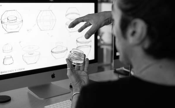
Based in the hills of Southern Italy, Basile ADV is an awardwinning creative studio led by Andrea Basile. Known for its deep design sensibility and multidisciplinary approach, the studio specializes in branding, packaging, and visual storytelling for luxury and artisan products.
With a passion for form, material, and meaning, Basile ADV crafts identities that speak with quiet strength—where every detail is intentional, and beauty is always purposeful.
basileadv.com
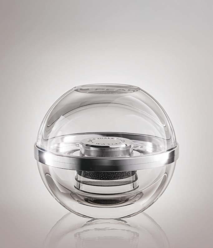

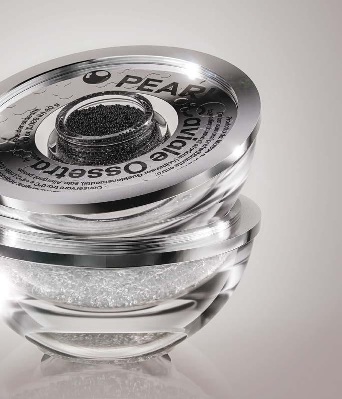
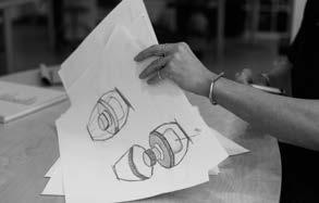
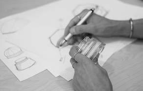
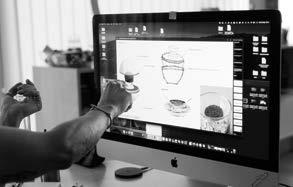
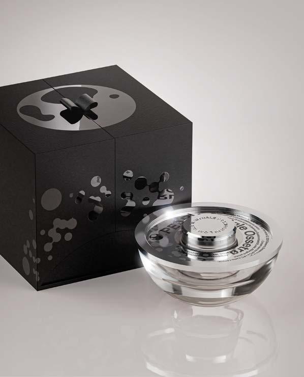
Concept: PEARL—A sphere. A gesture. An object.
Pearl was born from a radical idea: to design a caviar container that doesn’t look like packaging. No visible labels. No external branding. Just pure form and function.
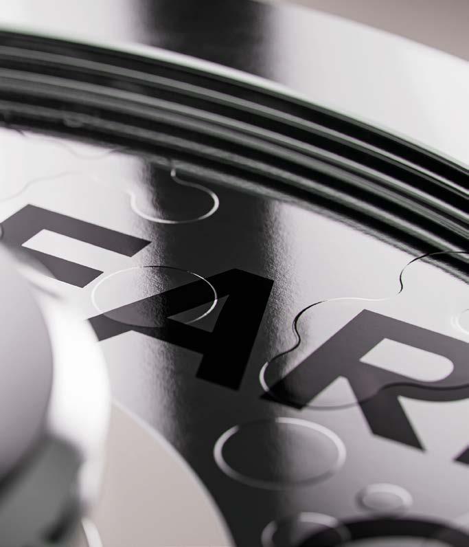
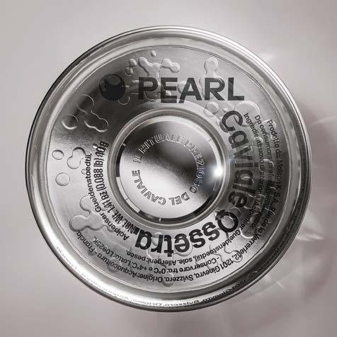
The design is composed of two transparent glass hemispheres. The lower half integrates a refined Estal jar to cradle the caviar. The upper half clasps on smoothly—acting as a lid, a seal, and, when reversed, an elegant ice chamber. Together, they create a solid, minimal, and tactile presence.
Pearl doesn’t present itself—it waits to be discovered. A silent archetype, referencing the preciousness and round brilliance of both pearls and caviar.
Glass Bottle.
Estal DA Lumiere 50ml in CUSTOM glass sphere
Label Materials.
Avery Dennison FASSON® Silver Foil Embossed FSC®
Transfer Foils.
KURZ ALUFIN ® 150 and LUXOR® 362
Closure.
Tapì custom pearl jar closure
Print Method.
Hot stamping, digital transparent 3D
Print Partner.
Sovemec, Italy
Secondary Packaging.
Custom container box by RetailPak, Hong Kong
Approach.
Inside the sphere, the label is discreetly hidden, designed for clarity— not persuasion. Pearl reduces packaging to its purest expression: an object with lasting beauty, designed for both ritual and reuse.
Modularity defines its function. After serving, Pearl transforms into a tabletop sculpture, a personal container, or a refillable experience. With a simple rotation, the top becomes the base, the bottom becomes the stage—elevating the product both literally and symbolically. Pearl is more than packaging. It’s design, distilled.

Fom the heart of the sunny Barcelona, Bulldog Studio is a creative agency specializing in Packaging and Branding.
Known for their honest, strategic approach and collaborative spirit, the team brings clarity, wit and quality to every project. They combine solid experience with a personal approach— turning ideas into successful brands that connect with people.
Creative projects with a human touch.
bulldogstudio.es Spain

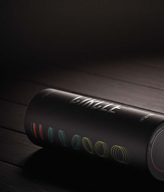
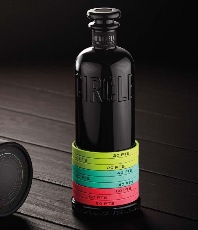
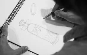
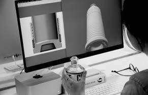
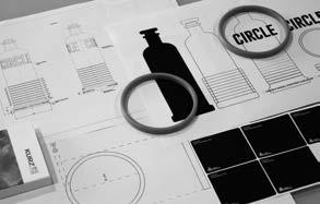
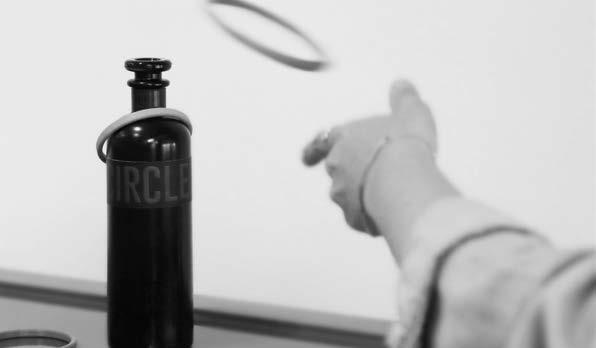
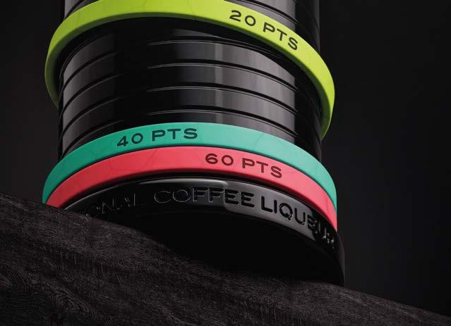
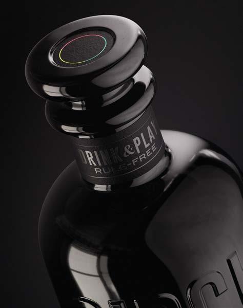
Concept: CIRCLE—Drink & Play.
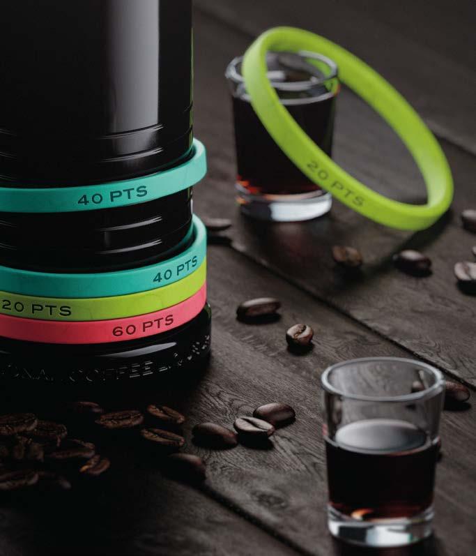
A tribute to the bottle brings with it a rule free game, a celebration of shared joy. Inspired by the after-meal pause “la sobremesa”—a cultural moment to reconnect, share and enjoy together— this concept revives the nostalgic energy of a 1920s game: tossing rings onto a bottle.
The result is a bold and unexpected coffee liqueur, housed in a design that merges sophistication with fun. Circle captures a mood: a time for connection, good vibes, and effortless celebration.
It’s more than a drink. It’s a playful invitation.
Glass Bottle.
Estal custom CIRCLE 700ml
Label Material. Avery Dennison Fasson® Leatherlike Black FSC®, Soft Touch White FSC
Transfer Foils.
KURZ LUXOR® 108139, 314, 366, 362, and COLORIT® 912.
Closure.
Estal T-Shape Philos
Print Method.
Offset Printing, Hot Stamping, Silkscreen Printing, Emboss/Deboss using H+M Tools
Print Partner.
Etinsa Impresores, Spain
Accessory.
Eceleni—dyed synthetic cork + laser printing
Approach.
Sustainability and luxury come together in surprising harmony. The team selected Estal’s DA ECO Philos Bold catalogue bottle—a minimal intervention approach that still delivers striking presence.
Black sets the tone: Avery Dennison’s Fasson® Leatherlike Black paper, black-on-black stamping with KURZ COLORIT® 912, and refined finishes evoke a quiet elegance. But it’s the vivid accents that transform it. Three electric foil colors and synthetic corks in bold hues flip the mood— introducing contrast, energy, and a wink of irreverence.
Circle is both refined and playful. Designed to be admired, touched, and yes—played with.

Bold, cultural, and globally attuned, Centdegrés is a creative agency driven by purpose and passion. With offices around the world and a deep-rooted belief in the power of storytelling, the agency brings together diverse talents to craft brand experiences that are as meaningful as they are iconic.
Grounded in brand intelligence and a daring creative process, Centdegrés designs with audacity and intention—shaping the future of brands through innovation, emotion, and cultural resonance.
centdegres.com
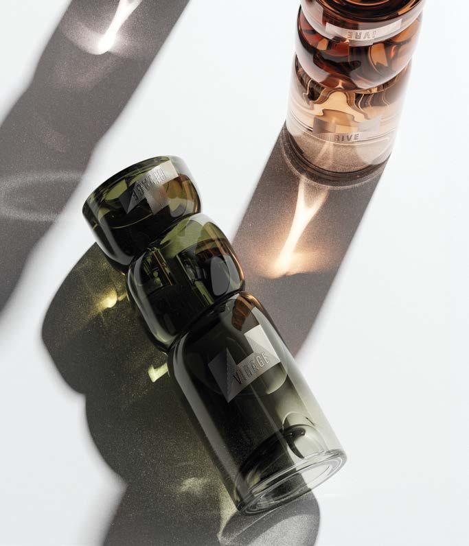
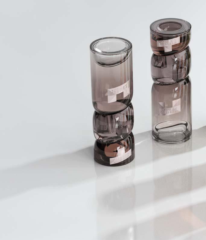


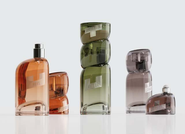
Concept: L’ESSENCE DU DEUX—A fragrance for creators.
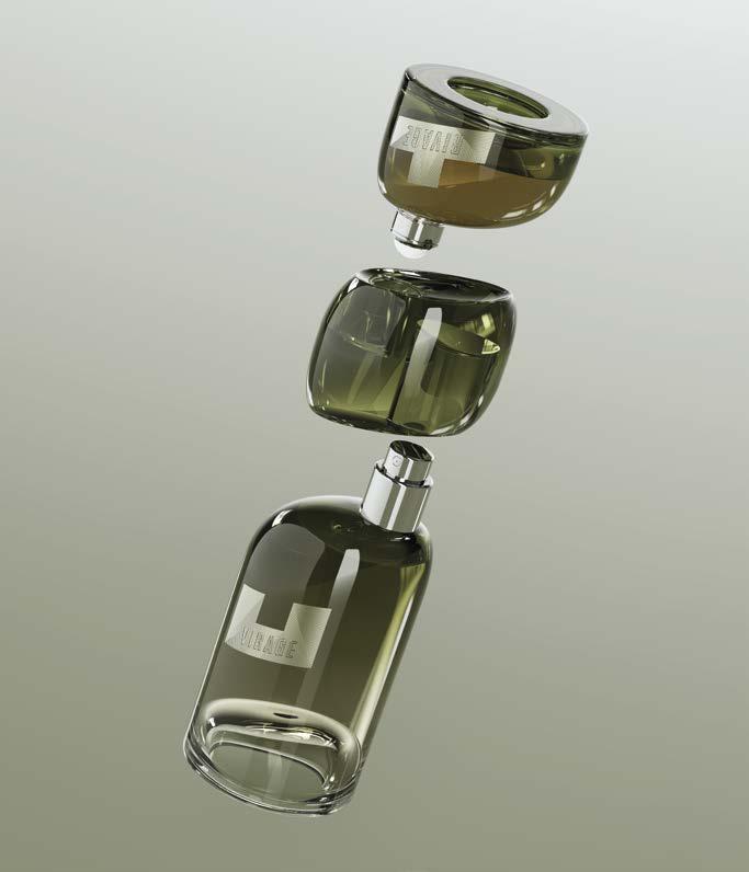
L’Essence du Deux redefines perfume as an interactive, sculptural experience. Inspired by the cultural practice of fragrance layering— particularly in the Middle East—this concept invites wearers to blend, compose, and create their own olfactory signature.
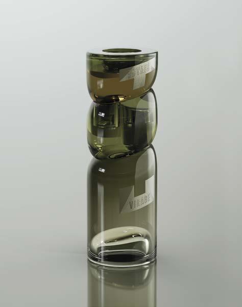
Each piece is a glass sculpture: two conjoined bottles crafted by Estal, one holding Eau de Parfum, the other a roll-on perfumed oil. Together, they form a dual-scent pairing—a celebration of contrast and complementarity. Every use becomes a personal ritual, a new composition.
The identity reinforces this creative tension. Labels are printed on textured linen paper, their designs split between bottles and only revealed as a complete work when reunited. Anagrams name the scents, reflecting the mirrored nature of the concept.
The palette—burnt orange, forest green, and soft violet—evokes a sensorial landscape both grounded and poetic.
Glass Bottle.
Estal CUSTOM L’Essence du Deux (20ml and 80ml)
Label Material.
Avery Dennison Fasson® Lin Fiber FSC®
Transfer Foils.
KURZ
Integrated dual-format
Print Method.
HP digital printing and micro-embossed foil stamping using H+M tools
Print Partner.
MCC, France
Approach. Materiality plays a central role in expressing the project’s vision of modern luxury.
Estal’s Bubbles Cloche glass technique forms the sculptural base, redistributing volume and visual weight with a light, artful push-up. This process enhances presence while minimizing material use—a balance of drama and sustainability.
The label material, Avery Dennison’s Fasson® Lin Fiber FSC®, features 50% flax fiber and a tactile, felt-marked surface. Natural and raw, it reflects craftsmanship and purity. A sustainable choice with an artisanal feel. Each label is enhanced with KURZ LUXOR® foils in three tones— 377, 376, and 397—applied through micro-embossing. This detailed finish brings dimension and luminosity, echoing the sculptural fluidity of the bottles.
L’Essence du Deux is a work of co-creation, where scent, form, and user imagination converge.


Co-Partnership is an independent drinks design agency specialising in strategic creative for branding, packaging and activation.
The team is an international mix of curious minds—creative strategists, insight-driven designers, technical engineers and strategic client service. We unite to solve complex problems for global drinks businesses, learning from consumer culture to build meaning and relevance. Drawing on our collective experience from diverse industries and our prioritization of the highest quality creative, we foster client trust through great work that makes people think and feel.
Founded in 2011 by Max Harkness and Zoe Green, the agency is built on the philosophy that the strongest brands are built in partnership.
co-partnership.com


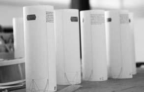

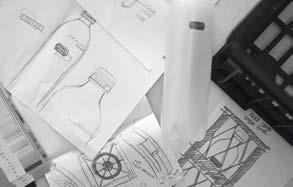
Concept. OUR PURSUIT IS PRICELESS.
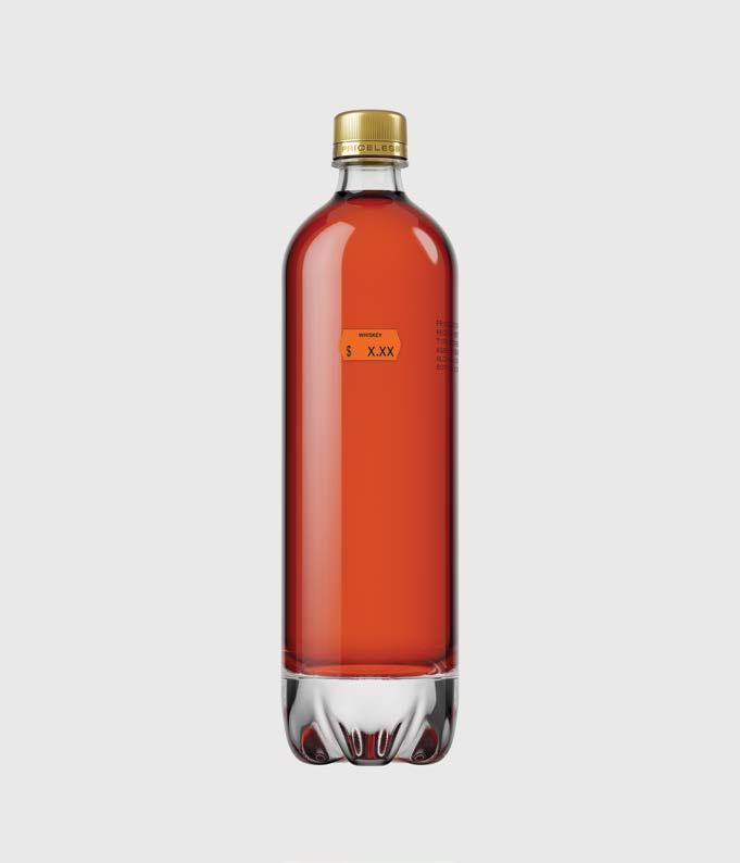
Not tied to any single place, process, or single way of thinking. We collaborate across disciplines—designing, creating, and distilling— with one shared pursuit: pleasure. As a Non-Distillery Producer, we have no stills to maintain, no walls to contain us. No distillery means fewer rules, a lighter footprint, and endless possibility. We source exceptional whiskies from across the globe, partnering with master blenders who share our vision for the unexpected.
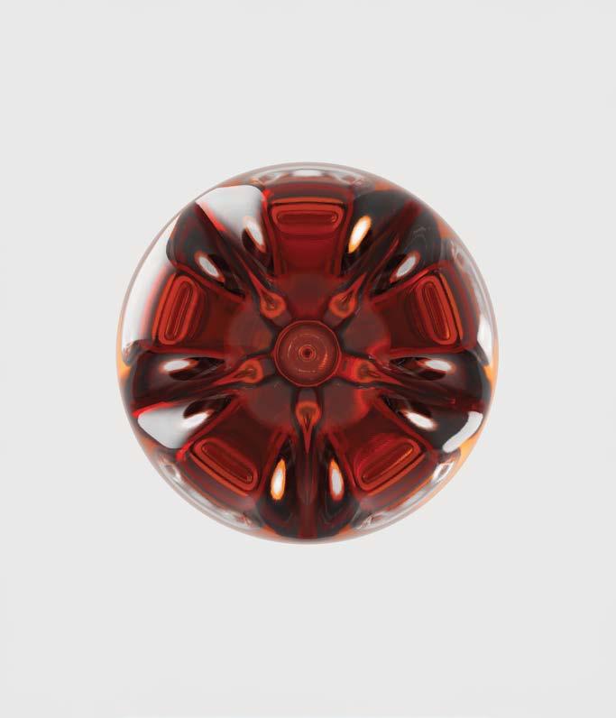
This is Priceless Pursuit No.1—a special Kentucky Bourbon Whiskey we discovered in the sweet spot of a prominent producer’s open-air rickhouse. We ask, can prestige exist without excessive ornamentation? Our bottle is premium glass, shaped like a PET soda bottle—a contradiction of form and expectation. Familiar yet unfamiliar, accessible yet subversive.
We are taught to equate status with certain cues. But what happens when we strip those symbols of their power and redefine aspiration? Whiskey has its codes. Design has its rules. We challenge both—not to disrupt but to reimagine, and spark conversation, curiosity, and connection. Priceless isn’t about what whiskey should be—it’s about what it could be.
Label Materials.
Transfer
KURZ
Closure.
Custom
Print Method.
Hot stamping and debossing using H+M Tools
Print Partner.
MCC
Secondary Packaging.
Approach.
Inspired by the everyday plastic soda bottle, Priceless is reimagined in glass—an infinitely recyclable material. With a simple change from plastic to glass, we shift the perception from everyday generic to an object of beauty, luxury, and desire.
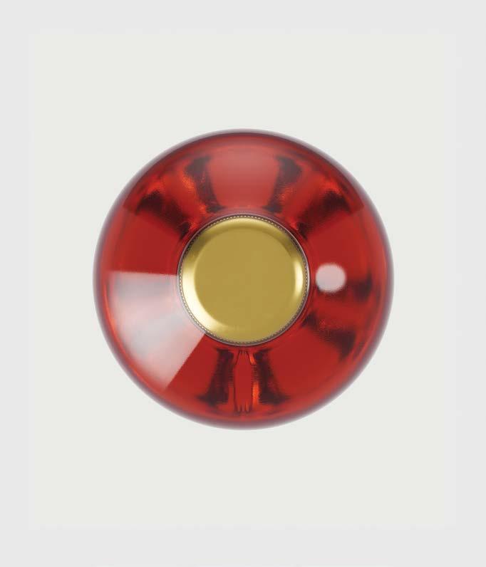
In collaboration with Estal, we kept the adornment minimal; the Bourbon’s unique details are screen-printed in a font reminiscent of a use-by-date stamp, while the debossed logo around the gold closure sits in a familiar place on the cap.
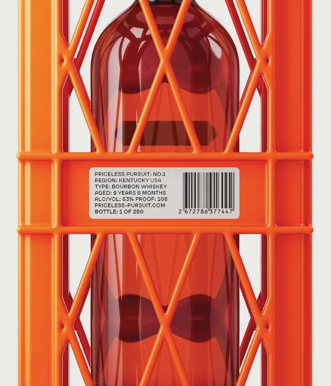
For the price tag, we partnered with MCC Adelaide, a renowned label printer and long-standing collaborator. To elevate to a premium feel, we used Avery Dennison’s Fasson® Silver Foil embossed substrate, which adds weight and sits proud on the glass. The label is finished with KURZ COLORIT® 307034, a vibrant orange underpinned with white, and topped with KURZ COLORIT® Trans 812 black foil, debossing the letters for tactility.
Our secondary packaging takes inspiration from utilitarian bottle crates, crafted from vibrant orange polypropylene—a recyclable material. Its custom structure protects the bottle and features a striking, intricate lattice. We partnered with MaCher, leaders in sustainable packaging, whose design expertise and collaborative approach helped refine the structure and create precision 3D-printed prototypes.
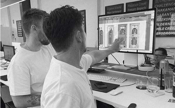

Based in the United Kingdom, Graphic Brands is a full-service creative agency specialising in end-to-end packaging solutions that transform visions into tangible brand expressions.
With a team of skilled designers, artworkers, and digital renderers, the studio excels at bridging creativity and technical precision—ensuring every packaging concept not only inspires but performs.
With storytelling at its core and print in its DNA, Graphic Brands is committed to crafting packaging that speaks clearly, acts boldly, and connects deeply.
graphicbrands.co.uk



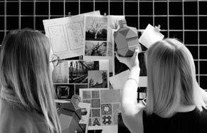
Concept.
THE VESSEL—An artifact of imagination.
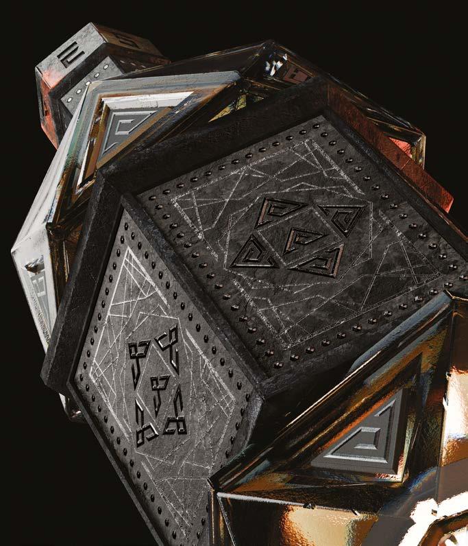
The Vessel is a premium spirit concept born from the world of roleplaying games—designed not just as a bottle, but as a storytelling centerpiece. It draws its narrative energy from the global RPG community, where the act of gathering, sharing, and imagining is a ritual of creativity.
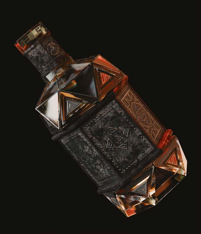
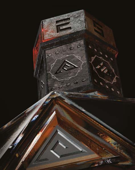
The structure channels the industrial elegance of Gustave Eiffel and the ornate detail of Beaux-Arts design. Built entirely from geometric symmetry, its faceted body pays tribute to the iconic D20 dice— instantly familiar to gamers, yet reimagined here as an object of luxury.
This is more than packaging. It’s a collector’s decanter. A storytelling prompt. A portal to both physical and augmented worlds, with hidden ciphers and a Cryptex-style mechanism unlocking interactive AR content. Every pour becomes part of a shared narrative.
Glass Bottle.
Estal CUSTOM The Vessel 700ml
Label Material.
Avery Dennison Fasson® rSable Blanc FSC®
Transfer Foil.
KURZ LUXOR® 377
Closure.
Custom stopper by Tapì/Les Bouchages Delage
Print Method.
Flexographic, hot stamping, embossing using H+M stamping dies, varnish and die-cut
Print Partners.
Reflex Label+ and Proof+, United Kigdom
AR Development Partners.
Vertical Realities and Trace3D
NFC Technology.
Avery Dennison
Approach.
Material choice and finish were central to the concept’s immersive world-building. The glass is aged and weathered—suggesting The Vessel has journeyed across time and genre. It looks lived-in, storied, significant.
Tactile, opaque materials—used on the bottle’s neck and rotating sleeve—create contrast and encourage sensory interaction. Developed with advanced 3D bump mapping, these elements mirror the digital storytelling woven into the AR experience.
The label, printed on Avery Dennison’s Fasson® rSable Blanc FSC®, integrates seamlessly into the mechanical assembly. A hot foil in gunmetal grey—KURZ LUXOR® 377—adds depth and neutrality, its shifting tone adapting to light and mood like the stories
The Vessel inspires.
The bottle features NFC activation via the stopper, with the medallion incorporating an Avery Dennison NFC chip. The hero NFC on top is the exclusive trigger for the AR experience. Additionally, six customizable NFCs are placed around the bottle, allowing users to add their own content to their story or campaign. All NFC technology is powered by Avery Dennison.
This is packaging as artifact—genre-agnostic, future-facing, and built to travel through countless tales to come.


Founded by creative director Nico Tjarks, Drinks by Kingpin is a specialist drinks agency designing the future of liquid culture. With a studio built on global expertise and boutique agility, Kingpin creates branding and packaging that doesn’t just stand out, it leads. From bar to shelf, their work is launch-ready, iconic, and conversation-starting.
Approaching every brief as artists first and designers second, the team believes that beauty alone isn’t enough, it is the ideas that make impact. In an age of infinite digital content, they focus on storytelling, emotion, and original thinking.
From rare spirits to blockchain-inspired provocations, Kingpin crafts design with presence and permanence.
kingpin.design


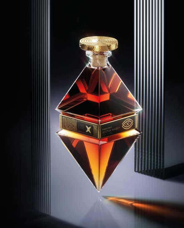


Concept.
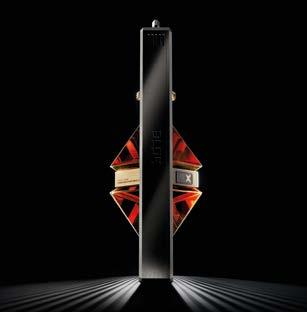
BLOK (v)
To encase value within form.
To immortalise culture through belief.
To make a mark.
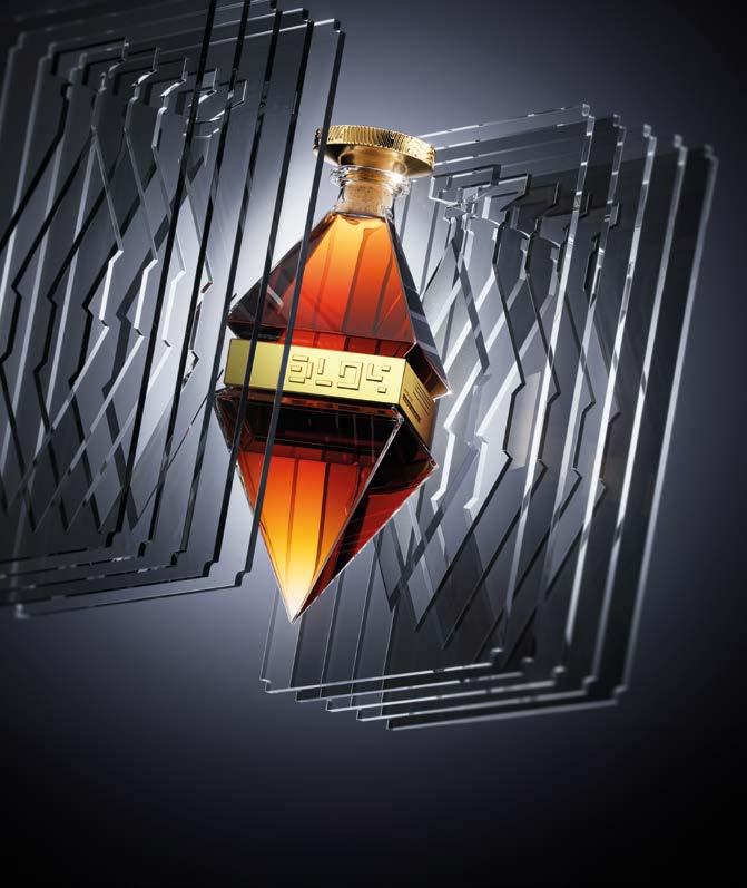
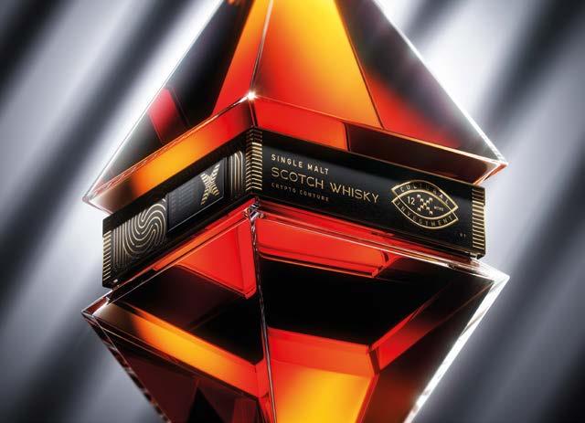
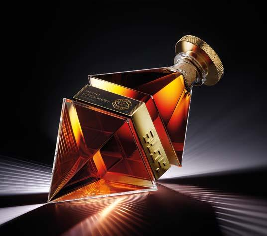
BLOK is a living cultural asset, and a radical new definition of luxury. At its heart: a rare Single Malt Scotch. Encased in a sculptural monolith, BLOK transforms packaging into a vessel of modern wealth.
At Make a Mark Monaco, BLOK will go live, activating a secure crypto wallet open to public investment. Each contribution increases its cultural and financial value, turning BLOK into a dynamic, decentralised artwork shaped by community.
After twelve months, BLOK goes to auction. If sold, investors double their money. If not, BLOK remains a permanent monument to speculation, ownership, and the evolving nature of value.
This is crypto couture. Sculpture as investment. Whisky as artefact. Value redefined.
Glass Bottle.
Estal CUSTOM Crypto Couture 1750ml
Label Materials.
Avery Dennison Fasson® rPaper Black FSC® and Leatherlike Black FSC®
Transfer Foil.
KURZ LUXOR® 425, LIGHT LINE® SB NEON SEAMLESS Closure.
TAPÌ/Les Bouchages Delage CUSTOM Crypto Couture closure Collar.
Signet CUSTOM Branded collar
Print Method.
Hot stamping and embossing using H+M Tools
Print Partner.
CCL, United Kingdom
Approach.
Everything in BLOK is intentional, from form to its embedded digital narrative.
Its centrepiece is a custom 1.75L Estal bottle, shaped as an angular octahedron to echo crypto iconography. Oversized and bold, it defies traditional scale, floating within ten perspex slats and a CNC-machined aluminium frame.
A bespoke closure from Tapí and Les Bouchages Delage is embossed with binary code. The collar, by Signet, holds dual Avery Dennison labels in FSC-certified blacks, enriched with KURZ LUXOR® 425 and LIGHT LINE® SB Neon Seamless foils. Inspired by rare banknotes, the labels include an NFC tag for real-time interaction.
LED strips and a digital display show BLOK’s fluctuating value, making it a living data sculpture.
BLOK’s connected wallet supports seven cryptocurrencies (BTC, ETH, SOL, ADA, AVAX, POLY, BNB), converting crypto transactions to USD in real time. The NFC tag links to a microsite for tracking values, exploring the project, and accessing security features.


Based in Mendoza, Argentina, Nano Alfonsín Studio is a creative practice rooted in the cultural and natural identity of wine. With a design language shaped by storytelling, symbolism, and material sensitivity, the studio specializes in branding and packaging that reveals the essence of place.
Led by Nano Alfonsín, the team brings together graphic clarity, tactile exploration, and emotional depth to create experiences that transcend the surface.
nanoalfonsin.com
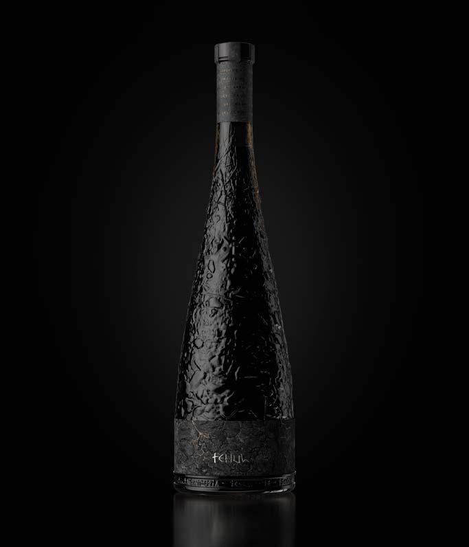

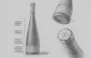
Concept.
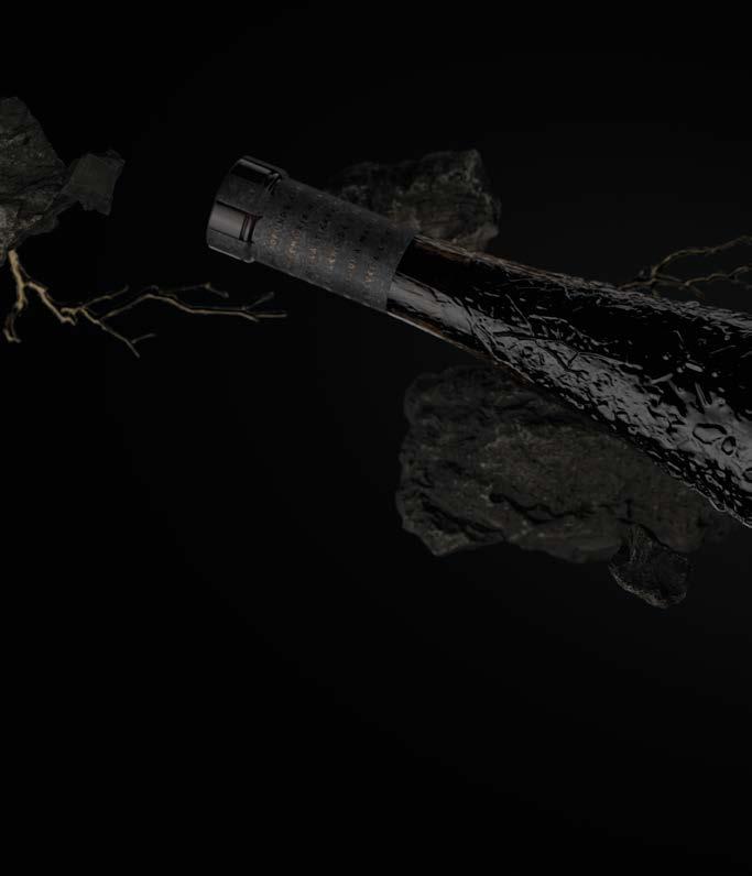
TEHUL—A tribute to what lies beneath.
Tehul draws its name from the Huarpe language, meaning what happens beneath the earth—an idea that becomes both literal and poetic. In the Uco Valley of Mendoza, the character of Malbec is born not only from the grape, but from the mineral-rich, alluvial soils shaped over centuries. This project honors that origin—celebrating the unseen foundations that give wine its voice.
The concept reconnects with ancestral wisdom, reviving the Huarpe worldview that the earth is not just ground, but memory, meaning, and life. Tehul is a gesture of respect: for roots, for culture, for everything that quietly supports what we taste.
Glass
Estal
Label
Avery
Transfer
KURZ
Custom
Digital
Print Partner.
Label
Approach.
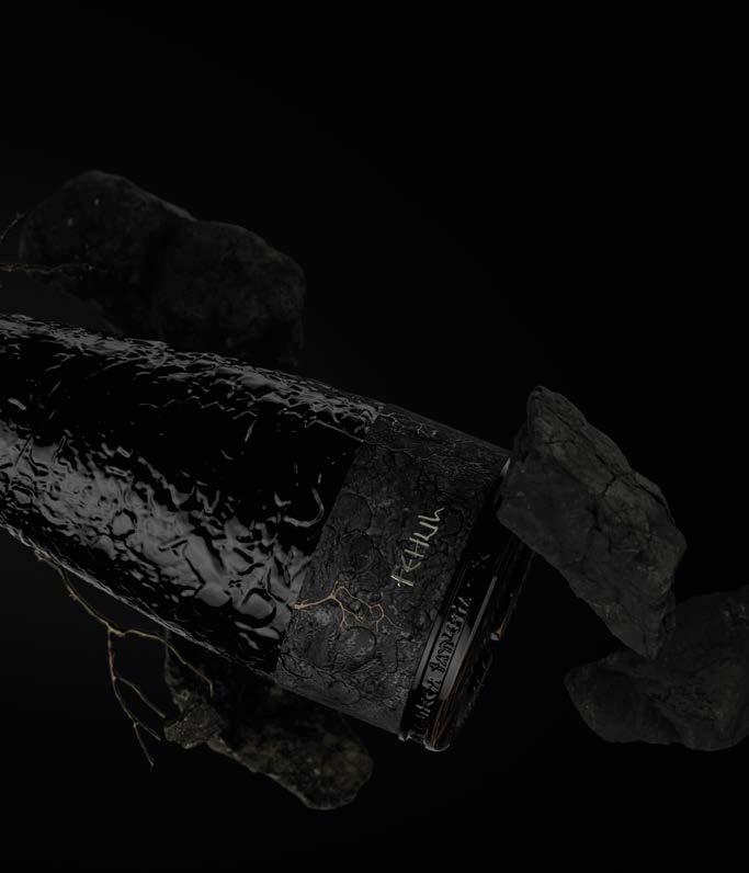
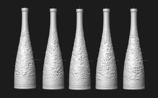
The entire bottle is treated as a sculptural surface—its texture inspired by the underground strata of stone, soil, and root. These layers wrap the form in a continuous topography, making visible what is normally hidden. The design transforms the bottle into an artefact—one that feels unearthed rather than manufactured.
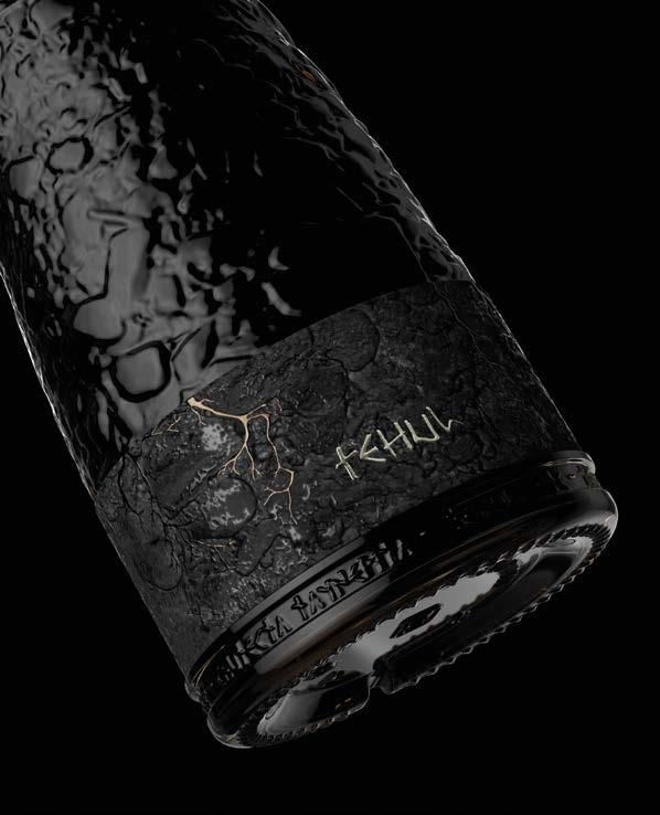
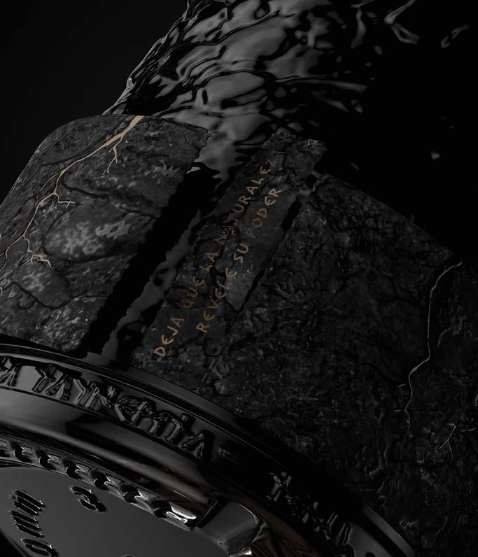
The label placement, deep at the base, symbolises the foundational layer of soil—the silent architect of terroir. Printed on textured Avery Dennison Fasson® Cotton Touch Craft FSC®, the label features metallic doming, digital screen printing, and debossing, evoking the rough mineral quality of the earth itself.
At the bottom, words from the Huarpe language are inscribed—binding the concept to a cultural memory that runs as deep as the land. Tehul invites us not just to look, but to look beneath.

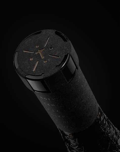
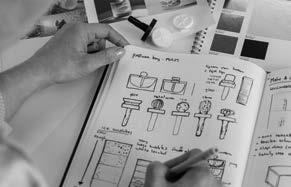
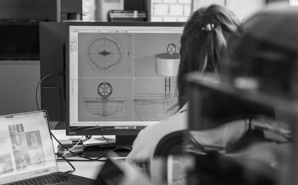
Founded in 2021, Periscoop is a new-generation design studio based in the Netherlands, built by five creatives from diverse disciplines. Uniting expertise across branding, packaging, digital, spatial, industrial, and strategic design, the agency resists boundaries—thriving on curiosity, versatility, and experimentation.
Periscoop crafts ideas that are not only visually striking but built with clarity, purpose, and long-term value. Through storytelling, research, and precision materiality, they deliver future-facing design that resonates far beyond the surface.
periscoopagency.com



Concept.
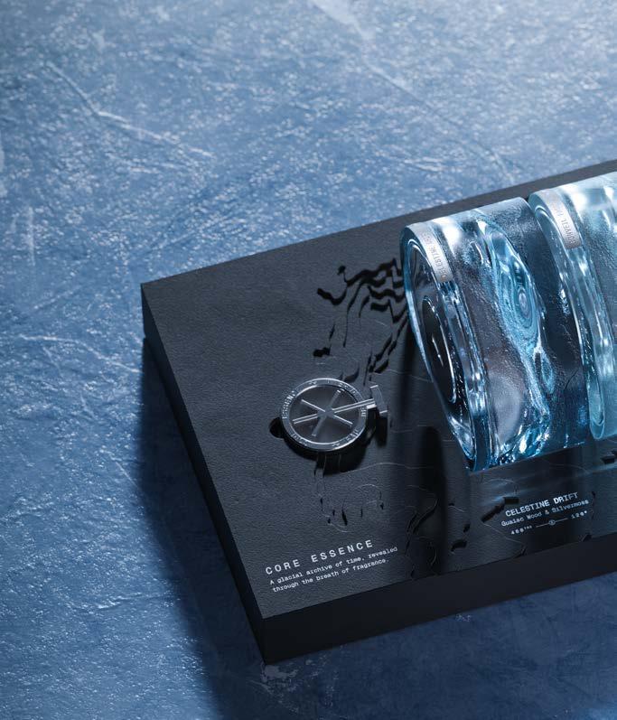
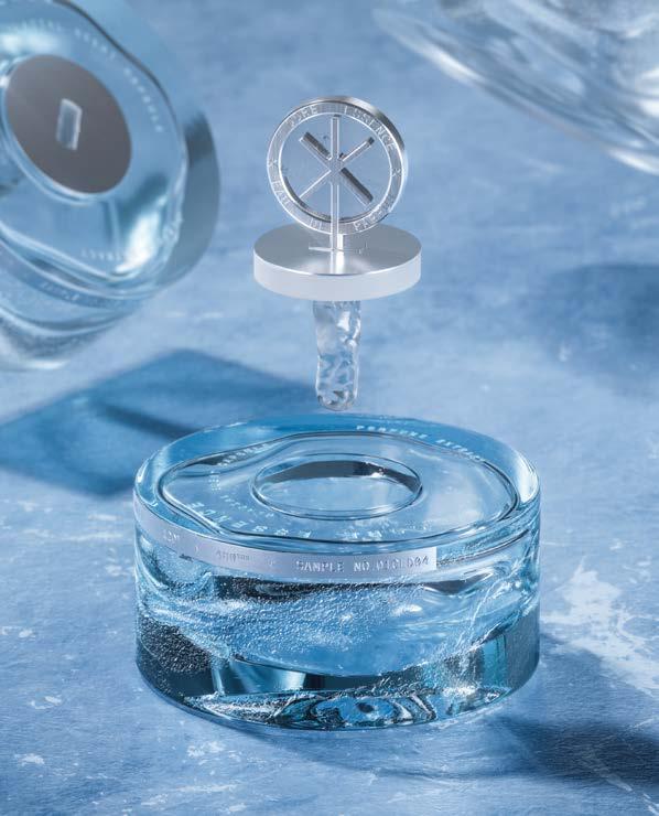
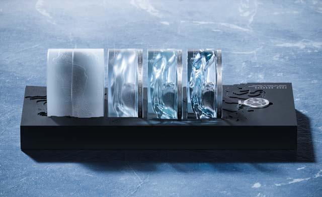
CORE ESSENCE—A fragrance frozen in time.
Core Essence takes inspiration from Antarctic ice core drilling, where million-year-old air bubbles are preserved within frozen layers of glacial history. This poetic yet scientific phenomenon forms the foundation for a sensory collection that captures the stillness, layering, and mystery of time.
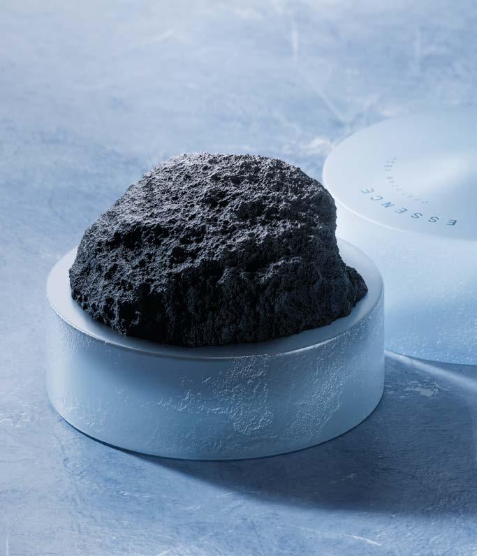
Three perfumes make up the series—each a facet of frozen memory. Celestine Drift is ozonic and fresh, echoing polar air. Eonveil Frost evokes ancient forests sealed beneath the ice. Abyssal Cryogem is mineral and ethereal, refined to near-transparency.
Completing the collection is Obsidian Veil, a home diffuser with a porous lava stone that gradually releases scent—like ancient air escaping a fractured core.
Core Essence is not just fragrance. It is a collection of artefacts, sensory echoes of a distant Earth.
Glass Bottle.
Estal CUSTOM Core Essence
Label Material.
Avery Dennison Fasson® Sable Blanc FSC®
Transfer Foils.
KURZ ALU FIN ® Matt, KURZ ALUFIN ® Satingloss
Closure.
Custom stopper by Tapì
Print Method.
Nano Embossing and embossing using H+M tools
Print Partner.
Reynders Label Printing, Belgium
Secondary Packaging.
Vrijdag, The Netherlands
Approach.
Periscoop designed with restraint and intention—mirroring both the vast purity of Antarctica and the precision of glacial research.
Glass became the narrative’s core: transparent, weighty, and endlessly recyclable, each bottle shaped like a cut segment of ice. Sprayers were replaced with glass droppers to slow down the user’s ritual and remove mechanical excess.
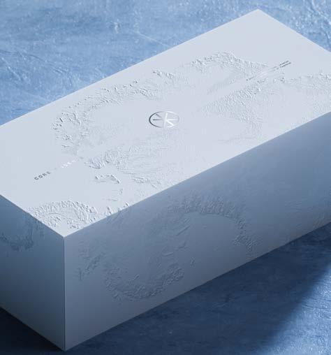
Outer packaging mimics untouched snowfields in matte white, with subtle topographic embossing and silver foil typography shimmering like frost. Inside, deep matte black contrasts with laser-cut elevation maps, echoing the divide between surface and depth.
The tactile language continues through mono-material closures, minimalist forms, and soft texture finishes. Every design choice contributes to a unified message: reverence for the Earth, the passage of time, and the value of what lies beneath.
Founded by Argentine siblings Luis and Daniela Piano, Piano & Piano is a Chile-based design studio with over three decades of creative experience.
Blending aesthetic sensitivity with strategic vision, the studio works across branding, editorial, and packaging design— particularly in the wine, spirits, and beverage sectors.
Known for their thoughtful integration of photography, materials, and storytelling, Piano & Piano creates design with meaning and experience. Every project is an opportunity to connect, transform, and express the true soul of a brand. pianoypiano.com


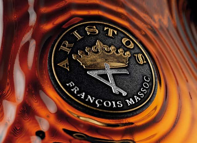
Concept.
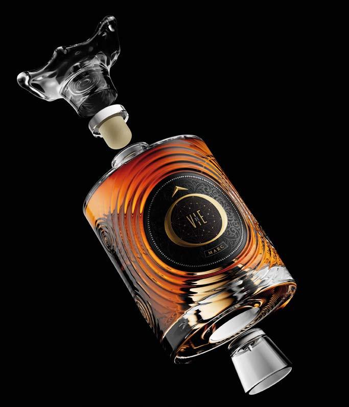
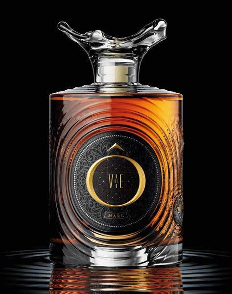
Ô de VIE—Where time turns to gold and the earth breathes in every drop.
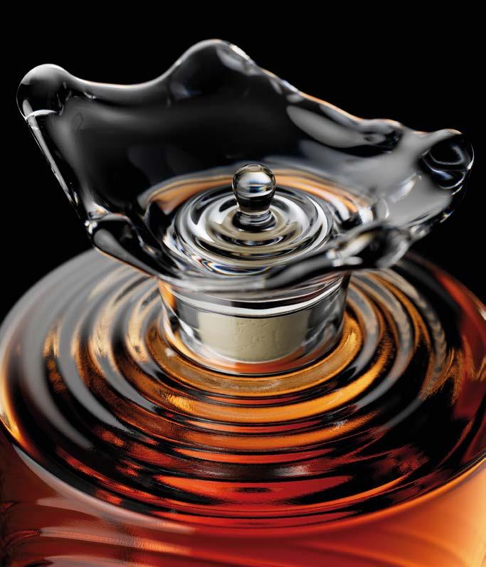
Ô de Vie is a tribute to grappa—not just as a spirit, but as an expression of nature, time, and transformation. This packaging concept celebrates the elements that shape the product: water, earth, heat, and above all, time.
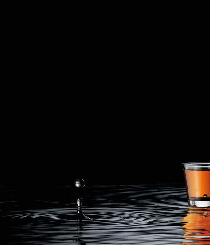
The crystalline glass bottle is etched with concentric ripples, inspired by the quiet moment a drop meets water. This gentle imprint is a metaphor for distillation, for patience, for process. At the heart of the label sits a gilded Ô—more than a typographic character, it becomes a symbol of balance and essence.
Ô de Vie is not designed to shout. Its beauty lies in restraint, in poetic textures, and in its invitation to reflect on what is elemental, sacred, and enduring.
Glass Bottle.
Estal CUSTOM Ô de Vie 500ml
Label Materials.
Avery Dennison Fasson® Cotton Touch Craft, Avery Dennison Fasson® Cotton Black, Avery Dennison Fasson® Velvet Black and Avery Dennison Fasson® Silver Foil Emboss Plus Transfer Foils.
KURZ ALUFIN ® 156, KURZ LUXOR® 347, 398 and 427
Closure.
Custom closure by Tapì/Les Bouchages Delage
Print Method.
Digital, hot stamping, micro-embossing, blind embossing, silkscreen using H+M Tools
Print Partner. Colorama, Chile
Approach. Every material in Ô de Vie was chosen for meaning.
The bottle’s clean lines and ripple relief reflect purity and natural movement. Crafted in crystalline glass, it evokes clarity and timelessness. The label is printed on textured, mineral-like papers— blending earthiness with tactility. Natural fiber surfaces connect directly to the land and to the grappa’s artisanal roots.
Finishes are symbolic: copper for the still, gold for the sacred, and silver for purity. Applied through precise stamping, these metallics bring hierarchy and light—used not as decoration but as narrative tools. The overall palette remains neutral and essential, reinforcing a philosophy of quiet luxury.
This is a project that respects its subject matter—an elegant spirit, wrapped in a design that breathes with meaning.


Based in Australia, Studio Guild is a packaging design studio dedicated to shaping bold, lasting brands in the drinks industry. With over 25 years of experience, they are experts in navigating an ever-changing market—helping clients adapt, endure, and thrive.
Guild’s approach is rooted in storytelling, strategy, and a curiosity to explore the unexpected. They dig deep into brand purpose, crafting brands that aren’t just designed to stand out today, but to remain relevant tomorrow.
For Guild, creativity is about making impact—and meaning. studioguild.com.au





Concept.
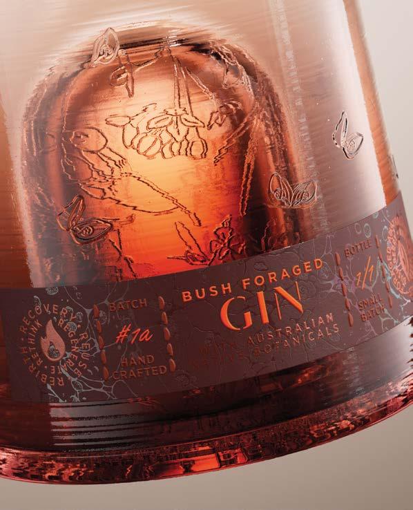
EMBA—A spark. A shelter. A story of survival.
EMBA draws inspiration from the historical glass cloche—a bell-shaped vessel used to protect fragile plants. Studio Guild reimagines this form to deliver a deeper message: one of environmental resilience and regeneration. The project takes cues from native Australian flora that rely on fire to release seeds and renew life. For these species, destruction becomes a possibility. If fire occurs more frequently than the time that the plants take to mature, the plants may be eliminated from the particular area.
EMBA isn’t just a bottle—it’s a vessel of hope. A meditation on nature’s ability to recover through adversity. Wrapped in symbolism and restrained elegance, the design celebrates the silent resilience that lives in every cycle of the natural world.
Glass Bottle.
Estal WCR Brute CUSTOM 700ml
Label Materials.
Avery Dennison FASSON® Cotton White
Transfer Foils.
KURZ LUXOR® 398 and LIGHT LINE® LP MAGMA TS Closure.
Custom closure by Tapì/Les Bouchages Delage
Print Method.
Hot stamping, embossing, debossing using H+M Tools
Print Partner.
MCC Melbourne, Australia
Approach.
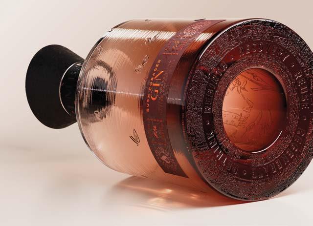
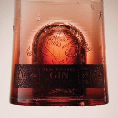
The glass bottle, shaped like a traditional cloche, features a raised punt adorned with endangered flora—an homage to plants that awaken through heat. Its textured surface captures the raw, organic imperfection of fire-touched earth.
The name EMBA, drawn from “ember,” whispers of transformation. The closure, like charred wood, holds a mantra of regeneration—etched into the base of the bottle: recovery, reuse, regenerate, rethink, rebirth.
Labels are crafted from Fasson® Cotton White, debossed with scorched textures and finished with KURZ LUXOR® 398 and LIGHT LINE® LP MAGMA TS foils. Clear foil elements shimmer like rising heat, evoking the energy of rebirth.
Every material, finish, and form speaks to the theme: that in fire, there is future. And in nature’s cycles, there is always a spark of renewal.


Based in Porto, Portugal, This is Pacifica is an independent design and art direction studio known for its strategic vision and expressive visual language.
The studio’s work spans branding, identity systems, and packaging—with every project grounded in craft, clarity, and purpose. Certified in EcoDesign and awarded from Portugal to Cannes, This is Pacifica stands at the intersection of sustainability and sophistication.
Their design philosophy is as thoughtful as it is bold—tirelessly exploring new ways to tell stories, elevate products, and create meaningful impact through design.
thisispacifica.com


Concept.
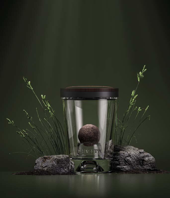
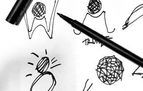
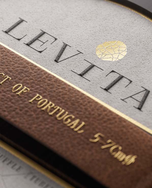
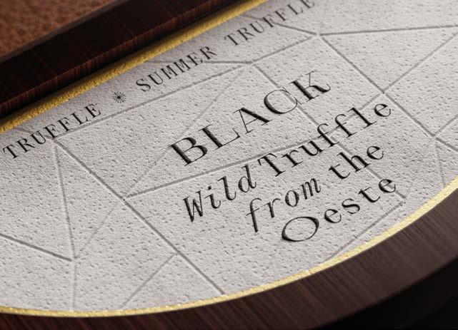
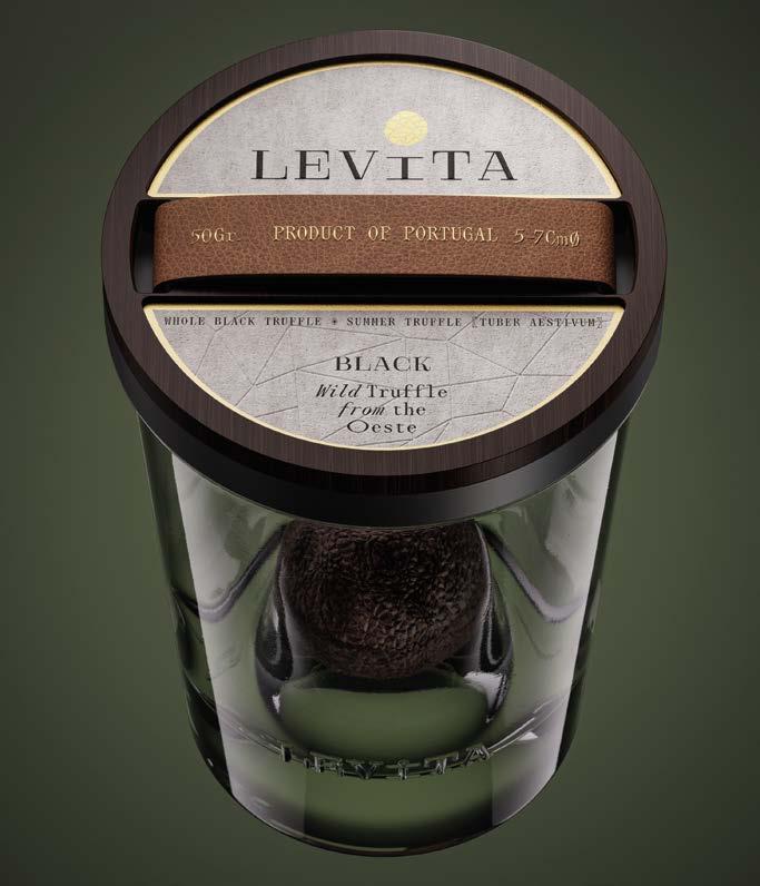
LEVITA—A rare treasure from the earth.
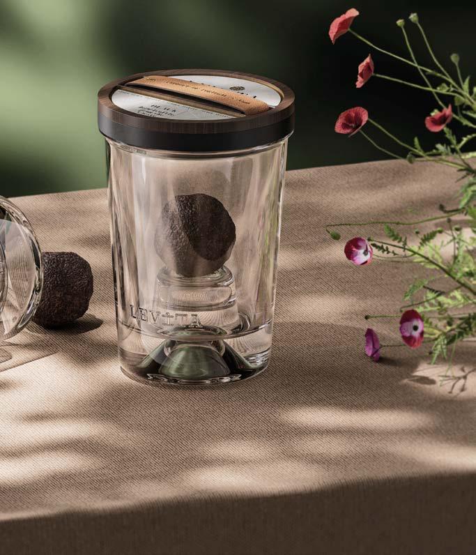
Levita was born from a recent and extraordinary discovery: wild truffles growing in the Oeste region of Portugal. To celebrate this moment, the studio created an entirely new brand—from name and identity to a unique packaging experience that elevates truffle presentation to the level of culinary ritual.
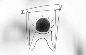
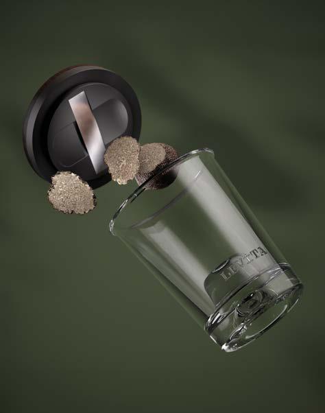
Encased in a custom Estal jar and sealed with a bespoke wooden slicer lid developed with TapíÌ, Levita is designed to be taken directly to the table—transforming a luxury product into an elegant, interactive experience. The truffle is sliced in front of the guest, making the packaging an integral part of the meal.
From concept to form, Levita reimagines the way we serve and celebrate a rare ingredient, blending beauty and functionality into a singular gesture of refinement.
Glass Bottle.
Estal CUSTOM Levita 314ml
Label Material.
Avery Dennison Fasson® Limestone Plus FSC®, Avery Dennison Fasson® Eco Leather Honey
Transfer Foil.
KURZ LUXOR® 352
Closure.
Tapì Beachwood Lid, Hot-stamping, Eco-Leather Handle and Steel Blade
Print Method.
Printing Colors, Embossing and Hot Stamping with H+M Tools, Special Cut
Print Partner.
VOX – Organização Industrial Gráfica, Portugal
Approach.
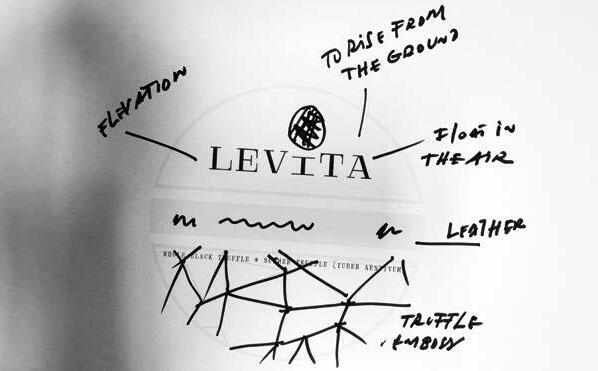
The material palette reflects the essence of the land—honoring the truffle’s rarity and natural origins. Every element was chosen through the lens of EcoDesign.
The label, printed on Avery Dennison’s Limestone FSC® paper, evokes organic tactility while dramatically reducing environmental impact by eliminating traditional wood pulp. KURZ LUXOR® 352 foil adds a subtle shimmer, enhancing the refined, nature-driven aesthetic without compromising recyclability.
The custom wooden lid, developed with Tapí, includes an integrated slicer—offering practicality with elegance and minimizing the need for additional utensils or packaging.
Together, glass, wood, cork, and stone-textured paper form a sustainable whole—where every material serves a purpose and every surface tells a story.
With a career grounded in the world of luxury and beauty, Vincent Villéger is a product, packaging, and retail designer known for creating deeply emotive, structurally refined experiences. His design language is rooted in threedimensional thinking—where form, material, and process come together to tell universal stories.
A long-time creative partner to brands like Burberry, Givenchy, Molton Brown, and Pangaia, Vincent brings a rare balance of aesthetic elegance and production expertise to every project. Based in London, he now works globally as a creative consultant, shaping thoughtful, timeless objects of desire.
villeger.net
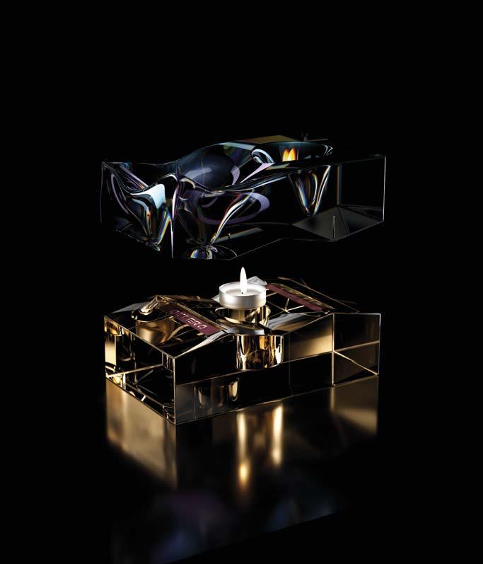
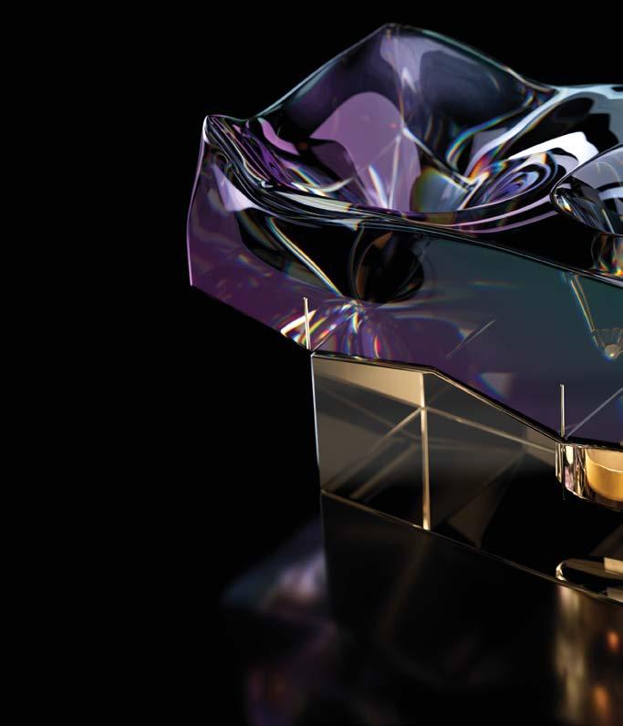


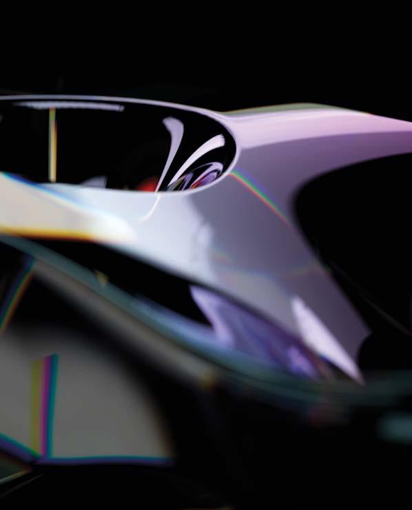
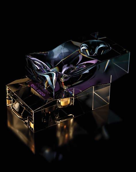
Who I Shall Become is a sculptural diffuser that explores identity as a fluid, evolving experience. Inspired by the transformative power of fragrance, this object represents the duality between who we are now— and who we aspire to be.
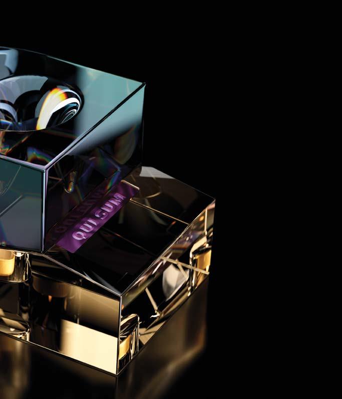
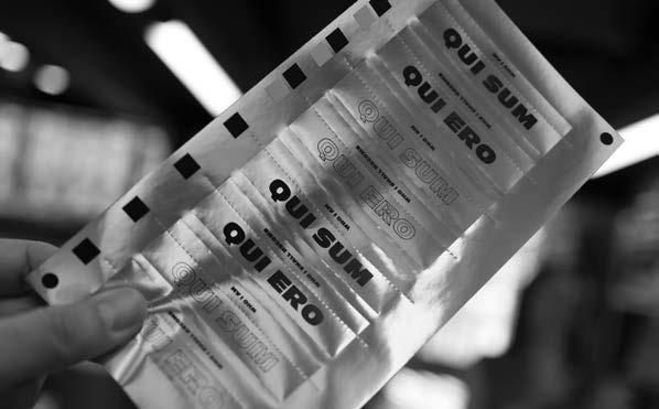
The diffuser consists of two chambers housed in an iridescent glass form. One side is structured and sharply defined: QUI SUM (“Who I Am”). The other is fluid and unresolved: QUI ERO (“Who I Shall Become”). The user slides the top to release one scent or the other—choosing between reflection or projection, reality or intention.
With every gesture, the object becomes a ritual of self-awareness. A moment to consider identity not as a fixed truth, but as a journey shaped by sensation, memory, and desire.
Approach.
The design plays with duality—in form, material, and meaning.
The top section’s iridescent finish enhances contrast between order and flow: straight planes absorb light quietly, while organic surfaces reflect it in shifting hues. This chromatic tension expresses the evolving nature of the self.
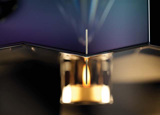
The gold-lacquered base grounds the object with warmth and tradition. It glows when the flame is lit, reinforcing the idea of presence and contemplation.
Label materials further the theme: contrasting the certainty of matt gold against the mutable, subjective nature of shimmering, colour-changing holographic surfaces.
Every surface, every transition, is a meditation on change—on being, becoming, and the subtle space in between.

Basile ADV
Via Masiello Tordiglione, 78 - 83032 Bonito (AV) Italy
+39 339 6699125 basileadv.com
Bulldog Studio
C/ Provença 281, 3º 8ª, 08037, Barcelona Spain
+34 9 3272 4308 bulldogstudio.es
Centdegrés
9 - 17 rue Salneuve, 75017 Paris France
+33 06 86 01 01 18 centdegres.com
Co-Partnership
Level 2 / 113 Reservoir St, Surry Hills NSW 2010 Australia
+61 2 9280 2007 co-partnership.com
Graphic Brands
Unit 6 – 7 Forest Industrial Estate, Pit Lane, Ketton PE9 3FL United Kingdom
+44 1780 752445 graphicbrands.co.uk
Kingpin
61 Ensign House, Juniper Drive, Battersea, London, SW18 1TR United Kingdom
+44 7593 243998 kingpin.design
Nano Alfonsín
Avenida España 1340, Office 2 - 9th Floor, Mendoza, ZIP 5500 Argentina
+54 9 2615 54 3999 nanoalfonsin.com
Periscoop Agency Via Crescendo 2, 5912 AW Venlo The Netherlands
+31 6534 94307 periscoopagency.com
Piano & Piano
Av. Presidente Kennedy 6575, Las Condes, CP 7560221 Chile
+56 9 4020 1398 pianoypiano.com
Studio Guild Level 4, 105 Victoria Street, Fitzroy, Victoria Australia
+61 3 9495 6300 studioguild.com.au
This is Pacifica Rua Brito e Cunha 431, 4450-087 Matosinhos Portugal
+351 221 150 210 thisispacifica.com
Vincent Villéger 169 Queens Road, Wimbledon, London, SW19 8NS United Kingdom
+44 7815 119769 villeger.net
CCL Label, UK
Pioneer Way, Castleford, West Yorkshire WF10 5QU United Kingdom
+44 1977 604 300 ccllabel.com
Colorama
Los Alerces 2096, Ñuñoa, Santiago Chile
+562 24114700 colorama.cl
Etinsa
Cl. Cobalto, 44, nave L, 47012 Valladolid Spain
+34 983 39 54 55 etinsa.eu
Hinderer + Mühlich GmbH & Co. KG
Heilbronner Str. 29, 73037 Göppingen Germany
+49 7161 978220 hinderer-muehlich.com
ISIMAT
Rindelbacher Str. 36-40, 73479 Ellwangen (Jagst) Germany
+49 7161 48892 0 isimat.com
Label Solutions
Solution Palere Impresores Brasil 144 - Mendoza Argentina
+54 261 374 9071 labelsolutions.com.ar
LARTEC
Les Molines, 55-03450, Banyeres de Mariola, Alicante Spain
+34 966568181 lartec.com.es
MaCher
Suite 203, 50 Marshall Street, Surry Hills, NSW 2010 Australia
+61 2 8198 4646 macher.com.au
MCC Label, Adelaide 381 South Road, Mile End South SA 5031 Australia
+61 8 8405 0500 mcclabel.com
MCC Label, Libourne 3 bis rue Firmin Didot, 33500 Libourne France
+33 557 25 62 20 mcclabel.com
MCC Label, Melbourne
294 Ferntree Gully Road, Notting Hill, VIC 3168 Australia
+61 3 9542 7777 mcclabel.com
Proof+
Unit 6 & 7 Forest Industrial Park, Pit Lane, Ketton, Stamford, PE9 3FL United Kingdom
+44 01780 752445 proofplus.uk
The Reflex Group Vision House, Hamilton Way, Mansfield, NG18 5BU United Kingdom
+44 01623 675000 reflexlabels.co.uk
RetailPak/Terra Firma
Unit A, 15/F, Hong Kong Industrial Building 444 – 452 Des Voeux Road Wes, Kennedy Town Hong Kong
+852 2815 8950 retailpak.com
Reynders
Nijverheidsstraat 3, 2530 Boechout Belgium
+32 3 455 70 71 reynders.com/en
Signet
Innovation House, Peterborough, PE2 6XU, UK United Kingdom
+44 01733 396080 signetbranding.com
Sovemec Via Boscofangone, 235 80035 Nola (NA)
Italy
+39 081 821 0842 sovemec.it
Tapì Group Via Arzari 3/A, 35011 Campodarsego (PD) Italy
+39 049 579 7300 tapigroup.com
Tricycle Studio Carrer d’Eduard Maristany, 288, 5-3, 08918, Badalona Spain
+34 645 176 463 tricyclestudio.es
Reynders
Nijverheidsstraat 3, 2530 Boechout Belgium
+32 3 455 70 71 reynders.com/en
VOX
Organização Industrial Gráfica R. Terços 353, 4410-236 Canelas Portugal
+351 22 715 1700 vox.co.pt
Vrijdag
Limburglaan 51, 5616 HR Eindhoven The Netherlands
+31 040 251 38 55 vrijdag.nl
In a rapidly changing world, packaging is no longer just a protective shell—it’s a space for ideas, transformation, and emotion. The future belongs to those willing to question the expected and reimagine what’s possible.
At Make a Mark, innovation is not simply about novelty—it’s about relevance. It’s about challenging convention to create new experiences through form, material, and interaction. Designers were encouraged to take risks, experiment boldly, and unleash creativity without constraint.
This year, innovation took many forms: Who I Shall Become by Vincent Villeger redefined the diffuser as a symbolic sculpture of duality and choice. EMBA by Studio Guild turned the traditional bottle punt into a poetic narrative on environmental resilience. And Ô de Vie by Piano &. revealed how subtle gestures—like ripples in glass—can become powerful metaphors for time and transformation. Innovation this year also meant embracing imperfection, play, and provocation—proving that form and function can coexist with storytelling and surprise.
At the heart of every project lies a growing sense of sustainability— not just as a technical requirement, but as a creative philosophy. This year’s brief pushed designers to explore circular thinking, monomaterial construction, and minimal waste through premium design.
Core Essence by Periscoop eliminated traditional spray mechanisms in favour of dropper-based rituals, promoting slow, mindful use. Pearl by Basile ADV transformed a caviar jar into a reusable sculptural object—luxurious in form, minimal in footprint. And Priceless by Co-Partnership challenged perceptions by turning a mass-produced soda bottle shape into a recyclable glass collectible—using simplicity to question prestige and permanence.
These projects reflect a key idea from the brief: that EcoDesign is no longer a constraint, but a powerful platform for aesthetic and ethical expression.
New this year, the brief introduced connectivity—a pillar that explores how packaging communicates, activates, and interacts. By integrating digital triggers like NFC chips, RFID inlays, or QR codes, designers created meaningful bridges between the physical and digital worlds but also connected on different other planes.
The Vessel by Graphic Brands features hidden symbols and an interactive AR experience that turns a bottle into a storytelling prompt. L’Essence du Deux by Centdegrés celebrates co-creation through personal scent layering—connecting the user not just to the brand, but to their own sensory narrative.
The brief reminded us that connectivity isn’t just about tech—it’s about resonance, transparency, and new modes of interaction that deepen emotional impact.
Together, these three principles—innovation, sustainability, and connectivity—define the frontier of contemporary packaging. Each project in this book is a step toward that future.
Immense thanks must go to the Make a Mark team for their project management of this book.
Make a Mark.
Marco Alberto Cavallini
Estal.
Adolfo Vilchez
Amelia Dales
Ana-Maria Odioviciuc
Anna Julià
Falco Aguilar
Gian Marco Fiorini
Gerard Albertí
Irene Abad
Jan Garcia
Jesús Cambra
Leonardo Abella
Ludovic Bantzhaff
Marcial Ahsayane
Marta Falguera
Nerea Sepúlveda
Avery Dennison.
Angus McGuffin
Irina Kylish
Marc Millet
Marco Gelain
Marit Meelis
Miguel Garcia
Mikaela Harding
Natalia Carro
Nataliya Malhanova
Simon Harris
Vladimir Tyulpin
LEONHARD KURZ.
Adrian Barbero
Agustin Prado
Alessandro Carnevale
Annie Kuschel
Cristian Sillero
Dalton Guastapaglia
Emilie Levaux
Heike Martetschläger
Inès Touati
Julia Hiltl
Leonarda Krasnici
Lena Bruns
Marc Dorsett
René Goossens
Stéphane Royere
Tapí Group.
Lauren Hylton-Davies
Paolo Boratto
Stefano Mogno
Finally, we would like to thank all the designers, printers and partners who generously shared their passion and vision. We would ever be able to truly make a mark without you.
©2025 Estal, Avery Dennison Corporation and LEONHARD KURZ.
Make a Mark is an exclusive innovation project between Estal, Avery Dennison and LEONHARD KURZ. All rights reserved. No part of this publication may be reproduced or transmitted in any form or by any means, electronic or mechanical, including photocopy, recording or any information storage and retrieval system, without prior written permission of the respective copyright owner.
All images in this book have been reproduced with the knowledge and prior consent of the artists concerned, and no responsibility is accepted by the producer, publisher, or printer for any infringement of copyright or otherwise arising from this publication. Every effort has been made to ensure that credits accurately comply with information supplied.
Printed by Graphius.
The material used in this document is from sustainable resources. The paper mill and printer are both registered with the Forestry Stewardship Council (FSC)® and additionally have the Environmental Management System ISO 14001. The paper is recyclable and bio-degradable. The inks are 100% vegetable based bio-inks and it is printed without the use of any solvents.
A groundbreaking innovation project developed by three global industry leaders—Estal, Avery Dennison, and LEONHARD KURZ.
Focused on sustainability, innovation, and connectivity, this open brief invited top packaging design agencies worldwide to collaborate. The result is an exciting platform that spans the Spirits & Drinks, Wines, Gourmet Food, Beauty & Home Fragrance sectors.
Leveraging cutting-edge sustainable packaging technologies, Make a Mark allows designers to push the limits of creativity. But this project is more than a book of inspiring concepts—it’s a platform for sharing ideas, sparking conversations, and fostering meaningful connections.
Within these pages, you’ll find the culmination of this dynamic community’s efforts—the exciting outcome of what happens when creatives are given the freedom to explore and design without the constraints of everyday challenges.
Featured studios:
Basile ADV
Italy
Bulldog Studio
Spain
Centdegrés
France
Co-Partnership
Australia
Graphic Brands
United Kingdom
Drinks by Kingpin
United Kingdom
Nano Alfonsín
Argentina
Periscoop Agency
The Netherlands
Piano & Piano
Chile
Studio Guild
Australia
This is Pacífica
Portugal
Vincent Villéger
United Kingdom