EB EB Estefany Busto
Estefany Busto Estefany Busto Estefany Busto Estefany Busto
Estefany Busto Estefany Busto Estefany Busto Estefany Busto
Estefany Busto Estefany Busto Estefany Busto Estefany Busto
Estefany Busto Estefany Busto Estefany Busto Estefany Busto
Estefany Busto Estefany Busto Estefany Busto Estefany Busto
Estefany Busto Estefany Busto Estefany Busto Estefany Busto
Estefany Busto Estefany Busto Estefany Busto Estefany Busto
Estefany Busto Estefany Busto Estefany Busto Estefany Busto
Estefany Busto Estefany Busto Estefany Busto Estefany Busto
Estefany Busto Estefany Busto Estefany Busto Estefany Busto
Estefany Busto Estefany Busto Estefany Busto Estefany Busto
Estefany Busto Estefany Busto Estefany Busto Estefany Busto
Estefany Busto Estefany Busto Estefany Busto Estefany Busto
Estefany Busto Estefany Busto Estefany Busto Estefany Busto
Estefany Busto Estefany Busto Estefany Busto Estefany Busto
Estefany Busto Estefany Busto Estefany Busto Estefany Busto
Estefany Busto Estefany Busto Estefany Busto Estefany Busto
MELODIES IN THE WORKPLACE

1
CULTURE WITHIN COFFEE
A study in retail and merchandising
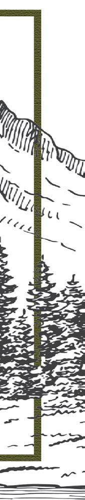
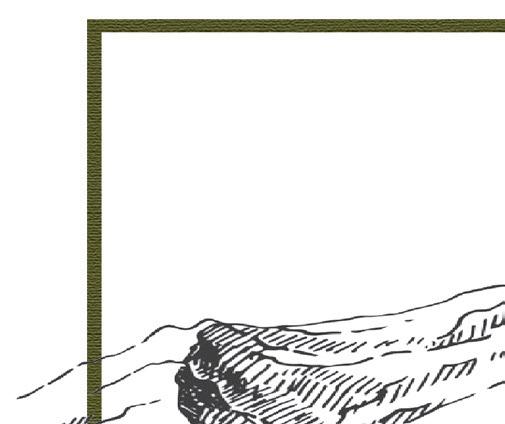
AGING AMONGST THE MOUNTAINS
A study in adaptive design
A STEP TOWARDS NEW BEGINNINGS
A study in Trauma Informed Design
SEEDS OF SURVIVAL
A study in creative thinking
DESTINATION: PARIS
A study in mixed media rendering
THRONE OF THORNS
A study in furniture design
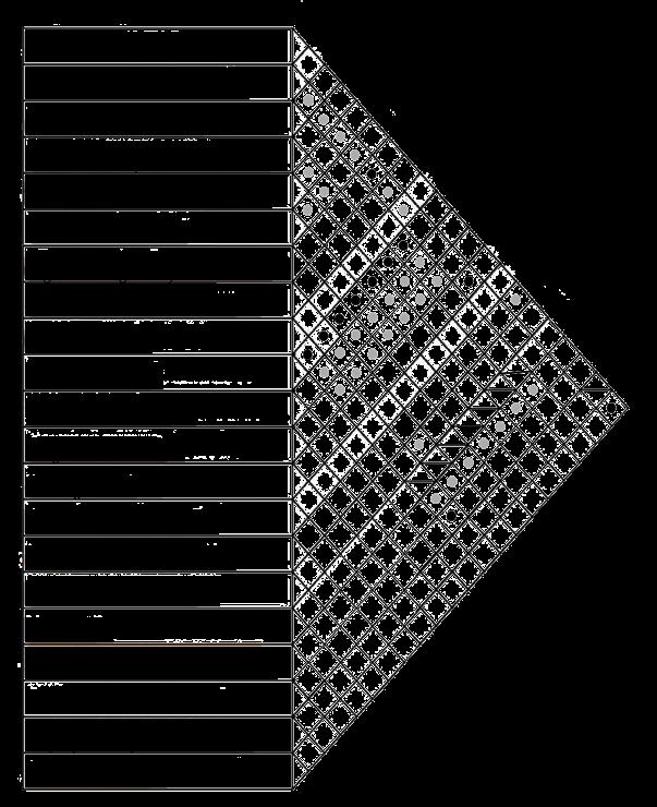
A study in workplace design 2 3 4 5 6 7
TABLE OF CONTENTS
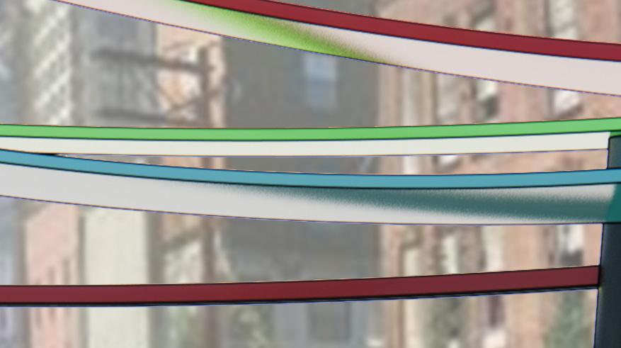
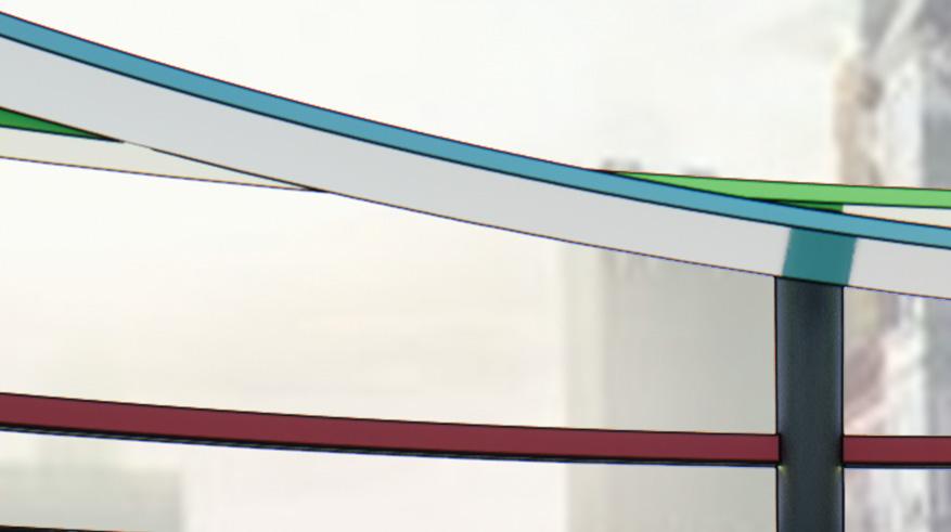
MELODIES IN THE WORKPLACE THE CLIENT
The research and design organization Lextant was founded in 1998 by the current president, Chris Rockwell. Lextant defines their company as a human experience firm, as they base themselves on a passion to understand the things around us and how they affect our lives. Within their work, the company follows six principles: aspirational, holistic, rigorous, visual, actionable, and collaborative. These principles reinforce their title of a human experience firm, and act as checkpoints for the production of their work. The company’s foundational beliefs are reflected and honored in the design of their new marketing workplace located in Nashville, Tennessee.

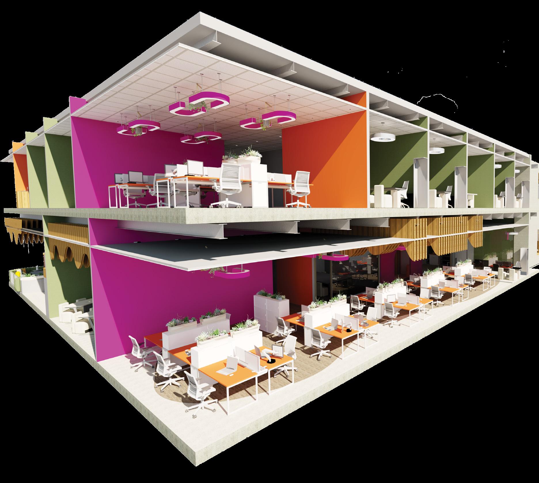
Section Perspective


The section box exemplifies the balance and flow between both levels of the workplace.
LOGO
THE
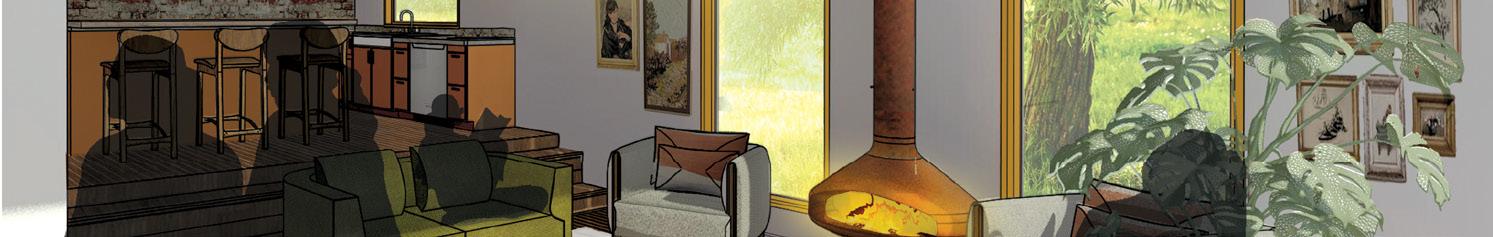
Workspace Perspective
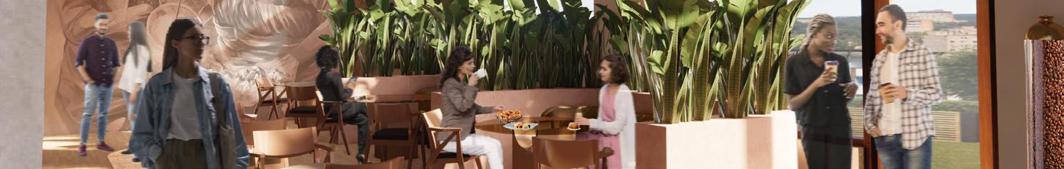
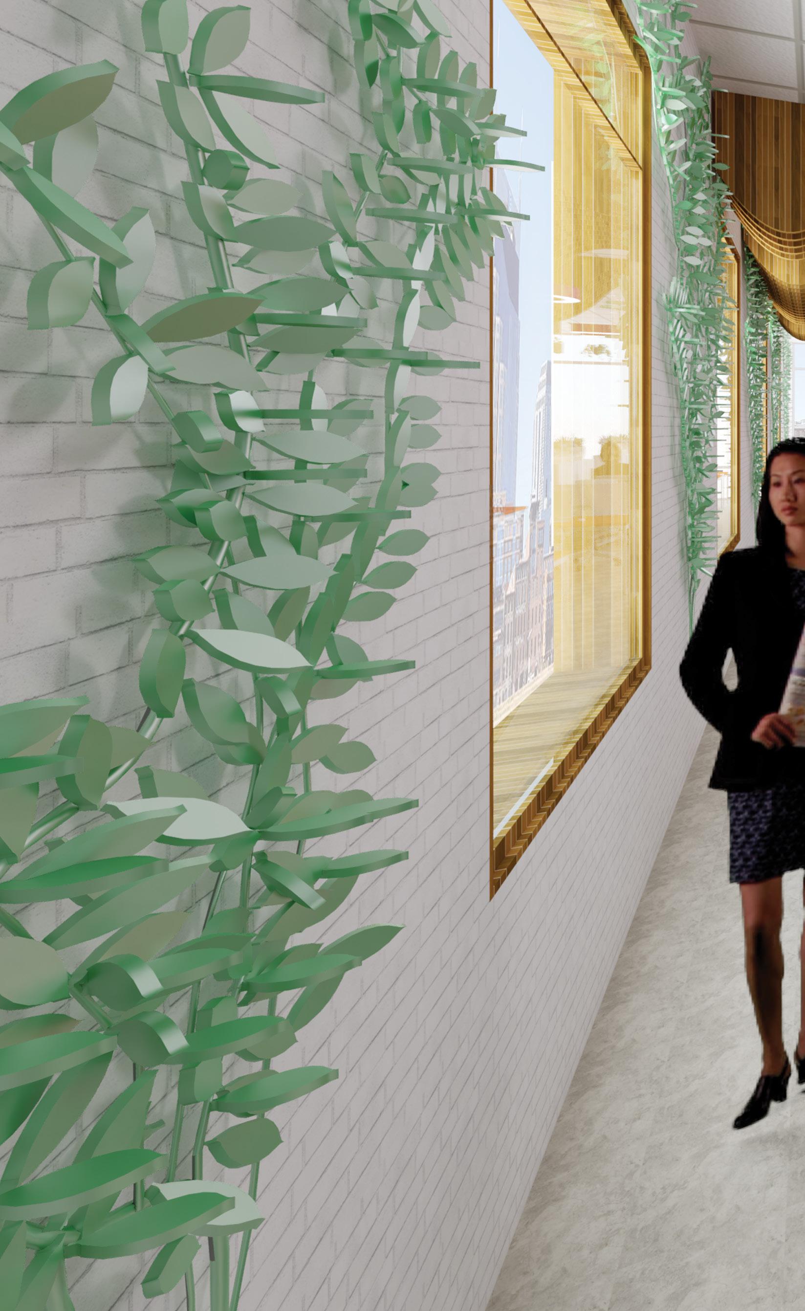
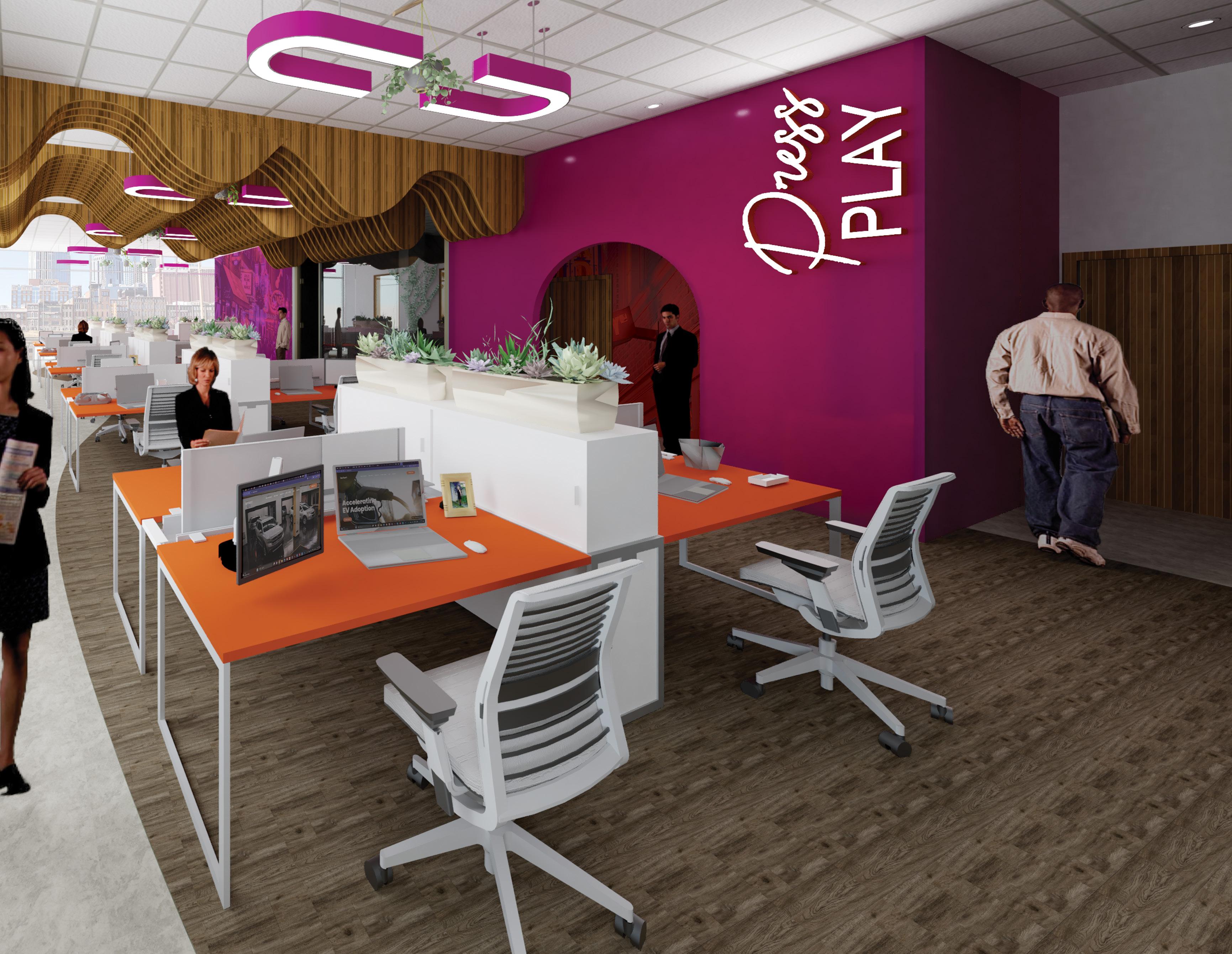
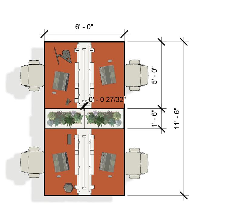
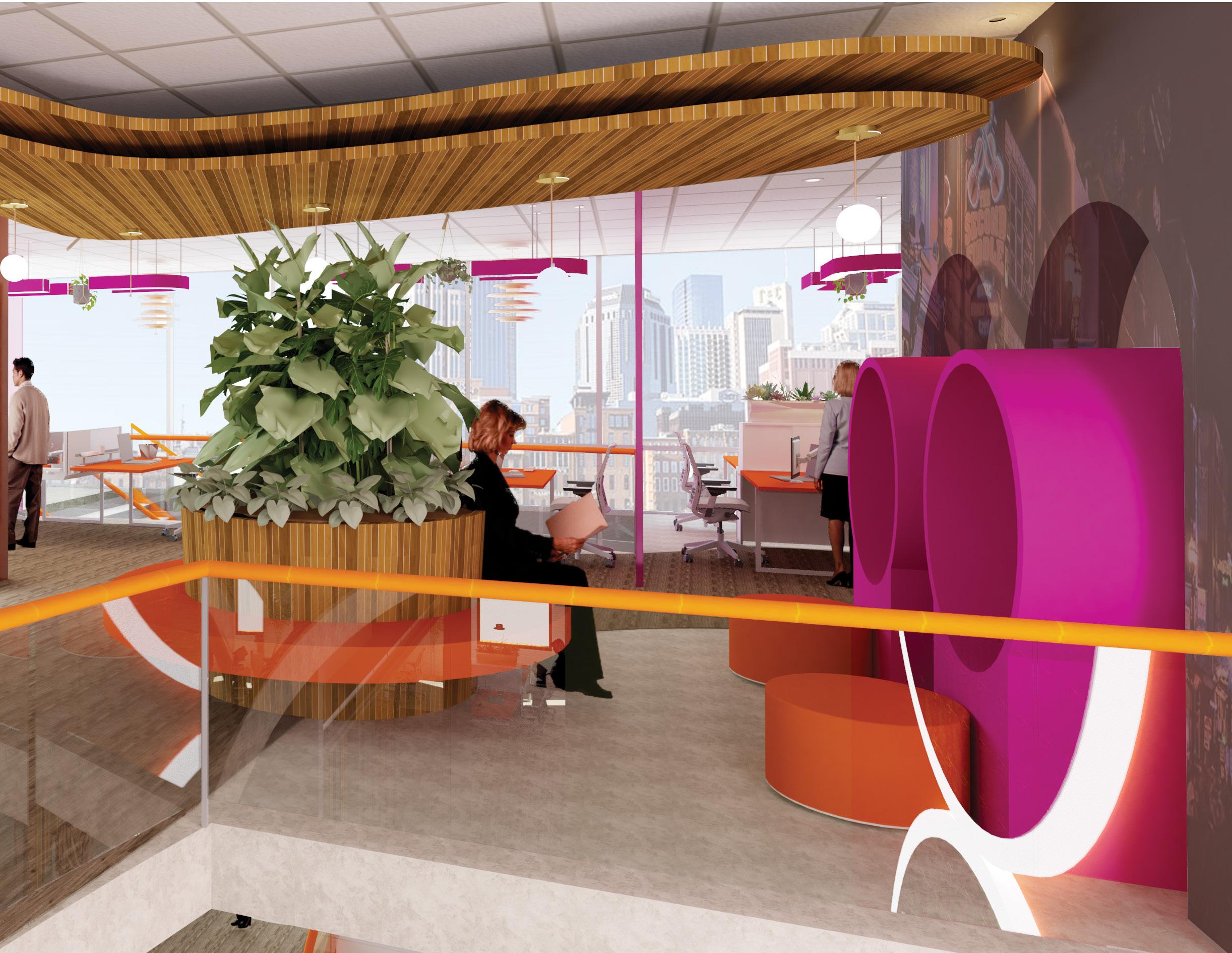
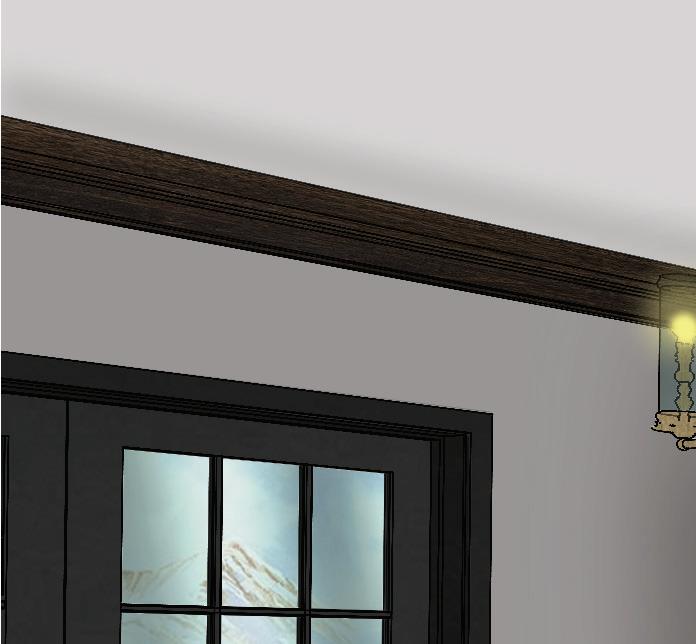
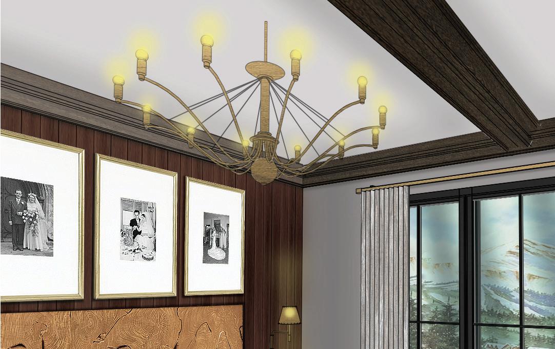
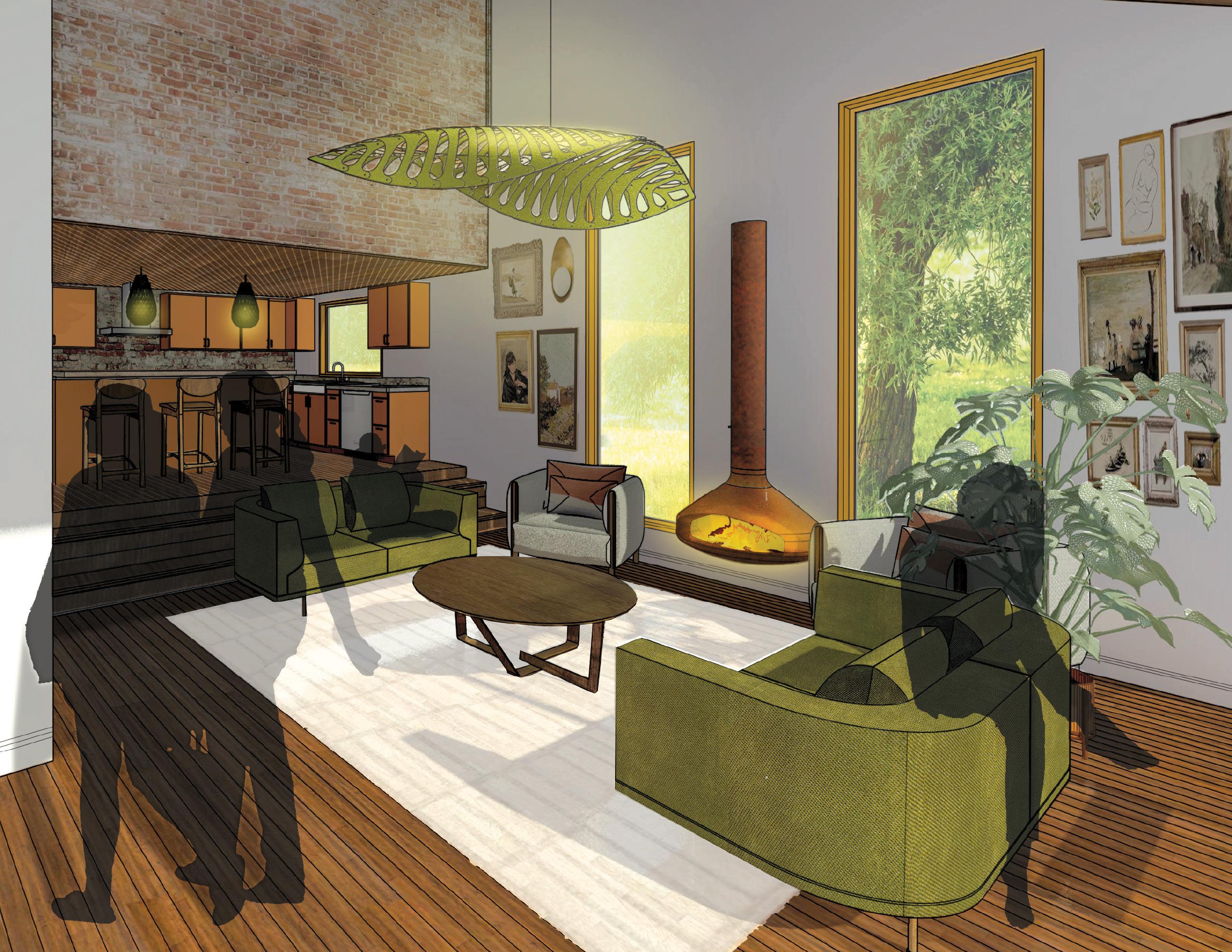
The design of the workstations blends the colors orange and magenta to create a lively work environment with enhanced productivity. The workstations enjoy a wood-fin ceiling and a live wall, two biophilic elements that are meant to alleviate feelings of stress in the workplace.
1
ASSOCIATES (8)
THE STRUCTURE
Structural Analysis

Lextant’s organizational structure can be defined as a “flatarchy,” which lies between a hierarchy and a flat organization. Lextant’s structure incorporates leadership positions such as Vice President and COO, and then trickles down to directors who manage flat teams in different sectors. Space planning considerations for this type of structure should include large areas for group collaboration, and break off spaces for the smaller groups.

THE EXECUTIVES

 FOUNDER AND PRESIDENT: CHRIS ROCKWELL
VICE PRESIDENT OF DESIGN RESEARCH: MARTY GAGE
VICE PRESIDENT OF DESIGN RESEARCH: SHEILA ZWELLING
VICE PRESIDENT OF INSIGHT TRANSLATION: SPENCER MURRELL
VICE PRESIDENT OF CLIENT SERVICES: CRAIG KAVICKY
CHIEF OPERATING OFFICER: MARK PALMER
SENIOR ASSOCIATES (3) DIRECTORS (8)
SENIOR FINANCE COORDINATOR (1) PROJECT MANAGER (2)
ASSOCIATE DIRECTORS (5)
MARKETING DESIGNER (1)
SENIOR RESEARCH RECRUIT COORDINATOR (1)
RESEARCH ASSISTANT (3)
HUMAN CENTERED DESIGN TEAM (3)
DESIGN RESEARCH TEAM (5)
FOUNDER AND PRESIDENT: CHRIS ROCKWELL
VICE PRESIDENT OF DESIGN RESEARCH: MARTY GAGE
VICE PRESIDENT OF DESIGN RESEARCH: SHEILA ZWELLING
VICE PRESIDENT OF INSIGHT TRANSLATION: SPENCER MURRELL
VICE PRESIDENT OF CLIENT SERVICES: CRAIG KAVICKY
CHIEF OPERATING OFFICER: MARK PALMER
FOUNDER AND PRESIDENT: CHRIS ROCKWELL
VICE PRESIDENT OF DESIGN RESEARCH: MARTY GAGE
VICE PRESIDENT OF DESIGN RESEARCH: SHEILA ZWELLING
VICE PRESIDENT OF INSIGHT TRANSLATION: SPENCER MURRELL
VICE PRESIDENT OF CLIENT SERVICES: CRAIG KAVICKY
CHIEF OPERATING OFFICER: MARK PALMER
SENIOR ASSOCIATES (3) DIRECTORS (8)
SENIOR FINANCE COORDINATOR (1) PROJECT MANAGER (2)
ASSOCIATE DIRECTORS (5)
MARKETING DESIGNER (1)
SENIOR RESEARCH RECRUIT COORDINATOR (1)
RESEARCH ASSISTANT (3)
HUMAN CENTERED DESIGN TEAM (3)
DESIGN RESEARCH TEAM (5)
FOUNDER AND PRESIDENT: CHRIS ROCKWELL
VICE PRESIDENT OF DESIGN RESEARCH: MARTY GAGE
VICE PRESIDENT OF DESIGN RESEARCH: SHEILA ZWELLING
VICE PRESIDENT OF INSIGHT TRANSLATION: SPENCER MURRELL
VICE PRESIDENT OF CLIENT SERVICES: CRAIG KAVICKY
CHIEF OPERATING OFFICER: MARK PALMER
THE CONCEPT
Melodies of Mankind
Following Lextant’s foundational principles, the workplace will incorporate human-centered architecture and design to optimize the relationship between the workplace and its workers. To achieve this, Lextant’s marketing workplace will be driven by the idea of ‘melodies of mankind,’ a concept that blends humanity and lyricism. Humanity can be defined as the human race, encompassing all that is mankind, but it can also mean benevolence, sympathy, and compassion, the qualities that make us all human. These feelings of kindness and care will be exemplified through amenities such as coffee bars and nursing rooms, which will be provided to accommodate the needs we as humans have.
Lyricism, on the other hand, is the deep articulation of emotion within an artist’s work, typically expressed in music, writing, or poetry. Nashville, known as the Music City, is the hometown of country music, the birthplace of bluegrass, and currently houses famous music landmarks and venues. With the location set in the heart of Nashville, just minutes away from Music Row, the office will capture the deep, romantic feelings that have been born from within the city. To exemplify these romantic, lyrical feelings, which connect back to our humanness, bright, vivid colors will be placed throughout the workplace to mimic the neon lights present throughout Music Row and typically used by artists during performances to appeal to their audience. Curvilinear elements will also be present throughout to resemble the shape of a guitar, the vessel used by Nashville artists to create their beautiful sentiments.
THE GOALS
1. OFFER areas for both retreat and collaboration to accommodate social and introverted preferences
2. GRANT access and views to outdoors for employee attention restoration
3. DEVISE distinct neighborhoods for teams throughout workplace to create a sense of belonging and community

4. EXTEND comfortable furniture and furnishings, such as lounge chairs, rugs, and throw pillows, to enhance emotions and create an openness to interact
5. EMPLOY
bright colors to positively impact emotions by creating visual interest
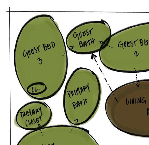
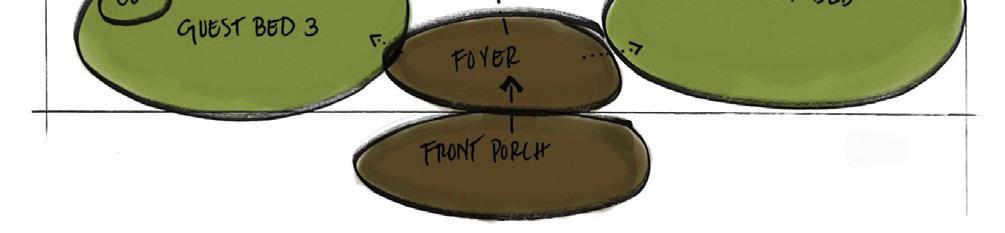
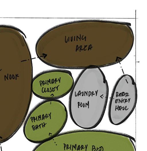
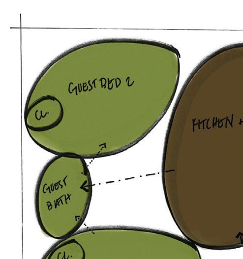
Paths
Bubble Diagrams
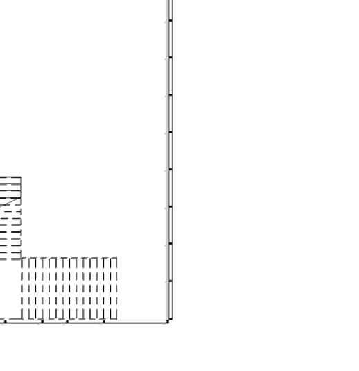
The first and second levels separate public, semi-private, and private spaces for the optimal experience of the user. By doing so, the user gains the ability to choose between what state of privacy they would like to engage in, resulting in a sense of comfort between users of the space. Workstations, the paramount spaces of the Lextant marketing workplace, are all located near the perimeter of the building, allowing access to outdoor views to elicit positive emotions from staff; they are also located near egress points for ease of traveling out of the building.
Adjacency Matrix
The matrix articulates the desired proximity of spaces to inform the space planning of the bubble diagram.
EDUCATION AND TRAINING ROOM RECEPTION AND WAITING AREA WORK-CAFE MONUMENTAL STAIRS 10-SEAT CONFERENCE ROOM SHORT-TERM ENCLAVES EMPLOYEE ENTRANCE AND MUDROOM HUMAN RESOURCES MANAGEMENT AND ADMIN. PRODUCT DEVELOPMENT AGILE WORKSTATIONS MARKETING X X LEVEL I BUBBLE DIAGRAM
THE PROCESS
RECEPTION AND WAITING AREA EXECUTIVE STAFF ACCOUNTING PRODUCT DEVELOPMENT MANAGEMENT AND ADMIN. MARKETING LEGAL AND REGULATORY VENDOR RELATIONS IT AGILE WORKSTATIONS SHORT-TERM ENCLAVES LONG-TERM ENCLAVES MEETING ROOMS 6-SEAT CONFERENCE ROOM 10-SEAT CONFERENCE ROOM EDUCATION/TRAINING ROOM WORK-CAFE COFFEE LOBBY IT SERVER ROOM/HELP BAR EMPL. ENRTY AND MUDROOM MONUMENTAL STAIR
PUBLIC SEMI-PRIVATE PRIVATE MINOR PATH MAJOR PATH X ENTRANCE/EXIT PRIMARY ADJACENCY SECONDARY ADJACENCY UNDESIRED ADJACENCY
THE KEY Zoning
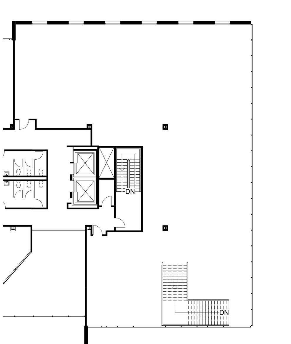
Reception and Waiting Area - 705.19 SF Monumental Stairs - 159.72 SF Work-Cafe - 1119.96 SF Education/Training Room - 514.03 SF Marketing Workstations - 366.13 SF Agile Workstations - 384.89 SF Product Development Workstations - 192.47 SF Management and Administration Workstations - 226.85 SF Human Resources - 196.82 SF Employee Entrance and Mudroom - 248.96 SF Short Term Enclaves - 145 SF 10-Seat Conference Room - 265.47 SF
Adjacencies THE MATRIX
THE FOOTAGE
Stairs - 174.22 SF Agile Workstations - 154.35 SF

Loft with Soft Seating - 503.5 SF
Room - 242.7 SF
THE REFINING
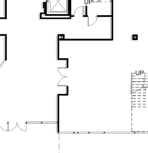
Blocking Diagrams

The blocking diagrams of both floors take into account the necessary square footage for the functionality of all spaces within the workplace. The diagrams also closely delineate corridors and other areas of passage, creating seamless, straightforward travel throughout both levels of the suite. Most rooms along the hallways are of the same length, to further the effortlessness of the user’s navigation.
Accounting Workstations - 239.37 SF
Legal and Regulatory Workstations - 283.71 SF
Chief Counsel - 176.29 SF
CFO and COO- 172.67 SF
Meeting Room - 172.67 SF
CEO - 168.8 SF
Short Term Enclaves - 152.54 SF
Long Term Enclaves - 377.23 SF
LEVEL II
COFFEE
SOFT
AGILE WORKSTATIONS VENDOR RELATIONS IT SERVER ROOM SHORT-TERM ENCLAVES LONG-TERM ENCLAVES CEO COO MEETING ROOM CFO CHIEF COUNSEL LEGAL AND REGULATORY ACCOUNTING 6-SEAT CONFERENCE ROOM MEETING ROOM IT AND HELP BAR MONUMENTAL STAIRS X X
BUBBLE
IT
Monumental
Meeting
6-Seat
1/16" = 1'-0" 1 Level 1 Suite 2 Copy 1 EDUCATION AND TRAINING ROOM RECEPTION AND WAITING AREA WORK-CAFE MONU. STAIRS 10-SEAT CONFERENCE ROOM SHORT-TERM ENCLAVES EMPLOYEE ENTRANCE AND MUDROOM HUMAN RESOURCES MANAGEMENT AND ADMIN. PRODUCT DEVELOPMENT AGILE WORKSTATIONS MARKETING LEVEL I COFFEE LOFT WITH SOFT SEATING AGILE WORKSTATIONS VENDOR RELATIONS IT SERVER ROOM SHORT-TERM ENCLAVES LONG-TERM ENCLAVES CEO COO MEETING ROOM CFO CHIEF COUNSEL LEGAL AND REGULATORY ACCOUNTING 6-SEAT CONFERENCE ROOM MEETING ROOM IT AND HELP BAR MONUMENTAL STAIRS
LOFT WITH
SEATING
LEVEL II
DIAGRAM IT Server Room - 112.94 SF
Workstations and Help Bar - 186.24 SF Vendor Relations Workstations - 166.91 SF
Coffee
Conference Room - 242.7 SF
THE THEORY
THE FINISHES
Floor Finish Selection
The selected floor finishes are commercial grade luxury vinyl tile, an extremely durable material. Such durability is necessary in a workplace setting as there is plenty of foot traffic within the office realm. The selections also are of earthy colors to reinforce the biophilic elements within the design of the office, and also to create balance between the flooring and the more colorful elements of the space.


Room Key
A- Reception and Waiting Area
B- Work-Cafe
C- Education/Training Room
D- Marketing Workstations
E- Agile Workstations
F- Product Development Workstations
G- Management and Administration Workstations
H- Human Resources
I- Employee Entrance and Mudroom
J- Short Term Enclaves
K- 10-Seat Conference Room
Concept and Theory Key
1- Proxemics: High-back furniture creates feelings of privacy and protection
2- Proxemics: Builtin storage separates desks from adjoining workstations and nearby pathways
3- Melodies of mankind: Grouping of workstations creates sense of community
4- Melodies of mankind: Curvilinear furniture provides rhythm within common areas
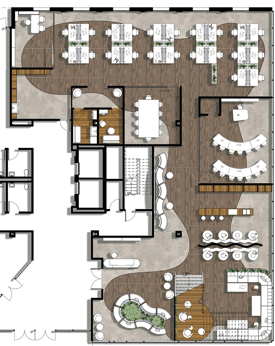
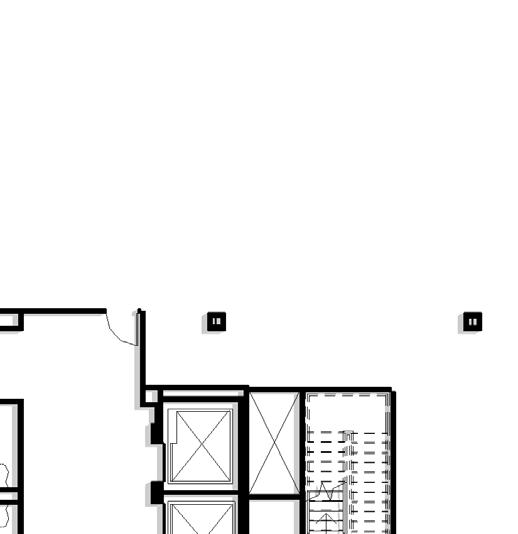
THE PLANS
1- Spacia Stone LVT
3- Altitude Isle of Skye LVT
2- Woodworks LVT A B
LEVEL I C
D E F G H I J K 1
2 3 4
Proxemics
Proxemics is used to define relationships between humans within a space and assesses the comfort level of individuals at differing distances. Interior designers can manage human interaction by the way they organize space. There are 3 ways to organize activities within a space: fixed features (walls, building materials, fixed furnishings), semi-fixed features (furniture, plants, screens, paintings), and informal (the space immediately surrounding our bodies). These may be adjusted to fit the needs of the users.
Concept and Theory Key
1- Proxemics: Partition walls create separation between zones


2- Proxemics: Screens within workstations can be controlled by user
3- Melodies of mankind: Jukeboxes present within enclaves help regulate emotions
4- Melodies of mankind: Access to outdoor views enhances emotions
THE WORKSTATIONS
Turnstone Tour Workspace
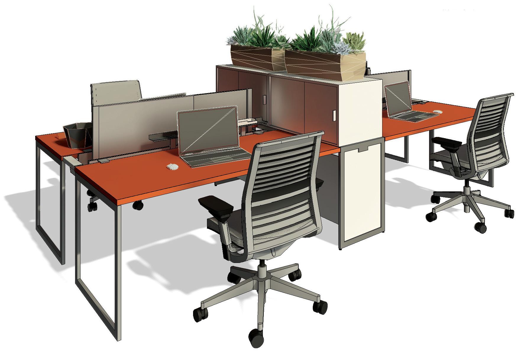
The selected workspace is manufactured by Steelcase. Its design facilitates both personal and collaborative work, as the user is able to control the adjoining panels. The workstation has built-in storage, which also doubles as separation when necessary. Built-in data routing and power is provided within the workstation, assisting the user in their various tasks.
A B C D E F G H I J K L M N O P 1 2 3 Room Key
A- IT Server Room
B- IT Workstations and Help Bar
C- Vendor Relations Workstations
D- Agile Workstations
E- Coffee Loft with Soft Seating
F- Meeting Room
G- 6-Seat Conference Room
H- Accounting Workstations
I- Legal and Regulatory Workstations
J- Chief Counsel
K- CFO
L- Meeting Room
M- COO
N- CEO
O- Short Term Enclaves
P- Long Term Enclaves
CUSTOM RAUCOUS ORANGE SW 6883 PAINTED WOOD
STEELCASE STEEL FRAMING
STEELCASE ARCTIC WHITE WOOD LAMINATE
PERSONAL STORAGE
ERGONOMIC CHAIR
STEEL FRAME
ORANGE PAINTED WOOD LAMINATE LEVEL II
WHITE WOOD LAMINATE 4
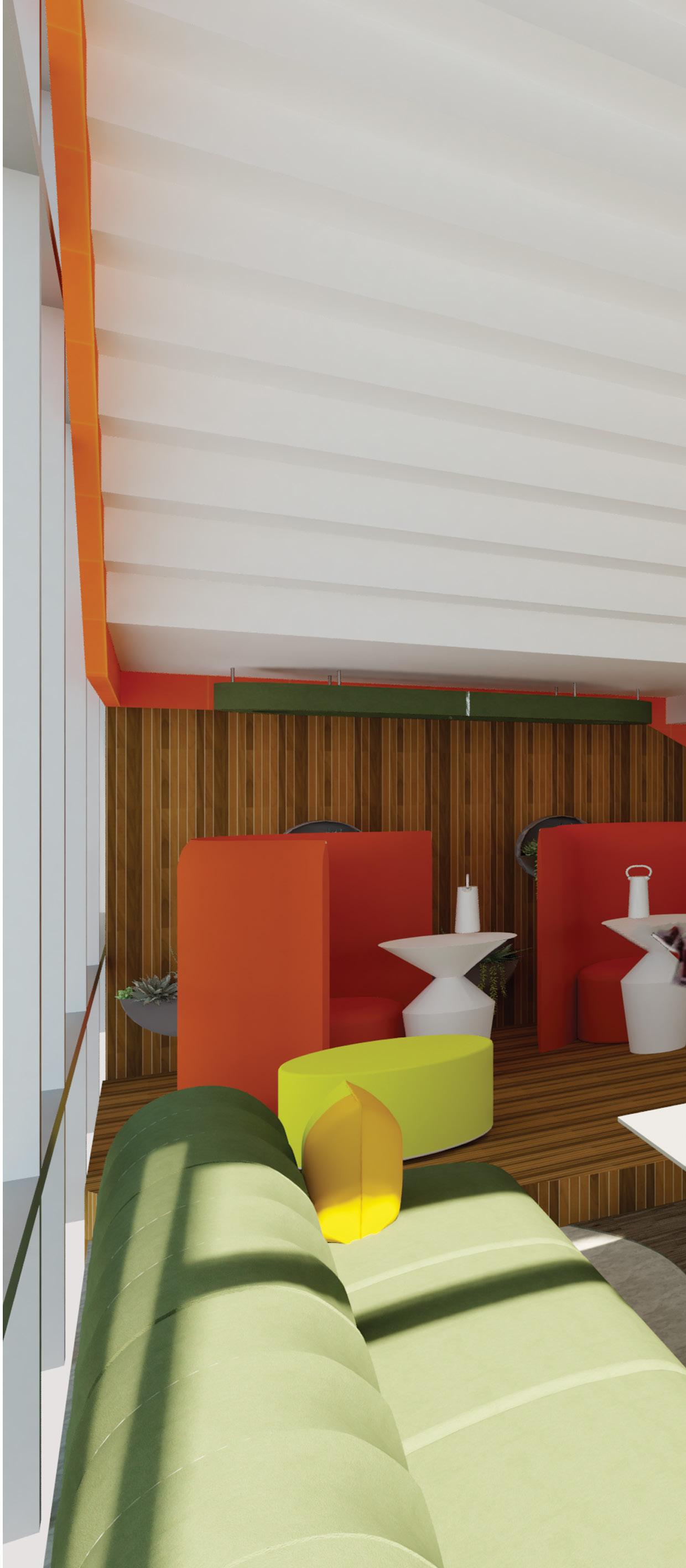
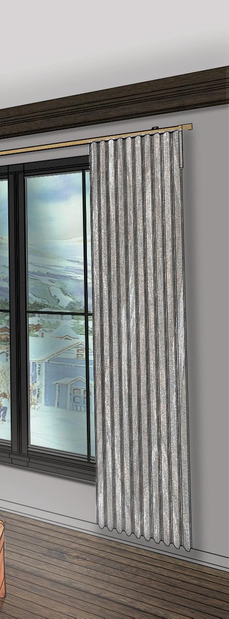
Coffee Loft Perspective
The coffee loft creates a cozy space where users can interact on their free time. The colors orange, magenta, and white shape this engaging and visually-interesting area that is perfectly centralized in the heart of the workplace and overlooks the work-cafe beneath. Curvilinear shapes and forms are used throughout the space, and translucent walls create feelings of privacy within this otherwise open area.
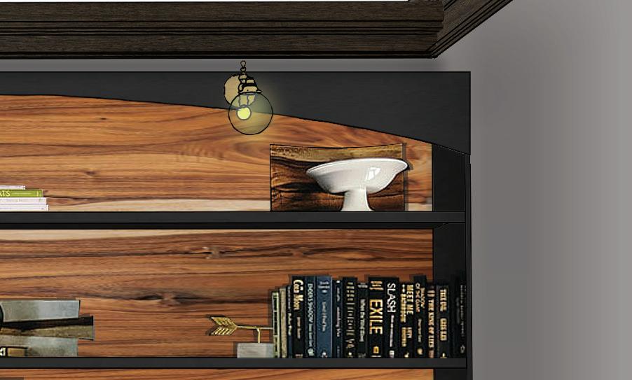
THE LOFT THE LIGHTING FIXTURE
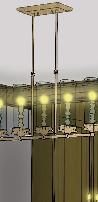
‘Disco’

Seen in the background of the perspective, the custom fixture uses vinyl records within its design to play off of the lyrical concept.
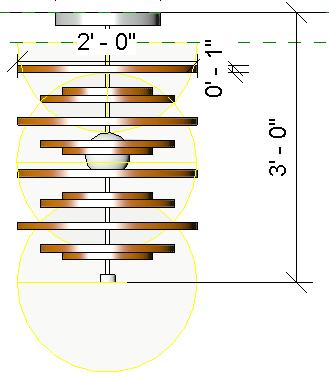
LIGHTBULB
VINYL RECORDS CANOPY
THE WORK-CAFE
Work-Cafe Elevation
The work-cafe’s lounge area aims to create a unique experience for members as large, plant-like art immerses users in nature. The identity of the company is also further referenced within this graphic, as the design draws inspiration from Lextant’s logo.
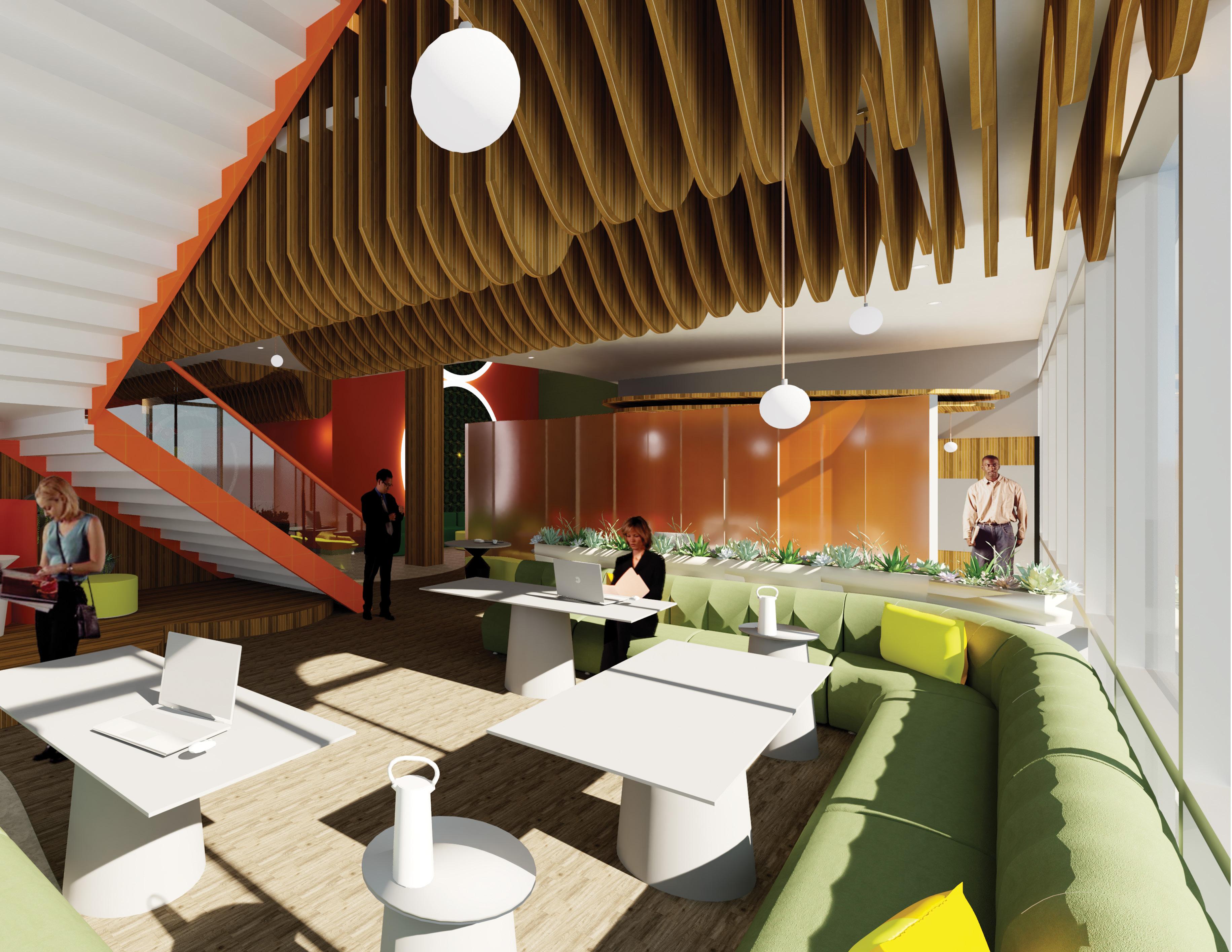
Work-Cafe Perspective
The work-cafe area provides users with a variety of seating options, including lounge seating, for increased user comfort. Orange is used within this space, as in other areas of the workplace, but green and yellow are added in this particular area to create a distinct zone within the first floor of the suite.
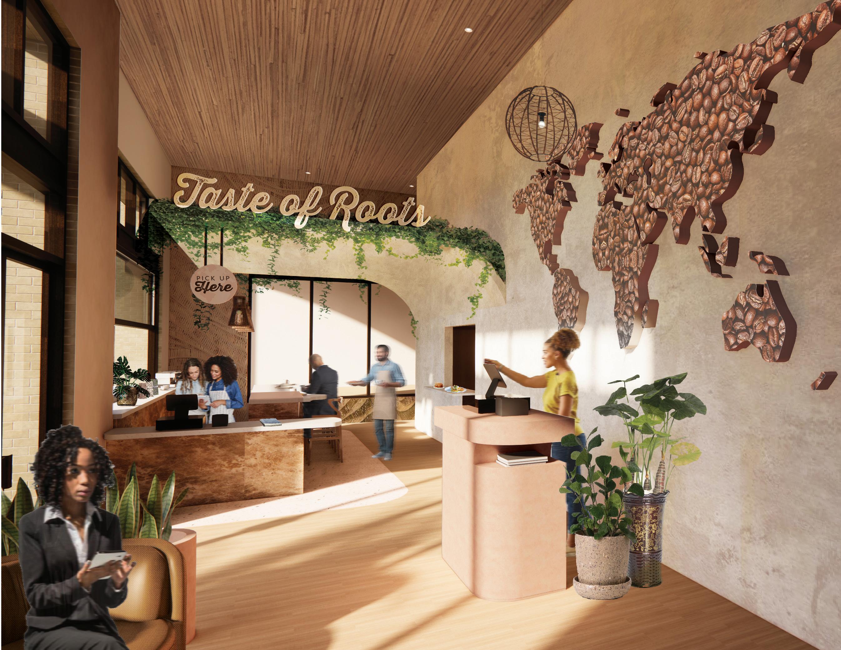
CULTURE WITHIN COFFEE
THE PROJECT
‘Taste of Roots’ is a café that focuses on creating an inclusive space where individuals feel like they can belong. Tallahassee has a diverse population, and integrating ‘Taste of Roots’ within a redeveloped area can break the barrier between its citizens. With three prestigious colleges and universities located within the realms of the city, along with the state’s capitol, people from all backgrounds and nationalities are always present. The café’s positive environment intends on building visitors up and fostering a sense of community between these individuals to create the ultimate local, diverse spot. The project was completed alongside another interior design student, Summer Oliver, in the span of 5 weeks.

THE GOALS
• Incorporate biophilic elements to connect user to nature and diverse origins of coffee
• Create a dynamic environment by providing seating options where several users can interact
• Reflect underrepresented groups through environmental graphics and non-Western architecture
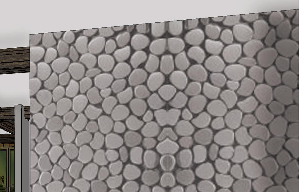
THE PALETTE Color Palette
Warm neutrals, pinks, and browns are used throughout the design, in addition to in the company’s branding, to create a cozy, homey ambiance where users always feel welcomed and accepted.
Logo Ideation
The logo’s design embraces the values of diversity and inclusion through its depiction of a globe, a symbol of union and conviviality.
GO
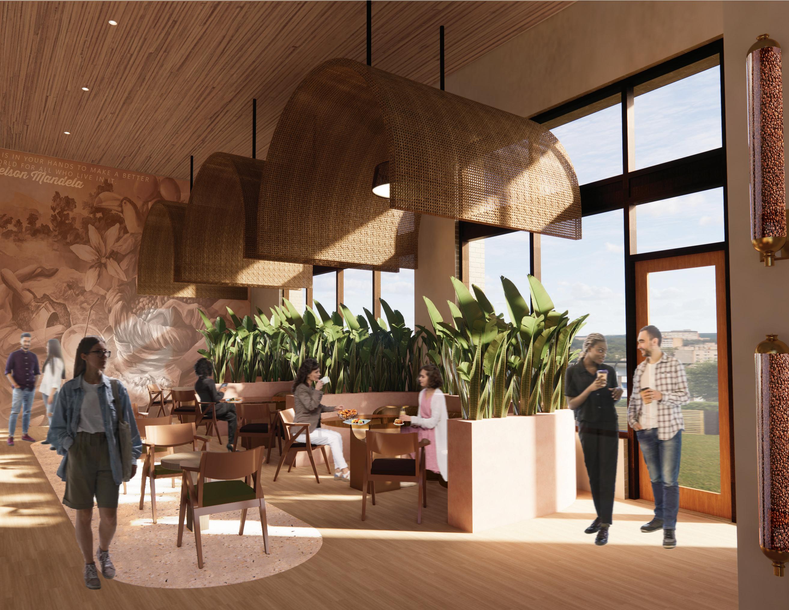
Dining Space Perspective
The main dining room features a monumental rattan dropped ceiling that complements a curved planter below it. A large environmental graphic wall lies at the end of the space to further the immersiveness of the room.
2
THE CONCEPT
Through its unique interpretation of the coffee bean, ‘Taste of Roots’ aims to establish a café community hub that reflects the bean’s culture in the diverse regions of the ‘Coffee Belt,’ spanning the Caribbean, South America, and Africa. The café seeks to create an inclusive space that celebrates diversity and fosters a sense of belonging for all users, with the coffee bean serving as a symbol of this diversity. The coffee bean’s geometry will also inspire the design of the space, by the mimicking of the bean’s fluidity, movement, and organic nature throughout. Neutral and earthy pigments that stem from the coffee bean’s color will also be implemented to ground the user and create a connection to the Earth, to ultimately satisfy the human need for biophilia.
THE PROCESS
Bubble Diagrams
Zones are created within the layout of the space to optimize the experience of both visitors and staff. Private zones are located in the back of the restaurant, where no windows are present for the security and comfortability of the user. Public spaces, conversely, surround the main entrance, and semi-private spaces lie between the public and private zones, serving as a buffer zone.
KEY
THE SELECTION
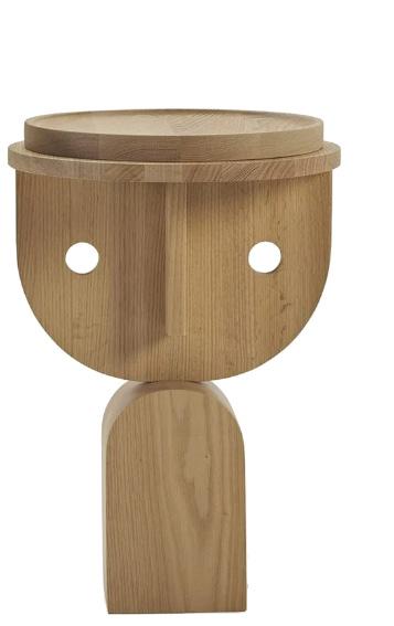
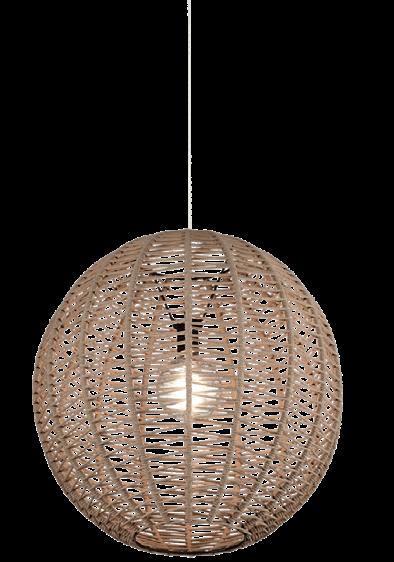
Furniture, Fixtures, and Equipment
The selected furnishings and finishes provide the cafe with organic forms that reinforce the driving concept of the cafe. The selection also grounds the space, through their earthy colors and natural materials.
DINING ROOM MERCHANDISE SHOWCASES HOSTESS STAND + RESTROOM 1 KITCHEN + STORAGE EMPLOYEE SPACE OUTDOOR DINING OUTDOOR COFFEE BAR PUBLIC SEMI-PRIVATE PRIVATE COFFEE BAR DINING + FRONT-LINE SPACE OUTDOOR DINING OUTDOOR DINING RESTROOM 2 EGRESS VISITOR PATH STAFF PATH
WAITING AREA
Floor Plan
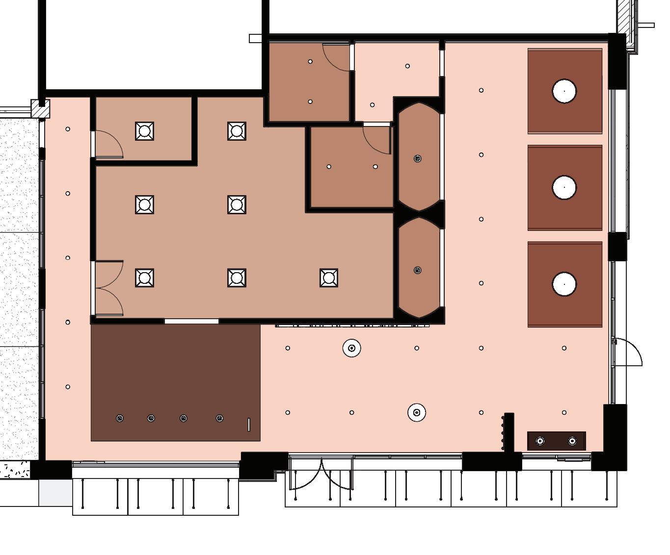
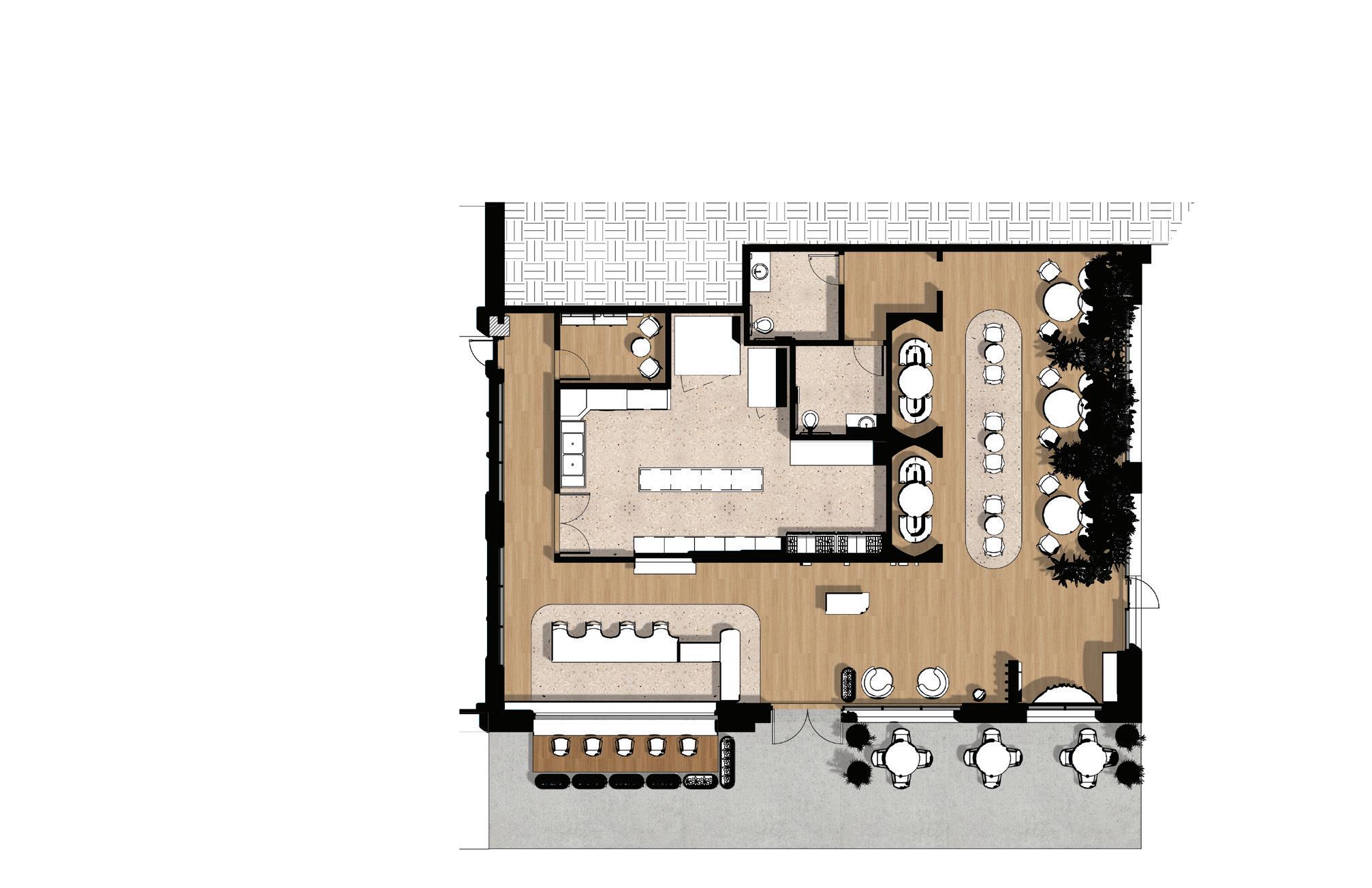
The floor plan’s layout follows the experience of the user as they navigate throughout the different zones within the space.
FINISH


FIXTURE KEY
FIXTURE KEY
Reflected Ceiling Plan

The

creating visual

A- OUTDOOR COFFEE BAR B- INDOOR COFFEE BAR + FRONT-LINE SPACE C- KITCHEN + STORAGE D- EMPLOYEE SPACE E- RESTROOM F- RESTROOM II G- DINING ROOM H- HOSTESS STAND + WAITING AREA I- MERCHANDISE SHOWCASE J- OUTDOOR DINING
FINISH KEY WOOD LVT BEIGE TERRAZZO OUTDOOR-GRADE WOOD LAMINATE A B C D E F G H I COLD FOOD PREP. WALK-IN FREEZER WALK-IN REF. DRY FOOD STORAGE PICK-UP COUNTER HOSTESS STAND + CASH WRAP EMPLOYEE STORAGE BAKED GOODS DISPLAY HANGING DISPLAY BUILD YOUR OWN BLEND COFFEE DISPLAY J HOT FOOD PREP. WORK COUNTER SHELF DISPLAY DW T
KEY 20’-0’ A.F.F. LAMINATE NATURAL RATTAN 15’-0” A.F.F. ACOUSTICAL CEILING TILE 15’-0” A.F.F. VENETIAN PLASTERED GYPSUM BOARD 14’-6” A.F.F. RATTAN ARCHED SPECIALTY CEILING 12’-6” A.F.F. VENETIAN PLASTERED GYPSUM BOARD 8’-0” A.F.F. RATTAN ARCHED SPECIALTY CEILING
ROOM KEY
FINISH
COOPER LIGHTING 6” RECESSED CAN DOWNLIGHT OLE LIGHTING KORA PENDANT OLE LIGHTING CONGA PENDANT OLE LIGHTING LLUNA PENDANT OLE LIGHTING DRUM PENDANT 2’ X 2’ TROFFER
20’-0’ A.F.F. LAMINATE NATURAL RATTAN 15’-0” A.F.F. ACOUSTICAL CEILING TILE 15’-0” A.F.F. VENETIAN PLASTERED GYPSUM BOARD 14’-6” A.F.F. RATTAN ARCHED SPECIALTY CEILING 12’-6” A.F.F. VENETIAN PLASTERED GYPSUM BOARD 8’-0” A.F.F. RATTAN ARCHED SPECIALTY CEILING
FINISH KEY
COOPER LIGHTING 6” RECESSED CAN DOWNLIGHT OLE LIGHTING KORA PENDANT OLE LIGHTING CONGA PENDANT OLE LIGHTING LLUNA PENDANT OLE LIGHTING DRUM PENDANT 2’ X 2’ TROFFER OUTDOOR SUN SHADE AWNING
FIXTURE KEY
fixtures,
interest
ceiling features an array of finishes and
for a more dynamic space.
KEY 20’-0’ A.F.F. LAMINATE NATURAL RATTAN 15’-0” A.F.F. ACOUSTICAL CEILING TILE 15’-0” A.F.F. VENETIAN PLASTERED GYPSUM BOARD 14’-6” A.F.F. RATTAN ARCHED SPECIALTY CEILING 12’-6” A.F.F. VENETIAN PLASTERED GYPSUM BOARD 8’-0” A.F.F. RATTAN ARCHED SPECIALTY CEILING
COOPER LIGHTING 6” RECESSED CAN DOWNLIGHT OLE LIGHTING KORA PENDANT OLE LIGHTING CONGA PENDANT OLE LIGHTING LLUNA PENDANT OLE LIGHTING DRUM PENDANT 2’ X 2’ TROFFER OUTDOOR SUN SHADE AWNING

THE EXPERIENCE

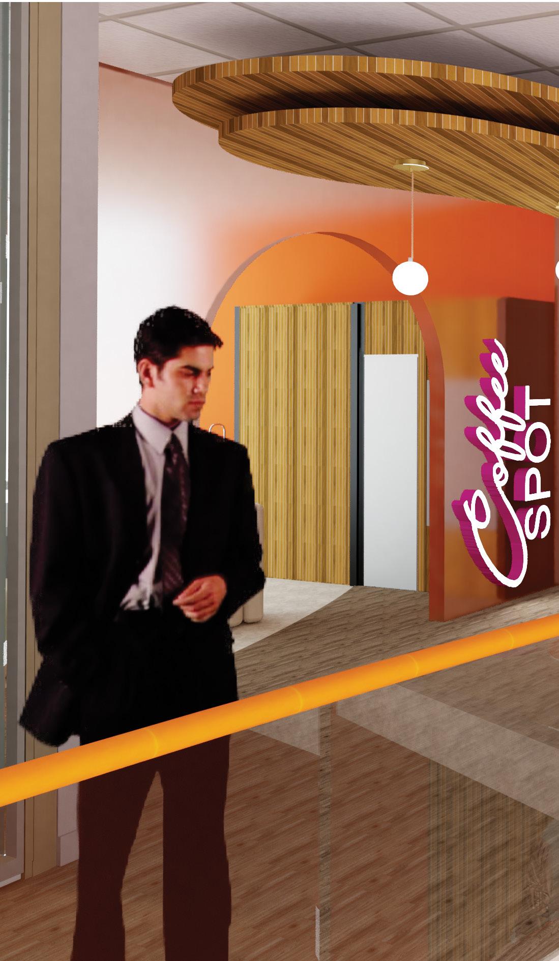
Entry and Bar Perspective
Visitors are greeted by a three-dimensional coffee map which lies behind the hostess stand. Nearby, a dual-sided coffee bar that services both indoor and outdoor provides customers with a speedy alternative to dining in.

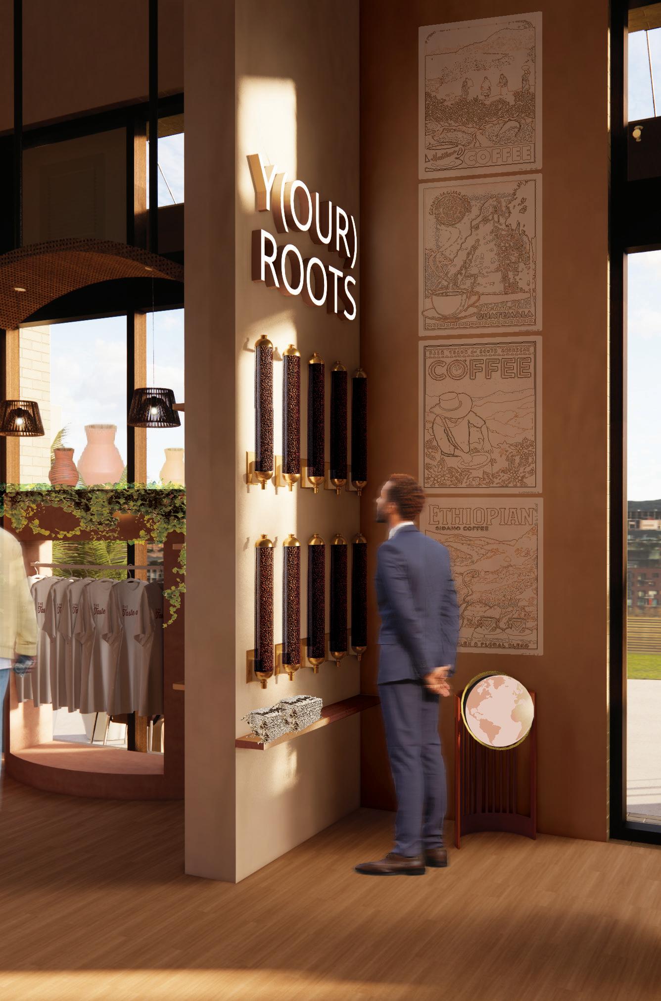
Merchandise Displays Perspective


A build-your-own-blend station with options including Brazilian, Sumatran, and Tanzanian varietals is conveniently placed near the entrance of the cafe. Other merchandise, such as mugs, prepackaged coffee, and t-shirts are located near street-facing windows and along the travel path of visitors.

AGING AMONGST THE MOUNTAINS


THE PROJECT
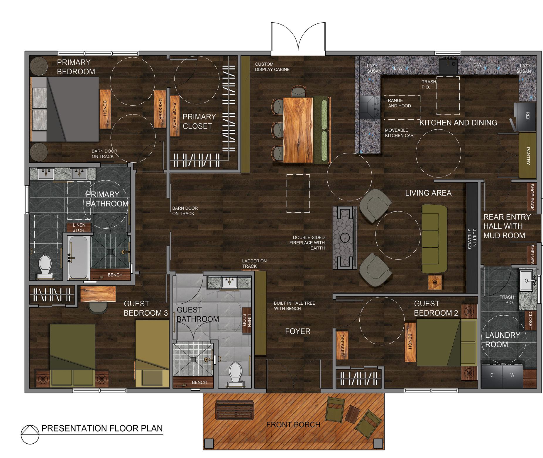
The residence is a 1960-square-foot home designed for a retired couple, Mr. and Mrs. Smith. The home is located in Breckenridge, CO, and embodies the local character of the town as well as the sophisticated country style aesthetic the clients expressed a preference for. The home includes comfortable and accommodating features that aid the couple as they age, in addition to their children and grandchildren, and their guests with different abilities. Agingin-place upgrades, Universal Design principles, and accessibility standards are in place to meet such accommodations.
THE CONCEPT

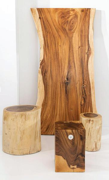
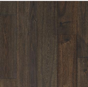
The design of the home was driven by the natural landscape of Breckenridge, CO. Through the use of natural materials, brown, gray, and green color palette, and airy, open spaces, the design of the home reinforces this natural concept. In particular, the residence employs both local and sustainable wood and natural stone for integrity purposes. Rigid, rough textures are also used throughout the space to create a raw, natural feel, especially with the accent unfinished stone placed throughout areas of the home.
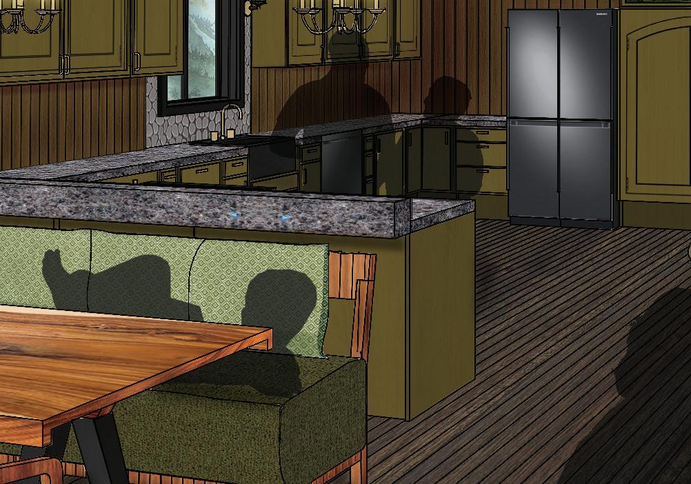
Living, Dining, and Kitchen Perspective
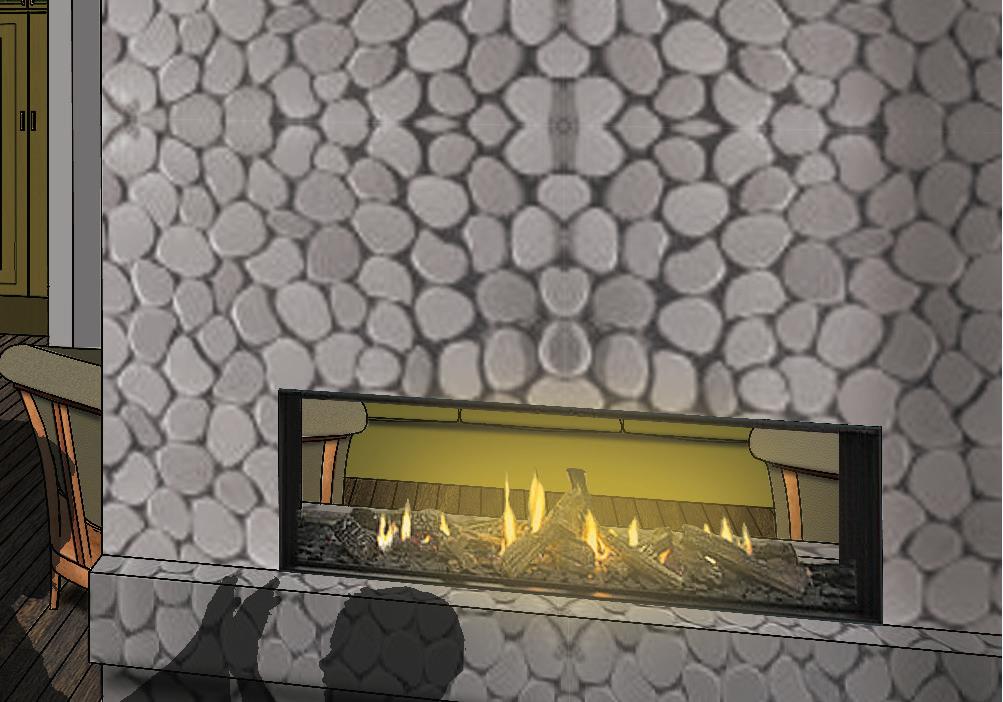
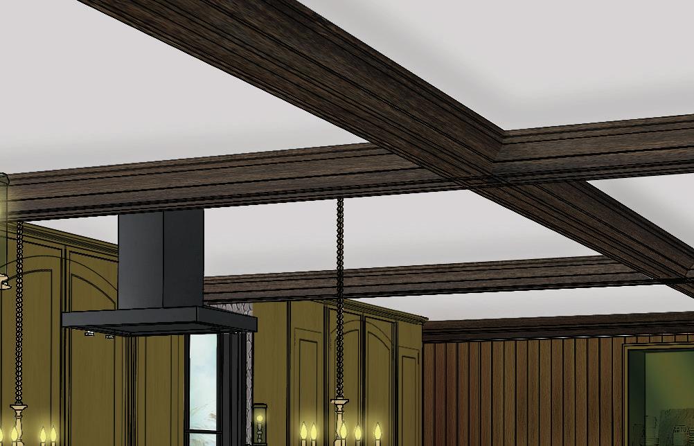
The perspective illustrates the main areas of the residence: the kitchen, dining, and living area. It features warm and earthy materials, creating cozy, provincial common spaces to host guests and children.
3
THE PROCESS
Bubble Diagrams
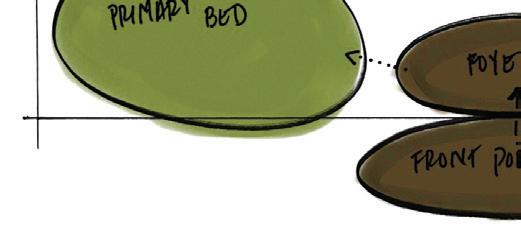
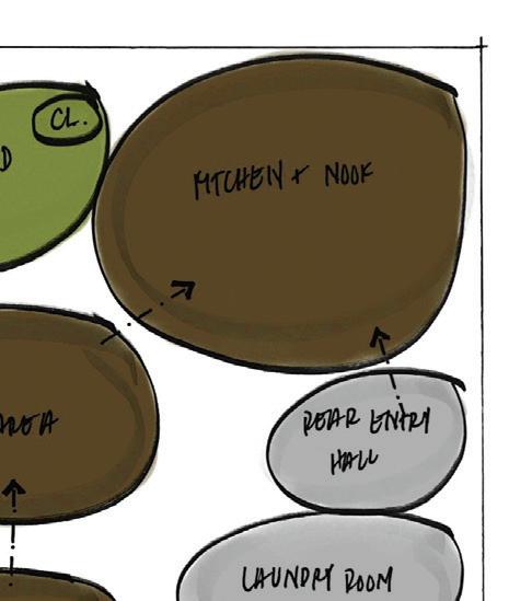
Private, semi-private, and public areas are grouped together in the space planning of the home to delineate zones and control the privacy of the residents while still accommodating the anticipated guests. The final floor plan blends aspects of both diagrams to optimize the spatial layout of the residence.
THE PLAN
Floor Plan
The floor plan exemplifies the overall layout of the residence and the ADA clearances present throughout for the comfort of the residents and their guests.
Sustainable Features
Sustainably harvested hardwood floors are present throughout the majority of the home.
 MAS Certified Green wood furniture products are used throughout different areas.
THE ELEVATIONS
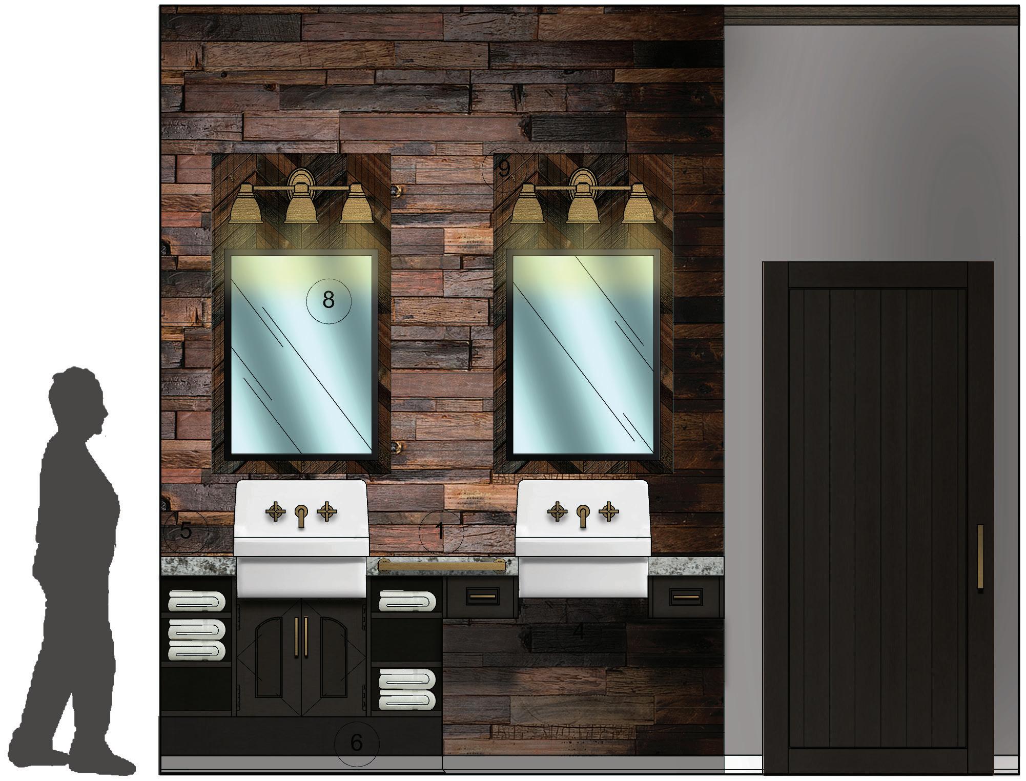
Primary Bathroom Elevation
The elevation depicts the north wall of the primary bathroom where the double vanity is located. It exemplifies some of the aging-in-place features of the bathroom, including a vanity with an ADA accessible roll under sink base, a 9-inch toe tick, and ADA-compliant grab bars. Wood wall tile is used to call attention to the vanity area, and black is used for the mill-work for a sleek, sophisticated look.
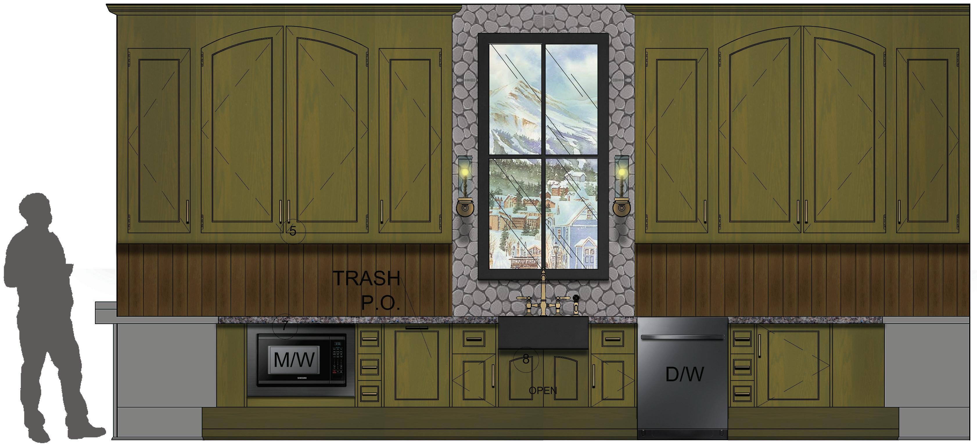
Kitchen Elevation
This elevation displays the kitchen in detail, highlighting the accessible features that were put in place to accommodate the residents. Green kitchen cabinets accentuate the kitchen to create an inviting, entertainment space within the home.
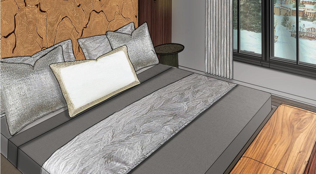
Primary Bedroom Vignette
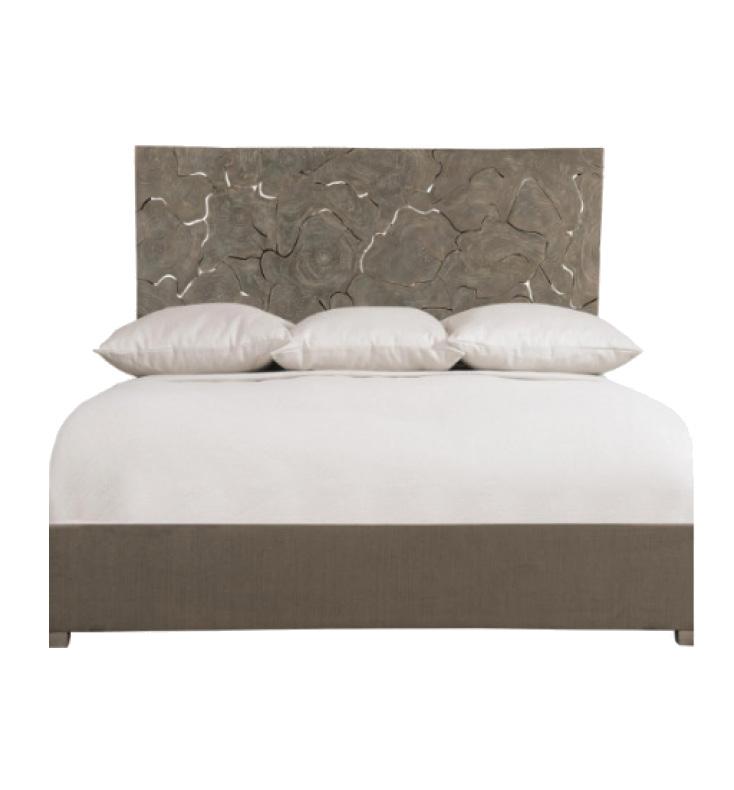
The vignette focuses on the primary bedroom window and its surrounding area. It demonstrates the soft, feminine decor present within the bedroom, and reinforces the concept of nature through the organic wood accent headboard.
THE VIGNETTES


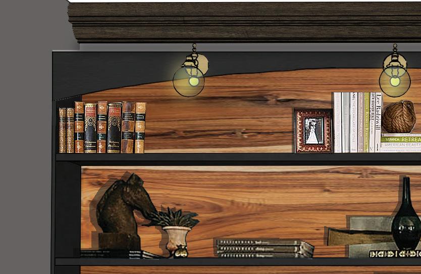
Living Room Vignette
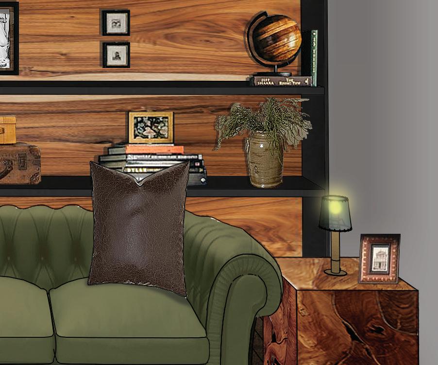
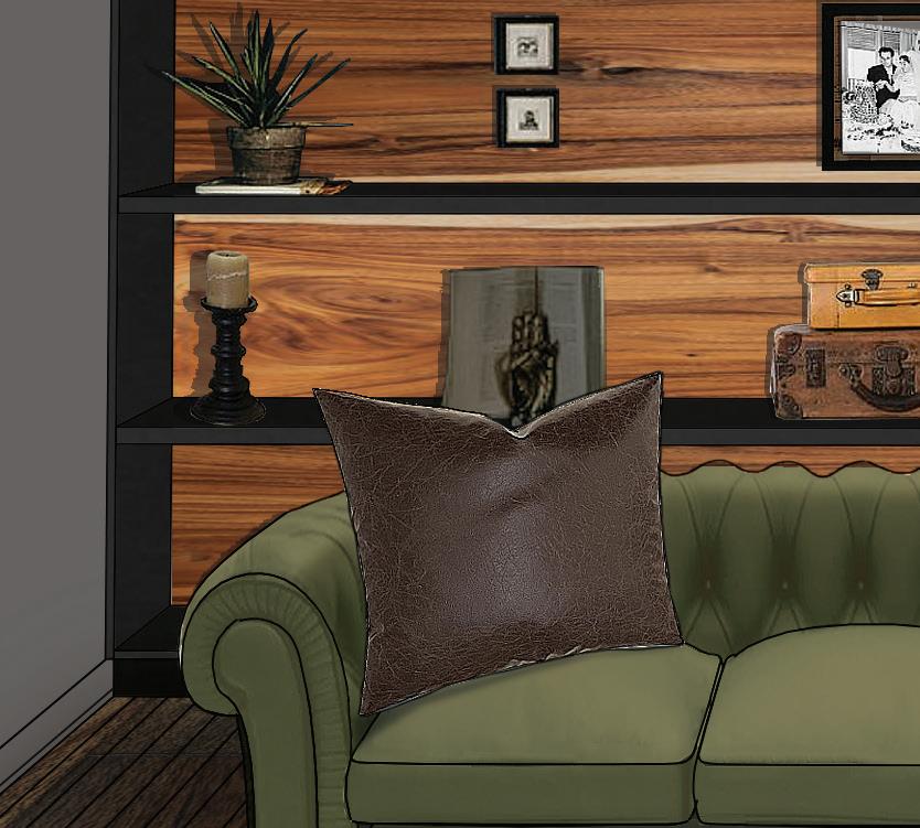
The vignette demonstrates another view of the living area, showcasing the bookshelf wall where the residents display their collection of souvenirs, books, and family portraits.
THE MOOD
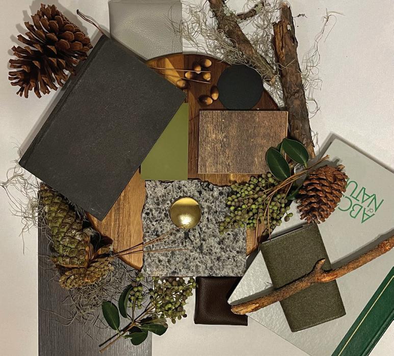
Living, Dining, and Kitchen Mood Board

This mood board captures the essence of the main areas, including the living room. It follows a natural color scheme, composed of browns, grays, and greens.


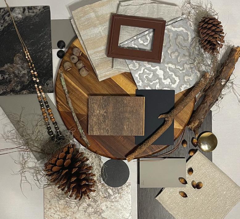
Primary Suite Mood Board
This mood board emulates the essence of the primary suite, which adheres to a brown and gray color palette and features feminine accents to appeal to Mrs. Smith, who spends most of her time in the space.
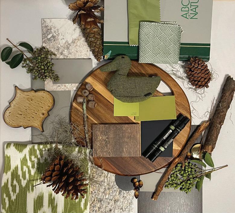
Guest Suite Mood Board
This mood board employs lighter shades of green with visually interesting patterns and accents to appeal to the residents’ grandchildren.
A STEP TOWARDS NEW BEGINNINGS
THE PROJECT
The Anti-Violence Center and Shelter for Youth project is designed as a 3270-square-foot, two-story sanctuary for young women between the ages of 16 and 24 who are victims of domestic violence and are seeking refuge. The sanctuary is located in Tallahassee, FL, and incorporates the principles of Trauma Informed Design within its layout to accommodate the delicate needs of the young women. The facility aims to act as a safe haven to shelter the women from their abusers, and to inspire change within the women through its resources and aesthetic components. The project was completed along with another student, Jaymie Kennedy.
Statistics on Domestic Violence
Domestic violence is an prominent issue in our society, and young women in their teenage years are the most susceptible.
THE CONCEPT
The shelter will incorporate and reflect the notion of ataraxia: a state of freedom from emotional disturbance and anxiety. The principle of ataraxia will aid in making the user feel safe and comfortable in the space after having gone through a traumatic experience. Natural elements, such as wood finishes, and a warm, earthy color scheme will be present throughout the space, as well as the practice of biophilia. The concept will also be shown in the design through a large kitchen and dining space as well as an open plan living area, as they will create a sense of community within the young women to reinforce feelings of support.
Conceptual Mood Board
The mood board exemplifies the natural, serene environment the shelter aims to create. It also displays the furniture selection of the common areas, which all have wooden accents.
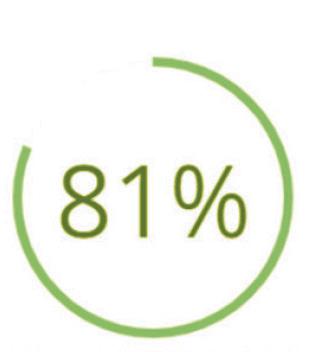
81% OF PARENTS
BELIEVE TEEN DATING VIOLENCE IS NOT AN ISSUE OR ADMIT THEY DON’T KNOW IF IT’S AN ISSUE
33% OF TEENS ARE IN AN ABUSIVE RELATIONSHIP

33% OF TEENS WHO WERE IN A VIOLENT RELATIONSHIP NEVER TOLD ANYONE ABOUT THE ABUSE
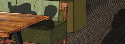
Kitchen and Living Room Perspective
This perspective depicts the main common areas of the space, the kitchen and living room. These areas feature soft goods, natural materials, and earthy colors to appeal to the women staying at the shelter. The two areas are adjacent and open to each other to create community spaces where women feel open and safe to interact with one another.
4
SEEDS OF SURVIVAL
THE PROJECT
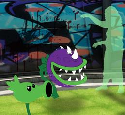
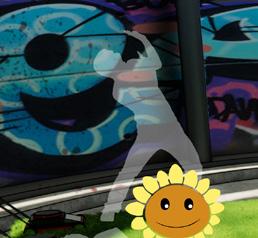
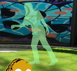
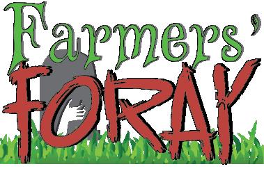
In a post-apocalyptic zombie world, Farmers’ Foray is a weekly game show that gives the surviving population of the world an opportunity at salvation. Based on Plants VS. Zombies, 5 farmers will work together each episode to keep multiple waves of zombies at bay. Using their green thumbs, contestants will plant herbs and flowers to fight against the zombie hoard. Each contestant is also given a lawnmower to be used as a last resort.


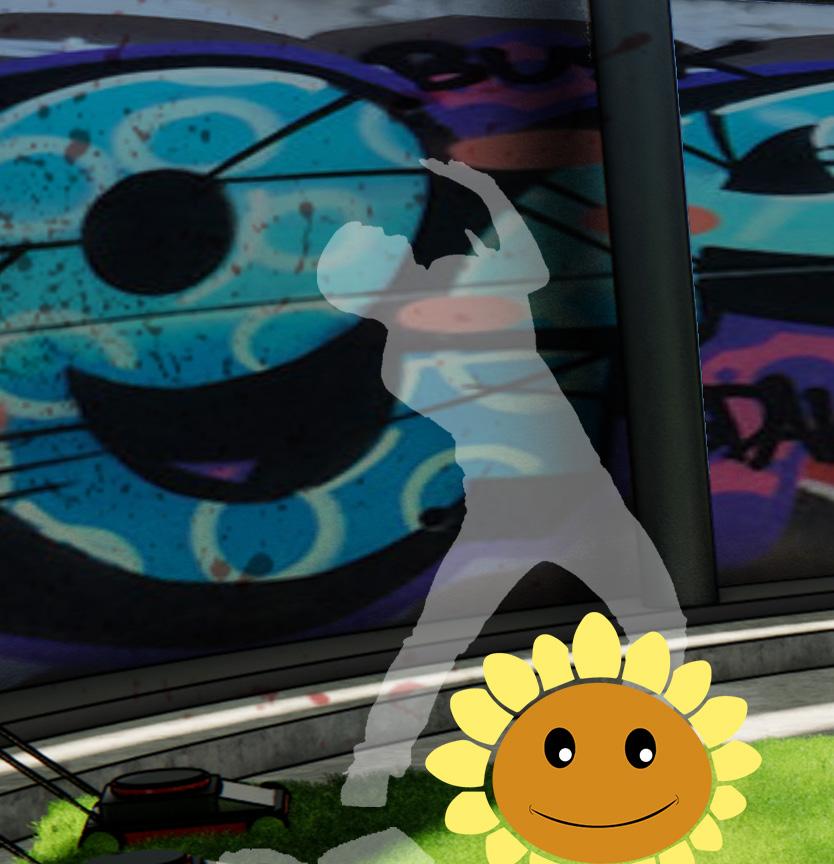

Farmers who survive the entirety of the 30-minute episode win the grand prize, the antidote! The project was completed along with a group of three other students.
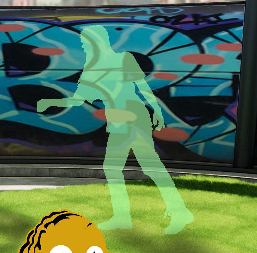
Stadium Perspective


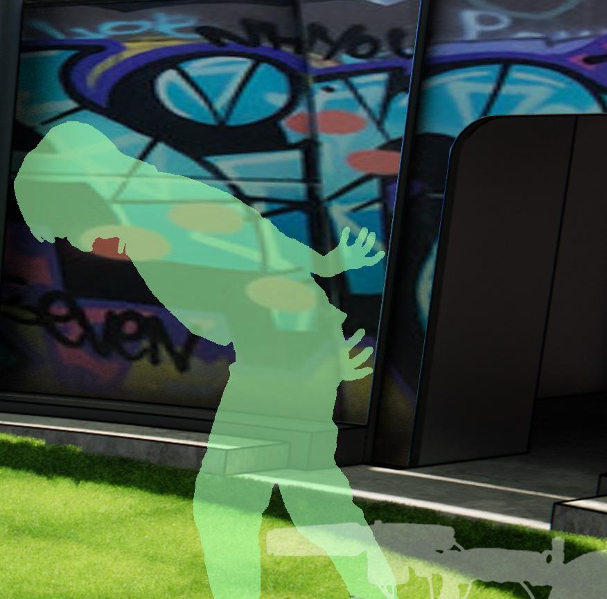
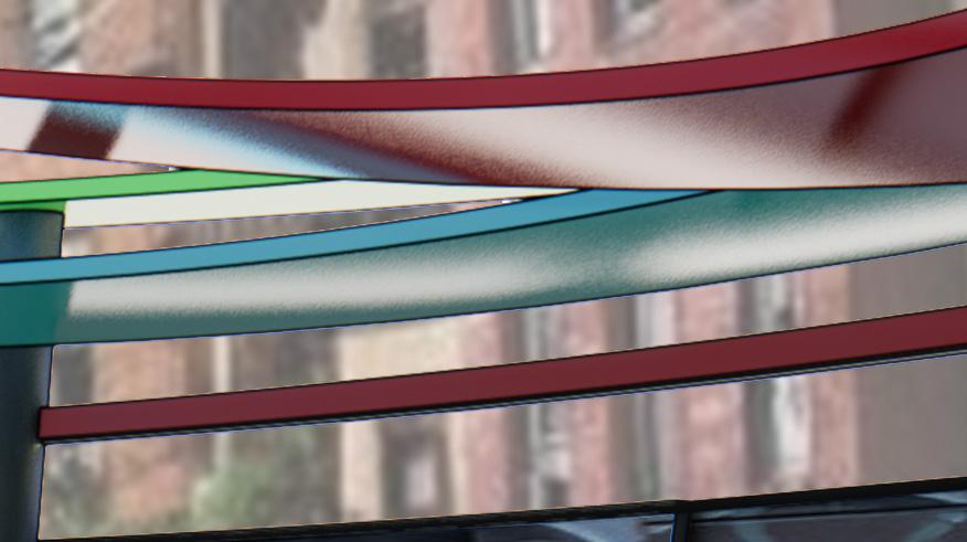
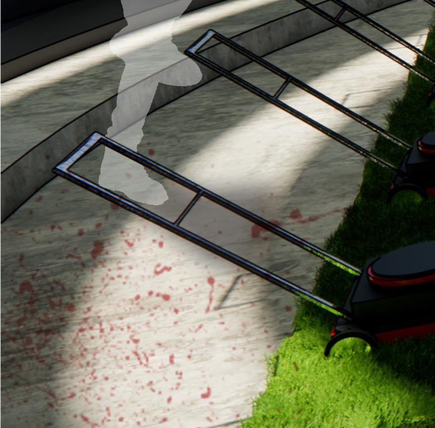
The perspective exemplifies the cold, apocalyptic interior of the game show stadium. It also visualizes how the game is played, with the contestants standing on the far left near their plants and lawnmowers, while the zombies emerge from the right of the stadium and a broadcaster films the gory scene.


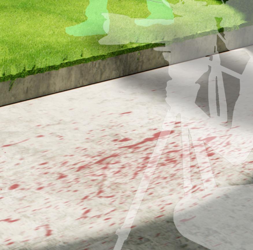

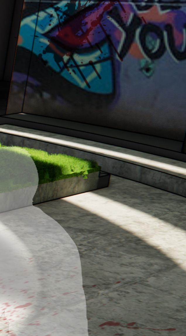
5
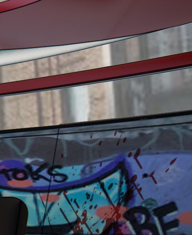
THE PLAYING FIELD
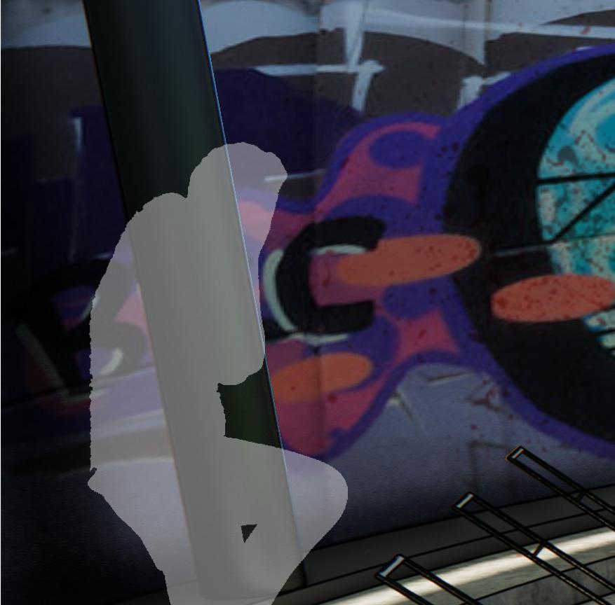
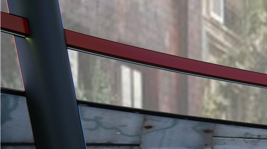
The arena design draws inspiration from the concept of the circle of life. Cold metal and concrete finishes around the exterior are covered in graffiti and surround a lush green game board, as the living battle the dead.
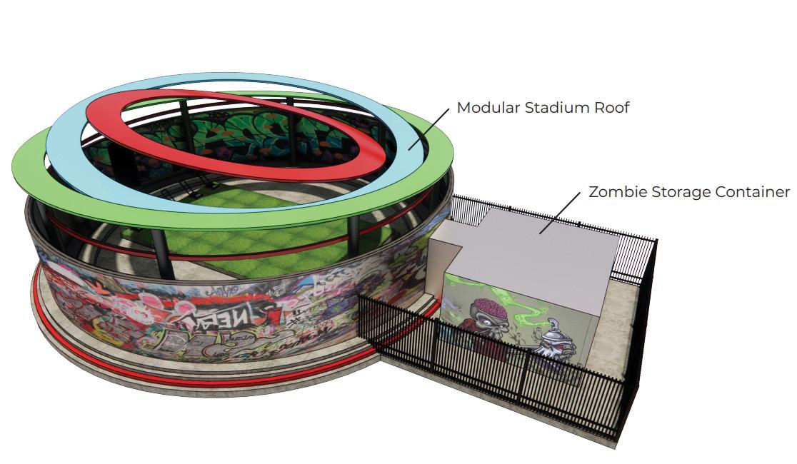
THE TWIST

Farmers’ Foray twists the odds against contestants through its separate appendages that move independently, the structure may shift randomly in game. Shadows cast across the garden make planting in these areas very difficult.
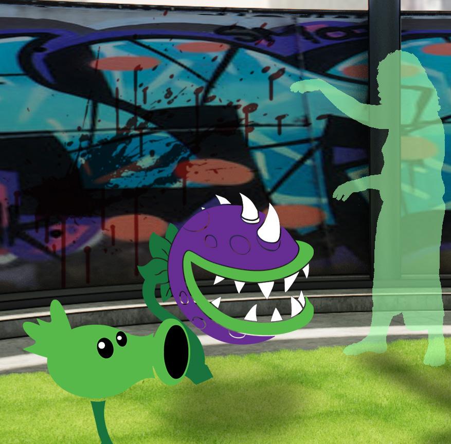
THE HEROES THE VILLAINS
Here comes the sun! Sunflowers are essential to a farmer’s success. These plants harness the sun’s energy and materialize it. Farmers can then use it to purchase more plants for their game.

Strength comes in numbers! These zombies are the first you will encounter. While they are easy to defeat, they can be quite tough during large waves.
Slow and steady wins the race! These trusty pea shooters are the farmers most basic line of defense. They can shoot to damage and kill zombies. Get your gloves ready! These frosty snow peas coat their projectiles in ice to damage zombies and slow them upon impact.

It’s time to turn the table on these zombies! This vicious plant drools at the sight of a tasty zombie and can devour them whole.

This tough nut will be your best friend to defend against zombies. Their hardy shell will hold the them back for some time - allowing you to safely destroy them from a distance!

Well-read zombies are highly irritable. They become even more dangerous if their newspaper is destroyed before they finish reading it.


Twice as tough and twice as cautious, the cone-head zombies are only able to be defeated once the cones are knocked off their head.
The Webber zombie is the last obstacle before reaching the antidote! Be careful, he is quite knowledgeable when it comes to fighting plants.

Trying to be unique, the bucket-head zombie protects themselves with a steel bucket, making them highly resistant to most attacks.


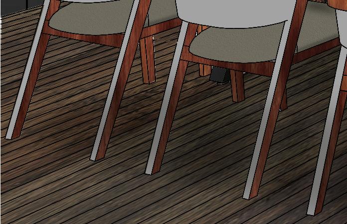
DESTINATION: PARIS
THE PROJECT
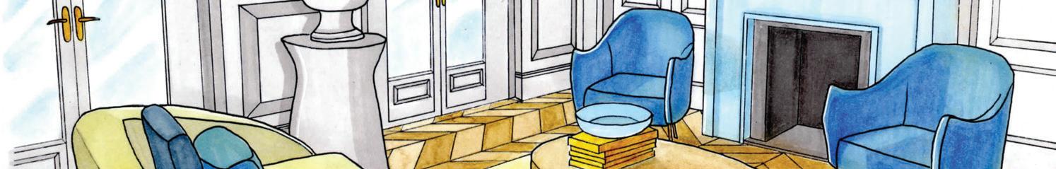
The Parisian apartment is designed for two clients, an interior designer and their spouse, a nephrologist. The clients use this apartment as a getaway escape, and require a workspace to operate their businesses while they are away. The design is centered on the primary areas of the residence: the study, living room, dining room, and kitchen. A tropical blue scheme is followed to provide the lovers with a vacation feel while they escape.
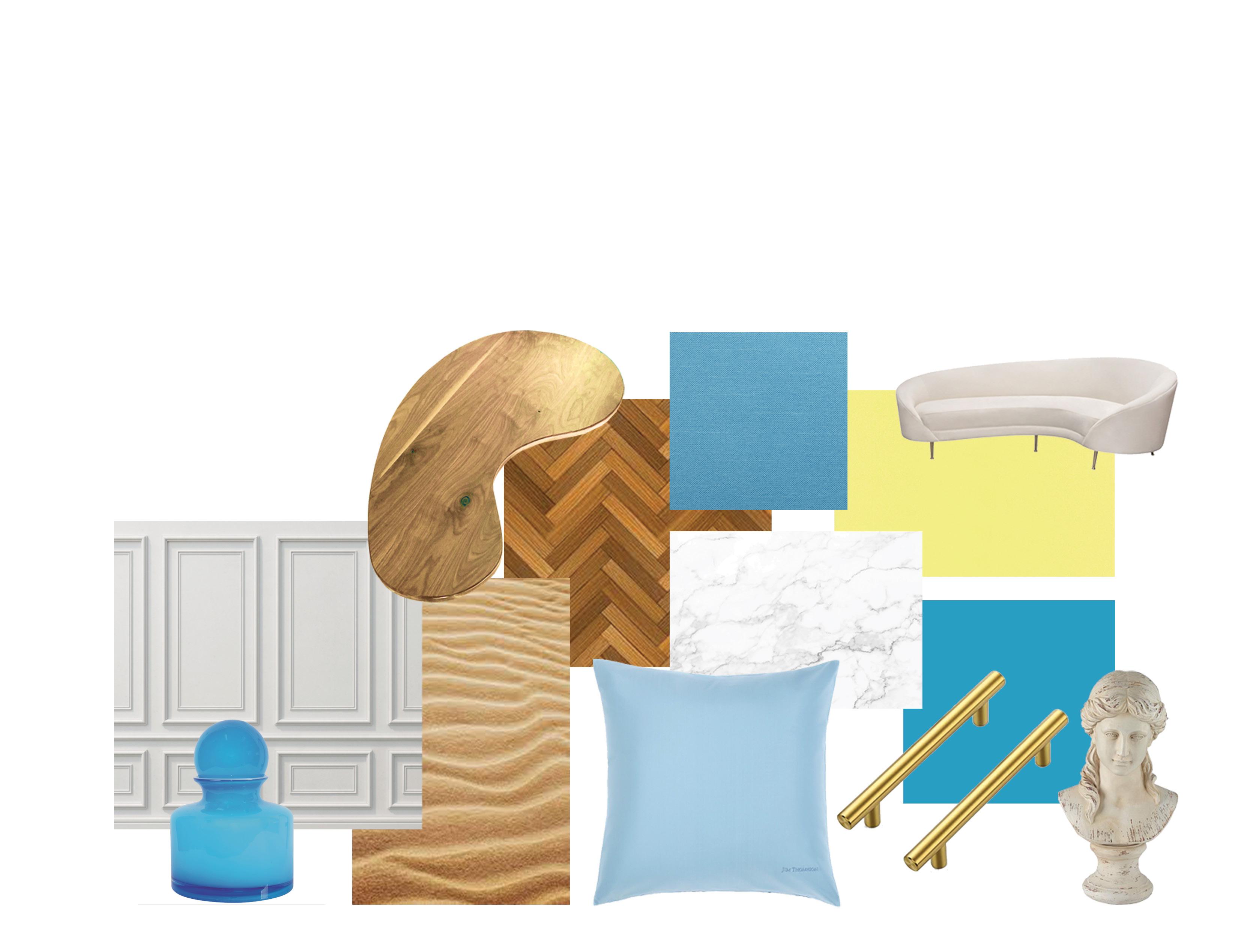
THE MOOD
Primary Areas Mood Board
The mood board exemplifies the rich, tropical feel present throughout the space through the use of blue, yellow, gold, and beige finishes.
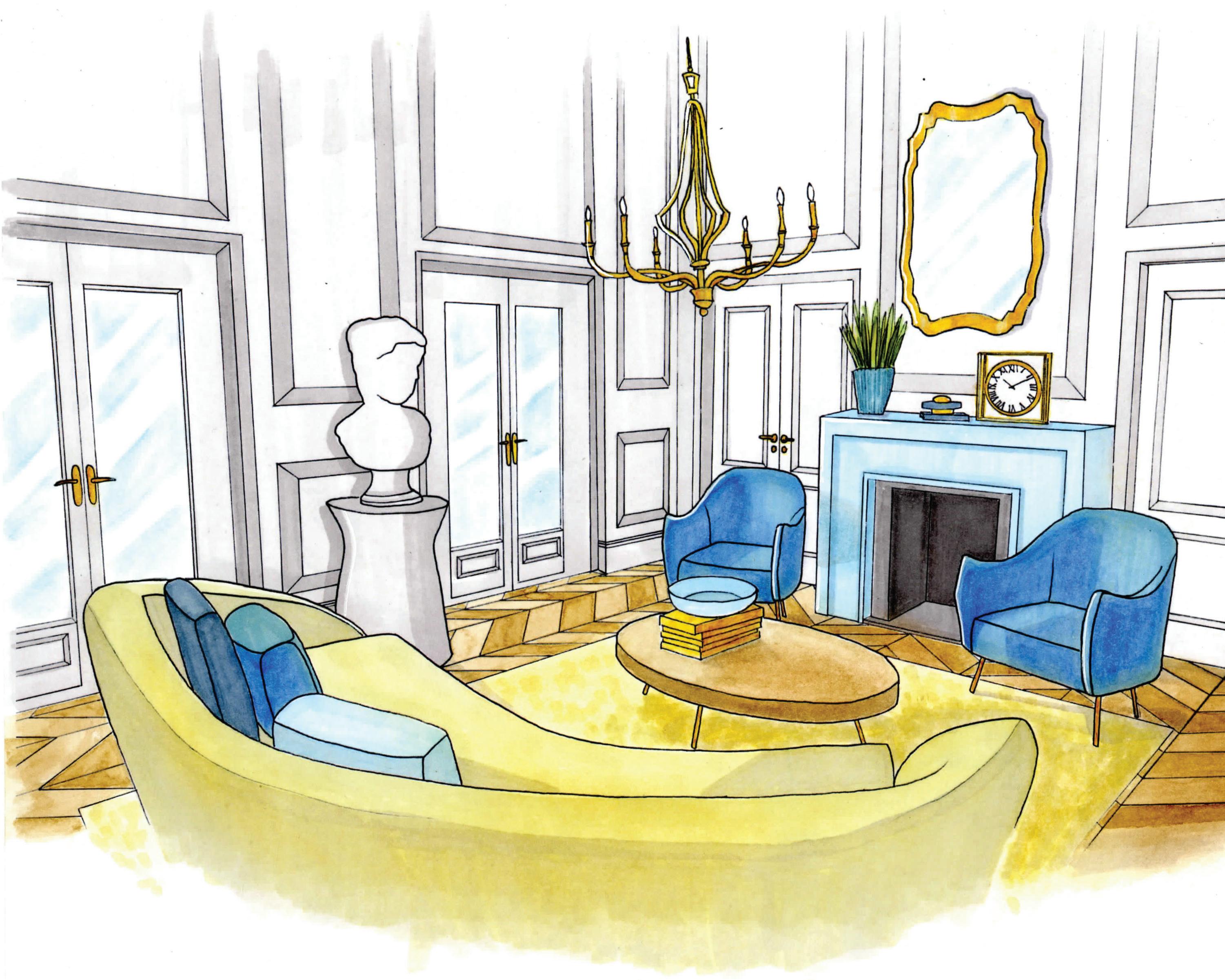
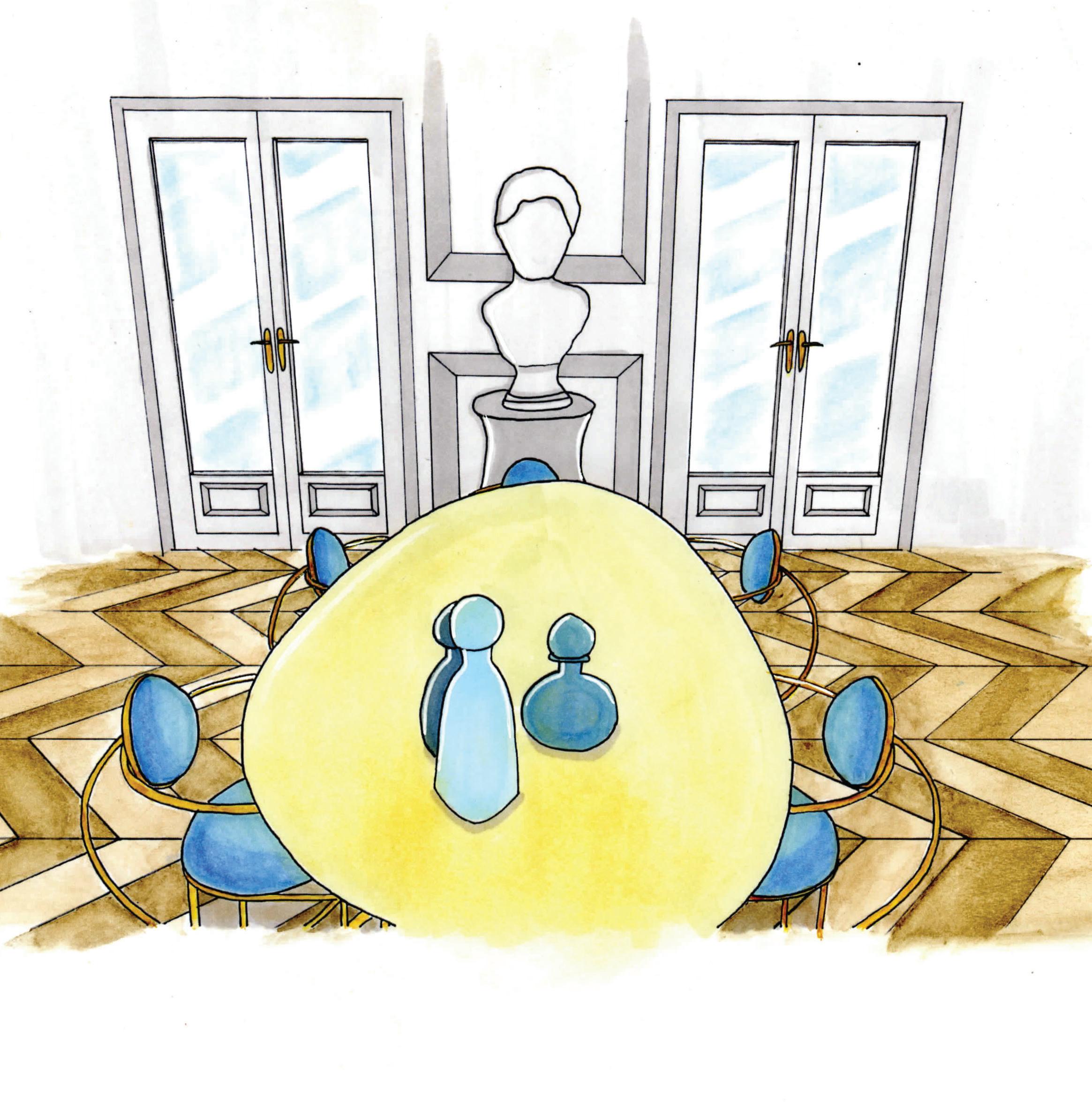
Living Room Perspective
The perspective of the living area exemplifies the kidney-shaped furniture present within the space that alludes to the client’s nephrology career. The living room follows a blue and beige color scheme to create a vacation feel. The perspective is hand rendered with colored pencils, pastels, watercolor, and marker.
6
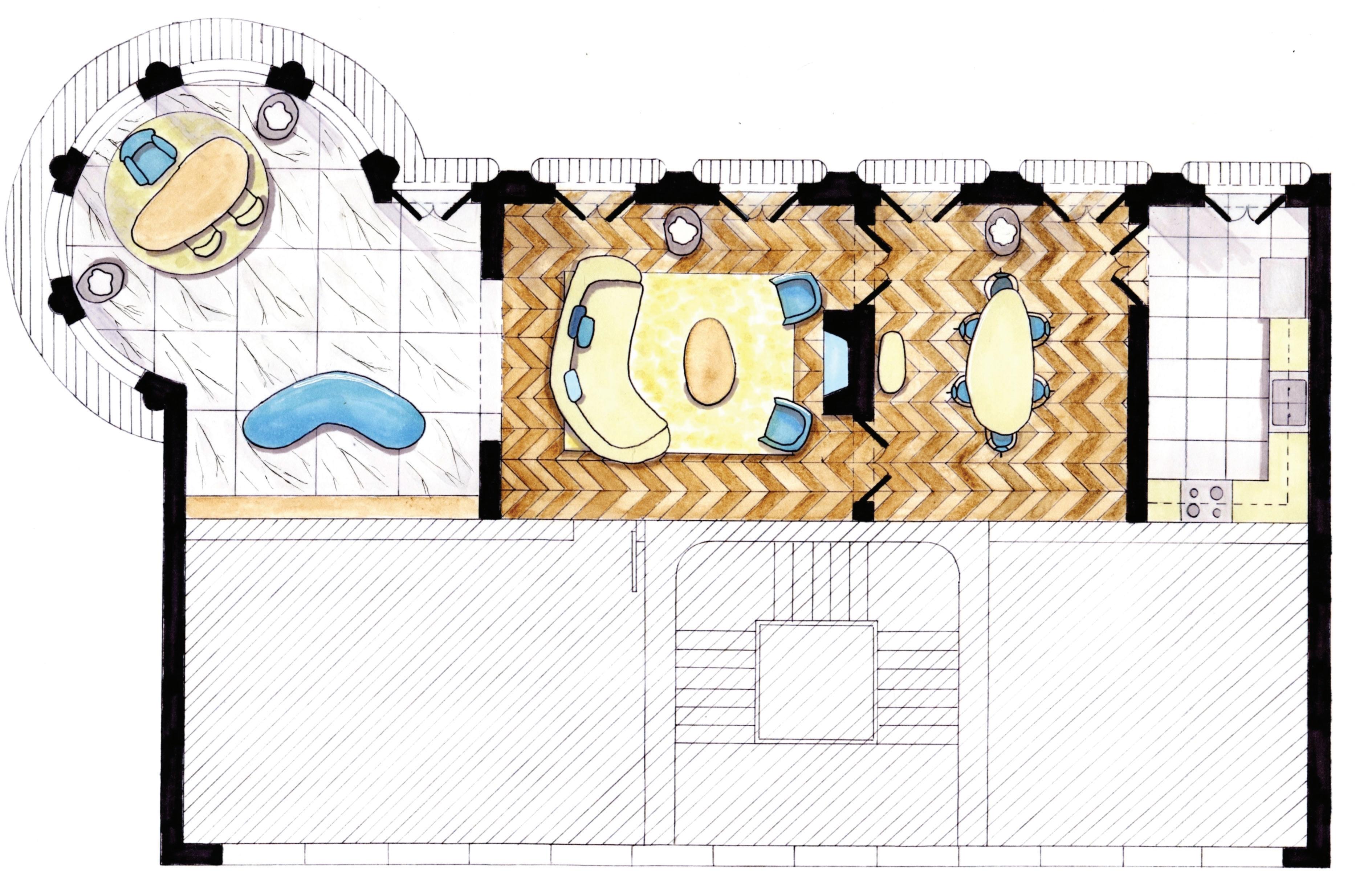
THE PLAN
Floor Plan
The floor plan illustrates how the primary areas are interconnected, and exemplifies the overall color scheme of finishes and furniture present within the spaces. The floor plan is hand rendered with colored pencils, pastels, watercolor, and marker.
4
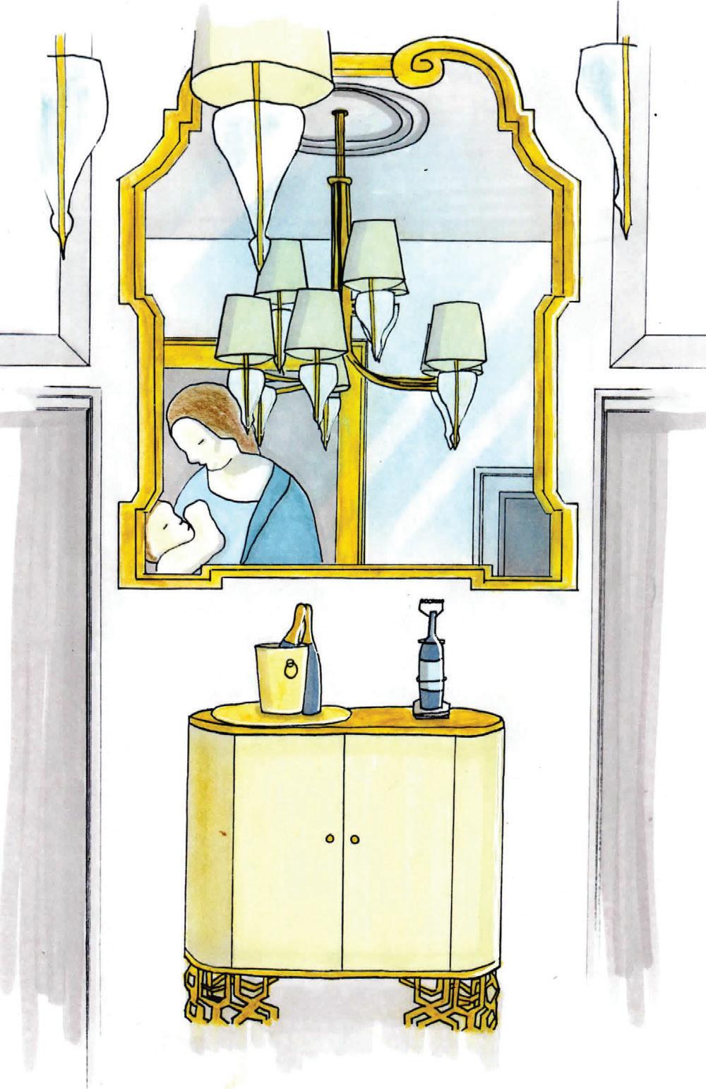
Dining Room Vignette
The vignette focuses on the bar area, located left of the dining room table. It is rendered with colored pencils, pastels, watercolor, and marker, and follows the same color palette as the rest of the residence.
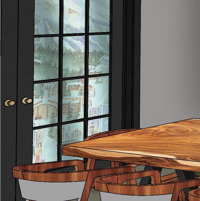
THE DINING
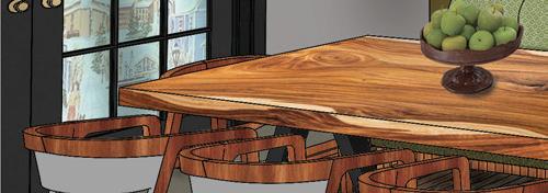
Dining Room Perspective
This perspective highlights the dining area in the residence, with the dining table in the foreground and the French doors in the background. It shows in greater detail the multi-colored herringbone flooring, and is rendered with colored pencils, pastels, watercolor, and marker.
4
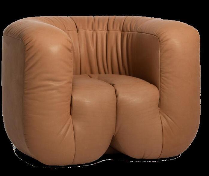
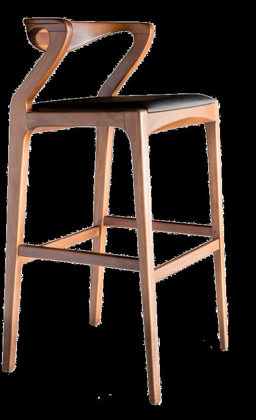
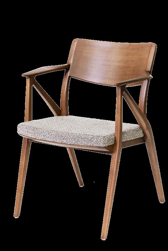
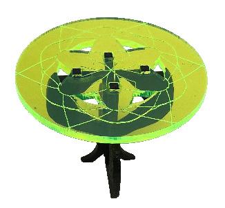
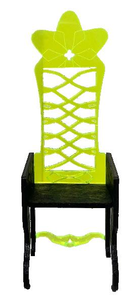
THRONE OF THORNS


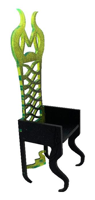

THE STORY
Maleficent is a fairy and a protector of the Moors, a community of magical, supernatural beings that reside in an enchanted forest. Before her switch to a dark fairy, Maleficent was lively, naive, and open to the world. It was not until her treason and heartbreak, which came from a human peasant boy who amputated her wings to ascend the human kingdom throne, that her darkness came out. This lessened her willingness to interact with humans as she feared another betrayal. Her disdain for humans earned her the title of the mighty ruler and defender of the Moors, which she maintained until she came across Aurora, her traitor’s daughter.
Maleficent’s maternal love for Aurora outweighed the hate in her heart for humans. She loved Aurora so much she reversed the curse she formerly placed upon her in hopes of punishing her father, and eventually crowned Aurora the Queen of the Moors. Nevertheless, though Maleficent grew less vengeful, her distrust in humans remained, as did the urge within some humans to harm the Moors and rid Maleficent of her powers.

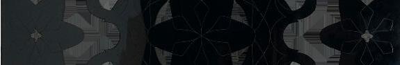
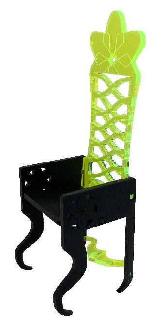
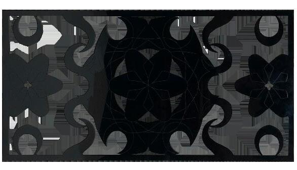
THE DESIGN

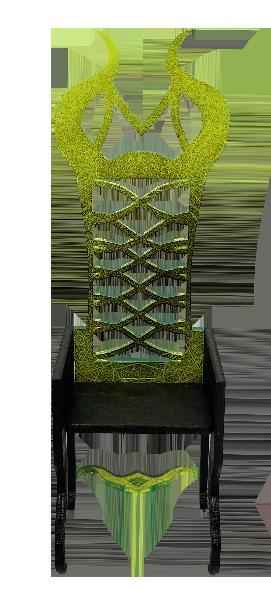


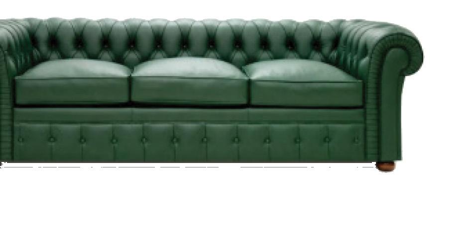
The design of the furniture draws inspiration from Maleficent and the enchanted world of the Moors. Maleficent’s iconic horns are reflected on the legs of the furniture pieces, as well as in the design of the panel. To contrast these dark, morbid elements, floral elements are incorporated within the design to reference both Maleficent’s vulnerable side and Aurora’s blossoming personality. The floral elements are surrounded by thorns, though, to protect the flowers, much like Maleficent does for Aurora.
TABLE
7
MALEFICENT’S THRONE
AURORA’S THRONE
PANEL SIDE

eb20o@fsu.edu | (786) 657-9238 | linkedin.com/in/esbusto LinkedIn QR EB EB Estefany Busto