COLOR THEORY IND5325 RVC 1228 FINAL BOOKLET
ERLYM
BY
RODRIGUEZ
TABLE OF CONTENT M.0 WHO AM I? M.02 COLOR + THEORY M.04 COLOR + PERCEPTION M.03 COLOR + DESIGNER M.05 COLOR + FILM M.06 COLOR + HEALTH M.08 COLOR + RETAIL M.07 COLOR + BALANCE M.09 COLOR + WORKPLACE M.10 COLOR + HOSPITALITY M.O1 COLOR +CULTURE


HEY, THERE I’M ERLYM…
BACKGROUND
Where I am from ? Havana is in Cuba in case you don’t know.

What is my family composition? Is two of us , but I’m the little girl.
What languages do I speak ? English and Spanish very basic but I’m bilingual.
Where do I live? Where people vacation and there’s no winter(MIAMI)
When was my first interest in design? I mean ever since I was a little girl I wanted to change around and decorate etc., everything around me.
What factors have affected my path? I had to learn a whole new language at 18 before starting all this. Kind of frustrating since I had to learn the language from scratch not with tv. Out of nowhere Ieft all the people I grew up with, but after all this was my dream.
Major: Interior architecture

Current degree: AA in Interior Design

EDUCATION
About three years ago I began my professional studies towards interior architecture. However, I have always had an attraction towards everything that has to do with design and creative currents.

I think that interior architecture is a discourse that can have many voices, many senses, but its pro richness, to a large extent, comes from the depth and reflection that can exist in it. I am a person attracted to details and I find in the subtleties attributes that are sometimes unnoticed, a lancet richness that is not always revealed.
Interior architecture is loaded with details that are the ones that give it infinite possibilities.
TRAVEL


I’VE BEEN TO SEVERAL COOL PLACES…


 Paris, France London, England
Amsterdam, Holland Punta Cana, Dominican Republic Brussels, Belgium Cancun, Mexico
Paris, France London, England
Amsterdam, Holland Punta Cana, Dominican Republic Brussels, Belgium Cancun, Mexico
HOBBIES
I love…

Reading books Hanging out with my friends
Watching new shows Decorate everyone's house

My color FOR LIFE is PINK ! BUT…


Pink is the color I use for everything that’s for me. But when we talk about designing, I like to keep it neutral …

C
olor
I absolutely love Photography look:
Photography often drives me to discover new things and to pay attention to the smallest of details. Light, shadows, colors and the textures of things that other people do not appreciate. It makes me see the world from another perspective. My grandfather gave me my first camera at the age of 16 as a birthday present while living in Cuba. Before I started traveling, I had to resort to what was within my reach.

M.1 COLOR + CULTURE

CUBA-DUBAI


When looking for the brightest hues as inspiration for an interior or exterior, consider the unmistakable palette found in Cuba. As an antidote to neutrals like gray and beige, a touch of brilliance can go far in transforming a room or an architectural element such as a stairway or door. The colors seen on these 14 buildings range from cobalt blue, bananaleaf green, and the occasional chocolate brown to sunbleached yellows and pinks. They defy definition they’re not quite primary, and yet they are more luminous than the pastels found elsewhere in the Caribbean. Cuban culture relishes the pure and saturated pigments covering entire façades and other large edifices. Let these historic buildings inspire you to bring a certain luster into your own home.


CUBA
Dubai is very cosmopolitan and never fails to impress us with its astounding beauty, energy, and cultural diversity!.


From initial impressions it’s easy to assume that lovers of colors, like me, will struggle in such a neutral landscape, but in fact the opposite is true. Not only can you find colors in Dubai’s rich cultural and culinary heritage, but it’s also urban and natural environment is full of colors too, you just need to change your perspective.

DUBAI
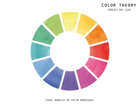
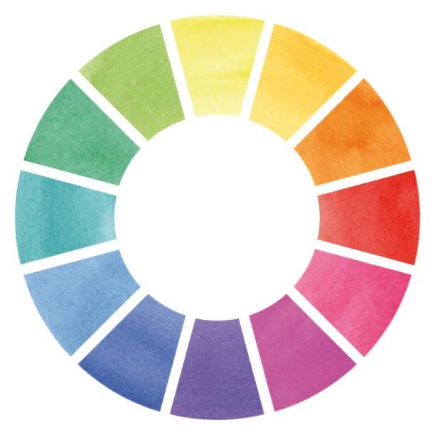
M.2 COLOR + THEORY
Color theory is both a science and an art form. It describes how humans perceive color as well as the visual effects of how colors mix, match, or contrast with one another. Color theory also includes the messages that colors convey as well as the methods used to replicate color.
Colors are organized on a color wheel and classified into three categories in color theory: primary colors, secondary colors, and tertiary colors. More on that in a moment.

There is no color in the absence of light. The visible spectrum refers to the light that the human eye can see. Color has three dimensions: hue, value, and chroma.

The pure color in the visible spectrum is referred to as hue. The hues are classified as primary, secondary (created by combining two primary hues), and tertiary (created by combining secondary and primary hues).
A color's value is its degree of lightness or darkness.
The saturation of a color is measured by the absence of white, gray, or black. The absence of a hue is referred to as achromatic.
Complementary colors are those that are opposite each other in the color wheel.
COLOR + DESIGNER
BARRAGAN’S HOUSE, MEXICO CITY

M .3
ABOUT THE ARCHITECT
Born in Guadalajara in 1902, Luis Ramiro Barragán Morfín is regarded as the most prominent figure in modern Mexican architecture. By the time of his death in 1988, his persona and way of working had attained almost mythical status, and the interest in his oeuvre has increased ever since.


Barragan's upbringing in a family of wealthy landowners was guided by a humanistic education and strict observance of Catholicism. The Mexican Revolution significantly impacted his family’s estate, as large properties were expropriated in the wake of agrarian reforms.
Barragán studied architecture and engineering at Guadalajara’s Escuela Libre de Ingenieros; his education was supplemented by what proved to be a formative trip to Europe in 1929. The European continent continued to be a source of inspiration for Barragán, and he returned multiple times over the course of his life.
ABOUT THE PROJECT
The personal residence built by Barragán in 1948 at 14 Calle Francisco Ramírez in Mexico City. The experience of the interior which simultaneously embraces modernity and tradition in a contemporary interpretation of the domestic space has an emotional component that continues to fascinate. The rationality of the geometric layout and functional organization typical of mid-century modern residential design is subtly subverted here, as a series of orchestrated views triggers a chain of sensuous responses and associations. Eluding any easy categorization, the whole spatial experience is best conveyed with emotive language; commentators refer to the house with words such as “enchantment” and “spellbound”, terms more commonly found in a lyric work than in the architectural discourse


USE OF COLOR

Barragán used colors in a very peculiar way. He did not choose his colors at random, he definitely put a lot of thought into which color went where, however, to the normal eye, it looks like he just splashed at bright magenta on the left wall, and a canary yellow on the right wall, and just almost forgetting that it might be a good idea to add a cool tone onto the structure. Barragán used color in a way that would accentuate the beautiful of the natural environment.


USE OF COLOR
He also believed his buildings were a place for serenity, to “evoke emotions and sensations” such as inner experience, remoteness, fantasy, and nostalgia. His color selections range from blue, to orange, pink, magenta, purple, red, but never green. Green, he said, is solely “for plants.” Black is used to hide the bottom of ponds. Through these color ideals and the influence of his friends, collaborators, and exposure to non-Mexican architecture, Barragán fused Mexican architecture with both American and European influences to create a vibrant and unique style that praised and


USE OF LIGHT

Color, light and space. These are the elements of this house that make it exceptional. Barragán used and manipulated "the places in between" the main rooms of the house. The most prominent was the reception room, having come through a low and dark corridor you arrive at a multi level space, with huge windows up high. The main purpose of these was to let in light and offer glimpses of nature outside, but they were positioned like most of the windows in the house to make seeing in very difficult. There are multiple art works that help channel light around the space, a large gold painting and the famous mirrored spheres reflecting the light and offering new perspectives. It was amazing how these clever tools enabled Barragán to use such a small amount of artificial light in the house. Barragan's use of light and color aimed to give an almost spiritual response to them, bypassing reason and appealing to a more intuitive reaction.


USE OF LIGHT

In this house Barragan’s made an emphasis on color, light, shadow, form, and texture. The unimposing façade facing the street humbly blends in with its neighbors, giving no hints to the personality of it's interior. The most prominent aspects of the design of Casa Barragán are the use of flat planes and light, both natural and artificial. The skylights and windows allow for visual tracking of light throughout the day; the floods of natural light and views of nature are the key purposes of the windows.


“The ideal space must contain elements of magic, serenity, sorcery and mystery.”
Luis Barragán
M.4 COLOR + PERCEPTION
A variety of factors influence how we perceive, act, and talk about color, from the biology of our eyes to how our brains process that information, to the color words in our languages categories. There's plenty of room for variation every step of the way.

Color and shape are qualities of objects that are intended to draw and hold our attention. Color is one of the most powerful elements for expressing personality, creating visual appeal, and generating consumer interest.

M.5 FILM ANALYSYS
GRAND BUDAPEST HOTEL [West Anderson,2014]

Film Summary

In the 1930s, the Grand Budapest Hotel is a popular European ski resort, presided over by concierge Gustave H. (Ralph Fiennes). Zero, a junior lobby boy, becomes Gustave's friend and protege. Gustave prides himself on providing first-class service to the hotel's guests, including satisfying the sexual needs of the many elderly women who stay there. When one of Gustave's lovers dies mysteriously, Gustave finds himself the recipient of a priceless painting and the chief suspect in her murder.

Scene 1 ANALYSIS

the famous concierge of the Grand Budapest, a marvelous European

Scene 2 ANALYSIS
purple uniforms of the hotel staff while swallowing up Madame D who now wears a red coat. This scene is the only time we see Madame D as after this she is killed, and M. Gustave is framed for her murder. Her being lost in the background of the frame is a way of slowly making the character less important to the audience because she needs to die to progress the story. In contrast, a young Zero Moustafa (the new lobby boy at the time) and M. Gustave are fully emphasized here, establishing their importance throughout the rest of the film because they are the only prominent things in this frame.


Scene 3 ANALYSIS

In this timeline which is a short one during 1985, brings us to the elder-self of the author talking about the true stories behind the book, again in a brown and orange pallet. And the fourth one shows us a later period in the author’s graveyard. Where colors are drained out to picture a cold world and a young girl interested in learning about the glorious days of the grand Budapest hotel by the book.


Scene 4
ANALYSIS


Scene 5 ANALYSIS
Conclusions
And this is how the color pallet of the film formed. Some believe that the world that Wes Anderson creates is slightly artificial, but within that world, the emotions and feelings are very real. So, Anderson’s color pallet helps him tell larger than life stories that evoke our interest in fantasy but holds a real message deep inside it. The colors of the Grand Budapest Hotel speak to us about a fanciful hotel at the heart of a dark time when war has washed away happy colors from people’s life and taken away the most beloved things they have.

COLOR + HEALTH M .6
In this chapter, we learned how color can affect people's mental health and how designers choose specific colors for different situations.
Color is an extremely effective communication tool that can be used to signal action, influence mood, and even influence physiological reactions. Certain colors have been linked to physiological changes such as increased blood pressure, metabolism, and eyestrain.


COLOR + BALANC E M .7
A dominant color temperature is required for a balanced color arrangement. This draws attention to the subordinate color because it stands out in the dominant field. A small area of warm can balance out an overall cool color temperature, or vice versa. Color balance in general is used to correct colors other than neutrals or to intentionally change them for effect.


RETAIL ANALYSIS
Miami Design District Celine Store

COLOR + RETAIL
M.8
Contrast of Hue
Contrast of Value
Contrast of Design Feature

Contrast of texture
Focal Point References
Content
Contrast of Hue
Utilizing colors that are opposite one another on the color wheel results in a contrast of hue. The color contrast is greater the farther apart they are from one another. This technique produces focal areas that draw your attention to the contrast. In this illustrations, the use of color contrast is achieved between this unique blue-tinged marble and those weathered wooden looks.


Contrast of Value

There can be high contrast (a big difference between light and dark) and/or low contrast (not a big difference between the light and dark). Those Celine’s advertisement are a great example of high contrast. There is bright white as well as deep, dark black. The effect of this high value contrast is that it really pops.

Value refers to the relative lightness and darkness of shapes in a composition. Understanding value contrast can help you add a new dimension to your own art. Value contrast refers to the amount of contrast between two areas of different value. It’s the relationship between a light area and a dark area.

Contrast of a Design Feature
When presented in various ways, emphasis can be recognized as hierarchy. The interior balances out its ethereal color palette with more angular forms, including sharp-cornered columns and structures seen throughout the store. Perhaps the most impressive feature is the pyramidal covering over the staircase that extends from the ground floor to the second floor.


Contrast of Texture
The precious stone clads walls, ceiling, specific floor sections, displays, and even the boutique’s façade, offering a subtle yet distinct contrast to the robust concrete pillars, benches and grey carpeting. Thick slabs of marble have been used as display stands for shoes and handbags, while clothing items are hung on simple brushed brass railings. Further textural detail is presented by grey, suede like rugs and cushion seats.


Focal Point
Focal Point
Design elements can be used to emphasize a focal point in interior design. This helps the focal point dominate the space and pull the design together. Whatever the focal point is, it should be better at drawing the eye than other areas of the room. The principle of emphasis highlights and draws attention to a specific area of the room, creating visual impact and a foundation upon which to build the rest of the design. Undoubtedly this pyramidal that covers over the staircase and extends from one floor to another draw's attention from the first moment you see it, that's why for me it is the focal point of this place.
COLOR + VARIETY
Commercial Design Analysis
Project: One Workplace
Architect: Design Blitz
Location: 2500 De La Cruz Boulevard, Santa Clara, CA 95050, United States

M.9
VARIETY is a principle of design that is concerned with the combination of one or more-color elements that use line, shape, texture, and/or pattern to create diversity and contrast in an interior space.
Project: One Workplace


Architect: Design Blitz
Location: 2500 De La Cruz Boulevard, Santa Clara, CA 95050, United States.
Discussion Details

One Workplace hired Blitz to combine an existing stand-alone, mid century office building and warehouse into a 35,000-squarefoot space accommodating an office, and showroom for the Bay Area workplace furniture dealers. As an adaptive reuse project, the company’s headquarters invigorates a previously overlooked industrial area and gives it new life. A highlight of the interiors is the central form of two stacked boomerang-like C-shaped structures representing “collaboration” and “creativity” that house an elevated conference room and observation platform for a bird’s-eye view of systems solutions. The boomerang concept also shapes the user experience, which assures that customers are guided through the entire showroom, stopping at a series of mapped touch points showcasing a variety of furniture vignettes. . Design Blitz planned for longevity and flexibility by providing a raised floor system in the open office for easy future furniture reconfiguration as well as limiting color and pattern to elements that are easily interchanged as trends change.


One Workplace in Santa Clara, California, garnered a collection of awards and nominations for their innovative new space for a new era of manufacturing headquarters and showrooms. A former paper-plant warehouse was transformed to meet the needs of their new space. An exterior cladding feature textured wall was requested to meld with the reclaimed and reworked industrial aesthetic carried through from the former warehouse. Arktura collaborated with Design Blitz SF to develop a custom perforated pattern in raw steel sheets to patina and leverage the environmental graphic’s relationship to the prevailing industrial structure. The result is an impressive entry facade sure to inspire those who walk through it.

Shape
Texture (Wall) Pattern
Line
(Ceiling)
(Rug)
(Furniture)
When line, texture, shape, and pattern are well designed and combined, they help the space to be productive.


Commercial Design Analysis Project: The Miami Beach Edition Architect: Nichols Architects Location: 2901 Collins Ave, Miami Beach FL 33140 M .10
COLOR + VARIETY


LOBBY BAR
DISCUSSION
The lobby bar of the Miami Beach EDITION hotel incorporates a variety of design elements such as colors, shapes, patterns, and textures to create a harmonious perform of great design. The glamour of 1950s Miami Beach can be found in every detail of the Lobby Bar, from the original gold and marble columns to the Latininspired soundtrack. With mesmerizing ocean views and a lush interior ideal for people watching.

COLOR + LINE
A line is a two-point connection in space. A line can define forms, create shapes, and include icons and symbols. Vertical lines, such as the columns of the bar's showcase, represent strength and stability. Verticality provides upward and downward movement, emphasizing height and creating expansive interiors.
COLOR + SHAPE
A shape is formed by connecting one or more lines to form a two-dimensional image. The rectangle is a stable shape, such as the front desk form, which adds variety by having two sides of varying widths. A rectangle is a more visually appealing shape than a square, and a rectangular room allows for more spatial arrangement options because it is slightly more complex.
COLOR + TEXTURE
This area is decorated with gold texture columns. Texture is the visible or tactile quality and character of a material that outcome from how it is built, prepared, or used together.


C O L O R + P A T T E R N
The amazing display of marble used by the designer on the floor and some columns in this space creates pattern. Pattern scale, material textures and finishes, and color harmony all contribute to visually appealing design.
 C O L O R + P A T T E R N (Column, Floor)
COLOR + LINE ( Bar)
COLOR + SHAPE (F ront-desk, wall)
COLOR + TEXTURE (Columns)
C O L O R + P A T T E R N (Column, Floor)
COLOR + LINE ( Bar)
COLOR + SHAPE (F ront-desk, wall)
COLOR + TEXTURE (Columns)
LOBBY BAR


MATADOR ROM
DISCUSSION
The signature restaurant of The Miami Beach EDITION. Featuring a supper clublike atmosphere reminiscent of the 1940s. Showing a variety of design elements which combine interesting color elements with lines, shape , pattern, and texture creating a diversity and contrast in the interiors.

COLOR + LINE
The way as the puffy background wall's lines are used and combined with color can determine the effectiveness of an interior space. Without line, no other aspects of a composition would be possible.
COLOR + SHAPE
The restaurant uses a circular shape repetition, particularly in the ceiling, lamp, and center of the restaurant, and the variation of circle size and concentric circles add rhythm and movement to this design.


COLOR + TEXTURE
Texture is visible on the furniture, such as the fabrics used for the sofa and pillows. Some textures might be found on the furniture, such as the high gloss tables and the sofa fabrics. The texture is smooth and provides a sense of calm and comfort.
C O L O R + P A T T E R N
The floor and counter have different wood patterns, adding to the restaurant's variety. The visual differentiation between the patterns creates visual movements that contribute to the restaurant's unity.
MATADOR ROOM
COLOR + LINE (Background Wall ) COLOR + SHAPE (lamp, ceiling lamp )
COLOR + TEXTURE (Furniture) COLOR + PATTERN (Furniture )
REFERENCES
Color + Design – Transforming Interior Space, Third Edition by Ron Reed
Bellantoni, P. 2005. If It’s Purple, Someone’s Gonna Die: The Power of Color in Visual Storytelling. London, UK: Taylor & Francis. IMDb. 2014. The Grand Budapest Hotel [online]. IMDb. Available from: https://www.imdb.com/title/tt2278388/?ref_=tt_ch [Accessed 20th May 2018]
Kalmus, N. 1935. Color Consciousness. Journal of the Society of Motion Picture Engineers [online], August 1935, pg 139 – 147. Wikipedia. 2017. Natalie Kalmus [online]. Wikipedia. Available from: https://en.wikipedia.org/wiki/Natalie_Kalmus [Accessed 20th May 2018]
https//www.archdaily.vom/407806/one-workplace-design-blitz https//www.studioblitz.com/work/one-workplace https//wwwdesignboom.com/architecture/design-blitz-one-workplace-headquarters/ https//www.wescover.com/p/interior-design-by-blitz-at-one-workplace—
https://www.editionhotels.com/miami-beach/restaurants-and-bars/matadorroom/https://upgradedpoints.com/travel/hotels/the-miami-beach-editionreview/https://www.editionhotels.com/miamibeach/gallery/https://www.forbes.com/sites/taylorboozan/2017/12/12/the-modern-glamour-of-miamibeach-edition/?sh=30e503f72cdb
Celine’s Flagship Minimalistic Store in Miami/Host by: Camila da Paz/ Marble design Colorsontheweb/color-theory/Color-Contrast. World Heritage Site (Luis Barragan house and Studio) © Fundación de Arquitectura Tapatía Luis Barragán A. C. The Technicolor Corners of Barragan's Mexico City Destinations, Architecture, Guides. Agresta, Carlos. “Casa Luis Barragán: Poetry of Color.” Architecture Week. Artifice Inc., 29 Nov. 2000. Web. 25 July 2015.