Catalogue 31 1502 1927 Fine Prints GILLIS G OLDMAN
GILLIS GOLDMAN FINE ART T +32 2 503 14 64 | W www.gillisgoldman.com | M noemie@gillisgoldman.com 1, rue aux laines | 1000 Brussels | Belgium October 2022 catalogue 31 GILLIS G OLDMAN 1502 1927 Fine Prints
Desire awakens only to things that are thought possible
René Descartes, Discourses (1637)
Dear Friends,
This catalogue is a special edition produced for our fourth exhibition in New York this 26 to 28 October, following a two-year break imposed by the Covid-19 pandemic. Verily, this year’s event has been eagerly awaited. We will once again be able to celebrate – together, in person – our dedication to old and 19th century master prints. It is always a privilege to be near such unusual treasures, and we look forward to discussing their intricacies and stories with you.
This catalogue our largest to date, comprising more than sixty prints dating from the early 16th to early 20th century. In all honesty, we are amazed that such a fine collection can even be gathered in this day and age; that private collectors and institutional curator can continue to build, expand, and complete their collections with such exceptional works in this essential field of history. As always, our criteria for inclusion are printing quality and state of preser vation – and of course, art historical interest. But also, artistic originality: how the image, composition, and subject speak to us; how the printmaker was able to achieve this emotional impact, and what unique touch and sensitivity were required to do so. It is a thrilling dia logue. Each print holds special meaning for us, and each was selected with no small amount of excitement. We would love to introduce all of them in this preface. Instead, we invite you to explore fully them in the forthcoming pages. We will, however, dwell upon six gems that have especially captured our hearts.
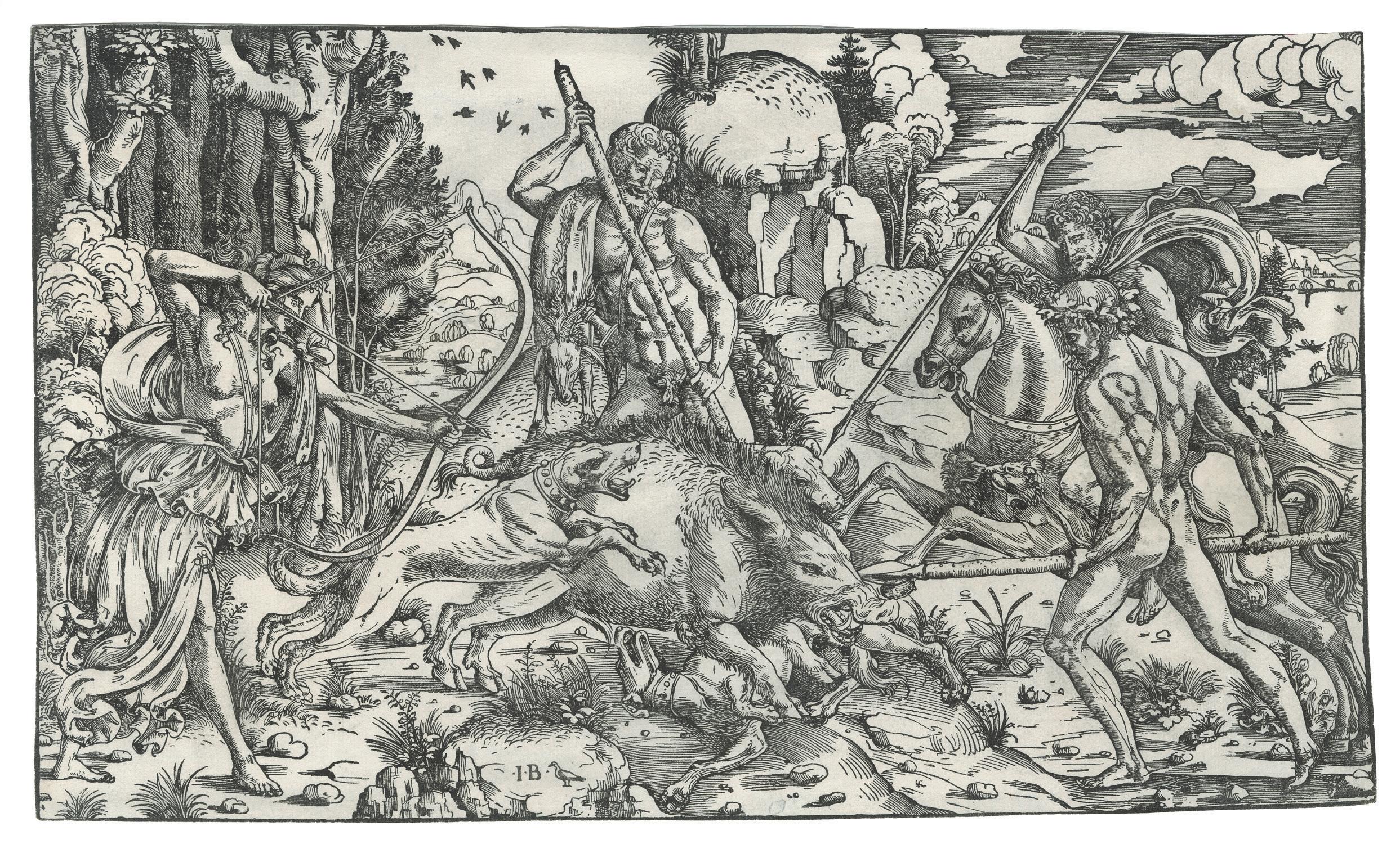
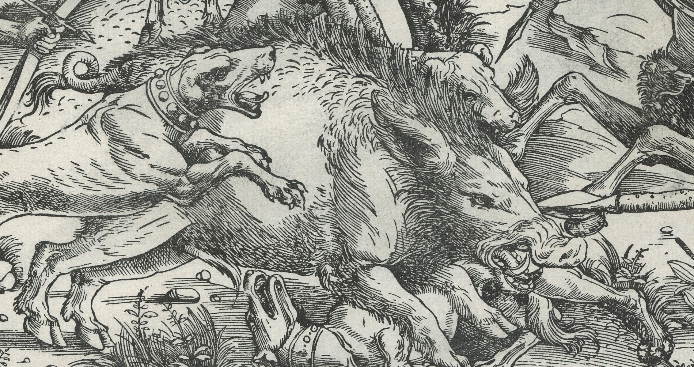
Chronologically, we must begin with the exceptional The Calydonian Boar-Hunt by Giovanni Battista Palumba (a.k.a. The Master I.B with the Bird). There is so much to say about this large woodcut made in Rome c. 1502-11, that it is by far the longest entry in this catalogue. Palumba has attained near myth-like status in the history of Italian printmaking. He was one of the earliest Italian printmakers to produce independent woodcuts and engravings featuring mythological subjects, often erotic in tone. The present figurative composition, with its highly complex and humanistic pictorial program, is enormously fascinating. It is also exceptional in size and quality. Its significance for the history of art occurs on many levels. Adding to its allure is the fact that until just recently, there were only four known recorded impressions in existence. Two at the British Museum, one at the Berlin Kupferstichkabinett, and one at the Bibliothèque Nationale de France in Paris. All four are in problematic condition (see entry). The one presented here, however, is in fairly good condition. It must have been kept in an album. A rare and special moment. Not a single impression exists in US collections.
We are also deeply fond of The Milliner, Renée Vert – a fascinating trial proof by Henri de Toulouse-Lautrec for the portrait of his friend. His use of spraying techniques is exceptional in many respects. No one before him had ever practiced lithography like this. In just a couple of years, from 1892-93, the artist achieved something truly ground-breaking and personal. For us, this is the work of a genius and no other printmaker has ever brought so much verve to the art.
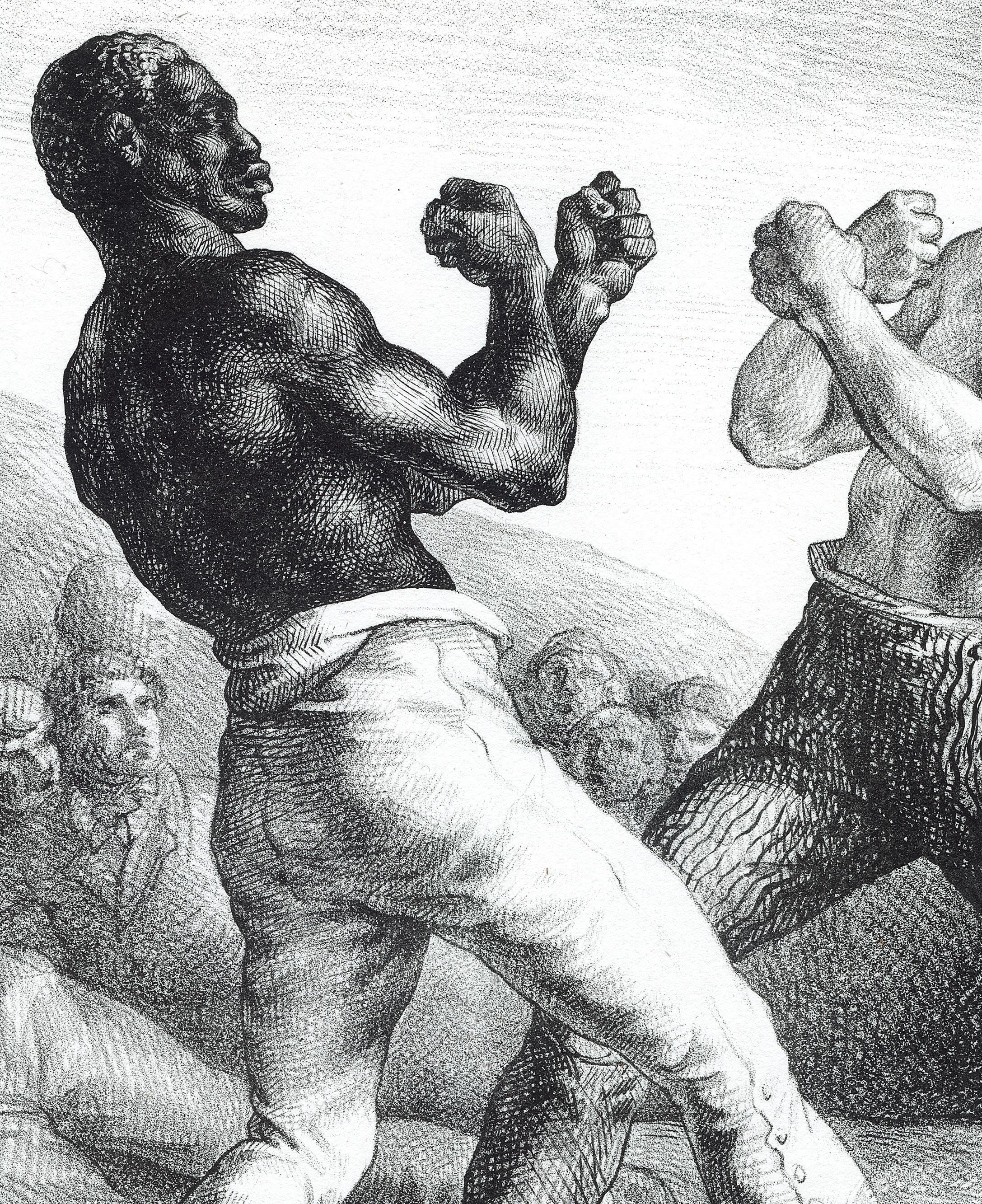
Our final coup de cœur goes to a trio of extremely rare prints: Wenzel Hollar’s Portraits of young black boy and black girl (a pair), and Théodore Géricault’s The Boxers. Together, they depict the position of black people in the 17th and 19th centuries – some servants, other entertainers –confined to the opposite ends of the power scale. A long chapter of our history to reconsider.
As we are fond of saying, the diversity of our selected prints is at the heart of our adventure. We hope you will celebrate and cherish this collection as much as we enjoyed compiling it for you. Enjoy art and life.
Eric Gillis & Noémie Goldman
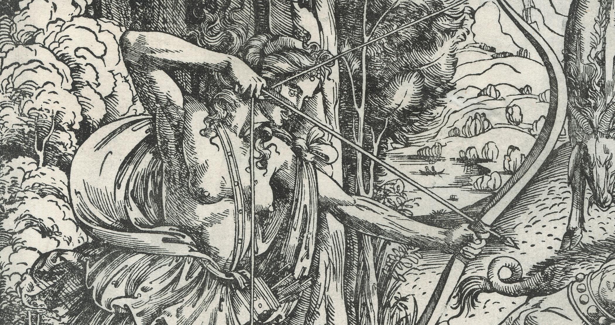
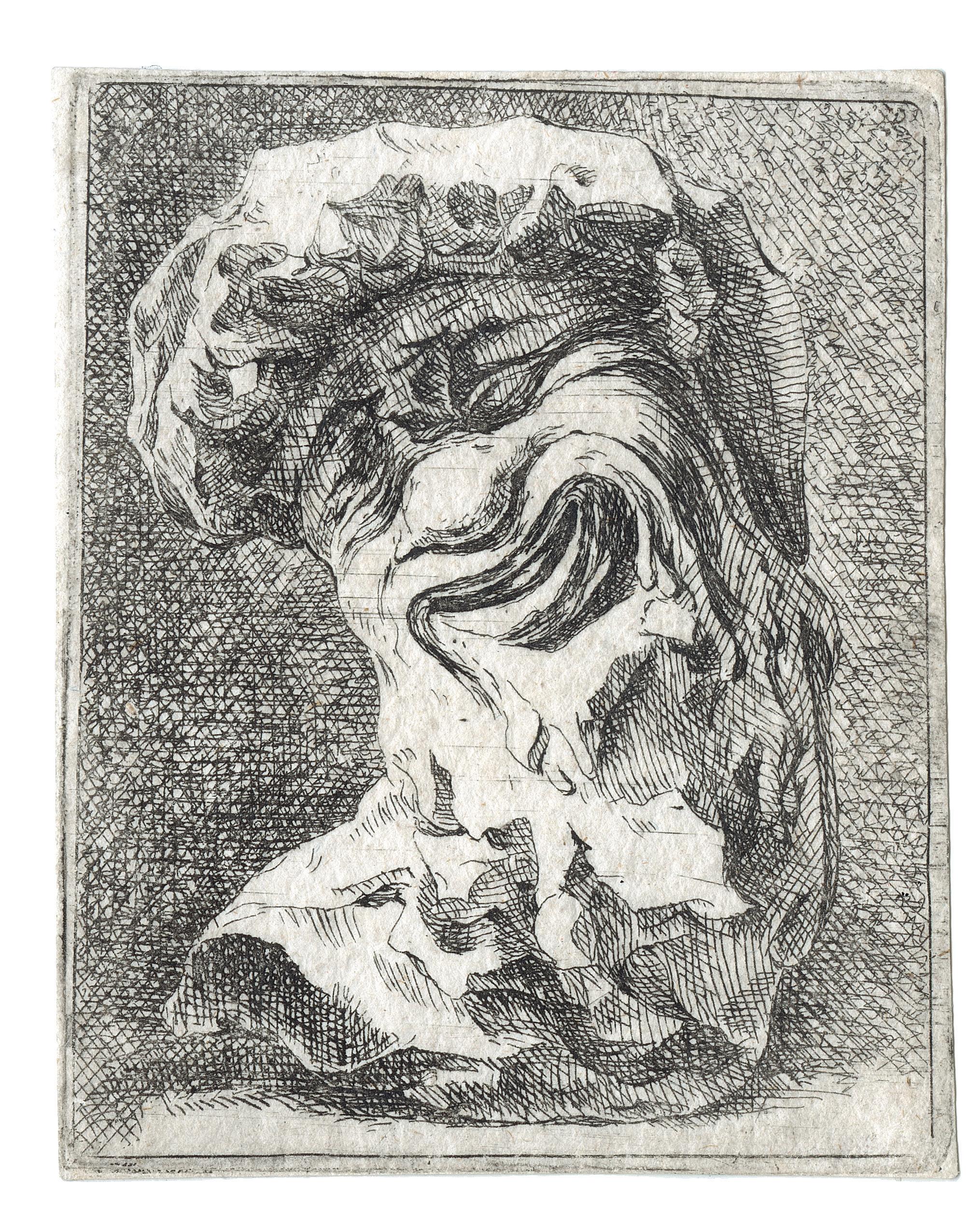
1 Giovanni Battista Palumba (active in North-Italy between 1500–1520) said The Master I.B with Bird
The Calydonian Boar-Hunt
Woodcut on laid paper, ca. 1502-11
Block 268 × 445 mm
Reference Emile Galichon, “École de Modène, Giovanni Battista del Porto dit Le Maitre à l’Oiseau”, in Gazette des Beaux-Arts, Paris, 1859, vol. IV, pp. 258-274, no. 7; Johann David Passavant, Le Peintre-Graveur, 1864, vol. V, pp. 149-153, no. 8; Friedrich Lippmann, The Woodcuts of the Master I. B. with the Bird, Berlin, International Chalcographical Society, 1894, no. 6; James Byam Shaw, “The Master I. B. with the Bird”, in Print Collector’s Quaterly, 1933, vol. 20, pp. 169-178, no. 21 (version B)
Literature James Byam Shaw, “The Master I. B. with the Bird”, in Print Collector’s Quaterly, 1932, October, vol. 19, no. 4, pp. 272-292; 1933, January, vol. 20, no. 1, pp. 9-34; Arthur M. Hind, An Introduction to a History of Woodcut, London, 1935, II, p. 443; Augusto Campana, “Intorno all’ incisore Gian Battista Palumba, e il pittore Jacopo Rimpacta (Ripanda)”, in Maso Finiguerra, I, 1936, p. 164-181; Arthur M. Hind, Early Italian Engraving. A critical catalogue with complete reproduction of all the prints described, New York, 1938-1948, V, p. 249; Konrad Oberhuber, “Giovanni Battista Palumba, the Master I. B. with the Bird,” in Early Italian Engravings from the National Gallery of Art, Washington DC, 1973, pp. 440-455; Zucker, M. J., ed., The Illustrated Bartsch / Commentary, vol. 25, New York, 1984, pp. 135-156; Gisèle Lambert, Les premières gravures italiennes. Quattrocento-début du cinquecento. Inventaire de la collection du département des Estampes et de la Photographie, Paris, 1999, p. 421 no. 773; Mark P. McDonald, The Print Collection of Ferdinand Columbus (1488-1539). A Renaissance Collector in Seville, London, 2004, no. 2033.
Provenance Private collection, Italy
Condition
In very good condition, no retouching. Two repaired areas of abrasion with former glue and paper repair, 15 cm long, running diagonally, 1.5cm in width. No missing fibres from the front; no detail of the actual drawing missing, the borders are intact, very slightly cut upper right corner.
The present work is exceptional on many respects. First of all, Renaissance and early Italian single and large woodcuts, as distinct from book illustrations, are extremely rare to find. Of this block, only fives copies are recorded, including the present one: two at the British Museum (inv. 1878,0713.4153 and 1895,0122.1215), one at the Bibliothèque Nationale de France (inv. Ea 33 rés), and one at the Berlin Kupferstichkabinett (inv. 1751893). All of them are damaged. In the London first copy, the whole of the lower left corner is missing and made up with pen and ink; in the London second copy, a 7mm large strip at upper left and the right corner are missing.
The Paris one is damaged in the centre, but not falsified. The Berlin copy is much damaged and restored with the brush. On the contrary, the present one is in very good condition, which is outstanding. It has been most probably kept in a book, never been exposed to the environment, and hidden away.
Giovanni Battista Palumba, who appears to have resided in Rome at the beginning of the 16th century, was one of the earliest Italian printmakers to produce independent woodcuts and engravings featuring mythological subjects, often erotic in tone. They are quite exceptional
6
7
go to hunt a boar, one has a lance in his right hand, the tip touches the left high of a dog which is on the pig and seizes its left ear, the horse is covered with the skin of a lion, its right hoof touches the left eye of the pig, next is a naked man wearing a garland on his head, in his hands a stake, in the other part a woman fires an arrow at the pig, we cannot see the right thumb, there are twelve birds flying and in the background a city, IB 1
The scene indeed depicts the savage boar sent by Artemis to wreak havoc on Calydon after she had been ignored during the annual sacrifice. The bravest warriors were sent to hunt the boar; at the left the great huntress Atalanta was the first to draw blood with one of her arrows. In various states of dress, the figures encircle the wild beast, and it allows for dramatic exploration of the body in motion. Several influences on Palumba’s works have been proposed, but in this case one could say that the naked man at the far right recalls the same figure in Pollaiuolo’s engraving. Because the figures are presented to the viewer like a sculptural frieze, other sources have also been suggested. The horse in the print is indeed
 (detail)
8 in size, quality and charm, and Emile Galichon’s praise is not too high for them. Of all Palumba’s woodcuts, this one, equally with the David (Byam Shaw 16), is his most successful composition. It is significant that this woodcut was also part of the extraordinary and contemporary collection of Ferdinand Columbus (1488-1539) at the time. Christopher’s son was without doubt the greatest bibliophile and print collector of his day. His collection contained all the major Renaissance artists working in the medium. As a travelling companion and adviser to Emperor Charles V, and a friend of the humanist Desiderius Erasmus, Ferdinand was at the centre of the great political and intellectual movements of his day, and he used his diplomatic travels to assemble his remarkable collection. At the time of his death, his library contained 15,000 volumes and more than 3,200 prints. Now vanished and only known through a very precious inventory in Seville, this was the largest Renaissance print collection we know of. The present print is described in the inventory at no. 2033 under the classification “pliego-size sheet of 4 naked men”: Roman on horseback, two men standing
remarkably like the horses of the Trajan column, in Rome. The composition is also closely related to the beautiful frieze of Baldassare Peruzzi on the ground floor of the Sala del Fregio of the Villa Farnesina in Rome.
The other great interest and fascinating point of this woodcut is about Giovanni Battista Palumba himself, in the contemporary artistic and literary environment, between Milan, Bologna and Rome. Although little is known about the life and career of the artist, his works show a profound engagement with humanists and their literary activities, most notably in Rome. It also brings a captivating contemporary system of influences on his works and from his works on others. His works have played a significant role at the time, and commanded wide audience, being reproduced by other well-known printmakers, including Nicoletto da Modena, and even adapted on majolica plates at the time2. It has also been advanced, based on stylistic comparisons, that Palumba was responsible for the classically inspired woodcuts featuring elegant medallion portraits and ornate frames in Andrea Fulvio’s Illustrium imagines published in Rome in 1517. If corrects, then this attribution would additionally situate Palumba firmly within the numismatic culture of the Renaissance3
After much and impressive guesswork and hypothesizes, by Pierre Jean Mariette, the Abbate Zani4, Emile Galichon, Adolfo Venturi 5, Friedrich Lippmann and finally James Byam Shaw, his name was discovered by Augusto Campana based on a marginal note on a Vatican manuscript (Vat. Lat. 3351) containing poems of the Roman humanist Evangelista Maddaleni dei Capodiferro (1450?-1527), more known under the nickname of Faustus, or Fausto in Italian6. The epigram is entitled “Of Leda printed by Dares” and alludes to a print representing Zeus and Leda embracing. Throughout the manuscript the humanist uses invented names for different people, whose identities are then revealed in marginal notes. The name “Dares” standing for Giovanni Battista Palumba. Referring to the engraving Leda and the Swan (BS3), Fausto presents Palumba’s printmaking as a mean of artistic
consummation: the creation of fabulous progeny that connects the past with the present and imagery that binds viewers emotionally, sensuously, and intellectually to the artist’s work. Fausto’s use of the name Dares in his poems ostensibly then inducts the artist into the elite circle of the Accademia Romana headed by Cardinal Riario and the humanist Pomponio Leto, and of the papa Curia, alongside artists such as the Bolognese Jacopo Ripenda and Amico Aspertini. Whatever, Palumba was far from bereft of esteem in his own time. His prints lure his audience, not as casual observers but as engaged and inquiring participants. Poet and printmaker reformulated mythological and narratives concerning the amorous nature of the gods to make them more vivid and vital for their audiences.
The origin of Palumba have been situated either in Lombardi (Lippmann) or in Bologna (Byam Shaw). More generally accepted, Lippmann’s idea was that the artist was a Lombard, a compatriot of the Master of the Beheading of St. John the Baptiste and of Giovanni Pietro Bigaro. He found affinities between Palumba’s woodcuts and some unsigned woodcuts in books printed in Milan and Saluzzo between 1490 and 1503, attributing some to Palumba. Another argument for Palumba’s Lombard origin, for Lippmann, is the fact that two of his engravings are of motifs taken from Leonardo da Vinci and very close to the Lombardi Cesare da Sesto, i.e. St. George and the Dragon (BS1), and Leda and the Swann. The lightness and the feeling for light flowing over the bodies and for the decorative qualities of the lines in Palumba works seem confirm the Lombard origin.
Palumba’s style is extremely eclectic, but he always appropriates his motives in such a way that the sources are not easy to identify. While his early woodcuts may remind one of Venetian sculpture, like that of Antonio and Tulio Lombardi, he later seems to reflect the taste for the antique, mixed with a feeling for the bizarre and the delicately beautiful, of Filipino Lippi, Bernardo Pinturicchio, Baldassare Peruzzi, and Jacopo Ripanda, all of whom at one time or another had an influence on art
9
in Rome. The basis of the technique, the landscape and the unity between figures and surrounding is the graphic work of Albrecht Dürer, particularly his early prints before 1500. In the engraving Palumba makes this style looser and airier. In the woodcuts the influence of Dürer is much less marked, lingering only in the forms of trees and plants, and in the character of the distant landscape. Even in the landscapes it is less clearly recognisable, merging with elements that recall Bolognese or Umbrian painters at the time. At a certain moment Palumba was also influenced by Antonio Pollaiuolo, who died in Rome in 1498; and in this relationship to Pollaiuolo, Palumba shows a strange affinity to the very nearly contemporary work of the Florentine Cristofano Robetta. About the Calvary (BS17), Lippmann has also made the link to the Andrea Solario’s Crucifixtion , executed in Milan in 1503, assuming that the Palumba’s composition is possibly earlier. Equally, Oberhuber set that the Solario’ St. Catherine of 1499 in the Museo Poldi Pezzoli in Milan is very close to the figure of Diana in Palumba’s woodcut Diana and Acteon (BS25).
We have little evidence for dating Palumba’s woodcuts, and through the veil of so many various influences it is more than usually difficult to trace a chronological development. None of his print is dated, and only the woodcut The Three Monstrosities (BS14) bears the date of the event recorded under the reign of the Pope Alexander VIII, in 1503. As regards the woodcuts, Lippmann has given a very fine account of Palumba’s development as a designer. He considered the Calvary (BS17) the earliest because of the Mantegnesque element in the style. It is the print with the greatest affinities to Milanese book illustration and painting, but it also shows the influence of Dürer’s early woodcut technique. The next stage comprises the prints Apollo and Daphne (BS26) and Venus, Mars and Vulcan (BS24); in these the artist gains in monumentality but returns to a completely Italian technique working with strong outlines and parallel shading. As these prints show a certain similarity to the works of the Lombardi, it is possible that they were designed under Venetian influence. The Diana and Actaeon (BS25) is slightly more
advanced, richer in the landscape and drapery. Here the artist clearly returns to the cross-hatching technique of Dürer without giving up all of the characteristics of the previous two prints. It is possible that at this point he executed the engraving Three Monstrosities. At the same time, he may also have produced the Christ on the cross (BS18), which, as Byam Shaw rightly observed, shows strong influences from Signorelli and Umbrian school. Lippmann adds to this group the woodcut of the Rape of Ganymede (BS23). The predominant stylistic influence in this woodcut and in the related engraving is that of Antonio Pollaiuolo.
Lippmann’s next stage consists of the great woodcut of David (BS16) and the equally large and impressive current composition of Meleager and Atalante. The David should also be associated with the Three Graces (BS22), which is, however, according to Lippmann, slightly earlier. The three prints follow the development that began with the Rape of Ganymede but become even richer and more delicate in the modelling. The outlines become much less prominent, and there is a greater monumentality and clarity of form. The influence of Pollaiuolo continues, but Palumba also studies Peruzzi, related to the composition of the present print. After this stage, Lippmann describes two further stages of woodcut’s production, which will be the final point of Palumba development of tonal qualities from the linear style of the early prints. It is here that Palumba finally becomes a master of the High Renaissance. Under all these influences Palumba slowly developed in his woodcuts from an almost Mantegnesque style, with strong outlines and only slightly curved lines of parallel shading, to a very rich and flexible technique, with great concern for modelling and with full pictorial unity achieved through long, curving, hatching lines that almost merge with the outlines.
Taking in account this demonstration and following Lippmann, that suggests then a termimus a quo for the present print of ca. 1503, when Palumba was supposed to be in Rome. For a terminus ad quem, one could make
10
As it is the case for two other Palumba’s woodcuts Marc, Venus and Vulcan (BS24) and Diana and Actaeon , there are two states, called version A and B of the same composition by James Byam Shaw, because it is hardly impossible to set which one comes before the other. The differences are only about the birds in the sky and the signature. In the version A, the birds have the form of tridentheads; in the version B they are more coarsely cut and have not the trident form. The signature in version A, the top serifs of the letters I and B almost touch one another; in the version B the letters I and B have no serifs and are placed wider apart. The impressions of London are version A. The present sheet is version B, like the one at the Bibliothèque Nationale de France in Paris.
The variation in the signature and in the form of the birds leaves no doubt of the existence of two different blocks, i.e. another one for the birds and the signature.
As regards to the printing quality, Byam Shaw notes that in the version A, the linework in general is clearer, the shading more open. In the version B, the shading is little closer and harder. Whatever it may be, there is much less difference of quality between the two than in the case of nos. BS24 and 25.
1. Mark P. McDonald, op. cit., no. 2033.
2. James Byam Shaw, “Jacopo Ripanda and Early Italian Majolica”, in Burlington Magazine, 61, 1932, pp. 19-25.
3. John Cunnally, Images of the Illustrious: The Numismatic presence in the Renaissance, Princeton, 1990, pp. 70-87.
4. Pietro Zani, Materiali per servire alla storia dell’origine e de’ progressi dell’incisione in rame e in legno, Parma, 1802, p. 134.
5. Adolfo Venturi, “Gli Orafi da Porto”, in Archivio Storico Italiano, 20, 1887, pp. 213-17.
6. Augusto Campana, op. cit., p. 168.
7. Konrad Oberhuber, op. cit., p. 445.
(detail)
11 the link to the Perruzzi’s decorations in the Sala del Fregio of the Farnesina, to which the present composition is related, as the building finished in 1511. It seems clear to Konrad Oberhuber that after about 1510-1511 Palumba’s production of single woodcuts and engravings ceases7
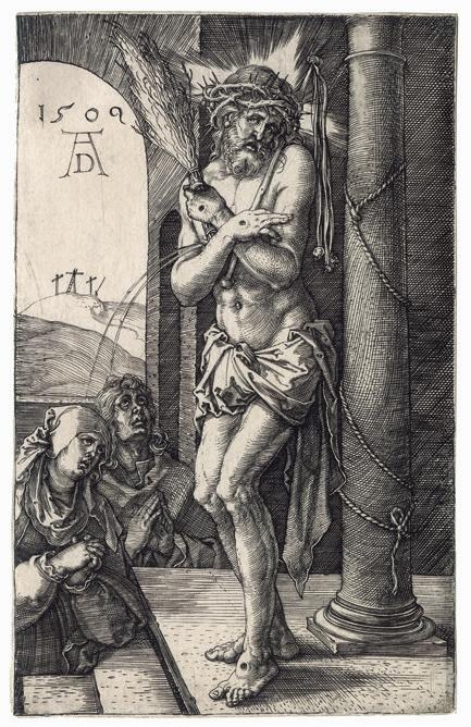
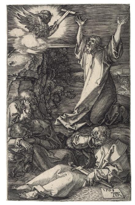
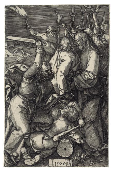
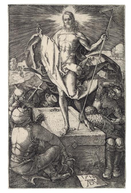
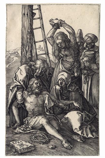
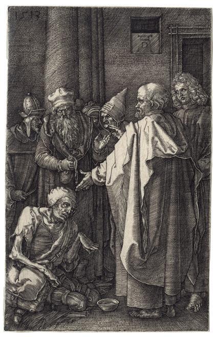
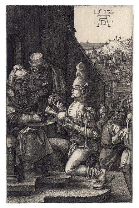
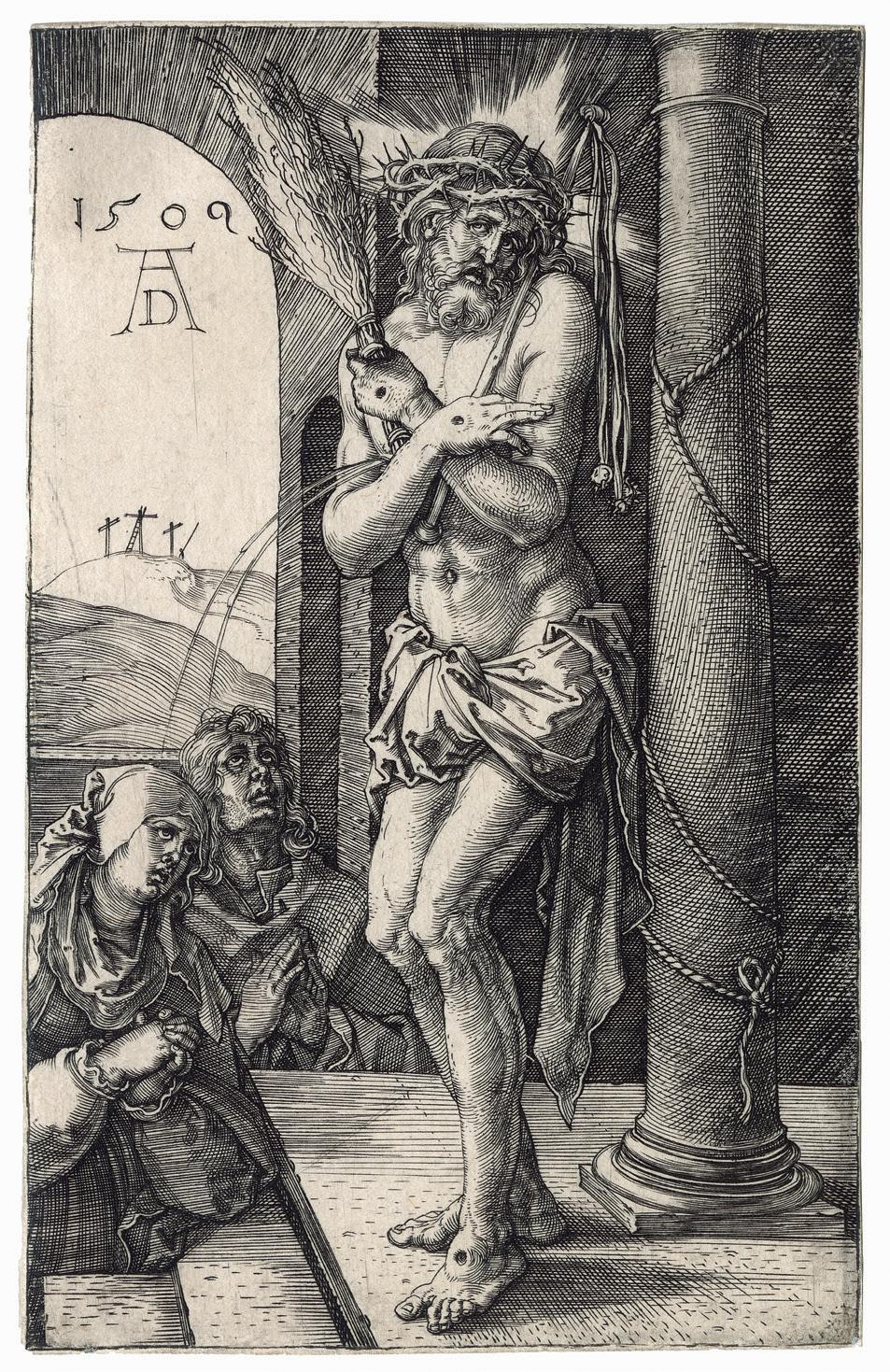
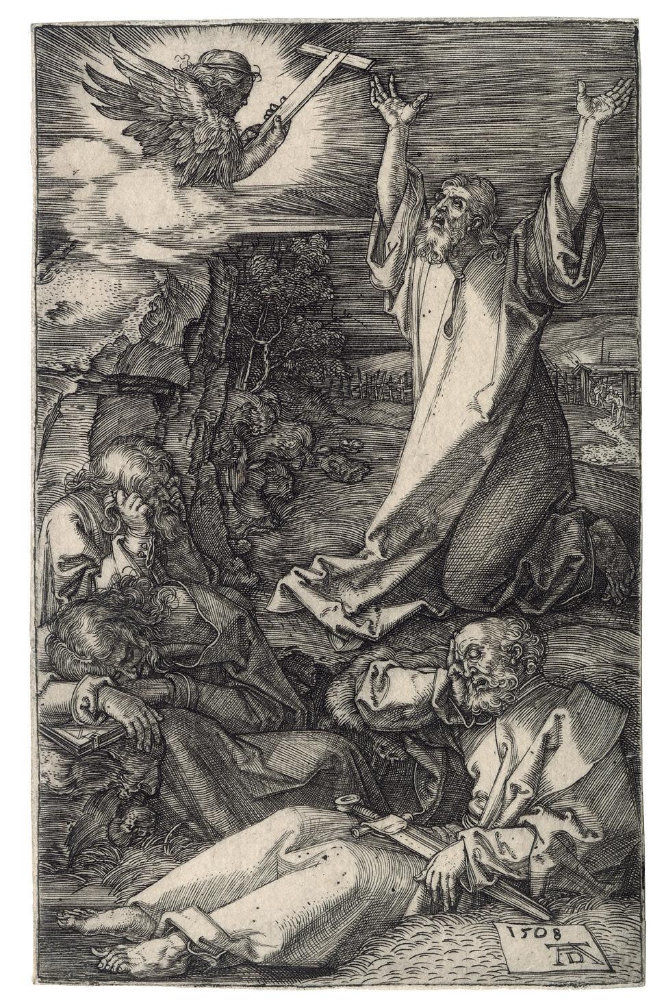
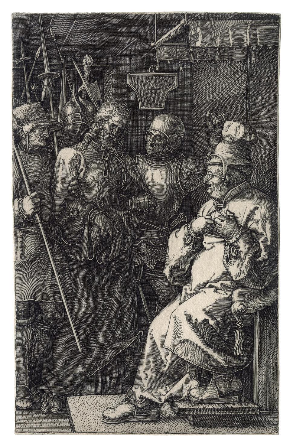
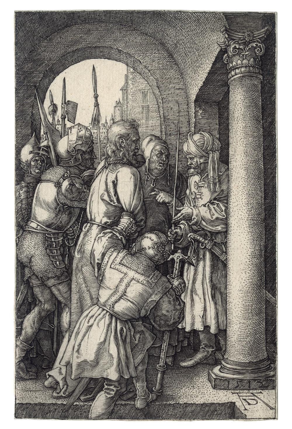
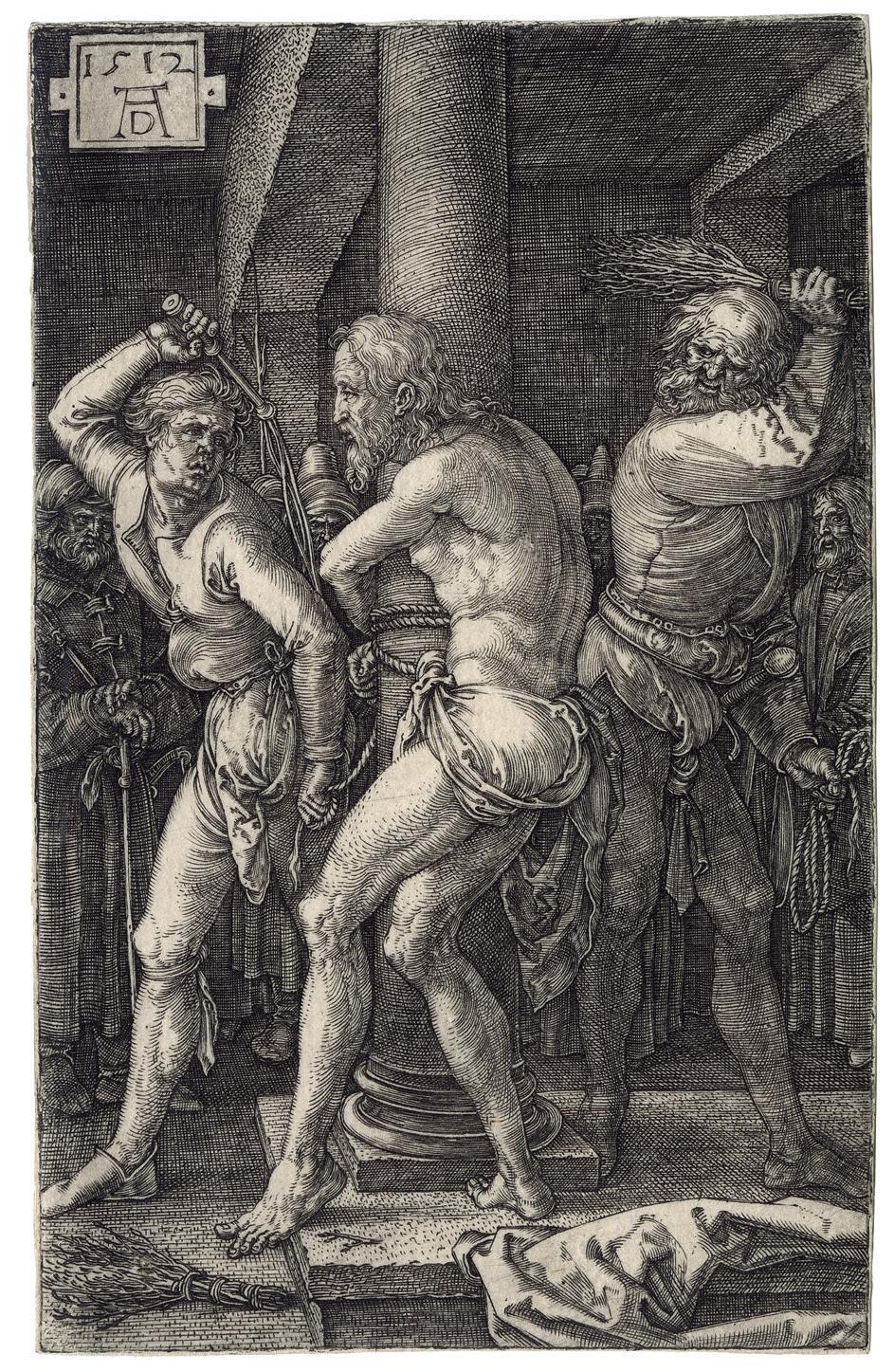
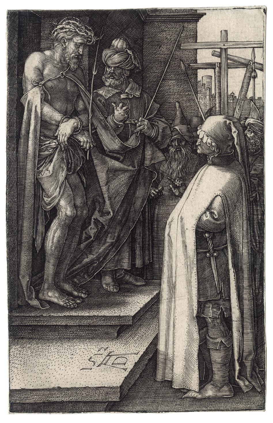
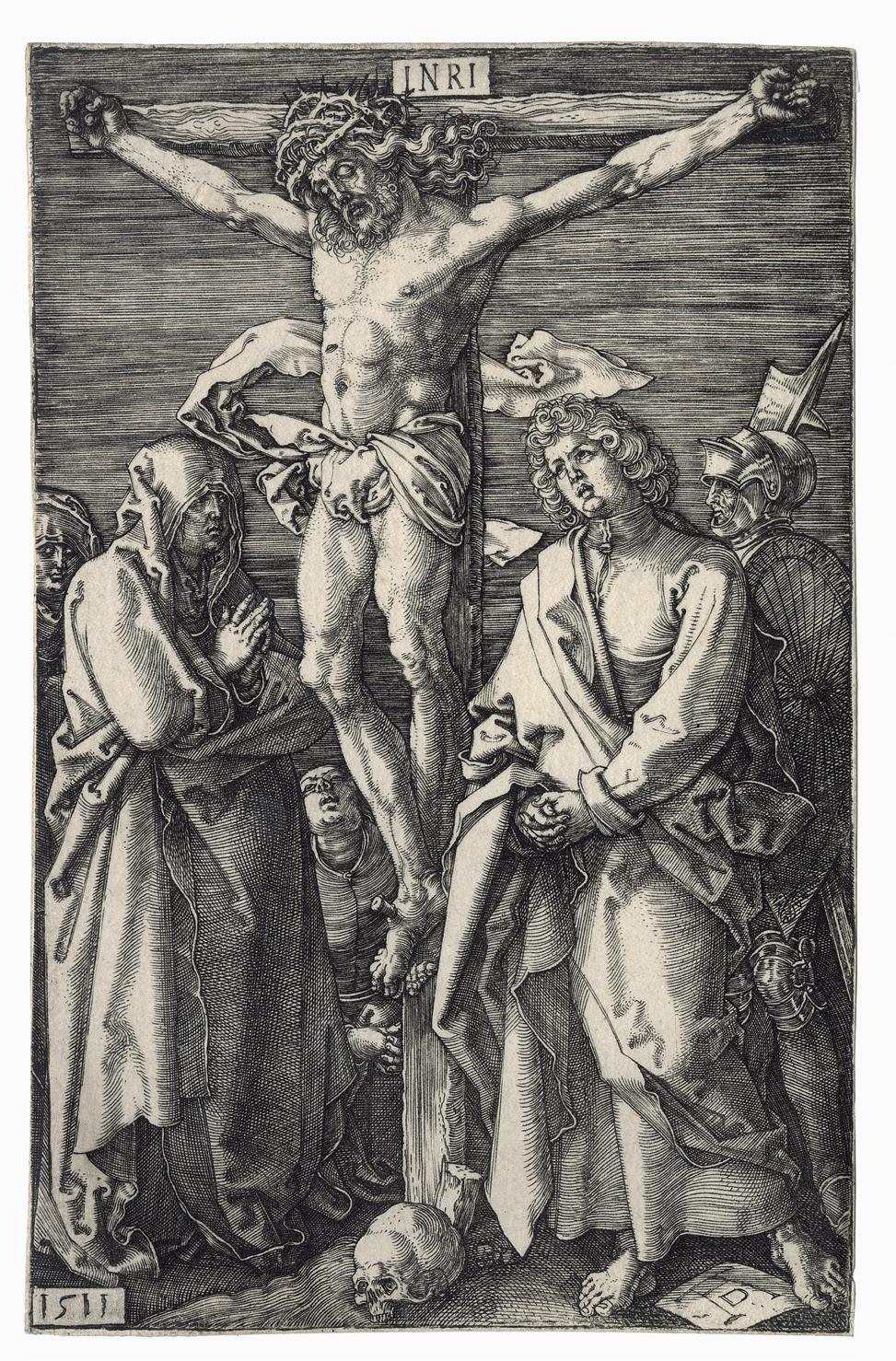
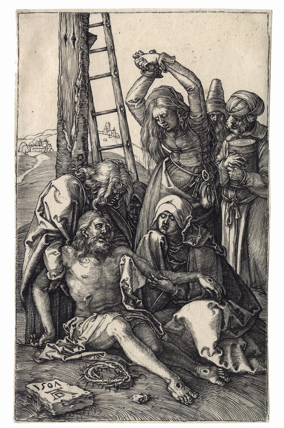
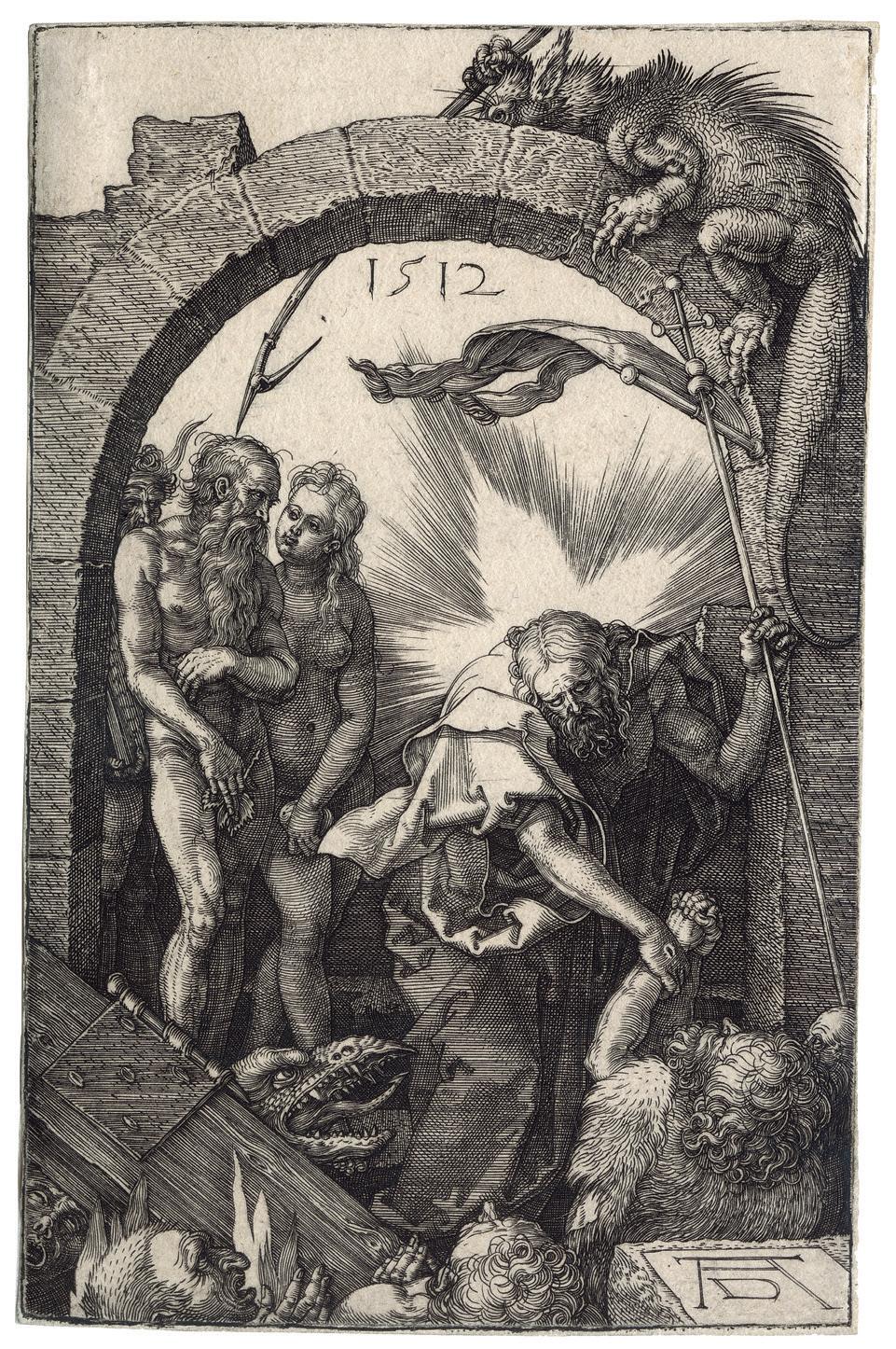
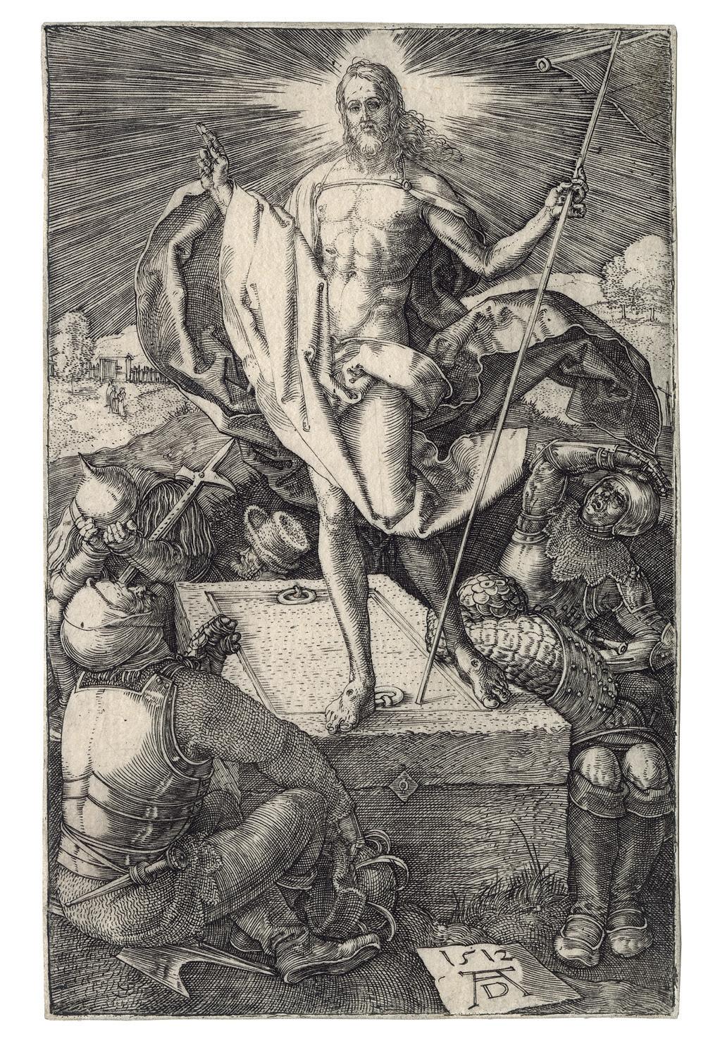
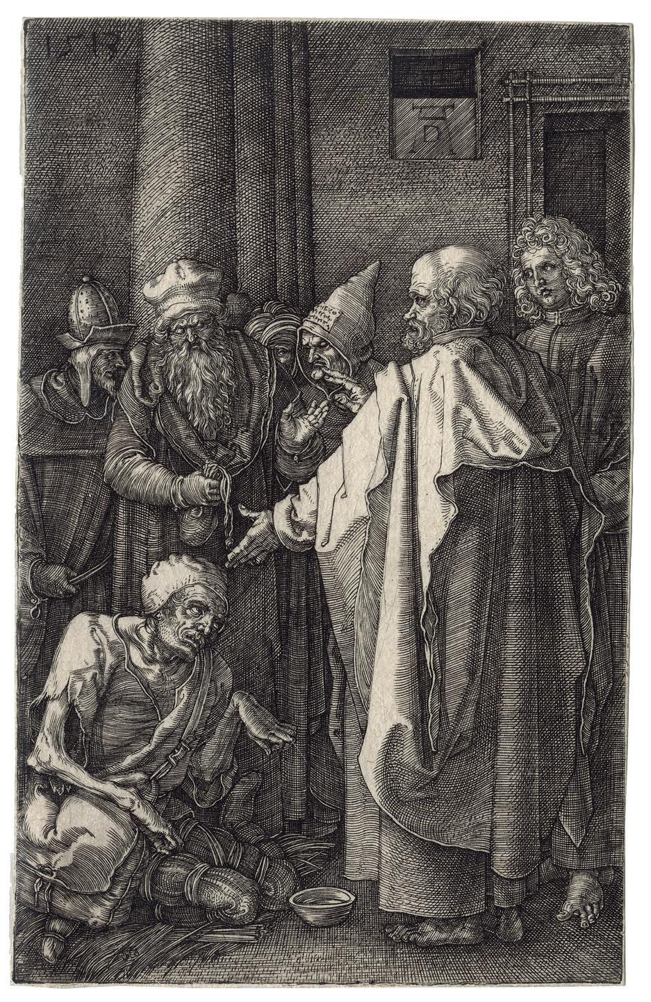
2 Albrecht Dürer 1471 – Nuremberg – 1528
The Engraved Passion
Engravings (16) on laid paper, 1507-13
Plates 115-119 × 71-75 mm
Watermark Greek cross on Resurrection (Meder 17 c/d)
Reference Bartsch 3-17; Meder 3-18
Provenance Colnaghi Ltd, London (with their stock number c. 75956 (set) on the back of first plate Man of Sorrows (Meder 3), possibly the Harold Wright’s hand, between 1911 and the 50’s); Private collection, France Condition In very fine condition
The present series is a wonderful and homogeneous set of the most famous Albrecht Dürer’s Engraved Passion Despite impressions are not all Meder a, except two, but mostly between b and c, the quality of the set is extremely good, and again homogeneous, which is a striking factor, and in very good condition, never restored or retouched. Meder b and c are most of the time considered by Meder as “Sehr gut”. The plates are the following:
Man of Sorrows (Meder 3 c/e)
Agony in the Garden (Meder 4 b/e)
Betrayal (Meder 5 d/f)
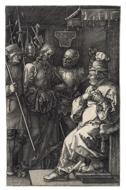
Christ before Caiaphas (Meder 6 a/c)
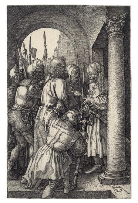
Christ before Pilate (Meder 7 c/d)
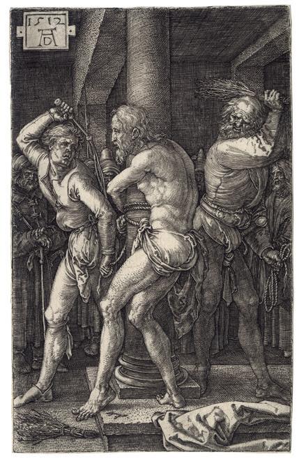
Flagellation (Meder 8 c/e)
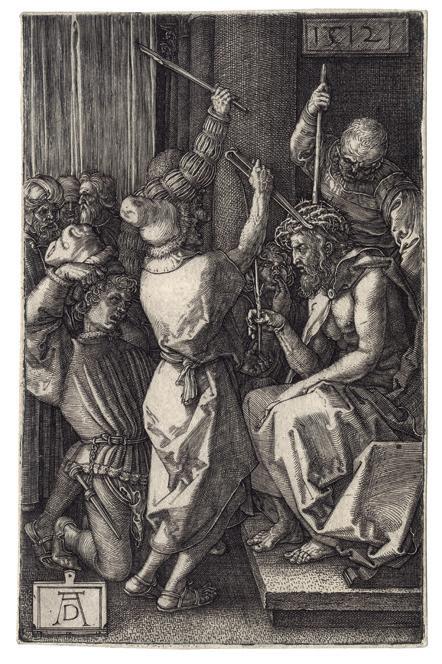
Christ Crowned with Thorns (Meder 9 b/c)
Ecce Homo (Meder 10 b/d)
Pilate washing his hands (Meder 11 a/c)
Bearing of the Cross (Meder 12 b/d)
Crucifixion (Meder 13 d/e)
Lamentation (Meder 14 b/c)
Deposition (Meder 15 c/e)
Harrowing of Hell (Meder 16 b/e)
Resurrection (Meder 17 c/d)
St. Peter and St. John (Meder 18 a/c)
Of the sixteen plates comprising this series, five were engraved between 1507 and 1511, and the remaining ten in 1512. The most likely reason for Dürer’s delay in completing the Engraved Passion is that he was engaged in the preparation of the three large woodcut books (Apocalypse, Large Passion, and Life of the Virgin) and the woodcut Small Passion, published in 1511. What is prodigious is that Dürer maintained himself for so many years at the same high-end quality and that the entire suite presents the same perfection everywhere. Dürer seeks out difficult problems, extreme foreshortenings, details of heads and
bodies, effects of costumes, all features which are omitted from the woodcut versions. He is working for a different audience, for the intelligentsia. These engravings have an air of artificiality but are nevertheless quite powerful. They are here more sombre and restrained in their presentation of Christ’s Passion than either the large or the small woodcut versions. The fineness of the engraved lines enabled Dürer to suggest in these scenes an almost spiritual light. The same fineness also made possible a greater exploration of facial expression, thereby expanding psychological dimensions. It is exceptional at the turn of the 15th century.
The Engraved passion scenes have a compelling forthrightness and grandeur owing to the prominence of the participants who occupy most of the available space. The consistent placement of the figures in the foreground unifies the series. With the exception of the earliest print, the 1507 Lamentation , Dürer has defined the limits of the shallow space by two devices; either parallel shading lines that depicts darkness or dark-toned architectural backgrounds. In the Deposition of Christ (Meder 15), the rocks behind the figures perform the same function as the architecture. Both shading and architecture often serve as an intermediate tone between the darkest shadows and the highlights created by the blank paper, as brilliantly exemplified in the Ecce Homo plate. This increased tonal range and the shallow space combine to produce an effect of high relief sculpture to the whole set.
12

13


3 Nicolas Beatrizet ca. 1507/15 Luneville – Rome ca. 1573
Man Walking or Joseph of Arimathea
Engraving on laid paper, ca. 1546-49
Watermark Letter M with Star in a Shield (similar to Briquet 8390 and 8391) Plate 362 × 190 mm
Literature Evelina Borea, “Stampe da modelli fiorentini nel cinquecento”, in Il primate del disegno, exh. cat., Florence, Palazzo Strozzi, 1980, p. 283, no. 783; Bruce William Davis Mannerist Prints: International style in the sixteenth century, exh. cat., Los Angeles, LACMA, 1988, no. 7; Bulletin van het Rijksmuseum, 2002, p. 86; Bernadine Barnes, Michelangelo in Print: Reproductions as Response in the Sixteenth Century, Farnham, 2010, no. 68
Provenance With Artemis Fine Arts in 1989, London; Eric Stanley, Oxford; thence by heirs Condition In very good condition, with a made-up platemark at left and below
A very fine impression of this rare and impressive plate, printed with a light plate tone and many wiping marks. This striking print of a soldier with arms folded was contemporarily taken from the figure of Joseph of Arimathea that occurs at far right in Michelangelo’s late fresco the Crucifixion of St Peter completed 1549 in the Cappella Paolina in the Vatican.
The plate was not recorded by Bartsch. Formerly, Mario Rotili gave first the plate to Giulio Bonasone, but from the 1960s, however, Evelina Borea, Arthur E. Popham (British Museum), Richard Godfrey and others have all agreed to identify the engraver as Nicolas Beatrizet. The image’s source in a work by Michelangelo undoubtedly inspired the attribution to Beatrizet, who engraved many of the
master’s designs. It is the style of the print, however, that is the clinching factor for the attribution. The fine network of lines shading the anatomy and drapery is consistent with Beatrizet’s manner and contrasts with Bonasone’s considerably looser modeling. The mesh of crosshatching in this engraving, interspersed with patches of closely spaces, long strokes of parallel lines, is found in other engravings by Beatrizet, such as The Death of Meleager after Francesco Salviati, 1543, and Aaron , ca. 1542. The greater delicacy of modeling in the present Man Walking, however, suggests a date of a few years later.
It has been noted by Geoffrey Keynes that this engraving served as the model for William Blake’s engraving Joseph of Arimathea among the Rocks of Albion, 1773.
18

19
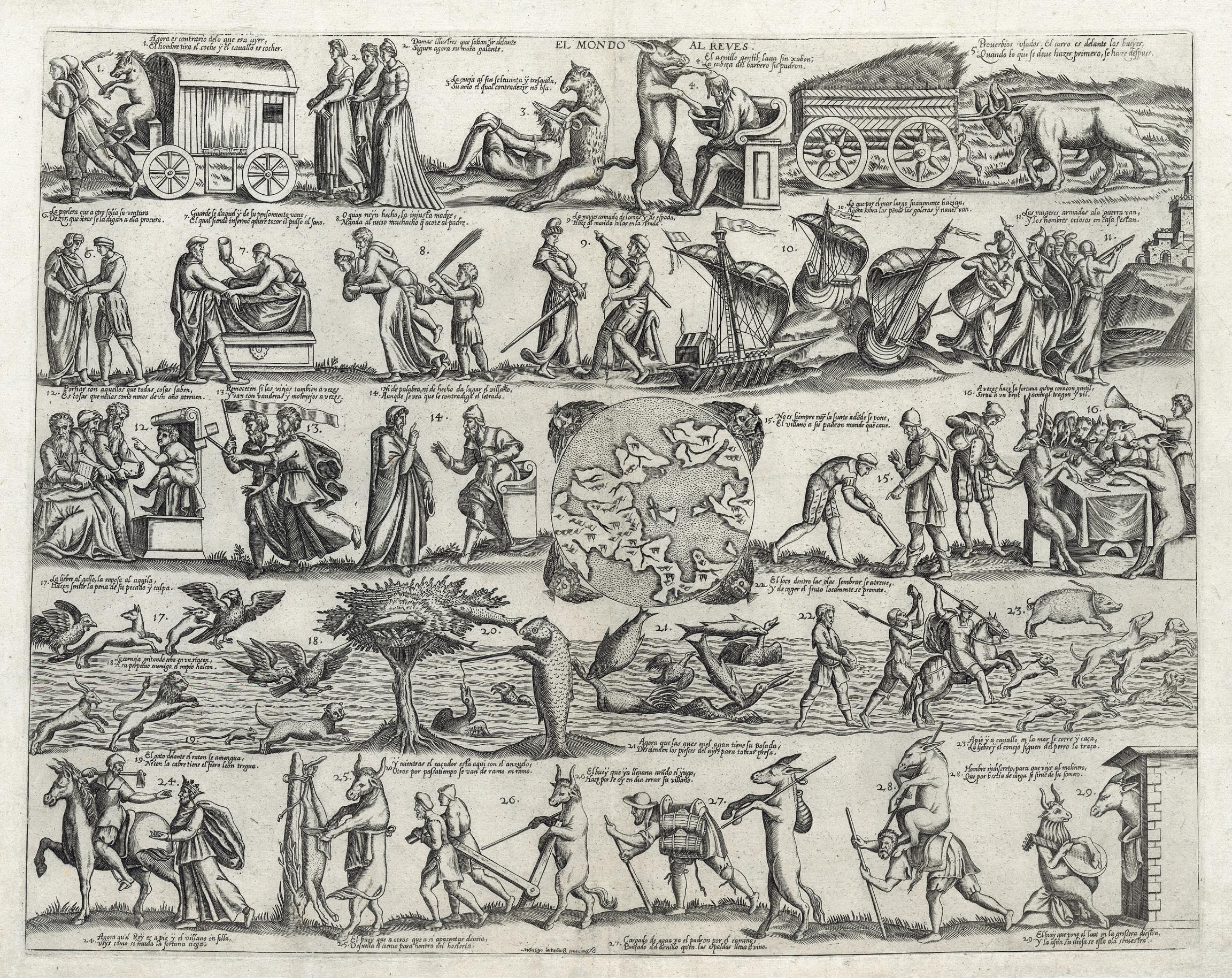
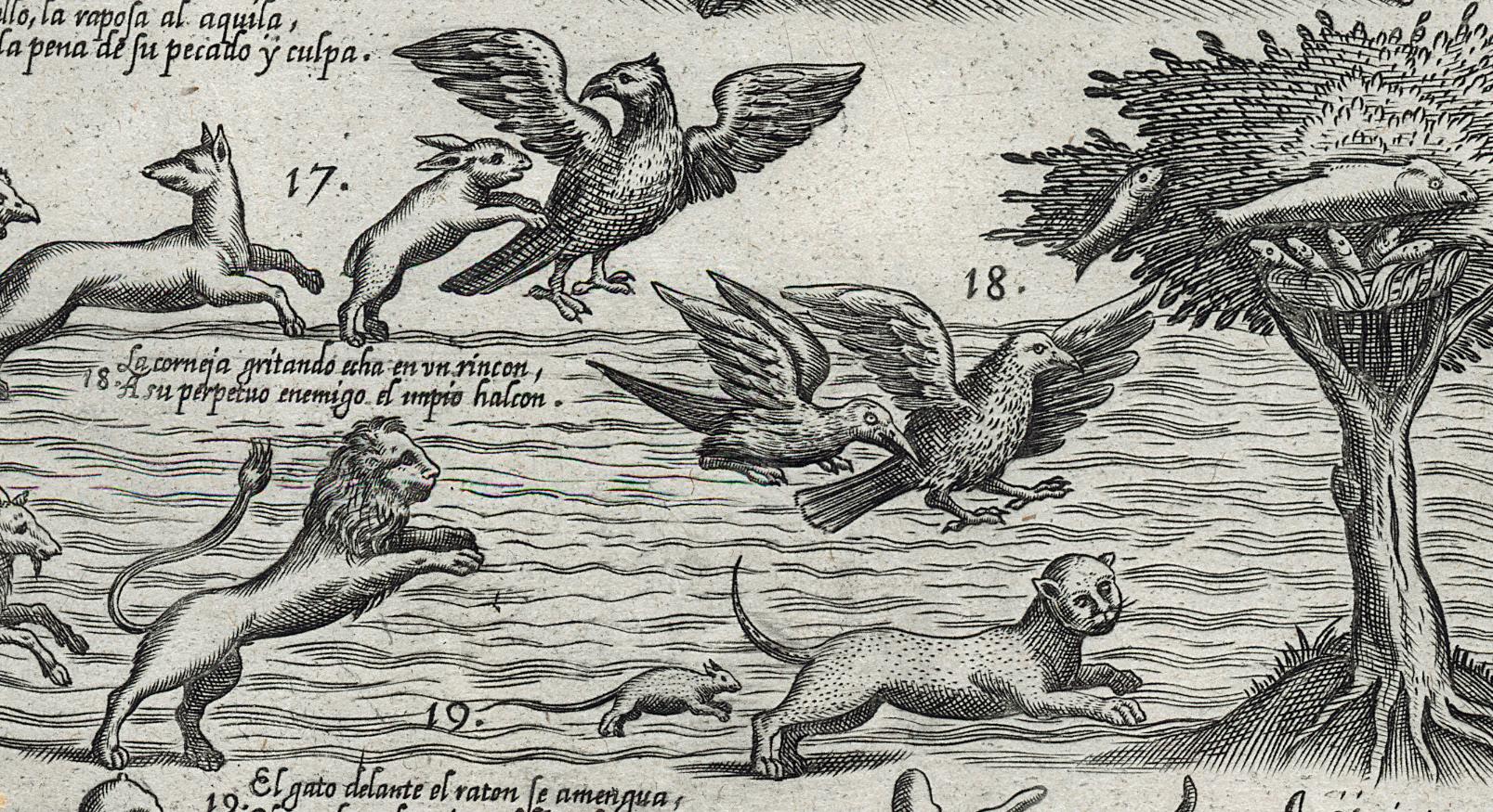
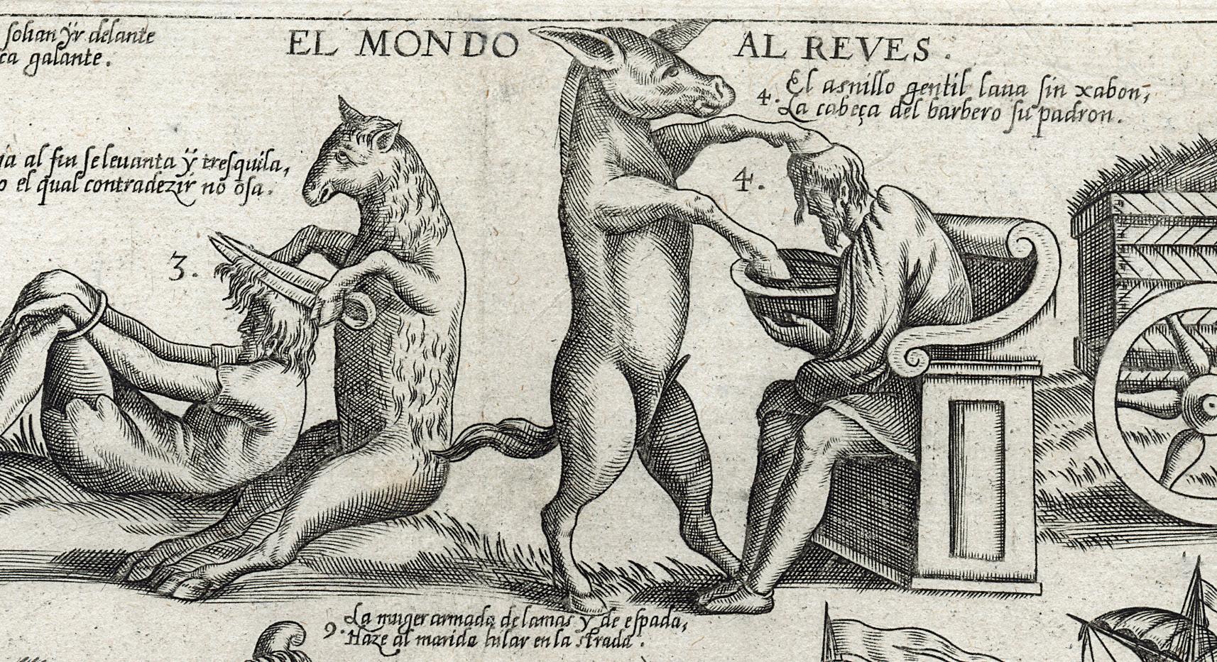
The World Turned Upside Down
Etching and drypoint on laid paper, ca. 1565 Plate 367 × 467 mm
Watermark unidentified (a cross in a heart?), late 16th century paper Provenance Private collection, Italy Condition In fine condition, a few minor tears restored
It is an extremely rare plate after the Venetian Niccolò Nelli, intended for the 16th century Spanish market, after his Il Mondo alla Riversa, and perhaps, like other popularthemed tables by Niccolò, inspired by a Cristofano Bertelli’s model. It is made up of twenty-nine vignettes without frame distributed in five registers and in a boustrophedon order, each with two lines of comments in Castilian. It is difficult to set the exact publication date, but it is printed on a very nice laid paper, most likely late 16th century made, with an unidentified watermark. The quality of the etching is very good, and it should be then the work of an accomplished printmaker.
The World upside down is one of the most fascinating iconographic themes in the field of popular prints, a reflection of the ambiguity and ambivalence of the everyday world and its unreal opposite. The grotesque scenes – like for instance an ass washing man’s head then cutting his hair, fish in trees and feeding on birds in the sea, etc. – often suggest a sense of social transgression, in some iconic repertoires connected with the carnival events, in which for a few days another possible apparent world emerges, made of chaos and madness, at the end of which one returns to the true virtuality of social
logic traditionally imposed and accepted. Some of these images are already present in Egyptian papyri and later in the classical and medieval ages, even if it was necessary to wait until the second half of the 16th century see the first tables printed in Italy, and the theme developed in different scenes. Examples published in Holland, France and Germany would follow. The present plate is the first example ever recorded in Spain. It will be then necessary to wait until the 17th and 18th centuries to see some sheets published in France (by Jean Ganiere and Jacques Honervogt) and in Italy (by the Remondini), and with a text in Castilian.
One of the most interesting points that this print shows is the role played by Venice in bringing such images to Spain in the 16th century, where and when the prints market and publishing were not developed, there were not that many designers and education for such a field. At the opposite, during the early modern period, Venice was one of the main centres in the Western world for the production and commerce of printed material, notably due to its extraordinary production of a wide range of books. Like in Rome and Antwerp in the mid-16th century, intaglio print publishing in Venice achieved prominence
4 After Niccolò Nelli
20
1530 – Venice (?) – between 1579-86
21
Not only Nelli tried to market his prints in Venice –he had a shop on the Rialto – but abroad with the help of other publishers, but the other most intriguing part of the production of more modest publishers such as Nelli, Zenoi and Ferrando Bertelli remains the so-called stampe popolari, through which they made an original contribution to European printmaking. It is for sure that the Venetian lower-middle-class background, to which Venetian printmakers and/or print publishers belonged, favoured the production of such images, and offered the ideal context for the production of such prints, since a dialectic between unorthodox and conservative ideas was not unusual among minor tradesmen and artisans.
However, as far as the reception is concerned, we know that Nelli’s prints, such as the present plate, and for instance Il Paese di Cuccagna and L’Arboro della Pazzia, with their subtle balance between satire and edification, are known to have reached all levels of society. And we could supposed it had the same reception in Spain.
The following references deal with Niccolò Nelli as a publisher and a printmaker in Venice:
— David Kunzle, The Early Comic Strip: Narrative Strips and Picture Stories in the European Broadsheet from c. 1450 to 1825, Berkeley/Los Angeles/London, 1973, pp. 200-01
— Fabio Piloni, “Nuovi contributi per Nicolò Nelli e Gaspare Osello”, in Grafica d’Arte, vol. 29, 1997, pp. 8-9
— Gert Jan van der Sman, ”Alcune precisazioni su Nicolò Nelli e Gaspare Osello”, in Grafica d’arte, vol. 37, 1999, pp. 2-9
— Gert Jan van der Sman, “Print Publishing in Venice in the Second Half of the Sixteenth Century”, in Print Quarterly, vol. 17, no. 3, 2000, pp. 235-247
— Michael Bury, The Print in Italy 1550-1625, British Museum, London, 2001, p. 229
22 as a profession or specialization, and notwithstanding the growth of the print market, print and book publishing coexisted in a symbiotic relationship. Nelli belonged to a group of Venetian print publishers who were both entrepreneurs and artisan, and together with Domenico Zenoi, he can be considered as the most productive “printmaker cum publisher” active in the period preceding the plague of 1576. Because of this combination of skills, they used to call themselves intagliatori di stampe rather than librari
23 (detail) (detail)
5 Jacques Callot 1592 – Nancy – 1635
The Three of a Kind
Etchings and engraving on laid paper, ca. 1628-29
Watermark La Mariée (Lieure 40)
Plate 216 × 280 mm
Reference Meaume 666; Lieure 596, 2nd (final) state
Literature Ellen G. D’Oench, Prodigal Son Narratives 1480–1980, Yale University Art Gallery and Davison Art Center, Wesleyan University, 1995, no. 6 and p. 7
Provenance Henri Grosjean-Maupin, Paris; his sale, Hotel Drouot, 26-27 March 1958, no. 189; Marcel Lecomte, Paris; thence by heirs, Paris Condition In fine condition, with a strip on the four sides at the back
Superb impression with large margins, which is exceptional. Usually it is cut along the borders. It is one of the most sought-after prints by Jacques Callot, one of his most famous compositions in the genre of effet de nuit and interior scene. The piece is also called by Lieure Les Joueurs de Cartes, or L’Enfant prodigue trompé par une bande de filous, i.e. The Card Players, or the Prodigal Son tricked by a group of thieves.
The scene depicts some card players sit around a rectangular table. In the middle, the prodigal child sits next to a woman who holds the cards and whose game he directs. Behind this woman, a crook uses a small
mirror to show the cards she holds to a partner sitting opposite on a bench. To the left of the prodigal child, a woman standing plays the harp, and other players are on either side of the table. The prodigal child actually looks like Callot according Lieure. The artist probably wanted to represent himself sitting next to his young wife, sometime after his marriage.
A brilliant clair-obscur in the history of printmaking.
24
25
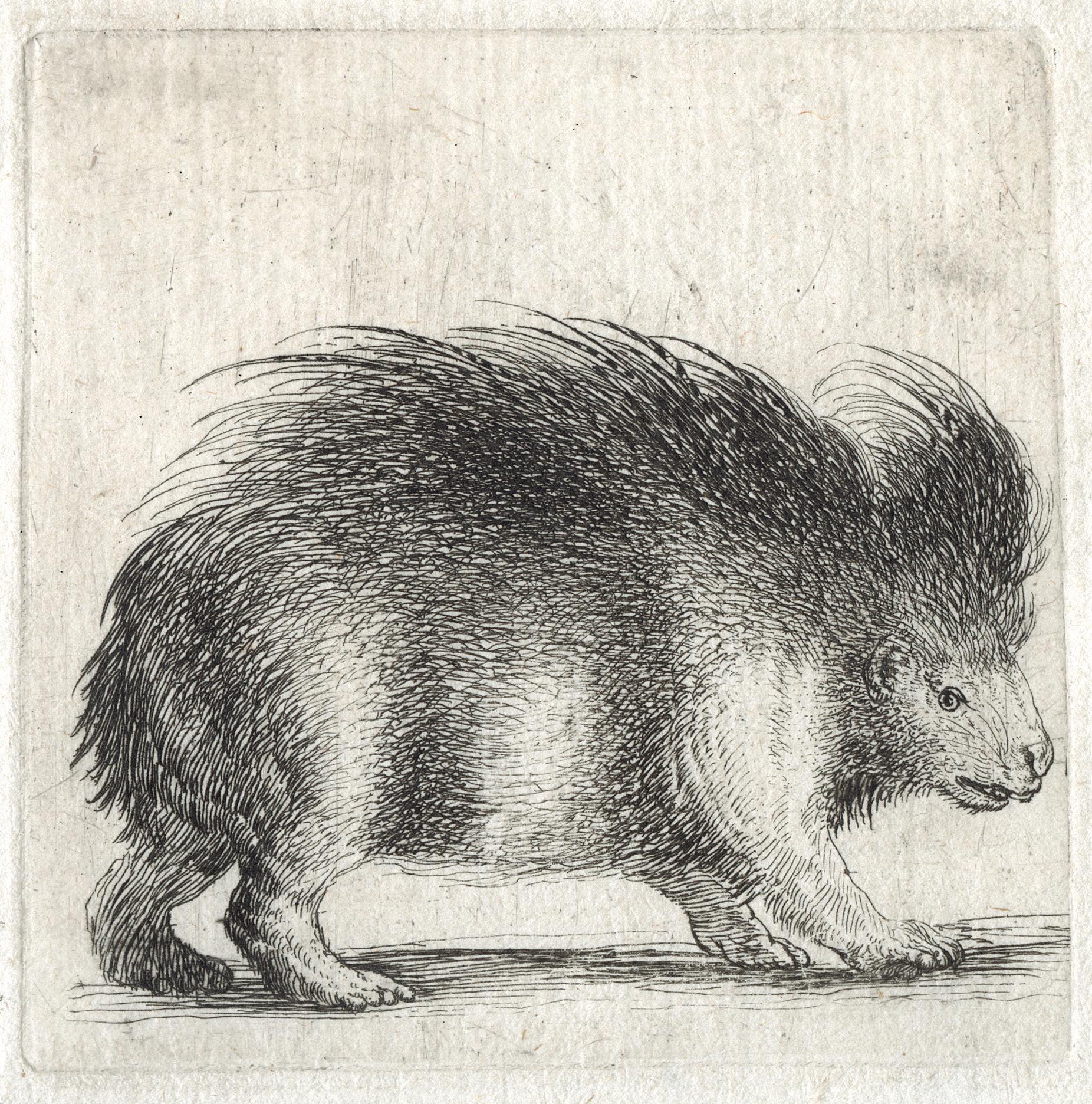
6 Stefano Della Bella 1610 – Florence – 1664
Porcupine, Facing Right
Etching on laid paper, ca. 1640-50
Plate 73 × 74 mm
Reference De Vesme & Massar, CII, p. 185
Provenance Private collection, Italy
Condition In very good condition
For the amateurs and connoisseurs of the Stefano Della Bella’s œuvre, the present print is extremely rare. The first, Jombert wrote in his catalogue1: “Ces trois estampes [with two others], extrêmement rares, ont été indiquées par Mr. Huquier, graveur et marchand d’estampes très-connoisseur; il est le seul qui les possède à Paris”. Alexandre De Vesme knew only two copies, at the Bibliothèque Nationale de France, Paris, and at the Albertina, Vienna. No other impression has been seen on the auction market for thirty years at least.
De Vesme was a bit hesitating about the attribution, because Mariette did not have them. However, in her revision of De Vesme’s catalogue, Phyllis Dearborn Massar made a case for accepting them as autograph works. She notes the existence of a related drawing of a porcupine by Stefano (Louvre, Stefano della Bella Album, folio 17, inv. 385.1, recto) and stresses ‘the very fine technique of
the prints’. In her opinion they should be regarded as made by Stefano himself. This is the attribution now followed by most, including the British Museum which has an impression only of the other plate also depicting a porcupine (inv. 2015.7073.1), that only entered the collection in 2015. This emphasizes its rarity.
It is a beautiful print, very charming. Della Bella liked depicting animals from Europe and abroad, and he was particularly skilled for that, like in his Caprice (De Vesme 104-116), Diversi animali (De Vesme 690-713), and in other series (see De Vesme 714-719, 720-725, 726-729, 730-731, and 732-740). The Diversi animali is dated 1641-48, and we choose to date the present print close to that series.
1. Charles Antoine Jombert, Essai d’un catalogue de l’œuvre d’Etienne de la Belle, Paris, 1772, p. 227.
26
27
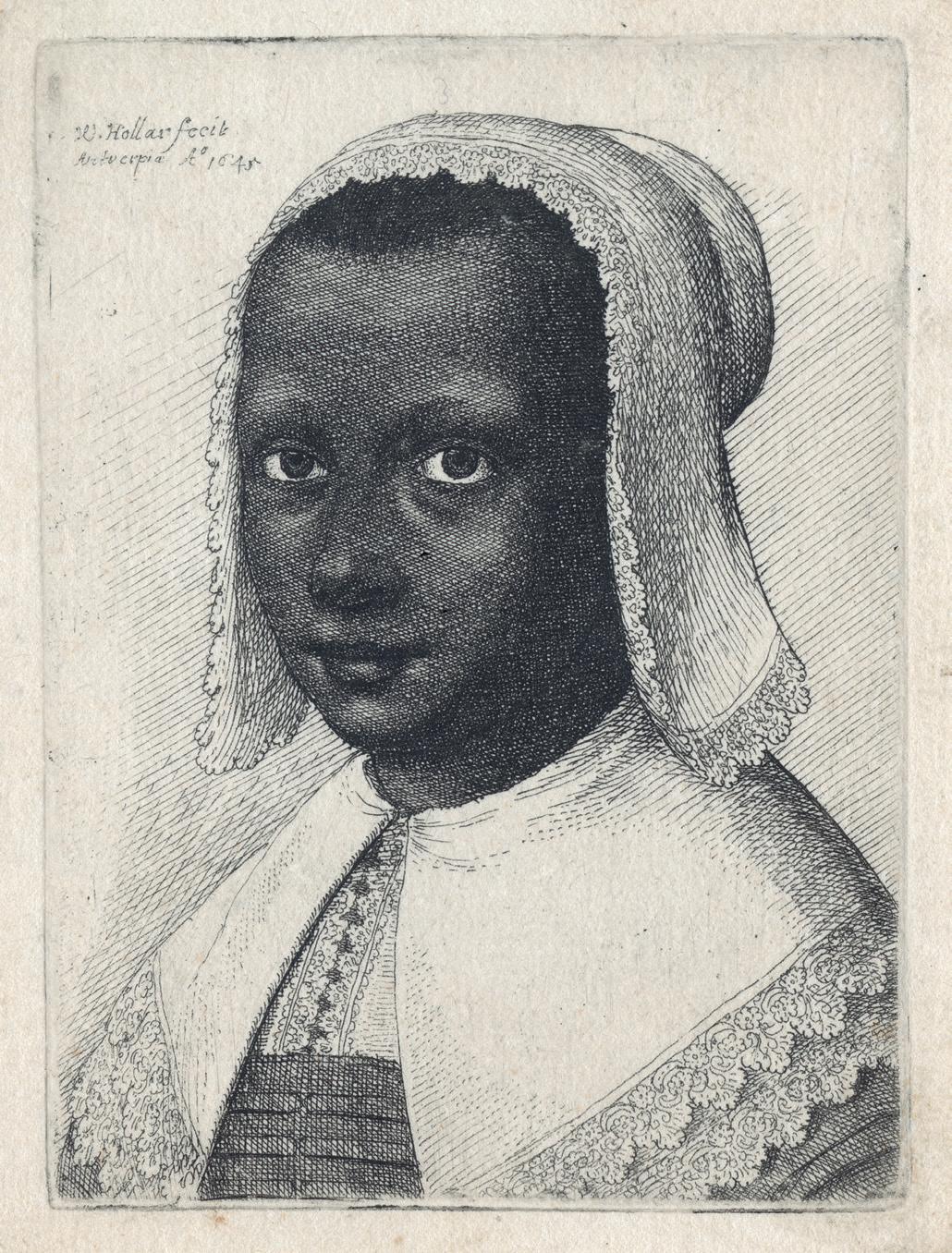
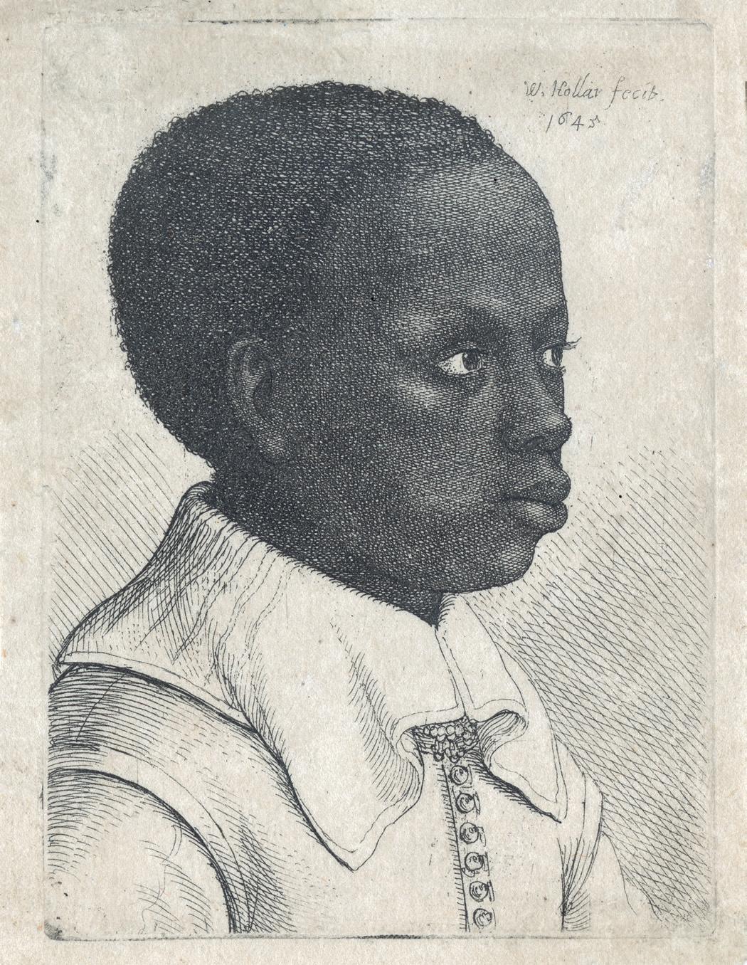
Portraits of Young Black Boy and Black Girl
Etchings on laid paper, 1645
Plate 79 × 58 mm
Watermark Two small and jointed circles
Reference Pennington 2004 (Boy) and 2007 (Girl), only state Provenance Private collection, The Netherlands
Condition In very good condition. Young black boy: a former small tear (3mm) restored in the upper margin
These two plates are an extremely rare pair of portraits of assumed victims of the European slave-trade, wearing servant’s clothes, typical in the Netherlands at the time, when it was fashionable to have exotic servants, as decorative appendage to the staff of an aristocratic household. This is even more affecting as the two sitters are still boy and girl. Both dressed in the European style, the young boy wears a soft, white collar with a pattern of pointed rays at the back, over a white doublet fastened in front of six buttons. The young girl wears a white kerchief with a lace border on her head and a white shoulder wrap fastened at the top round her neck. She has a dark bodice and a lace-trimmed under-bodice.
The prints are dated from Wenzel Hollar’s stay in the Low Countries, and one of them is even marked with the mention of Antwerp. They might have been etched from earlier drawings, because another Hollar’s plate depicting a black boy refers to a date of 1635, so before Hollar came to England. But we are not very sure about it.
Mostly because the subject clearly refers to the practice young black servants in the Netherlands and England, and much less to the German lands’ tradition, especially not in Cologne, where Hollar was in 1635 still. Secondly, the turning point in Hollar’s life came with the arrival of Lord Arundel at Cologne in 1636, whom Hollar started working for. We know Lady Arundel brought back from Italy in 1632 a black page. Even the old woman who ruled Samuel Pepy’s writing paper had a “comely black mayde to her servant”. Hollar might also have been inspired by this.
We have not been able to record any of these two plates in the market for thirty years at least. Of the group of six Hollar’s representations of young negroes, only one impression of Pennington 2005, of the same size, has been seen on the market, in the Netherlands in 2020, and sold for ca. 16,250€ with premium. The present pair is thus an extraordinary chance to be acquired.
7 Wenzel Hollar 1607 Prague – London 1677
28
29
Engraving on laid paper, ca. 1655-58
Watermark indistinct watermark [letter V] Plate 412 × 293 mm
Reference Hollstein 109, 1st state of three, before all letters
Literature Anne-Marie S. Logan, The ‘Cabinet’ of the Brothers Gerard and Jan Reynst, Amsterdam-Oxford-New York, 1975, pp. 38-45
Condition In fine condition
A superb impression before all letters. With his fellows
Jeremias Falck, Cornelis Holsteyn, Jan Lutma and Theodoor Matham, the young Cornelis II van Dalen was one of the most gifted engravers in Amsterdam from 1653, when he was 15 years old, until his premature death in 1664. Engraved after a painting by Lorenzo Lotto,
now in the Royal Collection at Hampton Court, the plate was intended to be part of series of prints ordered in 1655 by the Amsterdam collector and merchant Gerrit Reynst who owned the painting at the time. The series was still not finished at his death in 1658 and it was eventually published in 1671.
8 Cornelis II van Dalen 1638 – Amsterdam – 1664 Portrait of Painter Giorgione Barbarelli da Castelfranco
30
31
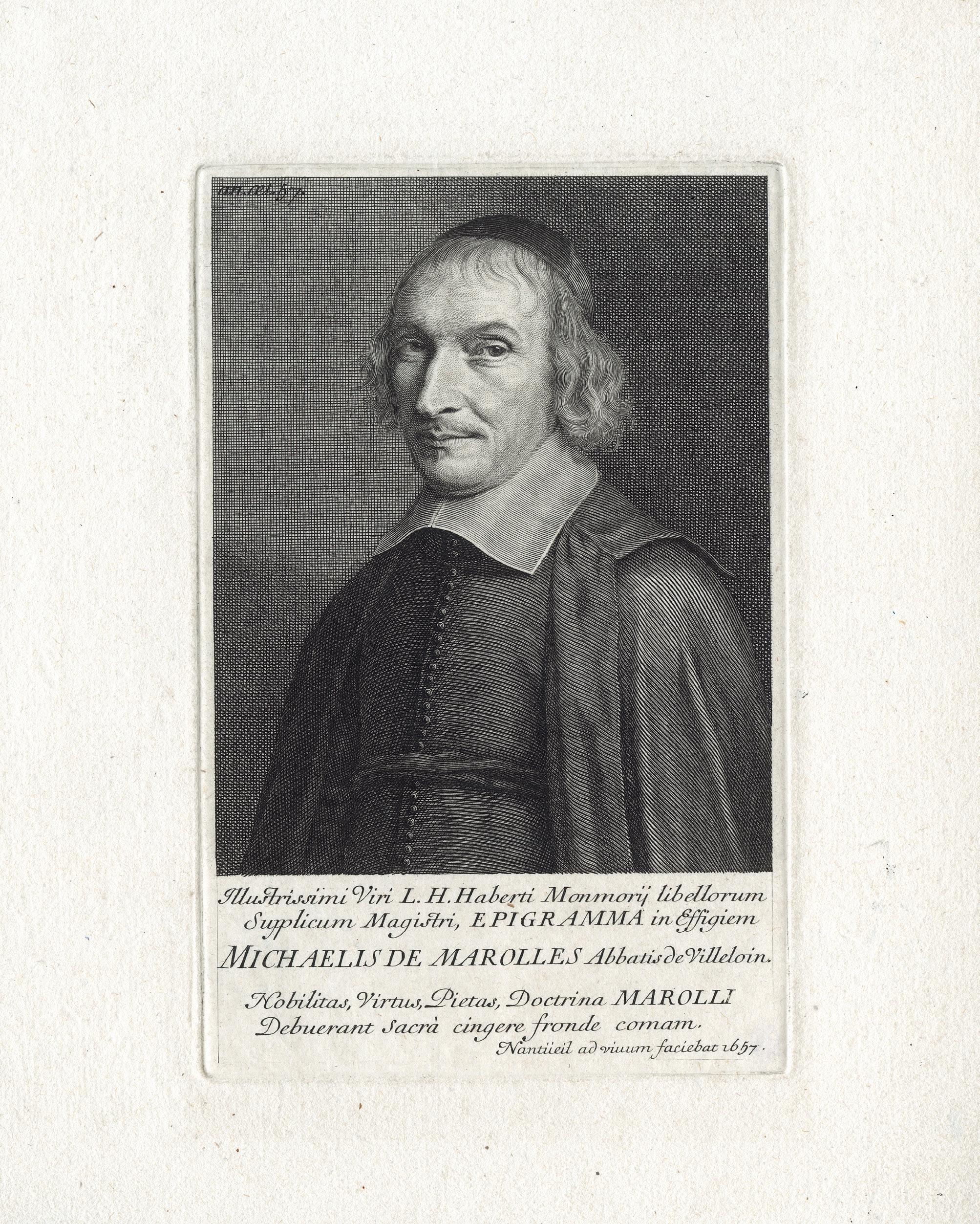
9 Robert Nanteuil 1623 Reims – Paris 1678
Portrait of the Abbé de Marolles
Engraving on laid paper, 1657
Plate 164 × 106 mm
Reference Robert-Dumesnil 171; Petitjean & Wickert 152, first state of four Literature Louis R. Metcalfe, “A Prince of Print-Collectors: Michel de Marolles, abbé de Villeloin (1600-1681)”, in Prints and their Makers. Essays on Engravers and Etchers Old and Modern, New York, The Century Co, 1912, p. 33-51
Provenance Félix Joubert, London (Lugt 1502a); Private collection, France Condition In perfect condition
This is a superb impression of the first state (of four) of the Nanteuil’s representation of the Abbé Marolles, one of the most important collectors in the world in the 17th century. Only the first and the second states are lifetime, when Marolles was 57 years old. The 3rd and the final states were published at his death in 1681 and later.
Michel de Marolles (1600-1681), known as the abbé de Marolles, was a French churchman and translator, known for his collection of old master prints. He became a monk in 1610 and later was abbot of Villeloin (1626-1674). He was the author of many translations of Latin poets and frequented many salons, notably the one of Madeleine de Scudéry.
Marolles is best known for having collected 123,000 prints, that were then bought from him in 1667 by Colbert for Louis XIV for 26,000 livres. The collection contained the works of around six thousand printmakers that were kept four hundred volumes. Marolles was one of the first to gather every sheet in albums. In a way, he was the first to personify in France and in the print world the concept of the amateur. This acquisition is considered as the foundation of the cabinet of prints in the royal library, though it was only constituted as a department in 1720, and it presently forms the basis for the print collection of the Bibliothèque nationale of France. After his sale to the King, Marolles started again another collection, also very large, which was sold at his death.
32
33
Sculptured Grotesque Head
Etching on laid paper, ca. 1680 Plate 71 × 57 mm
Reference Andresen, vol. 5, 2; Hollstein (German), vol. 8, 2, only state Provenance Private collection, Germany Condition In fine condition
This is an extremely rare impression of a sculptured theatrical mask or grotesque head, by the German and Nuremberg painter and etcher Johann Franz Ermels. The print is very rare to find, there are three other impressions recorded, one at the Rijksmuseum, one at the British Museum, one at the Philadelphia Museum of Art, but none at the Albertina or at the Kupferstichkabinett in Berlin (Staatliche Museen).
It depicts a bizarre head carved in stone or marble, the hair (or cover) of which and neck, carved into the raw, are only half finished. It is seen from the front, slightly tilted to the left side; the mouth warped to laugh.
Ermels was was a pupil of the history painter, Johann Hulsmann, in Cologne. Ermels subsequently left for the
Netherlands and was apprenticed by Jan Both, under whose influence he turned to landscape painting. In 1660 he settled in Nuremberg, where he was awarded the title of master craftsman in 1661. For a time, Ermels worked together with Willem van Bemmel, who was also active in the city, frequently supplying staff figures for his landscapes.
Ermels’ small, printed œuvre includes a series of nine etchings with ancient Roman monuments and ruins (Hollstein 6–14), and a few portraits (Hollstein 1-5). The six landscapes have one of their inspirations in the work of 17th century Dutch printmaker Bartholomeus Breenbergh, who also etched three plates with chimeric human heads.
34 10 Johann Franz Ermels (der Ältere) 1641 Reilkirchen – Nuremberg ca. 1693
35
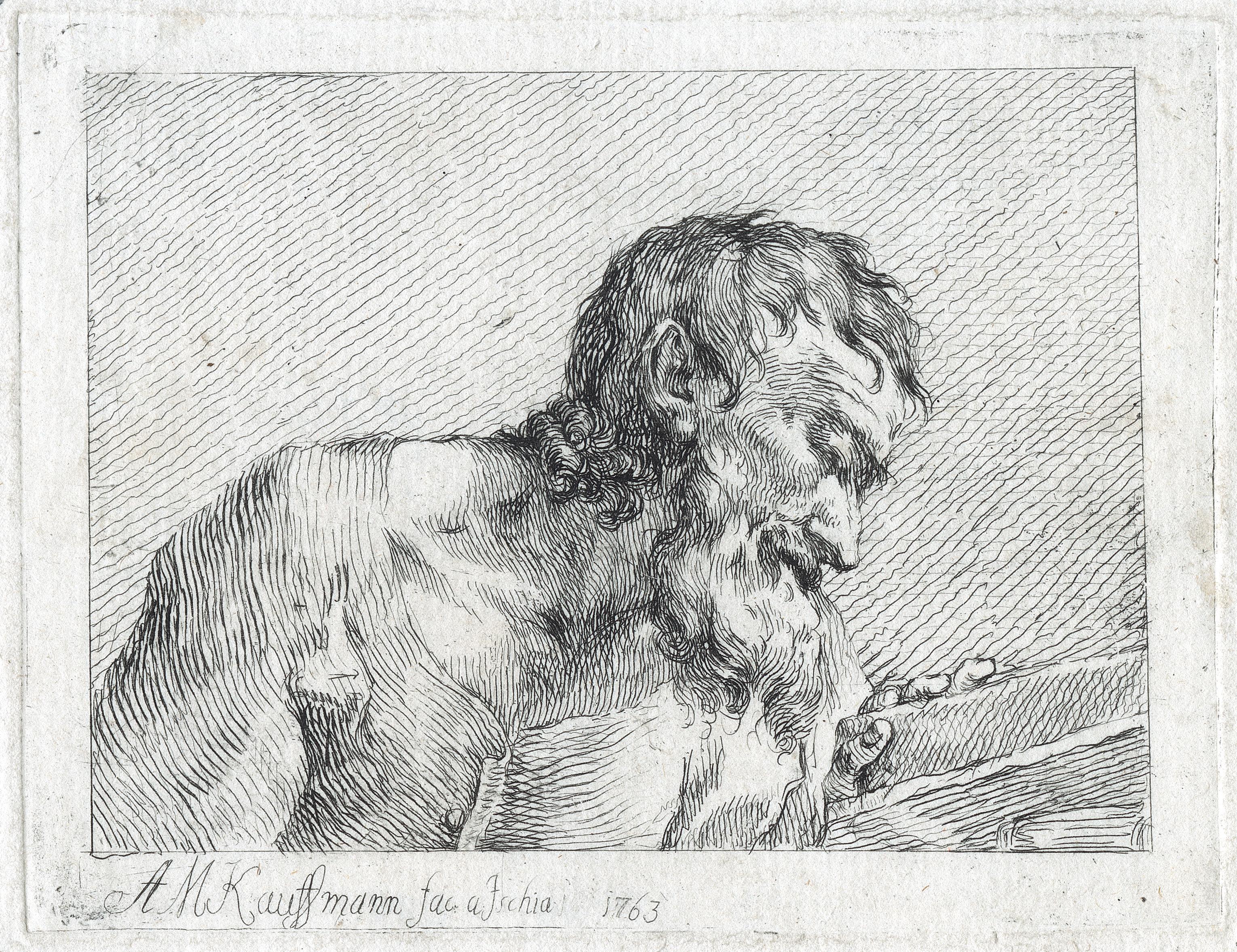
11 Angelica Kauffmann Chur Old Man Reading
Etching on laid paper, 1763 Plate 96 × 124 mm
Reference Nagler 26; Andresen 23, first state of three Provenance Private collection, Italy Condition In fine condition
A great impression of the first state of three, before the aquatint and then the address of John Boydell, with the date 1781. The present plate was made during Kauffmann’s stay in Italy, first in Florence in 1762, where she tried and learned etching, and then in Rome between 1763 and 1766, from where she travelled to Naples and Ischia. Between 1762 and 1779 Kauffman created a total of fortyone etchings. When she left London, she sold the plates to the publisher J. Boydell, who had them reworked and reissued.
Angelica Kauffmann was one of the most famous women artists, painters and portraitists of the 18th century. Her style is halfway between neo-classicism and Empfindsamkeit. Born in Chur, Switzerland in 1741, Kauffman was quickly recognised as a child prodigy. Her father, a painter himself, gave her drawing lessons from a young age as the family moved between Austria, Switzerland, and Italy. In Italy she established a reputa-
tion as an artist and was elected a member of the Roman Accademia di San Luca at the age of 23. After moving to London in 1766, Kauffman struck up a close friendship with Joshua Reynolds, commemorated in the portraits they painted of each other. When the Royal Academy of Arts was established in 1768 with Sir Joshua Reynolds as President, she and Mary Moser were the only two women invited to become Founder Members. Angelica Kauffman spent only 15 years in England, but made a significant impact on the 18th century London art scene. Her fame was huge across Europe, and she had connections with many key figures, as for instance the Emperor Joseph II, the Prince of Bavaria, and the Duchess of SaxeWeimar. She was well-known painting portraits, selfportraits, and landscapes, but identified herself primarily as a history painter, the genre Reynolds placed at the heart of the Academy’s teaching. During this period, women were still prohibited from drawing nude models and could only draw the male figure from existing casts.
36
1741
– 1807 Rome
37
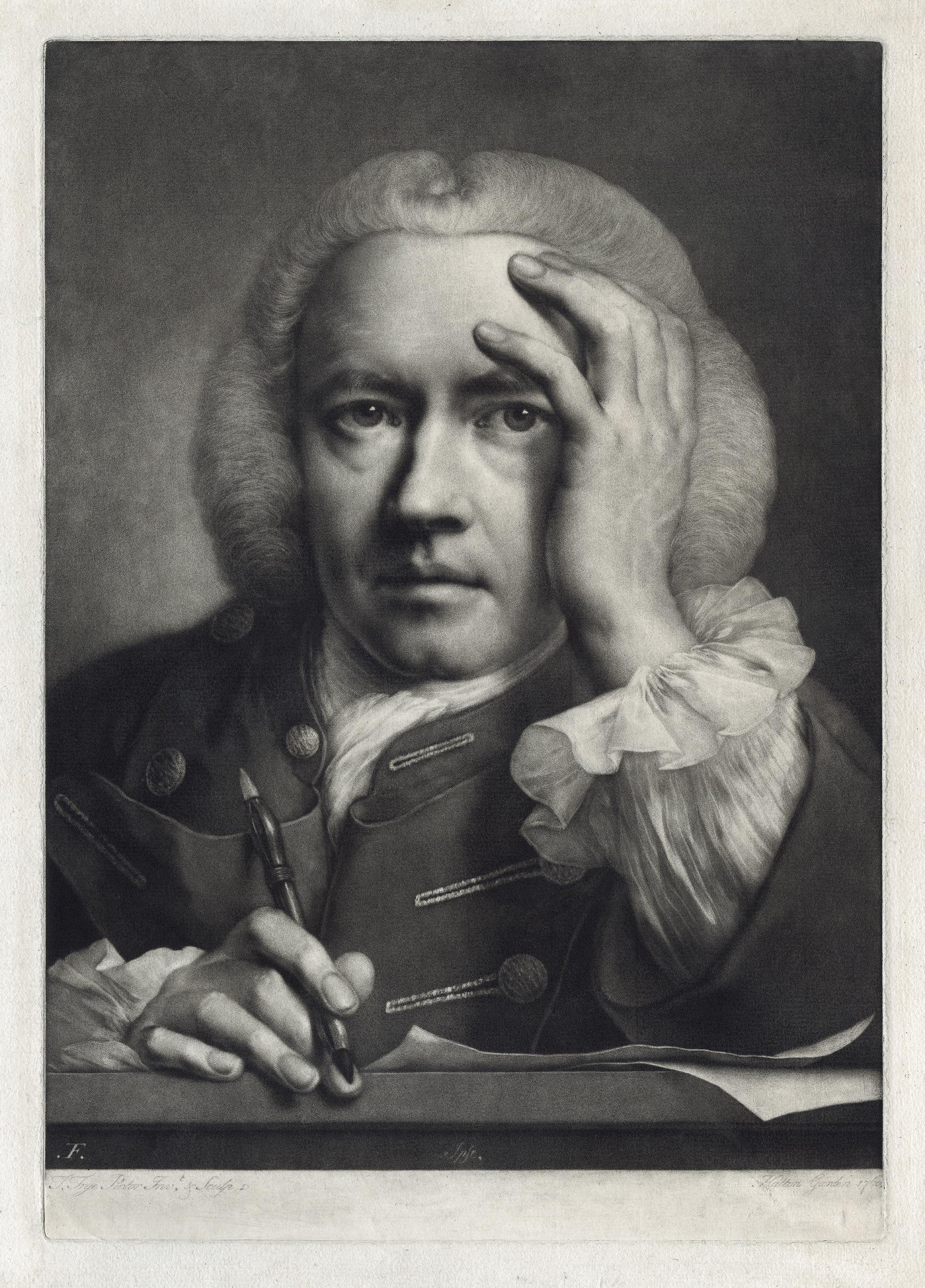
12 William Thomas Frye 1711/12 Dublin – London 1762
Self-portrait
Mezzotint on laid paper, 1760 Plate 502 × 352 mm
Reference John Chaloner Smith, British Mezzotinto Portraits, London, Henry Sotheran, 1884, vol. II, p. 521, no. 6, only state; Charles E. Russell, English Mezzotinto Portraits and Their States: Catalogue of Corrections and Additions to Chaloner Smith’s British Mezzotinto Portraits, London and New York, 1926, vol. II, p. 111, no. 6, second (final) state
Provenance Private collection, Australia
Condition In fine condition
A very fine impression of the mezzotint self-portrait of Thomas Frye; bust length, full face, almost life size. He wears a wig, a white shirt, and a braided coat. His right hand, holding a porte-crayon, rests on his drawing board. His left hand is raised to his head. Frye’s Self-portrait is one of the most dramatic prints of the period, the unusually large scale allowing him to capture the different textures of skin, hair, cloth, metal and paper using tone alone. Significantly, he shows himself holding not a mezzotint burnishing tool but a porte-crayon: he wished to emphasize his artistic genius rather than his technical skill. His pose, head in hand, was well established as a signifier of the “melancholic” artistic temperament.
The present plate was published in his series of life-size heads, titles Fancy Heads / Drawn from Nature and as large as life, in two series between 1760 and 1762. In the mid18th century, these prints were costly, sold as single sheets or in sets of loose six or twelves plates, and were considered as elegant decoration for houses of the elites. Except for this self-portrait, the other works in the series
were issued without titles and are imagined subjects rather than identifiable sitters. The difference between the first and the second state is only before or with the stipple inscription lower left.
Born in Dublin, Thomas Frye came to England at an early age and practised as a portrait painter, ca. 1735-40, before managing a China manufactory in Bow for fifteen years. Thomas Frye produced relatively few engravings, all of which are mezzotint portraits, and almost all of which date from the last two years of his life, after he retired from the porcelain dealing in 1759. Their significance lies in their dramatic approach to portraiture and in the fact that they are some of the few original mezzotint engravings of the period. At this time mezzotint was used almost exclusively as a reproductive process by engravers who would simply copy the designs of other painters. Thomas Frye was exceptional in using the mezzotint medium as a creative process, both designing and engraving his own works on the copper.
38
39
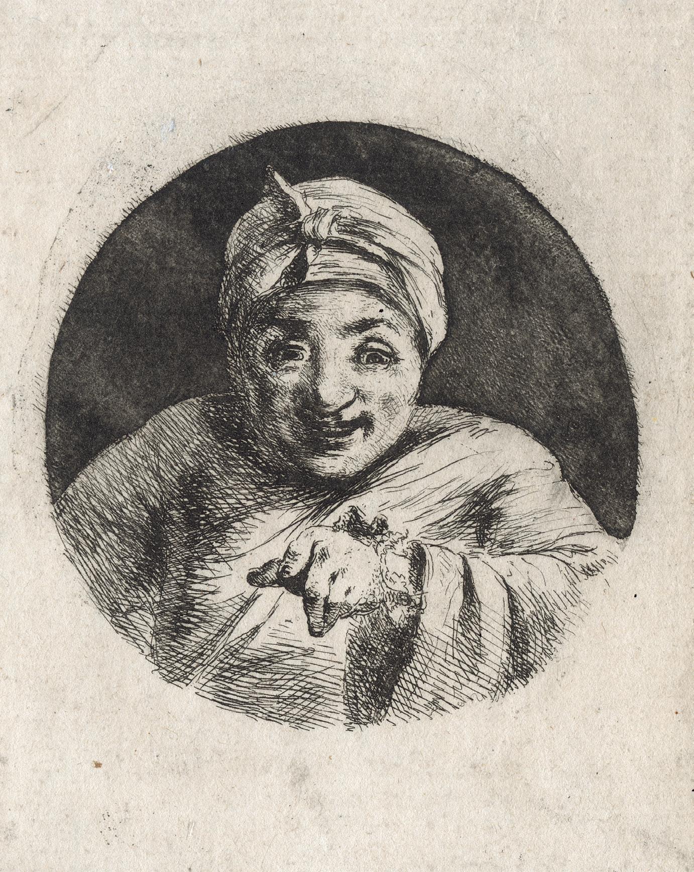
13 Dominique-Vivant Denon 1747 Chalon-sur-Saône – Paris 1825 Self-portrait, in Night Cap and Gown
Etching on laid paper, ca. 1780 Plate 71 mm
Reference Inventaire du Fonds Français, Graveurs du XVIIIe siècle (vol. VI) 266; Chu 159, only state Provenance Private collection, Italy Condition In fine condition
This is a fine and very rare impression of one of the earliest Denon’ self-portraits. A prolific etcher and perspective observer, Denon was drawn to self-portrait: nine can be documented in his graphic œuvre, and they record Denon’s intriguing physiognomy in various situations at different stages in his career. The image of Denon as a confident artist and connoisseur is recurrent and well known, and Denon produced six images of him in this vein. But the early self-portraits show another mood, where he is laughing about himself. This is funny and unusual if we consider the fact that he was at the time not only a young artist but a thirty-three-year-old diplomat of the French state, posted to Rome and Naples.
Here Denon is half-length, facing front, wearing a nightgown, gesturing, pointing at viewer and smiling, nearly as if he was a madman. There are other examples of amusing versions of himself and of the same year, ca. 1780, as for instance a small self-portrait where he is looking quizzically over his shoulder (Inventaire du Fonds Français 265), or a whimsical representation of himself as a satyr with pointed ears and bearing a thyrsus (Inventaire du Fonds Français 264).
40
41
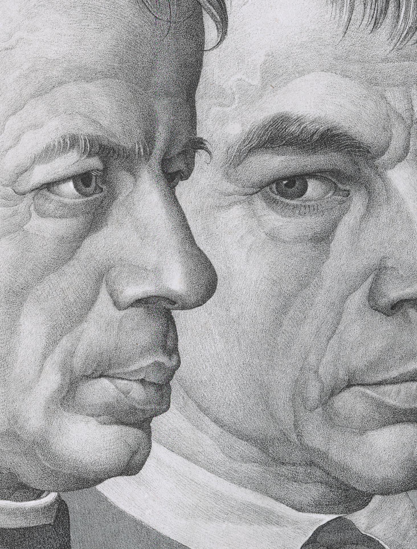
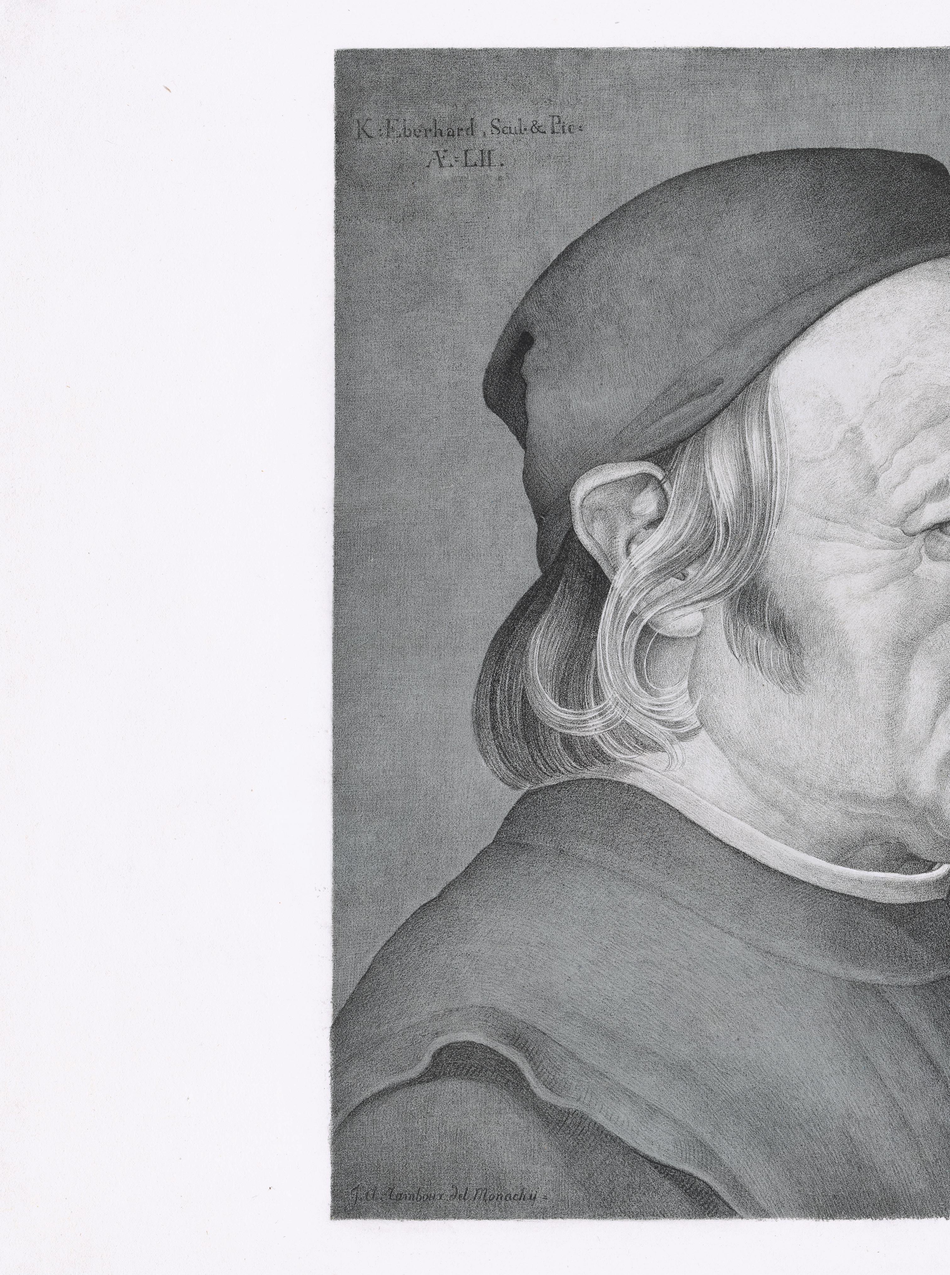
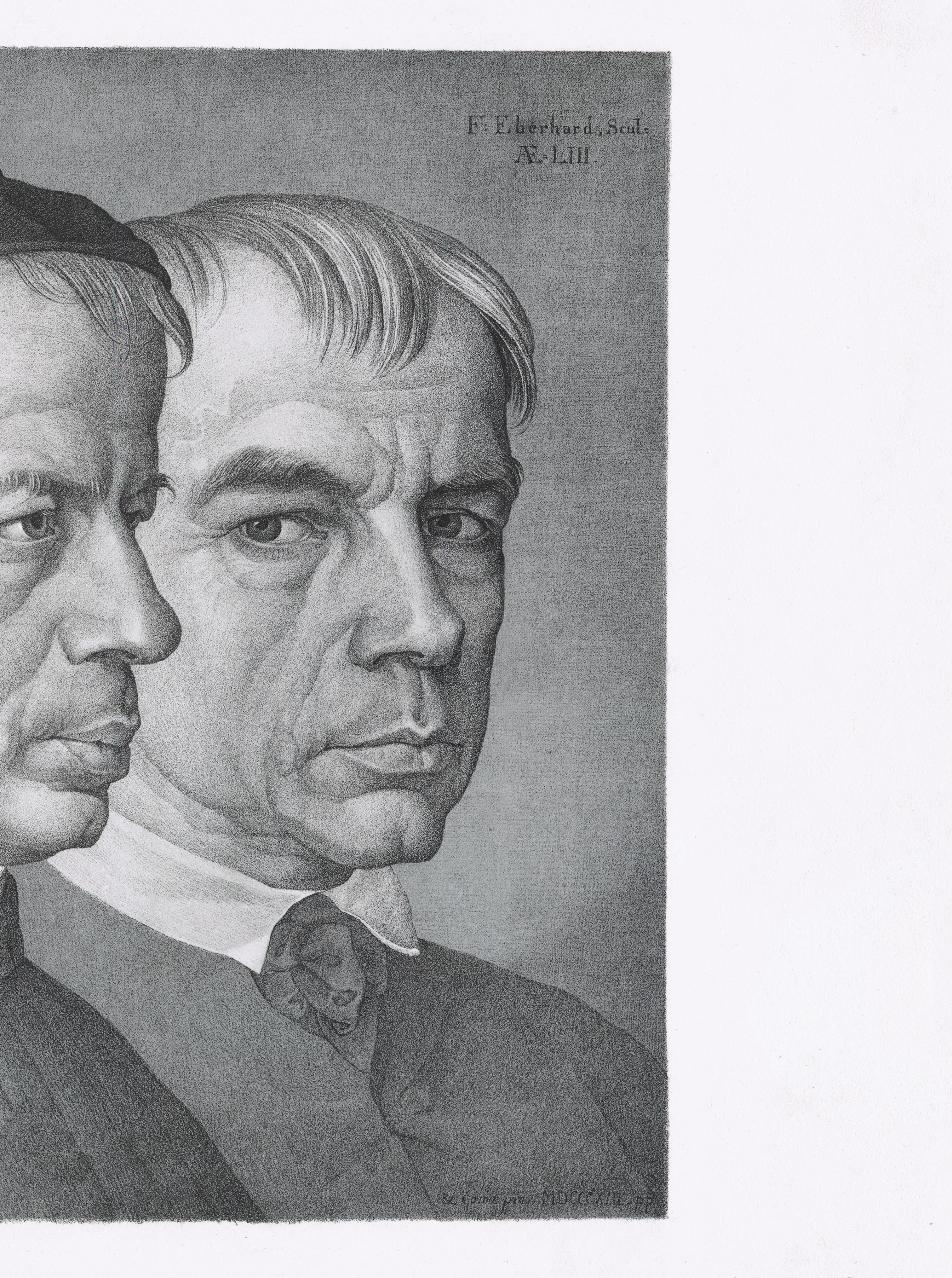
14 Johann Anton Ramboux 1790 Trier – Cologne 1866
Double Portrait of the Brothers Konrad and Franz Eberhard
Chalk lithograph in grey and with light grey on wove paper, 1822
Plate 318 × 343 mm
Reference Rolf Arnim Winkler, Die Frühzeit der deutschen Lithographie, Katalog der Bilddrucke von 1796-1821, Prestel-Verlag, Munich, 1975, no. 648.2
Literature Norbert Suhr, Unter Glas und Rahmen. Druckgraphik der Romantik aus den Beständen des Landesmuseums Mainz und aus Privatbesitz , Main, 1993, p. 33, no. 10 (Giuila Bartrum, German Romantic prints and drawings from an English Private Collection, exh. cat., The British Museum, 2011, no. 7; Mitchell B. Frank, “Portrait Prints 1770-1850: Friends and Family”, in The Enchanted World of German Romantic Prints 1770-1850, Philadelphia, 2017, p. 193 Provenance Private collection, Germany
Condition Very fine condition
The Double Portrait of the Painter Konrad Eberhard and his Brother Franz is one of the most significant friendships of German Romanticism and Nazarenes. Artistically and technically, Johann Anton Ramboux’s Double Portrait has been described as masterpiece and one of the great accomplishments of the early stage of the lithography.
The present sheet is one of the most beautiful impressions we have ever seen. The chalk lithograph is perfectly fresh and contrasted, with strong pressure, all the nuances finely emphasized and with graduated tonal tones. The fine texture of the paper perfectly displays Ramboux exquisite handling of the medium, evoking the sheen of a silverpoint drawing. It is a masterly tour-de-force.
The Double Portrait of the Painter Konrad Eberhard and his Brother Franz was printed in a very small number of impressions, probably for the Eberhards themselves to distribute amongst friends. The approach of the Munich based printer Johann Anton Selb appears to have been experimental, and there was no standard edition. Some impressions were printed with an additional tint tone (brown) on wove paper, other on China paper. As far as we know, there are 17 impressions in public collections. In 1975 Winkler recorded nine examples in German
museums. Another one was at the Art Institute of Chicago and since then a further seven have entered museum collections. Remaining impressions in private hands are of the utmost rarity.
Formerly a pupil of Jean-Louis David in Paris, Ramboux spent the years between 1816 and 1822 in Rome, where he became acquainted with the sculptor and painter Konrad Eberhard and his brother Franz, who also worked as a sculptor, in the circle of the Nazarenes (a circle of German artists who rejected neo-classicism and extolled a return to religious painting inspired by the art of the Middle Ages and early Renaissance). The genre of the double portrait, or Freundschaftsbild, was an important subject for this group of artists, who held an idealised view of friendship as integral to the life of the artist, associating it with medieval guilds and confraternities. Still in Rome, Ramboux made a small double portrait of these two brothers on oil, which is now at the Wallraf-Richartz Museum in Cologne. At the same time, the lithograph was created, to the same scale. Then, together, Ramboux and the Eberhard brothers left the city in 1822 and moved north. Having arrived in Munich, Johann Anton Selb got a very small edition of it.
42
43 (detail)
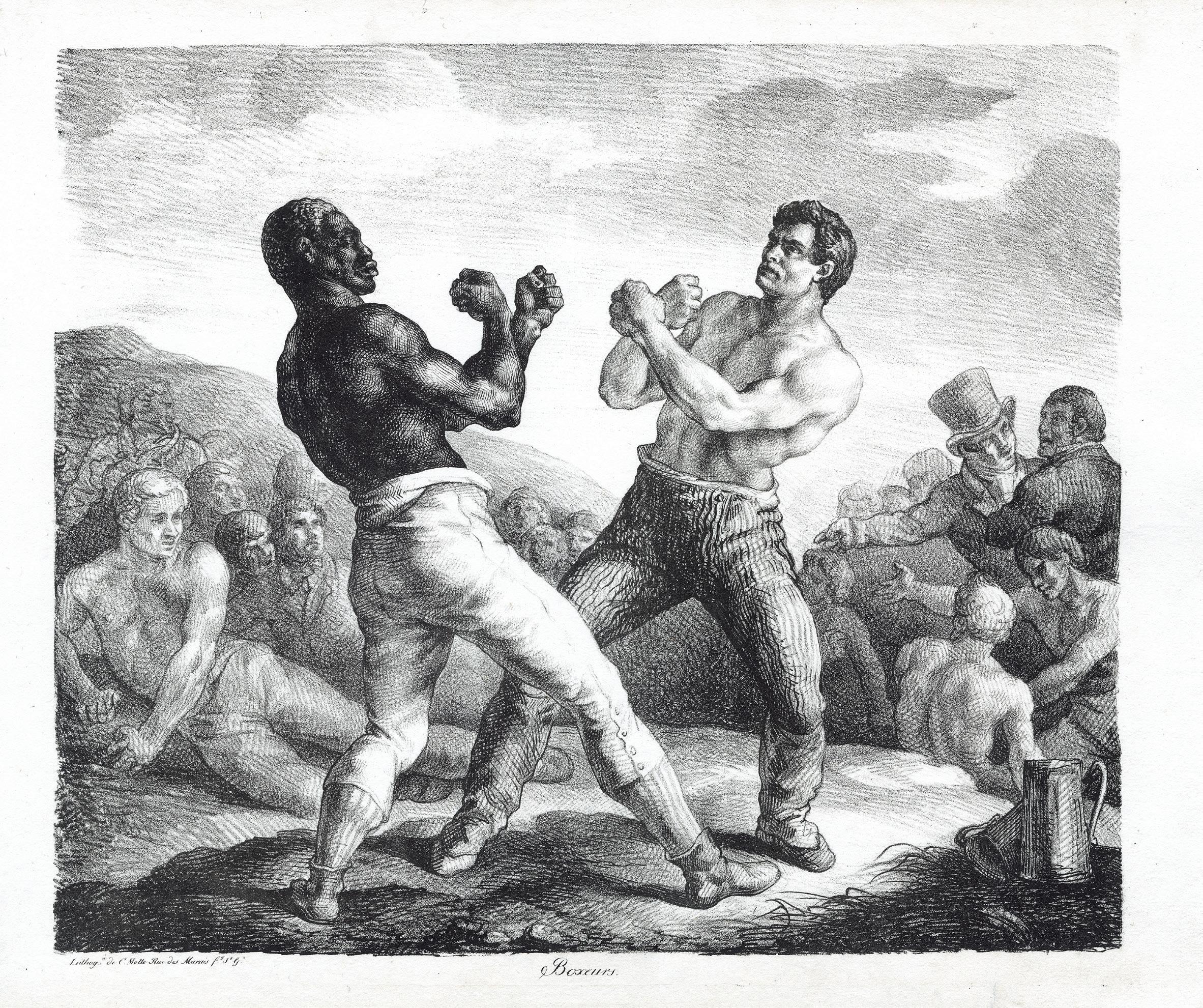
The Boxers
Lithograph on wove paper, 1818 Stone 360 × 412 mm
Reference Delteil 10, second (final) state Provenance Private collection, France Condition In fine condition
A very fine, rich impression of this very rare print by Théodore Géricault and printed by Charles Motte in Paris. The actual size of the edition cannot be confirmed, but it seems it was a very small one, which is a bit surprising for a subject now seen as a very strong one by our contemporaries.
Boxing was considered at the beginning of the 19th century as an “English” activity par excellence. This type of contemporary genre scene was also the main subject of the English sports prints that Géricault knew well before his departure for London. It was not legal however and clandestine fights took place in night clubs or in fields, as in this depiction. The artist may have been a direct spectator of boxing fights in France: he often went to Horace Vernet’s studio where amateur fights were an integral part of the painter’s universe. Even the Géricault’s student, Antoine Monfort, participated to those. The “bout” in the lithograph may have been indeed staged between Géricault’s young disciples Montfort and François Lehoux. The design reflects Marco da Ravenna’s engraving Entellus and Dares (Bartsch 195), which Géricault may have seen in Rome.
Whatever, Géricault made a lot of preliminary studies to the lithograph, most of them being kept in a album at the Art Institute of Chicago. They are a testimony to the care and precision he took in finishing all the details of the composition before executing the lithograph. A boxing match is represented by successive scenes, according to the different moments of its progress. The present Boxers, inspired by one of these sequences, is part of a creative process similar to that followed by the artist for The Raft
of the Medusa, made the same year, where a single moment is isolated from a narrative suite developed during many preliminary studies.
There is yet another link between The Boxers and The Raft of the Medusa, and that is the artist’s interest in the theme of race. The position of the black boxer as an equal, in the face of his white rival, seems to associate this lithograph with a kind of liberal, Bonapartist and republican political declaration. The identical representation of the attitude of the two boxers as if reflected in a mirror finds its equivalent in the technique used by Géricault to make his composition: the body of the black is drawn for its upper part with the pen and for the lower part with the pencil, while the body of the white is treated inversely. Géricault thus underlines the difference that separates the two fighters, the absolute opposite of each other, but also the reversible character of their image, as in a mirror.
Was Joseph the model for this lithograph, the Haitian model Géricault used for The Raft of the Medusa made at the same time? Working several times for the artist, Joseph’s story is now more documented and is part of the abolitionist beginnings first supported and later discouraged by Napoleon. From 1832, Joseph became one of only three black male models at the Ecole des BeauxArts, in Paris. As a model, he was the very symbol of the black man who comes out of the standardized representation that still prevailed in the 18th century –a single color, always with the same hair, the same nose – towards a much more realistic and precise representation, due to the rise of naturalism and the beginnings of anthropology.
46 15 Théodore Géricault 1791 Rouen – Paris 1824
47
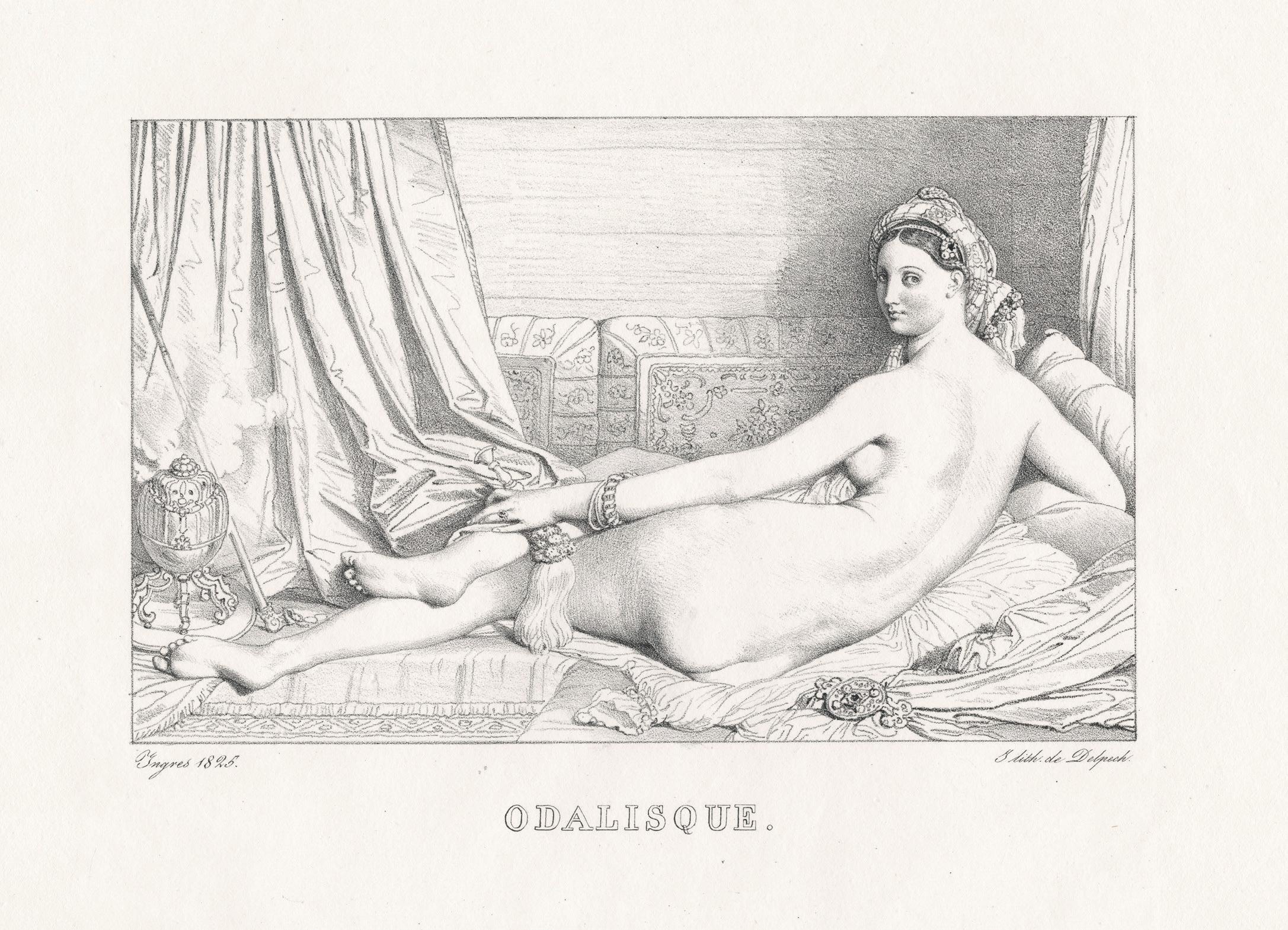
16 Ingres 1780 Montauban Paris 1867 Odalisque
Lithograph on wove paper, 1825 Plate 150 × 210 mm
Reference Delteil 8; Inventaire du Fonds Français (Après 1800), vol. 11, p.40
Literature Henri Delaborde, Ingres. Sa vie, ses travaux, sa doctrine, 1870, no. 432, p. 316
Provenance Private collection, France
Condition In very fine condition
A very rare lithograph. After having spent 18 years in Italy, Jean-Auguste-Dominique Ingres came back to France in 1824. His goal was to use lithography to widely spread his works. Ingres felt that his Grande Odalisque – painted in Rome in 1814 (Paris, Musée du Louvre) and first shown at the Parisian Salon of 1819 – was a good choice among his works to reproduce: the subject was both so-called erotic and exotic. These two features were highly appreciated under the reign of Charles X, and indeed the painting remains still today one of the key works at the Louvre.
Perhaps the greatest draughtsman of his era, Ingres made only few original prints: eight lithographs and one etching. The actual lithography was created in 1825 and presents the painting with a right to left inversion. It was published in 1826 by François Séraphin Delpech in his Album lithographique
48
Jean-Auguste-Dominique
–
49
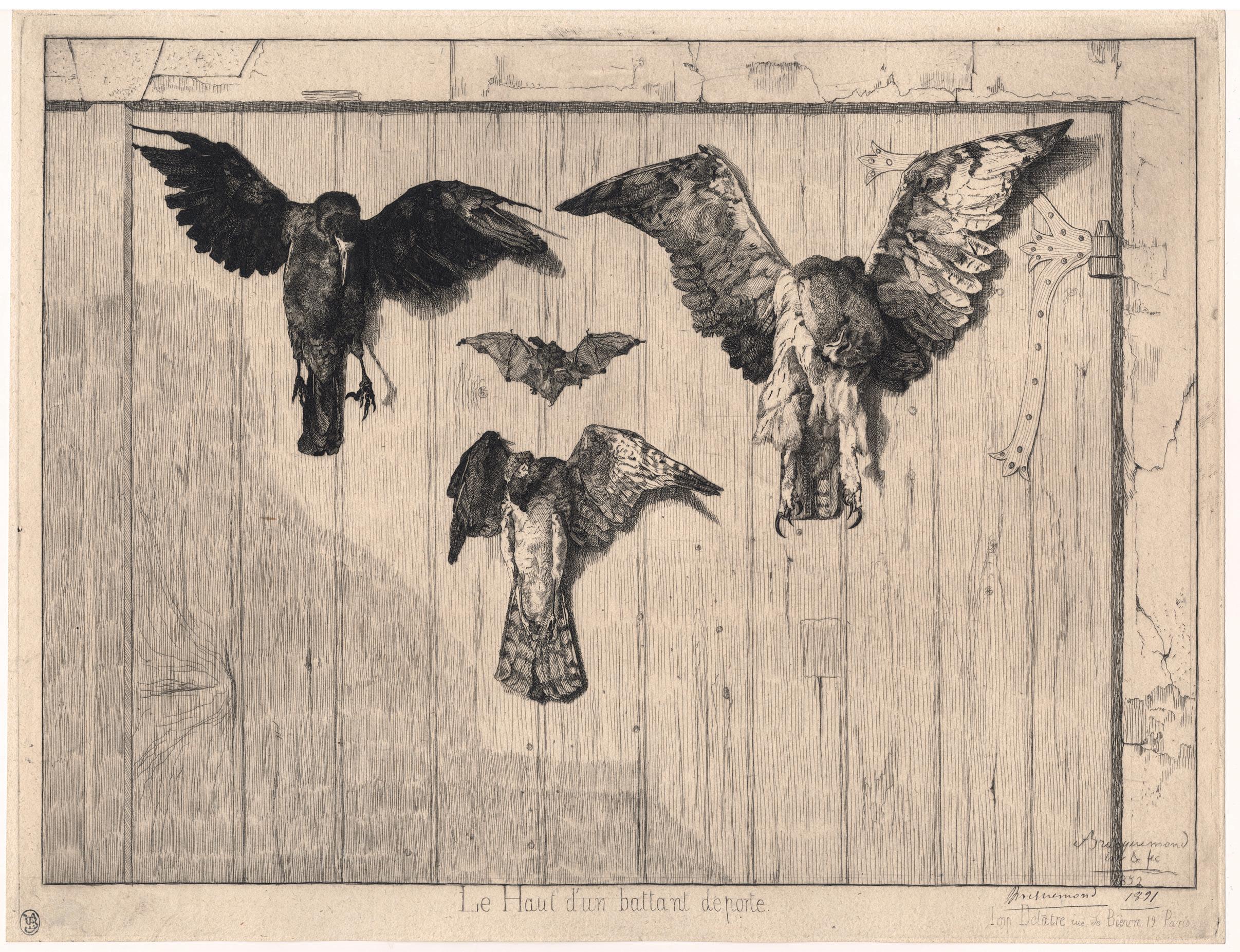
17 Felix Bracquemond 1833 – Paris – 1914
The Top of a Half-Door
Etching on old laid paper, 1852
Signed and dated lower right with ink Bracquemond 1891 Watermark Strasbourg Lily Plate 278 × 381 mm
Reference Béraldi 110, 3rd state of five; Bouillon Ac1, 3rd state of ten Provenance Alfred Beurdeley (Lugt 421); Private collection, Paris Condition In fine condition
This is a magnificent, early and sharp impression of the Bracquemond’s most celebrated image. It has been printed on an old laid paper, the third state of ten, with a distinguished provenance – if not the best for the late 19th century corpus – i.e. Alfred Beurdeley, and signed and dated by Bracquemond in ink. Given this signed date – 1891 – the present impression most likely remained in Bracquemond’s hands until then. As famous, this audacious etching is however one of his earliest.
There are only three impressions of the 1st and 2nd states, all together. The 3rd state was thus printed at Delâtre in 1852, according Béraldi’s estimation a printing of thirty copies. The 4th state – with the legend – was equally printed. Then the copperplate with others was sold to the publisher Mme Avenin, and later Cadart bought them out in 1864. He published it for the first time in 1865.
From Avenin’s printing, the plate got worn and the effect is no longer the same. It remains nevertheless a very powerful iconographical image and a great display of printmaking capacity.
Bracquemond was famous for his prints of birds. John Taylor Arms even notes that he was called “the Michelangelo of ducks”1. Here, on an old barn door are nailed a crow and a long-eared owl flanking a bat; beneath them is a sparrow-hawk. The most interesting aspects of the print – precise attention to natural detail, along with the careful outline and formal placement – could as easily have been derived from French influences as from Japanese ones.
1. John Taylor Arms, “By-Path in Print Collecting”, in Prints, vol. VII, no. 4 (April 1937), p. 199.
50
51
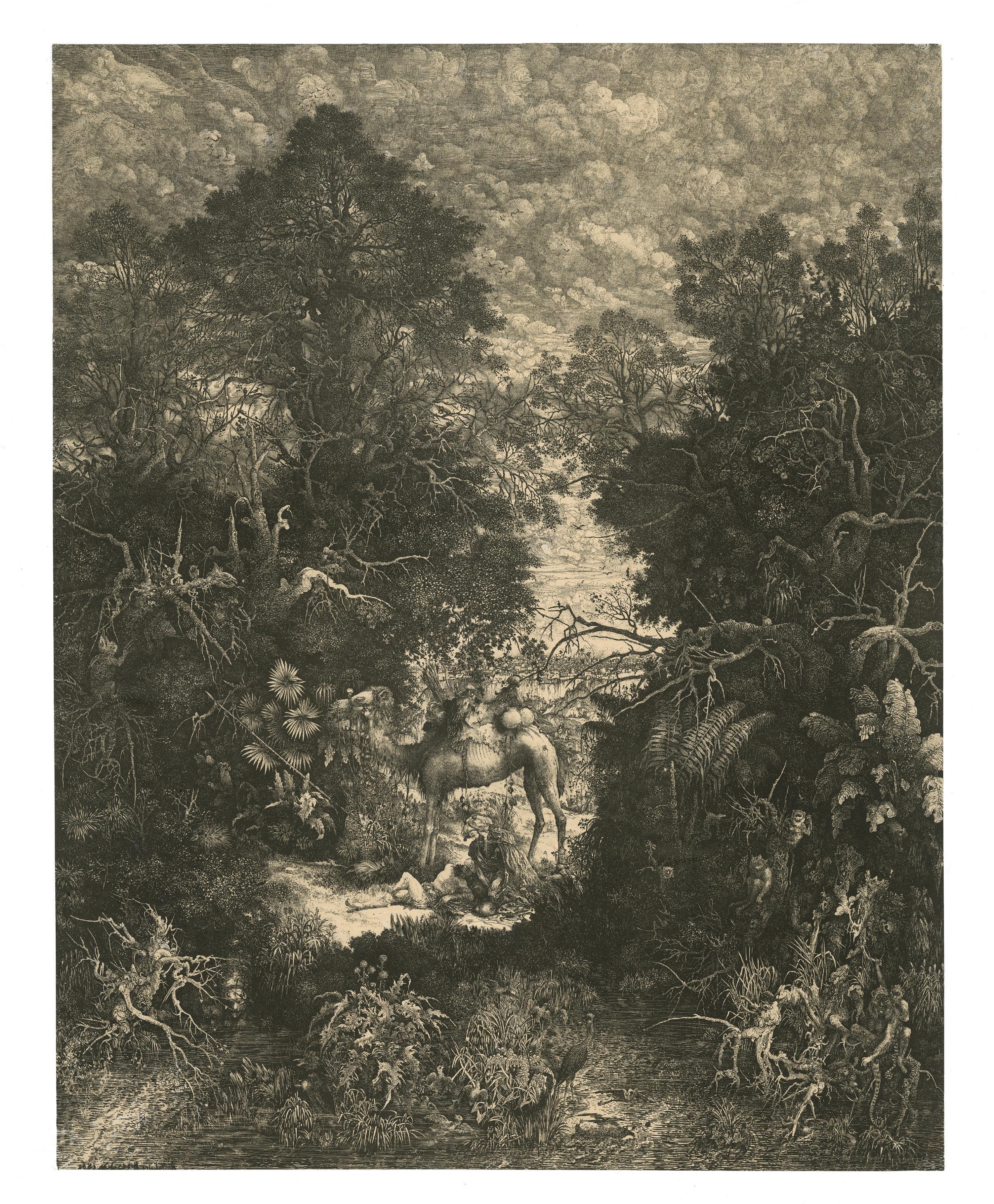
18 Rodolphe Bresdin 1822 Montrelais – Sèvres 1885
Le Bon Samaritain
Lithograph printed on yellowish Chine paper laid down on a white wove paper, 1861 Image 564 × 441 mm
Reference Van Gelder 100, first state of two
Literature David Becker, “Rodolphe Bresdin’s Le Bon Samaritain”, in Nouvelles de l’Estampe, nos. 70-71 (1983), pp. 7-14
Provenance With Frederick Mulder, London, in 2003; Private collection, Belgium Condition In very good condition, with tiny repairs along the margins
This is an exceptional impression of the very early first state printed in 1861, which is equally extremely rare. In our twenty years career, it is the first time that we have been able to acquire a copy of this state and early printing. David Becker (1983) knew only thirteen impressions and had records of a few others, and he thus suggested a total of ca. twenty impressions of the earliest state.
It is thus a first state impression before both the monkey’s black leg, the so-called “white bird” and the white thistle, somehow considered as accidents during the forthcoming printing. It corresponds to the Becker’s first state and Préaud first state, before the state described by Van Gelder but with some confusions about the accidents described above. Rodolphe Bresdin finished his lithograph at the beginning of 1861. Moving to Paris from Toulouse in March 1861, he entrusted the stone soon after to the printer Lemercier, who printed for the artist this first very small edition. Bresdin exhibited an impression at the Salon in May 1861 with five drawings. The critics of the Salon noted the amazing subject and the fantastic realization, but a new printing only came later six years later, in September 1867. It is generally agreed that the overall quality and sharpness of impressions deteriorates during the forthcoming successive printings from 1867.
As the present one, there were a few impressions printed in 1861 on Chine that were then remounted on a white wove paper, with no address. They might be considered as proofs, but it is difficult to ascertain.
The quality of this impression is great. The sky appears to be powerful, and with the trees especially vivid, in front of the sky. Later the lines begin to spread and become dull, leading to the gradual flattening of the print. One can even see the earliest traces of the roulette in the sky that would then disappear quickly. The vegetation is everywhere sharp and brilliant. The dark areas are perfectly deep and contrasted.
Le Bon Samaritain is the most celebrated lithograph by Bresdin, and is unquestionably his masterpiece, the largest, most spectacular of all his mind-boggling fantasies. The Samaritan who interrupts his journey to assist a wounded traveller is here envisioned midst a tangle of exotic plants and animals, teeming clods, and shadows. It is a prodigious tour de force of passionate attention to detail, held together by the artist’s amazing powers of composition.
52
53
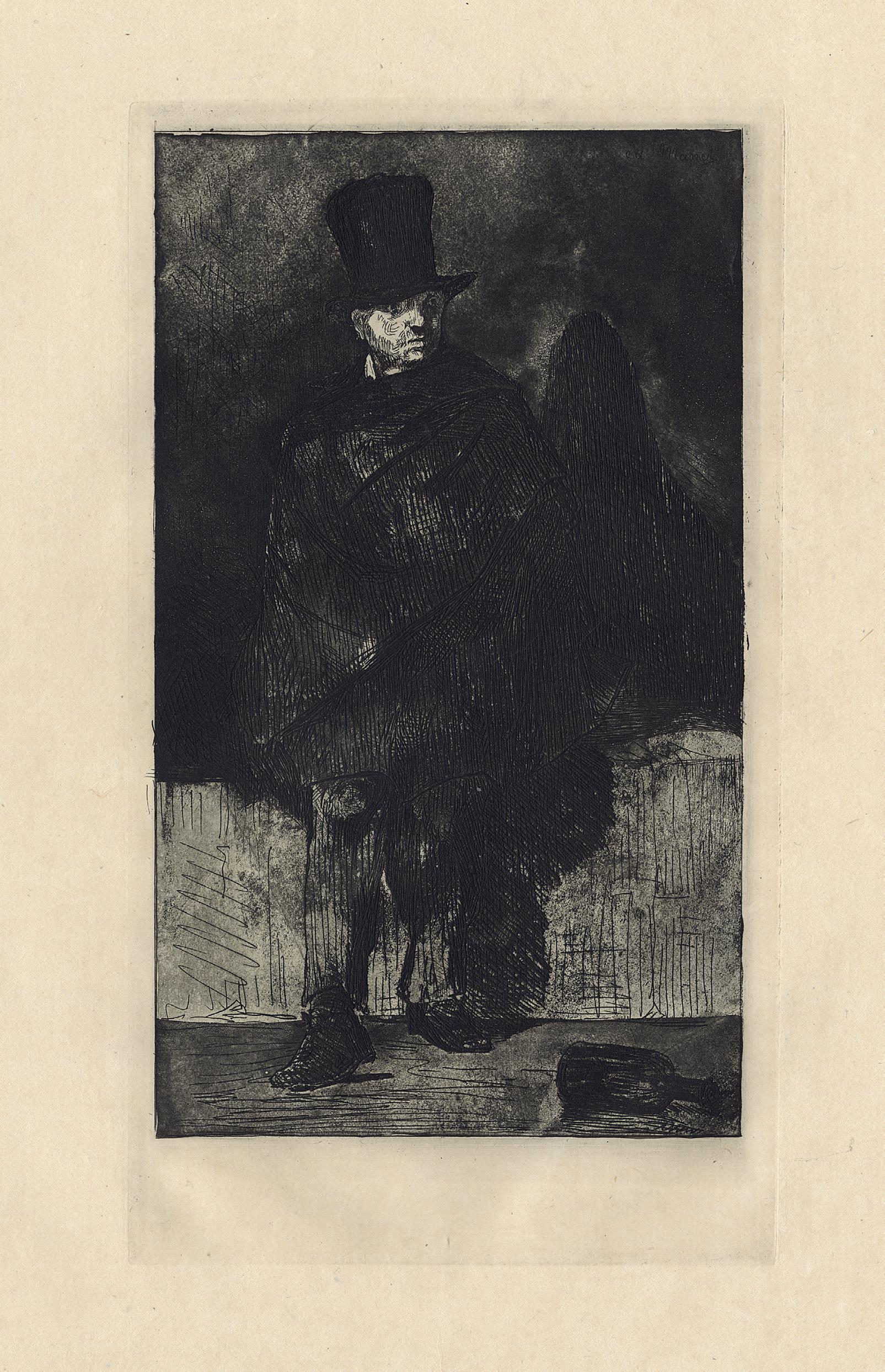
The Absinthe Drinker
Etching and aquatint on simili-Japan paper, ca. 1861-62
Plate 290 × 162 mm
Reference Guérin 17, 2nd (final) state; Harris 16, 3rd (final) state; Wilson (1978), 25; Fisher 5
Provenance Private collection, France
Condition In very good condition
It is a very nice impression of the 3rd sate, from the edition held by Alfred Porcabeuf, the uncle of Felix Bracquemond, in ca. 1906-10. Unfortunately, 1st and 2nd states impressions are unobtainable nowadays. Later, ca. 1867-68, Manet went back to several of his old plates and applied a heavy ground of aquatint to each, probably with Bracquemond’s help, transforming their effect. This is the case here, for the 3rd state, and only the face was left by Manet with a dramatic touch of light, and the back wall was given a lighter tone using a finer grain of aquatint.
The transformation was undoubtedly made with Goya’s Los Craprichos prints in mind. The composition is after the painting of the same title (Wildenstein 19), which was Manet’s first major independent work, and when it was rejected at the Salon of 1859, Manet was certain that his former master, Couture, had urged the refusal. Throughout Manet’s career he looked back to early works as subjects of new composition, and in 1861-62, the figure of the absinthe drinker was especially important to him.
54 19 Edouard Manet 1832 – Paris – 1883
55
20
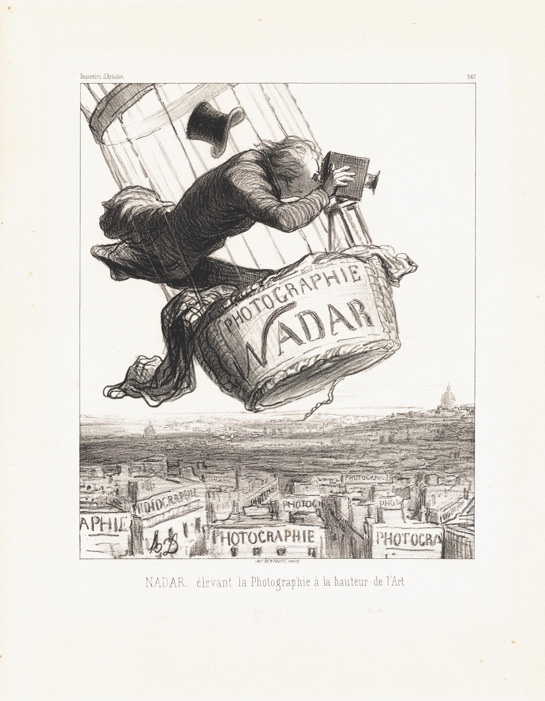
Nadar Elevating Photography to Art
Lithograph on thick wove paper, 1862 Dry-stamped Souvenirs d’Artistes, in the middle of the lower margin Image 273 × 222 mm Reference Delteil 3248, 2nd (final) state Condition In perfect condition
This is a perfect impression on “white paper” of one of the most iconic lithographs by Daumier, showing Nadar “elevating” photography to art. The only difference between the two states is the addition of the letters Souvenirs d’artistes on the upper left, and the number 367 on the upper right.
The image could be seen as a promotion of the photography and Félix Tournachon, called Nadar, who took the first photograph from the air in 1858. Indeed, later on, this composition became the most representative image of Nadar and his adventurous projects. But actually,
this image came right after a court decision in 1862 that permitted photographs to be considered works of art. Daumier depicts Nadar as a bizarre, daring photographer and taking risks. His hat is flying off, and in his own excitement to capture the perfect shot, he almost falls out of his balloon. Using the metaphor of the balloon in the air, Daumier laughs at Nadar, and he mocks the new declaration that photography could be equal to “high art.”
In a way, it also foreshadows modern aerial-surveillance photography, as Nadar’s balloon was used in the 1870 Siege of Paris for intrusive photography.
56
Honoré Daumier 1808 Marseille – Valmondois 1879
57
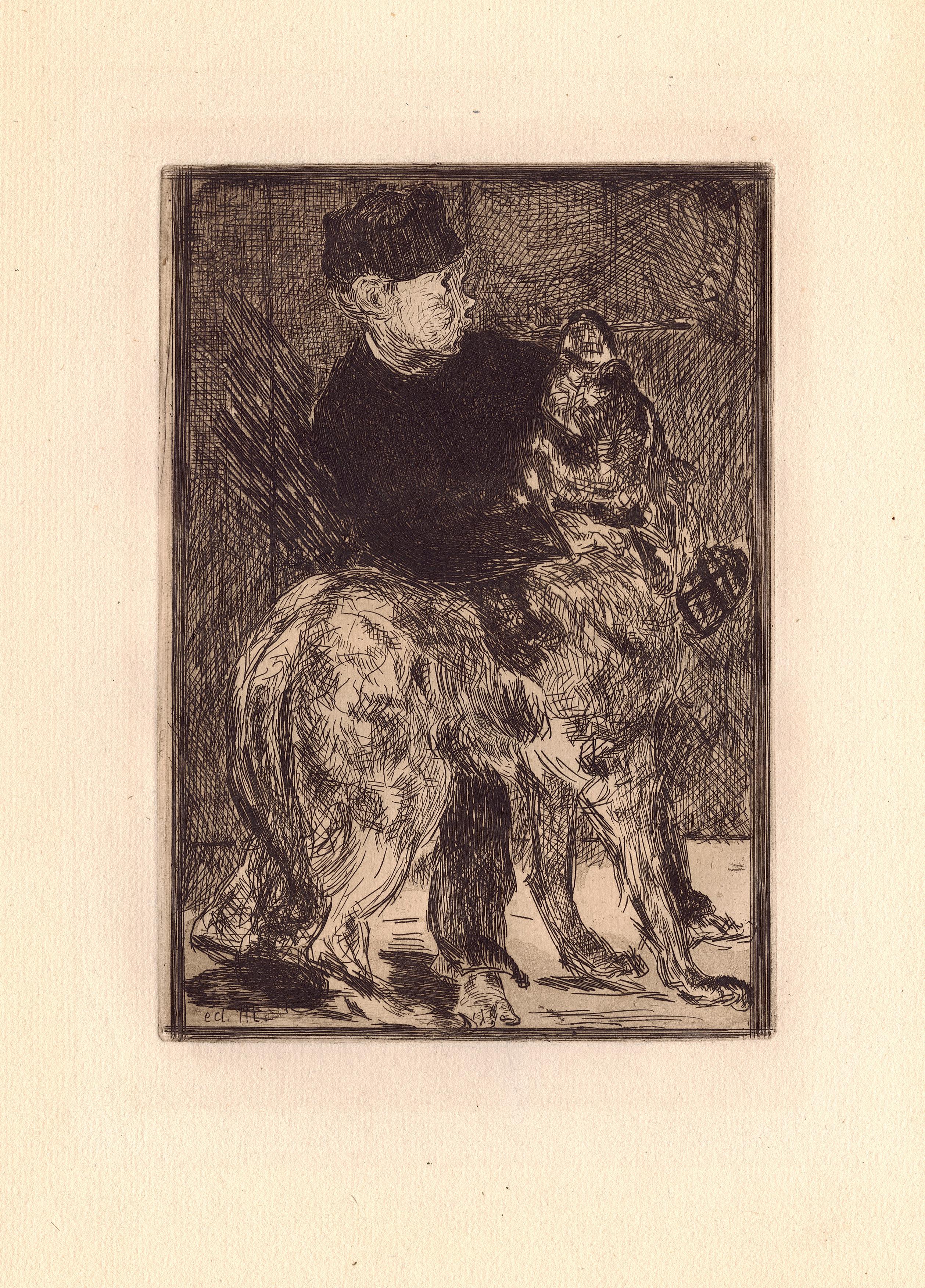
The Boy with a Dog
Etching and aquatint on laid paper, 1862 Plate 200 × 142 mm
Watermark Van Gelder (fragment)
Reference Guérin 17, 2nd (final) state; Harris 11, 3rd (final) state; Wilson (1978), 25; Fisher 5 Provenance Private collection, Germany Condition In very good condition
In spite of being considered as a popular type, this subject is much more personal and realistic, as here Manet shows his model and studio assistant, Alexandre, playfully holding a dog almost as large as he is. Alexander worked for Manet from 1858 to 1859, but in 1859 the boy hung himself in Manet’s studio. This event deeply disturbed Manet, and the print, done a few years later, is clearly an affectionate evocation. It is unusual in Manet’s œuvre, because no painted model has been found for this etching, although it might have been based on some free penand-ink sketch, but in reserve for the etching (Rouart & Wildenstein 455). The boy’s tragic death forms the subject of a prose poem in Charles Baudelaire’s Le Spleen de Paris. The piece, entitled La Corde, was dedicated by the writer to Manet.
The third state, distinguished from the second by the border line, shows the fabric of crosshatched lines added to compensate for the aquatint, a technique used by Manet for the first time. Manet very likely added this work at a slightly later time as it reveals more consistency in approach. The additional work helped strengthen the impact and clarity of The Boy with a dog. Varied hatchings are the most important accents here, and the distinction between masses and areas is more subtly achieved than in the earlier works. It is a very fine impression, from the Alfred Strölin edition in 1905.
58 21 Edouard Manet 1832 – Paris – 1883
59
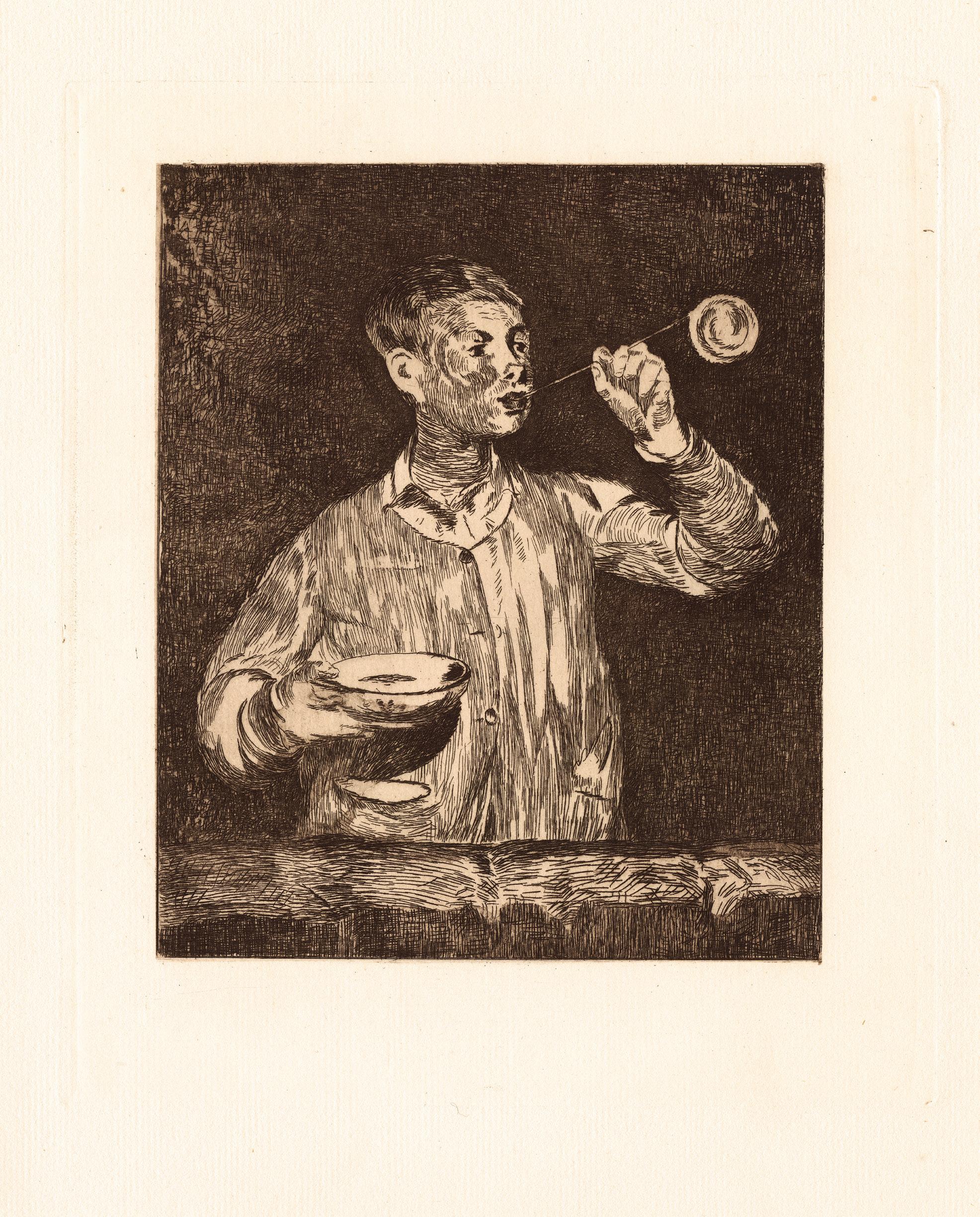
Boy Blowing Soap Bubbles
Etching and lavis aquatint on wove paper, ca. 1868-1869
Plate 249 × 210 mm
Reference Moreau-Nélaton 36; Guérin 54, second state of three; Wilson (1977) 62; Wilson (1978) 60; Fisher 41; Harris 63, second of four state
Provenance Private collection, France
Condition In fine condition
It is a beautiful impression, and a rare second state characterized by an elegant veil of aquatint in the background and on the boy’s right hand. Manet reproduced here one of his own painting created in 1867, and portraying Léon Leenhof, the artist’s probable natural son (the painting is at the Calouste-Gulbenkian Museum in Lisbon). The original copper plate is in the collection of the Bibliothèque Nationale in Paris.
60 22 Edouard Manet 1832 – Paris – 1883
61
23 Edouard Manet 1832 – Paris – 1883
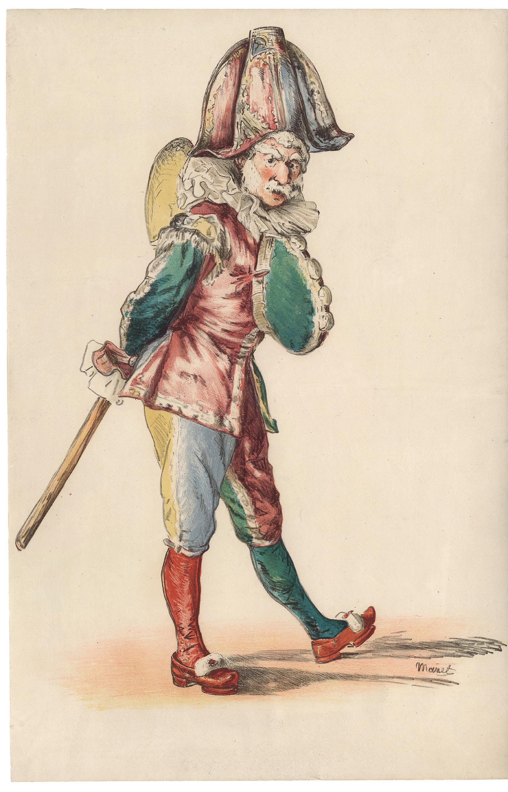
The Punch
Lithograph in seven colors on wove paper, 1874 Image 472 × 310 mm
Reference Guérin 79; Harris 80, 2nd state of four; Wilson (1978) 83; Fisher 61
Provenance Private collection, France
Condition In very good condition, laid down on a thin Japan paper
It is a very fine impression of the very rare 2nd state of four, before the letter. The printer Raçon claimed, to Adolphe Tabarant (quoted by Guérin), that twelve such impressions had been printed. It is not easy to ascertain but impressions before letters are indeed very rare to find, and the colors are lovely and more vivid than the editions coming later (see below).
Manet was sympathetic to lithograph’s history as a medium for the mass distribution of visual statements that could affect social change, and the present image drawn directly on the stone is best understood in the context of political caricature. The print is basically a caricature of the Maréchal MacMahon, known less reverently as the “Maréchal Bâton”, who was elected president of the Republic in May 1873, two years after he had directed the reprisals against the Paris commune. There can be no question that Manet’s well-documented political sympathies would have insured his disapproval of this general, who in the print is shown as a Polichinelle inspecting his troops. Beatrice Farwell has pointed out that the model is Manet’s friend, the painter Edmond André1. Notwithstanding, the authorities saw in Manet’s composition a caricature of MacMahon and forbade its publication. Indeed, we know that Manet intended a large distribution of the print in the journal Le Temps, for subscribers, but that never came out. The actual size of the second edition cannot be confirmed. Raçon, who was Joseph-Rose Lemercier’s nephew, the printer of Manet, told Tabarant that an edition of 8,000 was planned for this inclusion in Le Temps, and that the police destroyed
1,500 impressions along with the stones. While these statements need confirmation, a letter from Manet quoted in Moreau-Nélaton (reprinted in Guérin, p. 19) indicates that Manet tried to find a buyer for the stones to bring out an edition but that by October he had still not secured a publisher, and that Lemercier was anxious about the payment.
Whatever, the Polichinelle must be seen in the context of the chromolithography, a color lithograph of reproductive intent, where the color stones are the result of the collaboration between the artist and the printer. In this case, it has been based either on a watercolour Manet exhibited at the Salon in 1874 (Wildenstein 563), or a proof of the first state (Bibliothèque National de France), cited by Guérin, that was painted with watercolour by the artist, both undoubtedly as a model for the printers to prepare the colour stones, with Manet’s supervision. For instance, a very similar approach was used later in the century for Cézanne’s print The Large Bathers. Comparison between the 2nd state and impressions of the final edition reveals that the beige stone and the highlights stone printed in white ink become a general tone (beige) stone, and the bare surface of the paper, for the highlights in white, so less bright. Between, the present 2nd state printed at a few impressions, there was a smaller edition with letters and printed on Japan paper, which preceded thus the final edition.
1. Theodore Reff, Manet and Modern Paris, exh. cat., Washington DC, National Gallery of Art, 1982, p. 124.
62
63
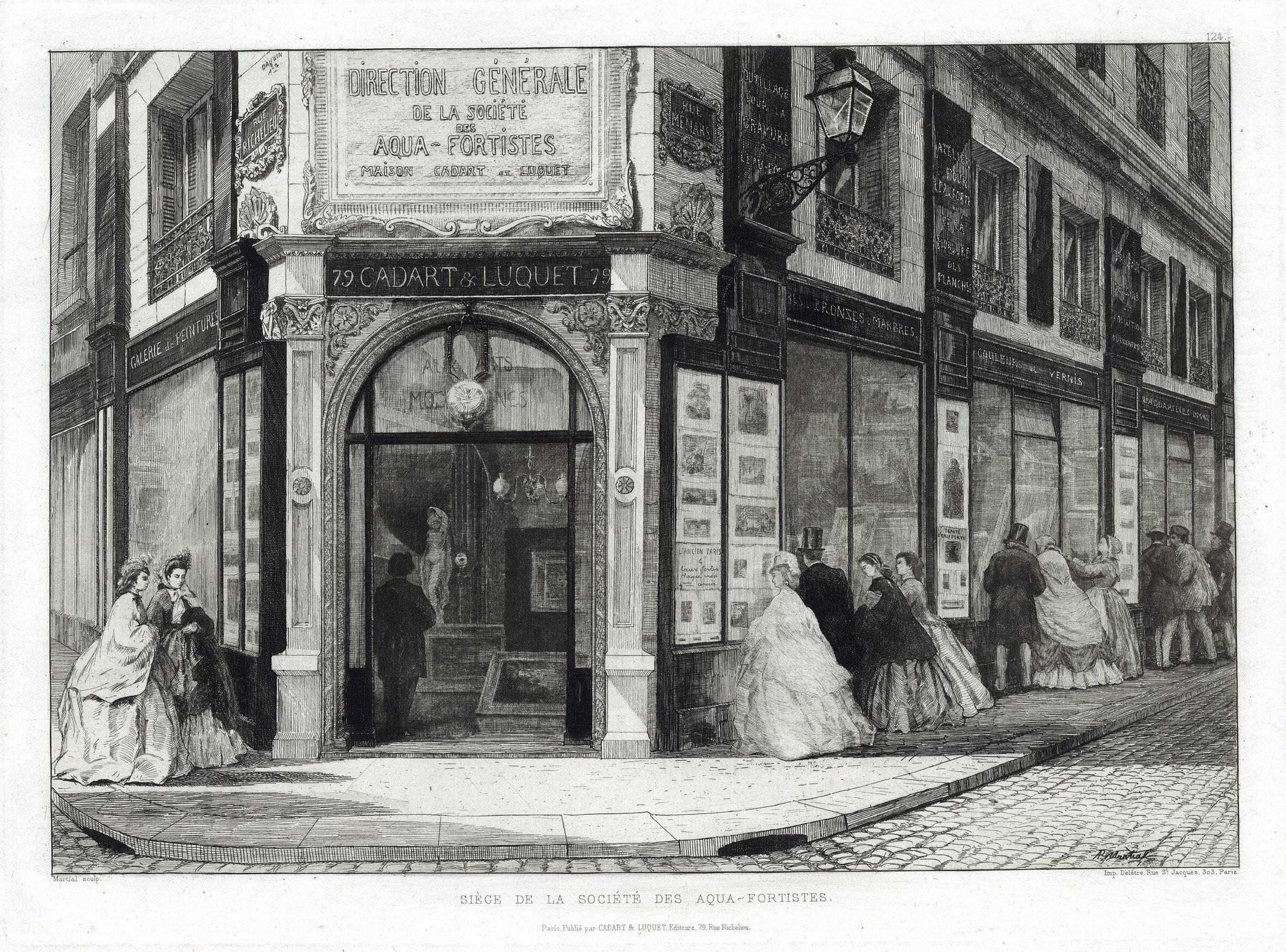
24 A.-P. Martial (Adolphe-Martial Potémont, dit) 1828 – Paris – 1883 Siège de la Société des Aqua-fortistes
Etching on Chine appliqué, 1864 Signed lower right in the image AP Martial, inscribed lower left in plate Martial sculp; lower right in plate Imp. Delâtre Rue st. Jacques 303; and lower center in plate: SIÈGE DE LA SOCIÉTÉ DES AQUA FORTISTES / Paris, Publié par CADART & LUQUET, Editeurs, Rue Richelieu Plate 389 × 287 mm
Provenance Private Collection, France Condition In very good condition
64
65
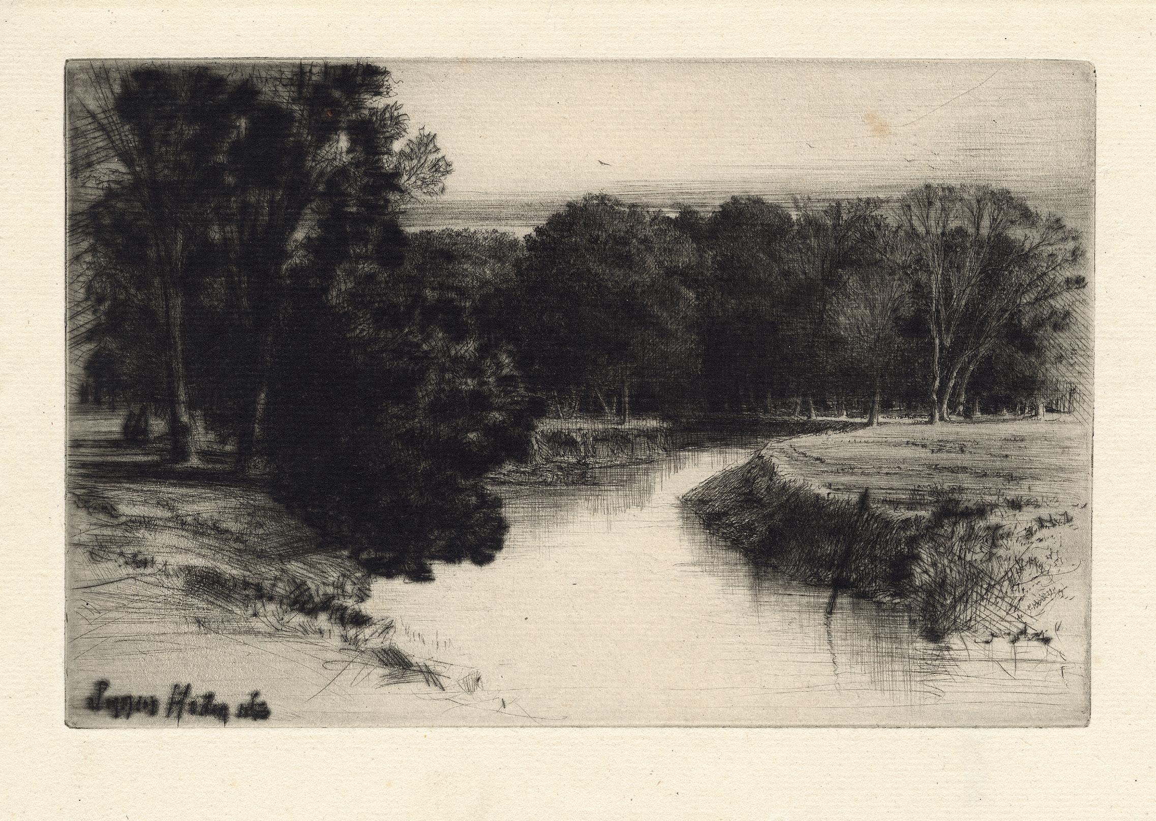
A Sunset in Ireland
Etching and drypoint on laid paper, 1863 Watermark IPFH Plate 139 × 215 mm
Reference Richard S. Schneiderman 47, 13th state of 14 Provenance Otto Gerstenberg (Lugt 2785); Private Collection, Paris Condition In very fine condition
A delightful impression of the Francis Seymour Haden’s preferred subject: views of typical English landscape. In this case, it is a view of the Drundrum (or Multeen) river in Tipperary (Ireland), flowing through the estate of Viscount of Hawarden, viewed from the east bank. This bright and richly inked impression, with very rich and dark drypoint burr, creates a wonderful contrast between the luminous river and the compact trees surrounding the water. The texture of the wood is dense, and the burr produced a shivering effect, as if the foliage were trembling through a gust of wind. This state is the last one before the plate was cancelled.
Haden was clearly inspired by the plein-air style, he loved to sketch the nature during his many excursions in
the countryside, and it is particularly noticeable that, contrary to many plein-air artists, he used the printmaking technic for this.
The provenance of this print is noteworthy. Otto Gerstenberg (1848-1935) was a German collector of old and modern prints, based in Berlin, and who started collecting around 1900. A talented mathematician, he became the CEO of the Assurance Compagny, Victoria. His collection of prints by Rembrandt, Dürer, Schongauer, as well as from Manet, Degas, ToulouseLautrec, Goya and Whistler, was also one of the very best ones ever for late 19th century and early 20th century French and England prints.
25 Francis Seymour Haden 1818 London – Alresford, Hampshire 1910
66
67
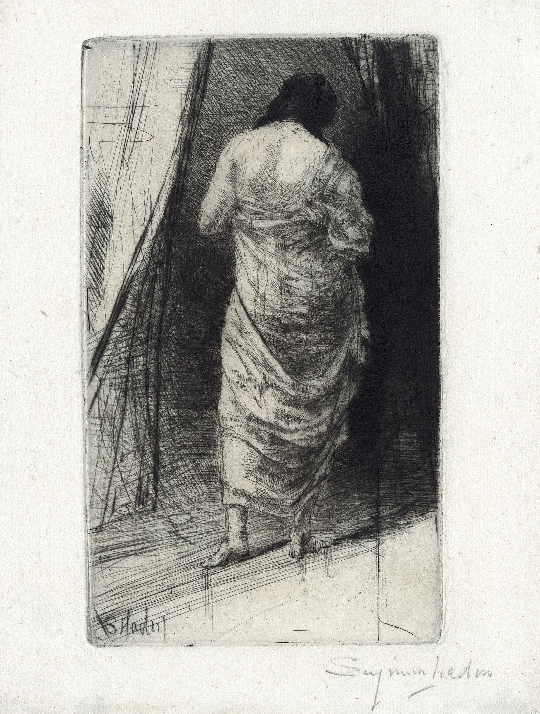
26 Francis Seymour Haden
1818 London – Alresford, Hampshire 1910 Turkish Bath
Etching and drypoint on laid paper, 1865 Signed lower right in pencil Seymour Haden Watermark IPFH Plate 212 × 135 mm
Reference Schneiderman 114, 5th state of 6 Provenance Private Collection, Paris Condition In very good condition
A very rare, beautiful impression of the 5th state of the Turkish Bath by Francis Seymour Haden, showing the influence of Rembrandt in the art of the British artist. This plate, by its subject, is however unusual in Haden’s œuvre. Up to this date, 1865, Haden’s work was predominantly landscape. Of the hundred thirteen prints Haden produced prior to this plate, there are only three full-length figures, The Letter no.1 and no.2 (Schneiderman 44-45), and both are after a photograph by Clémentina, Lady Hawarden; and a portrait of Haden’s ancestor, Thomas Haden of Derby, made after a painting by Joseph Wright of Derby (Schneiderman 53).
Turkish Bath , representing a woman seen from her back, in a vertical composition focusing on the silhouette works like a reminiscent of 1661 Rembrandt’s Woman with the arrow (Bartsch 202), which shows a mysterious, naked woman
seen from the back, sitting on a bench, and her white body creating a strong contrast with the sombre background. It is especially the case from the 4th state, when Haden added heavy drypoint burs to the background. On the other hand, the combination of the soft drypoint lines and thin paper are particularly effective.
It is not very clear how many impressions were printed. In a letter to Goulding in May 19011, Haden referred to a print-run of thirty in all. However, in his list of prints for sale, in the 4th edition of his About Etching (1879), a note at the bottom of the page mentions Haden’s home press indicating he would print on demand, retaining control of the quality of impression.
1. Quoted in Martin Hardie, Frederick Goulding. The Master Printer of Copper Plates, Stirling, 1911, p. 64.
68
69
27 Felix Buhot Valogne 1847 – 1898 Paris Bronze Toad
Etching, drypoint and aquatint on a thin India or Chinese paper tinted in yellow, 1874-75
Plate 215 × 154 mm
Reference Bourcard and Goodfriend 18, 3rd state of four
Literature Phillip Dennis Cate, “Felix Buhot & Japonism”, in The Print Collector’s Newsletter, July-Aug. 1975, pp. 64-67
Provenance Private collection, France
Condition In very good condition
It is a beautiful trial proof of the Toad Bronze printed on a thin India or Chinese paper tinted in yellow, with a large stamp printed in red ink below. The toad bronze depicted is in fact a decorative inkstand, inspired by the tradition of wildlife inkpots in Japan. Named Kaeru in Japanese, which means “return”, the toad is reputed to bring chance and happiness to the travellers, that is why this kind of inkpots often went with travellers in the old Asia.
The plate belongs to a series of etchings executed in 1874 and 1875 and titled Japonisme, and is now considered as one of the landmarks in the history of Japanese influence on French 19th century art. It reproduced objects from the Philippe Burty’s extensive collection of oriental art. Prints like the Bronze Toad demonstrate Buhot’s excellent training and control in etching technique for a young printmaker at that time. Although Buhot’s prints are not as coldly perfect as those of Jules Jacquemart, the famous practitioner of the reproductive style, Buhot obviously was indebted to Jacquemart’s achievement. As he wrote to the master in October 1875 about his own Salon entries: “I presented an early exact image, I think, of the things I had seen before me, but what I would have liked to render above all was the impression the specific aspect and ignoring the rest.”. This commission was extremely
important for Buhot, as it was not only a challenging technical education for a neophyte etcher, but also the beginning of a longstanding interest in Japanese art, an inspiration apparent in many of his prints. Although submitted as Buhot’s first Salon entries in 1875, it was not until 1883 that the series was finally published as an album, but meanwhile Buhot printed a number of exceptional proofs that reveal his early sensitivity to printing, proofing, and his careful selection of papers.
Like many other conscientious etchers such as Rembrandt and Whistler, Buhot was very involved with the uses and of and effects created by different papers. He used various old Dutch, wove and Japanese papers as well as China, India and a variety of vellum papers. It was after having etched the final state of a given print that Buhot tended to experiment with the use of various papers. Buhot also often altered the appearance of the paper through immersion in a weak tea or coffee solution. He also sometimes watercoloured the surface of the paper before printing. He was also known to immerse his papers in solutions mixed with turpentine, kerosene, or gasoline before printing. He even used a smoking technique to discolour the paper before printing.
70
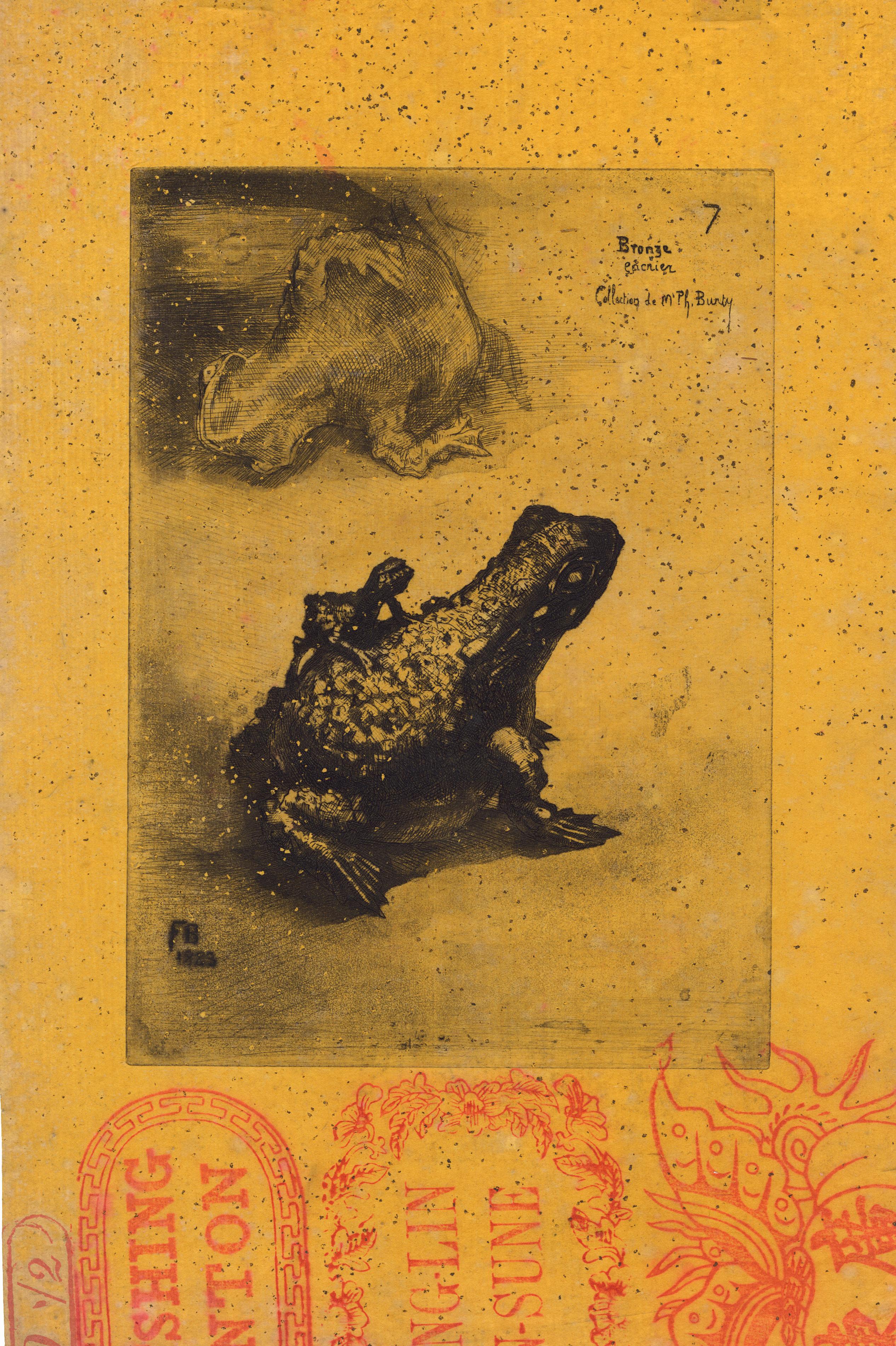
71
28 Nobert Goeneutte 1854 Paris – Auvers-sur-Oise
The Fife Player
Etching and aquatint on laid paper, ca. 1875-85 Annotated by the artist 4° Etat / n°2 Reference Not in Béraldi; Christophe Duvivier, Norbert Goeneutte 1854-1894, Pontoise, Musée de Pontoise, 1994, no. 212, 4th state of five Plate 275 × 172 mm
Provenance Private collection, France Condition In fine condition
It is a great impression of this very rare plate by Norbert Goeneutte after the same subject by Edouard Manet. The painting of Manet is now at the Musée d’Orsay since 1911. It is not easy to date the present plate. Goeneutte belonged to the circle of Manet through his friends Henri Guérard. In addition, the painting belonged between 1873 and 1893 to another member of the circle of Manet, the baryton Jean-Baptiste Faure, and Goeneutte knew him also. Certainly, the etcher made it during this time frame, as there is an impression of the 1st state at the New York Public Library labelled “collection Faure”. In 1888, Béraldi did not know the plate, but Christophe Duvivier has since showed that Béraldi list was not exhaustive at the time, quite a few plates made before 1888 were not in the Béraldi. Duvivier dates the plate “before 1888?” with a question mark. Goeneutte only made a few prints after his friends, the first one in 1871. Also, this time would match with his technique in the years 1878-1880. Consequently, we have to keep a large range and we date it between 1875-1885.
There are five states known and the present one is the 4th one. Surprisingly, Goeneutte actually lightened the background through the successive states until it matched the background of the original Manet’s painting, which is also light, without depth and perspective. Duvivier had found six impressions, one at the Bibliothèque Nationale de France (most probably a 2nd state), five at the New York Public Library, ex-collection Avery, in various states. To these, we can add the present sheet, two impressions in private collections, an additional impression of the 1st state but of unknow location, and two impressions of the 2nd state, also of unknown location.
Definitely, Goeneutte made a great work, the plate is vivid, perfectly etched and with a great presence. It perfectly respects the popular image Manet tried to set, so much decried when it was refused at the Salon in 1866, and so much praised by Zola afterwards in the Evè nement in the same year. A brilliant work.
72
1894

73
29 Nobert Goeneutte
The Indiscreet
Drypoint on laid paper, ca. 1876
1854 Paris – Auvers-sur-Oise 1894
With the artist stamp printed in red (Lugt 1182)
Plate 261 × 77 mm
Reference Béraldi 63; Christophe Duvivier, Norbert Goeneutte 1854-1894, Pontoise, Musée de Pontoise, 1994, no. 27, 2nd (final) state
Provenance Private collection, France
Condition In fine condition
74
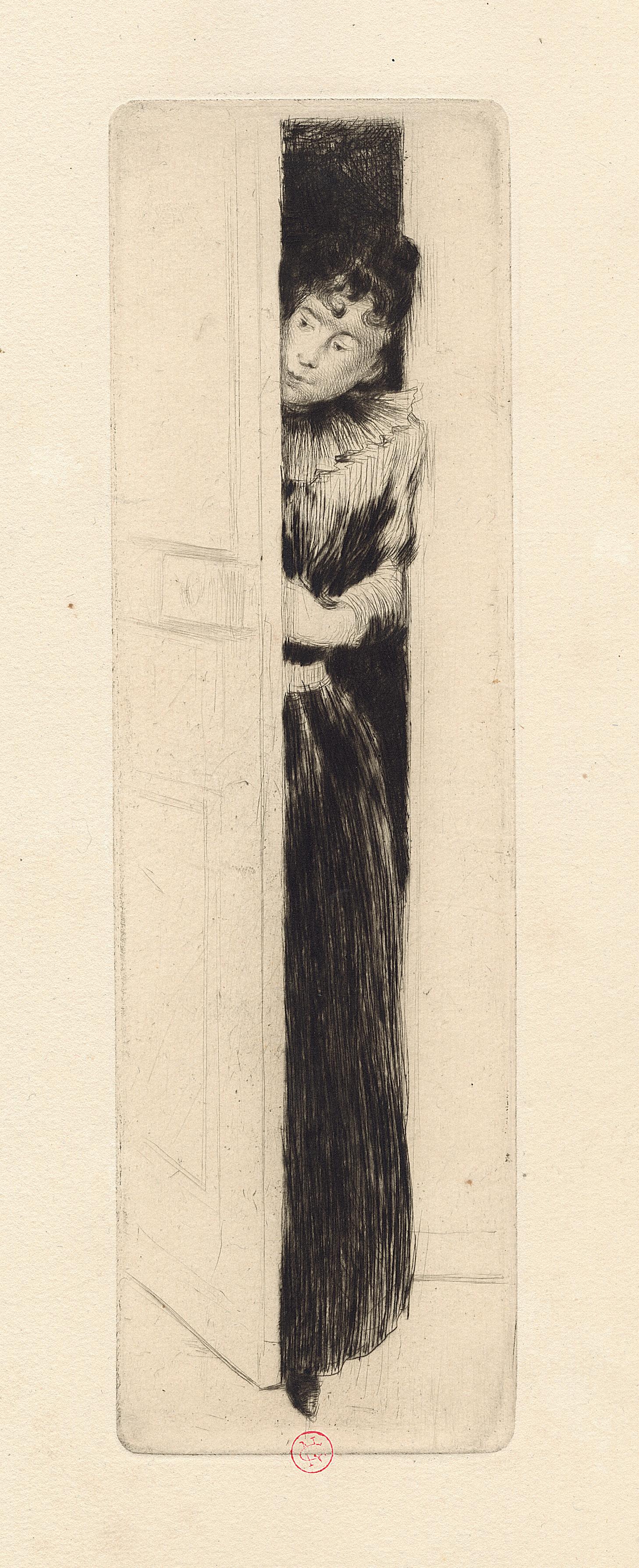
75
Portrait of Edouard Manet
Etching on laid paper, ca. 1875-85
With the artist monogram (Lugt 1157)
Plate 185 × 120 mm
Reference Bertin 11, undetermined state (probably 6th or 7th) of ten Provenance Artist’s heirs, France; Eric Carlson, New York; Private collection, Paris Condition In very good condition
It is an impressive and frontal portrait of the master, recalling the Degas’ versions of the same face. A great admirer of Edouard Manet, Guérard reworked his print of his friend and mentor throughout ten states, according to Claudie Bertin, thus achieving a meticulous recording of Manet’s face. It is here probably an impression of the 6th or 7th state. The exact date of this portrait remains unknown. It is sometimes given to ca. 1875, but it can also be that Guérard was stimulated to create a commemorative portrait following Manet’s death in 1883.
It is not very clear how Guérard became close to Manet. It might be possible that he met him at one of the Salon de la Société des Artistes Français, where he exhibited, maybe in 1872 or 1874. Whatever, Guérard made acquaintance of
Eva Gonzalès in 1874, Manet’s only formal pupil, and he became friend with the master. In 1877, he posed for Manet in La Patineuse (Wildenstein 260), and in 1878 alongside Ellen André dans Au Café (Wildenstein 278). And in 1879, Guérard married Eva, with Manet participating as one of their witnesses. It was obviously through his association with Manet and Eva that Guérard was introduced to many of the avant-garde ideas and individuals of the Parisian art world. Tragedy, however, struck them. On April 30, 1883, Manet died, aged only fifty-one. Six days later, Eva Gonzalès, who had given birth to her only child, Jean-Raymond, on April 19, succumbed to complication of childbirth. In less than a week, Guérard lost two of the most important people in his life.
76 30 Henri-Charles Guérard 1846 – Paris – 1897
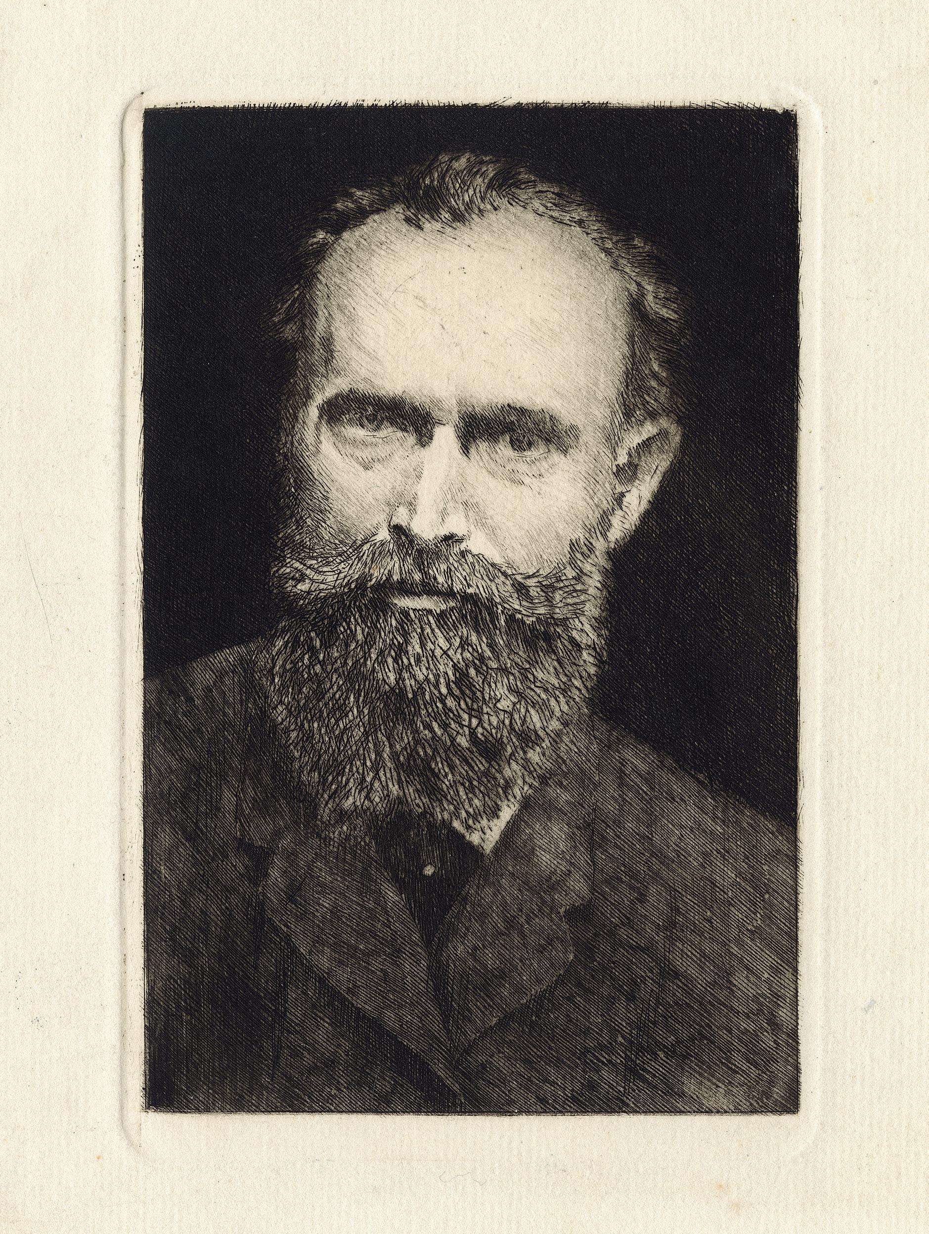
77
31 Henri-Charles Guérard 1846 – Paris – 1897
The Raven Hanged
Etching and drypoint on laid paper, before 1888
With the artist’s red monogram (Lugt 1157)
Plate 447 × 254 mm
Reference Bertin 322, only state
Provenance Private collection, Paris Condition In fine condition Perfect impression, full of burrs.
78
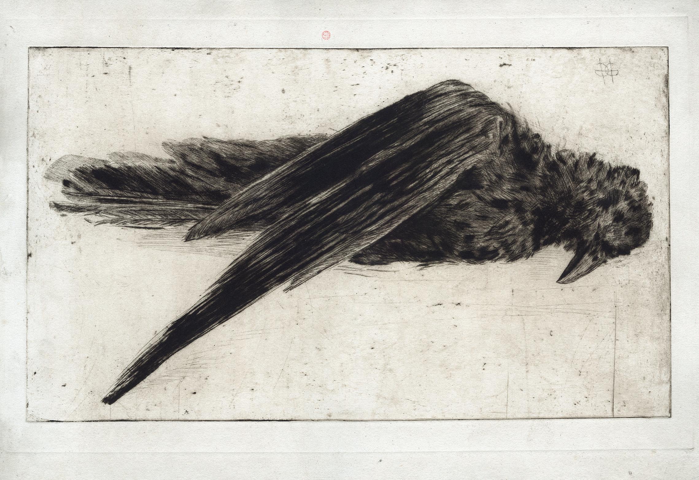
79
32 Henri-Charles Guérard 1846 – Paris – 1897
Ravens in the Snow
Drypoint, etching and roulette printed on laid paper, ca. 1890-91 Dedicated and signed lower left in pencil à Frantz Jourdain avec toutes mes amities / HGuérard, and stamped with the artist’s red monogram (Lugt 1157)
Plate 333 × 563 mm
Reference Bertin 325, only state Provenance Artist’s heirs, France; Eric Carlson, New York; Private collection, Paris Condition In very good condition
An extraordinary, beautiful, and very rare impression. Not a single impression of this plate has been seen on the market for at least thirty years. Henri Guérard exhibited the present plate in 1891 at the Société des PeintresGraveurs, and Felix Fénéon writing at that occasion in Le Chat Noir about this exhibition and plate, mentioned the influence of the Japanese repertoire; and notably the works of Sesshū Tōyō. Guérard captures the atmosphere of silence and calm prevailing over the countryside after a snowfall. We may add to this the works of the contemporary artist that Guérard may have known from his work i.e. Kawanabe Kyosai, and notably his large black
ravens. Guérard was the japonism artist par excellence, he had a deep knowledge about Japanese art, and certainly since he had illustrated in 1883 the two volumes of Louis Gonse’s L’Art japonais, with two hundred twenty drawings after a variety of Japanese artworks in a number of mediums. Then Guérard gained access to Philippe Burty, one of the main spokesmen for Japonism, and to all leading collections of Japanese art in Paris, after that, he was completely absorbed in the Japanese aesthetic, and it figured prominently in his art for the remaining years of his life.
80
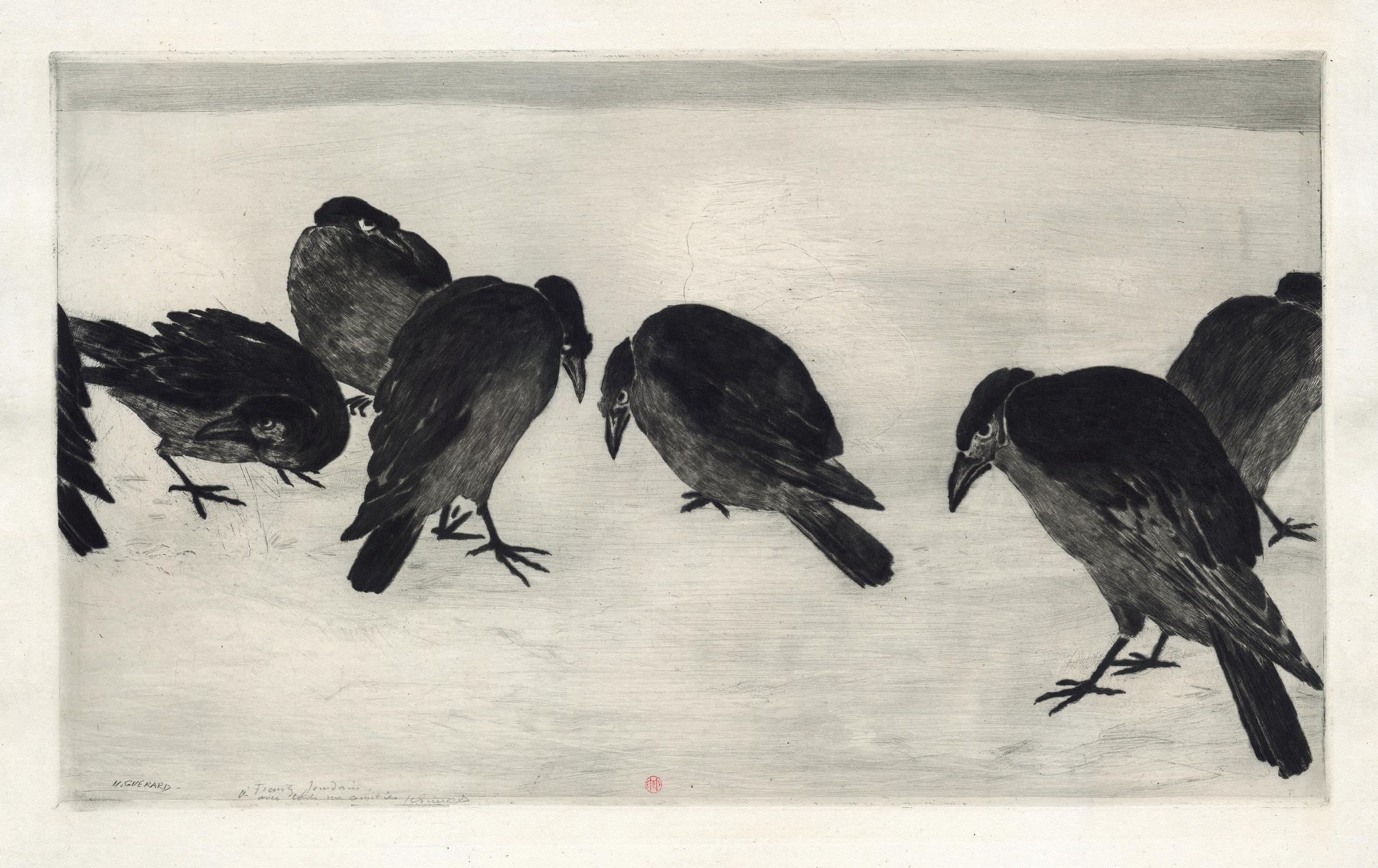
81
33 Henri-Charles Guérard 1846 Paris 1897
An African Woman
Etching and aquatint printed on laid paper, ca. 1885-88
With artist’s stamp lower right (Lugt 1157), and a press (not in Lugt) Plate 292 × 375 mm
Watermark D&C BLAUW
Reference Bertin 553, undescribed state, before the first state (of two), with the etched signature lower left Provenance Private collection, France Condition In very good condition
A truly superb and early impression printed on a laid paper, printed with tone to create the dark carnation, and before the zinc plate was reduced. The present plate is of the upmost rarity. Bertin supposed only five or six impressions of the first state and ten for the second state. Not recorded by Bertin, there is also a 3rd state with a large earring, for which there is only one impression, printed in black, and kept at the Rhode Island School of Design Museum, Providence.
In the late 1880s, Henri Guérard began to work on the present striking bust portrait of an unnamed African woman looking sideways and slightly upward, away from the viewer. Her hair is almost entirely tucked into a striped headdress, highlighting a large hoop earring, and she wears a white scarf tied around her neck that contrasts with the tone of her skin. The woman is positioned centrally on a sheet that is otherwise bare, emphasizing her presence.
The work is inspired by a painting and a drawing both made by Guérard’s wife, the artist Eva Gonzalès. Guérard purchased both works from an 1885 exhibition mounted at a Parisian gallery following Gonzales’s untimely death in childbirth in 1883. Gonzalès’ image of an African woman is known today only by its preparatory drawing, rendered in thick, sketchy charcoal marks – likely to replicate, in turn, a similarly painterly work by her teacher, Edouard Manet. Produced in 1861, this earlier
painting depicted one of Manet’s favorite models, Laure, in loose, heavy brushstrokes against a stark brown background. The subject fit within a popular interest in 19th century France in depictions of “racial types” from “exotic” locales, including French colonies such as Algeria. While the earlier works by Gonzalès and Manet clearly mark themselves as paintings and, thus, artistic interpretations, Guérard’s representation appears more explicitly informed by the rapidly developing genre of travel photography in its precise, scientific-like detail and monochromatic palette. Around the time he produced An African Woman, photographs, documenting people and places in locations thought of as exotic by Westerners, had become increasingly popular and were often collected in thematic albums. The formal properties of etching allowed Guérard to create a work that was experimental but featured a precise line that effectively replicated the detail and photographic realism distinctive to these works, moving away from the overtly artistic portrayal of his predecessors and toward a type of representation that presented itself as objective.
Except the description of states, the present entry is for the most part a repeat from the and excellent article by Britany Salsbury, “Henri Guérard, An African Woman, After Eva Gonzalès”, in Altered States: Etching in Late 19thCentury Paris, online publication, Rhode Island School of Design Museum, Providence, 2017.
82
–
–
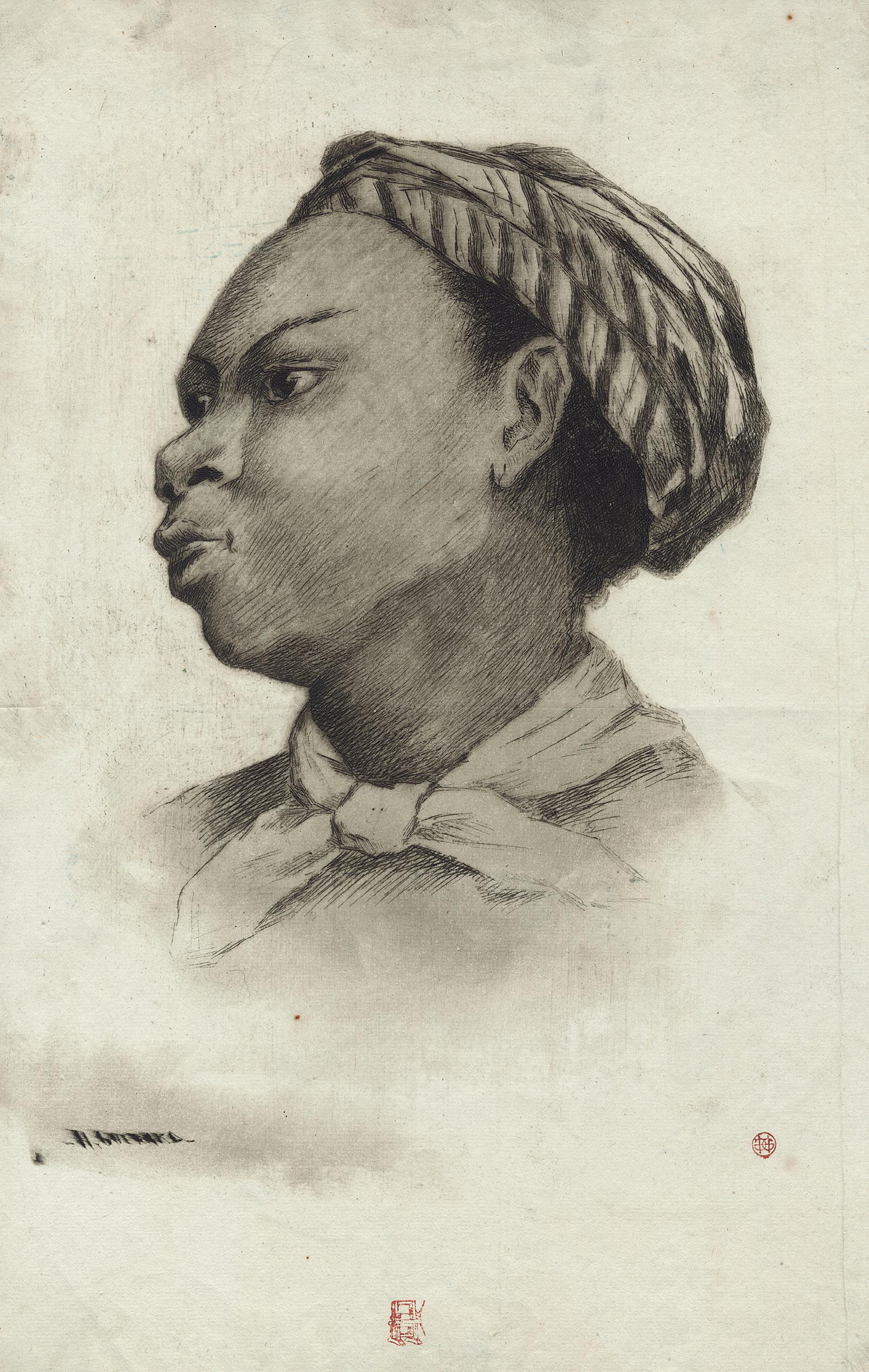
83
34 Marcellin Desboutin 1823 Cérilly – Nice 1902
Portrait of Edgar Degas, in Profile
Drypoint on laid paper, ca. 1876
Plate 90 × 74 mm
Reference Béraldi, t. V (Suppl.), 85; Clément-Janin 61, only state; Inventaire du Fonds Français 4
Provenance Galerie Paul Prouté, Paris (Marcellin Desboutin, Catalogue no. 150, 2016, no. 60); Private collection, France
Condition In fine condition, with large full margins
This is undeniably the finest impression we have ever seen on the market, and it is comparable in quality to the impression of the Bibliothèque Nationale de France, which was considered as the best. It is a very rare plate to find out. We have been able to locate only nine copies, including the present one. It was even not in the sale of the Degas’s heirs in 2006, at Christie’s (Paris), although the two other late portraits were in.
“For his numerous informal portraits, such as this small profile of Edgar Degas, Desboutin preferred the
directness of drypoint—a technique in which the artist directly scratches the image with a sharp needle, effectively drawing on the copper plate. With minimal lines, Desboutin skilfully created an intimate image of his friend, one of several known portraits of Degas by Desboutin. The two had a long-lasting and productive friendship, with Desboutin even encouraging Degas to try printmaking again in the mid-1870s, after more than a ten-year hiatus (see the entry from The Metropolitan Museum of Art, inv. 22.63.149).
84
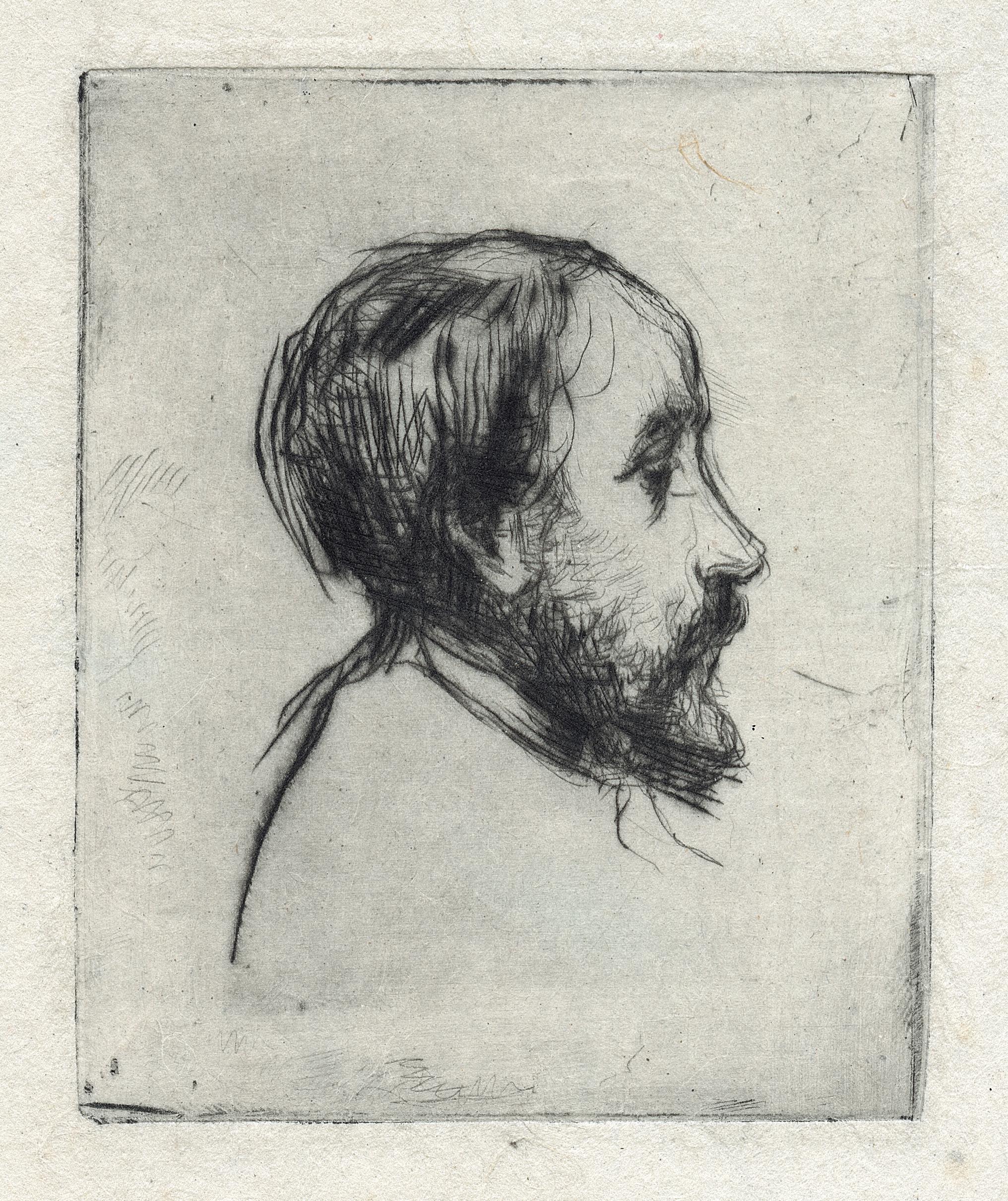
85
35 Marcellin Desboutin 1823 Cérilly – Nice 1902
The Man with a Pipe (Artist’s Self-portrait)
Etching and drypoint on wove paper, 1879 Dedicated and signed lower right A mon cher et bon Armand Silvestre / son vieux / M. Desboutin Plate 455 × 378 mm
Reference Beraldi 1; Inventaire du Fond Français 14 (vol. VI); Clément-Janin 63, 3rd state of five Literature Clément-Janin, La Curieuse Vie de Marcellin Desboutin, Paris, 1922, pp. 229-230
Provenance Private collection, Spain Condition In perfect condition
Recognized by many as the masterpiece of Desboutin œuvre, the present sheet is a very good impression of the 3rd state of five, and it has been dedicated to Armand Silvestre, close friend of the artist, poet and writer, and art critic.
This self-portrait, unusually large and heavily worked as Desboutin depicts a new type of artist. Here, rather than representing himself with traditional tools of his trade, Desboutin masterfully created an image of a bohemian: his simple jacket and dishevelled hair, barely contained under a cap, are complemented only with a pipe.
The simplicity and immediacy of the portrait is heightened further by his direct gaze over his shoulder.
This print was awarded a third-class medal at the Salon of 1879, and a medal of honour at the 1900 Paris Exposition Universelle. Beraldi found the piece “très rare”, and Clément-Janin believed that there were no more than thirty-forty impressions printed, which is rather small. Desboutin himself wrote ca. 1900 to an amateur in Nantes that the impressions are “très rare”, but he seemed to have exaggerated this a little for commercial purpose.
86
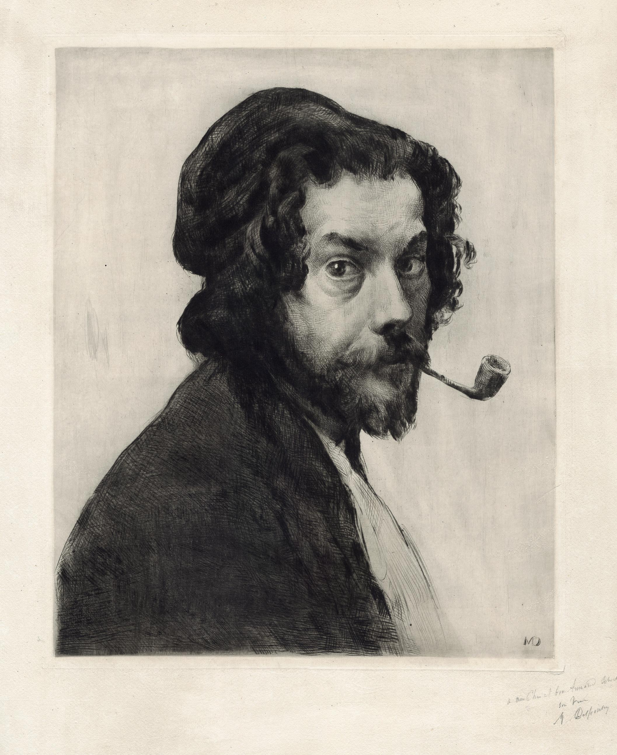
87
The Old Cottage
Aquatint, etching and soft ground on laid paper, 1879
Inscribed and entitled lower left in the margin with pencil n°2 – 4e Etat / La Masure Plate 167 × 170 mm
Reference Delteil 20, 4th state of seven
Literature Barbara S. Shapiro, Camille Pissarro, The Impressionist Printmaker, 1973, cat. 13-14 (states 4 and 7 ill.); Anne Röver (ed.), Camille Pissarro. Radierungen, Lithographien, Monotypien aus deutschen une österreichischen Sammlungen, 1991, cat. 8 (states 3 and 4 ill.)
Provenance Henri Petiet, Paris (Lugt 5031); Private collection, France Condition In fine condition
“One can be simple, natural and yet very expressive!”1
This is a superb proof of the fourth state in almost pure aquatint, existing in only two exemplars according Delteil, numbered by the artist, and one of the most famous landscapes by Camille Pissarro as a printmaker. In a certain way, this aquatint is a rare, typical, and stunning example of the quintessence of the impressionist print, as set by Degas and Pissarro in 1879 when they were very close, working together to the project of Le Jour et la Nuit, and experimenting a lot about techniques and inking. This was a key moment in the history of printmaking.
There are only two impressions of the first state. On the second state (two impression either according Deteil), Pissarro added only a few etched lines to the aquatint, on the house and in the sky. For the 3rd state, the house is more defined (one impression recorded by Delteil). The main addition at the 4th state is the aquatint to create the sky and its light. The present impression is carefully
printed with plate-tone in the sky, and it reflects the extraordinary equilibrium that the artist was able to achieve between light, dark and texture. As in a few other landscapes of that period, he created these early states primarily using a variety of aquatint tones, which were clarified in successive states by additional etched lines, here to delicately delineate the cottage, the sky, and the landscape. The only other fourth state impression of La Masure is at the Museum of Fine Art in Boston.
Pissarro presented three different states of this plate at the Cinquième exposition impressionniste in 1880, which proves that he was very interested in these variations. There are seven states in total. The delicacy of the early aquatint disappeared with the later states as the atmospheric light was sharply reduced with the addition of coarser aquatint grains and etched lines all over the plate.
1. Camille Pissarro: Letters to His Son Lucien, 1943, p. 352.
36 Camille Pissarro 1830 Charlotte Amalie (USA) – Paris 1903
88
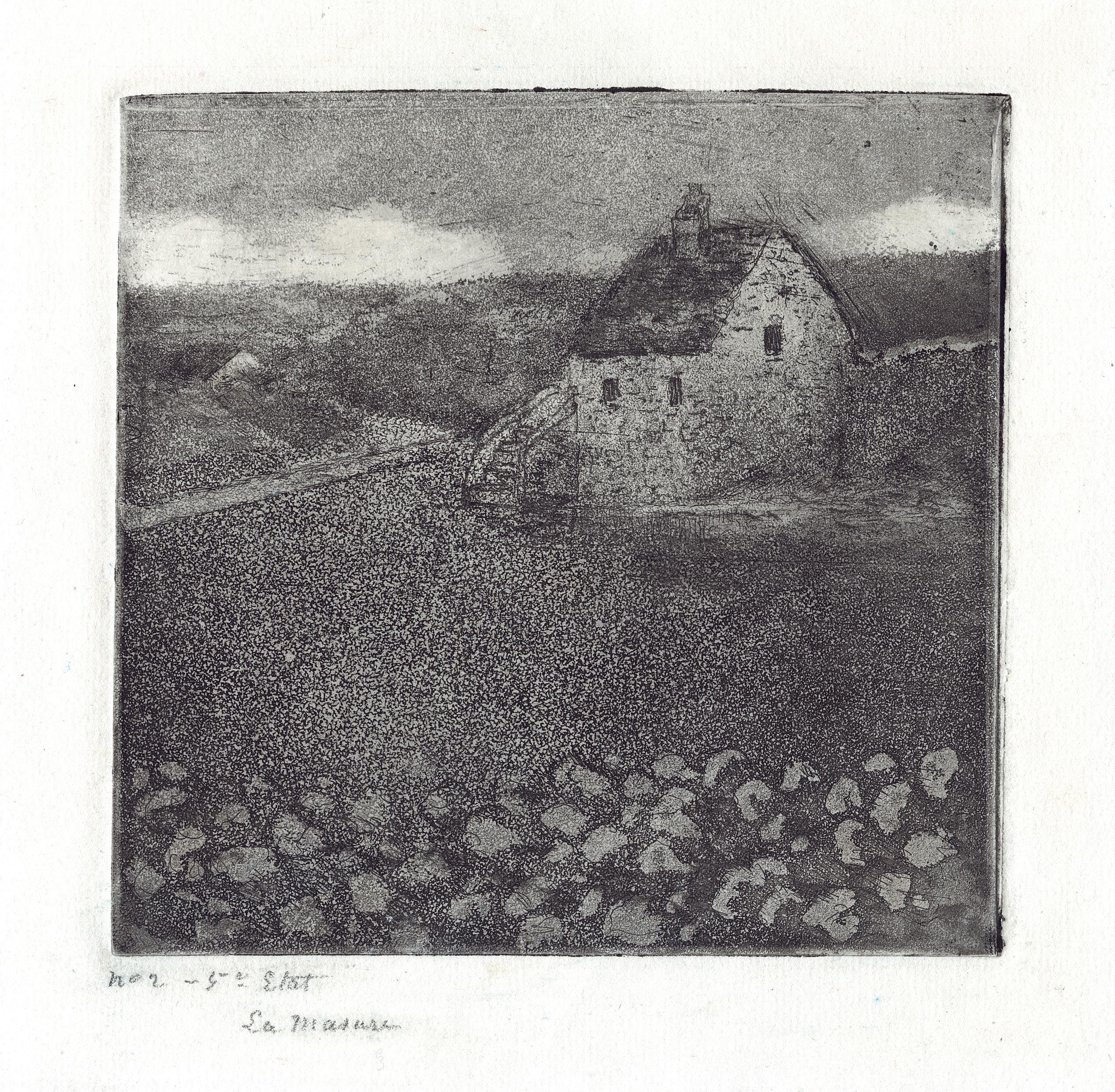
89
37 Camille Pissarro 1830 Ile Saint Thomas – Paris 1903 Peasant Women at the Market
Monotype printed in black on laid paper, ca. 1894-95
Signed lower right in black ink with the initials C.P. Plate 178 × 128 mm
Literature See Michel Melot and Barbara Shapiro, “Catalogue sommaire des monotypes de Camille Pissarro”, in Nouvelles de l’estampe, no. 19, Jan.-Feb. 1975, pp. 16-23
Provenance Private collection, Los Angeles Condition In very good condition
This very charming and interesting monotype must be added to the very rare corpus of monotypes made by Pissarro between ca. 1879 and 1895. The artist most likely learned the technique in ca. 1879 from Edgar Degas –who had exhibited drawings made with greasy ink and printed at the third Impressionist exhibition of 1877 – when the two artists were working together on the project for a journal of prints entitled Le Jour et la Nuit. However, unlike Degas, who used the technique extensively for fifteen years, Pissarro only made about 25-30 monotypes, the romantic printed drawings as he wrote to his son in April 18941. In 1975, Melot and Shapiro were able to list twenty compositions, to which we could add seven monotypes that came up on the market since then, including the present one and a second printing of Melot and Shapiro no. 4. Of all Pissarro’s monotypes only one is dated 1894 (Melot and Shapiro no. 1).
The present composition can be related to another monotype listed by Melot and Shapiro (no. 15), Marché,
of the same subject and dimensions but horizontal, and of the same style, i.e., with figures clearly outlined. It most probably belongs to a group of works made at the markets in Gisors, in Normandy, and in Pontoise, in 1894 and 1895, and notably the two farmers of Le Marché de Gisors (Pissarro/Venturi no. 932). Pissarro captured the essence of one of his favourite subjects: he isolated a fragment of the activity, yet he forces the viewer to look around the back of the peasant woman at the left. Only a few touches, such as the dots on the kerchief, the lines on the dress and the hats, distinguish the various figures.
These works are proofs of Pissarro’s profound interest in experimenting with a multiplicity of media to depict the same motif. Clearly, Pissarro fully invested the technique of monotype, with the same mastery as Degas.
1. John Rewald (ed.), Camille Pissarro : lettres à son fils Lucien, Paris, 1950, pp. 339-340.
90
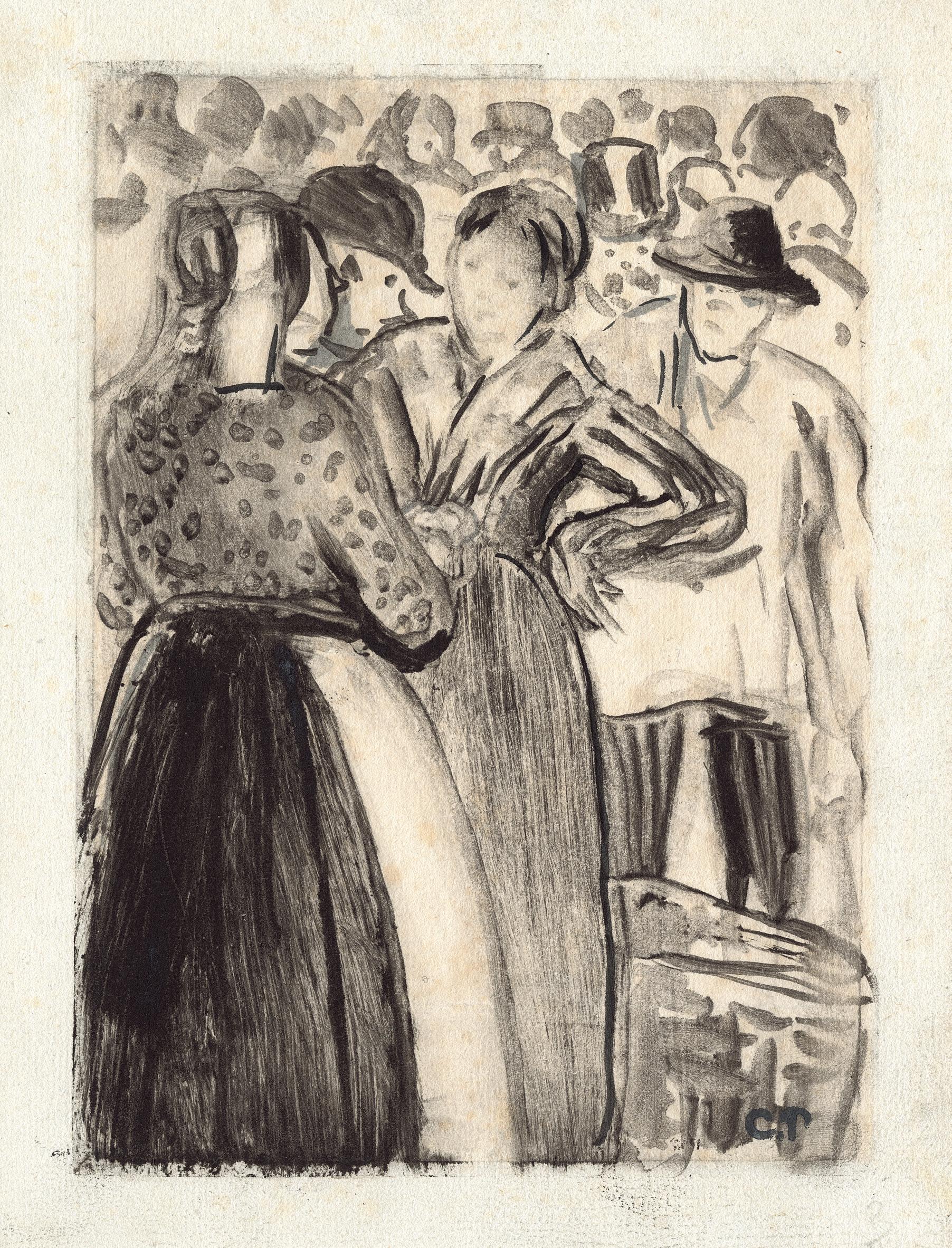
91
38 Docteur Paul Gachet, called Paul van Ryssel 1828 Lille – Auvers-sur-Oise 1909
Vincent Van Gogh on His Deathbed
Etching and drypoint printed on wove paper, ca. 1890
Dedicated and signed lower right au Citoyen L. [Lumot] Van Ryssel Plate 122 × 170 mm
Reference Gachet fils 55; Inventaire du Fonds Français 58, 4th (final) state
Literature Susan Alyson Stein, Cézanne to Van Gogh. The Collection of Doctor Gachet, exh. cat. Paris, New-York, Amsterdam, Grand palais, Metropolitan Museum, Van Gogh Museum, 1999, pp. 140-41
Provenance Private collection, France
Condition In fine condition
It is a very fine impression of the famous portrait of Vincent on his deathbed, etched by Dr. Paul Gachet. It is also of the uppermost rarity as there was a very small edition, and we know only three impressions that came up in the auction market in the last thirty years.
On 27th July 1890, Vincent van Gogh shot himself in the head with a revolver. While still suffering from the affecting traumatise of Vincent Van Gogh’s suicide, Dr. Gachet appear to have done several quick sketches of the artist on his deathbed. A small oil on cardboard that was dedicated to Vincent’s brother Theo and who offered it to his mother, is now at the Van Gogh Museum in Amsterdam; and two charcoal drawings, one presented by Paul Gachet’s son to the Musée du Louvre in 1951, and another now at the Van Gogh Museum. Our print derives from the first sketch, in the same year as Van Gogh’s death.
By making an image of Van Gogh on his deathbed Dr. Gachet has offered the ultimate in intimate portraits of the artist by his friends, intensified by the fact that we can clearly see Van Gogh’s left-side where he sliced off his own ear. It is a portrait which, even in death, gives traces of traumas of the tortured artist. The pain Dr. Gachet felt at the death of his dear friend and patient is obvious, not only in the image of Van Gogh on his deathbed but also, as Emile Bernard pointed out to Albert Aurier in a letter of 31st July 1890: “Dr. Gachet […] wanted
to say a few words of homage about Vincent and his life, but he was weeping so much that he could only stammer a very confused farewell…”.
Perhaps one of the most fascinating figures in the history of Impressionism, Gachet was a doctor who specialized in homeopathy, a psychiatrist, an engraver, a Darwinian, a Socialist and a consistently helpful and generous patron and friend to all those artists with whom he came into contact. By that time, Doctor Gachet was thoroughly engaged in collecting art; he would eventually amass mom than 1,000 prints and half that many paintings and drawings by celebrated and unknown artists of the day. But he also considered himself something of an artist. He bought a house at Auvers-sur-Oise and, there in his studio and with his press, became an enthusiastic engraver, partly as a consequence of his earlier contacts with Daumier and with some of the printmakers at the time, for instance Charles Meryon, Rodolphe Bresdin, Charles Jacques and Félix Bracquemond. He signed his works `Paul van Ryssel’, deriving the surname from his native village near Lille (“Ryssel” in Flemish). It was in this studio that several of the Impressionists took up etching during the summer 1873 through a dreamed course gathering Cézanne, Pissarro and Guillaume. This was the beginning of the Impressionist printmaking, where Gachet not as a great artist but as an originator played an essential role.
92
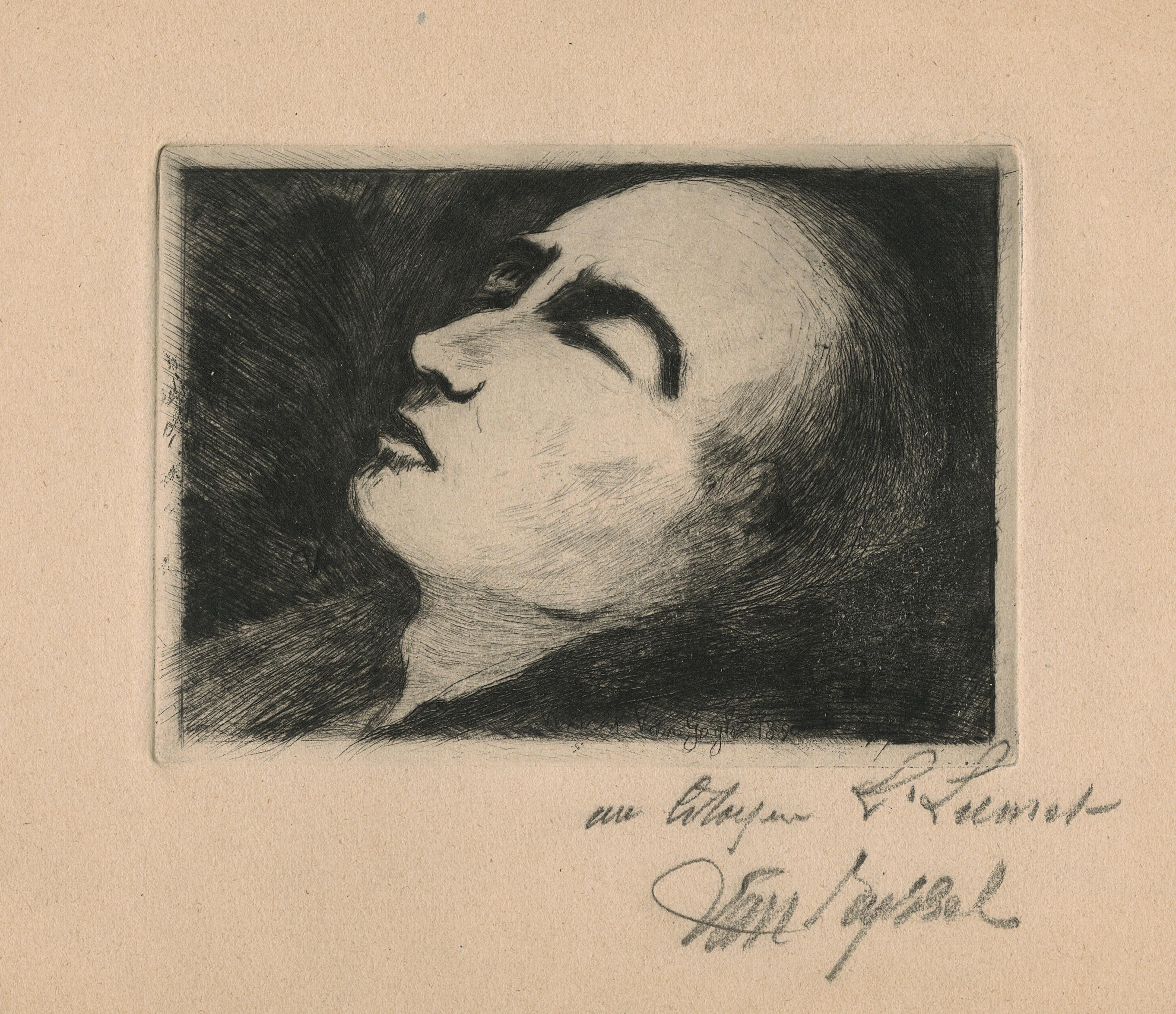
93
Family or My Children
Etching and aquatint on wove paper, 1890
Plates 150 × 112 mm
Reference Delteil 94, second (final) state
Provenance Private collection, France
A richly inked impression of this beautiful print by Albert Besnard, in the second (final) state, published in the Gazette des Beaux-Arts in July 1890. The artist represented his family, with his wife on the foreground, a fine, meditative profile surrounded by shinny long hair, and three of their children: Robert (the one looking directly at us), Germaine and Philippe (the youngest).
At the time, the couple had a fourth child, Jean, not portrayed here, most probably due to his very young age.
Besnard often illustrated his private life in his prints, as well as in his paintings. For instance, all the characters from this composition are also part of Une famille, and dated from the same year (Paris, Musée d’Orsay).
94 39 Albert Besnard 1849 – Paris – 1934
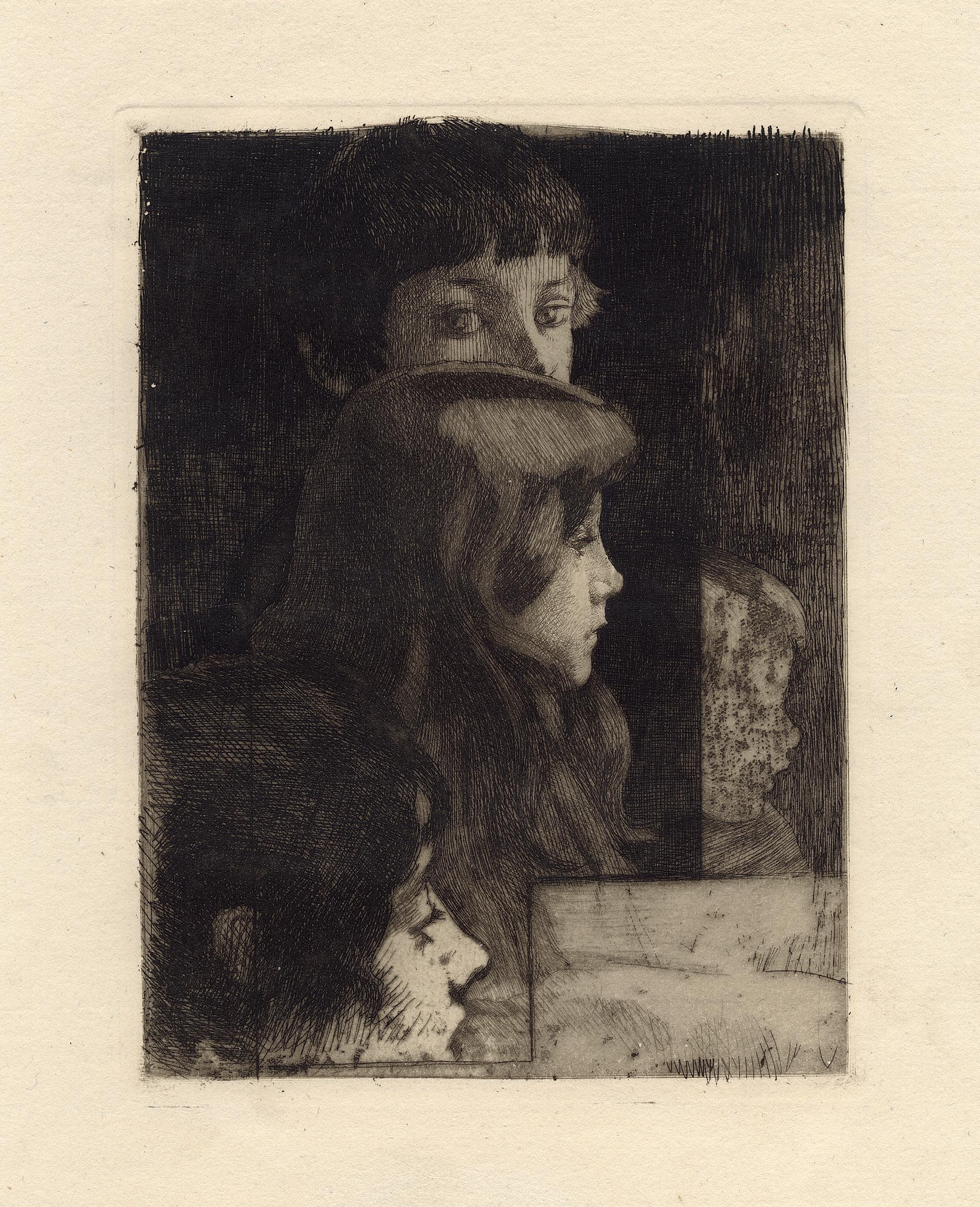
95
Drypoint on simili-Japan paper, 1891
With the artist monogram, numbered 5/5, and with the atelier stamp, lower right Plate 216 × 135 mm
Reference Vallotton & Goerg 8d
Literature Louis Godefroy, L’œuvre gravé de Félix Vallotton, Paris-Lausanne, 1932, no. 10
Provenance Private collection, Switzerland
Condition In fine condition
A very fine impression with burrs, numbered 5/5, and with the artist and atelier stamps. Lifetime impressions are extremely rare, Maxime Vallotton and Charles Goerg only knew a few. The present one has thus been printed in Paris, in 1931, by Paul Vallotton, the artist’s brother, when he got the intaglio plates by inheritance, and in an edition of around 35 copies printed on wove and similiJapan papers. For instance, the Bibliothèque National de France has only an impression from this edition.
There are only seven drypoints in the thirty-seven intaglio prints of Valloton’s whole œuvre. He actually first learned and used this technique from 1887, before turning to the woodcut process from 1891. The first ones are prints after old masters, like Rembrandt and then contemporary masters like Jean-François Millet, Pascal Dagnan-Bouveret, Jules Breton. Then came five drypoints and three etchings of his own invention until 1891. They are all portraits but one.
40 Felix Vallotton 1865 Lausanne – Paris 1925 Young Girl in Bust
96
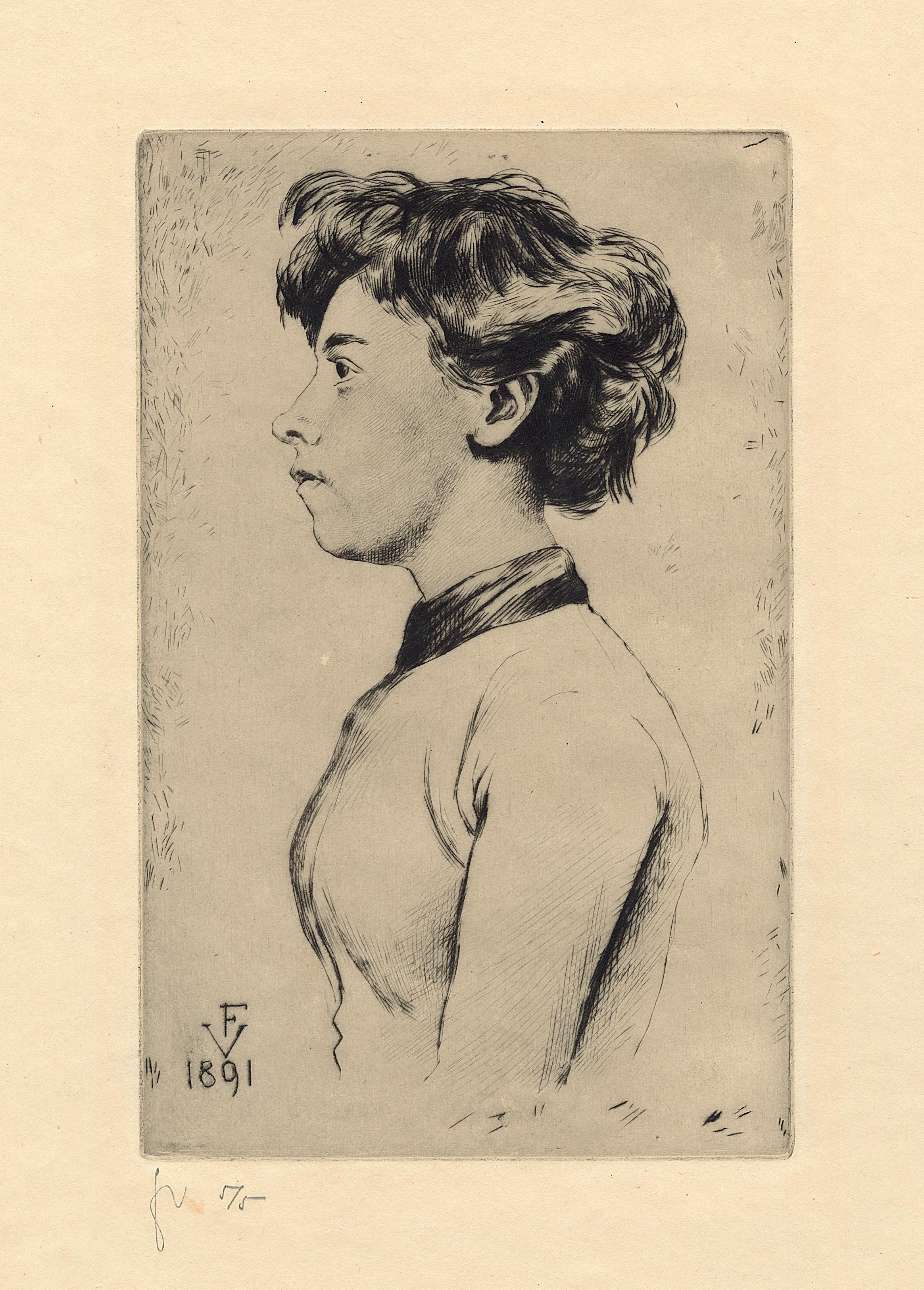
97
The Milliner, Renée Vert
Lithograph printed in black, with brush and spaying techniques, on wove paper, 1893 Image 460 × 290 mm
Reference Delteil 13; Adriani 13; Wittrock 4, first state of two (trial proof) Provenance Private collection, France Condition In fine condition
It is a wonderful trial proof of one of Lautrec’s most desirable works in the field of commercial graphics. It was intended for a menu card, showing Renée Vert, for a dinner given by the Société des Indépendants on 23 June 1893. Renée Vert had long been a member of the Lautrec’s circle. In 1893, she married his student friend, Adolphe Albert, who was later secretary of the Société des PeintresGraveurs Français. The print was printed by Ancourt, and it was based on a drawing made on transfer paper (Dortu D. 3457). Wittrock knew only six impressions with the text in public collection, six impressions before the final printing, and nine trial proofs printed with crachis (spray) from the key stone in olive green or black,
and from the colour stone in various tints. We have not seen any trial proof in the auction market for at least thirty years, not even in the very extensive Galerie Michel collection that came up for sale in 2021.
It is a surprizing how the effect of the few trial proofs is rather different from the final version. We are in the beginning of the Lautrec œuvre, when he used spraying techniques in many senses, and it is only during this time of two-three years that he tried that kind of experiments. The modiste seems like perched above the ground or her foot taken in a cushion, floating in a cloud of crachis, and doing something mysterious with her hands.
98 41 Henri de Toulouse-Lautrec 1864 Albi – Malromé 1901

99
The Castel of Tonquédec
Etching and aquatint on wove paper, 1894
Signed and numbered in pencil lower right Maufra no 1 (?)
Plate 297 × 353 mm
Reference Morane 17, 2nd (final) state
Provenance Jeffrey Kaplow, Paris
Condition In very fine condition
This is a very good impression of one of Maufra’s most celebrated works, The Castel of Tonquédec, in Brittany. The plate has been edited by L’Estampe Originale.
42 Maufra Nantes – Poncé-sur-le-Loir 1918
100
Maxime
1861
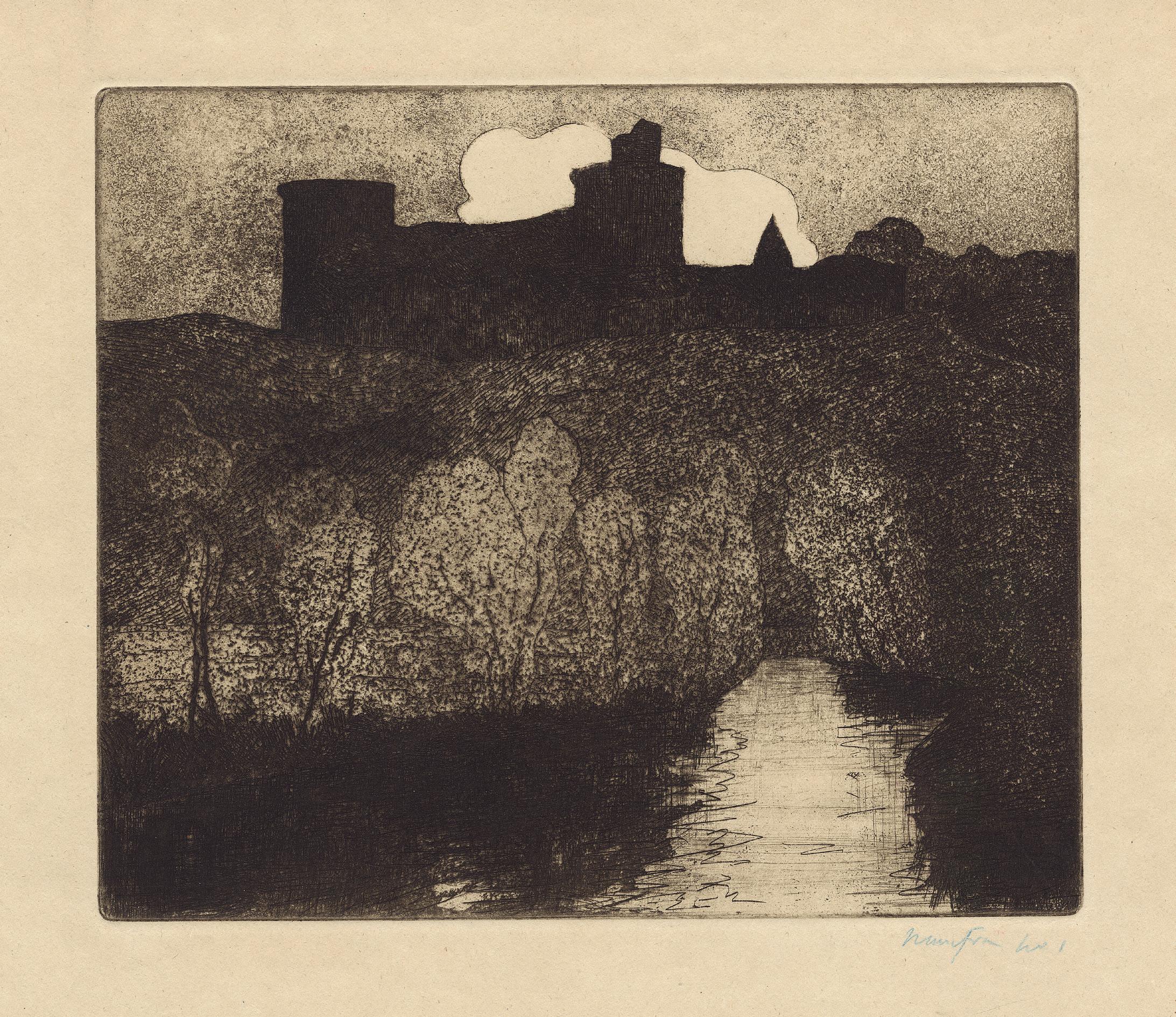
101
Lithograph in colors on wove paper, 1894
Signed lower right Paul Signac, with the stamp of L’Estampe originale (Lugt 819)
Image 273 × 365 mm
Reference Kornfeld & Wick 6, only state Provenance Private collection, France
Condition In very good condition
This is a wonderful impression of one of the very first lithographs printed in color by Paul Signac, and it is also one of the rarest, although it was published in L’Estampe originale. It is also his first print about Saint-Tropez. On the opposite to many forthcoming prints in his œuvre, the present composition is not after a painting.
Depressed in Paris after the death of Seurat in May 1891, Signac arrived in Saint-Tropez in 1892, following the advice from his friend Henri-Edmon Cross, and with his other friend Théo van Rysselberghe. At that time, Saint-
Tropez was still a peaceful little harbour of fishermen and sailing. Signac was immediately fascinated by the atmosphere of the port, its inhabitants, and the sea. He could reconcile his passion for the arts and for navigation, in a landscape and a village where he enjoyed vivid and colorful reflections on all sides. His technique here is still that of the first years in Saint-Tropez, all round and winding. It is later, in the same year, that he would return to a more classical neo-impressionism, with touches of pointillism.
43 Paul Signac 1863 – Paris – 1935 Saint-Tropez (II)
102
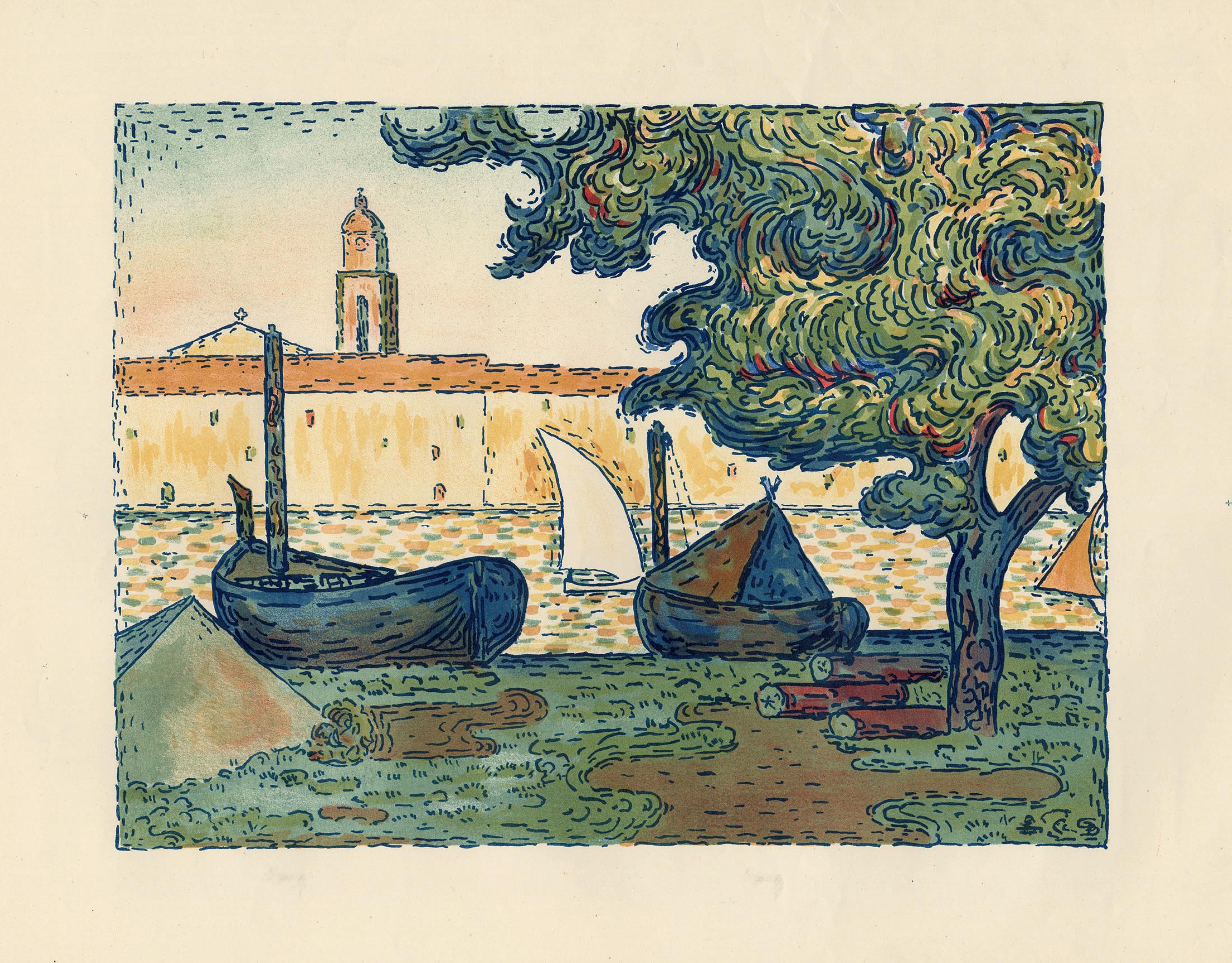
103
Two Cats Resting
Etching on laid paper, ca. 1898
Signed Steinlen, and annotated on the back 1er état avant de nouveaux travaux Dedicated lower right Pour Eug Delâtre Watermark RIVES Plate 295 × 294 mm
Provenance Private collection, France Condition In perfect condition
This is a superb and rare proof impression, annotated 1er état, and dedicated to Eugène Delâtre. As far we can assert, there must be around ten impressions of what could be the definitive state of this plate. There, the cats are widely reworked, especially the seated one; the ground and the background are set with strong hatching. On the opposite, here, the two cats are just outlined, and this gives a charming feeling of a large onego drawing, in an open blank space with plate tone.
Son of the printer August Delâtre, Eugène was both an artist and an extremely good printer, follower of his father in the atelier. He knew all the fine peintres-graveurs of his time and printed many works for all of them. He is also the inventor of various color printmaking processes, described by Philippe Dennis Cate (De Pissarro à Picasso, L’Eau-forte en couleur en France, Paris, Zimmerli Art Museum/Flammarion, pp. 58-68).
104 44 Theophile-Alexandre Steinlen 1859 Lausanne – Paris 1923
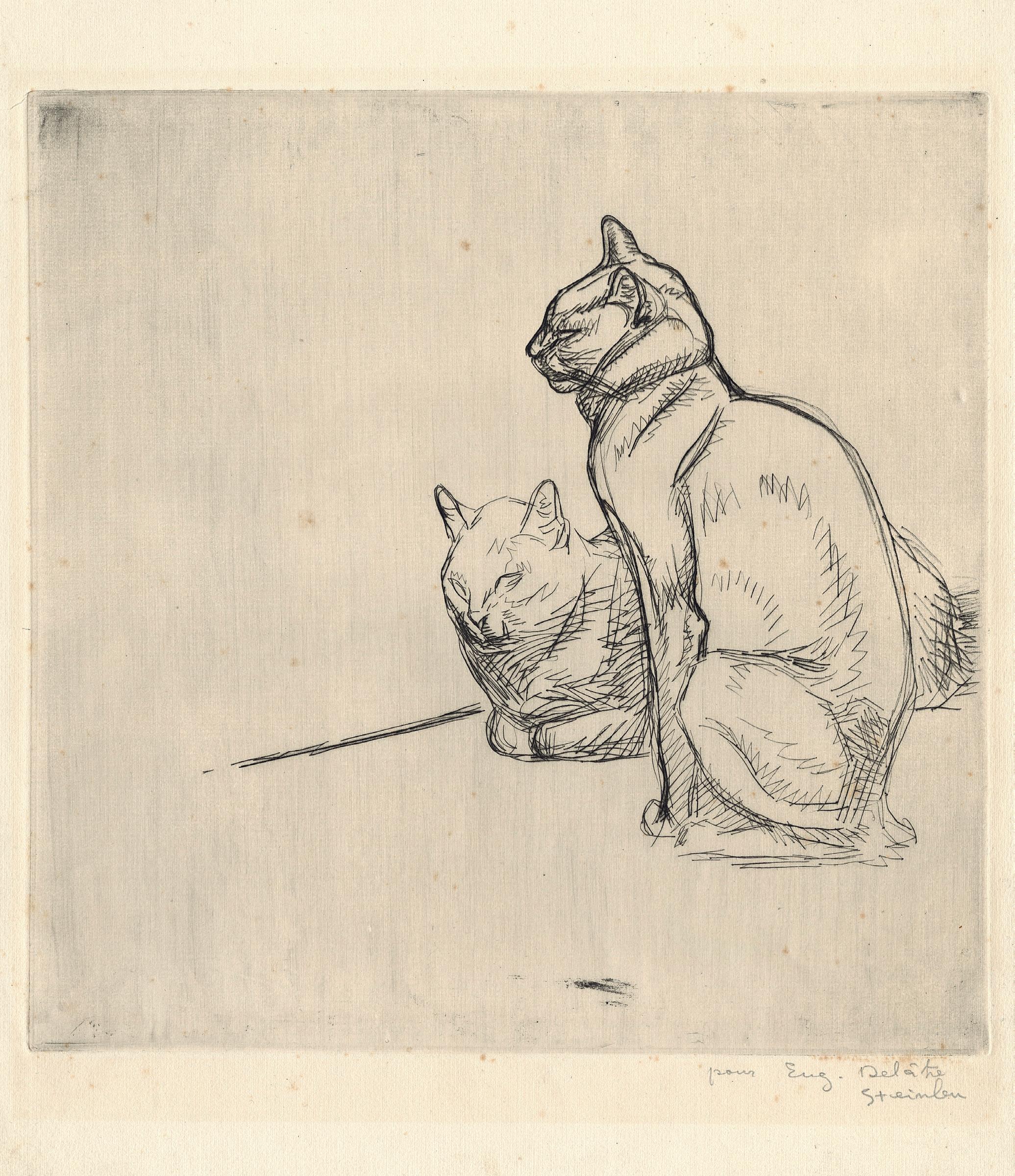
105
45 Francis Picabia 1879 – Paris – 1953
Morning Effect on the Pond of Berre (Martigues)
Etching and aquatint on wove paper, ca. 1901-04
Signed lower right F. Picabia, and numbered N°=10 Plate 172 × 253 mm
Provenance Private collection, France
A superb and tonal impression of this very scarce and early etching by Picabia.
Francis Picabia, the spokesman of the Cubist Section d’Or, the Dada and Surrealism artist actually started his early successful career as a post-Impressionist, working under the direct influence and early encouragement of Sisley and Pissarro, who he both met from 1897 at Moret-sur-Loing. His printmaking as an etcher seems largely confined to this early period, to a few works in that mood, and it provides a stunning insight into the ground of Picabia’s art. The very first three plates seem to be the present one, and two others that could be entitled Fishing boat on the waterside and Small Boats at the harbour. Of the present one, we have not been able to find any other impression, neither in private collection, nor in public collections like
the Centre Pompidou or the Bibliothèque Nationale de France in Paris. Of the Fishing boat on the waterside there was one copy for sale in 2018, of the Small Boats at the harbour, there is one copy at the MoMa, New York (numbered 3), and another copy was for sale in 2012 from a major collection of Picabia’s documentations, photographs, manuscripts, etc. These three prints are characterized by a strong black and white contrast, and are all similar in technique, style, and format. They would be followed by three plates, but with less contrast and less inventive.
Later, Picabia made six etchings in 1907, in a style dryer and with less tones, to be included in the first monograph about the artist, Picabia, le peintre et l’aquafortiste, by Édouard André, which was published in an edition of 250 copies in 1908. Those prints are much smaller, ca. 12 × 15cm.
106
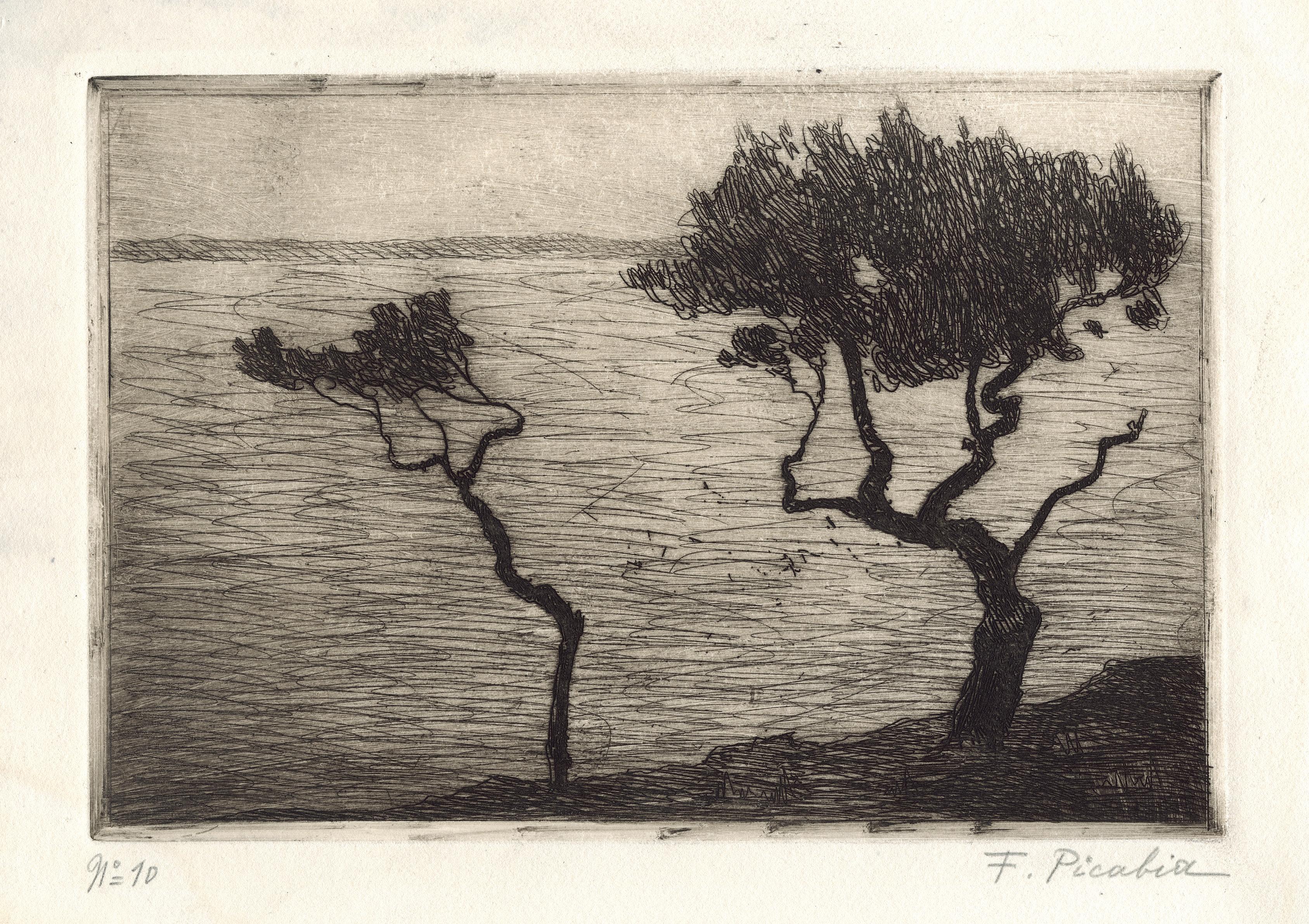
107
46 Cologne Würzburg
Original Engravings
Complete set of eleven etchings, with text, on Holland paper in the original beige linen portfolio, ca. 1875 Numbered in ink 73 on the second page of the album Sheet 435 × 306 mm
Reference Waldmann 2, 3, 4, 8, 10, 12, 14, 15, 16 and 17; Billeter B11/8; edition of 100 on Holland paper printed by Otto Felsing and published by Fritz Gurlitt, Berlin, in 1915
Literature Fritz Novotny, Painting and Sculpture in Europe, Harmondsworth, 1978, p. 289
Provenance Private collection, USA Condition In fine condition
Landscape with Tall Trees Leibl’s Farmhouse in Aibling Old Farmer with a Hat Peasant Boy with a Jug Leibl’s Aunt Team of Oxen in Harness
Therese Bauer (Head of a Young Farmgirl) Landscape with Resting Children Portrait of the Painter Sperl Portrait of the Painter Wopfner Bust of a Young Peasant Girl in a Plaid Jacket
This complete portfolio of eleven etchings was published by Fritz Gurlitt in Berlin in 1915, after Wilhelm Leibl’s death. There was no life-time edition of these plates. Their designs are to be dated circa 1875. The current
ensemble is a great testimony of the key role that Leibl played in the revival of printmaking in Germany in the late 19th century, together with Adolph von Menzel. By doing so, they paved the way for artists such as Max Liebermann or Max Klinger who explored this medium further.
In October 2019, the Kunsthaus Zürich and the Albertina organized a monographic exhibition dedicated to Leibl. This awaited show has demonstrated the importance of Leibl’s graphic production in the evolution of the 19th century German art. If Leibl is more known for being a painter, he was also active as a printmaker mainly between 1873 and 1877, when he produced the majority of his graphic works and actually soon after his return from France.
108
Wilhelm Leibl 1844
–
1900
109
110
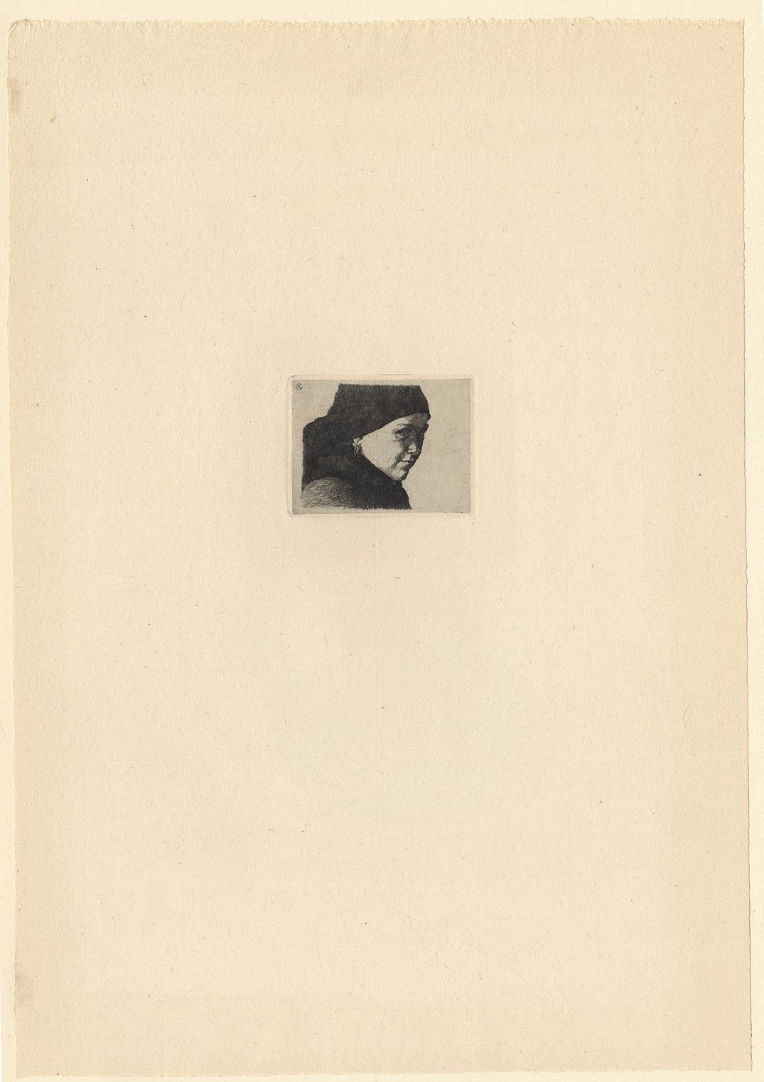
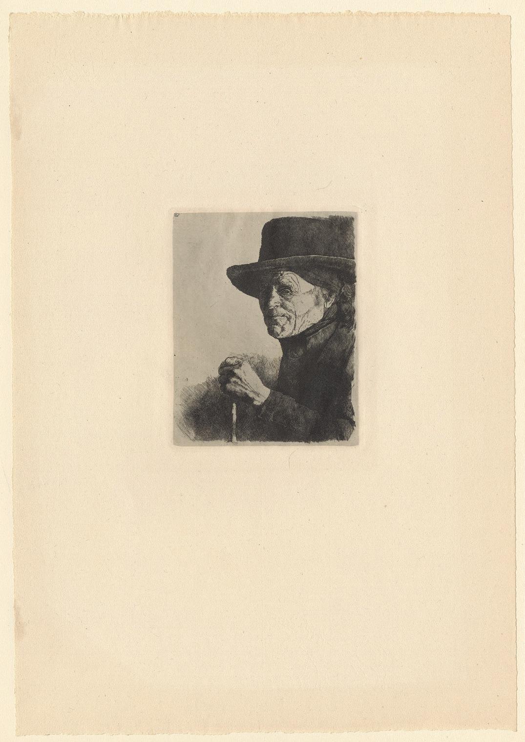
111
Ten Etching by A. W. Finch
Etchings, ca. 1886-1892 printed on laid paper laid down on brownish kupferstich paper Issued in 1893 in a map titled and numbered Exemplaire n°32 Some plate signed lower right in pencil A. W. Finch
The plates:
Le Verger – The Orchard 119 × 162 mm, ca. 1886-88 Derey-Capon 95, only state
Le Guitariste – The Guitariste 201 × 150 mm, ca. 1886-88 Derey-Capon 96, only state
Femme Cousant – Knitter woman 120 × 164 mm, ca. 1887-888 Derey – Capon 100, only state
Champs de blé – Kornfield 97 × 165 mm, ca. 1888-90 Derey – Capon, only state
Fenaison – Haymaking 150 × 216 mm, ca. 1888-90 Derey-Capon 102, only state
La Tamise à Londres – Thames in London
150 × 200 mm, 1891
Derey-Capon 103, only state
Les Saules – The wipping Willow 255 × 345 mm, 1891 Derey-Capon 104; only state
Battersea Bridge 170 × 195 mm, 1892 Derey-Capon 106, 2nd state
Etudes – Sketches 179 × 240 mm, ca. 1888-90 Derey-capon, undescribed
Porte de Namur in Brussels – Namur’s Gate 171 × 148 mm, ca. 1890 Derey – Capon, undescribed
An extremely rare set published by Willy Finch him-self in 1893, with ten of his etchings. We have only seen one other on the market, with the portfolio. The only other copy known to Danielle Derey-Capon is the n°21 from the Museum of Tournai, ex. collection Henri van Cutsem, major contemporary collector and sponsor of Finch works. The latter one has only eight etchings. Ours has ten prints, eight like the Tournai set, plus two undescribed plates by Derey-Capon, and then again very rare. The prints are all from the Belgian period, before he left for Helsinki.
Willy Finch was a Neo-Impressionist painter, watercolorist, printmaker and also a ceramist. Born out of an English family, Willy moved with his parents to Ostend in 1859. He received his artistic training at the Academy of Brussels under the mentorship of Joseph Van Severdonck from 1878 until 1880; with James Ensor as his friend and classmate who strongly influenced him throughout
his career. Finch represented the autochthone Belgian Impressionism. He was a member of La Chrysalide, L’Essor, Le Cercle des Aquarellistes et des Aquafortistes, also a founding member of the leading artistic group Les XX in 1883.
Finch was the first Belgian painter, under the influence of Georges Seurat, to produce significant Pointillist works between 1886 and 1892 using an abstract construction in rhythmic patterns. During the 1890s he became interested in the decorative arts together with Eugène Boch. Finch resided in Finland from 1897, where he was appointed teacher at the Academy of Fine Arts of Helsinki in 1902. He was an essential promoter of modern art and design in Finland.
His graphic work includes twenty-seven prints, all etchings but one lithograph made later in Helsinki. The present prints are certainly the most interesting works in his graphic œuvre.
112 47 Willy Finch 1854 Brussels – Helsinki 1930
113
114
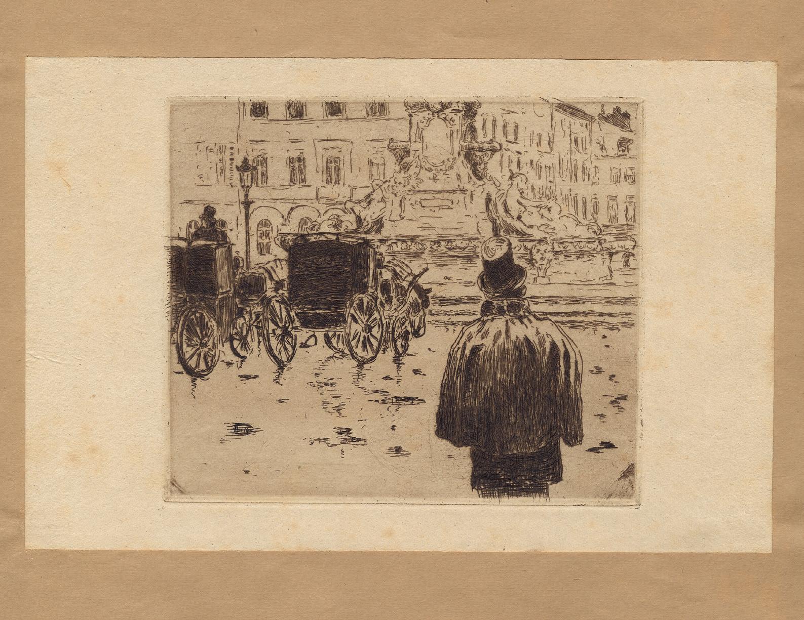
115
48 James Ensor 1860 – Ostend – 1949
Peculiar Insects
Drypoint printed on ivory simili-Japan paper, 1888
Titled on recto lower left Insectes singuliers, and signed and dated lower right James Ensor 1888
Plate 114 × 154 mm
References Delteil 46; Croquez 46; Taevernier 46, fifth (final) state; Elesh 46, fifth (final) state Provenance Private collection, France Condition In fine condition
It is a very fine impression of the Ensor’s Insectes Singuliers, which is a captivating anthropomorphic declaration of love from Ensor to Mariette HannonRousseau. The beetle has Ensor’s features and the dragonfly the face of Mariette. James Ensor was almost adult when he went to Brussels for the first time in 1877 to stay with the Rousseau family. The family’s social and intellectual circle was significant to Ensor’s development as an artist. Ernest Rousseau was married to a much younger woman, Mariette Hannon, with whom Ensor fell in love.
This platonic affection was revealed in several works, among them the one seen here. Heinrich Heine’s poem Die Launen der Verbliebten inspired Ensor to openly reveal his love for Mariette: “Un scarabée se tenait sur une haie, triste et pensif ; il est devenu amoureux d’une libellule : Ô libellule de mon âme ! sois l’épouse de mon choix / Épouse-moi, ne rejette pas mon amour, j’ai un ventre d’or.” [A beetle sits on a hedge, sad and pensive; he has fallen in love with a dragonfly: Ô dragonfly of my soul! be the spouse of my choice / Marry me, don’t reject my love, I have a golden belly].
116
117
Lithograph printed on Chine appliqué on wove paper, 1890 Image 312 × 242 mm
Reference Mellerio 107, first printing (with the title and the mention à 50 exemplaires) Provenance André Gide, Paris; Catherine Gide, Paris Condition In fine condition
A fine, delicate impression of Redon’s Closed Eyes, one of the most famous compositions by the artist, and which belonged to the writer André Gide, and then to his daughter Catherine. It is an impression from the first printing, as It was sold simultaneously by Dumont and Durand-Ruel in Paris, and Edmond Deman in Brussels. This may have contributed to the commercial success of the lithograph, which was reprinted in a second edition of fifty copies. Impressions of the first edition were printed in a silver-grey ink, and they are now rather rare to find.
The current provenance is very interesting. When Gide read Huysmans’ A Rebours in 1889, he found in chapter V a long description of the drawings of Redon who, at that time, was already known, if not famous, for his lithographs and charcoals, which he called his “blacks.” At that time, Redon frequented the “Mardis de la rue de Rome”, at Mallarmé’s, and it was there that Gide, introduced by Maurice Barrès and Pierre Louÿs, had to meet him. Redon thanks with enthusiasm and admiration the sending by Gide, in 1893, of his Voyage d’Urien, illustrated by Maurice Denis. It was at this time that Gide began to acquire works by Redon. Artistic, intellectual, and friendly exchanges between the two men kept going until the death of Odilon Redon in 1916.
The gentle pose of an androgynous figure, and the lithograph’s mood of melancholic introspection, are related to the artist’s admiration of Michelangelo’s famous statue of the Dying Slave in the Louvre. In May 1888, in his
diary, Redon wrote about this statue: “Under the closed eyes of this slave, what an elevated cerebral activity” (Odilon Redon, A Soi-même, Journal 1867-1915, H. Floury, Paris, 1922, p. 95). The sfumato-like, the delicacy with which Redon here models the facial form, and the serene regularity of his model’s features, could have equally well been influenced by a variety of Renaissance precursors, from da Vinci’s Madonna of the Rocks to Albrecht Dürer’s black chalk study of St Barbara which Redon could also have seen in the Louvre (from Ted Gott, The Enchanted Stone: The Graphic Worlds of Odilon Redon , exh. cat., Melbourne, National Gallery of Victoria, 1990, p. 87, no. 32).
Over the next fifteen years Redon engaged himself to explore this motif in numerous variant drawings and canvases. The initial experimentation forms a group of four works, including the present lithograph. We usually consider that the first one is a preliminary drawing (W467) on transfer paper as the head is inversed and outlines are drawn on the back with a lithographic pencil to make the transfer. It is followed immediately by the lithograph; the latter served as a model for the painting on paper, Au Ciel, dated 1889 (W475) and finally for the painting Yeux Clos dated 1890, now at Orsay (W469), and larger than the lithograph. Redon entitled the painting himself Au Ciel; it is related to a sentence in his diary “Beauty and Goodness are in the heaven, Science in scrawling on earth” (op. cit., p. 37). Thus, the subject could also be seen as a metaphor of the ideal unity between beauty and goodness.
118 49 Odilon Redon 1840 Bordeaux – Paris 1916 Yeux Clos
119
50 Franz von Stuck 1863 Tettenweis – Monaco di Baviera 1928 Lucifer
Etching and drypoint printed on chine collé on laid paper, ca. 1890-91
Signed in pencil lower right Franz v. Stuck
Plate 238 × 210 mm
Reference Hardtwig 43, 1st state of two Condition Very fine condition
A stunning impression on chine collé of the 1st state of two, before letters. The print is related to one of the most iconic paintings by Franz von Stuck, Lucifer, dated ca. 1890-91.
There are a few versions and preliminary sketches, but the final painting is now visible in the collection of the
National Gallery in Sofia. With this representation of Lucifer, von Stuck illustrates his personal vision of the world: the devil’s resemblance with a man, shows the humanity of Lucifer, as well as the diabolical character of Humanity.
120
121
51 Marcel Roux 1878 – Lyon – 1922 Dance of Death (suite II)
A set of fifteen etchings on laid paper, in its cover, printed 1905 Table of plates with the handwritten printing numbering No. 1 Sheets each ca. 585 × 445 mm
Reference Marcel Roux (1878 – 1922) Visions Fantastiques, Lyon, Musée de l’Imprimerie et de la Banque, 1991, suite II, 11-25
Literature Colette E. Bidon, “L’œuvre diabolique et apocalyptique de Marcel Roux, graveur lyonnais”, in Nouvelles de l’Estampe, May-June 1989, nr. 105, pp. 17-27.
Provenance Private collection, France
Condition The sheets are in very good condition; the cover, with fabric, is slightly covered with dust, but very nice
This is an extremely fine, rare set of the most famous series of Marcel Roux based on forms that the Death can take to appear to the humans, and castigating in passing social inequalities. Partially forgotten today, Roux realized however around four hundred prints and was very renowned at his time in France as well as in Europe. The Neue Zurcher Zeitung or the New York Herald devoted papers to him in 1911. Jacques Doucet bought his complete œuvre in 1912. Arsène Alexandre even saw Roux as one of the greatest printmakers of his time.
Born and dead in Lyon, Roux was much steeped in Catholicism and mysticism. Following the trend of the religious artists of this city, as Louis Janmot and Paul Borel, he acted in his œuvre as a proselyte trying to demonstrate the existence of God by the existence of the Devil. As Borel wrote: There are lots of peoples who, to understand God, would not come to it without scaring of the Devil In the main part of his graphic work, an ensemble of eight thematic series, Roux translated the adage with his
taste for death and fantasy following Hugo, Baudelaire, Poe – he illustrated Les Fleurs du Mal and La Chute de la maison Usher of the second – and Flaubert. But his dramatic exaltation and a certain form of Nihilism put him close to the contemporary expressionists as Kubin and Munch.
Recalling the print by Buhot on the same topic, the magnificent front-page shows the Death manipulating the press. Furthermore, the port-folio cover is illustrated with the same image, hand-colored in red and numbered “1” by hand. Except the present one, so far only three complete sets, with the hand-colored portfolio, are known.
The plates are:
Frontispice
Adam & Eve
Morceau à quatre mains
La Fête
Le Cabaret
Métamorphose
L’Avare
Le Festin
Le Démon du suicide
Le Génie
Le Religieux
Le Christ
L’Ouvrier Malheureux L’Enfant
Table des planches
122
123
124
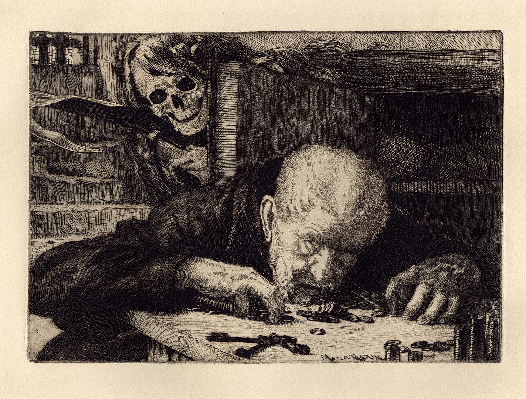
125
52 Filippo Marfori Savini
1877 Urbanie – Florence 1952 The Artist and His Types
Etching on wove paper, 1927
Signed lower right in pencil F Marfori Savini, and entitled lower left in pencil “L’Artista fra is suoi tipi” Plate 415 × 605 mm Provenance The artist’s studio (at least until 1949); Private collection, Italy
Filippo Marfori Savini offers here one of his best prints and a sarcastic and mordant vision of the society.
On the back of this print’s frame, there was an original inscription written by the artist, who described the present plate when cataloguing his œuvre in 1949. In this note, the artist identified different characters illustrated as an allegory. From left to right, we can see: The Fanatic, Three bigots, Sad Maternity, The Shadow Man, The Ignorant, two Prostitutes, The Artist, Painful Childhood, The Decayed, The Widow, The Wise Man, The Jew and other figures, the Drunkard, the unhappy Monsters, and the stray Dog. Represented next to each other, creating a compact mass, the artist walks among them with a smile on his face. This beautiful impression, with intense blacks, shows us the overall anguish and dark image of this world of misfits.
Quite surprisingly, Marfori Savini is not known first for this kind of caustic works, but mostly for picturesque views of his county, through classical portraits and landscapes. Born in Urbania, he studied at the Accademia in Florence and spent his life and career in the same city. Beside his success as a painter, he became more and more active in printmaking, which probably gave
him more freedom, in terms of subjects. He was then a renowned engraver, and in 1914, he founded the Accademia Internazionale di Pittura, Incisione, Xilografia e Acquaforte in Florence. He exhibited in many shows all around in Italy, his paintings, his woodcuts, etchings and drypoints; and some illustrated books.
Original inscription on a sheet laid down on the back of the frame:
Personaggi dell’allegoria incisa all’aquaforte da F. Marfori Savini
« L’Artista a i suoi tipi »
Da Sinistra a destra
Il Fanatico
Tre bigotte
Triste Maternita
L’uomo dell’ombra
L’ignorante
2 prostitute
L’Artista
Infanzia dolorosa
I decaduti
La Vedova
Il Saggio
L’ebreo e alter figure
L’ubriacone
Gli infelici mostruasi
Cane randagio
Elenco fatto dallo stesso autore sul 1949 / foglio incollato sul retro della cornice contenente l’iscrizione di Filippo Marfori Savini.
126
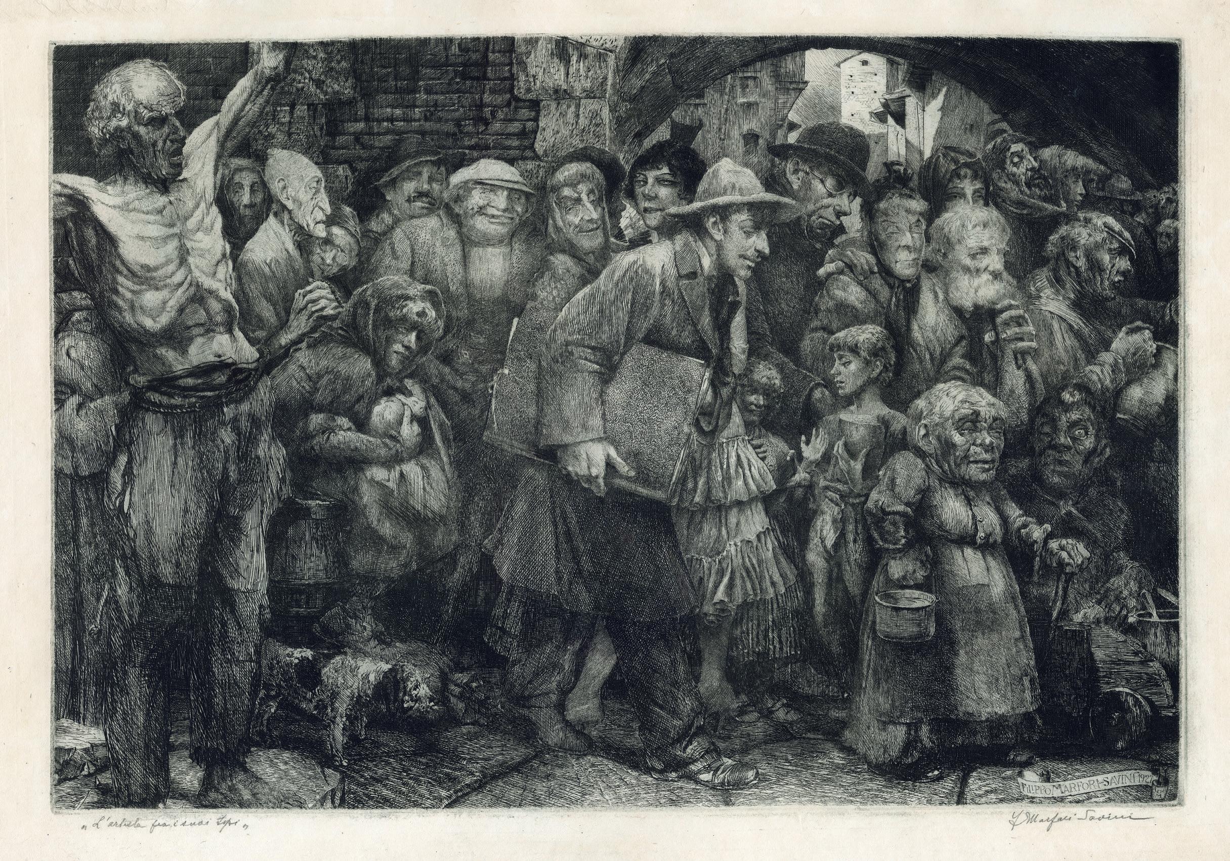
127
Index of artist names
BEATRIZET 18
BESNARD 94
BRACQUEMOND 50
BRESDIN 52
BUHOT 70
CALLOT 24
DAUMIER 56
DE TOULOUSE-LAUTREC 98
DELLA BELLA 26
DENON 40
DESBOUTIN 84, 86
DÜRER 12
ENSOR 116
ERMELS 34
FINCH 112
FRYE 38
GACHET 92
GÉRICAULT 46
GOENEUTTE 72, 74
GUÉRARD 76, 78, 80, 82
HADEN 66, 68
HOLLAR 28
INGRES 48
KAUFFMANN 36
LEIBL 108
MANET 54, 58, 60, 62
MARTIAL 64
MAUFRA 100
NANTEUIL 32 NELLI 20
PALUMBA 6
PICABIA 106
PISSARRO 88, 90
RAMBOUX 42
REDON 118
ROUX 122 SAVINI 126 SIGNAC 102
STEINLEN 104 VALLOTTON 96 VAN DALEN 30 VON STUCK 120
Catalogue entries
Eric Gillis
Noémie Goldman
Design
Tia Džamonja
Translation/Editing
Eric Gillis, Jean-Marie Gillis & Rhonda Sherwood
Scan
Jérôme Allard, Numérisart, Bruxelles
Special thanks to (by alphabetical order) to Melissa Hughes and her team, Dominique Lejeune and her team, and to all of those who have contributed to the publication of this catalogue.
© Gillis Goldman Fine Art – October 2022
————————————
——————————
———————————
——————————————
————————————
————————————
GILLIS GOLDMAN FINE ART T +32 2 503 14 64 W www.gillisgoldman.com M noemie@gillisgoldman.com 1, rue aux laines 1000 Brussels | Belgium GILLIS G OLDMAN
