
Visual Development Guide


Visual Development Guide

Mission Statement
New Name 00
Key Phrases
R1 Rough Sketches
R1 Refined Sketches
Updated Key Phrases
R2 Rough Sketches
R2 Refined Sketches 01 02 03
R3 Rough Sketches
R3 Refined Sketches
R3 Digital Comps
Visual Standard Guide
Inspiration
Logo Look-a-like’s 04
Mission Statement
Old Mission
To use the power of science, exploration, education, and storytelling to illuminate and protect the wonder of our world.
We combine technology and human experiences to educate many on the wonders of our world, and to seek action in becoming an active part of our story of making a change in protecting our planet.
Old Name
National Geographic was the old brand identity name which still remains relevant but as new issues present themselves in our world, NG pushes to be an advocate of change, education, and experiences going forward.
New Name
NG is the new direction of National Geographic which focuses on the continuation of exploring of the wonders of our world through enhanced education, hand-on learning and experiences, and more advocacy for change.
Keywords
R1 Sketches
R1 Refined Sketches
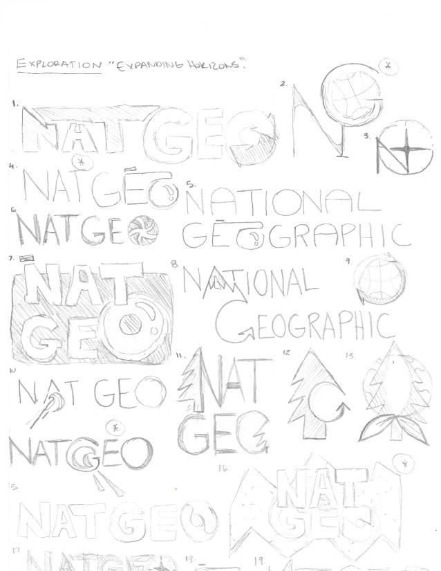
The first round of sketches for NG. Taking my three keywords, exploration, education, and change and the three created phrases for them, expanding horizons for exploration, quest for knowledge for education, and adaptation and growth for change NG created three-hundred possible logo sketches. Out of those three-hundred, selected thirty to refine.
• Key Phrases
• R1 Sketches
• R1 Refined Sketches

Showcasing the vast world in different forms, both digital and physically noting the stories and vast expeditions individuals went on and what they captured.
Being a large proactive resource individuals of all ages can refer to in order to learn more about our world and all it has to offer.
Advocating for our planet and the need for change to help keep our ecosystem, animals, and the people who live here thriving and hoping individuals will take action themselves.
Creating logo ideas based off the keyword , Exploration. I focused on showcasing exploration through globes, mountains, camera lenses, trees, and animals.


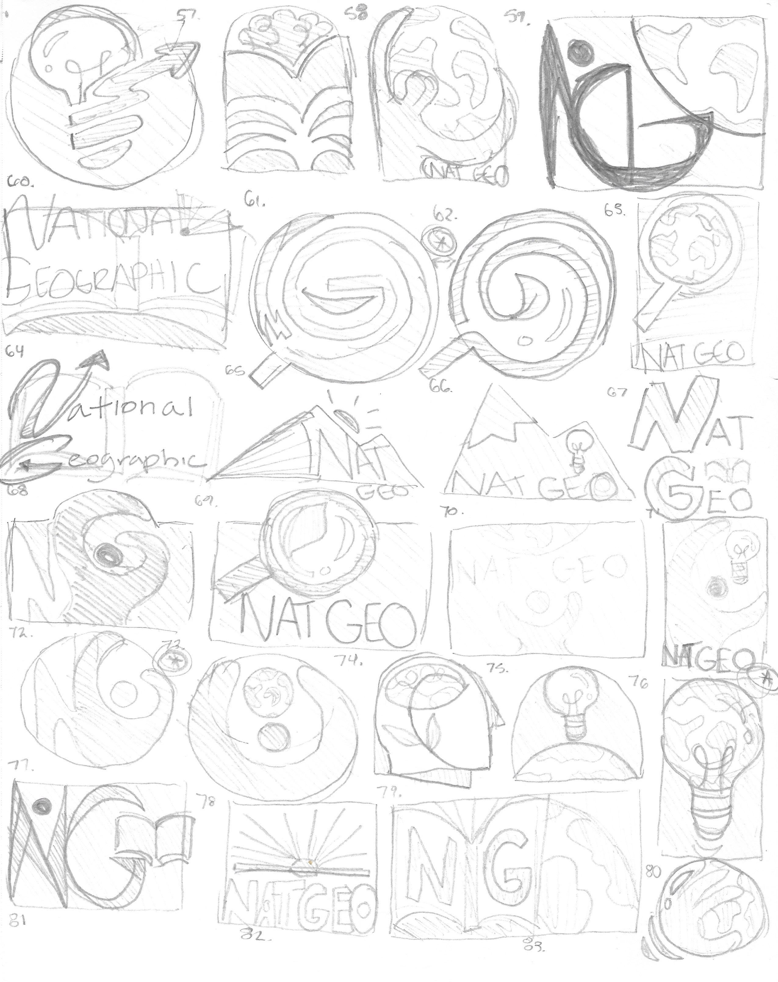
Creating logo ideas based off the keyword , Education. I focused on showcasing education through books, lights, globes, humans, and combinations of two or all.



Creating logo ideas based off the keyword , Change. I focused on showcasing change through arrows and globes in different formats.


Round Two: Updated Key Phrases & Logo Sketches
The second round of sketches for NG. Taking my three keywords, exploration, education, and change and refining them and my key phrases based off of peer and professor critique. Focusing on exploration and education more and based off of feedback, I worked on creating more divergent sketches of some chosen logos that were appealing from last module.
• Updated Key Phrases
• R2 Sketches
• R2 Refined Sketches

Exploration
Showcasing the vast world in different forms, both digital and physically noting the stories and vast expeditions individuals went on and what they captured.
Education
Being a large proactive resource individuals of all ages can refer to in order to learn more about our world and all it has to offer.
Discovery
Oneself going out on adventures to discover different things, places, animals, and nature all around the world. Being someone who directly connects with the discoveries.
From critique and student and professor feedback, I focused on generating different iterations of one idea several times to understand what is working well in regards to NG’s message.


Focusing on creating a spark or star and arrows to represent education and combining them with the NG for NG.


Based upon the newest keyword, Discovery, NG has created a mixture of different logo ideas showcasing stars, mountains, and a combination of the two.


Selecting the most promising rough sketches and refining them traditionally.

Round Three: Logo Sketches & Digital Comps
The third round of sketches for NG (National Geographic). Adding even more sketches and then went to the computer to comp them up in B&W and in color as well.
• R3 Sketches
• R3 Refined Sketched
• R3 Digital Comps

Working on combining graphical components together to create pleasing and eye-catching logo designs that translate well to NG’s brand identity.


R3 Digital Comp & Colored
NG with abstract mountains and stars digitally comped up along with various color ideas.
R3 Digital Comp & Colored
NG for NG with star shooting across the middle of it digitally comped up along with various color ideas.


NG with mountain sillouette and star digitally comped up along with various color ideas.
R3 Digital Comp & Colored NG for NG with abstract mountains overlayed on top of the NG and digitally comped up along with various color ideas.
R3 Digital Comp & Colored
NG wordmark with star shooting across the middle of it digitally comped up along with various different color ideas.
NG with star and lines digitally comped up along with various color ideas.

The fourth round of rough and refined sketches as well as digital comps and logo refinements for NG. Round Four: Logo Refinement
• R4 Sketches
• R4 Refined Sketches
• R4 Digital Comps
• R4 Digital Colored Comps
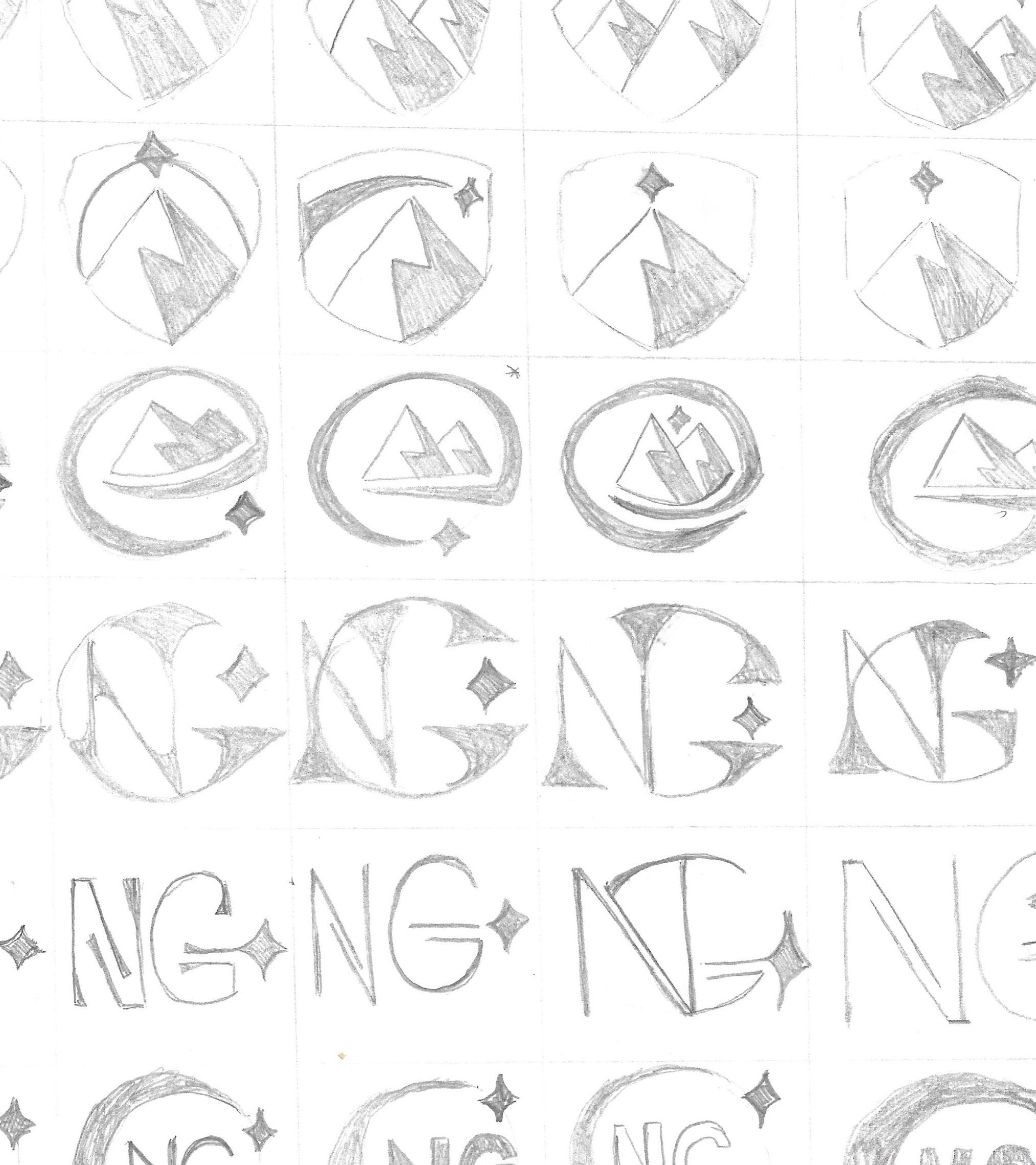
NG focused on showcasing mountains and stars for their new logo as a symbol of having to climb mountains in order to reach for future change, what the star symbolizes.


NG refined sketches using a grid for more precision showcasing refined versions of the mountain and star combination and NG with stars.

Using Adobe Illustrator, NG took the refined sketches of their new logo iterations and digitally comped them up to see how it translates on a screen.


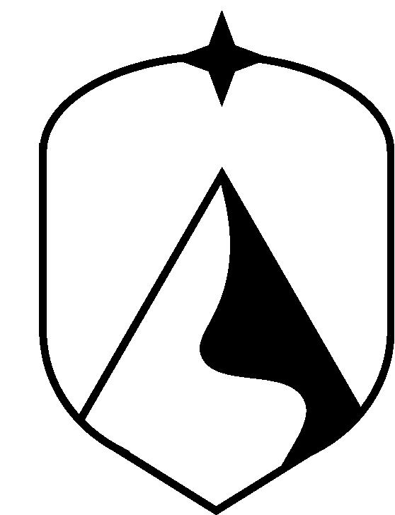


Using Adobe Illustrator, NG took the digital comps of the new logo ideas and created several different color iterations for each.



In this section, I looked at other brands visual systems and annotated and captured visual systems overall layout, what stood out to me, and why I found it appealing.
• Visual Systems
• Logo Look-A-Like

Exploratoriums intro to their visual system is engaging, playful, and connects to their audience very well through fun educational speech. It is inviting and visually appealing typography, and through the use of great typesetting that allows the user to understand the premise of what Exploratoriums requirements for their brand are.

Exploratoriums logo anatomy is clear and concise presenting multiple pages full of information and different ways of presenting their logo to their target audience. The overall spread layout is understandable and visually compelling which allows us, the viewer, to be able to understand and execute Exploratorium’s logo design in the correct manner.

Showcasing their typeface and type specs in not just a straight up way but making it quite visually appealing and interesting with size differenciation can make their message and specs more noticeably interesting and captivating. This also allows for users viewing the visual system to understand what they are looking at and ways Exploratorium’s logo, content, and information is viewed.

Boeings color pallet showcases their broad spectrum of colors they use and of different material as well. Also showcasing text and graphic overlays on top of the colors to showcase how to showcase their logo, graphic, and typography on the various colors. It is easy to understand and we understand how their content should be used and showcased and in the various ways.

The message Exploratorium is aiming to achieve is clear. They showcase many examples of what not to do with their logo and have places a clear message of if you change our logo, it sends the message to someone that we are someone else.

DFW’s alternative logos are clear, simple, and easy to understand seen in a visual way. Along with the type informing the viewer of proper scaling and sizing and other information informing about the proper usage of their logo.

Symantec showcases the different graphical elements which will be seen across their platforms and brand as a whole and what is allowed along with a description of what they are and why they are helpful to Symantec’s brand voice.

Symantec makes it clear with several examples of hierarchy usage, typesetting, and scale and how their content should be layed out on a spread of any size giving clear detailed notations for each section of type.

Symantec showcases many sections of text that informs the viewer about the brands voice and tone. It is increadibly in-depth and allows for a more broader understanding of Symantec which will allow for better execution.

Devon showcases clearly the correct ways to showcase imagery for their brand, noting what not to do with the imagery as well. Properly labeled, the imagery associates with the corresponding type written about each one and what they are.
Logos that have mountains and stars that would be considered similar or look-a-likes to the chosen logo of NG.


Name
Instructor
Class
Brand
Typography
Era Mahoney Hunter WimmerThe Nature of Identity
NG (National Geographic)
Proxima Nova