THE DEPOT GRILLE
EMMACRUISE
~ ARTS 224-002
MARKET R ESEARCH
SECTION 1
OVERVIEW
BACKGROUND
The Depot Grille is a relatively new restaurant in Lynchburg that has quickly left its mark on this southern town. In 2004(3), David Poole started this steak and seafood restaurant that was a mix of antique designs, American comfort food, and boasted of a unique location near the railroad and waterfront(3, 1). While it may be technically new, the Depot’s roots date back to the 1800s as the restaurant houses a variety of bygone pieces that have since been utilized in the dining area, back bar, and kitchen(1)
MISSION
The mission of a company helps not only provide information about it for customers, but also set a goal for the company to work towards, which for The Depot Grille is simple. It aims to show every customer that “a wellrounded menu of superbly cooked dishes is a treat for a family night out or impressing business clients”(1). This being said, how does the Depot achieve this? The owner, David Poole, states, “We do it the hard way”(3) meaning that they don’t buy precooked meat(3), include options for vegetarians and vegans(2,3), and offer gluten-free meals(2). They also focus on not only their menu, but making sure that the environment of the restaurant lines up with their mission: unique yet familiar, open, and of course, inviting (3).
TARGET AUDIENCE
With a full bar(4), reasonably pricy menu(4), and an “ideal environment for a casual business lunch” (1) The Depot Grille definitely targets a more mature, working audience. Since Lynchburg holds an employment rate of 52.1%(12) (which is decidedly lower than the United States average of 60.3%)(13) there could be potential problems with bringing in a workingclass audience. While the Depot has an Instagram page (as of 2015), it is set up and runs like a Facebook page with tons of pictures of food with the same basic format. With this is it not surprising that The Depot Grille points toward an older audience, yet they are trying to start branching out into the younger generation with “newer” forms of social media. With the median age of Lynchburg, Virginia at 27 years old it provides the Depot with a customer base that is old enough to venture into Facebook and
also a solid upcoming audience willing to take advantage of this unique, vintage restaurant. These younger customers value good American food, however, are more comfortable with a relaxed environment for business than their older counterparts. Nevertheless, all of this does not mean families will not find this as an incredible place to spend an evening, as the passing trains entertain and the model train enchants (1) both young and old. Overall, the ambiance of the Depot points toward casual meals with colleagues or family by encouraging a very relaxed environment alongside high quality American food.
COMPETITORS
The competitors of The Depot Grille mostly consist of other local Lynchburg restaurants that emphasis American food in a unique, cozy environment. Three of these types of places include The Neighbors Place, Market at Main, and RA Bistro. The Neighbors Place specializes in southern hospitality paired with hearty American food(6) which can immediately be seen through their warm and community focused website. A unique aspect of them is that they are able to host large amounts of guests in a variety of locations including the Private Dining Room, Front Patios, and more(6) In similarity to the Depot, they also offer a full bar along with vegetarian, vegan, and gluten-free meals, however unlike the Depot they do accept reservations (5). Market at Main is much like The Depot Grille in that they use unique antiques and designs in their decoration in order to achieve a friendly vintage vibe. For instance, the floors are made from planks found in an old tobacco warehouse in downtown Lynchburg, the 1800s styled front counter was designed to appear as an antique dry goods counter, and many other additions to ensure the building reflected the original atmosphere of the “good old days”(8). Their most obvious weakness is that their website is extremely bland and does not have solid design elements that would attract customers(7). The RA Bistro falls alongside the Depot in that it also offers meals for those on dietary restrictions, as well as hosting a bar(9). However, it differs in that it offers reservations, is a little more upscale, and brings burgers and other pieces of American cuisine into the picture (10). Overall, it puts a huge emphasis on the restaurant offering customers a place to rest, relax, and leave full of their favorite dishes. In conclusion, The Depot Grille has its work cut out as there are many similarly styled restaurants in the Lynchburg area that directly compete with it, thus it must work towards finding a strong unique standing in which will set it apart.
UNIQUE SELLING POINTS
Due to the huge amount of competition The Depot Grille faces it is important for it to be aware of its unique selling points in order to use them to grow its customer base, enhance its chance of being known, and draw in more of its target audience. This being said it has many strengths that it can utilize for this. For instance, its menu selection is varied yet still holds true to the classic American cuisine and the prices are low enough to encourage locals to enjoy a meal, but also high enough to make it feel like a special occasion (11,4). The biggest selling point that the Depot has is its location near the railroad and the emphasis on the railroad culture throughout its unique pieces. The kitchen is made up of two 1960 freight cars, the booths are church pews from 1906, the back bar is legend to have been shot by the James brothers back in the 1800s, and to top it off a hand-built model train from Mr. Reburn (1). By drawing from these unique pieces, The Depot Grille stands a strong chance against the local Lynchburg competition.
STRENGTHS & WEAKNESSES
When viewing a business strengths and weaknesses it is extremely advantageous to look through the lens of a SWAT analysis: strengths, weaknesses, opportunities, and threats. First off, The Depot Grille’s main strength is its unique history with the variety of vintage pieces and renovated antiques. Through these it is able to bring in customers who not only want a good meal, but also desire a great experience. The main weakness that the Depot has is that it is extremely similar to many other local restaurants in that it uses antiques to provide a vintage vibe, has a diversified menu for dietary options, and focuses on classic American food (2, 1). Another one that will greatly impact business in the near future is that its social media is not keeping up with current ideas and designs thus many customers could be lost. Thirdly, the Depot has many opportunities including building the business in order to provide reservations (perhaps even on just the weekends), bringing more awareness to social media feeds, and becoming a stronger, and more familiar, part of the Lynchburg community. Last but not least, The Depot Grille’s biggest threat is its competitors. Due to there being so many similar stores in the Lynchburg area, locals could be tempted to visit restaurants closer to home or try to find a cheaper deal elsewhere.
BRANDING
VISUAL SUMMARY
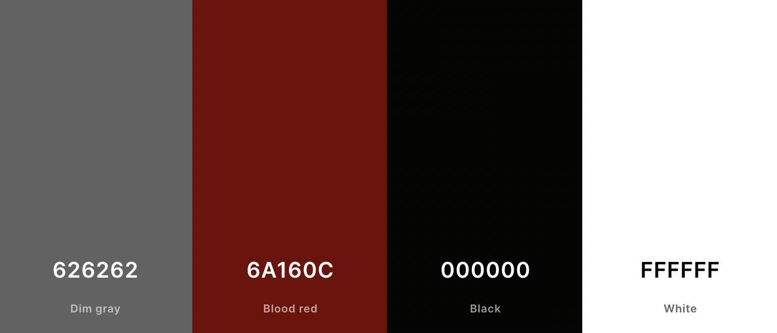
The Depot Grille is focused on a vintage vibe by utilizing refurbished antiques, classic typeface designs, and strong, bold colors. On its website customers are introduced to the logo which utilizes a simple sans serif typeface featuring the letters “DPO” which when said are “depot”. While this is an interesting form of word play it is distracted from by the “fuzzy” design and overuse of borders (on ovel and on letters). Besides the logo, the rest of the website is filled with an elegant serif typeface and a variety of photos of the restaurant and meals. The main palette is made up of black, white, blood red (#6A160C(14)), and dim gray (#626262(14)). These colors work well the overall vibe of the Depot as they match the old-style railroad colors. With social media the use of photos of food, logo, and palette matches the website, however, they completely change typefaces by going to a sans serif not found anywhere else. The online PDF menu(11) completely changes the logo, typeface, and goes for a brighter red thus separating itself almost completely from the original business. As for the actual location itself, the Depot make use of more rugged fonts on the business signs that match the overall vintage vibe of the building. There are definitely some problems with overall unification of the branding for The Depot Grille, but they are off to a solid start and with some minor tweaks could really become a well-known local Lynchburg restaurant.
VISUAL A NALYSIS
SECTION 2
COMPANY ADS
FIRST
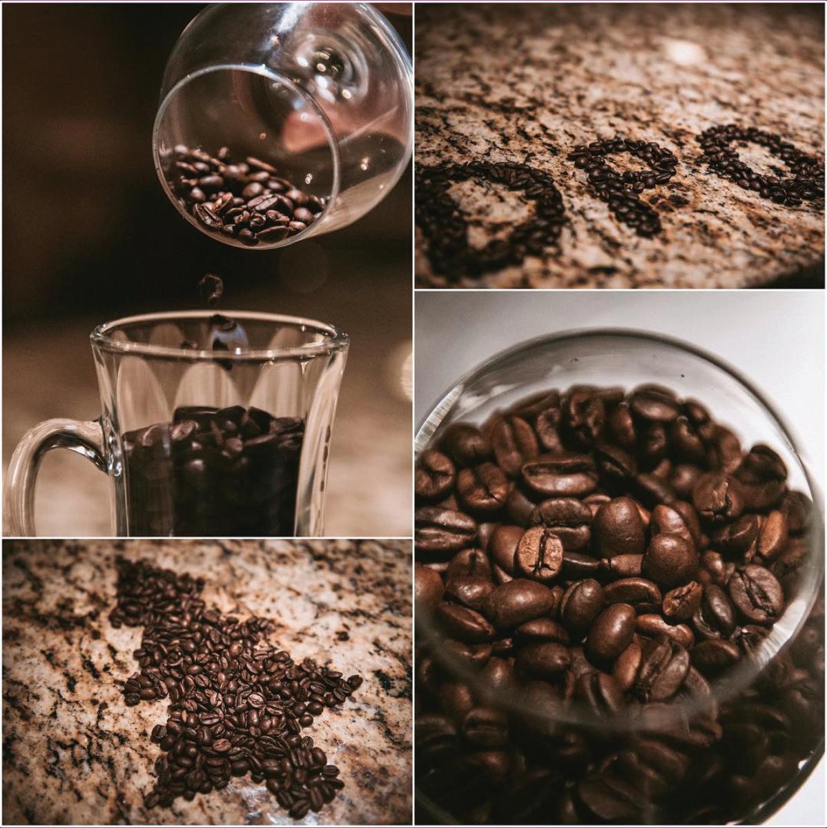
In this Instagram post from The Depot Grille coffee beans are used in an almost conceptual way in order to enchant those who may not be as interested in steak or seafood but still want to enjoy the unique atmosphere of the restaurant. In fact, it is not simply talking about coffee as a drink but also as a dessert, as shown in the caption where it states, “eat dessert first… or drink it”(15). On the good side, this ad keeps to the rustic and rugged look found throughout the aesthetics of the Depot. However, while the ad itself does encourage the customers to try out the coffee, it does have some design faults that hinder the overall concept. For instance, there is some lack of contrast that when quickly scrolling might cause you to miss the message and although it is pushing coffee as a dessert the ad’s photos do not show this. Overall, while there was only a simple 32 likes (15) and no comments it was a great idea that simply was not able to reach out due to the minuteness of the Depot’s social media and some design problems.
CONT.
SECOND
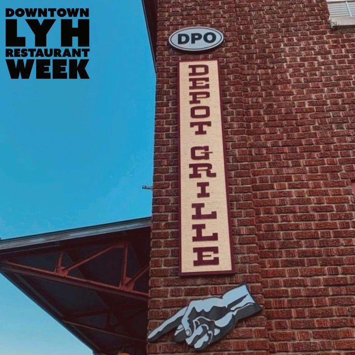
The Depot Grille really went for bold and distinct contrasts int this Instagram ad showcasing the Depot’s involvement in the “Downtown Lynchburg Restaurant Week”. This ad was focused on reaching a target audience of those who are interested in supporting local Lynchburg business and desire to try a new and interesting environment serving classic American food. The caption does a great job of supporting the ad by having the date it starts, a link to the menu, and support other local restaurants(16) For the actual ad picture the bright blue boldly contrasts the red bricks, thus becoming easily recognizable when scrolling and looking back on. One critique I would have is that there is a lot of words and “segments” in the picture so at first it is difficult to pinpoint where to look. Overall, using natural colors this ad has achieved the great heights that many look for in Photoshop. 16
CONT.
THIRD
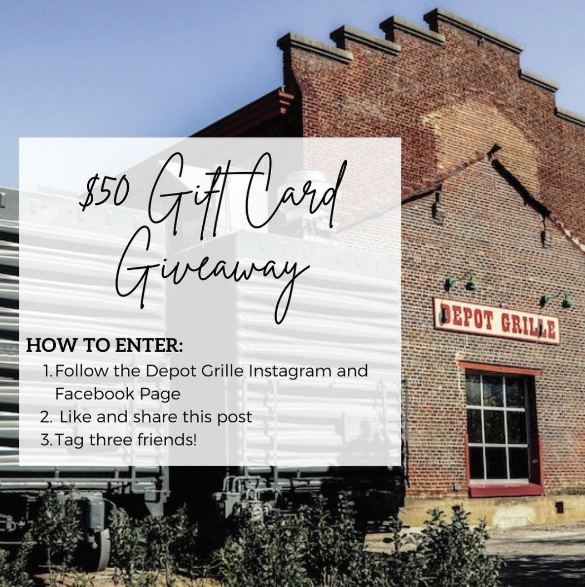
With over 60 likes this is definitely one of the more well received Instagram posts from The Depot Grille. This ad, by creating a giveaway, targets current and upcoming customers by encouraging people to come back for more business while also bringing in new people who are looking for “free food”. The Depot’s strategy was solid as ads involving prizes for simple actions are often extremely well received because customers believe they have a chance to “win”. However, on the design side I would have a couple critiques such as matching the typefaces. First off, the typeface does not match the website branding and it also does not match “itself” as it uses three different typefaces in this one ad: script, serif, and sans serif. Also this post is on Instagram yet tells customers to go to Facebook; this could cause the Depot to gain more followers by directing to another cite but could also complicate and confuse customers. This ad could have had a more unified design but overall go the message across.
COMPETITOR ADS
FIRST
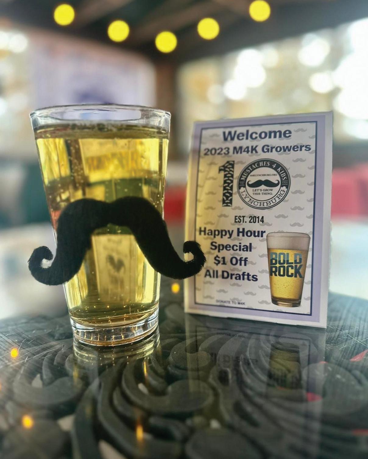
This Instagram post for The Neighbors Place focuses on bringing awareness to the “Mustache 4 Kids” charity thus encouraging patrons to enjoy drinks for a good cause. By bringing in a charity, this promotional ad targets customers who enjoy adult beverages and supporting solid foundations. The Neighbors Place utilized a fun strategy by marketing the beverages with a mustache on them creating an automatically interesting ad. While the image could have been more focused (solid table, less shadows, and higher resolution) the caption was extremely interesting and engaging. Overall, this was a solid idea that many business can definitely bring into their ads.
CONT.
SECOND
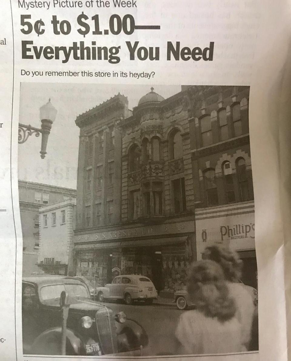
The Market at Main shows a different kind of promotional tactic by bringing in its heritage through the form of an antique photo. The photo shows an old building that the Market at Main is currently in thus bringing customers a feeling of nostalgia and yearning for the “good old days”. This tactic invokes emotions and feelings in association with the restaurant thus causing the audience to deeply connect with the location, dinning services, and food. One critique I would have is that the post could have situated the newspaper clipping better: in a way that looks professional and eye-catching. In conclusion, this promotion gets the job done in a concise and unique way.
CONT.
THRID
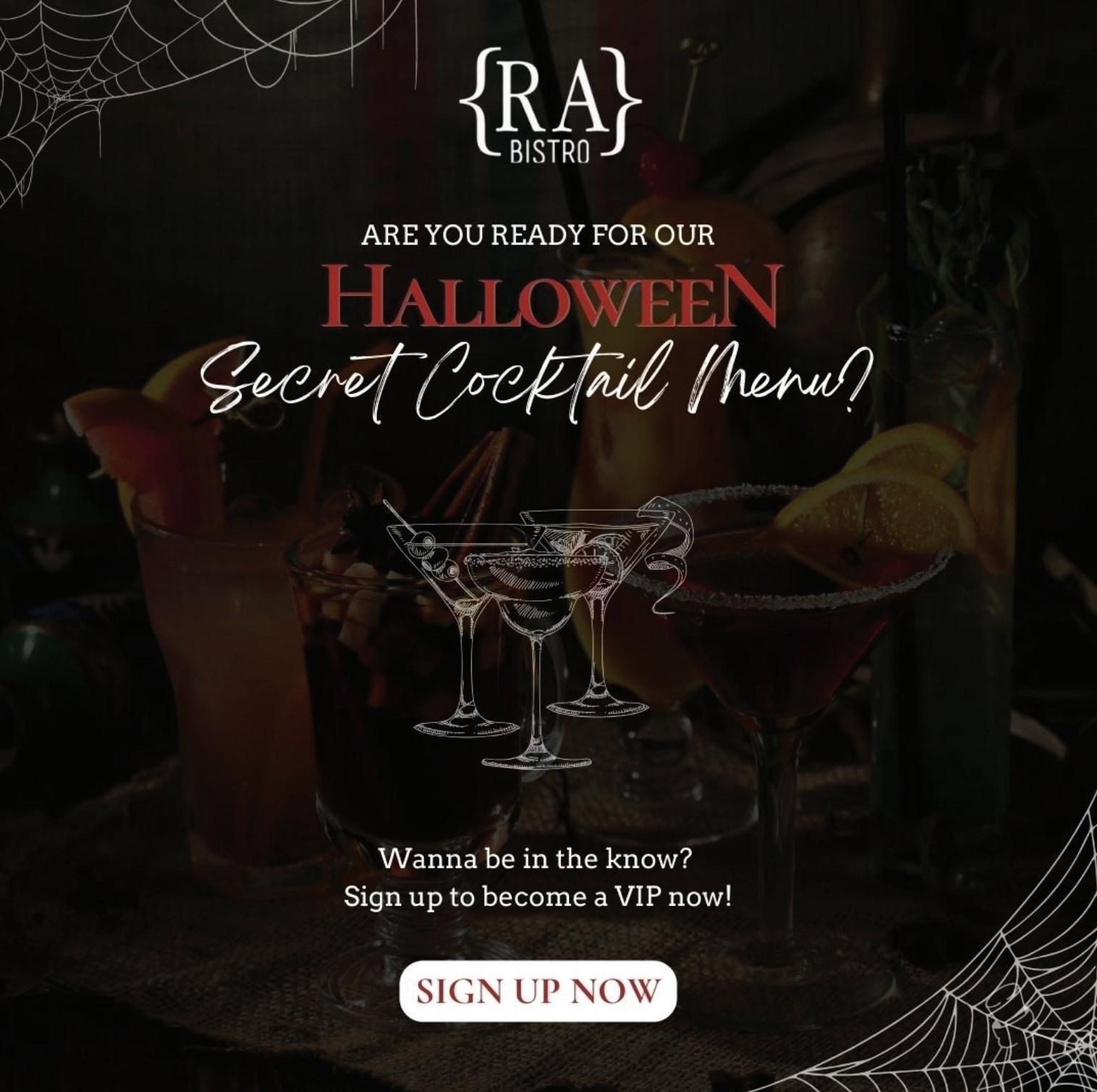
An ad for a Halloween event might be a bit old fashioned, but the RA Bistro was able to produce one that pulls you in and encourages you to become a “VIP”. This ad definitely targets an older audience since the main message is finding out the secret menu for cocktails(20). By utilizing cobwebs, a darkened background, and with the mix of fonts, this post is able to convey a scary vibe while keeping with the branding of RA Bistro. This post also encourages customers to sign up – take action – and in return you get “secret access”. The whole post allows for the aesthetic and designs to promote the RA Bistro in a new and “scary” way.
BRIEF/ PR OPOSAL
SECTION 3
PROJECT BRIEF
COMPANY OVERVIEW
Started in 2004, The Depot Grille was created in order to provide classic American cuisine in a unique and vintage environment near the railroad (3, 1). It utilized its location in Lynchburg by building on the railroad vibe including antiques such as two freight cars as a kitchen, a refurbished bar from the 1800s, and old church pews to create a cozy, rough aesthetic (1)
GOALS OF THE PROJECT
Our 20th year anniversary is coming up and we have been fortunate enough to build a relationship with very loyal customers in the Lynchburg area. They have been with us since the beginning, helped us grow, and kept us afloat during Covid-19. To celebrate our 20 years, we would like to update our identity by finding our true brand colors, typefaces, and adapting our logo to better encompass our ideas. To support this new change, we also want to create a campaign that assists us in advertising our new look while informing our audience that we are still the same great company they know and love. We are also open to running some sort of promotion with this campaign with the goal of saying thanks to our customers.
PROJECT BUDGET
Our budget will run up too $100,00 in order to pay for the rebranding, campaign (placement of ad, printing, installing, etc.), and potential promotion tactics (gift cards, discounts, etc.).
TARGET AUDIENCE
The current target audience of The Depot Grille is built out of workingclass people who need a casual place to meet with clients or colleagues(1) as well as families hoping for a nice night out where they can enjoy good food in a “special” place. Due to the Depot’s social media leaning toward Facebook and hosting a full bar it pulls more for an older to middle age generation(4). Through the rebranding and campaign process we hope to expand the target audience by bringing new and upcoming businessmen and women.
COMPETITOR INFORMATION
Local Lynchburg restaurants are the majority of The Depot Grille’s competitors, including The Neighbors Place, Market at Main, and RA Bistro. The main problem the Depot faces is that all of these restaurants are extremely similar to it, therefore many times drawing customers in will depend on who can reach its audience first. With the Depot having a struggling social media and not much other promotion, it needs to focus on advertising the special environment it brings patrons with its variety of antiques and railroad theme.
TIMELINE/SCHEDULE
Due to time constraints these ideas will need to be pitched in about 2 weeks. While this is much shorter than what we expected at first (5 weeks) we are excited and prepared to finish the rebranding and campaign as quickly as possible.
PROPOSAL
PURPOSE
In order to see what this campaign needs to accomplish for The Depot Grille, first we must figure out what the Depot needs in order to grow as a business. After much researching we have come to the conclusion that there are two major weakness in advertising that the Depot needs to address. First off, this campaign needs to bring in the growing, younger population of Lynchburg, since the Depot has attempted and crashed with its outreach into newer social media platforms. In order to accomplish this these ads need to be relevant promotions that encourage young businessmen and women that this is the ideal restaurant for a casual business lunch with colleagues. Secondly, the Depot needs to sell its unique location and environment in order to best the competition, which it can do by emphasizing its connection to the railroad and promoting it through these ads. Currently potential customers simply see the Depot as just another American restaurant, thus it is time to take the focus off the food and move onto something that sets it apart.
CONCEPTS
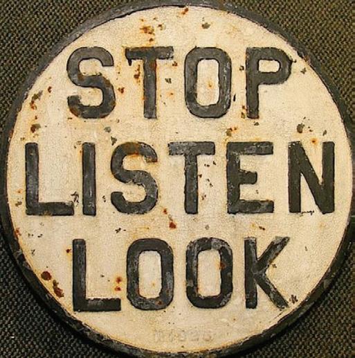
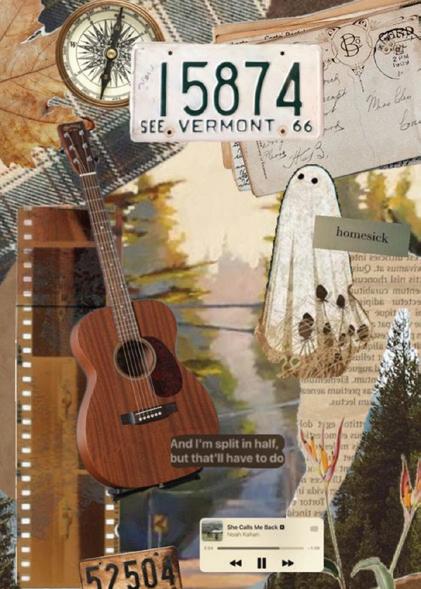
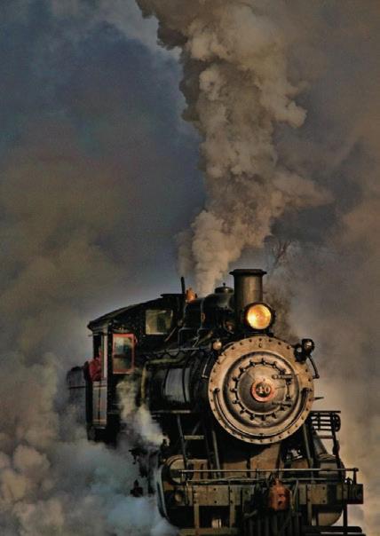
There is a multitude of concepts that can be done utilizing many different design ideas for The Depot Grille:
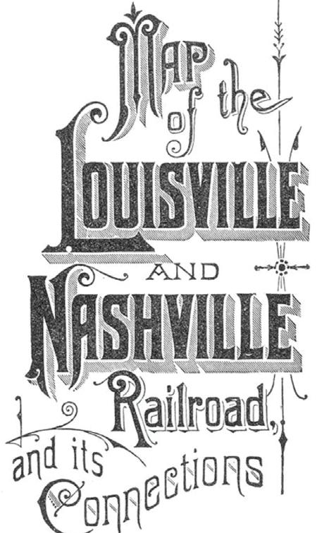
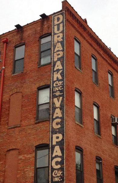
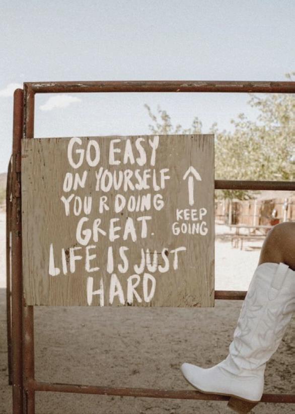
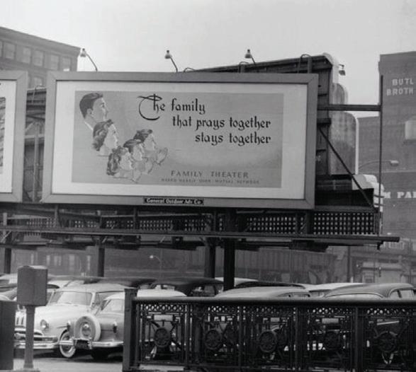
» A fun and encouraging concept that will help bring in the younger generation of businessmen and women would be to create a campaign that focus on inspiring quotes based on railroad and track themes (ex. staying on the right track no matter the opposition). These quotes would cheer up people on the way a stressful business meeting, a job interview, or an evaluation with the boss. With upcoming generations struggling with a lot of anxiety, depression, and other mental health difficulties in this fastpaced world, a caring, supporting, and encouraging local restaurant is just what they need.
» Another concept would be to take the cold, white office luncheon and contrast it with the warm and inviting environment of The Depot Grille. By showing the delicious food, offering a discount during “happy hours”, and asking questions such as “where would you rather be” the upcoming
businessmen and women who are terrified of being stuck in the office will immediately feel the desire to try out this Lynchburg restaurant.
» By focusing on the vintage railroad theme, the Depot could apply it to the business world by emphasizing the different types of companies that the railroad helped found or grow. With “trivia” types of ads the younger generation will find them interesting and want to share them with coworkers thus bringing in more awareness for the Depot.
After much complication we feel that the best concept that would both represent the style and tone of The Depot Grille and draw in the largest audience is inspiring railroad-based quotes.
TONE, MESSAGE, & STYLE
In order to achieve the notice of our target audience of young Lynchburg businessmen and women we must make sure the tone, message, and style reflect their motives and ambitions. The style will reflect the minimalistic vibes of modern day while also mixing with the maximalist styles of antiques and the earlier centuries. Elegant vintage designs combined with rough patterns set the scene for the unique environment of the Depot, while the message of the campaign will formulate around creating casual yet business-oriented conditions. Through these elements the younger audience will feel more relaxed doing business and yet still be in an environment that is conducive and considered appropriate by their elders and bosses.
DISPLAY (& WHY)
There are multiple places that The Depot Grille’s campaign can be promoted to customers yet the most effective that we have found is by using billboards. Billboards work well for small towns as potential customers don’t have to reach out and search for the restaurant. Therefore, for a local eatery is one of the best ways to reach the multitudes. Through this type of campaign, it could be set up to be three billboards in order thus having a continuing campaign (tagline is split between all three, etc.) or having three boards in different areas that are joined together by branding, style, and message.
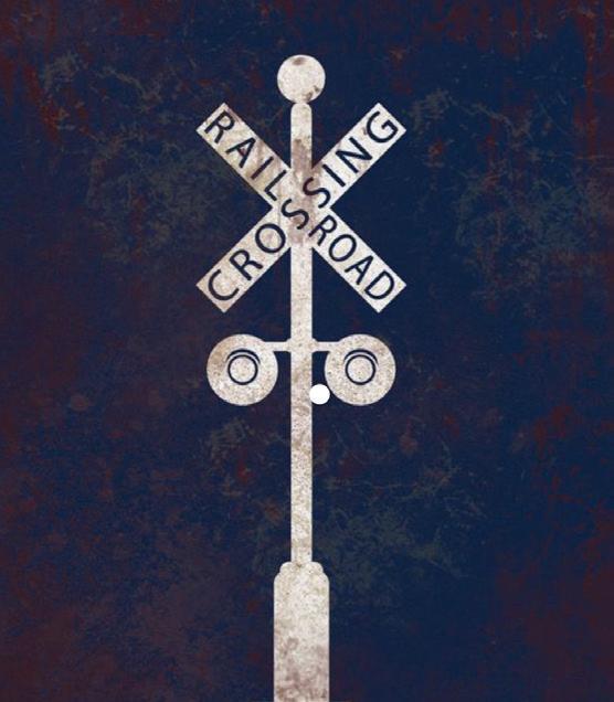
MOODBOARD
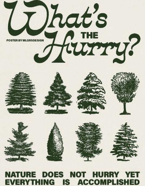
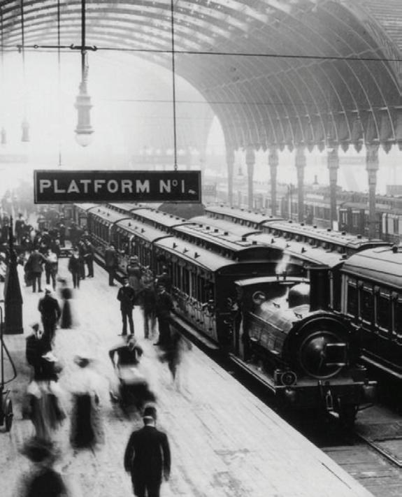
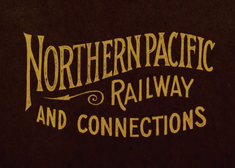
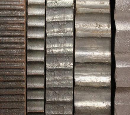






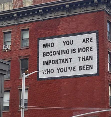
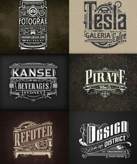
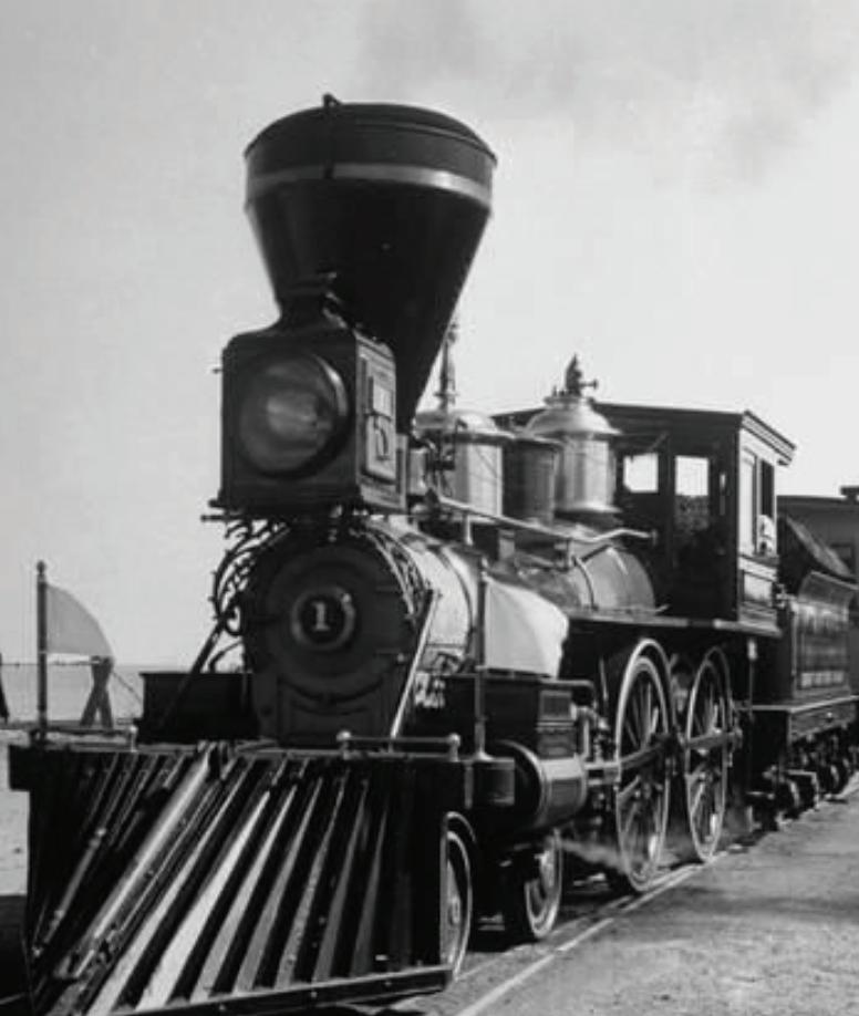
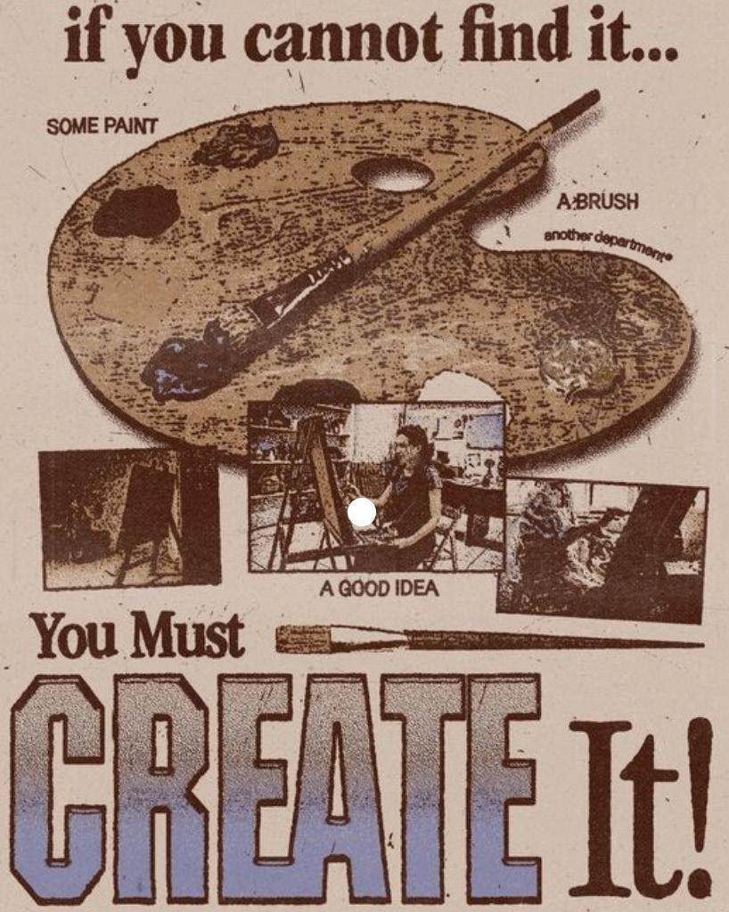
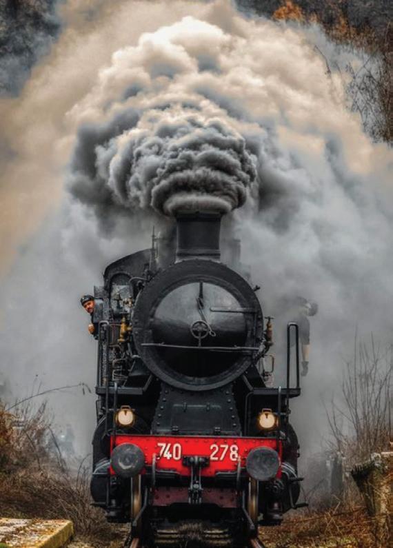
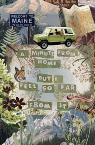
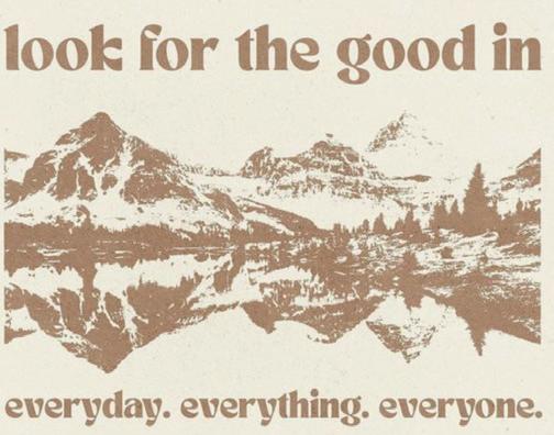
FINAL S OLUTION
SECTION 4
THUMBNAILS
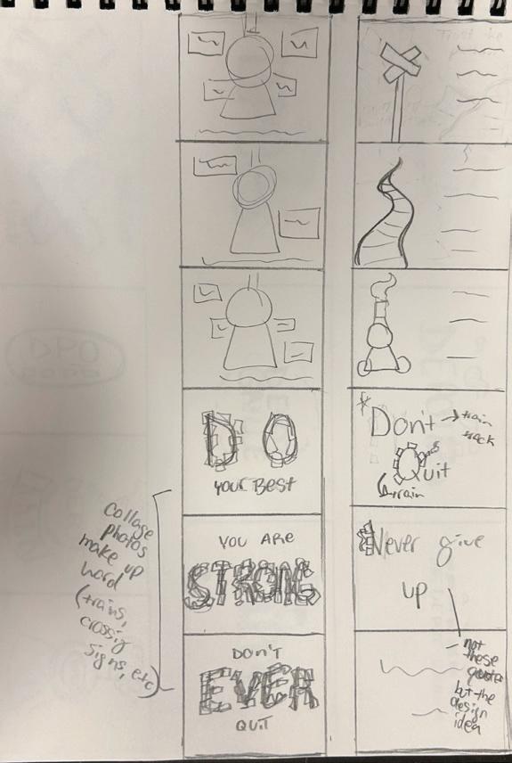
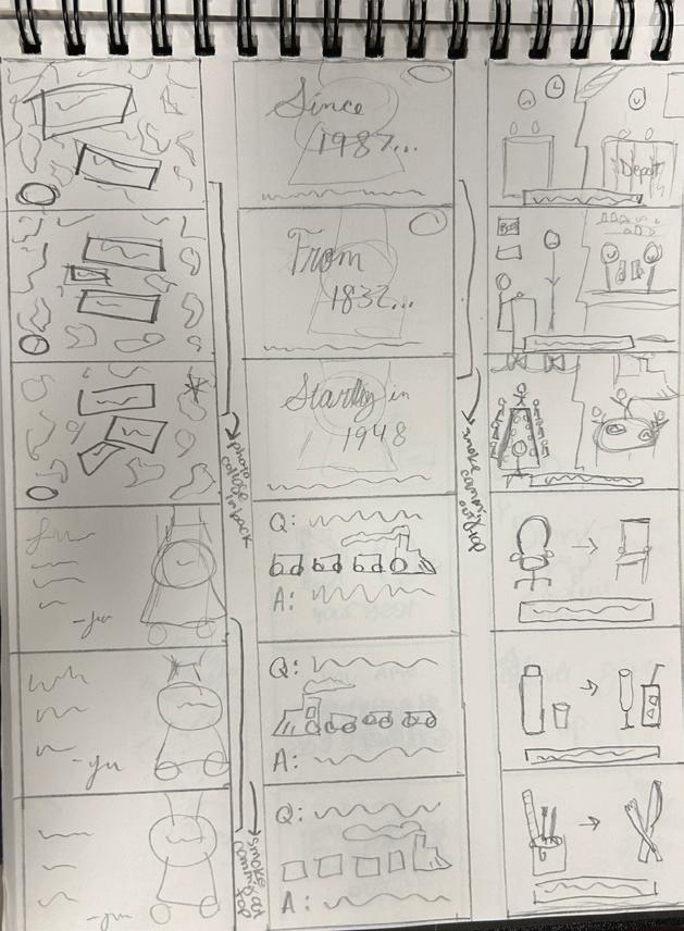
IDENTITY & CAMPAIGN SKETCHES
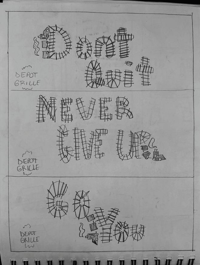
Through these basic sketches we desired to expand the ideas and concepts previously discussed and create a baseline for the campaign and identity (specifically the logo). For the campaign we wanted to focus on the aspect of bringing awareness to the railroad theme that the Depot shows off, as well as viewing different ways we could connect with our target audience. The logo was sketched with elegance and business in mind while also keeping in touch with the strong, vintage vibes of the Depot Grille.
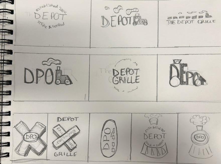
ROUGHS
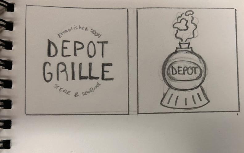
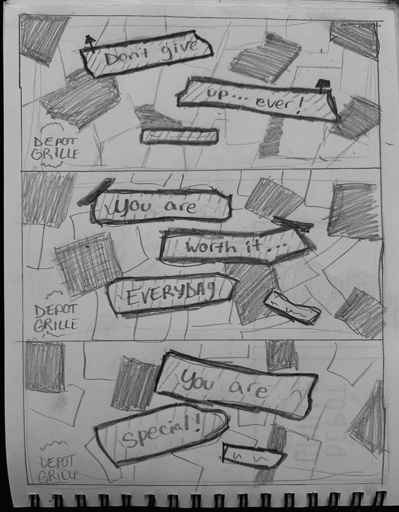
IDENTITY & CAMPAIGN REFINED
After narrowing down the thumbnails we came up with two ideas for the logo: one being very professional and the other a little more youthful. We also expanded on the campaign sketches in order to see what they would look like with regards to spacing, interesting messaging, and potential coloring. Through this process the ideas behind the “identify” of the Depot really started to come together.
FIRST DRAFT
IDENTITY & CAMPAIGN COMPS
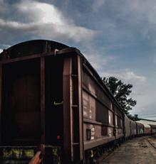
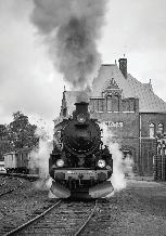
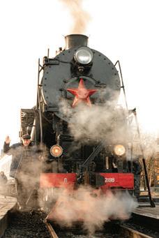
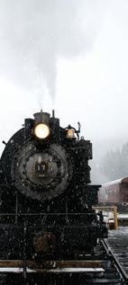
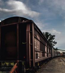
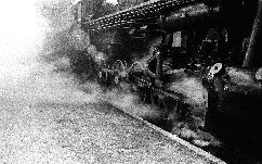
A lot happened in this first draft: collage billboard idea was brought to life, “The Depot Grille” was shortened to “Depot Grille”, and the theme colors were brought in. While these are simply comps, it is already evident the direction we are going as the business and vintage vibes mix to bring a unique “flavor”.
















REFINED DRAFT
IDENTITY & CAMPAIGN REVISED
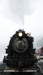
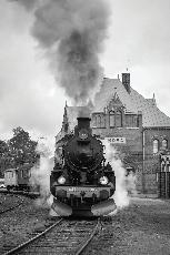
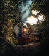
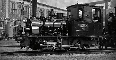
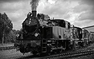
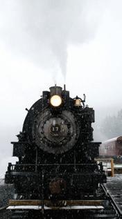
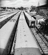
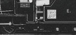
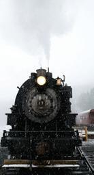
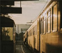
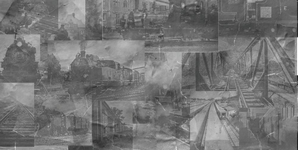
After taking time to dig into the first draft a more polished and refined look appeared. The bold golden yellow catches the eye as it stands against the faded railroad themed collage, the color palette was refined to three baseline colors, and an imagery style was added to the identity of the Depot Grille. While there were some changes made to this concept is extremely strong and has great potential.



Mencken Std Head Compress (extra bold)
ABCDEFGHIJKLMNOPQRSTUVWXYZ abcdefghijklmnopqrstuvwxyz
Secondary
Quasimoda (extra light)
ABCDEFGHIJKLMNOPQRSTUVWXYZ abcdefghijklmnopqrstuvwxyz


Decorative/ Supporting nexta Rust Sans (black shadow 2)
ABCDEFGHIJKLMNOPQRSTUVWXYZ abcdefghijklmnopqrstuvwxyz

FINAL DRAFT
COMPLETED CAMPAIGN DESIGN
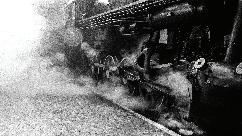
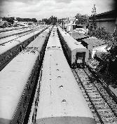
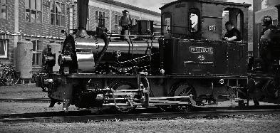
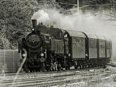
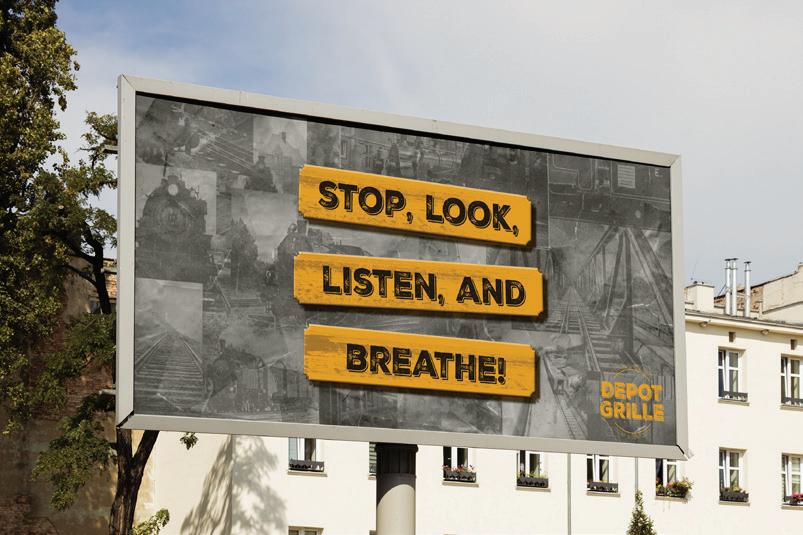
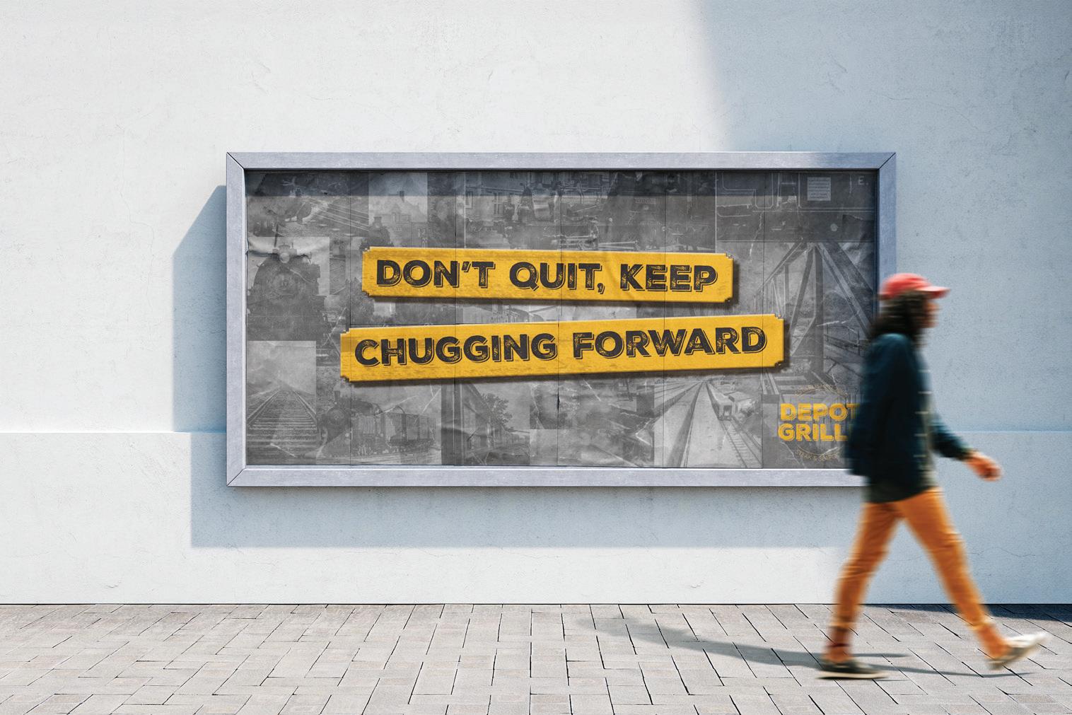
With the text shrunk, logo changed to match the golden yellow, and the collage background turned black and white, this completed campaign design definitely answers the call that is expected of it. It shows the railroad theme and brings emphasis to the unique environment that the Depot offers. Also, with its encouraging, railroad focused messaging it brings in the encouraging factor we were aiming to communicate to young businessmen and women.

the end there is Light of the tunnel




MOCKUPS
CAMPAIGN "IN THE REAL WORLD"
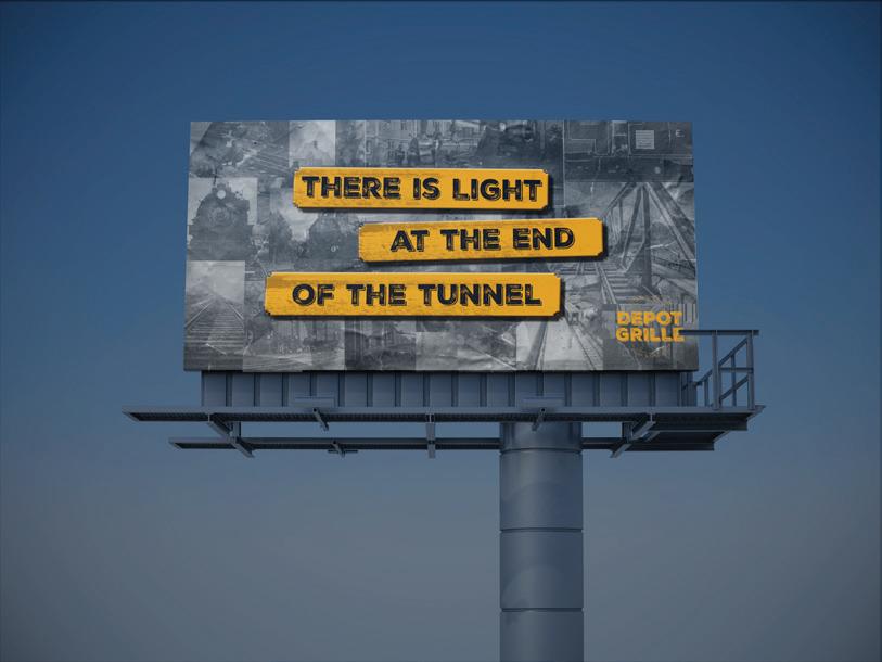
These mockups were chosen as they represent a variety of ways that this billboard campaign can be displayed throughout Lynchburg, Virginia. Through all of these, no matter the surroundings, the message is displayed clearly and cleanly, thus helping drivers speeding past to quickly notice them.
FINAL DRAFT
COMPLETED IDENTITY DESIGN
Throughout this process it became evident that it was necessary to create a branding for the Depot Grille that would be useful in bringing in business focused customer while also emphasizing its unique location and environment. Seen below is a condensed version of the Depot’s identity including its primary and secondary brand, color palette, typefaces, and imagery styles. Through the next few pages the branding will be shown as it is utilized in a useful way that clearly demonstrates its value to the business.
Primary
Mencken Std Head Compress (extra bold)
ABCDEFGHIJKLMNOPQRSTUVWXYZ abcdefghijklmnopqrstuvwxyz
Secondary
Quasimoda (extra light)
ABCDEFGHIJKLMNOPQRSTUVWXYZ abcdefghijklmnopqrstuvwxyz
Decorative/ Supporting
nexta Rust Sans (black shadow 2)
ABCDEFGHIJKLMNOPQRSTUVWXYZ abcdefghijklmnopqrstuvwxyz
Imagery Style / Patterns / Textures

DPO GRILLE
CMYK: C (32.68), M (97.76), Y (100), K (48.85)
RGB: R (106), G (24), B (14) HEX: 6A180E
CMYK: C (44), M (65), Y (100), K (81)
RGB: R (48), G (26), B (0) HEX: 301A00
CMYK: C (5.98), M (38.61), Y (100), K (0)
RGB: R (236), G (165), B (33) HEX: ECA523

An Example of the Primary Text
This is showing the secondary text. This text can be used for paragraphs, menu options, and any information that includes a lot of text. “Quasimodo” (extra light) is incredible at getting information across as its typeface is a simple sans serif that helps text blocks to not be overwhelming and overall draw the reader to the delicious food or inspiring images that it supports.
Used for Headings and Titles
The primary text is an almost total opposite of the secondary text as “Mencken Std Head Compress” (extra bold) is an elegant serif that pulls readers in and moves customers quickly to where they need to be. This font was chosen as it emphasizes that, while the Depot Grille is a casual business, it caters to those seeking to entertain clients, collogues, or even the boss.
Lastly “Nexta Rust Sans” (black shadow 2) works as a decorative font as well as being an integral part of the brand. Through it the strength and boldness of the railroad is shown to customer from the moment the logo or billboards are seen. It can be used to emphasis a quote, header (above the primary text), or in signage that wishes to show the branding of the Depot.
Head on over to the Depot for some delicious food!
Branding
The Depot Grille’s brands, while mainly black and white, are able to be pared with any of its primary color in order to achieve a unique look. However, there must me significant contrast in order that the logo may be seen. Also the brand colors may be applied to typefaces but should be done sparingly as to not take away from what they are discussing or referencing.
Examples
ENDNOTES
1. “About Us.” Lynchburg, depotgrille.com/lynchburg/about-us/. Accessed 15 Apr. 2024.
2. “Depot Grille.” Tripadvisor.com, www.tripadvisor.com/Restaurant_Review-g57919d952496-Reviews-Depot_Grille-Lynchburg_Virginia.html.
3. Murphy, Chris. “The Depot Grille.” Lynchburg Business Magazine, 1 Oct. 2017, lynchburgbusinessmag.com/the-depot-grille/. Accessed 15 Apr. 2024.
4. OpenTable. “Depot Grille - Lynchburg.” Opentable.com, www.opentable.com/r/ depot-grille-lynchburg.
5. “The Neighbors Place.” Tripadvisor.com, www.tripadvisor.com/Restaurant_Reviewg57919-d795028-Reviews-The_Neighbors_Place-Lynchburg_Virginia.html.
6. “Neighbors Place Restaurant | Best Restaurants | Lynchburg VA.” Www.theneighborsplace. com, 11 Oct. 2010, www.theneighborsplace.com/. Accessed 15 Apr. 2024.
7. “Market at Main.” Market at Main, www.marketatmain.com/. Accessed 15 Apr. 2024.
8. “Our Story.” Market at Main, www.marketatmain.com/story. Accessed 15 Apr. 2024.
9. “RA Bistro.” Tripadvisor.com, www.tripadvisor.com/Restaurant_Review-g57919d1574040-Reviews-RA_Bistro-Lynchburg_Virginia.html .
10. RA Bistro. www.rabistro.com/. Accessed 15 Apr. 2024.
11. The Depot Grille - Menu. depotgrille.com/lynchburg/wp-content/ uploads/2023/08/183760_menu_DepotGrille_Without_Cropmarks_8-25-23.pdf. Accessed 15 Apr. 2024.
12. “Explore Census Data.” Data.census.gov, data.census.gov/profile/Lynchburg_city.
13. US Census Bureau. “Search Results.” The United States Census Bureau, 29 June 2023, www.census.gov/search-results.html?searchType=web&cssp=SERP&q=United%20States. Accessed 15 Apr. 2024.
14. “Coolors.co.” Coolors.co, coolors.co/626262-6a160c-000000-ffffff. Accessed 15 Apr. 2024.
15. “Life Is Short, Eat Dessert First.” Www.instagram.com, 6 Dec. 2017, www.instagram. com/p/BcXRvzsnoOy/.
16. “Downtown Lynchburg Restaurant Week.” Www.instagram.com, 18 Jan. 2023, www. instagram.com/p/CnkAQ_OuDMm/.
17. “We Have Been Proudly Serving...” Www.instagram.com, 22 June 2023, www. instagram.com/p/Cty_3nHOJzJ/.
18. “We Must-Ache You a Question….” Www.instagram.com, 15 Nov. 2023, www. instagram.com/p/Czrpcw0M7IE/.
19. “Check out the Mystery Picture...” Www.instagram.com, 2 July 2018, www.instagram. com/p/Bku4yxvneL2/?hl=en.
20. “Something Wickedly Delicious...” Www.instagram.com, 23 Oct. 2023, www. instagram.com/p/Cyvu7MurPlt/.
21. Unsplash. “Photo by Todd Trapani on Unsplash.” Unsplash.com, 9 Jan. 2019, unsplash. com/photos/fogs-covering-trees-on-railways-I5MxOB3g_tw. Accessed 29 Apr. 2024.
22. Unsplash. “Photo by Christopher Burns on Unsplash.” Unsplash.com, 4 Apr. 2018, unsplash.com/photos/empty-brown-and-gray-train-bridge-at-daytime--mUBrTfsu0A. Accessed 29 Apr. 2024.
23. Unsplash. “Photo by Carmen Laezza on Unsplash.” Unsplash.com, 7 Oct. 2021, unsplash.com/photos/a-train-that-is-sitting-on-the-tracks-R2LsKqou9MQ. Accessed 29 Apr. 2024.
24. Unsplash. “Photo by David Lutta on Unsplash.” Unsplash.com, 11 Sept. 2019, unsplash. com/photos/grayscale-photo-of-charcoal-train-auGE7XGs-KU. Accessed 29 Apr. 2024.
25. Unsplash. “Photo by Andy Vult.” Unsplash.com, unsplash.com/photos/black-andred-steam-train-qwg5kvnyqOI.
26. Unsplash. “Photo by Casey Horner on Unsplash.” Unsplash.com, 26 Dec. 2017, unsplash.com/photos/gray-and-red-train-running-on-rail-in-between-trees-at-daytime-p69o_ a7XqDM. Accessed 29 Apr. 2024.
27. Unsplash. “Photo by Adam Chang on Unsplash.” Unsplash.com, 29 Dec. 2017, unsplash.com/photos/black-train-on-railway-at-daytime-YnMQFtSoE2g. Accessed 29 Apr. 2024.
32
28. Pexels. “Train on Railroad Tracks against Sky.” Pexels.com, www.pexels.com/photo/ train-on-railroad-tracks-against-sky-258455/.
29. Pexels. “Train on Railroad Track.” Pexels.com, www.pexels.com/photo/train-onrailroad-track-258405/.
30. Pexels. “Brown and Black Train under White Clouds.” Pexels.com, www.pexels.com/ photo/brown-and-black-train-under-white-clouds-1172099/.
31. Pexels. “Coal Train on Train Track.” Pexels.com, www.pexels.com/photo/coal-trainon-train-track-132414/.
32. Pexels. “Grayscale Photography of Train Tank.” Pexels.com, www.pexels.com/photo/ grayscale-photography-of-train-tank-2792299/.
33. Pexels. “Old Steam Locomotive in Black and White.” Pexels.com, www.pexels.com/ photo/old-steam-locomotive-in-black-and-white-18562449/.
34. Pexels. “Grayscale Photo of a Train.” Pexels.com, www.pexels.com/photo/grayscalephoto-of-a-train-5265138/.
35. Pexels. “Grayscale Photo of Trains.” Pexels.com, www.pexels.com/photo/grayscalephoto-of-trains-11852247/.
36. Texturelabs. Free Texture | Paper 293. texturelabs.org/textures/paper_293/. Accessed 29 Apr. 2024.
37. Texturelabs. Free Texture | InkPaint 388. texturelabs.org/textures/inkpaint_388/. Accessed 29 Apr. 2024.
38. “Free Billboard Mockup.” Mockups Design, 24 Jan. 2019, mockups-design.com/freebillboard-mockup/.
39. Andrew. “Clumsy Billboard Mockup - Instant Download.” Mockups Design, 3 Nov. 2022, mockups-design.com/clumsy-billboard-mockup/.
40. Andrew. “Free Street Billboard Mockup.” Mockups Design, 27 Oct. 2022, mockupsdesign.com/free-street-billboard-mockup/.
33
