Visual Development Guide
Our mission is to connect communities of curious minds and create lifelong learning possibilities
Keywords:
Growth: Becoming Brighter
1. The process of developing or maturing physically, mentally, or spiritually; 2. Progressive development; 3. Development from a simpler to a more complex stage
Potential: Full of Possibilities
1. The chance or possibility that something will develop and become real; 2. Latent qualities or abilities that may be developed and can lead to future success or usefulness; 3. The innate ability in every person to live and perform in alignment with their highest self
Interactive: Building Connections
1. Allowing a two-way flow of information, ideas, and messages; 2. Involving the actions or input of a user
Exploration: Searching for Knowledge
1. The activity of searching and finding out information about something; 2. The action of traveling in or through an unfamiliar area in order to learn about it
Table of Contents
Section .01
First Round Logo Sketches
Potential: Full of Possibilities
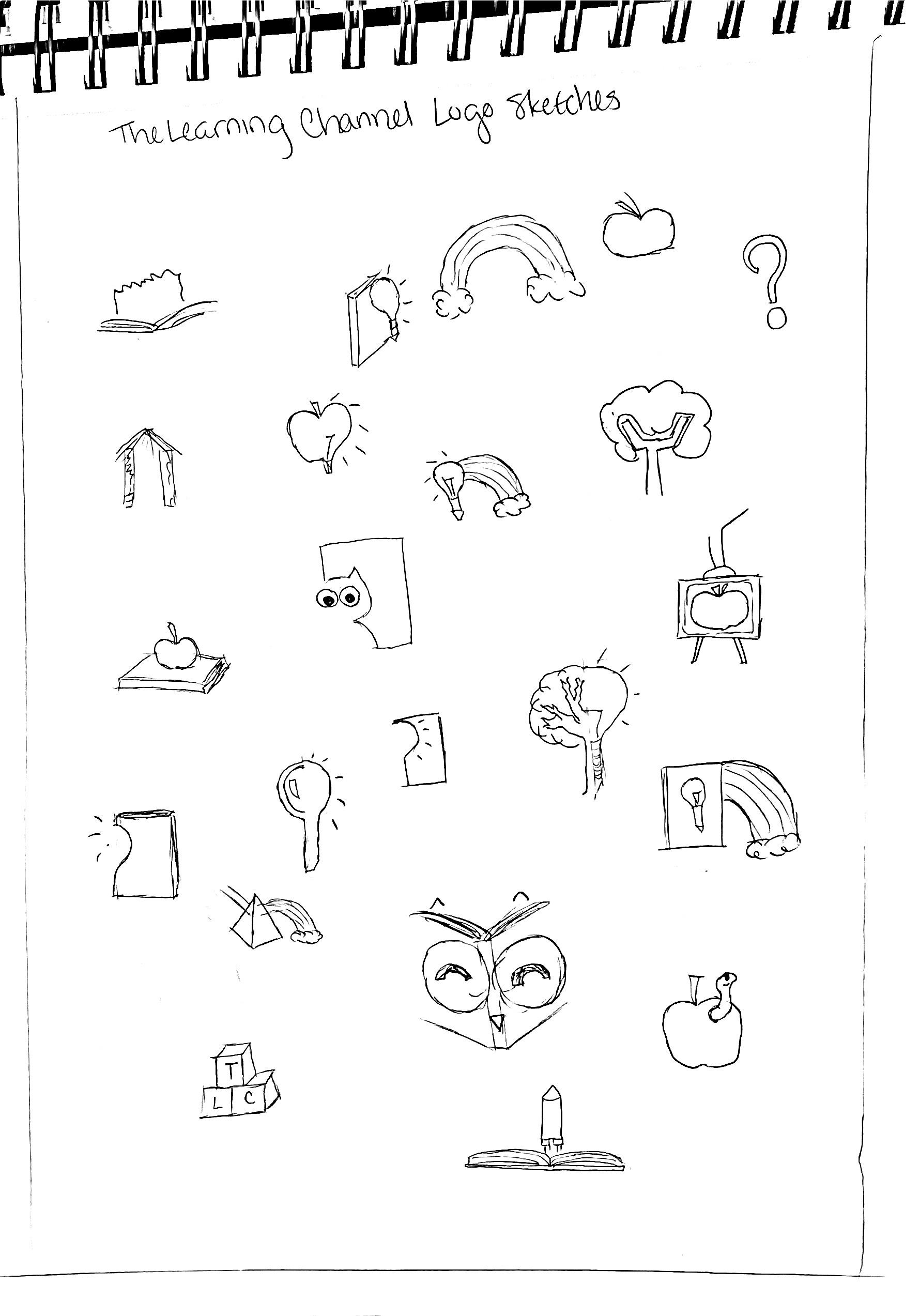
The following logos were inspired by the idea of being an endless source of wonder or energy. Towers with a circle on top hint towards the potential energy of a ball at the peak of a mountain. The spring/coil shapes were also inspired by the idea of the potential energy in an object. Seeds also captured the idea of something that have so much potential inside of them…




Interactive: Building Connections
Some of the ideas explored in the following logos include bridges, satellites, and electric currents. Doorway type shapes were also used to represent an open connection…


Exploration: Searching for Knowledge
The following logos embraced many of the common associations with learning; such as, owls, light bulbs, and graduation caps. Lights, maps, and telescopes were inspired by the idea of searching…


Refined Sketches
The refined logos add structure and detail to the highlighted rough sketches…


Section .02
Second Round Logo Sketches
Growth: Growing Brighter
The Round 1 key phrase “Potential: Full of Possibilities” was reworked to focus more on the idea of growth. The new key phrase created for the Round 2 logos was “Growth: Growing Brighter. Following feedback that the Round 1 logos appeal to a younger audience—rather than an audience of varying ages—the logos aimed to be more neutral. The three visual directions explored were sprouts, arrows, and stars…


Refined Sketches
The refined logos add structure and detail to the highlighted rough sketches…


Section .03
Third Round Logo Sketches
Growth: Becoming Brighter
The Round 3 key phrase was adjusted to “Growth: Becoming Brighter.” The visual direction was able to be narrowed down to arrows and stars. The final design chosen is an arrow pointing into a sunrise, which creates the overall shape of an asterisk. Asterisks are used to indicate that there is more information. A shade of orange was applied to the logo. A color psychology study found that orange, as it applies to learning environments, is “an energetic color that can increase alertness, excitement, and engagement…Orange may also promote collaboration in learning spaces”…


Computer Drafts
The computer drafts used the structure of the previous refined sketches to create a vector draft…
Color Explorations
Many colors and color combinations were explored. The final logo color is a warm, energizing orange…
Logotype Sketches
The following sketches explored different type structures for The Learning Company’s new wordmark…


THE LEARNING COMPANY

Section .04
Final Logo
The New Logo
After review, the sunrise shape was removed. This allowed the shape of the space between the arrow and the asterisk to follow seamlessly beside the lines of the arrow. The edges of the asterisk rays are slightly rounded to create a softer, more welcoming appearance. The symbol was then rotated to give the mark forward momentum. The final wordmark was handdrawn with soft serifs that mirror the curve at the tip of the asterisk rays…
Section .05
Similar Logos
Similar Logos
A thorough review of current brand marks cultivated the following collection of logos with a similar structure. While these may have a similar structure or idea, The Learning Company’s new logo remains unique…


Section .06
Website Development
Website Structure
Various information structures for the website were explored to determine the appropriate hierarchy…
HOME MISSION STATEMENT
FROM CHANNEL TO COMPANY
KEYWORDS ISSUU BOOKS
COMMUNITY OF CURIOUS MINDS BRAND HISTORY TIMELINE BRAND VISUALIZATIONS
EXPLORE
CONCEPTUAL CHART
ABBREVIATED EXTENSION LIST
CONNECT
CONCEPTUAL CHART
ABBREVIATED EXTENSION LIST
CREATE
CONCEPTUAL CHART
ABBREVIATED EXTENSION LIST
EXTENSION PROTOTYPE 1
NEW IDENTITY INTRODUCTION
EXTENSION PROTOTYPE 2
EXTENSION PROTOTYPE 4
EXTENSION PROTOTYPE 7
LOGO ANATOMY
LOGO DEVELOPMENT SKETCHES CONCEPTUAL CHART EXTENDED EXTENSION LIST
EXTENSION PROTOTYPE 3
MINI PROTOTYPES
EXTENSION PROTOTYPE 5 EXTENSION PROTOTYPE 6 MINI PROTOTYPES
EXTENSION PROTOTYPE 8
EXTENSION PROTOTYPE 9 MINI PROTOTYPES
LOGO DEVELOPMENT SKETCHES CONCEPTUAL CHART EXTENDED EXTENSION LIST
EXPLORE CONCEPTUAL CHART
ABBREVIATED EXTENSION LIST
EXTENSION PROTOTYPE 1
CONCEPTUAL CHART
EXTENSION PROTOTYPE 2
EXTENSION PROTOTYPE 3 MINI PROTOTYPES
CONNECT CONCEPTUAL CHART
ABBREVIATED EXTENSION LIST
CREATE
EXTENSION PROTOTYPE 4
ABBREVIATED EXTENSION LIST
EXTENSION PROTOTYPE 7
EXTENSION PROTOTYPE 5
EXTENSION PROTOTYPE 6 MINI PROTOTYPES
EXTENSION PROTOTYPE 8
KEYWORDS
COMMUNITY OF CURIOUS MINDS NEW IDENTITY INTRODUCTION LOGO ANATOMY
LOGO DEVELOPMENT SKETCHES
EXPLORE CONCEPTUAL CHART
CONNECT
CONCEPTUAL CHART
CREATE
CONCEPTUAL CHART
BRAND HISTORY TIMELINE
ISSUU BOOK 1
ISSUU BOOKS 2 & 3
ABBREVIATED EXTENSION LIST EXTENSION PROTOTYPE 1 EXTENSION PROTOTYPE 2
ABBREVIATED EXTENSION LIST EXTENSION PROTOTYPE 4 EXTENSION PROTOTYPE 5
ABBREVIATED EXTENSION LIST EXTENSION PROTOTYPE 7 EXTENSION PROTOTYPE 8
CONCEPTUAL CHART EXTENDED EXTENSION LIST
EXTENSION PROTOTYPE 3
MINI PROTOTYPES
EXTENSION PROTOTYPE 6 MINI PROTOTYPES
Visual Direction Sketches
Three directions were considered for The Learning Company website…


Visual Direction Wireframes
Three directions were considered for The Learning Company website…
---
----
----------------------
---
---
----


Final Website Visuals
The final website applies the visual system in an extension-first structure…


Section .07
Inspiration Analysis
Analyzing Inspiration
The visual standard guides of various businesses have been carefully considered for inspiration…
New Identity Introduction:
VMWARE
Good explanation of why they are choosing to change the identity and how the changes align with those goals
UNITED HEALTHCARE
Clear statement of what their new mission is and how it aligns with their brand promise


SKYPE
Explanation of how the subtle changes to the keywords make a good impact; language that is interesting and captivating

DEVON
Great explanation of why they chose strata as the basis for the new visual identity system; good visual language


CADENCE
Simplified list of how each part of the system aligns with their brand attributes; personal voice that explains it at a comfortable level
Logo Anatomy:
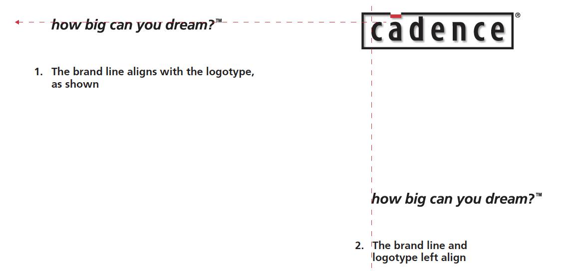
CADENCE

Detailed diagrams of spacing, alignment, and anatomy; anyone could look at this and know exactly how to use the logo
EXPLORATORIUM
Clear statement that this is the only version of the logo; explains how it can be used creatively with other imagery

NORWAY
Addresses how to handle different languages in the logo

FEDEX
Diagram showing how the small trademark simple is positioned with the logo



VMWARE

Shows a comparison of the logo before and after

Type Specs:
WORKDAY
Simple explanation of approved fonts and how to use the logo font

VMWARE
Explains how to create a visual scale for any application


SYMANTIC
Shows how to format the layers of hierarchy with clear examples
VMWARE

Explains why this typeface was chosen; examples of how the type is handled in the different layers of type hierarchy X


Addresses contrast and legibility of the type

SUMO
Shows examples of how not to format type

MENNONITE CHURCH
Clear explanation of how type should be formatted

Main Colors:
CADENCE
Red is not too vibrant that it is overwhelming, but still bold enough to make a statement
DFW
Explains why the specific color was chosen

NEUVA
Bold blue without being too bright or overwhelming
DEVON
Explanation of the inspiration behind the colors

WORKDAY

Shows colors in the context of the logo

SYMANTIC
Addresses how to print the logo color properly


Logo Don’ts:
EXPLORATORIUM
Shows an example of improper usage; statement that changing the logo changes their identity shows how important it is to use the logo properly


RIGHTTURNRETAIL
Addresses how to name the business as part of a text line
MENNONITE
CHURCH
Variety of visual example with clear text descriptions of what is wrong with each example


SYMANTEC
Addresses oddball usages such as bullet points
NUEVA SCHOOL
Variety of clear visual examples

WORKDAY
Simple language accompanying clear examples
Alternate Versions:
WORKDAY
Simple and clear examples of how the logo should appear on different backgrounds


/MTRL
Different colors but same structure for the related brands
NUEVA SCHOOL
Variety of examples showing the many ways the logo can be applied


BROADVIEW
Variety of background examples and which version should be used
USA TODAY

Examples of the different ways the logo can be modified while still maintaining the identity
NEXSTAR
Shows how to use the logo with the URL

Photography:
SYMANTEC
Detailed description of the photography style; access to a photo library X


Variety of examples of photography that is not allowed
DEVON
Method to creating a photo combination; how to format images within the graphic element shape


Relates imagery to the brand attributes; clear dos and don’ts


NUEVA SCHOOL
Clear explanation and examples of the lighting method and style
Competitor Logos
Visual Inspiration
+ All standards snapshots came from the standards guide of their respective brands
