An Atlas of Amateur Emily Conklin


Spring 2022

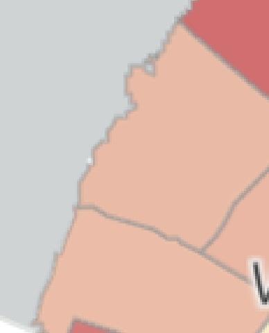
Chicago, Illinois, remains the nation’s most segregated city. Stark differences in land use, community investment, and accessibility to city-sponsored amenities from beaches to El trains are readily apparent. This series of maps focuses on the differences in North vs. South Sides, overlaying individual Historic Landmark building footprints with majority Black versus white populations.
The map asks the questions:
Whose heritage are we conserving?
How do histories of segregation delineate where preservation takes place?Whose (hi)stories remain?
Datasets courtesy City of Chicago Open DataWoodlawn
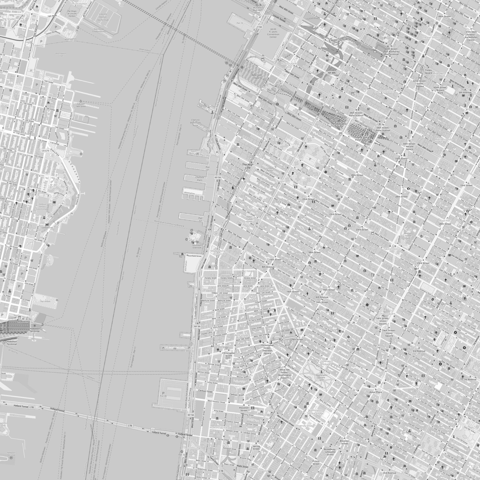
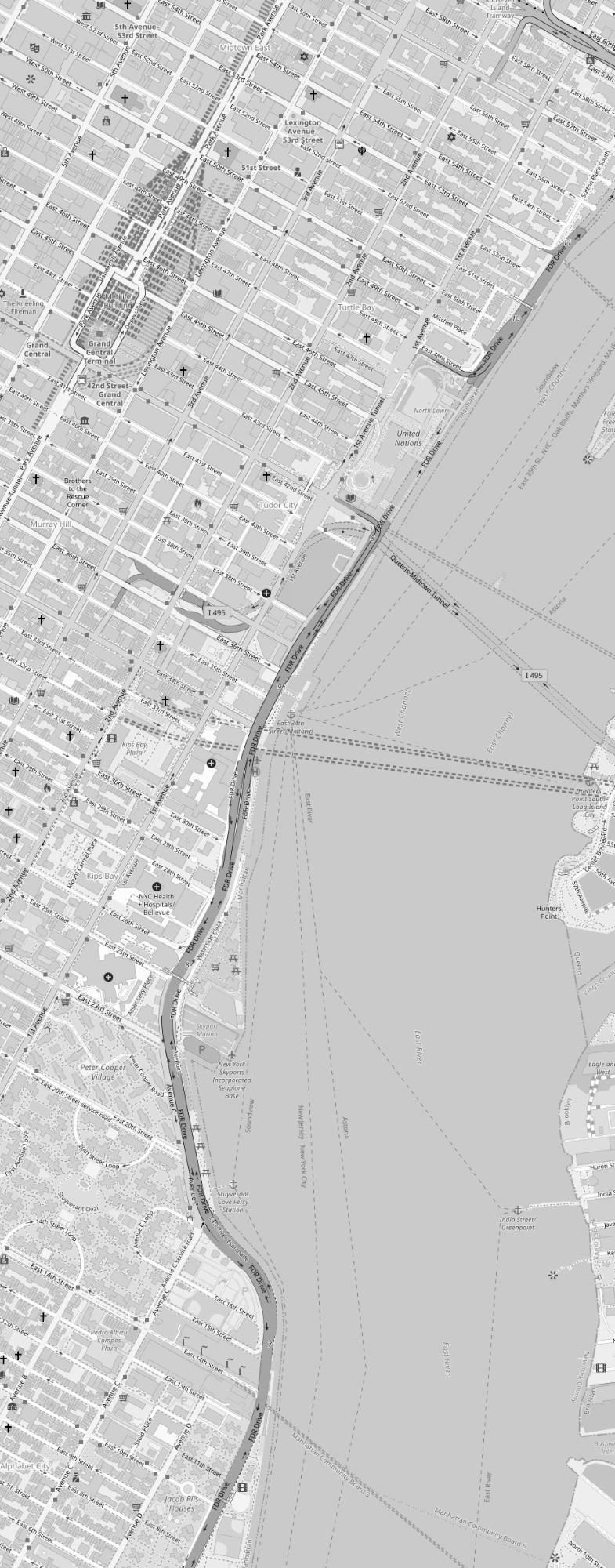
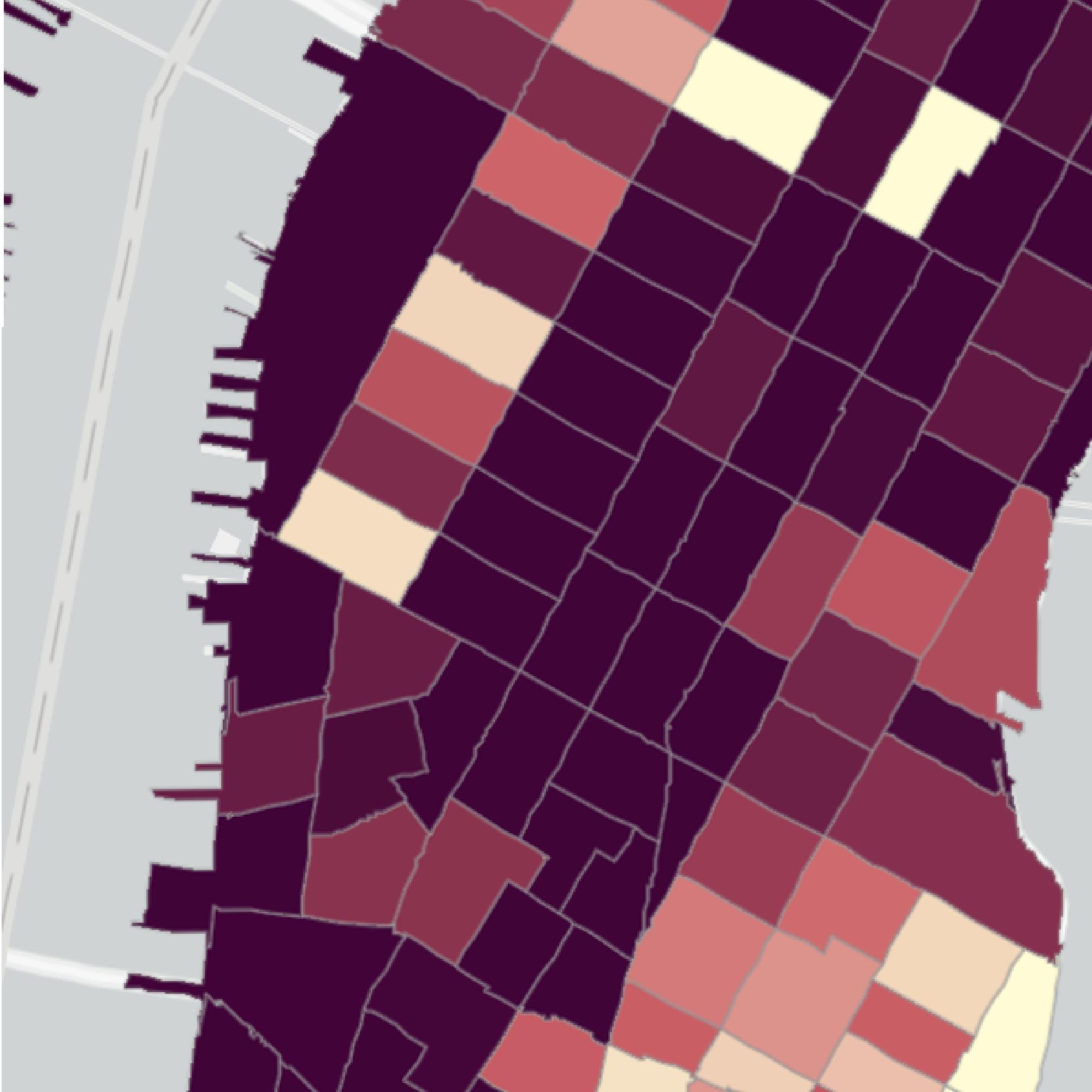
Utilizing both historic and contemporary map layers describing New York City, this map has a specific lens through which to view wealth accumulation spatially in Lower Manhattan.
The 1940 illustrated trade map describes where certain industrial practices were most densely packed — metalworkers and textiles are overlaid here in differing hatch fields. Overlaid in green illustrates the residential locations of those factory laborers: back then, industrial workers could not afford to live far from their place of work, so industrial centers were tightly correlated with low-income immigrant communities.
Today, we know Lower Manhattan as some of the most valuable and expensive real estate in the world. The base map shows areas of the census tracks where median household incomes are over $200,000.
This map interrogates the last century of socio-spatial wealth accumulation and changing demographics in a densifying, post-industrial city.
Data courtesy David Rumsey Historical Map Collections and ArcGIS user lisa_berry.


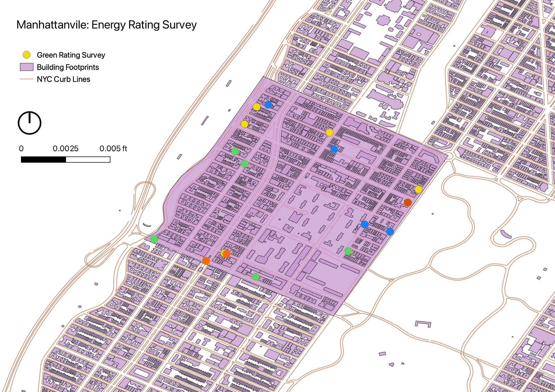
Walking is a form of moving meditation, and one where all the senses can be quite sensitive. Walking around my neighborhood of Manhattanville, I used my eyes and a survey mapping software to collect information on Green Building Ratings. These ratings, from A-F, are posted publicly on large residential buildings and businesses indicated their level of compliance with NYC energy code goals.
By overlaying my rating data: Green = A Yellow = B Blue = C Orange = D (No F’s were collected)
With planimetric data on building footprints size and age
White circle = 20th century or earlier building
All else = 19th century
This map illustrates and debunks myths about the energy efficiency of old vs. new buildings, as well as the unequal energy consumption inherent in wealthy vs. low-income residences.
This map questions:
1. As we go forth into a world increasingly plagued by climate change, how can we become aware of, and eventually effectively reduce our climate emissions inherent in the buildings we call home?
2. How does energy access and usage become a statistic of urban socioeconomic status?
Data courtesy NYC Open/Planimetric Data and the author (via KoboToolbox)
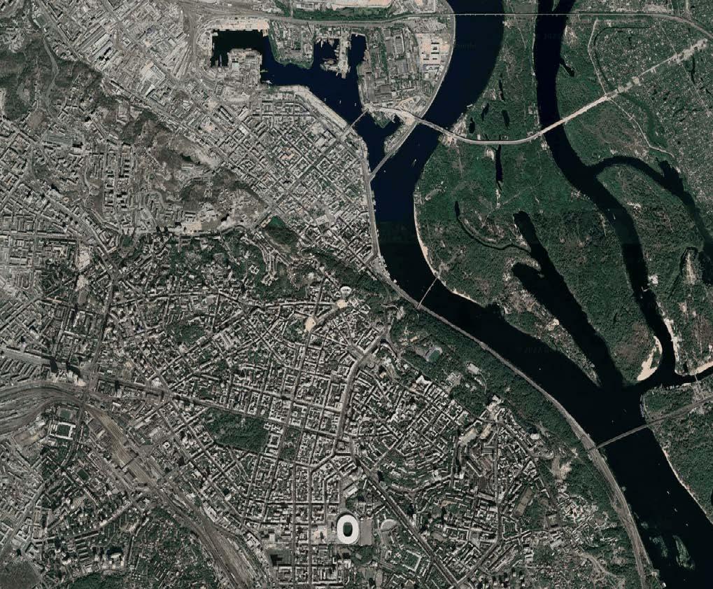
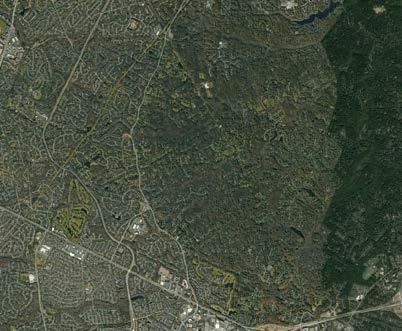
On February 24, 2022, the world heard the first rumbles of unprovoked invasion. Russian soldiers moved onto sovereign Ukrainian land, the tinderbox of contested borders igniting into the beginnings of war.
I, like so many, was shocked and appalled. As a child of a family from Czechoslovakia — as it was once known — I feel deeply the schism that erupts when a border is split, changed, moved, expanded, toyed with, by the powers that shape our world-form.
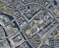
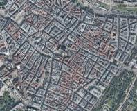
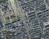
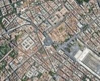
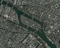
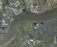
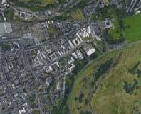
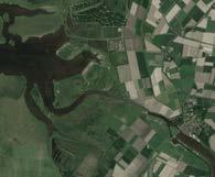
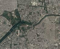
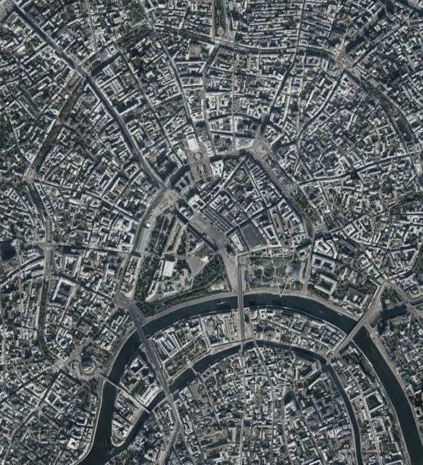
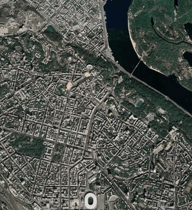
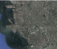
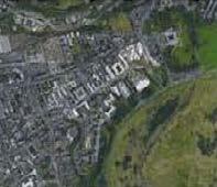
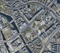
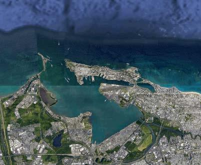
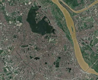
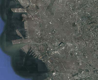
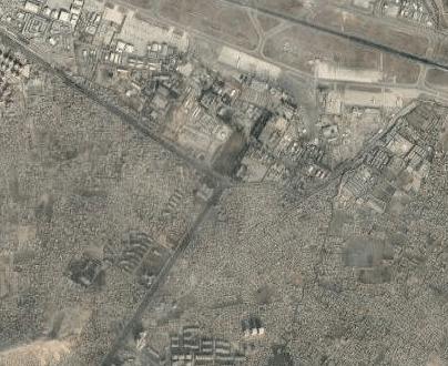
This mapping series is an archive of sorts, capturing aerial imagery of some of the great world capitols and the capitols that they at one point or another sought to integrate into empire. The pac-man effect of colonization that is invisible to pectoral forms that nevertheless show each city as an independent, beautiful place stitched together of blues and greens and browns.
Data courtesy Google Map satellite technologies
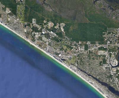
 The White House, USA Panama City, Panama
Hanoi, Vietnam San Juan, Puerto Rico
Manila, The Philippines
The United States Colonial Actions in the Global South
The White House, USA Panama City, Panama
Hanoi, Vietnam San Juan, Puerto Rico
Manila, The Philippines
The United States Colonial Actions in the Global South
 The White House, USA Kabul, Afghanistan Tehran, Iran