Emily Husted


Residential (1-8)
Landscape Architecture (9-16)
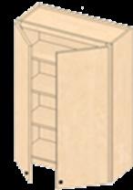
 1. Accessible Apartment
2. Water Pavilion
1. Accessible Apartment
2. Water Pavilion
Commercial (17-24)
Commercial (25-32)
Commercial (33-40))
 4. Palouse Elementary School
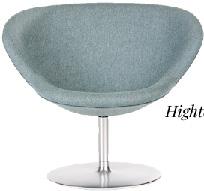
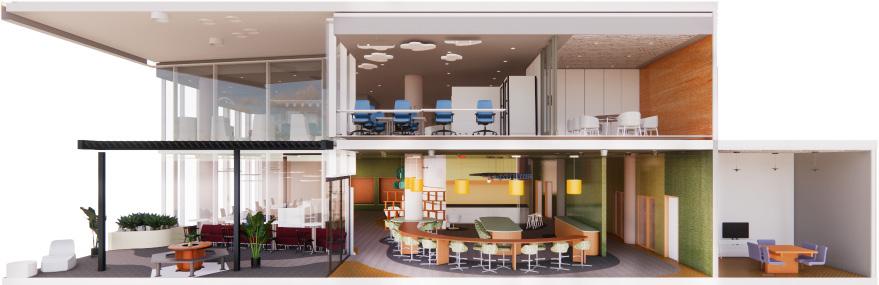
3. University Lounge
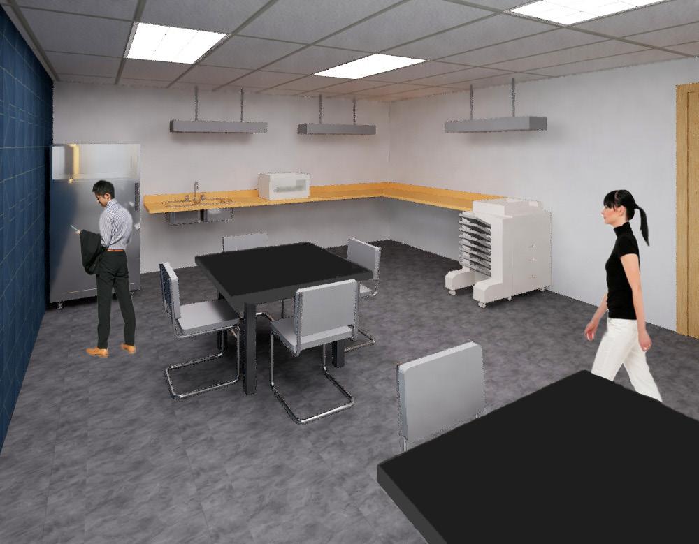
5. Workplace
4. Palouse Elementary School
3. University Lounge
5. Workplace
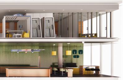
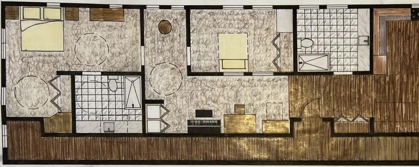
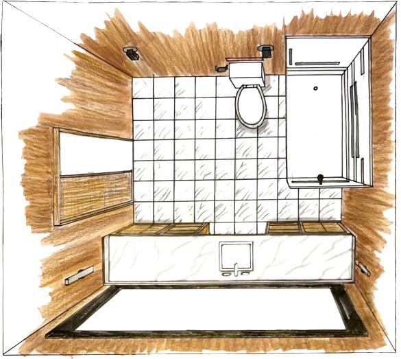
This project is a residential redesign. The new design needs to accommodate two bedrooms, two bathrooms, a home office, and an art area. An outdoor elevator that leads only to the apartment will be built for ADA. This ADA accessible design includes sinks with space underneath for legs, low counter tops, extra room for turning around, and pocket doors. The clients want a more open kitchen and living room as well as a neutral color scheme and they need separate bathrooms.
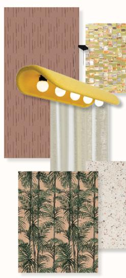
Yellow is used throughout the apartment and concept (personal meaning and color of warmth. Tan is used throughout the apartment (personally associated with the word family in concept). Linear and rounded furniture are seen, as well as a curved half wall in the art space.
Rendered Floor Plan
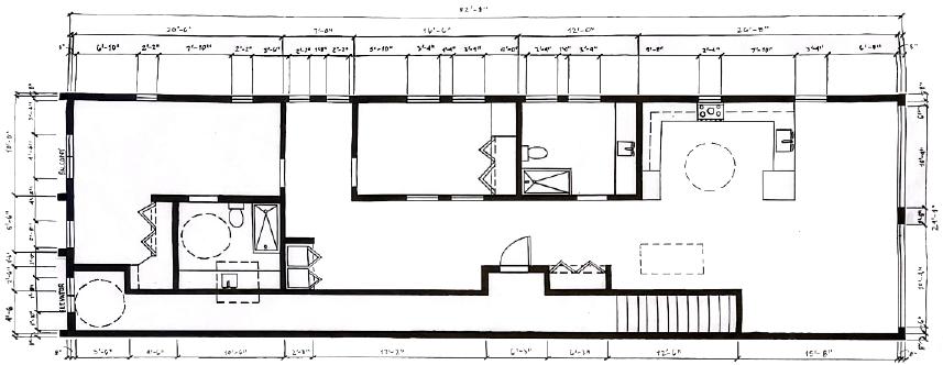


Pocket doors are used throughout, there is hardwood flooring in the kitchen and bathrooms, but carpet everywhere else for warmth, natural light is used, neutral colors are implemented, the dining room holds 6-8 people, the table extends and has folding chairs, the living room holds 4-5 people and has a designated wheelchair space, the furniture is upholstered, there is a wall for support when reclining in the living room, there is a gas fireplace, the main bedroom closet has room for storing medical supplies (Hoyer lift), the guest room has a pull out sofa for a caretaker or guests. The art space has an area to do watercolors with good lighting from the clerestory windows. The laundry room is centrally located, has one shelf for cleaning supplies, accordion doors, and a front-loading washer and dryer.
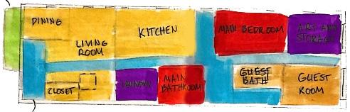

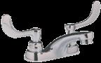
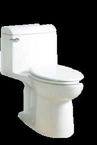
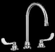
The bathroom incorporates a wall to wall counter with one sink, a big mirror, plenty of storage, a detachable shower head, and the bathroom is located close to the bedroom in the overall floor plan. The ADA accessible requirements are a grab bar in the shower, the tub is close enough to the toilet for a Hoyer lift, the counter is at 32'', and there is space under the sink for legs.


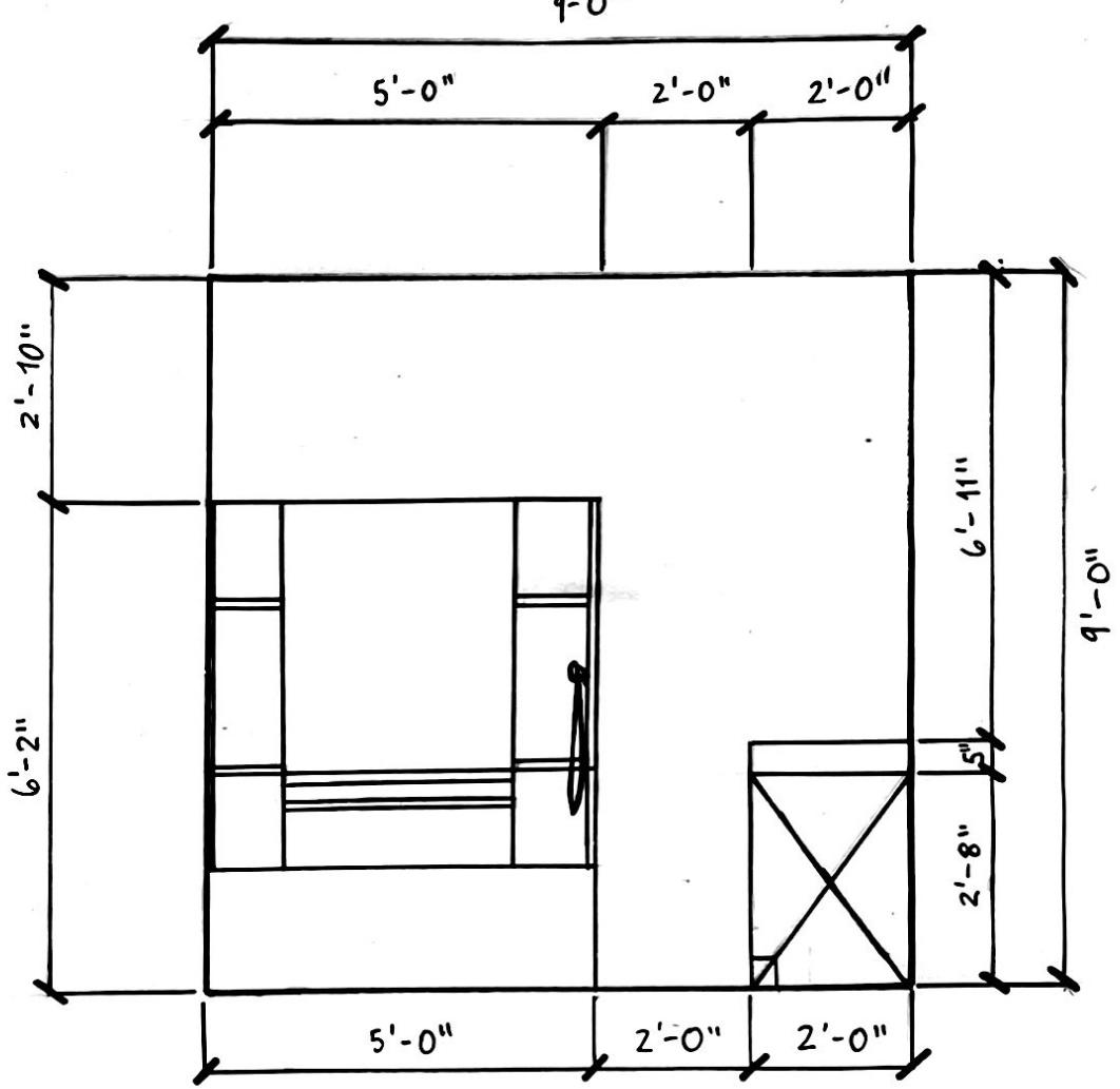


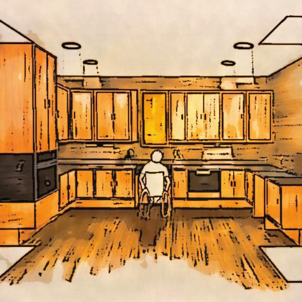
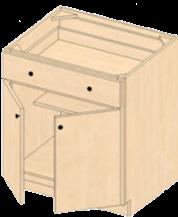
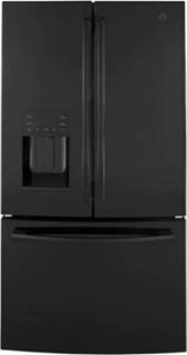
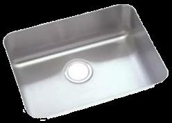
As requested by the client, the kitchen incorporates upper cabinets that are lowered by hydraulics, two built in cutting boards under top drawers (close to sink & fridge), Lazy Susans in the corner cabinets, pullout shelving, a refrigerator with side by side doors and a pull out freezer below, pull out pantry draws, a U-shaped plan, a gas stove, pull out trash in a cabinet, under cabinet lighting, and finally, they love openness and want to be able to see people from the kitchen into the dining and living room (open concept). The ADA accessible requirements are a counter lowered to 32", knee space under the sink, a stove top with space underneath to roll under, and 9" toe kicks.


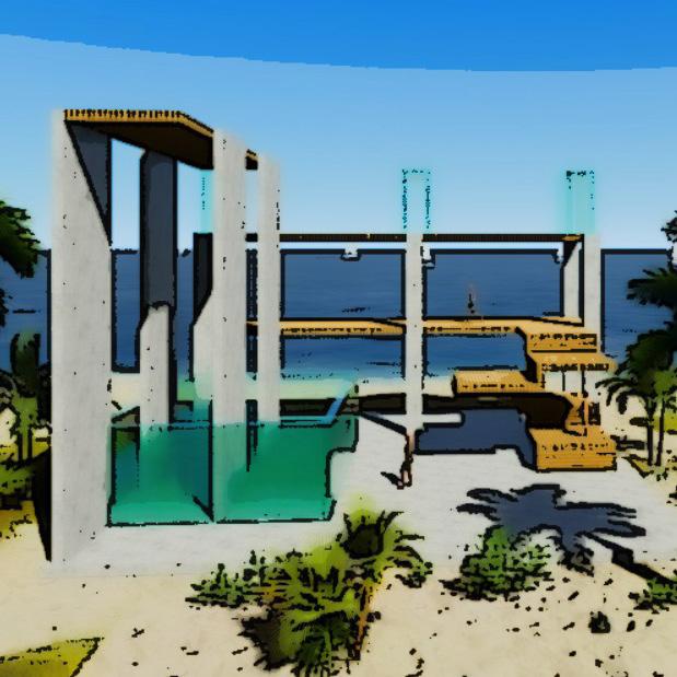
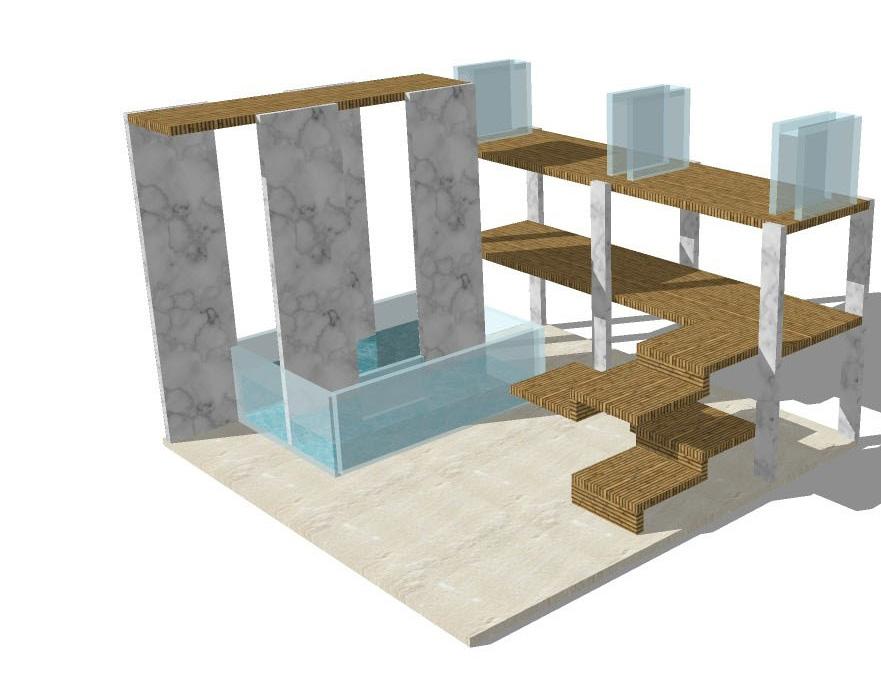
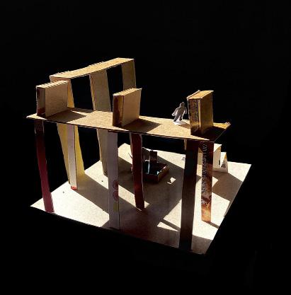
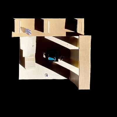
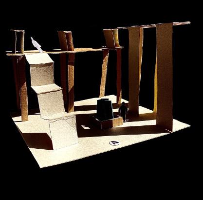
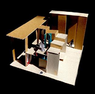
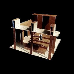
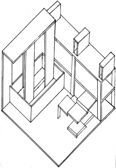
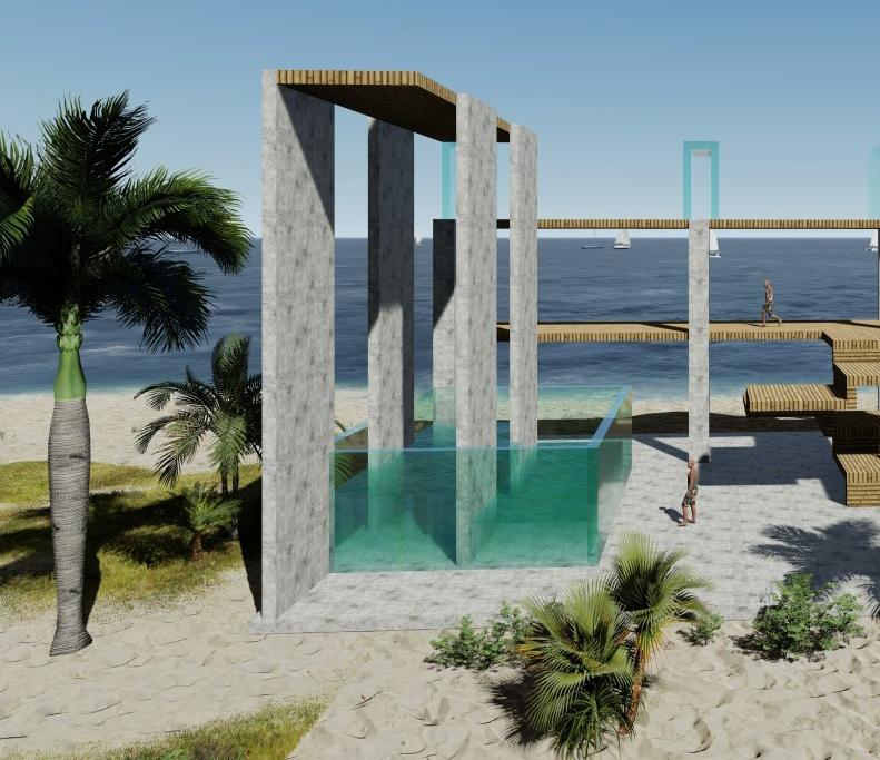
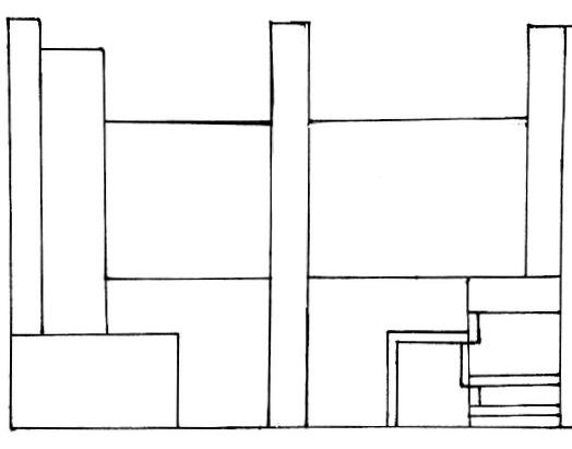
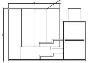
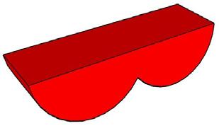
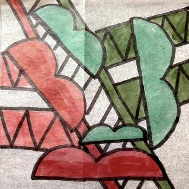
Vertical Pavilion is a pavilion with tall structures on two sides. These structures create beautiful morning shadows. When walking through the pavilion, you start on the north side and walk south past the water stairs. To continue, you turn east and reach the stairs which lead to the second floor only. From there, you can see a nice view, and the only way to exist is to head back down the stairs. The pavilion incorporates layers of material, tall structures, and U-shaped columns to create an interesting clustered and blocky Yin-Yang shaped pavilion. The west stairs waterfall from the vertical columns to incorporate water.


Caribbean Pine
Black Mangrove
Lignum Vitae
Agave Nashi
Cactus Harrisia Brookii
Orchids Encyclia Androsiana


The goal was to draft a plan of my model in a software, then bring in vegetation, and eventually export and render post-digitally. I achieved this by exporting the model into AutoCad, touching it up, choosing line weights, importing vegetation, and exporting into Photoshop to render. The floor plans were created by drafting a plan of my model in a software, then exporting the model into AutoCad and touching it up then choosing line weights as well as symbols. The sections of my model were drafted in a software. I achieved this by exporting the model into layout and arranging the views as well as creating title blocks.
The goal was to rebuild my physical model digitally and choose materials. I achieved this by using the kit of parts to create the model to scale, and using the Sketch Up materials library to render.
The goal was to take the model into another software to render. I achieved this by exporting my Sketch Up Model into Lumion and choosing a setting as well as choosing materials and adding people. For the elevations, I exported the model into AutoCad and then touched it up and choose line weights as well as symbols and annotations.
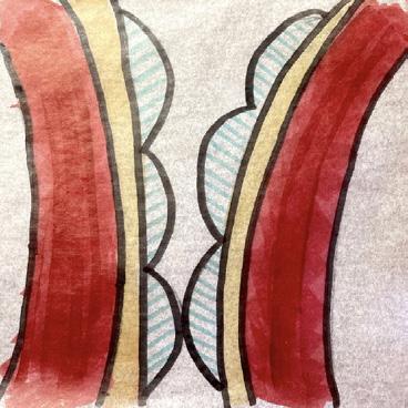
Inspiration: "Landscape with Sailing Boats"

Leroy Patrick lived from 1915-2006. He was a reverend and a painter who fought for equality and participated in the Art Deco era. He was most known for his landscapes done in oil paint.
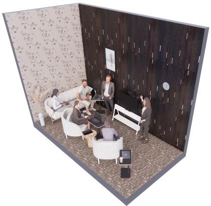
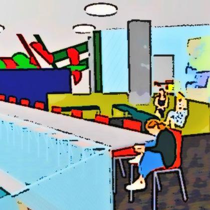
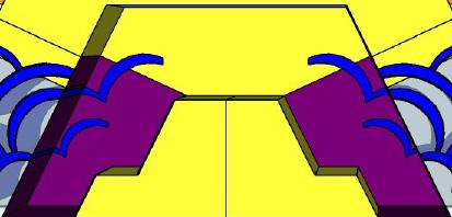
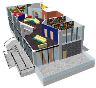
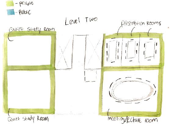
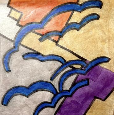
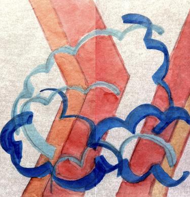
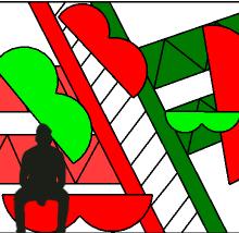
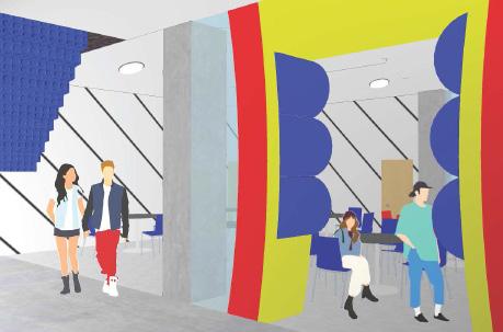
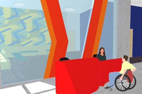
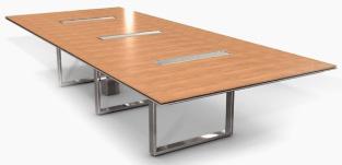
The lounge pulls apart bright colors and geometric shapes with gentle curves of "Landscape with Sailing Boats". It uses an excess of bright primary and complementary color schemes and striking shapes, creating a "super hero" theme. The first floor includes two open lounging areas, a designated dining area, and an employee break room. Level two includes two study rooms, two open lounges that overlook the first floor, and two quiet presentation rooms. The second floor includes built in seating elements as well as dynamic walls.


 Section A
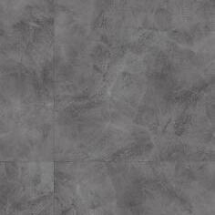
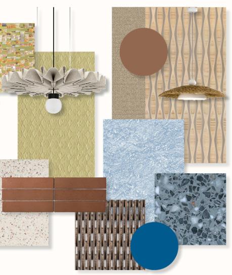
Carpet Tile Marble Rubber Tread Polished Concrete Marmoleum Steel Glass
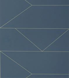
Wallpapers
Paints
Section A
Carpet Tile Marble Rubber Tread Polished Concrete Marmoleum Steel Glass
Wallpapers
Paints
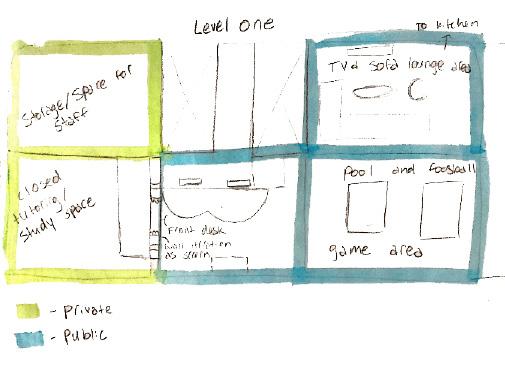
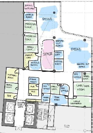
Level one of this project is considered the social level. One has to walk past the custom reception desk as a security checkpoint, and from there they have three options for social spaces: to the left, lounge furniture systems, and to the right, a place for eating (dining hall located through North door on top right corner), and seating along the edges of the wall. Each of these spaces incorporates a custom built wall, most of which also have built in seating elements. The employee break room is located at the top left corner (North East) of the plan.


Level two of this project incorporates quiet study spaces, and the door on the top left corner (North East) leads to the dormitories. This space has two private study spaces (one of which can act as a place to eat), two private conference rooms (or rent able presentation practice rooms), two open lounge seating areas, and one bar table that spans the width of the mezzanine. This floor also incorporates three of the custom built walls.
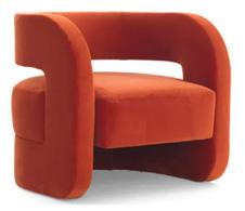
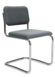
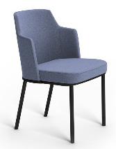
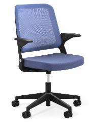
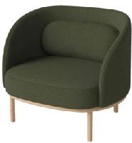
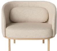
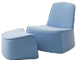
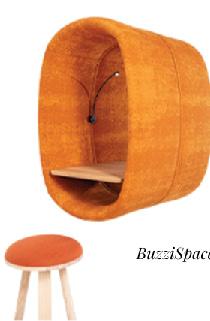
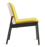 Steelcase Cat's Pajama Lounge Chair
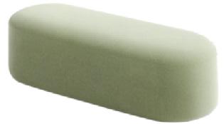
Custom Built-in Wall Seating
Custom Built-in Wall Bench
Turnstone Campfire Lounge System
Mateo Bench Diamond Sofa
Agati Sensi Chairs
Kirby Chair
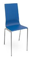
Steelcase Cat's Pajama Lounge Chair
Custom Built-in Wall Seating
Custom Built-in Wall Bench
Turnstone Campfire Lounge System
Mateo Bench Diamond Sofa
Agati Sensi Chairs
Kirby Chair

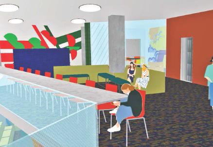
These renderings show off most of the custom built elements of the space while incorporating colors that pop which contribute to the "superhero" theme. Perspective 1 takes us into the bar and lounge space of floor 2 while perspectives 2 and 3 stay on the ground floor. Perspective 2 gives us a look at the dining space through the lens of a custom wall, and perspective 3 is a close-up of the reception desk being used by a person in a wheelchair.
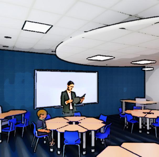
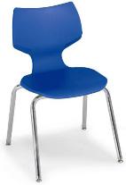
The Palouse Elementary School was designed around the concept of Palouse's well-known rolling hills and its sharp typography. To execute this idea, I chose circular acoustical ceiling tiles as well as some circular furniture specs. To contrast this, an array of linear tables and other furniture pieces were chosen. Additionally, the school was designed using Palouse Elementary's school colors blue and gray. When designing, I always put the needs that the interviewed teachers stressed as important for staff and the children at the top of the list to come up with a design that is most compliant with the occupants.
I used evidence-based design by researching Maslow's Hierarchy of needs as well as human behavior and student academic achievement to support design decisions and decide how to best create an environment conducive to learning. I also had the opportunity to interview and receive tours from two middle and elementary school teachers and a librarian who all have first-hand experience and knowledge of how a school should be designed to function at its best.

I researched case studies and theories then created bubble and blocking diagrams. As expressed by the teachers, I alloted space for a large break room. In the past, small spaces have caused teachers to eat lunch in their classrooms. The bathrooms are ADA accessible. And the principal, who spends a lot of time in the office, has good daylighting and sufficient privacy for hard conversations.


I researched case studies and theories then created bubble and blocking diagrams. The story time space is by window for good daylighting. The desks are in a separate region from the story time area so as to not distract or intermingle the kids from different classes. All of the spaces are ADA accessible and have places to turn around as well as lowered desks. A custom round reception desk was designed to have a better radius and view of the area. Finally, the book stacks allow a good line of sight.

I researched case studies and theories then created bubble and blocking diagrams. Flexible seating options were incorporated for students with fidgeting tendencies. The classroom includes a sink so students can frequently drink water and wash hands. The desks are also easily rearrangeable to fit needs of class at any given time.


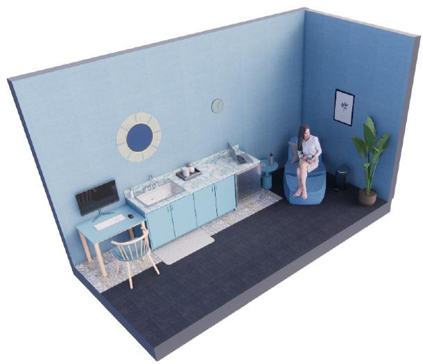
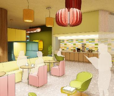
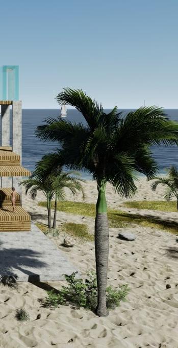
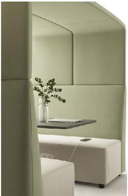
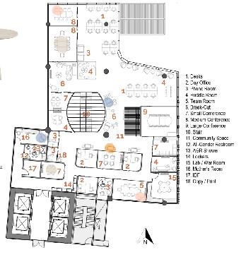
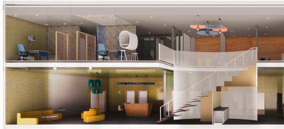
The Vida Verde Coffee headquarters office is located in San Jose, Costa Rica. The design focuses on the rich biodiversity of the area as well as the culture of the people. Hospitality and human connection are important to the locals of Costa Rica and is accomplished through sitting together and sipping together. When in the space, you should feel connected and immersed in the environment, feeling one with nature and exercising living a green life. The design is centered around the rainbow eucalyptus tree which is native to Costa Rica and represents the progressive growing city embracing the power of individuality.


The project was started with a lot of research about San Jose, Costa Rica, and a client interview with a coffee shop based in Seattle, Washington. Our team had to gather facts about the city and business we were given to then create a logo for our new company. The office is located in a large building, but our company is located on the second and third floors. The second floor is meant to be the social floor. There is a community space complete with a cafe and library, as well as access to an outdoor patio. This floor is where anyone would check in with reception, and it is a collaboration floor.


 Drawing credit to Kelly Richardson
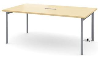
Furniture
Drawing credit to Kelly Richardson
Furniture
I heavily participated in the drafting of our blocking diagrams as well as the placing of walls and furniture in the floor plans. All team members helped approve materials and furniture found. The third floor is the private sector of the office. Most of the workspaces are located on this floor as well as the lactation room and some other day offices, conference, and collaboration rooms.
 Layout credit to Josie Percy
 Drawing credit to Kelly Richardson
I rendered a few of the views our team completed. This includes two section perspectives and two axons. The renderings were created in Revit paired with Enscape and feature a cut through the reception, the feature stair, and the community space, as well as a cut through the patio and cafe space. The axons feauture a lactation room and a huddle room. Our team stuck to a color palette of greens, blues, orange, reds, and yellow.