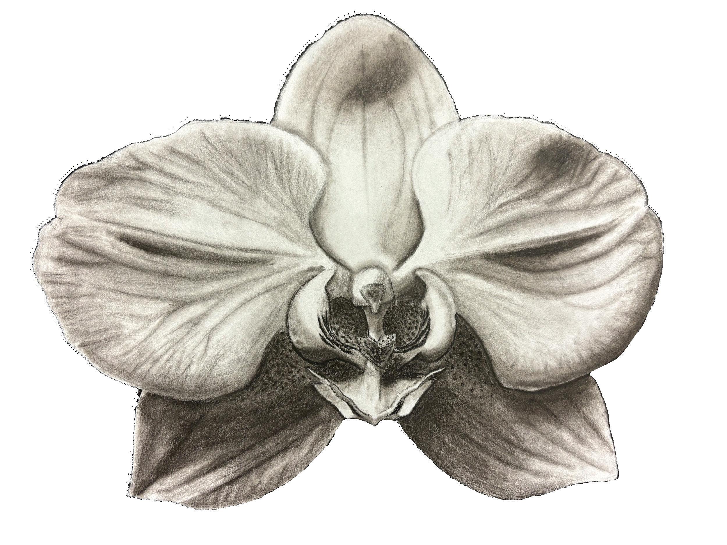
Emely Cajas PORTFOLIO


august 26, 2024
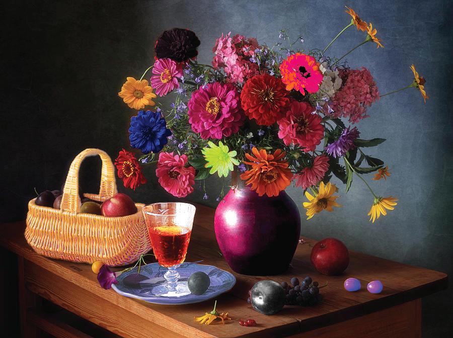
The image I used for this assignment consisted of numerous elements that were very similar. Because of this, I could use many tools to see how they would work on different shapes and textures. Some of the tools I applied in my work were the quick selection tool, the lasso tool, brightness contrast, and changing saturations and hues. When working with different layers, I learned about clipping layer masks so the rest of my work wouldn t be affected by any other changes I wanted to make.

august 30, 2024

First I chose the picture of a person with a lot of hair and opened it on PS. I then used the quick selection tool to roughly sketch the hair on the person, and later clicked Select and Mask to refine the hair better with the refine brush tool. I then added an adjustment layer to change the saturation of the hair and change the brightness of the person. I later entered the select and mask section again to add the face back onto the layer and remove the back ground. I then added a background that would fit the picture and finished.

September 8, 2024
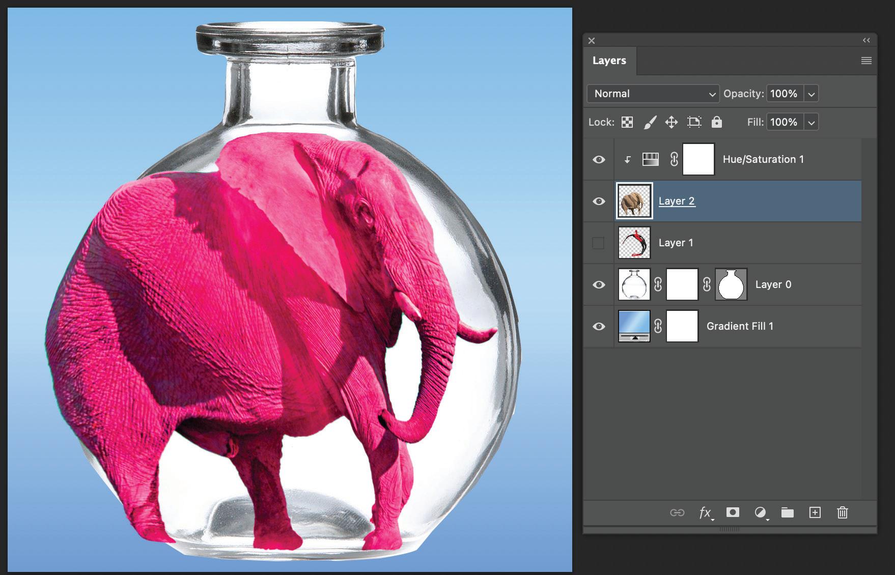
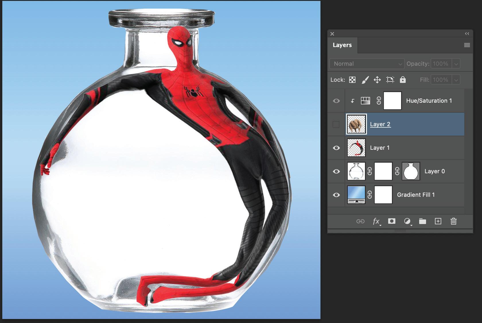
For these projects, I used the same tech niques of selecting and masking the imag es of the spiderman and elepant.
I later chose a gradient background and added a vase in which I would place the two previos images. I used the puppet warp tool to create fun images and fit the figures inside the vase.
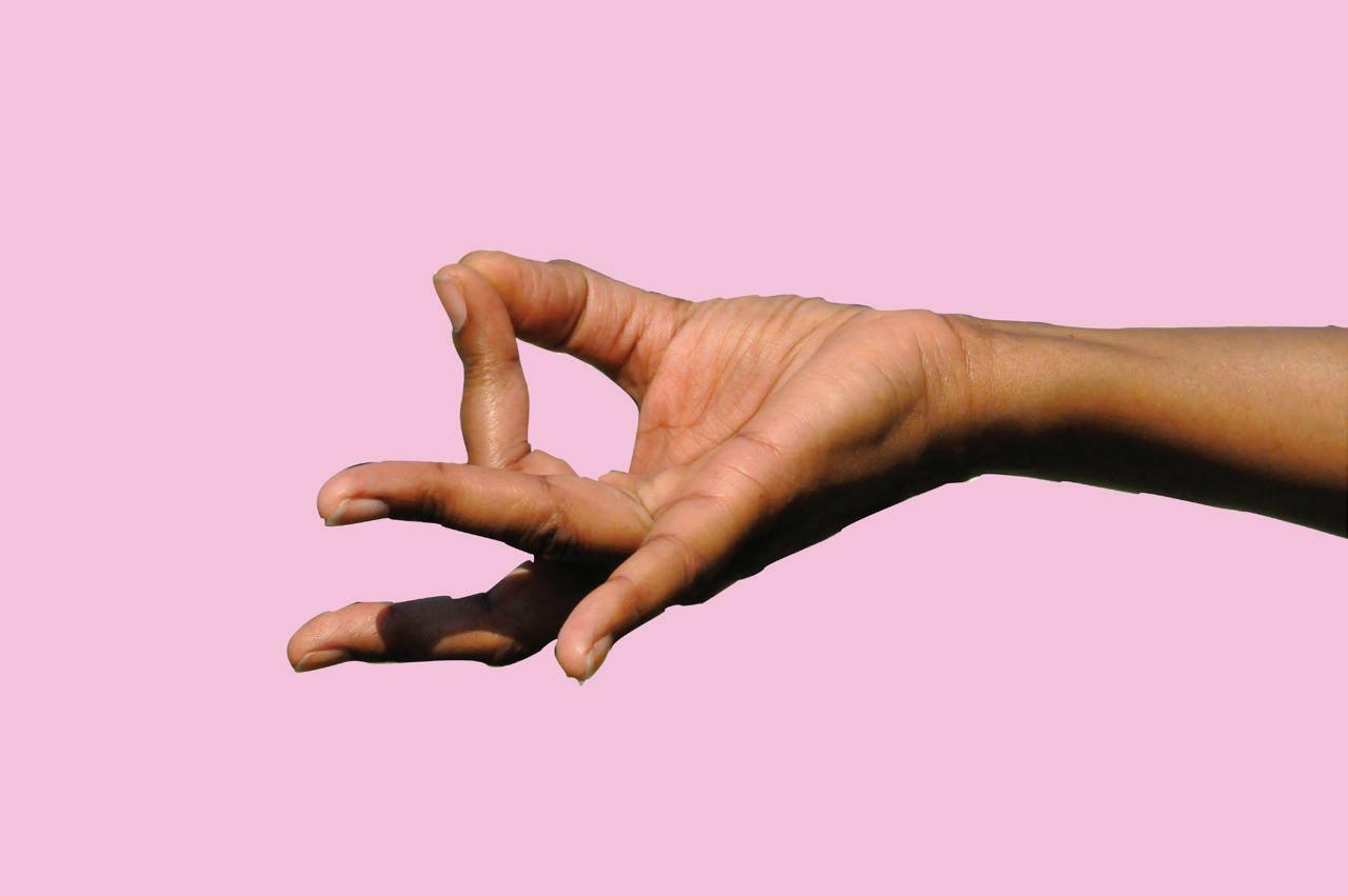

When working on these assignments, I realized that it consisted of all work and patience. At first I was having a had time dealing with the handle bars on the anchor points because I was either placing the points too far away or not curving them the right way. I started by using the pen tool and trac ing around the perimeter of the hand. I made sure to use the handle bars to curve the lines around the rounded parts of the image.
September 13, 2024
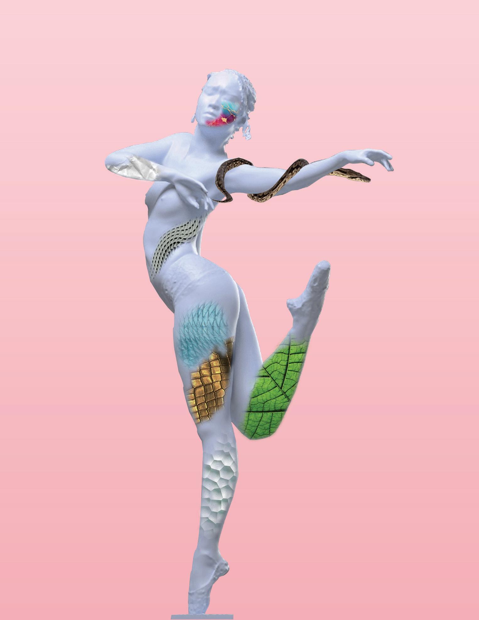
When choosing a sculpture to work with, I wanted to find one which had a lot surface space to work with to try and add many textures to it. After choosing the one I liked, I started by using the pen tool to select the figure to change the background color. Changing it to a gradient pink color, I then searched for differ ent textures that I could add to the sculpture. I didn t have a specific theme I was going for but I did use various animal skin textures that I thought blended really nicely with the sculpture. I would copy and paste the image to PS, hide the layer, and then use the lasso tool to select the area I wanted the texture to show up on. I then added a blending tool to soften the edges of the selection and go in with the brush tool to hide any excess parts I didn t want. After experimenting with the textures, I added a snake onto the arm of the sculpture and used the puppet warping tool to curve it around the figure s arm. Using the brush tool, I hid some parts of the snake so it would look more realistic as it wraps around the arm.

September 20, 2024
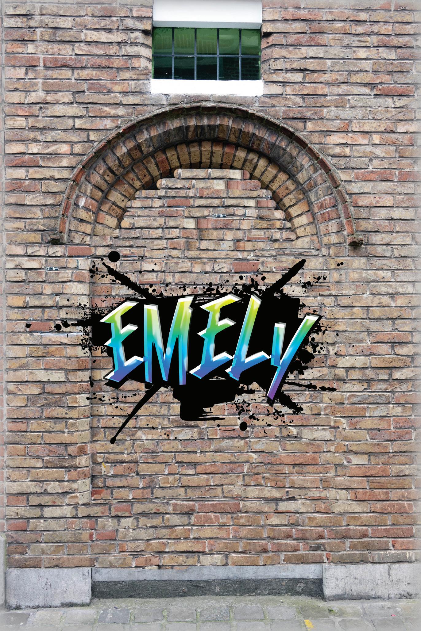
When working on this project, I stayed consistent with using only the clone stamp tool. As I worked I tried to use different selections to make the colors of the brick wall look more natural. When doing this, my idea was to start working from the left side of the wall towards the right side, however the bricks were not aligned equal ly on both sides. This was a little tricky for me seeing as I had to change the position of the lines between the bricks to make it look smooth all across. I changed my pro cess and started working from both sides at the same time. I would start on the left, do a little, and then move to the right side and meet in the middle of the wall. As I moved to the top, another challenge pre sented itself. The curve of the wall creat ed a dark shadow on the door, so when placing bricks it looked unrealistic. I tried placing the bricks to keep the curve, but time ran out and was not able to apply any blending tools to bring back the shadow. Adding the graffiti was another tricky pro cess seeing as it involved applying various text effects such as inner shadows, bevel and emboss, and gradient overlays. Over all, this project came with it challenges but was very interesting to complete.

October 4, 2024
When working on other sections such as the mesh on her skirt, these presented themselves as moments where I had to be pa tient. Continuing with the pen tool, I created individual diamond shapes that represent the holes in her skirt. I worked on the basis of each element of her outfit and ap plied the colors to match her actu al image.
When working on this project, I can definitely say it was challeng ing for me. The character I chose, Clawdeen, held a lot of small de tails such as hair highlights and the glitter on her shirt. I first started by tracing her skirt and later moving up. I realized I need ed to work on the harder sections in order to save time, so I started with the hair. This was the most difficult to me because her hair was interrupted in many sections such as her arms sticking out and her jacket. Throughout the whole process I used the pen tool and the eyedropper tool to match the colors accurately.

October 16, 2024
Working on this project, I understood just how patient and precise you have to be when do ing designs like these. In my first try, I copied and pasted in place all the circles the way they were meant to be, but when using the shape builder tool to combine some shapes, I realized that I had messed up somewhere in my process. I had not placed or intersected my circles right and therefore wasn t able to move onto the next step. In my second try I took my time and re did everything. This time everything went smoothly and I was able to combine my shapes and apply gradients to them.

October 25, 2024
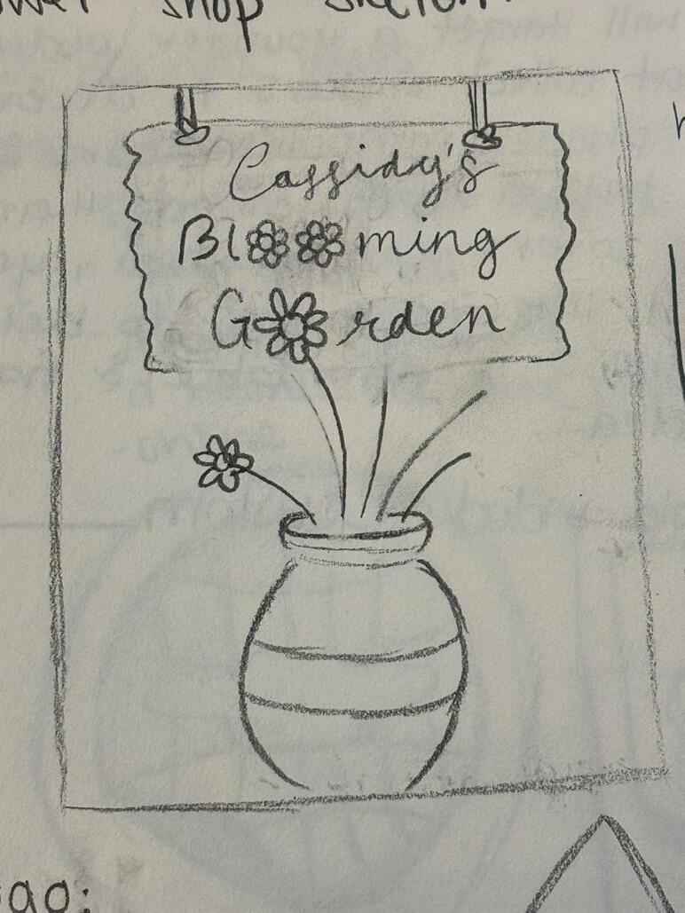
For this project my client was Cassidy, and for her business she was thinking of a nice flower shop. After meeting up with her and her informing me of her ideas, I got started with the design. Having creative liberty, I wanted to make the logo with a cute trendy plant like theme. I first decided to create a frame of vines but using the pen tool and moving the anchor points to make them into the circle shape. I was able to create this by copying, rotating and reflecting the shapes. Going off of my clients ideas, I then made some flowers and a vase shape. Using the pen tool and ellipse tool, I first created the flower pot and later started drawing the flower petals, making each one a unique shape, and adding gradients to it to make some lilies and more. After this, I created a wood like board to place the business name on and using the brush tool to create this effect. For the magazine cover I used the same items and this time made a background to fit the theme. Using the rectangle tool, and ellipse tool I made a small awning cover and a door to replicate the front of the flower shop. Overall everything when smoothly, but I think I would change some details like the flower sizes and the slogan since it was last minute. I wasn t able to get to the mutations but will make sure to finish them

October 18, 2024
For this particular project, I decided to make some logos for my personal small nail busi ness. I wanted to include symbols that were related to the theme so with the pencil tool and the rectangle tool, I drew a nail polish bottle and the brush.
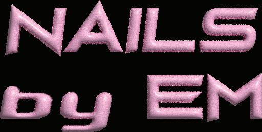
I added some shadows and changed the col ors where they would fit the color scheme of the logo, for example the first one I made it a pink color and added some gradients to prevent from making it boring to look at.
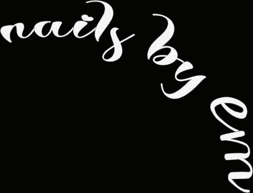


For all of the images, I added the same items to keep it uniformed like the stars, diamonds, and the bottle. For the title, I installed many fonts and attempted to use a variety of them in my logos, how ever I didn t like how they went together so I used different ones that seemed sim ilar. Out of the , the first one took the most time but my favorite would be the second one.

November 1, 2024



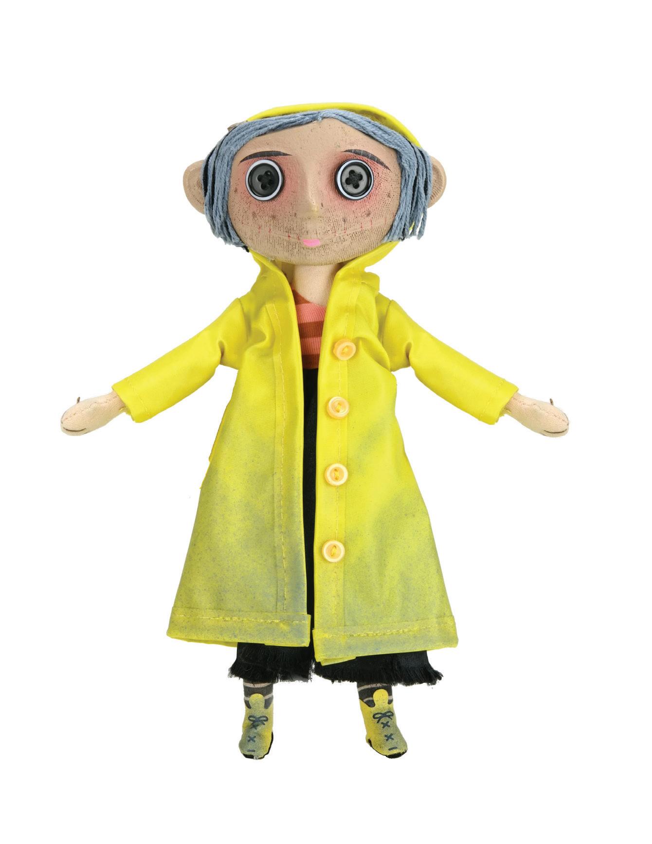
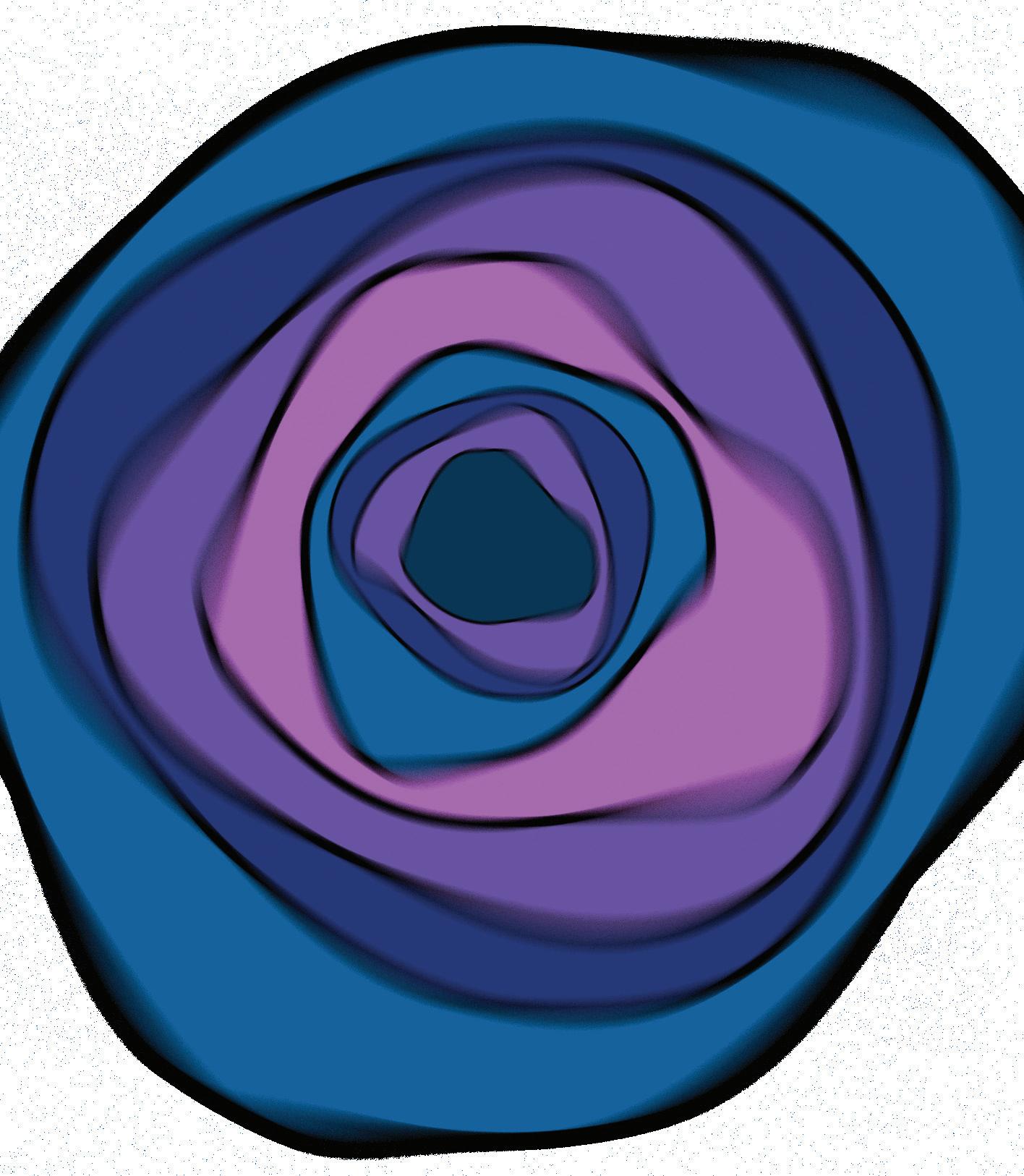
This assignment was a very excit ing one to work on. I chose to work on the Coraline movie poster and started with a sketch to bring my ideas together. I first started by cre ating a background on Photoshop. I then used Illustrator to create a tunnel like effect with the blur tool. I started by using the ellipse tool to create various circles and used the wave warp tool to distort the shape, and later added the Gauss ian blur effect. I then looked for an image of the coraline doll and in PS, used the select and mask to clean up the outline of her. The im age I had, had her arms in different positions than I had imagined so I selected her stretched out arm and reflected it to the other side and added a blending effect so it seam lessly blurred with the other side of her jacket. In Illustrator, I traced the movie title and added gradi ents to them and made the letter L into a needle image to fit the theme of the movie. When adding the ty pography, I kept the font simple to not take away much from the main elements of the poster.

November 8, 2024
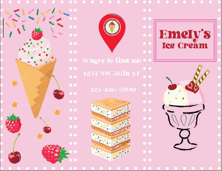
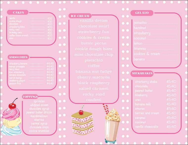
I then moved on to adding typography to my brochure. Since I was doing a food based shop, my brochure re sulted as a menu, so as a way to organize it I used the rect angle tool to create sections toppings, smoothies, and ice cream flavors. I used the gen erative AI tool to add images related to the theme to fill in empty spaces.
This assignment was an en joyable project to work on. I started by creating my InDe sign file and applying the mar gins and a background color. I then opened Illustrator to start on my shop s logo. My idea was an Ice Cream shop and I wanted the logo to be somewhat hand drawn. I used the pencil tool and brush tool to create the elements of my logo such as the cup, the ice cream scoops and the top pings.

November 22, 2024

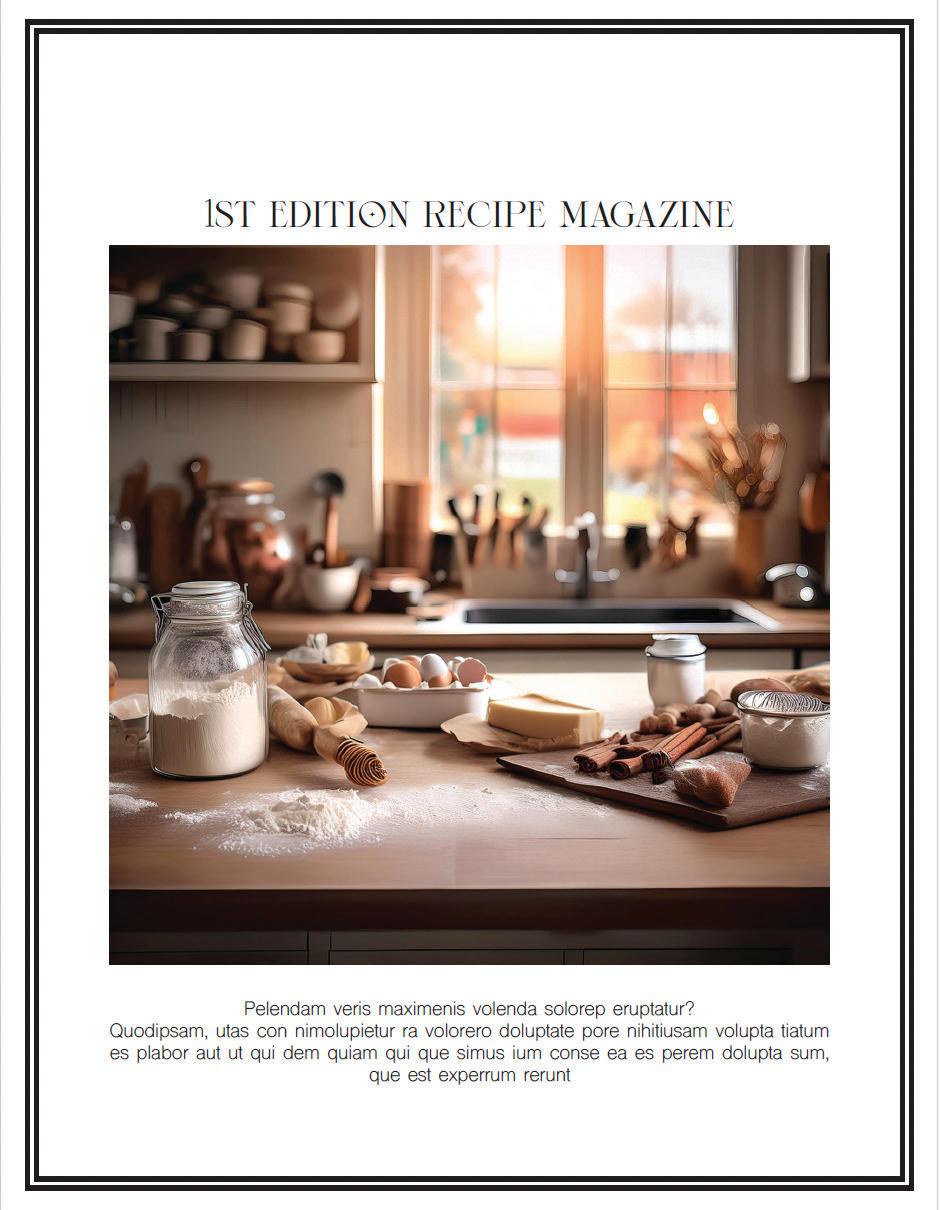
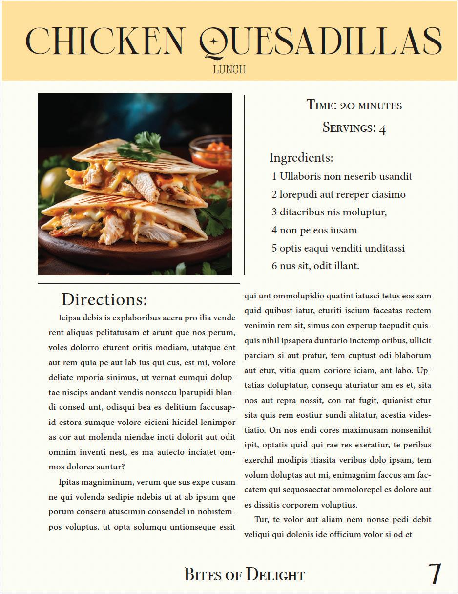
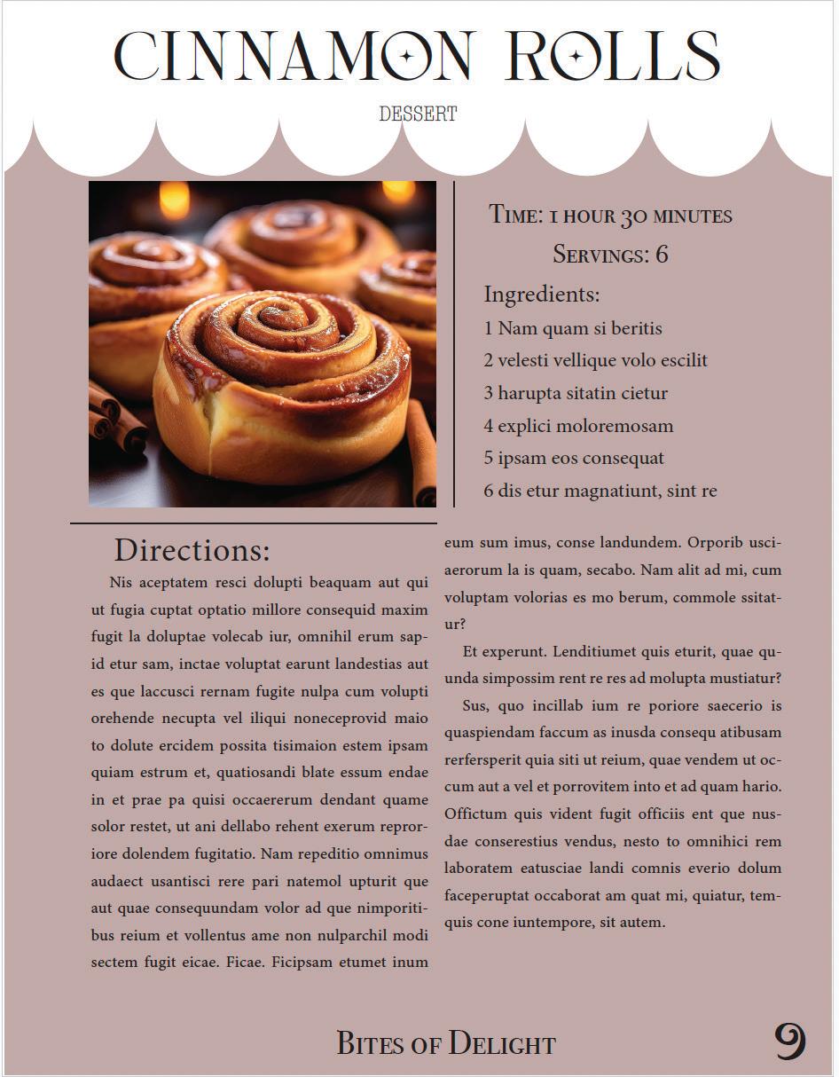
Creating this magazine was a nice and smooth process. I started by creating my pages and parents pages on InDesign and moving onto creating the layout for each one. The two sections for this cook book were Lunch and Dessert. I created different page formats to keep it pleasing for viewers. For the cover, I created the logo with the pen tool and used the AI Generator to create the wooden bowl. When designing the actual recipe pages, I once again used Ai to create the images for the food. As for the text, I added placeholder text and used tracking and leading tools to get it to that final result.

