E 2021-2022
ELIZABETH TORRES
INTERIOR DESIGN PORTFOLIO
I’m an aspiring Interior Design student passionate about integrating sustainable design principles into the design environment. I’m interested in continuous learning and getting experience about improving the quality of life with such principle.
The most beneficial aspect that I’ve cultivated at IU is the importance of teamwork and collaboration. My studio classes and my work experiences have played a role in this. Working together with others to achieve a common goal will increase the success of the project which will leave everyone feeling satisfied. This feeling is one that I always strive for.
I am proficient in AutoCAD, Adobe Creative Cloud, Revit, and Rhino, among other programs. I hope to obtain an internship during the summer of 2023 where I will be able to take part in real world projects.
INDIANA UNIVERSITY
May 2024
Bachelor of Arts in Interior Design
GPA: 3.6/4.0
Minor in Spanish
Minor in Business, Kelly School of Business
ELKHART AREA CAREER CENTER
May 2019
Cosmetology License
GPA: 3.9/4.0
01.
B UILT BY YOU
D esign Consultant
Designed floor plans on Revit per client specification
Generated 3D renderings for client visualization of project
ACTIVITIES IIDA at IU, Bloomington, IN Officer, Treasurer
Facilitated event awareness by helping board members distribute meeting details to encourage student involvement
01. 02.
INDIANA LATINO INSTITUTE, Indy, IN Intern, Scholarship Recipient
Networked in virtual and in person meetings/ events with Latino leaders in the Indianapolis area expanding my network

TECHNICAL LANGUAGES


Cosmetology License Fluent in English and Spanish

02.
LIBERTY & 33RD Intern South Bend, IN
Compiled database through research for furniture designer’s history and furniture brands to expand company awareness
Researched design firms nationally to broaden the customer base for the company


BELLE AME COLOR & FACIAL BAR Cosmetologist
Bloomington, IN
Applied practical cosmetology skills and nurtured my creativity when an opportunity presented itself
Scheduled appointments and ensured customer satisfaction by delivering service on time, fortifying the soft skill of time management
May
June
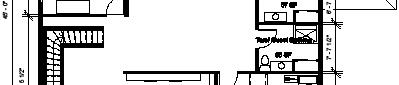
03.Gaudium company recently decided to relocate their headquarters from Chicago to Bloomington. The floor plan has curvilinear walls to represent an organic connection to nature and also provides glass paneling to connect nature with the indoors and to introduce natural sunlight. Bringing all of these elements together, there is a great potential of growth within the company, because the employees will have a variety of working locations and a great atmosphere.


The chosen color scheme was influenced by the company’s five-color brand identity. The company is focused on real estate and keeping colors that have the same hue, just different shades and tones helps to keep Gaudium looking uniform.
The green is an indication of nature which is shown in the main landscape of the area. The variety of tone and shade in the blue colors are meant to represent the open sky and the visibility of it. This creates a calm feeling to the client.
These colors are shown in relevance to the importance of them in the project, so the widths of the columns are a representation of that.
This space exemplifies glass ribbon windows that allow for natural sunlight and help blur the line between the outdoors and indoors. There is also an incorporation of plants along the wall and throughout the project.
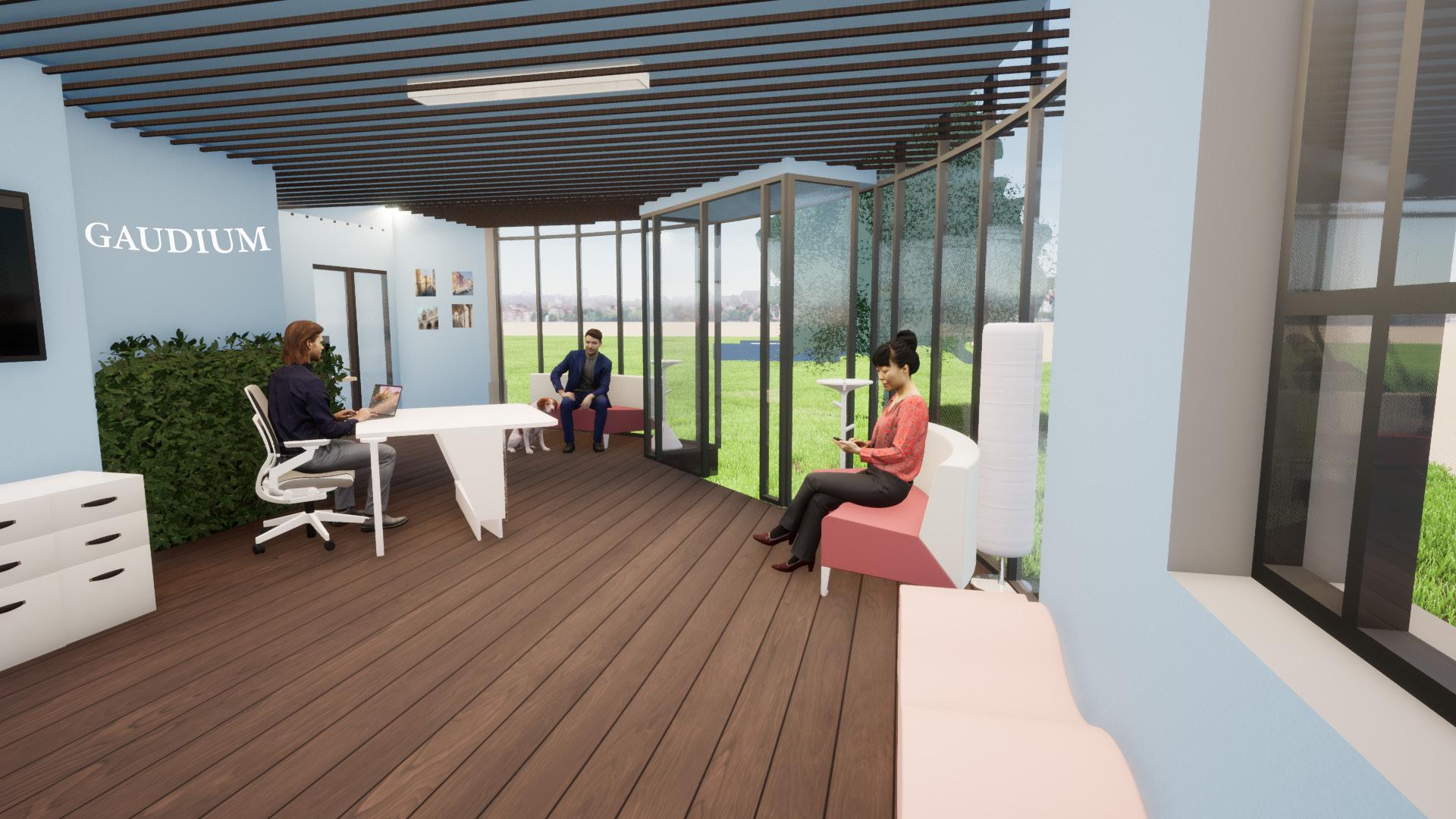

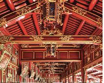
This is a quiet room near the entrance that allows for easy access. It incorporates Gaudium’s color brand, and ceiling beams are incorporated to attract client’s interest.
- Gaudium Headquarters, Bloomington, IN

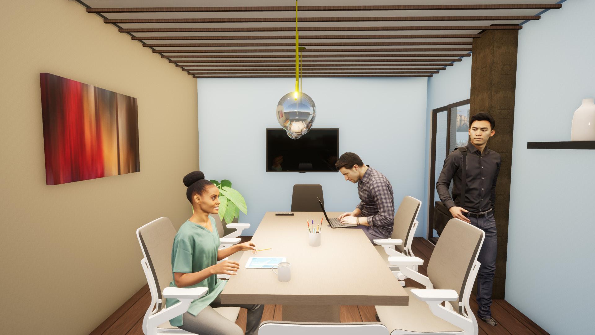
SEMI-PUBLIC SPACES 2/3
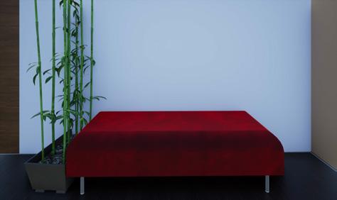
BREAK-AWAY SPACE
Conveniently located in front of the wellness area which is a quiet location.
More casual seating is added as well as a larger screen.
Glass is incorporated throughout to allow for an open feel and more sunlight to go through the office. Ceiling beams are incorporated to add emphasis.

Steelcase
Gestrure
Steelcase Flex Height Adustable desk


Gaudium Headquarters, Bloomington, IN
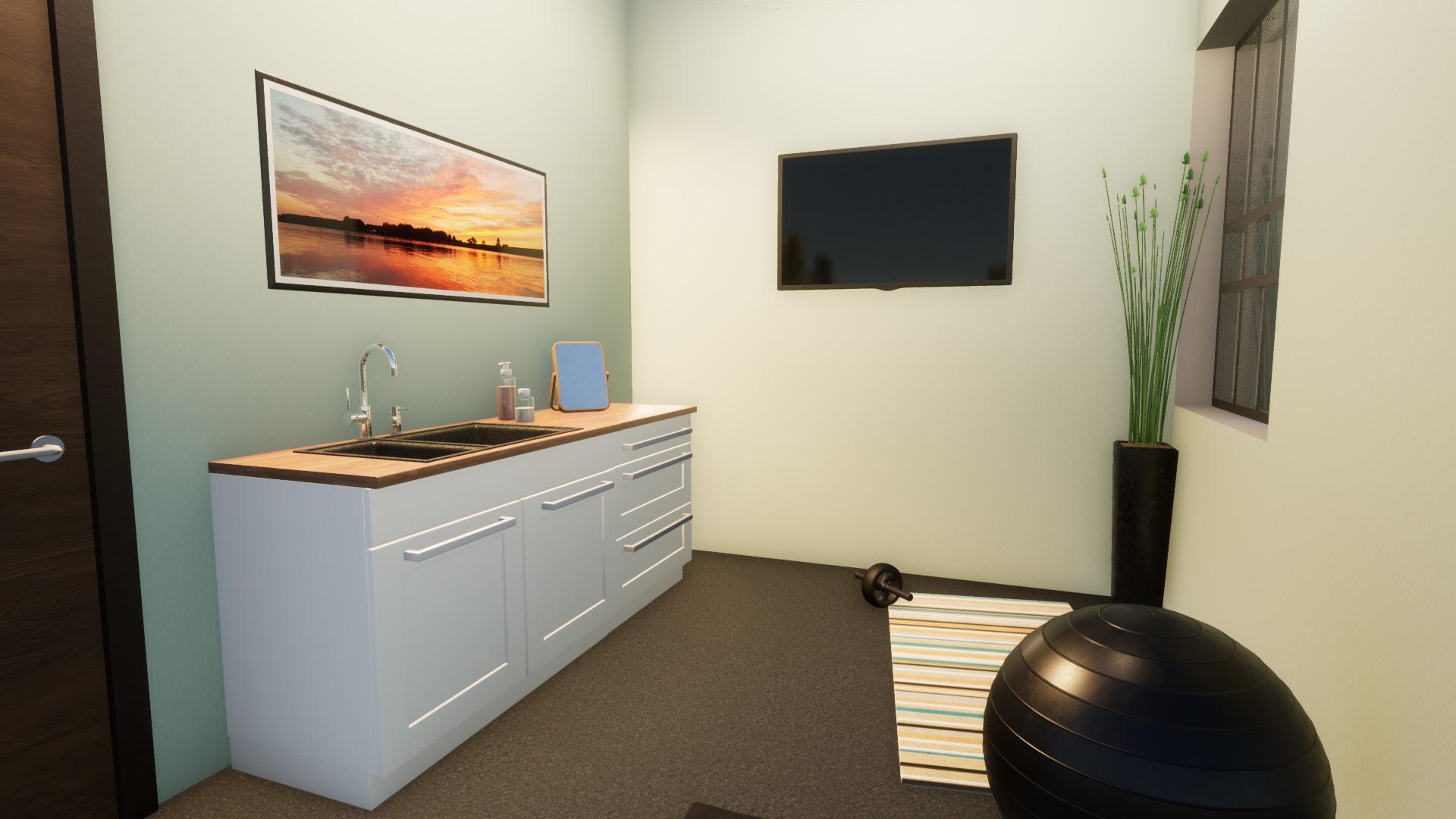
WELLNESS AREA
This is a space to take care of mental well-being or physical well-being. It has access to daylight as well as a fully covered and lockable door for privacy. The floor is rubber to separate the space and the walls are a neutral color for relaxation.
CINCINNATI, OHIO | 3,726 SQFT
Dante, Tam and Niamh have recently purchased a new home in Ohio where they plan to live long term.
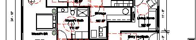
Designers were tasked with dividing the space into two spaces that are side by side. One side will be dedicated for Dante and his son, Tam, and the other will be for Niamh. Their home overlooks the Ohio River and the family enjoys to spend time in nature.


MEANINGFUL IMAGES

INSPIRATION CHOSEN BY CLIENT


In the images provided by the clients, they seem to have a large preference for a variety of shades and tints. Firstly, there are many instances where blue shows up. In most instances, the blue is in a darker shade, but there are instances where blue appears to show in a bright tint. Following the blue, red is another significant hue. There are many shades of red on the carpets and accessories. There are tints of red on walls and structures as well as accessories. This red hue may be represented to signal their love for one another and their unity. A yellow hue is represented the same amount as red.
It’s especially shown through accessories or wall colors. It’s also represented in some of the designs of a structure. Green is shown a little less than the yellow hue by being represented in the plants and wall colors. Green is an indication of nature, and by choosing blue and green to be incorporated, it shows the family’s love for hiking, picnics, and Niamh’s ex-service for the U.S. Forest Service.
The brown color is added as the neutral color that brings everything in together. There is a monochromatic scale that is present with the tints and shades.

This is a space is utilized by Dante and Tam when working outside of work and school. There needed to be a clear view of the office for Dante to look after Tam when he wasn’t there. There is an incorporation of a painting that was significant for the family.


Meaningful image

This is the cooking space that the whole family shares. This spaces needs to be ADA complaint and include a kitchen triangle. The dining area is adjacent to the kitchen as shown. There are also two important objects that had significance to the family.

Meaningful image Important piece

This room is on the second floor and has a toilet room incorporated. Dante likes to practice yoga and meditation so there is room for his yoga mat and is located away from common areas, so it will allow him to concentrate.


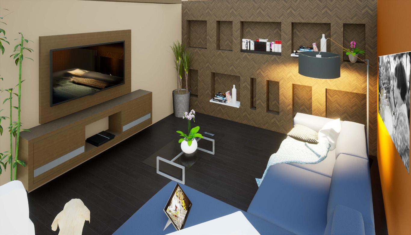
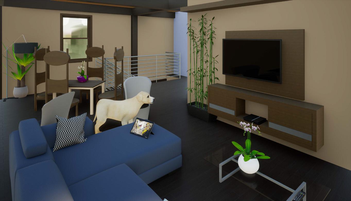
This space is one that Dante and Tam share. It’s on the second level and incorporates several seating options for either watching TV, reading a book, or playing games. They have significant daylighting with a view to the Ohio River.