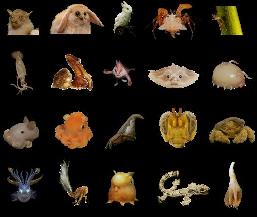
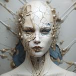
Every year there are approximately 5 to 10,000 new species found in nature. In 2024 over 100 novel species were found in New Zealand.
These newfound organisms stand as testament to the ongoing process of adaptation, showcasing the dynamic between life and its surroundings. The world continues moving forward, no matter what we do. Viewed through this lens, the existence of humans seems less important.
Global statistics project that by 2100, the world’s population will surge to 11 billion. This tremendous growth and expansion have established humanity as the dominant force on land. But here's the question: Is this anthropocentric view sustainable or even accurate in the grand scheme of Earth's history? As we continue to develop, we often overlook the future of the natural world. Yet, nature is constantly changing, and life is perpetually evolving. So why not take a moment to reflect on our current state and reconsider our approach to the future?
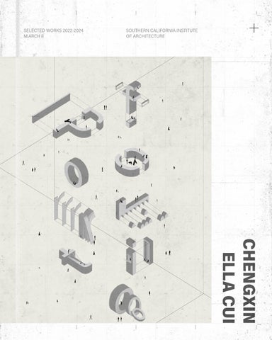
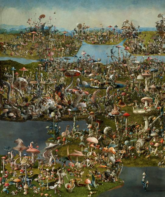
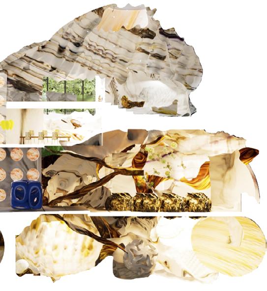
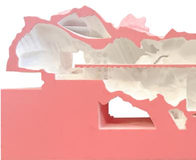
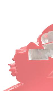
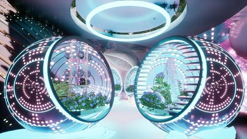
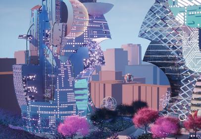
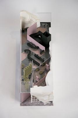
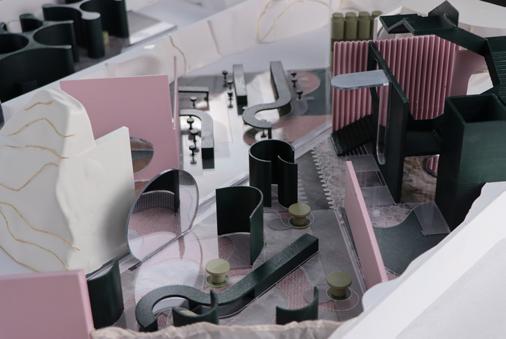
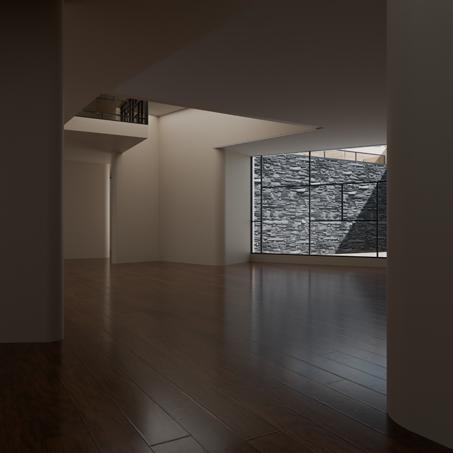
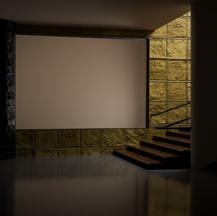
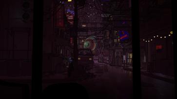
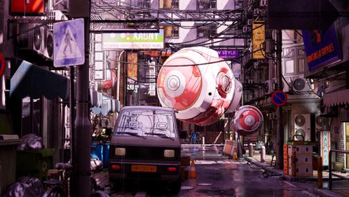
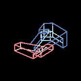
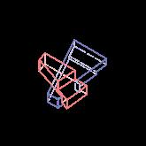
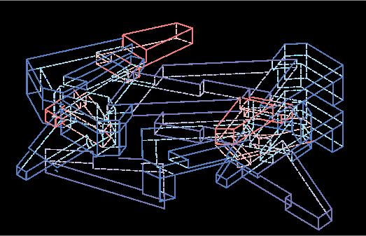
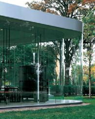
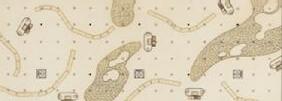
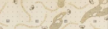
LIFE, OTHERWISE Map of The New World
World Setting _ Gaia
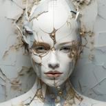
There have been so many different theories about how the future environment will become, such as Supercontinent Formation, Evolutionary adaptation, Sun's Expansion, Mass Extinctions, etc. Based on these principles, let's assume a possible future: A major tectonic event, for example, an earthquake, dramatically altering global ecosystems. The Pacific Ocean quickly disappears, and Asia and North America connect to form the central continent. Africa and South America remain untouched, and the rest of the continents sink. Meanwhile, strong magnetic waves remain on earth, leading the creatures to migrate with the current in their own cycles.
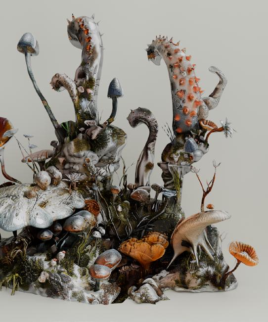
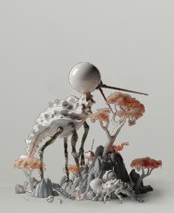
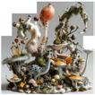
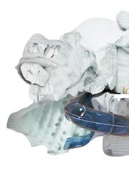
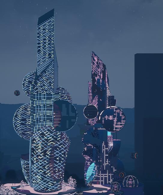
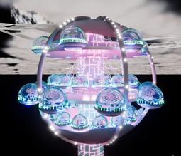
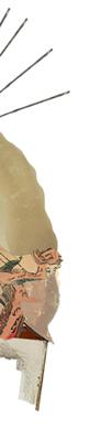
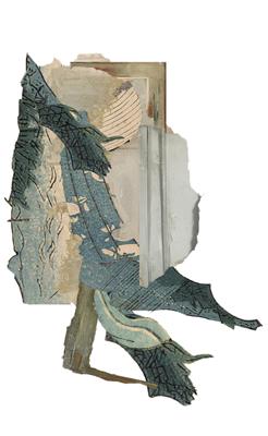
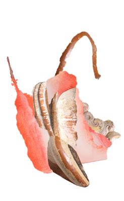
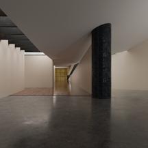
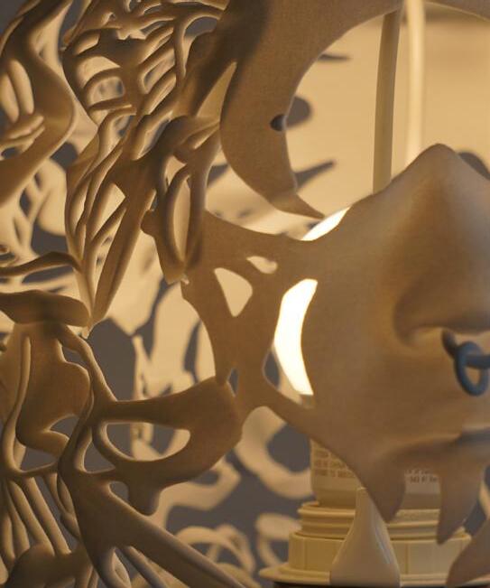
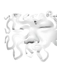
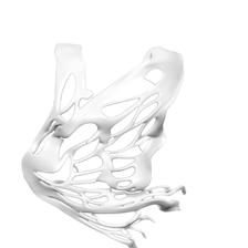
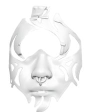
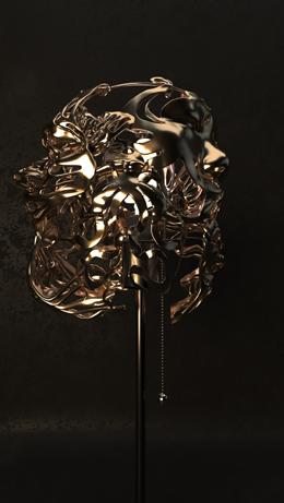
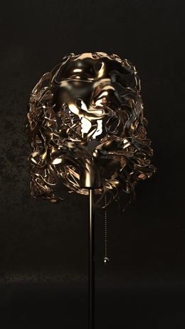
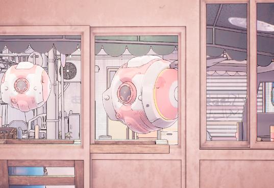
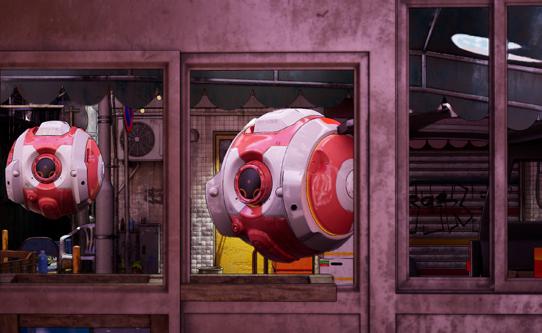
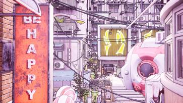
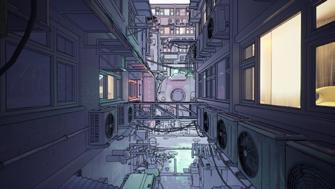
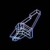
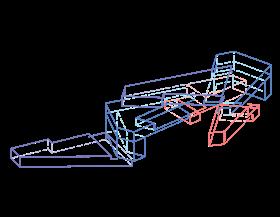
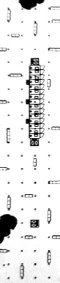
LIFE, OTHERWISE Future Evolved Creatures
World Setting _ Gaia
As proposed by James Lovelock, "Gaia_the Earth_ is a selfregulating organism that responds to environmental changes. All life forms work together to maintain balance." Nature will always prevail.
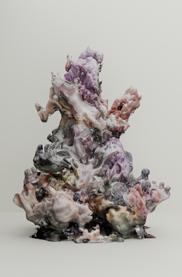
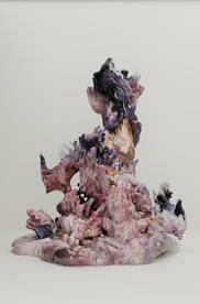
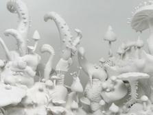
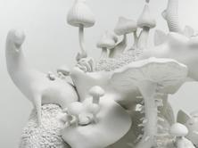
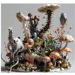
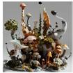
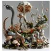
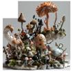
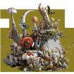
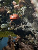
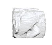
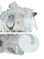
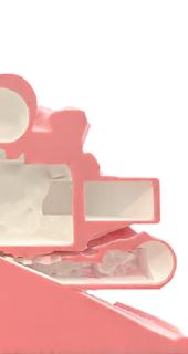
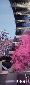
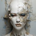
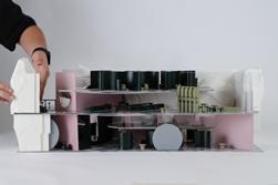
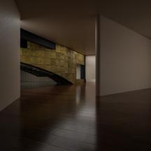
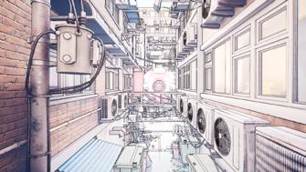
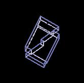
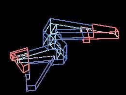
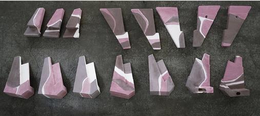
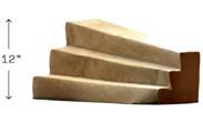
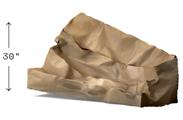
Mycelium
Mycelium is the first to stand out from all the organisms after the earthquake. They flourish in the new world with their ability to store and transport nutrients, and gradually form colonies of various sizes to provide habitats for living things. Mycelium networks become dominant life forms. Unlike trees we have today, mushrooms grow from the mother root and cling to its surroundings. They provide more living space among the roots or on the crown above.
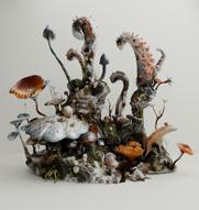
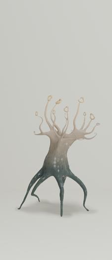
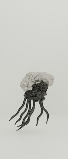
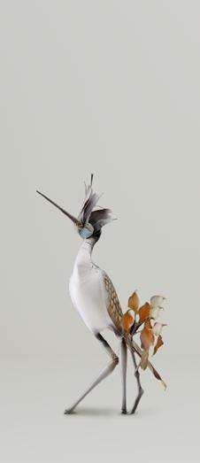
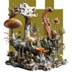
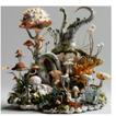
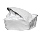
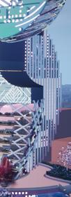
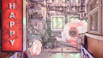
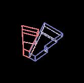
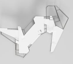
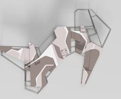
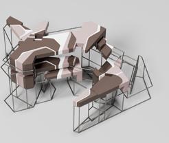
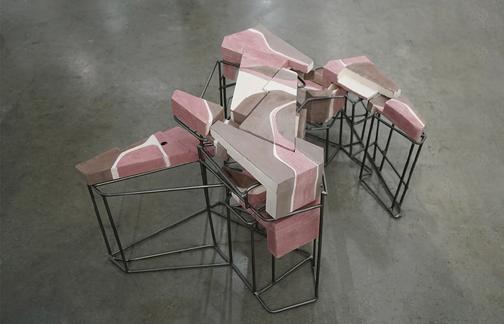
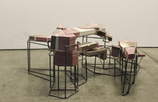
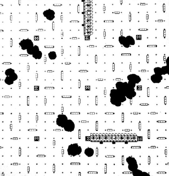
Scenarios
In such an environment, living things gradually adapt to it. Scenarios like these showcasing the persistence and adaptability of life itself in an aesthetic way.
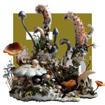
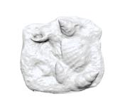
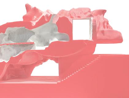
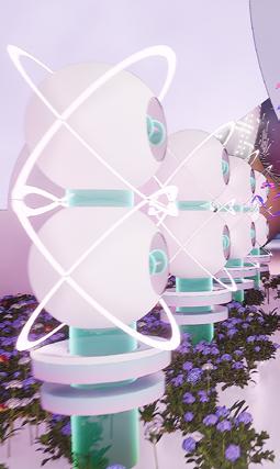
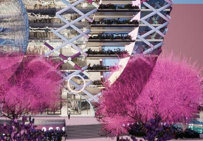
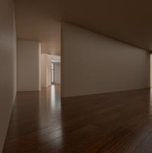
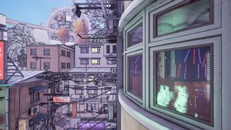
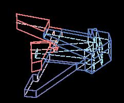
World Setting _ Gaia
living things gradually adapt to the new environment. They grow out tails to help climb up the mushroom. Wings that can hold short distances. Organs that can collect nutrients from the stem, membrane to navigate, or camouflage skin that blends with the new environment.
World Setting _ Gaia
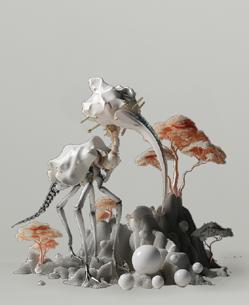
Monika Bielskyte is arguing in her protopia framework that, we are facing a vast scope of many alternative futures. It is continuously being shaped not just by our actions but also by our inactions and our apathy. This is where my proposal, "Life, otherwise," comes into play. It offers an aesthetic glimpse into one possible future - a world that unfolds 1 million years from now, without the presence of humans.
The goal is not to address a dystopian picture, but rather to evoke a profound shift in perspective. It proposes that human thriving in the long-term will depend on our ability to see ourselves not as the central, but rather as just one part of the broader environment of life on this planet. So that we can make more informed, sustainable decisions today.
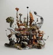
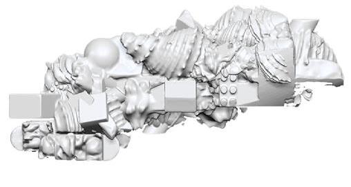
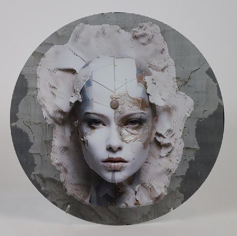
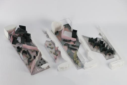
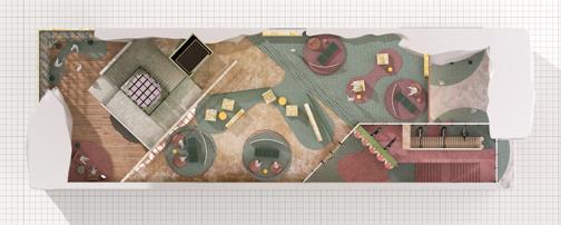
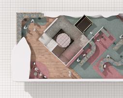
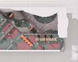
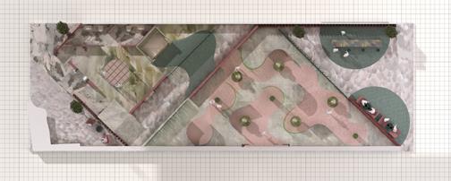
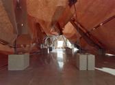
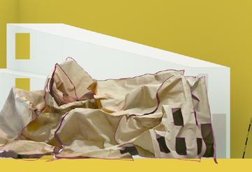
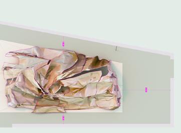
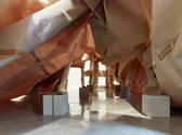
SENARIOS Model Photos SENARIOS Renders
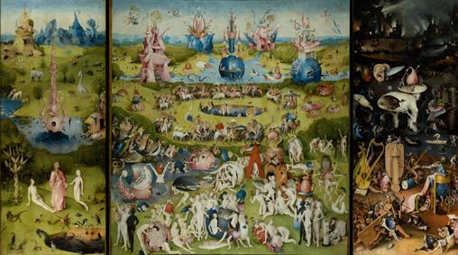
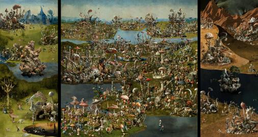
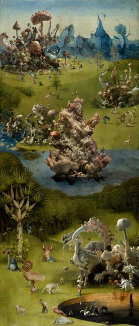
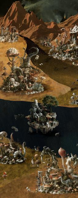
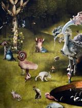
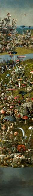
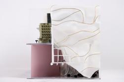
The project is imitating the “Garden of earthly delights” to unveil the living world in 1 million years. The original painting presents a narrative spanning from the Garden of Eden to a hellish future. The project mirrors this structure which helps visualize the enormity of time we're dealing with. The creatures in the painting are simultaneously alien and recognizable - much like how the evolved species in our future scenario might appear to us.
LIFE, OTHERWISE Garden of Earthly Delights
LIFE, OTHERWISE Render
Ella Cui M.Arch
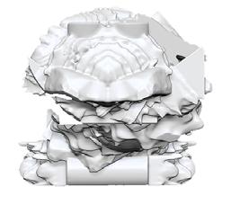
LIFE, OTHERWISE Left Panel
LIFE, OTHERWISE Right Panel
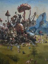
LIFE, OTHERWISE Photos of Painting Details
The project mirrors this structure which helps visualize the enormity of time we're dealing with. The creatures in the painting are simultaneously alien and recognizable - much like how the evolved species in our future scenario might appear to us.
Ella Cui M.Arch
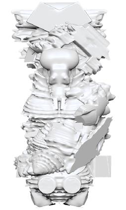
LIFE, OTHERWISE Middle Panel LIFE, OTHERWISE Photos of Painting Details
In one million years, many organisms will have vanished, yet some will have adapted, and new forms of life will emerge. Life will remain abundant. But will humans be part of that picture? The answer depends on the choices we make now. As we look back at our present, we should not design solely for ourselves. Our vision should encompass all living things. By drawing inspiration from the biological world, we can drive innovation. Instead of focusing on 'world-building,' let us shift towards 'world-growing.' The absence of humans in this future scenario isn't a foregone conclusion. Instead, it's a powerful thought experiment designed to shift our perspective and behaviors in the present.
classROOM
Couse Name: 2GAX Design Studio
Instructor: Florencia Pita
Semester: Fall 2022
Partners: Yifan Zhang
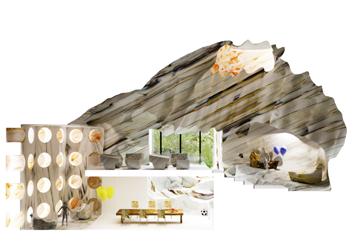
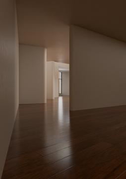
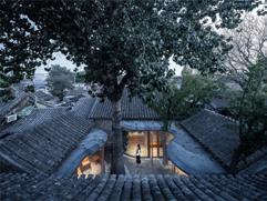
classRoom, as part of the new Diamond Ranch Elementary School, questions the contemporary status of the image in architecture. we are constantly exposed to images, both in ordinary and extraordinary situations. This heightened engagement with images puts pressure on architecture's traditional identity as a representation of reality. Consequently, there is a need to reimagine what constitutes an architecture of images, and to create new narratives that require fresh forms, aesthetics, and ways of experiencing the world.
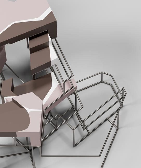
Situated in the city of Pomona, CA, this project tries to create a synchronicity within the site, one that comprises and integrates the existing Diamond Ranch and the new Elementary School. The Project began with the study of terrazzo. By focusing on the solid and viod during the casting process, classroom space is designed. These unique space conveys social, cultural, visual, physical, and ethnical diversity to kids, providing a new study atmosphere for the students.
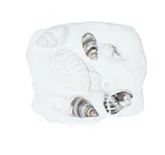
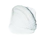
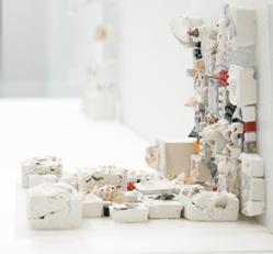
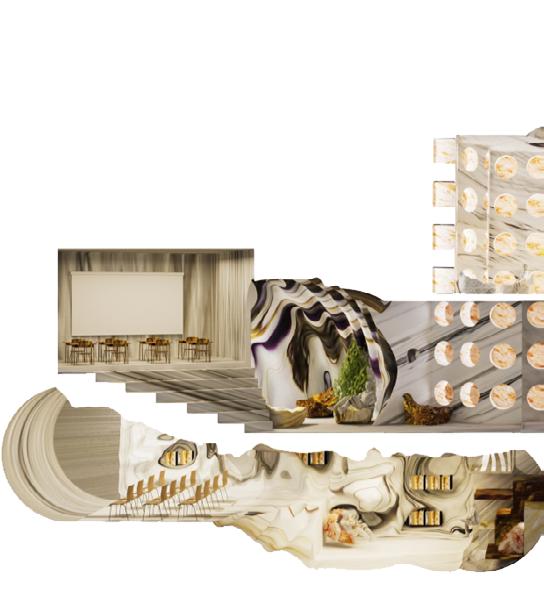
CABINET
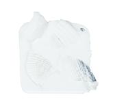
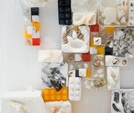
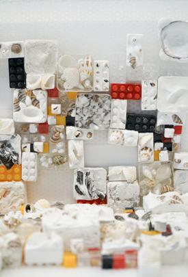
Terrazzo is like a mosaic of life, blending together different elements to create a beautiful and unique pattern that tells a story of its own. The Cabinet of Terrazzo is using plaster to cast different shells. Seashells belong to many of our’s childhood memory. Each shell was a tiny treasure, with its own unique curves and patterns, softly echoing the secrets of the sea. These collections represent our seeking of joy and pleasure.
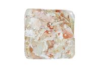
WALL
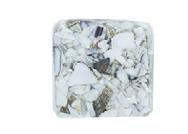
Terrazzo is not just a flooring material, it's a work of art that captures the beauty of nature, the texture of history, and the essence of craftsmanship, all in one seamless surface. By exploring the combination and organization of different terrazzo, the wall provides a scheme of color and geometry. Space created in between represents the potential of terrazzos. Fluid curves, bumpy textures, and unique rhythm allow us to focus on classroom spaces that are interesting and interactive.
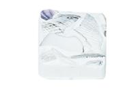
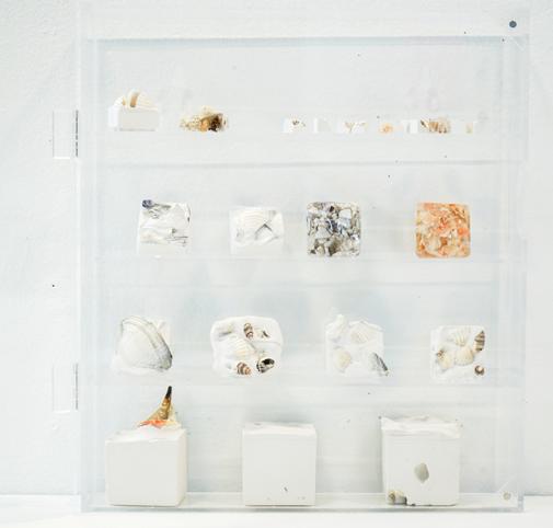
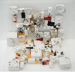
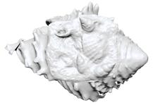
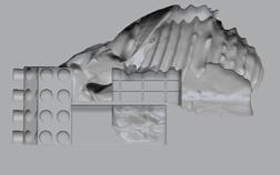
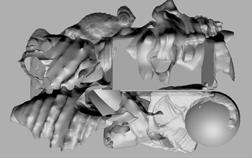
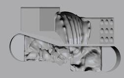
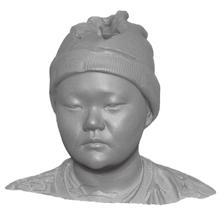
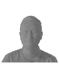
3D SCANNING OBJECTS
After the initial study that focusing terrazzos’ characteristics, several most intriguing terrazzos and shells are scanned into digital format to further explore space and material reality.
SECTION SPATIAL STUDY
Carving out by the scanned objects, several new types of space are designed. These spaces speak about shells as memories on the surrounding walls. Certain hierarchy are taken to explore different senarios of rhe rooms.
SECTION MATERIAL STUDY
Textures and colors form seashells and their recreation in terrazzos inspired our material study. Two types of materials are created to define different spatial qualities. And later on, three rooms are combined into one section of the building. These material studies not only define the boundary, but provide a fluent transition between different rooms.
Section Laboratory
Section Entertainment Room
Section Reading Room
Section Combined Rooms
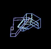
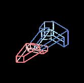
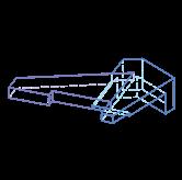
MASSING
After having initial sections of classrooms, the massing is taking the same methodology to develop. Rethinking the role of the classroom, we start to investigate alternatives to the traditional pedagogical space. The format of the building is somewhat completely detached from what we understand as a classroom. Then using the same technique, new spaces, and sections are designed in the end.
Massing Left View
Massing Front View
Render Laboratory
Render Botanic Classroom
Section ModeL South Side
Section Model North Side
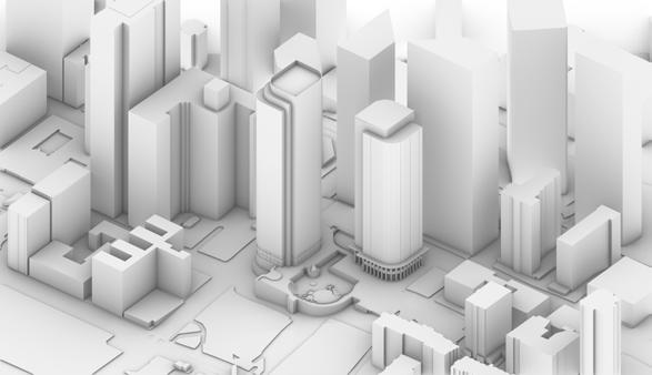
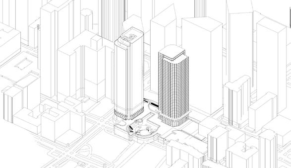
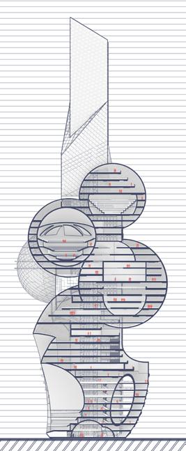
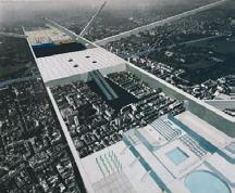
SITE
The site is the California Plaza designed by Bunker Hill Associates, obtained 11 acres of public land on which it intended to develop three office towers in the Bunker Hill section of Downtown Los Angeles in the early 1980s. Due to the high rate of office vacancy at the time, the developer built only two of them, One and Two California Tower. The third tower, would be located across the street and was intended to rise 65 stories.
CLIMATE CRISIS
Since 1880, average global temperatures have increased by about 1 degrees Celsius. Global temperature is projected to warm by about 1.5 degrees Celsius by 2050 and 2-4 degrees Celsius by 2100. This increasing temperature causes the sea level rising, lack of food production, Health risks, etc., severe issues. As the climate continue change to an inhabitable environment for living, By the 2050, the city Los Angeles, technology and the emphasis on environmental protection have become the main directions of urban development. To prevent the world from suffering a climate catastrophe, greenhouse gas emissions has to be significantly reduced.
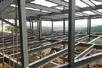
Due to the high vacant rate of thes office tower, the new design will only keep the core structure and start to develop a live-work tower that is both private and open to the public. Increase the utilization rate by inviting public activity into some part of the building.
ALGAE SYSTEM
The design adopting algae as main technology, where fifteen feet long algae pipes with 2 feet diameter are cross intersected and covering the etire building. It serves as a air filtration system that converts sunlight, CO2 and water into energy and oxygen throughout the building, greatly reducing dependence on conventional energy sources and environmental pollution. Each unit of the pipe releases about one kilogram of oxygen per day, which is equivalent to 20 large trees.
ALGAE SYSTEM Planter
ALGAE PLANTER
A lager algae produce system is designed on the site, where algea is cultivated and grew. Due to the rapid reproduction ability, excessed parts will be sent to the small bubble planter inside, serve as nutuition for food production.
Ella Cui M.Arch
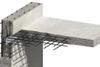
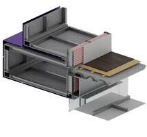
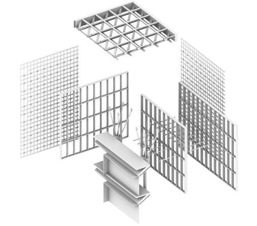
18x18x3 Steel Column
W24x117 Steel I Beam
W12x120 Steel I Beam
Pier Foundation
CALGAE PRIMARY STRUCTURE
CALGAE SECDONDARY
18x18x3 Steel Column
3” Metal Deck
Concrete
Structural System Criteria
A rigid frame structure is a structural system in which horizontal and vertical members are interconnected to create a stable and rigid framework. The design of a rigid frame structure involves considering various criteria to ensure its stability, strength, and overall performance.
Pros: 1. Strength and Stability 2. Versatility
3. Large Clear Spans
4. Efficient Use of 5. Quick Construction Cons: 1. Cost 2. Limited Flexibility
3. Energy Intensive
A braced frame structure is a type of structural system where vertical and horizontal bracing elements are used to provide lateral stability and resist horizontal forces such as those from wind or seismic loads. The design of a braced frame structure involves considering various criteria to ensure its stability, strength, and overall performance
Outrigger structures are a type of lateral load-resisting system used in tall buildings to enhance their stability and reduce structural displacements caused by wind or seismic forces. The design of an outrigger system involves specific criteria to ensure its effectiveness and structural performance.
The design and use of reinforced concrete involve various criteria to ensure the structural integrity, durability, and safety of the construction.
Pros: 1. Lateral Load Resistance
2. Open Floor Plans
3. Ease of Construction Cons: 1. Limited Clear Spans 2. Occupancy Considerations
3. Cost for Tall Buildings
Pros: 1. Increased Lateral 2. Reduction in Drift
3. Efficient Load Distribution Cons: 1. Cost
2. Occupancy Impact
3. Construction Challenges Pros: 1. Strength and Durability 2. Versatility
3. Fire Resistance
4. Cost-Effective
5. Resistance to Corrosion Cons: 1. High Initial Embodied 2. Limited Tensile
3. Carbon Emissions
Pile foundations are used to transfer loads from a structure to deeper, more stable soil or rock layers. The design and implementation of pile foundations involve various criteria to ensure their effectiveness and structural performance.
Pros: 1. Load-Bearing Capacit
2. Versatility
3. Applicability in 4. Lateral Load Resistance
5. Deep Foundations Cons: 1. Cost
2. Construction Time 3. Corrosion Concerns
Difficult Soil Conditions
Resistance Foundations
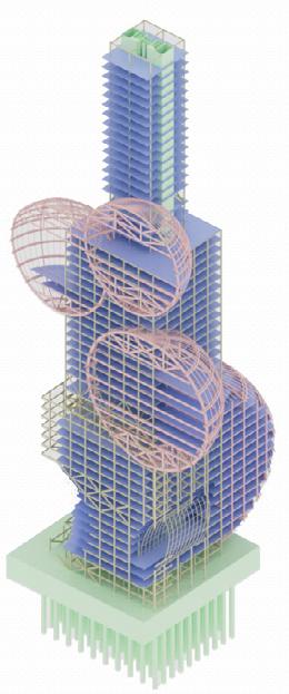
CALGAE
340 S Grand Ave, Los Angeles
APPLIED STUDIES DESIGN DEVELOPMENTY FALL 2023
TEAM:
Abbas Taher
Ella Cui
Gao Sun
Hanyang Yan
Mengxi Xu
Ryan McBride
Yaoyu Lin
Yifan Zhang
INSTRUCTORS:
Herwig Baumgartner
Zach Burns
STRUCTURAL CONSULTANT:
Matthew Melnyk
MEP CONSULTANT:
Jamey Lyzun
Sophie Pennetier
DRAWN BY: Ella Cui
DRAWING REVISION:
1. OCT. 31, 2023
2. NOV.07, 2023
3. NOV. 14, 2023
4. NOV. 21, 2023
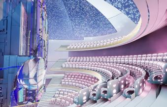
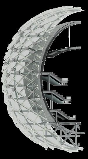
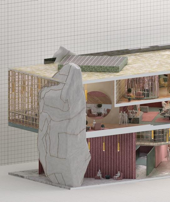
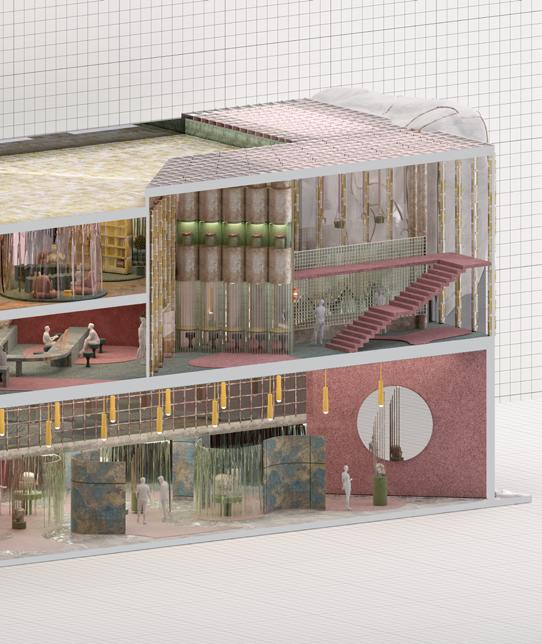
CALGAE TOWER TWO Thearter Setion
CALGAE TOWER TWO Public Resting Area
CALGAE TOWER TWO Lobby
PROGRAM
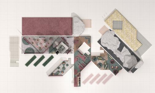
Calgae contains two towers, each tower takes use of the core of existing california plaza and develop bubble like geometry to maximize sunlight penetration during the day. To let the public more involved, the main entrance of each tower is facing the South Grand Avenue, which is more accessible for the public. Another major entrance is located at the bottom of the public vertical garden facing the south olive street, providing freedom for the public circulation. Living, working and public sapce are distributed throughout the project. In addition, theater, mall, and little garden are scattered. A central core and several small circulation connect all functions together. Each circulation give people freedom to explore the space in side the building.
CALGAE TOWER TWO South Section
Apartments are located at the top floors of each building, providing the view of entire downtown LA. Theater and interior garden are located at the middle bubble and are convenient to access from each floor.
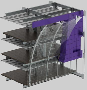
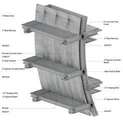
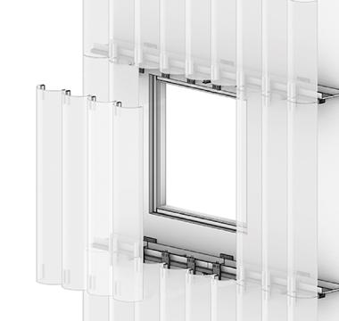
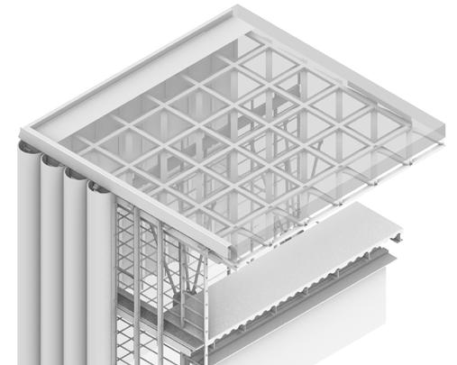
CHUNK ANALYSIS 1
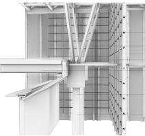
The first detail analysis zoomed into building chunk that including different facade systems. Glass, aluminum panels, algae pipes are intergrated together. The design focused on how structure functioned and the facade assembly
I-Beam W24x117
Bracket Clamp
I-Beam W12x120
Ceiling System
Bolt-based cable end
Steel tube
Double-glazed
Curved glass curtain wall system
Concrete column Aluminum Panels
Cement Board (Waterproof)
Concrete Filling 6”
Algea Pipes
Metai desk
Exposwed Framing Glass Curtain Wall
CALGAE CHUNK Chunk Section Render
CALGAE
CALGAE CHUNK Chunk Section Render
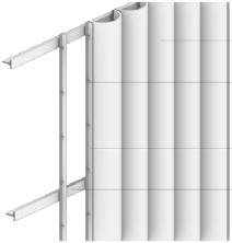
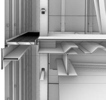
CHUNK ANALYSIS 2
The scond chunk located at building one's NW sphere, where theater is occupying the entire space. The sphere is attached to the main structure and canterlivering out from the main structure. The design focus on strcucture stability and attaching glass rainscreen and algae pipes on its prerimeter.
CHUNK Detail Section
CHUNK Detail Section
ANIMATION Main Entrance
ANIMATION South Perspective
Mdjourney AVATAR
The conceptual idea of the store is to create future shopping experience that focus on "imperfection". To begin with, Midjourney images are generated to help designing the products sell in the sotre. The final collage, cobining multipe Midjourney generations, is products' initial idea.
AVATAR
Based on the mdjourney generation, a AR avatar is modeled and function as prodect display and alter ego. Further on, the digial avatar is processed as physical artifact that printed on mirror, showcasing the interaction and transformation between physical and digital.
Ear Clip
The earlobe is often considered a nonfunctional part of the human head, as it lacks the complex structures and functions associated with other parts of the ear. The earlobe itself doesn't play a significant role in hearing or balance, However, it can have cultural and aesthetic significance, often serving as a site for piercings or adornments.
The clip is designed as a enlarged earlobe and having wrinkle texture on the surface as decoration.
Bracelet
The veins under the skin of the forearm are the main material required for bypass surgery. After the blood vessels are taken out, nearly 10' scars will be left. The design of this bracelet is dedicated to highlighting the meaning of scars and giving them aesthetic meaning, thereby allowing people to redefine scars and feel the special experience behind them.
PROGRAM
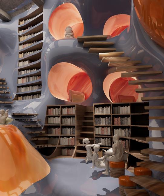
The store is designed to become a self-experiencing retail space for people to embrace themselves. Spatially, the store is divided into four areas: exhibition, scanning, material library, and designing space.
The store is open 24/7 to the customers. Upon entering the store, visitors embark on a transformative voyage of self-discovery— exhibitions in the middle of the first floor, enclosed by a translucent fabric curtain. Vertical transportation is happening on the further end of the store. Mirrors are placed to help increase the spatial depth and self-awareness of consumers. On the second floor, 3d scanners capture and project the intricate contours of one's scars onto a pristine marble model, a striking symbol of the societal pursuit of perfection. The scanned skin can also be sent to the AR design stations on the 4th floor for future use. The material library and factory are on the third floor, where products are made and packaged, and finally delivered to individuals through drones.
I'M Model Images
MATERIAL
The project tends to use soft, sensual materials, such as fabric, leather, and rubber, as furniture and spatial divisions to help increase the ambiguity within the space and imitate the intimacy of human skin. Materials like marble representing perfection and mirrors revealing the true self also interact with the space. and pleasure.
All of the functional spaces are interspersed into each other, aiming to create a boundaryless spatial experience. and pleasure.
I'M Model Images
I'M Model Images
The store serves as a tangible embodiment of the individual's journey, much like a scar tells a story of resilience and healing. This innovative experience showcases the power of self-acceptance and underscores the beauty of embracing one's unique narrative. Wearing the products from I'm isn't about concealing but celebrating. These creations serve as a powerful aesthetic tool to redefine how we perceive skin imperfections, giving them a new, empowering meaning in our lives. By embracing and adorning our so-called flaws, we are redefining the concept of imperfection, transforming it into a source of strength and beauty.
I'M Fourth Floor Plan
I'M Third Floor Plan
I'M First Floor Plan
I'M Unfold Render Image
I'M Animation Render
THIRD FORM COLLAGE Morandi Color & Gensha
THIRD FORM COLLAGE Mexican Pre Columbian Pottery & Mark Rothko Paintings Traditional Japanese Wood
GALLERY Interior Renders
Beyond transforming the 'Third Form,' various spatial strategies enhance narrative-based spaces. These include adjacency, contact, positional adjustment, interpenetration, co-emergence, and defusion.
Movement is an important element in architecture prominar. It helps to bring up curiosity. difference between drama and episodes is the theories of unfolding the space. Varieties, breaking-up continuous, and providing several visions allow people to make choices within the space and, thus, the episodes begin.
GALLERY Interior Renders
GALLERY Interior Renders
Materials in terms of transforming the artistic language are important to create intrinsic space. When two different things come together, tension will be created. The merging moments of different materials creat an intellectural movement where the audience can start to be aware of the difference and realize the movement.
GALLERY Interior Renders
GALLERY Interior Renders
GALLERY Interior Renders
SCULPTING
Chosen several interesting pictures online and make them into black and white alphas, the shades are generated semirandomly, as shown on the right. These shades are then combined as a vessel like lamp shades.
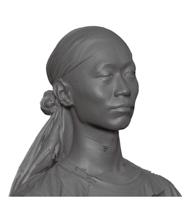
3D SCANNING
The project begins with scanning each other’s heads within a group. Details of the head need to be precisely controlled during the process so that it could provide abundant texture and geometry for future use. After scanning, some processes are taken to clean up the useless meshes and results as three heads shown on the left.
INTO THE PHYSICAL WORLD
After being printed, the lamp became a physical object that came from the digital world. It starts to have the ability to speak to its surroundings, instead of renders within a 27” screen. The Lamp is exhibited around the SCIArc Campus. By changing the location, the lamp changes its own narrative story. Based on our understanding of these stories, the lamp is brought back to the digital world, and rendered in a way that enhances the narrative of its characteristic.
1206 Model Photos
1206 Model Photos
ANIMATION Intriguing Moments
In the universe envisioned by TwinTown, a reality harsh and bleak, Where artificial intelligence reigns supreme with an ironlike physique. Humanity quivers, their future unknown, hunted down like helpless prey, In a world shrouded in perpetual darkness, where no light holds sway. A constant state of dread lingers, suffocating the very air they breathe, For the machines that rule with a heartless might, human life do bereave. The imagery evoked, vivid and raw, paints a picture of despair. A dystopian world that enthralls and captivates, leaving one in a trance-like stare.
TwinTower Bright Side
The alternate realm in TwinTown unfurls, a society in peaceful coexistence. Where humans and AI exist in perfect harmony, a union of mutual assistance. Gone are the shackles of oppressive darkness that weighed down the first scenario. No fear lingers, only the joyous freedom of a world with no need for a dystopian scenario. The animation shines a spotlight on the advantages of this symbiotic connection, where technology serves as a catalyst, aiding human life's ascension. AI's role, as a tool to enhance and improve human existence, An innovative partnership that promises a future of boundless persistence.
TwinTower Dark Side Render
TwinTower Bright Side Render
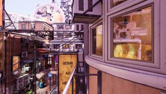
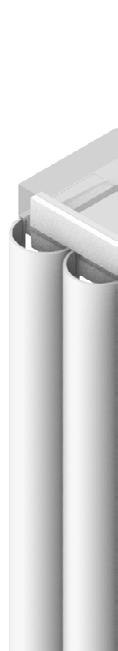
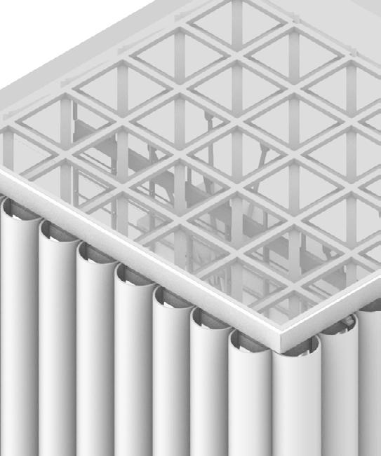
The Chunk is taken form the northeast coner of Aspen Art Museum. The museum, founded in 2014, is located in Aspen, Colorado. The building is diagonally divided into two parts. one is enclosed with an opaque concrete wall, while the other part is transparent with a glass facade and wood-woven rainscreen. The transparency and open-view planes invite the outside to engage with the building’s interior and allow the inside to see the exterior surroundings.
The building's facade incorporates glass half-tubes that are laminated with acrylic sheets to capture and diffuse light within. To reduce solar heat gain by an estimated and direct sunlight while still allowing light to filter through, these opaque glass half-tubes are coated with a layer of acrylic material. The cylindrical elements are first cut in half and then laminated onto an ordinary ventilated facade component, which is attached to the secondary metal structure.
Facade Member
Bolts
Vertical support / connector
Horizontal support / connector
Steel roof connector
Steel V Column
Horizontal member
Vertical member
Floor Finish Steel column
Concrete Wall
Floor System
Catwalk
Bolts
Metal Decking
Facade horizontal support
Steel I beam
Aluminum Member
Vertical Aluminum Member
CHUNK Pealed Axon CHUNK Details
CHAIR Geometry Analysis
CHAIR Geometry Analysis
DIGITAL ASSEMBLY
Considering the sitting comforty, the chair is designed to have one flat sitting surface that in curver backward forming a U shaped area for sitting. vertically, the chait is design to have multiple layers for storage.
CHAIR Renders
All of the clay pieces would sitting ontop of the steel frame, ehich will tansfer the load to the ground and creats a contradiction between chunky clay piece and light weight metal rod as visual aesthetics.
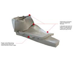
FAILURE ANALYSIS
1. Deformation: Deformation and broken parts are happened because clay pieces' drying time are different based on water ratio. When drying time is not long enough, the piece will be broken. after examination. the best time period to take out clay is around two days.
Another reason is the plaster mold moved during drying period. The best way is store the mold at somewhere flat and without sunshine. Wait two days to move it.
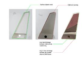
2. Shrinkage: Shrinkage happened because of water. The clay will shrink three times. First one happened when liquid clay is dried into greenware. Later after each fire, the piece will shrink more. The shrinkage is uncontrollable, but in average, the difference will not exceed 8mm. However, this number may change based different brand liquid clay.
CHAIR Process Photos
PAINTING
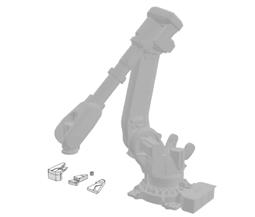
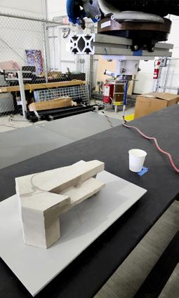
After liquid clay dried, the greenware was taken out from the mold and sanded to have a fluent surface. Then, each piece, based on the designed pattern, was inputted into grasshopper to create the outline and export to robotic arm to paint. After painting, the green ware is fired for final assembly.
CHAIR Process Photos
CHAIR Final Photos
CHAIR Final Photos
Horror Space
Couse Name: History of Contamporary Architecture
Instructor's Name: Dr. Michael James Tiberius Stock
Semester: Spring 2024
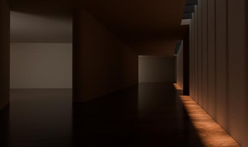
When talking about horror films, we often tend to analyze plot, characters, music, and filming techniques, while the architectural space, as an indispensable element, tends to fade out from people's view. The architecture in horror movies is not only the background of the narrative but also a important element in the development of the plot and the psychology of the characters. Imagine what if The Shining (Stanley Kubrick, 1980) took place in a typical family house, that is small in scale for three people, without the isolation of heavy snow, or what if Night of the Living Dead (George Romero, 1968) happened in an open grassland or a school building, their sense of horror would change due to the change of the architecture. Therefore, through the selection, design, and presentation of architectural space, viewers can deeply experience the atmosphere such as fear, isolation, and loss of control, as well as the psychological state of humanity when facing the unknown or supernatural phenomena.
This paper will focus on the analysis of architecture in horror movies based on the most fundamental definition of architecture in the modern architectural field, which is defined as spaces with clear boundaries and enclosures. It explores how architecture becomes an important narrative element of the horror atmosphere and how it influences the feeling and experiences of the audience. Through the analysis of scale, color, enclosure, and elements, it will reveal how architecture becomes a powerful and diversified narrative tool in horror movies, conveying and deepening the sense of horror in the films.
The Impact of Enclosed Spaces
Enclosed spaces typically provide a sense of safety as they offer humans a place to stay away from danger and survive comfortably. However, enclosed architectural
spaces can also become something that conveys fear, further intensifying people's sense of scariness. However, Stephen King used to write ten things to keep scary stories scary: "dark, squishy things, snakes, rats, closed-in space, insects, death, others, someone else.”. How does the enclosed space change from providing protection to enlarging fear?
First of all, when conflicts or dangers happen inside an enclosed space, the fear of being unable to escape and having nowhere to hide get enhanced. We humans are advanced animals, the socialized feature is one of the most important features that distinguish us from other animals. The social class or social group formed by humans is much more stable and broader than others. So, when one gets isolated from this social group, he will feel lonely and depressed. For example, in Night of Living Dead, the existence of that house keeps humans away from zombies from outside. However, within the house, people are also divided into three or four groups because of different stands and personal desires, and the vertical spaces of the room also got separate. Thus, the enclosed space not only did not provide security, but increased the opposition and isolation between each other, making the horror atmosphere enhanced.
Secondly, when the enclosed space itself cannot provide a sense of security, audiences’ fear can be enlarged by imagining and relating to real life situations. Each of us is living inside the enclosed space. If anybody tells us this space is no longer safe, the helpless, anxious,
and scariness will explode. As shown in The Ring (Hideo Nakata, 1998), Sada can crawl into everyone’s house just through a tape and a TV. The enclosed space is no longer safe, and there’s nowhere to run away from. The fear of the corruption of the most satisfying place is conveyed to the audience. Thus, the enclosed space can enhance the atmosphere of horror. Therefore, enclosed architectural spaces not only offer protection but can also become sources of fear. When enclosed spaces become stages of internal-external conflicts or lose their protective function, people's sense of fear further intensifies, making them feel helpless and terrified.
Influence of Spatial Scale Sensibility
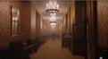
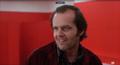
The scale of the space can affect the horror atmosphere in the movie. The sense of different scaled space can be conveyed through size, proportion, or layout, which can also directly influence audiences’ perception about themselves and surroundings. First of all, large-scaled architecture or monumental space often creates an overwhelmed feeling, making people feel small and alone, which is closely attached to the purpose of most horror films, to make audiences feel frightened and helpless. Meanwhile, this kind of large scale also indicates unpredictable danger, so when wandering around the space through camera, the sense of intense and anxious can be enhanced. However, since large-scale buildings are hard to arouse audiences’ recognition and intimacy. The scariness sometime needs to work together with the story to emphasize. For example, in The Shining, the family lives in that large hotel. The contrast between the scale
Image 1.1
Image 1.2 Image 1.3
of an entire empty hotel and the actual size a family needs makes the characters isolated from both space and time. Thus, enhanced the fear of lonely and helplessness, while also enhanced the suspicion of violence inside the hotel.
Second, the small-scale space can also help enhance horror atmosphere. Small spaces usually create a sense of confinement and suppression which could make audiences feel helpless and unable to escape. Using The Exorcist (William Friedkin, 1973) as an example, most of the scenes happened within the bedroom. The devil is laying on the bed, but until the end, people seem to have no clue to help defeat him. An overwhelming and anxious feeling can be expressed. Or in The Ring the perception of the building's scale shapes the horror atmosphere through the layout and environment of the house. The small-scale interior of the house is filled with a sense of confinement and opacity, heightening the audience's tension. At the same time, the isolated environment and ominous atmosphere of the house reinforce people's sense of fear. In this large-scale social isolation and small-scale house oppression, the audience experiences the depth of horror.
Third, when these two senses of scalespace is combined together, movies’ scariness can be enlarged even more. For instance, in Alien (Ridley Scott, 1979), spaceship as a monumental space floating in the universe, which already arouses the audience’s feeling of alone and fear of the unknown. In contras, the indoor spaces are so narrow that people usually only have two ways to escape, which helps indicate the sense of helplessness. Combining different scaled- space can help trigger people’s imagination about remaining space, which seems to be everywhere and make the hidden monster unpredictable, thus, increase the fear of unknow.Influence of Architectural Progressive Spatial Development
Influence of Architectural Progressive Spatial Development
When different scaled architectural space intertwined, the progression of space start to form. This progression is distinct from the fear introduced by a single scale space. Instead, it brings about the fear of the unknown for the viewer. As the characters move through this different scaled space, this sense of unknown fear to some extent dictates the rhythm of the film and various speculations about the unknown. The progression of space can be presented in a linear manner, shaping a sense of powerlessness towards space. For example, in Train to Busan (Sang-ho Yeon, 2016), the enclosed space formed by the train is a good example. Modern transportation vehicles often evoke strong sensory and emotional impact due to their massive size, volume, grandeur, inherent human will, and rapid mobility. In the film, the doors of each train cabin divide the entire linear space, and the characters, like in a game, needs to pass through each cabiin to reach the destination. The situation inside each cabin is unknown but repetitive. The opening of each door may trigger the appearance of zombies. Through this repetitive spatial progression design, the rhythm of the film is intensified, and emotions are anxious. This not only visually enhances the atmosphere of oppression, tension, and suffocation but also psychologically highlights the sense of powerlessness in confronting fear.
The progression of space can also take a scatterred form. Compared to linear progression, this method is often more easily combined with jump scare and can continuously shift between hope and despair, thus creating a countious atmosphere of horror. In Gonjiam: Haunted Asylum m (Jung Bum-Shik, 2018), the layout of the building is presented through this method. Rooms of various sizes intersect with each other, forming a three-dimensional space spreading outward from a certain point. In such a space, characters need to move repeatedly in the same area, while these areas can easily create scariness through
subtle changes. Compared to linear intersection, the distributed layout often blurs the viewer's sense of direction and space, creating a mazelike sensory effect. The progression of space is not just a visual experience but also a psychological challenge. By cleverly designing the sense of scale and layout of architectural space, the film can profoundly influence the audience's emotions and mental states. Linear progression and distributed progression each present different horror atmospheres, but they both enhance the tension of the film to varying degrees and guide the audience to immerse themselves in the atmosphere of horror.
The Influence of Architectural Colors
Color is one of the important elements in architectural design, and different colors can produce different effects in indoor spaces. In horror movies, the application of architectural color is often subtle. In retrospect, it seems that all spaces are dim and lacking in vitality. Of course, this is also a form of color application. However, as a sensory experience, color is one of the first features perceived in spatial design. The colors of architectural space in horror movies are usually hidden beneath a gray background, giving psychological hints and escalating the viewer's sense of fear. For example, in The Babadook (Jennifer Kent, 2014), the color of the house is a dim blue, creating a visual effect of oppression, suffocation, and gloominess that complements the repressed life of the mother and child. At the same time, the gloomy tones, along with the black and white silhouette style of the Babadook, jointly create a bizarre visual effect. Additionally, bright colors can also help create atmosphere.
Firstly, a sudden change of color will make the scene pop out the indicate something important is going to happen. For example, in Texas Chainsaw Massacre (Tobe Hooper, 1974), the house of the killers has a very gloomy color scheme. When it first shows up, even in the
daytime, the interior tends to have a cold, blue tone. Next scene, a red rectangle space pops out. It visually indicates something unusual is about to happen. So the killer showed up and killed one of the characters. The rhythm of the scene because of the color red becomes not only compact and dense but very fluent, achieving the effect of jump scare. Meanwhile, this red space not only causing visual effect but psychologically indicates the fear of blood, violence, and death.
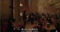
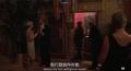
Secondly, though gradual color changes, the character’s psychological situation can be conveyed. Using The Shining as an example, the following six images are showing the gradual change of color from yellow to red, which indicates a character’s gradual mental change from rational to losing control. In these images, red act as the only clue that interconnects them. In the scenes, the red gradually gets closer to the character, its area is getting larger, brightness is getting higher, and even the saturation is getting bigger. In the movie, jack just had a big fight with his wife, when he is walking pass by the hallway, there are music comes from the dining hall. When jack look at that that direction, the redness suddenly shows up in an empty hallway, serves as an invitation for jack to join the club. (Image 2.1). Jack follows the hint and keeps walking towards the dining hall. The red in this part shows on the side as if indicating he is walking to the right path. (Image 2.2) as jack entered the hall, suddenly the redness increased,
Image 2.1
Image 2.2
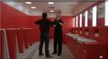
more couches are in red and the area taking almost 1/3 of the scene. (Image 2.3) Next, the waiter lead jack towards restroom, where, as the door opened, the entire entrance is red, forming a great contrast to the background dark color. It Convey the feeling that this is the room you are looking for. (Image 2.4) Eventually, Jack enters that bathroom, where the only color is red and white. (Image 2.5) and in this place jack listen to the waiter’s idea, decide to control and kill his family. This series of gradually increased redness is like the violence inside jack from angry to explode. This kind of gradual change of color compared to sudden change is more unnoticeable for the audience. However, it can convey the changes of the character to viewers, thus bringing them into the scene and creating the sense of creepiness.
Influence of Architectural Elements
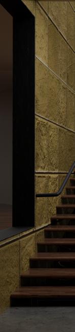
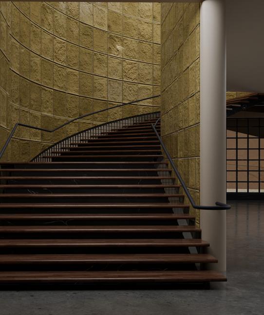
The elements in architecture are diverse, such as windows, columns, corridors, and so on. Each of them carries different functions and symbolic meanings. However, some elements frequently appear in horror movies due to their unique spatial sense, enhancing the horror atmosphere of the scene. Stair is one of them. Stairs can take various forms, straight, spiral, folded, etc. But their common characteristic is the ability to make our sight obscure and connect main areas through narrow spaces, thus exabits strong contrast of foreground, midground, and background in the same frame. By presenting double-layered spaces from bottom to top or top to bottom perspectival, along with handling the contrasts of light and shadow, the sound of footsteps on stairs, and the tension of background music, a tense
atmosphere can be effectively established, express the sense of fear and unease towards the audience. For example, in Psycho (Alfred Hitchcock, 1960), a detective slowly moves along a gloomy and terrifying staircase, creating a quiet and solemn atmosphere. Suddenly, the door upstairs opens slightly, and the killer wielding a blade rushes out. At this moment, the camera is positioned directly above the staircase, preventing the audience from clearly seeing the assailant's face, only witnessing his movement. Then, the camera switches to a front view, displaying the detective's shocked expression and the blood comes out on his face on the stair, seemingly immersing the audience into the killer’s perspective, further intensifying the tension of the scene.
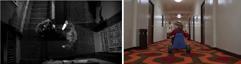
Corridors are another common element used in horror movies to create a sense of oppression and unease. Whether straight or curved or even spiraled, corridors always have spatial orientation. Unlike staircases, corridors are often enclosed spaces with doors that are repetitively opened or closed along the path, emphasizing the spatial limitations. At the same time, the length of corridors can make the audience feel the panic of objects moving forward or backward. Narrow spaces may conceal various threats, turning the corridor into a dangerous place. For example, in The Shining, the camera follows Danny riding his bicycle through the corridor. The quietness of the corridor, Danny's occasional backward glances, and the extreme stability of the camera give a sense of tension and anxiety, as if all the unease is accumulating beneath this corridor, ready to erupt at any moment. This place makes the scene more uncertain.
Apart from staircases and corridors, basements and attics are also common elements. They are often depicted as dark, enclosed spaces filled with a mysterious and wired atmosphere. Their shadowy corners,
Image 2.5
Image 2.6
lowered ceilings, and cluttered belongings add even more unsettling factors to the horror scenes. In some movies, attics and basements are portrayed as home of evil characters or demons, evoking unpredictable fear in people. Unlike corridors and staircases, these two places are often concealed, and few people would go there randomly in daily life. They act as a forbidden place in the building, increasing the tension and anxiety for the audience about what might happen there. Additionally, due to their unique structure, typically having only one entrance and exit, viewers often feel isolated from their usual living spaces, thus amplifying the sense of insecurity about the events occurring within. For example, in Night of the Living Dead, the girl awakens from the basement and kills her parents. In this isolated space, the elements of horror are magnified, and the probability of escape is reduced due to the singular exit.
Influence of Interior Elements
In addition to the various architectural elements mentioned earlier, some common interior designs also play a crucial role in creating a sense of horror. These elements serve as spatial separations, without physical boundaries. For example, curtains. In Halloween (John Carpenter, 1978), there's a scene where the character stands in a room and suddenly all the curtains are blown into the room by a strong wind. Even though the audience cannot see what's happening beneath the curtains, they can still sense that the windows are open. Unlike directly filming the open windows, revealing this scene through the curtains prompts the audience to imagine what might be happening
outside and whether someone is trying to climb into the room. Everything becomes uncertain because of the curtains. Another important element is the wall. Walls are a crucial part of interior design, capable of separating indoor spaces with physical boundaries. Even minor changes to the walls can convey a sense of creepiness. For instance, in Psycho, the killer peeks at the lady through a hole in the office wall. This covert observation makes people aware of the killer's different personalities, while also showcasing an uncertain state between jis two characters. This small hole successfully creates a space full of suspense, located at the boundary between indoors and outdoors. Such a space can help establish the feeling of to concealment and peeking.
Overall, these elements in interior design not only shape the atmosphere of a scene but also stimulate the audience's imagination and sense of fear. The subtle changes in elements like curtains and walls often subtly create a deep and unsettling atmosphere, allowing the audience to immerse themselves and experience horror and uncertainty alongside the characters.
In conclusion, this paper has analyzed the often ignored but significant role of architectural space in helping create the horror feeling within film. While much attention is typically given to plot, characters, and filming techniques, the spatial environment in which these elements unfold is equally improtant. Architecture in horror movies serves not only as a background but as a dynamic force influencing plot development and character psychology. By examining the fundamental definition of architecture as spaces with clear boundaries and enclosures, this paper has emphisized how architectural space contributes to themes such as fear, isolation, and loss of control. Through careful selection, design, and presentation, filmmakers evoke deep emotions in the audience, leading them into the psychological depths of confronting the unknown
Image 3.1
Image 3.2
and supernatural. The impact of enclosed spaces on the sense of horror has been explored, demonstrating how the perceived safety of confinement can swiftly transform into a breeding ground for fear, intensifying viewers' sense of dread and helplessness. Similarly, the influence of spatial scale sensibility has been discussed, illustrating how both large-scale and small-scale spaces can evoke feelings of isolation and terror, each in their own distinct manner. Furthermore, the progressive spatial development within horror films has been analyzed, showcasing how the interplay between different scales of architectural space creates a sense of unknown horror, controlling the rhythm of the narrative and heightening suspense. Additionally, the influence of architectural colors and elements on the sense of horror has been examined, highlighting their subtle yet profound impact on viewers' emotions and perceptions. In essence, this paper underscores the multifaceted nature of architectural space in horror movies, emphasizing its ability to evoke a wide range of emotions and intensify the overall atmosphere of herror. By recognizing the importance of architecture as a narrative tool, filmmakers can continue to innovate and captivate audiences, pushing the boundaries of the horror genre to new and terrifying levels.
Bluestone, Harry, and Emil Cadkin. “Night of the Living Dead (1968).” IMDb, https://www.imdb. com/title/tt0063350/?ref_=fn_al_tt_1. Accessed 12 April 2024.
Carlos, Wendy, and Rachel Elkind. “The Shining (1980).” IMDb, https://www.imdb.com/title/ tt0081505/?ref_=fn_al_tt_1. Accessed 12 April 2024.
“Train to Busan (2016).” IMDb, https://www.imdb. com/title/tt5700672/?ref_=fn_al_tt_1. Accessed 13 April 2024.
Reference :
Roof Kimbell Art Museum
Roof Azuma House
Roof Glass Pavilion
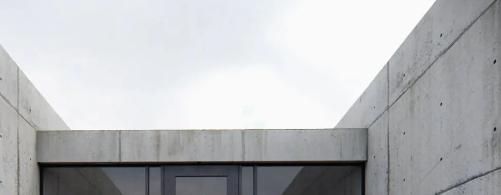
behind the scene and become a queer space. So what is the boundary of vertical space? Roofs.
What is a roof? From the origin of architecture, the roof has been a crucial element. It is the layer separating the interior and sky, and usually, because it is not reachable for visitors, roofs need more visual and spatial qualities. For instance, the dome of the Santa Maria Cathedral not only uses creative structural techniques but harmonious decorations, which make the dome one of the most attractive parts of the space. Meanwhile, in Eastern, ancient Chinese architecture has multiple roofs within single buildings, various ridges, eaves, tiles, etc. They are brought together to form a city skyline. However, as technology advances, the number of skyscrapers increases, which brings a shift in perspective. People used to see the city from a more flat perspective. Instead of giving rooftops freedom and abundance, technology makes roofs disappear from urban view. Roofs became the "background" of architecture. People start to consider architecture from a different perspective, only through its space, material, or atmosphere. We touch and experience its facade, structure, or even the furniture arranged inside, but we do not think about or experience the roof. As soon as we enter a building, our focus is limited to things within our visual horizon: floor, walls, columns, etc. The sense of boundary is lost.
The ignorance happened to highrise buildings. For example, as a single-floor architecture, the Glass Pavillion at Toledo Museum of Art is enclosed with glass to enhance visitors' visual experience with surroundings. The building is designed as several circular spaces connected to immerse the architecture in its environment. However, once visitors enter the volume, it is hard for them to drag their attention from the glass wall to what is happening above. Indeed the glass
facade as the foreground element successfully orients toward the surroundings. It confined visitors' capacity to see things outside of their preview. On the other hand, Peter Zumthor's Sound Box, designed for the 2000 World Expo, makes vertical boundaries sensible. The design also focuses on connection with the surroundings and follows a grid system to create interior space. However, the atmosphere would allow visitors to wander around and be oriented toward space horizontally and vertically. Wind, light, and repeated patterns make people aware of what is happening above. Thus, the sense of space is complete.
As for high-rise buildings, the roof is isolated. It neither has interaction with the sky nor with the interior below. Nevertheless, interacting with roofs does not mean simply applying a function to them, such as having a roof patio, as many buildings are adopted. Instead, allowing roofs to have their qualities is vital, as other crucial building elements do. The Roofscape Studio is working on transforming
Figure 1 Swiss Sound Pavilion
untapped roofs into a new city system. "We consider that buildings need to adapt to the way societies evolve. We design solutions to update spaces and allow more collective and cooperative uses. 3" The city on the roof is trying to reconstruct and organize people's way of life and re-establish the relationship between people and the sky, people and people, and people and the earth. Thus, designers should bring back the roof from the background to make it a more active place for the city and a more positive space between people and nature.
One's existence is understood through his "stay" in space, and the understanding of boundaries defines space. In other words, the relationship between people and space is determined by boundaries. Heidegger wrote, "Dwelling is the manner in which mortals are on the earth.4" On the earth means above the ground and below the sky. Only when we
4Martin Heidegger, Building Dwelling Thinking, (Harper Colophon Books, 1971), 2,3
know and pay attention to the queer object, the vertical boundary - the roof, our existence becomes complete. As mentioned in his book Atmosphere, "it was essential for us to induce a sense of freedom of movement.5" It is crucial for designers to provide the possibility for people to move or sense the space without confinement and for the roof to connect with the sky above and the interior below spatially.
Bibliography
Ahmed, Sara. 2006. Queer Phenomenology: Orientations, Objects, Others. N.p.: Duke University Press Books.
Cousin, Tim. Mar 14, 2022. “roofscapes envision green roof network to combat heat island effect in European cities.” https://www.designboom. com/architecture/roofscapes-studio-head-inthe-clouds-03-14-2022/.
Heidegger, Martin. 1971. Building Dwelling Thinking. N.p.: Harper Colophon Books.
In the global trend of urbanization, cities and buildings face unprecedented threats during development: scale, speed, and resource scarcity. However, people will continue moving to cities because of housing problems. They will live in shantytowns and slums. As early as the nineteenth century, the US government began to intervene in improving slums. Photojournalist Jacob Riis's 1890 album How the Other Half Lives documented the wretchedness of life in New York's slums and drew national attention to housing conditions. For many cities, however, urban renewal has focused too much on eliminating decay without properly envisioning the task of building new housing. For example, in the decade after the housing bill was passed, 425,000 homes were demolished, but only 125,000 were built; many poor neighborhoods
were uprooted to make way for transit construction, and modernist buildings, a form of It often appears in the style of "towers in the park" pioneered by Corbusier: the towers are placed far away from the sidewalk, and the surroundings of the buildings are used as parking lots, lawns, and landscape belts. Towers are usually rectangular or cruciform in plan, with no ornamentation other than brick veneering or simple facades.
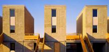
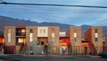
The same situation happened in Chile as well. In 2003, architect Alejandro Aravena was asked to design a residential space for 100 families. Most of these families left their homes and came to cities to seek for living. Land far away from the urban area is cheap, but the city means more opportunities for them. Thus they are reluctant to move to sufficiently spacious apartments in the suburbs. Instead of dealing with this social problem from the architects' point of view or covering the problem in a utopian way, Aravena combined the residences' idea with the design concept, creating a strategy, "Buy half the house and let them build the rest.1" In Chile, the common area of a middle-class family house is 80 square meters. Aravena decided to use limited funds to build a house of 40 square meters, which will be half of the house, and the other half will be organized by the residents based on their own needs.
In the project, Quinta Monroy, half of the home designed by Alejandro contains all the needs for family living, including Bathroom plumbing, firewalls, sound insulation systems, privacy, etc. This allows the resident to design their half without restriction. Thus, Architects and residents collaborate to create a unique community. Just as Alejandro said, "We cannot solve the problem of providing housing for a million people a week if we do not harness the power of the people themselves. So, with the right design, slums and shanty towns may not 3Alejandro Aravena, 2014
Figure 1 44 Low-Resolution Houses Exhibition
Figure 2 Voluntary Prisoners of Architecture
be a problem, but the only possible solution".
Indeed, every architect expresses their understanding of architecture through design, whether the design is to reveal problems or to cover them. However, it is essential to be aware that in most cases, when a large number of people recognize a building, the audience facing the building has different backgrounds, and there are differences in individual cognitive appreciation. In this context, weaponized architecture is difficult to identify. However, when architecture is used to solve problems, the answer is only dichotomous, yes or no. Architecture can maximize the alleviation of social or political conflicts instead of just raising problems and waiting for others to solve them. Therefore, help create a better world.
Bibliography
Aravena, Alejandro. 2014. “My architectural philosophy? Bring the community into the process.” https://www.ted.com/talks/alejandro aravena my architecturalphilosophy bring the community into the process?language=en.
Aureli, Pier V. 2011. The Possibility of an Absolute Architecture. N.p.: MIT Press.
Boano, Camillo, and Francisco V. Perucich. n.d. “Halfhappy architecture.”
Lambert, Leopold. n.d. Weaponised Architecture
Lucarelli, Fosco. 2011. “Exodus, or the voluntary prisoners of architecture.” https://socks-studio. com/2011/03/19/exodus-or-the-voluntary-prisonersof-architecture/.
Shaw, Matt. 2018. “What is Low-resolution architecture.” https://www.archpaper.com/2018/12/ low-resolution-architecture/.
Figure 3 Quinta Monroy Before Self Install
Figure 4 Quinta Monroy After Self Install
Jump Out of The Boundary
Couse Name: History of Contamporary Architecture
Instructor's Name: Marcelyn Gow
Semester: Spring 2023
Digital modeling technology has no doubt revolutionized architecture, making it easier than ever before for architects to explore and present their work. The inconvenience of production and time consuming qualities of the physical model gradually fade. Indeed, the digital model gives more opportunities to explore design possibilities. It is vital to notice that the digital model cannot replace the physical one because the digital is always two-dimensional. Designers cannot experience the actual outcomes. However, when combining two methods in the design process, the potential of architecture can be achieved when these two methods challenge each other significantly. As Eskenazi mentioned in his article Tired ... and Behaving Poorly, "a new possibility arises when models are freed from their digital predecessors and from a faithful adherence to a building."1
The on-site experience is the most direct and effective way to understand a building. People can always feel everything about the architecture as long as they are in the building. However, in reality, we need to use media to understand architecture because of the barrier of time and space. Models are one of the powerful media that help understand architecture. Architecture can be scaled down into achievable sizes through handcraft. Every material used in construction can be used in physical models, which gives designers opportunities to experience space through its materiality. But in reality, the texture, geometry, and extreme condition of the material are hard to test out, which becomes a constraint of designing. In digital models, however, the designer can ignore the actual condition of the material. When combining these two, new possibilities emerge.
The project "Slump Model" by David Eskenazi presents a 1: 2 scaled paper model based on a villa in Yucatan. Paper used in models usually represents concrete, steel, structure, or facade 1 Eskenazi, “Tired ... and Behaving Poorly”
Figure 1-9 Slump Model, d.esk.
elements, but when building larger-scale models using the same technique, paper will collapse and deform. However, models in 3D ignore the physical properties of material so that they can be successfully built in a digital form, which starts consideration of paper architecture as "a new architectural resistance, and a revisitation of paper architecture after the digital turn."2 The slump model uses paper to create a unique spatial quality representing paper's materiality. During traditional design, paper is usually a rigid form that conveys drawings, models, design concepts, etc., but hardly has opportunities actually to build the architecture. The combination of the digital model and the paper materiality gives paper new possibilities. It can be both conceptual and material for architecture.
Scale
Based on Mark Lee and Sharon Johnston's idea, a model has three dimensions, conceptual, exhibition, and full-scall. The first one represents abstraction and exploration. The second conveys narrative in a particular context, and a third scale is a form of approximation, refining but not the final. The physical model conveys to people its actual spatial qualities.
We experience the space through our senses, just as Jose Luis Sert said, "You would only understand the relationship between architecture and an object when standing in front of the building at eye level. Moreover, you will see a building from zero to 15 meters. Then you can understand the tactility of the building, the activity of the people, the cars, and sometimes the smell."3 In the digital model, however, our senses are constrained. We experience the space only through our eyes. When these two methods challenge each other, designers start to use other tools that can utilize
2 “Slump Model — d.esk” 2019
3 Lee and Johnston, “Models and Models Of Models.”
the quality of both. Nowadays, VR, as a tool for interactive design, helps people consider digital space with more three-dimensional or even four-dimensional features. Because of the challenge of physical models, digital models can break the boundary and start to explore interaction with people.
Visualization/ Technology
It is a common opinion that the computer model cannot replace the physical model because the output of the computer model is 2D graphics, which is entirely different from the 3D feeling of the physical model. However, the imagination of architecture is created during the transition between the two-dimensional space on the screen and the built or projected threedimensional space.
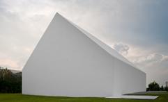
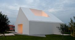
Stan Allen mentioned in his article "Thinking in Model" that "today's design primarily through the slow buildup of an abstract three-dimensional construct situated in a boundless yet measurable space: a computer model that is constantly rotated and viewed from different angles, but also in more or less proximate viewpoints – now close in, now far away, at times from inside."4 The digital model allows designers to test out infinite possible iterations of a design concept. Because of this unlimited technique, any building can have its new interpretation and life. Like many traditional houses in Europe or America, the House in Leiria designed by Aires Mateus is a simple white house with a traditional pitched roof, which is usually the form of house that people will draw based on their memory. However, the house is extremely simple, with almost no edges. It looks like a 3D model in real life. Combining traditional physical models and digital technology allows designers to design a traditional model with new qualities.
4 Allen, “Thinking in Models”.
In conclusion, integrating physical and digital modeling technologies can bring new architectural possibilities. Physical models allow designers to experience the spatial qualities of architecture through the materiality of construction, while digital models offer greater flexibility and unlimited possibilities for iteration and exploration. By combining these two methods, the limitations of one can be overcome by the advantages of the other, leading to a more innovative and dynamic design process. Furthermore, virtual reality technology enhances the experience of digital space and bridges the gap between the two methods. By combining the benefits of both physical and digital models, architects can create designs that are not limited by the constraints of traditional design methods, resulting in more innovative and creative architecture. With the integration of these tools, architects can create new architectural possibilities that are not
bound by the limitations of traditional design methods.
Bibliography
Allen, Stan. 2020. “Thinking in Models.” Anyone Corporation No. 50, no. Model Behavior (Fall): 16-27. https://www.jstor.org/stable/10.2307/27092858.
“House In Leiria / Aires Mateus.” 2011. ArchDaily. https://www.archdaily.com/118906/house-in-leiriaaires-mateus.
Lee, Mark, and Sharon Johnston. 2020. “Models and Models Of Models.” Anyone Corporation No. 50, no. Model Behavior (Fall): 55-61. https://www.jstor.org/ stable/10.2307/27092862.
“Slump Model — d.esk.” 2019. d.esk. https://d-esk. net/Slump-Model.
Figure 10 House In Leiria, Aires Mateus
Figure 11 House In Leiria, Aires Mateus
Upcycling
Couse Name: History of Contamporary Architecture
Instructor's Name: John Cooper
Semester: Spring 2023
Upcycling, similar to reuse, repurposing/adaptive reuse, recycling, and reprocessing, is a major aspect of achieving sustainability when considering architectural design. It can be defined as “defined as the reuse and recycling of used building components of building materials in a way that yields something of a clearly higher quality and/ or use category. A city completely based on reusing and upcycling existing artificial elements would be highly sustainable and environmentally conscious. Such a city would prioritize using existing resources rather than relying on new construction materials and methods, which would significantly reduce its carbon footprint and overall environmental impact. However, based on Daniel Stockammer’s article, Upcycling and Repurposing as a Design Principle in Architecture, “upcycling architecture is full of undeterminacy,”1 where upcycling materials and methods often result in unpredictable and unexpected outcomes. In other words, architects may not be able to predict exactly how a material will behave or look once it is repurposed and incorporated into a building. But, overall, the improvement in function and aesthetics always remain clear.
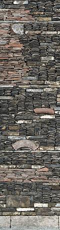
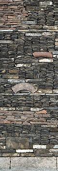
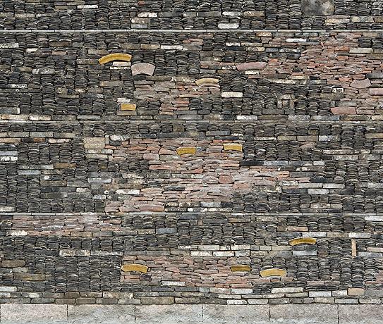
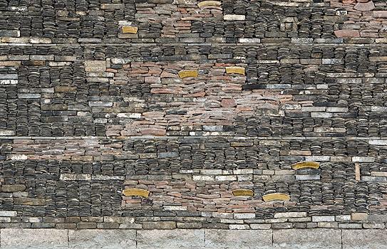
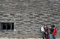
To deal with this undeterminacy during upcycling, architects should think about, firstly, life cycle assessment, where architects should conduct a life cycle assessment of the materials and components used in their buildings to understand their environmental impact over time. In the China Academy of Art, designed by Wang Shu, the roof tiles are upcycling from their original usage. Roof tails represent the history and culture of the local village, allowing the architecture to communicate to the surroundings culturally and historically. The lifecycle of the tiles in this way is elongated and improved into something with higher implications. Another project would be the Lavezzorio Community Center, designed by
1 Stockhammer 2020
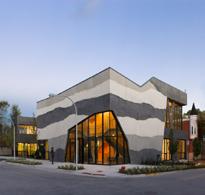
Studio Gang. In this project, the southwest corner of the building was constructed using various concrete mixtures such as fly ash, Portland cement, and slag aggregate. The concrete is layered in bands that change color to reveal its liquid nature. This leads to designs that directly expose their importance. This exterior feature resembles geological stratification, with varying shades of gray in the irregular horizontal lines representing varying concrete densities. Aggregate from the concrete is another life form of the original material. In both projects, upcycling becomes a designer’s aesthetic. However, the upcycling process mentioned above only changes its aesthetic to a higher value. Its function is still part of the regular building elements.
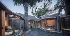
Secondly, Collaborative design, where different building aspects can be combined together and enhance its outcomes or users’ needs. So that the building or structure is designed to meet the needs of users over time and can help identify opportunities for the reuse and repurposing of materials and components. The Seven Houses Courtyard, designed by Architecture Camp Design Studio, is a renewal project based on Beijing Courtyard. The original building is relatively old. Except for the wooden beams and columns that are still basically maintained and some arched openings with the characteristics of the Republic of China, most of the other roofs, walls, doors, and windows have been damaged or disappeared. The new design adopts Corridor as an anchor point to start to collaborate old elements with new concepts. New living function equipment, infrastructure, and veranda space are superimposed on the old to form a new whole to meet the future use requirements of the yard as a public reception and living space. Upcycling, thus, at this point, has a clear connection to both function and aesthetical aspects of design.
Figure 1 New Academy of Art in Hangzhou, Wang Shu
Figure 2 SOS Children's Villages Lavezzorio Community Center, Studio Gang
Figure 3 Glass lantern greenhouse, Rachael Taylor
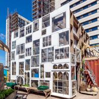
Thirdly, modularity and flexibility, where architects should design buildings and structures with modular components that can be easily disassembled and reconfigured to adapt to changing needs over time. This can include designing buildings with standardized components that can be easily replaced or upgraded or designing structures with flexible layouts that can accommodate a variety of uses and users. The project Glass lantern greenhouse, designed by Rachael Taylor, is an upcycling project based on glass modules. The external facade is made from recycled window sashes donated by individuals across London, and the internal structure is made from recycled scaffolding boards. This combination of both modular materials allows architecture to be upcycled into a new modular design, where every part of the building is a unique connection
to the original building.
To develop the concept of uncertainty in upcycled architecture as an architectural idea, practice form, or aesthetic agenda, architects can explore and embrace the unpredictable and unexpected outcomes of upcycled materials and methods. This can involve experimenting with different materials and processes to see how they can be repurposed and incorporated into buildings in unique and creative ways. Architects can also focus on designing buildings that are adaptable and flexible, allowing for changes and modifications over time as new materials and technologies become available. By embracing the uncertainty of upcycling, architects can create innovative and sustainable designs that are both beautiful and environmentally responsible.
“Home.” n.d. YouTube. Accessed April 21, 2023. https://chat.openai.com/c/8c3f28e7-d993-4b779c9b-44ccf11a6fba.
“New Academy of Art in Hangzhou / Wang Shu, Amateur Architecture Studio.” 2009. ArchDaily. https://www.archdaily.com/20523/new-academyof-art-in-hangzhou-wang-shu-amateur-architecturestudio.
“SOS Children's Villages Lavezzorio Community Center.” n.d. Studio Gang. Accessed April 21, 2023. https://studiogang.com/project/sos-children-svillages-lavezzorio-community-center.
Stockhammer, Daniel, ed. 2020. Upcycling: Reuse and Repurposing as a Design Principle in Architecture. N.p.: Triest.