O R T F O L I O

LIZ FEARS
INTERIOR DESIGN
SPRING 2025
O R T F O L I O
SPRING 2025
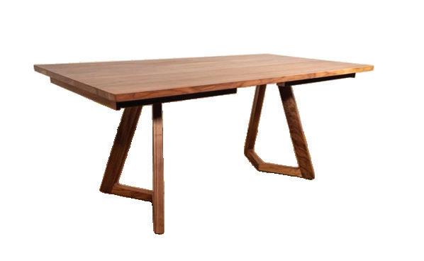
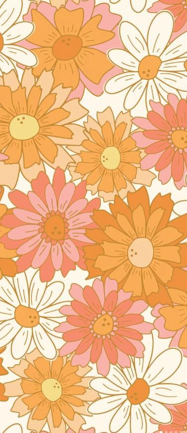
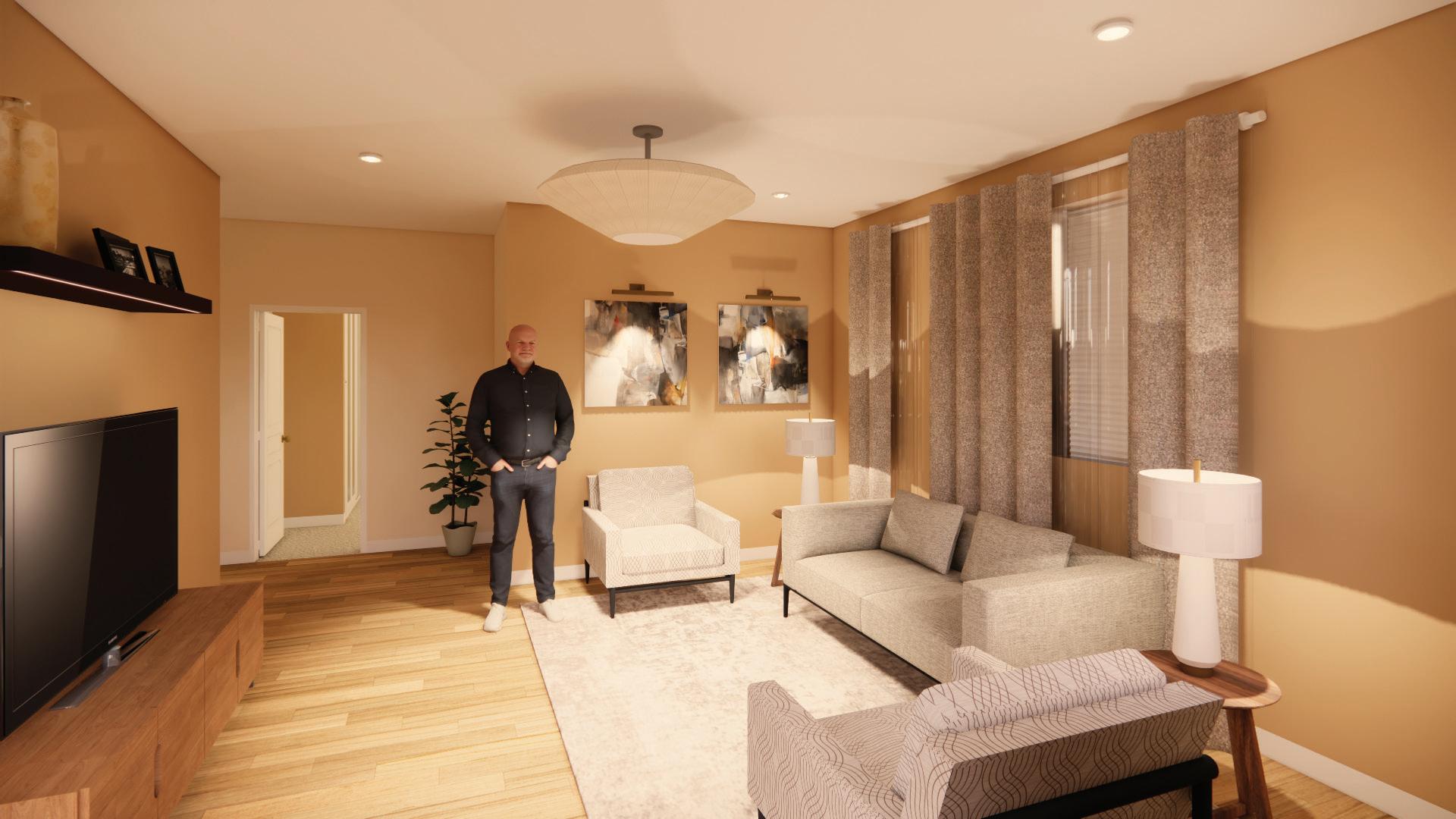
This remodel reimagines this expansive space, transforming it into a warm and inviting layout inspired by the golden age of vinyl records and the iconic styles of the 1960s and 70s. By creating intimate vignettes throughout the space, we will evoke a sense of nostalgia and cozy comfort. The space will come to life with moments that will bring a different energy to each area. These areas will be defined by room division, mood lighting, and a strategic color pallet to create a cohesive and comfortable environment from the moment you walk in the door.
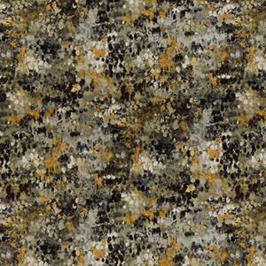
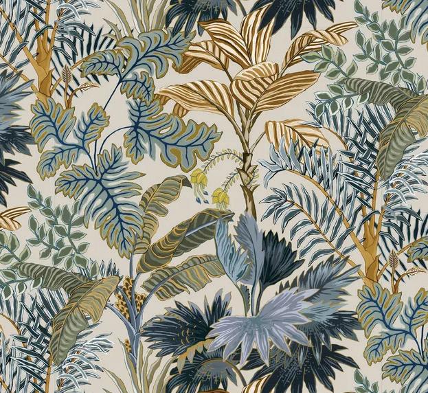
The color journey through this space tells the story of our retro vignettes concept, starting bright and gradually becoming more intimate. We begin with energetic combinations in the vestibule and foyer. As we move deeper into the home, the Social Table area transitions to warm tones and blush pinks, while The Hangout embraces rich earth tones with its tiki-inspired wall covering. The journey culminates in our most intimate spaces - The Screening Room and Fireside - where deep greens and charcoal create a cocooning effect.
Design Objective: Space Planning and FFE Selection

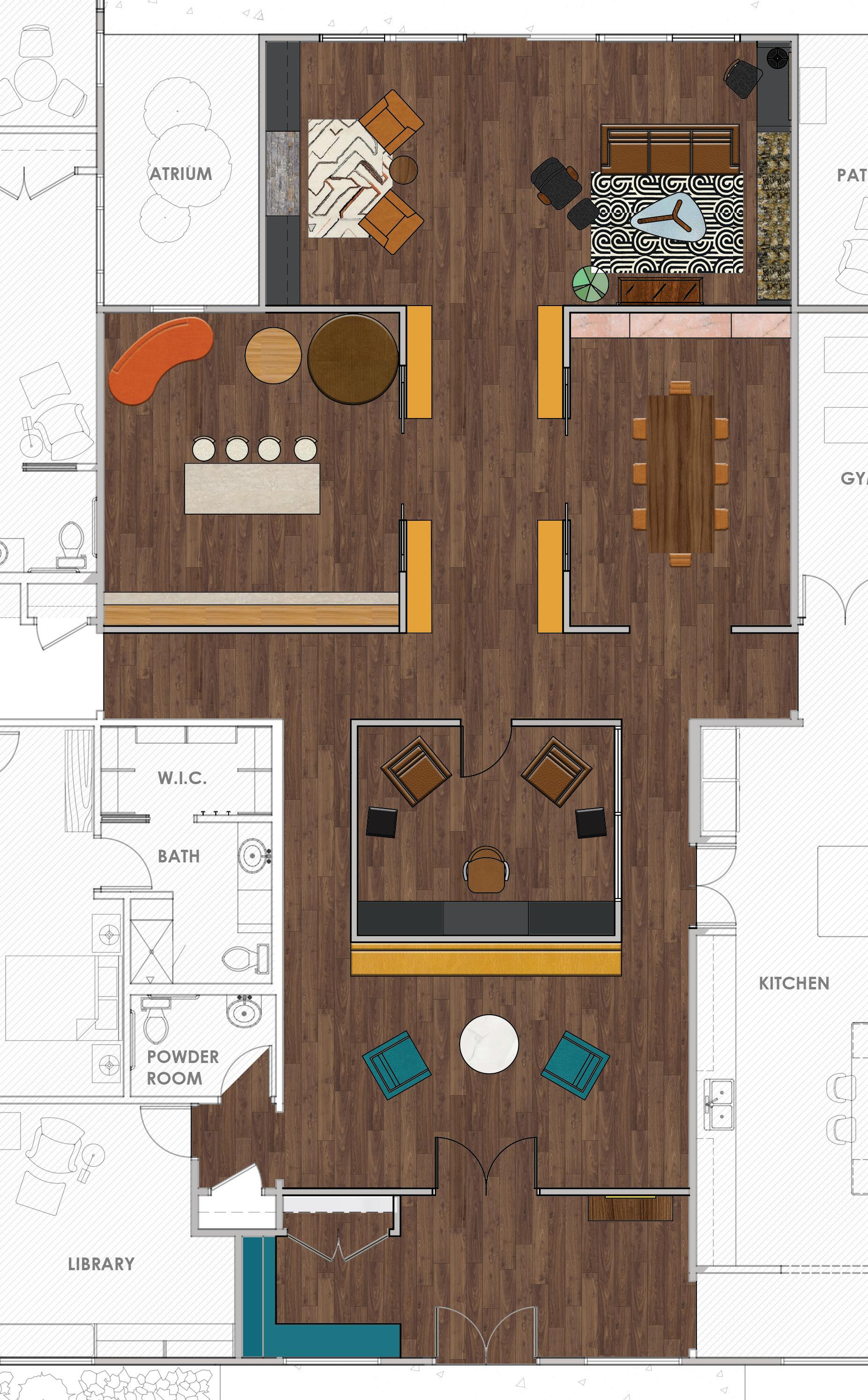


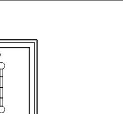
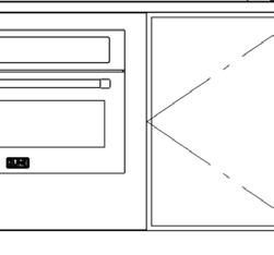
The entry creates a welcoming transition into the home. The Vestibule is more than just an entry point – it’s a functional space featuring custombuilt cubbies for storage and organization.

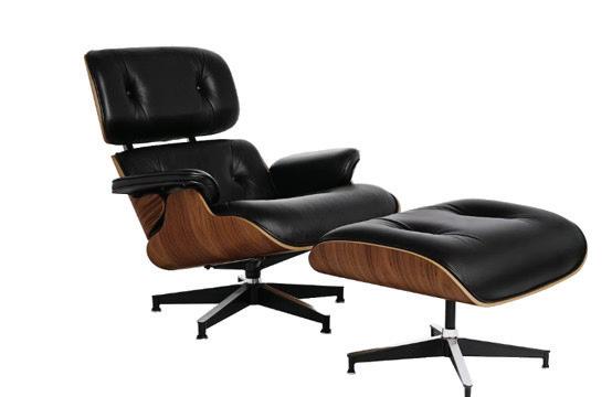
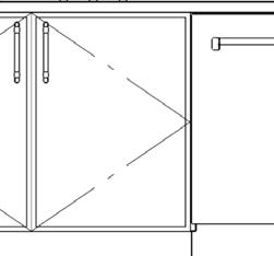
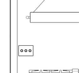
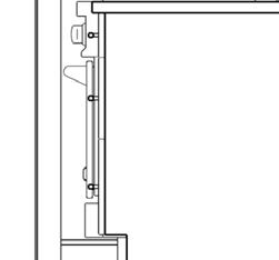
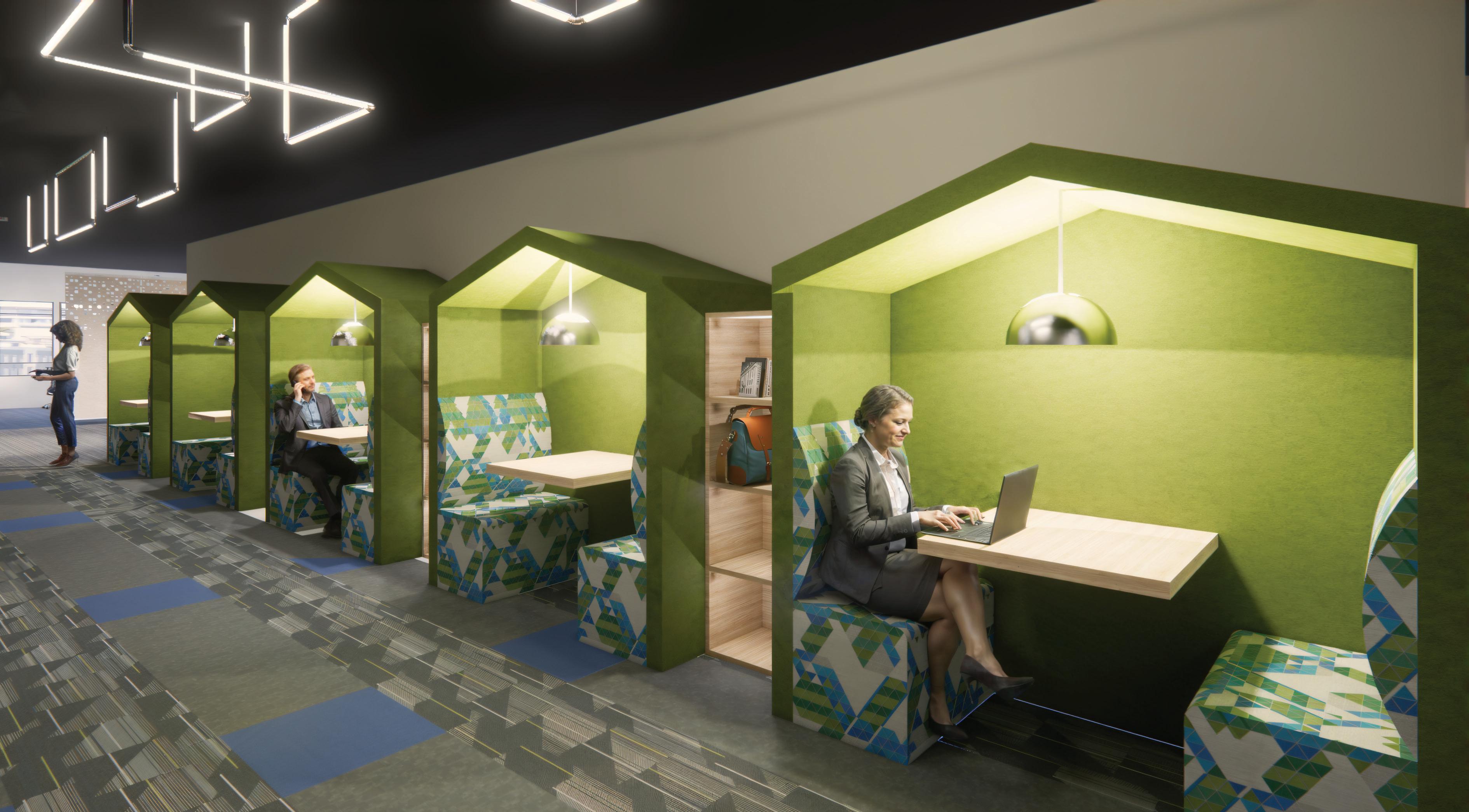
The Listening Lounge is our most specialized vignette, designed to celebrate the ritual of vinyl record appreciation. A key architectural feature of this space is the interior glazing along one wall, which creates visual connectivity with the adjacent areas while maintaining acoustic separation. This transparency allows the space to feel private yet connected.
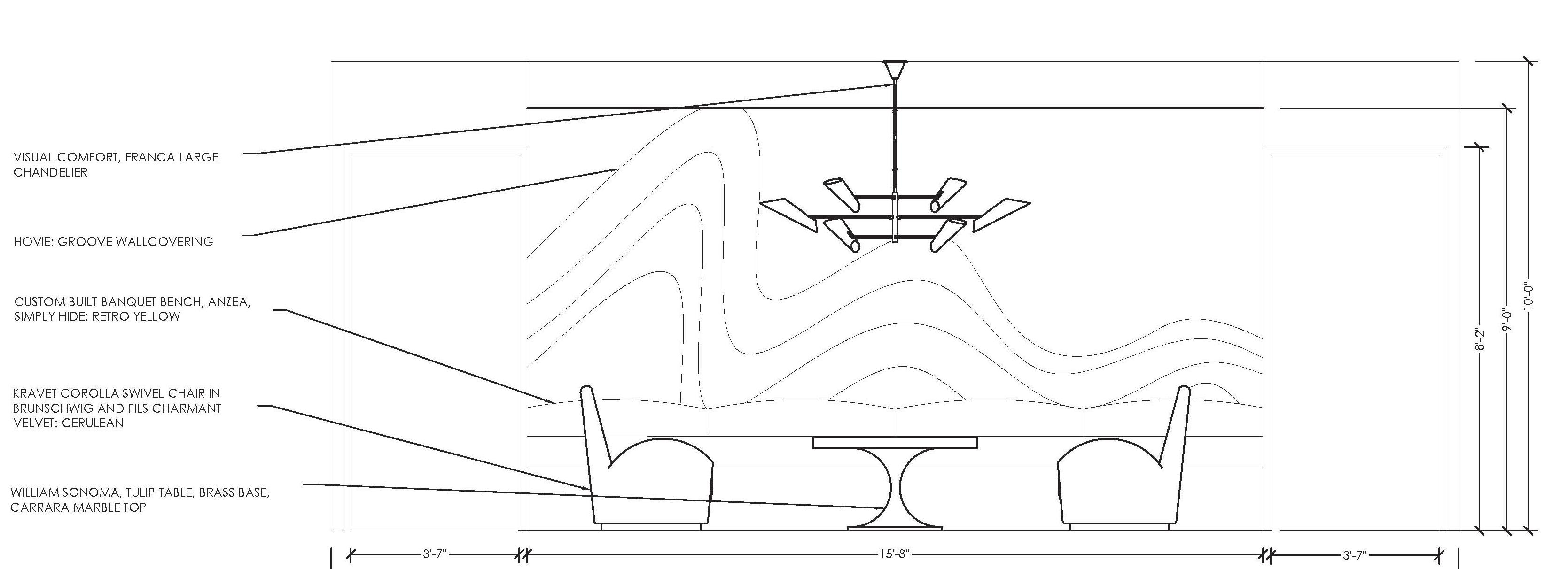
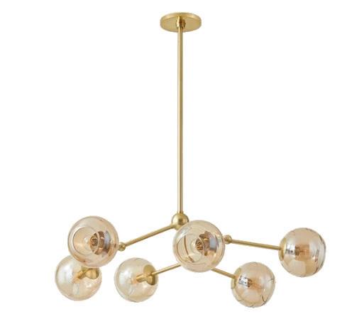

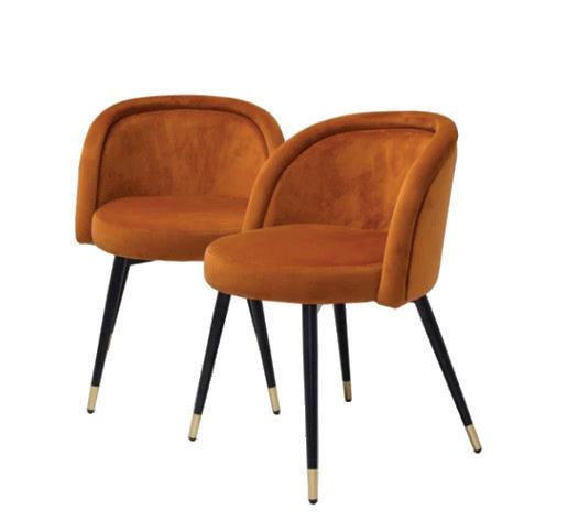
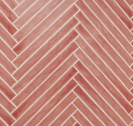

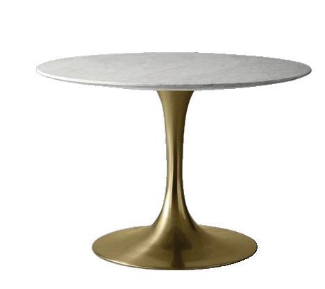
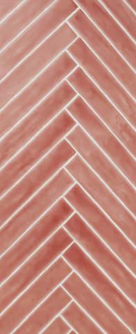
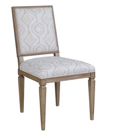
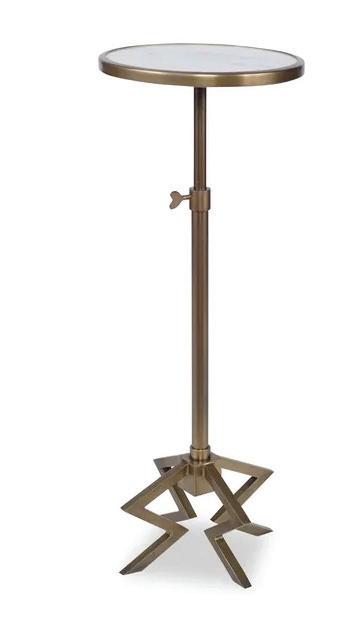
The Social Table area embodies a fresh take on the mid-century dining experience. We’ve created a space that encourages both elegant entertaining and casual gatherings. Our color palette here pays direct homage to the 1960s and early 1970s when pink was far from just a feminine accent color—it was a bold design choice found in everything from bathroom tiles to kitchen appliances.


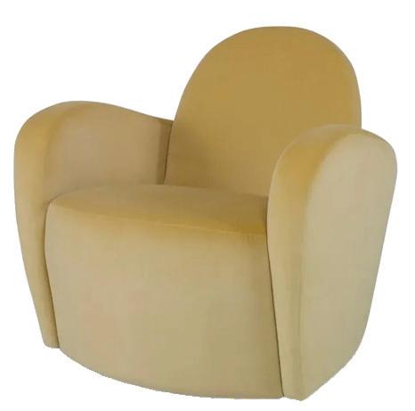
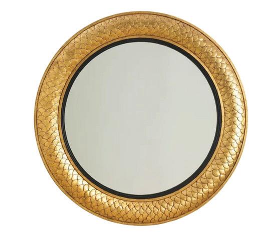
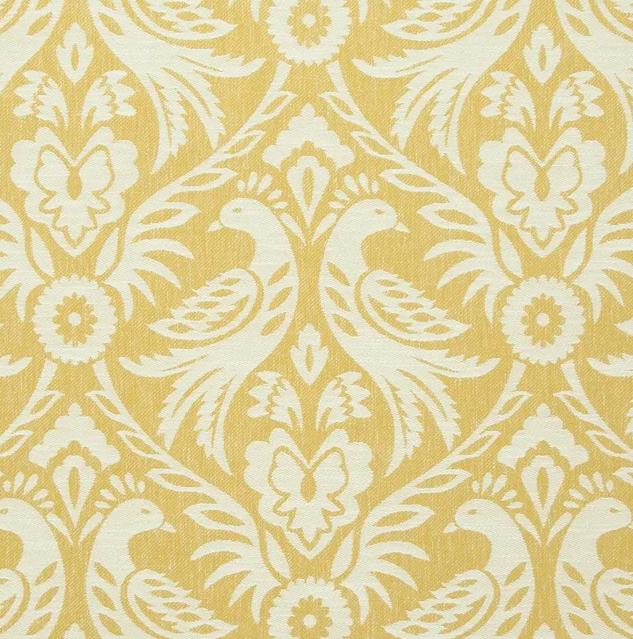
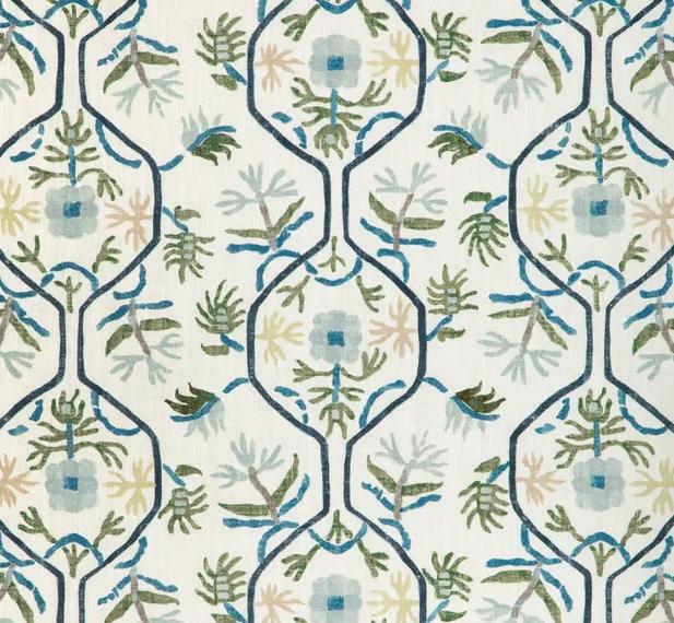
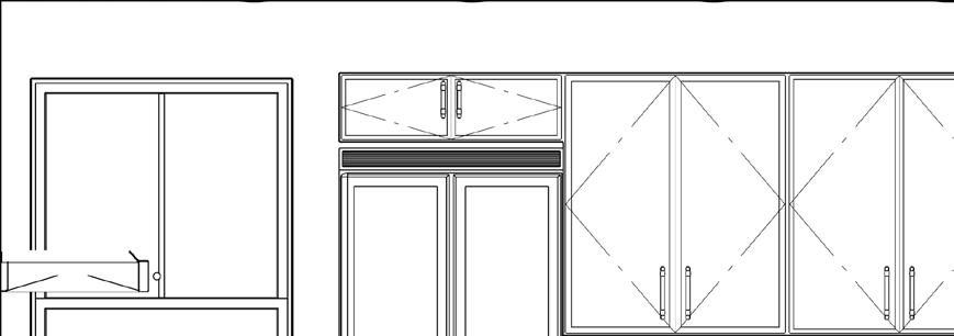
The star of The Foyer is a custom-built banquette upholstered in Anzea Simply Hyde leather in a striking retro yellow. Its slightly arched back creates both visual interest and comfort, while the curved form echoes the organic lines of our Hovie Groove wall covering.


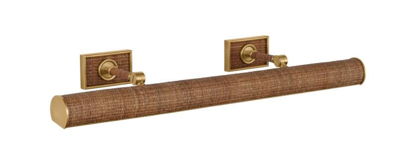


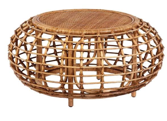


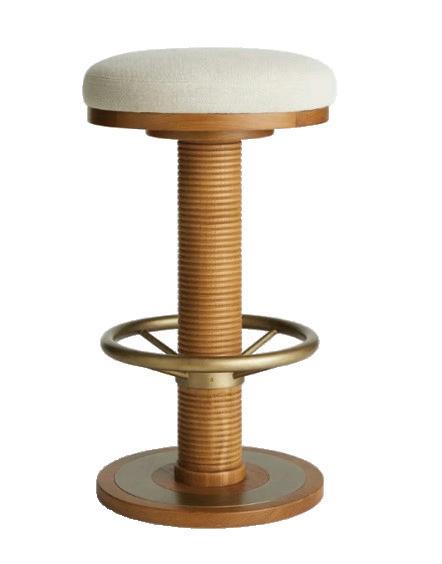
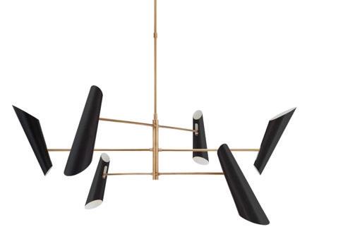
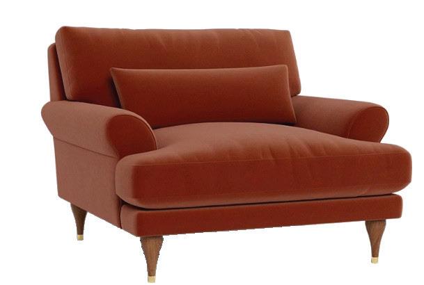
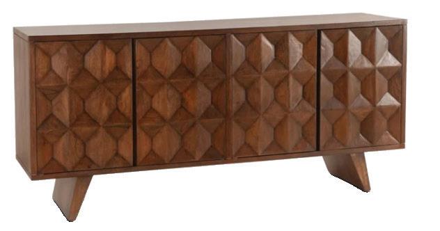
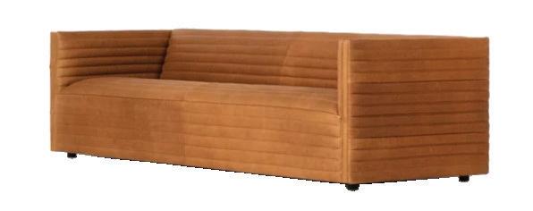
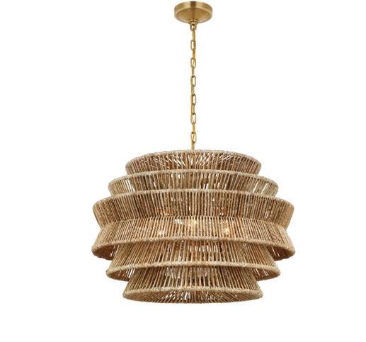
The Hangout space exemplifies our retro vision with its curved orange sectional and tikiinspired wall covering. The custom bar features bamboo detailing and brass accents, creating a sophisticated atmosphere that recalls the best 1960s lounge design. The bamboo ceiling in this room accentuates the warmth and spirit of the design.
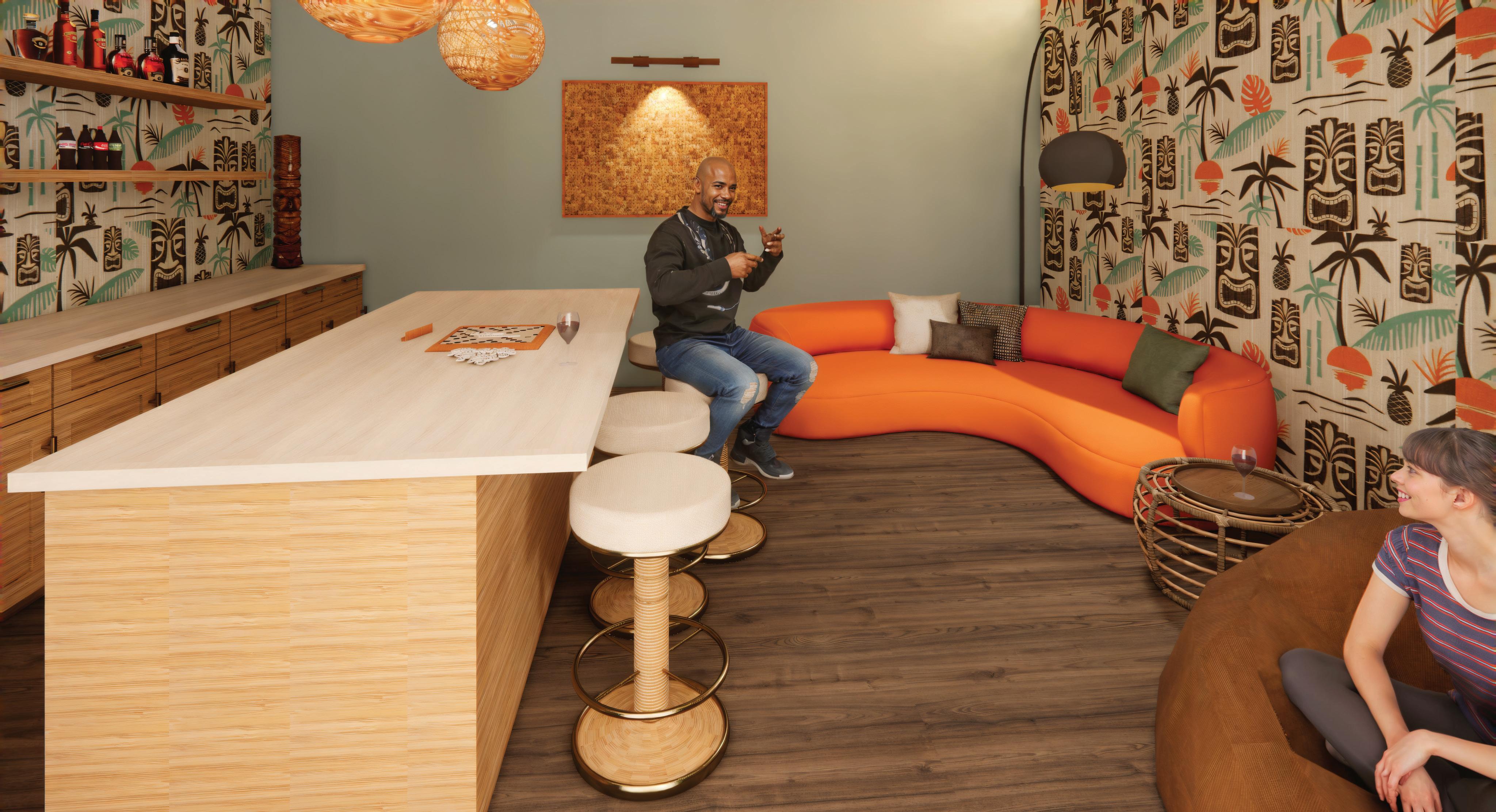

Between The Social Table and The Hangout, we've created a sophisticated gallery space dedicated to displaying collections – a nod to the mid-century tradition of incorporating personal treasures into home design.
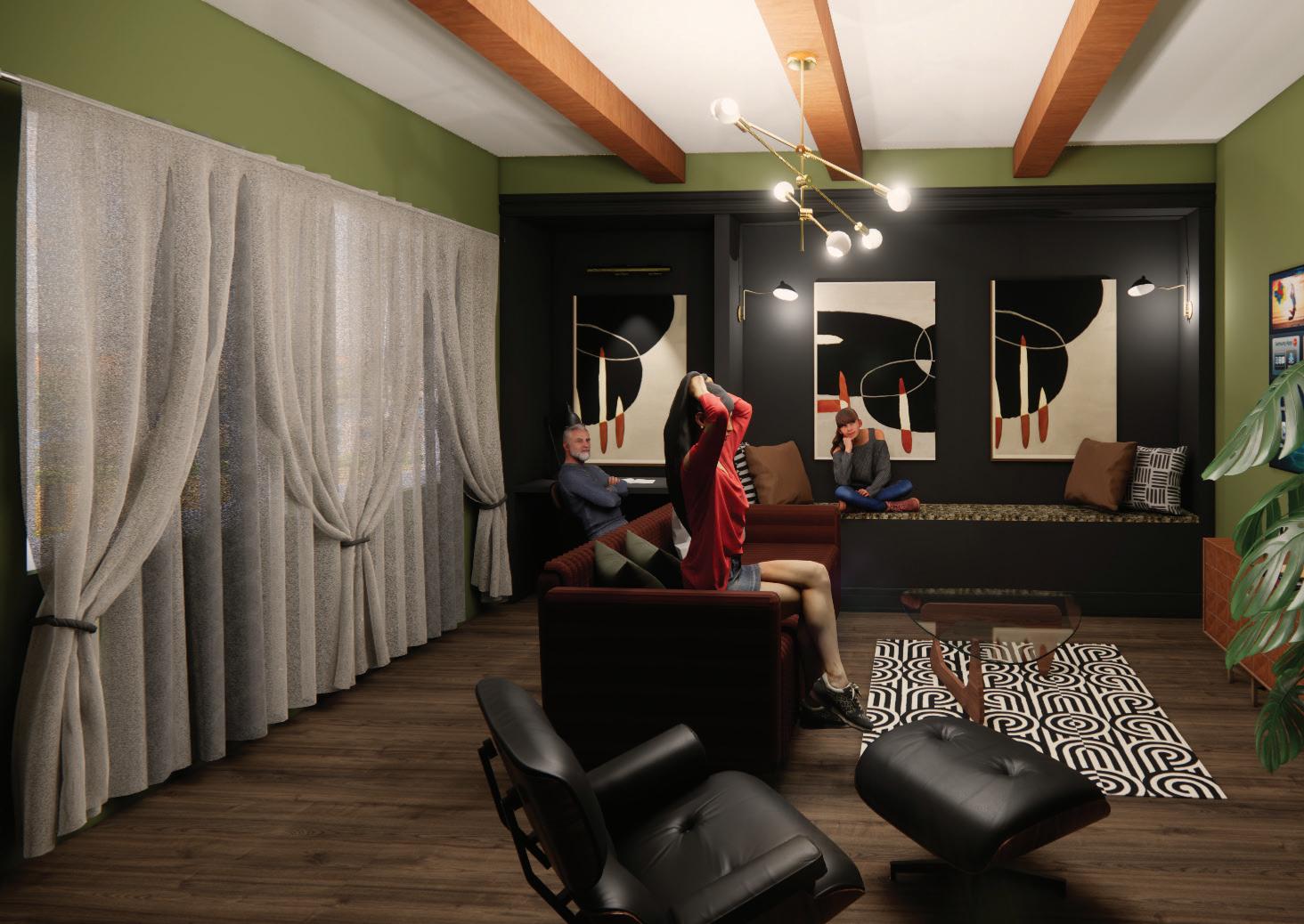


The Screening Room and Fireside are the most intimate spaces, we've balanced technology with comfort. The rich greens and warm materials create a mid-century den. These areas culminate the vignettes in a space made for entertainment, conversation, and relaxation.


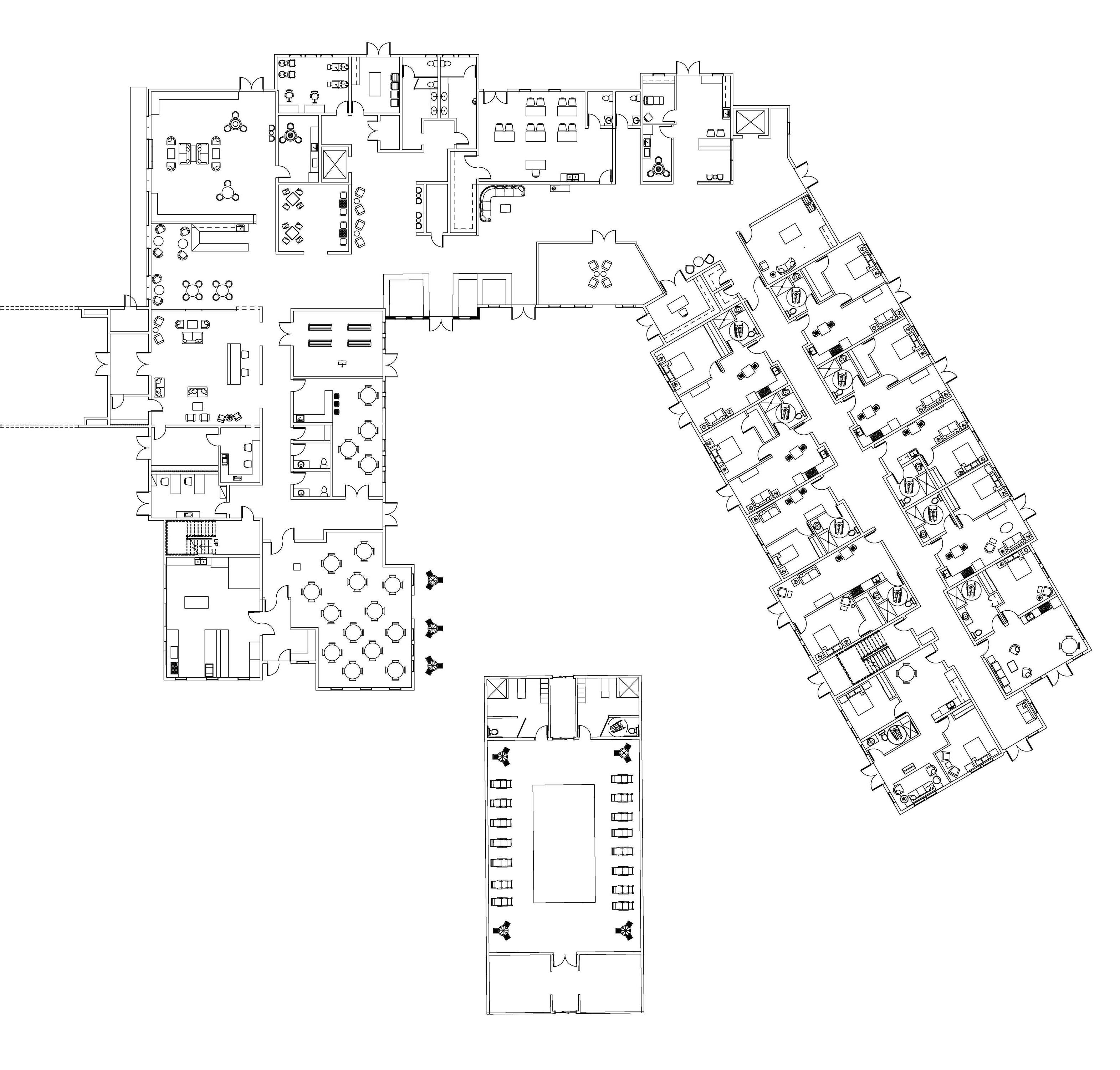
• Attention to adjacency to keep the flow of activities in appropriate locations
• Signage and maps to assist in locating areas of interest
• Destination areas for social activities, rest, and area guidance
• Available staff access points for assistance
• Evidence-based design utilized to ensure the design meets all needs of an aging population
• Finish and fabric selections chosen for high use and stain resistance
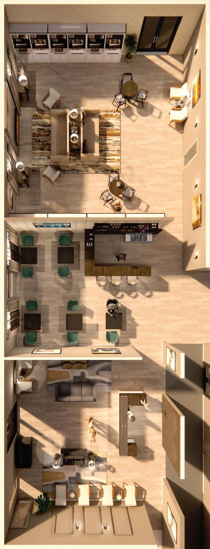

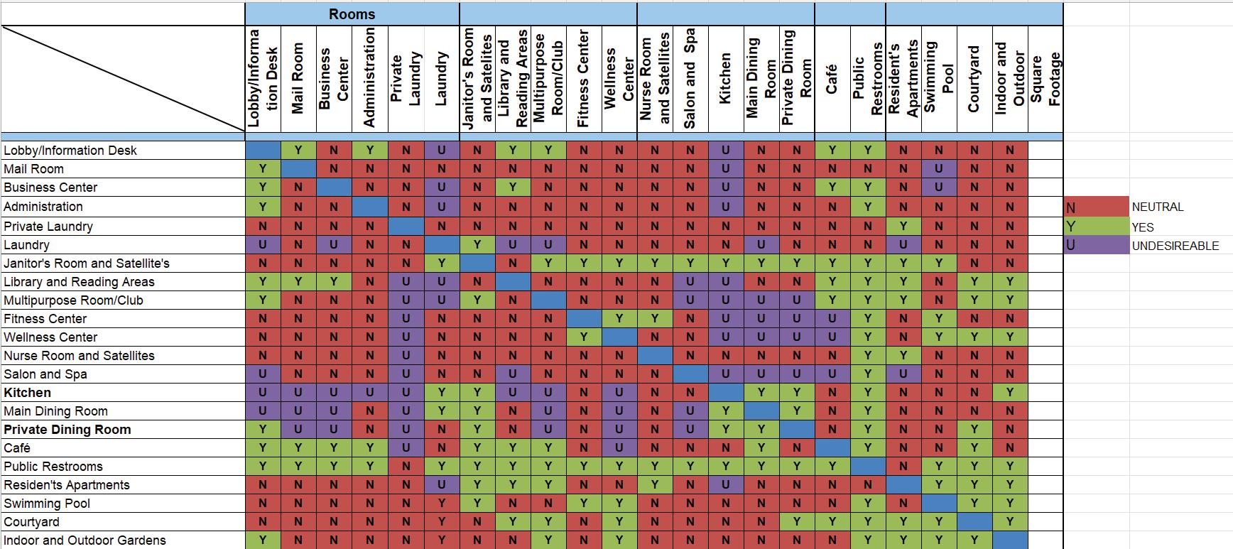
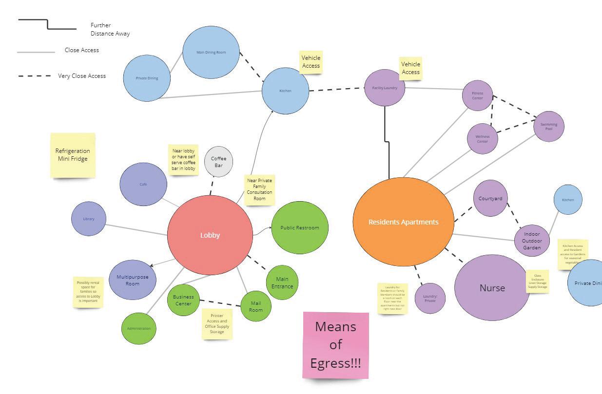
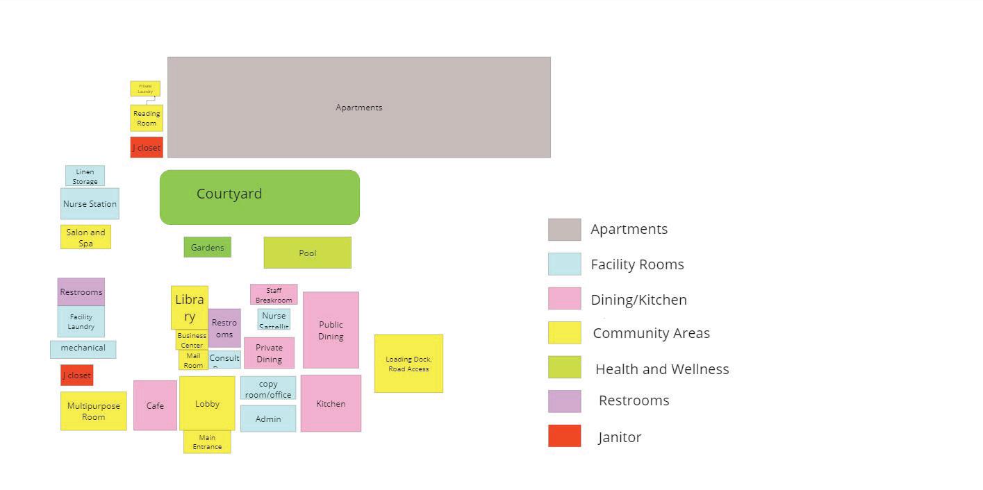
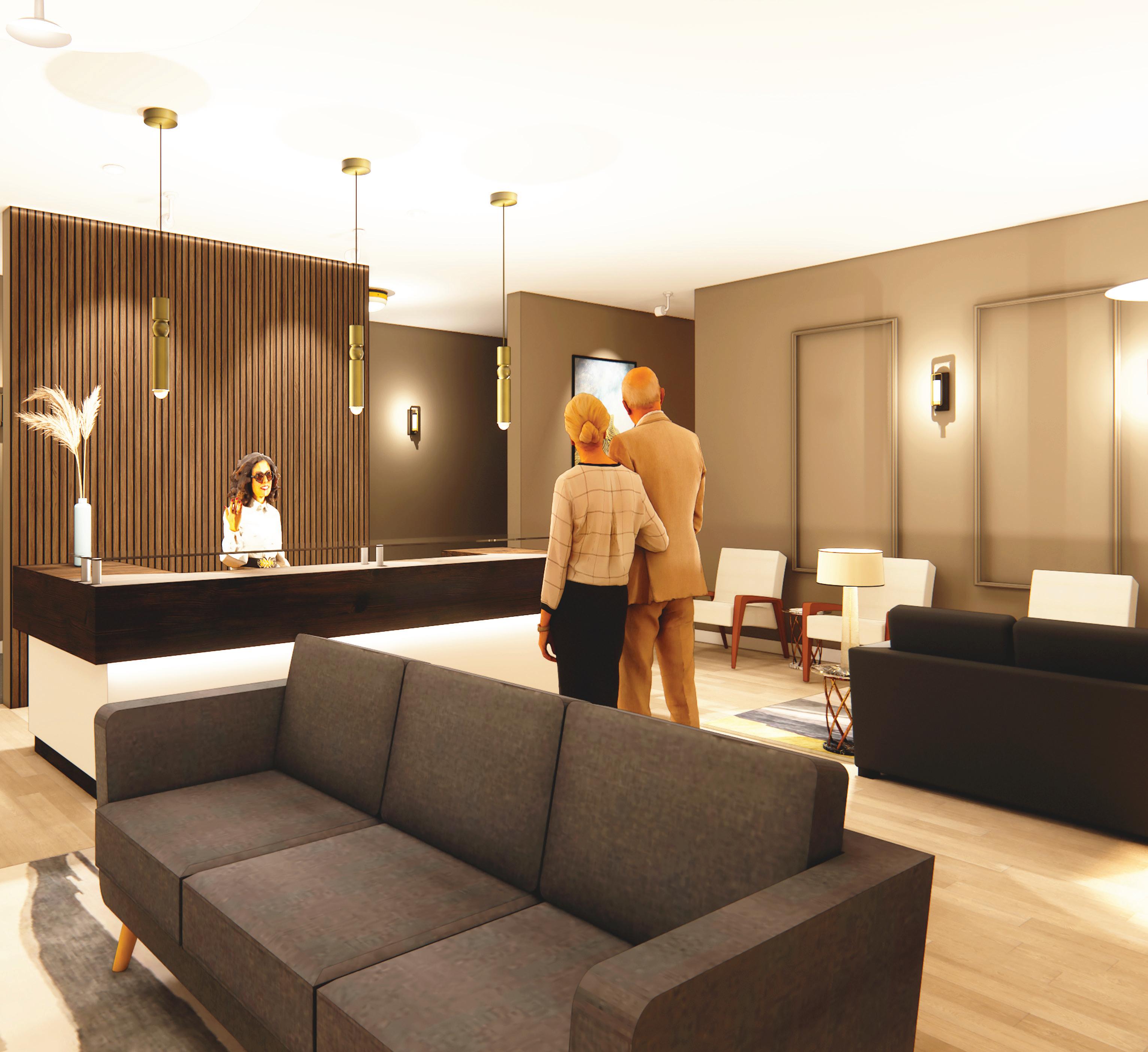
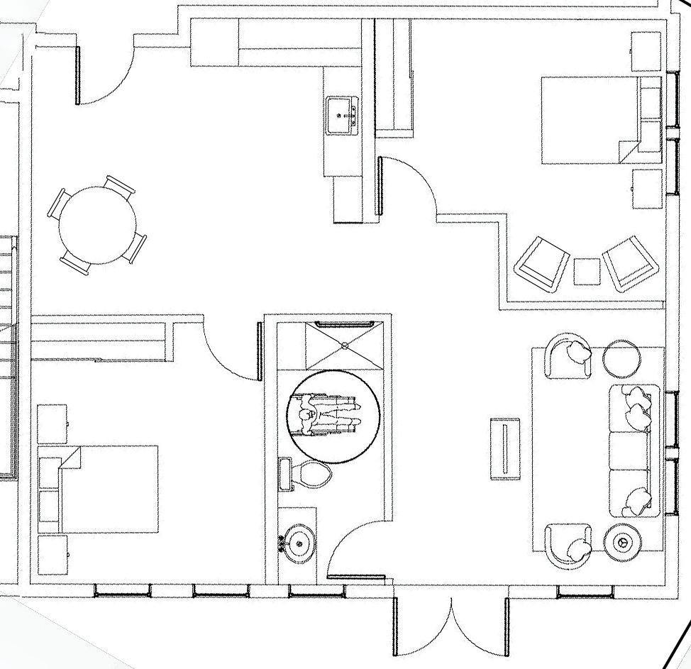
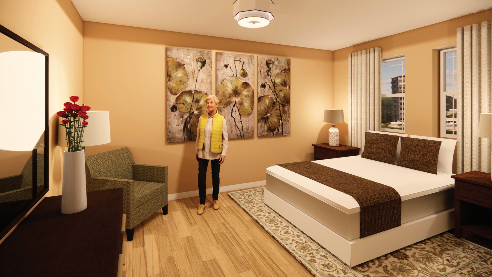
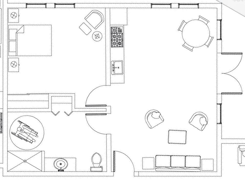
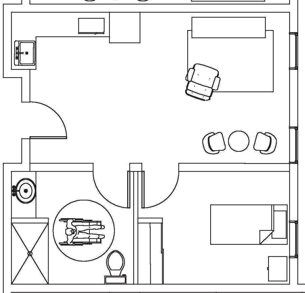
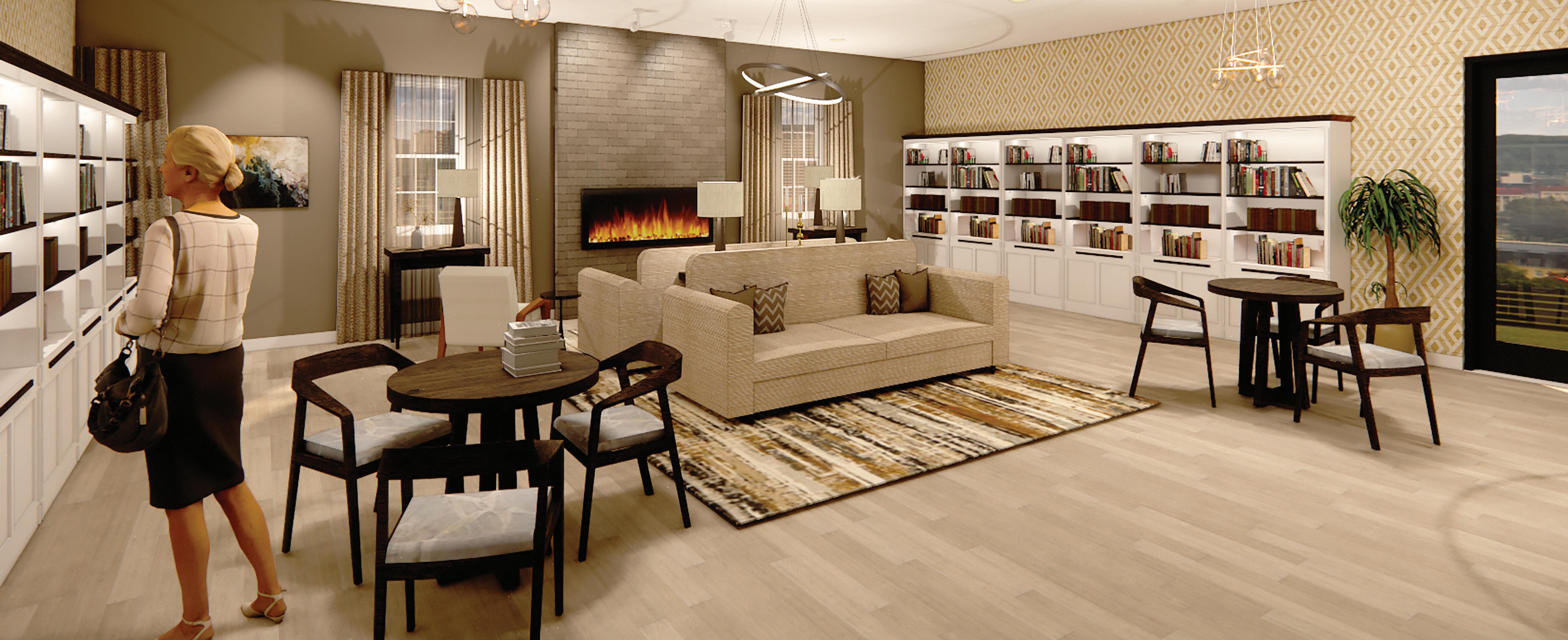
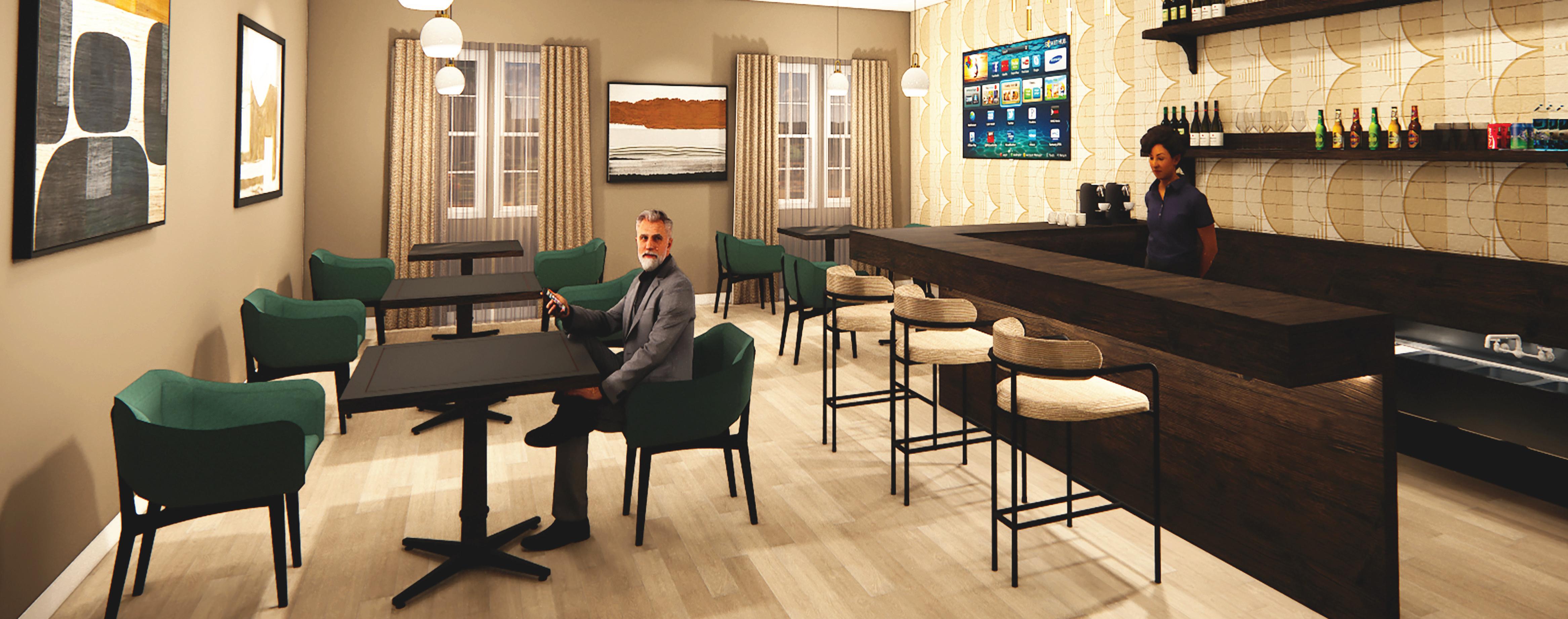
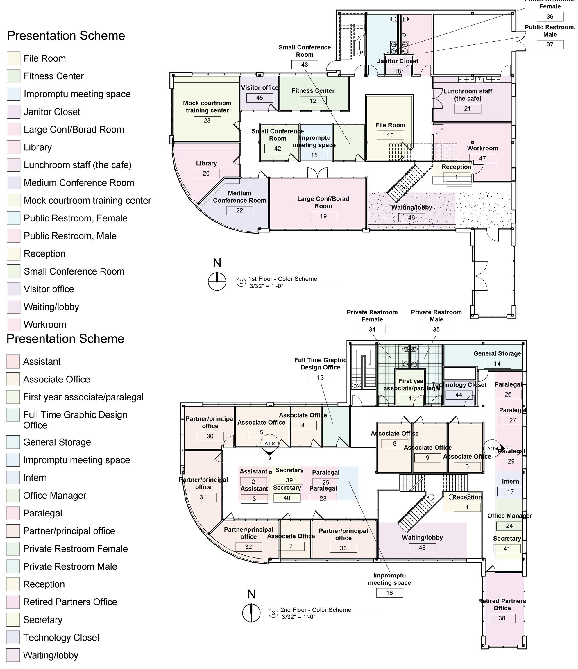
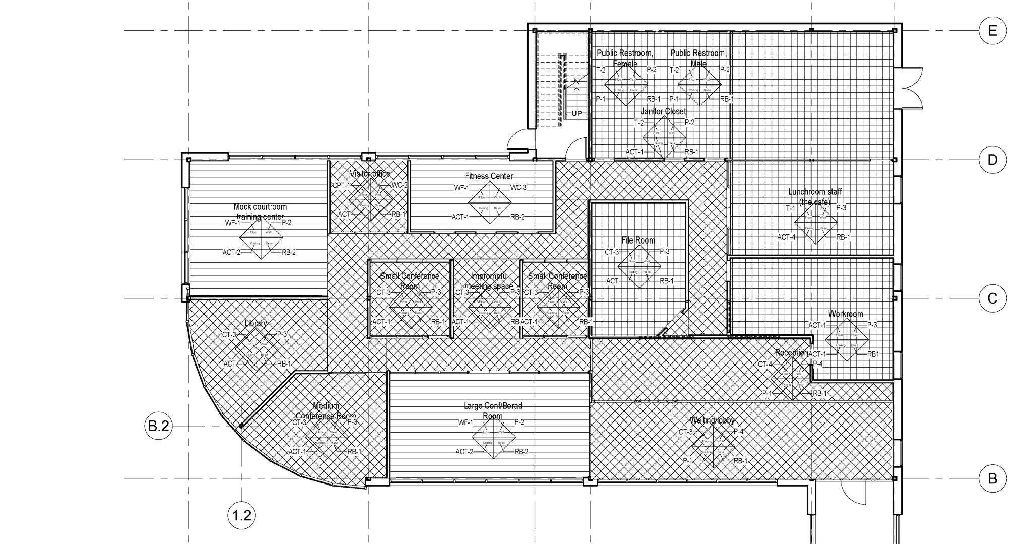
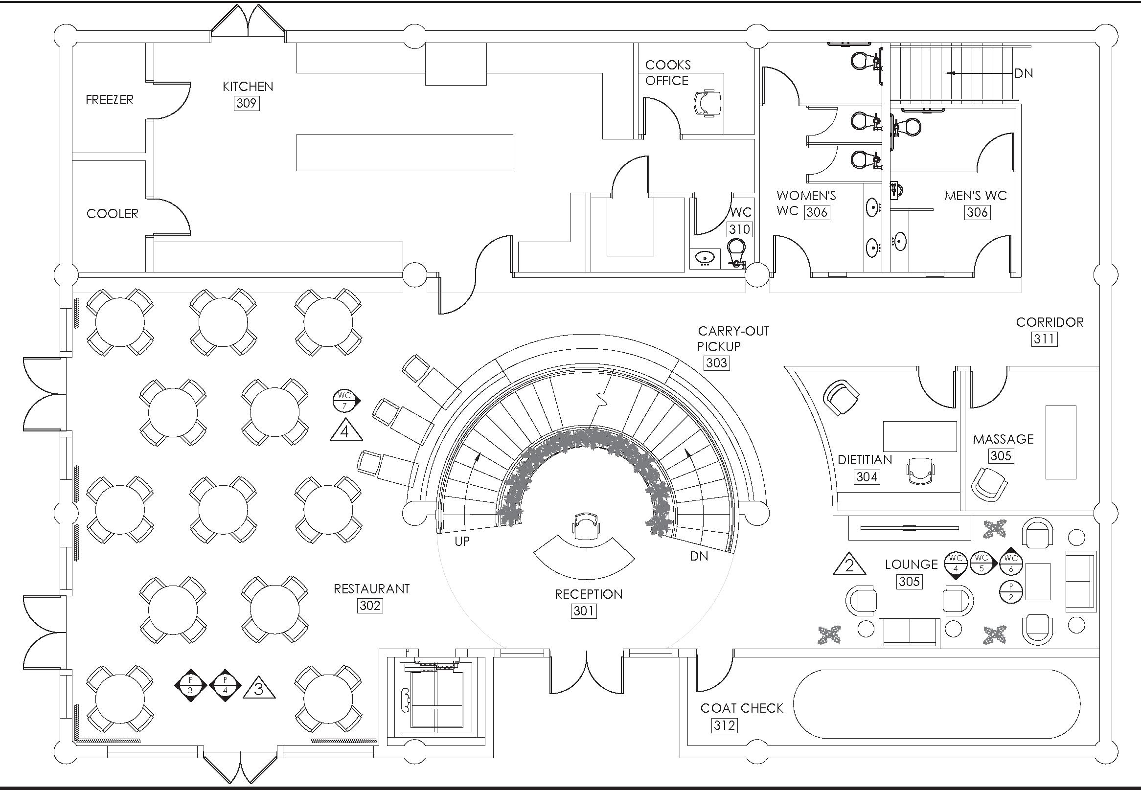
Pampas Place Assisted Living is thoughtfully designed for older adults. Its resident-centric design is an ideal blend of high-end luxury, amenities, residences, and care. It is designed to boost quality of life through plentiful opportunities to socialize, learn new skills, dine on exquisite cuisine, and relax in a timelessly sophisticated and comfortable atmosphere.
Evidence-based design (EBD) is the process of basing decisions about the built environment on credible research to achieve the best possible outcomes. Pampas Place Assisted Living considered EBD when creating a design that would bolster the confidence, mobility, and safety of its residents. The intention was to create a facility that supported independent living with access to care when it was needed. The importance of socialization among seniors led to the increase in multifunctional spaces as well as designated social rooms such as the library and cafe.
SCALE 1/8” = 1’-0”

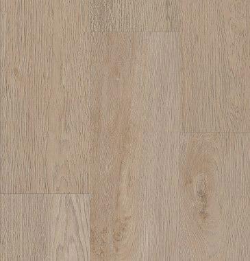
• Keeping flooring and wall paint light colors and utilizing soft patterns to assist with depth perception
• Slip-resistant flooring with foam core for ease of walking and standing
• Ample opportunities to sit and gather for rest and socialization
• Ease of access to elevators to reach 1st floor
• Views of nature, including 1st floor aviary to enhance mood and decrease stress
• Walking trails, gardens, and a pond for access to nature
• Separate pool building with locker rooms and seating
• Ample opportunity to sit and enjoy views of nature and fountains
• Native plants and trees to enhance landscape design
While the palette remains neutral, calming patterns are added to stimulate visual interest.
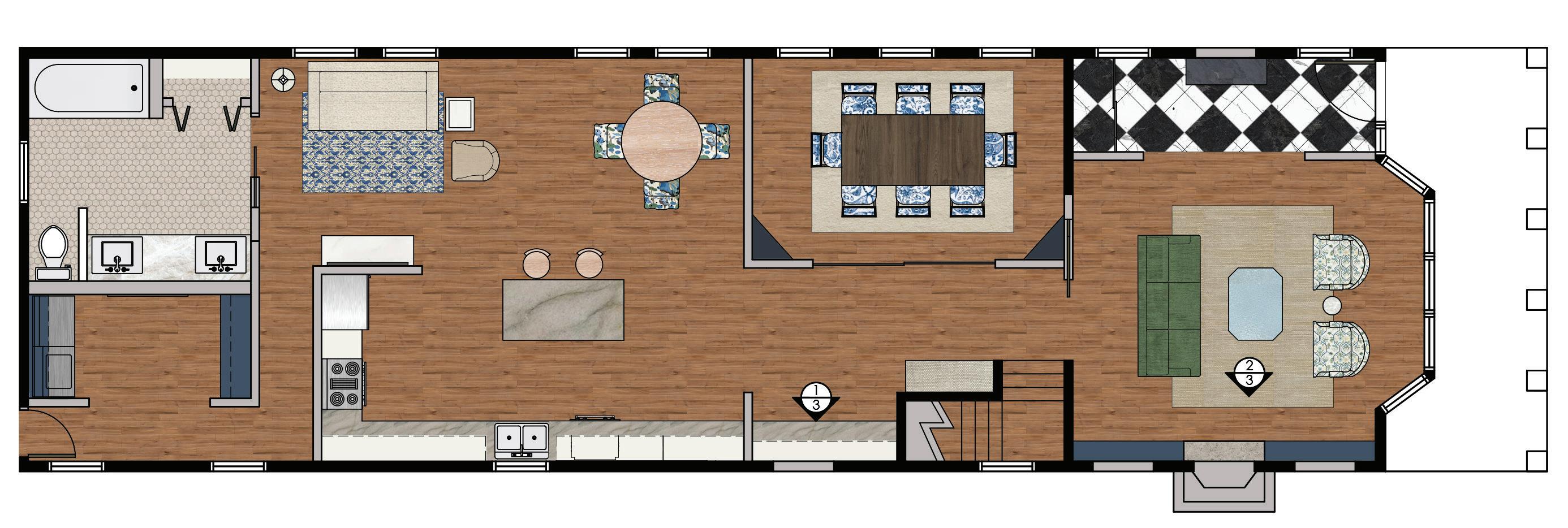
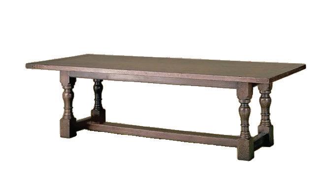
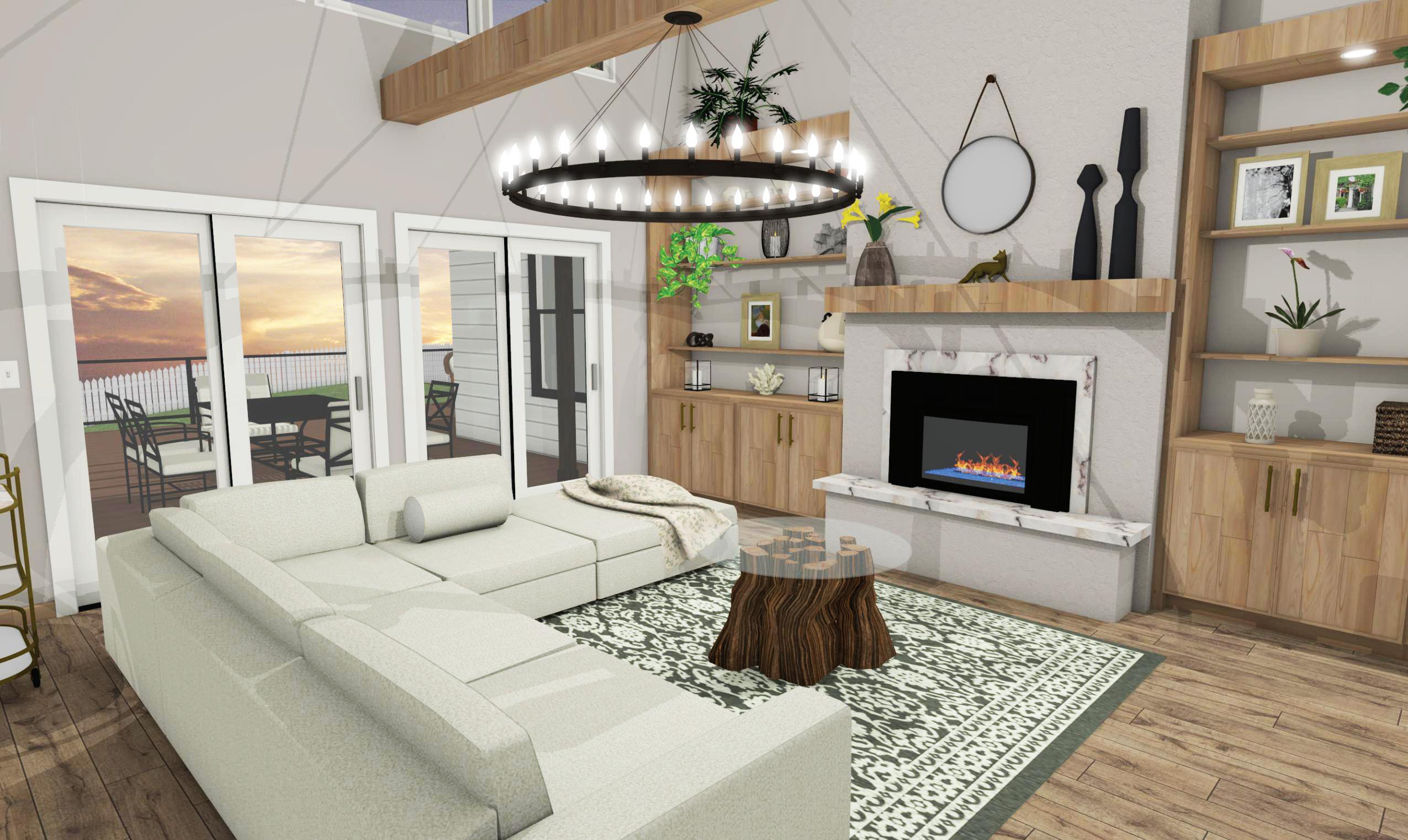
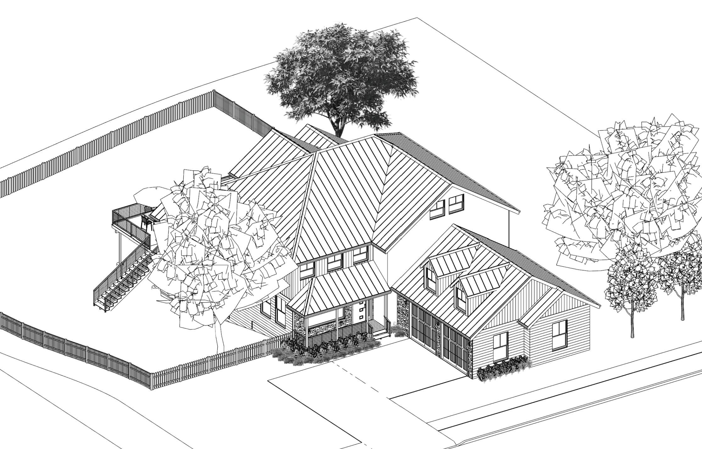
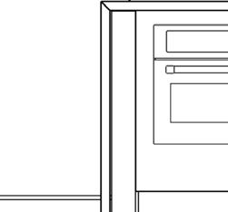
The Adkin’s historic Chicago Brownstone has been given a modern makeover, themed Airy Revival. This project sought to balance traditional elegance with modern functionality. A harmonious and inviting atmosphere has been achieved by preserving original architectural details and maximizing natural light.
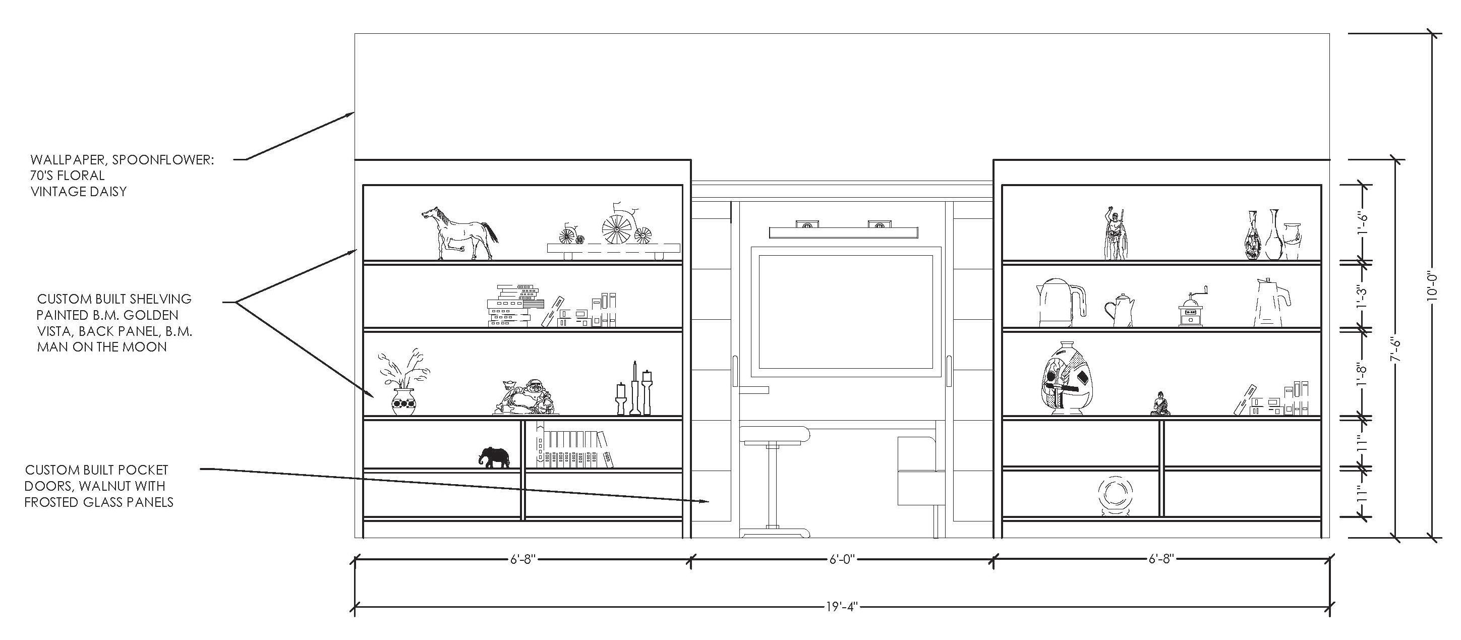
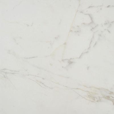
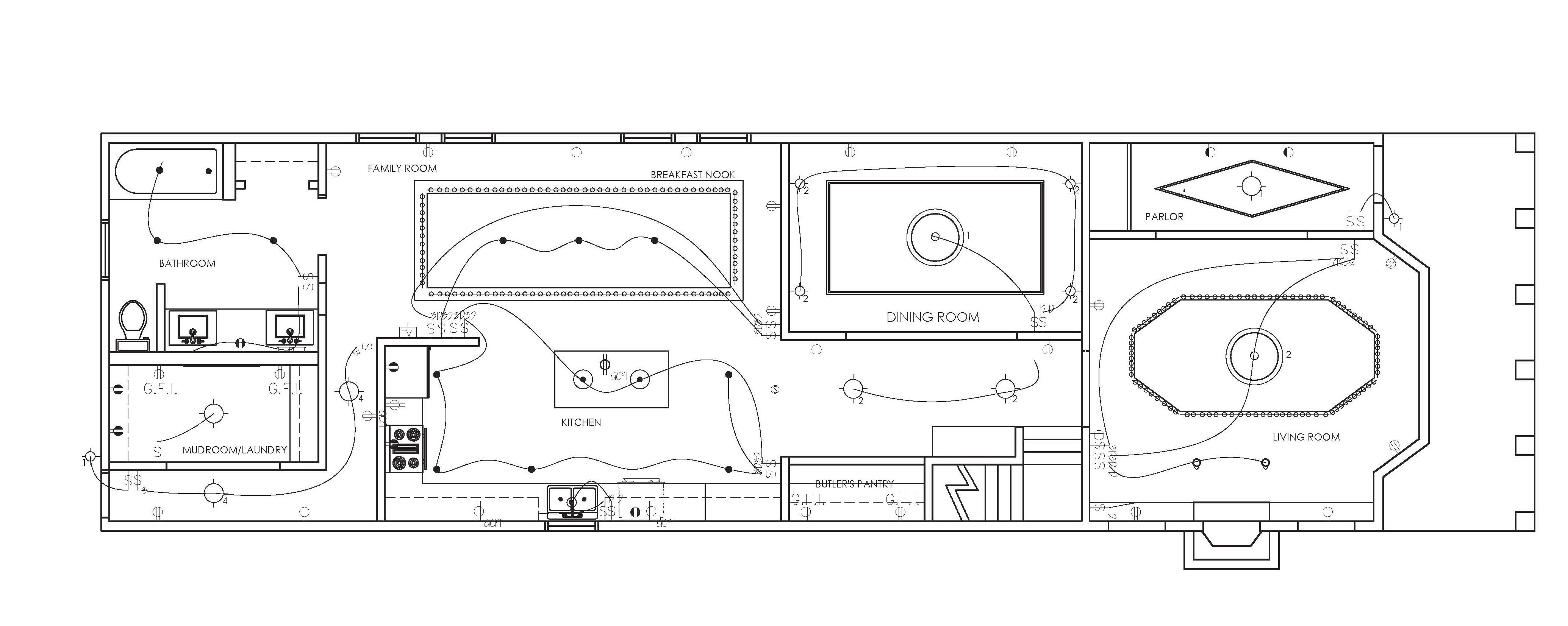
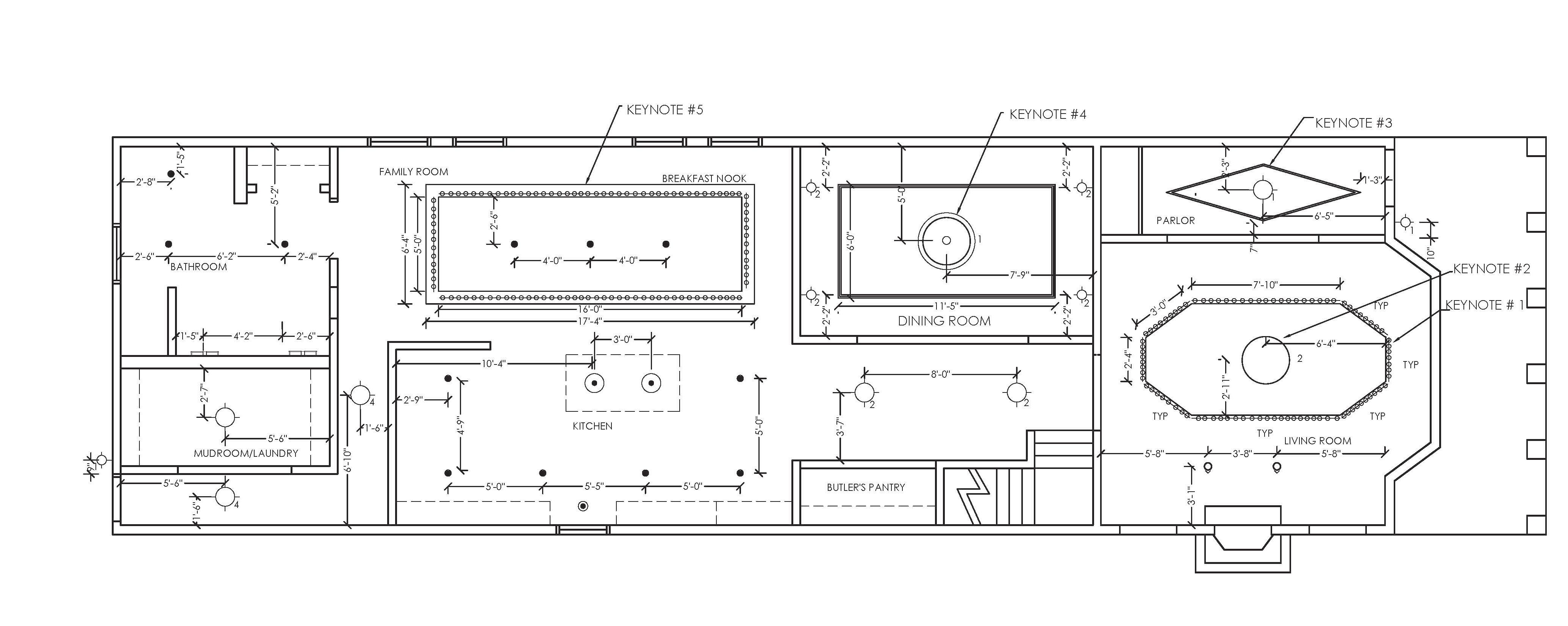
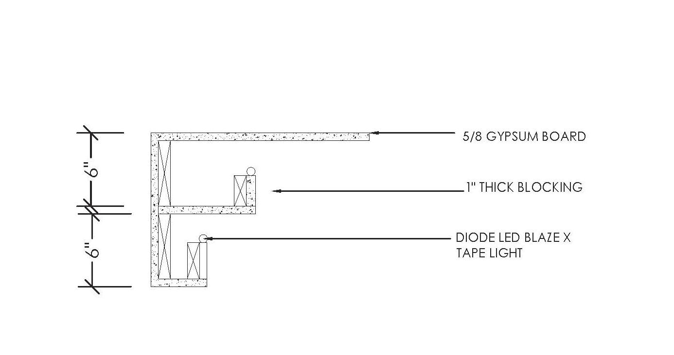
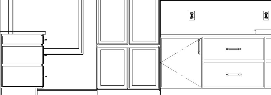
Key design elements include the detailed fireplace wall with built-in cabinetry, a butler’s pantry that bridges kitchen and dining spaces, and thoughtfully partitioned rooms that maintain an open feel while providing distinct living zones. The consistent application of quality materials—from Audacia quartzite countertops to custom millwork—ensures beauty and durability, demonstrating how historic homes can be respectfully updated for modern lifestyles without sacrificing their original character.
Accessibility Considerations: Thoughtful space planning that accommodates diverse mobility needs with clear circulation paths and appropriate clearances. Human-Centered Design: Ergonomic furnishing selections and customized millwork that prioritize comfort and functionality for daily living. Sustainable Practices: Integration of energy-efficient lighting solutions and durable, long-lasting materials to minimize environmental impact.


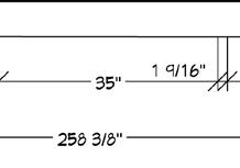
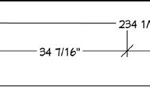
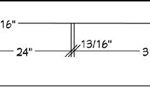
SCALE 1/4” = 1’-0”

SCALE 1/4” = 1’-0”


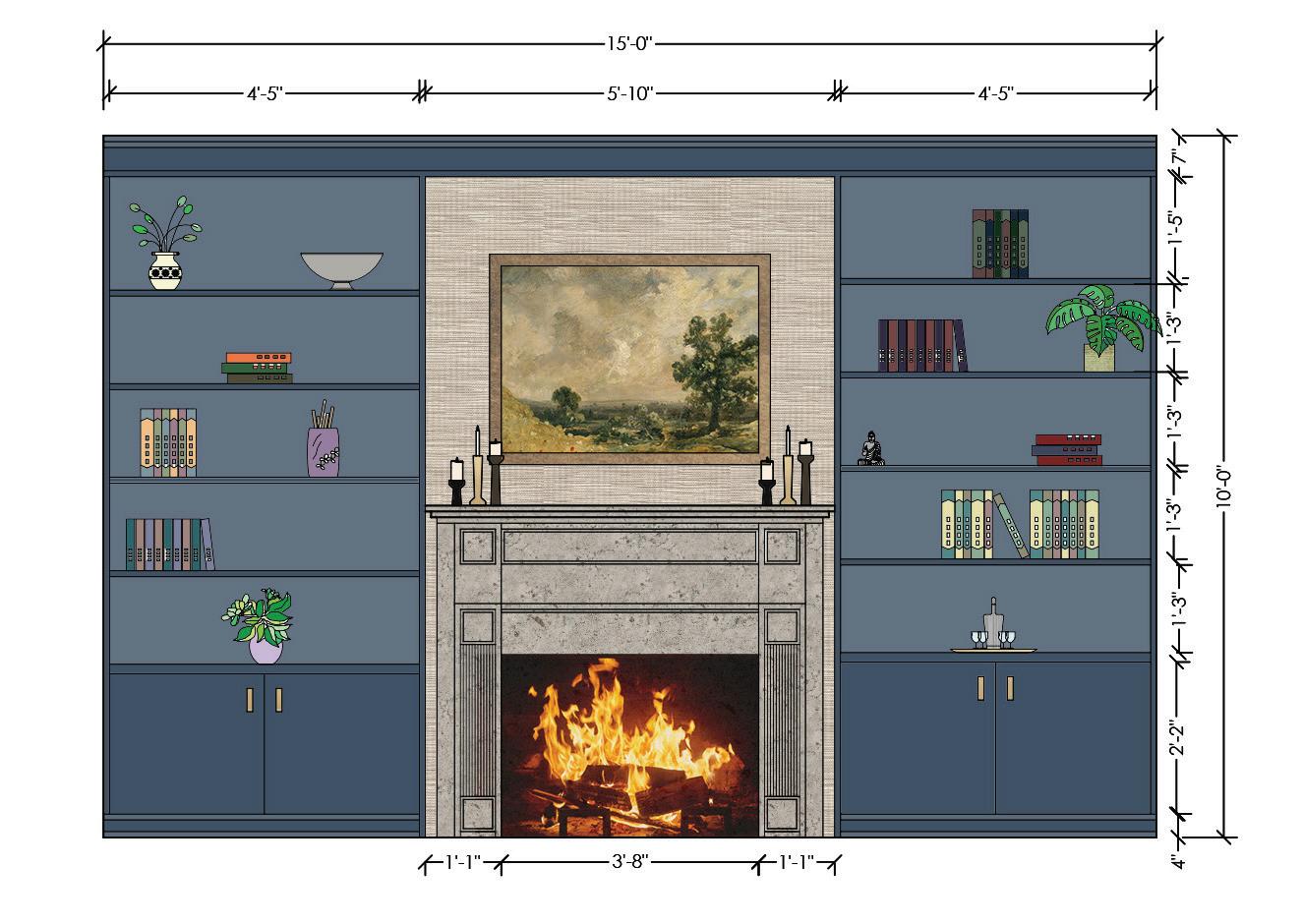
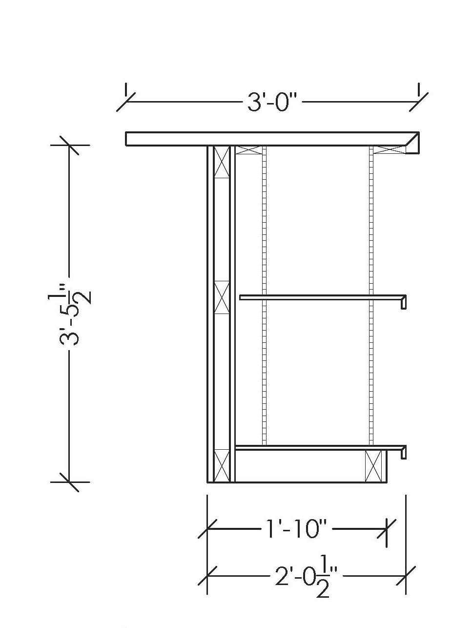
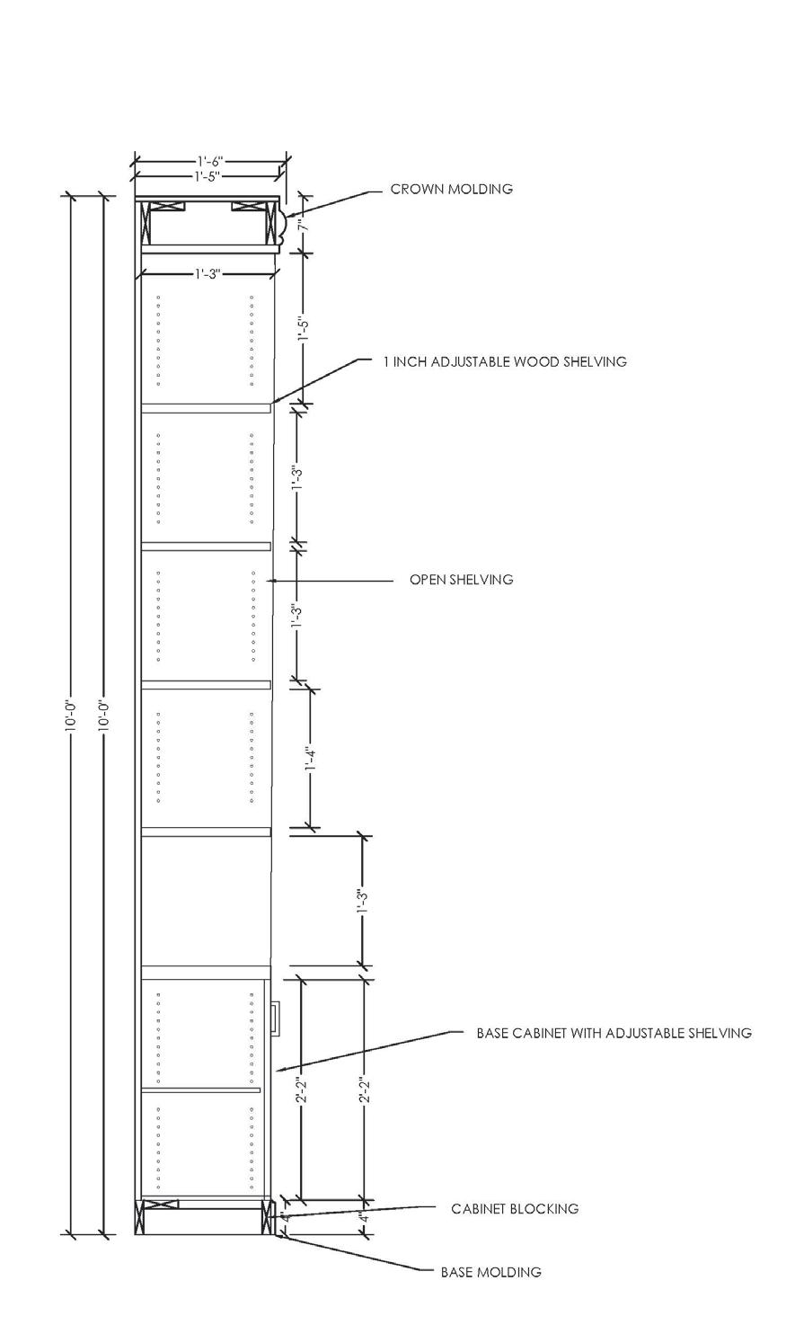
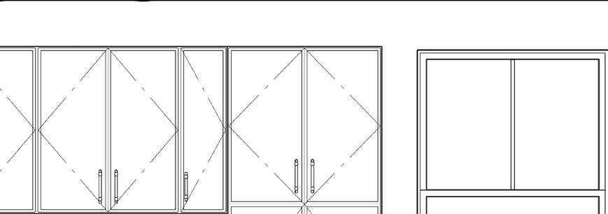
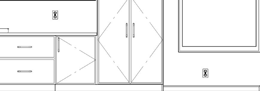
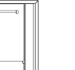
BOOKSHELF ELEVATION
SCALE 1/2” = 1’-0”
SCALE 1” = 1’-0”
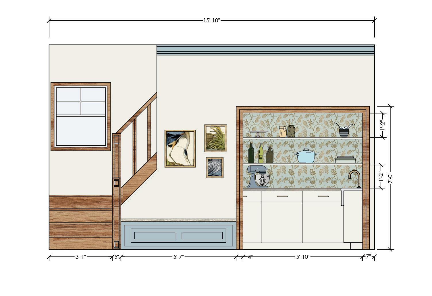
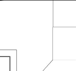
BUTLER’S PANTRY ELEVATION
SCALE 1/2” = 1’-0”


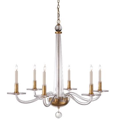
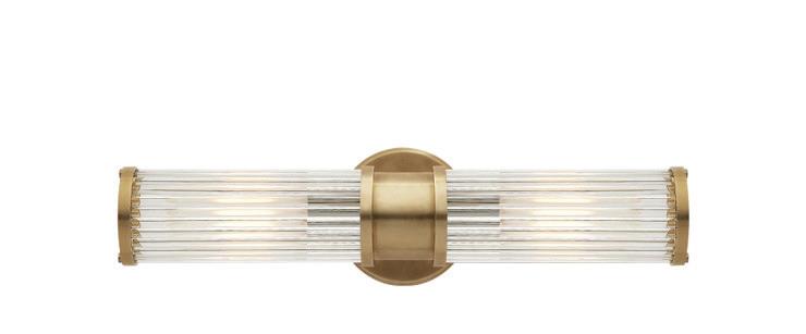
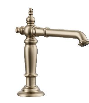
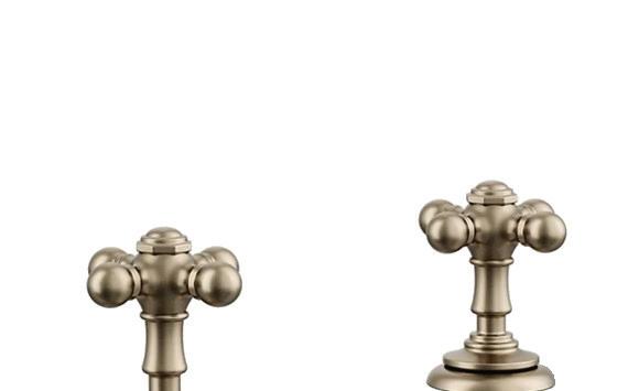
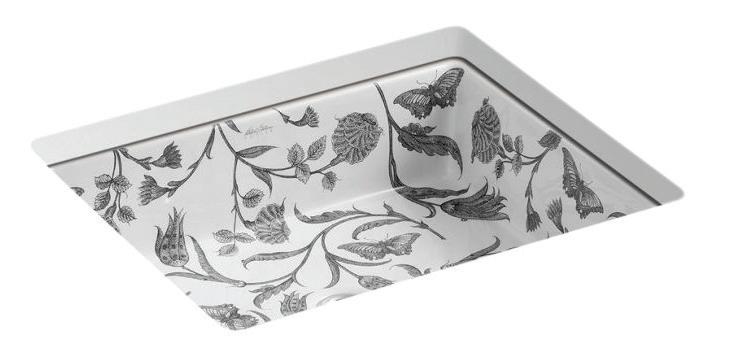
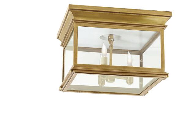
Liz Fears created this project for the Kravet Student Design Competition, which challenged designers to showcase creative applications of Kravet’s extensive product offerings. Most materials, textiles, and furnishings featured in the Adkins Residence were sourced from Kravet’s diverse collections, including their Kravet Couture, Lee Joffe, GP & J Baker, and Brunschwig & Fils lines.
The design received a second-place award in the competition, highlighting its successful balance of historic preservation with contemporary luxury using Kravet’s distinctive materials.
SCALE 1/4” = 1’-0”
SCALE 1/4” = 1’-0”
SCALE 1 1/2” = 1’0”

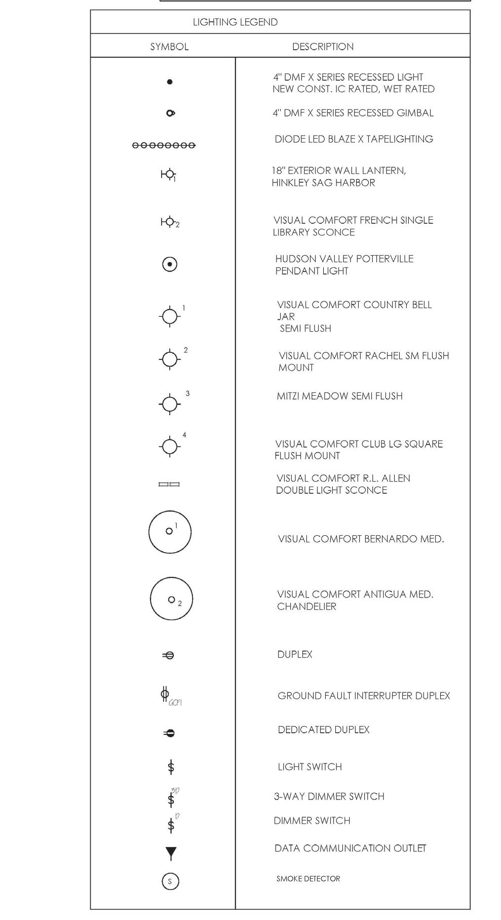
The Adler residence project served as a platform to explore Chief Architect’s capabilities. This software lets designers create architectural drawings and documentation, including detailed floor plans, site specifications, and construction drawings, with integrated material schedules and 3D modeling. Its automated modeling system helps by generating 3D representations as you draw walls and building elements, which automatically update the connected documentation
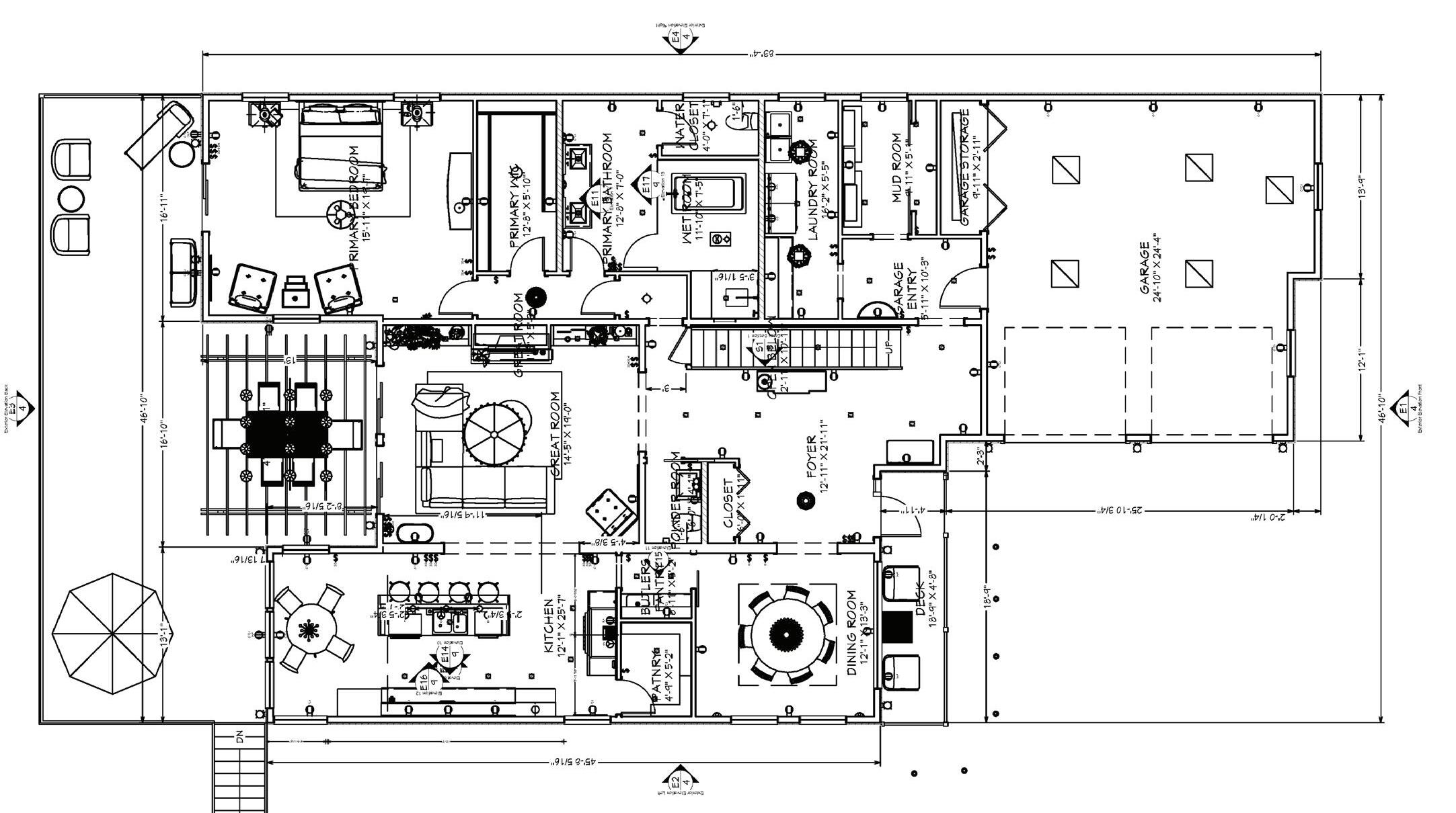
FLOOR PLAN 1ST FLOOR
SCALE 1/4” = 1-’0”


SCALE 1/2” = 1’-0”

SCALE 1/2” = 1’-0”


KITCHEN FLOOR PLAN
SCALE 1/4” = 1’-0”


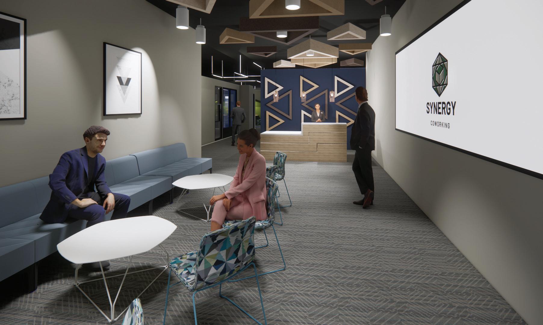
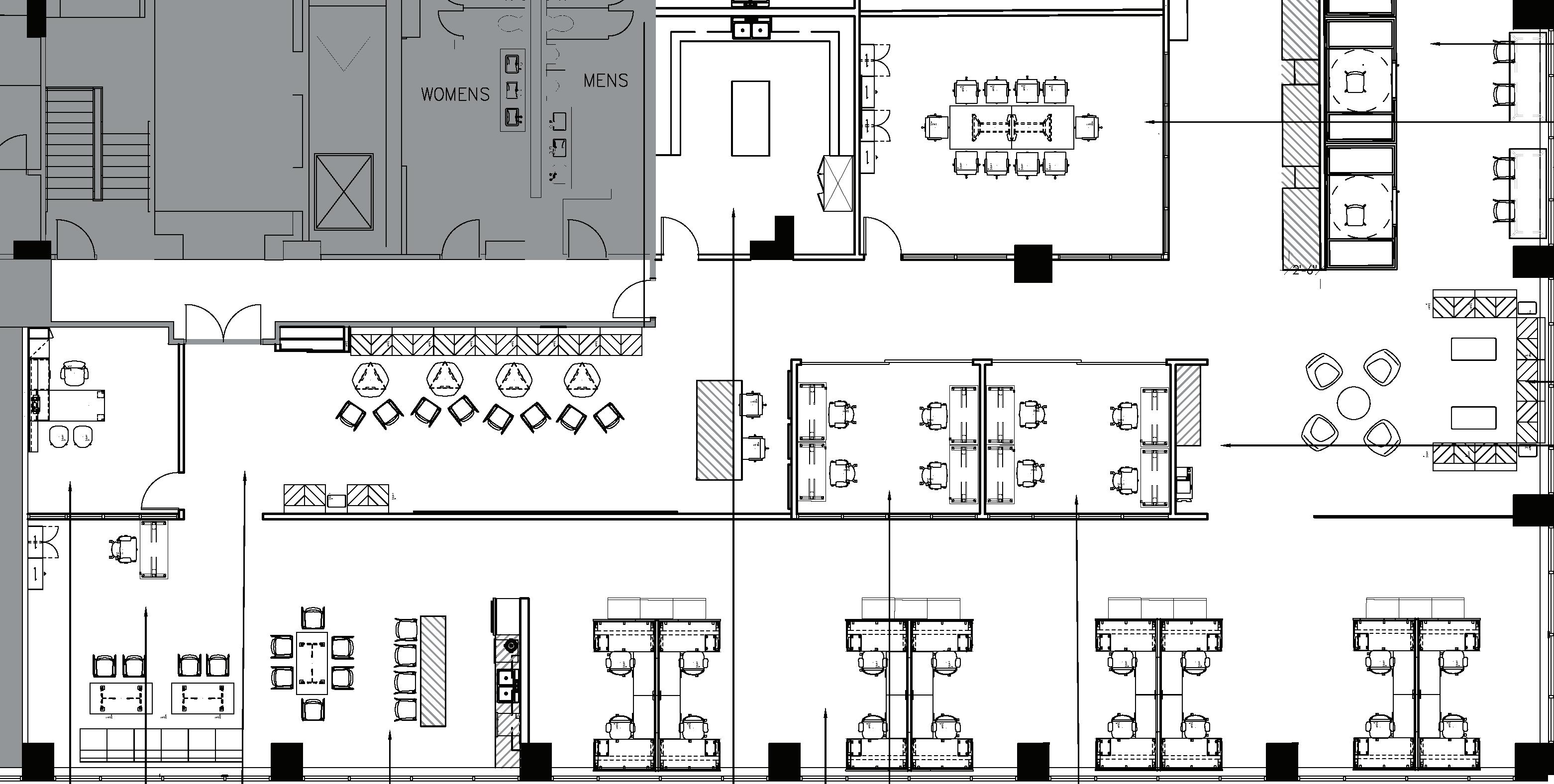
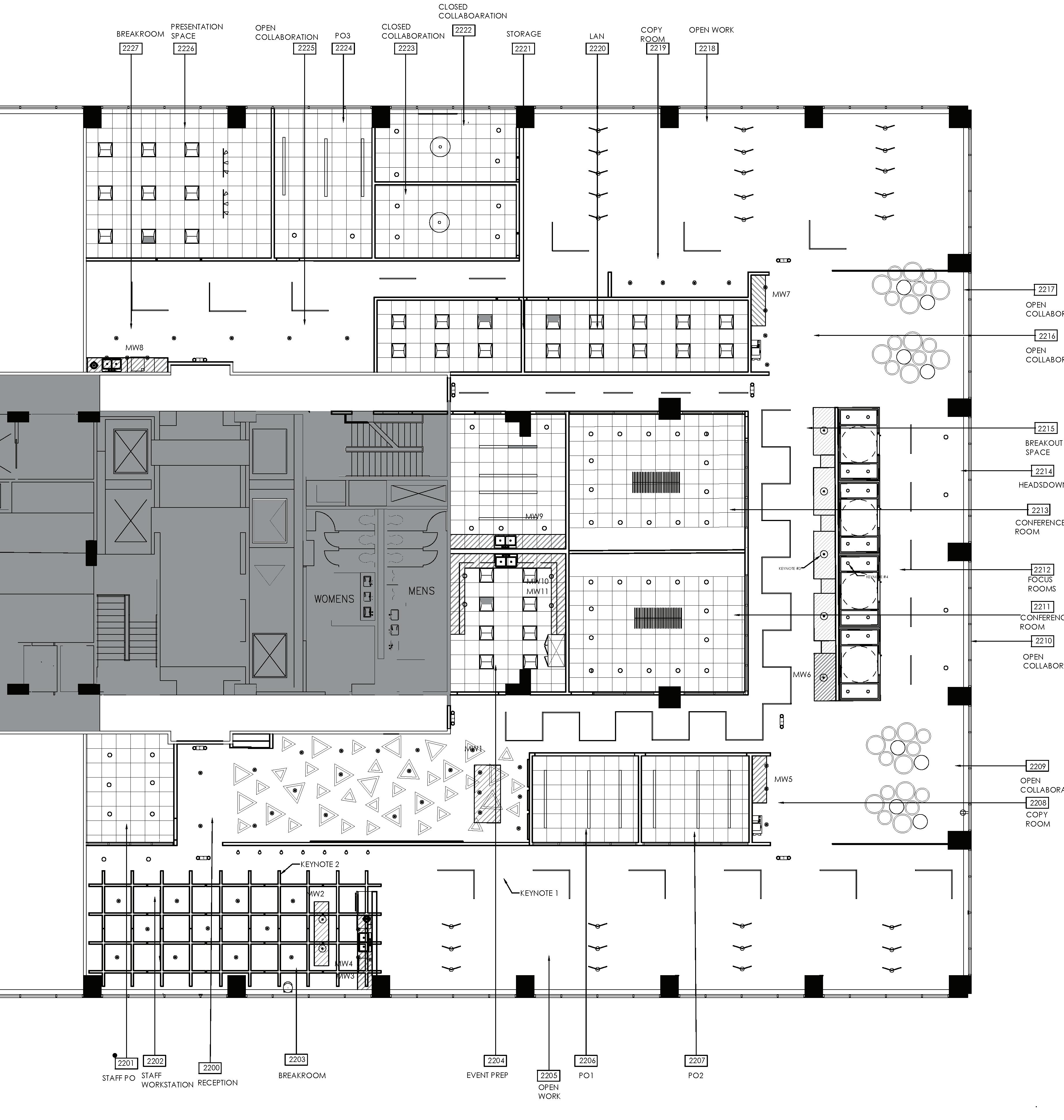
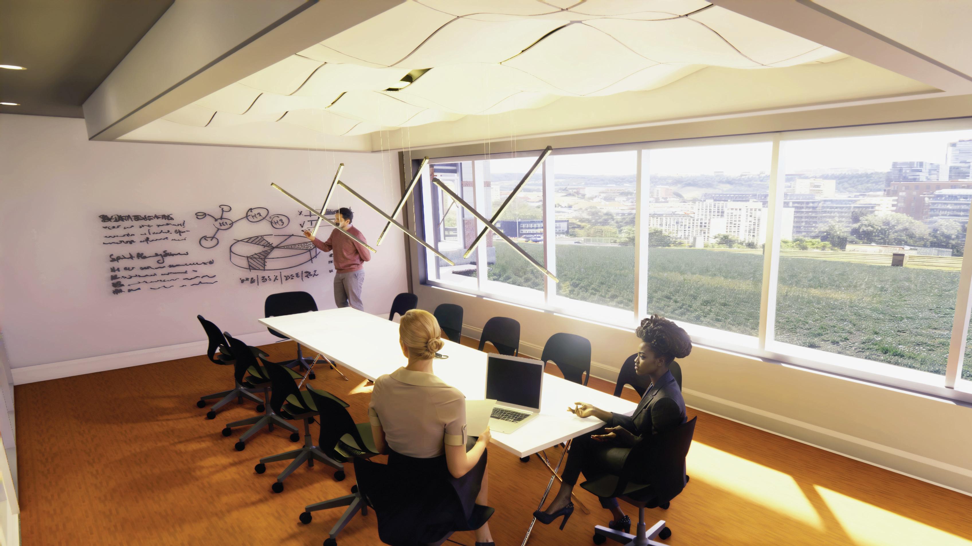
Inspired by geometric principles in nature and architecture this workspace design celebrates the power of interconnectedness. The geometric configurations in each aspect of the design symbolize the synergy that emerges when individual elements combine.
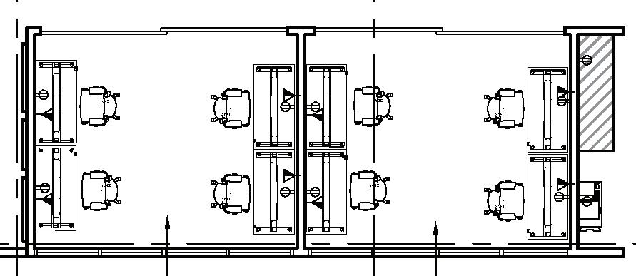
The floor plan embraces the concept of interconnectedness through a thoughtful progression of spaces. Beginning at reception, the geometry guides visitors through a series of zones. The break room and lounge areas serve as anchors that promote community and collaboration.
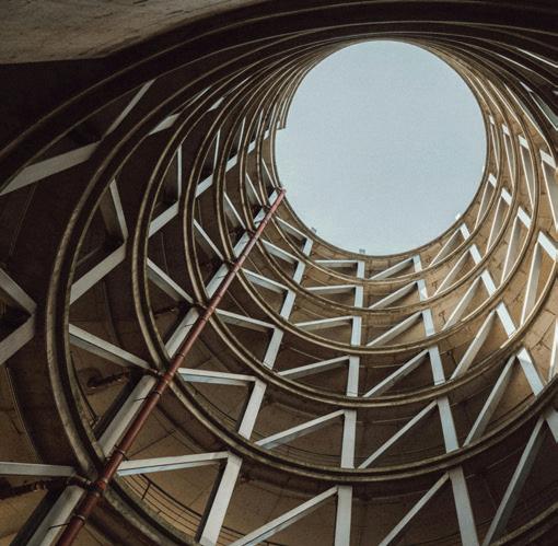
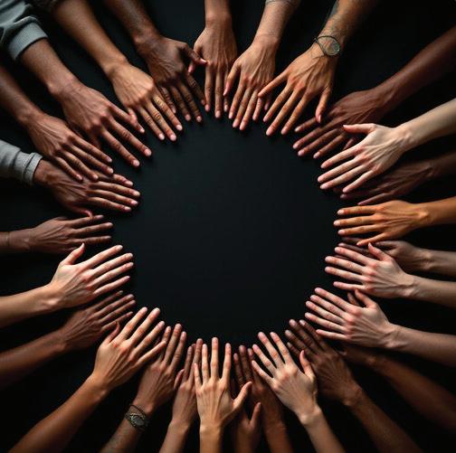
These images represent our design journey from nature’s inherent geometry to human collaboration. The succulent demonstrates how organic forms create perfect mathematical sequences and patterns. Moving to architectural expressions, we see how geometric principles translate into built forms. Finally, the human elements show how geometry guides movement and encourages connection.

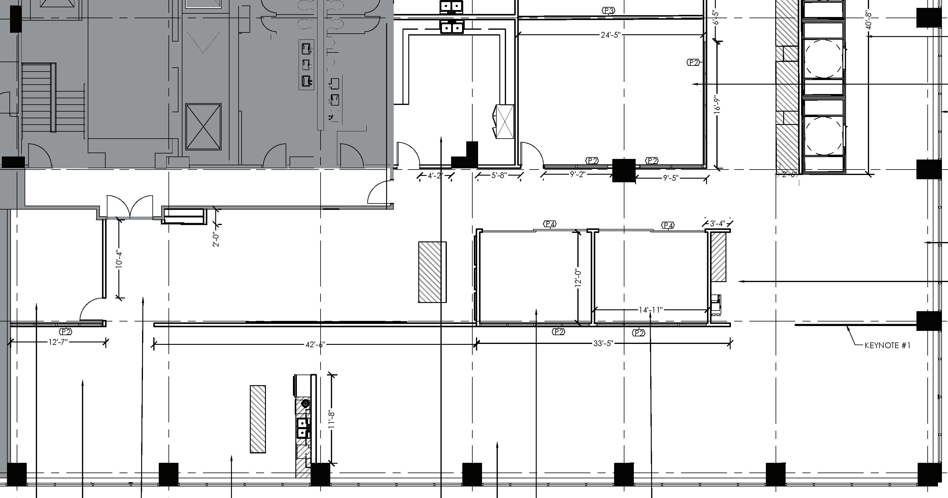
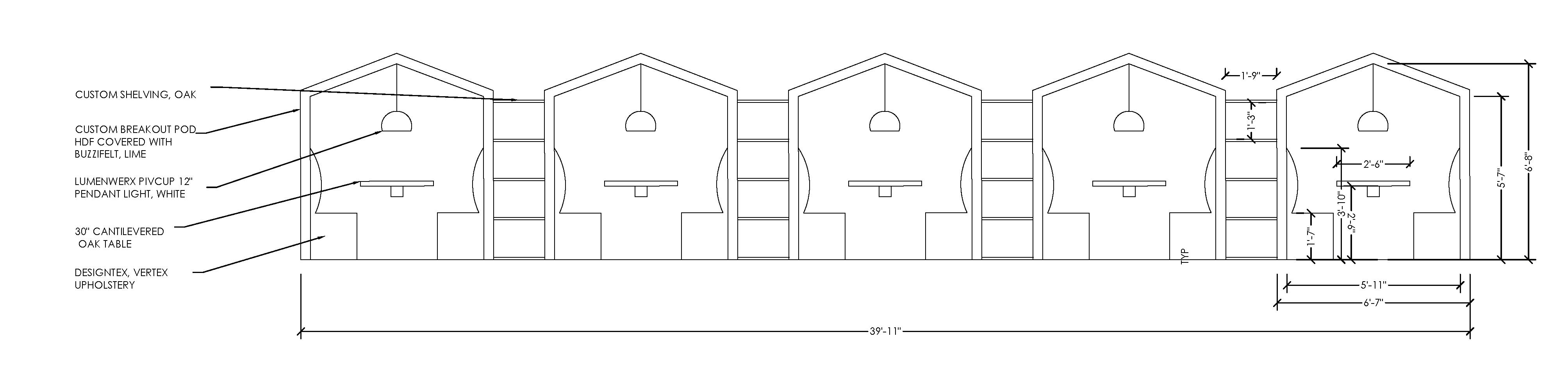
The Synergy Coworking Office furniture plan tells a geometric story of connection and flow. Triangular forms in the reception anchor the journey, while the linear workspaces create rhythm through repeating configuration. Each furniture grouping creates collaboration hubs or quiet focus spaces. This deliberate layout creates not just visible interest but functional logic—paths of egress are spaced at a minimum of 44”, and the clear lines of sight allow the integrated emergency lighting to be seen from any location.
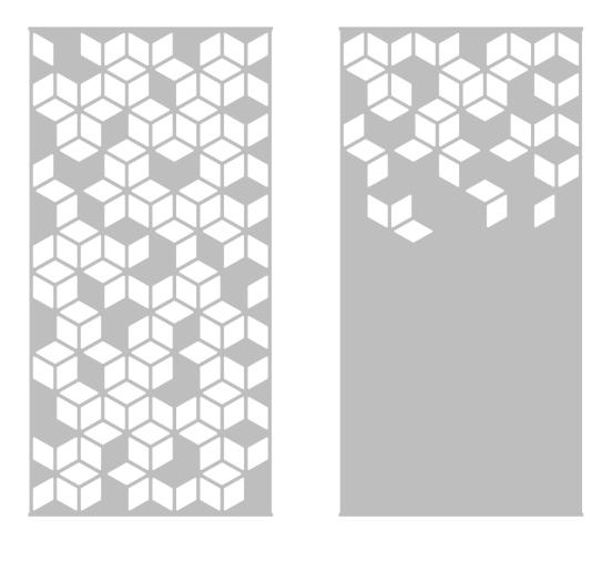
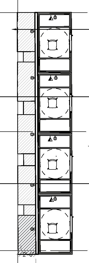
The partition strategy at Synergy Coworking reinforces our geometric concept through thoughtful transitions. Glass partitions create connections between spaces, allow for natural light to travel throughout the space and manage acoustics. The Arktura Soft Screen Cora panels act as sculptural dividers with perforated patterns continuing the design. Full-height partitions with required fire ratings provide necessary privacy and security.


SCALE 1/8” = 1’-0”
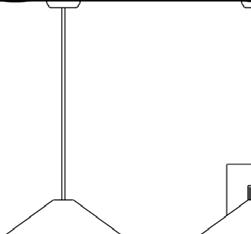
The ceiling plan continues the geometric story overhead. Layers of visual interest define and connect spaces throughout. The reception area welcomes you with Arktura Soft Shapes Tri, setting the tone for the architectural elements to follow. As we move through the space, the ceiling height shifts from 12’ exposed ceiling covered with black acoustic spray to intimate 9’6” acoustic features in work and gathering spaces.
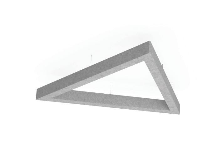
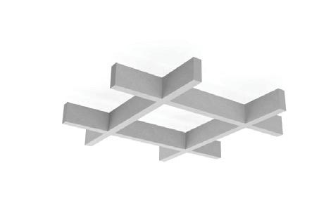


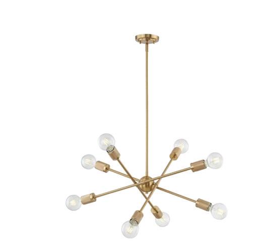
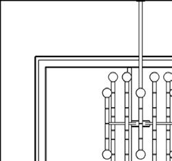
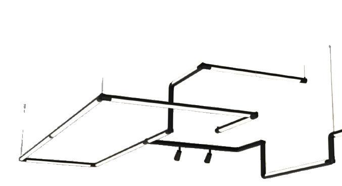
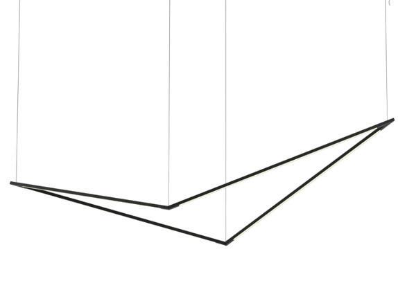
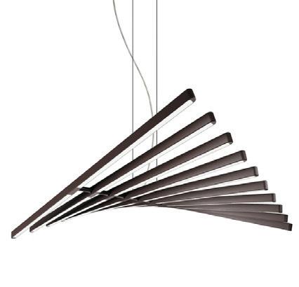
The lighting allows not only tasks but is also part of the geometric design from the dramatic pipeline that outlines the conference room to the soaring concept Zbird pendants above the workstations. Each element reinforces the sense of flow and connection.
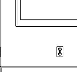
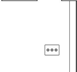
POWER PLAN
SCALE 1/8” = 1’-0”

The Alcon Law Office project served as a practical application to explore building information modeling through Revit. This program allows the designer to generate multiple documentation types, including the Floor Plan, FF&E, and Reflected Ceiling Plan, along with comprehensive schedules and presentations. Revit’s strength is parametric modeling, meaning that changes to one element automatically update all related items in the model. Revit can generate schedules and quantity takeoffs as well as create photorealistic renderings.
SCALE 3/32” = 1’0”
SCALE 3/32” = 1’-0”
Drawings produced in Autodesk Revit. Not to scale. Original scale representative of industry standards.
Re-Fit is built on the principle of renewal—rejuvenating the mind and body while championing renewable and recyclable materials. The facility’s design pays homage to Oak Park’s architectural heritage, drawing inspiration from Frank Lloyd Wright’s influential Craftsman and Prairie styles that define the town’s character. These design elements emphasize natural materials, horizontal lines, and harmony with the environment. ReFit’s design was a collaboration between Liz Fears, Rachel Russel, Dani Arellano and Lisa Trousdale, each creating a space plan and material selections for a different space. Liz Fears was responsible for the restaurant and bar.
SCALE 1/8” = 1’-0”
Drawings produced in Autodesk AutoCAD. Not to scale. Original scale representative of industry standards.


Re-Fresh, Re-Fit’s signature restaurant, blends inviting warmth with sophisticated elegance as a gathering hub for both club members and the community. The space features thoughtful acoustic solutions crafted from post-consumer waste, natural Beuchel limestone, and sustainable fabrics at the bar, as well as a warm dining area with reclaimed oak extending dramatically from floor to ceiling.
Dark onyx limewash walls create intimacy, while black millwork provides depth without contrast. The seating showcases rich tobacco leather and persimmon fabrics incorporating recycled materials. Light-filtering window treatments with linear elements complete this space where architectural heritage harmonizes perfectly with modern sustainability.

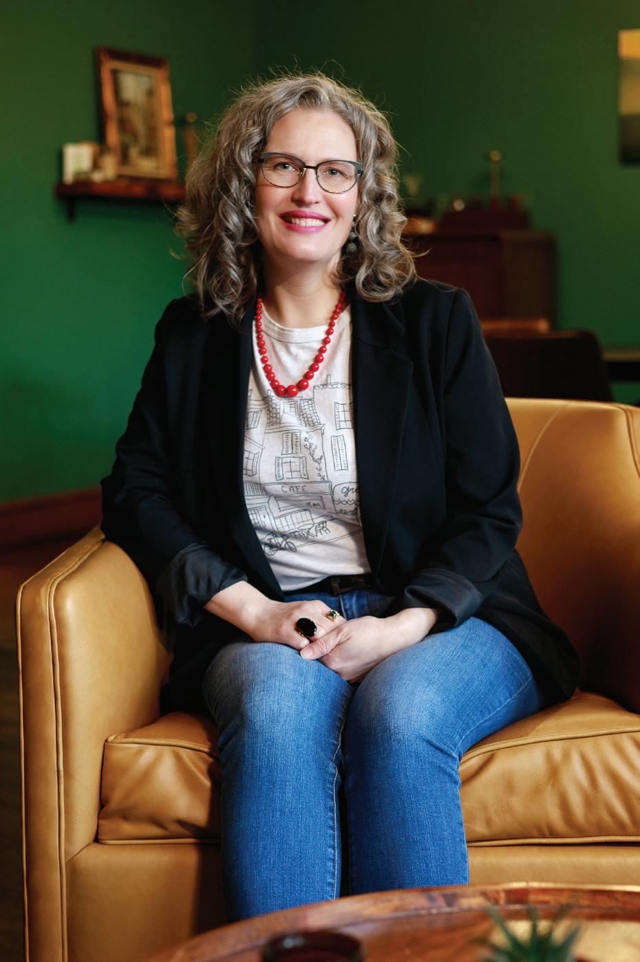

Liz Fears is a recent graduate of the College of DuPage with an Associate of Applied Science in Interior Design. She also holds certifications in Lighting and Computer Aided Design.
Liz brings a unique perspective to interior design through her background in lighting design. With five years of experience spanning residential and architectural lighting, she understands how light shapes a space's aesthetic, functionality, and emotional impact. Her approach combines careful attention to material selection and curated palettes that evolve through spaces and tell a cohesive story.
Liz excels at translating clients' needs and preferences into thoughtful design solutions. Her collaborative nature and strong communication abilities allow her to build lasting relationships with clients and industry partners.
Liz's technical toolkit includes Autodesk AutoCAD, Trimble SketchUp with Chaos Enscape, Chief Architect, Autodesk Revit, Adobe Photoshop, and InDesign, allowing her to communicate design concepts effectively.
Outside of the studio, Liz balances her creative work with family time. She cheers on her three children at their activities, crochets, reads, and enjoys walks with her dog.
630-888-2032
Issuu.com/elizabethfears
linkedin.com/in/elizabethfears