
With only one to two gallon paint and a couple of hours, you can easily transform the bathroom into something new. In fact, the hardest part of the process is deciding on the colour scheme. There is no exact science to choosing the best bathroom colours, and there are infinite combinations that could go together, so it can be overwhelming to make the decision. To help, we gathered up some of the best tips, including how to pick shades for the ceiling, or for your tiles, and where to use them. Whether you are looking to create a spa-like master bath, or a statement powder room, these tips can help you pick out the best bathroom colours for a space you'll love.
Use the Colour Wheel
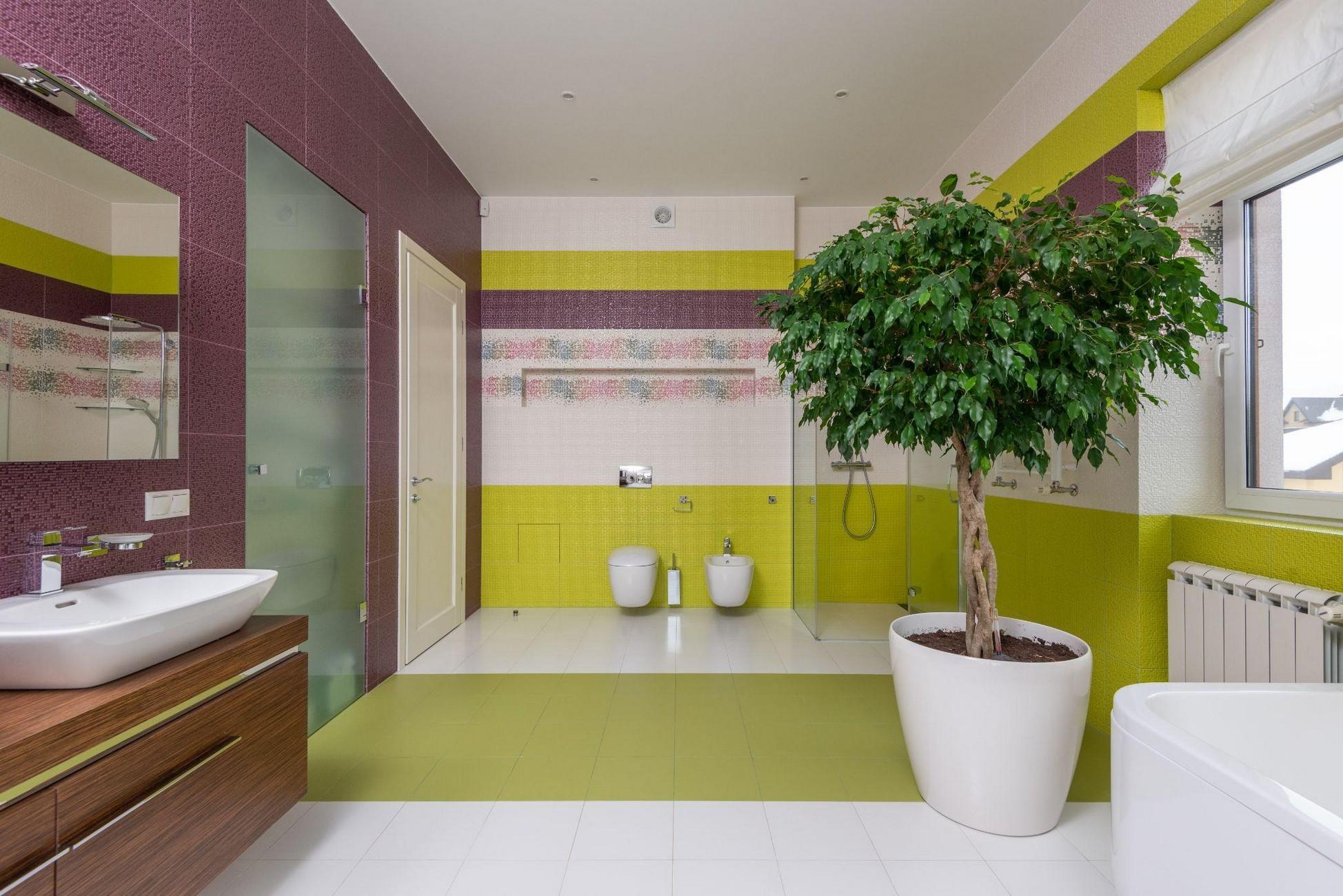
If you are stuck trying to decide what colours work together, consult the colour wheel for inspiration. The concepts in colour theory can help guide you towards shades that work well together. Purple and yellow, for instance, work well together, as they are opposite of one another on the colour wheel, making them complementary. Green and blue are good at going together, because they are right next to each other, making them analogous. When in doubt, refer to a wheel to get a quick, simple answer to your problem.
Choose Three colours
Use the Rule of Three as your guideline for creating your bathroom colour scheme: Choose a neutral, a saturated colour, and an accent. To pull this off successfully, consider proportions and
lean toward the 70/20/10 spread. Use your brightest colours about 70% of your rooms decoration, your second brightest colours 20%, and your most daring colours 10%.
Keep in mind, neutrals can be combined in many ways. For instance, the colour palette of white, cocoa brown, and pale green makes a clean, classic look. But combine these same neutrals with Kelly Green, and the effect is energetic and uplifting. With this smart rule, your bathroom paint colours will feel like you have been picked by an expert.
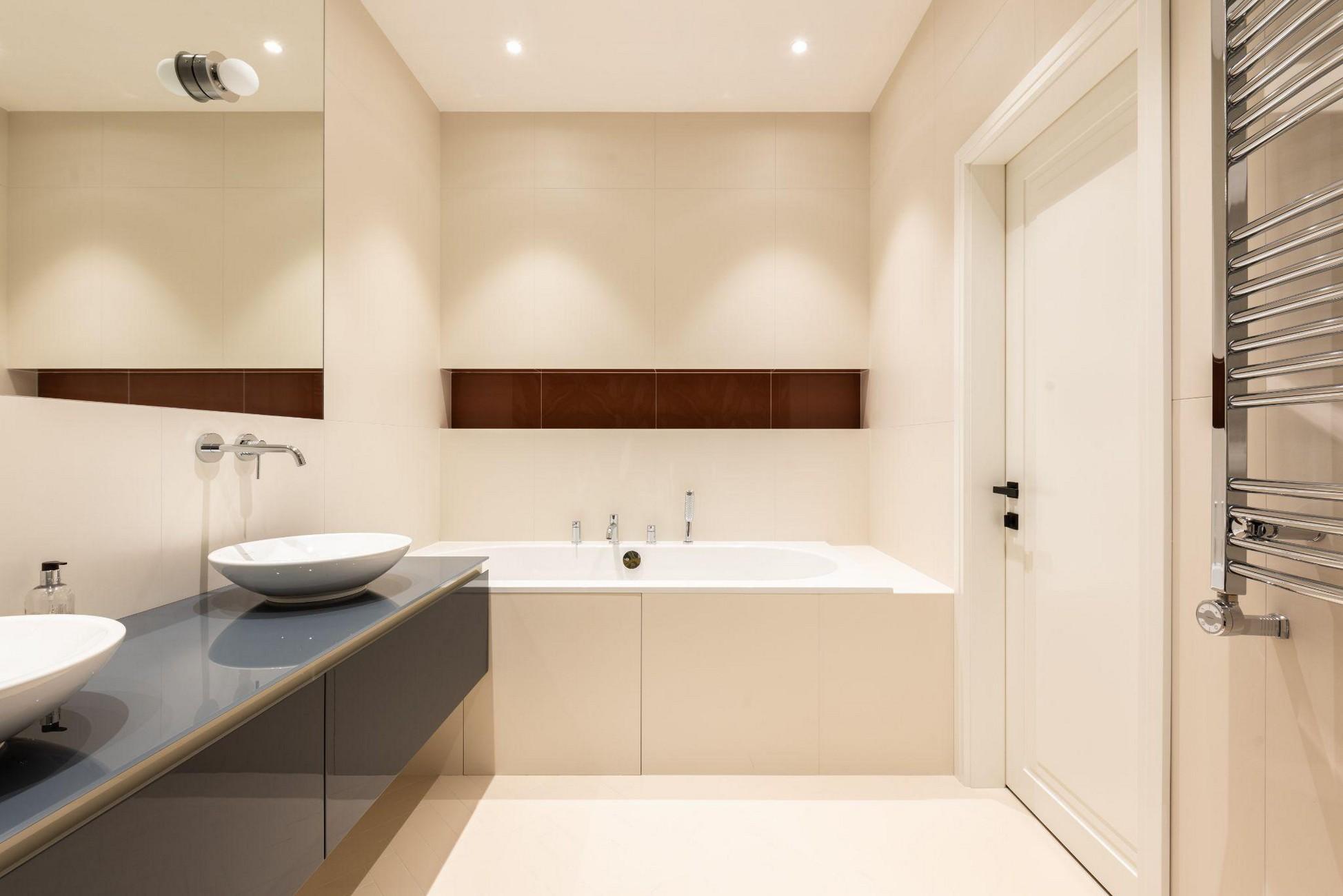
Mix Two Neutrals
A largely neutral colour scheme for the bathroom helps to create a relaxing, serene vibe. Again, the rules of proportion apply: When using two colours, focus on a 70/30 split. Two neutrals, like grey and white, create a soothing colour scheme that is restrained but not dull. To give your room some visual intrigue, incorporate patterned elements, such as chevron tiles on your floors or marble with striated facets on your countertops or wainscoting.
Follow the Second Rule of Three
Another rule of three can help you execute a bath colour scheme effectively. When choosing a colour, use it in the room at least three times. This can include towels, a vanity accent, or an item of furniture. In this bathroom, for instance, the red is repeated in the vanity, the light fixtures, and the wallpaper. The uniform distribution of the bathrooms colours makes every shade seem deliberate, rather than cluttered.
Don't Be Afraid of Dark colours
Many people avoid saturated, deep tones, opting instead for lighter, brighter colours for smaller rooms. However, darker colours like charcoal or cocoa can provide dramatic contrasts in powder rooms, particularly if balanced with white trim and white fixtures. And, when mixed with another shade, like a vibrant green, the overall effect is lively and modern. "People are nervous about going dark in a small room. But they are not making the rooms look smaller, they are just making them darker," says L.A.-based designer Kashani Perera. "Use mercury glass and mirrored lamps so that rooms feel a little less cavernous."
Contrast Two Brights
If you are looking for a bath colour scheme that is a little more energy-filled than soothing, think about an array of bright, bold shades. For instance, orange and blue create a complementary, invigorating colour combination. To infuse this vibrant colour scheme with some peace, incorporate lots of white into your trim, sink, bathtub, or any other focal point of your room. Layer in interesting colours using inexpensive, easy-to-change accessories such as linens. "A bit of healthy tension is a good thing. I like to bring some surprises to the colour schemes," says designer Liz Levine. "If you do not have the eye for that, just look up a piece of fabric or artwork with a fun mix of colours, then use it as your guide."
Go Organic
Nature-inspired colours like kelp green and robins-egg blue tend to make good combinations, and they can contribute to the feeling of being natural. These types of hues also help soften some of the harsh edges and geometric shapes that are common in bathrooms. Incorporate pull-from-nature shades in the bathroom wall paint or the bathroom vanity surfaces to create a clean, crisp look.
Balance Fun Selections with a Neutral
If your colour palette includes bolder tones like apple green or hot pink, go with a bold colour, but pick one neutral to serve as the counterpoint and foundation. "Think of paint as complementary wallpaper, not something that will throw you off when you walk into a room," says Levine. For instance, a creamy, pale brown or stark white could provide a neutral counterpoint on walls, or serve as the bathroom tiles colour. Black accents, provided by coordinating cabinetry or patterning the wallpaper, offer a punctuation point that breaks up bold colours.
Look to the Rest of Your Home
To guide your bathroom palette, take colour cues from other parts of your house. Take the accent colour from your living room, for instance, and make that your main bathroom colour. While the rooms will retain their individual identities, a consistent colour flow will add to your homes overall aesthetic. Here, the same accent colour for the bathroom gold is found throughout other rooms throughout the home.
