PROCESS BOOK
2023-2024
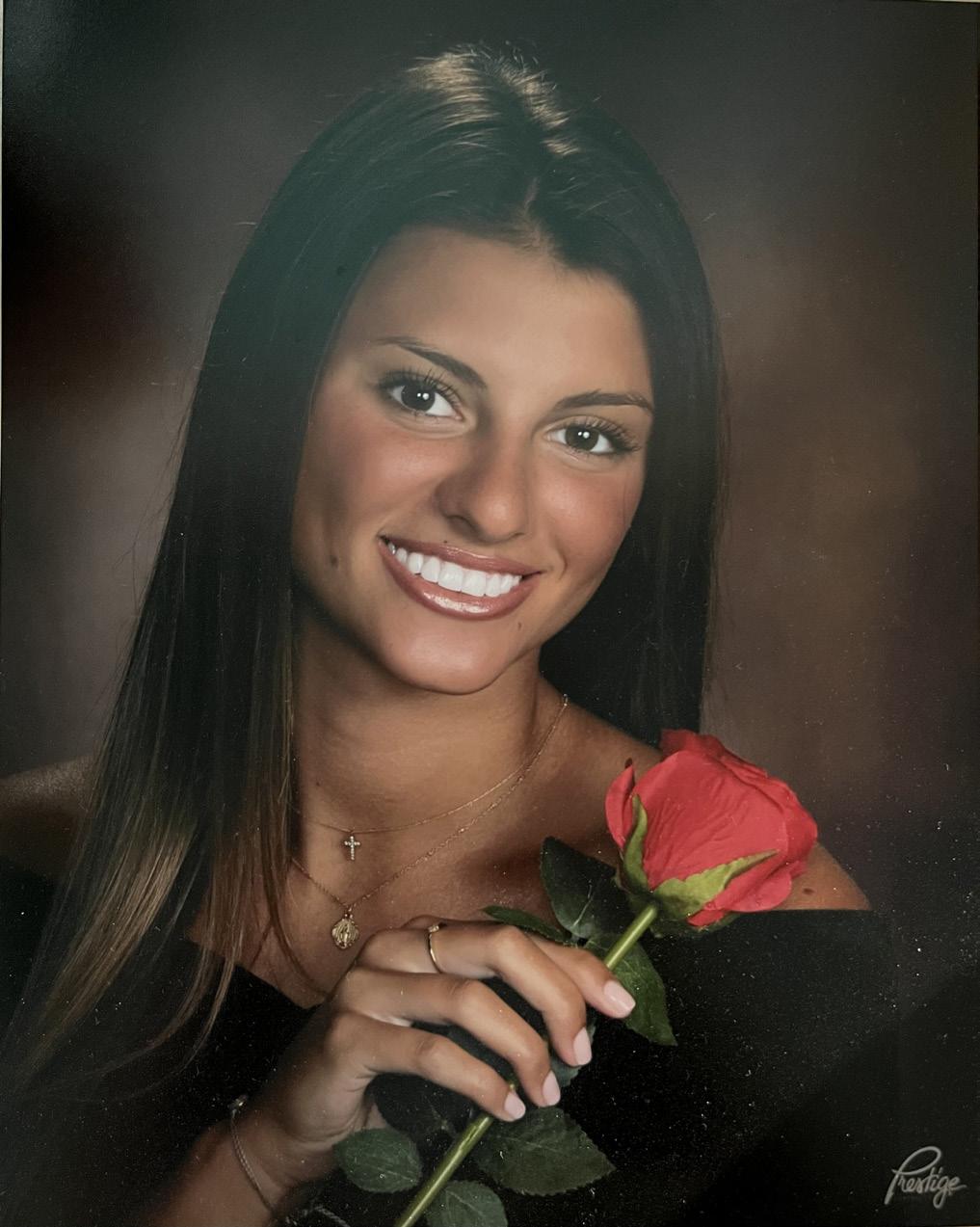
ELIZABETH ELLIOTT
2023-2024
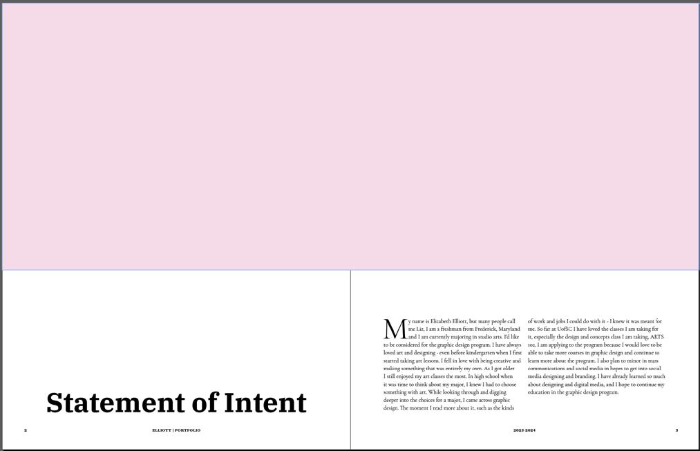
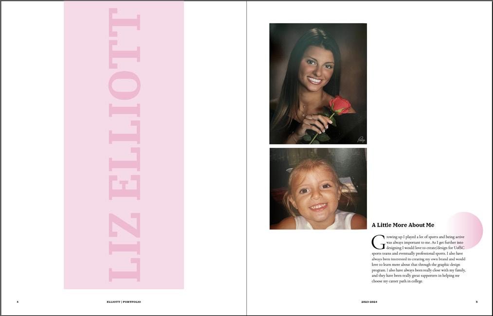
ELIZABETH ELLIOTTMy name is Elizabeth Elliott, but many people call me Liz, I am a freshman from Frederick, Maryland and I am currently majoring in studio arts. I’d like to be considered for the graphic design program. I have always loved art and designing - even before kindergarten when I first started taking art lessons. I fell in love with being creative and making something that was entirely my own. As I got older I still enjoyed my art classes the most. In high school when it was time to think about my major, I knew I had to choose something with art. While looking through and digging deeper into the choices for a major, I came across graphic design. The moment I read more about it, such as the kinds
of work and jobs I could do with it - I knew it was meant for me. So far at UofSC I have loved the classes I am taking for it, especially the design and concepts class I am taking, ARTS 102. I am applying to the program because I would love to be able to take more courses in graphic design and continue to learn more about the program. I also plan to minor in mass communications and social media in hopes to get into social media designing and branding. I have already learned so much about designing and digital media, and I hope to continue my education in the graphic design program.
Growing up I played a lot of sports and being active was always important to me. As I get further into designing I would love to create/design for UofSC sports teams and eventually professional sports. I also have always been interested in creating my own brand and would love to learn more about that through the graphic design program. I also have always been really close with my family, and they have been really great supporters in helping me choose my career path in college.
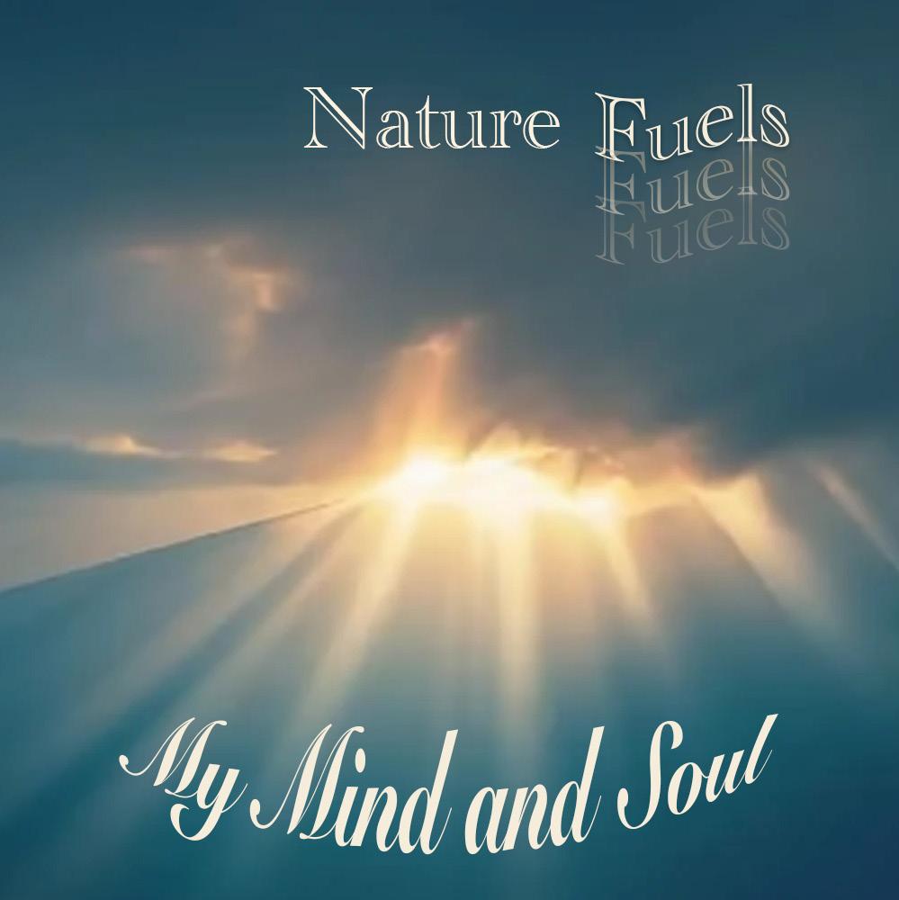
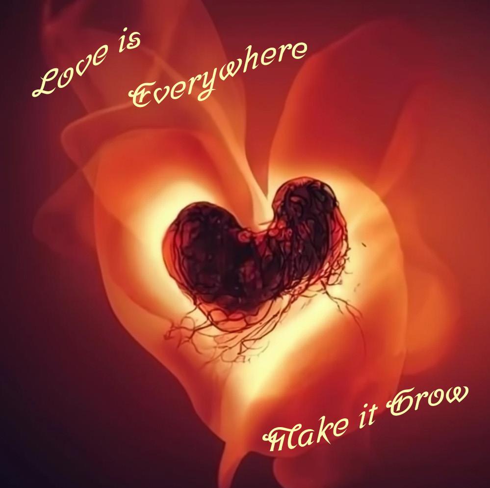
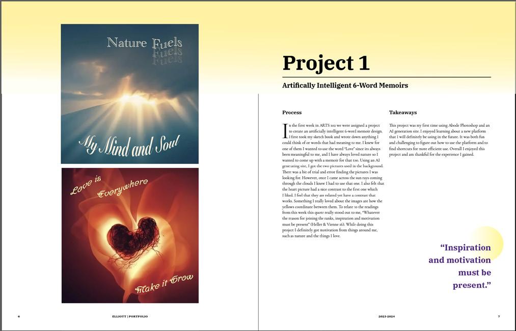
In the first week in ARTS 102 we were assigned a project to create an artificially intelligent 6-word memoir design. I first took my sketch book and wrote down anything I could think of or words that had meaning to me. I knew for one of them I wanted to use the word “Love” since its always been meaningful to me, and I have always loved nature so I wanted to come up with a memoir for that too. Using an AI generating site, I got the two pictures used in the background. There was a bit of trial and error finding the pictures I was looking for. However, once I came across the sun rays coming through the clouds I knew I had to use that one. I also felt that the heart picture had a nice contrast to the first one which I liked. I feel that they are related yet have a contrast that works. Something I really loved about the images are how the yellows coordinate between them. To relate to the readings from this week this quote really stood out to me, “Whatever the reason for joining the ranks, inspiration and motivation must be present” (Heller & Vienne 16). While doing this project I definitely got motivation from things around me, such as nature and the things I love.
This project was my first time using Abode Photoshop and an AI generation site. I enjoyed learning about a new platform that I will definitely be using in the future. It was both fun and challenging to figure out how to use the platform and to find shortcuts for more efficient use. Overall I enjoyed this project and am thankful for the experience I gained.
“Inspiration and motivation must be present.”
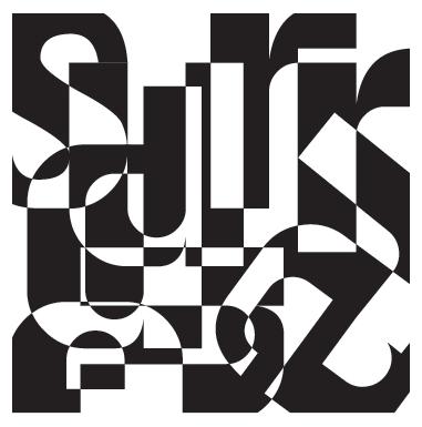
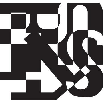
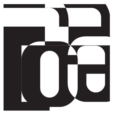
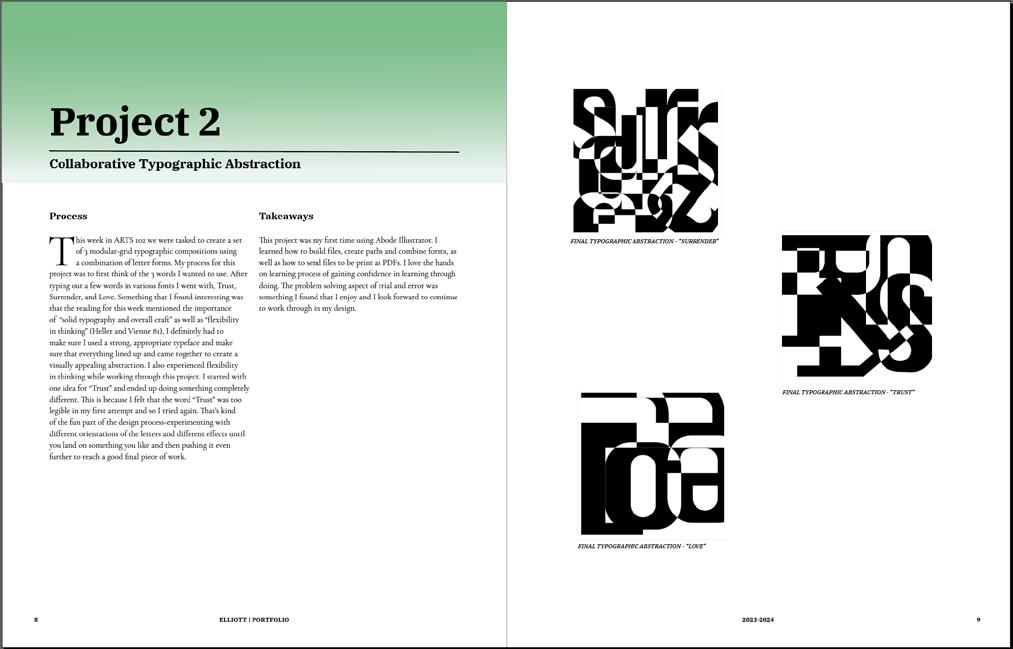
This week in ARTS 102 we were tasked to create a set of 3 modular-grid typographic compositions using a combination of letter forms. My process for this project was to first think of the 3 words I wanted to use. After typing out a few words in various fonts I went with, Trust, Surrender, and Love. Something that I found interesting was that the reading for this week mentioned the importance of “solid typography and overall craft” as well as “flexibility in thinking” (Heller and Vienne 81), I definitely had to make sure I used a strong, appropriate typeface and make sure that everything lined up and came together to create a visually appealing abstraction. I also experienced flexibility in thinking while working through this project. I started with one idea for “Trust” and ended up doing something completely different. This is because I felt that the word “Trust” was too legible in my first attempt and so I tried again. That’s kind of the fun part of the design process-experimenting with different orientations 0f the letters and different effects until you land on something you like and then pushing it even further to reach a good final piece of work.
This project was my first time using Abode Illustrator. I learned how to build files, create paths and combine forms, as well as how to send files to be print as PDFs. I love the hands on learning process of gaining confidence in learning through doing. The problem solving aspect of trial and error was something I found that I enjoy and I look forward to continue to work through in my design.
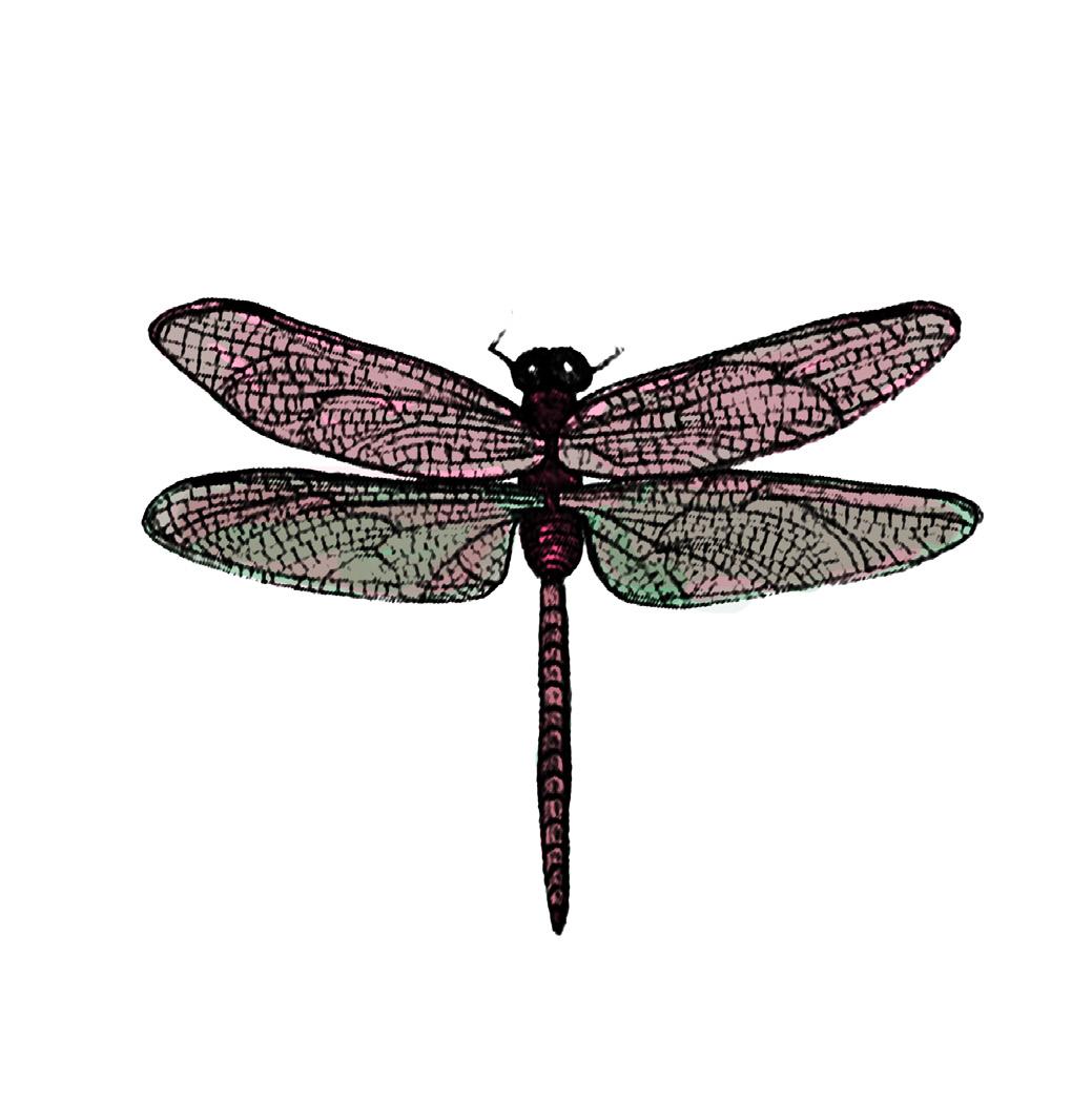
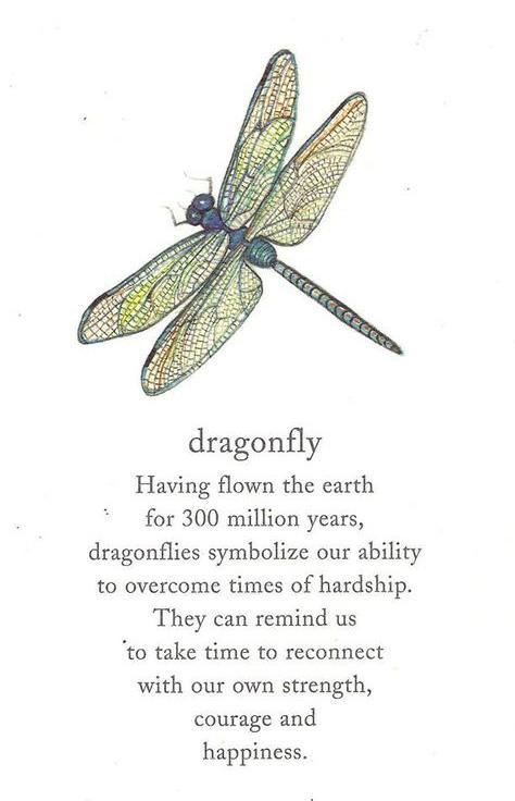
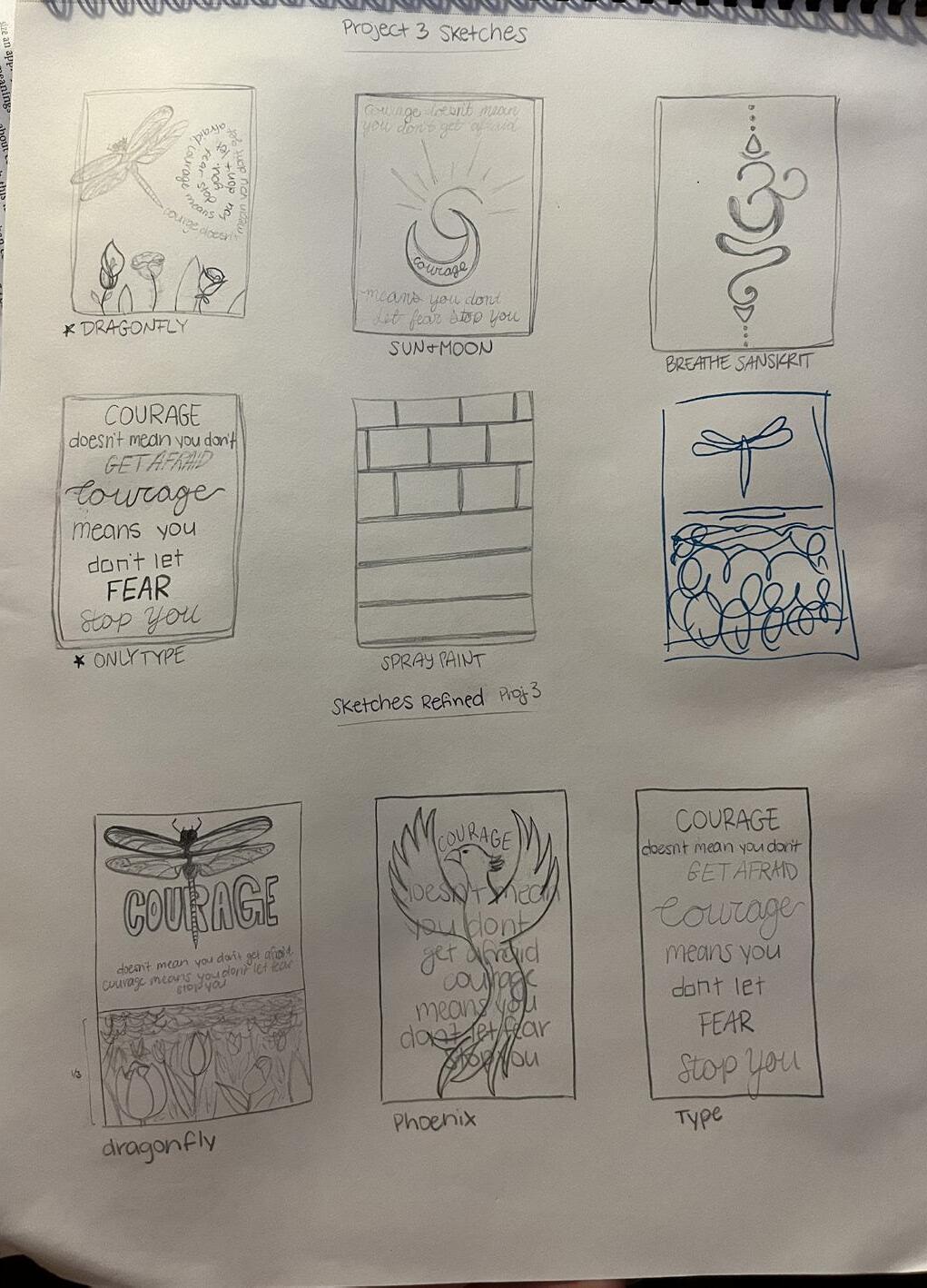
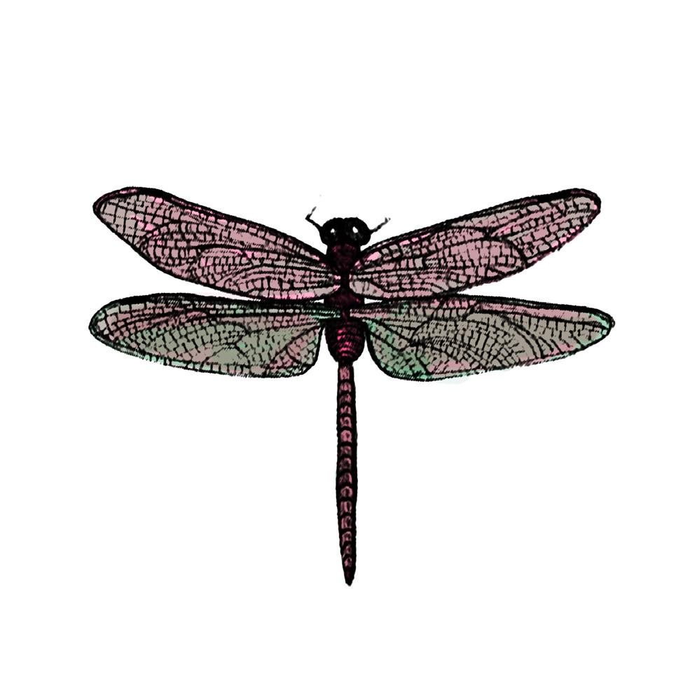
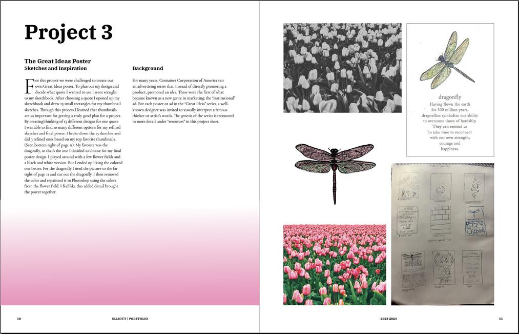
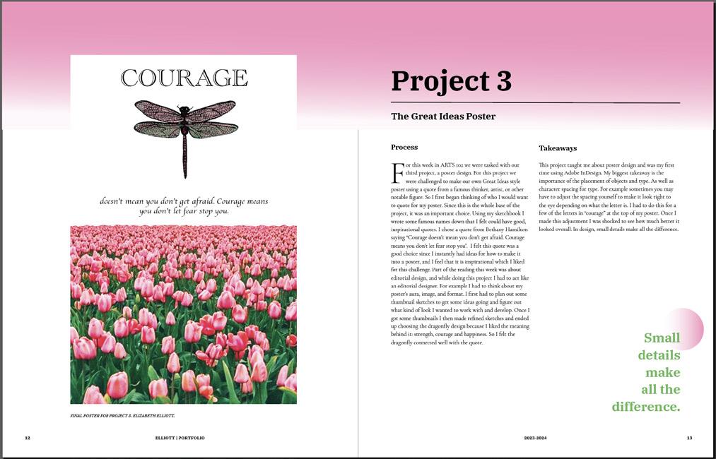
For this project we were challenged to create our own Great Ideas poster. To plan out my design and decide what quote I wanted to use I went straight to my sketchbook. After choosing a quote I opened up my sketchbook and drew 15 small rectangles for my thumbnail sketches. Through this process I learned that thumbnails are so important for getting a truly good plan for a project. By creating/thinking of 15 different designs for one quote I was able to find so many different options for my refined sketches and final poster. I broke down the 15 sketches and did 3 refined ones based on my top favorite thumbnails. (Seen bottom right of page 11). My favorite was the dragonfly, so that’s the one I decided to choose for my final poster design. I played around with a few flower fields and a black and white version. But I ended up liking the colored one better. For the dragonfly I used the picture to the far right of page 11 and cut out the dragonfly. I then removed the color and repainted it in Photoshop using the colors from the flower field. I feel like this added detail brought the poster together.
For many years, Container Corporation of America ran an advertising series that, instead of directly promoting a product, promoted an idea. These were the first of what became known as a new genre in marketing: the “institutional” ad. For each poster or ad in the “Great Ideas” series, a wellknown designer was invited to visually interpret a famous thinker or artist’s words. The genesis of the series is recounted in more detail under “resources” in this project sheet.


doesn’t mean you don’t get afraid. Courage means you don’t let fear stop you.

For this week in ARTS 102 we were tasked with our third project, a poster design. For this project we were challenged to make our own Great Ideas style poster using a quote from a famous thinker, artist, or other notable figure. So I first began thinking of who I would want to quote for my poster. Since this is the whole base of the project, it was an important choice. Using my sketchbook I wrote some famous names down that I felt could have good, inspirational quotes. I chose a quote from Bethany Hamilton saying “Courage doesn’t mean you don’t get afraid. Courage means you don’t let fear stop you”. I felt this quote was a good choice since I instantly had ideas for how to make it into a poster, and I feel that it is inspirational which I liked for this challenge. Part of the reading this week was about editorial design, and while doing this project I had to act like an editorial designer. For example I had to think about my poster’s aura, image, and format. I first had to plan out some thumbnail sketches to get some ideas going and figure out what kind of look I wanted to work with and develop. Once I got some thumbnails I then made refined sketches and ended up choosing the dragonfly design because I liked the meaning behind it: strength, courage and happiness. So I felt the dragonfly connected well with the quote.
This project taught me about poster design and was my first time using Adobe InDesign. My biggest takeaway is the importance of the placement of objects and type. As well as character spacing for type. For example sometimes you may have to adjust the spacing yourself to make it look right to the eye depending on what the letter is. I had to do this for a few of the letters in “courage” at the top of my poster. Once I made this adjustment I was shocked to see how much better it looked overall. In design, small details make all the difference.
Small details make all the difference.
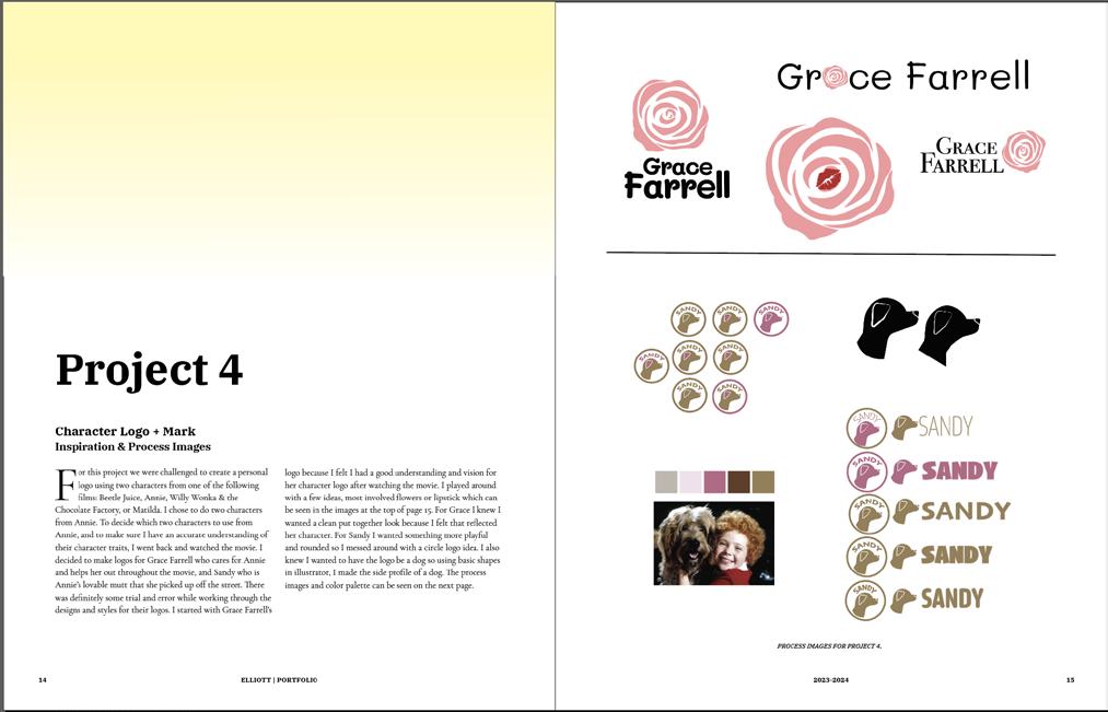
For this project we were challenged to create a personal logo using two characters from one of the following films: Beetle Juice, Annie, Willy Wonka & the Chocolate Factory, or Matilda. I chose to do two characters from Annie. To decide which two characters to use from Annie, and to make sure I have an accurate understanding of their character traits, I went back and watched the movie. I decided to make logos for Grace Farrell who cares for Annie and helps her out throughout the movie, and Sandy who is Annie’s lovable mutt that she picked up off the street. There was definitely some trial and error while working through the designs and styles for their logos. I started with Grace Farrell’s
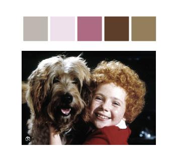
logo because I felt I had a good understanding and vision for her character logo after watching the movie. I played around with a few ideas, most involved flowers or lipstick which can be seen in the images at the top of page 15. For Grace I knew I wanted a clean put together look because I felt that reflected her character. For Sandy I wanted something more playful and rounded so I messed around with a circle logo idea. I also knew I wanted to have the logo be a dog so using basic shapes in illustrator, I made the side profile of a dog. The process images and color palette can be seen on the next page.

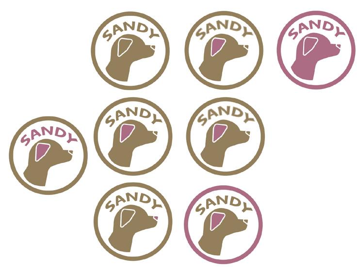
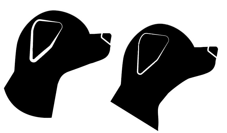
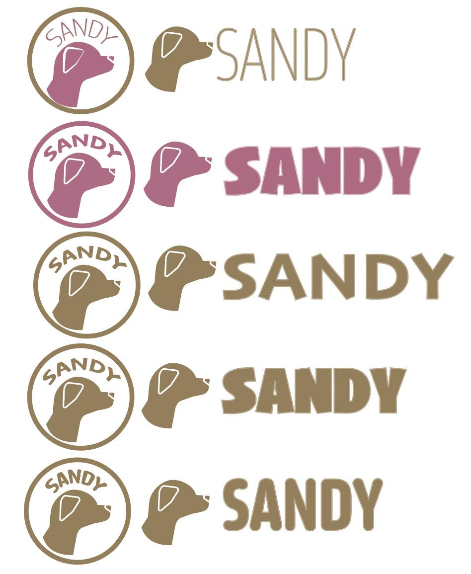
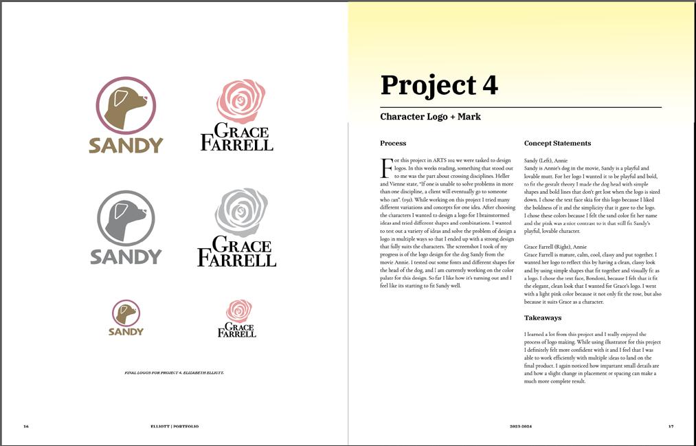
For this project in ARTS 102 we were tasked to design logos. In this weeks reading, something that stood out to me was the part about crossing disciplines. Heller and Vienne state, “If one is unable to solve problems in more than one discipline, a client will eventually go to someone who can”. (191). While working on this project I tried many different variations and concepts for one idea. After choosing the characters I wanted to design a logo for I brainstormed ideas and tried different shapes and combinations. I wanted to test out a variety of ideas and solve the problem of design a logo in multiple ways so that I ended up with a strong design that fully suits the characters. The screenshot I took of my progress is of the logo design for the dog Sandy from the movie Annie. I tested out some fonts and different shapes for the head of the dog, and I am currently working on the color palate for this design. So far I like how it’s turning out and I feel like its starting to fit Sandy well.
Sandy (Left), Annie
Sandy is Annie’s dog in the movie, Sandy is a playful and lovable mutt. For her logo I wanted it to be playful and bold, to fit the gestalt theory I made the dog head with simple shapes and bold lines that don’t get lost when the logo is sized down. I chose the text face skia for this logo because I liked the boldness of it and the simplicity that it gave to the logo. I chose these colors because I felt the sand color fit her name and the pink was a nice contrast to it that still fit Sandy’s playful, lovable character.
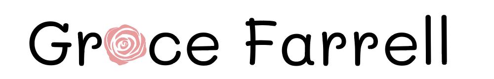
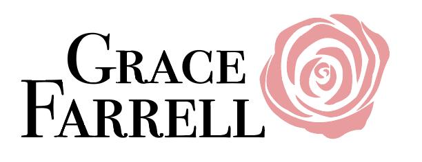
Grace Farrell (Right), Annie
Grace Farrell is mature, calm, cool, classy and put together. I wanted her logo to reflect this by having a clean, classy look and by using simple shapes that fit together and visually fit as a logo. I chose the text face, Bondoni, because I felt that it fit the elegant, clean look that I wanted for Grace’s logo. I went with a light pink color because it not only fit the rose, but also because it suits Grace as a character.
I learned a lot from this project and I really enjoyed the process of logo making. While using illustrator for this project I definitely felt more confident with it and I feel that I was able to work efficiently with multiple ideas to land on the final product. I again noticed how impartant small details are and how a slight change in placement or spacing can make a much more complete result.
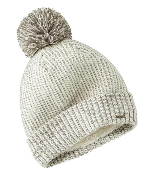
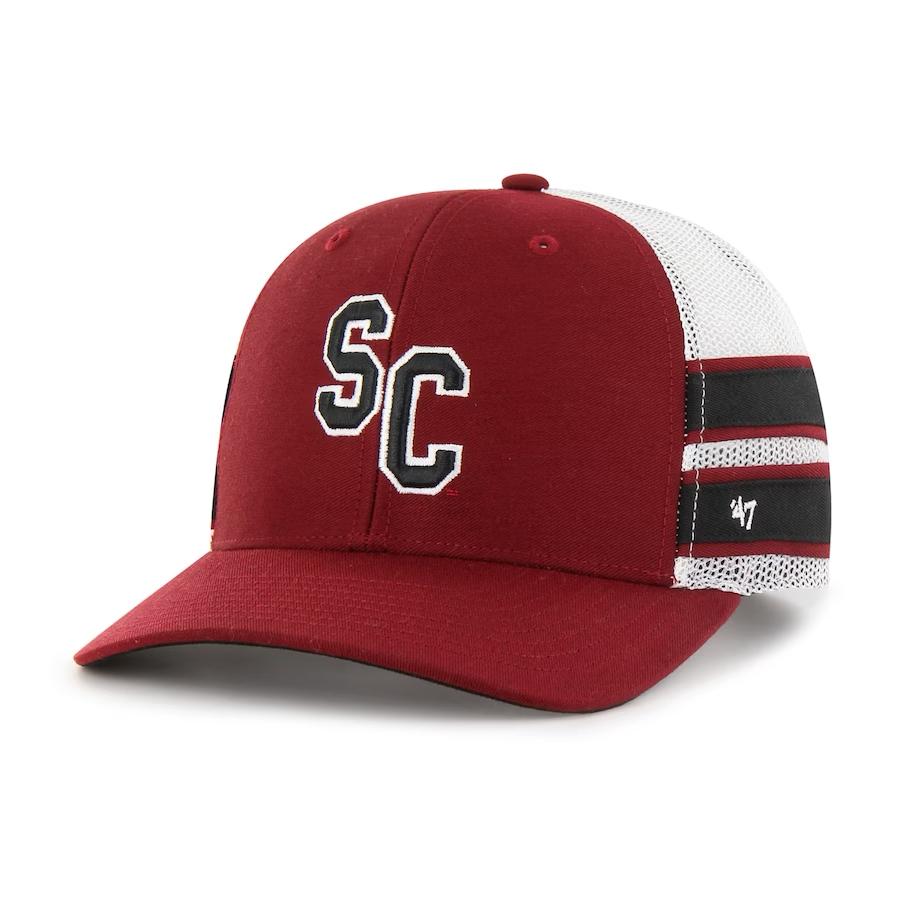
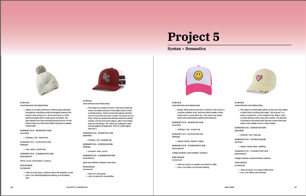
This week in ARTS 102 we read ch. 15 which was about user interface design. The reading discussed the importance of designers taking into account how users interact with products. For our fifth project, we were tasked to analyze a product in 4 different forms: I chose to look at 4 types of hats. They included a beanie, baseball cap, trucker hat, and a dad cap. By breaking down each type of hat into a basic category and form I was able to really explain each one. For the syntax we had to describe the object’s visual elements and relationships. So this part was like an alien description of the object using colors and simple shapes to describe what it looked like. For this part it was difficult to describe the hat in a very basic way. For example with the smiley face trucker hat I had to figure out a way to describe the smiley face without saying “there is a smiley face in the center of the object”. Then we had to describe the semantics of the object which broke down the denotation, expression, and connotation. Finally we had to describe it’s presence, so places where it would blend in and be normal to see versus places where it would stand out and be weird to see.
Overall this project helped me understand how to break down an object and to better understand syntax and semantics. It was challenging but fun to figure out how to describe an object in a way that doesn’t say what it actually is. In other words to describe it in an “alien” way.
Taking into account how users interact with products. Taking into account how users interact with products.
SYNTAX
SYNTAX visual elements and relationships
visual elements and relationships
» Object is a mostly white form. Minimal gray elements throughout including a small rectangular shape at the bottom with writing on it. At the top there is a fluffy spherical shape that is mostly gray and white. The gray details form lines vertically along the form. At the bottom there is a fold where fluffy material is revealed underneath.
» Object is a mostly white form. Minimal gray elements throughout including a small rectangular shape at the bottom with writing on it. At the top there is a fluffy spherical shape that is mostly gray and white. The gray details form lines vertically along the form. At the bottom there is a fold where fluffy material is revealed underneath.
SEMANTICS: DENOTATION (specified)
SEMANTICS: DENOTATION (specified)
» clothing > hat > beanie hat
» clothing > hat > beanie hat
SEMANTICS: EXPRESSION (feelings)
SEMANTICS: EXPRESSION (feelings)
» cozy, warm, comforting
» cozy, warm, comforting
SEMANTICS: CONNOTATION (associations)
SEMANTICS: CONNOTATION (associations)
Winter, snow, cold weather, outdoors
Winter, snow, cold weather, outdoors
PRESENCE (contextual)
PRESENCE (contextual)
» Little: At a ski resort, outdoors when the weather is cold
SYNTAX visual elements and relationships
SYNTAX visual elements and relationships
» This object is a mostly red form. It has some white elements, the sides and back of the object seem to have a net-like texture. There are two thick garnet red lines that are horizontal and have a bright red border around them. There is a small white element inside the bottom red line. On the front of the object, right in the middle, there are the letters, “SC” which are outlined in white and are slightly off alignment. The S is a little higher than the C.
» This object is a mostly red form. It has some white elements, the sides and back of the object seem to have a net-like texture. There are two thick garnet red lines that are horizontal and have a bright red border around them. There is a small white element inside the bottom red line. On the front of the object, right in the middle, there are the letters, “SC” which are outlined in white and are slightly off alignment. The S is a little higher than the C.
SEMANTICS: DENOTATION (specified)
SEMANTICS: DENOTATION (specified)
» clothing > hat > baseball cap
» clothing > hat > baseball cap
SEMANTICS: EXPRESSION (feelings)
SEMANTICS: EXPRESSION (feelings)
» energetic, basic, sporty
» energetic, basic, sporty
SEMANTICS: CONNOTATION (associations)
SEMANTICS: CONNOTATION (associations)
game day, athletes, baseball, sunny days
SYNTAX visual elements
SYNTAX visual elements
» Mostly white a yellow inside and bold colors
» Mostly white a yellow inside and bold colors
SEMANTICS: (specified)
SEMANTICS: (specified)
» clothing
» clothing
SEMANTICS: (feelings)
SEMANTICS: (feelings)
» casual, trendy,
» casual, trendy,
SEMANTICS: (associations) college students, PRESENCE (contextual)
SEMANTICS: (associations) college students,
PRESENCE (contextual)
» Little: at
» Lots: in an
» Little: at
» Little: At a ski resort, outdoors when the weather is cold
» Lots: In an office/professional setting, at a Broadway play
» Lots: In an office/professional setting, at a Broadway play
game day, athletes, baseball, sunny days
PRESENCE (contextual)
PRESENCE (contextual)
» Little: At a USC game
» Lots: In a law firm, formal office
» Little: At a USC game
» Lots: In a law firm, formal office
» Lots: in
SYNTAX visual elements and relationships
SYNTAX visual elements and relationships
SYNTAX visual elements and relationships
SYNTAX visual elements and relationships
some white eleseem to have garnet red lines border around the bottom the middle, outlined in white little higher
some white eleseem to have garnet red lines border around inside the bottom in the middle, outlined in white little higher
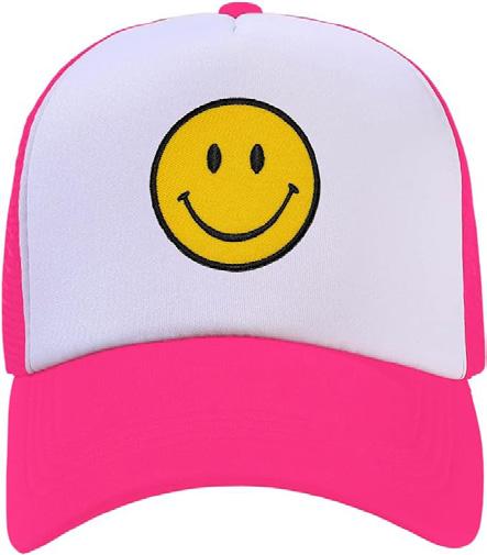
» Mostly white and hot pink form. Directly in the center is a yellow outlined circle, with two black smaller circles inside and a curved black line. This object has bright bold colors and simple outlines and elements.
» Mostly white and hot pink form. Directly in the center is a yellow outlined circle, with two black smaller circles inside and a curved black line. This object has bright bold colors and simple outlines and elements.
SEMANTICS: DENOTATION (specified)
SEMANTICS: DENOTATION (specified)
» clothing > hat > trucker hat
» clothing > hat > trucker hat
SEMANTICS: EXPRESSION (feelings)
SEMANTICS: EXPRESSION (feelings)
» casual, trendy, cheerful, happy
» casual, trendy, cheerful, happy
SEMANTICS: CONNOTATION (associations)
SEMANTICS: CONNOTATION (associations)
college students, warm weather, outdoors
college students, warm weather, outdoors
PRESENCE (contextual)
PRESENCE (contextual)
» Little: at a park, on vacation at a beach or lake
» Little: at a park, on vacation at a beach or lake
» Lots: in an office, at a formal meeting
» Lots: in an office, at a formal meeting
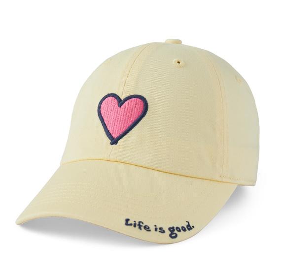
» This object is mostly light yellow. At the tip of the object in black there is writing that reads “Life is good.” in a playful, simple font. In the middle of the object, there is a pink element with a navy blue outline. The element is pointed at the bottom and has two curves that meet lower in the middle to form a heart shape.
» This object is mostly light yellow. At the tip of the object in black there is writing that reads “Life is good.” in a playful, simple font. In the middle of the object, there is a pink element with a navy blue outline. The element is pointed at the bottom and has two curves that meet lower in the middle to form a heart shape.
SEMANTICS: DENOTATION (specified)
SEMANTICS: DENOTATION (specified)
» clothing > hat > dad cap
» clothing > hat > dad cap
SEMANTICS: EXPRESSION (feelings)
SEMANTICS: EXPRESSION (feelings)
» casual, trendy, basic, uplifting
» casual, trendy, basic, uplifting
SEMANTICS: CONNOTATION (associations)
SEMANTICS: CONNOTATION (associations)
college students, vacation/travel, outdoors
college students, vacation/travel, outdoors
PRESENCE (contextual)
PRESENCE (contextual)
» Little: at a park, at a casual coffee shop
» Little: at a park, at a casual coffee shop
» Lots: in an office, job interview
» Lots: in an office, job interview
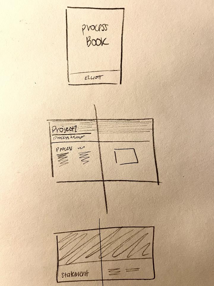
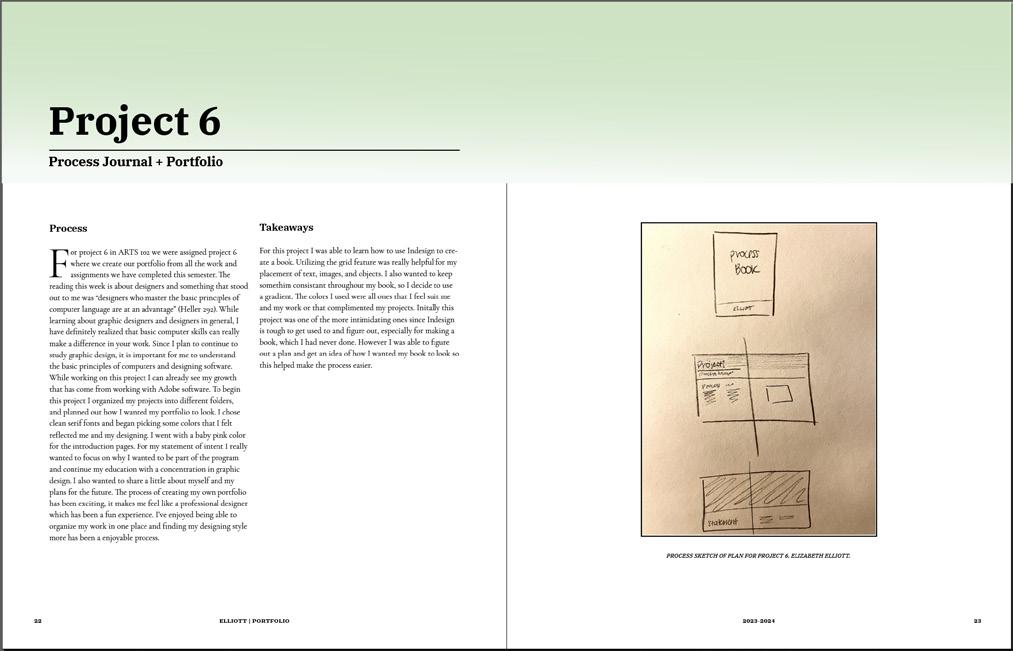
or project 6 in ARTS 102 we were assigned project 6 where we create our portfolio from all the work and assignments we have completed this semester. The reading this week is about designers and something that stood out to me was “designers who master the basic principles of computer language are at an advantage” (Heller 292). While learning about graphic designers and designers in general, I have definitely realized that basic computer skills can really make a difference in your work. Since I plan to continue to study graphic design, it is important for me to understand the basic principles of computers and designing software. While working on this project I can already see my growth that has come from working with Adobe software. To begin this project I organized my projects into different folders, and planned out how I wanted my portfolio to look. I chose clean serif fonts and began picking some colors that I felt reflected me and my designing. I went with a baby pink color for the introduction pages. For my statement of intent I really wanted to focus on why I wanted to be part of the program and continue my education with a concentration in graphic design. I also wanted to share a little about myself and my plans for the future. The process of creating my own portfolio has been exciting, it makes me feel like a professional designer which has been a fun experience. I’ve enjoyed being able to organize my work in one place and finding my designing style more has been a enjoyable process.
For this project I was able to learn how to use Indesign to create a book. Utilizing the grid feature was really helpful for my placement of text, images, and objects. I also wanted to keep somethim consistant throughout my book, so I decide to use a gradient. The colors I used were all ones that I feel suit me and my work or that complimented my projects. Initally this project was one of the more intimidating ones since Indesign is tough to get used to and figure out, especially for making a book, which I had never done. However I was able to figure out a plan and get an idea of how I wanted my book to look so this helped make the process easier.
Overall, I have really enjoyed developing my designing skills and knowledge through this class. I have found something that I do love doing. I like being challenged to solve a problem, being creative, and learning new tips when it comes to deigning. I feel that it is a rewarding process to be able to bring a vision to life. This is
why I would love to continue my learning in Graphic Design. I plan on minoring in social media and mass communications as well, so I am excited to utilize what I will learn in those classes with my designing.
Front Page Title | IBM Plex Serif, Bold, Font 48pt
Page Titles | IBM Plex Serif, Bold, Font 48pt
Subtitle 1 | IBM Plex Serif, Bold, Font 16pt
Subtitle 2 | IBM Plex Serif, Bold, Font 12pt
Body | Cormorant Garamond, Regular, Font 10pt
Captions | IBM Plex Serif, Text Italic, Font 7.5pt