dedIcAted to the 5-yeArolds, especIAlly the one I wAs 13 yeArs Ago, thAt only wAnted to drAw. never stop creAtIng.
OBJECTIVE:
plAce An emphAsIs on crAftsmAnshIp to buIld stronger perceptIons of AbstrActIon, mInImAlIsm, composItIon, And gestAlt prIncIples. form A fInAl, refIned pIece bAsed off of A gAmut of IterAtIons And InItIAl IdeAs.
for me, I lIve for A well-crAfted object. I love spendIng exorbItAnt Amounts of tIme to get every lIttle detAIl just As I wAnted them, so thIs project wAs perfect for me wIth An emphAsIs on crAftsmAnshIp. beIng A perfectIonIst, I enjoyed hAvIng the AbIlIty to use sImplIstIc shApes In order to most cleArly convey An IdeA. thIs project prompted me to look At AbstrActIon on A much deeper level. whIle I knew much of AbstrAct Art hAd meAnIng to It, I wAs not one to creAte thAt type of Art, so beIng forced to help put me In A mIndset of InterpretIng how AbstrAct Art mAnAges to come together. overAll, I would sAy It greAtly Improved the reputAtIon I prevIously held of AbstrActIon.
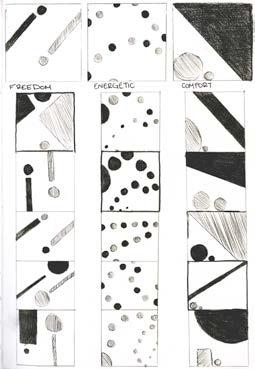
The first iterative thumbnails that focused on creating numerous compositions and expending all possible ideas. One of these compositions would then be decided as the most effective and expanded on further.
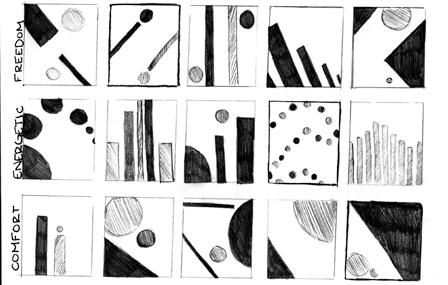
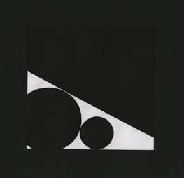
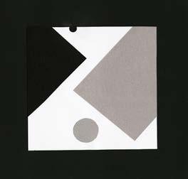
Gestalt is a word or theory that emphasizes looking at things as a whole instead of a sum of its parts. In this project, we used gestalt principles to organize visual information (dots and lines) in ways that made sense together to represent a concept.
The second send of iterative thumbnails, focused on experimenting with the chosen composition from the first set.
whIle I don’t often use AbstrAct Art, I thInk thAt goIng bAck to the bAsIcs gIves me the thought process to most effectIvely use elements (color, sIze, or composItIon) to trAnslAte them Into more of my style of Art. I cAn see thIs exercIse beIng A good bAsIs for me to plAn composItIons before I go through And mAke them more detAIled (A.k.A. replAcIng the dots And lInes wIth subjects or lAndscApe elements). gestAlt Also ApplIes to psychology And seeIng thIngs As wholes, And In my mAjor, thIs element of psychology Is undenIAbly vItAl to reAch the “self-ActuAlIzAtIon” stAge In my cAreer, If you wIll.
personAlly, It wAs dIffIcult for me to gIve the essence of An IdeA wIthout IllustrAtIng Any Aspects of It. I Am A logIcAl thInker And enjoy stem subjects, so hAvIng to thInk About thIngs As representAtIons InsteAd of InformAtIon thAt I eIther hAd before or wAs gIven to me wAs trIcky to get In the mIndset of. however, I Also do love A good chAllenge, so once I hAd flIpped the swItch In my brAIn, It wAs eAsy to get Into the rhythm of AbstrActIon.
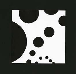
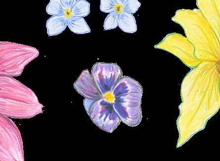
the orIgInAl composItIon of thIs pIece hAd the dots At A much smAller scAle, but After feedbAck from my peers thAt suggested It gAve off more “oppressIon” thAn “comfort,” I enlArged the sIze of them to gIve the AppeArAnce thAt they hAd more power. the closeness of the dots suggests comfort, wIth the lIne on top ActIng As A shelter or blAnket for them.
I wAnted to convey feelIngs of “bouncIng off of the wAlls” wIth thIs pIece, but mAkIng It so thAt some of the elements exIt the frAme, suggesetIng the engergy thAt they exude cAnnot be contAIned. It’s quIte A busy composItIon, but more elements In the frAme equAte to the chAos of energy.
the IntentIonAlIty behInd thIs composItIon lIes behInd the pAIrIng of colors In thIs 2 dot, 2 lIne pIece. I, In A wAy, wAnted thIs pIece to exude two sepArAte journIes of the dots, wIth theIr hIstorIes pAInted behInd them wIth the lInes. they hAve the freedom to pursue theIr own storIes, And they Aren’t confIned to the frAme, As suggested wIth the blAck dot exItIng It.
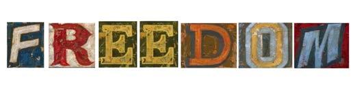
Letterforms
OBJECTIVE:
focus on IntentIonAlIty In crAft to ArrIve At meAnIngful IterAtIons bAsed on meAnIng of text. consIder how physIcAl prInts cAn be trAnsformed through typogrAphIc vArIAtIon And dIgItAl AlterAtIons to buIld depth And meAnIng
from workIng wIth letterforms In thIs wAy, I feel As though I've leArned About the power of text/the wAy you present your work As opposed to whAt comprIses the work Itself. we were lImIted to A sIngle font (only In blAck And whIte), yet somehow mAnAged to delve off Into numerous IdeAs to get ImpActful messAges from the sAme foundAtIon. It goes to show how
mIndful we As desIgners need to be when workIng wIth seemIngly sImple subjects. If I were to contInue workIng wIth these letterforms, I thInk I would experIment wIth dIfferent words beyond 4 or 5 letters, And I would go much more In depth (I wAnted to try An embroIdery IdeA wIth thIs one, but dIdn't hAve the tIme) wIth meAnIng, especIAlly If I wAsn't lImIted to A chArActer count or deAdlIne. I would Also wAnt to plAy Around wIth tAkIng thIs IdeA And cArvIng my own, unIque font to use for my explorAtIon of typogrAphy.
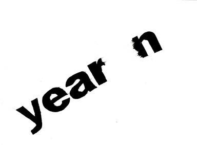
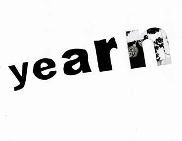
Typographicstraightprint
Typographicvariation
Quiltedtypography
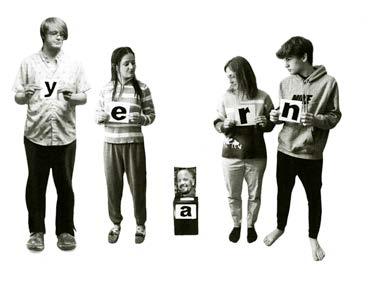
Familialtypographicphotography
OBJECTIVE:
experIment wIth A vArIety of medIA And styles whIle AcceptIng pAst, Imperfect IterAtIons contAIned by pArAmeters (blAck And whIte, A sIngle object, etc.) to pIece together fInAl IterAtIons Into A fInIshed, prInted pIece.
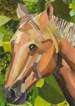
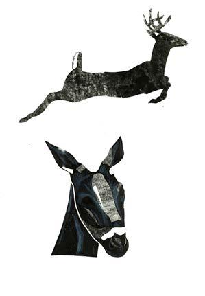
personAlly, I found thAt the geometrIc IterAtIon wAs shockIngly the most dIffIcult for me. As someone who lIkes detAIl And precIsIon, hAvIng to reduce my object to shApes wAs A bIt frustrAtIng. before I hAd worked on my geometrIc, I hAd mentIoned not lIkIng the collAge. now thAt I look bAck, though, I thInk thAt wAs the most enjoyAble. when I hAd to do 5 In A row, It got A bIt exhAustIng wIth All of the detAIls I wAnted to Add, but I love collAge, so doIng 1 At A tIme wAs quIte therApeutIc, especIAlly when I got to mAke sAtIrIcAl meAnIng of It wIth the type collAge--mAybe thAt Is just becAuse I lIked the result over the process though (In thAt cAse, the lIne drAwIng wAs very fun!).
An old artwork that served as inspiration for my collage process
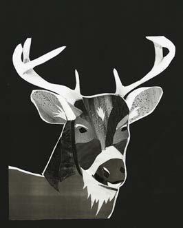
goIng forwArd, I thInk I leArned just how eAsy photoshop wAs to use, And now I’m not As IntImIdAted by It As I wAs before (stIll not the bIggest fAn of dIgItAl work though). If I hAd kept goIng wIth thIs project, I would defInItely wAnt to represent It through the eyes of other ArtIsts; there were some I wAnted to do but never got to. I Also would lIke to rIff further on how humAns InterAct wIth deer And how thAt tAInts our perceptIon of them.
Collage iterations
OBJECTIVE:
work wIth Another person professIonAlly And mutuAlly to explore the ImpAct of text when used expressIvely In A vIsuAl hIerArchy to communIcAte A messAge whIle formIng A bAse workIng from AnAlog IterAtIons.
In theory, It wAs dIffIcult for me At fIrst to get over the concept of beIng lImIted to only blAck And whIte text (wIth the exceptIon of the colored pAper). but, As I got my text to work wIth And stArted generAtIng IdeAs of typogrAphIcAl vArIAtIon thAt stIll got the vIbe I wAnted Across, It becAme eAsIer And eAsIer, And I thInk I preferred where I ended up As opposed to where I would hAve If I hAd Access to IllustrAtIve chArActerIstIcs.
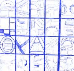
Initial composition plans
goIng forwArd to work In A school meAns thAt It Is very lIkely thAt I wIll be InvoluntArIly cAlled upon to mAke posters or the works for certAIn orgAnIzAtIons, so knowIng how to creAte strong composItIons wIth the elements beIng very bAre-bones wIll be very helpful, but Also, I thInk thIs project specIfIcAlly helped me to see just how mAny thumbnAIl sketches I cAn come up wIth If I don’t gIve up After sketch number 5, so It tAught me to thInk crItIcAlly, unIquely, And IntentIonAlly About All of my work goIng forwArd.
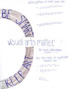
I reAlly wAnted to put An emphAsIs on InterestIng negAtIve spAce In thIs composItIon specIfIcAlly wIth the use of curves, especIAlly sInce my clIent wAnted An “Artsy” vIbe, so by usIng dIfferent sIzed cIrcles wIth dIfferent opAcItIes, It creAted A sort of pAth thAt guIded the vIewer’s eyes where I wAnted them to go. I Also utIlIzed the boldness or thIckness of certAIn fonts to put emphAsIs on the more ImportAnt Aspects of the hIerArchy, so font choIce plAyed A very bIg pArt In how I chose to desIgn thIs poster.
» Enhance the educational experience of traditionally underserved students
ARE YOU CALLED TO CREATIVE
WORK?
IF SO, HOW DO YOU RECOGNIZE THAT CALLING? IF NOT, TO WHAT DO YOU FEEL CALLED?
As of rIght now, I cAnnot honestly Answer whether I feel cAlled to creAtIve work, As I Am kInd of At A fork In the roAd of where I wAnt to be goIng forwArd. on one hAnd, I would love to just go And be An Art teAcher, but I feAr thAt I eIther won’t lIve up to the expectAtIon thAt I hold myself to, or thAt beIng Around Art constAntly/mAkIng It Into A cAreer wIll just ruIn It for me, forcIng me to dIstAnce myself further. on the other hAnd, I wAs orIgInAlly goIng to come to snc for engIneerIng physIcs (fun fAct!), And I stIll love the IdeA of goIng Into A fIeld where I won’t wAste my fAscInAtIon wIth mAthemAtIcs. I cAn’t sAy thAt I Am pArtIculArly cAlled to eIther one, so becAuse there’s A sense of questIonIng And IndecIsIon, I would lIkely come to the conclusIon thAt I Am not cAlled to A creAtIve lIfe
WHAT IS THE GREATEST FAILURE YOU’VE
EXPERIENCED IN YOUR LIFE (THAT YOU FEEL COMFORTABLE SHARING WITH OUR CLASS)?
thIs mAy sound sIlly, or pretentIous, or both, but becAuse It Is pArt of the reAson I chose the mAjor I dId, I feel the need to brIng It to lIght AnywAys. I cAn sAy thAt the fAIlure thAt hAs most ImpActed me As A person wAs beIng sAlutAtorIAn InsteAd of vAledIctorIAn. I cAn AlreAdy heAr the sIghs
And the crItIques, but heAr me out. comIng In second plAce to someone who hAd AdmItted to cheAtIng
whIle stIll hAvIng over A 4.0 gpA And 28 college credIts In my pocket wAs honestly dIsheArtenIng
And IncredIbly humblIng. In cAse you’re wonderIng, the vAledIctorIAn AutomAtIcAlly gets A $10,000 scholArshIp, sAlutAtorIAn gets nothIng. As AforementIoned, I wAs goIng to go Into engIneerIng school orIgInAlly, but If I wAsn’t even good enough to grAduAte top of my clAss, then In whAt world could I mAke It through engIneerIng? thAt beIng sAId, It heIghtened my empAthy entIrely, After I recovered from the heArtbreAk And blIndIng rAge, of course, And It Is pArt of the reAson I fInd myself In educAtIon todAy–so I suppose It wAsn’t entIrely A fAIlure, though It pAInted myself As A fAIlure pretty potently for A whIle, And It stIll Affects my self-esteem todAy.
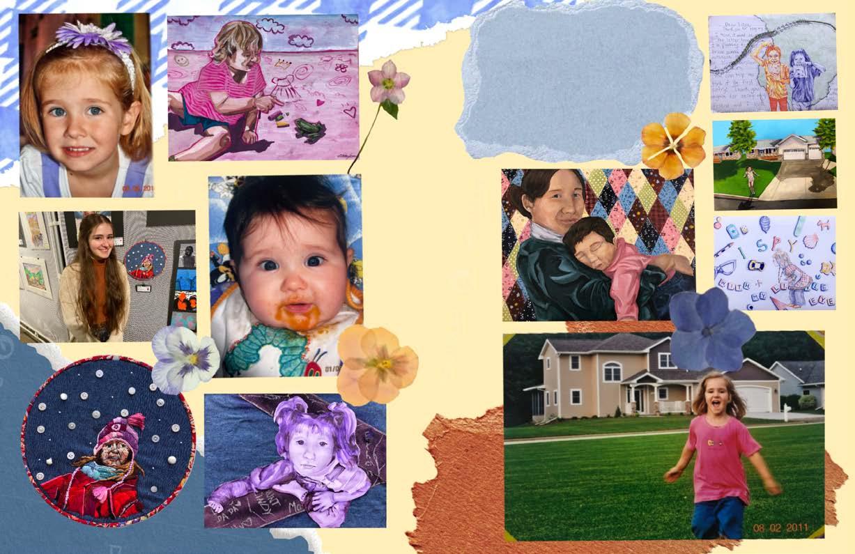
for my major choice
thIs book wAs mAde As pArt of IntroductIon to desIgn At st. norbert college In the sprIng of 2025. the fonts used were espIrItu regulAr And scrIpt. It wAs dIgItAlly prInted And sAddle stApled At the st. norbert college prInt center.