Portfolio
UCAS ID: 1817623561
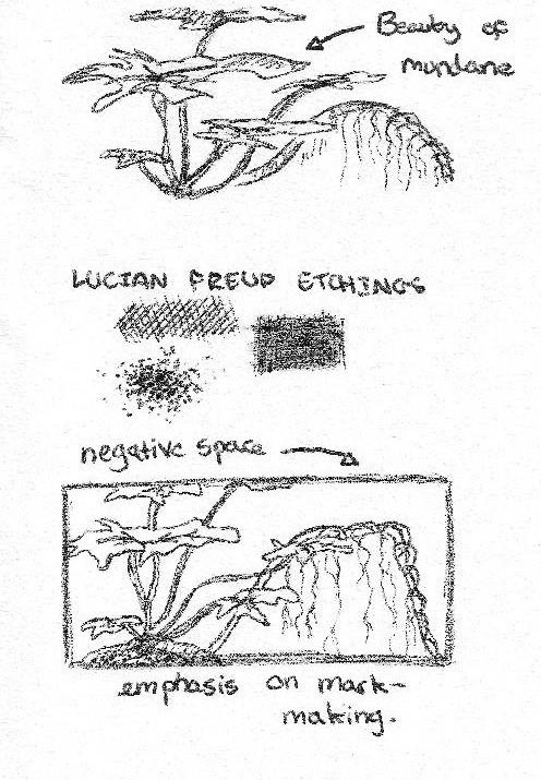
Weeds
Dry-point etching on aluminium sheet, 42.3 x 29.6 cm
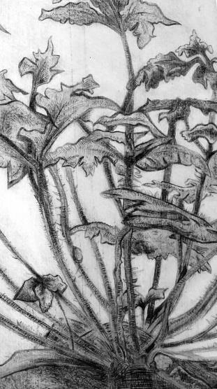
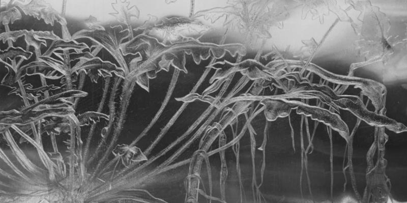
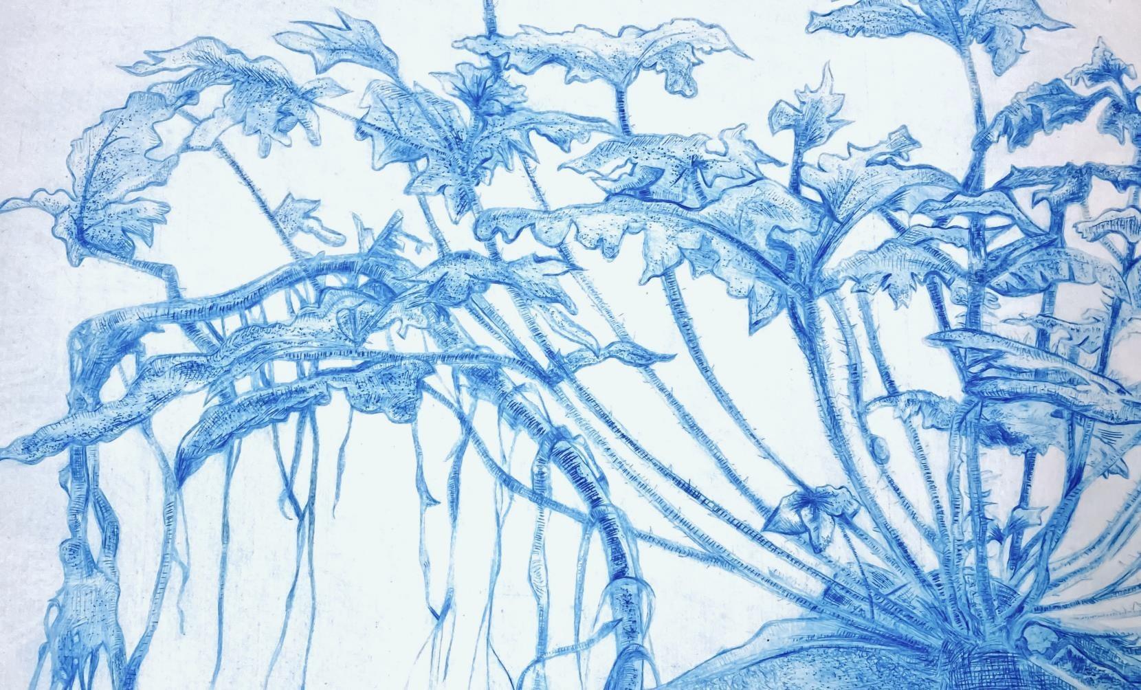
With a love for Lucian Freud’s botanical etchings, I was inspired to explore the medium myself. Scratching into an aluminium plate, I thoroughly enjoyed the involved process of line-making and the rewarding nature of pulling a print. The composition is not tied to a specific project, but rather an appreciation for the nature around me at college. My decision to depict weeds, rather than a more conventionally ‘attractive’ plant comes from an admiration of the intricacy and interwovenness of the stems and roots. Though I used intaglio inks of black, sepia, and green; the blue print is by far my favourite. Having specifically left a lot of negative space to frame my etching, I believe the cerulean undertones really make the details pop.
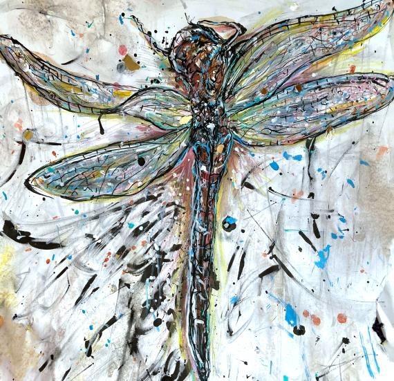
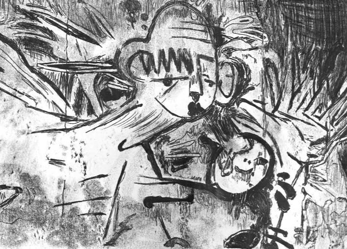
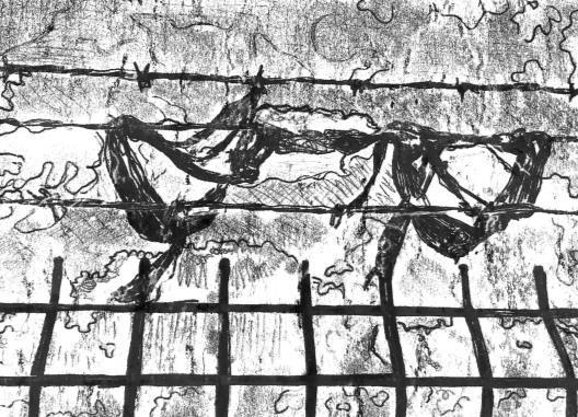
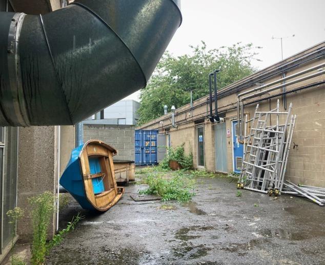
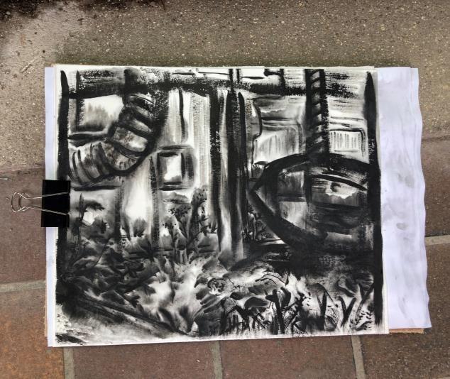
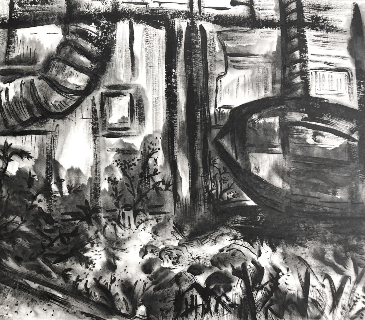
The ‘Ghost’ Estate (Series)
Left to right:
• Loose ink and posca pens (A4)
• Various inks and biro (A4)
• Monoprints and negatives on newsprint (A3)
Ghost Estate, Short Animation:
Researching Hull’s ‘Ghost Estate’, it became apparent multiple factors contributed to its nickname. In recent years, incorrect plumbing instillation meant residents of the estate were forced to temporarily relocate; leaving their houses behind, ghost-like. Heading to the estate, with an expectation of abandonment, I was pleasantly surprised. With the houses now reinhabited, so much greenery and life was to be found walking around. This contrast between tarnished reputation and reality is what most intrigued me. Trapped by preconceived notions, I sought to dispel stigma and showcase the estate in a more nuanced and positive light.
https://www.flickr.com/photos/200071626@N07/53528137377/in/datetaken/
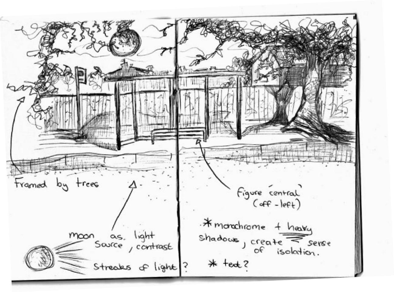
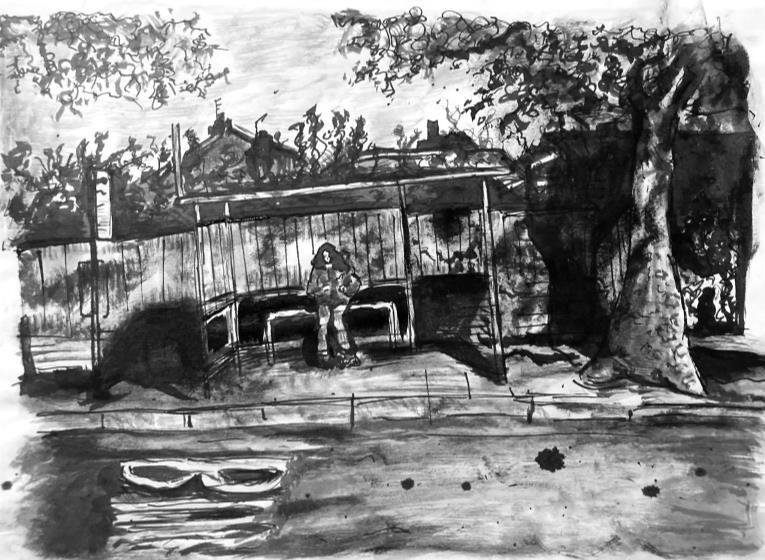
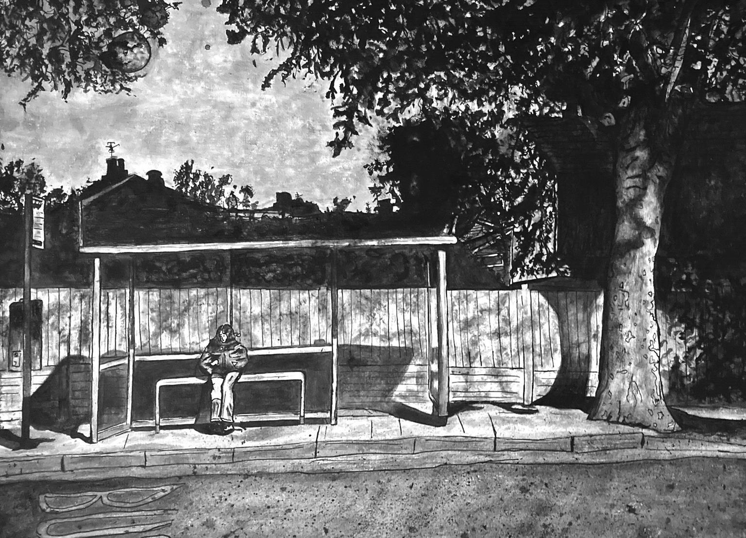
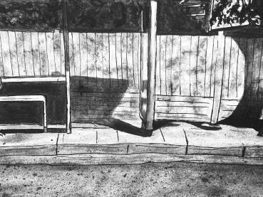
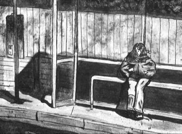
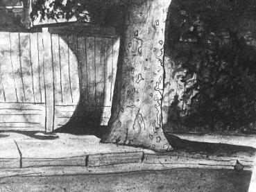
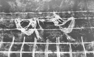
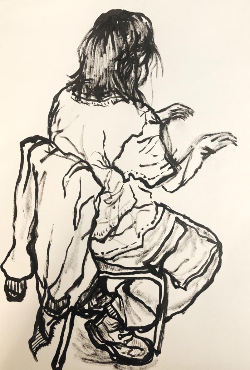
Anna Waits For The Bus Ink on card (A3)
Following a prompt of ‘Shadows’ I sought to explore them in not only a literal sense but metaphorical. Though the work is visually championing monochrome tones, I wanted the composition to equally focus on ambience and create an overall sense of loneliness. The figure is off-centre and small compared to the surrounding trees, purposefully framing her to exaggerate her solitariness. Though I am pleased with the outcome, (right) I do admittedly believe the initial sketch (left) achieves a fluidness the more ‘polished’ version lacks.
Winter’s Approach
Painting en plein air, using ink and rain (A3)
This work was one of the first things I made on my Foundation. Although the piece lacks ‘technicality’, it’s exactly why I like it. Encouraged to take an experimental approach, I completed a series of ink sketches en plein air and during rain; resulting in a smudged quality I thoroughly enjoy.
Life Drawing: 10-Minute Study
Rub at work:
Ink on paper (A3)
This life drawing was created while a peer worked at their laptop. Admittedly, proportions have historically not been a strong point, and so I wanted to challenge myself by using a non-erasable material under timed conditions. Overall, I was very pleased with the loose nature of the linework and believe It captured a very characterful quality.
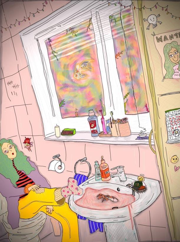
My Workspace:
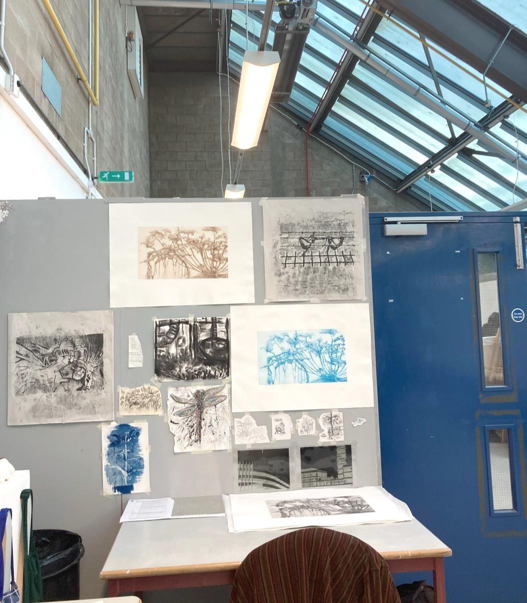
My workspace is equally important as my practice. I like to make my space interactive and reflective of my projects. Filling my space with things I enjoy and can draw inspiration from, fuels my work in times of uncertainty over where to head next, both thematically and practically.
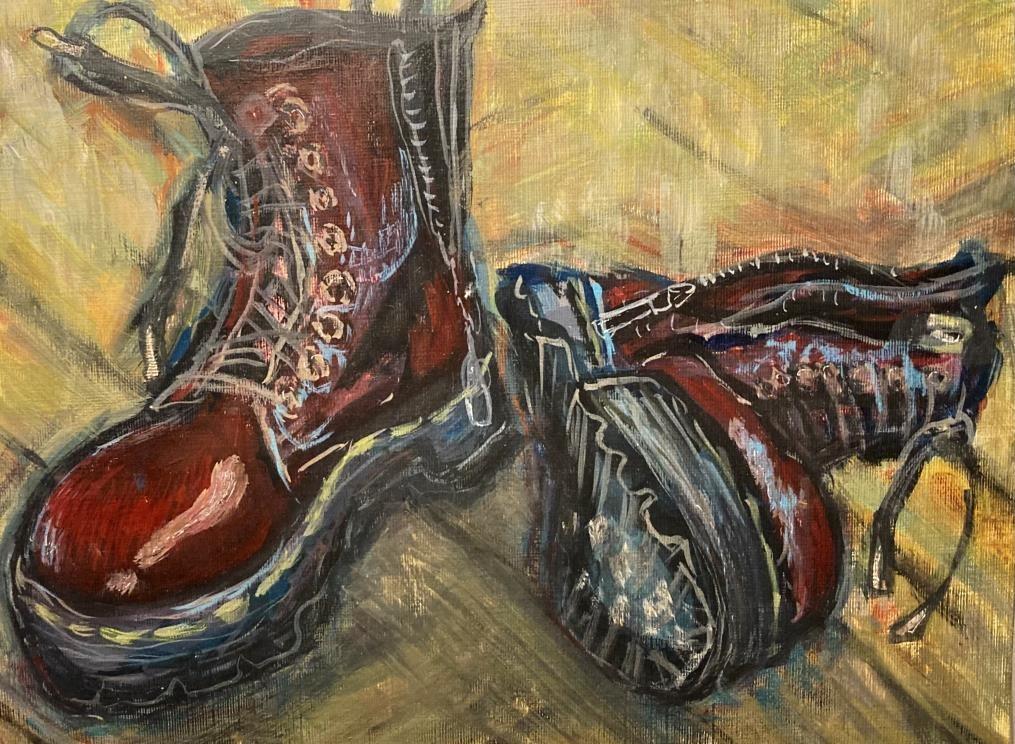
Observational Studies, Exploring Mediums:
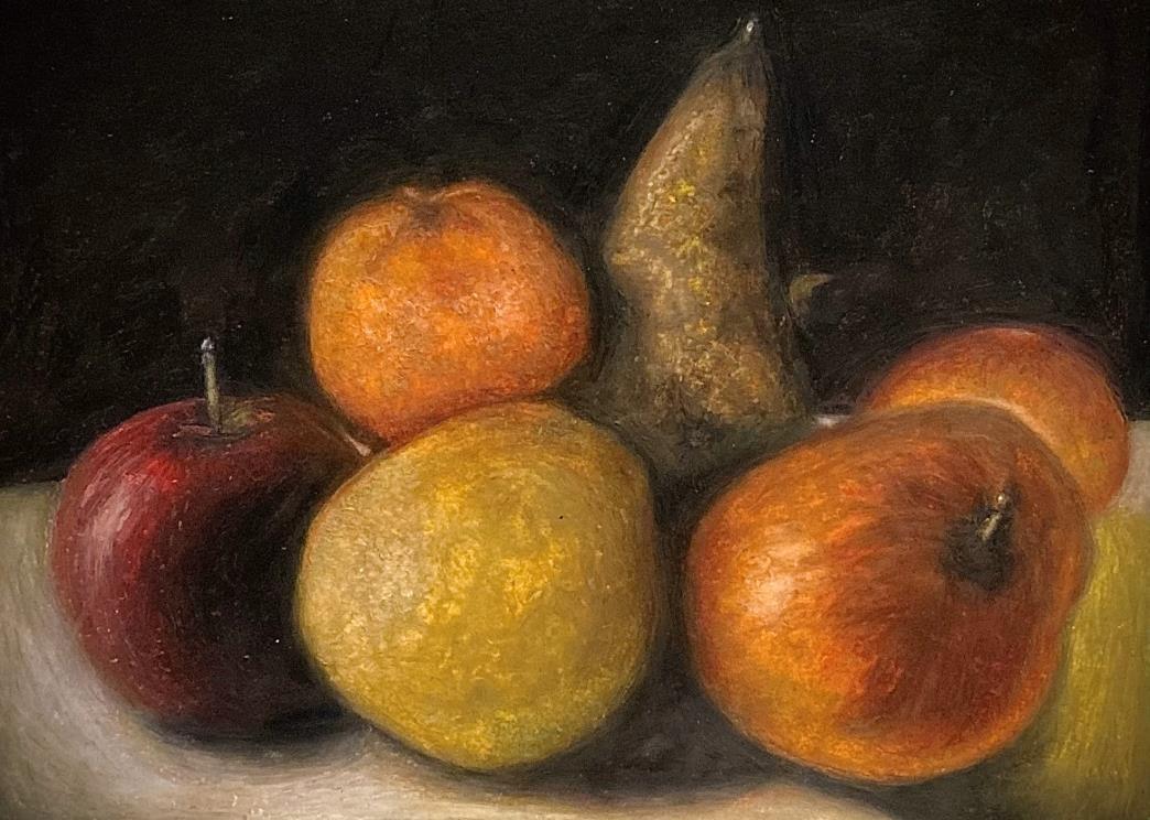
 left, gouache on canvas board, (A4) right, oil pastel on paper (A5)
The study of my Dr Martens drew from the work of Van Gogh. The gouache allowed for easy layering within the work, and it was fun to try a material I had never worked with previously. My oil pastel depiction of fruit, was a nod to Goya’s still-life paintings, and aims to showcase a more ‘refined’ composition; with a focus on detail, tone, and depth. I enjoy playing with style and medium and constantly re-address what I find most exciting to use, and how.
More Portraiture:
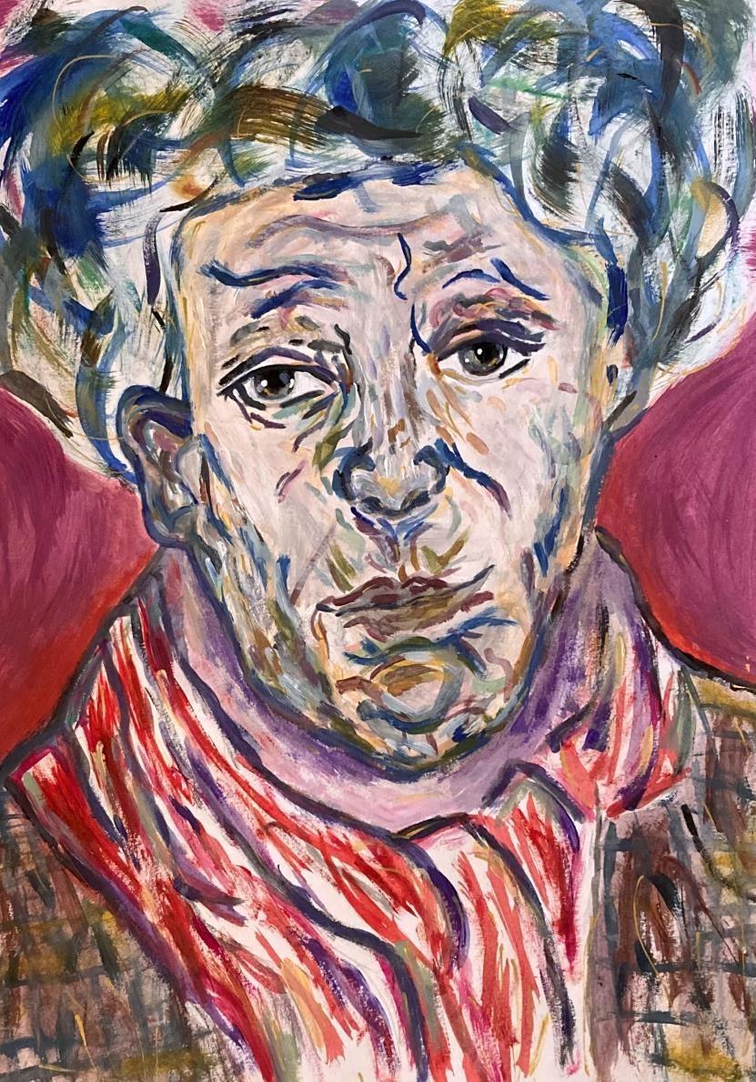 Left, self-portrait in mirror, gouache on board (A3), Right, acrylic on paper (A3)
Within my portraiture, I love to exaggerate the colours I see and introduce new ones through trial and error. I enjoy the brushstrokes of a piece and believe visible mark-making often makes for a more interesting final product. The self-portrait on the left was completed in front of a mirror. I had never produced a life painting in that manner before, and I found the process both challenging proportionally and simultaneously relaxing. Rather than focusing on a reference, it was a nice change to attempt a non-stationary subject. I think the painting was quite successful, made up of intriguing gestural shapes and tones.
Spag Bol
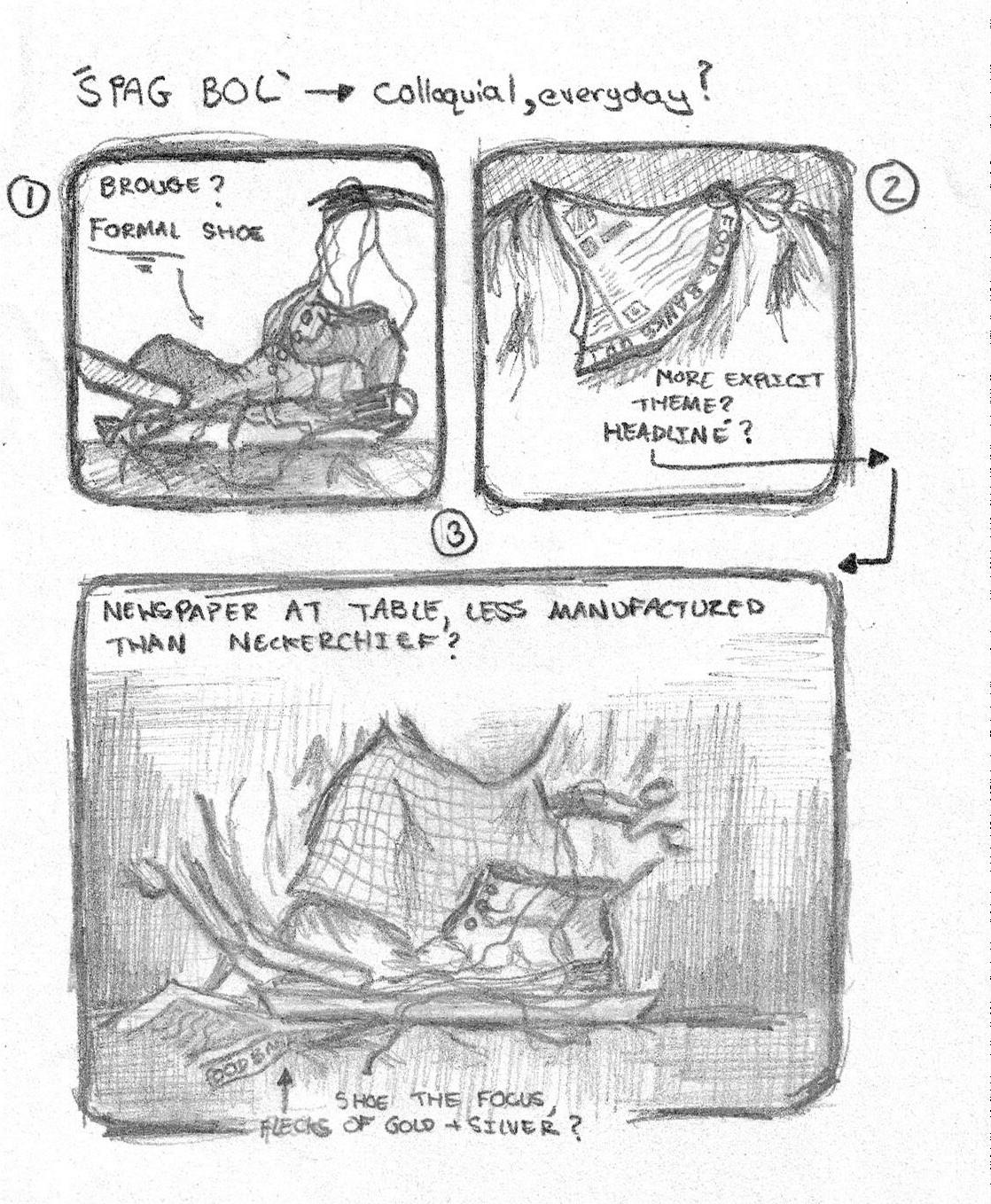
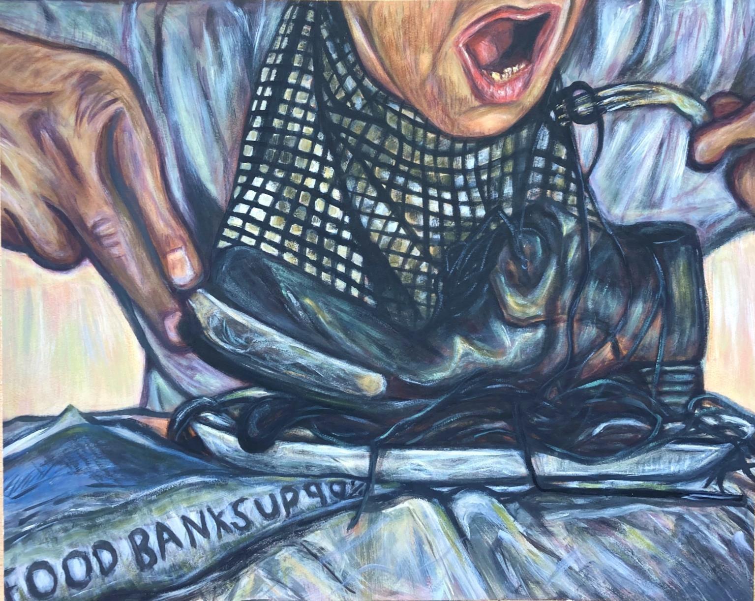 Acrylic on board (A2)
Drawing from the colour profiles and expressionism of Munch, ‘Spag Bol’ tackles themes of politics and class. Inspired by a Chaplin skit, the piece alludes to increased poverty rates and food bank usage under Tory legislation. Having previously considered footwear as a vessel for ideas of identity and subculture, I chose the brogue intending to suggest a businessman's attire; prompting questions about the dichotomy of lifestyle between the shoe owner and one who eats it. The title itself Is purposefully colloquial, a nod to the comedic origins (Chaplin) and furthering the central figure’s relatability and ’everydayness.’
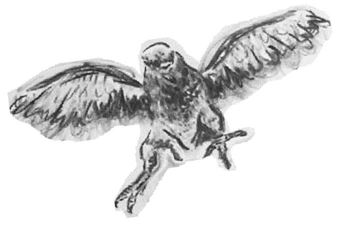
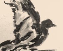
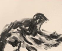
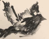
Flying In Circles (Series)
Left to right:
• Ceramics, glazed (hand-size)
• Airdry clay (palm-size)
• Zine test, ink (25 x 8 cm)
• cyanotypes (A4)
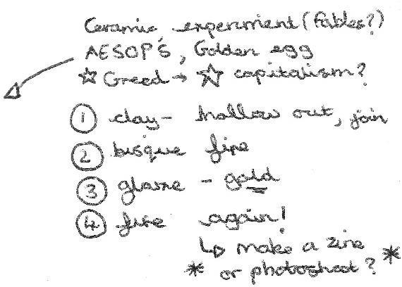
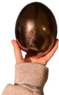
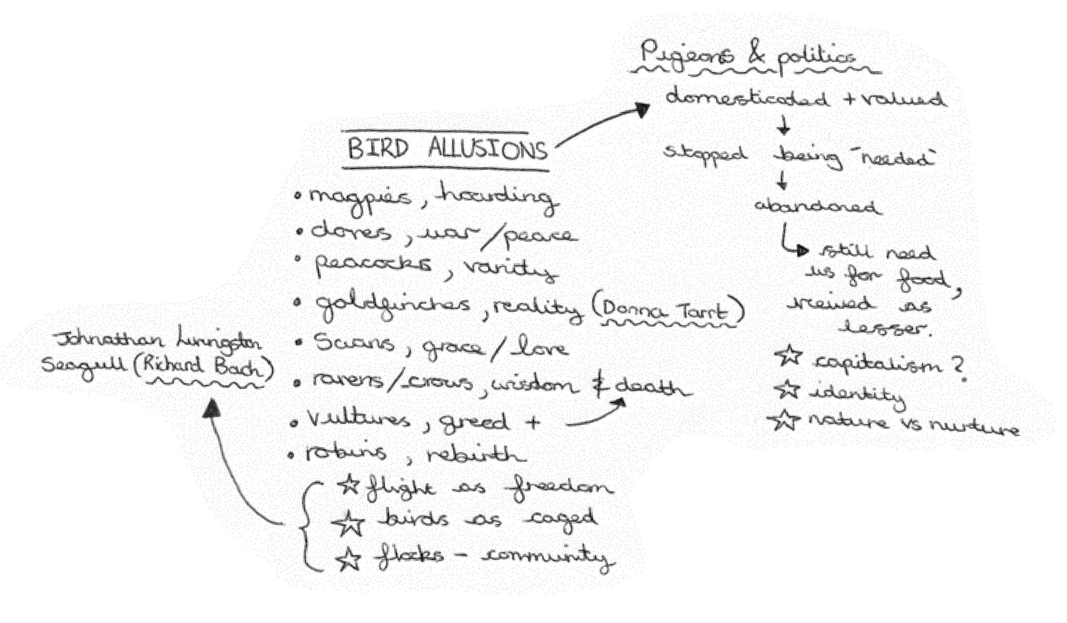
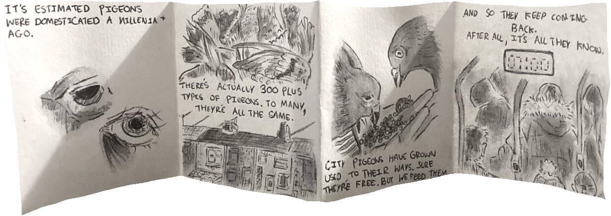
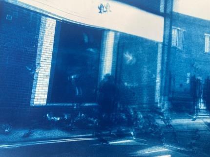
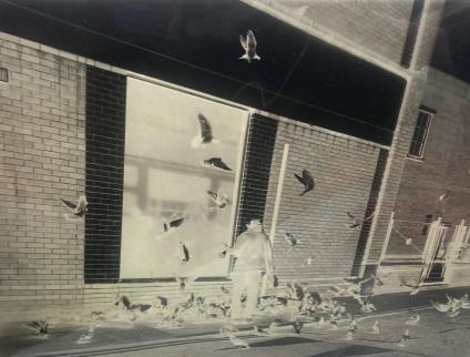
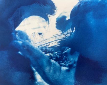
In my second unit I’m currently considering birds as metaphors; inspired by my interest in literature and history, respectively. I find pigeons especially interesting and think their journey from domesticated, to abandoned, elicits themes of capitalism and nature vs nurture. I specifically enjoyed playing with pigeons as an allusion to the working man, looking at this idea of being stuck in a loop of what we are familiar with. I am conscious of not playing into ‘gimmicks’ and looking to explore these socio-political themes through mixed media accompanied by research.
Current Project: Work In Progress (1)
Left to right:
• Charcoal animation (A2)
• ‘Pecking Order’ Ink animation (A2 )
• Charcoal animation, test (A5)
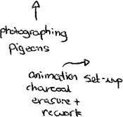
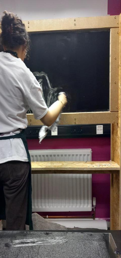
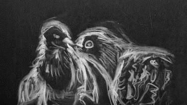
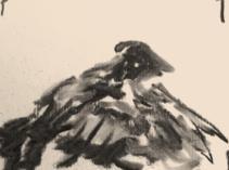
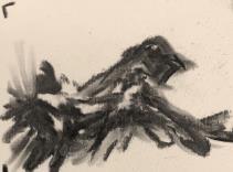
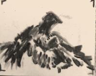
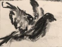
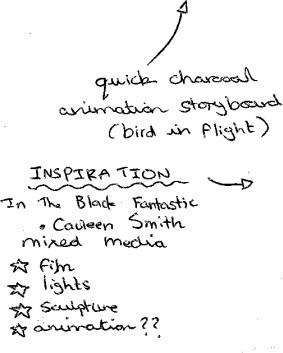
While researching the work of William Kentridge, an artist whose work primarily revolves around the apartheid in South Africa, I came across his film work. I find his use of charcoal to animate inspiring; practicality-wise the material is malleable, creating a sense of looseness and fragility to his illustrations, their non-permanence, explicit in the smudged quality. His work inspired me to (using my own footage and audio) attempt my own animations; using ink and charcoal for erasure and rework. I have tested these various mediums and plan to create a piece incorporating spoken or written word for the project’s end.
https://www.flickr.com/photos/200071626@N07/53529356349/in/dateposted-public/
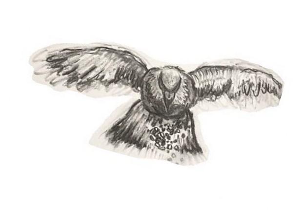
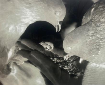
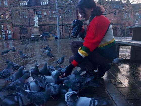
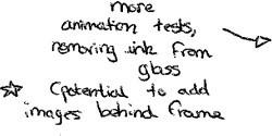
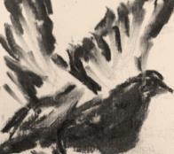
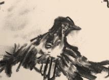
Current Project: Work In Progress (2)
Pigeon triptych, etching on aluminium sheet, 40 x 15 cm
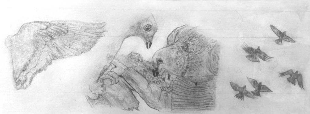
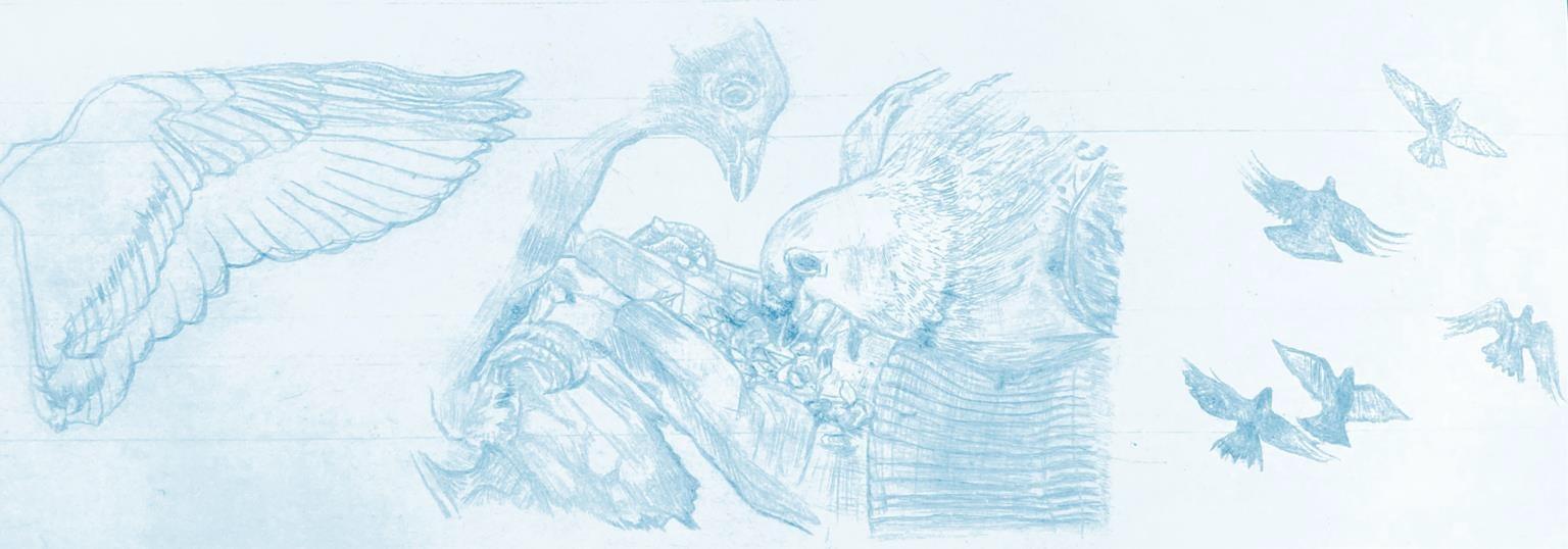
Having taken a camera into the city centre to capture footage of birds in flight, feeding, and landing, I wanted to create a piece that explored the details of the pigeons captured on film. The etching is now complete and will be re-printed before the end of my unit. I decided to put this work on temporary hold, as I am conscious of introducing a strong narrative before the project’s conclusion.
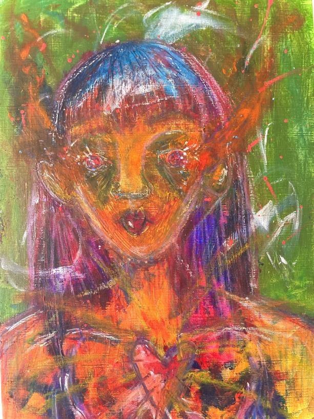
Personal Illustrations:
Left to right:
• Sharpie and watercolour on paper, A3
• Posca Pens, acrylic and oil pastel on canvas, A4
• Digital composition, made on my phone (exploring mental health during lockdown)
• Digital composition for a friend, phone
Personal Animations:
https://www.flickr.com/photos/200071626@N07/53528137107/in/datetaken/
200 Words
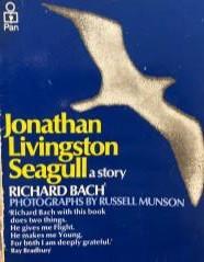
My body of work is ever-evolving and draws from current affairs and media. Referenced in my annotations; my influences have spanned from the skits of Charlie Chaplin to the work of Goya, and even touched on ideas of philosophy as explored in Richard Bach’s ‘Johnathan Livingston Seagull’. Beyond physical art, I'm equally fueled by engaging with its critical context, historical and contemporary. Most recently, I’ve been listening to ‘The White Pube’ podcast, a social commentary duo that offers a personalised approach to art criticism.
Discussing class, race, and gender, they ask thought-provoking questions about the art world's accessibility. This consideration and questioning of the culture informing practices of past, present, and future is central to my practice. With this in mind and approaching my Foundation's end, I've begun considering where my final unit will take me. Combined with love for Machado's memoir, 'In the Dream House', and Baldwin's ‘Giovanni's Room', my recent viewing of 'All of us strangers' has inspired more personal exploration.
Addressing the documentation of queerness throughout history, I intend to consider the likes of Claude Cahun and Salman Toor: using colour and the fantastical to explore not only queer complexity but joy.
Thank you for your consideration.