BRAND BOOK
VISUAL IDENTITY GUIDELINES

2022

INFORM & DELIGHT
04 Brand Statement 05 Logo 08 Color Palettes 11 Typography and Text Guidelines 13 Visual Elements 16 Photography Guidelines 20 Appendix Application Examples and Style Guides CONTENTS 3
BRAND STATEMENT
Captivate is a leading digital-out-of-home video network with over 12,000 screens featured in premier locations where modern professionals live, work, and play. We connect agencies and brands to a high-value audience through live editorial content, serve as a turnkey communication platform for our real estate partners, and deliver a seamless, engaging viewer experience designed to inform and delight.
The Captivate brand is a visual reflection of our company’s purpose to enrich the lives of modern professionals with content that informs and delights at seamless touchpoints along the daily journey. Since we cater to the modern professional our brand exudes professionalism and charisma without crossing into exclusivity. We are diverse and inclusive of a multitude of voices, so our brand remains welcoming and approachable through intentional use of color, typography, and visual elements which work in concert with our multifaceted network and pay homage to our on-screen experience.
4
The standalone logo is our primary visual symbol; use it as a default. The logo is available in two color combinations, as well as in all-black and all-white (knockout) versions. The logo must be used in its entirety, and can never be modified, cropped, stretched, or rotated. Never use color combination outside of the ones included. The logo must have sufficient “clear space” in all applications, and never be crowded by other design elements. The clear space on all four sides must be large enough to accommodate the letter C as illustrated below. No other elements may appear in the clear space.
main corporate logo
main corporate logo - white and blue
main corporate logo - black
main corporate logo - white (knockout)
LOGO
5
LOGO - ALTERNATE MARK INFORM &
The Captivate mark is an alternate small-format version of the logo for use in small applications where our full logo may not be legible or we are unable to use the full logo at minimum allowable size described on the next page. The alt mark is available in two versions: stand-alone and with brand promise. Only two colors, along with black and white, are allowed in all logo applications. The “^” should not be used by itself, it should always be enclosed in the square. The alt mark should not be used larger than 0.75 inches. Captivate mark


DELIGHT
INFORM & DELIGHT INFORM & DELIGHT
DELIGHT
6
INFORM &
Captivate mark with brand promise
LOGO - COLORS AND SIZES
PANTONE
7546C
PANTONE 312C
#1c3854
#009cdb
logo colors (note - the A may not appear in dark blue)


minimum screen size: 150 pixels at 96 DPI (about 1.5 inches) minimum print size: 1.5 inches or 3.8 cm
logo sizes
minimum screen size: 25 pixels at 96 DPI (about 0.25 inches) minimum print size: 0.25 inches or 0.63 cm
maximum screen size: 72 pixels at 96 DPI (about 0.75 inches) maximum print size: 0.75 inches or 2 cm
minimum screen size: 96 pixels at 96 DPI (about 1 inch) minimum print size: 1 inch or 2.54 cm
alt mark sizes

C 94 M 76 Y 43 K 35 R 28 G 56 B 84 HEX:
C 76 M 24 Y 0 K 0 R 3 G 159 B 210 HEX:
INFORM & DELIGHT
7
COLOR - PRIMARY PALETTE
The color palette is comprised of a primary (corporate) palette and secondary (accent) palette. The primary palette is used to set the tone of the brand, while the accent palette provides additional creative flexibility with three bright tones and 3 metallics. The dark and light grays of the primary brand are to be used primarily as background and text colors. This color palette must be used for all client-facing creative.
PANTONE 7546C C 94 M 76 Y 43 K 35 R 28 G 56 B 84 HEX: #1c3854 C 76 M 24 Y 0 K 0 R 3 G 159 B 210 HEX:
PANTONE 312C PANTONE 426C C 71 M 67 Y 61 K 67 R 41 G 39 B 42 HEX: #29272a C 2 M 4 Y 2 K 0 R 242 G 242 B 242 HEX:
PANTONE 656C
8
#009cdb
#f2f2f2
NOTE The primary blues have been modified into more sophisticated shades. before after
The accent palette provides additional creative flexibility with three bright tones and 3 metallics. Suggested uses are described below and examples of application are provided in the appendix.
BOLD ACCENTS
These colors complement the primary palette and serve well in applications like infographics, charts, icons and presentations where a more varied palette is required to convey information. The colors are bright, bold, and modern, and work well on either a dark or light background. These colors are more appropriate for the digital world, where punchy and visually sticky communication broadcasts better.
NOTE
METALLIC ACCENTS
The metallic palette is more subdued and sophisticated, appropriate for use in more bespoke client communication, like deluxe branding clients, and premium real estate portfolios. The colors are warm and evocative of hospitality and high end finishes. These colors are meant to serve as accents on our dark blue or dark gray primaries.
Accent colors may not be used as body text. In typography applications, they may only be used as titles, subtitles, or other decorative typographical elements.
C 0 M 95 Y 100 K 0 R 250 G 38 B 0 HEX: #fa2600 C 66 M 0 Y 35 K 0 R 63 G 193 B 183 HEX: #3fc1b7 3258C 7548C C 1 M 22 Y 100 K 0 R 253 G 198 B 0 HEX: #fdc600 456C C 31 M 43 Y 100 K 7 R 175 G 135 B 3 HEX: #af8703 C 35 M 29 Y 34 K 0 R 170 G 168 B 161 HEX:
414C 7525C C 33 M 59 Y 71 K 15 R 156 G 105 B 78
COLOR - ACCENT PALETTE
1788C
#828083
HEX: #9c694e
9
The accent palette swatches may be used at various opacities at 20% increments whenever additional flexibility is needed.
RED BLUE YELLOW GOLD SILVER BRONZE
80%
80%
80%
80%
80%
80% 60% 40% 20%
60% 40% 20%
60% 40% 20%
60% 40% 20%
60% 40% 20%
60% 40% 20%
10
COLOR - ACCENT PALETTE
TYPOGRAPHY
Captivate’s primary font is the Century Gothic font family. Century Gothic is well established and has been widely used in advertising since the mid 20th century. Its simple, sans serif styling and great legibility make it easy to read even at small sizes, and it scales up well to large and oversize proportions, allowing for great flexibility in typographic design for both desktop and web applications across all OS.
CENTURY GOTHIC FAMILY
ABCDEFGHIJKLM
NOPQRSTUVWXYZ abcdefghijklm nopqrstuvwxyz 1234567890
ABCDEFGHIJKLM
NOPQRSTUVWXYZ
abcdefghijklm nopqrstuvwxyz 1234567890
GUIDELINES FOR USE
ABCDEFGHIJKLM NOPQRSTUVWXYZ abcdefghijklm nopqrstuvwxyz 1234567890
ABCDEFGHIJKLM NOPQRSTUVWXYZ abcdefghijklm nopqrstuvwxyz 1234567890
• Body type must be Regular only. Italic may be used for callouts.
• Body type must not be smaller than 10 points
• Titles must be Bold or Bold Italic (not both in same document)
11
TYPOGRAPHY
Captivate’s impact font is Misses. As a nod to our differentiator of offering “the human touch” in our editorial approach as well as our excellent client service, we are adding a font that simulates handwriting while still being sophisticated and highly legible. Because this is a decorative font, it is important to adhere to use guidelines outlined below.
MISSES
GUIDELINES FOR USE
• This is an impact (decorative) font and is to be used exceedingly sparingly for emphasis or as a design element
• Misses may only be used in titles and headlines, never in body text, even on callouts
• It may not be used in headlines longer than 4 words, excluding propositions
• The font is for corporate marketing use. It is not recommended for SalesDev communication with rare exception.
ABCDEFGHIJKLM NOPQRSTUVWXYZ abcdefghijklm nopqrstuvwxyz 1234567890 12
VISUAL ELEMENTS - THE FRACTAL

The fractal is used in a nod to our on-screen experience, which features a similar element. Given that it is vector-based, it is infinitely flexible and can be used in whole, in part, at different angles, in different colors, and as an animated feature. The illustration below shows the fractal in full and in different color combinations. Application uses are demonstrated in the Appendix.

the fractal


13
VISUAL ELEMENTS - THE LINE
The Line mirrors a similar element used in our on-screen experience, as a countdown ticker between screen refreshes. In marketing communications, the Line can be static, acting as an underscore, or it can be animated in communications like social media gifs and power point presentations.
GUIDELINES FOR USE
• The Line must always be light blue (#009cdb)
• It must be straight and can only be horizontal or vertical when static (other angles are allowed in animation)
6pt 2pt 1pt .25pt 14
the line
VISUAL ELEMENTS - ICONS
An extended set of icons is now available to provide emphasis and visual interest to our marketing communications, describe our products and services, and accompany our storytelling in a wide variety of topics. The icons are available on the Graphics Resource Hub. They are vector based, and can be indefinitely scaled and presented in the various colors of our palette. Icons are divided into sections for easy searching, and may be used in all clientfacing and internal communication. Do not use icons from outside of the provided library. The library will be regularly updated, and new icons may be requested from Marketing and Studio. A sampling of the icon library is provided below.
15
PHOTOGRAPHY GUIDELINES
Along with visual elements like the Fractal, the Line, and the icons, photography is essential in helping Captivate tell the full story of our brand and highlight our product offering. Photography is stored on the Graphics Hub and divided into three types.
Stock Images Product Images
Captivate Culture
The purpose of these guidelines is to align on, and standardize photography efforts across Captivate, in order to:
• develop a consistent visual language of photography to maximize utility
• support marketing and media goals
• ensure quality of photography is maximized across the board
• standardize process for cataloging images and provide ease of access for browsing and selection
16
PHOTOGRAPHY GUIDELINES
Stock Images


Photos purchased through an image library like Getty
Abstract + Detail - abstact geometric or conceptual images that communicate industryrelated concepts like DOOH, audience measurement, etc.
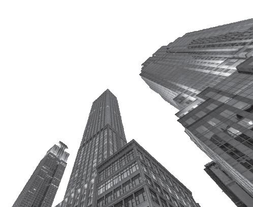
Environmental - photos showing environments, locations, and people where our products may be located.

Demographic - with our value proposition being to provide access to a valuable audience, an image library was created showing members of that audience in a variety of appropriate settings.

GUIDELINES FOR USE
• Look for photos featuring cool or neutral tones, dynamic motion, and bold angles. Avoid static, bland images. Do not use images without people except in abstract/detail category.

• Show diversity in photos to reflect our values.

• Do not download images off google or other internet sites where we not have a subscription. This constitutes a copyright violation and can result in using watermarked, low quality, unsuitable images.
• Always download the highest quality image or .eps format for vector graphics
17
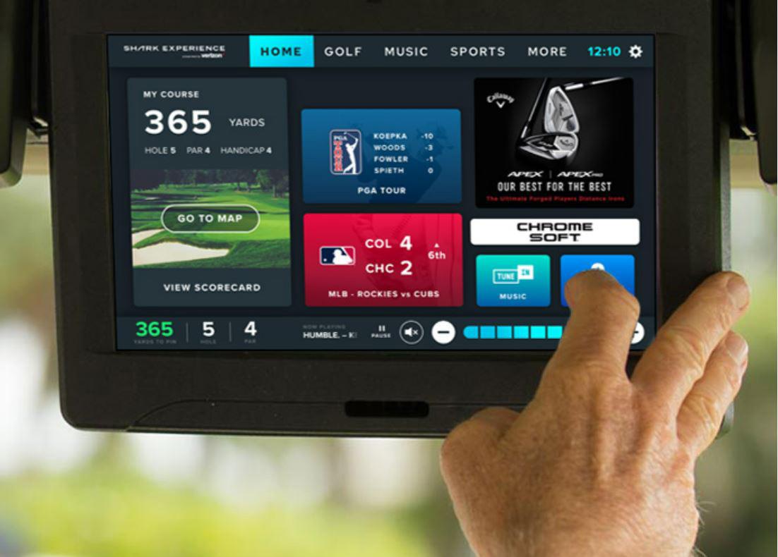
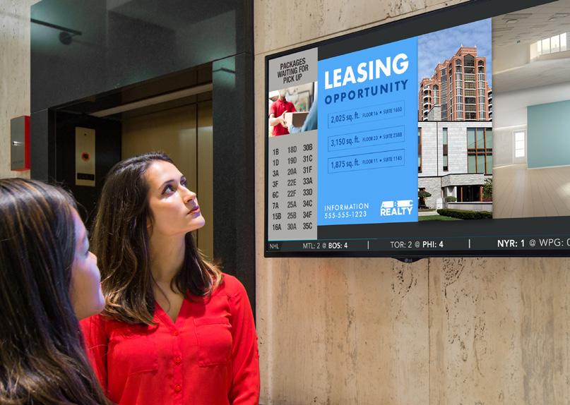
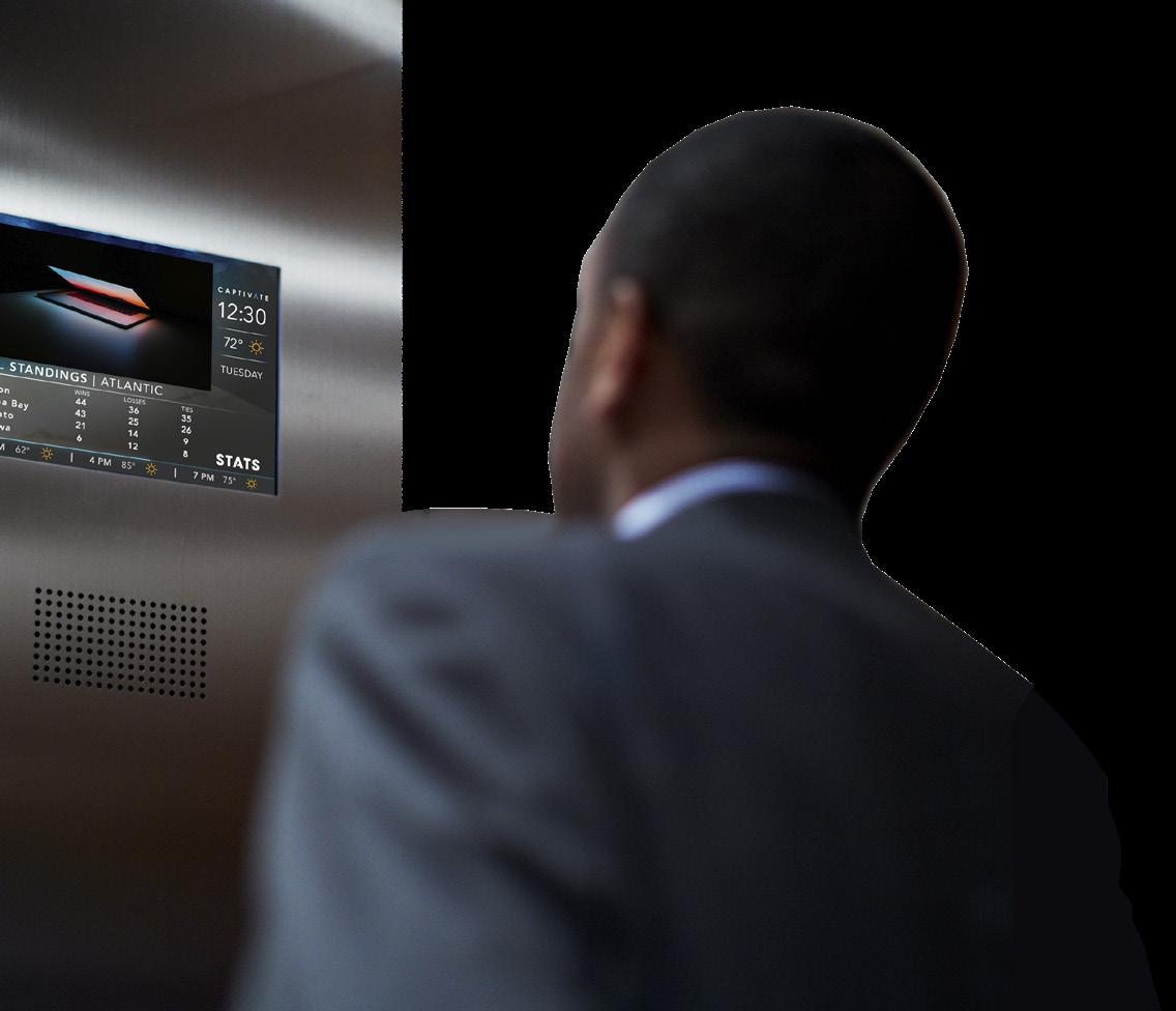
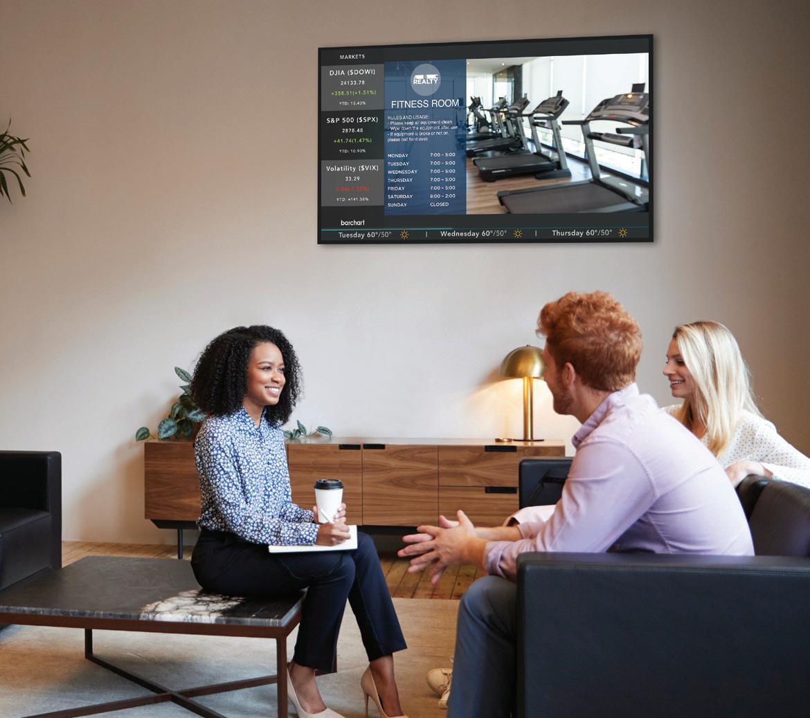
PHOTOGRAPHY GUIDELINES
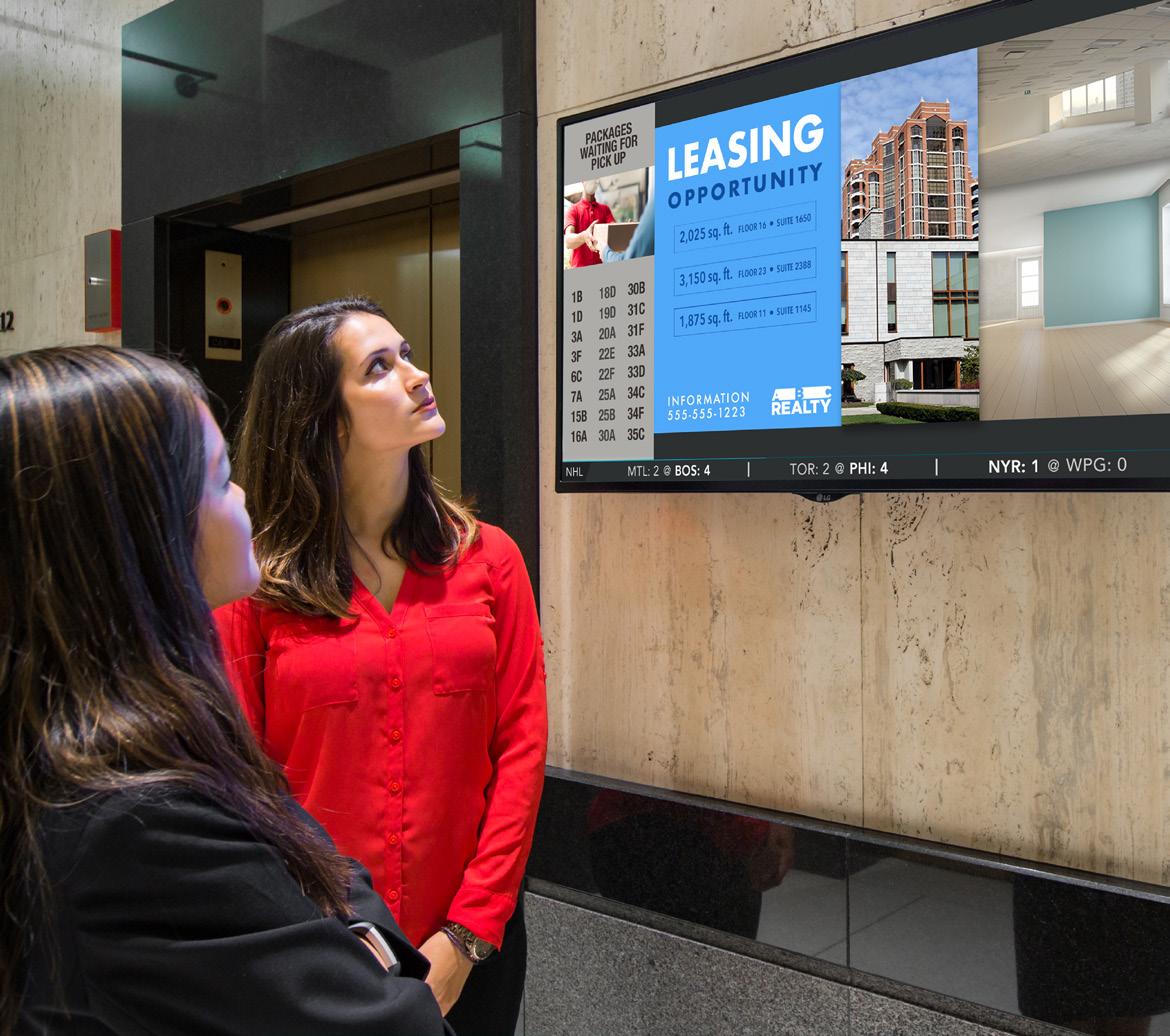
Product Images
Photos taken by Captivate, or manipulated stock photos, that show our screens in their environment (environment mocks).
GUIDELINES FOR USE
• avoid using product images without people whenever possible
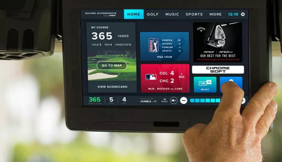
• as much as possible, people should be engaging with / looking at product rather than ignoring it or walking by
• photos should be in cool or neutral tones, feature dynamic motion, and bold angles.
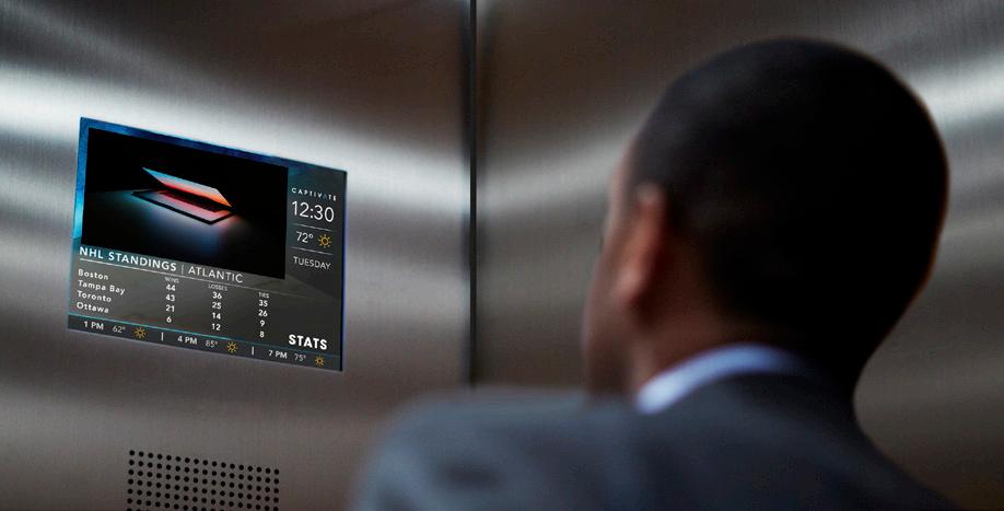
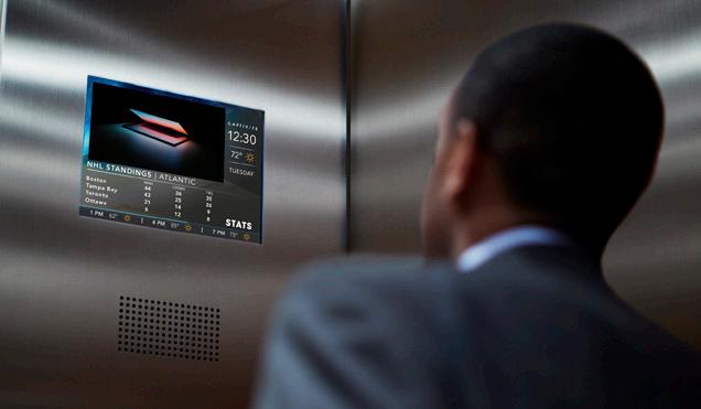
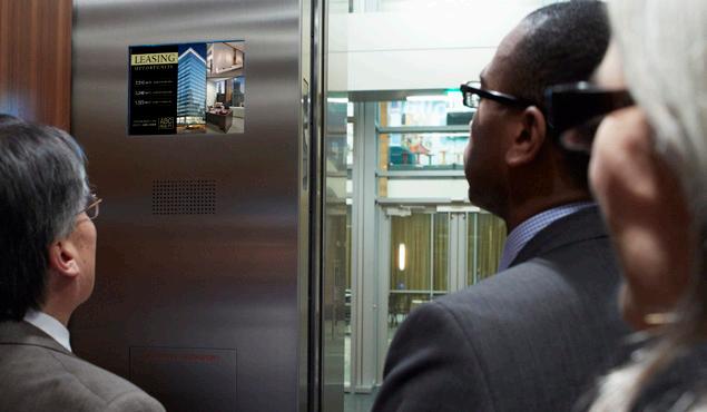
• level, straight-on photos may be appropriate for some situations to highlight the product, especially in SalesDev decks or client demos. Remember that our value lies not in the screen itself, but in the audience we provide access to. In corporate and brand marketing creative, it is more important to show the moment of pause with viewers enjoying or interacting with the product, rather than a clear but bland photo of the product itself.
• it is acceptable in some cases to use photos of people in our typical environments (lobby, elevator) looking towards something even when the product is not visible. This is preferable to using photos of a product without people or being ignored.


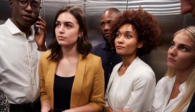
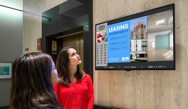
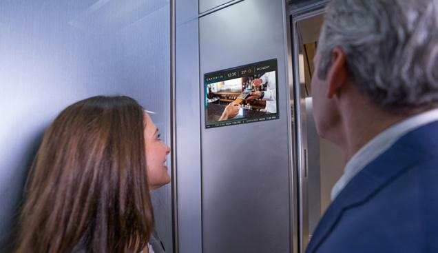
• photos and video taken by Captivate staff, our partners or external freelancers must be of professional quality. No grainy, blurry, poorly cropped photos (or video) may be used in corporate marketing materials.
18
PHOTOGRAPHY GUIDELINES
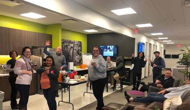
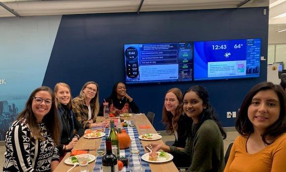
Captivate Culture
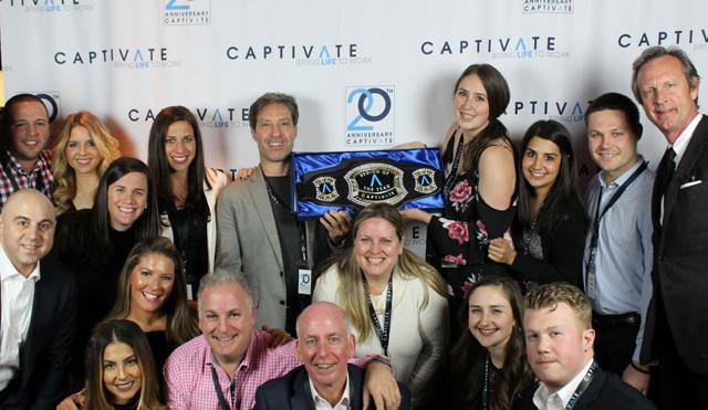
As we work to infuse our mission, vision, and values into our brand, our company culture needs to become more visible across our marketing platform. It is imperative to show the people behind the screens: on our website, social media, in our visibility and content channels. With that in mind, culture images will be used more frequently in marketing collateral on a go-forward basis.
GUIDELINES FOR USE
• to be used in external-facing marketing materials, photos must be of high quality: properly framed, in focus, compositionally balanced.
• show off our people at work, at play, and contributing to the greater good (volunteering, etc)
• no personal or family photos (except on social media)
19
Appendix Application Examples and Style Guides
20
LOGO - APPLICATION EXAMPLES
APPROVED USES ✓
Logo can be used on solid and slightly textured backgrounds provided there is enough contrast between the logo and its environment
The A can be cropped and used as a watermark, or appear as an outline for creative purposes. The logo may not.


The A can be patterned and used as a watermark for creative purposes. The logo may not.
Logo can be used over photos as long as proper contrast is maintained. Use of feather gradients is encouraged to ensure contrast and legibility.
21
LOGO - APPLICATION EXAMPLES
PROHIBITED USES X
Using the A element in any color other than light blue, white, or black.


Changing logo colors to anything other than outlined four options.
Placing any element inside the alt mark.
Using outlines or other modifications
Stretching, condensing, cropping, skewing, desaturating, and any other distortion or manipulation of the logo is not allowed.
Crowding or placing elements over the logo is not allowed.

22
PRODUCT + NETWORK LOGOS
Our network and product logos will be updated to adhere to logo use guidelines.
OFFICE
• Colors will be updated to new palette
• The space between the logo and the divider line will be extended to the width of one “c” to avoid crowding of the elements
• network or product name will appear in Century Gothic Bold and mimic logo kearning (360)

• Product or network name, as well as divider line, must always appear in light blue OR white for knockout version


• where network or product names are long, a stacked version may be used as demonstrated below GOLF MOVE GO

OFFICE
LOGO - APPLICATION EXAMPLES
23 CANDIDATE CORNER MULTI-PLATEFORMES


GRAPHIC ELEMENTS - APPLICATION EXAMPLES “
Conversations Captivate with It is crucial to have women represented, as we driving anywhere between 70-80% of all consumer purchasing decisions. “ Branded content pieces Research findings social media posts
CarrieAntrim
Product
DIGITAL OUT OF HOME TRENDS IN THE POST-COVID ERA 24
AliceGogh
SVP Content,
& Strategy

About us Captivate’s premium digital video network engages millions of high-value decision-makers with professionally curated news and contextually relevant advertising at various touch points throughout the day. Captivate screens deliver a brand-safe, 100% viewable and fraud-free experience to upscale audiences in premier office towers, luxury residential properties, and top golf courses across North America. Founded as an office media company with a mission to make elevator rides less awkward, Captivate has evolved into a premier DOOH (digitalout-of-home) media company that offers provides brands with access to a valuable audience of professionals, and a turnkey communication platform for our real estate partners. We set ourselves apart with our live editorial team that curates custom content and pairs it with contextually relevant advertising, announcements, and property communication services. For more information, please visit www.captivate.com. 304 Screens 31 Residential Markets 243 Locations in North America By the numbers RESIDENTIAL network OFFICE network 12,739 Screens 36 Office Markets 1,777 Locations in North America 12,426 Screens 89 Markets 183 Courses in North America GOLF network MONTHLY IMPRESSIONS 59.1M US Office 11.M US Residential 6.7M Canada Office 32K Canada Residential 34.8M Golf 120+ employees 4 US offices: New York, Boston, Los Angeles, Chicago 1 Canada office: Toronto Company fact sheet GRAPHIC ELEMENTS - APPLICATION EXAMPLES 25
GRAPHIC
ELEMENTS
APPLICATION
Presentation slide examples (for illustration purposes only) INFORM & DELIGHT lorenzo papa lpapa@captivate.com 123.456.7890 May 2022
-
EXAMPLES
To serve as turnkey connector between our clients and the modern professional by offering unique programming that invites engagement, builds community, and delivers value for everyone in front of and behind our screens. 26
Our mission

GRAPHIC ELEMENTS - APPLICATION EXAMPLES 27 Exclusive Access to Business Decision Makers IT Equipment Banking/ Corporate Investments Freight/ Express Services $110 Billion $44 Billion $42 Billion Targeted B2B reach Tenants Small Businesses Mid-size Businesses 50,000 43,500 1,800 Headquarters Enterprise Businesses Fortune 1000 1,600 365 83
DIGITAL COMMUNICATION SOLUTION nicolas beaver nbeaver@captivate.com 123.456.7890 May 2022 Industry Leadership 2000+ Buildings 25,500 Screens 7M+ Viewers 100+ Markets Measured results VIEWERS LOVE CAPTIVATE 95% 90% 85% LOVE CAPTIVATE CONTENT WATCH CAPTIVATE SCREENS IN ELEVATORS OR COMMON AREAS FIND CAPTIVATE SCREENS INFORMATIVE AND ENTERTAINING GRAPHIC ELEMENTS - APPLICATION EXAMPLES 28 Presentation slide examples (for illustration purposes only)
GRAPHIC ELEMENTS - APPLICATION EXAMPLES 29 Multifamily programming mix Extended hours of editorial updates focus on lifestyle & high-utility content for residents on-the-go 40% 30% 20% 10% Residential mix 5am - 11pm 7 days a week • AM Traffic Report • Family-Oriented Content • Local Events • Entertainment • Local Restaurants & Retailers Presentation slide and ad examples (for illustration purposes only)
VISUAL IDENTITY GUIDELINES

2022
