

Art Stories
from the Netherlands and Italy, 1550-1800

Art Stories
from the Netherlands and Italy, 1550-1800
liber amicorum in honour of gregor j.m. weber
Edited by:
Fred G. Meijer
Carla van de Puttelaar
Lisanne Wepler

Essays
gwendolyn p. boevé-jones and eddy schavemaker 17
Frans van Mieris’s Holy Family Revisited
carolin bohlmann 27
Aus der Nähe. Zu Tintorettos tiefgründigen Oberflächen
marten jan bok 35
Niet Albert Poel maar Abraham van de Poel graveert naar Hendrick ter Brugghen edwin buijsen 43
‘Kunst om gunst’: een grisaille van Adriaen van de Venne gelezen nils büttner 53
What did Bruegel Know About Bosch? Reflections on a Motif
mireille e. cornelis and huigen leeflang 59
Utrecht Sea Views. A Drawing Attributed to Adam Willaerts and a Print Series by the Engraver Magdalena de Passe
franziska ehrl 69
Sehen und Verstehen – Anatomie der Kunst
margriet van eikema hommes 77
The Painted Room for Jacob de Flines by Johannes Glauber and Gerard de Lairesse rudi ekkart 95
Joris van Schooten en zijn schilderijen voor de Lutherse Kerk in Leiden
julia ellinghaus 107
Dem Verstummten Gehör verschaffen. Zur Wiederentdeckung eines Gemäldes von Wolfgang Heimbach josephina de fouw 115
Adriaan de Lelie’s Portrait of Jan de Bosch and Margaretha Kroon: A Collector’s Portrait with a Message
marlies giebe
‘Ich gehe vom Geschauten aus’. Veroneses Cuccina-Zyklus in der Dresdener
129
Gemäldegalerie und dessen Einfluss auf das Großstadt-Triptychon von Otto Dix jasper hillegers 141
‘Einem jeweils neu gelegten Kartenspiel’. David Colijns as a Painter of Animal Pieces kayo hirakawa 155
Jan Brueghel the Elder’s Sojourn in Prague holger jacob-friesen 163
Die Verkündigung an Hagar. Zu einem Gemälde von Bartholomeus Breenbergh anita jansen 175
Een anachronistisch familieportret. Thomas van der Wilt schildert het gezin van zijn
Delftse collega Jan van der Kloot thomas ketelsen 183
Eine Proserpina-Zeichnung von Victor Honoré Janssens in Weimar: Ikonographische und kennerschaftliche Irrgänge christi m. klinkert 193
Four ‘Grey’ Evangelists. A New Addition to Caesar van Everdingen’s Oeuvre geert-jan koot 201
Two Early Printed Books for Artists on Mathematics and Perspective in the Rijksmuseum Research Library friso lammertse 209
Op zoek naar de kakker. Scatologische humor in de beeldende kunst van de zestiende eeuw justus lange 221
From Rotterdam to Kassel. The Fate of Adriaen van der Werff’s ‘Garden Room’ andrea linnebach
‘Madam Lis’ und andere Schönheiten. Jacob Grimms Besuch der Pariser Kunstsammlungen im Jahr 1805
fred g. meijer
229
239
The Master of the Mended Flute Identified: Nicolaes Fick sander paarlberg 249
Oude meesters en negentiende-eeuwse verzamelaars in Engeland teresa posada kubissa 263
Did Rembrandt Look at Nicolò dell’Abate?
carla van de puttelaar
271
Birds and Bugs. Life and Work of Cornelia de Rijk cèlia querol torelló 291
Rediscovering a Painting of the Supper at Emmaus at the Rijksmuseum gero seelig
Cornelis Troost in Schwerin? A Picture Puzzle to be Solved christian tico seifert
The Party is Over. Gerrit Dou’s An Interior with a Young Viola Player paul j. smith and lisanne wepler
Dancing Animals in the Rijksmuseum Amsterdam
299
307
317
giovanni paolo di stefano
Pour un plaisir que si peu dure. The Fleeting Pleasure of Music in Adriaen van Utrecht’s Still life at the Rijksmuseum
ariane van suchtelen
Een bloemstilleven van Clara Peeters
jane shoaf turner
Whispering ‘Sweet Nothings’ via the Taste Buds: Bakery Traditions, Romance and the Dutch Kermis
matthias ubl
Emanuel de Witte en de Meester van Alkmaar
christiaan vogelaar
Het planetarium van Isaac de Jouderville
arthur k. wheelock jr.
Gerrit Dou and Night Scenes
marjorie e. wieseman
Rembrandt, Rihel, …and Renesse?
david de witt
An Intriguing Dutch Seventeenth-century Female Nude Study, after Life, from the Collection of Julius Held

Preface
Since 2009, Gregor J.M. Weber has been Head of the Department of Fine Arts of the Rijksmuseum in Amsterdam. Recently he retired from this position, finishing off his career with a proper apotheosis: the major Vermeer exhibition, on which he worked with heart and soul. This has resulted in a memorable overview of that master’s work and has provided numerous new insights. It was a worthy finale for an eminent art historian who, over nearly half a century, built up his knowledge and reputation by combining hard work with considerable talent to become a worldwide esteemed colleague and connoisseur. Gregor’s enthusiasm and eagerness to research, to learn and to understand works of art in their context has been an enormous source of inspiration for many of his colleagues and students. Many of them have enthusiastically and generously contributed to this Liber Amicorum to celebrate the achievements of this kind and modest, highly regarded art historian.
The art-historical career of Gregor J.M. Weber (1956, Düsseldorf) began when he was still in highschool and his father presented him with a book on Pieter Bruegel the Elder. This book was immediately devoured and thus art gained a head start over his second passion, music. While still in school, he traveled to Brussels and Antwerp in the footsteps of Bruegel, but also to nearby Kalkar, Xanten and Düsseldorf, exploring the traces of medieval art.
In order to be even closer to the old masters and to learn to understand them better, Gregor began to copy them from his fifteenth birthday onwards. He still draws from the experience of this combination of theoretical work with the subject and practical experience with the medium – and painting itself will again play a major role after his retirement.
In 1975 Gregor began studying art history in Cologne, which was immediately interrupted by community service as a male nurse at the St. Anna Hospital in Duisburg. After that intermission, his studies continued at the Rheinisch-Westfälische Technische Hochschule Aachen
with art history, philosophy and architecture history and a one-year study visit to the University of Utrecht (1983). Here the foundations of Gregor’s dissertation were laid: Der Lobtopos des ‘lebenden’ Bildes. Jan Vos und sein “Zeege der Schilderkunst” (1654), which he completed summa cum laude under his ‘Doktorvater‘ Götz Pochat in 1987. During his studies, Gregor worked for years as an assistant at the Philosophical Institute and as a volunteer at the SuermondtLudwig-Museum Aachen to research Dutch painting.
A few weeks after the rigorosum, Gregor took up his position as an intern at the Gemäldegalerie Alte Meister in Kassel (1987-1989). As many of his stories about this period make clear, the insight into the work of the painting restoration department there under Hans Brammer was particularly instructive and formative.
This was followed by more than four difficult years without a permanent job, which Gregor filled with a lot of activities: the publication of his dissertation (1991), various teaching positions at the Fachhochschule für Graphik und Design in Düsseldorf, at the Art History departments of Utrecht University and of Graz (1990-1991). In the summer of 1993, Gregor worked again as a visiting professor in Graz. Further work contracts concerned the reworking of the inventory of Dutch paintings at Museum Schloss Rheydt in Mönchengladbach and the exhibition Pegasus and the Arts at the Museum für Kunst und Gewerbe in Hamburg. The range of occupations remained broad – art theory, iconography and knowledge of Dutch art.
Contracts with a publisher also included writing 120 short texts on masterpieces in the Dresden Picture Gallery (1992). The book, written together with the director, Harald Marx, founded the necessary confidence in Gregor to offer him the position of curator for Italian painting which became vacant in Dresden later (1994). This meant a new challenge, a lot of hard work and many opportunities. Gregor‘s first task was to re-record and study the entire stock of Italian
painting, which was done with the aid of numerous interns over the years. Research work led to a number of discoveries and publications; some students wrote their theses on gallery themes, which in three cases resulted in exhibitions with a catalogue. With Gregor’s intern Tristan Weddigen (today director of the Bibliotheca Hertziana, Rome) it was possible to reconstruct the hanging of the gallery of Italian paintings in the eighteenth century. Tristan later worked on their art-historical significance in his habilitation. Among the many results of Gregor’s research is the reconstruction of a lost inventory of the picture gallery, which made the chronology of certain acquisitions clear for the first time. This also applied to the delivery of the vedutes by Bernardo Bellotto, on whose large number of works Gregor’s substantial research resulted in various publications. Another focus was the painting collection from Ferrara, which had come to Dresden via the court in Modena. This work resulted in exhibitions in Ferrara and Dresden in 2002 and 2003.
The catastrophic flood of August 2002 also occurred during Gregor’s tenure in Dresden. At the time, he was replacing the absent director. After persistent rain, small mountain streams swelled into torrents, and ultimately the Elbe river rose to a record level of 9.40 meters. Underground museum depots flooded and had to be evacuated within a few hours. Without electricity, some large formats could not be brought to safety and could therefore only be protected from the rising water flat under the ceiling of the depot. For days it was necessary to ensure the climate and the safety of all works of art. Ultimately, all the art was saved, but the experience itself was etched deeply into the memories of all those involved.
After ten years of working on Italian paintings in Dresden, Gregor took over the management of the Gemäldegalerie Alte Meister in the Museumslandschaft Hessen-Kassel in 2004, where, too, he looked after Italian works, as well as Dutch, Flemish and German paintings from the fifteenth to eighteenth centuries. During five years in Kassel, he organized three exhibitions on Rembrandt in the Rembrandt Year 2006, of which 34 Gemälde ‘Rembrandts’ in Kassel! at the same time involved cataloging of the historical Rembrandt collection. The following year, Gregor staged the exhibition Vom Adel der Malerei (2007), which had been developed together with the partners in Cologne and Dordrecht. Only in Kassel Gregor’s reconstruction of Adriaen van der Werff’s partially burned garden room was on view. Gregor‘s fifth exhibition in Kassel created a close bond with George and Ilone Kremer: Private views: die Sammlung Kremer
Meanwhile, teaching at universities did not become less. Teaching assignments at the universities in Dresden, Halle and – continuously – in Bamberg inspired the students as well as Gregor himself. In 2005 he was appointed Honorary Professor at the University of Bamberg.
Gregor expanded his art-historical network by participating in the network ad fontes! Zu den Quellen initiated by him and Karin Leonhard, and which was later financially supported by the Deutsche Forschungsgesellschaft (DFG). From this, a little later, in 2008, the Arbeitskreis für Niederländische Kunst- und Kulturgeschichte (ANKK) emerged, of which Gregor was one of the founding members. Since then, this circle has gained a permanent position in German and Dutch art history.
In 2009, Gregor left his secure civil service position in Kassel to follow his heart and take over the management of the Fine Arts Department at the Rijksmuseum in Amsterdam. He never regretted moving to the Netherlands, since the task was to rethink and redesign the renovated Rijksmuseum with enthusiastic employees. After the reopening in 2013, for which he also presented a monograph on Vermeer’s Woman reading a Letter, work began immediately on an exhibition on Rembrandt’s late work, in collaboration with the National Gallery London. In 2015, together with Jonathan Bikker, he curated this blockbuster, which, with over 520,000 visitors, was the Rijksmuseum’s best-attended exhibition to date. Gregor then worked with Cèlia Querol Torelló on the exhibition Rembrandt-Velàzquez (2019), staging surprising dialogues between Dutch and Spanish paintings. Together with Pieter Roelofs, the large exhibition on Johannes Vermeer (2023) was subsequently developed. For Gregor there is no better artist to complete his active museum career.
This does of course not mean that his activities as an art historian will cease here. Knowing his drive and enthusiasm, we expect to see many results of future research and are in eager anticipation to see and read them. It was a great pleasure for us to compile this Liber Amicorum for him and we hope that he will enjoy reading all the innovative and creative contributions of our valued colleagues as much as we did.
Fred G. Meijer
Carla van de Puttelaar Lisanne Wepler


Essays

Frans van Mieris’s Holy Family Revisited*
gwendolyn p. boevé-jones and eddy schavemaker
On 12 March 1681 Frans van Mieris I (1635-1681) died. Sources mentioning paintings that were left unfinished in his studio suggest he was still painting until the very end.1 In 2020 we wrote an article about one of these paintings, The Holy Family, which is described by Van Mieris’s earliest biographers, Arnold Houbraken (1660-1719) and Jacob Campo Weyerman (1677-1747) (fig. 1) 2 No less than four versions of a scene matching Houbraken’s and Weyerman’s descriptions are preserved. The challenge initially was to determine if any of these qualified as the prime version. The panel we examined had skilled and deft brushwork; it was indeed not worked out in equal measure seemingly making it a likely candidate: close examination and technical research on this version confirmed our hypothesis. Frans van Mieris’s Holy Family is, however, still surrounded by question marks. Recently, one of the other versions (IV) resurfaced and was put at our disposal for technical examination: the results suggest it originated in Frans’s studio and that it is concurrent with the prime version (fig. 2). In this contribution we will go into detail about our research on this rediscovered version, which challenges a few assumptions made in our first article. Further, we will ponder this case in the context of Frans van Mieris’s studio practice during the final months of his productivity. By a technical comparison of the two paintings, it is our intention to add new insight for future research on the role of replicating paintings within the artist’s atelier.3 This has a bearing on an important but unsettled question; to what extent was Frans himself involved in making copies?
Copies, Replica’s
and Versions
Frans van Mieris was a successful and internationally acclaimed artist during his lifetime and, hence, his best compositions have spawned a plethora of paintings ranging from faithful copies to free interpretations of his inventions. Most of the copies are anonymous and very few have
been extensively scrutinized. Some were certainly painted at a later date and not in the studio. Surely it is no coincidence that Van Mieris’s most-copied work, the Oyster-Meal, has been on public display for centuries almost without disruption.4 However, Frans van Mieris’s Holy Family has only been exhibited in public in 2000, making its non-primary three versions possible candidates for studio output. All three versions show a dilapidated arch on the right. Our technical examination of Version I confirmed this shape was also present on this panel attributed to Frans but it was painted over with a new classical style column before the painting had fully dried. This replication of a form that is no longer visible on the prime Version is another strong clue for the studio output hypothesis. Each replica also reveals minor differences. So, their authorship now emerges as a particularly formidable subject which invites further speculation as to this complex matter of studio versions. There has always been deliberation on whether Frans van Mieris duplicated his own paintings or engaged pupils in copying his works in the studio. In his 1981 catalogue raisonné of Frans van Mieris, Otto Naumann still accepted three replicas of Van Mieris’s compositions as autograph, but in the catalogue of the 2005 exhibition, edited by Quentin Buvelot, two had been removed from the master’s oeuvre and the third was doubted.5 Meanwhile, the latter picture, Woman Feeding a Parrot, is still a matter of debate.6
There is, however, documentary evidence that Van Mieris’s works were copied during his lifetime and with his approval. Adriaen van der Werff (1659-1722) recalls in his autobiography, written for Houbraken’s Groote schouburgh, that his teacher Eglon van der Neer (1635/36-1703) borrowed a painting from Van Mieris to have it copied by a pupil. The latter declined the task and the young Van der Werff was allowed to try his hand at the painting. And with a good, though decidedly apocryphal outcome: cognoscenti mistook

it for the original.7 But to what extent did the copying also happen in Frans van Mieris’s studio? Did Van Mieris himself engage his pupils in copying his works in the studio? Did he himself paint replica’s? Current scholarship has no clearcut answer, but at present none of the preserved copies are accepted as autograph by Naumann.
Historical Sources on the Original
Since the origins of the composition of Frans van Mieris’s Holy Family are surrounded with uncertainty it is necessary to re-introduce this painting, called Version I in our first article, before proceeding to this other version, called Version IV. We will maintain these labels. Let us first turn to the sources.
1. Frans van Mieris the Elder and Willem van Mieris, The Holy Family, 1681, remains of a signature and date upper right: ‘F. van M[…] / An[…]’, oil on panel, 36.1 x 35.3 cm (with strips added later, without these: 34.5 x 35.1 cm). The Netherlands, Private collection

Houbraken and Weyerman were personally acquainted with the artist’s son Willem (1662-1747) and clearly based their descriptions of The Holy Family on first-hand knowledge. Houbraken’s text is included in the third volume of his Groote schouburgh published posthumously in 1720:
[…] we just want to say another thing about his last artwork, which was left unfinished since the envious death did not allow him enough time to complete it. In it Mary is depicted, seated and reading, the small figure of Christ measuring his cross, and Joseph in the background at his planer, and it was left unfinished. The female figure, dressed in Celadon coloured woollen cloth, is so artful and beautifully draped, that
one cannot see anything more beautiful anywhere, and on top of that there is such a surprising virtue in the whole and the still life attributes are extremely detailed and natural. For this artwork he would have received 1,500 guilders from the Marquis de Bethune. But since the widow of our Mieris did not want to part with it for less (although unfinished), the Marquis turned it down and it later passed into the hands of Mister Desoubrie in Leiden, in whose art cabinet it still hangs.8
This ‘Marquis de Bethune’ was the French army commander François Gaston de Béthune, Marquis de Chabris (1638-1692) who sojourned in the Republic in 1672. It
2. Here attributed to Willem van Mieris with collaboration of Frans van Mieris the Elder, The Holy Family, 1681, signed upper right: ‘W. van Mieris’, oil on panel, 34 x 43.5 cm. The Netherlands, Private collection
indeed seems that he had commissioned The Holy Family We do not know exactly when Frans created the painting, but it is probable in around 1680, by which time De Béthune was the French ambassador in Poland. The deal with Van Mieris could have been brokered by an art dealer, perhaps Vorstermans or someone else acting as De Béthune’s agent, and Van Mieris may have made a drawing to give his client an impression of the composition he envisaged.9
The first owner, a Mr Desoubrie, was probably Isaac Desoubrie (?-1720), and Houbraken saw the painting in his home, no doubt being escorted there by Frans’s son Willem probably in around 1718.10 Weyerman wrote in volume II of his Levenbeschryvingen published in 1729 the following lines about The Holy Family:
And we saw with Mister Desoubrie a very beautiful small scene by this painter depicting the Holy Family, splendidly painted, in which the latter’s [Frans’s] son, a skilled artist, painted the infant Jesus, which is truly nice, but not on a par with the art of his father.11
In his biography of Willem in the next volume, published that same year, Weyerman states that he had visited him in April 1728.12 Weyerman probably visited Willem mainly to obtain his biography. By this time the Holy Family’s first owner Isaac Desoubrie had died and he had bequeathed his estate to his brother Andries (?-1737 or later) who lived in Amsterdam. This is where Weyerman must have seen the Holy Family. Willem could have given the author the new owner’s address so he could take a look. As always, Weyerman repeats what Houbraken writes, but also adds a tiny bit of new information (that Willem had painted the Christ Child) the fact that the work is a collaboration, which invokes a comparison between the parts by the father and son respectively. Houbraken on the other hand stresses the painting had remained unfinished and, being careful not to offend anyone, mainly lavishes praise on it. He is particularly taken in by the Virgin’s cloak, for which he uses the term celadon: a word that came into use in the seventeenth century as a description for a particular light blueish green.13 In our first article we passed over the fact that the studied work (Version I) sports a dark green garment, also omitting that the microscope examination revealed the presence of a pigment whose appearance matches the description of celadon in very small quantities. In any case, the Virgin’s cloak has darkened due to the ageing of the oil paint and seems
slightly out of balance with the palette of the rest of the scene. To further complicate matters, Version II does have a celadon coloured robe, but unfortunately, we have not been able to examine this work in person.14
Comparison and Technical Analysis
Previously, we only knew Version IV from a poor black and white image that made it appear inferior. After coming into a Dutch private collection, the work was fully restored revealing a very competently painted work albeit of uneven quality. This opportunity was used to study the materials of Version IV, signed by Willem van Mieris, in comparison to Version I ascribed to Frans. Our observations recorded both overlaps and differences in the components of the paint and its application. The evidence confirms that this replica has almost certainly been completed within the studio of Frans. In brief, dendrochronology assigns to the oak panels of Version I and IV approximately the same age.15 The ground layers on each panel are however distinctly different and inevitably this has contributed to the differing appearance of the artworks today. Version I has a warm reddish brown ground and Version IV has a double preparation of dark grey ground, followed by a thin light brown imprimatura. The fact that the panels are made with very different grounds suggests that they were not prepared at the same time or by the same person. Against the warmth of Version I, the grey ground of Version IV creates a cooler tonality overall. This ground is also the origin of an extensive network of very fine drying cracks. The micro-cracks show the dark grey underlying layer, thereby breaking up lines and forms and interfering with the fineness of the brushwork. This indicates that the grey ground had a high oil content that hindered the proper drying of the upper paint layers. Is this related in any way to the replication process or does it merely signify a too heavy oil content in the ground in combination with more lean upper layers?
Infra-red reflectography clearly displays major drawn compositional lines on Version I while it did not reveal underdrawing on Version IV. This could be because the pigment was transparent in infra-red reflectography. In fact, there appears to be a red underdrawing visible in several areas. Since reflectography depends on differences in reflection and absorption, the red pigment cannot be visualized against the grey ground layer which contains a large amount of carbon. We had hoped that IRR would help in identifying the method employed for the replication of the composition, but unfortunately, this was not the case.16
However, the infrared study of Version I revealed interesting details that forced us to question our previous conclusions. IRR depicts a detailed drawing under the classical column on the left, while the right side was given only one line starting from the bottom edge and ending near the waist of Joseph. This suggests that the work was conceived asymmetrically at the outset. This undefined side was first painted with a dilapidated wall, identical to the ones featured in the three other versions. Later, this wall was replaced with a classical column, the same as the one on

the left. These two paint layers have both pigment interaction and drying cracks leading us to believe the change was made while the paint layer below was still relatively fresh. We assumed in our first article that this change was made by Willem but there is no way of knowing this for sure. Because the classical column matches the classical column on the left, both in plan and fineness of the execution, it is possible that this was done by Frans. The reason why the classicist column on the right is not repeated in the other versions remains a mystery. However, it does provide a firm terminus ante quem for the copying. Since these replicate the earlier form they must be made in the studio, before the change of the column, plausibly even while Frans was still alive.
What is certain, however, is that the still-life at the window and windowsill would have been very awkward if there was a dilapidated column on the left. The classicist column on the left makes very little sense as anything more than an excuse for the still-life. It is interesting that the change to a matching column was not adopted in any of the other versions. Many other questions remain. It is difficult to grasp why the painting (Version I) was not finished while on the other hand a signature and date were applied, normally a sign a work is deemed finished. The fragmentary and poorly legible signature clearly shows the F of Frans’s name. The inscription is period, but we had assumed that Willem added it, probably shortly after his father died, but even this is conjecture. Finally, Naumann considers the Christ Child too sophisticated for Willem (fig. 3) 17 On the other hand, there is no reason to completely discredit Weyerman here. Perhaps father and son both worked on the Christ Child?
A comparison of the two versions I and IV was made using technical imaging, XRF, and microscope examination. Interestingly, an overlay of the images illustrates that the main compositional lines of the architecture are identical; this also supports the idea of an underdrawing that is not visualized by infrared. The still life elements correspond more closely in scale, in shape, and in their positioning on the panel, as if this motif had been the focus in the execution from the outset. The figures, by comparison, are not as closely aligned. Technical research revealed further differences and similarities in execution between the original and Version IV. The similarities are indicative of insider knowledge of the technical genesis of the original and warrants the conclusion that Version IV was produced in Frans van Mieris’s studio, under his guidance and possibly with his collaboration.
3. Detail from fig. 1 top and fig. 2 below: the head of the Christ Child
frans van mieris’s holy family revisited


By far the strongest elements of Version IV are the jug on the windowsill and still-life on the table which approach the quality of the original (figs. 4 and 5). The similarity of even the smallest details is remarkable. Examination with a microscope revealed that parts of these still-life compositions are rendered using remarkably similar tricks. For example, in the window pure white highlights have been added behind the hanging gourd to enhance the contrast (fig. 6). This similarity continues in other areas where the application of shadow and highlights mimics that in Version I (fig. 7). Nevertheless, the hand is clearly distinct and the paint has other differences such as, absence of the yellow used to simulate the sunlight streaming through the window.
Interestingly, the details of the table still-life correspond very precisely with those from Version I. We observed under the microscope and with XRF, that again the painter employed the same pigment mixtures applied using the technique of Version I. For instance, the highlights on the jug are almost identical (fig. 8). Not only would this close correspondence require physical access to the original, it strongly implies that the artist, Willem van Mieris, had

4. Detail from fig. 1 left and fig. 2 right: the window
5. Detail from fig. 1 top and fig. 2 below: the table still life
6. Comparison of fig. 1 top and fig. 2 below: highlights placed behind the rope (photograph with Hirox 3D Digital Microscope)

advice and instruction about following precisely the same paint application techniques as Frans van Mieris. Taking it one step further, it begs the question as to the exact role of Frans van Mieiris in parts the still-life section. The most significant differences are due to the visual impact of the ground layer below and the drying cracks.
The pigments employed for both paintings were examined with XRF and showed a consistent use of the same pigments and even identical pigment mixtures in many places. The similarity of the materials again implies that the original and this version were painted simultaneously. The fact that, in some instances, colours from Version I, which were achieved by overlapping thin paint layers, were instead imitated in Version IV by mixing pigments, suggests that the execution of parts of Version IV were less sophisticated. The technique employed in the original bespeaks a more refined and thinly layered approach, whereas the author of most of Version IV was primarily concerned with mimicking the appearance of the original, sometimes taking recourse to less sophisticated means.
This is most apparent in the figures of Version IV. Examination of the Virgin’s hands and the book that sits
on her lap (fig. 9) clearly shows that Version IV lacks in finesse and the shadowy contours are applied around the outside of the form, but are not blended into the lighter areas. Though the paint and design are similar the application fails to achieve the liveliness and fresh details that are so keenly observed in Version I. In the drapery of both Mary and Christ an attempt was made to follow the form, but the glazes and highlights are much less sharp; the forms are again more flat and less illusionistic than those in Version I. On the other hand, certain details such as the curls in Christ’s hair are made more defined in Version IV. Their pronounced strokes are almost unnatural and again betray an inferior understanding of projection in space.
Conclusion
The existence of a copy with minor variations by Willem van Mieris after a work by his father is consistent with seventeenth-century studio practice in The Netherlands for several reasons. It is well-established that the final episode of a painter’s training consisted of copying works by the teacher or painting free variations. This practice served to ensure the gamut of technical skills were mastered by the
7. Comparison of fig. 1 top and fig. 2 below: the bottle on the window sill (photograph with stereomicroscope)
8. Comparison of fig. 1 top and fig. 2 below: handle and top of the jug from the table still life (photograph with stereomicroscope)

pupil and it was a way to internalize the style of the teacher. Finally, these copies or versions were sold by the studio and produced income. Archival evidence has shown that Frans van Mieris suffered financial difficulties particularly in his final years, at a time when artists were already facing a slow market. He seems to have been affected by excessive drinking which may have hampered his productivity. All of this meant that the yields from the production of his pupils, including his sons, would have been particularly welcome to Frans and his family.
Frans van Mieris seems only to have taken on pupils late in his career. In 1672 his first pupil was Carel de Moor (16551738). Around this same year his eldest son Jan (1660-1690) would have started his training with his father. Three years was a normal period to learn the trade.18 If Willem finished his education in 1681, he must have embarked fairly late on his training program with his father. Calculating backwards by three years, Willem would have been about fifteen, whereas twelve was a customary age to start.
Of the hundreds of copies or versions of original Frans van Mieris paintings, very few have been investigated using technical imaging and material analysis.19 Without this comparative data, we are unable to make broader conclusions about how these materials relate to Van Mieris works. Noting the four known versions of The Holy Family, it
seems plausible that Frans knew about and even prompted these copies possibly made by students within the studio. Our technical observations support this concept, confirming that Version IV was very likely made within the studio. We noted slight discrepancies in Version IV which show the fledgling Willem insecurely tweaking inconsequential details in his father’s composition. The educational function of Version IV makes it unlikely that it was painted on commission but the question remains: did the replicating of compositions occur in Frans’s studio outside of the educational context? Was there a financial incentive to produce and sell copies? To establish this, it would be necessary to research all extant old copies or versions of Frans van Mieris’s compositions, which is way beyond the scope of this article.
We know that colleagues of Van Mieris such as Gerrit Dou (1613-1675), Gerard ter Borch and Eglon van der Neer hosted pupils who produced free interpretations of their teachers’ work. However, remarkably few works have come to light that are attributable to designated pupils within the fijnschilder circle. Although current understanding of Frans van Mieris’s oeuvre is undecided about whether or not he made any copies by his own hand: this does not mean that his studio did not produce copies. Copying or replicating can be lucrative. But the copying of a painting by a fijnschilder with its sophisticated treatment of surface qualities and light effects may have entailed a considerable investment in time and cost. These works would consequently not have been cheap to produce on speculation. Instead this could have been a blended area where the educational copies, if deemed good in quality, could also support the wider business of the studio. This case shows evidence that some copies were produced by and for the studio. We hope that future case studies and technical examination of the fijnschilders will yield more information about these artists, their studio practices, and the role replication played in the training process and the economic drive of the atelier.
9. Detail from fig. 1 top and fig. 2 below: the hands and book of the Virgin
* We would like to thank Kimberly Frost (Redivivus) for her valuable input in to this essay. Also, many thanks to Otto Nauman for his expertise and insight.
1 ‘heremietje nagtligt van den ouden Fr. Van Mieris origineel van lugtig geschilderd zijnde inderdaad goed doodverf’ (a hermit original by the elder Frans van Mieris painted airily being indeed in dead colour) and ‘Diana en Calisto in 1 landschap door den ouwde Frans van Mieris ten deelen geheel opgeschilderd en daarop koomende te sterven door zijn zoon W. van Mieris in zijn beste tijd opgemaakt die ook ’t hondje, kleederen en jagttuyg […] doen schilderen’ (Diana and Callisto in a landscape partly executed by the elder Frans van Mieris who then died after which his son finished it in his best time, who also painted the small dog, dress and hunting equipment’; Th.H. Lunsingh Scheurleer, C.W. Fock and A.J. van Dissel (eds.), Het Rapenburg. Geschiedenis van een Leidse gracht, 6 vols., Leiden 1986-1992, vol. VIa (1992), p. 479. The descriptions of these paintings in the later De la Court inventories of 1739, 1749 as well as the lots in the De la Court van der Voort-Backer sale (Lugt 1557) of 1766 were also published in O. Naumann, Frans van Mieris (1635-1681) the Elder, 2 vols., Doornspijk 1981, vol. I, p. 209.
2 G. Boevé-Jones and E. Schavemaker, ‘The Holy Family: The attribution of Frans van Mieris’s last masterpiece’, in: C. Dumas, R. Ekkart and C. van de Puttelaar (eds.), Connoisseurship: Essays in Honour of Fred G. Meijer, Leiden 2020, pp. 41-45.
3 This practice has been more thoroughly researched in the case of Gerard ter Borch (1617-1681), especially regarding replica’s. See for instance: A. Wallert, ‘The miracle of Gerard ter Borch’s satin’, in: A.K. Wheelock Jr. (ed.), exh. cat. Gerard ter Borch, Washington (National Gallery of Art), Detroit (Detroit Institute of Arts) 2004/2005, p. 35; and A.K. Wheelock Jr, ‘The artistic development of Gerard ter Borch’, in: ibid., pp. 149-153, nos. 39-40; A. Wallert and G. Tauber, ‘Over herhalingen in de schilderkunst: het probleem van reproductie’, Bulletin van het Rijksmuseum 52/3-4 (2004), pp. 316-327; G. Korevaar and G. Tauber, ‘Gerard ter Borch Repeats: On Autograph Copies in the Work of Ter Borch (1617-1681)’, The Rijksmuseum Bulletin 62/4 (2014), pp. 348-381.
4 For which see Naumann 1981 (note 1), vol. II, pp. 43-48.
5 The three initially accepted replicas are one in Glasgow, Kelvingrove Art Gallery and Museum, of the Doctor’s Visit in Vienna, Kunsthistorisches Museum, one in the National Gallery, London, of Woman Feeding a Parrot in the Leiden Collection, New York, and one in Museo Franz Mayer, Mexico City, of the Doctor’s Visit in The J. Paul Getty Museum, Los Angeles, for which see Naumann 1981 (note 1), vol. II, pp. 22-24, nos. I 20 and II 20, pp. 64-69, nos. I 54 and II 54, pp. 84-87, nos. I 71 and II 71, respectively. In the catalogue of the 2005 exhibition the Woman Feeding a Parrot
was labelled attributed to Frans van Mieris: Q. Buvelot (ed.), exh. cat. Frans van Mieris 16351681, The Hague (Mauritshuis), Washington (National Gallery of Art) 2005, p. 234, no. 54 II.
6 See Marjorie E. Wieseman’s succinct discussion of the matter, focused on Woman Feeding a Parrot, which she attributes to ‘an extremely accomplished but as yet unidentified artist, presumably working in his [i.e. Frans van Mieris’s] studio’, in the context of an exhibition in London, National Gallery, held in 2010 and titled Close Examination: Fakes, Mistakes and Discoveries: https://www.nationalgallery.org.uk/ research/research-resources/research-papers/ close-examination/a-woman-in-a-red-jacketfeeding-a-parrot (accessed 3 January 2022). Buvelot repeated his reservations about the London version of Woman Feeding a Parrot in: Q. Buvelot, ‘Young Woman Feeding a Parrot’, in: A.K. Wheelock Jr. and L. Yeager-Crasselt (eds.), The Leiden Collection Catalogue, New York 2020–. https://theleidencollection.com/ artwork/woman-feeding-a-parrot/ (accessed 3 January 2022).
7 See for van der Werff’s text, preserved in the handwriting of his son-in-law Adriaen Brouwer: B. Gaehtgens, Adriaen van der Werff 1659-1722, Munich 1987, p. 433. Van der Werff’s copy is not preserved.
8 A. Houbraken, De groote schouburgh der Nederlantsche konstschilders en schilderessen, 3 vols., Amsterdam 1718-1721, vol. 3 (1721), p. 11.
9 Travelling artists occasionally acted as brokers for Frans van Mieris to sell his paintings abroad. For instance, the Rijksmuseum’s Young Woman Tuning a Theorbo of 1665 was sold to Sweden by the artist and dealer Toussaint Gelton (c.1630-1680), for which see: A. Jager, ‘Selling paintings to Sweden: Toussaint Gelton’s correspondence with Pontus Fredrik de la Gardie’, Oud Holland 133 (2020), pp. 108126, especially p. 115. It is quite conceivable that Frans sent sketches for paintings to prospective clients abroad because this is how his son Willem in his early career went about, and he could have copied this practice from his father. See: A.J. Elen, ‘Brieven van de jonge Willem van Mieris met ‘ruwe schetsen’ van schilderijen’, in: C. Dumas (ed.), Liber Amicorum Dorine van Sasse van Ysselt: Collegiale bijdragen over teken- en prentkunst, The Hague 2011, pp. 133-144.
10 For the identification of this owner and the possible line of inheritance, see: Naumann 1981 (note 1), vol. I, p. 204. Houbraken began gathering material for his Groote schouburgh after 1715 and was probably writing full-time by 1717. Frans van Mieris only appeared in the third volume so 1717 and part of 1718 were no doubt devoted to research and writing on the first two volumes that saw the light in 1718 and 1719 respectively. For the genesis of Houbrakens Groote schouburgh see: H.J. Horn, The golden age revisited: Arnold Houbraken’s Great Theatre of Netherlandish painters and paintresses, 2 vols., Doornspijk 2000, vol. I, pp. 72-80.
11 J. Campo Weyerman, De levens-beschrijvingen der Nederlandsche konst-schilders en konstschilderessen, 4 vols., The Hague/Dordrecht 1729-1769, vol. II (1729), pp. 345-346.
12 Weyerman 1729-1769 (note 11), vol. III (1729), p. 392.
13 For the French origin of the colour’s name, which since the first half of the nineteenth century was used to denote green pottery from China, see for instance: W.B. Honey, The ceramic art of China and other countries of the Far East, London 1945, p. 74. The colour is described as ‘Zeegroen’ in the dictionary of French-Dutch: Casparus van den Ende, Le gazophilace de la langue francoise et flamande …, comprenant les purs & propres mots de ces deus langues: etant le François selon la nouvêlle móde d’ecrïre, qu’on ús’ aujourd’hui en France / ... adjouté la traductiön de la grammaire françois’ & Flaman, Rotterdam 1697.
14 This judgement is based on high resolution images. We were unable to track down the painting to examine it in the flesh. The most recent documented owner is the dealer Xaver Scheidwimmer from Munich. He has closed down his company and there is no archive in which the buyer can be traced.
15 Peter Klein’s report states that the panel was ready for use from 1662 onwards for both artworks.
16 Possibly a drawing was used to reproduce the composition. For methods of reproduction, focused on the works of Gerard ter Borch, see: Wallert and Tauber 2004 (note 3), pp. 316-327.
17 Orally to Gwendolyn Boevé-Jones during a first-hand inspection in the studio 22 September 2022.
18 For this see R. de Jager, ‘Meester, leerjongen, leertijd: Een analyse van zeventiende-eeuwse Noord-Nederlandse leerlingcontracten van kunstschilders, goud-en zilversmeden’, Oud Holland 104 (1990), p. 70.
19 There is one closely studied copy in the Leiden Collection, New York (oil on panel 31.8 x 24.5 cm) after the Woman in Front of a Mirror in Berlin, Gemäldegalerie, and published in the collection’s online catalogue as a possible studio copy: Q. Buvelot, Woman Standing before a Mirror (2017). In The Leiden Collection Catalogue, 3rd ed. Arthur K. Wheelock Jr. and Lara Yeager-Crasselt (eds.), New York, 2020–. https://theleidencollection.com/artwork/awoman-standing-before-a-mirror/ (accessed 16 October 2022).

Aus der Nähe
Zu Tintorettos tiefgründigen Oberflächen
carolin bohlmann
Auf den ersten Blick ist es nur ein Pinselstrich, bei näherem Hinsehen erkennt man Malmaterialien, oder auch piktorale Zeichen, doch was sie darstellen bleibt zunächst verborgen. Wann hat sich das Material in dieser Weise vor die Darstellung geschoben – und wer vermag es zu lesen und zu deuten? Womöglich nur ein Betrachter, für den Material, Technik, Geschichte der Malerei und Darstellung gleichberechtigt nebeneinanderstehen, dem die Maltechnik, der von der Praxis geleitete forschende Blick und ein großes ikonographisches Wissen vertraut sind. Und der dem Kosmos der Entdeckungen, die sich in dieser Kombination von Fähigkeiten erschließen, zu folgen vermag.
Ich möchte den Blick in das Venedig des sechzehnten Jahrhunderts lenken, auf die Bildoberflächen der Gemälde des venezianischen Malers Jacopo Tintoretto (1518-1594), der es mit neuartigen, ereignishaften Darstellungen und pigmentgesättigtem Ölbindemittel vermochte, die Betrachter zu verwirren und zu bedrängen, denn seine Malweise war für das zeitgenössische Publikum so ungewohnt, dass es sich bedroht fühlte von dieser Lebendigkeit.1 Über die Untersuchung des Materials und der Technik sowie der Nachzeichnung des Werkprozesses lassen sich die in den Bildern Tintorettos dargestellten Ereignisse und Geschichten aufdecken und neu lesen. Für die Gespräche sowie Ein-und Durchblicke, unter anderem auch in Form von Röntgenaufnahmen der Dresdner Gemälde, die mir Gregor J.M. Weber ungewöhnlich grosszügig und freundschaftlich zur Verfügung stellte und die die forschende Perspektive maßgeblich mitentwickelten, möchte ich ihm hier danken.
Mit der ihm eigenen Virtuosität begann Tintoretto schon früh, sich die Möglichkeiten der Farbbehandlung, die Stofflichkeit des Materials anzueignen. Der Künstler experimentierte extensiv mit dem Malmaterial und gelangt auf diese Weise zu Darstellungsweisen, die sich immer radikaler von einem repräsentierenden Zugriff lösen. Das Material
aus der nähe. zu tintorettos tiefgründigen oberflächen
selbst generiert in diese Werken die Bildaussage und wird zum Bedeutungsträger im Bild. Indem Tintoretto sich über die Tradition der kanonisierten Werkstattgebräuche bei der Herstellung seiner Bilder hinwegsetzte, trat die freie Verfügbarkeit der einzelnen Techniken als beliebig zu rezipierendes Element hervor.
Die einzelnen Gegenstände und Bildelemente werden bei Tintoretto also nicht mehr detailreich und realitätsnah abgebildet, sie werden vielmehr erfasst in einem zeichenhaften Kürzel. Sie vermögen die Empfindungen der Betrachter_innen im Erkennen zu berühren und somit das Dargestellte mit einem Blick nachzuvollziehen.
Schon zu Lebzeiten wurde das malerische non-finito zum Charakteristikum von Tintorettos Bildern, wofür er scharf kritisiert wurde.2 Den Kritikern, die Tintoretto vorwarfen, seine Malerei vernachlässige das disegno zugunsten der Farben, entgegnete der Künstler zunächst überraschenderweise, dass nichts wichtiger sei, als das Studium der Zeichnung.3 In seiner Malerei aber ersetzten breite pastose Pinselstriche, die auch in die Endgestalt des Bildes eingingen, immer mehr die traditionellen Vorzeichnungen. In Tintorettos Bildern bleibt der Entwurf, das concetto sichtbar und selbst materiell. Linien und Farben durchdringen einander, reagieren auch aufeinander, in gewisser Weise verliert das disegno sein idealistisches Primat.
Giorgio Vasaris Urteil über den exzentrischen Maler, der für eine eigenwillige und gegen die Gewohnheiten der anderen Maler gerichteten Malweise steht, wurde in der Folge immer wieder zitiert und verfestigte sich zum Charakteristikum für die Beschreibung Tintorettos Werk. So schreibt Vasari:
[…] und er hat aufs Geratewohl und ohne Entwurf gearbeitet. Manchmal hat er seine aus dem Gröbsten heraus gebrachten Skizzen für vollendet gelassen,
dass man die Pinselstriche sieht vom Zufall und der Willkür vielmehr, als mit Zeichnung und Einsicht geführt!4
Doch was Vasari und andere Kritiker als schnell, skizzenhaft und flüchtig bezeichneten entsprach natürlich einer Malweise, die auf große Formate zielte, vergleichbar mit den Techniken, die bei der Freskomalerei und der Festmalereien auf Textilgewebe, der telleri, Anwendung fanden.5 Beide Maltechniken hatten aufgrund der materiellen Beschaffenheit ihres Trägermaterials, der Wand oder des dünnen Gewebes keine lange Haltbarkeit im feuchten Klima der Lagunenstadt. Erst die Einführung von Leinwand als Bildgrund versprach, aufgrund ihrer Flexibilität und hygroskopischen Eigenschaften, eine dauerhafte Lösung für den Wunsch der Zeitgenossen nach großformatigen Bildschöpfungen. Mit der Etablierung von Leinwand als Bildträger änderten sich aber auch die Anforderungen an das Malmaterial. Wichtig sind die Entwicklungen im Umgang mit der Ölfarbe, die nun sowohl Transparenz als auch einen opaken Farbauftrag erlaubte, weshalb auch die Farbe des Untergrundes an Bedeutung gewann. Die Verwendung der Gründe bei Tintoretto baut systematisch auf diesem Umgang und der Anwendung der Ölmalerei auf und lässt ein fortwährendes Experimentieren des Malers mit den spezifischen Eigenschaften des Materials entdecken. Es ging nicht mehr darum, einen planen, starren Bildgrund zu schaffen, sondern mit der Grundierung des Bildträgers der jeweils spezifischen Beschaffenheit der Leinwand zu folgen.6 Für textile Bildträger waren Ölgründe die ideale Grundierungsform, denn sie waren flexibler als die leimgebundenen Gips-und Kreidegründe. Der experimentierfreudige Tintoretto gilt als Vorreiter in der Verwendung dunkler Gründe und man schreibt ihm sogar die Einführung der farbigen Ölgründe zu. Die Verbreitung der Ölmalerei ließ die Farbe der Untergründe bedeutsam werden, da sich das Gemälde nicht mehr aus einander verdeckenden Farbschichten zusammensetzte und die Wirkung der Ölfarbe jetzt aufgrund ihres transluziden Charakters auch von vielen anderen Faktoren bestimmt wurde. Über diese Grundfärbungen mit Ölbindemittel konnte man transparente Farbtöne legen und damit, wesentlich leichter stufenlose Übergänge zur erstrebten Hell-DunkelMalerei erzielen. Nicht zuletzt war es möglich durch das Stehenlassen des Grundtones in den Schattenpartien den Malvorgang zu beschleunigen und zu rationalisieren.7 Auch die Trocknungszeit von Ölfarben verlangte ein ganz anderes
maltechnisches Vorgehen. Das vielschichtige Einsetzen von Unter- und Übermalungen wich bei Tintoretto einer neuen Technik. Er arbeitete nun mit partiellen Untermalungen, Aussparungen, und absichtsvoll angelegten Löchern in der Farbschicht, um die farbigen Gründe in die Bildaussage mit einzubeziehen. Der malerische Aufbau seiner Gemälde wurde wird immer innovativer und freier. Die einzelnen Techniken, Schichten und Bildelemente griffen ineinander und stürzten die klassische Schichtenfolge eines traditionellen Bildaufbaus um.8
Den Gemälden Tintorettos liegt somit ein veränderter Bildbegriff zugrunde. Das Material setzt sich ‘ins Werk’ und die einzelnen Bestandteile, wie Bildträger, Malmaterial und Technik bleiben eigenständige Momente des Bildes. Sie können nicht unmittelbar in einer Synthesis der Wahrnehmung aufgelöst werden. Sie dienen weder einem symbolistischen, illusionistischen noch einem auf Naturnachahmung gerichteten Effekt – sie bleiben für sich in ihrer materiellen Erscheinung unverbunden und autonom. Ebenso wie die farbige Grundierung die Bildwirkung beeinflusst, sich Unterzeichnung und Untermalung überlappen und ineinander übergehen, gibt es keine im Ganzen durchgehende und in gleichmäßigem Finish die Darstellung abschließende Malschicht. Stattdessen schließen sich die in großen Teilen sichtbar gebliebene Untermalung und die zum Teil flüchtig darauf gelegte letzte Malschicht zu einem einheitlichen Bildeindruck zusammen, einer vielschichtig beschreibenden Skizze.
Das Verhältnis von Grund und Figur wird damit auf den Kopf gestellt, die verflochtene Struktur des Bildträgers tritt hervor, Pigmente, Striche, Farbaufträge, Untermalungen, Lasuren, Unterzeichnungen scheinen sich, ungeachtet ihrer maltechnischen Tradition und Zuordnung, auf der Bildoberfläche zu vermischen.9
Dank der ausgeführten Methoden und Malpraxis etabliert Tintoretto immer mehr Bildformeln, die kein Vorbild in der Natur finden, die nicht mimetisch funktionieren. Die Materialität der Bildgegenstände, die nicht hinter der Bildfunktion verschwindet, wird in den geisterhaften Wesen, die in Tintorettos Oeuvre eine so zentrale Rolle spielen am deutlichsten. Die Rolle der Zeichnung in seinem Werk, die sich von der vorbereitenden Skizze über die Unterzeichnung auf alle Strukturen seines malerischen Schaffens erstreckt, erfährt damit eine neue Akzentuierung.

aus der nähe. zu tintorettos tiefgründigen oberflächen
1. Jacopo Tintoretto, Fortschaffung des Leichnams des Heiligen Markus, 1562/66, Öl auf Leinwand, 397 x 315 cm. Venedig, Gallerie dell’Accademia di Venezia, Inv.Nr. 831

2. Jacopo Tintoretto, Auffindung des Leichnams des Heiligen Markus, 1562/66, Öl auf Leinwand, 396 x 400 cm. Mailand, Pinacoteca di Brera, Inv.Nr. 5959
Tintorettos Darstellungen lösen sich somit immer stärker von der mimetischen Abbildung des Sichtbaren. Diese Loslösung eröffnete ihm zugleich die Möglichkeit Wundersames zu malen. Das sich-unähnlich-werden auf der Ebene der Darstellung hinsichtlich einer ‘realistischen Wiedergabe’ berührt den Inhalt des Gemäldes dort, wo es über das Wiedererkennen hinausführt. Es sind besonders Tintorettos ‘Geisterbilder’, in denen die entsprechende maltechnische Konsequenz – das Material generiert hier maßgeblich die Bildaussage – greifbar wird. Wir sehen Figuren, die sich in obskuren, gespenstischen Ansammlungen anhäufen – es herrscht eine materielle Unruhe, die gleichsam wie ein Zeuge der Geschichte die Gleichzeitigkeit einer anderen Zeit hineinbringt. Es sind vielmehr Empfindungen zu den jeweiligen Ereignissen, die durch völlig neue bildnerische Zeichen, die Tintoretto in seinen Werken erfand, das Geschehen begleiten und ‘bezeugen’.
Einem bestimmten Gegenstandsbereich hat Tintoretto diese Malweise vor allem gewidmet: Es sind dies die atmosphärischen Phänomene, wie sie aus Wettererscheinungen wie Nebel, Wasserdunst oder Lichtwechseln bekannt sind, aber auch flackerndes Feuer und alles der Nahsicht entzogene, all dies was so oft von geisterhaften Wesen bevölkert ist, deren Körper sich im Grenzbereich von Sichtbarem und Unsichtbarem entwickeln. Ihnen selbst ist diese atmosphärisch-immaterielle Existenzweise eigen, sie sind durchsichtig, schwebend und flüchtig. Der Aggregatzustand der Lichtwesen löst sich mit zunehmender Nähe auf, sie materialisieren sich in der Flüchtigkeit engelhafter Wesen.
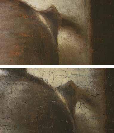
In dem Gemälde, das die Fortschaffung des Leichnams des Heiligen Markus aus Alexandrien zum Thema hat (abb. 1) ist es Tintoretto mit wenigen Strichen gelungen, die Atmosphäre eines drohenden Unwetters im Moment der Flucht darzustellen. Dieser Effekt resultiert einem ganz spezifischen Einsatz der Maltechnik. Die Leinwand ist mit der dunklen Grundierung überzogen, die die malerischen Mittel der Hell-Dunkel. Malerei sehr gut herausstellt. Ein warmer Terra di Siena-Ton vermittelt hier zwischen Schatten und Weiß. Nur der Körper des Heiligen und seines vorderen Trägers scheinen von einer gewissen Plastizität zu sein, der ganze übrige Teil des Bildes ist fast nur mit Weiß gehalten – in einer Art monochromer Grisaille präsentieren sich die Architektur und die anderen Wesen, die das Bild bevölkern. Links zwischen Arkaden fliehen die Schemen der Ungläubigen, deren Körper von pastosen, zarten Pinselstrichen skizziert sind, den Effekt
des Schleierhaften und der Transluzidität betonend. In der linken oberen Ecke war ursprünglich die zum Himmel auffahrende Seele des Heiligen Markus in Gestalt eines durchsichtigen, lediglich aus Konturen und Binnenzeichnung bestehenden Männeraktes zu sehen – von Cherubimköpfen begleitet. Von dem Geist sind auf dem erhaltenen Bild nur noch Fragmente eines Fußes und angedeutete Engelsköpfe enthalten. Daraus und aus der Gestaltung der Fliehenden ableitend lässt sich recht sicher bestimmen, dass der Geist des heiligen Markus ursprünglich als eine Art Grisaille gezeichnet war. In ähnlich monochromer Weise sind die Blitze, der Orkan und die Feuchtigkeit auf dem Platz gemalt. Mit wenigen Pinselstrichen skizziert, bilden sich die scheinbar immateriellen Wesen wie bildimmanente Faktoren aus atmosphärischen Elementen, wie Nebel, Wasser, Licht, Blitzen, Feuer und Rauch.
Die Darstellungen erinnern in ihrer Monochromie in malerischer Gestaltung an die Zeichnung Tintorettos auf dem gefärbtem venezianischen Papier.10
Doch seit neuerer Forschungen zu Unterzeichnungen assoziiert man damit eher die Bleiweißzeichnungen auf den dunklen Grundierungen, die unter den Farbschichten liegen. Es bedeutet, dass hier in der abschließenden Farbschicht sich eine Phase aus dem Entwurfsprozess wiederholt, gerade so, als würde sich skizzenhaft das Gemälde visualisieren. Die Unterscheidung zwischen Malerei und Zeichnung existiert in ihrer traditionellen Form hier nicht mehr. Der Pinselstrich ist sowohl zeichnerisch als auch malerisch zugleich. Tintoretto führte eine Gleichzeitigkeit der beiden Verfahren ein, eine Verflechtung.
In der Auffindung des Heiligen Markus (abb. 2) erzählt uns Tintoretto mit der für ihn eigenen Malweise eine Geschichte, in der sich mehrere Wunder gleichzeitig ereignen: Die Auffindung des Heiligen, die Heilung des Kranken, das Erscheinen des Heiligen und die Präsentation seines Leichnams. Die Simultaneität in der Darstellung wird begleitet von der Abbildung geisterhafter Gestalten, die sich im Inneren des Kirchenraumes bewegen (abb. 3)
Diabolische Figuren hängen von der Balustrade herab unkenntlich, teilweise zu Architekturelementen geronnen, auch sich aus diesen herauswindend. (abb. 4). Unter der Gewölbedecke des Kirchenraumes schweben Fetzen von Stofflichkeit, die von dem links untenstehenden Heiligen gebannt worden sind – sie stellen die Materialisation der zerrissenen Geister bei der Auffindung des Heiligen Markus dar.

Keine Maltechnik – weder die zeichnerische noch die malerische – geht hier im Rahmen ihrer bildnerischen Funktion der anderen voraus. Zeichnerisches und Malerisches stehen nebeneinander und machen den Entwurfsprozess im Bild sichtbar. Die das Bild konstituierenden Malweisen sind auf einer Ebene umgesetzt, was bedeutet, dass im Pinselstrich sowohl der colorito als auch der disegno vorhanden sind. Tintoretto verwebte die Strukturen, Schichten, Materialanordnungen durch das Malmaterial und die Technik miteinander.
Dem Nebeneinander unterschiedlicher Techniken entspricht die Präsenz jedes einzelnen narrativen Moments in einer dieser Techniken. So ging Tintoretto über die realistische Darstellung je einer Szene hinaus. Er konstituierte einen die Wirklichkeit transzendierenden Bildzusammenhang disparater Erzählmomente. Die Simultaneität der Szenen in der Auffindung des Leichnams auf dem Gemälde in der Brera verdeutlicht dies. Dadurch werden die Bildformeln zum rhetorischen Schlüssel für einen emotionalen Zustand, der sich in dieser Szene artikuliert.
Tintoretto ahmt hier nicht mehr nur nach, was in der Natur zu sehen ist, sondern zugleich das, was nur fühlbar
bleibt, was scheinbar nur im toten Winkel des Gesichtsfeldes seine Existenz hat. David Rosand spricht hier von der Gleichzeitigkeit des Gefühls und der Optik, welche sich in Tintorettos Malweise anbietet.11
Als Ergebnis der Untersuchungen zu Tintorettos Malweise lässt sich abschließend herausstellen, dass der Künstler durch die Entwicklung und den spezifischen Einsatz der Malmittel neue Repräsentationsmodi für die bildnerische Darstellung geschaffen hat. Die Pinselstriche und neuen Bildschöpfungen behaupten ihre Autonomie als Farbe und Material und existieren somit zugleich als Medium der Sichtbarkeit. Jenseits der ikonographischen und stilistischen Interpretationsansätze vermag die Untersuchung des Materials, des Werkprozesses und der Gemäldeoberflächen die Darstellungen neu zu lesen, aber auch den venezianischen Poeten Marco Boschini zu verstehen, der für Tintorettos Darstellungen die folgenden Worte fand:
In Ciel vedemo l’Anima beata, Che diafana traspar, come divina, Che splende tuta pura e cristalina.12
3. Detail von Abb. 2
summary – Up Close. On Tintoretto’s Profound Surfaces
Beyond the iconographic and stylistic approaches to interpretation, the study of the material can provide a wide scope of information that allows us to make authoritative statements about the works and their time. By examining the painting material and technique, as well as tracing the process of execution, events and histories can be read anew.
With his characteristic virtuosity, the Venetian painter Jacopo Tintoretto began early on to make the possibilities of colour treatment, and the materiality of the paint his own. Tintoretto experimented extensively with the painting material and thus arrived at ways of representation that increasingly radically detached themselves from a representational approach. Here, the material itself generates the pictorial statement and becomes the bearer of meaning in the picture. By disregarding the tradition of canonized workshop customs in the production of his pictures, the free availability of the individual techniques emerged as an element to be received at will.
Thus, in Tintoretto’s work, the objects and pictorial elements are no longer depicted and formulated; rather, they are captured in a sign-like abbreviation. As signs, they are at the same time able to be more explicit. Closer to the sensation, the comprehension – only with a glance, with knowledge of materiality, material and pictorial statement stand here on an equal footing. As an event, with a specific time and simultaneity of stories and painterly penetrating picture levels.

1 T. Nichols, Tintoretto: Tradition and Identity, London 1999, S. 61.
2 R. Krischel, Jacopo Tintorettos ‘Sklavenwunder’, München 1991, S. 141.
3 C. Rdolfi, Le maraviglie dell’arte, D. v. Hadeln (Hg.), Berlin 1914, Bd. II, S. 14
4 G. Vasari und G. Milanesi 1881, Le vite de piu eccellenti pittori scultori ed architettori, Milano, Bd. IV, S. 587, Übers.: Vasari-Gottschewski/ Gronau 1908, Bd. V, S. 142.
5 Als telleri wurden die großen Festmalereien auf Gewebe mit Gouache bezeichnet, die aber aufgrund ihrer Fragilität, kaum erhalten sind. Vgl.: Krischel 1991 (Anm. 2), S. 96-97.
6 ‘Tintorettos Leinwände und ihre Wölbungen, Buchtungen und sonstigen Unebenheiten sind viel eher in Begriffen der Kraft beschreibbar
als in solchen der Geometrie’, W. Pichler und R. Ubl, ‘Enden und Falten’, Neue Rundschau, 4/113 (2002), S. 64.
7 M. Koller, ‘Das Staffeleibild der Neuzeit’, in: H. Kühn, H. Roosen-Runge, R.E. Straub und M. Koller (Hg.), Reclams Handbuch der künstlerischen Techniken, Stuttgart 1984, Bd. 1, S. 303.
8 C. Bohlmann, Tintorettos Maltechnik. Zur Dialektik von Theorie und Praxis, München 1998, S. 108.
9 K. Vellodi verweist in diesem Zusammenhang auf Tintorettos Arbeitspraxis mit Bühnenmodellen und erklärt aus dieser Methode Tintorettos unorthodoxe Bildschöpfungen und die Vielzahl der ungewohnten Effekte in Tintorettos Bildern,
wie die in das Bild fliegenden Gestalten, die Lichterscheinungen, die geisterhaften Wesen, die überhöhten Beleuchtungen. K. Vellodi, ‘Tintoretto’s Time’, Art History 28/3 (2015), S. 414-433.
10 J. Meder, Die Handzeichnung, Ihre Technik und Entwicklung, Wien 1923, S. 104.
11 D. Rosand, ‘Jacopo Tintoretto nel quarto Centenario dela morte. Atti del covegno 1994’, in: P. Rossi und L. Puppi (Hg.), Tintoretto e gli spiriti nel pennello, Padua 1996, S. 133-137.
12 M. Boschini, La carta del navegar pitoresco: con la “Breve instruzione” premessa alle “Ricche minere della pittura Veneziana”, Venedig 1966, S. 278.
4. Detail von Abb. 2

Niet Albert Poel maar Abraham van de Poel graveert naar Hendrick ter Brugghen
marten jan bok
Gregor Weber stelde in 1988 vast dat een ‘A. P[oel]’ gemonogrammeerde prent moet zijn gegraveerd naar een nu niet meer bekend schilderij van Hendrick ter Brugghen (15881629), voorstellende ‘De engel draagt Jozef in een droom op met Maria en het Christuskind naar Egypte te vluchten’ (afb. 1) 1 Hij wees daarbij op ‘astounding analogies’ met het beeldrepertoire van Ter Brugghen en kwam op stilistische
gronden tot een datering omstreeks 1624.2 Voorheen was de inventie waarop de prent teruggaat op onjuiste gronden toegeschreven aan Adam Elsheimer (1578-1610).3 Na het verschijnen van Webers artikel in 1988 heb ik in Utrechtse archivalia herhaaldelijk gezocht naar een mogelijke vermelding van een graveur A. Poel. Zonder succes. Ook in andere archieven vond ik geen sporen van hem.
1. Abraham van de Poel, De engel draagt Jozef in een droom op met Maria en het Christuskind naar Egypte te vluchten, 1619-1629, gesigneerd linksonder (in pen) ‘APoel. / scul[psit]’, gravure, 238 x 304 mm. Amsterdam, Rijksmuseum, inv.nr. RP-P-1890-A-15944 [Hollstein Dutch, i.v. ‘Albert Poel’, 1-1(2)]

Leonard Slatkes wees in zijn in 2007 verschenen en door Wayne Franits geredigeerde monografie Webers toeschrijving aan Ter Brugghen af, omdat in 1980 op een New Yorkse veiling een schilderijtje was opgedoken dat dezelfde voorstelling had, maar dat in niets de hand van Ter Brugghen verraadde – het was in de catalogus toegeschreven aan ‘omgeving Gottfried Schalcken’ (1643-1706).4 Slatkes’ argumentatie overtuigt niet, aangezien het veel meer voor de hand ligt dat het kleine paneeltje (20 x 29 cm.) een kopie is naar de prent, in plaats van andersom.5
Dat Weber Ter Brugghen’s beeldtaal goed had herkend, wordt in een klap duidelijk wanneer men de onderbeentjes van het kind in de prent vergelijkt met die van het pasgeboren kindeke Jezus op Hendrick ter Brugghen’s Aanbidding der koningen in het Rijksmuseum (afb. 2). Nergens is de woestheid van Ter Brugghens doelbewuste breuk met het visuele decorum beter zichtbaar dan juist daar, in het bijzonder in de polsen en de handjes, die nog alle sporen dragen van de gang door het geboortekanaal. Maar ondertussen bleef het knagen dat de graveur niet nader kon worden geïdentificeerd.

op doek, 132,5 x 160,5 cm. Amsterdam, Rijksmuseum, inv.nr. SK-A-4188
2. Hendrick ter Brugghen, De aanbidding der koningen, gesigneerd en gedateerd linksonder ‘HT-Brugghen fecit 1619’, olieverf
Een nieuwe poging tot identificatie op basis van archiefonderzoek Vertrouwend op de sterk toegenomen digitalisering van de Nederlandse archieven en bibliotheken besloot ik ten behoeve van deze feestbundel een nieuwe poging te wagen Poels identiteit en levensdata vast te stellen. Daarbij heb ik mij in eerste instantie laten leiden door een vijftal kernvragen: (1) welke biografische informatie kan worden gedestilleerd uit het bewaard gebleven oeuvre?; (2) waar komt de voornaam Albert vandaan die in de literatuur aan hem wordt gegeven?; (3) kunnen archiefbronnen een overtuigende identificatie opleveren?; (4) wat zijn de levensdata van de kunstenaar?; en (5) in welke artistieke en sociale netwerken opereerde hij?
Van de plaatsnijder A. Poel zijn drie prenten bekend:
1. De genoemde prent, waarvan twee staten bekend zijn:6
1. Voor de belettering, gesigneerd (in pen) ‘APoel. / scul[psit]’ (afb. 1). [Hollstein Dutch, i.v. ‘Albert Poel’, 1-1(2)]
2. Met achtregelig onderschrift, gemonogrammeerd: ‘AP’.7 [Hollstein Dutch 1-2(2)]
2. Een portret van de Zutphense predikant, theoloog, en kerkhistoricus Willem Baudartius. Afgedrukt in Baudartius’ in 1624 in Arnhem door Jan Jansz., en tegelijkertijd in Zutphen door Andries Jansz. van Aelst uitgegeven Memoryen, ofte cort verhael der gedenck-weerdichste [...] gheschiedenissen van Nederland, [etc.]. Ook hiervan bestaan twee staten:
1. Gesigneerd ‘APoel fe[cit]’. [Hollstein Dutch 2-1(2)]
2 Gesigneerd en gedateerd ‘APoel fe[cit]’ ‘Anno 1624’ (afb. 3). [Hollstein Dutch 2-2(2)]
3. Een zinnebeeldige voorstelling van ‘Liefdes brand verslint ‘t verstand’ (naar Adriaen Pietersz. van de Venne), gesigneerd: ‘APoel’, te dateren op 1624 (afb. 4). Afgedrukt in de in 1624 in Middelburg gedrukte, en in Amsterdam door Jan Evertsz. Cloppenburgh uitgegeven Emblemata of Zinne-werck, [etc.], van Johan de Brune (de Oude).8
[Hollstein Dutch 3]
Op grond van de bewaard gebleven prenten kunnen we constateren dat onze graveur omstreeks 1624 even plotseling opduikt als hij weer verdwijnt. Is hij jong gestorven? Of besloot hij na een veelbelovend begin een andere professie te kiezen? Hij opereerde in ieder geval meteen in een opvallend artistiek en intellectueel milieu, met verbindingen in een groot deel van de Republiek. Weber wees er
al op dat behalve Ter Brugghen, ook twee van de bij het boek van De Brune betrokken graveurs in Utrecht waren opgeleid: Johannes Gelle (ca. 1580-1624/1625) en Willem de Passe (ca. 1598-1636/1637).9 De laatste graveerde eveneens naar het religieuze werk van Ter Brugghen. De uitgevers voor wie onze graveur werkte zaten in Arnhem, Zutphen en Amsterdam. De geleerde predikant Wilhelmus Baudartius stond in Zutphen op de kansel.10 Hij was sinds 1618 betrokken bij de nieuwe vertaling van de Bijbel, de zogeheten Statenvertaling. Maar daarnaast was Baudartius een felle pamflettist van contra-remonstrantse signatuur. De in Middelburg werkzame advocaat De Brune was eveneens een streng gelovig calvinist. Adriaen Pietersz. van de Venne (1590-1662), die een groot aantal van de prenten voor De Brune’s Emblemata ontwierp, woonde tot 1625 in Middelburg, terwijl ook de reeds genoemde Willem de Passe een Zeeuwse connectie had.11 Wij zullen in het hiernavolgende terugkomen op het milieu en het sociale netwerk van Poel. Maar eerst moeten we nog een geval van naamsverwarring uit de weg ruimen.
Naamsverwarring
Een exemplaar van de prent naar Ter Brugghen werd in 1847 door Passavant onder de naam ‘Albert Poel’ beschreven als: ‘A. Elsheimer p[inxit] A. Poel fecit.’.12 Weber kende deze vermelding maar negeerde in zijn artikel van 1988 behoedzaam de voornaam ‘Albert’ die Passavant aan de graveur toedichtte.13 Deze combinatie van namen komt namelijk nergens in de kunsthistorische literatuur voor met een verwijzing naar primaire biografische bronnen. Bij nader onderzoek blijkt dat zowel een naamsverwisseling als een geleidelijke identiteitsverschuiving heeft plaatsgevonden. In de oude Duitstalige kunsthistorische literatuur werden schilderijen van Adriaen Lievensz. van der Poel (16281671/1672) namelijk al in de achttiende eeuw abusievelijk onder de naam Albert Poel gecatalogiseerd.14 In het werk van deze kunstenaar komen nachtstukken en brandjes voor. Gezien zijn geboortejaar 1628 kan Adriaen van der Poel echter niet onze in 1624 werkzame graveur zijn. Passavant stapelde hier dus fout (chronologie) op fout (onomastiek) op fout (toeschrijving).
Nog verwarrender wordt het doordat Dr. Jan Sysmus in zijn omstreeks 1669 begonnen ‘Schildersregister’ Adriaen Lievensz. van der Poel abusievelijk de voornaam Abraham gaf: ‘Abram van der Poel, in brandtjes, broeder van Egbert [Lievensz. van der Poel (1621-1664)], floreerde 1650.’.15 De naamsverwisseling van Sysmus vond evenwel geen navol-
ging. Die van Passavant ging echter de moderne kunsthistorische literatuur in. In het in 1933 uitgegeven 27-ste deel van Thieme-Beckers Allgemeines Lexikon der bildenden Künstler werd de graveur door Henkel behandeld onder het lemma ‘Albert Poel’.16 Waller (1938) nam die naam over.17 Als Albert Poel is hij later ook opgenomen in Hollstein en in de catalogus van het Rijksprentenkabinet.
Met het bovenstaande in het achterhoofd besloot ik in de online genealogische database Wiewaswie een onderzoek in te stellen naar alle mannen die in de jaren 1620 in Nederlandse doop-, trouw-, en begraafregisters voorkwamen

3. Abraham van de Poel, Portret van Willem Baudartius, gesigneerd rechtsonder ‘APoel fe[cit]’ en gedateerd ‘Anno 1624’, gravure, 272 x 170 mm. Amsterdam, Rijksmuseum, inv.nr. RP-P-1938-1993(R) (Legaat F.G. Waller), Amsterdam). [Hollstein Dutch 2-2(2)]
met de achternaam Poel (of varianten op die naam) en een voornaam beginnend met de letter ‘A’.18 De eerste bruikbare aanwijzing die ik vond was de doop in de Nieuwe Kerk te Amsterdam van een meisje Clara, dochter van Abraham van de Poel en Dorothea Ouwens (ca. 1606-1646). Bij deze doop op 20 november 1629 trad een Andries van Aelst op als doopgetuige.19 Aannemende dat deze Andries van Aelst identiek zou zijn met de uitgever van Baudartius werd verder gezocht naar de namen van de ouders. Dit leverde een Amsterdamse ondertrouwakte van 6 september 1625 op:
Compareerden [...] Abraham van de Poel, van Aernem, out 24 jaren, wonen[de] op de Heregraft, geassisteert met Godelieff de la Rame wed[uw]e van Pieter van de Poel, ter eenre; ende Dorothea Ouwens, out ontrent 19 jaren, wonen[de] op de Keysergraft, geassisteert met Baltaser Schuijlenburch, haer voocht, met Catelyna de la Rame, ter ander syden.20
Tegen het voorgenomen huwelijk werd bezwaar aangetekend door de grootmoeder van de bruid.21 Maar omdat bruid en bruidegom beiden wilden trouwen, en zij hoogzwanger was – ‘Liefdes brand verslint ‘t verstand’ –, konden de Amsterdamse huwelijkscommissarissen niet anders doen dan het huwelijk te laten voltrekken.22 Op 18 oktober werden de huwelijksvoorwaarden opgemaakt.23 Abraham van de Poel werd daarbij geassisteerd door zijn moeder Godelieve ‘Ingran’ (ook genoemd Ingenrame en De la Rame) en zijn halfbroer Lodewijck van Aelst. Hij bracht 6.000 gulden in, waaronder zijn aandeel (ter waarde van 4.800 gulden) in drie grauwpapiermolens te Doorwerth en Velp bij Arnhem uit de nalatenschap van zijn overleden vader. Verder bracht hij onder meer voor 950 gulden in ‘aen schilderijen van exempte [= uitnemende] meesters ende andere consten’. De gezamenlijk waarde van zijn bezittingen bedroeg 7.550 gulden (waartegenover 550 gulden aan schulden stonden). Een zevende van zijn bezittingen bestond daarmee uit kunstwerken.
De gevonden documenten boden genoeg aanknopingspunten om een gedetailleerde genealogie van de familie Van de Poel te kunnen samenstellen, evenals van enkele aanverwante geslachten.24 Dit is niet de plaats om diep op die resultaten in te gaan en ik zal mij beperken tot de meest relevante biografische gegevens inzake de graveur zelf.25
Levensloop
Abraham van de Poel (ca. 1601-1637) werd omstreeks 1601 in Arnhem geboren als zoon van de papiermaker Pieter

Jacobsz. van de Poel en Godelieve Ingenrame alias De la Rame.26 Zijn uit Antwerpen afkomstige moeder was eerder weduwe van de eveneens uit Antwerpen afkomstige Hans van Aelst, die in 1586 de grondlegger is geweest van de Noord-Nederlandse papierindustrie.27 Uit dat huwelijk was Abrahams oudere halfbroer Andries Jansz. van Aelst geboren.28 Deze was van 1606 tot 1630 stadsdrukker van Zutphen. Dankzij Andries’ huwelijk (vóór 1615) met Neeltien Jans, dochter van de bekende Arnhemse boek- en prentendrukker Jan Jansz. (de Oude) en Merrij Jans, kan zich voor Abraham de mogelijkheid hebben geopend om zich te bekwamen in het plaatsnijden.29 Jan Jansz. was al sinds 1604 de drukker en uitgever van de prenten van Crispijn de Passe de Oude (1564/1565-1637), die zich in 1611 vanuit Keulen in Utrecht zou vestigen.30 Jonker Hendrick Goudt (1583-1648), de graveur die de schilderijen van Adam Elsheimer in prent bracht, vestigde zich in 1612 vanuit Rome in Utrecht, in 1614 gevolgd door Hendrick ter Brugghen.
Weber neemt, in navolging van eerdere auteurs, aan dat Van de Poel in Utrecht binnen deze kring is opgeleid tot graveur.31 Nu wij weten dat Jan Jansz. de schoonvader was van Abrahams broer, lijkt het gerechtvaardigd om aan te nemen dat Abraham op enig moment naar Utrecht werd gestuurd om aldaar in de leer te gaan bij Jan Janszoons zakenpartner Crispijn de Passe de Oude.
In de jaren na hun huwelijk lieten Abraham van de Poel en Dorothea Ouwens in Amsterdam zeven kinderen dopen, het laatste in 1634.32 De dood van zijn vader Pieter Jacobsz. van de Poel, in of kort voor 1625, zal echter een eind hebben gemaakt aan Abrahams ambities als kunstenaar. We vinden hem daarna met zijn oudere broer Pieter van de Poel werkzaam als koopman in papier.33 Het gezin woonde in 1631 niet meer op de Herengracht, maar op het Singel, aan de oostzijde, iets ten noorden van de Jan Rodenpoort. Daar werden zij toen aangeslagen voor een vermogen van 7.000 gulden.34 Later vestigde Abraham zich als vertegenwoor-
4. Abraham van de Poel naar Adriaen Pietersz. van de Venne, Liefdes brand verslint ‘t verstand, gesigneerd linksonder ‘APoel’, 1624, gravure, 73 x 109 mm. Amsterdam, Rijksmuseum, inv.nr. RP-P-1900-A-21994. [Hollstein Dutch 3]
diger van de firma in Londen, waar hij in 1637 overleed.35 Op 29 oktober van dat jaar deden Pieter van de Poel en Abraham Willemsz. Beyerland, als oomen en voogden van de vier nagelaten kinderen van Abraham van de Poel, bij de Amsterdamse Weeskamer inbreng van de nalatenschap. Zij leverden een inventaris in van ‘alle de meublen ende huysraet, schilderye, printen, silverwerck, pillegiften, alhier tot Amsterdam’. Ook bij de in Londen verblijvende moeder van de kinderen bevonden zich nog bezittingen. Het vermogen was sinds 1625 flink gegroeid. Tot de nalatenschap behoorde onder meer een aandeel in de Verenigde OostIndische Compagnie (VOC) ter waarde van 3.000 gulden dat later tegen een hoge koers werd verkocht voor 9.510 gulden. Voor ons is echter vooral één specifieke post van belang: met de opbrengst van de ‘vercochte printen, schilderyen ende eenige meubelen’ werd voor de kinderen een obligatie van 1.400 gulden aangekocht.36 Uit het feit dat de prenten hier als eerste worden genoemd mogen we afleiden dat de erfgenamen die als het belangrijkste bestanddeel van zijn kunstbezit beschouwden.37
Wel wetende dat in geen van de gevonden documenten Abraham van de Poel expliciet als plaatsnijder wordt aangeduid, concludeer ik dat mijn onderzoek voldoende aanwijzingen heeft opgeleverd om hem te kunnen aanwijzen als de auteur van de drie prenten die tot op heden op naam van Albert Poel stonden.38 Albert Poel heeft nooit bestaan en kan uit de kunsthistorische literatuur worden geschrapt. Gregor Webers scherpzinnige identificatie uit 1988 van een verloren gegaan werk Hendrick ter Brugghen, blijkt dankzij het archiefonderzoek van een kunst- en cultuurhistorische context te kunnen worden voorzien.39 Abraham van de Poel stamde uit een milieu van zeer ondernemende ZuidNederlandse immigranten, voor wie het maken, verzamelen en verhandelen van kunst een vanzelfsprekend onderdeel van het zakendoen was.
summary – Not Albert Poel but Abraham van de Poel Engraves after Hendrick ter Brugghen
In 1988 Gregor Weber published a short article in which he identified the Utrecht painter Hendrick ter Brugghen as the designer of a print by the enigmatic engraver A. Poel. Although his identification has been questioned by some, today all the specialists agree that the print records a now lost painting by Ter Brugghen. Attempts to identify the engraver Poel remained fruitless up to this date. In this contribution new archival research points to Abraham van de Poel as the engraver. He was born around 1601 in Arnhem, in a family of paper makers and printers, and was related to the well knows Arnhem book and print publisher Jan Jansz. Abraham van de Poel was a talented young engraver when around 1624 he published three prints. He was also well connected in the artistic and intellectual world of the Dutch Republic. However, after his marriage in 1625 and the death of his father, Van de Poel took up the paper trade. He died in London in 1637, leaving behind a considerable stock of prints and paintings. The engraver Albert Poel, to whom the three prints were traditionally attributed, never existed.
1 G.J.M. Weber, ‘Ter Brugghen, Elsheimer, Poel en Rubens’, Hoogsteder-Naumann Mercury 7 (1988), pp. 23-28.
2 Weber 1988 (noot 1), p. 24.
3 Weber 1988 (noot 1), p. 27 noot 8.
4 L.W. Slatkes en W. Franits, The Paintings of Hendrick ter Brugghen, 1588-1629. Catalogue Raisonné (Amsterdam / Philadelphia 2007), pp. 238-239, cat. nr. R9; pp. 440-441,
pl. 68-69. Hierin alle in het hiernavolgende geciteerde informatie over de prent en de ernaar geschilderde kopie.
5 Dit werd door Franits reeds opgemerkt in een terzijde op het commentaar van Slatkes. Zie: Slatkes en Franits 2007 (noot 4), p. 239, noot 6.
7 Het gedicht onder de prent is niet gesigneerd. Het is mij niet gelukt de dichter te identificeren.
8 Zie voor de editiegeschiedenis van dit boek: W. Hendriks, J. Mateboer, en P.J. Verkruijsse, Johan de Brune de Oude (1588-1658). Descriptieve auteursbibliografie (Amsterdam 1988; online: DBNL 1990), pp. 44-53, nr. 1009.
6 Er zou nog een derde staat (niet bij Hollstein) zijn, waarvan geen exemplaar meer kan worden aangewezen. Zie: Slatkes en Franits 2007 (noot 4), p. 239, noot 5. Weber 1988 (noot 1), p. 27 noot 8, twijfelt aan het bestaan van deze staat.
9 Weber 1988 (noot 1), p. 25.
10 Het Latijnse lofdicht onder het portret werd geschreven door Johannes Anthonius Biber, rector van de Latijnse school te Zutphen.
11 I.M. Veldman, Crispijn de Passe and his Progeny (1564-1670). A Century of Print Production. (Studies in prints and printmaking, vol. 3), Rotterdam 2001, p. 250.
12 J.D. Passavant, ‘Adam Elsheimer, Maler aus Frankfurt am Main’, Archiv für Frankfurts Geschichte und Kunst 1, Heft 4 (1847), pp. 44-85, p. 82, cat.nr. 56.
13 Vergelijk: Weber 1988 (noot 1), p. 27, noot 8.
14 Zie bijvoorbeeld: C. von Mechel, Verzeichniss der Gemälde der Kaiserlich Königlichen Bilder Gallerie in Wien, Wien 1783, p. 207, cat. nr. 11; F.W.B. von Ramdohr, Beschreibung der GemäldeGalerie des Freiherren von Brabek zu Hildesheim (Hannover 1792), pp. 49-50, cat. nr. 56; F.C.G. Lentke, Verzeichniss der Grossherzoglichen Gemälde-Sammlung, welche sich auf dem alten Schlosse in Schwerin befindet, Schwerin 1836, pp. 83-84, cat.nr. 308.
15 A. Bredius, ‘Het schildersregister van Jan Sysmus (I)’, Oud Holland 8 (1890), pp. 1-17, p. 2.
16 M.D. Henkel, ‘Albert Poel’, U. Thieme en F. Becker (eds.), Allgemeines Lexikon der bildenden Künstler von der Antike bis zur Gegenwart, 37 delen, Leipzig 1908-1950, reprint München 1992, deel 27 (1933), p. 177.
17 F.G. Waller (W.R. Juynboll, ed.), Biographisch woordenboek van Noord Nederlandsche graveurs, ‘s-Gravenhage 1938, reprint Amsterdam 1974, p. 257.
18 Wiewaswie (online database van het Centraal Bureau voor Genealogie, Den Haag: https:// www.wiewaswie.nl/; geraadpleegd 8 april 2022). Hierin kan op naamsvarianten worden gezocht met behulp van het truncatiesymbool ‘*’ (de asterisk).
19 Amsterdam, Stadsarchief Amsterdam (SAA), DTB-registers [toegangsnummer 5001], inv.nr. 41, p. 52.
20 SAA (noot 19), DTB, 430, p. 246.
21 Zie voor dit conflict ook: SAA (noot 19), Archief van de Notarissen ter standplaats Amsterdam (NAA) [toegangsnummer 5057], inv.nr. 607 (notaris L. Lamberti); online, aktenr. 397994, d.d. 8-9-1625.
22 Op 21-10-1625 maakte Dorothea Ouwen haar testament. Hierin is sprake van het kind ‘daermede zij testatrice tegenwoordich bevrucht gaet’. SAA (noot 19), NAA inv.nr. 574 (notaris L. Lamberti), fol. 437-439; online, aktenr. 19012. Al op 30-10-1625 werd in de Oude Kerk dat kind (Pieter) gedoopt. SAA, DTB, 6, p. 126.
23 SAA (noot 19), NAA, inv.nr. 547 (notaris L.Lamberti), fol. 428-429; online, aktenr. 17111, d.d. 8-10-1625.
24 Zie voor een gepubliceerde stamboom Van de Poel: I. Prins, ‘Gegevens betreffende de “Oprechte Hollandsche Civet”’, EconomischHistorisch Jaarboek 20 (1936), pp. 3-211, na p. 24, stamboom E2 (Van de Poel). Daar ook een stamboom Van Aelst.
25 Genealogische gegevens met bronvermeldingen zullen worden gepubliceerd op de website
van de Ecartico database (M.J. Bok, H. Nijboer en J. Brouwer (eds.), ECARTICO. Linking cultural industries in the early modern Low Countries, ca. 1475 - ca. 1725: https://www.vondel. humanities.uva.nl/ecartico/). Zijn ouders, (half)broers en zusters waren allen actief in de papierproductie en -handel, maar exploiteerden ook koperslagerijen. Abraham van de Poels zwager Abraham Willemsz. van Beyerlant (x Geertruy Pieters van de Poel) was een van de initiatiefnemers tot de civetnijverheid in de Republiek, en uitgever van geschriften op het gebied van het geldwezen. Zie hiervoor: Prins 1936 (noot 24), passim. Maar hij is vooral bekend geworden als vertaler en uitgever (16341643) van de werken van de Duitse mysticus Jakob Böhme (1575-1624). Hij was bovendien de Nederlandse vertaler, en in 1643 uitgever van het mystiek-magische Corpus Hermeticum van Hermes Trismegistus. Zie: G. Snoek, De Rozenkruisers in Nederland. Voornamelijk in de eerste helft van de 17e eeuw. Een inventarisatie, Haarlem 2006, pp. 42, 162, 301, 329, 440-441, 446, 461.
26 Zie voor hun biografische gegevens de Ecarticodatabase (noot 25).
27 Zie voor Hans van Aelst: R. Hardonk, “Koornmullenaers, pampiermaeckers en coperslaghers”. Korte historie der waterradmolens van Apeldoorn, Beekbergen en Loenen, Apeldoorn 1968, pp. 49-52.
28 Zie voor hem: J.G.C.A. Briels, Zuidnederlandse boekdrukkers en boekverkopers in de Republiek der Verenigde Nederlanden omstreeks 1570-1630, [etc.], Bibliotheca Bibliographica Neerlandica 6, Nieuwkoop 1974, pp. 132, 133, 231-232, 333, 604. Zie voor zijn grote onderneming als koperslager onder Apeldoorn: Hardonk 1968 (noot 27), pp. 189-193.
29 Het bewijs voor dit huwelijk wordt geleverd door een Arnhemse akte waarbij de vier kinderen en erfgenamen ‘van hare zal. olderen’ Jan Jansz. en Marrie Jans, ‘gewesene echtel[uijden]’, te weten: Andries Jansz. van Aelst, [en zijn vrouw] Neeltie Jans, Jacob van Biesen, [boekverkoper], en zijn vrouw Catharina Jans, mitsgaders Jasper ten Bosch, als gemachtigde (cf. procuratie d.d. 24-5-1634, voor schepenen van Amsterdam) van Jan Jansz. [Brouwer alias Johannes Janssonius], boekverkoper, en diens vrouw Elizabeth Carlier, en als gemachtigde (cf. procuratie d.d.10-61634, voor schepenen van Amsterdam) van Herman Jansz. [Brouwer, uitgever], hun ouderlijk huis staande in de Turfstraat te Arnhem transporteren. (Arnhem, Gelders Archief, Oud-rechterlijk archief (ORA) Arnhem [toegangsnummer 2003], inv.nr. 418, Schepensignaat, fol. 358-358v, d.d. 6-6-1634; online, scans nrs. 731-732). Zie voor deze akte en het huwelijk van Andries Jansz. van Aelst: M. Potjer, ‘De uitgever Jacob van Biesen aan het werk (1643-1645)’, Arnhems Historisch Tijdschrift 37 (2017, nr. 4), pp. 206-215. Potjer herkent Andries Jansz. van Aelst wel als schoonzoon van Jan Jansz., maar geeft hem abusievelijk de naam Adriaen Jansz. van Aelst (p. 208). Zie
ook: F. Reurink, ‘Het uitgebreide netwerk van Jan Jansz., boekverkoper, uitgever en drukker te Arnhem’, Arnhems Historisch Tijdschrift 33 (2013, nr. 3), pp. 151-156. Tot op heden was de herkomst van Jan Jansz. niet bekend. Naar nu blijkt was hij afkomstig uit ‘s-Hertogenbosch, en zoon van Jan die Brouwer. Dit gaf hij op toen hij op 13 september 1584 in Arnhem in het huwelijk trad met Merry Janssen. Zie: Arnhem, Gelders Archief, DTB-registers Gelderland [toegangsnummer 0176], inv.nr. 126, fol. 13v. Dit verklaart tevens waarom zijn zoon Johannes Janssonius zich ‘Brouwer’ noemt. Ook kan hiermee worden vastgesteld dat de Amsterdamse uitgever Harmen Jansen Brouwer een zoon was.
30 Veldman 2001 (noot 11), passim.
31 Weber 1988 (noot 1) pp. 25, 27, noot 18.
32 Zie voor de bronvermeldingen de Ecarticodatabase (noot 25), i.v. Abraham van de Poel.
33 Zie bijvoorbeeld: Rotterdam, Stadsarchief Rotterdam, Oud notarieel archief [toegangsnummer 18], inv.nr. 134 (notaris A. Wagensvelt), akte 407 (fol. 581-582), d.d. 19-12-1630.
34 J.G. Frederiks en P.J. Frederiks, Kohier van den tweehonderdsten penning voor Amsterdam en onderhoorige plaatsen over 1631, Amsterdam 1890, p. 9, nr. 170.
35 Prins 1936 (noot 24), stamboom E2 (Van de Poel).
36 SAA, Archief van de Weeskamer [toegangsnummer 5073], inv.nr. 794, Inbrengregister nr. 23, fol. 258-261, 400; online, scans nrs. 269-271, 410.
37 We kunnen er alleen maar over speculeren of Abraham van de Poel in 1624 ook de eerste eigenaar van Ter Brugghens ‘Aanbidding der koningen’ is geweest.
38 Prins 1936 (noot 24) schrijft over Abraham van de Poel dat hij handelde in papier en tabak, en bovendien (met een vraagteken) dat hij plaatsnijder was. Hij geeft hiervoor geen bron. Mogelijk doelde hij hiermee op de gedateerde prenten en was hij al tot dezelfde identificatie gekomen die in deze bijdrage naar voren wordt gebracht.
39 Wayne Franits liet mij op 15 april 2022 per email weten dat hij zich, anders dan Slatkes, in Webers toeschrijving van 1988 kan vinden.
niet albert poel maar abraham van de poel graveert naar hendrick ter brugghen