A PORTFOLIO BY A COOL DESIGNER
BY EGY SATYANA (SELFA MUST SEE 2022 SELECTED WORKS
PROCLAIMED BEST GRAPHIC DESIGNER / ILLUSTRATOR ALIVE)
it’s me
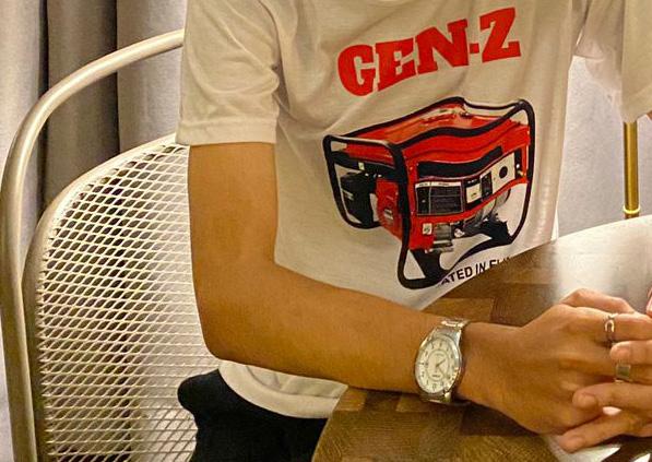
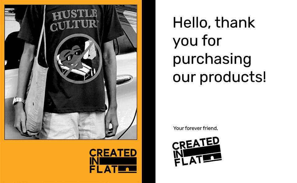
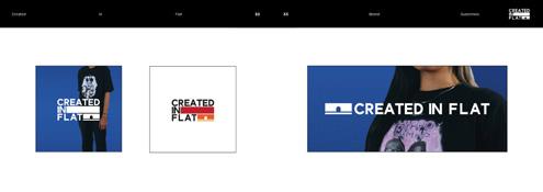
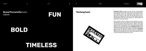
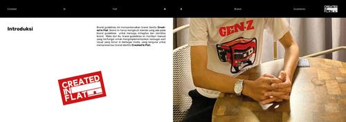
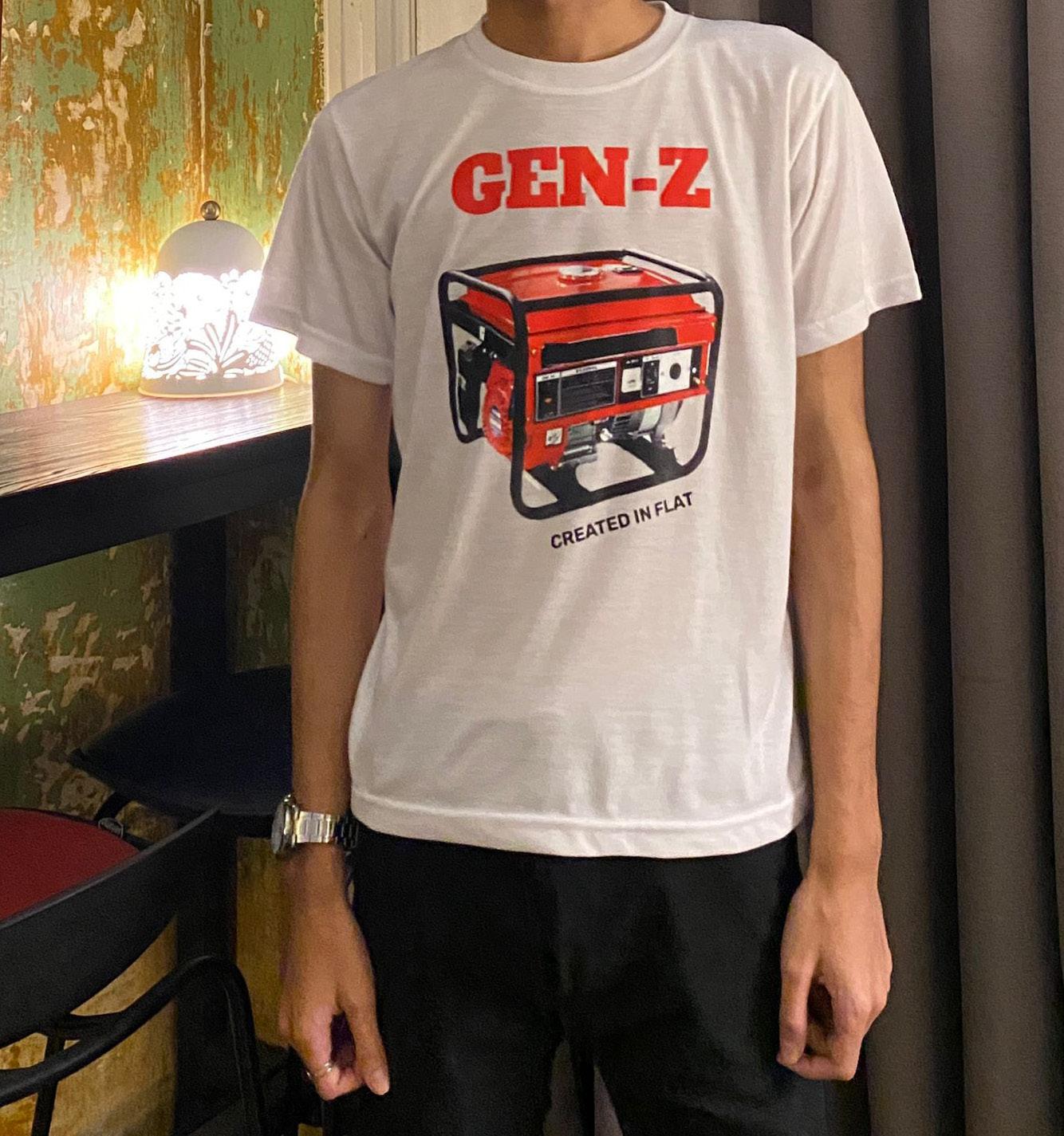
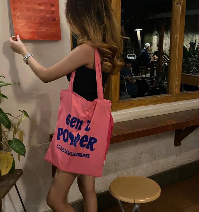
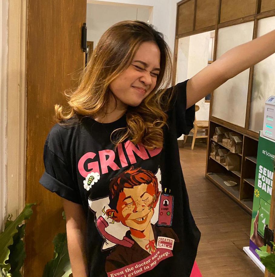
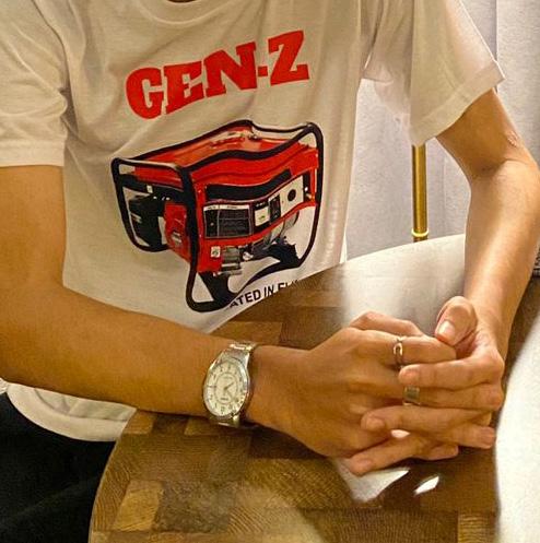
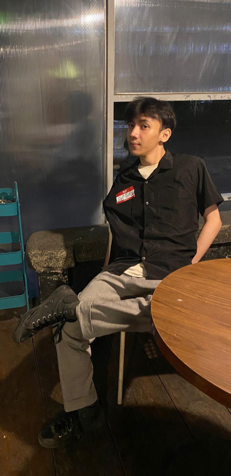
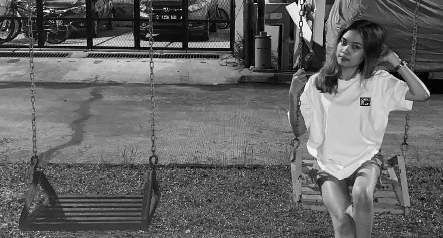
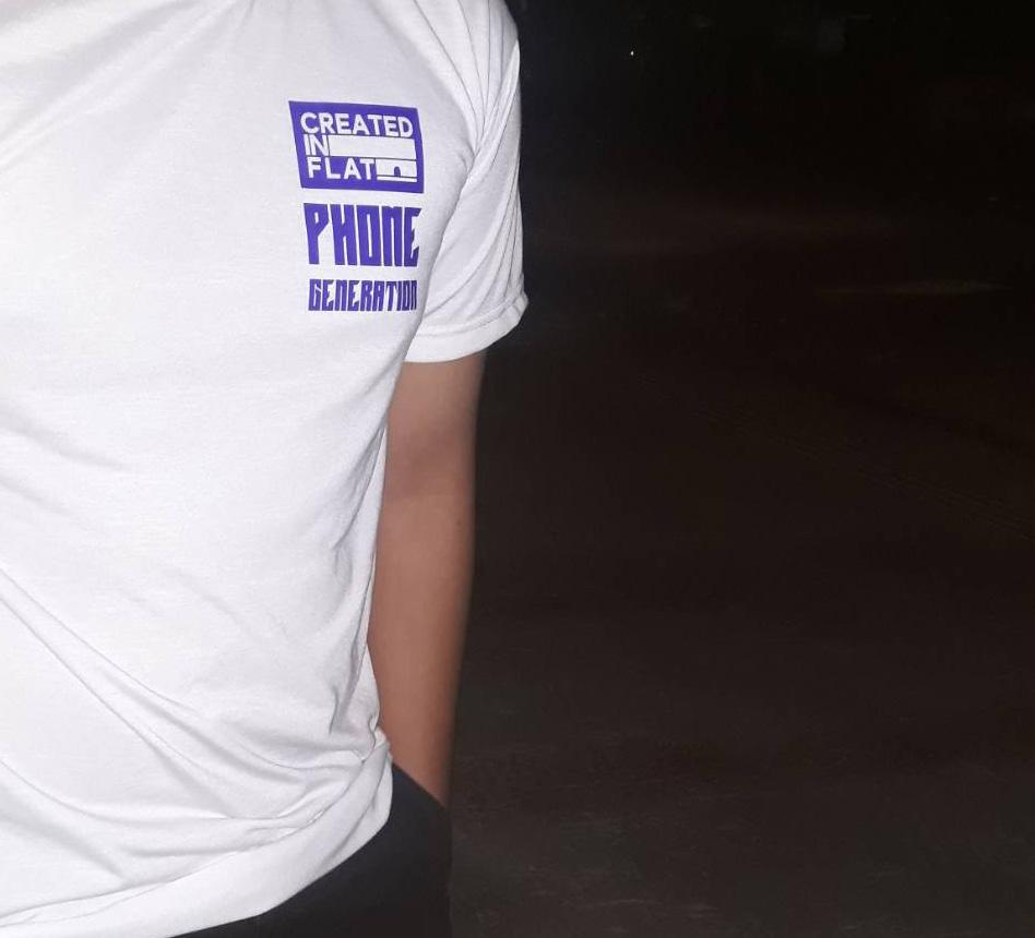
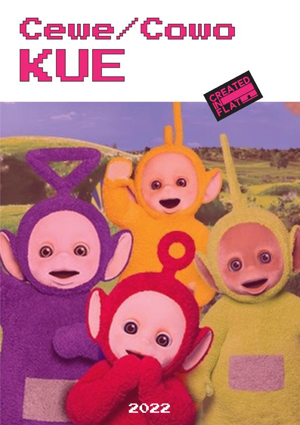
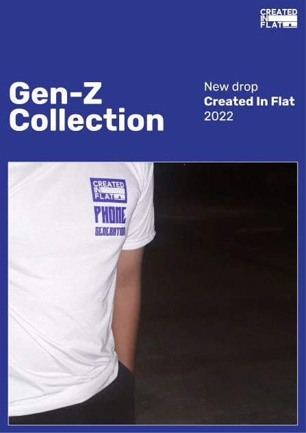
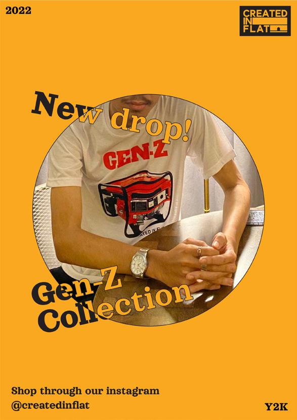
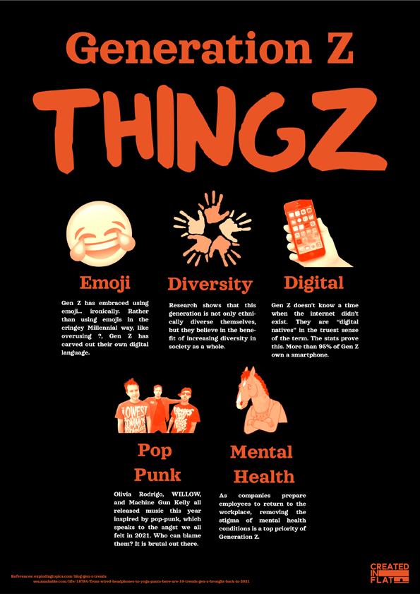
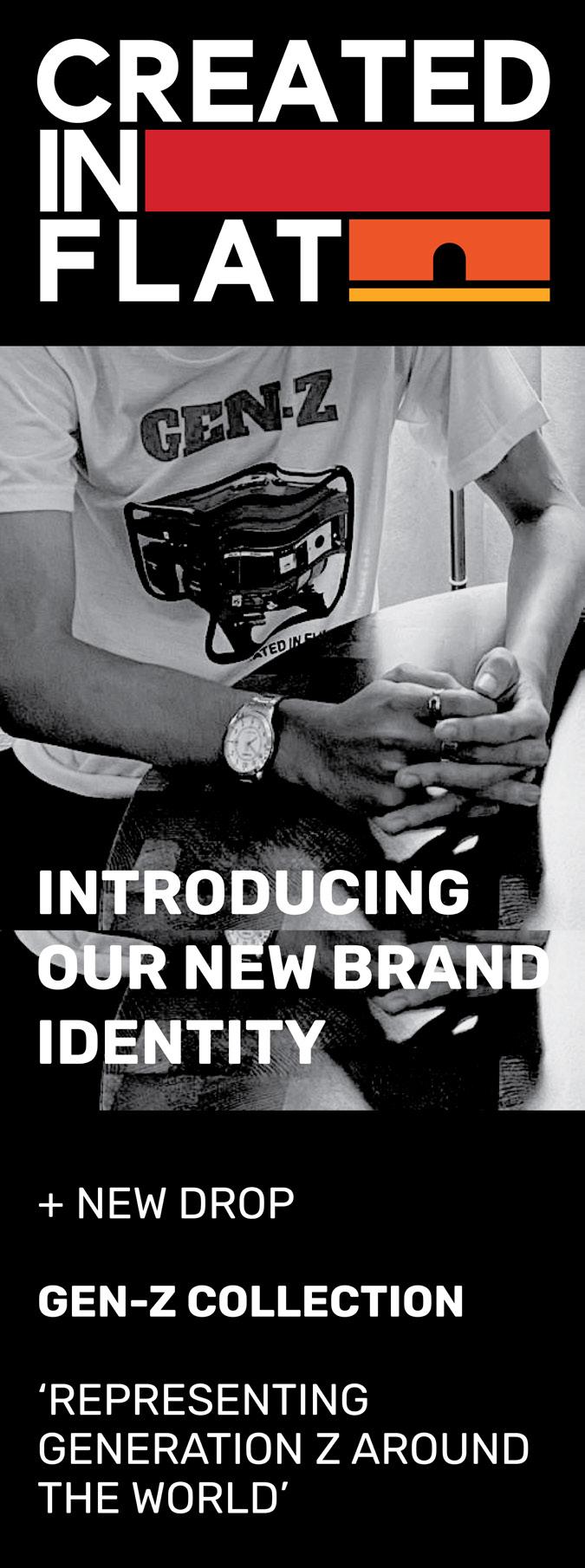
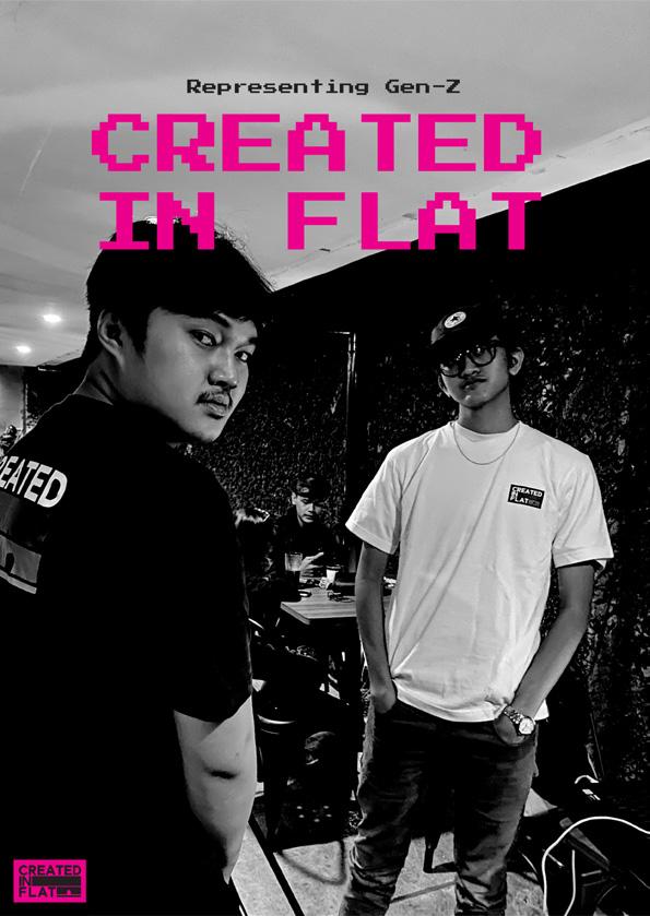
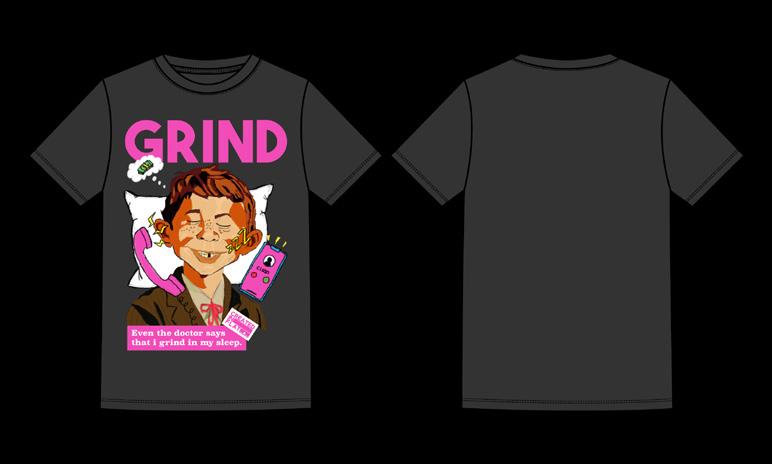
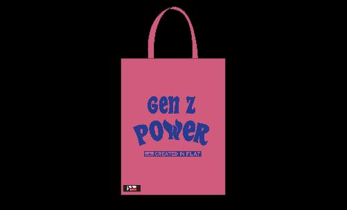
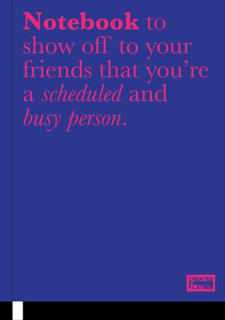
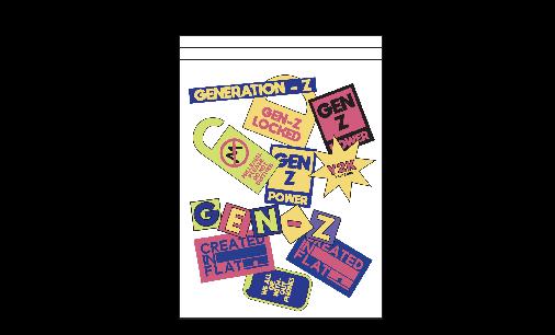
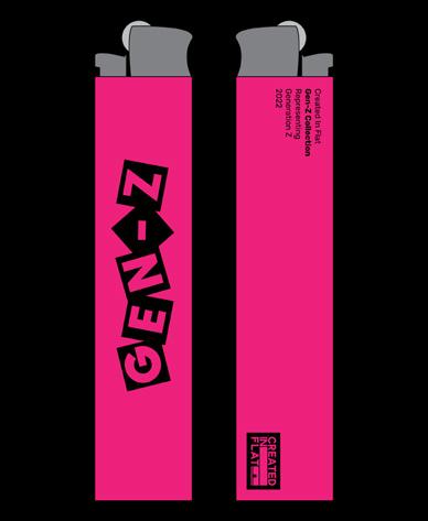
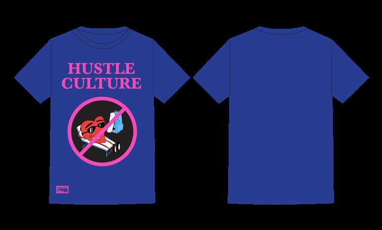
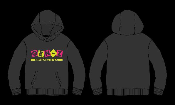
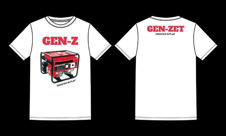
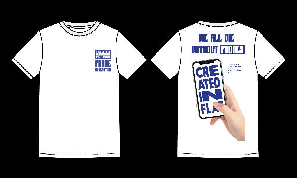
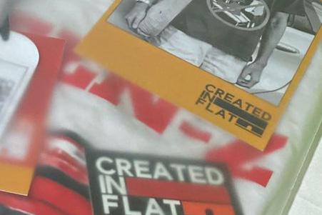
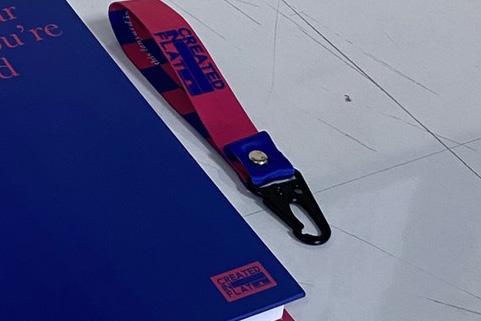
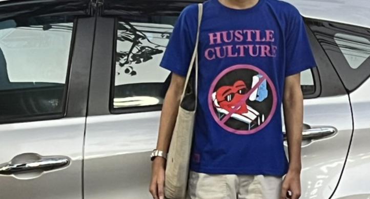
Created In Flat is a fashion brand based in Bandung, Indonesia. Established in 2020, this brand represents many culture dan subcul ture like music, pop culture, pop art, and many more. Septian Dwi Rahman created this brand to channel and share his creativity, design, and his passion for music and fashion. Gen-Z gen eration are Created In Flat main segmentation, because Gen-Z are a generation that have a unique characteristic and largest generation in the world right now.
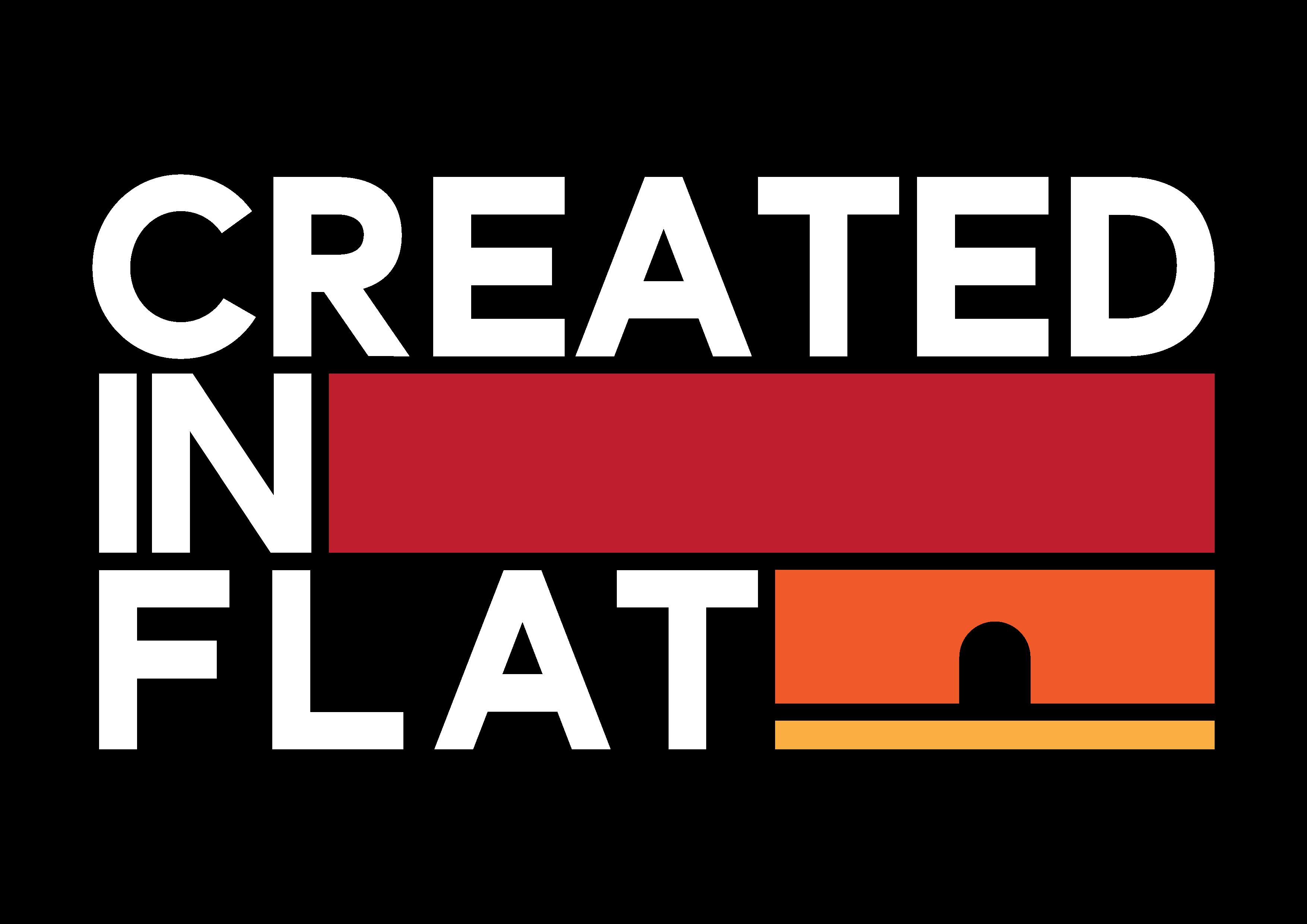
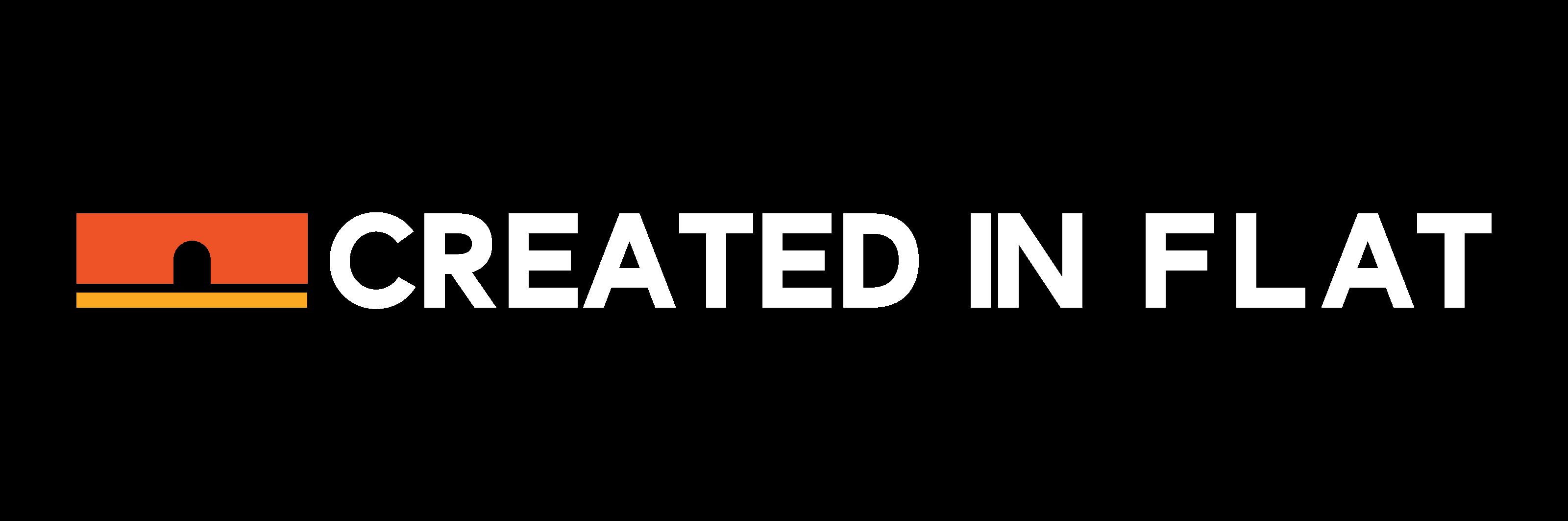

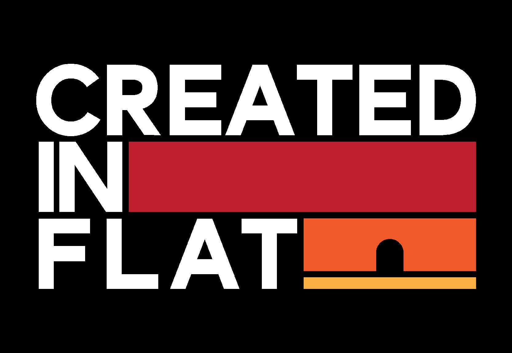
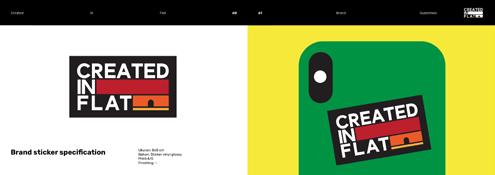
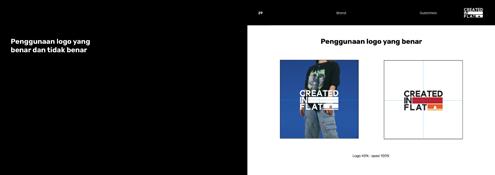
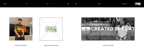
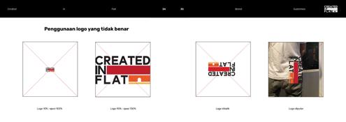
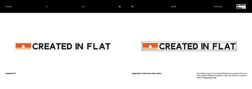
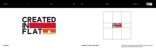
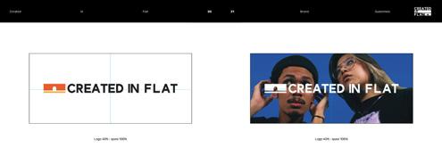
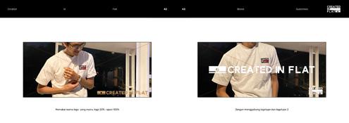
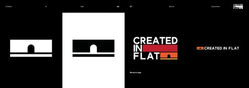
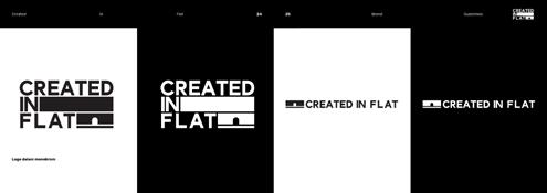
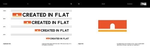
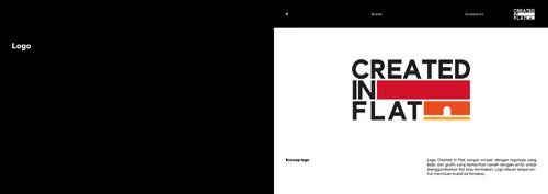
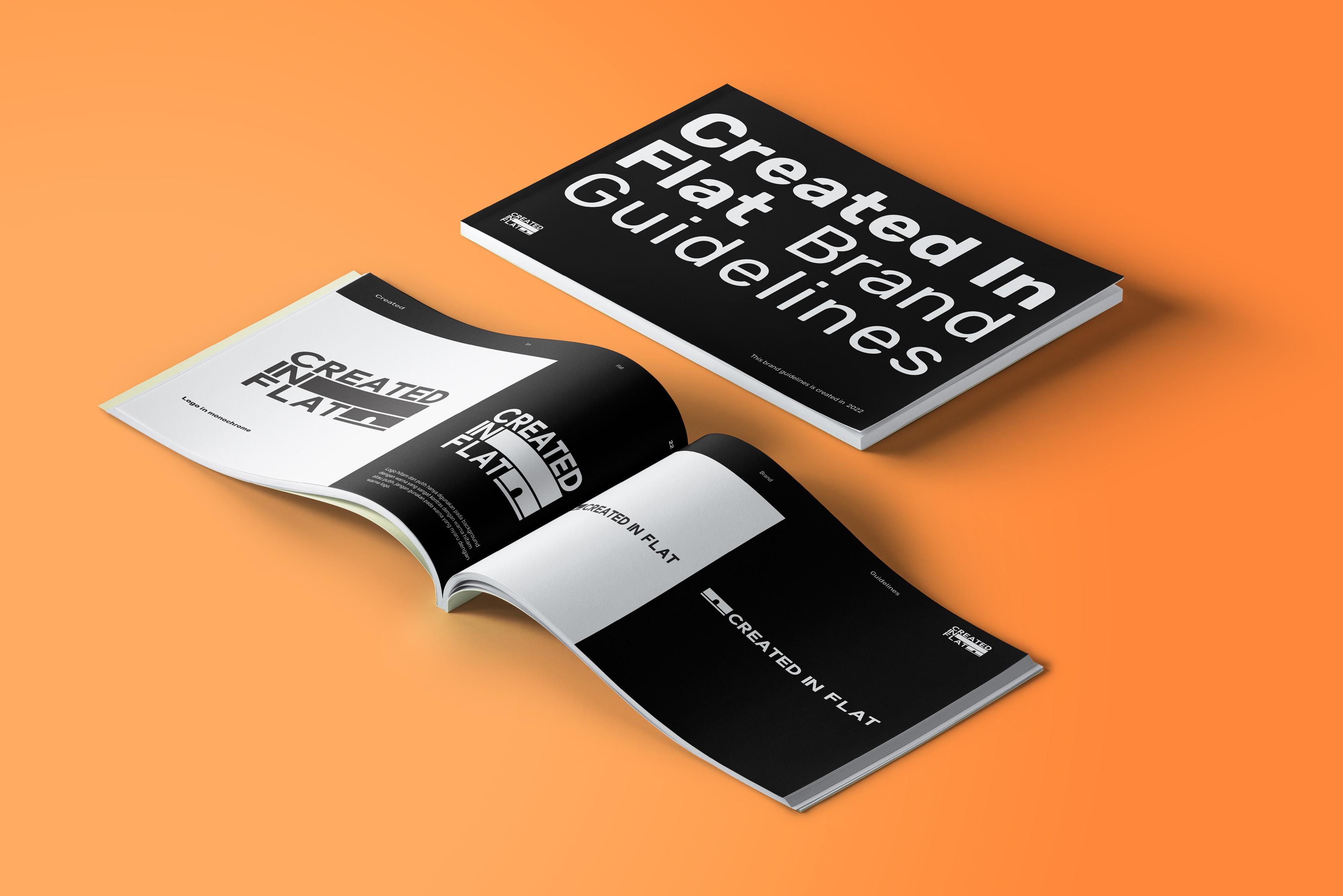
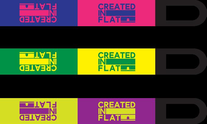
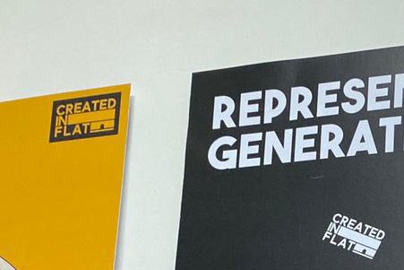
Created In Flat logo is very simple, with bold logotype, and a graphic that represent a house with a door to represent a flat house. Logo is designed simple to make this brand timeless.
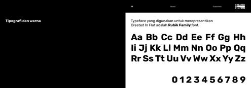
Rubik regular is for body copy. Rubik regular is for body copy. Rubik regular is for body copy. Rubik regular is for body copy. Rubik regular is for body copy. Rubik regular is for body copy. Rubik regular is for body copy. Rubik regular is for body copy. Rubik regular is for body copy. Rubik regular is for body copy. Rubik regular is for body copy. Rubik regular is for body copy. Rubik regular is for body copy. Rubik regular is for body copy. Rubik regular is for body copy.
Rubik regular is for body copy. Rubik regular is for body copy. Rubik regular is for body copy. Rubik regular is for body copy. Rubik regular is for body copy. Rubik regular is for body copy. Rubik regular is for body copy. Rubik regular is for body copy. Rubik regular is for body copy. Rubik regular is for body copy. Rubik regular is for body copy. Rubik regular is for body copy. Rubik regular is for body copy. Rubik regular is for body copy.
BRAND COLOR
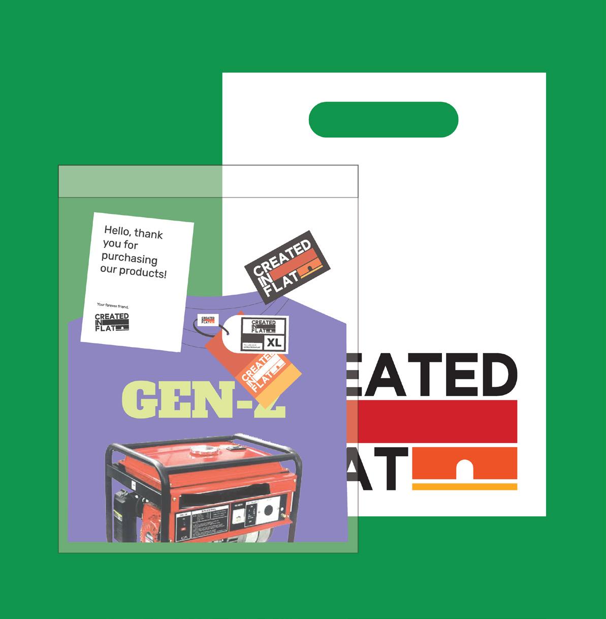
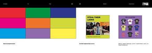
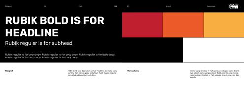
Colors that Created In Flat used as it brand color are contrast, bold, and colorful colors that represent Cre ated In Flat as a brand that are fun and bold.
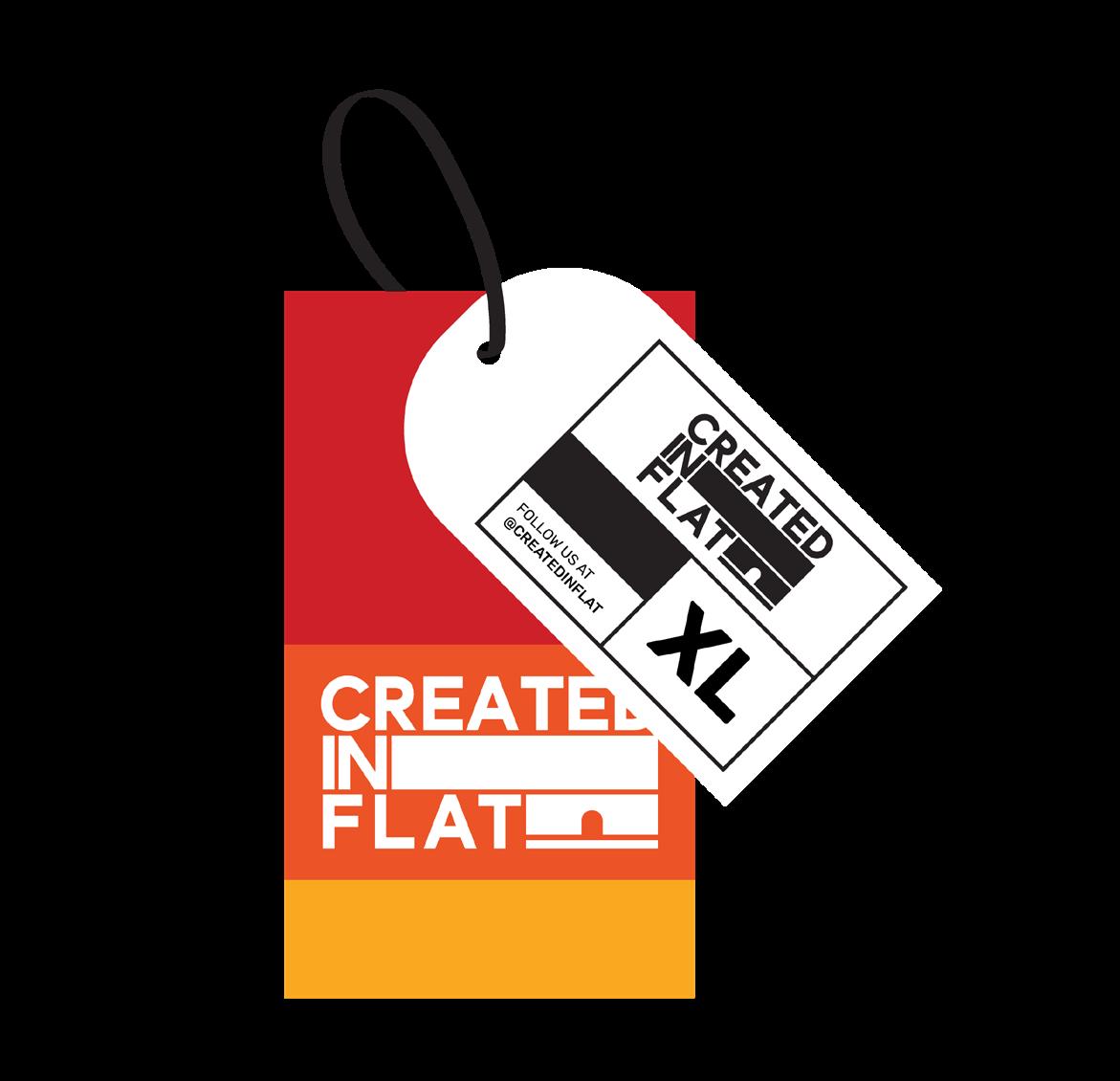
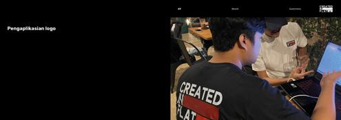
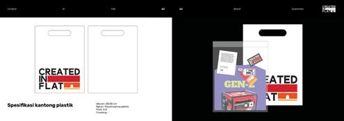
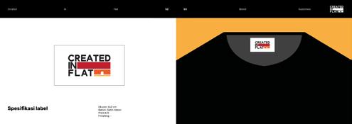
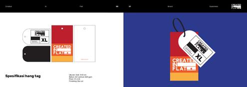
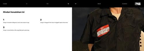
In designing a brand identity, it’s neccesary to de sign a brand guidelines that function as a guide to apply the brand identity to it’s many applications. Brand guidelines include informations like coorect and proportional logo use, brand visual identity, and brand identity appli cations to Created In Flat products.
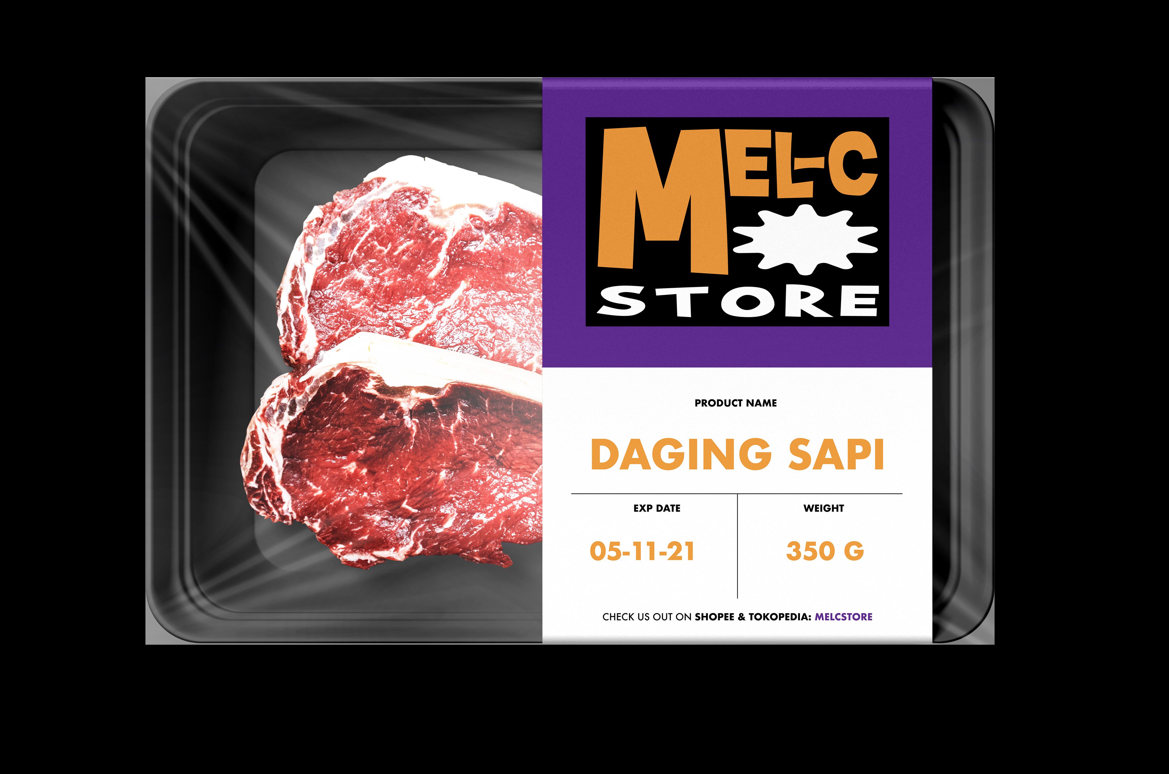
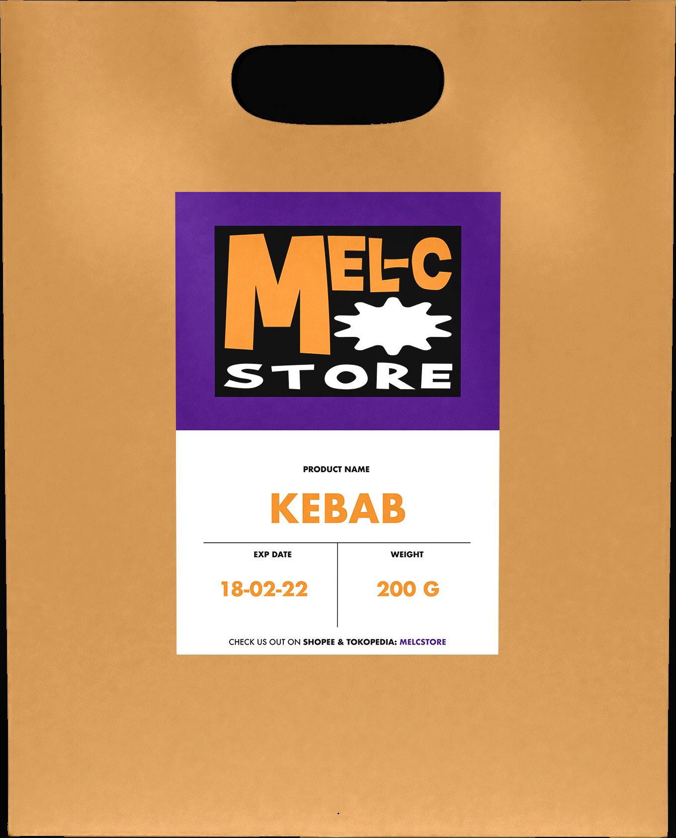

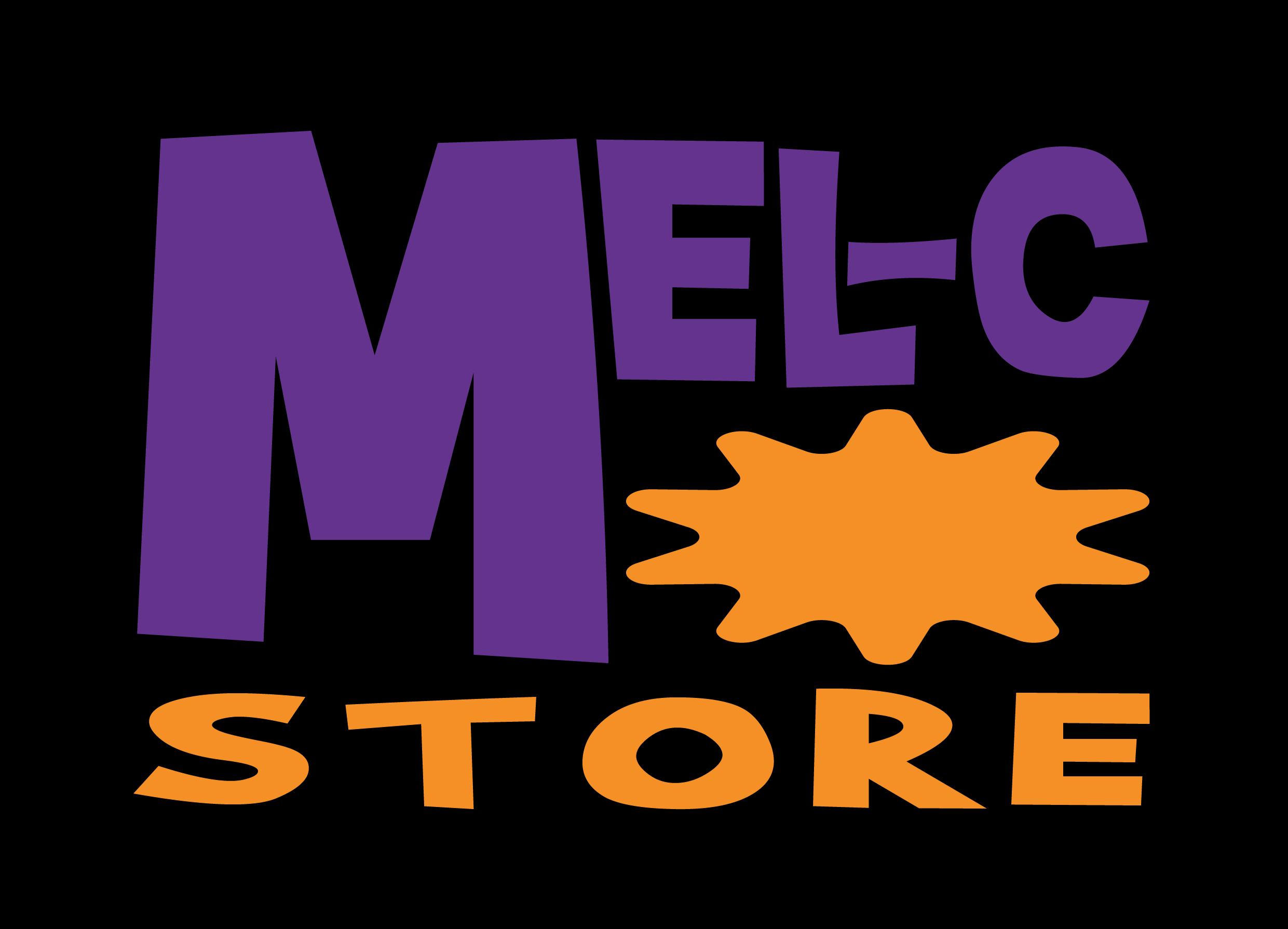
MEL-C STORE is an Indonesia based online shop that primarily sells daily products and fro zen or instant foods. The products range from daily products like cooking ingredients to fro zen foods such as frozen kebabs, cuankie, and many more. MEL-C STORE sells their products on Indonesian e-commerce that is Tokopedia and Shopee.
MEL-C STORE name comes from it’s owner name Melsy Meliany. The owner wants her name as it’s brand name because she said it herself “My name Melsy is already catchy as it is”.
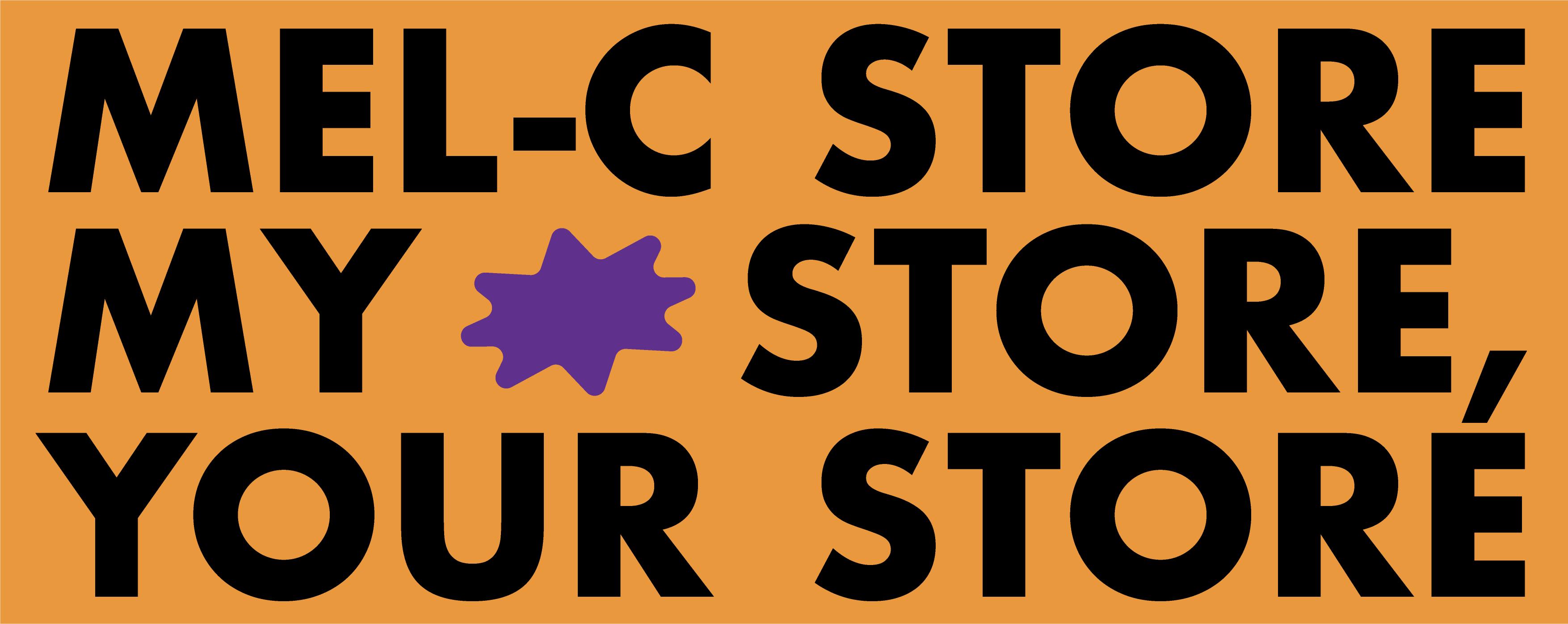
MEL-C STORE uses “MEL-C STORE, MY STORE, YOUR STORE” as it’s tagline. The tagline describe the brand personality that is friendly.
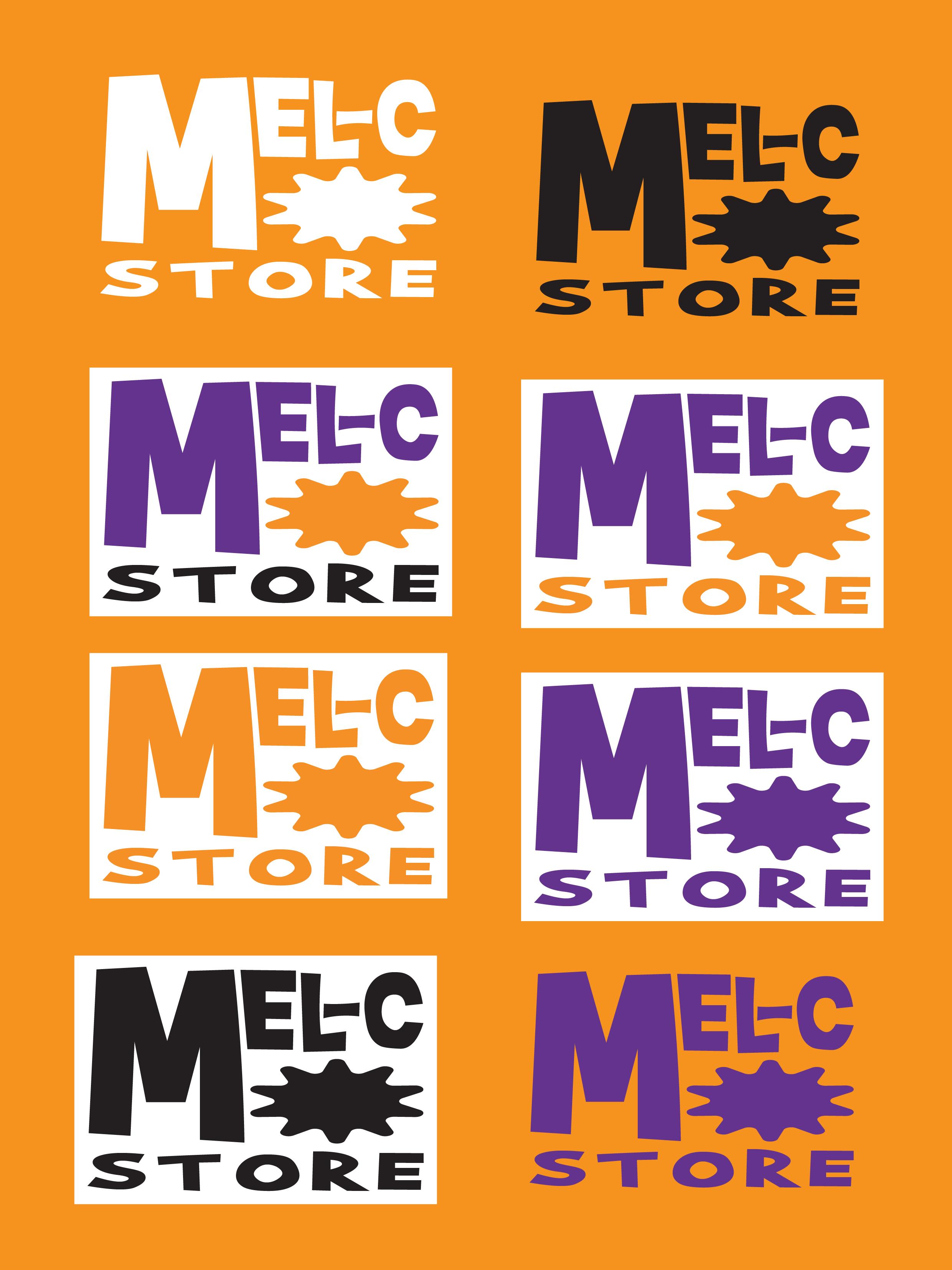
COLOR
MEL-C STORE uses a contrast color to bring a modern and playful feel to it’s brand. The color used is perfect for all generation as it’s target.
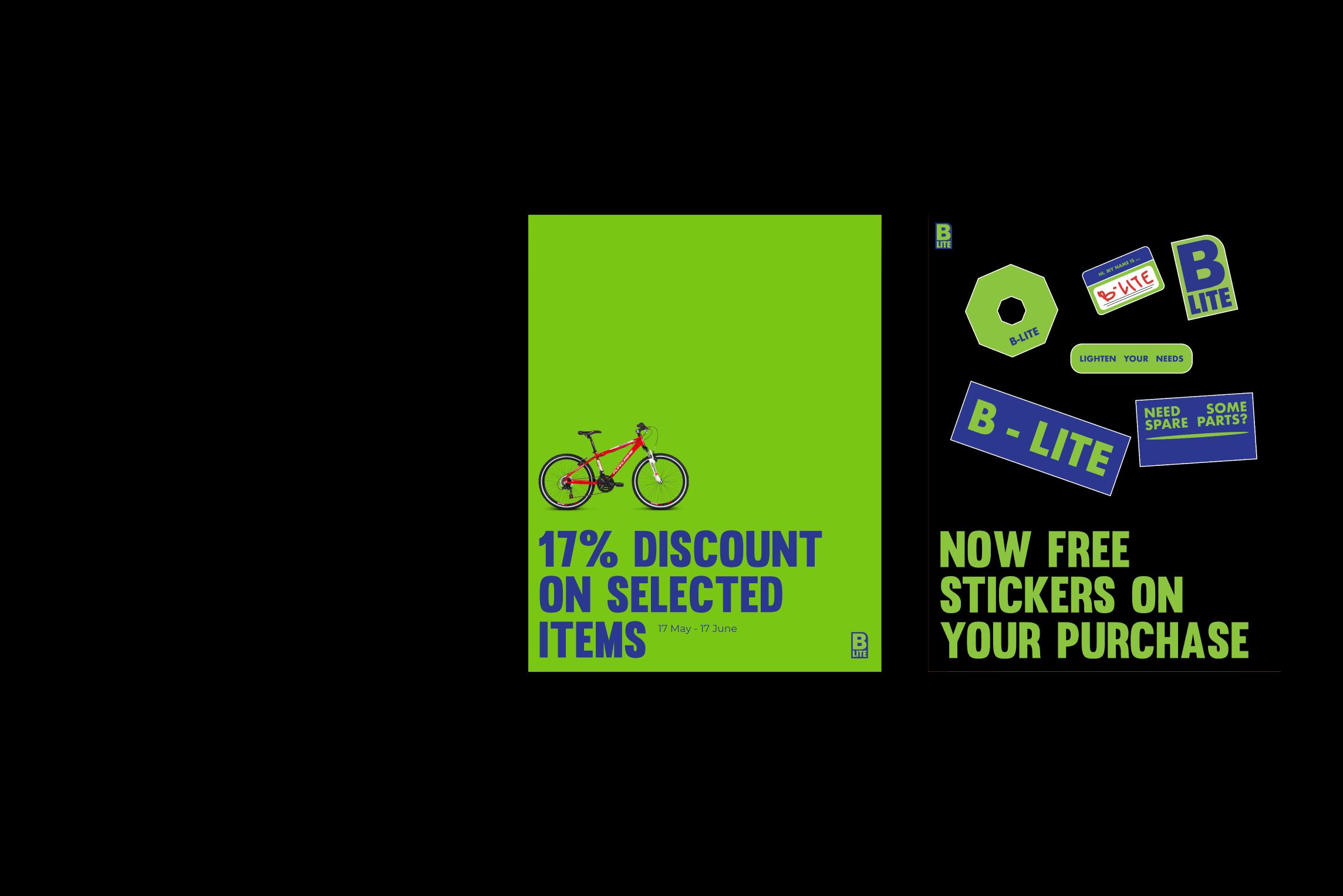
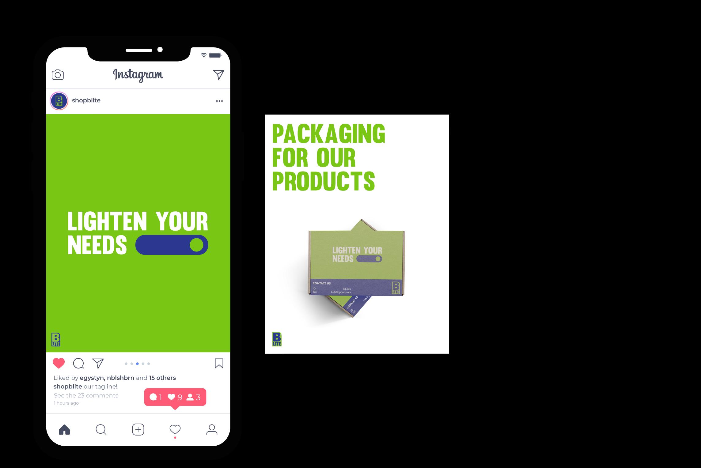
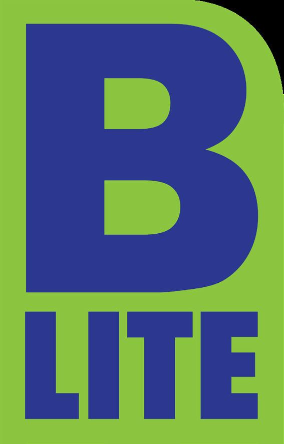
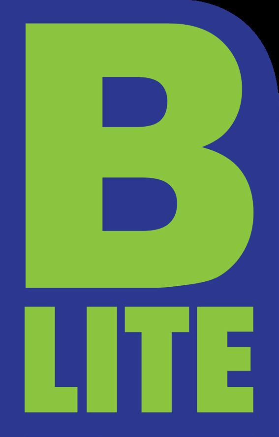
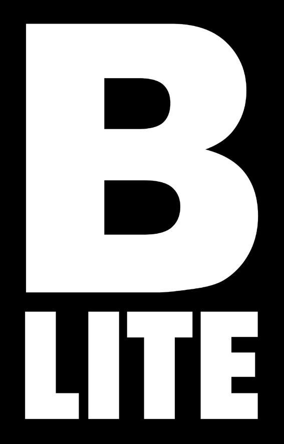
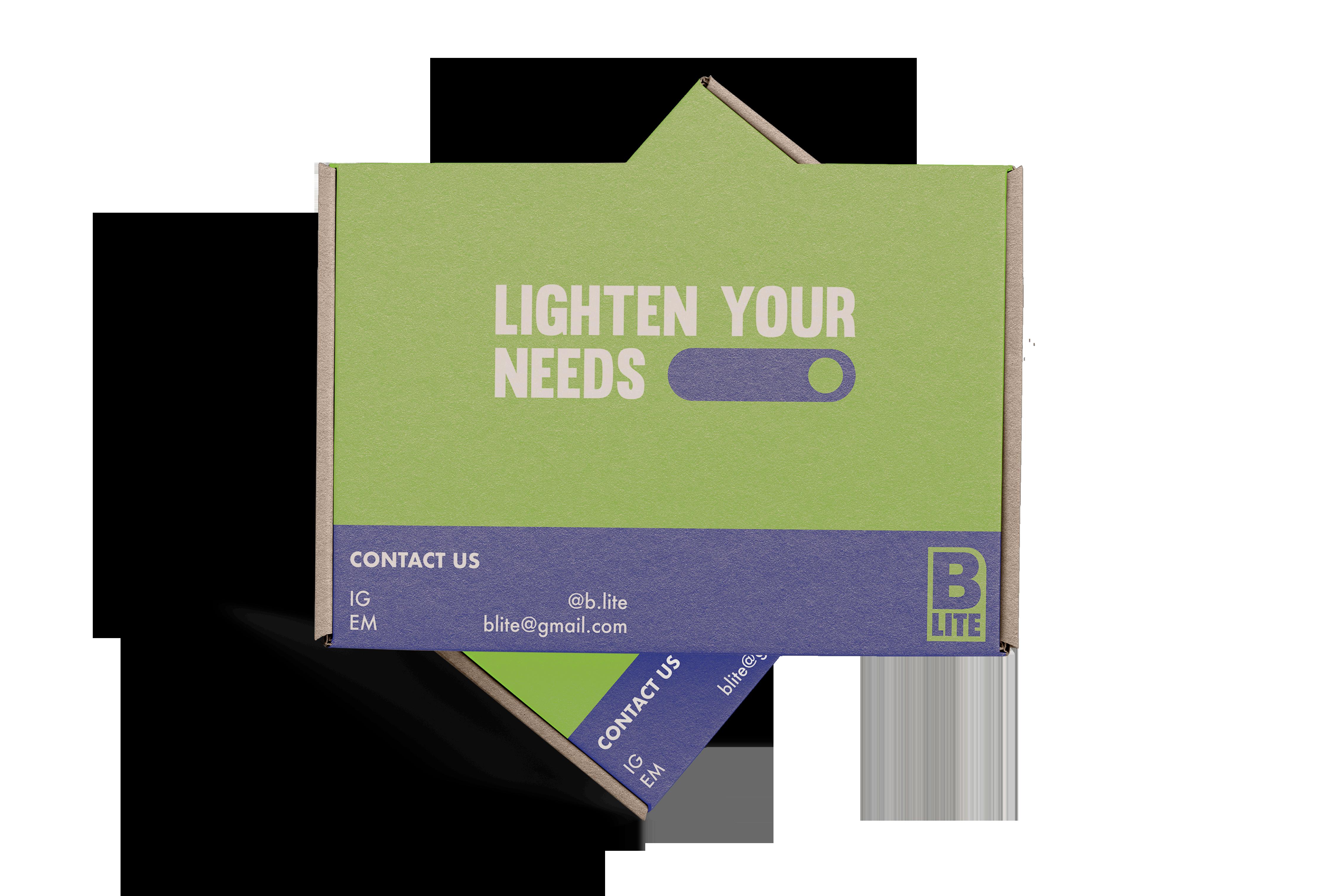
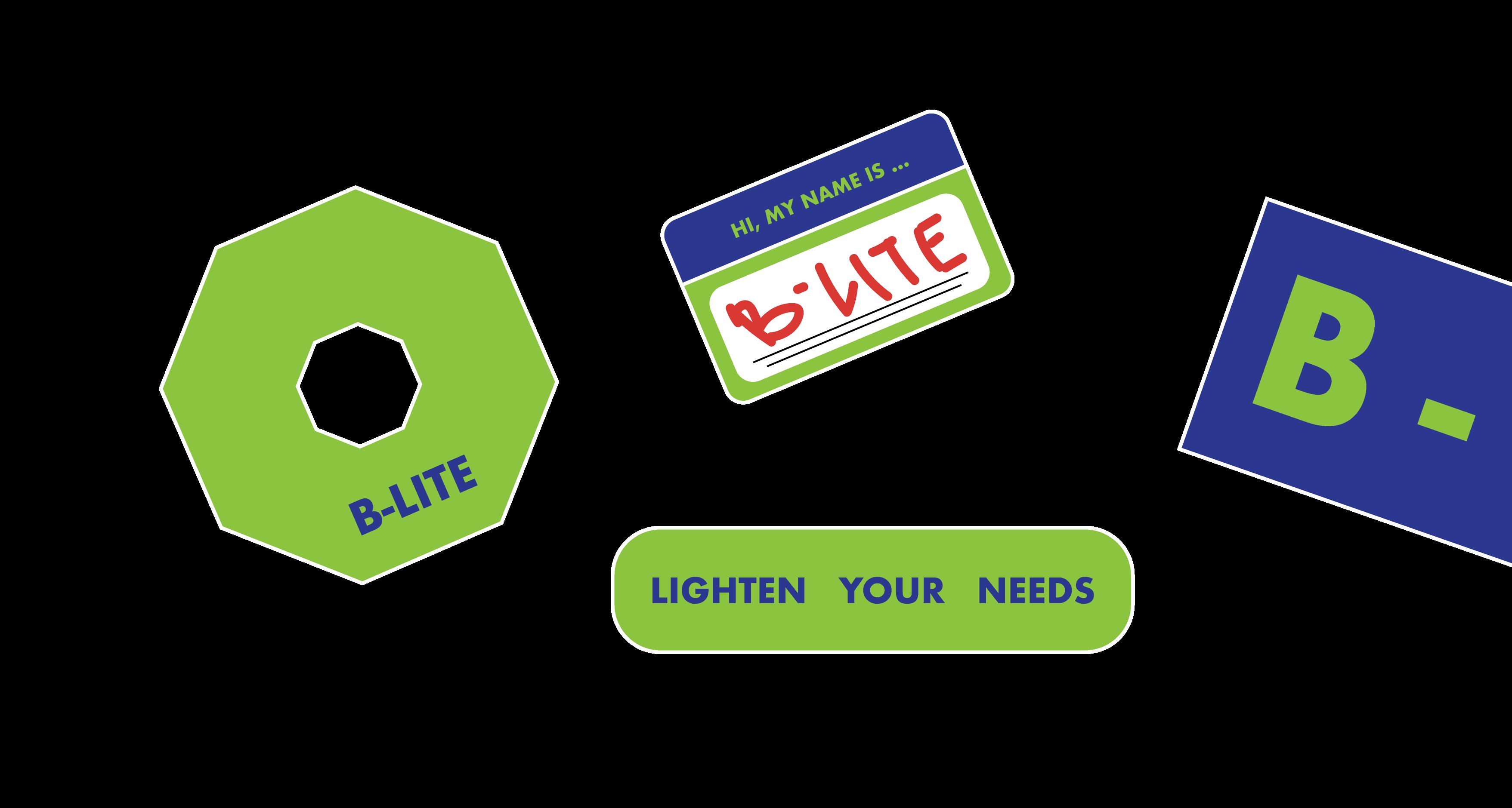
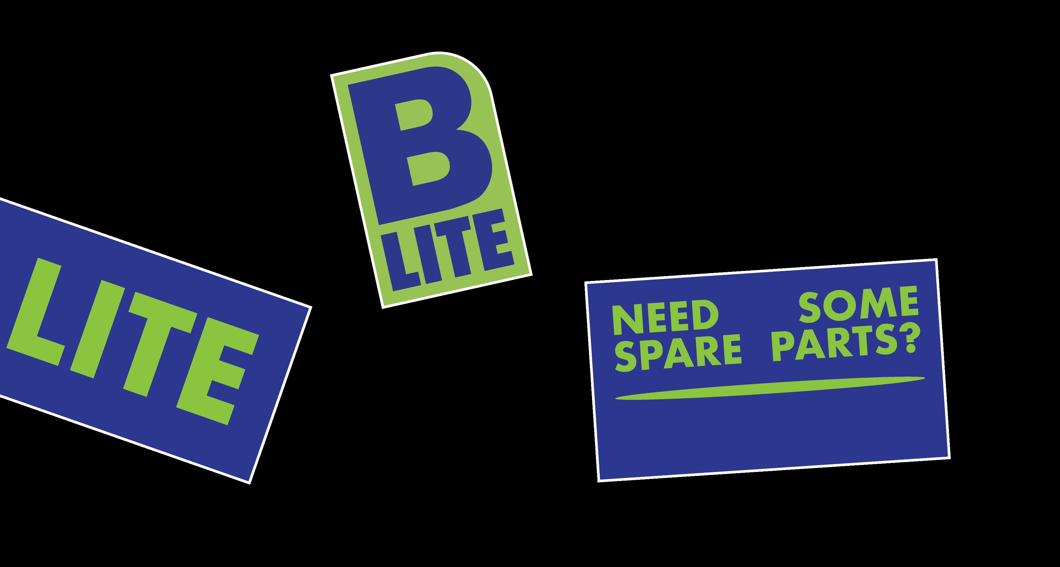
B Lite is an online store based in Bandung, Indonesia that sell many products including brand new and used products. B Lite sells it’s products on Tokopedia, Bukal apak, and Shopee. B Lite sells mainly man products such as spare parts, gadgets, and tools.
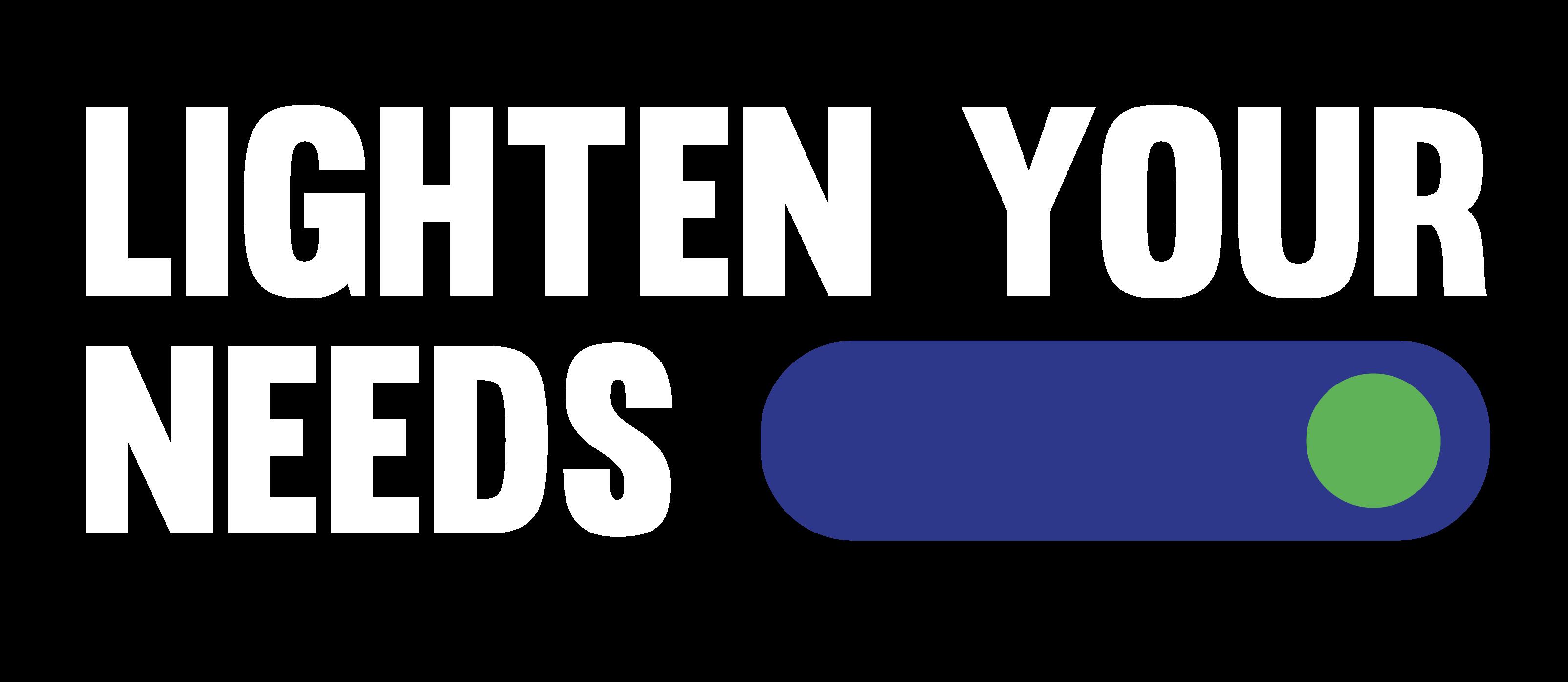
Lighten Your Needs means B Lite will light en all your needs because B Lite nearly have all the needs u need. This tagline also have a friendly feel to it.
BRAND COLOR
B Lite uses contrast and bold colors to define it’s brand personality that is bold, macho, modern, and follow this generation trends to make it more relatable to the consumer.
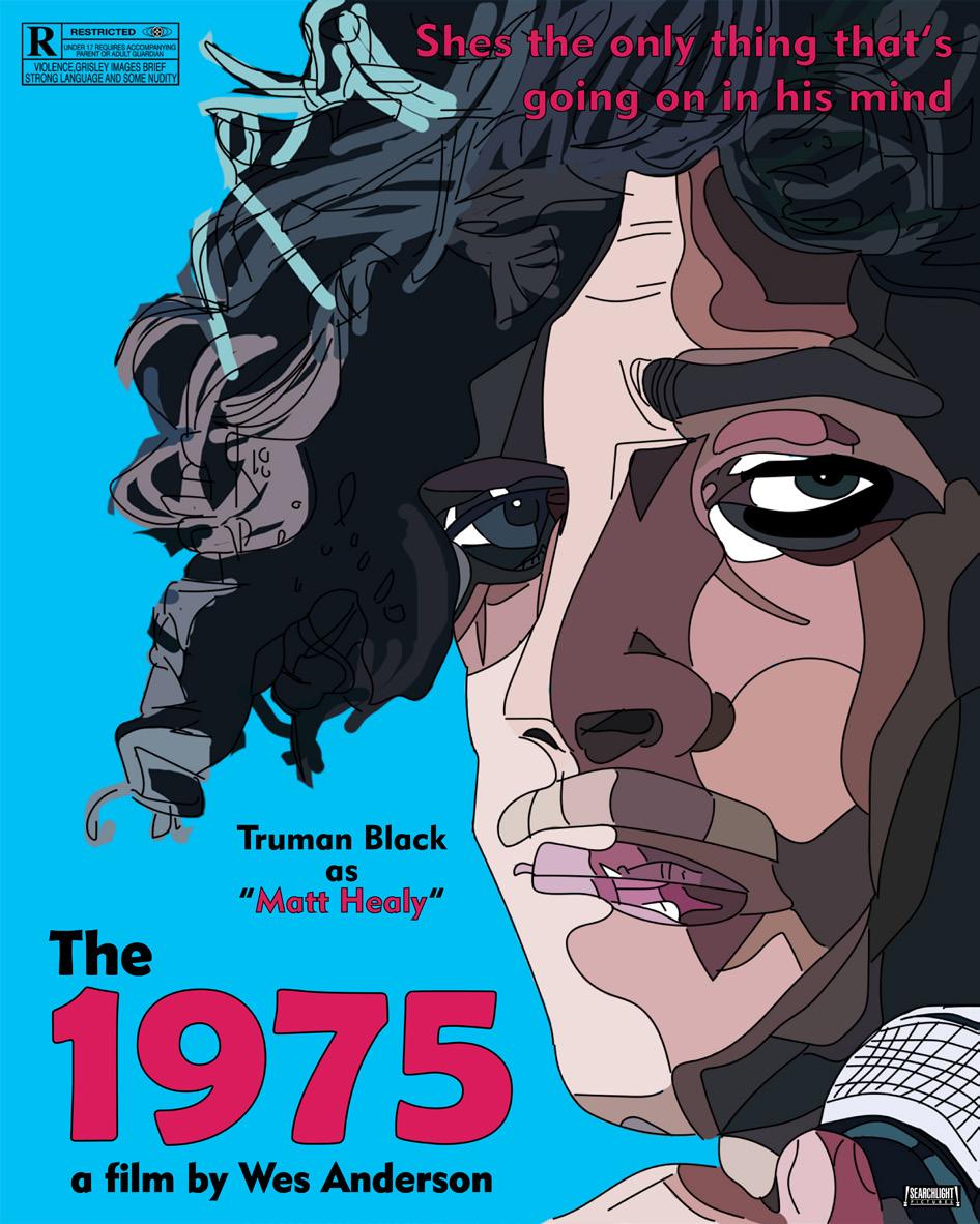
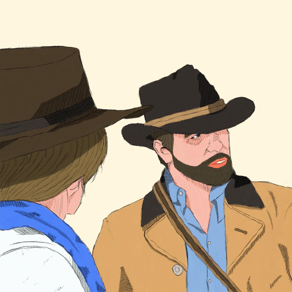
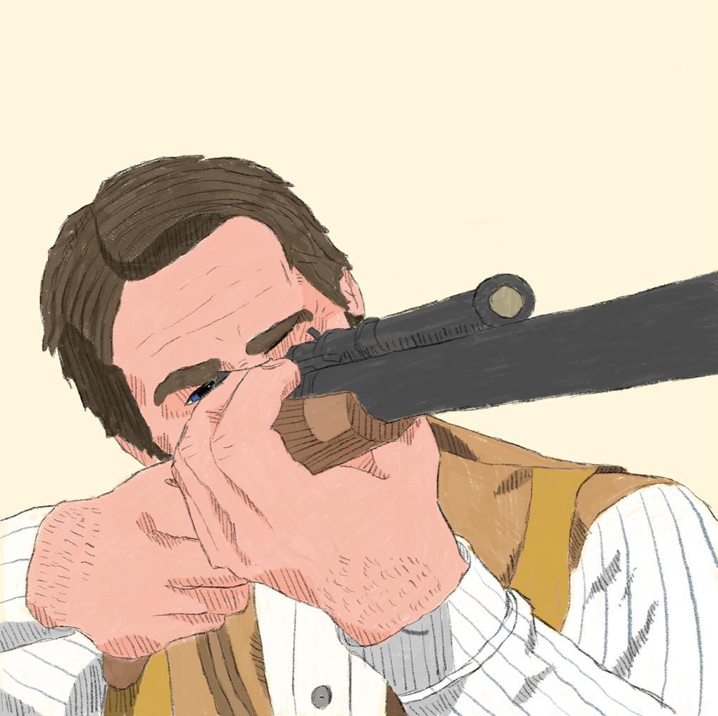
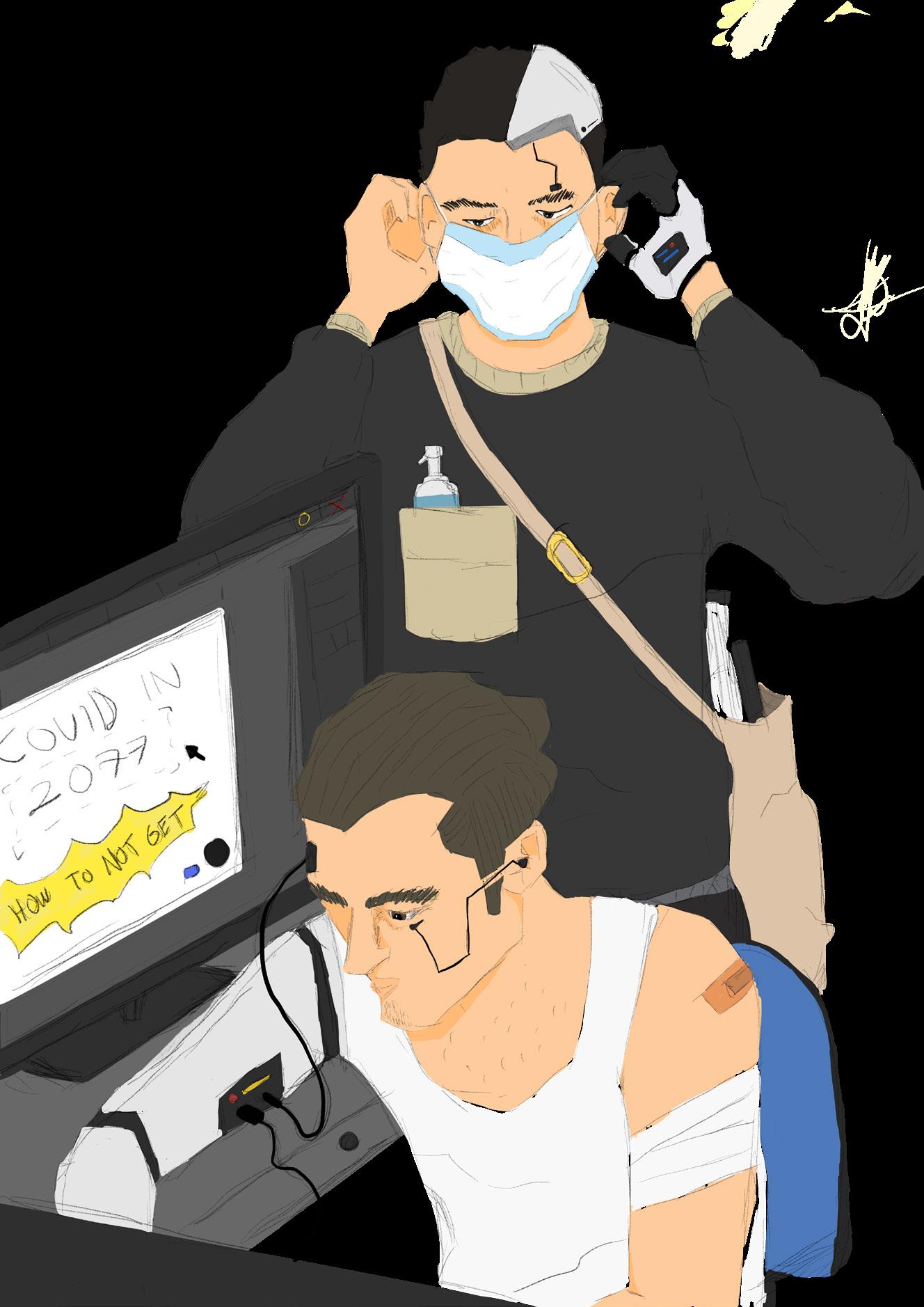
The 1975 and Wes Anderson is one of my fav things, so i made a poster about it.
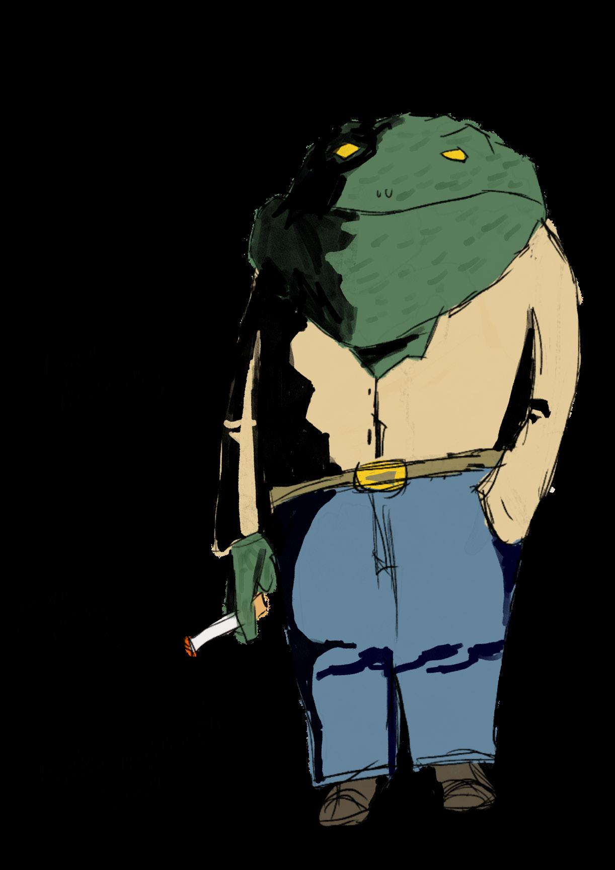
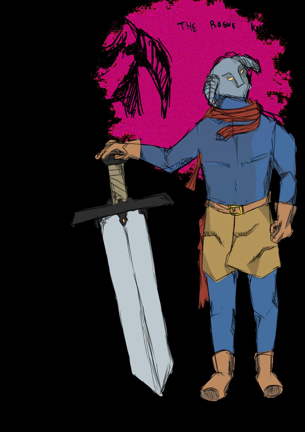
I always dreamt of making a comic book cover since i was a kid.
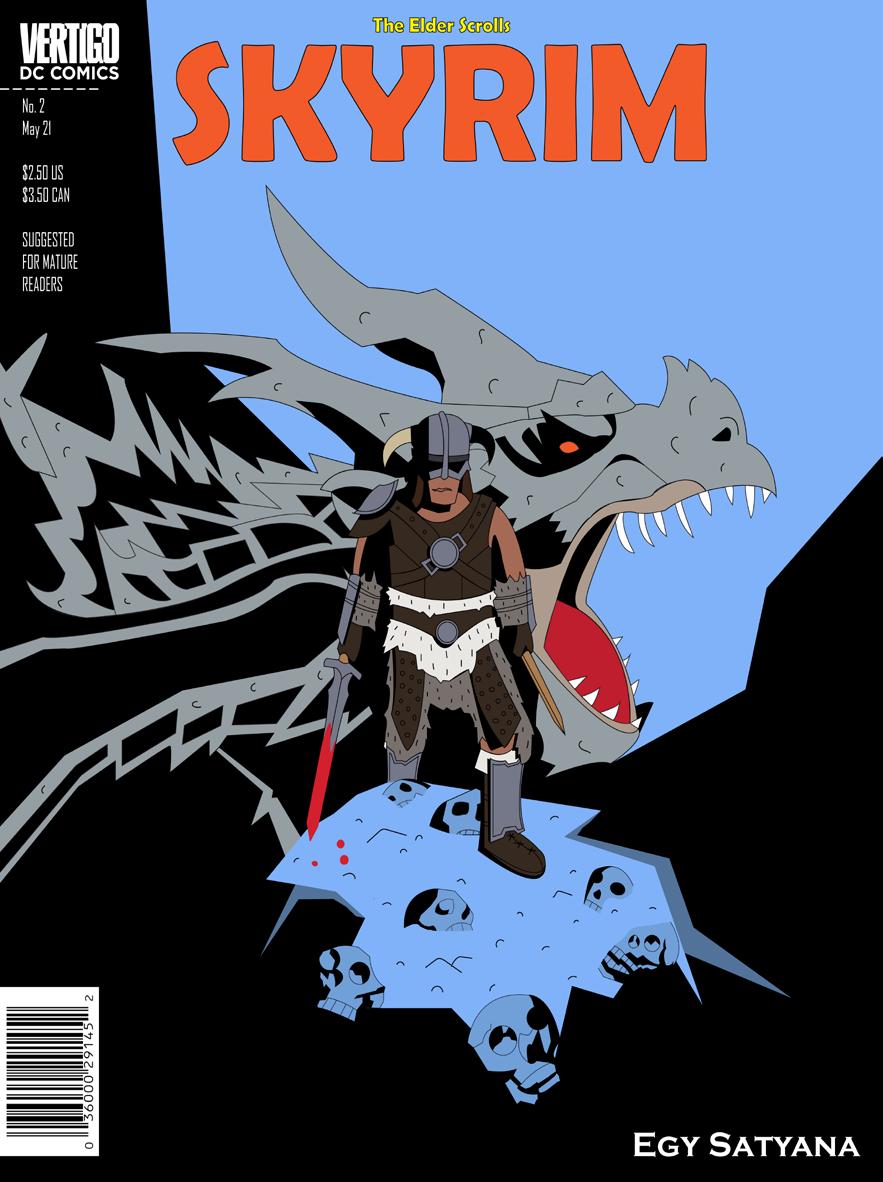
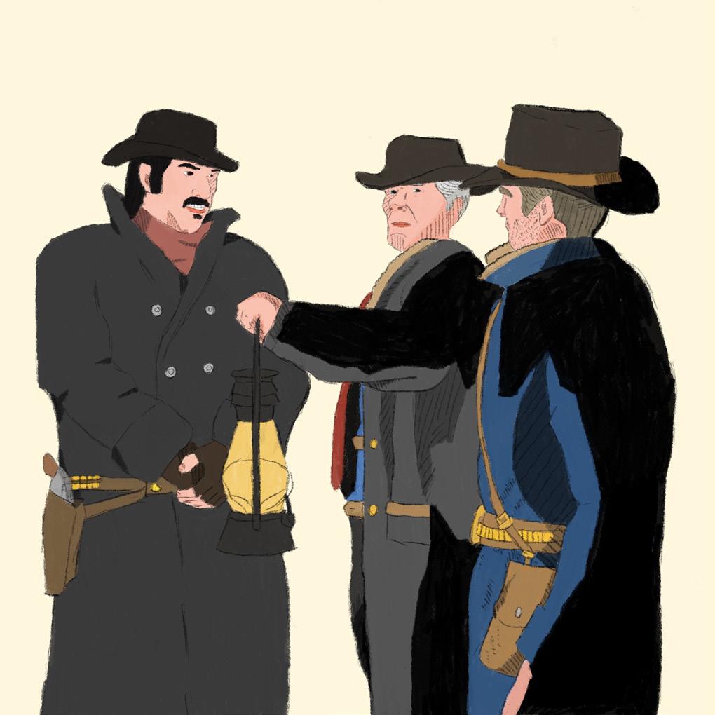
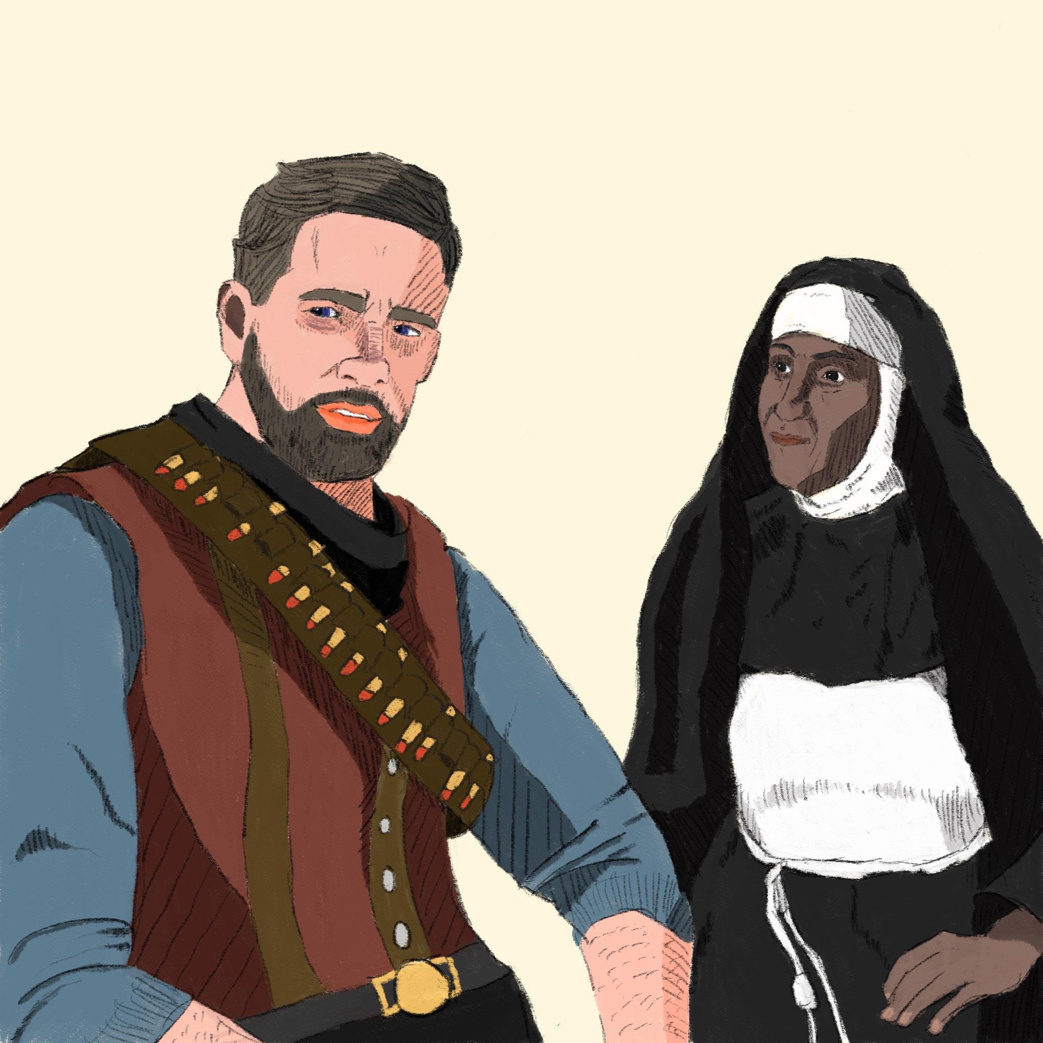
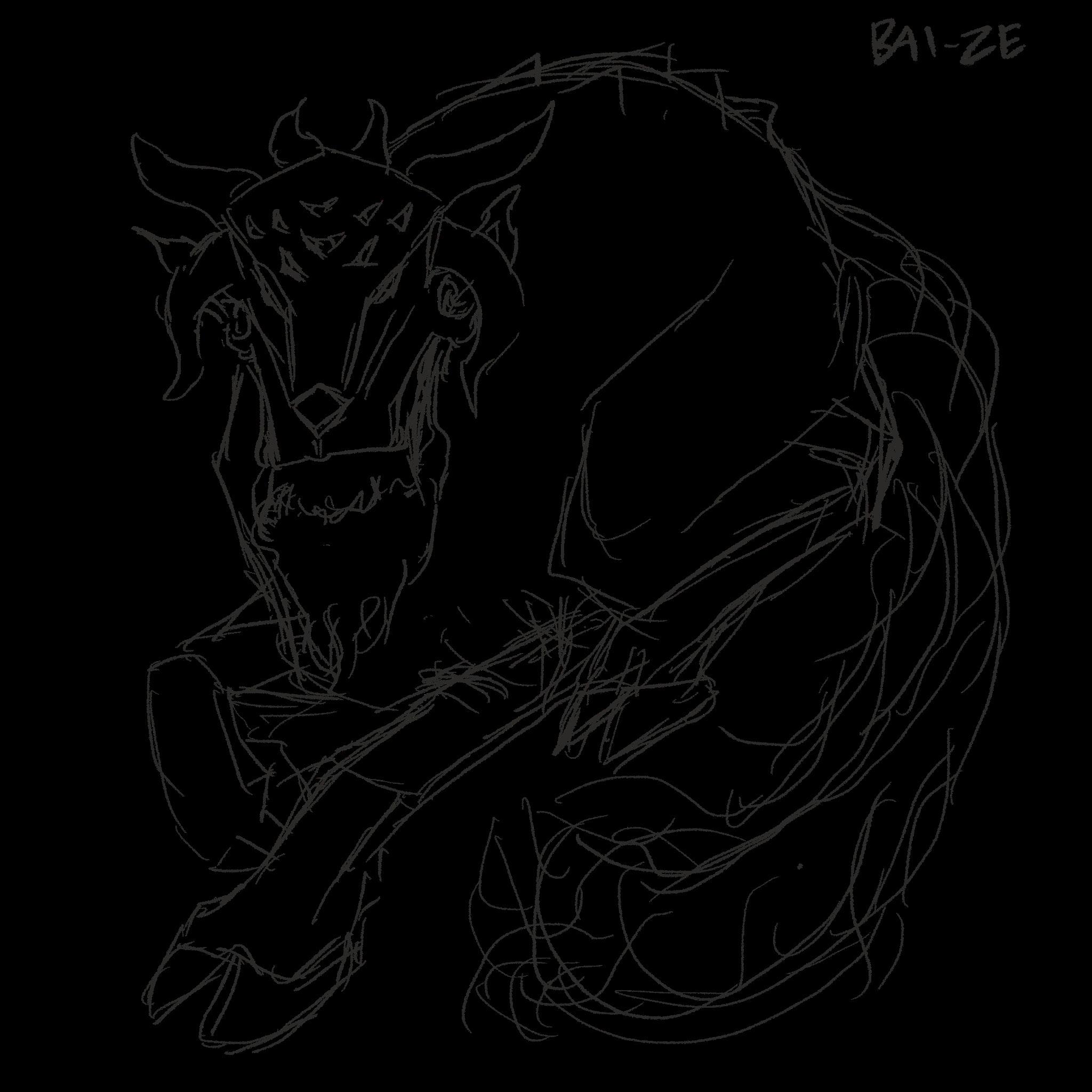
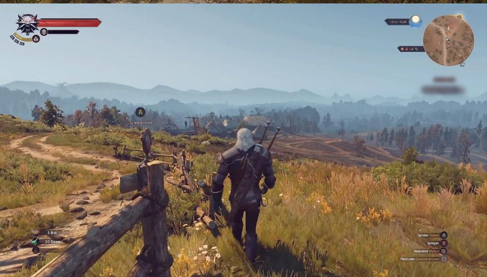
Since Skyrim is one of my favorite video game, i made a comic book cover about it.
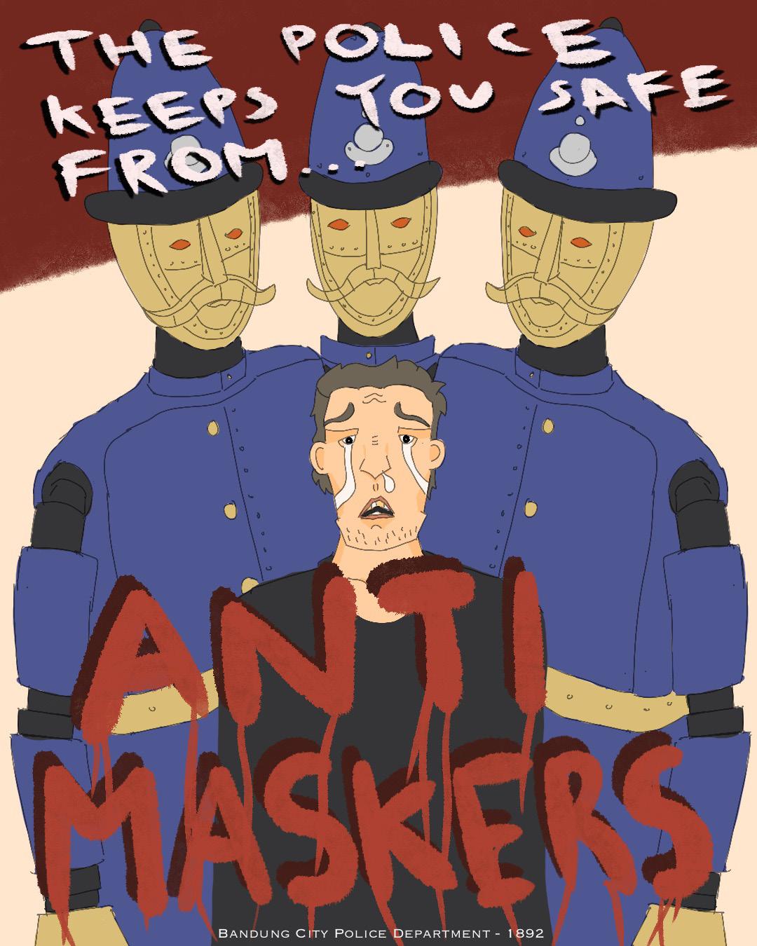
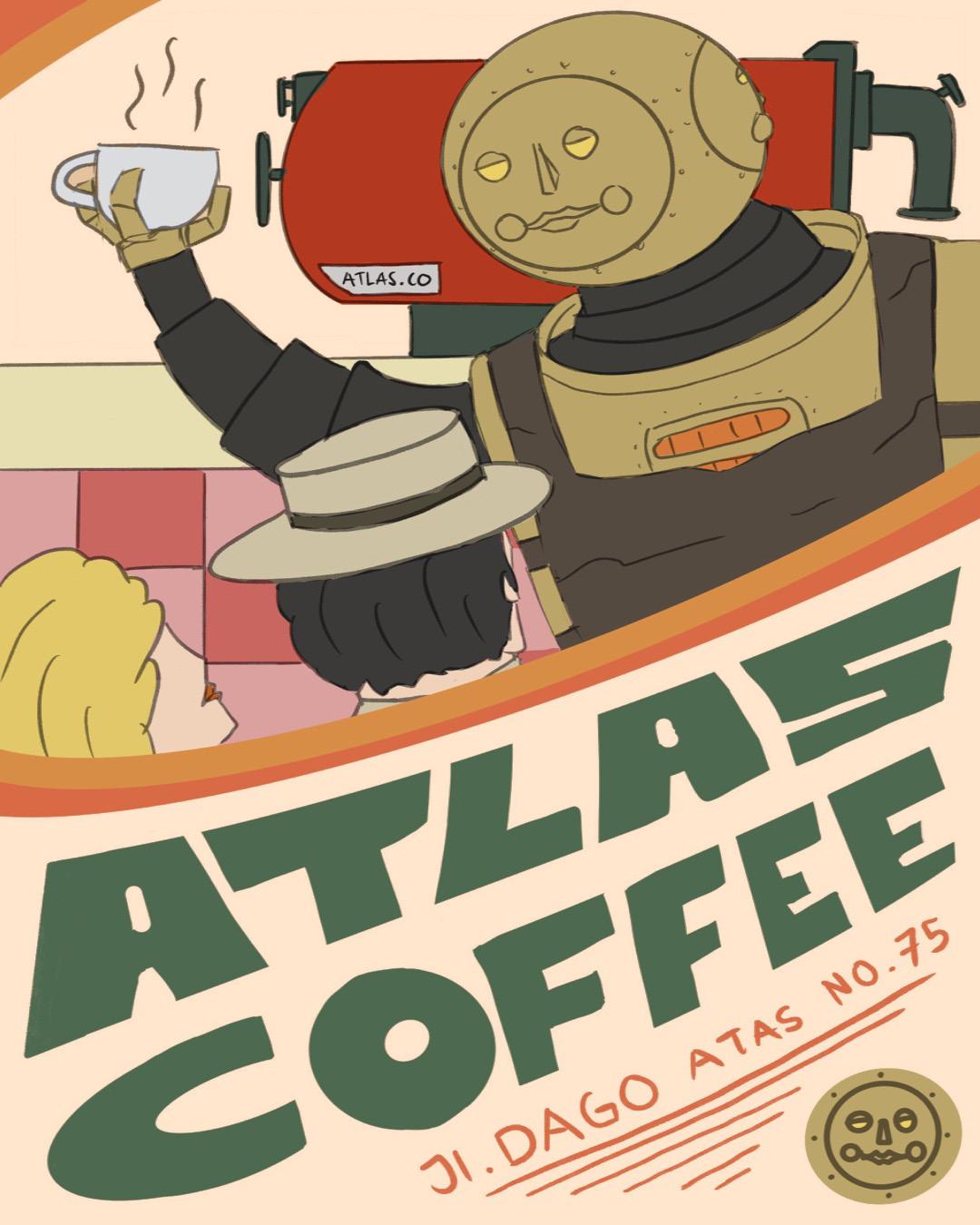
A victorian era steampunk themed illustration poster. The first is a propaganda poster and the other is an ads of a coffee shop.


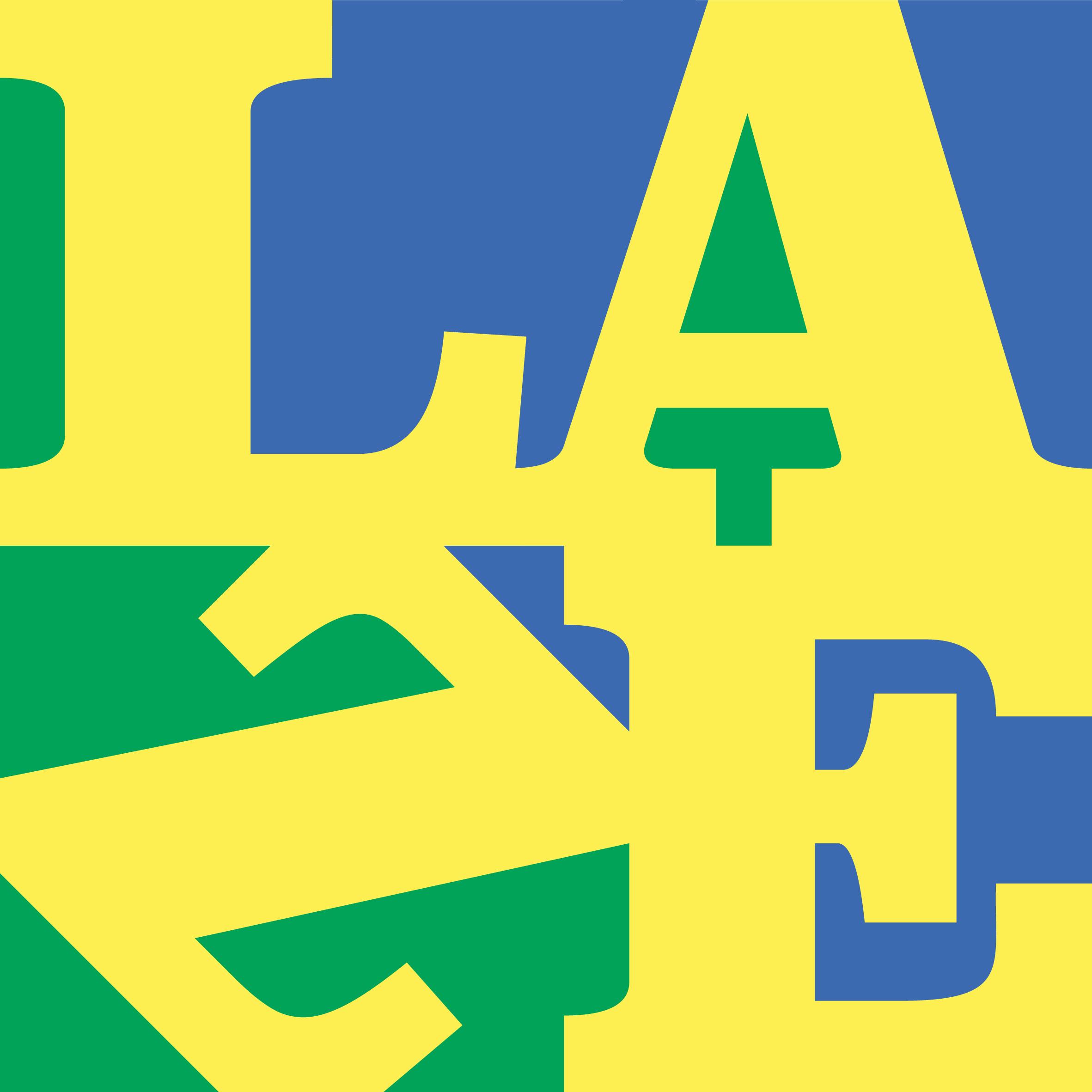
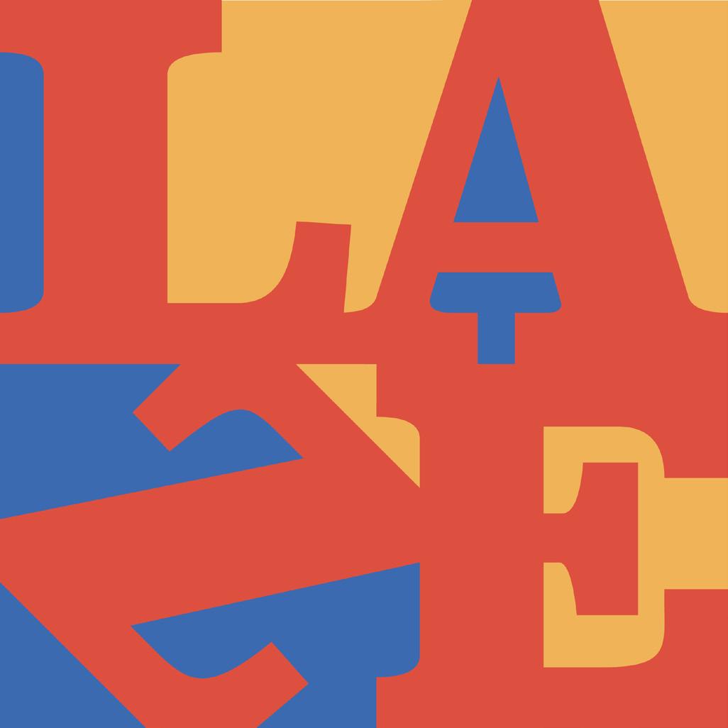
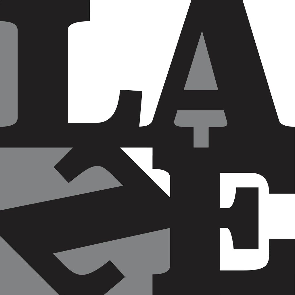
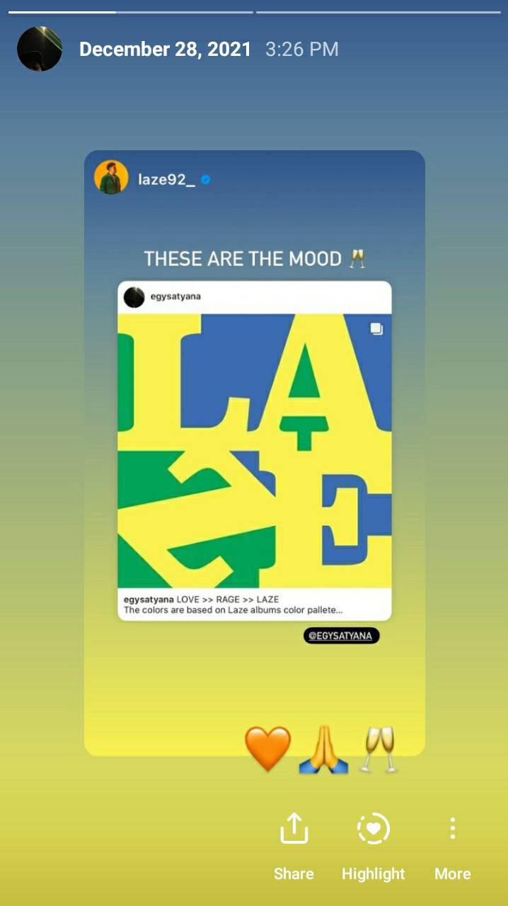
An artwork of Indonesian hip hop musician Laze, that i made to parody the album cover of Renegades by Rage Against The Machine. The color used represent Laze albums color palette. Laze reposted my post of this art work on Instagram.
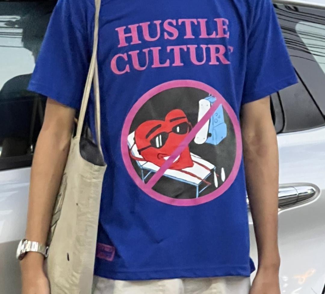
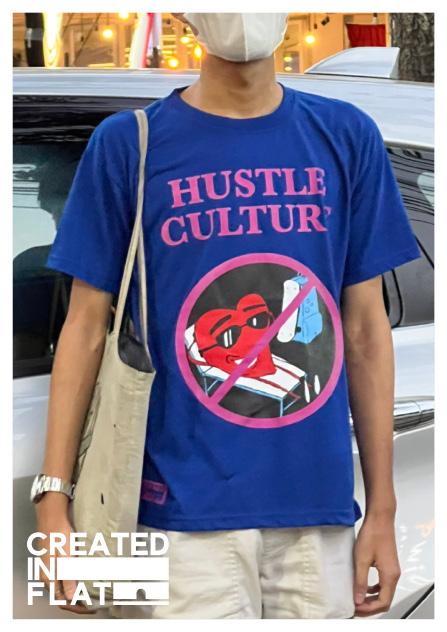
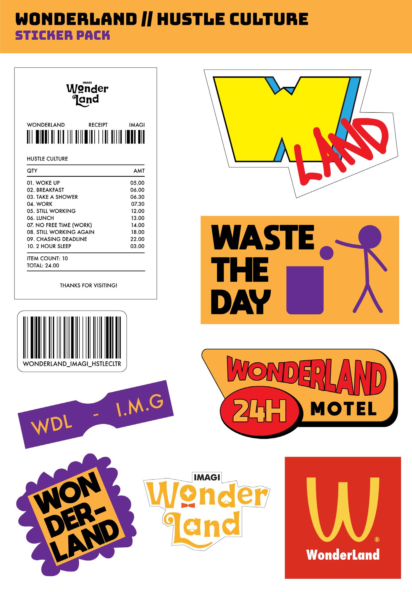
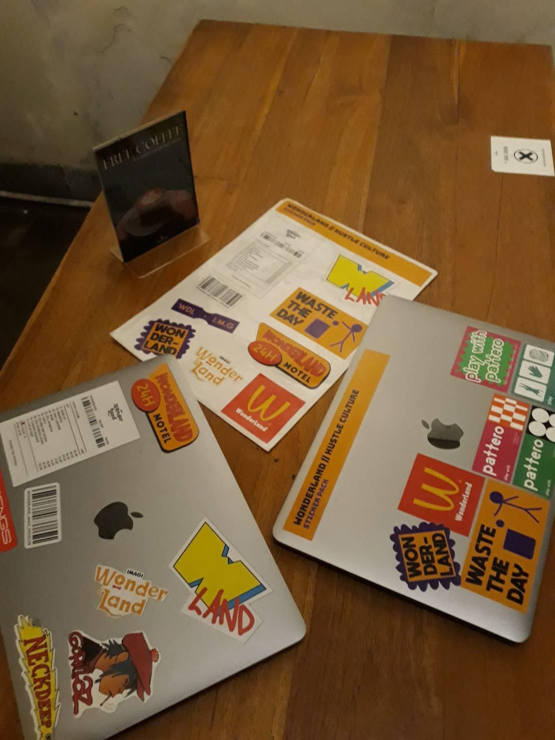
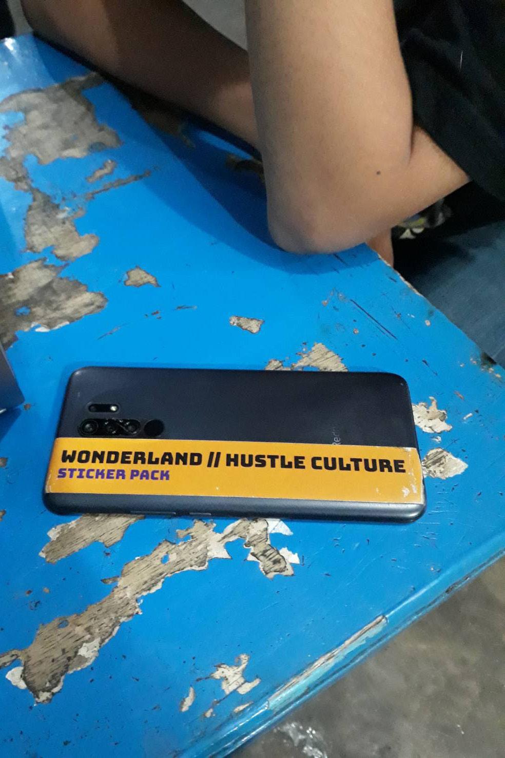
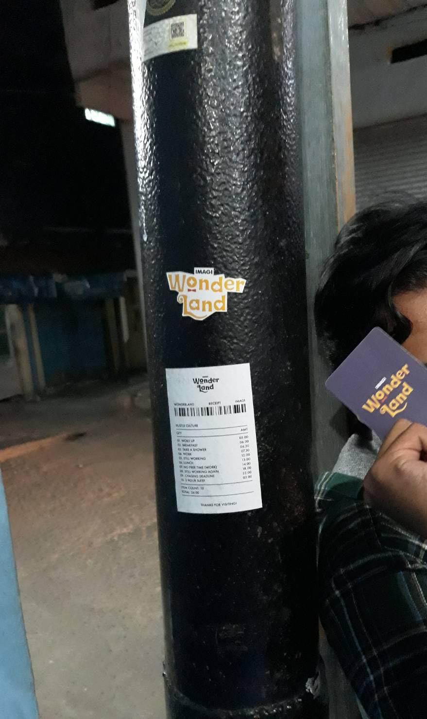
A sticker that i made for Wonderland, a exhibition that located at IT’S LOCO, Bandung held by my campus organization, IMAGI. The theme of the exhibiton is hustle culture with wonderland feel in it.

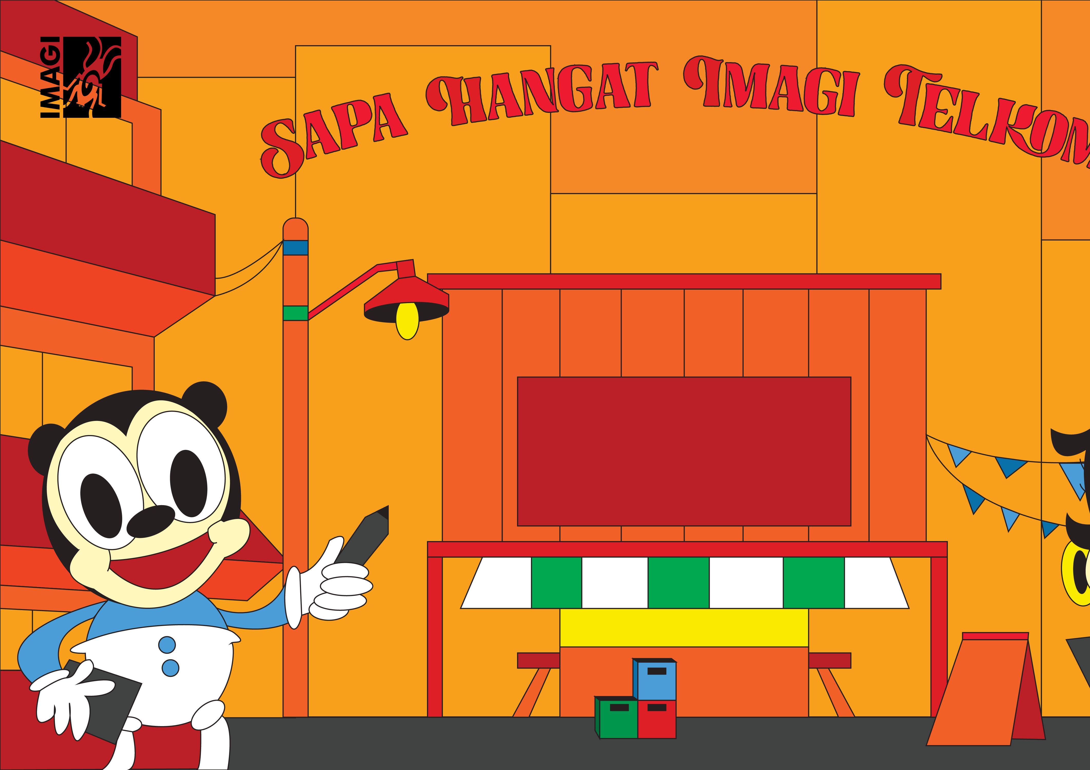
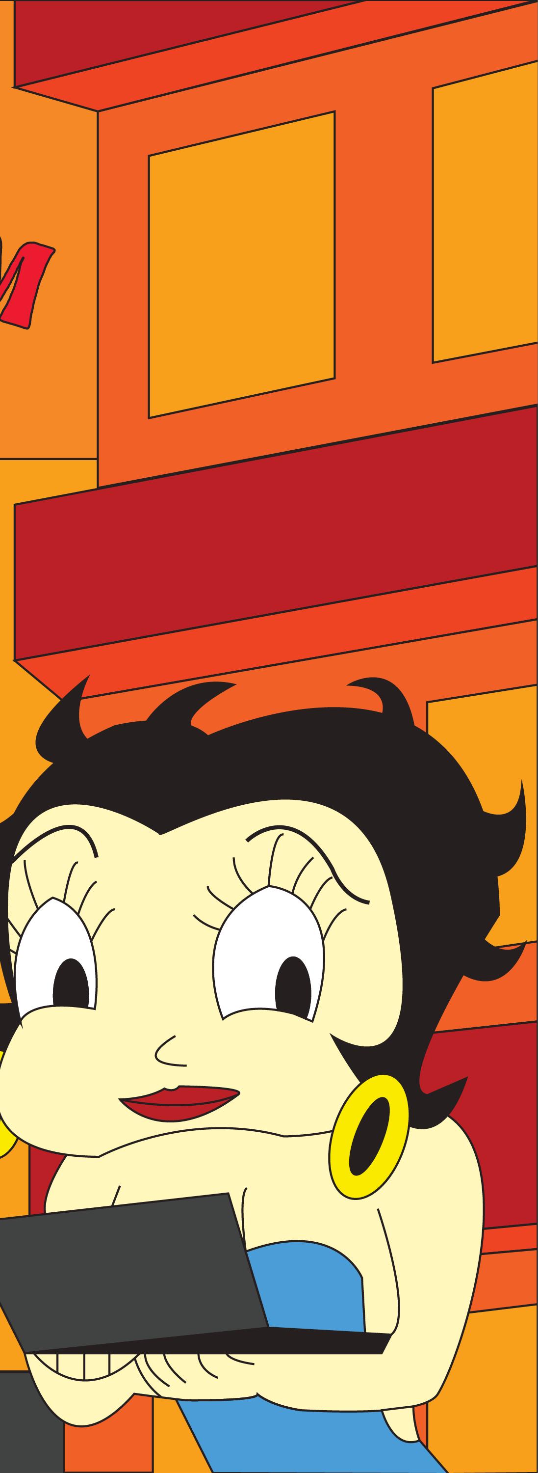
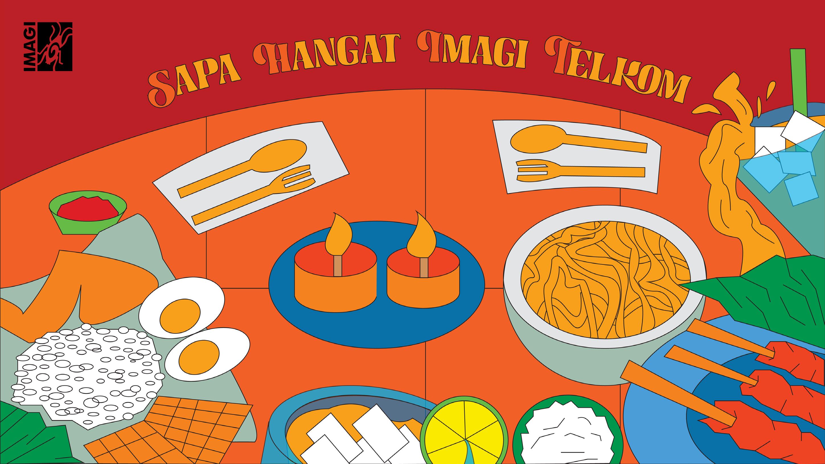
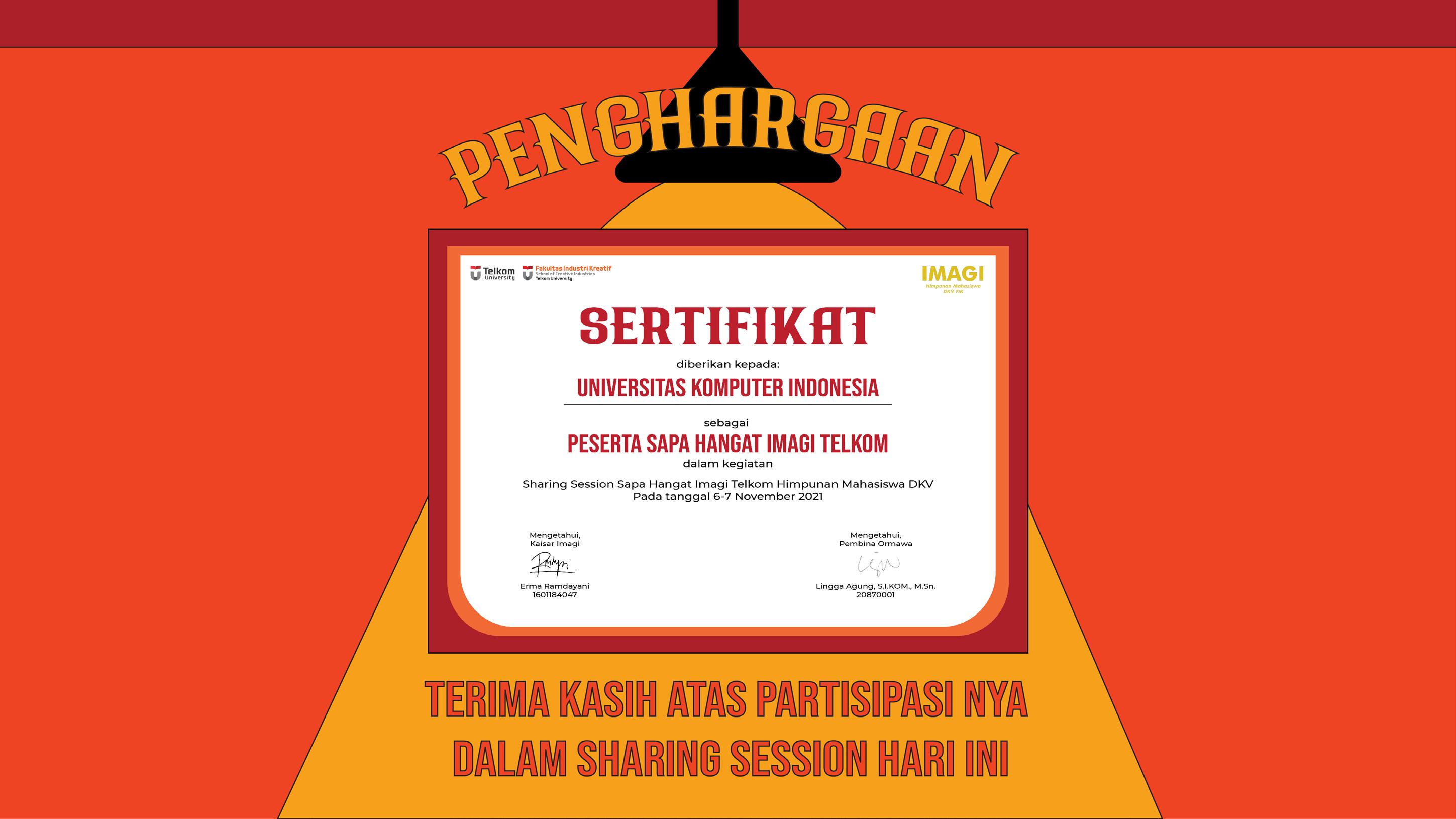
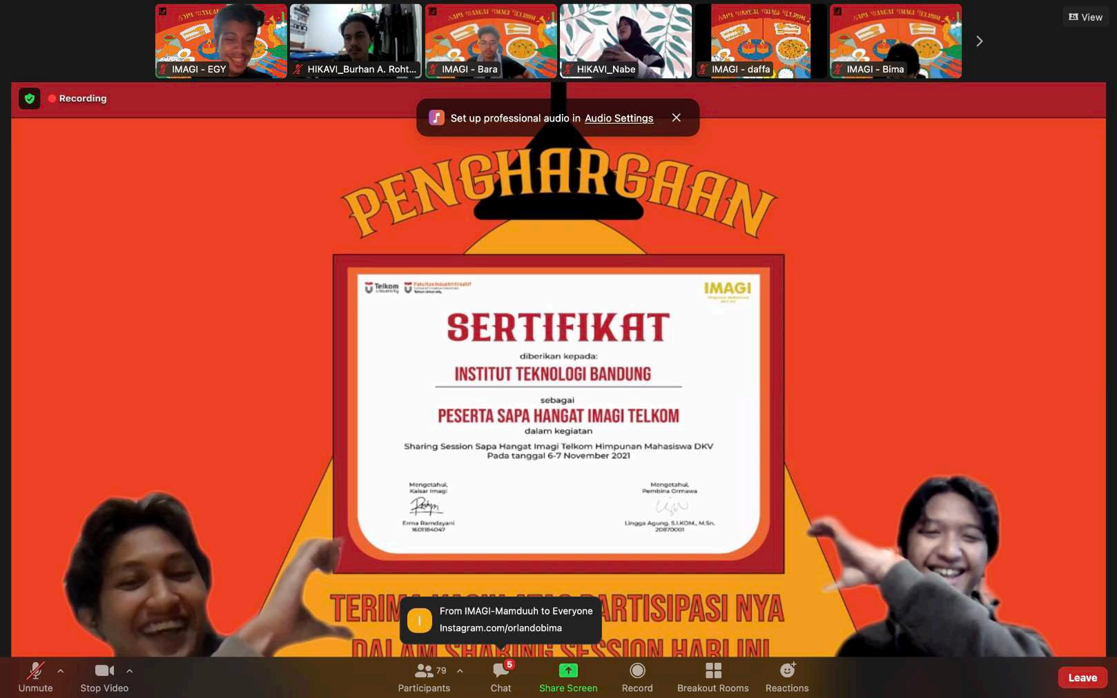
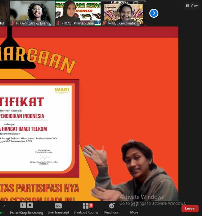
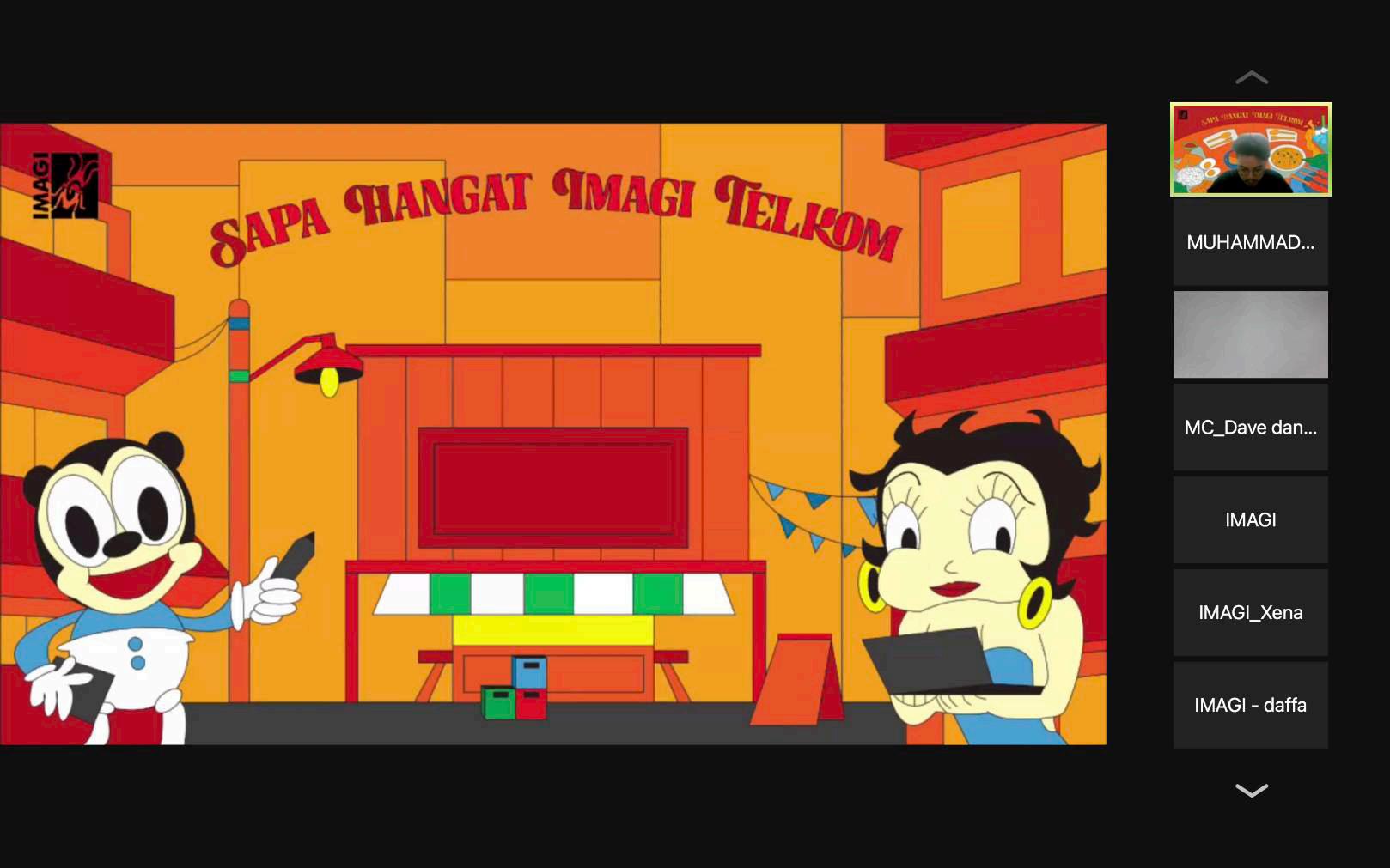
Sapa Hangat Imagi Telkom is a online workshop from Telkom University that invites design student of Universitas Pendidikan Indonesia (UPI), Institut Teknologi Bandung (ITB), and Universitas Komputer Indonesia (UNIKOM) to share all about design and the student organization in their campus.
I design the background for the online workshop. The theme of this workshop is ‘eating at a local food restaurant’, so the background reflect that as its theme.
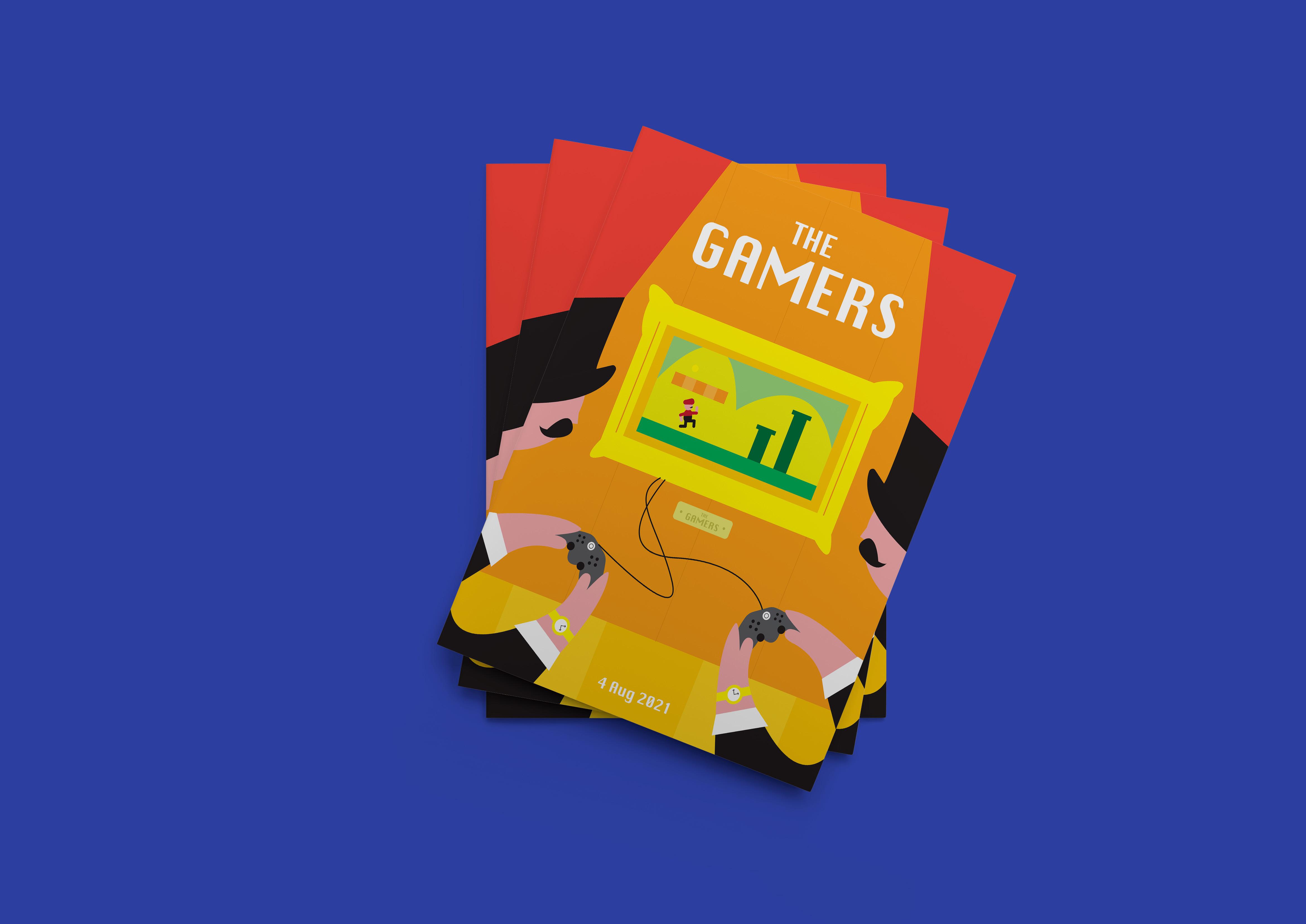
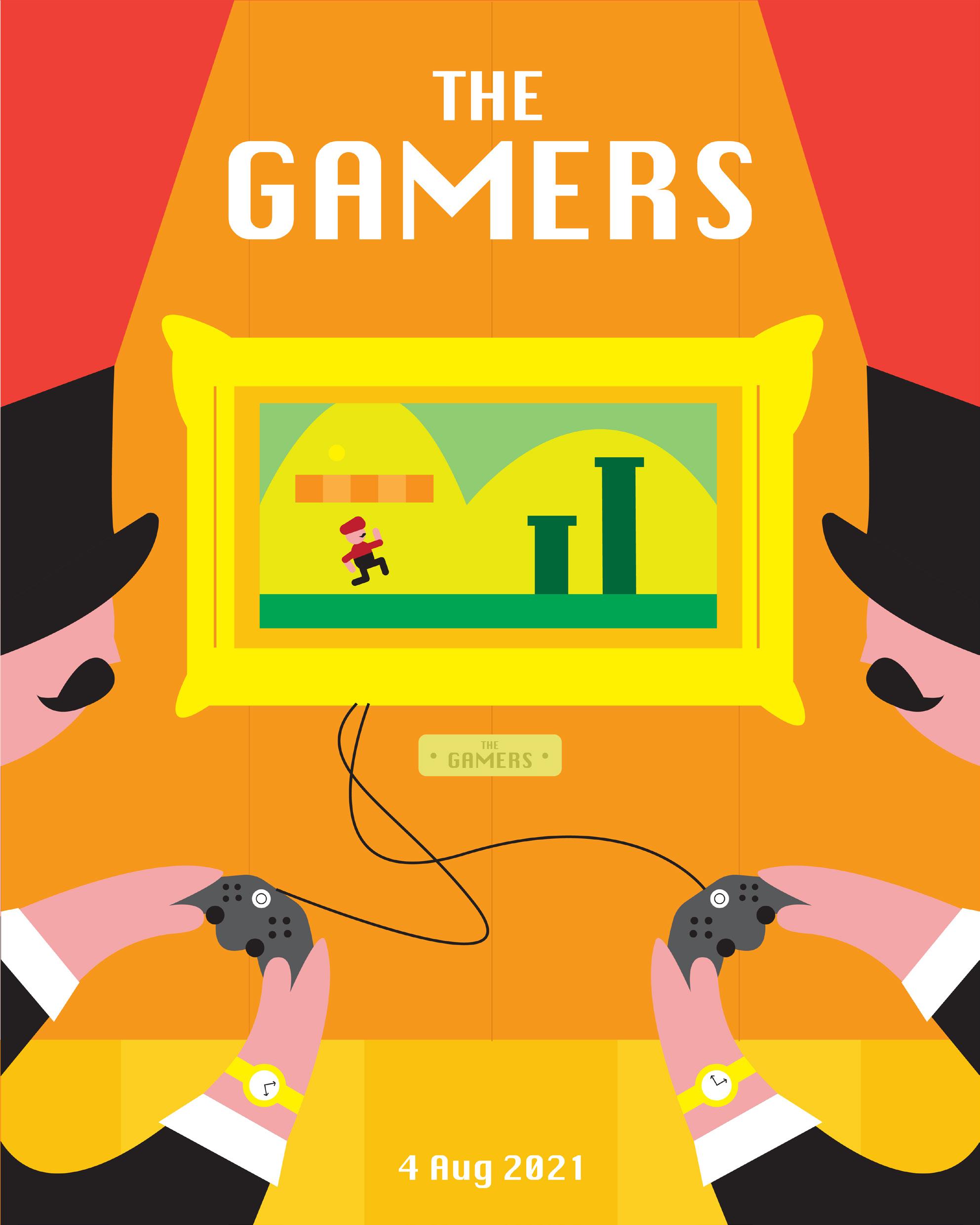
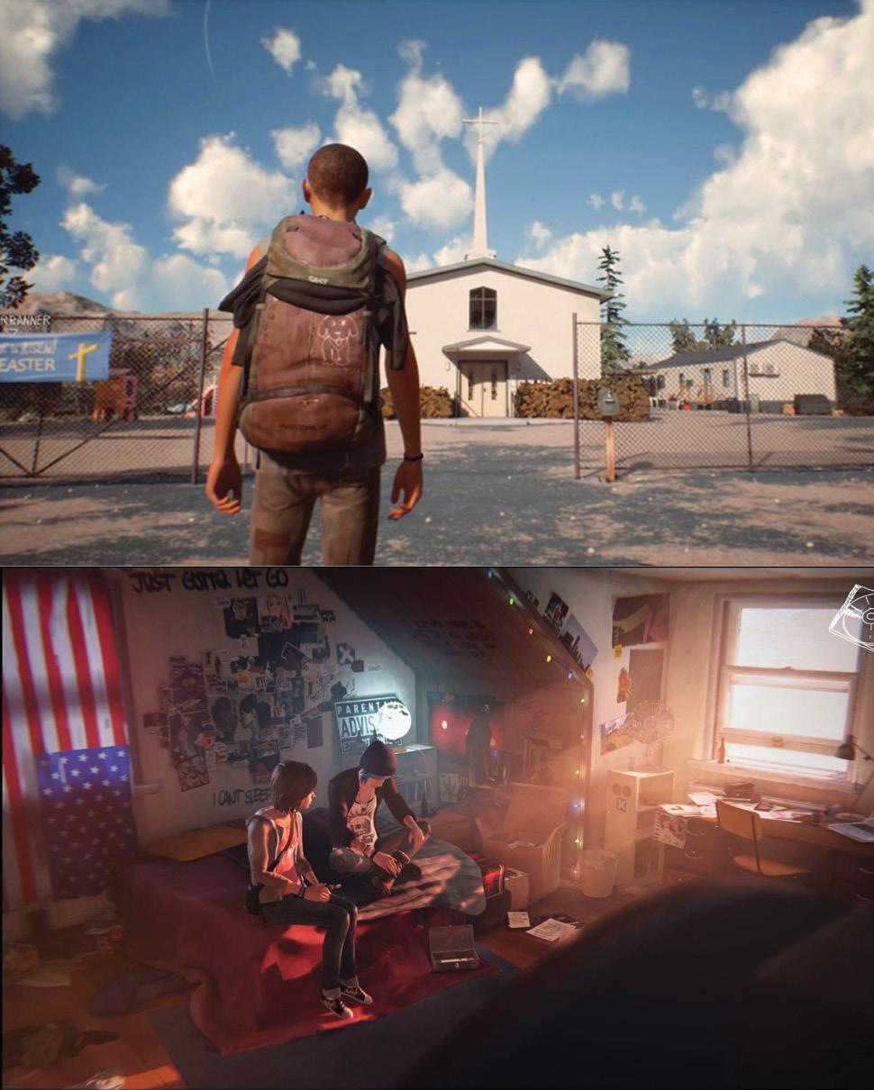
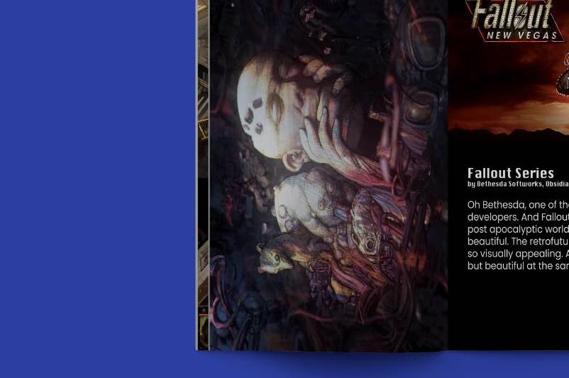
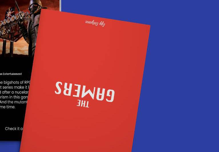
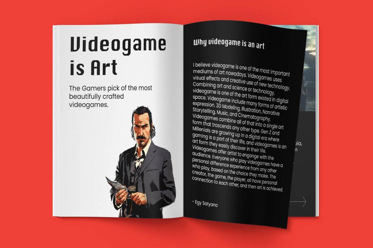
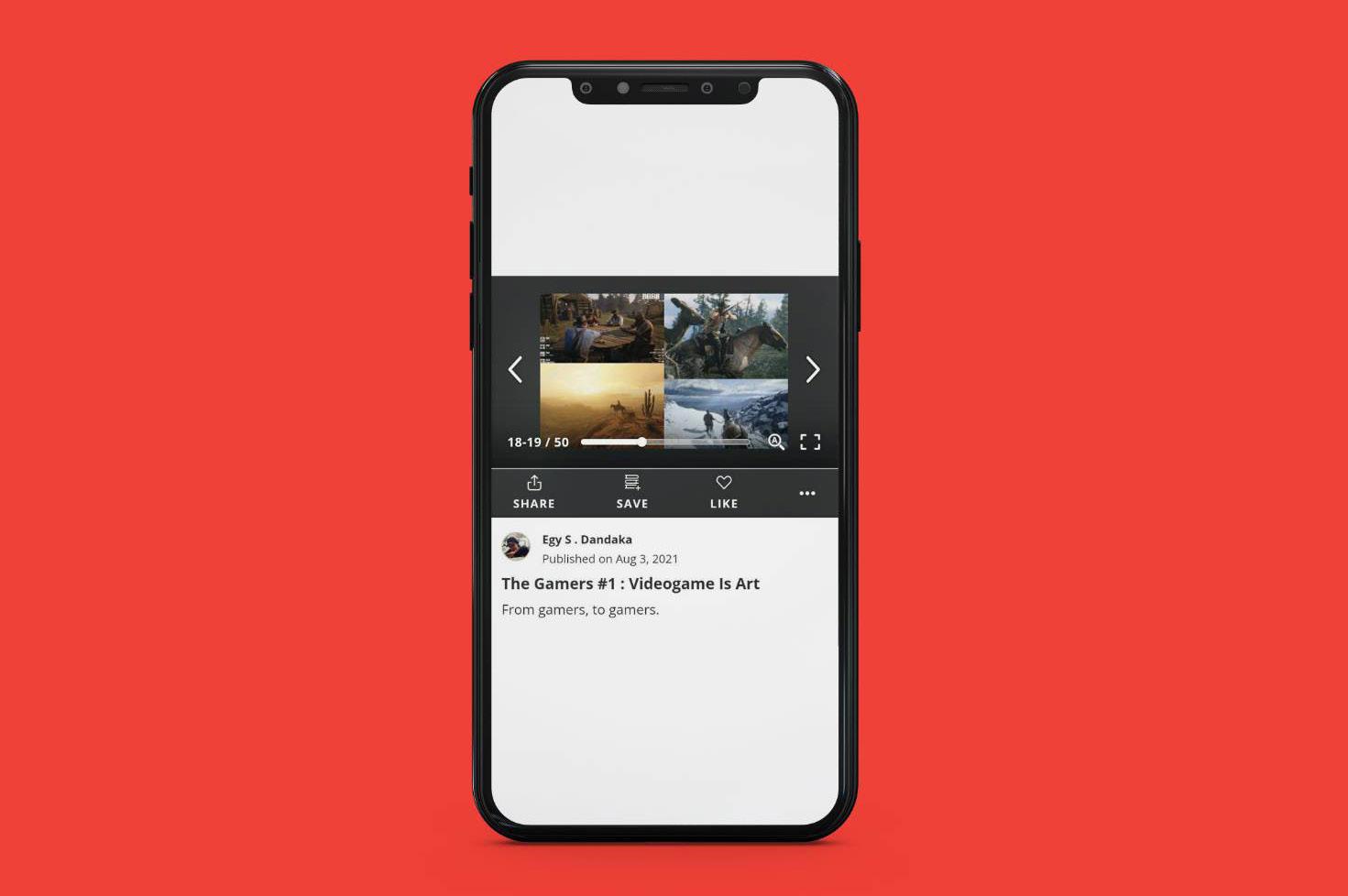
The Gamers is a zine that i made, it’s a zine all about video games. I made it because gaming is one of my favorite activity in leisure time, so making this is a lot of fun for me.

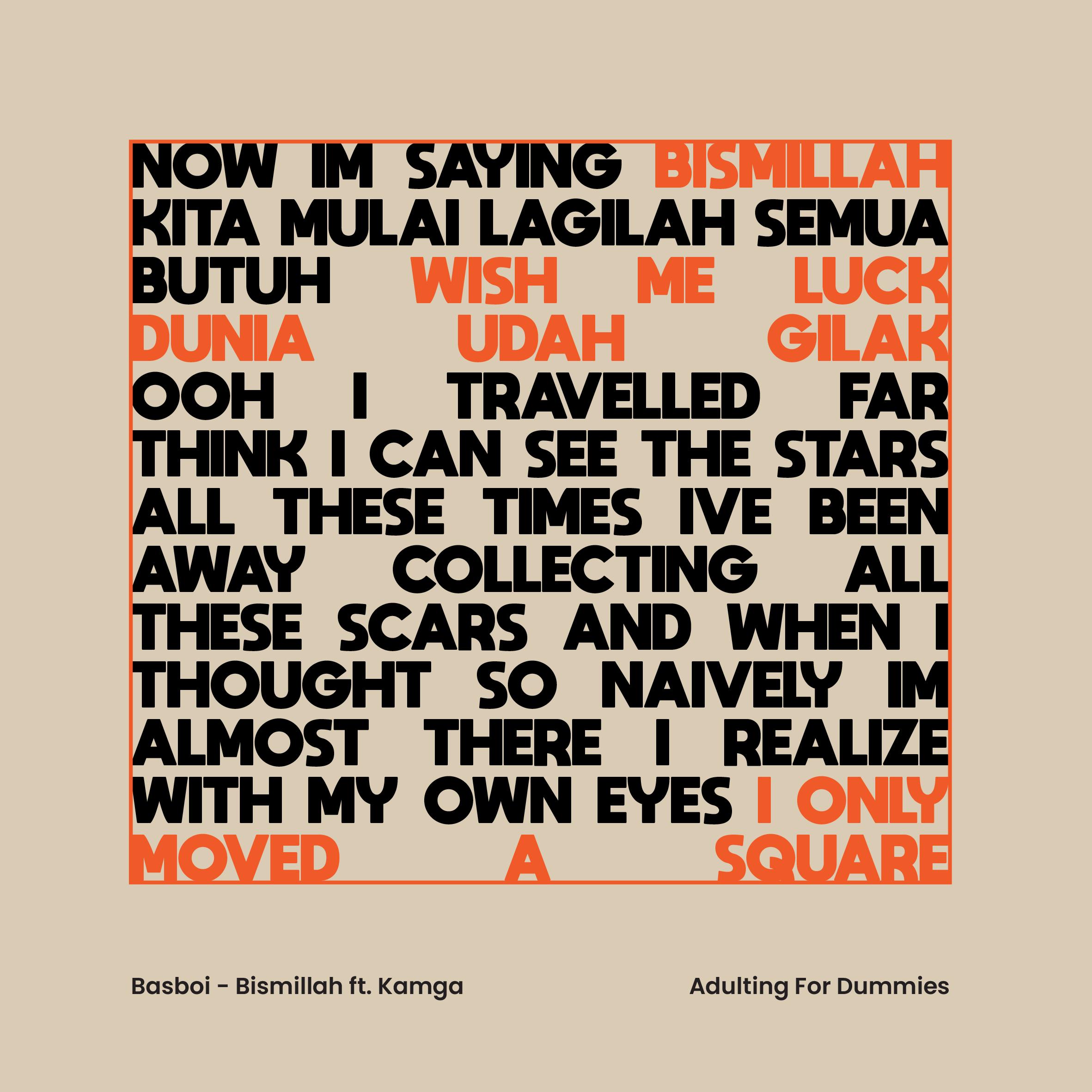
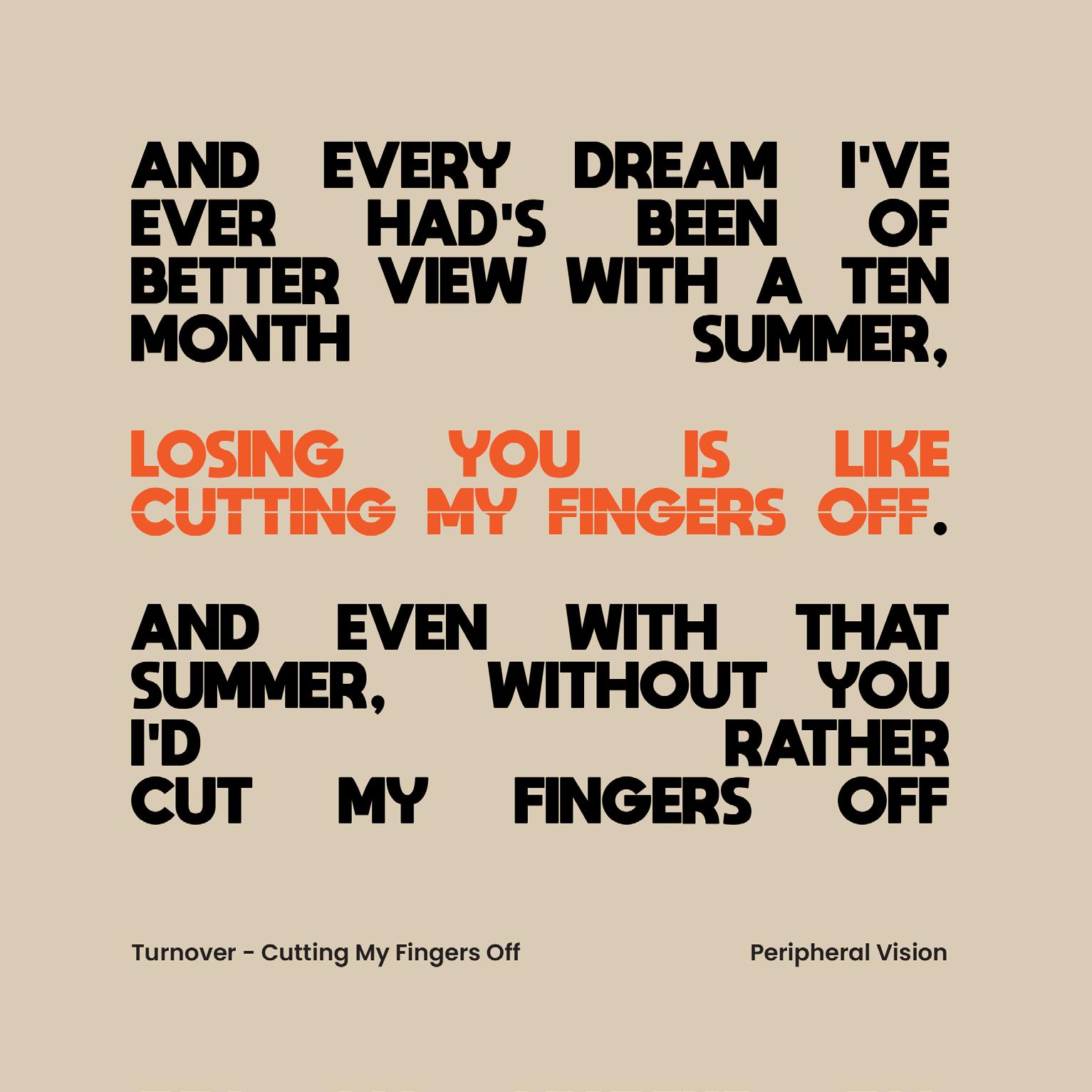
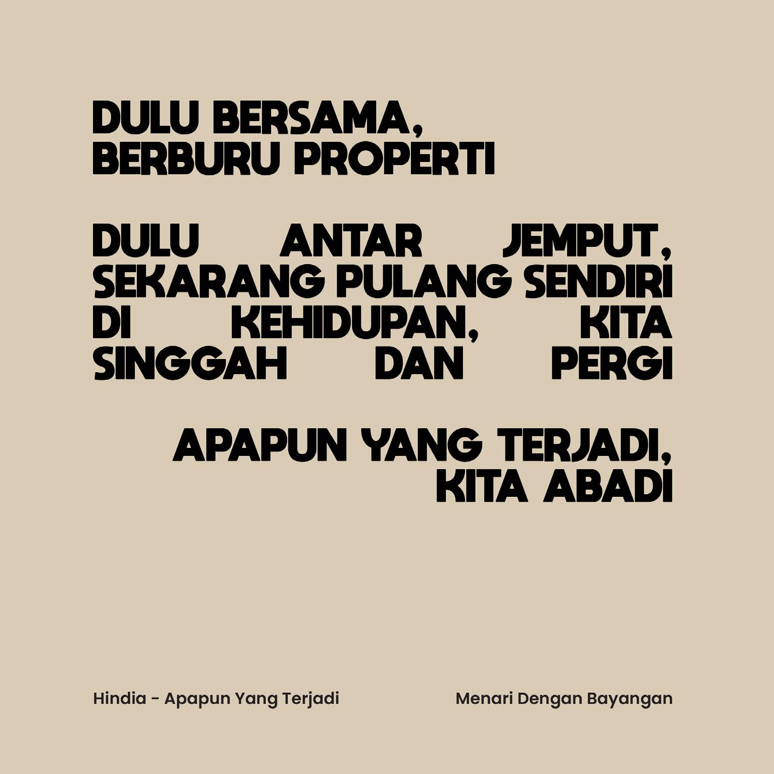
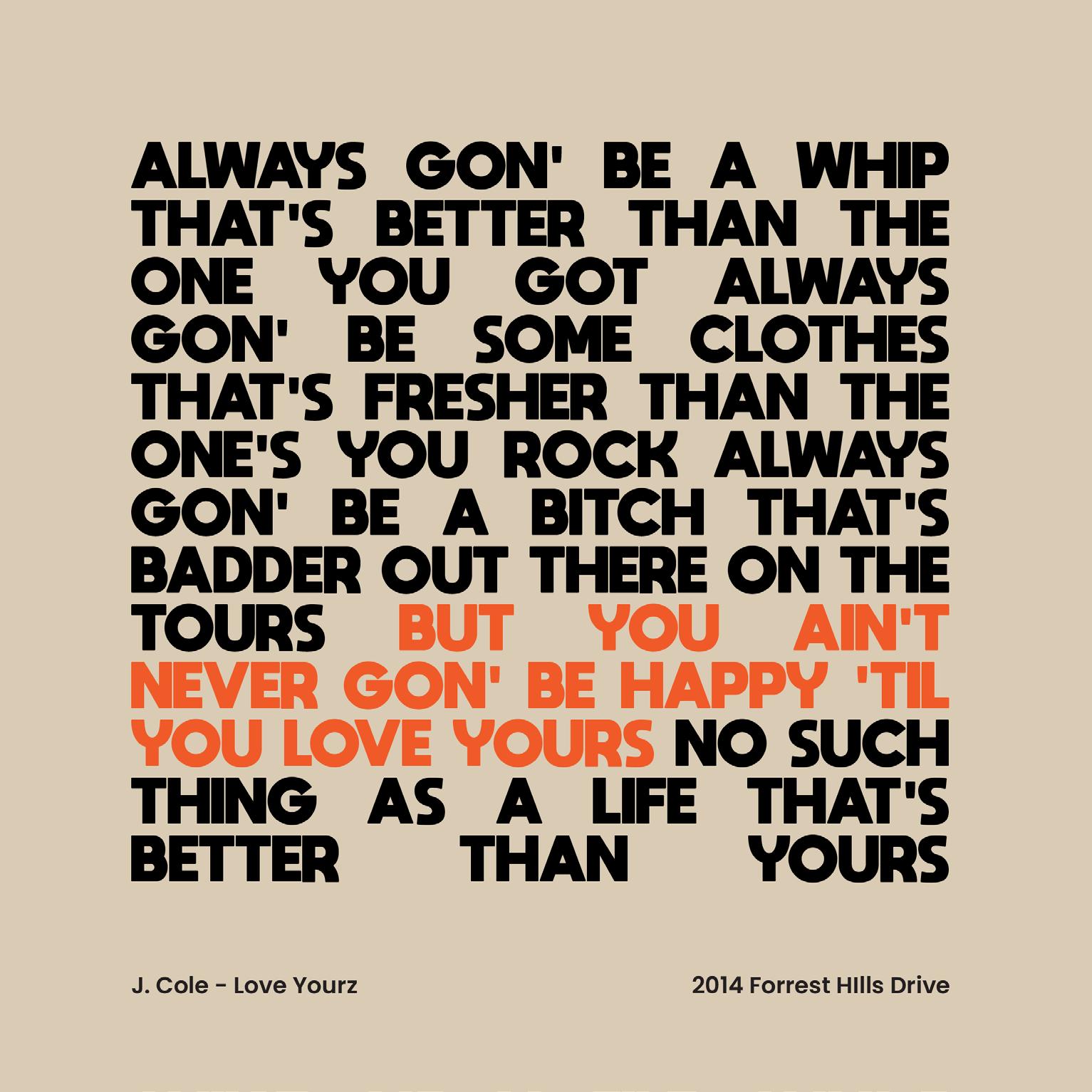
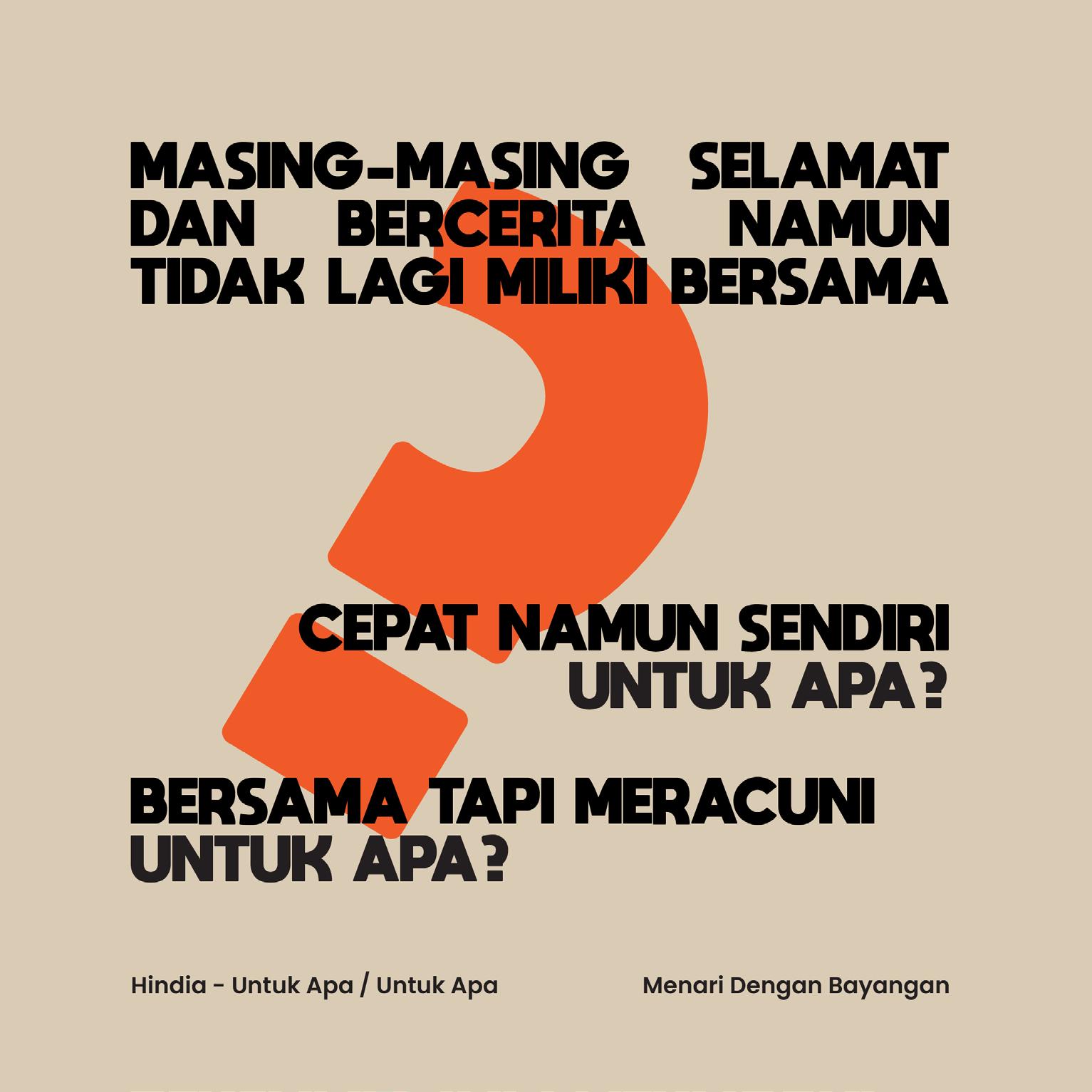
An artwork of music lyrics from my Spotify playlist. I used minimal graphics to make the typeface the main focus point.
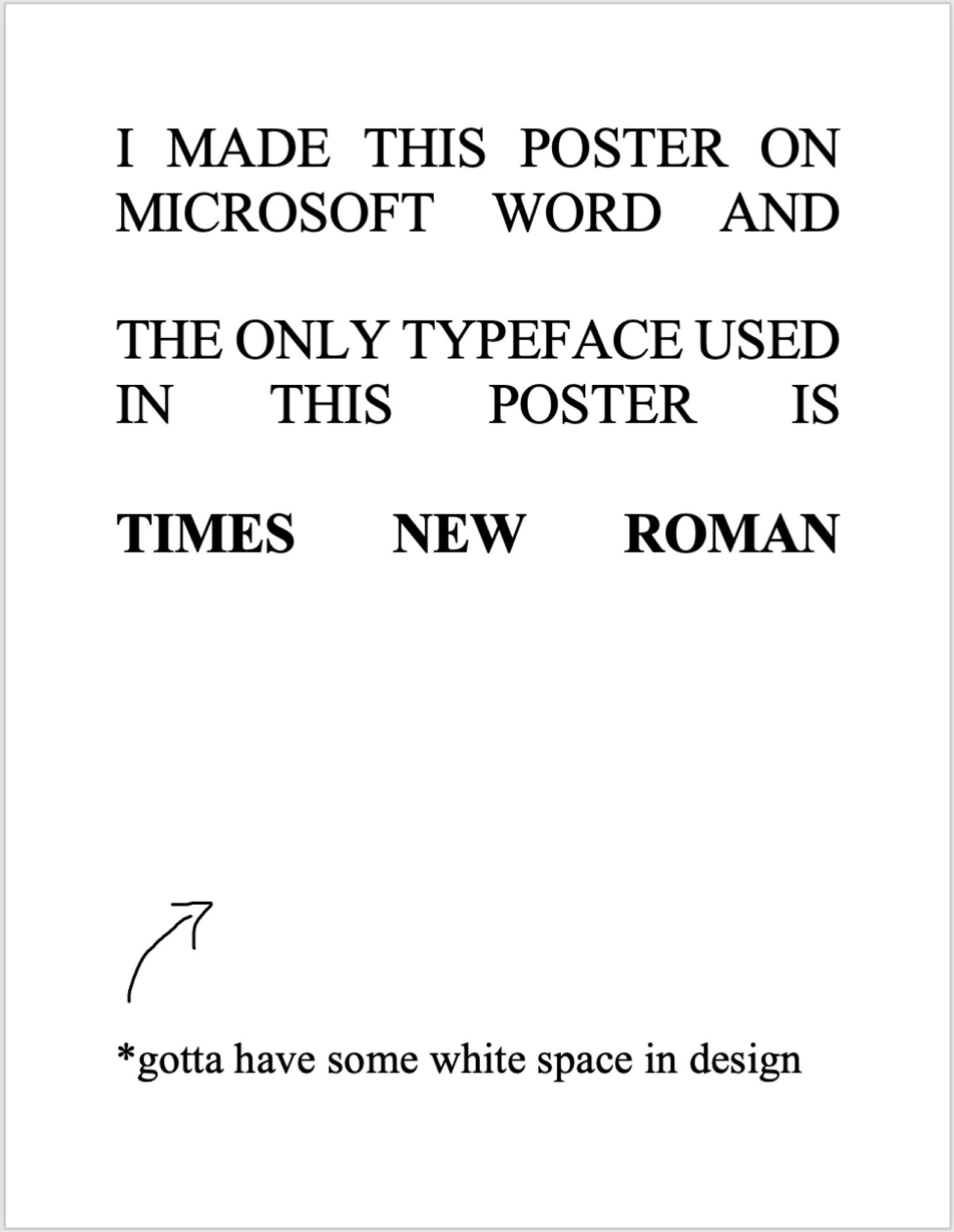
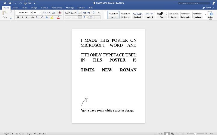
A poster i made in Microsoft Word, the proccess to make this poster is around 15-30 minutes.