stylebook


2022


Table of Content 01 02 03 04 05 06 Our Brand Color Application Logo Typography Photography Stationary Elements

Maeve is a brand created by Šaha Isaković - Jelačić. Šaha noticed that there is a need for professional, quality fashion choices for self-confident, business women in Bosnia and Herzegovina. She made this discovery after multiple conversations with her friends, family and acquaintances.
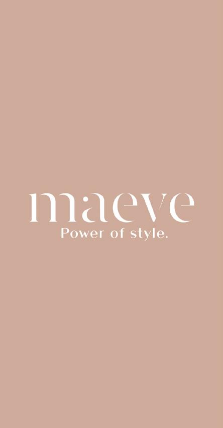
The brand slogan is Be Authentic. Be You and it further describes the brand’s priorities which to give women a variety of quaility clothing options and help them express their style and personality through clothing. Maeve is an authentic brand.
Modern Elegant Strong
Timeless clothing. Classic attire. Versatile and adaptable.
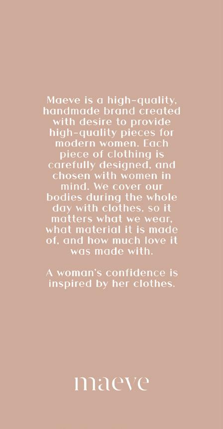
Maeve is a high-quality, handmade brand created in the desire to provide high-quality pieces for modern women.
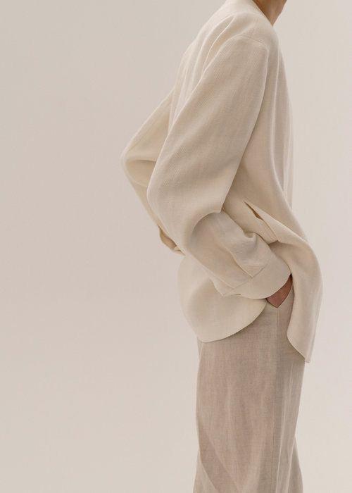

We cover our bodies during the whole day with clothes, so it matters what we wear, what material it is made of, and how much love it was made with.
A woman’s confidence is inspired by her clothes.
We cover our bodies during the whole day with clothes, so it matters what we wear, what material it is made of, and how much love it was made with.
A woman’s confidence is inspired by her clothes.
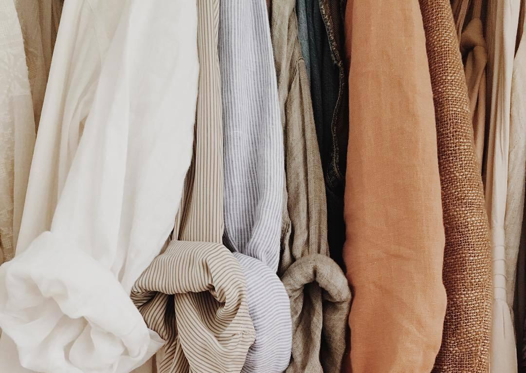
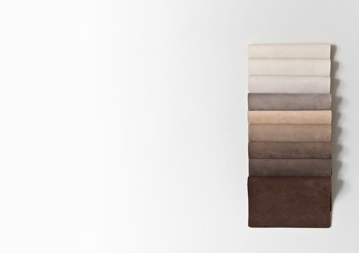
Color is an integral part of brand identity. Consistent use of the color palette not only reinforces the cohesiveness of the brand, but color also serves psychological purpose by communicating a certain feeling or message to your audience. Below are the key base, and accent colors for Maeve and each must be used with visual clarity and contrast in mind.
Fashion brand Maeve has an established main color palette. The following color palette expands on the main palette, and can be used cohesively. It is essentially darker and lighter colors of the main palette, that can be used when the designer sees fit. The color palette shouldn’t be lighter than Ivory, nor darker than Midnight.
Color “Ivory” can be used with all other colors in the Maeve color palette. It is encouraged to use this color to enhance contrast in various visuals.
Colors “Ivory”, “Linen”, and “Match” are the base colors for the Maeve brand for the light visuals.
Colors “Sand”, “Sagey”, and “Midnight” are the base colors for the Maeve brand for the darker visuals.
Maeve brand recognition stems from the minimalistic yet elegant visuals and style. The following color combinations are encouraged:
1) Matcha, Sagey, Linen
2) Ivory, Rosy, Sand
3) Ivory, Midnight, Rosy
4)Sand, Ivory, Linen
Monochromatic color choices are always a great idea for the Maeve brand.

The Maeve wordmark is important expression of the brand identity. By applying the wordmark in a consistent man ner, it strengthens the recognition & visibility of Maeve brand.
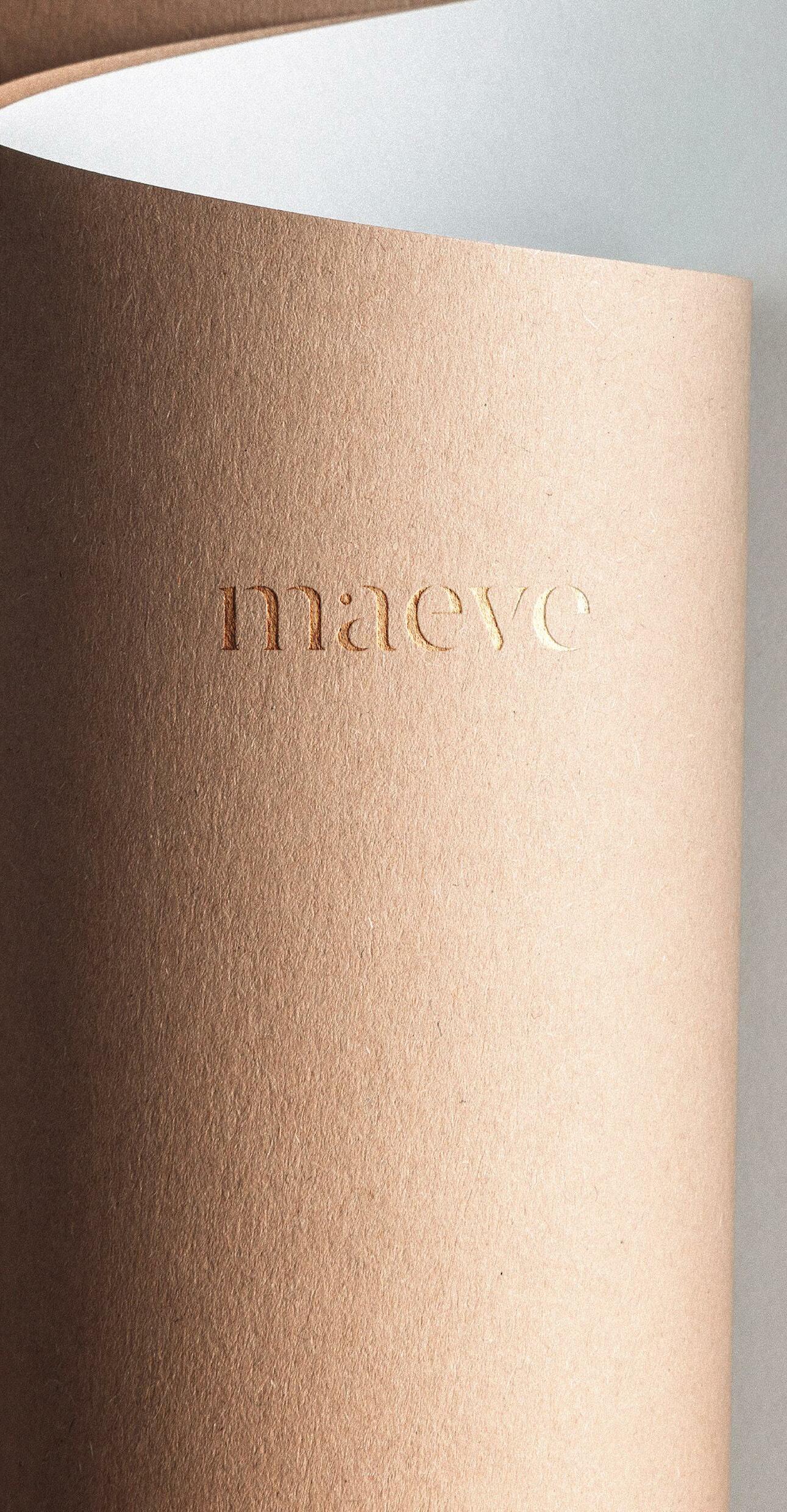
Logo vision stems from Šaha’s motivation for the brand, and re flects the mission, goal and principles of the brand. It is minimalis tic, yet it consists of light curves and sleek elements of a Serif font.
The Maeve logo is a wordmark, and as such should be used as a whole on all documents, and visuals. Maeve logo can be used in all main colors of the Maeve palette depend ing on the situation, but the following should be the main ones:
1) Ivory 2) Sagey 3) Sand 4)Midnight
A few logo rules are necessary to maintain a consistent visual appereance of the Maeve brand. Don’t compromise the overall look of the logo by skewing, distorting or com promising logo visibility. This also includes any ad ditional elements such as: stroke, shadows or high lights. Below, you will find the rules for the logo usage.


Do NOT distort the logo.
Do NOT crop the logo.
Do NOT use off brand colors. Do NOT rotate the logo unless 90 degrees.
Do NOT make the logo too small and unreadable.

Give the logo space to breathe.
Do NOT compromise visibility of the logo with poor contrast.
Do NOT use logos that blend with the photography.

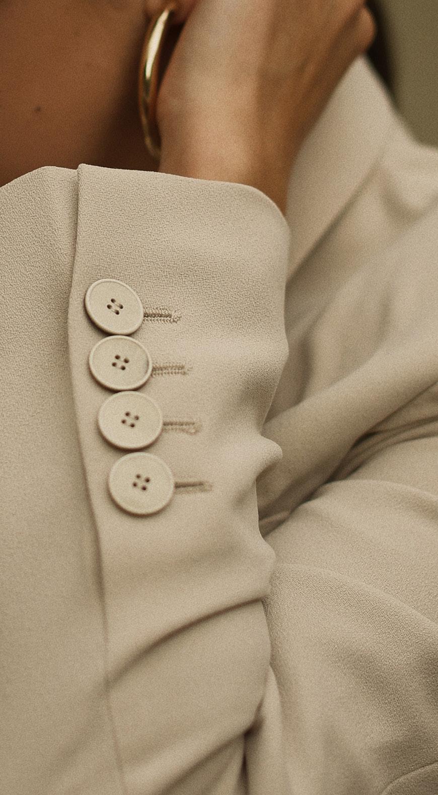
Typography is an important aspect of a brand. When used right, it can be a great element of recognition for Maeve brand. The set of typography used by a brand needs to be clear, consistent and visually cohesive with the style of logo and brand mission.
font is a minimalistic, yet elegant font that should be used for headlines. Aside from the headlines, Athena can and should be used for subtitles in a text, however there needs to be a font size difference between the subtitles and headlines.
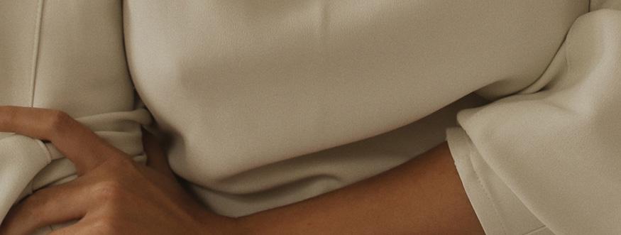
Photography implementation into a brand can be great for brand recognition. There are a couple ways the Maeve logo can and should be implemented with various photograph ic backgrounds, but all photography and logo combinations needs to be well thought of so it does not compromise the visibility of the logo.
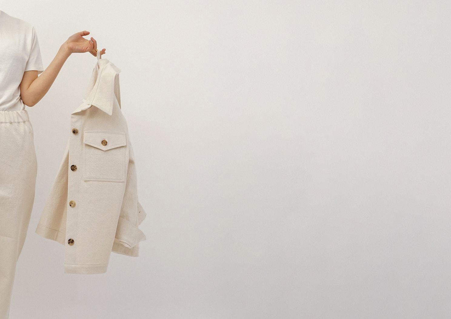
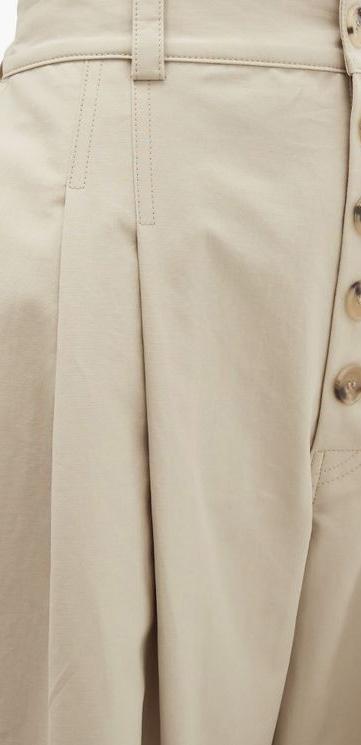
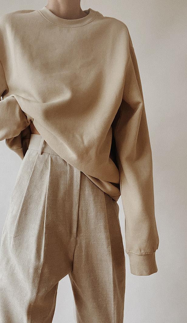
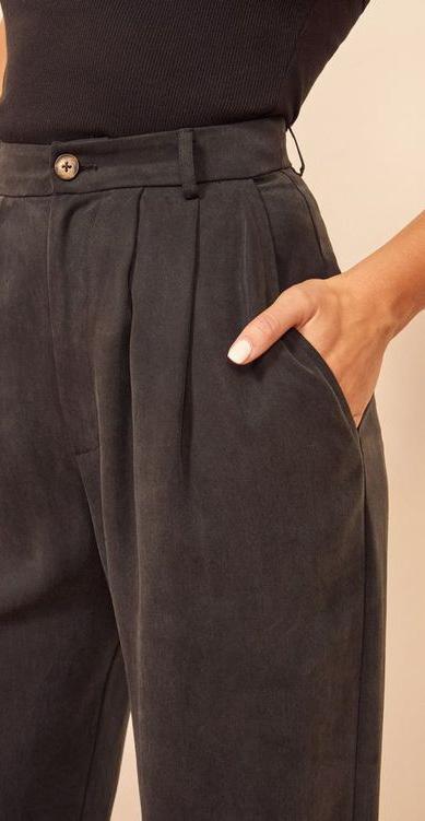
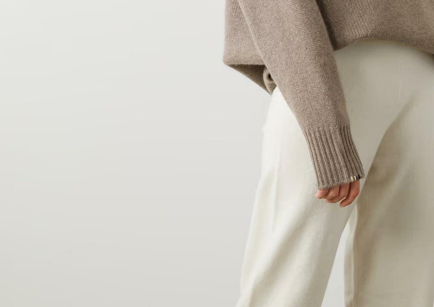
1) Photo types should focus on: lifestyle, enviromental pho tography, and products.
2) Shallow depth of field works well.
3) Do not use background blocks to add logo to a photo.
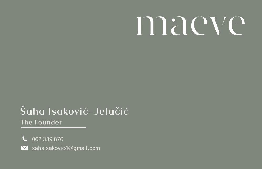

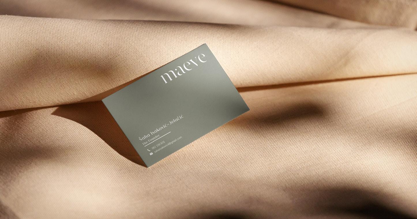
Front
The purpose of the Maeve brand guidelines is to maintain the branding and visual appereance of the brand. These guidelines highlight the most important parts such as what typography, and what colors to use. If in doubt about the brand visual communication, please make sure to refer back to the guidelines. If there are any doubts, or additional questions please do not hesitate to contact ednaporca3008@gmail.com.