
BA1 Humanities Portfolio Thinking through Drawing
Convention
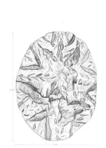
SOURDOUGH BREAD

‘We draw to make something of what someone has made in the past’ (McFadyen, 2016:35) In this case, I chose to portray my mother’s homemade sourdough bread. This breakfast, served at least once a week at home, is lovingly prepared with her six year-old starter. There’s a new design carved on each one she makes.
The orthographic portrayal of this sourdough bread is done at 1:1 scale on A3 paper in order to provide as much detail as the eye can see, from the carefuly carved designs to the unintentional cracks that are common to this non-yeast bread.

The initial step of drawing both the plan and elevation involved making thin outlines of the positions of the carvings with pencil, after which the pencil was routinely sharpenend during the shading process.


To intepret the dusting of four on the surface, I gently brushed a blunt pencil on the paper. For the darker areas, the same low pressure was applied, but I went over each area twice or more, depending on the shade. The dark outlines of the cracks and carves were done with pressure applied sharpened pencil for a juxtaposing effect.
 The loaf of sourdough that was interpreted in this task
Above: the process of drawing the plan shown below.
The loaf of sourdough that was interpreted in this task
Above: the process of drawing the plan shown below.
Inspired by Enric Miralles’ cross-sections through a crossoint, I visualised the loaf in 3 slices of varying sizes. What intrigued me is that despite having the general form of a semicircle, the bread was not without its imperfections. The curves, bumps and cracks all prevent the section from appearing completely symmetrical on the y-axis. Continuity was prominent in this series of sections, as shown by a crack on the left side and a large air bubble in the loaf. The thick crust was also noted.
Clockwise from right: Sections taken at 1/2, 3/10 and 1/10 cuts of the loaf, respectively; the calculations of generic form of the loaf which also shows the section cuts and elevation direction; and the elevation of the loaf.


Redrawing
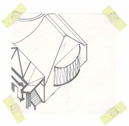
ITERATIVE DESIGNS
These iterations of James Stirling’s Latina Library are all symmetrical and were inspired 3 basic shapes - circles, triangles and rectangles. Each design offers a different level of engagement with the exterior environment, from 180° views to views in particular directions only. First, I traced the axonometric drawing of the building onto a small piece of paper. Then indivusual squares of tracing paper were placed onto it, upon which I drew each iteration of the balcony.


COPYING
I chose to redraw James Stirling and Michael Wilford’s House Studies axonometric drawing from 1956.

Axonometric drawings are eccentric in their nature to show details in plans and on elevations of buildings in their actual or scaled dimensions.

Using tracing paper, I transferred the outlines of the drawing onto an A3 sheet. Then, a marker was used to go over these lines. The diagonal hatches on the walls of the building were also done with marker.
Curved walls on this building were depicted with slightly thicker dashed lines, whilst walls in the shadows were coloured in.
Finally, small smudges and extra thick lines were drawn in to replicate the ink smudges in the corners of the walls in the original drawing.
Sequences
A WALK THROUGH THE PARK
The composition of a perspective drawing resembles a scene exactly the way a human eye perceives it. Rather than depict monotonous streets of rowhouses, I opted to draw a nature walk. Each gateway in this park lies in a different state of ruin, and each piece of land it leads into scenes each different from the last. Trees and nature are perhaps the only thing in this series that really change the look of the landscape in each drawing; everything manmade always seems to repeat, whether in rowhouses or walls near the edges of a path. Nature is a wild thing, it does not follow rules. So, inspired by Gordon Cullen’s The Concise Townscape (1971), this is a Path through Baylis Memorial Park. These 6 images were shrunk down from the original A5 size.


 Picture 1
Picture 2
Picture 3
Picture 1
Picture 2
Picture 3
Through these drawings, I learned to not overthink my work. With time and practice, my hand automatically started guessing the perspective lines. I began paying more attention to differentiating objects in the foreground and background, the former of which I depicted with darker, neater lines, this series of perspectives describing a route were done in my own style. I also learned that things that are hidden get revealed in subtle ways (ie. the rowhouses that appear in the distance disappear in the next drawing before appearing again.


 Picture 4
Picture 5
Picture 6
Picture 4
Picture 5
Picture 6
Translation
Pier Vittorio Aureli’s work in The Marriage of Reason and Squalor (2014) is a series of pen and ink drawings that focus on the effect of shadows in a space. I picked this particular piece as I was intrigued by the simplicity of it and the lack of outlines around each shade.

LOOKING THROUGH A CHILD’S EYE
The inspiration behind all 4 of my iterations was to redraw them with a child’s eye, using materials that would normally be found in a kids’ art room.
The same amount of pressure was applied to 5 blue oil pastels (prussian, cobalt, brilliant, sky and light) which gave off an effect not unlike gouache. The borders between shades were blurred. With more usage of each crayon it became more curved and blunt, and my control over the lines was consideraly lesser than with a brand new crayon; the lines became thicker and rougher.

To investigate the effect further, I used the same crayon, this time with increasing pressure applied to it as the shadows got darker. The result was even more messy. I had completely lost control over the lines and there was much lesser differentiation between the shades than before.
 Different pastels, same pressure.
Same pastel, different pressures.
Different pastels, same pressure.
Same pastel, different pressures.
All drawings are failures. This was certainly proven true in my next iteration. Glue and paint aren’t often materials that are used together, especially on tracing paper. I pushed the brief to its limit, not just using the wrong materials, but materials that are wrong together.
The paper absorbed the dampness of the glue-paint and wrinkled. It was only after it had dried that I realised that tracing paper strongly diffuses light and that my shadow study wouldn’t work.


Instead, I backlit the paper to show the failure of the lines on the image, which had become squiggly when the paper had started to wrinkle.
I had another go with the shadow study, using the same method of adding more and more black acrylic paint to the glue as the shadows got darker. This time, however, I used a clear plastic sheet. This material, of course, did not wrinkle, but the smoothness of the sheet allowed the different shades of glue to slide into each other. The bubbles formed pushed paint pigments away as they dried up, thus resulting in several circular empty spots in the fnal piece (shown picture below)
These photographs show the shadows produced on a wall when the plastic of a torchlight.


This glue-paint method starkly contrasts with the crisp lines and clear defnition drawing. However, my 10 year-old spreadingglue-on-her-palm-and-waiting-for-it-to-dry-sothat-she-can-peel-it-off-self was thrilled with the results.
All these iterations unfinchingly failures, the same way children own nonsensical scribbling. with childlike innocence is a freeing feeling.
Analysis
Gordon Cullen’s The Concise Townscape (1971) presents his different ideas of public spaces and occupation of space, and is an excellent example of his drawing style. He showcases his opinion of being against identical, repetitive spaces and uses a persuasive drawing style and positive reinforcement to convince the audience to agree with him. I have chosen to analyse these two comparative drawings of the same street.

MATERIAL AND TEXTURE INITIAL IMPRESSION
Through the use of pen and what could be a crayon, Cullen employs several strokes and texture to convey a different piece of information in these drawings
A light tone on the sky differenciates it from white spaces in the drawing.

Parallel and cross hatching is used for the roof and chimney, respectively.
Hatching and vigorous scribbling is used on the trees in far distance, which gives the idea that they are full of leaves.
Parallel lines are used to show rows of bricks or panels on the building left of the centre.

Parts of any building in the shadows employs this stippling that is slightly lighter than shadows on the ground.


The roads are grainy and dotted, signifying the slightly rough texture of tar.

These drawings show two views of the same street, arguing that the intervention of modern city planning (streetlights in regular rhythm) does great damage to a varied space.


The shadows on the ground are shown with very dense stippling and texture.


Finally, the very darkest parts of the drawing (windows and other small shadows) are coloured in with pen for mystery and/or privacy.
PERSPECTIVE LINES THE SHAPES
The frst image has almost a closed off box-like perspective, the trees and the bridge. Lines drawn from the buildings on the side accentuate the bottom edge of the “frame.” The second image provides a deeper perspective into the vanishing point in the distance. Unlinke the previous drawing, focus is drawn away from the buildings in the foreground. The “kinetic unity” of the space is lost. (Cullen, 1971:147)


The basic shape formation on the frst image act as a framing frst to details in the foreground which then lead him intoage directly takes the viewers’ attention straight to the vanishing point. The buildings in this seem to merely exist as an interupting afterthought, and the building on the left side does not contribute to the image at all.

REDRAWING
To understand the composition of the drawing better, I redrew it using pencil.
SHADOWS AND TONES
REIMAGINING THE SPACE
Redrawing Cullens work made me see the almost cartoon-like character of the drawing, so I colourised it to further this emotion and to see if there was any difference in how the space felt.
This exercise made me understand how Cullen made this drawing engaging without absolute mimicing the absolute photorealism like contemporary architectural renderings. One can clearly see the traces of handmade nature of these drawings. It almost feels like a cartoon.
Another thing I found interesting about the drawings were the different darkness of tones, which I decided to investigate further.
used for the darkest shadows, which are very prominent in this drawing. straight line hatching and grainy roads are next in the darkness spectrum Trees, roofs and other shadings employed careful and thin line scribbling.


This exercise shows how the original street clearly presents the variation, complexity and interest in this space in an uncluttered manner.
“Wasn’t this better?” seems to be the rhetorical question the author asks the viewer.

To differentiate the sky from white spaces in the drawing, a light tone was used.
MAPPING THE AREA
Lastly, I present my own interpretation of the drawings in plan form, using the same colours for each building as I did in the cartoon for easier understanding.


In this shadow and tone study, cross and scribble hatchings were considered to be of the same tone and so where grainy dots and parallel line shading, as they both come accross as a similar shade. The result of this study shows how the shadows defne the space, and how the streetlights seem to interupt continuity in the drawings. There were four distinct hues, as shown in the key to the right of the drawing.


The road is shown to become straighter and lesser trees surround it. the red arrows show the points from where the perspectives are viewed. please take note, this is only a rough intepreation and by no means really shows the correct reality.

REFERENCES
McFadyen, L. (2016) “Practice Drawing Writing Object” in Ingold, T. (Ed.), Redrawing Anthropology: Materials, Movements, Lines London: Routledge
Cullen, G. (1971) The Concise Townscape., Oxford: The Architectural Press