GR3332
Self Initiated Project
EBay’s rebranding is a major visual design initiative that attempts to modernise the web design and brand’s identity to appeal to current customers. This project is organised into divisions, each with its own set of aims and goals.
The initial portion of the project might include detailed study on eBay’s present brand identity, including visual aspects, message, and overall positioning. This study will aid in identifying areas for improvement and will serve as the foundation for the rebranding approach.
The following phase might concentrate on developing a new logo and visual identity for the brand. This entails creating a new logo that expresses the brand’s values and personality while being distinctive and ageless. This part may also include the creation of new visual components such as font, colour palettes and artwork to create coherent brand identity.
Overall, rebranding is a complex graphic design project that requires meticulous research, planning and execution. A good rebranding will assist ebay in remaining current and appealing to modern consumers while keeping its position as major online marketplace.

Why does ebay need new webite UI and rebranding?
EBay’s business is global with 133M buyers in 190 countries. Being one of the leading e-commerce websites, eBay must stay current and relevant in an ever-changing digital world. A new website UI and rebranding may provide clients a new appearance and an enhanced user experience, thereby improving engagement and revenue. It may also assist Ebay in distinguishing itself from competitors and reinforcing its brand image. Furthermore, new technology and design trends may necessitate website changes to maintain compatibility and functionality.
According to eBay itself, number of active eBay buyers have declined to 147 million.
Ebay has experienced increased competition from e-commerce behemoths such as Amazon, reducing its market share dramatically. Many online buyers favour Amazon because of its wider product range, faster shipping choices, and better pricing. Furthermore, Amazon’s Prime membership programme provides unique privileges such as free delivery, streaming services, and other perks, which have assisted in attracting and retaining consumers. While eBay remains a popular online marketplace, it has failed to keep up with Amazon’s innovations and customer-focused methods, making long-term competitiveness difficult.
The technique of splitting a bigger market into smaller groups of consumers with comparable demands or characteristics is known as market segmentation. Instead of attempting to appeal to a wide audience, firms should restrict their marketing efforts to specific niches. Businesses can increase their chances of success by better addressing their target consumers’ demands and preferences. the market is segmented by four criterias: Demographic, Psychographic, Geographic and Behavioural.

1. Small business owner and manufacturers.
2. Second hand items sellers and buyers
3. Art enthusiasts
4. Antiques and motor enthusiasts
1. People are more inclined towards new attractive products promoted via social media platforms like Instagram and Tiktok.

2. Customers usually need a website they can trust to sell their second-hand or unique products. Same goes for the people buying used things on eBay.

1. EBay is spread over 190 countries, larger portions of the market are consumed by countries like US, UK, Australia and Germany. The market is segregated on the basis of region and country. So customers living in the same region are suggested similar products according to their needs.
1. EBay has a separate approach for their target market in China. They operate via a local company called Tom. com which is focused towards catering mainland China market. This helps them identify popular products
1. Business platforms like Amazon and eBay use cookies to track their customers’ purchasing habits. For ex, if a customer buys a set of headphones, they will start getting recommendations of other smartphone accessories. If a person is even surfing through the websites, cookies helps keep track of what kind of products the person is interested in nowadays.
2. Adding discounts and other promotional vouchers help business platforms persuade their customers who haven’t been active in a while. Sometimes the customers wait for special occasions like Black Friday and Christmas for the discounts to shop for the things they like.
Consumer profiling is the practise of acquiring information on a certain set of customers or target audience’s attributes, interests, and behaviour. This data is then utilised to develop a persona or profile of the ideal consumer or target audience for a product or service.
Businesses may customise their goods and marketing efforts to the individual requirements and preferences of their target audience by building a complete consumer profile, which can boost the efficacy of their marketing campaigns and eventually lead to increased sales and customer satisfaction.
Fashion Flair
Combining value and sustainability, Ade and Samuel came together as a family to build a successful second hand clothing business from scratch on eBay.
Fashion Flair specialises in secondhand and new shoes, clothing and bags, from both designer and high street brands. They add new items to their shop everyday to keep their
Founders, Sarah Dean, Carl Walker and Sam Hunter, had previously dabbled in selling vintage clothes as a side hustle alongside their day jobs, and they had always known that it was what they wanted to do eventually.
Go Thrift has boomed and grown in size exponentially, aided by eBay providing them a platform to sell their items to a
22k items sold
100% positive feedback
1.1k followers
191k items sold
99.6% positive feedback
23k followers


It was critical for the project to research about the type of market eBay has been catering to (or should be catering to, in the near future). It has provided an insight upon the types of marketing approaches we should be looking into. This project will delivers an extensive and comprehensive brand style guidelines for the new brand identity of eBay and a new website UI mockup which is a byproduct of the new brand guidelines.
EBay currently have a Brand style website called Playbook created by Lindsay Gravette and Azi Rad (designed in Jan, 2020) which helps Digital Marketers and sellers on eBay to create content for promotions relevant to the brand.
A new Brand Style Guide will be created on the basis of current trends and brand colours. It will consist of:
• Vision and Missions of the Brand
• Logo Guidelines
• Brand colours and usage
• Typography and Font usage
• Brand imagery
• Iconography
• Patterns and textures

eBay is a website where people can buy and sell a variety of items. It was founded in 1995 and has since evolved to become one of the world’s largest online retailers. eBay sells a variety of items, including electronics, clothing, home products, antiquities, and much more. Customers may search for things on the website by category, brand, and price range. eBay also offers a number of payment and shipping options, allowing consumers to buy items from anywhere in the world. With millions of registered users and millions of things for sale at any given time, eBay is a one-stop shop for online shopping.
“To be the most sustainable and community-driven online marketplace in the world, allowing people to buy and sell with confidence while minimising our environmental impact and encouraging social responsibility.”
“eBay is dedicated to ensuring a sustainable future for our world and communities. We want to create a platform where individuals can find one-of-a-kind and precious products while also making a beneficial influence on the planet. We are committed to lowering our environmental effect through sustainable practises and encouraging social responsibility through partnering with local businesses, charitable organisations, and community activities. Our objective is to make the world a more sustainable and fair place by allowing our consumers, sellers, and workers to make a difference on our platform.”
A carefully chosen colour scheme may also communicate feelings and ideas that are consistent with the brand’s principles and character. A colour scheme may also assist to make sure that all marketing materials have a unified aesthetic and seem polished, which can increase the brand’s credibility and appeal to potential buyers. A company may establish a strong visual identity that is readily recognisable to buyers by employing a consistent set of colours throughout all marketing materials, such as logos, websites, and
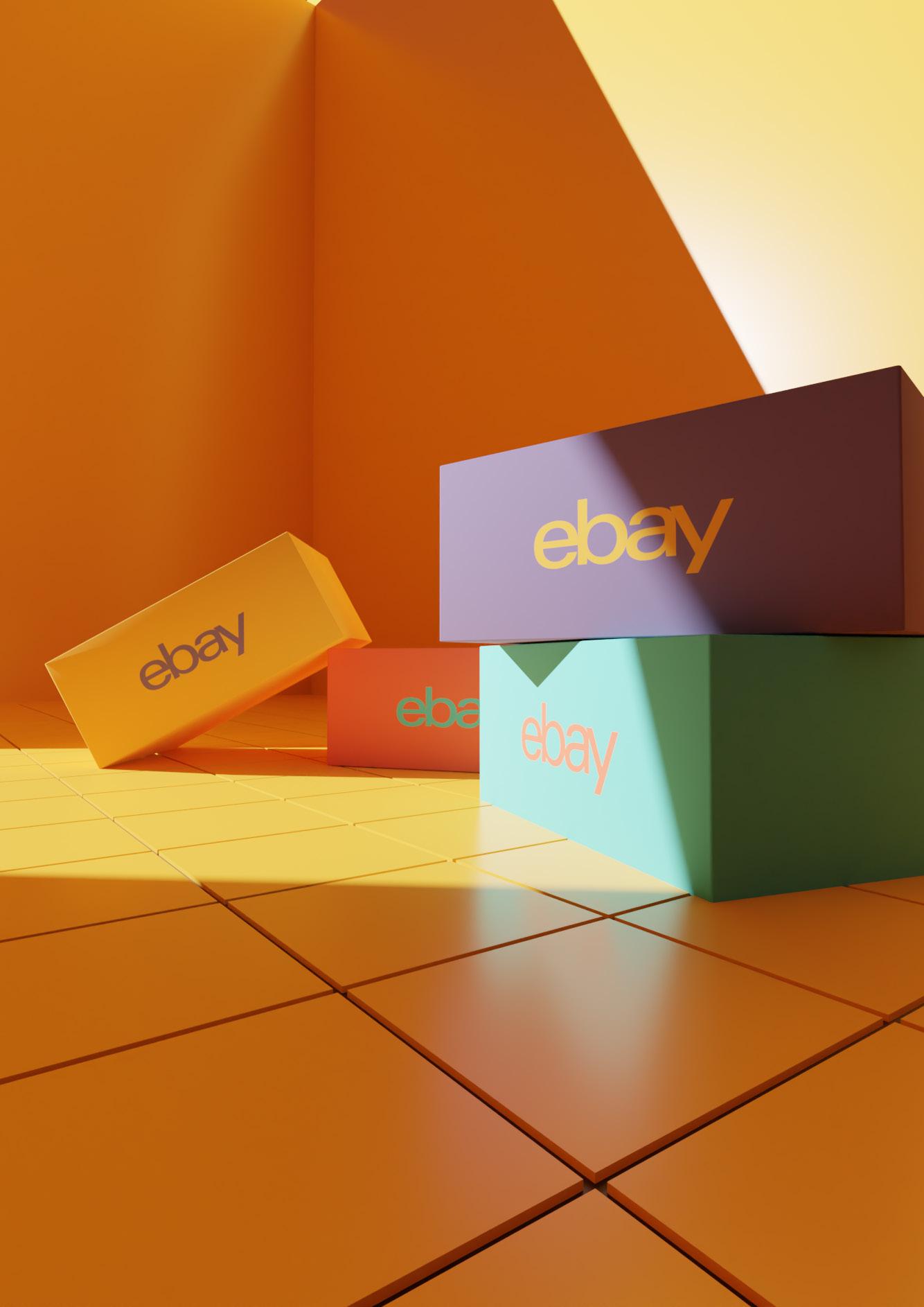
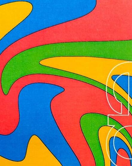
The originals of eBay. This color palette has been used by eBay for the past 22 years. Still the bands of these colours are instantly recognisable as the brand colours of eBay. The colour palette of eBay has been iconic for years and its still used in the marketing and promotional adverts of eBay (usually in the form of strips or bands.
Since eBay needs to stay true to its origin, the strip and band pattern is going to stay the same. Primary colours like red, blue and yellow are simple and memorable. they signify versatility. The additional green color signifies By carefully using these colours, eBay has differentiated its brand from the others.
The Tomato, Verdigris, Saffron & Deep Blue Grey colour palette has been carefully chosen for eBay to represent the diversity of the brand. In the past years, eBay has been a constant supporter of small businesses and business owners while also promoting economic and sustainability opportunities for its users (both buyers and sellers).
Besides all the well deeds that eBay has been doing, it still lacks in marketing these initiatives. The new colour schemes will be a fine promoter of all the new and exciting initiatives of the new eBay. The four colours of the palette are complimentary to each other and they could also be used in a tinted manner for Heading or body of the any
NOTE:
These colors must be used in these exact colour values. The RGB codes are given for web and digital screen references and CMYK values are provided
Tomato Verdigris Deep Saffron Dark Blue Grey #51C2B4It is essential to develop a brand’s colour scheme since it promotes identification and brand awareness. A company may establish a strong visual identity that is readily recognisable to buyers by employing a consistent set of colours throughout all marketing materials, such as logos, websites, and commercials.
A carefully chosen colour scheme may also communicate feelings and ideas that are consistent with the brand’s principles and character. A colour scheme may also assist to make sure that all marketing materials have a unified aesthetic and seem polished, which can increase the brand’s credibility and appeal to
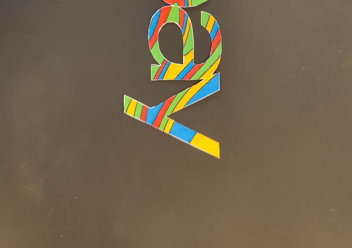
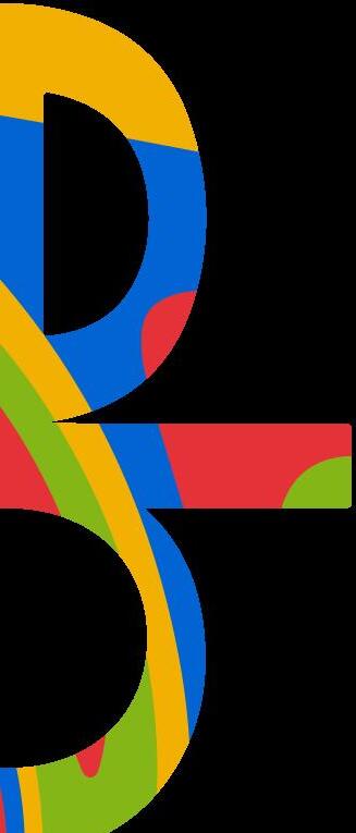
Each letter in the corporate name of eBay’s logo has a small overlap to generate a sense of community and connection. In order to convey a sense of tolerance and diversity, the letters are also coloured in a variety of vivid tones of red, blue, yellow and green. Since eBay’s foundation in 1995, the logo has undergone a number of revisions, with each one attempting to represent the company’s changing identity and principles. The overall goal of the eBay logo is to communicate the company’s core values of approachability,
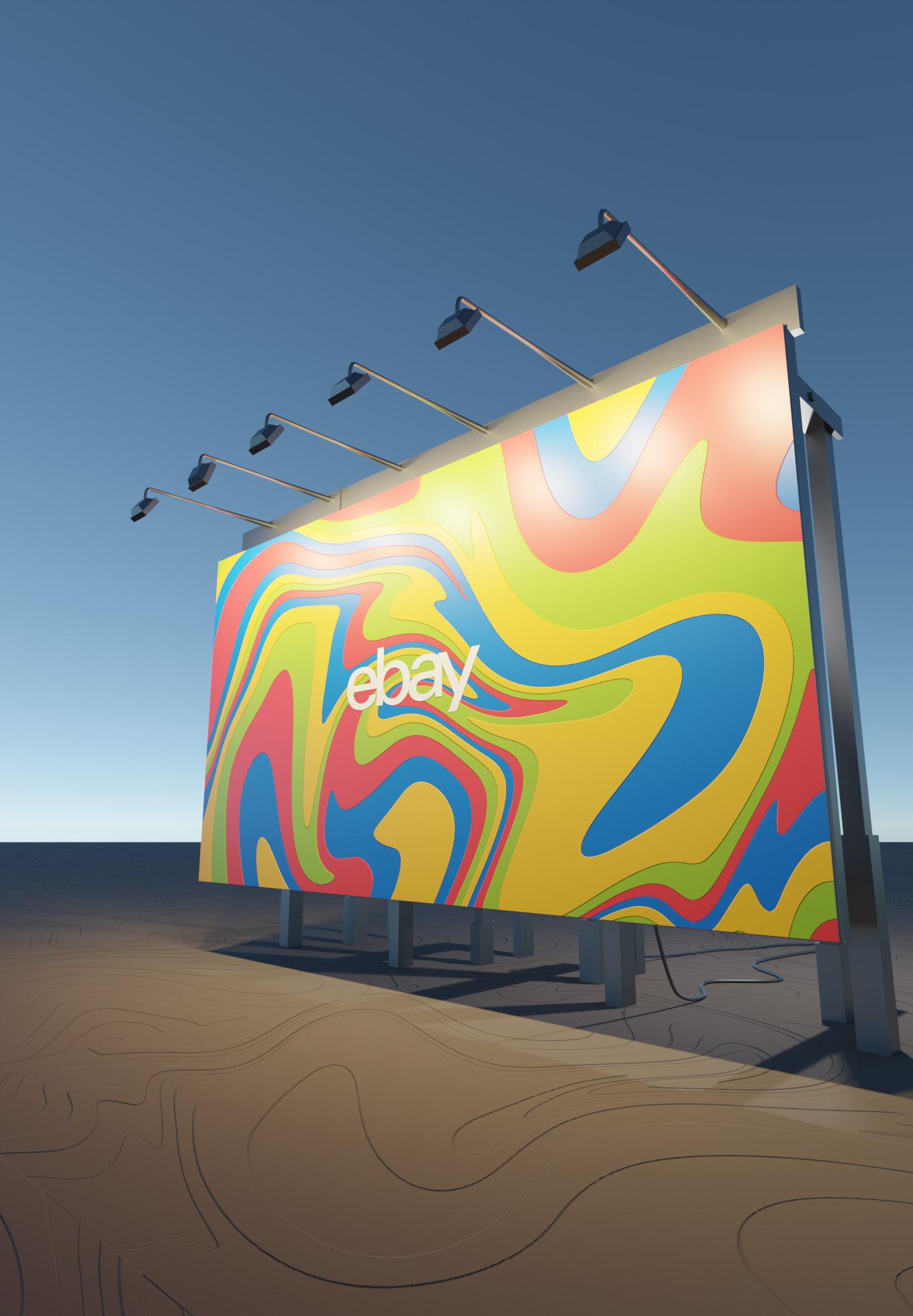
The new logo has the same outlines and the Univers 53 Extended with an approximate optical kerning of -135. The colours of the logo remain the same in order to keep ebay logo recognisable to its origin. The masking layer of liquified illustration patterns convey a sense of creativity, innovation, and flexibility. Additionally, they might induce feelings of fluidity, mobility, and change, which may be enticing to businesses looking to convey an air of flexibility and attentiveness to the demands of their target market. In order to illustrate the morphing of the brand identity, some iterations of the logo have been created for a slide in animation. These signify the playfulness, simplicity, diversity, well-balanced and down to earth nature of the brand.


Logo construction is an essential part of a brand identity since it helps in accurately determining the use of the logo. The iconic Univers 53 extended logo has been around for 12 years. Even the online brand style guide Playbook didn’t change the outline of the logo and only experimented with color combinations and typography. Many iterations of the logo were made before finalising liquified art style of the logo which is masked by the outline of the original eBay logo.
The liquified illustration was created using Procreate. The illustration was then converted to a vector by image trace on Adobe Illustrator 2022.


Clear spacing box dimensions: 1920 x 1440 px
Clear spacing blanks: 205 x 146 px
This will indicate the proportions of the logo and distance between the stroke and the space in which the icon is confined within
A favicon is a little symbol that displays in bookmarks, on mobile devices, and in the browser tab next to the page title. Favicons are also crucial for websites because they improve branding, user experience, and recognition. Websites may strengthen their brand identification and increase their site’s visibility in a sea of open tabs by utilising a favicon.


This is the depiction of what the eBay app icon would look in a phone UI.
Like people place their pictures as their profile picture for identification, brands put their logos in their social media profile pictures
 eBay
eBay
Designing alternate logos is essential for organisations and businesses because it helps them to adapt to diverse mediums and situations while keeping their brand identity. Logos must be adaptable to multiple forms, sizes, and backgrounds.
Original Coloured Logo Vector Line Logo with White Background Vector Line Logo with Black Background Original Logo with Black Background Original Logo with White Background Original Coloured Logo with TaglineIn order to maintain a consistent and powerful brand identity, the Do’s and Don’ts of the logo must be included in a brand style guide. A logo is the visual image of a brand, thus it must be utilised consistently and correctly to communicate the intended message.
Use the logo in the standard configurations as provided in the Brand
Do not use black for background for a coloured logo.
Do not expand the logo outside the directed clearspace.
Do not tilt the logo.
Businesses may establish rules for the right usage of their logo by incorporating the Do’s and Don’ts, ensuring that it is used correctly across diverse mediums and settings. This contributes to brand consistency while also increasing brand awareness and trust.
Do not use gradient as a logo background.
Do not use colours outside the given colour palette.
Do not shift the logo from the center of the clearspace grid
Do not abbreviate the logo in order to make a symbol out of the logo.
Do not use reflection, glow or shadow on 2d illustrated logo.
Do not decrease the opacity of the logo.
The sans-serif typeface Gotham Bold has a powerful, contemporary appearance that makes it perfect for headers and titles. It exudes professionalism and power because to its geometric features and crisp lines. While Montserrat Classic is a sans-serif font as well, it has a softer, more accessible feel that makes it perfect for body writing.
The prominence of Gotham Bold attracts attention to the headers, whilst Montserrat Classic’s crisp and readable letterforms make the body content simple to read. They work together to provide a professional and polished appearance that boosts the overall design of a website.
Large blocks of text can be easily read thanks to its legibility and readability, and it may be utilised in a number of settings thanks to its adaptability. It is a versatile and highly legible sans-serif font with a clean and modern appearance, making it an excellent choice for body text in websites. When these two typefaces are used together, they produce a harmonic contrast that improves reading and adds visual appeal.
Iconography is crucuial to the basic UI of any website or app. Icons may aid in the visual and intuitive communication of information, making it simpler for users to explore and comprehend the material. Additionally, icons can improve a website’s visual attractiveness and giving it a more contemporary, businesslike appearance. In addition, using icons instead of words might enhance the user experience. This is especially true for mobile devices with smaller
Grid based on icon design proportions
Stroke
Width: 5 px
Corners: Round
Joints: Sharp
Allign stroke to center
Clear spacing: 4 px
This will indicate the proportions of the logo and distance between the stroke and the space in which the icon is con-
NOTE:
The smaller parts of the icons are left white while the larger parts are colour filled. DO NOT fill the whole icon.