- Meet with product planning to analyze market data.
- Analysis position models for concept development and graphic motorcycle design.
- Design color combinations, select finishing materials, and set design direction based on customer surveys and briefs.
- Conduct customer surveys in Asia Pacific, analyze data for design and product improvement.
- Develop colors and study trends.
- Develop motorcycle materials with partners.
- Working with 3D for efficiency and cost reduction, enabling online and VR design reviews.
- support the team on other assigned projects by brainstorming ideas, designing concepts, creating mood boards, and finding solutions to streamline workflows. I also serve on the company's welfare committee.
Art Director (OCT 2021 - APR 2022)
Minterax Studio Co.,Ltd. ,CNX
Oversee Design Operations:
- Collaborate on team planning.
- Conduct client brief discussions.
- Develop design concepts. and brainstorm idea.
- Analyze design trends.
- Define the design scope for graphic designers.
- Manage Partner Meetings for content creation.
- Meeting with partner to establish client brand positioning.
- Coordinate with Clients To ensure smooth project progression.
Graphic Designer (JUNE 2020 - DEC 2020)
BMW - Sky Autohaus Co.,Ltd. ,KKC
- Oversee all visual and graphic aspects within the organization.
- Including sales promotion campaigns.
- Design graphics for both offline and online sales promotion and advertising.
- Coordinate with partners for production.
FULL COLORING CHANGE - CMFG PROJECT LEADER
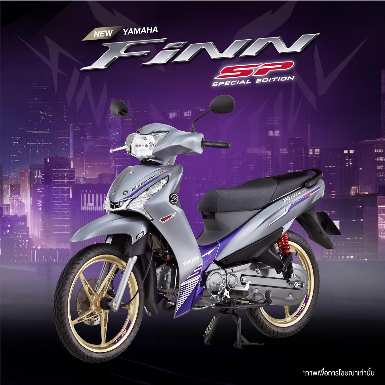
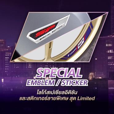
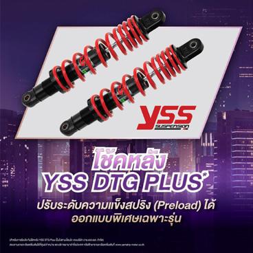
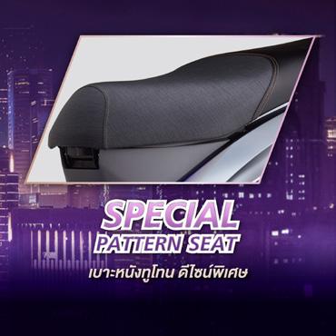
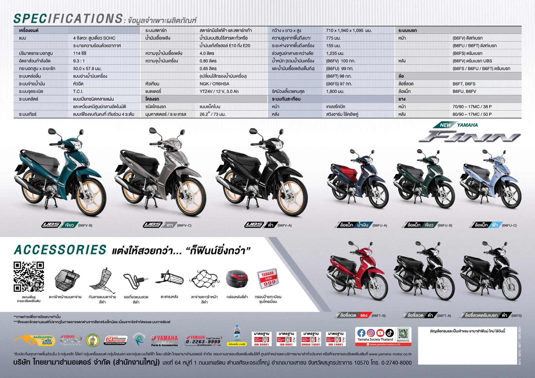
YAMAHA Finn 115i - MY2024
The project leader was responsible for designing the new CMFG ( colors, materials, finishing, and graphics ) for Yamaha Finn 2024 model lineup. I was actively involved from the early stages, participating in discussions to establish hypothesis as a basis for customer surveys. The feedback collected was used to refine the design to better align with the target audience. My work included defining the design direction, developing graphic ideas, selecting color and material combinations, designing the emblem to create a unique identity for the SP Special Edition model, and even developing new materials to be used for this model.
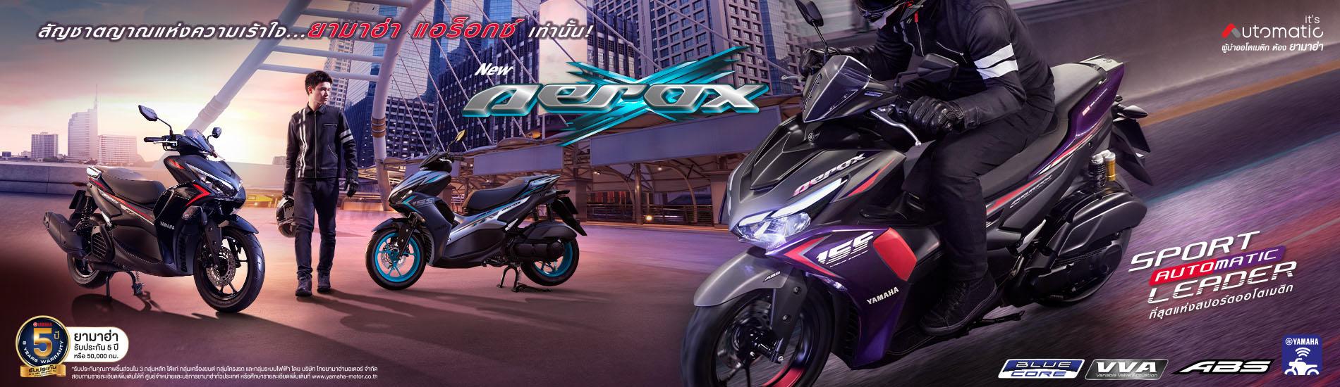
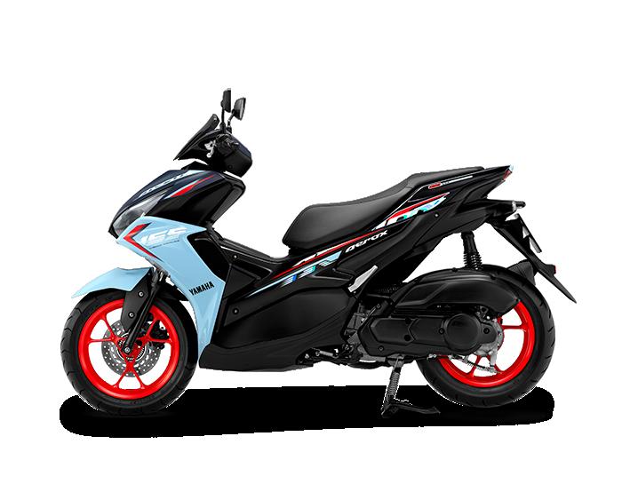
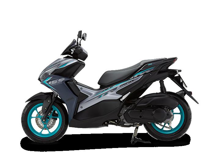
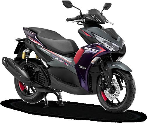
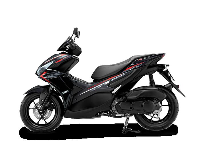
COLORING CHANGE - CMFG PROJECT LEADER
YAMAHA AEROX 155 - MY2024
I was the project leader for the coloring change of the Yamaha Aerox 2023. The project began with researching the background of the sport scooter target audience. After analyzing customer insights, I studied future color trends to define the design direction for refreshing the existing model lineup. Based on these trends and the evolving preferences of sport scooter customers, who were becoming more open-minded, one of the selected color combinations featured a mix of purple and pink to refresh the sporty look.
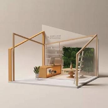
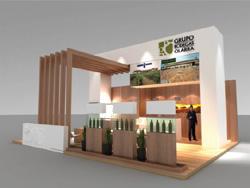
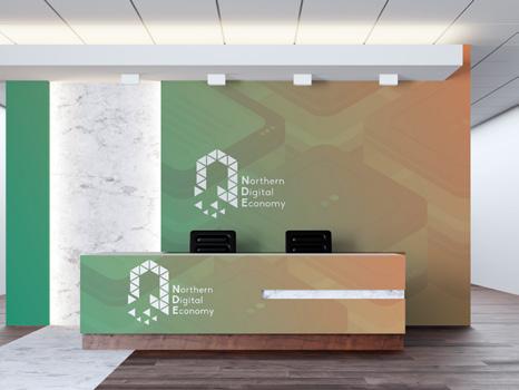
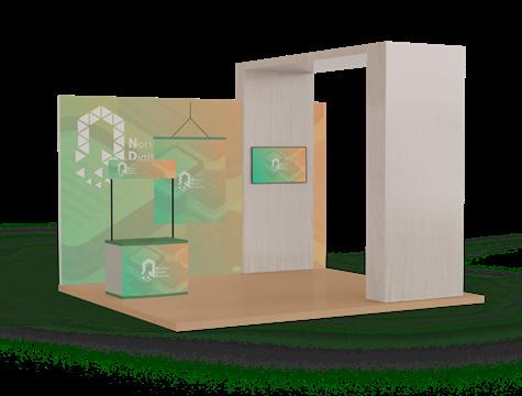
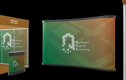
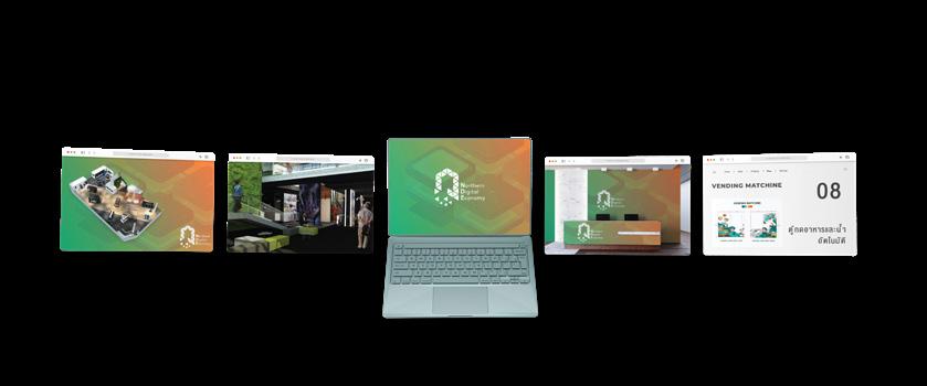
EXHIBITION DESIGN - DIRECTOR
Northern Digital Economy
NDE - Virtual Exhibition
The exhibition design is based on the concept of "Economic", Designed to let visitors experience the way of community life. The design features a smooth color gradient, blending brick orange, which represents the soil as the foundation of growth, with green, symbolizing nature that grows from deep roots. These two colors are the main palette used to bring the concept to life.
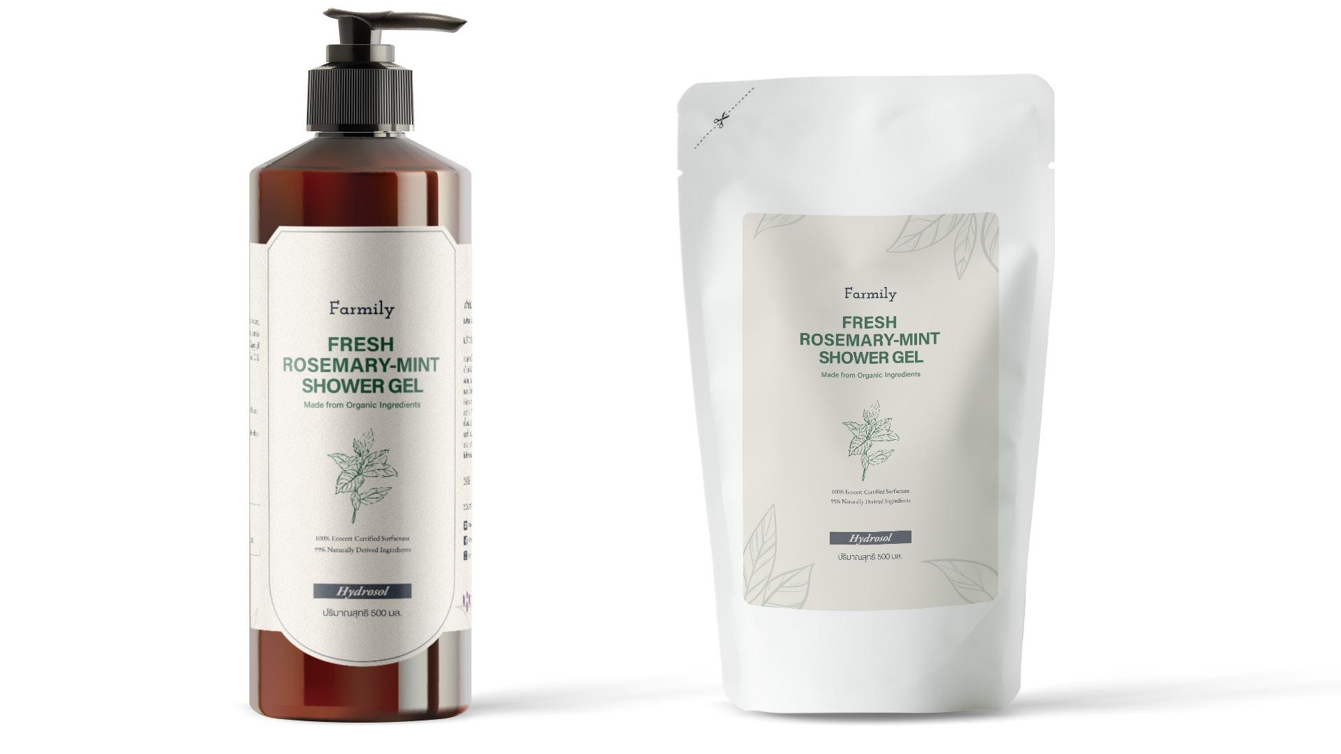
PACKAGING DESIGN DIRECTOR
Farmily - Shower Gel
The packaging design for the Farmily brand features 100% natural bath products. To reflect this, the concept is inspired by organic elements, blended with a minimalist approach. This combination ensures a clean, approachable design that effectively communicates the product’s natural essence. The final look was created with this idea in mind.
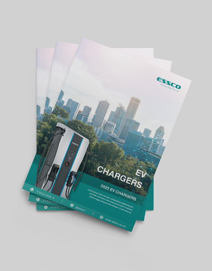
CATALOGUE DESIGN DIRECTOR
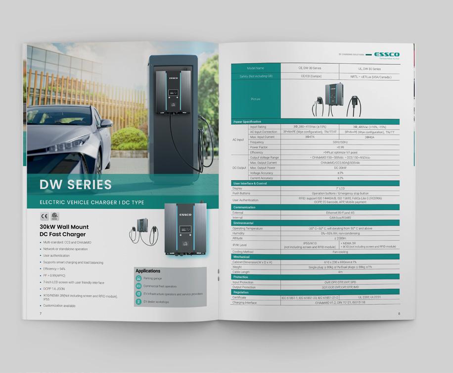
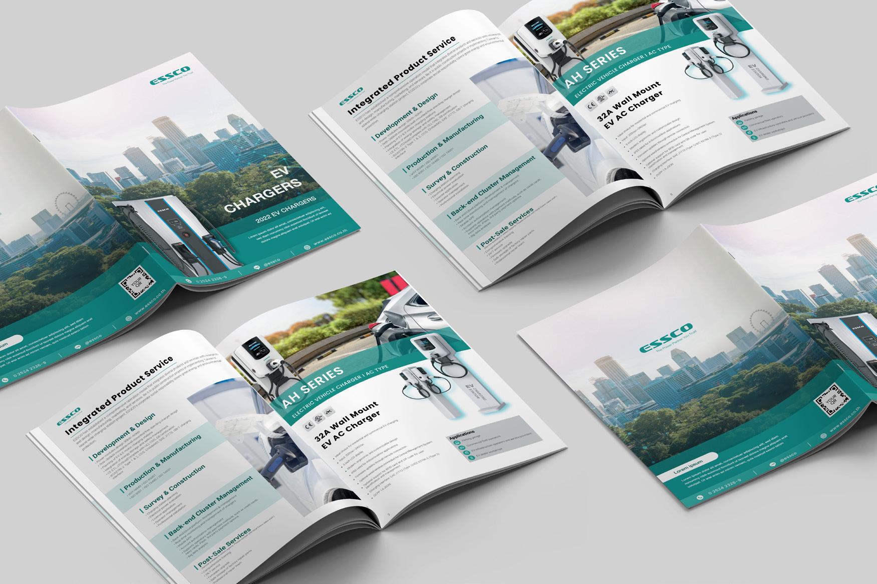
ESSCO EV CHARGERS STATION
The brochure and spec sheet design for Essco, a distributor of EV chargers, was created with the brand’s strong identity in mind. Since the logo already has a bold and powerful color, we incorporated it into the brochure to maintain brand consistency. The mood and tone were designed to blend a natural feel with a digitalized, professional look, ensuring clear communication. The overall composition was crafted to give the brand a more global appeal.
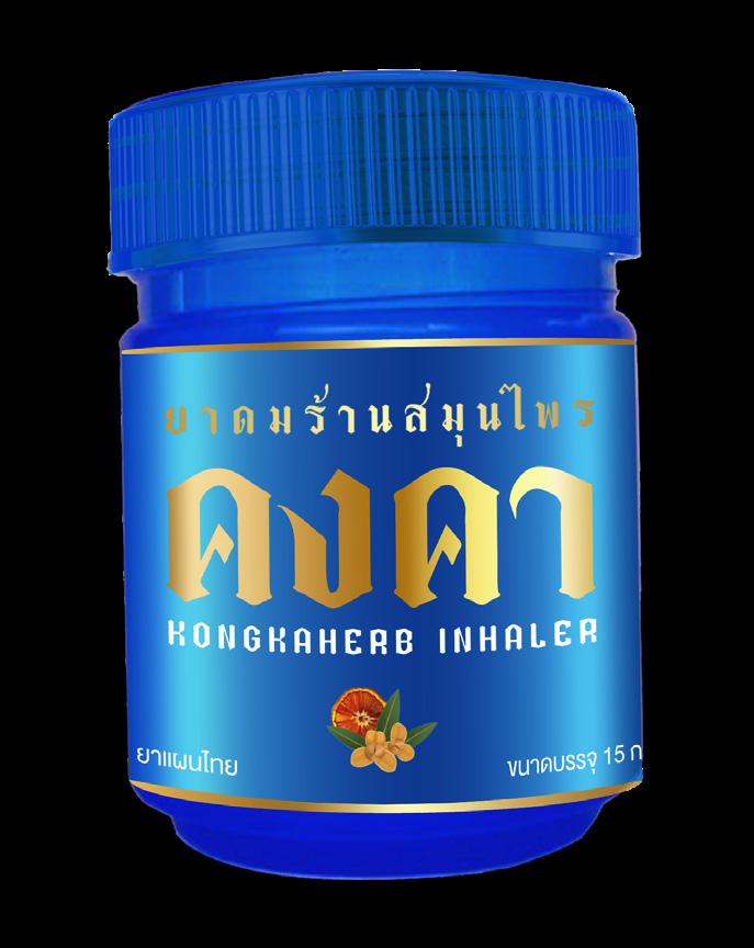
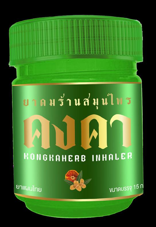
PACKAGING RE-DESIGN
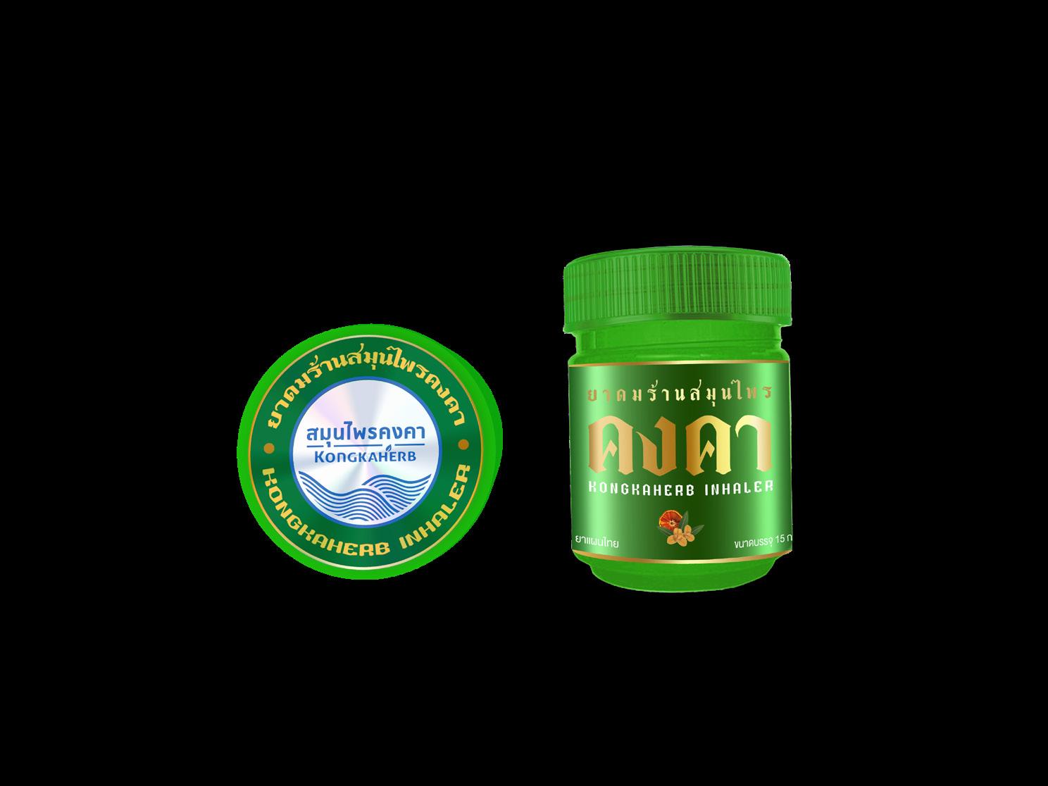
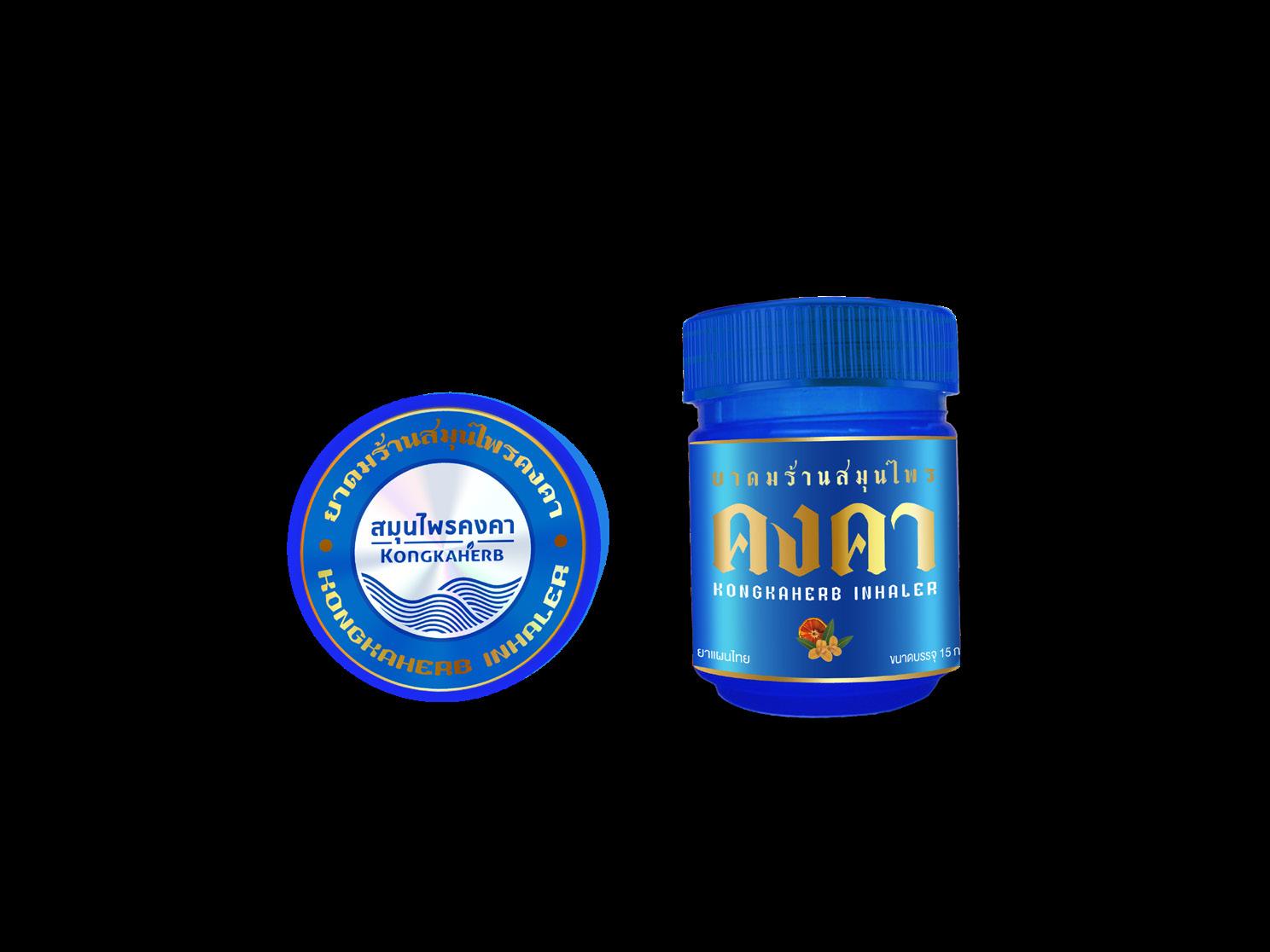
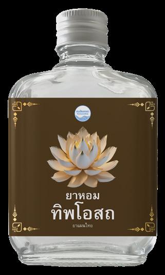
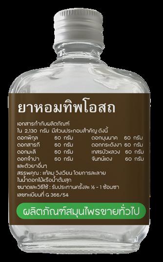
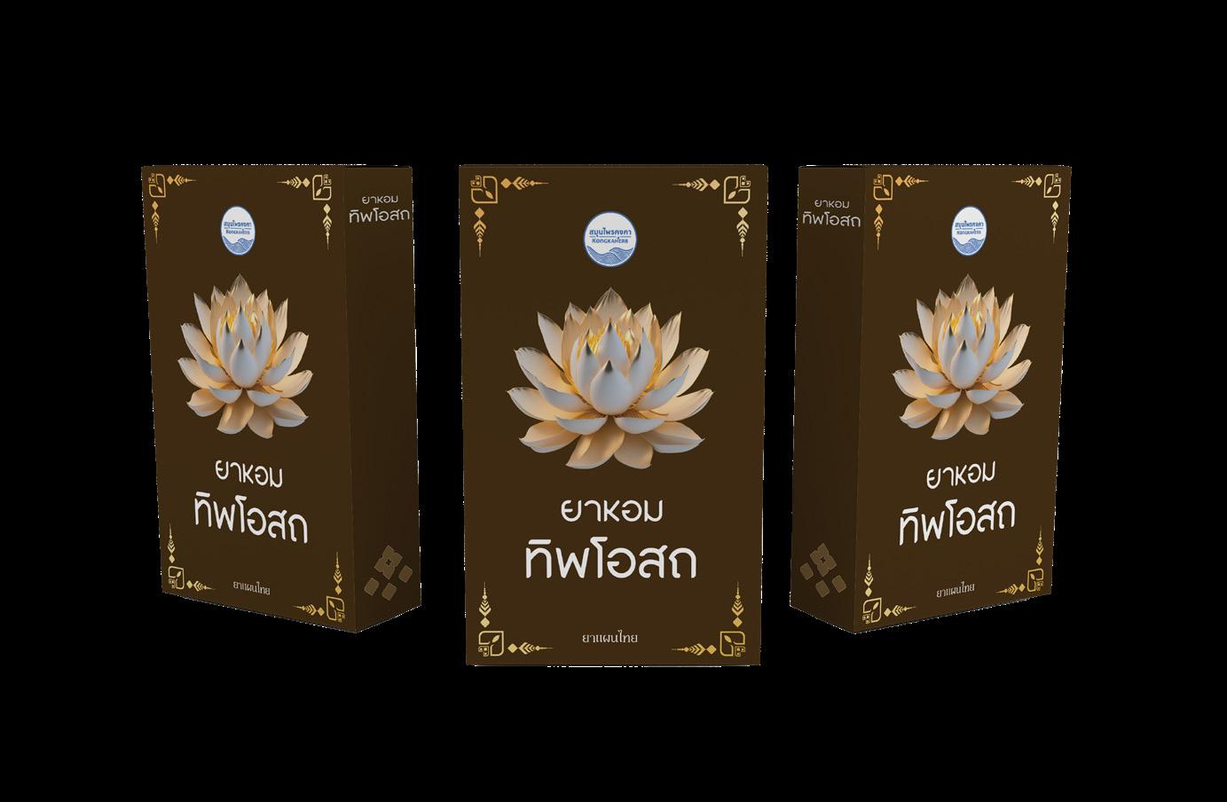
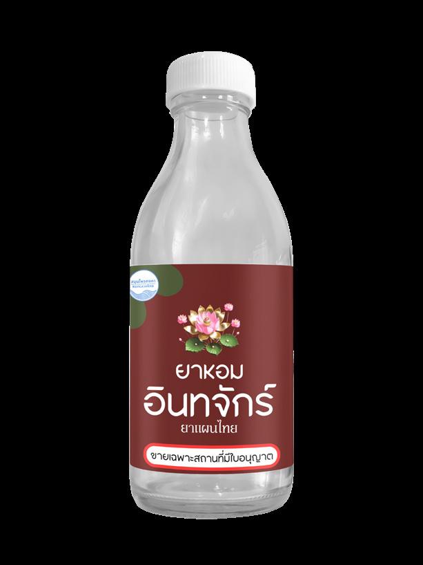
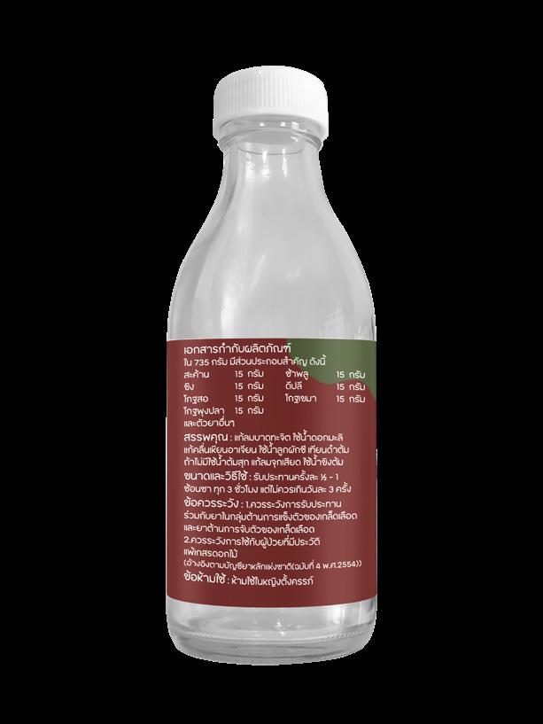
The label design for the Kongkaherb inhaler was created with a concept that highlights Thai identity. A distinctive Thai-style font was chosen to catch customers’ attention and convey the essence of traditional herbal aromas. Additionally, the design includes character illustrations of key herbs, visually representing their scents in a clear and direct way.
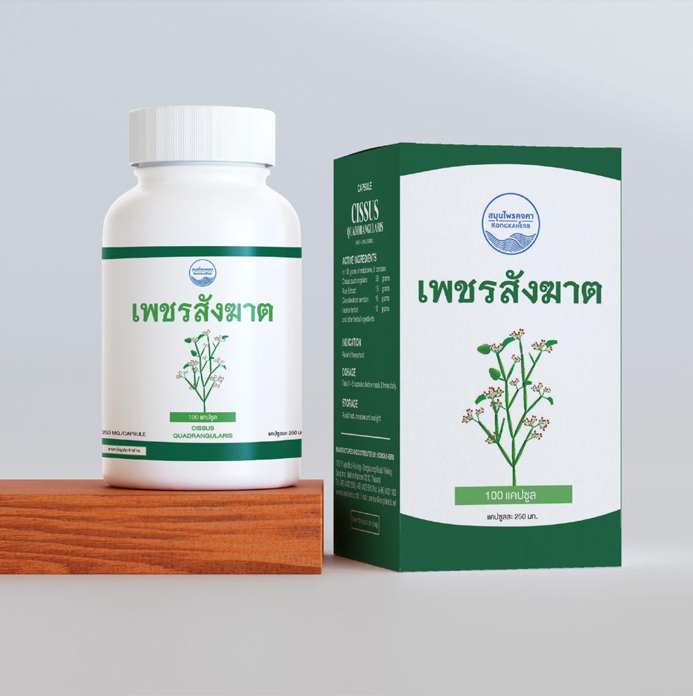
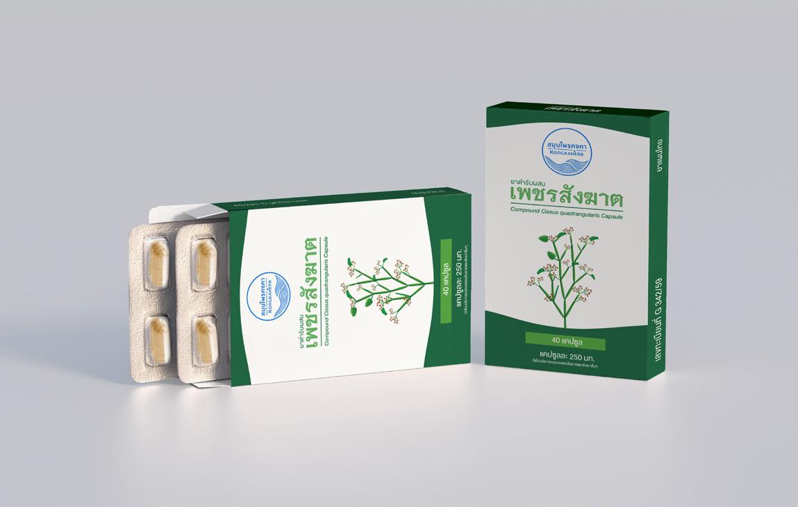
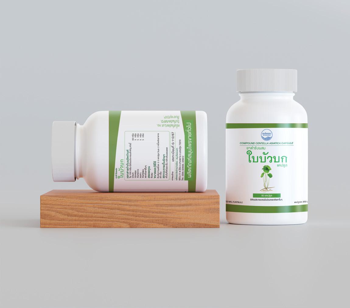
PROJECT RE-DESIGN
- KONGKA HERB
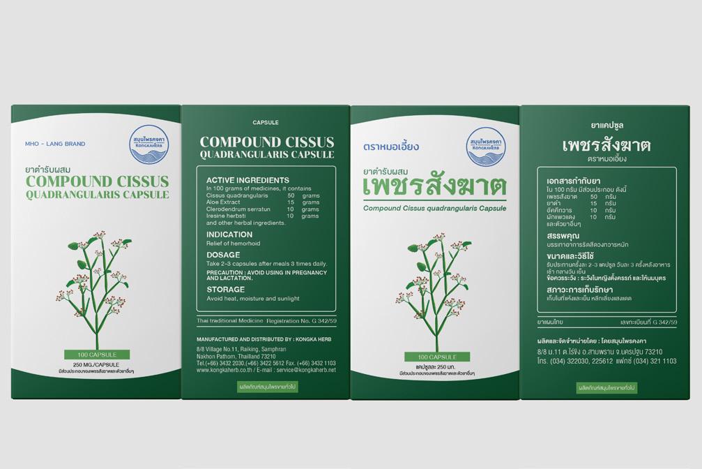
The rebranding project for Kongkaherb medicine packaging includes the redesign of bottle labels, medicine boxes, and tablet packaging. The brand designed to elevate its positioning by shifting from its traditional look to a more modern and refined aesthetic while maintaining its heritage in herbal remedies.
To achieve this, the background design incorporates subtle yet distinctive elements that provide brand consistency. However, the colors are carefully adjusted across different product variations within the SKU lineup, ensuring a cohesive yet easily distinguishable identity for each herbal formula. The result is a fresh, modern, and visually appealing design that enhances brand recognition while staying true to its natural roots.
PROJECT RE-DESIGN
- KONGKA HERB
PACKAGING DESIGN -
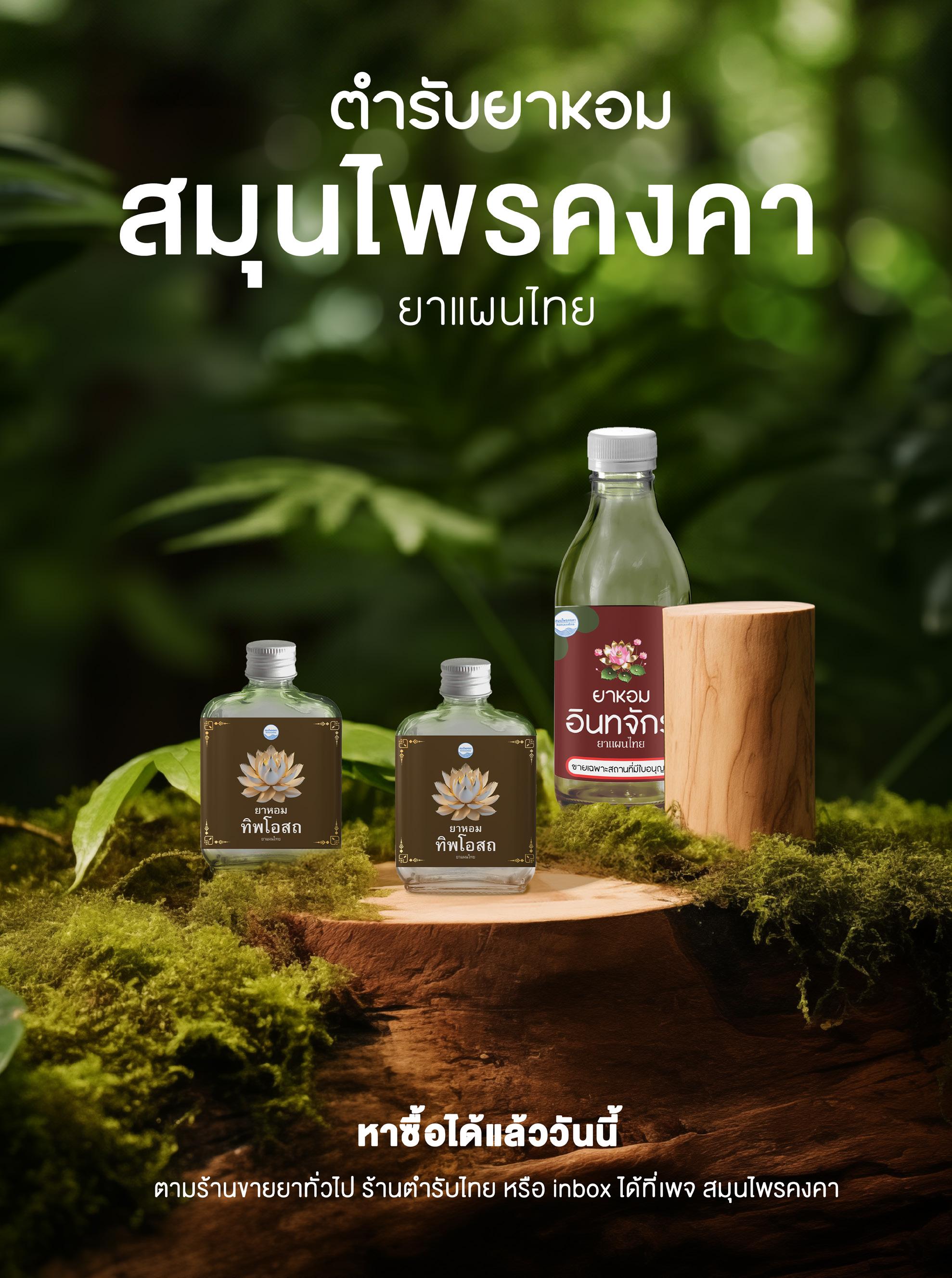
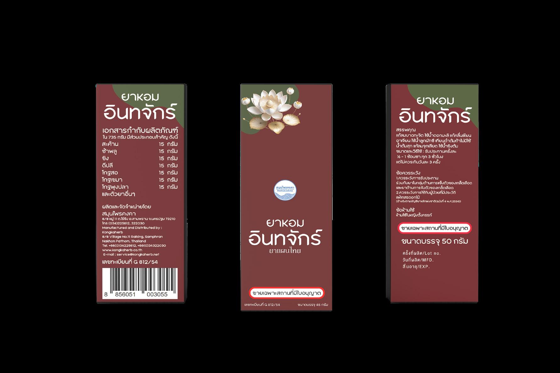
PROJECT RE-DESIGN
- KONGKA HERB
The rebranding of Kongka’s herbal medicine packaging focuses on refreshing the design for traditional powdered remedies that are mixed with water for drinking. Since these formulas are deeply rooted in ancient Thai herbal traditions, the new design follows the concept of "Thai Traditional + Modern."
To achieve this, Thai artistic elements are incorporated into the design, ensuring it resonates with both older customers who appreciate traditional remedies and younger generations who may be curious about Thai herbal medicine. The overall packaging maintains a Thai traditional aesthetic, seamlessly blended with a modern touch, creating a fresh and unique look.
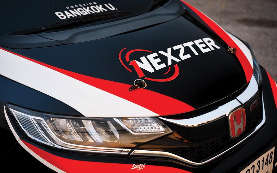
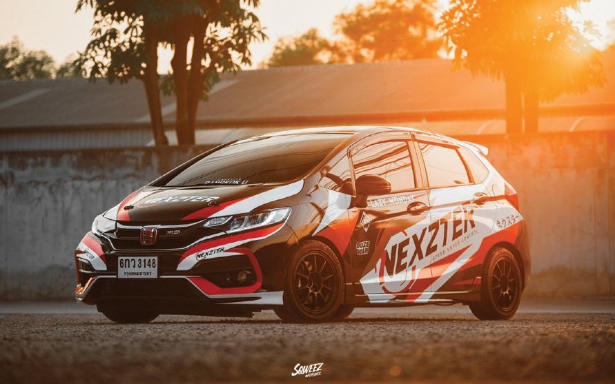
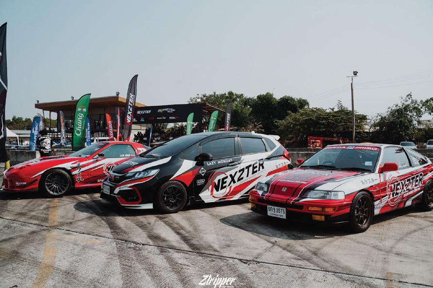
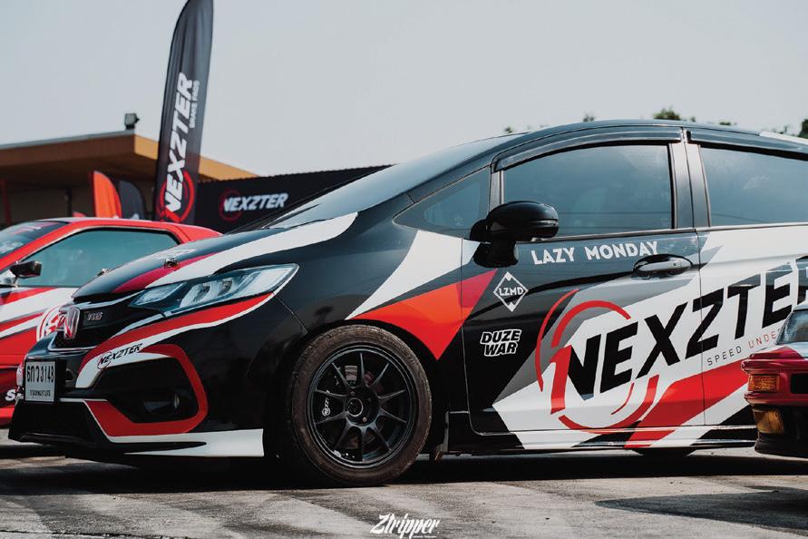
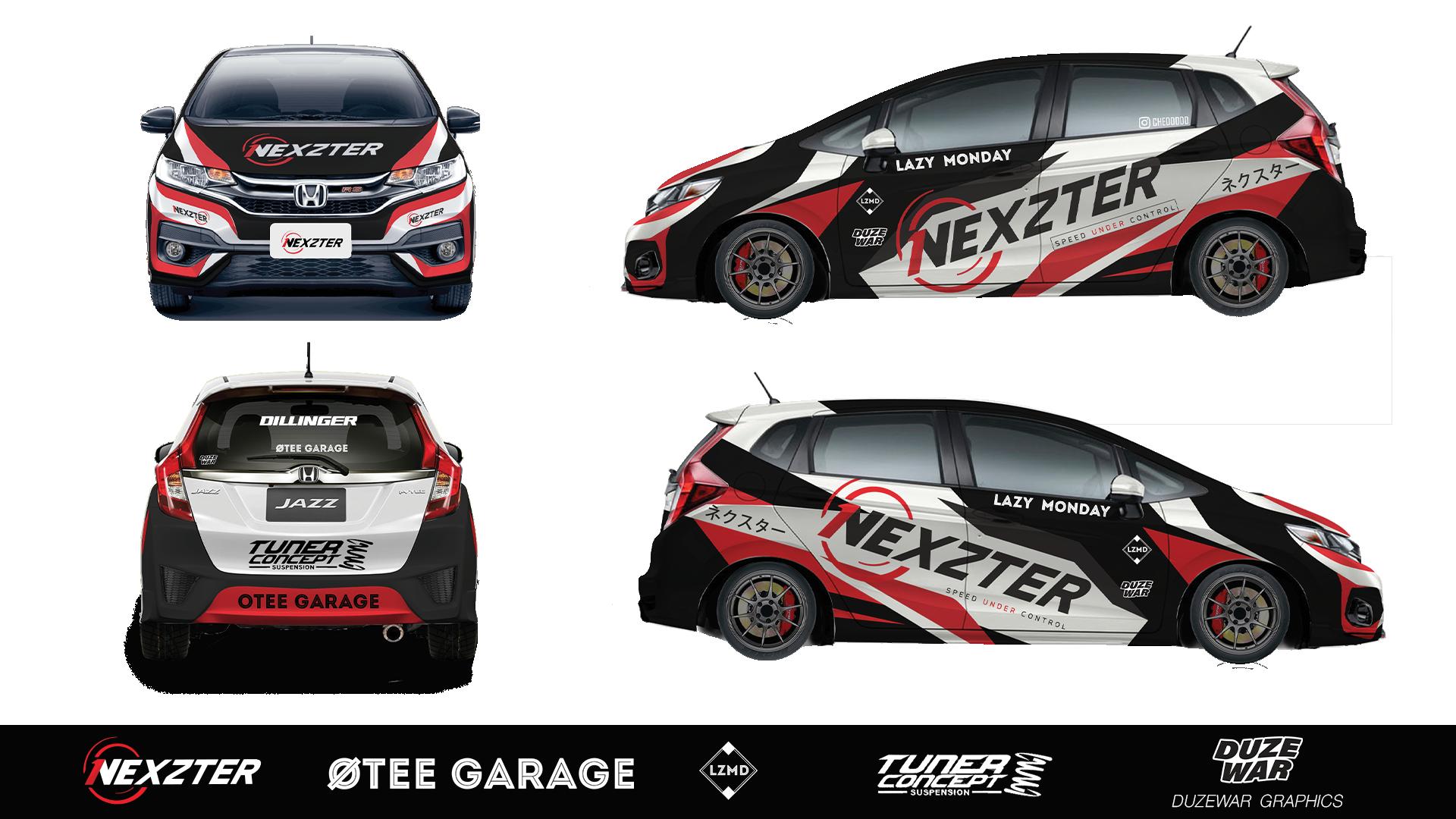
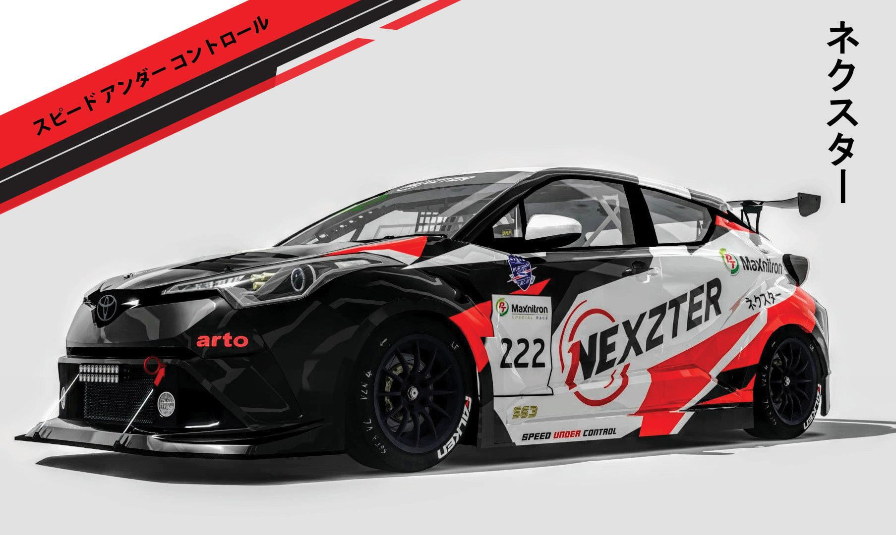
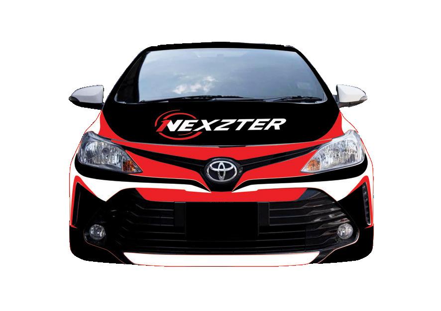
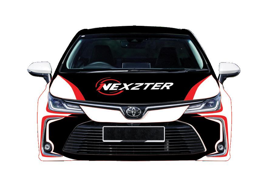
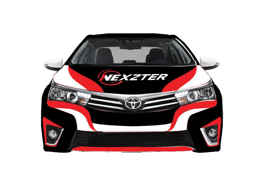
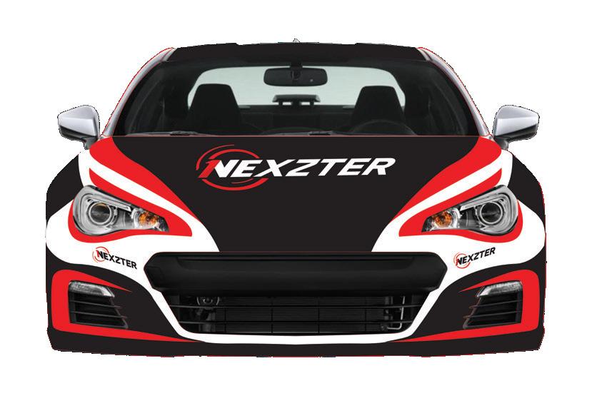
The Project Car Livery Of Nexzter Brand
Event Connection The UnderUp 2020 Car Show - Honda Jazz GK
CAR LIVERY
The Project Car Livery Of Nexzter Brand
Racing competition - PT Maxnitron Chill X Toyota Gazoo Racing
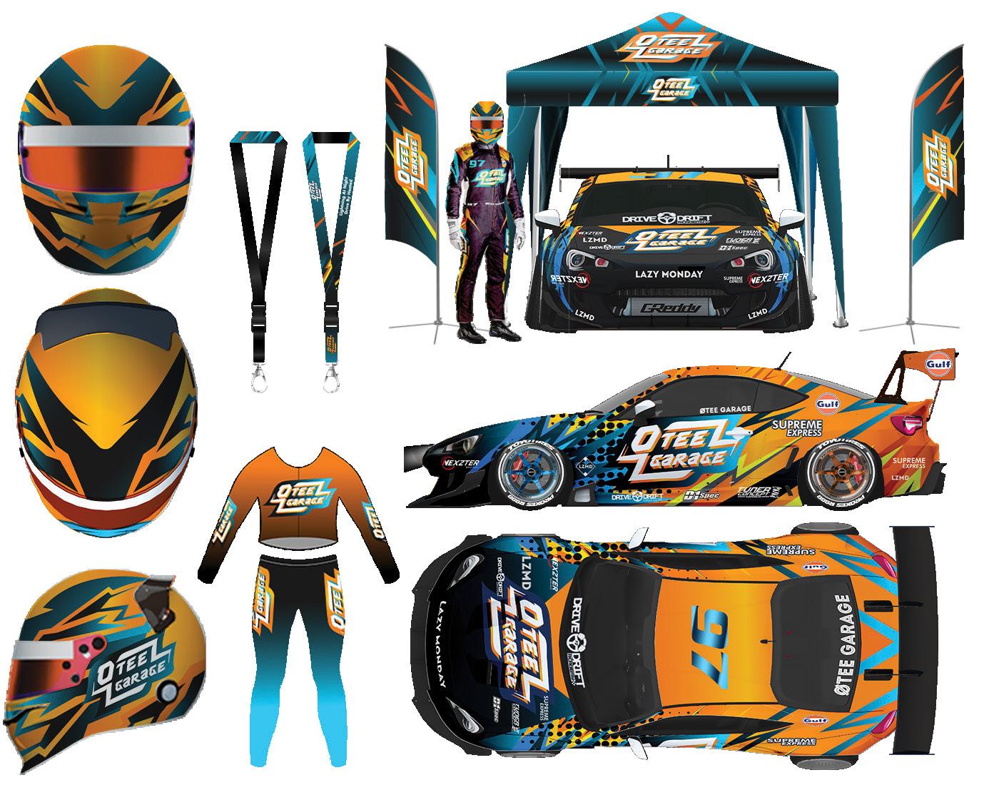
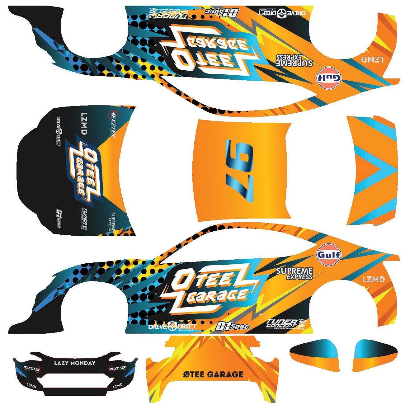
The car livery design for Nexzter was created based on the brand’s request to use red, black, and white - colors that relate to both the Nexzter logo and Toyota Gazoo Racing. However, the goal was to establish a new identity that could be adapted across different types of race cars.
Inspired by the Kitsune Mask, the iconic Japanese fox mask, the design reflects Nexzter’s braking technology, which is developed using Japanese engineering standards. The color scheme and dynamic patterns of the Kitsune Mask were integrated into the Nexzter Car Livery, ensuring a bold and modern look while maintaining the brand’s strong identity. The result is a sleek, sharp, and high-performance-inspired design that stands out on the track.
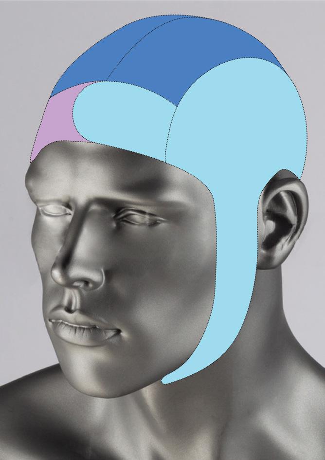
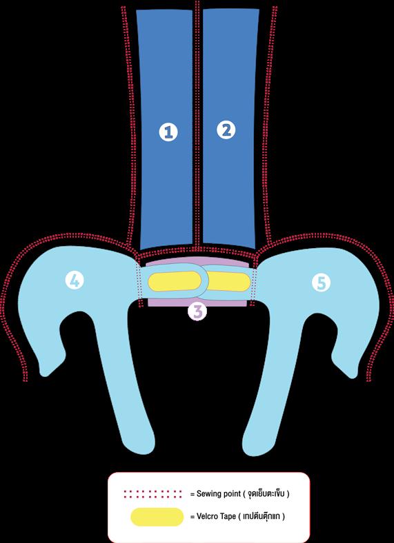
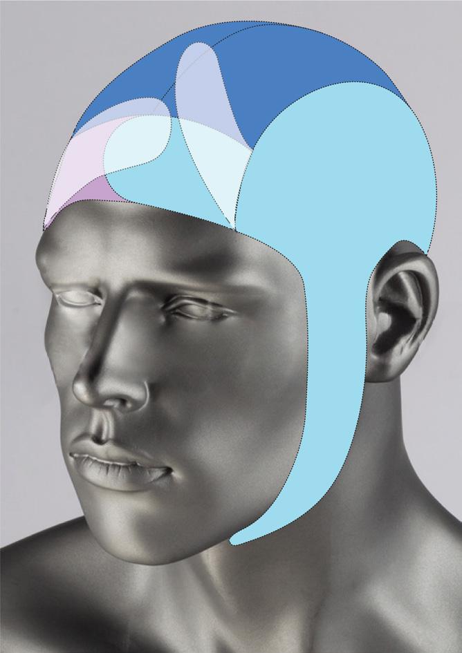
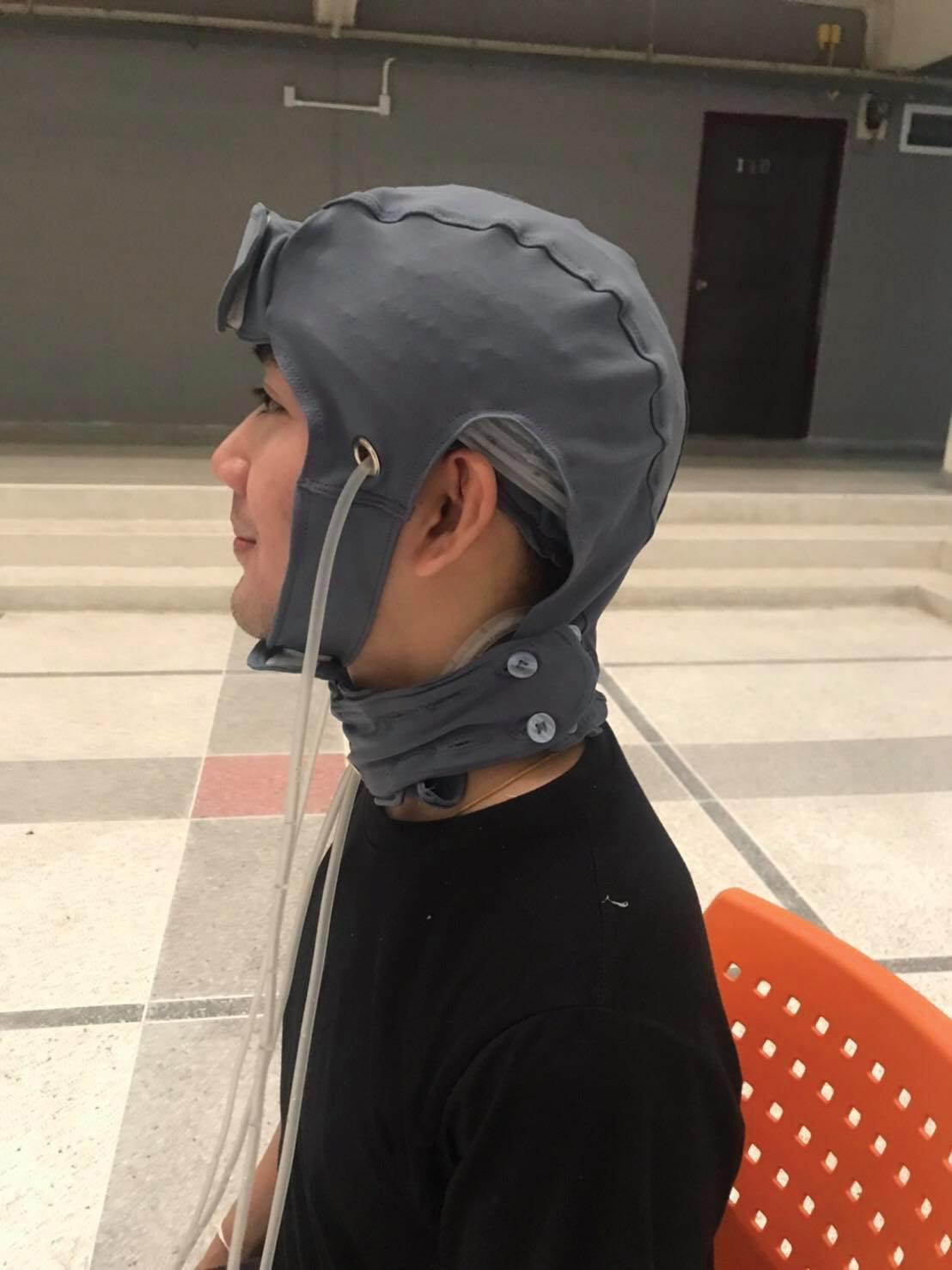
INNOVATION DESIGN PROJECT DIRECTOR
Innovative head cooling cap for reducing body temperature in patients with severe traumatic brain injury and a body temperature higher than normal in the first 72 hours
Faculty of Nursing ,Khon Kaen University
Reference Material
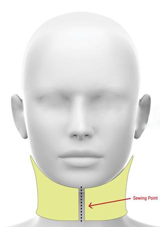
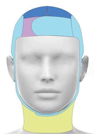
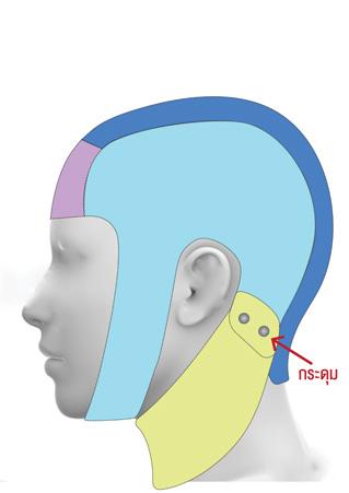
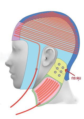
INNOVATION DESIGN PROJECT DIRECTOR
Innovative head cooling cap for reducing body temperature in patients with severe traumatic brain injury and a body temperature higher than normal in the first 72 hours
Faculty of Nursing ,Khon Kaen University
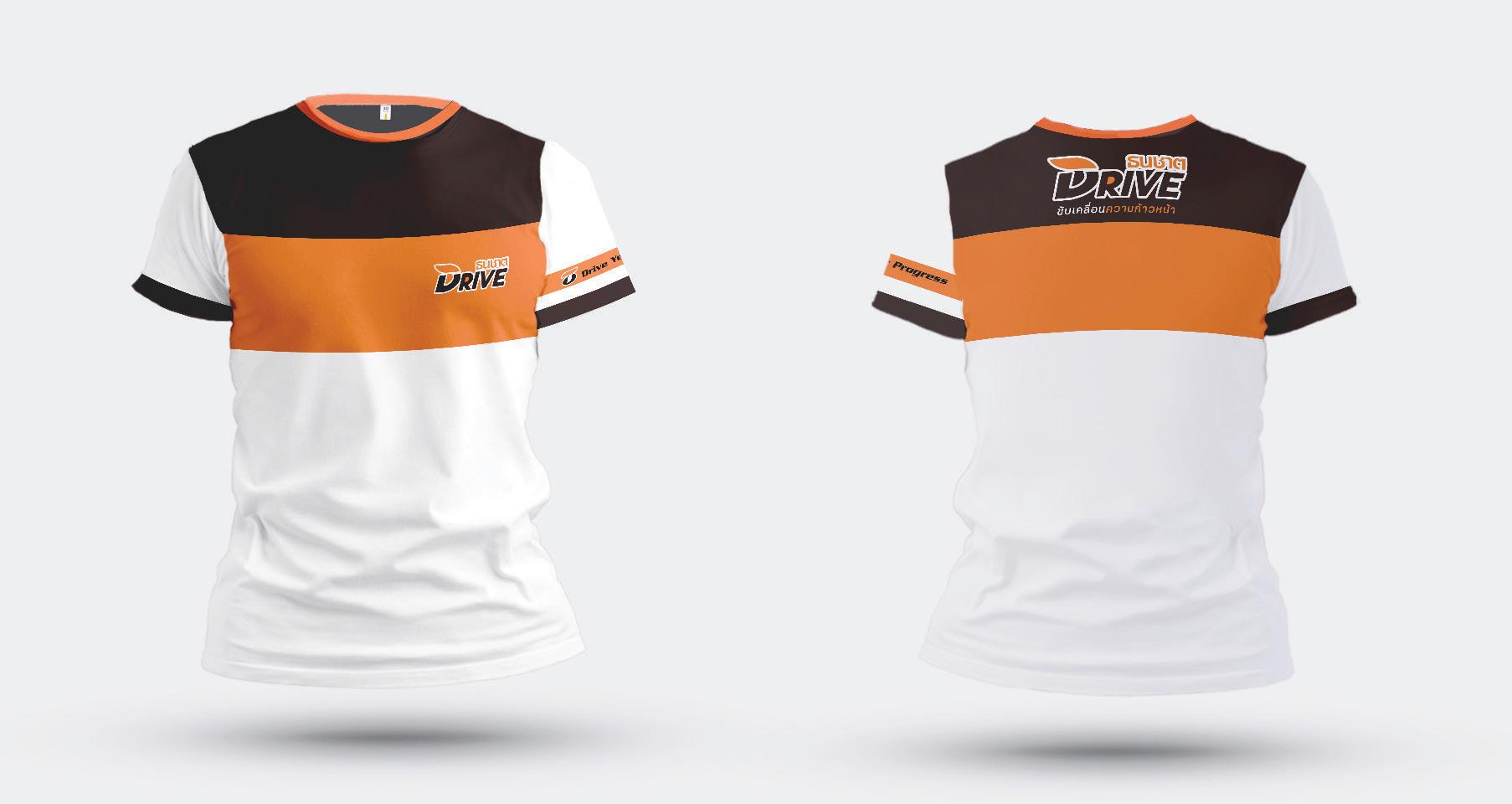
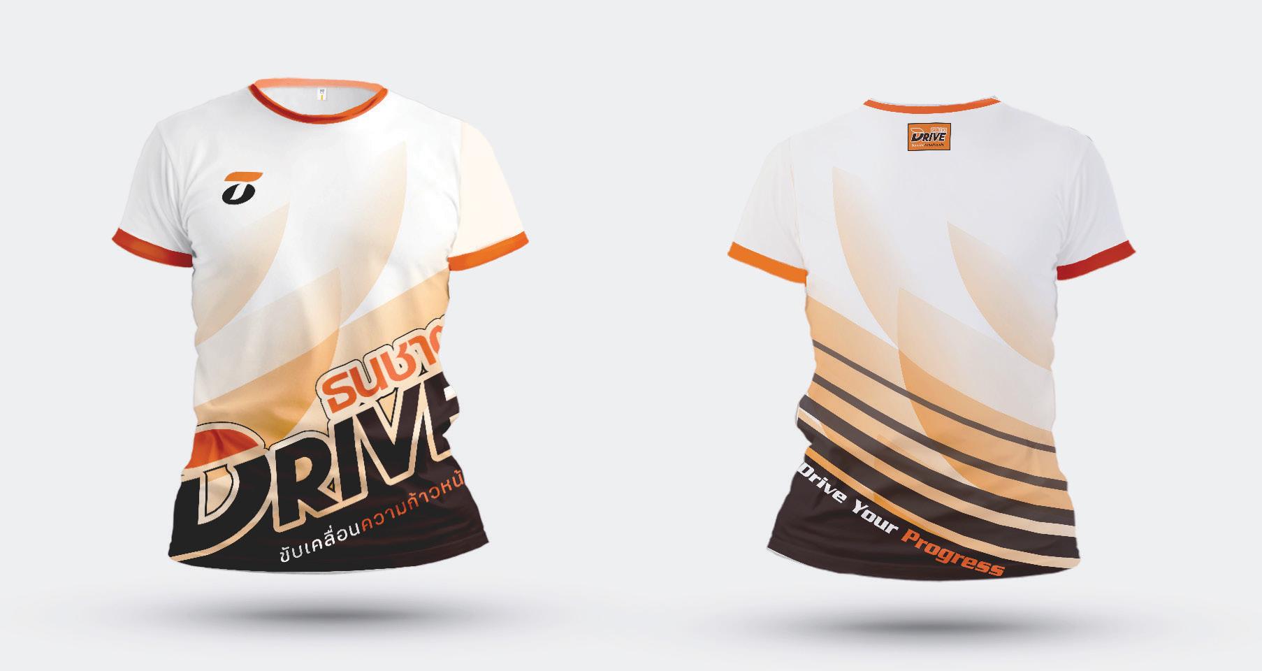
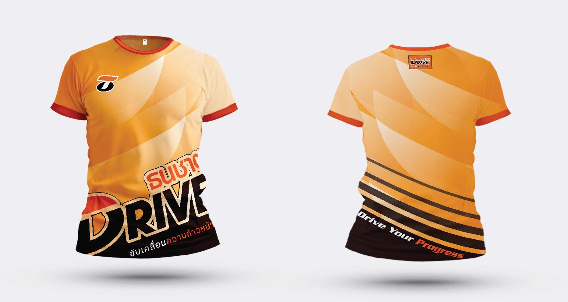
RUNNING JERSEY DESIGN
Thanachart Drive - Running Day 2019
GRAPHIC ON PRODUCT SOUVENIR DESIGN
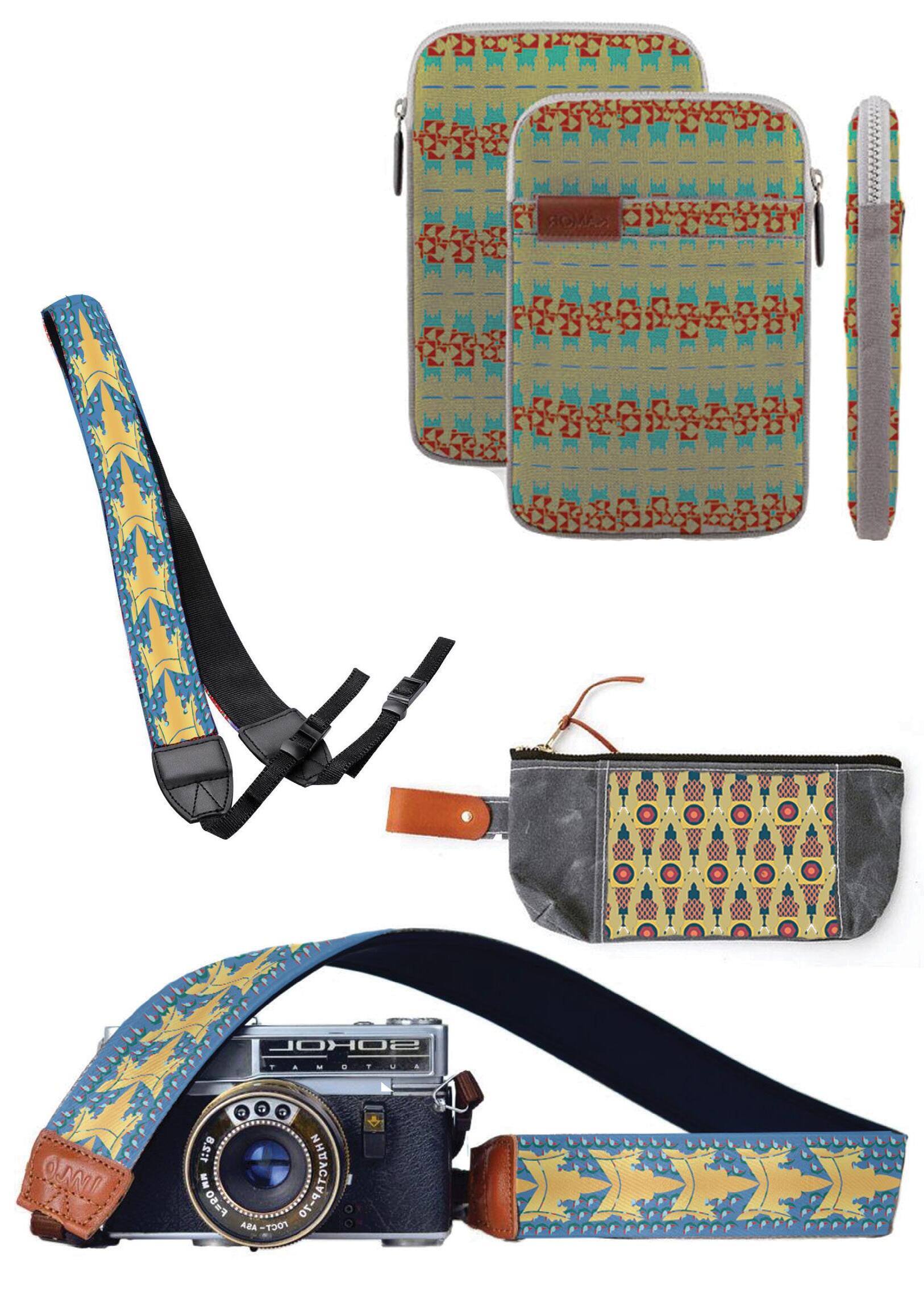
Ayutthaya Identity OTOP Souvenir Contest 2017
The souvenir design competition was held for a local community enterprise in Ayutthaya. Since Ayutthaya is home to many historic temples and is a well-known cultural destination that attracts international tourists, we drew inspiration from its traditional Thai art and temple architecture.
To create a more modern appeal, we simplified these intricate details into a stylized pattern, making the design feel more contemporary. Vibrant colors were also added to make the souvenirs more eye-catching and appealing to international visitors.
CORPORATE IDENTITY DESIGN
The Project Of Identity And Graphic Design About Drift Racing Team Which Inspired By Anti - Gravity, For ‘OTee Garage Team’”