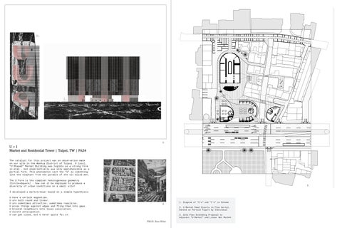


Market and Residential Tower | Taipei, TW | FA24
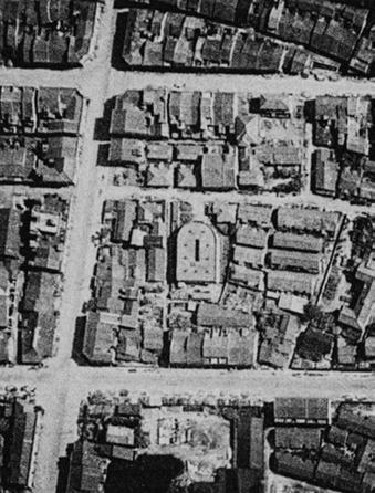
The catalyst for this project was an observation made on our site in the Wanhua District of Taipei. A local, “U-Shaped” Market Building was legible as a strong form in plan - but experientially was only apprehensible as a partial form. This phenomenon cast the “U” as something like the elephant from the parable of the six blind men.
The U-Form is the simplest heterogeneous geometry (Circle+Square) - how can it be deployed to produce a diversity of urban conditions on a small site?
I developed a market+tower based on a simple hypothesis:
U have a certain magnetism.
U are both round and linear.
U are sometimes attractive, sometimes repulsive.
U press things against edges and fling them into gaps.
U bracket neighbours into loose association.
U excite anticipation.
U can get close, but U never quite fit in.


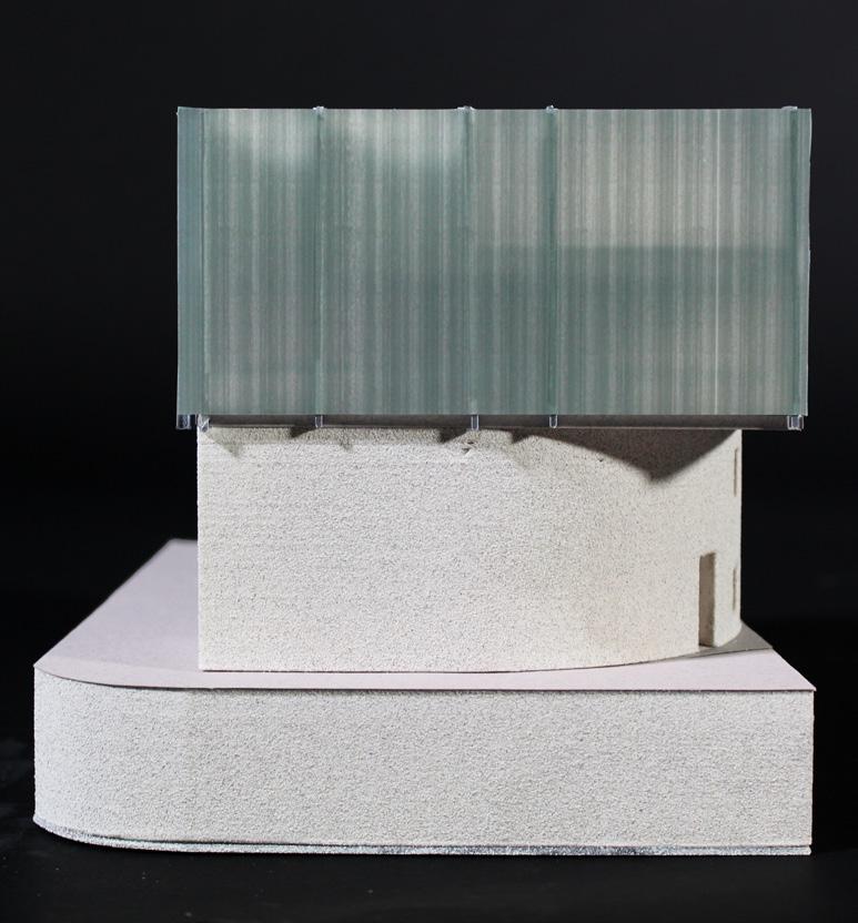
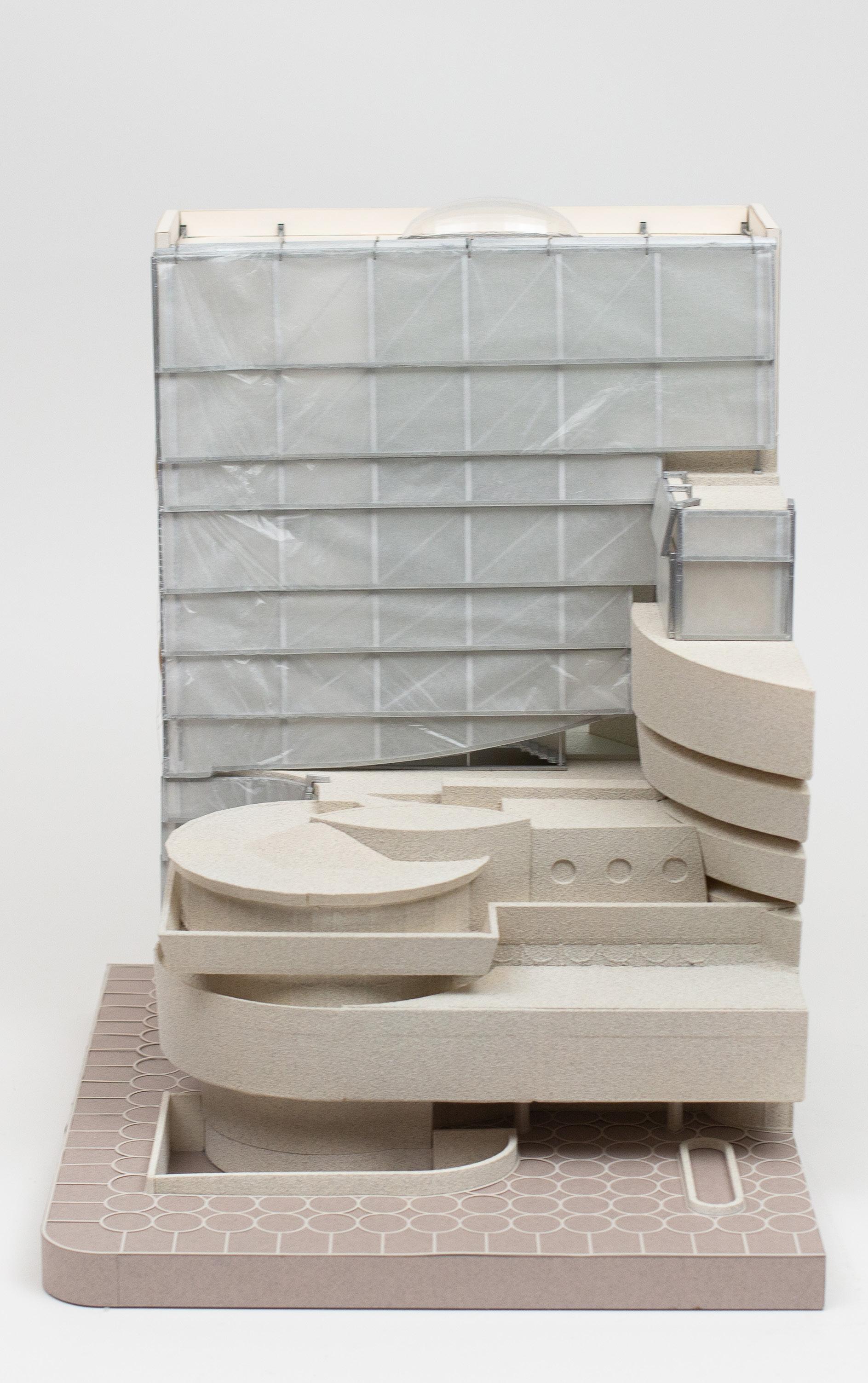
The U’s became brackets which directed circulation both at the level of the site and within the market and tower.
I developed rules for loosely arranging them around “I” cores as in horseshoes.
1. Site Circulation Diagram
2. “U” Technique Diagram
3. Massing Diagram
4. Circulation Diagram


The arrangement of the U’s produced a similar dynamic within the building to what was observed on the site.
In plan, they are recognizable forms which structure circulation and divide floors into diverse program areas.
At the level of experience, they produce a curious parallax effect whereby a subject (You) moving around a fixed U will interpret the object as being mutable.


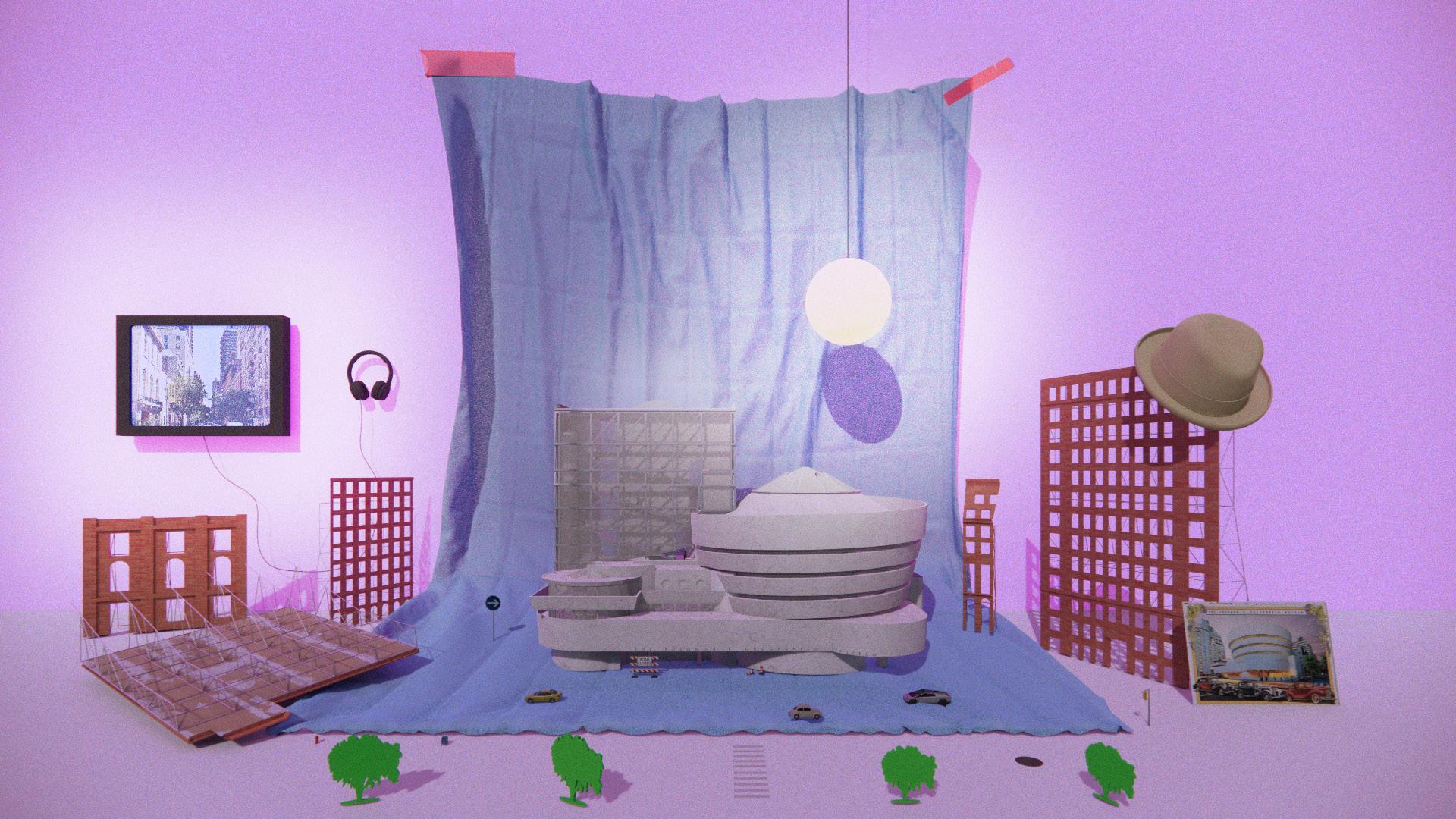
| New York, USA | SP24
The Guggenheim is not just the round. Its present backdrop, a mute Gwathmey Siegel renovation of a noisier 1967 tower gallery, is near the end of its lifespan and congested by vestigial partition walls.
This project suggests a new facade, circulatory system, galleries, and an event space for the tower gallery. Our proposal would produce a secondary common space for the Guggenheim, sufficiently separated from the rotunda that it can continue to host programming during exhibition changeovers of the main gallery space.
The magic of the original rotunda lies in establishing a zone in which people are open to collective experience - it formally suggests alien rules for participation in a way that is productively disarming .
In a similar spirit, we sought to produce a distinct figure with a unique circulatory pattern which remains capable of playing second fiddle to FLW. We hope to extend the museum’s capacity to excite discourse and accommodate different publics and programs.


In order to integrate sectionally with the rotunda, we designed a series of mezzanine floors within the tower. Each floor plate features subtle grading to bridge these spaces and direct visitors to different galleries.
Our primary circulation system is nested behind and within an EPFE curtain facade hung in front of the galleries and behind the existing Guggenheim Monitor structure. From within this skin, views out to Central Park are abstracted and defamiliarized without cutting off the sense that the museum is situated within the city.
1. Exploded 1:200 Plans 2. Render of Proposed Stair Nested Within EPFE Facade


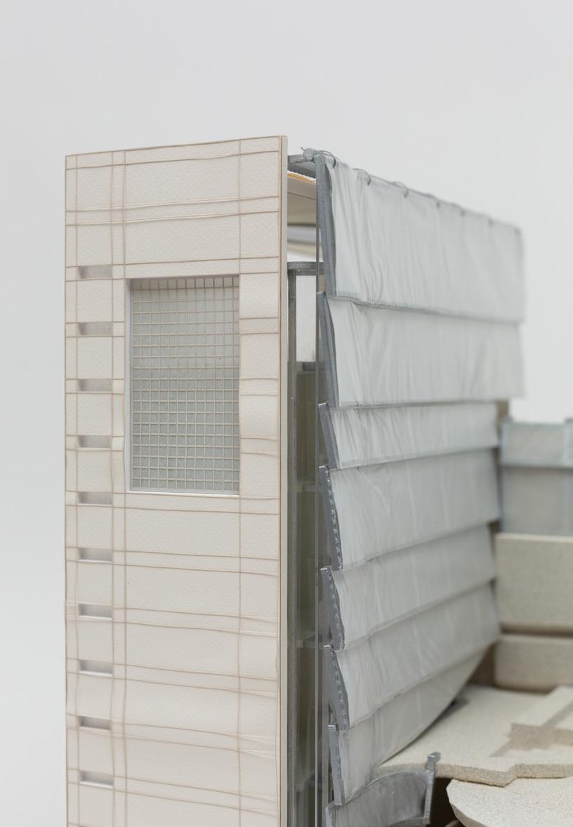


The project was presented at the Guggenheim Museum through this 1:100 Model. As such, it had to simultaneously present the image of the project and didactically explain the relationship between interior spaces and circulation. We opened the back of the model and made the section cut explicit as a foil surface in order to articulate our project to architects and non-architects alike.

SECOND OPPORTUNITY TOWER
Design Archive | Cambridge, USA | (1/2 Module) FA23
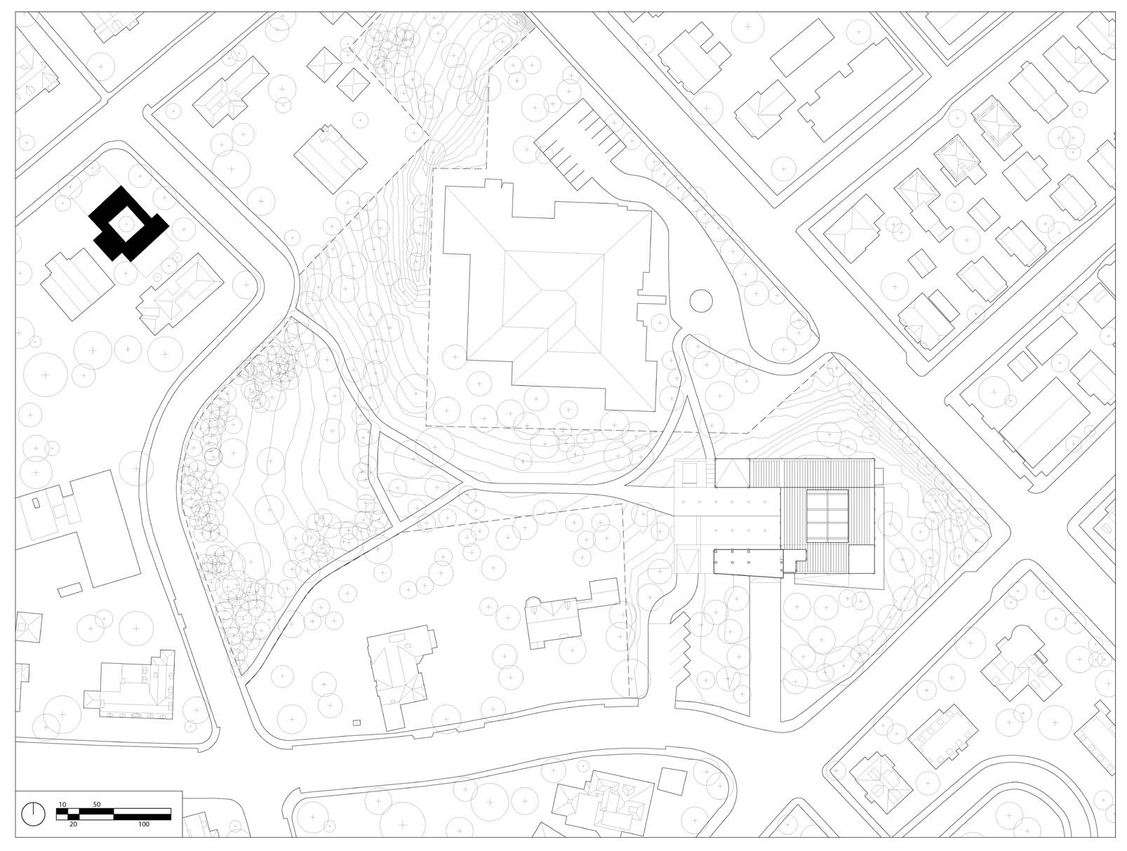
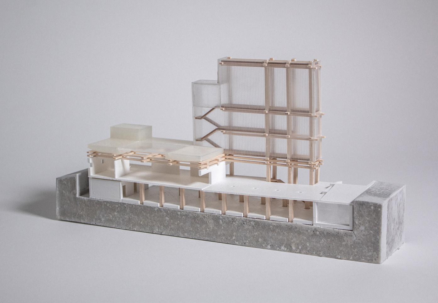
Archival research relies equally on material fact and the narrative infill around it. This project took existing fragments from past studio work (good models produced for bad projects) as a given condition, and sought a structure and organizational system to mediate between them in proposing a new archive building.
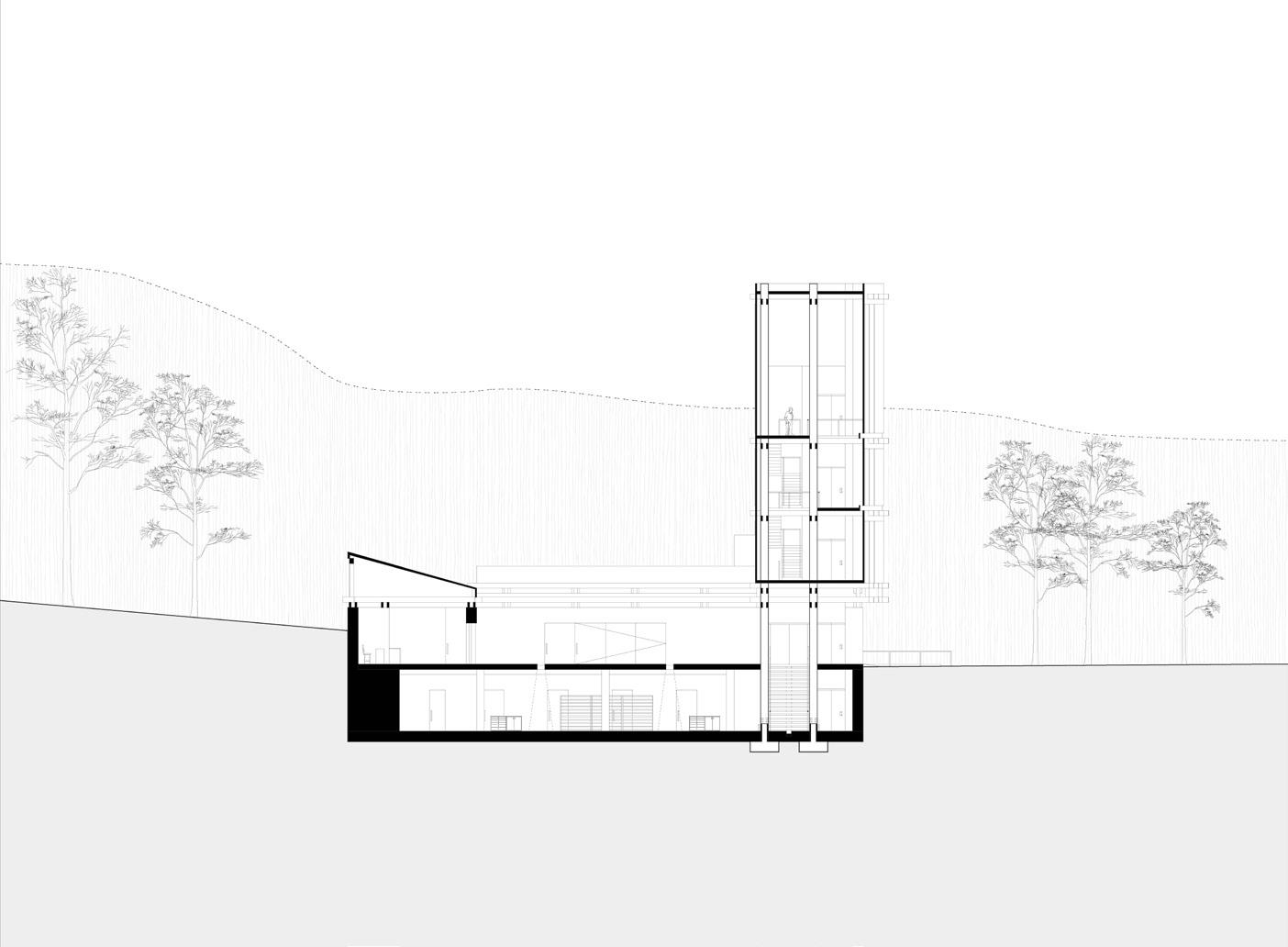
The archive is sited in a shallow divot in Somerville, MA. This position allows for a tall tower amid suburban density and preserves the meandering, arcadian walk between the site and the historic Josep Lluis Sert house to its North. Archival programs are distributed axially (access vertically, store horizontally), these correspond, in turn, with material approaches to light exposure and temperature control.
The decay induced by artifacts’ display is inevitable, but a more conscious hinge point between storage and gallery might benefit both the archive and the public.
I am interested in the way that a piece of a project, reconsidered, becomes legible as a new whole.


This module’s premise was producing architecture while designing as little new material as possible.
My building appears heterogeneous because each program area is derived from a previous study model or chunk.
The basic scheme is split into a tower for research work, a cavernous archival processing bunker, and a large villa housing a cafe and administrative offices.


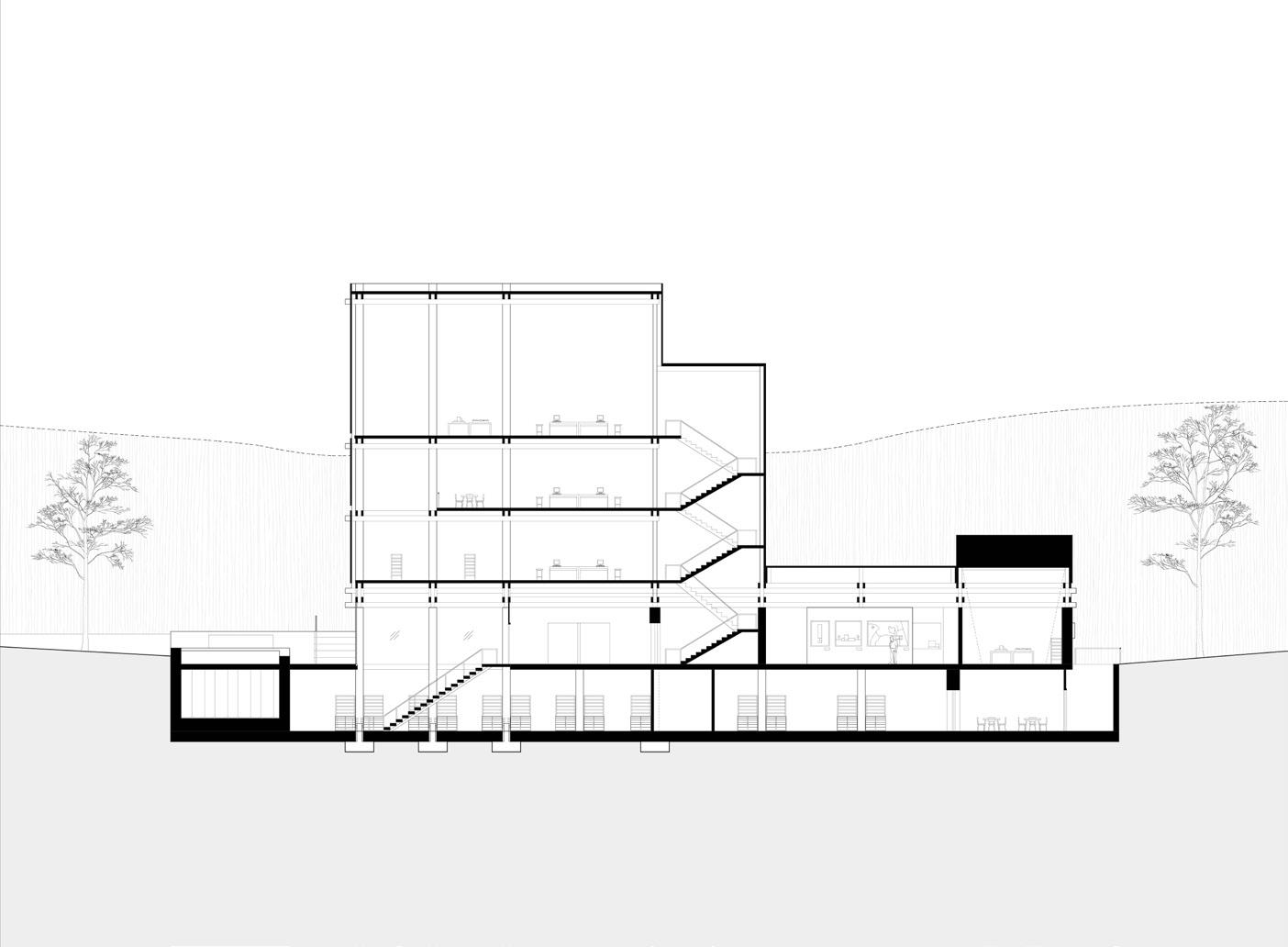


Processing Area for Archivists
In the end, the project took on sophistication in the moments when I had to delicately suture one architectural chunk onto another.
I developed a unifying system of interlocking wood framing which allowed different spaces to take on diverse material, tectonic, and programmatic agendas without reading as incoherent or aleatory.


POST-POST OFFICE Adaptive Reuse | Cambridge, USA | (2/2 Module) FA23
This half-semester module’s topic was necessary interventions for the houseless population of Cambridge. My partner and I identified the Clifton Merriman Post Office as a site of importance for that community, particularly the general delivery mail system by which individuals without an address or P.O box can receive correspondence.
We proposed a renovation of the office’s interior to accomodate a revamped general delivery system. Our intervention retrofit interior walls with thousands of P.O. box panels such that each city resident could have an address internal to the post office and a locker. While the problem is fundamentally urban in scale, we developed a 1:20 model to articulate how we might productively intervene with tools we have as architects.
Our project represented an attempt to take up the collectivist spirit of New Deal architecture and plays on conventions of PWA ornament to question how a post office might serve a new understanding of the public.


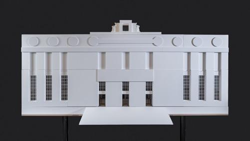


The current ad-hoc general delivery system is a far cry from the uplifting ornament of the WPA Post Office as-designed.
Our project seeks to extend the same dignity of address to all patrons of the USPS by working outwards from the most granular treatment of furnishing elements: benches, service counters, and P.O. boxes.


