Dulux Colour Forecast 2018 Design Edition AU

Page 1

Dulux Colour Forecast 2018

The future of interiors

Design Edition

1

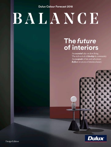
An essential take on slow living The rich revival of kinship & community An escapade of fun and adventure Reflect on an era of timeless luxury


Letter

The colour team at Dulux has been forecasting colour trends for over 18 years. It’s been such a journey and incredible to look back over the early beginnings of our work, from the year 2000 through to today. Colour is enjoying a resurgence in design, and the eclectic combinations of colour we’re seeing in residential and commercial spaces reveals our growing confidence with colour as a tool for design expression. We hope you enjoy the exciting journey that the Dulux Colour Forecast 2018 presents. Balance is desired in many areas of life, whether it be work-life balance or a sense of inner balance. With the future of interiors in mind, the idea of balance is crucial to ensure we can live and work in harmonious spaces that help to stimulate our senses, as well as enable us to relax and retreat. We invite you to immerse yourself in this uplifting world of colour and discover how to transform the essence and mood of a space, so that it feels at once positive and productive.

02

Andrea Lucena-Orr Dulux Colour & Communications Manager


Leading designers use colour to inspire exciting interior concepts.

User Tip Click/tap on any image on the contents page to jump to the trend.

p. 06 Balance Escape, reconnect & replenish using a broad & flexible colour palette. p. 08 Suppliers Explore the designers & retailers behind this year’s Forecast. p. 98

Follow us @duluxaus Share your images with us #duluxcolourau

3 03

Contents

Contributors


Contents

Kinship A rich, earthy palette to warm the heart & heat the hearth. p. 10—31 26 Details Browse the full trend breakdown 27 Palette Explore the Kinship colour scheme 28 Inspiration Top trend picks from Milan Design Week. 30 Designer Edit Tim Webber designs a cosy, warm lounge environment inspired by Kinship.

Essential Calm, nurturing colours to remedy life’s chaotic pace. p. 32—53 48 Details Browse the full trend breakdown 49 Palette Explore the Essential colour scheme 50 Inspiration Insights and Essential colour influences from Milan Design Week.

404

52 Designer Edit Yasmine Ghoniem of Amber Road uses Essential qualities to create an honest & moving space.


Escapade A dreamy cocktail of colours to inspire discovery & escape. p. 54—75 70 Details Browse the full trend breakdown 71 Palette Explore the Escapade colour scheme 72 Inspiration The global trends that helped shape Escapade, direct from Milan Design Week. 74 Designer Edit Bold Escapade colours inspire Flack Studio’s stunning new concept gallery/ retail space.

Reflect A rich, moody palette to blend the past with the present. p. 76—97 92 Details Browse the full trend breakdown 93 Palette Explore the Reflect colour scheme 94 Inspiration The Milan Design Week highlights that modeled Dulux’s Reflect trend.

5

96 Designer Edit Bec Dowie of Douglas & Bec designs a playful yet luxurious living environment with Reflect.


Contributors

Andrea Lucena-Orr Dulux Colour & Communications Manager As Dulux Australia’s Colour & Communications Manager, Andrea Lucena-Orr researches colour trends, presenting her findings to trade and retail markets, and media. Travelling to Milan Design Week, Andrea with Davina and Bree solidified their concepts and insights for the Dulux Colour Trends 2018. “I adore working with colour and experimenting with unusual colour combinations and textures,” Andrea says. “Colour has an amazing power to transform spaces and I love the emotional connections you can create through the personalising of colour schemes.” Andrea highlights Reflect as her top Dulux Colour Trend. “The rich and moody colour combinations used in this trend offer up some exciting opportunities for new colour expression in our home spaces,” she says. @DULUXAUS

Bree Leech Creative Director, Dulux Colour Forecast

As the Creative Director behind the Dulux Colour Forecast, Bree collaborates closely with Andrea and Davina to create each year’s trend predictions. Bringing the trend concepts to life, Bree produces and styles the images and art directs the digital magazine. Bree is passionate about interpreting interior trends into beautifully styled spaces that are both appealing in aesthetic and rich in narrative. Her unique talent for styling inspires others to create new styles and looks for their design projects. “My colour trend highlights for 2018 are Dulux Bombay Pink and Fairoaks,” Bree says. Among her top designer pieces: “The Polar Light by Ross Gardam and Halo Coffee Table by Something Beginning With.” @BREELEECH

06

Throughout the Dulux Colour Forecast you’ll find inspiring colours and ideas on how to bring them into your home. Due to limitations of your display screen and the printing process, photographic and printed images and swatches may not represent true colour. If you love one of the colours from our trends we recommend you review it in accurate colour chips, large Dulux Colour Swatches or sample pots.

View Offline Select the download button to receive an interactive pdf of the magazine. Swatches At the end of each trend you’ll find the full palette of colours, click on the link ‘Order large Dulux Colour Swatches’ and it will take you to the Dulux shop. Here you can order colour swatches to view accurate colours. They are simple to order and delivered direct to your mailbox.


Contributors

Davina Harper Colour & Design Specialist, Dulux As Dulux’s New Zealand Colour Specialist, Davina is fascinated by the constant evolution of colour in response to shifting social influences. In collaboration with Andrea and Bree, Davina applies her interior and colour design expertise to help shape the Dulux Colour Trends 2018. She is passionate about New Zealand design and excited to see local designers represented in this year’s colour trends. “My favourite trend this year is Escapade because of the playful colour combinations,” she says. @DULUXNZ

Mike Baker Photographer Mike Baker is a Melbourne-based commercial photographer who regularly works with stylists and creative directors on commercial

and retail campaigns. His collaborative approach sees him work closely alongside his creative counterparts to bring their projects to completion. Mike’s hands-on approach and diverse skills set extends across both his professional and personal projects. Most recently, his eye for detail saw him extend his visual thinking beyond photography to his own architect-designed home in rural Victoria. @MIKEBAKERPHOTOGRAPHER

Amber Road Interior & Landscape Architecture Studio

Amber Road is one of the most awarded landscape and interiors practices in Australia today. Headed up by Yasmine Ghoniem (Dulux Colour Forecast 2018 contributor), and sister Katy Svalbe, Amber Road is known for its nuanced, sophisticated design approach and practical, considered approach to delivery. A trained interior architect, Yasmine sees colour as a way to express, unfold and deliver something unique and unforgettable. For the Dulux Colour Forecast, Yasmine conceptualises the Essential trend. @AMBERROADDESIGN

Flack Studio Interior Architects Based out of Melbourne, Flack Studio work across residential, hospitality and commercial environments. Their aesthetic is contemporary yet respectfully classic, inspired by the architecture and design of bygone eras, a thirst for travel and adventure, and the delight of discovering unusual and beautiful things. “In our designs we are bold and elegantly masculine,” says Director David Flack. Flack Studio applies its design prowess to the Escapade trend, with exciting results. @FLACKSTUDIO

Bec Dowie Creative Director Douglas & Bec Bec Dowie was lucky to be born into a family that appreciated beautiful things. Growing up on a farm in rural northland, New Zealand, she began designing furniture and

lighting while completing a fine arts degree. “I’m very interested in how the different creative disciplines cross over,” she says. Now a decade on, her design brand, Douglas and Bec, has clients the world over with showrooms in Auckland and Melbourne. For the Dulux Colour Forecast 2018 Bec brings her design eye to re-create the Reflect trend. @DOUGLASANDBEC

Tim Webber Furniture Designer Furniture and Product Designer, Tim Webber, has designed furniture and lighting for home and office spaces for the past six years. He loves to express details which create a sense of intrigue, while also celebrating unique material, colour and texture combinations. “Inspiration for me is drawn from the everyday world around me. From an architectural building detail to the formation of veins through a leaf it’s just a matter of purposefully looking for these details,” he says. For the Dulux Colour Forecast 2018 Tim gets creative with the Kinship trend. @TIMWEBBERDESIGN


As life moves into the fast lane, the desire to shift gears and slow down takes over. The Dulux Colour Forecast 2018 harnesses the power of colour to balance the complex challenges of everyday life.

08

B A

L

A


A

The give and take of modern life keeps us on our toes. The push-pull of work and play, the tension between public image and private self. Our inner sense of health, prosperity and happiness is constantly put to the test, while the prospect of revival, replenishment and relief promises harmony. A broad and flexible colour palette gives you the chance to achieve balance in all aspects of your life. Whether you’re looking to escape, reconnect, replenish or simply move forward, the Dulux Colour Forecast 2018 can be tailored to your creative vision and personal needs. Discover your inner equilibrium through colour.

N C E


10


Kinship TREND I

11

A gentle revolution is underway


Kinship

Sometimes it feels like the bad news just keeps coming. Reports of social and political turmoil fill our news feeds. Between the fake news and click-bate headlines it can be hard to sort the truth from the alternative facts! It’s time to tap out. A beacon of hearth-warming hope, Kinship offers us a source of spiritual wellbeing in hard times. As this gentle revolution gains momentum, we’re empowered to switch off the noise and drown out the negative vibes. To create space for compassion and kindness, truth and transparency. We find new joy in reviving long-held traditions. A colourful mish-mash of cultural influences ignites our sense of community. Renewing our faith in one another and the world around us. This Page From left: Wall with cut-out in Dulux Maiko, background in Herbalist, tall wall in Ruski, low wall in Beige Artefacts, floor in Time Capsule.

12

Kelly Easy Chair by Claesson Koivisto Rune for Tacchini, Stylecraft Previous Page From left: Ceiling in Dulux Reddy Brown, wall in Very Terracotta, background & 3D wall in Herbalist, plinth in Outrageous Red, floor in Time Capsule. Duresta Montgomery Large Bench, DOMO


13


14


From left: Walls in Dulux Ruski, ceiling in Reddy Brown, wall in Sassy, background in Herbalist, wall in Very Terracotta, floor in Time Capsule.

15

Terracotta Pendant, Wyalla; Duresta Montgomery Large Bench, DOMO.


16

folklore

Kinship


revival

This Page Custom design pattern in Kinship colours. From Left: Wall in Dulux Maiko, groove wall in Beige Artefacts, zig zag wall in Red Ochre, background in Herbalist, plinth in Very Terracotta, floor in Time Capsule. Kelly Easy Chair by Claesson Koivisto Rune for Tacchini, Stylecraft.


18


From left: Background & wall in Dulux Herbalist, plinth in Outrageous Red, paneled wall in Sassy, floor in Time Capsule. Gardenia Vases by Jaime Hayon for BD Barcelona, Ajar; Bench Seat, So Watt.


From left: Zig zag wall in Dulux Red Ochre, paneled wall in Sassy, background in Herbalist, zig zag shape in Outrageous Red, wall with cut-out in Maiko. Terracotta Pendant, Wyalla.


Rich, earthy hues intermingle with cosy, neutral shades.


Kinship

pattern &

22

colour From left: Zig zag wall in Dulux Red Ochre, paneled wall in Sassy, zig zag wall in Outrageous Red, floor in Time Capsule. Tattoo Stool by Gert WingĂĽrdh & Sara Helder for Zanat, Hub Furniture.


23


24


25

From left: Background in Dulux Herbalist, wall with cut-out in Maiko, groove wall in Beige Artefacts, zig zag wall in Red Ochre, bulkhead in Herbalist, plinth in Very Terracotta, bulkhead in Ruski, floor in Time Capsule. Kelly Easy Chair by Claesson Koivisto Rune for Tacchini, Stylecraft; Halo Coffee Table, Something Beginning With.


Details

KINSHIP

1

The Kinship trend brings together a diverse mix of cultural references. Furniture forms are inspired by traditional crafts such as wood turning, knitting and sewing. Punctations of red hint at Eastern influences.

2

4

5

Details are informed by familiar and traditional architectural treatments, while colour is simple and uncomplicated, providing warmth without overwhelming the senses.

26

3

1. Parachute Pendant by Nathan Yong for Ligne Roset, DOMO 2. Facett Settee by Bouroullec brothers for Ligne Roset, DOMO 3. Loom Sofa by Adam Goodrum for Nau, Cult Design 4.Ottoman Armchair by Noe Duchaufour-Lawrence for Ligne Roset, DOMO 5. Nub Throne Chair by Patricia Urquiola for Andreuworld, Ke-Zu.


KINSHIP

Palette

The Kinship palette is composed of rich, earthy hues and cosy, neutral shades. This careful intermingling of colours is designed to elevate with its positivity, while also exuding a sense of intimacy and warmth.

1 Beige Artefacts

2 Maiko

3 Time Capsule

4 Red Ochre

5 Sassy

6 Very Terracotta

7 Reddy Brown

8 Herbalist

9 Hildegard

10 Raccoon Tail

11 Ruski

12 Outrageous Red

PROPORTIONS

9

10

2

10

3

3

11

4

8

1

6

11

5

2

For accurate colour representation, order large Dulux Colour Swatches here

12


Inspiration

Dulux Sassy

Deep Sofa by Rafa García for Sancal.

Hayon x Nani Rug by Jaime Hayon for Nanimarquina.

Dulux picks out the top Milan Design Week trends influencing Kinship.

28

Tribal Cues This stunning installation by Jaime Hayon for Caesarstone draws on a diverse mix of folkloric references from Hungarian myths to African tribal influences. Perhaps most distinctive of all is Hayon’s signature tribal mask and furniture featuring animated characters. A fresh and visionary take on Caesarstone surfaces. Caesarstone’s Stone Age Folk by Jaime Hayon, photograph by Tom Mannion.


Eastern Influence References to traditional Eastern design appeared everywhere at the fair. Iconic Chinese ceramics, lantern-like lighting forms, and fabric patterns with traditional Asian motifs sat alongside contemporary references and retro forms like Dimore Studio’s installation. Left: Dimore Studio installation by designers Emiliano Salci and Britt Moran.

Nasa Vases by Roberto Sironi for Incipit.

Welcome Warmth

Antique Tradition

In ‘Warm Welcome Journey to Italy’ blankets become a symbol of protection and haven. These one-off pieces, woven from antique repurposed blankets, address themes of diversity, warmth, comfort and welcome. An important social comment in a time of mass migration.

Above: MASK, Kvadrat x GamFratesi installation.

MASK is a whimsical, expressive installation by design duo GamFratesi. Playing with the iconic shape and expression of the ancient mask, it meditates on textile as the ‘mask’ of a piece of furniture. “It changes its personality, or makes it act in an unexpected way,” they say. References to ceremony, ritual and ornamentation are rich.

29

Yuri Himuro’s Motion Textiles.

Dulux Raccoon Tail

Dulux Red Ochre


Designer Edit

1

KINSHIP X TIM WEBBER

Tim draws on a myriad of cultural and design influences to create an intimate, cosy lounge space.

11

10

“The lounge is the perfect environment for creating a natural connection between people. I’ve used the Kinship trend to inspire a design that cultivates a sense of harmony, understanding and togetherness. Bold forms and solid proportions paired with rich and humble colours keep the space grounded. Setting the tone for this aesthetic is Dulux Herbalist, which I’ve used on the large feature wall. A touch of Very Terracotta emphasises the feeling of warmth, while the addition of deep grey with Ruski neutralises the scheme. Drawing all the colours together and centring the space is Beige Artefacts. To finish, I’ve used a curated collection of furnishings, lighting and objects to highlight qualities of workmanship and craft.”

30

timwebberdesign.com

8

1. Mayu Series Pendant lights, Coco Flip 2. ‘More Than None’ by Matt Arbuckle, Courtesy of Artist & Paul Nache Gallery 3. Timber clad ceiling 4. “Top Heavy’ by Matt Arbuckle Courtesy of Artist & Paul Nache Gallery 5. Gyrofocus Fireplace, Focus Fireplaces 6. Series Sofa by Tim Webber, Tim Webber Design 7. Regal Oak 580 Windsor Wide floorboards, Godfrey HIrst 8. Pony Braid Natural rug, Nodi Rugs 9. Ready Made 1.04 Times Two Blanket 2 Ply / Grey, Plump & Co 10. Pebble Weave Husk rug, Nodi Rugs 11. Pala Armchair & matching Pouf by Luca Nichetto for Artifort, Ke-Zu


3 Dulux Very Terracotta

2

Dulux Beige Artefacts

5

4

Dulux Herbalist

6

9

10 8 Dulux Ruski

7


From left: Low Column in Dulux Mornington Half, background in Dieskau, rounded end wall in Gnu Tan, low wall in Suede Effect Century Mist, floor in Knight Of The Realm.

32

Offset Stool by Philippe Malouin for Resident, District.


Essential TREND II

33

It’s time to slow life right down


From left: Column in Dulux Gnu Tan, background & main wall in Dieskau, cantilever bulkhead in Suede Effect Century Mist, rectangular plinth in Flooded Gum, low wall in Terrace White, square plinth in Noble Knight, round plinth in Clay Court, floor in Knight Of The Realm. Bentu Bai Side table, Remodern.


Essential

Feeling worn down by the fast fashion of a hyper-connected, technology driven life? Essential is the slow living remedy to life’s chaotic pace. As we embrace a more authentic existence, our sense of global consciousness kicks into gear. Showy status symbols lose their shine. Wealth and happiness are redefined by life’s simple beauty. The Nordic tradition of Hygge reminds us to savour the time we have. To be present in the moment. To let nature’s elements nourish our spirit and time spent with family and friends feed the soul. Our search for genuine simplicity inspires a newfound appreciation for natural and recycled materials. As we embrace the old as new, we repair our rifts with nature and move towards a more conscious way of living.

36

From left: Low column in Dulux Clay Court, column in Mornington Half, low wall in Elusive Blue, background in Dieskau, tall column in Gnu Tan, column in Crystal Palace, floor in Knight Of The Realm. Chummy Frizzy Pouf by Maurizio Galante + Tal Lancman for Opinion Ciatti, Space Furniture.


37


From Left: Tall column in Dulux Gnu Tan, background in Dieskau, rounded end wall in Gnu Tan, wall in Spanish Olive, wall in Suede Effect Century Mist, floor in Knight Of The Realm.

38

Trio Sofa Section by Team Form AG for COR, Meizai.


39

Essential’s calm, nurturing palette draws together cool greys and soft, warm leathers.


40


From Left: Wall in Dulux Spanish Olive, low wall in Terrace White, rectangle plinth in Flooded Gum, round plinth in Clay Court, background in Dieskau, low wall in Suede Effect Century Mist, wall in Flooded Gum, nib in wall in Clay Court, square plinth in Noble Knight, floor in Knight Of The Realm.

41

Oshi bench by Tom Skeehan, Skeehan.


Essential

42

simple forms


subtle

texture This Page From left: Wall in Dulux Suede Effect Century Mist, wall in Flooded Gum, floor in Knight Of The Realm. Oshi bench by Tom Skeehan, Skeehan. Opposite From left: Wall in Dulux Suede Effect Century Mist, wall in Spanish Olive, square plinth in Elusive Blue, low wall in Terrace White, rectangular plinth in Flooded Gum. Bentu Dian Pendant Lights, Redmodern.


Fromin Wall Left: Dulux Background Very Terracotta, in Dulux Dieskau, ceilinglow in Natural wall in Terrace White, White, ceiling in Noble Knight, rectangular plinth in ceiling inOlive, Spanish Clay Court. main wall in Flooded nib in White vase Gum, on table wall in Clay Court, round from Country Road low plinth in Mornington Half, floor in Knight Of The Realm.

44

Jehs + Laub Jalis Sofa, Meizai.


45


46


From left:Background in Dulux Dieskau, wall in Flooded Gum, nib in wall Clay Court, square plinth Timeless, round plinth Mornington Half, archway in Dieskau, rounded end wall in Suede Effect Century Mist, floor in Knight of The Realm. Cipria Arm Chair by The Campana Brothers for Edra, Space Furniture

47

A minimalist approach to shapes, finishes and forms is warmed by cosy Hygge vibes.


Details

ESSENTIAL

1

Imperfections are a key attribute of the Essential trend, playing out through textured finishes and a handcrafted aesthetic. Wall finishes such as Dulux Suede Effect allow you to create a bespoke finish that is either heavily textured, or soft and subtle – depending on the application.

2

Paper and fabric are explored as viable materials in the creation of more solid forms whether by the process of upcycling or through innovative manufacturing techniques. 3

5

48

4

1. Luiz Lamp in dark natural FSC cork by Bottcher Henssler, Cult Design 2. Resin Bonded Sand Console #1 in natural, Steven Haulenbeek 3. Pion Composite Paper Lamps by Bertjan Pot for Hay, Cult Design 4. Bilgola Coffee Table by Adam Goodrum for Nau, Cult Design 5. Resin Bonded Sand Vessels #9-11 in light, dark & medium blue, Steven Haulenbeek


ESSENTIAL

Palette

Essential’s calm, nurturing palette draws on the soft warmth of leathers, a pop of bold blue, and the beautiful imperfections of aging materials in rusted tones.

1 Terrace White

2 Dieskau

3 Spanish Olive

4 Mornington Half

5 Crystal Palace

6 Gnu Tan

7 Clay Court

8 Timeless

9 Elusive Blue

10 Noble Knight

11 Suede Effect Century Mist 13 Knight of the Realm

12 Flooded Gum

PROPORTIONS

1

3

3

9

12

13

2

10

6

1

8

2

5

4

For accurate colour representation, order large Dulux Colour Swatches here

7


Dulux Clay Court

Inspiration

The Duet by Hanne G at the Mindcraft Exhibition.

Excavations What is old becomes new again. When London designer Paul Cocksedge found out his studio was destined for demolition, he began to take core samples from the foundations. The materials he excavated concrete and Victorian-era bricks, have formed the basis for five new furniture pieces. Left: Excavated: Evicted installation by Paul Cocksedge.

The key influences shaping Essential, direct from Milan Design Week 2017.

Rusted Beauty Designers like Ariana Prin are celebrating the unique effects of patinas and marks left by other materials. Prin’s Rust Collection is the result of a specially developed metal dust oxidisation process that utilises metal shavings to create beautiful colours and random effects in her ceramic pieces.

50

Rust Collection by Ariane Prin.

Dulux Spanish Olive

Dulux Terrace White


Ceramics at Amour Mon Amour installation by Farge & Blanche.

“ Salvaged materials that document, commemorate & preserve.” Dulux Timeless

Natural Effect Timber’s imperfections like knots, holes and tool markings left behind during the manufacturing process become prized finishes. The ES01 TRUNK table by Philipp Mainzer for E15 is crafted from an individually chosen, single European walnut trunk. Planks are purposely offset to reveal the raw edges of the tree trunk. Below: ES01 TRUNK table by Philipp Mainzer for E15.

Imperfections These curiously beautiful textiles by Studio Liza Freijsen are based on life’s unsightly imperfections mildew and mould, the stains and marks of everyday life left on walls, floors and ceilings. “Embracing Imperfection is a response to the over controlled society in which we live,” they say.

51

Above: Studio Lizan Freijsen ‘The Living Surface’ installation at Masterly.


Designer Edit ESSENTIAL X AMBER ROAD

Yasmine Ghoniem of Amber Road applies an essential ethos to this concept space. “We wanted our design to deliver ‘everything you need, and nothing you don’t’. It needed to be rich in cultural and sensual resonance, while also honest and moving. The resulting concept is based around Essential qualities of Wabisabi and the beauty in the imperfect; the idea of ‘graceful aging’ – highlighted by vintage, patinaed pieces and handcrafted contemporary designs; as well as authenticity – emphasised by a series of honest earthy material gestures. For this space we’ve chosen a neutral base palette composed of subtle tonal changes (Dulux Terrace White, Crystal Palace and Dieskau). Earthy tones of Clay Court, Mornington Half and Gnu Tan help to ground the base palette. An accent of Noble Knight blue is used sparingly and colour blocked to create an arresting contrast between the perfect and imperfect.”

52

amberroaddesign.com.au

1

9

1. Metronome Table Lamp, Apparatus 2. ‘Untitled’, Kareem Ghoniem 3. ‘Portrait of Tommaso de Feo’, Kareem Ghoniem 4. Ceramic Vessels various, Nicolette Johnson 5. Ames Nobosa Rug by Sebastian Herkner, Halcyon Lake 6. Chaise by India Mahdavi, Ralph Pucci 11. 5. 6. 7. Antique Terracotta/The Malina Family Reclaimed Tiles, Gather Co 8. Volcano Onyx, CDK Stone 9. Roly Poly Table and Dining Chairs by Faye Toogood for Studio Toogood, Hub Furniture

8


3 Dulux Terrace White

2

3

Dulux Spanish Olive

4

Dulux Crystal Palace

5 6

Dulux Gnu Tan

7

Dulux Clay Court

Dulux Noble Knight


From Left: Background in Dulux Friends, Arches in Bombay Pink, half round plinth in Tangerine Flake, rectangular plinth in Solution, porthole wall in Bondi, bulkhead in Cuticle Pink, floor in Soft Fresco. Lens Tables by Patricia Urquiola for B&B Italia, Space Furniture; SP01 Jeanette Chair, Space Furniture.

54

TREND III


Escapade TREND III

55

Fun never looked so good


From left: Wall with cut-out in Dulux Purple Balance, half round plinth in Sir Edmund, background in Friends, rectangular plinth in Solution, porthole wall in Bondi, side wall in Carmen, bulkhead in Cuticle Pink, floor in Soft Fresco.

56

Federation Cube, Porcelain Bear; Buds 3 Table Lamp by Rodolfo Dordoni for Foscarini, Space Furniture; SP01 Jeanette Chair, Space Furniture.


57


Escapade

Pack your suitcase, don your espadrilles and upgrade to those premium class seats. The time for holiday and adventure is here. Everybody can be a global citizen in 2018. Escapade gives you permission to create your ultimate dream destination in full living colour. Kick back and prepare to take off, let your dreams run wild. Adventure and discovery hover on the horizon. Paradise is just a plane ride away. The glamour of travel lives on in the fine leather finish of your designer luggage and the free-spirited selfies filling your social feeds. Luxury is what you make it – a hot Brazilian beach, a stylish Palm Springs spa, or a Miamiesque pina colada.

58

From left: Wall with cut- out in Dulux Purple Balance, half round plinth in Sir Edmund, background in Friends, rectangular plinth in Solution, porthole wall in Bondi, side wall in Carmen, Bulkhead in Cuticle Pink, floor in Soft Fresco. Federation Cube, Porcelain Bear; Buds 3 Table Lamp by Rodolfo Dordoni for Foscarini, Space Furniture; SP01 Jeanette Chair, Space Furniture.


60


Organic shapes blend with solid forms in a lively clash of styles.

Federation Cube, Porcelain Bear; Buds 3 Table Lamp by Rodolfo Dordoni for Foscarini, Space Furniture.

61

From left: Background in Dulux Friends, porthole wall in Bondi, short wall in Pale Mustard, rectangular plinth in Solution, half round plinth in Sir Edmund, wall in Purple Balance, floor in Soft Fresco.


62


From Left: Arches in Dulux Bombay Pink, background in Friends, wall in Cuticle Pink, low wall in Carmen, round plinth in Tangerine Flake, floor in Soft Fresco.

63

Lens Tables by Patricia Urquiola for B&B Italia, Space Furniture; Pianca Tosca Sideboard, Meizai; Polar Lamp, Ross Gardam.


64 Escapade


playful blends This Page From left: Plinths in Dulux Tangerine Flake & Solution, floor in Soft Fresco. Opposite Background in Dulux Friends, porthole wall in Bondi and Solution, short wall in Pale Mustard, wall in Purple Balance


From left: Half round wall in Dulux Sir Edmund, geometric wall in Soft Fresco, Solution & Sir Edmund, background in Friends, rounded end wall in Bombay Pink, wall in Purple Balance, rounded end plinth in Bombay Pink, floor in Soft Fresco.

66

1 + 1 Round Coffee Table by Stefano Gaggero for Pianca, Meizai; Bell Pendant by Adam Goodrum for Nau, Cult Design.


67


A lively interplay of pattern and colour is at once both nostalgic and futuristic.

From left: Background in Dulux Friends, rectangle plinth in Solution, wall in Carmen, geometric wall in Soft Fresco & Solution, floor in Soft Fresco Miniforms Illo Tavolino Coffee Tables, James Richardson; Bentu Tu Pendant, Remodern


69


Details

ESCAPADE

3

2

The diagonal line is directing its very own trend. Found in the fine detailing of bespoke furniture, and popping up in architectural details, painted patterns and floor tiles.

1

4

5

70

With a distinct nod to the 80s, quirky shapes are finding their way back into our furnishings. Offset by the colourful undercurrents of the Memphis Movement as well as a 50s Palm Spring vibe.

1. The Other Rug by Alex Proba for CC-Tapis, Loom Rugs 2. Shibam 1 mirror by Ettore Sottsass for Glas Italia, Space Furniture 3. Anda Armchair by Pierre Paulin for Ligne Roset, DOMO 4. Besta Storage Unit, IKEA 5. EJ 123 Toward Sofa by Anne Boysen for Erik Jørgensen, Cult Design


ESCAPADE

Palette

Escapade channels a tropical holiday vibe with a heady combination of saturated colours thrown into relief by cool mints, deep teals and powdery pinks.

1 Soft Fresco

2 Solution

3 Bondi

4 Friends

5 Cuticle Pink

6 Bombay Pink

7 Carmen

8 Purple Balance

9 Pale Mustard

10 Tangerine Flake

11 Blue Sail

12 Sir Edmund

PROPORTIONS

5

3

10

11

8

4

4

9

1

5

1

7

12

2

For accurate colour representation, order large Dulux Colour Swatches here


Inspiration

Saturated Hues Cassina celebrated its 90th anniversary by engaging Patricia Urquiola to create its showroom display for Milan Design Week. The mood captured a blend of past and present with a distinct new approach to interiors, tempered by the familiar undercurrent of retro references. Colours revealed a cleverly curated combination of saturated hues the perfect Escapade! Left: Cassina installation for its 90th anniversary by Patricia Urquiola.

Raindrops Rug in rouge by Scarlet Splendour.

Magnum Chair by Estudihac JM Ferrero for Sancal. Nesso Coffee Table in Mint by Scarlet Splendour.

TITLE ABOUT MILAN

72

Exciting discoveries at Milan Design Week influence the Escapade trend.

Dulux Bombay Pink


Iola Chair by Miniforms

La Isla by Note Design Studio for Sancal.

Bold Statements The Miniforms stand at the Fiera was one of bold colour statements. Strong shapes formed curved edge walls and entry points. Furniture followed suit with rounded forms, simple geometric detailing, and quirky mixes of metallics and saturated colours. Left: Miniforms Stand at the Fiera, Milan Furniture Fair.

Dulux Friends

“ Rounded forms, simple geometric detailing & quirky colour mixes”

Gone Troppo The lure of the tropics was a strong theme, symbolised through the recurring motif of the palm leaf, tropical colour combinations and luxury travel accessories. Le Refuge by designer Marc Ange is a unique outdoor furniture piece which became one of the most Instagrammed moments of Milan Design Week, drawing design-lovers off the busy sidewalks with the promise of sanctuary.

Sherbet Greens Almost as influential as the pink family of hues was the soft blue-greens. Mint, celery and teal made a distinctive splash across furniture and accessories, while a sherbet shade of green popped up around the fair a definitive nod to the 80s. Left: Matter Made Champ stools in a sherbet shade of green.

73

Left: Most shared moment – The Green Gallery at Wallpaper.

Dulux Soft Freco


Designer Edit ESCAPADE X FLACK STUDIO

Flack Studio uses Escapade to inspire the design of a concept gallery/ retail space. “We wanted to create a welcoming environment for people to experience art and photography. Using Escapade as our inspiration we’ve combined bold forms and shapes with colour and texture to create a series of environments that immerse the viewer into the world of photography. By manipulating these architectural elements we’ve also created an interior that challenges traditional notions of ‘the gallery’, offering a new perspective on how to view and display photography. Using experimental colour combinations, we’ve designed multiple memorable moments. Recesses, archways and thresholds use colour to create highlights and emphasis. Contrasting natural stones and textured plaster work hand-in-hand with the colour palette to deliver an unusual and unexpectedly harmonious interior.”

74

flackstudio.com.au

Above Custom joinery pieces display artwork in an interactive way, simulating a flick book. Bold shapes frame artwork and create interesting photo opportunities. Right Tactile surfaces and geometry are a driving force in the design of the gallery, inviting people to touch, listen, linger and interpret photography in a new and experiential way. Far Right The vibrant colour palette creates a playful journey between gallery environments. Paired with complementary stones, and a high gloss reflective white floor. Photographic art shown is courtesy of Brownie Photo browniephoto.com


Dulux Carmen

Dulux Cuticle Pink

1

Dulux Pale Mustard

75

Dulux Sir Edmund


From left: Arch wall in Dulux Bruised Burgundy, background in Deep Rift, round column in Biro Blue, column in Porter’s Paint Liquid Gold in Bronze Gold, floor in Chainmail.

76

Oluce Superluna Floor Lamp, Euroluce; Volley Swivel chair by Jamie McLellan for Resident, District.


Reflect TREND IV

77

An opulent homage to the classics


From left: Background in Dulux Deep Rift, round columns in Goyder Green, square column in Porter’s Paints Liquid Stainless Steel, square archway in Dulux Terra Rose, floor in Chainmail.

78

Library Stairs by Robyn Holt & Liam Mugavin for Commissioned Editions, Criteria Collection; Colossal Pendant light, Lost Profile Studio.


79


Reflect

The age of intelligence is upon us, but our romance with the past lives on. As smart technology dives deep into our daily rituals, we temper our desire for rapid progress with an appreciation for the simple genius of classic architecture and design. Reflect revisits history’s best moments with fresh eyes, borrowing from the legacies of our luminaries to refashion our future spaces.

80

The balance plays out in an opulent fusion of eclectic classic style. Hints of 70s glamour clash with sassy bursts of 90s style. Twentieth-century relics are recast as sophisticates of the new century. Design statements are bold, yet that sense of timeless understated luxury remains intact.

From left: Square archway in Dulux Bruised Burgundy, background in Deep Rift, round columns in Biro Blue, column in Forbidden Forest, floor in Chainmail. Kartell Joe Colombo Chair, Space Furniture


81


From Left: Wall in Dulux Fairoaks & Oath, background in Deep Rift, wall in Smoky Quartz & Terra Rose, column in Rose Pink Villa, floor in Chainmail.

82

M Side Tables, Daniel Boddam; Aballs Table Lamp small by Jaime Hayon for Parachilna, Criteria Collection; Arlex Diva Screen, Poliform.


83

Classic 30s cues blend with bold 60s style to create an ‘eclectic classic’ statement.


84

eclectic

Reflect


classic

This Page From left: Wall in Dulux Bruised Burgundy, background in Deep Rift, floor in Chainmail. Bigola Day Bed by Adam Goodrum for Nau, Cult Design. Opposite From left: Background in Dulux Deep Rift, column in Goyder Green, floor in Chainmail. Library Stairs by Robyn Holt & Liam Mugavin for Commissioned Editions, Criteria Collections.


From left: Wall in Dulux Amazon Queen, column in Biro Blue, wall in Bruised Burgundy, background in Deep Rift, floor in Chainmail.

86

Boule Lamps by Sebastian Herkner for Polpo, Hub Furniture; Silk Fabric, Seneca; Bigola Day Bed by Adam Goodrum for Nau, Cult Design.


87


From left: Walls in Dulux Oath, panels in Bruised Burgundy & Terra Rose, background in Deep Rift, floor in Chainmail.

88

Droplet Wall Light, Soktas; Silk Fabric, Seneca; 194 9 Side Table by Piero Lissoni for Cassina, Space Furniture.


89

Colour statements are bold while furniture and furnishings channel a sense of timeless understated luxury.


90


From Left: Columns in Dulux Forbidden Forest, background in Deep Rift, wall in Amazon Queen, round column in Biro Blue, wall rear in Bruised Burgundy, floor in Chainmail, panelled column in Forbidden Forest and Porter’s Paints Liquid Gold in Bronze Gold. Objects of Free Use, brass sculptures by Anna Varendorff, Hub Furniture.


REFLECT

Details

1

Metallic details add an opulent mood to the reflect trend. Apply Porter’s Paints Liquid Stainless Steel with a roller to get an even, subtle steel effect.

Reflect looks at the past to re-imagine the future. Iconic designs are reissued in new materials and/or proportions while new designs reference classic forms with a fresh twist.

2

4

3

Porter’s Paints Liquid Gold in Bronze Gold is a rich metallic finish, with a depth that gives the impression of cast bronze.

92

5

1. Circus 750 Pendant by Resident Studio, District 2. Randaccio Mirror in Antique Brass by Gio Ponti for Gubi, Cult Design 3. Cloche Table Lamp in Polished Copper by Lars Beller Fjetland for Hay, Cult Design 4. Scape Chair by Grant & Mary Featherston, Grazia & Co. 5. Formation Cocktail Table by Steven Haulenbeek - image Jonathan Allen, Holly Hunt


REFLECT

Palette

The Reflect trend’s moody scheme draws on the splendour of jewel tones to create an opulent yet tastefully elegant colour palette.

1 Smoky Quartz

2 Terra Rose

3 Rose Pink Villa

4 Bruised Burgundy

5 Chainmail

6 Oath

7 Biro Blue

8 Goyder Green

9 Deep Rift

10 Forbidden Forest

11 Fairoaks

12 Amazon Queen

13 Porter’s Liquid Stainless Steel

14 Porter’s Liquid Gold in Bronze Gold

PROPORTIONS

10

9

11

5

2

7

12

13

7

8

6

1

4

For accurate colour representation, order large Dulux Colour Swatches here


Dulux Rose Quartz

1

Inspiration

New Traditions The Milan Home by Carl Hansen & Son was a thoughtfully curated mock apartment, installed at the Fiera. Beautiful, enriching materials were applied in a fresh contemporary way, creating a mood that felt social and modern, yet steeped in tradition. Left: Carl Hansen & Son ‘The Milan Home’ at Salone del Mobile.

Lume by Cara Davide for Mingardo.

Ventall Chair by Yonoh Studio for Won.

TITLE ABOUT MILAN

94

Milan Design Week reveals a rich source of inspiration for the Reflect trend.

Dulux Biro Blue


Dulux Rose Pink Villa

Chair N.O by Front for GerbrĂźder Thonet.

Past Revisited Studiopepe created an intimate apartment setting that cleverly combined traditional and modern details. Stylistic clues revealed stories and conjured a distinctly Milanese air of creativity and sophistication. Drapes were used to divide the floor space, while also adding a lush material aspect to the architecture. Left: The Visit by Studiopepe.

Test of Time UK designer Lee Broom celebrated a decade of design by reimagining all his furniture, lighting and accessories in white. This made for an impactful display. The key piece and the only new edition in this year’s showcase was a stunning Carrara marble grandfather clock. A fresh, luxurious take on a timehonoured furniture piece. Below: Time Machine, marble grandfather clock by Lee Broom.

Chester Line by Renzo Frau Poltrona Frau.

Reflections Dimore Studio are masters at creating a spatial experience that blends references to the past with something completely new. This year their installation was so seamlessly designed, it was hard to spot where the past ended and the present began!

95

Left: Dimore Studio installation by designers Emiliano Salci & Britt Moran.

Dulux Deep Rift


Designer Edit

1

REFLECT X BEC DOWIE

Bec Dowie of Douglas & Bec creates her dream apartment using Reflect as her inspiration source. “Our concept for this open plan apartment centres around a playful yet luxurious blend of art and design. The interior palette offsets bold colour against the textural and tonal contrasts of materials including marble, velvet, brass and antiqued walnut. We love the interplay of shiny against dull! Furniture pieces are an eclectic mix of modern and antique. While a series of lamps are used to heighten the mood of the space. The overall effect is reminiscent of an Italian hotel apartment. It would be an absolute dream to live in this space!”

96

douglasandbec.com

10

1. ‘Blush’ artwork, Jane Blackmore 2. Pare Floor Lamp 01, Douglas and Bec 3. Rosso Levanto & Verde Ming, Italian Stone 4. Inheritance Collection Sofa by Stephen Kenn, Criteria Collection 5. Arch Floor Lamp, Douglas and Bec 6. Elysia Lounge Chair by De La Espada/ Nichetto, Criteria Collection 7. Antique Hamadan Rug circa 1930, Persian Rug Gallery 8. Calm colour Brick & Ruby, James Dunlop Textiles 9. Victorian Burr Walnut and Marquetry oval snap top breakfast table, Dunbar Sloane 10. Arch Cane Chair, Douglas & Bec

9


Dulux Amazon Queen

Dulux Goyder Green

3

6

4

2

8 6

5

7

97

Dulux Terra Rose


Directory

98

The designers & retailers bringing the Dulux Colour Forecast to life Ajar

ajar.com.au

Apparatus

apparatusstudio.com

Cdk Stone

cdkstone.com.au

Coco Flip

cocoflip.com.au

Criteria Collection

criteriacollection.com.au

Cult Design

cultdesign.com.au

Daniel Boddam

danielboddam.com

District

district.com.au

Douglas & Bec

douglasandbec.com

Domo

domo.com.au

Dunbar Sloane

dunbarsloane.com

Euroluce

euroluce.com.au

Focus

focus-fireplaces.com

Gather Co

gathercogreen.com

Godfrey Hirst

godfreyhirst.com

Halcyon Lake

halcyonlake.com

Holly Hunt

hollyhunt.com

Hub Furniture

hubfurniture.com.au

Italian Stone

italianstone.co.nz

James Dunlop

jamesdunloptextiles.com

James Richardson

jamesrichardsonfurniture.com.au

Jane Blackmore

janeblackmore.com

Ke-Zu

kezu.com.au

Lost Profile Studio

lostprofile.net

Matt Arbuckle

mattarbuckle.com

Meizai

meizai.com.au

Nodi Rugs

nodirugs.com

Paul Nache Gallery

paulnache.com

Persian Rug Gallery

ruggallery.co.nz

Plump & Co

plumpandco.co

Poliform

poliformaustralia.com.au

Pop & Scott

popandscott.com

Porcelain Bear

porcelainbear.com

Porter’s Paints

porterspaints.com

Printmaker Gallery

printmakergallery.com.au


Ralph Pucci

ralphpucci.net

Remodern

remodern.com.au

Resident

resident.co.nz

Ross Gardam

rossgardam.com.au

Seneca

seneca.co.nz

Skeehan

skeehan.com.au

So Watt

sowatt.com.au

Soktas

soktas.co

Something Beginning With

somethingbeginningwith.com

Space Furniture

spacefurniture.com.au

top3 by design

top3.com

Tim Webber

timwebberdesign.com

Wyalla

wyallastudio.com.au

Production EDITOR & ART DIRECTOR

Bree Leech @breeleech DESIGN & LAYOUT

Jessica Lillico @jess lillico WORDS

Alice Blackwood @aliceblackwood PHOTOGRAPHY

Mike Baker @mikebakerphotographer PRODUCTION ASSISTANT

dulux.com.au Customer service 13 23 77

99

Kirsty Macafee @kootoyoo


Colours shown are as close as possible to actual paint colours. Metallic pigment effects and textures can vary depending on the application. Due to limitations of your display screen and the printing process, photographic and printed images and swatches may not represent true colour. Colours and images displayed are a guide only. Always confirm your colour choice with Dulux Colour Swatches, Sample Pots or Porter’s Paints Product Samples. Dulux, Worth doing, worth Dulux and Porter’s Paints are registered trade marks of DuluxGroup (Australia) Pty Ltd (ACN 67 000 049 427) 1956 Dandenong Road, Clayton, Victoria 3168.


Issuu converts static files into: digital portfolios, online yearbooks, online catalogs, digital photo albums and more. Sign up and create your flipbook.