5 minute read
Arial AA


COLOR PALETTES
Abcdefghijk Lmnopqrst Uvwxyz
Advertisement
M=
K=
C= 12 K=
C= 100
M= 0 Y= 0
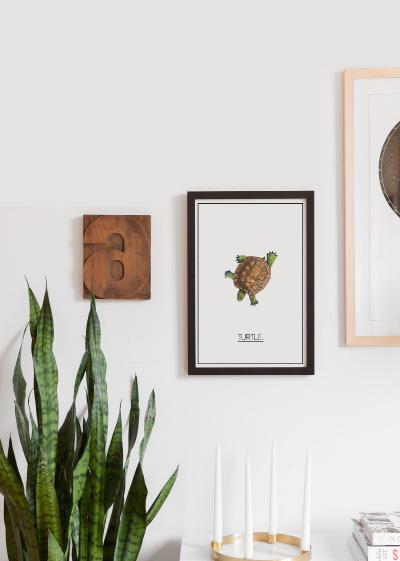
After my personal analysis study of the old logo of the national chain of Congo, I was able to find a concrete idea.
Furthermore, my idea is to create a new logo that will offer something that reflects the evolution of the logo starting from the old and adding a touch of modernity. And also this idea of globalization and highlighting the Congolese national channel.
Old logo approach
COLOR PALETTES
C= 100 M= 97 Y= 6 K= 0
C= 8 M= 1 Y= 100 K= 0
After a personal analysis of the old logo of the national channel, which is the Rtnc, there were two elements that caught my attention. First, colorization. It is obvious to notice the choice of colors was based on the colors of the flag of Congo (DRC) of the time, which are light yellow and dark blue.


Finally, the second element that I noticed is the approach of the designer at the time to highlight the dominating color of the flag, which is blue, to also make it a color that occupies a large surface in the logo, and the light yellow which is less conspicuous and prevalent in the flag and in the logo as well.

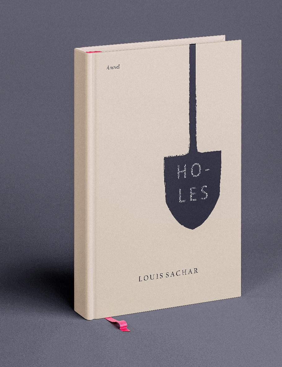
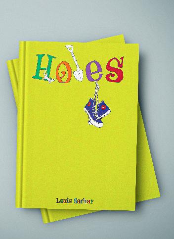
During my first years of learning English in the U.S., in my reading class, I was assigned to design a proposal for a new design for the cover of the popular book which is Holes. I read and watched, many times, these beautiful stories. However, it wasn’t something that was required for everybody but if someone wanted to do it, he had a green light to do so. So I came up with two ideas, both strongly related to the holes’ story. I wanted to make the first cover for the kids with flashy colors and some key points in the story such as shoes, shelves, and lizards. For instance, the shelves were the tool that help Stanley, his friends, and everybody else to dig a hole. It was quotidian tools. Finally, the second cover is designed for adults with deep, simple, and shade colors. I wanted to keep everything simple and pleasant to look at.
For this poster, I wanted to create a simple and easy way to represent our community at Bellevue College. According to Oxford languages, the word DIVERSITY means the state of being diverse; variety. This entire word includes many others sub-words that make it stronger, such as gender. It can any kind of living thing or object, including human beings. However, That meaning is something that many people from my country ignore.
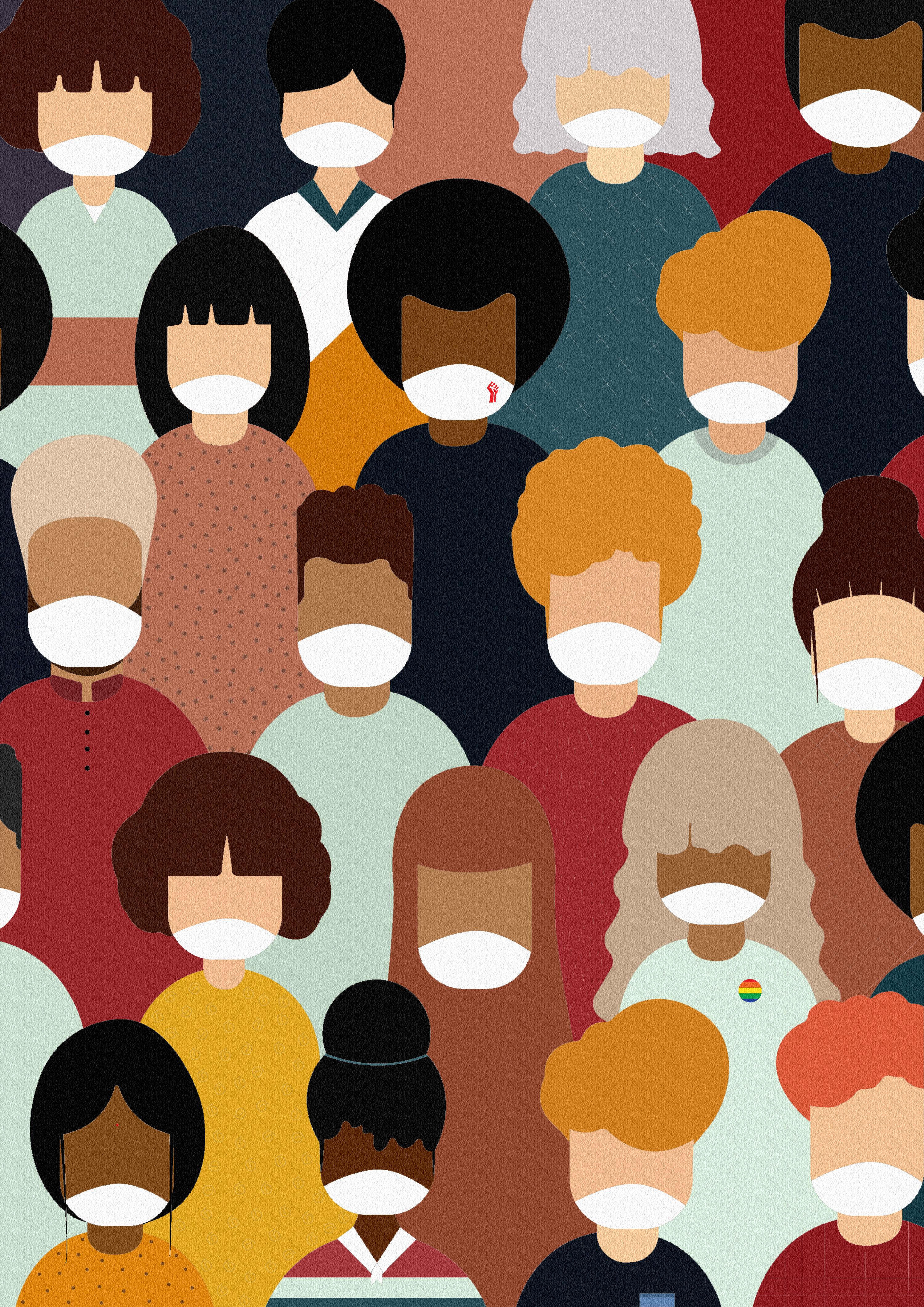
Since I came here to the US, I started to understand the deep meaning of this word through the protest event across of the United States of America. So, this poster is my understanding of the word diversity that reflects our community such as teachers, students, and workers at Bellevue College no matter where you came from or tone of your skin or religion. We are Bellevue College
For this poster, as a black international student, it is important to show people our lives matter like everybody too. However, the recent tragic event that happened in Minnesota, was something I couldn’t imagine that going to happen. Maybe that happened many times in the past without being seen or recorded by someone. Now everybody has seen it! Through this event, people started to understand the hypocrisy that exists in the United States of America.
This country is built for everyone, no matter where you came from or the color of your skin. So, I wanted to create something simple, clear, powerful, symbolic, and meaningful. And I decided to replace the letter I in the phrase Black Lives Matter with a powerful symbol, which is a fist up in a red color that expresses the sense of courage and dignity of minority people since the beginning of this movement.
For this project, I have to choose a city by my choice and design it in bringing a depth sense on it. I chose Seattle because it where I’m living rigth now. Also, I love the ambiance and athmopshere here. Everywhere is green and calm. I picked green color because is more related to the nature or forest ecosytem at all.
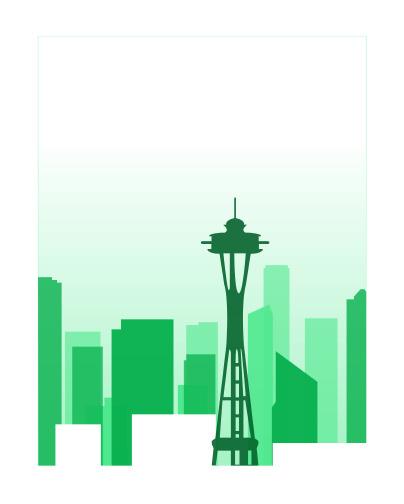
Yet, for makeing the depth aspect, I used the green gradient on the background down to up. Also, for making the depth much more visible, i have chosen to process by playing with the opacity of green which means :
- Most closer buildings( front) = Fully green opacity.
- Less closer buildings ( middle) = Half green opacity.
- Away buildings ( Background) = Less than half opacity. And I played with the paper color to increase the depth of my design as well.
This poster was inspired by 80’s vibes, especially Miami vice color which are blue, pink, yellow... I picked Seattle city because I love being here. I appreciate the way both posts have been designed. It is simple and at the same time complicated to design it.

For the first image, it has captured my attention in the way the focal point expresses the movement. It’s great but the real reason for my choice it’s the background with stars behind the sun. Those stars look awesome and bring a galactic or unique mood to the design. Finally the second image, I have borrowed from one of my favorite games on every console, which is ‘’ Sayonara: Wild Hearts.” This game has a unique and won- derful switching dimension when you play. Also, the colors, characters, and music are immersive. I love it!!
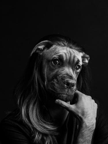
This poster is inspired by the concept of Anthropomorphic photo/collage arts, and it was made by using only photoshop. However, the black and white portrait is more convenient for me to work on. Also, I do like renaissance art, which is characterized mainly by the emotion on it. So, that is the reason why I choose this poster that is expressive in the way the man posted and also the dog work together.
For this design, I have spent many times thinking and also trying different approaches to design my donuts’ flyer. It took me much energy to work on it. Therefore, playing with colors is not my cut of tea. I always do my best to have good composition. However, I have been inspired by the theme of ‘’ party.’’ It’s not easy to do one, especially at this time. Also, I like donuts, even though I can eat only one. So, the party’s theme and one donut per day have made me design this poster/flyer.


Drawings: black pencil and markers
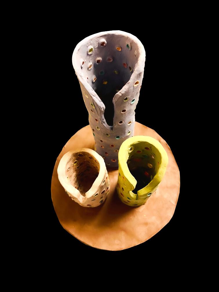
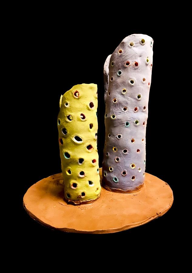
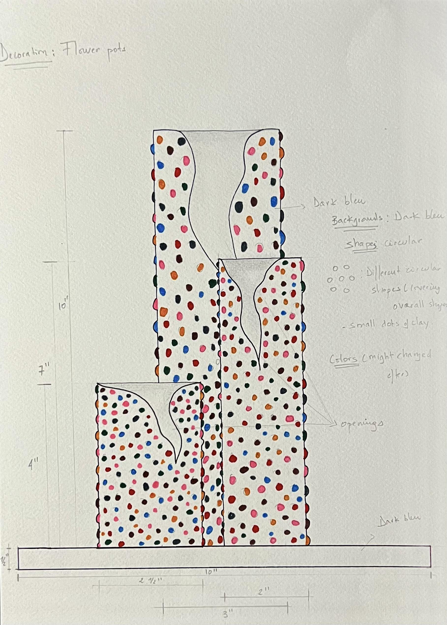
Futurist Flowers tower pots
I was thinking about creating something most people attend to purchase for making their house warmer and welcoming to their friends or family. And then I thought about designing a pot for flowers that can be placed in the living room or dining room. However, I looked up some online ideas and most of them were simple but unique in their ways. So I got inspired by them, and also I was thinking about bringing my own signature/characteristics through my pots.
And I came up with these unique openings and small colorful dots all around the designs supported by a circular base shape. Although the final design looks different from the drawing, it still has the same basic idea of expressing my own unique touch. Therefore, these final changes are due to the fragility of small dots to stick around pots, and I replaced them with different small colorful openings.
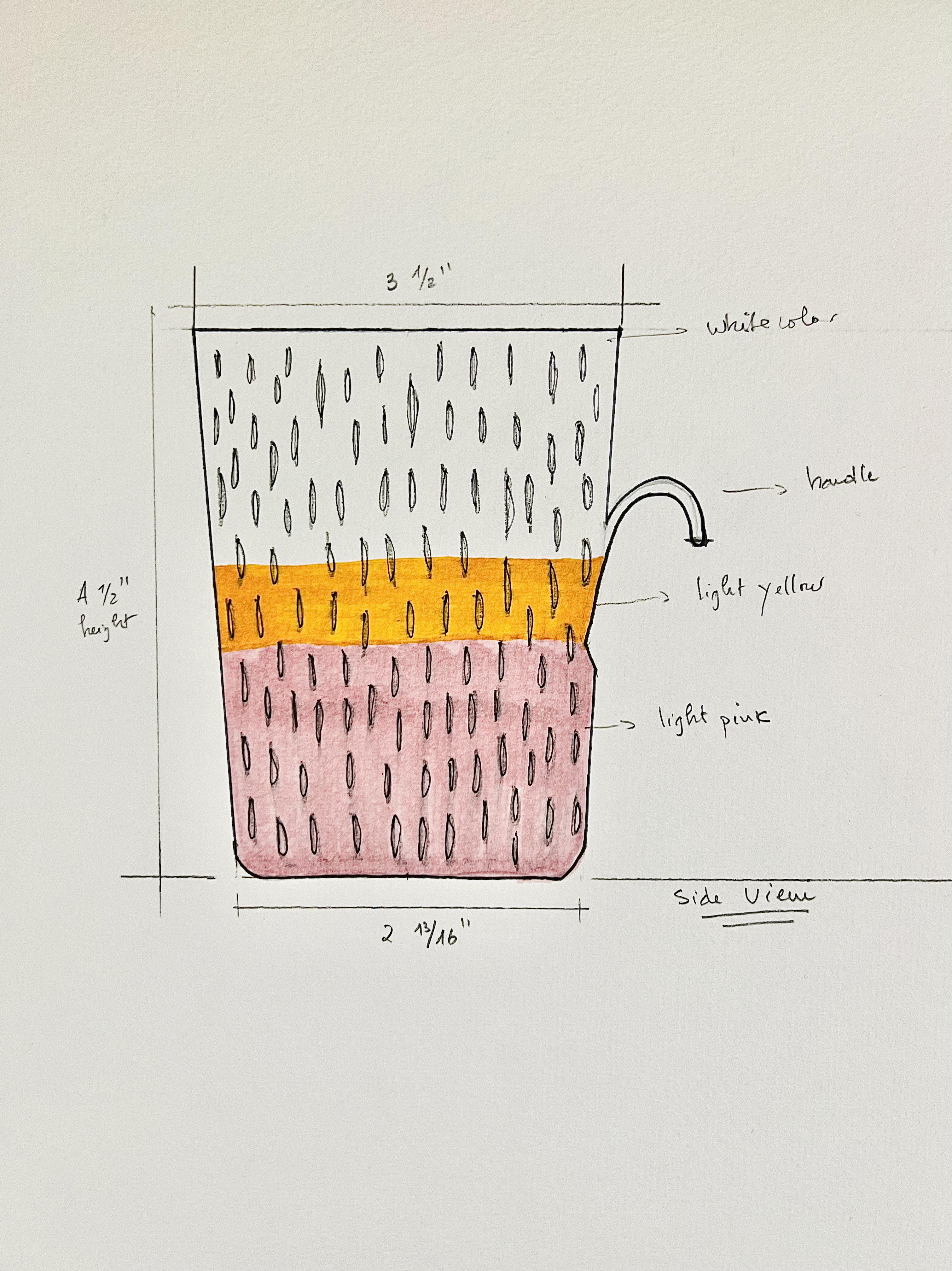
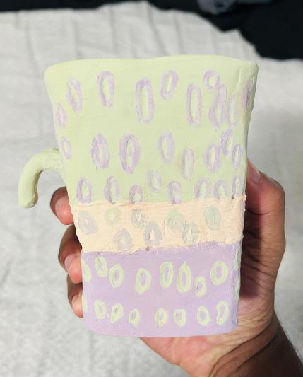
Drinking vessel
The main idea of this project was to create a functional mug that will be used quite often. And I came up with this idea of playing with the way of handling “the traditional cup” to make something new. So, I decided to create almost half of the traditional handle and make the around surface a bit coming inside/cut instead overall shape. It’s kind of created an irregular shape by following the way people manage to grab the cup.
And the color and texture, I wanted something that might be touchy and feelable when you grab it. Therefore, I designed a small ellipse all over the cup shape. Also, the color looks different from my drawing is because of the lack of blaze color that I had at this time. So, I decided to make change the color for something more present to look at.